├── .devcontainer
└── devcontainer.json
├── .github
└── workflows
│ └── codeql.yml
├── README.md
├── examples
├── Hass horseshoe overview 920x693.png
├── flex-horseshoe-card--example-card-1.png
├── flex-horseshoe-card--example-card-12.png
├── flex-horseshoe-card--example-card-4.png
└── view-flex-horseshoe-card-examples.yaml
├── flex-horseshoe-card.js
├── hacs.json
├── images
└── Hass horseshoe overview 920x693.png
└── info.md
/.devcontainer/devcontainer.json:
--------------------------------------------------------------------------------
1 | // For format details, see https://aka.ms/devcontainer.json. For config options, see the
2 | // README at: https://github.com/devcontainers/templates/tree/main/src/javascript-node
3 | {
4 | "name": "Node.js",
5 | // Or use a Dockerfile or Docker Compose file. More info: https://containers.dev/guide/dockerfile
6 | "image": "mcr.microsoft.com/devcontainers/javascript-node:0-20"
7 |
8 | // Features to add to the dev container. More info: https://containers.dev/features.
9 | // "features": {},
10 |
11 | // Use 'forwardPorts' to make a list of ports inside the container available locally.
12 | // "forwardPorts": [],
13 |
14 | // Use 'postCreateCommand' to run commands after the container is created.
15 | // "postCreateCommand": "yarn install",
16 |
17 | // Configure tool-specific properties.
18 | // "customizations": {},
19 |
20 | // Uncomment to connect as root instead. More info: https://aka.ms/dev-containers-non-root.
21 | // "remoteUser": "root"
22 | }
23 |
--------------------------------------------------------------------------------
/.github/workflows/codeql.yml:
--------------------------------------------------------------------------------
1 | name: "CodeQL"
2 |
3 | on:
4 | push:
5 | branches: [ "develop" ]
6 | pull_request:
7 | branches: [ "develop" ]
8 | schedule:
9 | - cron: "16 5 * * 6"
10 |
11 | jobs:
12 | analyze:
13 | name: Analyze
14 | runs-on: ubuntu-latest
15 | permissions:
16 | actions: read
17 | contents: read
18 | security-events: write
19 |
20 | strategy:
21 | fail-fast: false
22 | matrix:
23 | language: [ javascript ]
24 |
25 | steps:
26 | - name: Checkout
27 | uses: actions/checkout@v3
28 |
29 | - name: Initialize CodeQL
30 | uses: github/codeql-action/init@v2
31 | with:
32 | languages: ${{ matrix.language }}
33 | queries: +security-and-quality
34 |
35 | - name: Autobuild
36 | uses: github/codeql-action/autobuild@v2
37 |
38 | - name: Perform CodeQL Analysis
39 | uses: github/codeql-action/analyze@v2
40 | with:
41 | category: "/language:${{ matrix.language }}"
42 |
--------------------------------------------------------------------------------
/README.md:
--------------------------------------------------------------------------------
1 | **Personal Note, april 2023**
2 |
3 | Getting up to speed again with my custom cards after some difficult years!
4 |
5 | First commit is compatibility for Home Assistant 2023.4. I missed that one in my testcard view. For some reason I fixed the HA version to some 2023.3 version in my docker compose file. And in that case you can `docker compose pull` but nothing is updated...
6 | ***
7 |
8 | [](https://github.com/hacs/integration)
9 | 
10 | 
11 |
12 | #  Flexible Horseshoe Card
13 | Flexible looks-like-a-horseshoe card for [Home Assistant](https://github.com/home-assistant/home-assistant) Lovelace UI
14 |
15 | 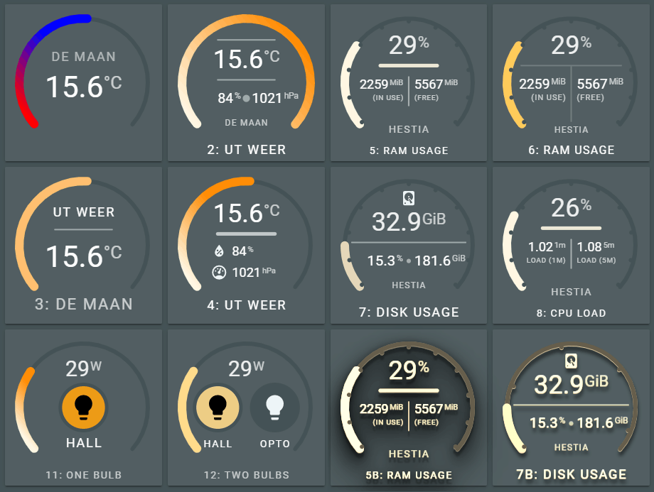
16 |
17 |
18 | *The Lovelace view of the above examples is in the repository in the examples folder.
19 | So you can see how these layouts are done*
20 | ***
21 |
22 | ### v0.8.0 is the first public release of this card. Be gentle with it!
23 | * * *
24 |
25 | ## Introduction
26 | The flexible horseshoe card can display data from entities and attributes from the sensor and other domains. It displays the current state and for the primary entity it fills the horseshoe with a color depending on the min and max values of the state and the configured color stops and styling.
27 |
28 | The main perk of this card is it's flexibility. It is able to position a number of things where YOU want it using a layout specification for each object you want on the card:
29 |
30 | | Feature | Description |
31 | |---------|-------------|
32 | | **Any** number of **entities** |For each entity, the attribute, units, icon, name, area and tap action can be specified.
*There is currently no limit imposed on the number of entities in this card. I'm using max. 3 entities in the examples, but there is no problem using more.*
33 | | **Any** number of **circles**, **horizontal** and **vertical** **lines** | To function as a divider between values or background for values.
34 | | The **layout** of the card | You can specify each object with a relative position on the card |
35 | | **Animations**, dynamic behaviour | You can specify what happens if an entity changes state like change color, or execute a CSS animation. There are predefined animations. |
36 | | Several ways to **color** the **horseshoe** | From single, fixed color, to a gradient depending on a list of colorstops |
37 | | **Actions** | Handle click actions per entity to for instance switch a light on/off |
38 |
39 | * * *
40 | #  Table of contents
41 | - [Some examples](#-some-examples)
42 | - [Install](#-install)
43 | - [Using the card](#-using-the-card)
44 | - [Card Options](#-card-options)
45 | - [Enities Section](#-entities-section)
46 | - [Layout Section](#-layout-section)
47 | - [Horseshoe Section](#-horseshoe-section)
48 | - [Show Section](#-show-section)
49 | - [Card filter Section](#-card-filter-section)
50 | - [Animations Section](#-animations-section)
51 | - [12 reusable Examples](#-examples-section)
52 | - [Design your OWN card](#-design-your-own-card)
53 | - [End notes](#-end-notes)
54 | ***
55 |
56 | #  Some examples
57 |
58 | ## Normal, flat UI
59 | Cards in a standard vertical stack / horizontal stack - 2 cards per row - combination.
60 |
61 | 
62 |
63 | Legend:
64 | - (3), showing a single attribute from a darksky sensor, a unit (temperature), an area and horizontal line
65 | - (4), showing three attributes from a darksky sensor (temperature, humidity and air pressure), units, two icons, a name and a horizontal line
66 | - (5), showing three sensors from system monitoring (ram used, ram used percentage and ram free), two sensor names ("in use" and "free"), a horizontal line and a vertical line.
67 | - (6), same as (5), bit with different horizontal and vertical line and different fill style for the horseshoe.
68 |
69 | All cards use different styling for filling the horseshoe with a color.
70 |
71 | ## Some extreme, industrial look, 3D UI
72 | Using the same cards as above, but with a predefined set of filters applied. In this case the `card--dropshadow-heavy--sepia90` class filter for the card_filter variable.
73 |
74 | Again, cards in a standard vertical stack / horizontal stack - 2 cards per row - combination.
75 |
76 | 
77 | 
78 |
79 | ## It scales, as it is based on SVG
80 | Using a single card in a row. Card scales to maximum width of the vertical stack card. No changes required for text size, icons, lines and state & attribute values. All thanks to SVG.
81 |
82 | 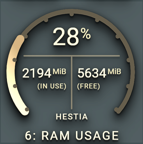
83 |
84 | ## Yes, you can interact with it. Switching lights is no problem!
85 | For each entity a `tap_action` can be defined. The default is the known show-more info dialog. This can be changed in executing a service for instance.
86 |
87 | Combined with animations and states, you can alter the appearance of objects. The card containts a list of [predefined animations](#predefined-animations), or you just create your own!
88 |
89 | 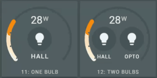
90 |
91 | #  Install
92 |
93 | ## Install via HACS
94 | [](https://github.com/custom-components/hacs)
95 |
96 | ## Manual install
97 |
98 | 1. Download and copy `flex-horseshoe-card.js` from github into your `config/www` directory.
99 |
100 | 2. If using the editor UI: Add a reference to `flex-horseshoe-card.js` inside your `ui-lovelace.yaml` or at the top of the *raw config editor UI*.
101 | 3. If using yaml mode, add a reference in the resources.yaml file that is !included in your `ui-lovelac.yaml` file
102 |
103 | ```yaml
104 | resources:
105 | - url: /community_plugin/flex-horseshoe-card/flex-horseshoe-card.js
106 | type: module
107 | ```
108 | #  Using the card
109 |
110 | The preferred method of using this card is by [`decluttering card`](https://github.com/custom-cards/decluttering-card) templates. You define the layout and default options in this template and use the template in your Lovelace config. This config stays clean this way: you only specify the entities, attributes, units and icons which are displayed according to the layout defined in the template.
111 |
112 | The advice will become obvious once you scroll throught the list of card options :smile:
113 |
114 | ## A basic example
115 | This is the card 1 of the examples. It shows the basic definition for the flexible horseshoe card using the darksky sensor with the temperature attribute and its unit and decimals.
116 |
117 | 
118 |
119 | ```yaml
120 | - type: 'custom:flex-horseshoe-card'
121 | entities:
122 | - entity: weather.dark_sky
123 | attribute: temperature
124 | decimals: 1
125 | unit: '°C'
126 | area: De Maan
127 | show:
128 | horseshoe_style: 'lineargradient'
129 | layout:
130 | states:
131 | # Refers to the first entity in the list, ie index 0
132 | # State value is positioned at (50%,60%) with a large font size
133 | # The size of the units are automatically calculated at 60% of the
134 | # state value font size and shifted upwards.
135 | # The default font color is the theme defined primary-text-color.
136 | - id: 0
137 | entity_index: 0
138 | xpos: 50
139 | ypos: 60
140 | styles:
141 | - font-size: 3.5em;
142 | areas:
143 | # Refers to the first entity in the list, ie index 1
144 | # Area value is positioned at (50%,35%) with font-size 1.5 and
145 | # an opacity of 80%.
146 | # The default font color is the theme defined primary-text-color.
147 | - id: 0
148 | entity_index: 0
149 | xpos: 50
150 | ypos: 35
151 | styles:
152 | - font-size: 1.5em;
153 | - opacity: 0.8;
154 |
155 | # Scale set to -10 to +40 degrees celcius
156 | horseshoe_scale:
157 | min: -10
158 | max: 40
159 | # color stop list with two colors. With the `lineargradient` fill style, only the
160 | # colors are used. The thresholds are ignored with this setting.
161 | color_stops:
162 | 10: 'red'
163 | 18: 'blue'
164 | ```
165 |
166 | ## Extending the basic example with two more entities and a horizontal line
167 | This is card 4 of the examples. It extends the basic definition of card 1 with two more attributes from the darksky sensor and adds a horizontal line as a divider. We also swap the `area` with the `name` of the first entity.
168 |
169 | 
170 |
171 | ```yaml
172 | - type: 'custom:flex-horseshoe-card'
173 | entities:
174 | - entity: weather.dark_sky
175 | attribute: temperature
176 | decimals: 1
177 | name: '4: Ut Weer'
178 | unit: '°C'
179 | - entity: weather.dark_sky
180 | attribute: humidity
181 | decimals: 0
182 | unit: '%'
183 | icon: mdi:water-percent
184 | - entity: weather.dark_sky
185 | attribute: pressure
186 | decimals: 0
187 | unit: 'hPa'
188 | icon: mdi:gauge
189 | show:
190 | horseshoe_style: 'lineargradient'
191 | layout:
192 | hlines:
193 | # A horizontal line. Not connected to an entity
194 | - id: 0
195 | xpos: 50
196 | ypos: 42
197 | length: 40
198 | styles:
199 | - stroke: var(--primary-text-color);
200 | - stroke-width: 5;
201 | - stroke-linecap: round;
202 | - opacity: 0.7;
203 | states:
204 | # States 0 refers to the first entity in the list, ie index 0
205 | - id: 0
206 | entity_index: 0
207 | xpos: 50
208 | ypos: 34
209 | styles:
210 | - font-size: 3em;
211 | # States 1 refers to the second entity in the list, ie index 1
212 | - id: 1
213 | entity_index: 1
214 | xpos: 40
215 | ypos: 57
216 | styles:
217 | - text-anchor: start;
218 | - font-size: 1.5em;
219 | # States 2 refers to the third entity in the list, ie index 2
220 | - id: 2
221 | entity_index: 2
222 | xpos: 40
223 | ypos: 72
224 | styles:
225 | - text-anchor: start;
226 | - font-size: 1.5em;
227 | icons:
228 | # Icons 0 refers to the second entity in the list, ie index 1
229 | - id: 0
230 | entity_index: 1
231 | xpos: 37
232 | ypos: 57
233 | align: end
234 | size: 1.3
235 | # Icons 1 refers to the third entity in the list, ie index 2
236 | - id: 1
237 | entity_index: 2
238 | xpos: 37
239 | ypos: 72
240 | align: end
241 | size: 1.3
242 | names:
243 | # Names 0 refers to the first entity in the list, ie index 0
244 | - id: 0
245 | entity_index: 0
246 | xpos: 50
247 | ypos: 95
248 |
249 | # Scale set to -10 to +40 degrees celcius
250 | horseshoe_scale:
251 | min: -10
252 | max: 40
253 | # color stop list with 10 colors defined in the theme. With the `lineargradient` fill style, only the
254 | # first (16:) and last (25:) colors are used. The thresholds are ignored with this setting.
255 | color_stops:
256 | 16: '#FFF6E3'
257 | 17: '#FFE9B9'
258 | 18: '#FFDA8A'
259 | 19: '#FFCB5B'
260 | 20: '#FFBF37'
261 | 21: '#ffb414'
262 | 22: '#FFAD12'
263 | 23: '#FFA40E'
264 | 24: '#FF9C0B'
265 | 25: '#FF8C06'
266 | ```
267 |
268 | ## Extending the basic example with a lot more options like actions and animations
269 | This is the card 12 of the examples. It displays the wattage (memory sensor is used for this value) and the state of two lights. Both ligts can be switched on and off. The left light uses a predefined animation (yello and zoomout), the right light uses a user defined animation.
270 |
271 | Let's see how that looks :smile:
272 |
273 | 
274 |
275 | ```yaml
276 | - type: 'custom:flex-horseshoe-card'
277 | entities:
278 | # Abuse the memory_use_percent sensor as the wattage the bulbs use. Just to show the possibilities
279 | - entity: sensor.memory_use_percent
280 | decimals: 0
281 | name: '12: Two Bulbs'
282 | area: Hestia
283 | unit: W
284 | decimals: 0
285 | tap_action:
286 | action: more-info
287 |
288 | # The left light displayed on the card. Index 1
289 | - entity: light.1st_floor_hall_light
290 | name: 'hall'
291 | icon: mdi:lightbulb
292 | tap_action:
293 | action: call-service
294 | service: light.toggle
295 | service_data: { "entity_id" : "light.1st_floor_hall_light" }
296 |
297 | # The right light displayed on the card. Index 2
298 | - entity: light.gledopto
299 | name: 'opto'
300 | icon: mdi:lightbulb
301 | tap_action:
302 | action: call-service
303 | service: light.toggle
304 | service_data: { "entity_id" : "light.gledopto" }
305 |
306 | animations:
307 | # Animations for the second entity, index 1
308 | entity.1:
309 | - state: 'on'
310 | circles:
311 | - animation_id: 11
312 | styles:
313 | - fill: var(--theme-gradient-color-03);
314 | - opacity: 0.9;
315 | - transform-origin: 30% 50%;
316 | - animation: jello 1s ease-in-out both;
317 | icons:
318 | - animation_id: 10
319 | styles:
320 | - fill: black;
321 | - state: 'off'
322 | circles:
323 | - animation_id: 11
324 | reuse: true
325 | styles:
326 | - transform-origin: 30% 50%;
327 | - animation: zoomOut 1s ease-out both;
328 | icons:
329 | - animation_id: 10
330 | styles:
331 | - fill: var(--primary-text-color);
332 |
333 | # Animations for the third entity, index 2
334 | entity.2:
335 | - state: 'on'
336 | circles:
337 | - animation_id: 21
338 | styles:
339 | - fill: var(--theme-gradient-color-03);
340 | - stroke-width: 2;
341 | - stroke: var(--primary-background-color);
342 | - opacity: 0.9;
343 | - stroke-dasharray: 94;
344 | - stroke-dashoffset: 1000;
345 | - animation: stroke 2s ease-out forwards;
346 |
347 | icons:
348 | - animation_id: 20
349 | styles:
350 | - fill: black;
351 |
352 | - state: 'off'
353 | circles:
354 | - animation_id: 21
355 | styles:
356 | - fill: var(--primary-background-color);
357 | - opacity: 0.7;
358 | icons:
359 | - animation_id: 20
360 | styles:
361 | - fill: var(--primary-text-color);
362 |
363 | show:
364 | horseshoe_style: 'fixed'
365 | layout:
366 | states:
367 | - id: 0
368 | entity_index: 0
369 | animation_id: 0
370 | xpos: 50
371 | ypos: 28
372 | uom_font_size: 1.5
373 | styles:
374 | - font-size: 2.5em;
375 | - opacity: 0.9;
376 | names:
377 | - id: 0
378 | animation_id: 0
379 | entity_index: 0
380 | xpos: 50
381 | ypos: 100
382 | styles:
383 | - font-size: 1.2em;
384 | - opacity: 0.7;
385 | - id: 1
386 | animation_id: 1
387 | entity_index: 1
388 | xpos: 30
389 | ypos: 78
390 | styles:
391 | - font-size: 1.2em;
392 | - id: 2
393 | animation_id: 2
394 | entity_index: 2
395 | xpos: 70
396 | ypos: 78
397 | styles:
398 | - font-size: 1.2em;
399 | icons:
400 | - id: 0
401 | animation_id: 10
402 | xpos: 30
403 | ypos: 55
404 | entity_index: 1
405 | icon_size: 3.5
406 | styles:
407 | - color: var(--primary-text-color);;
408 | - id: 1
409 | animation_id: 20
410 | xpos: 70
411 | ypos: 55
412 | entity_index: 2
413 | icon_size: 3.5
414 | styles:
415 | - color: var(--primary-text-color);;
416 | circles:
417 | - animation_id: 3
418 | xpos: 30
419 | ypos: 50
420 | radius: 35
421 | styles:
422 | - fill: var(--primary-background-color);
423 | - animation_id: 11
424 | xpos: 30
425 | ypos: 50
426 | radius: 30
427 | entity_index: 1
428 |
429 | - animation_id: 2
430 | xpos: 70
431 | ypos: 50
432 | radius: 35
433 | styles:
434 | - fill: var(--primary-background-color);
435 | - animation_id: 21
436 | xpos: 70
437 | ypos: 50
438 | radius: 30
439 | entity_index: 2
440 |
441 | horseshoe_scale:
442 | min: 0
443 | max: 100
444 | color: 'var(--primary-background-color)'
445 | horseshoe_state:
446 | color: '#FFDA8A'
447 | color_stops:
448 | 0: '#FFF6E3'
449 | 10: '#FFE9B9'
450 | 20: '#FFDA8A'
451 | 30: '#FFCB5B'
452 | 40: '#FFBF37'
453 | 50: '#ffb414'
454 | 60: '#FFAD12'
455 | 70: '#FFA40E'
456 | 80: '#FF9C0B'
457 | 90: '#FF8C06'
458 | # The @keyframes stroke runs the stroke animation for the second lightbulb, entity light.gledopto
459 | style: |
460 | @keyframes stroke { to { stroke-dashoffset: 0; } }
461 | ```
462 |
463 | #  Card Options
464 |
465 | ## Main Card required, defaulted and pure optional sections
466 | The Card Options are divided into Sections. To give a clear overview of which of the sheer number of sections are required, optional with defaults and optional, the following table is made.
467 |
468 | The [examples section](#-examples-section) shows 12 examples of card definitions, from basic to using all available options!
469 |
470 | Note: The examples will get decluttering templates as an example too, to show how you can better manage and maintain the all the card layouts without loosing overview in the Lovelace views.
471 |
472 | Each section might have it's own required, defaulted and optional properties.
473 |
474 | | Name | Required | Optional /w defaults | Optional | Since | Description |
475 | |------|:--------:|:---------:|:--------:|-------|-------------|
476 | | type |  | | | v0.8.0 | `custom:flex-horseshoe-card`.
477 | | entities |  | | | v0.8.0 | One or more sensor entities in a list. See [entities section](#-entities-section) for requirements.
478 | | layout |  | | | v0.8.0 | You MUST of course specify where each item is positioned on the card. See [available layout options](#available-layout-options) for requirements.
479 | | horseshoe_scale |  | some | | v0.8.0 | Specifies the scale configuration, like min, max, width and color of the scale. See [horseshoe scale](#horseshoe-scale-options) for requirements.
480 | | color_stops |  | | | v0.8.0 | Set thresholds for horseshoe gradients and colormapping. See [color stops](#horseshoe-state-options) for requirements.
481 | | | | | | |
482 | | horseshoe_state | |  | | v0.8.0 | Specifies the horseshoe width, and fixed color. See [horseshoe state](#horseshoe-state-options) for requirements.
483 | | show | |  | | v0.8.0 | Determines what is shown, like the scale and the horseshoe style. See [available show options](#available-show-options) for requirements.
484 | | card_filter | |  | | v0.8.0 |
485 | | entities tap_action | |  | | v0.8.0 | How to respond to a mouse-click or tap. See [available tap actions](#action-object-optionss) for requirements.
486 | | | | | | |
487 | | animations | | |  | v0.8.0 | You can specify animations / dynamic behaviour depending on the state of an entity. Circles, lines and icons can be controlled depending on the state of a given entity. See [available animation options](#available-animation-options) for requirements.
488 |
489 | #  Entities section
490 |
491 | ## Available entity options
492 | | Name | Type | Default | Since | Description |
493 | |------|:----:|---------|-------|-------------|
494 | | attribute | string | optional | v0.8.0 | The attribute to be used for the entity.
495 | | unit | string | optional | v0.8.0 | Specifies the entity or attribute unit to be displayed.
496 | | decimals | number | optional | v0.8.0 | Specifies the decimals to format the entity or attribute value.
497 | | name | string | optional | v0.8.0 | Name used for entity or attribute. Overwrites the `friendly_name` attribute.
498 | | area | string | optional | v0.8.0 | Area used for entity or attribute.
499 | | tap_action | [action object](#action-object-options) | optional | v0.8.0 | How to respond to a mouse-click or tap. See [available tap actions](#action-object-optionss) for requirements.
500 |
501 | #### Example 1, displaying an entity:
502 | ```yaml
503 | entities:
504 | - entity: sensor.memory_use_percent
505 | decimals: 0
506 | icon: mdi:memory
507 | name: '5: RAM Usage'
508 | area: Hestia
509 | ```
510 |
511 | #### Example 2, displaying an attribute:
512 | ```yaml
513 | entities:
514 | - entity: weather.dark_sky
515 | attribute: temperature
516 | units: '°C'
517 | icon: mdi:temperature
518 | decimals: 1
519 | name: 'Temperature'
520 | ```
521 |
522 | ## Action object options
523 | (changed to be identical to mini graph card)
524 |
525 | | Name | Type | Default | Options | Since | Description |
526 | |------|:----:|---------|---------|-------|-------------|
527 | | action | string | `more-info` | `more-info`, `navigate`, `call-service`, `none` | v0.8.0 |Action to perform
528 | | service | string | none | Any service | v0.8.0 |Service to call (e.g. `media_player.toggle`) when `action` is defined as `call-service`
529 | | service_data | object | none | Any service data | v0.8.0 |Service data to include with the service call (e.g. `entity_id: media_player.office`)
530 | | navigation_path | string | none | Any path | v0.8.0 |Path to navigate to (e.g. `/lovelace/0/`) when `action` is defined as `navigate`
531 |
532 | #### Example 3: a light switch:
533 | ```yaml
534 | entities:
535 | - entity: light.1st_floor_hall_light
536 | name: 'hall'
537 | icon: mdi:lightbulb
538 | tap_action:
539 | action: call-service
540 | service: light.toggle
541 | service_data: { "entity_id" : "light.1st_floor_hall_light" }
542 | ```
543 |
544 | #  Layout section
545 |
546 | ## Available layout options
547 | The layout options determine where the objects are located on the card, and their initial appearance like font, font size, color, width, fill color, stroke color, etc.
548 |
549 | | Name | Type | Default | Since | Description |
550 | |------|:----:|:-------:|-------|-------------|
551 | | Layout object | [layout object](#layout-object-options) | **required** | v0.8.0 | Entity objects:
`states` for displaying a entity or attribute value
`names` for the name of the entity
`icons` for the entity icons
Graphic objects:
`circles` for circles
`hlines` and `vlines` for drawing lines.
552 |
553 | ## Layout object options
554 |
555 | | Name | Type | Default | Options | Since | Description |
556 | |------|:----:|---------|---------|-------|-------------|
557 | | id | number | *not used yet* | | v0.8.0 | Identifies the object.
558 | | xpos | percentage | **required** | percentage 0..100 | v0.8.0 | Relative x-position in card. A value of 50 (%) places the object in the middle of the x-axis
559 | | ypos | percentage | **required** | percentage 0..100 | v0.8.0 | Relative y-position in card. A value of 50 (%) places the object in the middle of the y-axis
560 | | length*(lines only)* | percentage | **required** | percentage 0.100 | v0.8.0 | Relative length of a line. A value of 50 (%) means the line is half the size of the card's width
561 | | radius*(circles only)* | pixels | **required** | > 1 / < 200 | v0.8.0 | Specifies the radius of the circle in pixels.
562 | | icon_size *(icons only)* | em value | **required**| a value of 1 = 12px | v0.8.0 | Specifies the size of the icon in em units. A calculation takes care of positioning the icon
563 | | align *(icons only)* | position | `middle` | `start`/ `middle`/ `end` | v0.8.0 | Specifies the alignment of the icon relative to the xpos and ypos. Functions idential to the `text-anchor`css property. Used in positioning calculations for the icon.
564 | | entity_index | number | **required** | N/A | v0.8.0 | Refers to the 0-based index in the entity list which the layout is connected to |
565 | | animation_id | number | optional | an Id | v0.8.0 | Identifies an animation in the animations section. It connects this layout object with dynamic behaviour
566 | | styles | list | optional | any valid css entry | v0.8.0 | specify a list of css values to style the object. Must be terminated with a semicolon `;`
567 |
568 | #### Example layout entry
569 | The following layout is a part of card 5. For more complete examples, see the [examples section](#-examples-section)
570 |
571 | 
572 |
573 | - xpos, ypos and length are **percentages**
574 | - state layout 0 is connected to entity 0, ie the first entity in the entities section
575 | - name layout 0 is also connected to entity 0
576 |
577 | ```yaml
578 | layout:
579 | hlines:
580 | - id: 0
581 | xpos: 50
582 | ypos: 38
583 | length: 40
584 | styles:
585 | - stroke: var(--theme-gradient-color-01);
586 | - stroke-width: 5;
587 | - opacity: 0.9;
588 | - stroke-linecap: round;
589 | vlines:
590 | - id: 0
591 | xpos: 50
592 | ypos: 56
593 | length: 20
594 | styles:
595 | - stroke: white;
596 | - opacity: 0.5;
597 | - stroke-width: 2;
598 | - stroke-linecap: round;
599 | states:
600 | - id: 0
601 | entity_index: 0
602 | xpos: 50
603 | ypos: 30
604 | styles:
605 | - font-size: 3em;
606 | - opacity: 0.9;
607 | names:
608 | - id: 0
609 | entity_index: 0
610 | xpos: 50
611 | ypos: 100
612 | styles:
613 | - font-size: 1.2em;
614 |
615 | ```
616 |
617 | #  Horseshoe section
618 |
619 | ## Horseshoe scale options
620 | | Name | Type | Default | Options | Since | Description |
621 | |------|:----:|---------|---------|-------|-------------|
622 | | min | number | **required** | | v0.8.0 | Minimum value of the scale / horseshoe
623 | | max | number | **required** | | v0.8.0 | Maximum value of the scale / horseshoe
624 | | color | color | `var(--primary-background-color)`|any # or var color| v0.8.0 | Color of the scale and tickmarks, if enabled through `show.scale_tickmarks` option.
625 | | width | pixels | 6 |size in pixels| v0.8.0 | Width of scale
626 |
627 | #### Example:
628 | ```yaml
629 | horseshoe_scale:
630 | min: 0
631 | max: 100
632 | width: 6
633 | color: 'var(--primary-background-color)'
634 | ```
635 | ## Horseshoe state options
636 | | Name | Type | Default | Options | Since | Description |
637 | |------|:----:|---------|---------|-------|-------------|
638 | | color | color | **required** |any valid color| v0.8.0 | Color of horseshoe if `show.horseshoe_style` = `fixed`
639 | | width | pixels | 12 |size in pixels| v0.8.0 | Width of horseshoe
640 |
641 | #### Example:
642 | ```yaml
643 | horseshoe_state:
644 | width: 12
645 | color: 'var(--theme-gradient-color-01)'
646 | ```
647 |
648 | ## Horseshoe color stops
649 | | Name | Type | Default | Options | Since | Description |
650 | |------|:----:|---------|---------|-------|-------------|
651 | | color_stops | list | **required** | | v0.8.0 | List of colorstop value and colors. Colors can be specified using:
A standard hex `#RRGGBB` color
An `RGB()` or `RGBA()` color
A `HSL()`or `HSLA()` color
A named CSS color, ie `white`
A css variable defined in the theme, ie something like `var(--color)`
983 |
984 |
990 |
991 | `;
992 | }
993 |
994 | /*******************************************************************************
995 | * renderTickMarks()
996 | *
997 | * Summary.
998 | * Renders the tick marks on the scale.
999 | *
1000 | */
1001 |
1002 | _renderTickMarks() {
1003 | const { config, } = this;
1004 | if (!config) return;
1005 | if (!config.show) return;
1006 | if (!config.show.scale_tickmarks) return;
1007 |
1008 | const stroke = config.horseshoe_scale.color ? config.horseshoe_scale.color : 'var(--primary-background-color)';
1009 | const tickSize = config.horseshoe_scale.ticksize ? config.horseshoe_scale.ticksize
1010 | : (config.horseshoe_scale.max - config.horseshoe_scale.min) / 10;
1011 |
1012 | // fullScale is 260 degrees. Hard coded for now...
1013 | const fullScale = 260;
1014 | const remainder = config.horseshoe_scale.min % tickSize;
1015 | const startTickValue = config.horseshoe_scale.min + (remainder == 0 ? 0 : (tickSize - remainder));
1016 | const startAngle = ((startTickValue - config.horseshoe_scale.min) /
1017 | (config.horseshoe_scale.max - config.horseshoe_scale.min)) * fullScale;
1018 | var tickSteps = ((config.horseshoe_scale.max - startTickValue) / tickSize);
1019 |
1020 | // new
1021 | var steps = Math.floor(tickSteps);
1022 | const angleStepSize = (fullScale - startAngle) / tickSteps;
1023 |
1024 | // If steps exactly match the max. value/range, add extra step for that max value.
1025 | if ((Math.floor(((steps) * tickSize) + startTickValue)) <= (config.horseshoe_scale.max)) {steps++;}
1026 |
1027 | const radius = config.horseshoe_scale.width ? config.horseshoe_scale.width / 2 : 6/2;
1028 | var angle;
1029 | var scaleItems = [];
1030 |
1031 | // NTS:
1032 | // Value of -230 is weird. Should be -220. Can't find why...
1033 | var i;
1034 | for (i = 0; i < steps; i++) {
1035 | angle = startAngle + ((-230 + (360 - i*angleStepSize)) * Math.PI / 180);
1036 | scaleItems[i] = svg`
1037 |
1040 | `;
1041 | }
1042 | return svg`${scaleItems}`;
1043 | }
1044 |
1045 | /*******************************************************************************
1046 | * _renderSvg()
1047 | *
1048 | * Summary.
1049 | * Renders the SVG
1050 | *
1051 | * NTS:
1052 | * If height and width given for svg it equals the viewbox. The card is not scaled
1053 | * anymore to the full dimensions of the card given by hass/lovelace.
1054 | * Card or svg is also placed default at start of viewport (not box), and can be
1055 | * placed at start, center or end of viewport (Use align-self to center it).
1056 | *
1057 | * 1. If height and width are ommitted, the ha-card/viewport is forced to the x/y
1058 | * aspect ratio of the viewbox, ie 1:1. EXACTLY WHAT WE WANT!
1059 | * 2. If height and width are set to 100%, the viewport (or ha-card) forces the
1060 | * aspect-ratio on the svg. Although GetCardSize is set to 4, it seems the
1061 | * height is forced to 150px, so part of the viewbox/svg is not shown or
1062 | * out of proportion!
1063 | * 3. Setting the height/width also to 200/200 (same as viewbox), the horseshoe is
1064 | * displayed correctly, but doesn't scale to the max space of the ha-card/viewport.
1065 | * It also is displayed at the start of the viewport. For a large horizontal
1066 | * card this is ok, but in other cases, the center position would be better...
1067 | * - use align-self: center on the svg ...or...
1068 | * - use align-items: center on the parent container of the svg.
1069 | *
1070 | */
1071 | _renderSvg() {
1072 | // For some reason, using a var/const for the viewboxsize doesn't work.
1073 | // Even if the Chrome inspector shows 200 200. So hardcode for now!
1074 | // const { viewBoxSize, } = this;
1075 |
1076 | const cardFilter = this.config.card_filter ? this.config.card_filter : 'card--filter-none';
1077 |
1078 | return svg`
1079 |
1093 | `;
1094 | }
1095 | /*******************************************************************************
1096 | * _renderHorseShoe()
1097 | *
1098 | * Summary.
1099 | * Renders the horseshoe group.
1100 | *
1101 | * Description.
1102 | * The horseshoes are rendered in a viewbox of 200x200 (SVG_VIEW_BOX).
1103 | * Both are centered with a radius of 45%, ie 200*0.45 = 90.
1104 | *
1105 | * The foreground horseshoe is always rendered as a gradient with two colors.
1106 | *
1107 | * The horseshoes are rotated 220 degrees and are 2 * 26/36 * Math.PI * r in size
1108 | * There you get your value of 408.4070449 ;-)
1109 | */
1110 |
1111 | _renderHorseShoe() {
1112 |
1113 | if (!this.config.show.horseshoe) return;
1114 |
1115 | return svg`
1116 |
1117 |
1124 |
1125 |
1133 |
1134 | ${this._renderTickMarks()}
1135 |
1136 | `;
1137 | }
1138 |
1139 | /*******************************************************************************
1140 | * _renderEntityNames()
1141 | *
1142 | * Summary.
1143 | * Renders the given name to the card. If name not given a space is rendered.
1144 | * The location of the name is specified in the layout.
1145 | *
1146 | */
1147 |
1148 | _renderEntityNames() {
1149 | const {
1150 | layout,
1151 | } = this.config;
1152 |
1153 | if (!layout) return;
1154 | if (!layout.names) return;
1155 |
1156 | const svgItems = layout.names.map(item => {
1157 |
1158 | // compute some styling elements if configured for this name item
1159 | const ENTITY_NAME_STYLES = {
1160 | "font-size": '1.5em;',
1161 | "color": 'var(--primary-text-color);',
1162 | "opacity": '1.0;',
1163 | "text-anchor": 'middle;'
1164 | };
1165 |
1166 | // Get configuration styles as the default styles
1167 | let configStyle = {...ENTITY_NAME_STYLES};
1168 | if (item.styles) configStyle = Object.assign(configStyle, ...item.styles);
1169 |
1170 | // Get the runtime styles, caused by states & animation settings
1171 | let stateStyle = {};
1172 | if (this.animations.names[item.index])
1173 | stateStyle = Object.assign(stateStyle, this.animations.names[item.index]);
1174 |
1175 | // Merge the two, where the runtime styles may overwrite the statically configured styles
1176 | configStyle = { ...configStyle, ...stateStyle};
1177 |
1178 | // Convert javascript records to plain text, without "{}" and "," between the styles.
1179 | const configStyleStr = JSON.stringify(configStyle).slice(1, -1).replace(/"/g,"").replace(/,/g,"");
1180 |
1181 | const name = this._buildName(this.entities[item.entity_index], this.config.entities[item.entity_index]);
1182 |
1183 | return svg`
1184 |
1185 | ${name}
1186 |
1187 | `;
1188 | })
1189 |
1190 | return svg`${svgItems}`;
1191 | }
1192 |
1193 | /*******************************************************************************
1194 | * _renderEntityAreas()
1195 | *
1196 | * Summary.
1197 | * Renders the given area to the card. If area not given a space is rendered.
1198 | * The location of the area is specified in the layout.
1199 | *
1200 | */
1201 |
1202 | _renderEntityAreas() {
1203 | const {
1204 | layout,
1205 | } = this.config;
1206 |
1207 | if (!layout) return;
1208 | if (!layout.areas) return;
1209 |
1210 | const svgItems = layout.areas.map(item => {
1211 | const AREA_STYLES = {
1212 | "font-size": '1em;',
1213 | "color": 'var(--primary-text-color);',
1214 | "opacity": '1.0;',
1215 | "text-anchor": 'middle;'
1216 | };
1217 |
1218 | // Get configuration styles as the default styles
1219 | let configStyle = {...AREA_STYLES};
1220 | if (item.styles) configStyle = Object.assign(configStyle, ...item.styles);
1221 |
1222 | // Get the runtime styles, caused by states & animation settings
1223 | let stateStyle = {};
1224 | if (this.animations.areas[item.index])
1225 | stateStyle = Object.assign(stateStyle, this.animations.areas[item.index]);
1226 |
1227 | // Merge the two, where the runtime styles may overwrite the statically configured styles
1228 | configStyle = { ...configStyle, ...stateStyle};
1229 |
1230 | // Convert javascript records to plain text, without "{}" and "," between the styles.
1231 | const configStyleStr = JSON.stringify(configStyle).slice(1, -1).replace(/"/g,"").replace(/,/g,"");
1232 |
1233 | const area = this._buildArea(this.entities[item.entity_index], this.config.entities[item.entity_index]);
1234 |
1235 | return svg`
1236 |
1237 | ${area}
1238 |
1239 | `;
1240 | })
1241 |
1242 | return svg`${svgItems}`;
1243 | }
1244 |
1245 | /*******************************************************************************
1246 | * _renderState()
1247 | *
1248 | * Summary.
1249 | * Renders the entity or attribute state of a single item.
1250 | *
1251 | */
1252 |
1253 | _renderState(item) {
1254 |
1255 | if (!item) return;
1256 |
1257 | // compute x,y or dx,dy positions. Spec none if not specified.
1258 | const x = item.xpos ? item.xpos : '';
1259 | const y = item.ypos ? item.ypos : '';
1260 | const dx = item.dx ? item.dx : '0';
1261 | const dy = item.dy ? item.dy : '0';
1262 |
1263 | // compute some styling elements if configured for this state item
1264 | const STATE_STYLES = {
1265 | "font-size": '1em;',
1266 | "color": 'var(--primary-text-color);',
1267 | "opacity": '1.0;',
1268 | "text-anchor": 'middle;'
1269 | };
1270 |
1271 | const UOM_STYLES = {
1272 | "opacity": '0.7;'
1273 | };
1274 |
1275 | // Get configuration styles as the default styles
1276 | let configStyle = {...STATE_STYLES};
1277 | if (item.styles) configStyle = Object.assign(configStyle, ...item.styles);
1278 |
1279 | // Get the runtime styles, caused by states & animation settings
1280 | let stateStyle = {};
1281 | if (this.animations.states[item.index])
1282 | stateStyle = Object.assign(stateStyle, this.animations.states[item.index]);
1283 |
1284 | // Merge the two, where the runtime styles may overwrite the statically configured styles
1285 | configStyle = { ...configStyle, ...stateStyle};
1286 |
1287 | // Convert javascript records to plain text, without "{}" and "," between the styles.
1288 | const configStyleStr = JSON.stringify(configStyle).slice(1, -1).replace(/"/g,"").replace(/,/g,"");
1289 |
1290 | // Get font-size of state in configStyle.
1291 | // Split value and px/em; See: https://stackoverflow.com/questions/3370263/separate-integers-and-text-in-a-string
1292 | // For floats and strings:
1293 | // - https://stackoverflow.com/questions/17374893/how-to-extract-floating-numbers-from-strings-in-javascript
1294 |
1295 | // 2019.09.12
1296 | // https://stackoverflow.com/questions/40758143/regular-expression-to-split-double-and-integer-numbers-in-a-string
1297 | // https://regex101.com/r/QYfDtB/1
1298 | // regex \D+|\d*\.?\d+ (met /g van global matches) zou het wel moeten doen. Deze haalt goed de 1.27em; uit elkaar
1299 | // in twee stukken, dus 1.27 en em;
1300 |
1301 | var fsuomStr = configStyle["font-size"];
1302 |
1303 | var fsuomValue = 0.5;
1304 | var fsuomType = 'em;';
1305 | const fsuomSplit = fsuomStr.match(/\D+|\d*\.?\d+/g);
1306 | if (fsuomSplit.length == 2) {
1307 | fsuomValue = Number(fsuomSplit[0]) * .6;
1308 | fsuomType = fsuomSplit[1];
1309 | }
1310 | else console.error('Cannot determine font-size for state', fsuomStr);
1311 |
1312 | fsuomStr = { "font-size": fsuomValue + fsuomType};
1313 |
1314 | let uomStyle = {...configStyle, ...UOM_STYLES, ...fsuomStr};
1315 | const uomStyleStr = JSON.stringify(uomStyle).slice(1, -1).replace(/"/g,"").replace(/,/g,"");
1316 |
1317 | const uom = this._buildUom(this.entities[item.entity_index], this.config.entities[item.entity_index]);
1318 |
1319 | const state = (this.config.entities[item.entity_index].attribute &&
1320 | this.entities[item.entity_index].attributes[this.config.entities[item.entity_index].attribute])
1321 | ? this.attributesStr[item.entity_index]
1322 | : this.entitiesStr[item.entity_index];
1323 |
1324 | if (this._computeDomain(this.entities[item.entity_index].entity_id) == 'sensor') {
1325 | return svg`
1326 | this.handlePopup(e, this.entities[item.entity_index])}>
1327 |
1329 | ${state}
1330 |
1332 | ${uom}
1333 |
1334 | `;
1335 | } else {
1336 | // Not a sensor. Might be any other domain. Unit can only be specified using the units: in the configuration.
1337 | // Still check for using an attribute value for the domain...
1338 | return svg`
1339 | this.handlePopup(e, this.entities[item.entity_index])}>
1340 |
1342 | ${state}
1343 |
1345 | ${uom}
1346 |
1347 | `;
1348 | }
1349 | }
1350 |
1351 | /*******************************************************************************
1352 | * _renderStates()
1353 | *
1354 | * Summary.
1355 | * Renders the states.
1356 | *
1357 | */
1358 |
1359 | _renderStates() {
1360 | const {
1361 | layout,
1362 | } = this.config;
1363 |
1364 | if (!layout) return;
1365 | if (!layout.states) return;
1366 |
1367 | const svgItems = layout.states.map(item => {
1368 | return svg`
1369 | ${this._renderState(item)}
1370 | `;
1371 | })
1372 |
1373 | return svg`${svgItems}`;
1374 | }
1375 |
1376 | /*******************************************************************************
1377 | * _renderIcon()
1378 | *
1379 | * Summary.
1380 | * Renders a single icon.
1381 | *
1382 | */
1383 |
1384 | _renderIcon(item) {
1385 |
1386 | if (!item) return;
1387 |
1388 | item.entity = item.entity ? item.entity : 0;
1389 |
1390 | // get icon size, and calculate the foreignObject position and size. This must match the icon size
1391 | // 1em = FONT_SIZE pixels, so we can calculate the icon size, and x/y positions of the foreignObject
1392 | // the viewport is 200x200, so we can calulate the offset.
1393 | //
1394 | // NOTE:
1395 | // Safari doesn't use the svg viewport for rendering of the foreignObject, but the real clientsize.
1396 | // So positioning an icon doesn't work correctly...
1397 |
1398 | var iconSize = item.icon_size ? item.icon_size : 2;
1399 | var iconPixels = iconSize * FONT_SIZE;
1400 | const x = item.xpos ? item.xpos / 100 : 0.5;
1401 | const y = item.ypos ? item.ypos / 100 : 0.5;
1402 |
1403 | const align = item.align ? item.align : 'center';
1404 | const adjust = (align == 'center' ? 0.5 : (align == 'start' ? -1 : +1));
1405 |
1406 | // const parentClientWidth = this.parentElement.clientWidth;
1407 | const clientWidth = this.clientWidth - 20; // hard coded adjust for padding...
1408 | const correction = clientWidth / SVG_VIEW_BOX;
1409 |
1410 | var xpx = (x * SVG_VIEW_BOX);
1411 | var ypx = (y * SVG_VIEW_BOX);
1412 |
1413 |
1414 | if ((this.isSafari) || (this.iOS)) {
1415 | iconSize = iconSize * correction;
1416 |
1417 | xpx = (xpx * correction) - (iconPixels * adjust * correction);
1418 | ypx = (ypx * correction) - (iconPixels * 0.5 * correction) - (iconPixels * 0.25 * correction);// - (iconPixels * 0.25 / 1.86);
1419 | } else {
1420 | // Get x,y in viewbox dimensions and center with half of size of icon.
1421 | // Adjust horizontal for aligning. Can be 1, 0.5 and -1
1422 | // Adjust vertical for half of height... and correct for 0.25em textfont to align.
1423 | xpx = xpx - (iconPixels * adjust);
1424 | ypx = ypx - (iconPixels * 0.5) - (iconPixels * 0.25);
1425 | }
1426 |
1427 | // Get configuration styles as the default styles
1428 | let configStyle = {};
1429 | if (item.styles) configStyle = Object.assign(configStyle, ...item.styles);
1430 |
1431 | // Get the runtime styles, caused by states & animation settings
1432 | let stateStyle = {};
1433 | if (this.animations.icons[item.animation_id])
1434 | stateStyle = Object.assign(stateStyle, this.animations.icons[item.animation_id]);
1435 |
1436 | // Merge the two, where the runtime styles may overwrite the statically configured styles
1437 | configStyle = { ...configStyle, ...stateStyle};
1438 |
1439 | // Convert javascript records to plain text, without "{}" and "," between the styles.
1440 | const configStyleStr = JSON.stringify(configStyle).slice(1, -1).replace(/"/g,"").replace(/,/g,"");
1441 |
1442 | const icon = this._buildIcon(this.entities[item.entity_index], this.config.entities[item.entity_index]);
1443 |
1444 | return svg`
1445 | this.handlePopup(e, this.entities[item.entity_index])}>
1446 |
1447 |
1448 |
1449 |
1450 |
1451 |
1452 |
1453 |
1454 | `;
1455 | }
1456 |
1457 | /*******************************************************************************
1458 | * _renderIcons()
1459 | *
1460 | * Summary.
1461 | * Renders all the icons in the list.
1462 | *
1463 | */
1464 |
1465 | _renderIcons() {
1466 | const {
1467 | layout,
1468 | } = this.config;
1469 |
1470 | if (!layout) return;
1471 | if (!layout.icons) return;
1472 |
1473 | const svgItems = layout.icons.map(item => {
1474 | return svg`
1475 | ${this._renderIcon(item)}
1476 | `;
1477 | })
1478 |
1479 | return svg`${svgItems}`;
1480 | }
1481 |
1482 | /*******************************************************************************
1483 | * _renderHorizontalLines()
1484 | *
1485 | * Summary.
1486 | * Renders the specified lines in the grid.
1487 | *
1488 | */
1489 |
1490 | _renderHorizontalLines() {
1491 | const {
1492 | layout,
1493 | } = this.config;
1494 |
1495 | if (!layout) return;
1496 | if (!layout.hlines) return;
1497 |
1498 | // compute some styling elements if configured for this state item
1499 | const HLINES_STYLES = {
1500 | "stroke-linecap": 'round;',
1501 | "stroke": 'var(--primary-text-color);',
1502 | "opacity": '1.0;',
1503 | "stroke-width": '2;'
1504 | };
1505 |
1506 | const svgItems = layout.hlines.map(item => {
1507 | // Get configuration styles as the default styles
1508 | let configStyle = {...HLINES_STYLES};
1509 | configStyle = Object.assign(configStyle, ...item.styles);
1510 |
1511 | // Get the runtime styles, caused by states & animation settings
1512 | let stateStyle = {};
1513 | if (this.animations.hlines[item.animation_id])
1514 | stateStyle = Object.assign(stateStyle, this.animations.hlines[item.animation_id]);
1515 |
1516 | // Merge the two, where the runtime styles may overwrite the statically configured styles
1517 | configStyle = { ...configStyle, ...stateStyle};
1518 |
1519 | // Convert javascript records to plain text, without "{}" and "," between the styles.
1520 | const configStyleStr = JSON.stringify(configStyle).slice(1, -1).replace(/"/g,"").replace(/,/g,"");
1521 |
1522 | item.entity_index = item.entity_index ? item.entity_index : 0;
1523 |
1524 | return svg`
1525 | this.handlePopup(e, this.entities[item.entity_index])} class="line__horizontal" x1="${item.xpos-item.length/2}%" y1="${item.ypos}%" x2="${item.xpos+item.length/2}%" y2="${item.ypos}%" style="${configStyleStr}"/>
1526 | `;
1527 | })
1528 |
1529 | return svg`${svgItems}`;
1530 | }
1531 |
1532 | /*******************************************************************************
1533 | * _renderVerticalLines()
1534 | *
1535 | * Summary.
1536 | * Renders the specified lines in the grid.
1537 | *
1538 | */
1539 |
1540 | _renderVerticalLines() {
1541 | const {
1542 | layout,
1543 | } = this.config;
1544 |
1545 | if (!layout) return;
1546 | if (!layout.vlines) return;
1547 |
1548 | const VLINES_STYLES = {
1549 | "stroke-linecap": 'round;',
1550 | "stroke": 'var(--primary-text-color);',
1551 | "opacity": '1.0;',
1552 | "stroke-width": '2;'
1553 | };
1554 |
1555 | const svgItems = layout.vlines.map(item => {
1556 | // Get configuration styles as the default styles
1557 | let configStyle = {...VLINES_STYLES};
1558 | configStyle = Object.assign(configStyle, ...item.styles);
1559 |
1560 | // Get the runtime styles, caused by states & animation settings
1561 | let stateStyle = {};
1562 | if (this.animations.vlines[item.animation_id])
1563 | stateStyle = Object.assign(stateStyle, this.animations.vlines[item.animation_id]);
1564 |
1565 | // Merge the two, where the runtime styles may overwrite the statically configured styles
1566 | configStyle = { ...configStyle, ...stateStyle};
1567 |
1568 | // Convert javascript records to plain text, without "{}" and "," between the styles.
1569 | const configStyleStr = JSON.stringify(configStyle).slice(1, -1).replace(/"/g,"").replace(/,/g,"");
1570 |
1571 | item.entity_index = item.entity_index ? item.entity_index : 0;
1572 |
1573 | return svg`
1574 | this.handlePopup(e, this.entities[item.entity_index])} class="line__vertical" x1="${item.xpos}%" y1="${item.ypos-item.length/2}%" x2="${item.xpos}%" y2="${item.ypos+item.length/2}%" style="${configStyleStr}"/>
1575 | `;
1576 | })
1577 |
1578 | return svg`${svgItems}`;
1579 | }
1580 |
1581 | /*******************************************************************************
1582 | * _renderCircles()
1583 | *
1584 | * Summary.
1585 | * Renders the specified circles in the grid.
1586 | *
1587 | */
1588 |
1589 | _renderCircles() {
1590 | const {
1591 | layout,
1592 | } = this.config;
1593 |
1594 | if (!layout) return;
1595 | if (!layout.circles) return;
1596 |
1597 | const svgItems = layout.circles.map(item => {
1598 | // Get configuration styles as the default styles
1599 | let configStyle = {};
1600 | if (item.styles) configStyle = Object.assign(configStyle, ...item.styles);
1601 |
1602 | // Get the runtime styles, caused by states & animation settings
1603 | let stateStyle = {};
1604 | if (this.animations.circles[item.animation_id])
1605 | stateStyle = Object.assign(stateStyle, this.animations.circles[item.animation_id]);
1606 |
1607 | // Merge the two, where the runtime styles may overwrite the statically configured styles
1608 | configStyle = { ...configStyle, ...stateStyle};
1609 |
1610 | // Convert javascript records to plain text, without "{}" and "," between the styles.
1611 | const configStyleStr = JSON.stringify(configStyle).slice(1, -1).replace(/"/g,"").replace(/,/g,"");
1612 |
1613 | item.entity_index = item.entity_index ? item.entity_index : 0;
1614 |
1615 | return svg`
1616 | this.handlePopup(e, this.entities[item.entity_index])}
1617 | cx="${item.xpos}%" cy="${item.ypos}%" r="${item.radius}"
1618 | style="${configStyleStr}"/>
1619 | `;
1620 | })
1621 | return svg`${svgItems}`;
1622 | }
1623 |
1624 | /*******************************************************************************
1625 | * _handleClick()
1626 | *
1627 | * Summary.
1628 | * Processes the mouse click of the user and dispatches the event to the
1629 | * configure handler.
1630 | * At this moment, only 'more-info' is used!
1631 | *
1632 | * Credits:
1633 | * All credits to the mini-graph-card for this function.
1634 | *
1635 | */
1636 |
1637 | _handleClick(node, hass, config, actionConfig, entityId) {
1638 | let e;
1639 | // eslint-disable-next-line default-case
1640 | switch (actionConfig.action) {
1641 | case 'more-info': {
1642 | e = new Event('hass-more-info', { composed: true });
1643 | e.detail = { entityId };
1644 | node.dispatchEvent(e);
1645 | break;
1646 | }
1647 | case 'navigate': {
1648 | if (!actionConfig.navigation_path) return;
1649 | window.history.pushState(null, '', actionConfig.navigation_path);
1650 | e = new Event('location-changed', { composed: true });
1651 | e.detail = { replace: false };
1652 | window.dispatchEvent(e);
1653 | break;
1654 | }
1655 | case 'call-service': {
1656 | if (!actionConfig.service) return;
1657 | const [domain, service] = actionConfig.service.split('.', 2);
1658 | const serviceData = { ...actionConfig.service_data };
1659 | hass.callService(domain, service, serviceData);
1660 | }
1661 | }
1662 | }
1663 |
1664 | /*******************************************************************************
1665 | * handlePopup()
1666 | *
1667 | * Summary.
1668 | * Handles the first part of mouse click processing.
1669 | * It stops propagation to the parent and processes the event.
1670 | *
1671 | * The action can be configured per entity. Look-up the entity, and handle the click
1672 | * event for further processing.
1673 | *
1674 | * Credits:
1675 | * Almost all credits to the mini-graph-card for this function.
1676 | *
1677 | */
1678 |
1679 | handlePopup(e, entity) {
1680 | e.stopPropagation();
1681 |
1682 | this._handleClick(this, this._hass, this.config,
1683 | this.config.entities[this.config.entities.findIndex(
1684 | function(element, index, array){return element.entity == entity.entity_id})]
1685 | .tap_action, entity.entity_id);
1686 | }
1687 |
1688 | /*******************************************************************************
1689 | * _buildArea()
1690 | *
1691 | * Summary.
1692 | * Builds the Area string.
1693 | *
1694 | */
1695 |
1696 | _buildArea(entityState, entityConfig) {
1697 | return (
1698 | entityConfig.area
1699 | || '?'
1700 | );
1701 | }
1702 |
1703 | /*******************************************************************************
1704 | * _buildName()
1705 | *
1706 | * Summary.
1707 | * Builds the Name string.
1708 | *
1709 | */
1710 |
1711 | _buildName(entityState, entityConfig) {
1712 | return (
1713 | entityConfig.name
1714 | || entityState.attributes.friendly_name
1715 | );
1716 | }
1717 |
1718 | /*******************************************************************************
1719 | * _buildIcon()
1720 | *
1721 | * Summary.
1722 | * Builds the Icon specification name.
1723 | *
1724 | */
1725 | _buildIcon(entityState, entityConfig) {
1726 | return (
1727 | entityConfig.icon
1728 | || entityState.attributes.icon
1729 | );
1730 | }
1731 |
1732 | /*******************************************************************************
1733 | * _buildUom()
1734 | *
1735 | * Summary.
1736 | * Builds the Unit of Measurement string.
1737 | *
1738 | */
1739 |
1740 | _buildUom(entityState, entityConfig) {
1741 | return (
1742 | entityConfig.unit
1743 | || entityState.attributes.unit_of_measurement
1744 | || ''
1745 | );
1746 | }
1747 |
1748 | /*******************************************************************************
1749 | * _buildState()
1750 | *
1751 | * Summary.
1752 | * Builds the State string.
1753 | * If state is not a number, the state is returned AS IS, otherwise the state
1754 | * is build according to the specified number of decimals.
1755 | *
1756 | */
1757 |
1758 | _buildState(inState, entityConfig) {
1759 | if (isNaN(inState))
1760 | return inState;
1761 |
1762 | const state = Number(inState);
1763 |
1764 | if (entityConfig.decimals === undefined || Number.isNaN(entityConfig.decimals) || Number.isNaN(state))
1765 | return Math.round(state * 100) / 100;
1766 |
1767 | const x = 10 ** entityConfig.decimals;
1768 | return (Math.round(state * x) / x).toFixed(entityConfig.decimals);
1769 | }
1770 |
1771 |
1772 | /*******************************************************************************
1773 | * _computeState()
1774 | *
1775 | * Summary.
1776 | *
1777 | */
1778 |
1779 | _computeState(inState, dec) {
1780 |
1781 | if (isNaN(inState))
1782 | return inState;
1783 |
1784 | const state = Number(inState);
1785 |
1786 | if (dec === undefined || Number.isNaN(dec) || Number.isNaN(state))
1787 | return Math.round(state * 100) / 100;
1788 |
1789 | const x = 10 ** dec;
1790 | return (Math.round(state * x) / x).toFixed(dec);
1791 | }
1792 |
1793 | /*******************************************************************************
1794 | * _calculateStrokeColor()
1795 | *
1796 | * Summary.
1797 | *
1798 | */
1799 |
1800 | _calculateStrokeColor(state, stops, gradient) {
1801 | const sortedStops = Object.keys(stops).map(n => Number(n)).sort((a, b) => a - b);
1802 | let start, end, val;
1803 | const l = sortedStops.length;
1804 | if (state <= sortedStops[0]) {
1805 | return stops[sortedStops[0]];
1806 | } else if (state >= sortedStops[l - 1]) {
1807 | return stops[sortedStops[l - 1]];
1808 | } else {
1809 | for (let i = 0; i < l - 1; i++) {
1810 | const s1 = sortedStops[i];
1811 | const s2 = sortedStops[i + 1];
1812 | if (state >= s1 && state < s2) {
1813 | [start, end] = [stops[s1], stops[s2]];
1814 | if (!gradient) {
1815 | return start;
1816 | }
1817 | val = this._calculateValueBetween(s1, s2, state);
1818 | break;
1819 | }
1820 | }
1821 | }
1822 | return this._getGradientValue(start, end, val);
1823 | }
1824 |
1825 | /*******************************************************************************
1826 | * _calculateValueBetween()
1827 | *
1828 | * Summary.
1829 | * Clips the val value between start and end, and returns the between value ;-)
1830 | *
1831 | */
1832 |
1833 | _calculateValueBetween(start, end, val) {
1834 | return (Math.min(Math.max(val, start), end) - start) / (end - start);
1835 | }
1836 |
1837 | _getLovelacePanel() {
1838 | var root = document.querySelector('home-assistant');
1839 | root = root && root.shadowRoot;
1840 | root = root && root.querySelector('home-assistant-main');
1841 | root = root && root.shadowRoot;
1842 | root = root && root.querySelector('app-drawer-layout partial-panel-resolver, ha-drawer partial-panel-resolver');
1843 | root = (root && root.shadowRoot) || root;
1844 | root = root && root.querySelector('ha-panel-lovelace');
1845 | if (root) {
1846 | return root;
1847 | }
1848 | return null;
1849 | }
1850 | /*******************************************************************************
1851 | * _getColorVariable()
1852 | *
1853 | * Summary.
1854 | * Get value of CSS color variable, specified as var(--color-value)
1855 | * These variables are defined in the lovelace element so it appears...
1856 | *
1857 | */
1858 |
1859 | _getColorVariable(inColor) {
1860 | const newColor = inColor.substr(4, inColor.length-5);
1861 |
1862 | if (!this.lovelace) {
1863 | this.lovelace = this._getLovelacePanel();
1864 | // const root = document.querySelector('home-assistant');
1865 | // const main = root.shadowRoot.querySelector('home-assistant-main');
1866 | // const drawer_layout = main.shadowRoot.querySelector('app-drawer-layout');
1867 | // const pages = drawer_layout.querySelector('partial-panel-resolver');
1868 | // this.lovelace = pages.querySelector('ha-panel-lovelace');
1869 | } else { }
1870 |
1871 | const returnColor = window.getComputedStyle(this.lovelace).getPropertyValue(newColor);
1872 | return returnColor;
1873 | }
1874 |
1875 | /*******************************************************************************
1876 | * _getGradientValue()
1877 | *
1878 | * Summary.
1879 | * Get gradient value of color as a result of a color_stop.
1880 | * An RGBA value is calculated, so transparancy is possible...
1881 | *
1882 | * The colors (colorA and colorB) can be specified as:
1883 | * - a css variable, var(--color-value)
1884 | * - a hex value, #fff or #ffffff
1885 | * - an rgb() or rgba() value
1886 | * - a hsl() or hsla() value
1887 | * - a named css color value, such as white.
1888 | *
1889 | */
1890 |
1891 | _getGradientValue(colorA, colorB, val) {
1892 |
1893 | const resultColorA = this._colorToRGBA(colorA);
1894 | const resultColorB = this._colorToRGBA(colorB);
1895 |
1896 | // We have a rgba() color array from cache or canvas.
1897 | // Calculate color in between, and return #hex value as a result.
1898 | //
1899 |
1900 | const v1 = 1 - val;
1901 | const v2 = val;
1902 | const rDec = Math.floor((resultColorA[0] * v1) + (resultColorB[0] * v2));
1903 | const gDec = Math.floor((resultColorA[1] * v1) + (resultColorB[1] * v2));
1904 | const bDec = Math.floor((resultColorA[2] * v1) + (resultColorB[2] * v2));
1905 | const aDec = Math.floor((resultColorA[3] * v1) + (resultColorB[3] * v2));
1906 |
1907 | // And convert full RRGGBBAA value to #hex.
1908 | const rHex = this._padZero(rDec.toString(16));
1909 | const gHex = this._padZero(gDec.toString(16));
1910 | const bHex = this._padZero(bDec.toString(16));
1911 | const aHex = this._padZero(aDec.toString(16));
1912 | return `#${rHex}${gHex}${bHex}${aHex}`;
1913 | }
1914 | _padZero(val) {
1915 | if (val.length < 2) {
1916 | val = `0${val}`;
1917 | }
1918 | return val.substr(0, 2);
1919 | }
1920 |
1921 | _computeDomain(entityId) {
1922 | return entityId.substr(0, entityId.indexOf('.'));
1923 | }
1924 |
1925 | _computeEntity(entityId) {
1926 | return entityId.substr(entityId.indexOf('.') + 1);
1927 | }
1928 |
1929 | /*******************************************************************************
1930 | * _colorToRGBA()
1931 | *
1932 | * Summary.
1933 | * Get RGBA color value of inColor.
1934 | *
1935 | * The inColor can be specified as:
1936 | * - a css variable, var(--color-value)
1937 | * - a hex value, #fff or #ffffff
1938 | * - an rgb() or rgba() value
1939 | * - a hsl() or hsla() value
1940 | * - a named css color value, such as white.
1941 | *
1942 | */
1943 |
1944 | _colorToRGBA(inColor) {
1945 | // return color if found in colorCache...
1946 | if (inColor in this.colorCache) {
1947 | return this.colorCache[inColor];
1948 | }
1949 |
1950 | var theColor = inColor;
1951 | // Check for 'var' colors
1952 | let a0 = inColor.substr(0,3);
1953 | if (a0.valueOf() === 'var') {
1954 | theColor = this._getColorVariable(inColor);
1955 | }
1956 |
1957 | // Get color from canvas. This always returns an rgba() value...
1958 | var canvas = document.createElement('canvas');
1959 | canvas.width = canvas.height = 1;
1960 | var ctx = canvas.getContext('2d');
1961 |
1962 | ctx.clearRect(0, 0, 1, 1);
1963 | ctx.fillStyle = theColor;
1964 | ctx.fillRect(0, 0, 1, 1);
1965 | const outColor = [ ...ctx.getImageData(0, 0, 1, 1).data ];
1966 |
1967 | this.colorCache[inColor] = outColor;
1968 | return outColor;
1969 | }
1970 |
1971 | getCardSize() {
1972 | return (4);
1973 | }
1974 | }
1975 |
1976 | customElements.define('flex-horseshoe-card', FlexHorseshoeCard);
1977 |
--------------------------------------------------------------------------------
/hacs.json:
--------------------------------------------------------------------------------
1 | {
2 | "name": "Flexible Horseshoe Card for Lovelace",
3 | "content_in_root": true,
4 | "filename": "flex-horseshoe-card.js"
5 | }
6 |
--------------------------------------------------------------------------------
/images/Hass horseshoe overview 920x693.png:
--------------------------------------------------------------------------------
https://raw.githubusercontent.com/AmoebeLabs/flex-horseshoe-card/882ed05e442f42cc354c67088ed773cad0bd28ee/images/Hass horseshoe overview 920x693.png
--------------------------------------------------------------------------------
/info.md:
--------------------------------------------------------------------------------
1 | #  Flexible Horseshoe Card
2 | Info Flexible looks-like-a-horseshoe card for [Home Assistant](https://github.com/home-assistant/home-assistant) Lovelace UI
3 |
4 | 
5 |
6 |
7 | *The Lovelace view of the above examples is in the repository in the examples folder.
8 | So you can see how these layouts are done*
9 | ***
10 |
11 | ## Introduction
12 | The flexible horseshoe card can display data from entities and attributes from the sensor and other domains. It displays the current state and for the primary entity it fills the horseshoe with a color depending on the min and max values of the state and the configured color stops and styling.
13 |
14 | The main perk of this card is it's flexibility. It is able to position a number of things where YOU want it using a layout specification for each object you want on the card:
15 |
16 | | Feature | Description |
17 | |---------|-------------|
18 | | **Any** number of **entities** |For each entity, the attribute, units, icon, name, area and tap action can be specified.
*There is currently no limit imposed on the number of entities in this card. I'm using max. 3 entities in the examples, but there is no problem using more.*
19 | | **Any** number of **circles**, **horizontal** and **vertical** **lines** | To function as a divider between values or background for values.
20 | | The **layout** of the card | You can specify each object with a relative position on the card |
21 | | **Animations**, dynamic behaviour | You can specify what happens if an entity changes state like change color, or execute a CSS animation. There are predefined animations. |
22 | | Several ways to **color** the **horseshoe** | From single, fixed color, to a gradient depending on a list of colorstops |
23 | | **Actions** | Handle click actions per entity to for instance switch a light on/off  |
24 |
25 | * * *
26 |
--------------------------------------------------------------------------------