├── loader ├── index.html └── style.css ├── README.md ├── expanding-text-animation ├── index.html └── style.css ├── 3D-glowing-bottle ├── index.html └── style.css ├── progress-bar ├── index.html └── style.css ├── loading-animation ├── index.html └── style.css ├── image-rotate-animation ├── index.html └── style.css ├── radial-menu ├── index.html └── style.css ├── animated-text-disappear ├── index.html └── style.css ├── azure-pipelines.yml ├── subscription-form ├── index.html └── style.css ├── weather-animation ├── index.html └── style.css ├── search-bar ├── index.html └── style.css ├── light-and-dark-toggle ├── index.html └── style.css ├── text-transition ├── index.html └── style.css ├── style.css ├── demo ├── style.css └── demo.html ├── opening-envelope ├── index.html └── style.css ├── product-card-animation ├── index.html └── style.css ├── heart-beat-animation ├── index.html └── style.css ├── demo.html ├── social-media-icon-popup ├── index.html └── style.css ├── circular-progress-bar ├── index.html └── style.css ├── controlled-brightness-in-a-light ├── index.html └── style.css ├── dual-search-bar ├── index.html └── style.css ├── dropdown-menu ├── index.html └── style.css ├── vertical-navigation-bar ├── index.html └── style.css ├── bottom-navigation-bar ├── index.html └── style.css ├── drag-and-drop-list ├── style.css └── index.html ├── responsive-footer ├── index.html └── style.css ├── login-form ├── index.html └── style.css └── fingerprint-login-animation ├── style.css └── index.html /loader/index.html: -------------------------------------------------------------------------------- 1 | 2 | -------------------------------------------------------------------------------- /README.md: -------------------------------------------------------------------------------- 1 | # css-projects 2 | You can find all source codes for all css projects here 3 | -------------------------------------------------------------------------------- /expanding-text-animation/index.html: -------------------------------------------------------------------------------- 1 | 2 | 3 | 4 | 5 | 6 | Expanding Text Animation 7 | 8 | 9 | 10 | 11 | CodeCrafters!! 12 | 13 | 14 | -------------------------------------------------------------------------------- /3D-glowing-bottle/index.html: -------------------------------------------------------------------------------- 1 | 2 | 3 | 4 | 5 | 6 | 3D Glowing Bottle 7 | 8 | 9 | 10 | 11 | 12 |
13 |
14 |
15 |
16 | 17 |
18 |
19 | 20 | 21 | -------------------------------------------------------------------------------- /progress-bar/index.html: -------------------------------------------------------------------------------- 1 | 2 | 3 | 4 | 5 | 6 | Progress Bar 7 | 8 | 9 | 10 |
11 |
12 |
13 | 14 | 15 | -------------------------------------------------------------------------------- /loading-animation/index.html: -------------------------------------------------------------------------------- 1 | 2 | 3 | 4 | 5 | 6 | 7 | Loading Animation 8 | 9 | 10 | 11 |
12 | 13 | 14 | -------------------------------------------------------------------------------- /image-rotate-animation/index.html: -------------------------------------------------------------------------------- 1 | 2 | 3 | 4 | 5 | 6 | Image Rotate Animation 7 | 8 | 9 | 10 | 11 | 12 | 13 | 14 |
15 | City 16 | Trees 17 |
18 | 19 | 20 | 21 | -------------------------------------------------------------------------------- /radial-menu/index.html: -------------------------------------------------------------------------------- 1 | 2 | 3 | 4 | 5 | 6 | Radial Menu 7 | 8 | 9 | 10 | 11 | 12 | 13 | 14 | 15 |
16 |
17 |
18 |
19 |
20 |
21 | 22 |
23 | 24 | 25 | 26 | -------------------------------------------------------------------------------- /animated-text-disappear/index.html: -------------------------------------------------------------------------------- 1 | 2 | 3 | 4 | 5 | 6 | Animated Text Disappear 7 | 8 | 9 | 10 | 11 | 12 |
13 | d 14 | i 15 | s 16 | a 17 | p 18 | p 19 | e 20 | a 21 | r 22 |
23 | 24 | 25 | 26 | -------------------------------------------------------------------------------- /azure-pipelines.yml: -------------------------------------------------------------------------------- 1 | # Starter pipeline 2 | # Start with a minimal pipeline that you can customize to build and deploy your code. 3 | # Add steps that build, run tests, deploy, and more: 4 | # https://aka.ms/yaml 5 | 6 | trigger: 7 | - main 8 | 9 | pool: 10 | vmImage: ubuntu-latest 11 | 12 | steps: 13 | - script: echo Hello, world! 14 | displayName: 'Run a one-line script' 15 | 16 | - script: | 17 | echo Add other tasks to build, test, and deploy your project. 18 | echo See https://aka.ms/yaml 19 | displayName: 'Run a multi-line script' 20 | -------------------------------------------------------------------------------- /loading-animation/style.css: -------------------------------------------------------------------------------- 1 | body { 2 | background: linear-gradient(to bottom right, rgb(38, 70, 2), rgb(4, 77, 77)); 3 | display: flex; 4 | height: 100vh; 5 | align-items: center; 6 | justify-content: center; 7 | } 8 | 9 | .spinner{ 10 | height: 120px; 11 | width: 120px; 12 | border: 6px solid; 13 | border-color: white transparent white transparent; 14 | border-radius: 50%; 15 | animation: spin 1.3s linear infinite; 16 | } 17 | 18 | @keyframes spin { 19 | to { 20 | transform: rotate(360deg); 21 | } 22 | } 23 | -------------------------------------------------------------------------------- /subscription-form/index.html: -------------------------------------------------------------------------------- 1 | 2 | 3 | 4 | 5 | 6 | Subcription form 7 | 8 | 9 | 10 |
11 |

Subscribe to our Newsletter

12 |
13 | 14 | 15 |
16 |
17 | 18 | 19 | 20 | -------------------------------------------------------------------------------- /weather-animation/index.html: -------------------------------------------------------------------------------- 1 | 2 | 3 | 4 | 5 | 6 | Weather Animation 7 | 8 | 9 | 10 | 11 | 12 |
13 | fabrizio.co 14 | 15 |
16 |
17 |
18 |
19 |
20 |
21 |
22 |
23 |
24 | 25 | 26 | 27 | -------------------------------------------------------------------------------- /search-bar/index.html: -------------------------------------------------------------------------------- 1 | 2 | 3 | 4 | 5 | 6 | 7 | Search Bar 8 | 9 | 10 | 11 | 12 | 13 | 14 | 20 | 21 | 22 | -------------------------------------------------------------------------------- /expanding-text-animation/style.css: -------------------------------------------------------------------------------- 1 | @import url("https://fonts.googleapis.com/css2?family=Inter:wght@100..900&display=swap"); 2 | 3 | * { 4 | margin: 0; 5 | padding: 0; 6 | box-sizing: border-box; 7 | font-family: "Inter", sans-serif; 8 | } 9 | 10 | body { 11 | display: flex; 12 | align-items: center; 13 | justify-content: center; 14 | min-height: 100vh; 15 | background: #eee; 16 | } 17 | 18 | span { 19 | font-size: 10vw; 20 | text-decoration: none; 21 | font-weight: 100; 22 | letter-spacing: -3px; 23 | animation: weight 2s infinite; 24 | animation-delay: calc(var(--char-index) * 150ms); 25 | } 26 | 27 | @keyframes weight { 28 | from { 29 | font-weight: 100; 30 | } 31 | 32 | 50% { 33 | font-weight: 900; 34 | } 35 | 36 | to { 37 | font-weight: 100; 38 | } 39 | } 40 | -------------------------------------------------------------------------------- /light-and-dark-toggle/index.html: -------------------------------------------------------------------------------- 1 | 2 | 3 | 4 | 5 | Light And Dark Mode Toggle 6 | 7 | 8 | 9 | 10 | 11 | 12 | 25 | 26 | 27 | 28 | -------------------------------------------------------------------------------- /text-transition/index.html: -------------------------------------------------------------------------------- 1 | 2 | 3 | 4 | Text Transition 5 | 6 | 7 | 8 | 9 | 10 | FOLLOW!! 11 | 12 | 13 | 14 | 15 | 16 | 17 | 18 | 19 | 20 | 21 | 22 | 23 | -------------------------------------------------------------------------------- /style.css: -------------------------------------------------------------------------------- 1 | /* Reset some default browser styles */ 2 | body, h1, h2, ul, p { 3 | margin: 0; 4 | padding: 0; 5 | } 6 | 7 | body { 8 | font-family: Arial, sans-serif; 9 | } 10 | 11 | header { 12 | background-color: #333; 13 | color: white; 14 | text-align: center; 15 | padding: 10px 0; 16 | } 17 | 18 | nav { 19 | background-color: #666; 20 | padding: 10px 0; 21 | } 22 | 23 | nav ul { 24 | list-style-type: none; 25 | text-align: center; 26 | } 27 | 28 | nav ul li { 29 | display: inline; 30 | margin-right: 20px; 31 | } 32 | 33 | nav ul li a { 34 | color: white; 35 | text-decoration: none; 36 | } 37 | 38 | footer { 39 | background-color: #333; 40 | color: white; 41 | text-align: center; 42 | padding: 10px 0; 43 | position: fixed; 44 | bottom: 0; 45 | width: 100%; 46 | } 47 | -------------------------------------------------------------------------------- /demo/style.css: -------------------------------------------------------------------------------- 1 | /* Reset some default browser styles */ 2 | body, h1, h2, ul, p { 3 | margin: 0; 4 | padding: 0; 5 | } 6 | 7 | body { 8 | font-family: Arial, sans-serif; 9 | } 10 | 11 | header { 12 | background-color: #333; 13 | color: white; 14 | text-align: center; 15 | padding: 10px 0; 16 | } 17 | 18 | nav { 19 | background-color: #666; 20 | padding: 10px 0; 21 | } 22 | 23 | nav ul { 24 | list-style-type: none; 25 | text-align: center; 26 | } 27 | 28 | nav ul li { 29 | display: inline; 30 | margin-right: 20px; 31 | } 32 | 33 | nav ul li a { 34 | color: white; 35 | text-decoration: none; 36 | } 37 | 38 | footer { 39 | background-color: #333; 40 | color: white; 41 | text-align: center; 42 | padding: 10px 0; 43 | position: fixed; 44 | bottom: 0; 45 | width: 100%; 46 | } 47 | -------------------------------------------------------------------------------- /progress-bar/style.css: -------------------------------------------------------------------------------- 1 | body { 2 | width: 100%; 3 | height: 100vh; 4 | margin: 0; 5 | padding: 0; 6 | } 7 | 8 | .center { 9 | width: 100%; 10 | height: 100%; 11 | display: flex; 12 | align-items: center; 13 | justify-content: center; 14 | background: rgb(124, 19, 19); 15 | } 16 | 17 | .progress-bar { 18 | width: 400px; 19 | height: 24px; 20 | box-sizing: border-box; 21 | outline: 0.6mm solid rgb(255, 255, 0); 22 | position: relative; 23 | } 24 | 25 | .progress-bar::before { 26 | position: absolute; 27 | content: ""; 28 | top: 50%; 29 | left: 2px; 30 | transform: translate(0, -50%); 31 | width: 0; 32 | height: 20px; 33 | background: rgb(255, 255, 0); 34 | animation: progress 1.5s forwards infinite; 35 | } 36 | 37 | @keyframes progress { 38 | to { 39 | width: calc(100% - 2px); 40 | } 41 | } -------------------------------------------------------------------------------- /opening-envelope/index.html: -------------------------------------------------------------------------------- 1 | 2 | 3 | 4 | Opening Envelope 5 | 6 | 7 | 8 |
9 |
10 |
11 |
12 |
13 |
14 |
15 |
16 |
17 |
18 |
19 |
20 |
21 |
22 |
23 |
24 |
25 | 26 | 27 | -------------------------------------------------------------------------------- /product-card-animation/index.html: -------------------------------------------------------------------------------- 1 | 2 | 3 | 4 | 5 | 6 | Product Card Animation 7 | 8 | 9 | 10 | 11 | 12 |
13 |
14 |
15 | nike-air-shoe 16 |
17 |
18 |

Nike Shoes

19 |
20 |

Size :

21 | 7 22 | 8 23 | 9 24 | 10 25 |
26 |
27 |

Color :

28 | 29 | 30 | 31 |
32 | Buy Now 33 |
34 |
35 |
36 | 37 | 38 | -------------------------------------------------------------------------------- /heart-beat-animation/index.html: -------------------------------------------------------------------------------- 1 | 2 | 3 | 4 | 5 | 6 | Heart Beat Animation 7 | 8 | 9 | 10 | 11 | 12 | 13 |
14 |
15 |
16 |
17 | 19 | 23 | 24 | 25 |
26 | 27 |
28 |
29 | 30 |
31 | 32 |
33 | 34 |
35 | 36 | 37 | 38 | -------------------------------------------------------------------------------- /demo.html: -------------------------------------------------------------------------------- 1 | 2 | 3 | 4 | 5 | 6 | 7 | My Webpage 8 | 9 | 10 | 11 | 12 |
13 |

Welcome to My Webpage

14 |
15 | 16 | 23 | 24 |
25 |
26 |

About Me

27 |

This is a brief description of myself.

28 |
29 | 30 |
31 |

Contact Information

32 |

Email: example@example.com
Phone: 123-456-7890
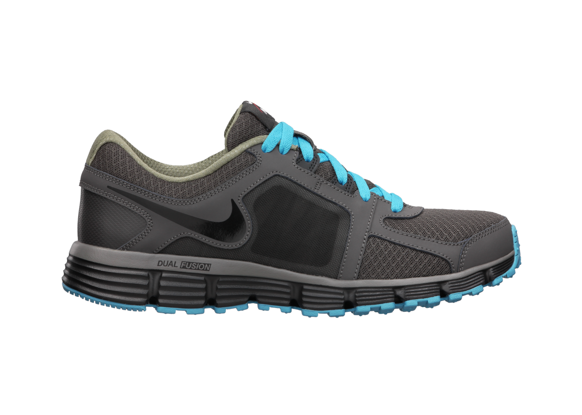
33 |
34 |
35 | 36 | 39 | 40 | 41 | 42 | -------------------------------------------------------------------------------- /demo/demo.html: -------------------------------------------------------------------------------- 1 | 2 | 3 | 4 | 5 | 6 | 7 | My Webpage 8 | 9 | 10 | 11 | 12 |
13 |

Welcome to My Webpage

14 |
15 | 16 | 23 | 24 |
25 |
26 |

About Me

27 |

This is a brief description of myself.

28 |
29 | 30 |
31 |

Contact Information

32 |

Email: example@example.com
Phone: 123-456-7890

33 |
34 |
35 | 36 | 39 | 40 | 41 | 42 | -------------------------------------------------------------------------------- /search-bar/style.css: -------------------------------------------------------------------------------- 1 | 2 | body { 3 | margin: 0; 4 | padding: 0; 5 | background: #99a811; 6 | } 7 | 8 | .search-box { 9 | position: absolute; 10 | top : 50%; 11 | left: 50%; 12 | transform: translate(-50%, -50%); 13 | background: #2f3640; 14 | height: 40px; 15 | border-radius: 40px; 16 | padding: 10px; 17 | } 18 | 19 | .search-box:hover > .search-text{ 20 | width: 240px; 21 | padding: 0 6px; 22 | } 23 | 24 | .search-box:hover > .search-btn{ 25 | background: white; 26 | color: black; 27 | } 28 | 29 | .search-btn { 30 | color: #ffd000; 31 | float: right; 32 | width: 40px; 33 | height: 40px; 34 | border-radius: 50%; 35 | background: #2f3640; 36 | display: flex; 37 | justify-content: center; 38 | align-items: center; 39 | transition: 0.4s; 40 | cursor: pointer; 41 | text-decoration: none; 42 | } 43 | 44 | .search-text { 45 | border: none; 46 | background: none; 47 | outline: none; 48 | float: left; 49 | padding: 0; 50 | color: white; 51 | font-size: 16px; 52 | font-weight: normal; 53 | transition: 0.4s; 54 | line-height: 40px; 55 | width: 0px; 56 | } -------------------------------------------------------------------------------- /text-transition/style.css: -------------------------------------------------------------------------------- 1 | @import url(https://fonts.googleapis.com/css?family=Montserrat); 2 | 3 | html, body{ 4 | height: 100%; 5 | font-weight: 800; 6 | } 7 | 8 | body{ 9 | background: #000000; 10 | font-family: Arial; 11 | } 12 | 13 | svg { 14 | display: block; 15 | font: 8em 'Montserrat'; 16 | width: 100%; 17 | height: 400px; 18 | margin: 0 auto; 19 | } 20 | 21 | .text-copy { 22 | fill: none; 23 | stroke: white; 24 | stroke-dasharray: 6% 29%; 25 | stroke-width: 5px; 26 | stroke-dashoffset: 0%; 27 | animation: stroke-offset 5.5s infinite linear; 28 | } 29 | 30 | .text-copy:nth-child(1){ 31 | stroke: #4D163D; 32 | animation-delay: -1; 33 | } 34 | 35 | .text-copy:nth-child(2){ 36 | stroke: #cf1578; 37 | animation-delay: -2s; 38 | } 39 | 40 | .text-copy:nth-child(3){ 41 | stroke: #e8d21d; 42 | animation-delay: -3s; 43 | } 44 | 45 | .text-copy:nth-child(4){ 46 | stroke: #039fbe; 47 | animation-delay: -4s; 48 | } 49 | 50 | .text-copy:nth-child(5){ 51 | stroke: #b20238; 52 | animation-delay: -5s; 53 | } 54 | 55 | @keyframes stroke-offset{ 56 | 100% {stroke-dashoffset: -35%;} 57 | } -------------------------------------------------------------------------------- /social-media-icon-popup/index.html: -------------------------------------------------------------------------------- 1 | 2 | 3 | 4 | 5 | 6 | Social Media Icon Popup 7 | 8 | 9 | 10 | 11 | 33 | 34 | 35 | -------------------------------------------------------------------------------- /circular-progress-bar/index.html: -------------------------------------------------------------------------------- 1 | 2 | 3 | 4 | 5 | 6 | Circular Progress Bar 7 | 8 | 11 | 12 | 13 | 16 | 17 | 18 | 19 |
20 |
21 | 22 | 23 | 24 | 25 |
26 | 75% 27 | Completed 28 |
29 |
30 |
31 | 32 | 33 | -------------------------------------------------------------------------------- /heart-beat-animation/style.css: -------------------------------------------------------------------------------- 1 | body{ 2 | background: #000 none repeat scroll 0 0; 3 | color: #999; 4 | font-size: 100%; 5 | line-height: 24px; 6 | margin: 0; 7 | padding: 0; 8 | font-family: sans-serif; 9 | } 10 | 11 | .container{ 12 | display: flex; 13 | justify-content: center; 14 | align-items: center; 15 | height: 100vh; 16 | } 17 | 18 | .heart-rate{ 19 | width: 150px; 20 | height: 73px; 21 | position: relative; 22 | margin: 20px auto; 23 | } 24 | 25 | .fade-in{ 26 | position: absolute; 27 | width: 100%; 28 | height: 100%; 29 | background-color: #000; 30 | top: 0; 31 | right: 0; 32 | animation: heartRateIn 2.5s linear infinite; 33 | } 34 | 35 | .fade-out{ 36 | position: absolute; 37 | width: 120%; 38 | height: 100%; 39 | background-color: #000; 40 | top: 0; 41 | right: -120%; 42 | animation: heartRateOut 2.5s linear infinite; 43 | background: rgba(0, 0, 0, 1); 44 | background: linear-gradient(to right,rgba(0,0,0,1)0%, rgba(0,0,0,1)80%,rgba(0,0,0,0)100%); 45 | } 46 | 47 | @keyframes heartRateIn{ 48 | 0%{ 49 | width: 100%; 50 | } 51 | 50%{ 52 | width: 0; 53 | } 54 | 100%{ 55 | width: 0; 56 | } 57 | } 58 | @keyframes heartRateOut{ 59 | 0%{ 60 | left: -120%; 61 | } 62 | 30%{ 63 | left: -120%; 64 | } 65 | 100%{ 66 | left: 0; 67 | } 68 | 69 | } 70 | -------------------------------------------------------------------------------- /controlled-brightness-in-a-light/index.html: -------------------------------------------------------------------------------- 1 | 2 | 3 | 4 | 5 | 6 | Controlled Brightness in a Lamp 7 | 8 | 9 | 10 | 11 | 12 |
13 |
14 |
15 |
16 |
17 |
18 |
19 |
20 |
21 |
22 |
23 |
24 |
25 |
26 | 27 |
28 |
29 |
30 |
31 |
32 |
33 |
34 |
35 |
36 |
37 |
38 | 39 |
40 | 41 | 42 | 43 | -------------------------------------------------------------------------------- /dual-search-bar/index.html: -------------------------------------------------------------------------------- 1 | 2 | 3 | 4 | 5 | 6 | 7 | Dual Search Bar 8 | 9 | 10 | 14 | 15 | 16 | 20 | 21 | 22 |
23 | 36 |
37 | 38 | 39 | -------------------------------------------------------------------------------- /dropdown-menu/index.html: -------------------------------------------------------------------------------- 1 | 2 | 3 | 4 | 5 | 6 | Dropdown Menu 7 | 8 | 9 | 10 | 11 |
12 | 37 |
38 | 39 | 40 | -------------------------------------------------------------------------------- /circular-progress-bar/style.css: -------------------------------------------------------------------------------- 1 | body { 2 | width: 100%; 3 | height: 100vh; 4 | margin: 0; 5 | padding: 0; 6 | } 7 | 8 | .center { 9 | width: 100%; 10 | height: 100%; 11 | display: flex; 12 | align-items: center; 13 | justify-content: center; 14 | background: rgb(25, 25, 50); 15 | } 16 | 17 | .progress { 18 | width: 400px; 19 | height: 400px; 20 | background: rgb(69, 74, 110); 21 | border-radius: 5mm; 22 | display: flex; 23 | align-items: center; 24 | justify-content: center; 25 | position: relative; 26 | } 27 | 28 | circle { 29 | fill: none; 30 | } 31 | 32 | svg { 33 | transform: rotate(-90deg); 34 | } 35 | 36 | circle:nth-child(1) { 37 | stroke: rgb(25, 26, 49); 38 | stroke-width: 12px; 39 | } 40 | 41 | circle:nth-child(2) { 42 | stroke: white; 43 | stroke-dasharray: 848; 44 | stroke-dashoffset: calc(848 - (848 * 75) / 100); 45 | stroke-linecap: round; 46 | stroke-width: 16px; 47 | animation: progress 1s ease; 48 | } 49 | 50 | @keyframes progress { 51 | from { 52 | stroke-dashoffset: 848; 53 | } 54 | } 55 | 56 | .text { 57 | position: absolute; 58 | top: 50%; 59 | left: 50%; 60 | transform: translate(-50%, -50%); 61 | font-family: poppins; 62 | font-size: 60px; 63 | color: rgb(255, 196, 0); 64 | font-weight: 500; 65 | display: flex; 66 | align-items: center; 67 | justify-content: center; 68 | flex-direction: column; 69 | } 70 | 71 | .text span { 72 | font-size: 14px; 73 | color: rgb(230, 230, 230); 74 | } -------------------------------------------------------------------------------- /vertical-navigation-bar/index.html: -------------------------------------------------------------------------------- 1 | 2 | 3 | 4 | 5 | 6 | Vertical Navigation Bar 7 | 8 | 9 | 10 | 11 |
12 | 36 |
37 | 45 | 46 | 47 | -------------------------------------------------------------------------------- /bottom-navigation-bar/index.html: -------------------------------------------------------------------------------- 1 | 2 | 3 | 4 | 5 | 6 | 7 | Bottom Navigation Bar 8 | 9 | 10 | 11 | 12 | 36 | 37 | 38 | -------------------------------------------------------------------------------- /bottom-navigation-bar/style.css: -------------------------------------------------------------------------------- 1 | body { 2 | background-color: #9ae7bd; 3 | height: 100vh; 4 | display: flex; 5 | justify-content: center; 6 | align-items: center; 7 | } 8 | 9 | .menu ul { 10 | display: flex; 11 | list-style: none; 12 | margin: 0; 13 | padding: 0 30px; 14 | background-color: #006105; 15 | border-radius: 12px; 16 | box-shadow: 0 0 10px rgba(0, 0, 0, 0.5); 17 | } 18 | 19 | .menu ul li a { 20 | color: #fff; 21 | display: flex; 22 | flex-direction: column; 23 | font-size: 20px; 24 | font-family: poppins; 25 | text-decoration: none; 26 | height: 70px; 27 | width: 70px; 28 | position: relative; 29 | } 30 | 31 | .menu ul li a .title { 32 | position: absolute; 33 | font-size: 16px; 34 | top: 50%; 35 | left: 50%; 36 | transform: translate(-50%, -50%); 37 | opacity: 0; 38 | transition: .5s; 39 | } 40 | 41 | .menu ul li a .icon { 42 | position: absolute; 43 | font-size: 20px; 44 | top: 50%; 45 | left: 50%; 46 | transform: translate(-50%, -50%); 47 | transition: .5s; 48 | width: 50px; 49 | height: 50px; 50 | border-radius: 50%; 51 | display: flex; 52 | justify-content: center; 53 | align-items: center; 54 | } 55 | 56 | .menu ul li a:hover .title { 57 | transform: translate(-50%, calc(-50% + 10px)); 58 | opacity: 1; 59 | } 60 | 61 | .menu ul li a:hover .icon { 62 | top: 0; 63 | background-color: #55eb5d; 64 | color: #fff; 65 | outline: 4px #fff solid; 66 | } -------------------------------------------------------------------------------- /subscription-form/style.css: -------------------------------------------------------------------------------- 1 | @import url('https://fonts.googleapis.com/css2?family=Poppins:wght@400;600;700&display=swap'); 2 | 3 | *:before, 4 | *:after { 5 | box-sizing: inherit; 6 | } 7 | :root{ 8 | --clr-bg: #880808; 9 | --clr-primary: rgb(138, 28, 21); 10 | --clr-secondary: rgba(236, 38, 24, 0.62); 11 | } 12 | body { 13 | min-height: 100vh; 14 | display: flex; 15 | font-family: 'poppins', Arial; 16 | justify-content: center; 17 | align-items: center; 18 | column-gap: 40px; 19 | background: var(--clr-bg); 20 | overflow: hidden; 21 | } 22 | .subscription-form { 23 | min-width: 350px; 24 | text-align: center; 25 | background-color: #cccccc9c; 26 | padding: 20px; 27 | display: flex; 28 | flex-direction: column; 29 | align-items: center; 30 | border: none; 31 | border-radius: 32px 64px; 32 | } 33 | 34 | h2 { 35 | font-size: 24px; 36 | margin-bottom: 20px; 37 | } 38 | h2 span{ 39 | color: var(--clr-primary); 40 | } 41 | input[type="email"] { 42 | width: 90%; 43 | padding: 10px; 44 | margin-bottom: 10px; 45 | border: 1px solid #ccc; 46 | border-radius: 5px; 47 | } 48 | 49 | button[type="submit"] { 50 | padding: 10px 20px; 51 | background-color: var(--clr-primary); 52 | color: white; 53 | border: none; 54 | border-radius: 10px; 55 | cursor: pointer; 56 | font-weight: bold; 57 | font-size: 1.1rem; 58 | transition: all .25s ease-in; 59 | } 60 | 61 | button[type="submit"]:hover { 62 | background-color: var(--clr-secondary); 63 | } 64 | -------------------------------------------------------------------------------- /drag-and-drop-list/style.css: -------------------------------------------------------------------------------- 1 | body { 2 | width: 100%; 3 | height: 100vh; 4 | margin: 0; 5 | padding: 0; 6 | background: rgb(166, 255, 0); 7 | } 8 | 9 | .center { 10 | width: 100%; 11 | height: 100%; 12 | display: flex; 13 | align-items: center; 14 | justify-content: center; 15 | } 16 | 17 | .container { 18 | position: relative; 19 | display: flex; 20 | align-items: center; 21 | justify-content: center; 22 | flex-direction: column; 23 | } 24 | 25 | .item { 26 | width: 350px; 27 | height: 60px; 28 | box-sizing: border-box; 29 | display: flex; 30 | align-items: center; 31 | justify-content: center; 32 | position: relative; 33 | background: white; 34 | border-radius: 3mm; 35 | margin: 10px 0; 36 | cursor: grab; 37 | box-shadow: rgba(0, 0, 0, 0.19) 0px 5px 10px, 38 | rgba(0, 0, 0, 0.23) 0px 3px 3px; 39 | transition: margin 0.25s; 40 | } 41 | 42 | .name { 43 | width: 100%; 44 | text-align: center; 45 | font-family: poppins; 46 | font-size: 18px; 47 | font-weight: 500; 48 | } 49 | 50 | .item span { 51 | position: absolute; 52 | top: 50%; 53 | right: 10px; 54 | transform: translate(0, -50%); 55 | font-size: 30px; 56 | color: rgb(180, 180, 180); 57 | } 58 | 59 | .item.dragging { 60 | position: absolute; 61 | left: 50%; 62 | transform: translate(-50%, 0) scale(1.15); 63 | pointer-events: none; 64 | z-index: 1000; 65 | } 66 | 67 | .insert-animation { 68 | animation: scaleit 0.1s ease-in-out; 69 | } 70 | 71 | @keyframes scaleit { 72 | from { 73 | transform: translate(-50%, 0) scale(1); 74 | } 75 | } 76 | 77 | .item.dragging .name { 78 | color: rgb(218, 83, 80); 79 | } 80 | 81 | .item.dragging span { 82 | color: rgb(214, 104, 103); 83 | } -------------------------------------------------------------------------------- /dropdown-menu/style.css: -------------------------------------------------------------------------------- 1 | * { 2 | margin: 0; 3 | padding: 0; 4 | font-family: system-ui, -apple-system, BlinkMacSystemFont, 'Segoe UI', Roboto, Oxygen, Ubuntu, Cantarell, 'Open Sans', 'Helvetica Neue', sans-serif; 5 | } 6 | 7 | .container { 8 | display: flex; 9 | font-size: 14px; 10 | height: 100vh; 11 | background: #880303; 12 | } 13 | 14 | .navbar { 15 | margin: auto; 16 | padding: 0.5rem 1.5rem; 17 | background: #fff; 18 | border-radius: 1rem; 19 | box-shadow: 0 4px 12px rgba(0, 0, 0, 0.1); 20 | } 21 | 22 | .nav-links { 23 | display: flex; 24 | gap: 2rem; 25 | } 26 | 27 | .nav-link, .drop-down li { 28 | list-style: none; 29 | height: 100%; 30 | padding: 0.5rem 1rem; 31 | font-weight: 600; 32 | cursor: pointer; 33 | } 34 | 35 | a { 36 | text-decoration: none; 37 | color: currentColor; 38 | } 39 | 40 | .drop-down { 41 | position: absolute; 42 | padding: 0.5rem 0; 43 | margin: 0.5rem -0.5rem; 44 | background: antiquewhite; 45 | color: black; 46 | box-shadow: 0 4px 12px rgba(0, 0, 0, 0.1); 47 | border-radius: 0.5rem; 48 | font-size: 12px; 49 | display: none; 50 | } 51 | 52 | .nav-link:hover { 53 | background-color: black; 54 | color: #fff; 55 | border-radius: 0.5rem; 56 | } 57 | 58 | .services:hover .drop-down { 59 | display: block; 60 | } 61 | 62 | .services a { 63 | display: flex; 64 | align-items: center; 65 | } 66 | 67 | .services .dropdown-icon { 68 | font-size: 18px; 69 | position: relative; 70 | right: -5px; 71 | transform: rotate(0deg); 72 | transition: 0.3s ease-in-out all; 73 | } 74 | 75 | .services:hover .dropdown-icon { 76 | transform: rotate(180deg); 77 | } 78 | 79 | .drop-down li:hover { 80 | background: black; 81 | color: #fff; 82 | border-radius: 0.5rem; 83 | } -------------------------------------------------------------------------------- /loader/style.css: -------------------------------------------------------------------------------- 1 | @import url('https://fonts.googleapis.com/css2?family=Poppins:wght@400;600;700&display=swap'); 2 | 3 | *{ 4 | box-sizing: border-box; 5 | margin: 0; 6 | padding: 0; 7 | } 8 | 9 | body { 10 | font-family: sans-serif; 11 | min-height: 100vh; 12 | width: 100%; 13 | display: flex; 14 | align-items: center; 15 | justify-content: center; 16 | background-color: #6C9A8B; 17 | font-family: 'poppins'; 18 | } 19 | 20 | .load { 21 | display: flex; 22 | align-items: flex-end; 23 | justify-content: center; 24 | column-gap: 5px; 25 | height: 200px; 26 | width: 200px; 27 | background-color: #fff; 28 | border-radius: 50% 20% / 10% 40%; 29 | padding-bottom: 4rem; 30 | } 31 | 32 | .load span { 33 | --duration: 1s; 34 | height: var(--height); 35 | width: 10px; 36 | background-color: #E8998D; 37 | border: none; 38 | border-radius: 5px; 39 | animation: animation var(--duration) ease-in-out infinite; 40 | } 41 | 42 | .load span:nth-child(1) { 43 | --height: 40px; 44 | animation-delay: 0.25s; 45 | } 46 | 47 | .load span:nth-child(2) { 48 | --height: 60px; 49 | animation-delay: 0.55s; 50 | } 51 | 52 | .load span:nth-child(3) { 53 | --height: 75px; 54 | animation-delay: 0.75s; 55 | } 56 | 57 | .load span:nth-child(4) { 58 | --height: 60px; 59 | animation-delay: 1s; 60 | } 61 | 62 | .load span:nth-child(5) { 63 | --height: 40px; 64 | animation-delay: 1.25s; 65 | } 66 | 67 | .attribute{ 68 | position: absolute; 69 | bottom: 10px; 70 | } 71 | 72 | @keyframes animation { 73 | 0%, 100% { 74 | transform: translateY(25%); 75 | opacity: 0.4; 76 | box-shadow: 0 0 20px #EED2CC; 77 | } 78 | 50% { 79 | transform: translateY(0); 80 | opacity: 1; 81 | box-shadow: none; 82 | height: calc(var(--height) + 25px); 83 | } 84 | } -------------------------------------------------------------------------------- /dual-search-bar/style.css: -------------------------------------------------------------------------------- 1 | body { 2 | width: 100%; 3 | height: 100vh; 4 | margin: 0; 5 | padding: 0; 6 | } 7 | 8 | .center { 9 | width: 100%; 10 | height: 100%; 11 | display: flex; 12 | align-items: center; 13 | justify-content: center; 14 | background: rgb(161, 126, 0); 15 | } 16 | 17 | .search-bar { 18 | width: fit-content; 19 | height: fit-content; 20 | background: white; 21 | display: flex; 22 | align-items: center; 23 | justify-content: center; 24 | border: 0.5mm solid rgb(3, 35, 67); 25 | border-radius: 1mm; 26 | padding: 7px 10px; 27 | } 28 | 29 | .inputf { 30 | width: fit-content; 31 | height: fit-content; 32 | position: relative; 33 | } 34 | 35 | .search-bar input { 36 | width: 225px; 37 | flex-grow: 1; 38 | height: 35px; 39 | box-sizing: border-box; 40 | padding: 10px 25px; 41 | background: transparent; 42 | font-family: poppins; 43 | outline: none; 44 | border: none; 45 | position: relative; 46 | } 47 | 48 | #search1 { 49 | border-right: 0.5mm solid rgba(3, 35, 67, 0.5); 50 | margin-right: 10px; 51 | } 52 | 53 | 54 | .inputf::before { 55 | content: "search"; 56 | font-family: "Material Icons"; 57 | font-size: 20px; 58 | color: rgba(0, 0, 0, 0.7); 59 | position: absolute; 60 | top: 50%; 61 | left: -3px; 62 | transform: translate(0, -50%) rotateY(180deg); 63 | z-index: 1; 64 | } 65 | 66 | .inputf:nth-child(2)::before { 67 | content: "location_on"; 68 | } 69 | 70 | .search-bar button { 71 | width: 80px; 72 | height: 35px; 73 | font-family: poppins; 74 | background: rgb(41, 41, 41); 75 | color: white; 76 | outline: none; 77 | border: none; 78 | border-radius: 1mm; 79 | font-weight: 500; 80 | cursor: pointer; 81 | box-shadow: 0px 3px 8px rgba(0, 0, 0, 0.25); 82 | } 83 | 84 | input[type="search"]::-webkit-search-cancel-button { 85 | appearance: none; 86 | position: relative; 87 | right: -10px; 88 | width: 16px; 89 | height: 16px; 90 | background-image: url(../images/cancel.svg); 91 | background-repeat: no-repeat; 92 | background-position: center; 93 | background-size: 16px 16px; 94 | cursor: pointer; 95 | } -------------------------------------------------------------------------------- /vertical-navigation-bar/style.css: -------------------------------------------------------------------------------- 1 | *{ 2 | margin: 0; 3 | padding: 0; 4 | box-sizing: border-box; 5 | font-family: 'Open Sans', sans-serif; 6 | } 7 | 8 | html, 9 | body { 10 | height: 100vh; 11 | background-color: #004257; 12 | } 13 | 14 | body { 15 | display: flex; 16 | align-items: center; 17 | justify-content: center; 18 | } 19 | 20 | .card { 21 | position: relative; 22 | } 23 | 24 | .menu { 25 | width: 67px; 26 | height: 300px; 27 | background-color: #ffffff; 28 | border-radius: 10px; 29 | box-shadow: 10px 0 50px rgba(0, 0, 0, 0.2); 30 | overflow: hidden; 31 | transition: 0.5s; 32 | } 33 | 34 | .menu.active { 35 | width: 225px; 36 | } 37 | 38 | .toggle { 39 | position: absolute; 40 | top: -20px; 41 | right: -15px; 42 | height: 40px; 43 | width: 40px; 44 | border-radius: 50%; 45 | z-index: 1; 46 | background-color: #000000; 47 | display: flex; 48 | align-items: center; 49 | justify-content: center; 50 | cursor: pointer; 51 | } 52 | 53 | .line-1, 54 | .line-2 { 55 | height: 2px; 56 | width: 15px; 57 | background-color: #ffffff; 58 | transition: 0.5s ease; 59 | } 60 | 61 | .line-1 { 62 | transform: rotate(-35deg) translate(5px, 8px); 63 | } 64 | 65 | .line-2 { 66 | transform: rotate(35deg) translate(-8px, 0px); 67 | } 68 | 69 | .menu.active .line-1 { 70 | transform: rotate(-45deg) translate(5px, 6px); 71 | } 72 | 73 | .menu.active .line-2 { 74 | transform: rotate(45deg) translate(-5px, 6px); 75 | } 76 | 77 | ul { 78 | position: relative; 79 | width: 100%; 80 | } 81 | 82 | li { 83 | position: relative; 84 | list-style: none; 85 | height: 75px; 86 | width: 100%; 87 | padding-left: 23px; 88 | display: flex; 89 | align-items: center; 90 | cursor: pointer; 91 | } 92 | 93 | li:hover { 94 | background-color: #dddddd; 95 | } 96 | 97 | span { 98 | margin-left: 20px; 99 | white-space: nowrap; 100 | visibility: hidden; 101 | opacity: 0; 102 | } 103 | 104 | .menu.active span { 105 | visibility: visible; 106 | opacity: 1; 107 | } -------------------------------------------------------------------------------- /animated-text-disappear/style.css: -------------------------------------------------------------------------------- 1 | @import url('https://fonts.googleapis.com/css2?family=Poppins&display=swap'); 2 | 3 | body{ 4 | background-color: black; 5 | height: 100vh; 6 | font-family: 'Poppins' sans-serif; 7 | font-size: 12vw; 8 | text-transform: uppercase; 9 | overflow: hidden; 10 | } 11 | .disappear{ 12 | position: absolute; 13 | left: 0; 14 | right: 0; 15 | margin: auto; 16 | width: 100%; 17 | text-align: center; 18 | height: fit-content; 19 | bottom: 0; 20 | top: 0; 21 | } 22 | .disappear span{ 23 | display: inline-block; 24 | color: transparent; 25 | text-shadow: 0px 0px 0px rgb(255, 255, 255); 26 | animation-duration: 3s; 27 | animation-iteration-count: infinite; 28 | } 29 | .disappear span:nth-child(1) 30 | { 31 | animation-name: disappearleft; 32 | } 33 | 34 | 35 | .disappear span:nth-child(2) 36 | { 37 | animation-name: disappearleft; 38 | animation-delay: .3s; 39 | } 40 | 41 | .disappear span:nth-child(2) 42 | { 43 | animation-name: disappearleft; 44 | animation-delay: .3s; 45 | } 46 | 47 | .disappear span:nth-child(3) 48 | { 49 | animation-name: disappearleft; 50 | animation-delay: .6s; 51 | } 52 | 53 | .disappear span:nth-child(4) 54 | { 55 | animation-name: disappearright; 56 | animation-delay: .8s; 57 | } 58 | 59 | .disappear span:nth-child(5) 60 | { 61 | animation-name: disappearright; 62 | animation-delay: 1s; 63 | } 64 | 65 | .disappear span:nth-child(6) 66 | { 67 | animation-name: disappearright; 68 | animation-delay: 1.3s; 69 | } 70 | 71 | 72 | .disappear span:nth-child(7) 73 | { 74 | animation-name: disappearleft; 75 | animation-delay: 1.6s; 76 | } 77 | 78 | .disappear span:nth-child(8) 79 | { 80 | animation-name: disappearright; 81 | animation-delay: 2s; 82 | } 83 | 84 | .disappear span:nth-child(9) 85 | { 86 | animation-name: disappearright; 87 | animation-delay: 2.3s; 88 | } 89 | 90 | 91 | 92 | @keyframes disappearleft{ 93 | 50%{ 94 | transform: skew(50deg) translateY(-200%); 95 | text-shadow: 0px 0px 50px; 96 | opacity: 0; 97 | } 98 | } 99 | 100 | 101 | @keyframes disappearright{ 102 | 50%{ 103 | transform: skew(-50deg) translateY(-200%); 104 | text-shadow: 0px 0px 50px; 105 | opacity: 0; 106 | } 107 | } 108 | 109 | 110 | -------------------------------------------------------------------------------- /responsive-footer/index.html: -------------------------------------------------------------------------------- 1 | 2 | 3 | 4 | 5 | 6 | Responsive Footer 7 | 8 | 9 | 10 | 11 | 64 | 65 | 66 | -------------------------------------------------------------------------------- /image-rotate-animation/style.css: -------------------------------------------------------------------------------- 1 | body { 2 | margin: 0; 3 | min-height: 100vh; 4 | display: grid; 5 | place-content: center; 6 | grid-auto-flow: column; 7 | gap: 30px; 8 | background: #460c0c; 9 | } 10 | 11 | @property --a { 12 | syntax: ""; 13 | initial-value: 0deg; 14 | inherits: true; 15 | } 16 | 17 | @property --d { 18 | syntax: ""; 19 | initial-value: 0%; 20 | inherits: true; 21 | } 22 | 23 | img { 24 | --b: 10px; /* control the border thickness */ 25 | --g: 20px; /* control the gap */ 26 | 27 | --d: 30%; 28 | --a: 45deg; 29 | --_o:50% + (var(--d) + var(--g) + var(--b)); 30 | --_i:50% + (var(--d) + var(--g)); 31 | --_f:50% + (var(--d)); 32 | clip-path: polygon( 33 | /* */ 34 | calc(var(--_o)*sin(-45deg + var(--a))) calc(var(--_o)*cos(-45deg + var(--a))), 35 | calc(var(--_o)*sin( 45deg + var(--a))) calc(var(--_o)*cos( 45deg + var(--a))), 36 | calc(var(--_o)*sin(135deg + var(--a))) calc(var(--_o)*cos(135deg + var(--a))), 37 | calc(var(--_o)*sin(225deg + var(--a))) calc(var(--_o)*cos(225deg + var(--a))), 38 | calc(var(--_o)*sin(-45deg + var(--a))) calc(var(--_o)*cos(-45deg + var(--a))), 39 | /* */ 40 | calc(var(--_i)*sin(-45deg + var(--a))) calc(var(--_i)*cos(-45deg + var(--a))), 41 | calc(var(--_i)*sin(225deg + var(--a))) calc(var(--_i)*cos(225deg + var(--a))), 42 | calc(var(--_i)*sin(135deg + var(--a))) calc(var(--_i)*cos(135deg + var(--a))), 43 | calc(var(--_i)*sin( 45deg + var(--a))) calc(var(--_i)*cos( 45deg + var(--a))), 44 | calc(var(--_i)*sin(-45deg + var(--a))) calc(var(--_i)*cos(-45deg + var(--a))), 45 | /* */ 46 | calc(var(--_f)*sin(-45deg + var(--a))) calc(var(--_f)*cos(-45deg + var(--a))), 47 | calc(var(--_f)*sin( 45deg + var(--a))) calc(var(--_f)*cos( 45deg + var(--a))), 48 | calc(var(--_f)*sin(135deg + var(--a))) calc(var(--_f)*cos(135deg + var(--a))), 49 | calc(var(--_f)*sin(225deg + var(--a))) calc(var(--_f)*cos(225deg + var(--a))), 50 | calc(var(--_f)*sin(-45deg + var(--a))) calc(var(--_f)*cos(-45deg + var(--a))) 51 | ); 52 | 53 | outline: 166px solid #2c2c2c; /* color here */ 54 | outline-offset: 2px; /* a small value to avoid a visual glitch */ 55 | cursor: pointer; 56 | transition: --d .3s,--a .2s .2s; 57 | } 58 | 59 | img:hover { 60 | --a: 0deg; 61 | --d: 71%; 62 | transition: --a .3s,--d .2s .2s; 63 | } 64 | 65 | 66 | -------------------------------------------------------------------------------- /light-and-dark-toggle/style.css: -------------------------------------------------------------------------------- 1 | body{ 2 | height: 100vh; 3 | display: flex; 4 | align-items: center; 5 | justify-content: center; 6 | } 7 | .toggle-checkbox{ 8 | position: absolute; 9 | opacity: 0; 10 | cursor: pointer; 11 | height: 0; 12 | width: 0; 13 | } 14 | .toggle-slot{ 15 | position: relative; 16 | height: 10em; 17 | width: 20em; 18 | border: 5px solid #e4e7ec; 19 | border-radius: 10em; 20 | background-color: white; 21 | box-shadow: 0px 10px 25px #e4e7ec; 22 | transition: background-color 250ms; 23 | } 24 | .toggle-checkbox:checked ~ .toggle-slot{ 25 | background-color: #374151; 26 | } 27 | .toggle-button{ 28 | transform: translate(11.75em,1.75em); 29 | position: absolute; 30 | height: 6.5em; 31 | width: 6.5em; 32 | border-radius: 50%; 33 | background-color: #ffeccf; 34 | box-shadow: inset 0px 0px 0px 0.75em #ffbb52; 35 | transition: background-color 250ms,border-color 250ms,transform 1500ms cubic-bezier(.26,2,.46,.71); 36 | 37 | } 38 | .toggle-checkbox:checked ~ .toggle-slot .toggle-button{ 39 | background-color: #485367; 40 | box-shadow: inset 0px 0px 0px 0.75em white; 41 | transform: translate(1.75em,1.75em); 42 | 43 | } 44 | 45 | .sun-icon{ 46 | position: absolute; 47 | height: 6em; 48 | width: 6em; 49 | color: #ffbb52; 50 | } 51 | 52 | .sun-icon-wrapper{ 53 | position: absolute; 54 | height: 6em; 55 | width: 6em; 56 | opacity: 1; 57 | transform: translate(2em ,2em) rotate(15deg); 58 | transform-origin: 50% 50%; 59 | transition: opacity 150ms,transform 1500ms cubic-bezier(.26,2,.46,.71) 60 | } 61 | 62 | .toggle-checkbox:checked ~ .toggle-slot .sun-icon-wrapper{ 63 | 64 | opacity: 0; 65 | transform: translate(3em,2em) rotate(0deg); 66 | } 67 | 68 | .moon-icon{ 69 | position: absolute; 70 | height: 6em; 71 | width: 6em; 72 | color: white; 73 | } 74 | 75 | .moon-icon-wrapper{ 76 | position: absolute; 77 | height: 6em; 78 | width: 6em; 79 | opacity: 0; 80 | transform: translate(11em ,2em) rotate(0deg); 81 | transform-origin: 50% 50%; 82 | transition: opacity 150ms,transform 1500ms cubic-bezier(.26,2,.46,.71) 83 | } 84 | 85 | .toggle-checkbox:checked ~ .toggle-slot .moon-icon-wrapper{ 86 | 87 | opacity: 1; 88 | transform: translate(12em,2em) rotate(-15deg); 89 | } 90 | 91 | 92 | 93 | 94 | 95 | 96 | 97 | 98 | 99 | 100 | 101 | 102 | 103 | 104 | 105 | 106 | 107 | 108 | 109 | 110 | 111 | 112 | 113 | 114 | 115 | 116 | -------------------------------------------------------------------------------- /login-form/index.html: -------------------------------------------------------------------------------- 1 | 2 | 3 | 4 | 5 | 6 | Login Form 7 | 8 | 9 | 12 | 13 | 14 | 16 | 17 | 18 |
19 |
20 |
Login
21 | 22 | 23 | 24 | Email 25 | email 26 | 27 | 28 | 29 | Password 30 | lock 31 | 32 | 33 | 40 | 48 |
49 | New user? Create an account Register 50 |
51 |
52 |
53 | 67 | 68 | 69 | -------------------------------------------------------------------------------- /responsive-footer/style.css: -------------------------------------------------------------------------------- 1 | @import url('https://fonts.googleapis.com/css2?family=Open+Sans:wght@300;400;500;600;700&display=swap'); 2 | 3 | * { 4 | margin: 0; 5 | padding: 0; 6 | box-sizing: border-box; 7 | font-family: 'Open Sans', sans-serif; 8 | } 9 | 10 | .footer { 11 | position: absolute; 12 | top: 50%; 13 | left: 50%; 14 | transform: translate(-50%, -50%); 15 | max-width: 1280px; 16 | width: 95%; 17 | background: #000000; 18 | border-radius: 6px; 19 | } 20 | 21 | .footer .footer-row { 22 | display: flex; 23 | flex-wrap: wrap; 24 | justify-content: space-between; 25 | gap: 3.5rem; 26 | padding: 60px; 27 | } 28 | 29 | .footer-row .footer-col h4 { 30 | color: #fff; 31 | font-size: 1.2rem; 32 | font-weight: 400; 33 | } 34 | 35 | .footer-col .links { 36 | margin-top: 20px; 37 | } 38 | 39 | .footer-col .links li { 40 | list-style: none; 41 | margin-bottom: 10px; 42 | } 43 | 44 | .footer-col .links li a { 45 | text-decoration: none; 46 | color: #bfbfbf; 47 | } 48 | 49 | .footer-col .links li a:hover { 50 | color: #fff; 51 | } 52 | 53 | .footer-col p { 54 | margin: 20px 0; 55 | color: #bfbfbf; 56 | max-width: 300px; 57 | } 58 | 59 | .footer-col form { 60 | display: flex; 61 | gap: 5px; 62 | } 63 | 64 | .footer-col input { 65 | height: 40px; 66 | border-radius: 6px; 67 | background: none; 68 | width: 100%; 69 | outline: none; 70 | border: 1px solid #7489C6 ; 71 | caret-color: #fff; 72 | color: #fff; 73 | padding-left: 10px; 74 | } 75 | 76 | .footer-col input::placeholder { 77 | color: #ccc; 78 | } 79 | 80 | .footer-col form button { 81 | background: #ca1f1f; 82 | color: white; 83 | outline: none; 84 | border: none; 85 | padding: 10px 15px; 86 | border-radius: 6px; 87 | cursor: pointer; 88 | font-weight: 500; 89 | transition: 0.2s ease; 90 | } 91 | 92 | .footer-col form button:hover { 93 | background: #cecccc; 94 | } 95 | 96 | .footer-col .icons { 97 | display: flex; 98 | margin-top: 30px; 99 | gap: 30px; 100 | cursor: pointer; 101 | } 102 | 103 | .footer-col .icons i { 104 | color: #afb6c7; 105 | } 106 | 107 | .footer-col .icons i:hover { 108 | color: #fff; 109 | } 110 | 111 | @media (max-width: 768px) { 112 | .footer { 113 | position: relative; 114 | bottom: 0; 115 | left: 0; 116 | transform: none; 117 | width: 100%; 118 | border-radius: 0; 119 | } 120 | 121 | .footer .footer-row { 122 | padding: 20px; 123 | gap: 1rem; 124 | } 125 | 126 | .footer-col form { 127 | display: block; 128 | } 129 | 130 | .footer-col form :where(input, button) { 131 | width: 100%; 132 | } 133 | 134 | .footer-col form button { 135 | margin: 10px 0 0 0; 136 | } 137 | } 138 | -------------------------------------------------------------------------------- /social-media-icon-popup/style.css: -------------------------------------------------------------------------------- 1 | @import url("https://fonts.googleapis.com/css2?family=Poppins&display=swap"); 2 | 3 | * { 4 | margin: 0; 5 | padding: 0; 6 | box-sizing: border-box; 7 | } 8 | 9 | *:focus, 10 | *:active { 11 | outline: none !important; 12 | -webkit-tap-highlight-color: transparent; 13 | } 14 | 15 | html, 16 | body { 17 | display: grid; 18 | height: 100%; 19 | width: 100%; 20 | font-family: "Poppins", sans-serif; 21 | place-items: center; 22 | background: linear-gradient(315deg, #026e2f, #0ce680); 23 | } 24 | 25 | .wrapper { 26 | display: inline-flex; 27 | list-style: none; 28 | } 29 | 30 | .wrapper .icon { 31 | position: relative; 32 | background: #ffffff; 33 | border-radius: 50%; 34 | padding: 15px; 35 | margin: 10px; 36 | width: 50px; 37 | height: 50px; 38 | font-size: 18px; 39 | display: flex; 40 | justify-content: center; 41 | align-items: center; 42 | flex-direction: column; 43 | box-shadow: 0 10px 10px rgba(0, 0, 0, 0.1); 44 | cursor: pointer; 45 | transition: all 0.2s cubic-bezier(0.68, -0.55, 0.265, 1.55); 46 | } 47 | 48 | .wrapper .tooltip { 49 | position: absolute; 50 | top: 0; 51 | font-size: 14px; 52 | background: #ffffff; 53 | color: #ffffff; 54 | padding: 5px 8px; 55 | border-radius: 5px; 56 | box-shadow: 0 10px 10px rgba(0, 0, 0, 0.1); 57 | opacity: 0; 58 | pointer-events: none; 59 | transition: all 0.3s cubic-bezier(0.68, -0.55, 0.265, 1.55); 60 | } 61 | 62 | .wrapper .tooltip::before { 63 | position: absolute; 64 | content: ""; 65 | height: 8px; 66 | width: 8px; 67 | background: #ffffff; 68 | bottom: -3px; 69 | left: 50%; 70 | transform: translate(-50%) rotate(45deg); 71 | transition: all 0.3s cubic-bezier(0.68, -0.55, 0.265, 1.55); 72 | } 73 | 74 | .wrapper .icon:hover .tooltip { 75 | top: -45px; 76 | opacity: 1; 77 | visibility: visible; 78 | pointer-events: auto; 79 | } 80 | 81 | .wrapper .icon:hover span, 82 | .wrapper .icon:hover .tooltip { 83 | text-shadow: 0px -1px 0px rgba(0, 0, 0, 0.1); 84 | } 85 | 86 | .wrapper .facebook:hover, 87 | .wrapper .facebook:hover .tooltip, 88 | .wrapper .facebook:hover .tooltip::before { 89 | background: #1877F2; 90 | color: #ffffff; 91 | } 92 | 93 | .wrapper .twitter:hover, 94 | .wrapper .twitter:hover .tooltip, 95 | .wrapper .twitter:hover .tooltip::before { 96 | background: #1DA1F2; 97 | color: #ffffff; 98 | } 99 | 100 | .wrapper .instagram:hover, 101 | .wrapper .instagram:hover .tooltip, 102 | .wrapper .instagram:hover .tooltip::before { 103 | background: #E4405F; 104 | color: #ffffff; 105 | } 106 | 107 | .wrapper .github:hover, 108 | .wrapper .github:hover .tooltip, 109 | .wrapper .github:hover .tooltip::before { 110 | background: #333333; 111 | color: #ffffff; 112 | } 113 | 114 | .wrapper .youtube:hover, 115 | .wrapper .youtube:hover .tooltip, 116 | .wrapper .youtube:hover .tooltip::before { 117 | background: #CD201F; 118 | color: #ffffff; 119 | } 120 | -------------------------------------------------------------------------------- /fingerprint-login-animation/style.css: -------------------------------------------------------------------------------- 1 | body { 2 | align-items: center; 3 | display: flex; 4 | font-family: sans-serif; 5 | font-weight: 600; 6 | font-size: 26px; 7 | height: 100vh; 8 | justify-content: center; 9 | margin: 0; 10 | } 11 | .container { 12 | align-items: center; 13 | background: #000; 14 | border-radius: 40px; 15 | box-shadow: 0 14px 28px rgba(0,0,0,0.25), 0 10px 10px rgba(0,0,0,0.22); 16 | display: flex; 17 | height: 80px; 18 | justify-content: center; 19 | position: relative; 20 | width: 200px; 21 | } 22 | .text { 23 | color: white; 24 | position: absolute; 25 | transition: opacity 300ms; 26 | user-select: none; 27 | -moz-user-select: none; 28 | } 29 | .fingerprint { 30 | /* height: 80px; */ 31 | left: -8px; 32 | opacity: 0; 33 | position: absolute; 34 | stroke: #777; 35 | top: -9px; 36 | transition: opacity 1ms; 37 | } 38 | .fingerprint-active { 39 | stroke: #fff; 40 | } 41 | .fingerprint-out { 42 | opacity: 1; 43 | } 44 | .odd { 45 | stroke-dasharray: 0px 50px; 46 | stroke-dashoffset: 1px; 47 | transition: stroke-dasharray 1ms; 48 | } 49 | .even { 50 | stroke-dasharray: 50px 50px; 51 | stroke-dashoffset: -41px; 52 | transition: stroke-dashoffset 1ms; 53 | } 54 | .ok { 55 | opacity: 0; 56 | } 57 | .active.container { 58 | animation: 6s Container; 59 | } 60 | .active .text { 61 | opacity: 0; 62 | animation: 6s Text forwards; 63 | } 64 | .active .fingerprint { 65 | opacity: 1; 66 | transition: opacity 300ms 200ms; 67 | } 68 | .active .fingerprint-base .odd { 69 | stroke-dasharray: 50px 50px; 70 | transition: stroke-dasharray 800ms 100ms; 71 | } 72 | .active .fingerprint-base .even { 73 | stroke-dashoffset: 0px; 74 | transition: stroke-dashoffset 800ms; 75 | } 76 | .active .fingerprint-active .odd { 77 | stroke-dasharray: 50px 50px; 78 | transition: stroke-dasharray 2000ms 1500ms; 79 | } 80 | .active .fingerprint-active .even { 81 | stroke-dashoffset: 0px; 82 | transition: stroke-dashoffset 2000ms 1300ms; 83 | } 84 | .active .fingerprint-out { 85 | opacity: 0; 86 | transition: opacity 300ms 4100ms; 87 | } 88 | .active .ok { 89 | opacity: 1; 90 | animation: 6s Ok forwards; 91 | } 92 | @keyframes Container { 93 | 0% { width: 200px } 94 | 6% { width: 80px } 95 | 71% { transform: scale(1); } 96 | 75% { transform: scale(1.2); } 97 | 77% { transform: scale(1); } 98 | 99 | 94% { width: 80px } 100 | 100% { width: 200px } 101 | } 102 | @keyframes Text { 103 | 0% { opacity: 1; transform: scale(1); } 104 | 6% { opacity: 0; transform: scale(0.5); } 105 | 106 | 94% { opacity: 0; transform: scale(0.5); } 107 | 100% { opacity: 1; transform: scale(1); } 108 | } 109 | @keyframes Ok { 110 | 0% { opacity: 0 } 111 | 70% { opacity: 0; transform: scale(0); } 112 | 75% { opacity: 1; transform: scale(1.1); } 113 | 77% { opacity: 1; transform: scale(1); } 114 | 92% { opacity: 1; transform: scale(1); } 115 | 96% { opacity: 0; transform: scale(0.5); } 116 | 100% { opacity: 0 } 117 | } -------------------------------------------------------------------------------- /radial-menu/style.css: -------------------------------------------------------------------------------- 1 | body,html{ 2 | margin: 0; 3 | padding: 0; 4 | height: 100%; 5 | } 6 | body{ 7 | background: #E3DFD2; 8 | box-shadow: inset 0 0 20vmin 0 #585247; 9 | } 10 | .wrap{ 11 | position: relative; 12 | width: 80vmin; 13 | height: 80vmin; 14 | background: inherit; 15 | transform: scale(0.2) translateZ(0px); 16 | opacity: 0; 17 | transition: transform .5s, opacity .5s; 18 | margin: 0 auto; 19 | } 20 | 21 | a{ 22 | position: absolute; 23 | left: 0; top: 0; 24 | width: 47.5%;height: 47.5%; 25 | overflow: hidden; 26 | transform: scale(.5) translateZ(0px); 27 | background: #585247; 28 | } 29 | a div{ 30 | height: 100%; 31 | background-size: cover; 32 | opacity: .5; 33 | transition: opacity .5s; 34 | border-radius: inherit; 35 | 36 | } 37 | a:nth-child(1) 38 | { 39 | border-radius: 40vmin 0 0 0; 40 | transform-origin: 110% 110%; 41 | transition: transform .4s .15s; 42 | } 43 | a:nth-child(1) div{ 44 | background-image:url('https://farm3.staticflickr.com/2827/10384422264_d9c7299146.jpg'); 45 | } 46 | 47 | a:nth-child(2) 48 | { 49 | border-radius: 0 40vmin 0 0; 50 | left: 52.5%; 51 | transform-origin: -10% 110%; 52 | transition: transform .4s .2s; 53 | } 54 | a:nth-child(2) div{ 55 | background-image:url('https://farm7.staticflickr.com/6083/6055581292_d94c2d90e3.jpg'); 56 | } 57 | 58 | 59 | a:nth-child(3) 60 | { 61 | border-radius: 0 0 0 40vmin; 62 | top: 52.5%; 63 | transform-origin: 110% -10%; 64 | transition: transform .4s .25s; 65 | } 66 | a:nth-child(3) div{ 67 | background-image:url('https://farm7.staticflickr.com/6092/6227418584_d5883b0948.jpg'); 68 | } 69 | a:nth-child(4) 70 | { 71 | border-radius: 0 0 40vmin 0; 72 | top: 52.5%; left: 52.5%; 73 | transform-origin: -10% -10%; 74 | transition: transform .4s .3s; 75 | } 76 | a:nth-child(4) div{ 77 | background-image: url('https://farm8.staticflickr.com/7187/6895047173_d4b1a0d798.jpg'); 78 | } 79 | 80 | 81 | a:nth-child(5) 82 | { 83 | border-radius: 50vmin; 84 | width: 55%; height: 55%; 85 | top: 22.5%; left: 22.5%; 86 | transform-origin: -10% -10%; 87 | transform: scale(1); 88 | box-shadow: 0 0 0 5vmin #E3DfD2; 89 | 90 | } 91 | a:nth-child(5) div{ 92 | background-image: url('https://farm4.staticflickr.com/3766/12953056854_b8cdf14f21.jpg'); 93 | 94 | } 95 | 96 | span{ 97 | position: relative; 98 | display: block; 99 | margin: 0 auto; 100 | top: 45vmin; 101 | width: 10vmin; 102 | height: 10vmin; 103 | border-radius: 100%; 104 | background: #585247; 105 | transform: translateZ(0px); 106 | } 107 | span span{ 108 | position: absolute; 109 | width: 60%; 110 | height: 3px; 111 | background: #ACA696; 112 | left: 20%; 113 | top: 50%; 114 | border-radius: 0; 115 | } 116 | span span:after, span span:before{ 117 | content: ""; 118 | position: absolute; 119 | left: 0; 120 | top: -1.5vmin; 121 | width: 100%; 122 | height: 100%; 123 | background: inherit; 124 | } 125 | span span:after{ 126 | top: 1.5vmin; 127 | } 128 | span:hover + .wrap, .wrap:hover{ 129 | transform: scale(0.8) translateZ(0px); 130 | opacity: 1; 131 | } 132 | span:hover + .wrap a, .wrap:hover a{ 133 | transform: scale(1) translateZ(0px); 134 | } 135 | 136 | 137 | 138 | a:hover div{ 139 | opacity: 1; 140 | transform: translateZ(0px); 141 | } 142 | 143 | 144 | 145 | 146 | 147 | 148 | 149 | -------------------------------------------------------------------------------- /opening-envelope/style.css: -------------------------------------------------------------------------------- 1 | body { 2 | background: #323641; 3 | } 4 | 5 | .letter-image { 6 | position: absolute; 7 | top: 50%; 8 | left: 50%; 9 | width: 200px; 10 | height: 200px; 11 | -webkit-transform: translate(-50%, -50%); 12 | -moz-transform: translate(-50%, -50%); 13 | transform: translate(-50%, -50%); 14 | cursor: pointer; 15 | } 16 | 17 | .animated-mail { 18 | position: absolute; 19 | height: 150px; 20 | width: 200px; 21 | -webkit-transition: .4s; 22 | -moz-transition: .4s; 23 | transition: .4s; 24 | 25 | .body { 26 | position: absolute; 27 | bottom: 0; 28 | width: 0; 29 | height: 0; 30 | border-style: solid; 31 | border-width: 0 0 100px 200px; 32 | border-color: transparent transparent #e95f55 transparent; 33 | z-index: 2; 34 | } 35 | 36 | .top-fold { 37 | position: absolute; 38 | top: 50px; 39 | width: 0; 40 | height: 0; 41 | border-style: solid; 42 | border-width: 50px 100px 0 100px; 43 | -webkit-transform-origin: 50% 0%; 44 | -webkit-transition: transform .4s .4s, z-index .2s .4s; 45 | -moz-transform-origin: 50% 0%; 46 | -moz-transition: transform .4s .4s, z-index .2s .4s; 47 | transform-origin: 50% 0%; 48 | transition: transform .4s .4s, z-index .2s .4s; 49 | border-color: #cf4a43 transparent transparent transparent; 50 | z-index: 2; 51 | } 52 | 53 | .back-fold { 54 | position: absolute; 55 | bottom: 0; 56 | width: 200px; 57 | height: 100px; 58 | background: #cf4a43; 59 | z-index: 0; 60 | } 61 | 62 | .left-fold { 63 | position: absolute; 64 | bottom: 0; 65 | width: 0; 66 | height: 0; 67 | border-style: solid; 68 | border-width: 50px 0 50px 100px; 69 | border-color: transparent transparent transparent #e15349; 70 | z-index: 2; 71 | } 72 | 73 | .letter { 74 | left: 20px; 75 | bottom: 0px; 76 | position: absolute; 77 | width: 160px; 78 | height: 60px; 79 | background: white; 80 | z-index: 1; 81 | overflow: hidden; 82 | -webkit-transition: .4s .2s; 83 | -moz-transition: .4s .2s; 84 | transition: .4s .2s; 85 | 86 | .letter-border { 87 | height: 10px; 88 | width: 100%; 89 | background: repeating-linear-gradient( 90 | -45deg, 91 | #cb5a5e, 92 | #cb5a5e 8px, 93 | transparent 8px, 94 | transparent 18px 95 | ); 96 | } 97 | 98 | .letter-title { 99 | margin-top: 10px; 100 | margin-left: 5px; 101 | height: 10px; 102 | width: 40%; 103 | background: #cb5a5e; 104 | } 105 | .letter-context { 106 | margin-top: 10px; 107 | margin-left: 5px; 108 | height: 10px; 109 | width: 20%; 110 | background: #cb5a5e; 111 | } 112 | 113 | .letter-stamp { 114 | margin-top: 30px; 115 | margin-left: 120px; 116 | border-radius: 100%; 117 | height: 30px; 118 | width: 30px; 119 | background: #cb5a5e; 120 | opacity: 0.3; 121 | } 122 | } 123 | } 124 | 125 | .shadow { 126 | position: absolute; 127 | top: 200px; 128 | left: 50%; 129 | width: 400px; 130 | height: 30px; 131 | transition: .4s; 132 | transform: translateX(-50%); 133 | -webkit-transition: .4s; 134 | -webkit-transform: translateX(-50%); 135 | -moz-transition: .4s; 136 | -moz-transform: translateX(-50%); 137 | 138 | border-radius: 100%; 139 | background: radial-gradient(rgba(0,0,0,0.5), rgba(0,0,0,0.0), rgba(0,0,0,0.0)); 140 | } 141 | 142 | .letter-image:hover { 143 | .animated-mail { 144 | transform: translateY(50px); 145 | -webkit-transform: translateY(50px); 146 | -moz-transform: translateY(50px); 147 | } 148 | 149 | .animated-mail .top-fold { 150 | transition: transform .4s, z-index .2s; 151 | transform: rotateX(180deg); 152 | -webkit-transition: transform .4s, z-index .2s; 153 | -webkit-transform: rotateX(180deg); 154 | -moz-transition: transform .4s, z-index .2s; 155 | -moz-transform: rotateX(180deg); 156 | z-index: 0; 157 | } 158 | 159 | .animated-mail .letter { 160 | height: 180px; 161 | } 162 | 163 | .shadow { 164 | width: 250px; 165 | } 166 | } -------------------------------------------------------------------------------- /3D-glowing-bottle/style.css: -------------------------------------------------------------------------------- 1 | @import url('https://fonts.googleapis.com/css2?family=BhuTuka+Expanded+One&family=Kanit&family=Mrs+Sheppards&family=Oswald:wght@700&display=swap'); 2 | 3 | *{ 4 | margin: 0; 5 | padding: 0; 6 | box-sizing: border-box; 7 | } 8 | section{ 9 | display: flex; 10 | justify-content: center; 11 | align-items: center; 12 | min-height: 100vh; 13 | background: #121212; 14 | 15 | } 16 | .bowl{ 17 | position: relative; 18 | width: 300px; 19 | height: 300px; 20 | background: rgba(255, 255, 255, 0.1); 21 | border-radius: 50%; 22 | border: 8px solid transparent; 23 | animation: animate 5s linear infinite; 24 | transform-origin: bottom center; 25 | animation-play-state: run; 26 | } 27 | @keyframes animate{ 28 | 0%{ 29 | transform: rotate(0deg); 30 | } 31 | 25%{ 32 | transform: rotate(22deg); 33 | } 34 | 50%{ 35 | transform: rotate(0deg); 36 | } 37 | 75%{ 38 | transform: rotate(-22deg); 39 | } 40 | 100%{ 41 | filter: hue-rotate(360deg); 42 | } 43 | } 44 | .bowl::before{ 45 | content: ""; 46 | position: absolute; 47 | top: -15px; 48 | left: 50%; 49 | transform: translateX(-50%); 50 | width: 40%; 51 | height: 30px; 52 | border: 15px solid #444; 53 | border-radius: 50%; 54 | box-shadow: 0 10px #222; 55 | 56 | } 57 | .bowl::after{ 58 | content: ""; 59 | position: absolute; 60 | top: 35%; 61 | left: 50%; 62 | transform: translate(-50%,-50%); 63 | width: 150px; 64 | height: 60px; 65 | background: rgba(255, 255, 255, 0.05); 66 | transform-origin: center; 67 | animation: animatebowlshadow 5s linear infinite; 68 | border-radius: 50%; 69 | animation-play-state: running; 70 | 71 | } 72 | 73 | 74 | @keyframes animatebowlshadow{ 75 | 0%{ 76 | left: 50%; 77 | width: 150px; 78 | height: 60px; 79 | } 80 | 25%{ 81 | left: 55%; 82 | width: 140px; 83 | height: 65px; 84 | }50%{ 85 | left: 50%; 86 | width: 150px; 87 | height: 60px; 88 | } 89 | 75%{ 90 | left: 45%; 91 | width: 140px; 92 | height: 65px; 93 | } 94 | 100%{ 95 | 96 | 97 | } 98 | } 99 | 100 | 101 | .liquid{ 102 | position: absolute; 103 | top: 50%; 104 | left: 5px; 105 | right: 5px; 106 | bottom: 5px; 107 | background: #1ae907; 108 | border-bottom-left-radius: 150px; 109 | border-bottom-right-radius: 150px; 110 | filter: drop-shadow(0 0 80px #1ae907); 111 | transform-origin: top center; 112 | animation: animateliquid 5s linear infinite; 113 | animation-play-state: running; 114 | } 115 | 116 | @keyframes animateliquid{ 117 | 0%{ 118 | transform: rotate(0deg); 119 | } 120 | 25%{ 121 | transform: rotate(-22deg); 122 | } 123 | 30%{ 124 | transform: rotate(-23deg); 125 | } 126 | 50%{ 127 | transform: rotate(0deg); 128 | } 129 | 75%{ 130 | transform: rotate(22deg); 131 | } 132 | 80%{ 133 | transform: rotate(23deg); 134 | } 135 | 100%{ 136 | transform: rotate(0deg); 137 | } 138 | 139 | 140 | } 141 | .liquid::before{ 142 | content: ""; 143 | position: absolute; 144 | top: -10px; 145 | width: 100%; 146 | height: 20px; 147 | background: #15be05; 148 | border-radius: 50%; 149 | filter:drop-shadow(0 0 80px #15be05) ; 150 | } 151 | .shadow{ 152 | position: absolute; 153 | top: calc(50% + 150px); 154 | left: 50%; 155 | transform: translate(-50%,-50%); 156 | width: 260px; 157 | height: 40px; 158 | background: rgba(0, 0, 0, 0.5); 159 | border-radius: 50%; 160 | animation: animateshadow 5s linear infinite; 161 | animation-play-state: running; 162 | 163 | } 164 | @keyframes animateshadow{ 165 | 0%{ 166 | left: 50%; 167 | width: 260px; 168 | height: 40px; 169 | top: calc(50% + 150px); 170 | 171 | } 172 | 173 | 25%{ 174 | left: 55%; 175 | width: 265px; 176 | height: 30px; 177 | top: calc(50% + 130px); 178 | 179 | }50%{ 180 | left: 50%; 181 | width: 260px; 182 | height: 40px; 183 | top: calc(50% + 150px); 184 | 185 | }75%{ 186 | left: 45%; 187 | width: 265px; 188 | height: 30px; 189 | top: calc(50% + 130px); 190 | 191 | }100%{ 192 | } 193 | } 194 | 195 | 196 | 197 | 198 | 199 | 200 | 201 | 202 | 203 | 204 | -------------------------------------------------------------------------------- /drag-and-drop-list/index.html: -------------------------------------------------------------------------------- 1 | 2 | 3 | 4 | 5 | 6 | Drag and Drop List 7 | 8 | 11 | 12 | 13 | 16 | 17 | 18 |
19 |
20 |
21 |
Item 1
22 | drag_indicator 23 |
24 |
25 |
Item 2
26 | drag_indicator 27 |
28 |
29 |
Item 3
30 | drag_indicator 31 |
32 |
33 |
Item 4
34 | drag_indicator 35 |
36 |
37 |
38 | 112 | 113 | 114 | -------------------------------------------------------------------------------- /product-card-animation/style.css: -------------------------------------------------------------------------------- 1 | @import url('https://fonts.googleapis.com/css?family=Poppins:100,300,400,500,600,700,800, 800i, 900&display=swap'); 2 | * { 3 | padding: 0; 4 | margin: 0; 5 | font-family: 'Poppins', sans-serif; 6 | } 7 | body { 8 | display: flex; 9 | justify-content: center; 10 | align-items: center; 11 | min-height: 100vh; 12 | background: #000000; 13 | } 14 | .container { 15 | position: relative; 16 | } 17 | .container .card { 18 | position: relative; 19 | width: 320px; 20 | height: 450px; 21 | background: #232323; 22 | border-radius: 20px; 23 | overflow: hidden; 24 | } 25 | .container .card:before { 26 | content: ""; 27 | position: absolute; 28 | top: 0; 29 | left: 0; 30 | width: 100%; 31 | height: 100%; 32 | background: #1BBFE9; 33 | clip-path: circle(150px at 80% 20%); 34 | transition: 0.5s ease-in-out; 35 | } 36 | .container .card:hover:before { 37 | clip-path: circle(300px at 80% -20%); 38 | } 39 | .container .card:after { 40 | content: "Nike"; 41 | position: absolute; 42 | top: 30%; 43 | left: -20%; 44 | font-size: 12em; 45 | font-weight: 800; 46 | font-style: italic; 47 | color: rgba(255, 255, 255, 0.04); 48 | } 49 | .container .card .imgBx { 50 | position: absolute; 51 | top: 50%; 52 | transform: translateY(-50%); 53 | z-index: 1000; 54 | width: 100%; 55 | height: 100%; 56 | transition: .5s; 57 | } 58 | .container .card:hover .imgBx { 59 | top: 0%; 60 | transform: translateY(-25%); 61 | /* bug */ 62 | } 63 | .container .card .imgBx img { 64 | position: absolute; 65 | top: 50%; 66 | left: 50%; 67 | transform: translate(-50%, -50%) rotate(20deg); 68 | width: 270px; 69 | } 70 | .container .card .contentBx { 71 | position: absolute; 72 | bottom: 0; 73 | width: 100%; 74 | height: 100px; 75 | text-align: center; 76 | transition: 1s; 77 | z-index: 90; 78 | } 79 | .container .card:hover .contentBx { 80 | height: 210px; 81 | } 82 | .container .card .contentBx h2 { 83 | position: relative; 84 | font-weight: 600; 85 | letter-spacing: 1px; 86 | color: #fff; 87 | } 88 | .container .card .contentBx .size, 89 | .container .card .contentBx .color { 90 | display: flex; 91 | justify-content: center; 92 | align-items: center; 93 | padding: 8px 20px; 94 | transition: .5s; 95 | opacity: 0; 96 | visibility: hidden; 97 | } 98 | .container .card:hover .contentBx .size { 99 | opacity: 1; 100 | visibility: visible; 101 | transition-delay: .5s; 102 | } 103 | .container .card:hover .contentBx .color { 104 | opacity: 1; 105 | visibility: visible; 106 | transition-delay: .6s; 107 | } 108 | .container .card .contentBx .size h3, 109 | .container .card .contentBx .color h3 { 110 | color: white; 111 | font-weight: 300; 112 | font-size: 14px; 113 | text-transform: uppercase; 114 | letter-spacing: 2px; 115 | margin-right: 10px; 116 | } 117 | .container .card .contentBx .size span { 118 | width: 26px; 119 | height: 26px; 120 | text-align: center; 121 | line-height: 26px; 122 | font-size: 14px; 123 | display: inline-block; 124 | color: #111; 125 | background: #fff; 126 | margin: 0 5px; 127 | transition: .5s; 128 | color: #111; 129 | border-radius: 4px; 130 | cursor: pointer; 131 | } 132 | .container .card .contentBx .size span:hover { /* other bug */ 133 | background: #B90000; 134 | } 135 | .container .card .contentBx .color span { 136 | width: 20px; 137 | height: 20px; 138 | background: #ff0; 139 | border-radius: 50%; 140 | margin: 0 5px; 141 | cursor: pointer; 142 | } 143 | .container .card .contentBx .color span:nth-child(2) { 144 | background: #1BBFE9; 145 | } 146 | .container .card .contentBx .color span:nth-child(3) { 147 | background: #1B2FE9; 148 | } 149 | .container .card .contentBx .color span:nth-child(4) { 150 | background: #080481; 151 | } 152 | .container .card .contentBx a { 153 | display: inline-block; 154 | padding: 10px 20px; 155 | background: #fff; 156 | border-radius: 4px; 157 | margin-top: 10px; 158 | text-decoration: none; 159 | font-weight: 600; 160 | color: #111; 161 | opacity: 0; 162 | transform: translateY(50px); 163 | transition: .5s; 164 | } 165 | .container .card:hover .contentBx a { 166 | opacity: 1; 167 | transform: translateY(0px); 168 | transition-delay: .7s; 169 | } -------------------------------------------------------------------------------- /login-form/style.css: -------------------------------------------------------------------------------- 1 | body { 2 | width: 100%; 3 | height: 100vh; 4 | margin: 0; 5 | padding: 0; 6 | } 7 | 8 | .center { 9 | width: 100%; 10 | height: 100%; 11 | display: flex; 12 | align-items: center; 13 | justify-content: center; 14 | background: url(../images/login-back.png); 15 | background-size: cover; 16 | } 17 | 18 | form { 19 | width: 400px; 20 | height: 450px; 21 | box-sizing: border-box; 22 | border-radius: 5mm; 23 | padding: 40px 30px; 24 | backdrop-filter: blur(5px) saturate(160%); 25 | -webkit-backdrop-filter: blur(5px) saturate(160%); 26 | background: #000; /* Changed to solid black */ 27 | border: 0.5mm solid rgba(0, 0, 0, 0.65); 28 | position: relative; 29 | } 30 | 31 | .title { 32 | width: 100%; 33 | font-family: poppins; 34 | font-size: 30px; 35 | text-align: center; 36 | margin-bottom: 20px; 37 | color: white; 38 | } 39 | 40 | .inputs { 41 | width: 100%; 42 | height: fit-content; 43 | display: flex; 44 | align-items: center; 45 | justify-content: center; 46 | flex-direction: column; 47 | } 48 | 49 | .inputf { 50 | width: 100%; 51 | height: fit-content; 52 | box-sizing: border-box; 53 | margin: 15px 0; 54 | position: relative; 55 | } 56 | 57 | .input { 58 | width: 100%; 59 | height: 45px; 60 | box-sizing: border-box; 61 | border: none; 62 | border-bottom: 0.55mm solid rgb(255, 255, 255); 63 | background: none; 64 | padding: 0 15px; 65 | font-family: poppins; 66 | font-size: 15px; 67 | color: white; 68 | outline: none; 69 | } 70 | 71 | .input::placeholder { 72 | color: rgb(241, 232, 232); 73 | } 74 | 75 | .label { 76 | position: absolute; 77 | top: 0; 78 | left: 0; 79 | color: white; 80 | font-size: 13px; 81 | font-weight: 500; 82 | font-family: poppins; 83 | opacity: 0; 84 | z-index: -1; 85 | transition: 0.25s ease-out; 86 | } 87 | 88 | .input:focus + .label { 89 | top: -20px; 90 | opacity: 1; 91 | z-index: 1; 92 | } 93 | 94 | .input:focus::placeholder { 95 | opacity: 0; 96 | } 97 | 98 | .input:not(:placeholder-shown) + .label { 99 | top: -20px; 100 | opacity: 1; 101 | z-index: 1; 102 | } 103 | 104 | .icon { 105 | color: white; 106 | position: absolute; 107 | right: 0px; 108 | top: 50%; 109 | transform: translate(0, -50%); 110 | font-size: 18px; 111 | } 112 | 113 | .links { 114 | width: 100%; 115 | display: flex; 116 | align-items: center; 117 | justify-content: space-between; 118 | font-size: 12px; 119 | font-family: poppins; 120 | margin-bottom: 50px; 121 | color: white; 122 | } 123 | 124 | .links label { 125 | display: flex; 126 | align-items: center; 127 | justify-content: center; 128 | } 129 | 130 | .links a { 131 | font-weight: 600; 132 | color: white; 133 | } 134 | 135 | .btn { 136 | width: 100%; 137 | height: 40px; 138 | background: white; 139 | outline: none; 140 | border: none; 141 | cursor: pointer; 142 | border-radius: 6mm; 143 | display: flex; 144 | align-items: center; 145 | justify-content: center; 146 | margin-bottom: 10px; 147 | } 148 | 149 | .btn span { 150 | color: rgb(40, 40, 40); 151 | font-family: poppins; 152 | font-size: 16px; 153 | } 154 | 155 | .text { 156 | width: 100%; 157 | font-family: poppins; 158 | font-size: 13px; 159 | text-align: center; 160 | color: rgb(240, 240, 240); 161 | } 162 | 163 | .text a { 164 | color: white; 165 | font-weight: 600; 166 | } 167 | 168 | .dots { 169 | width: fit-content; 170 | height: fit-content; 171 | display: flex; 172 | align-items: center; 173 | justify-content: center; 174 | } 175 | 176 | .dot { 177 | width: 12px; 178 | height: 12px; 179 | border-radius: 50%; 180 | background: rgba(0, 0, 0, 0.1); 181 | margin: 1px; 182 | animation: load 0.5s ease-out infinite alternate var(--delay); 183 | } 184 | 185 | @keyframes load { 186 | 0% { 187 | background: rgb(0, 0, 0); 188 | } 189 | 50%, 190 | 100% { 191 | background: rgba(0, 0, 0, 0.1); 192 | } 193 | } 194 | 195 | .btn .dots { 196 | display: none; 197 | } 198 | 199 | .btn span { 200 | display: block; 201 | } 202 | 203 | .btn.active .dots { 204 | display: flex; 205 | } 206 | 207 | .btn.active span { 208 | display: none; 209 | } 210 | 211 | .input.active { 212 | animation: shake 0.25s ease-in-out 3; 213 | } 214 | 215 | @keyframes shake { 216 | 0% { 217 | margin-left: 0px; 218 | } 219 | 25% { 220 | margin-left: 5px; 221 | } 222 | 75% { 223 | margin-left: -5px; 224 | } 225 | 100% { 226 | margin-left: 0px; 227 | } 228 | } -------------------------------------------------------------------------------- /fingerprint-login-animation/index.html: -------------------------------------------------------------------------------- 1 | 2 | 3 | 4 | 5 | Fingerprint Login Animation 6 | 7 | 8 | 9 | 10 | 11 |
12 | LOGIN 13 | 14 | 15 | 17 | 19 | 21 | 23 | 25 | 27 | 29 | 31 | 33 | 35 | 37 | 39 | 41 | 43 | 45 | 47 | 49 | 51 | 52 | 53 | 54 | 55 | 57 | 59 | 61 | 63 | 65 | 67 | 69 | 71 | 73 | 75 | 77 | 79 | 81 | 83 | 85 | 87 | 89 | 91 | 92 | 93 | 94 |
95 | 96 | 97 | 98 | 99 | 100 | -------------------------------------------------------------------------------- /controlled-brightness-in-a-light/style.css: -------------------------------------------------------------------------------- 1 | :root { 2 | --border-color: #482896; 3 | --shadow-color: #734bd4; 4 | --main-bg-color: #8357eb; 5 | --secondary-bg-color: #986ef1; 6 | --lamp-light-color: #c791e5; 7 | --lamp-dark-color: #f679d2; 8 | --rope-color: #9938b8; 9 | --icon-color: #ebe4f1; 10 | 11 | --lamp-width: 140px; 12 | --lamp-height: 100px; 13 | --lamp-top-height: 20px; 14 | } 15 | 16 | body { 17 | box-sizing: border-box; 18 | margin: 0; 19 | padding: 0; 20 | display: flex; 21 | flex-direction: column; 22 | justify-content: space-evenly; 23 | align-items: center; 24 | background-color: var(--main-bg-color); 25 | overflow: hidden; 26 | width: 100vw; 27 | height: 100vh; 28 | } 29 | 30 | form { 31 | margin: 0; 32 | width: 200px; 33 | padding: 2em 2.2em; 34 | border-radius: 4px; 35 | background: var(--secondary-bg-color); 36 | box-shadow: 0 5px 15px var(--shadow-color); 37 | } 38 | 39 | .lamp-wrapper { 40 | position: relative; 41 | width: 100%; 42 | justify-content: center; 43 | display: flex; 44 | } 45 | 46 | .lamp { 47 | height: var(--lamp-height); 48 | width: var(--lamp-width); 49 | position: relative; 50 | z-index: 2; 51 | } 52 | 53 | .lamp-part { 54 | background-color: var(--lamp-dark-color); 55 | transform: skewX(-5deg); 56 | height: var(--lamp-height); 57 | width: 60%; 58 | position: absolute; 59 | top: 0; 60 | left: 0; 61 | } 62 | .lamp-part.-body.right { 63 | transform: skewX(5deg); 64 | left: auto; 65 | right: 0; 66 | } 67 | .lamp-part.-top { 68 | background: transparent; 69 | position: absolute; 70 | width: calc(var(--lamp-width) - 10px); 71 | height: var(--lamp-top-height); 72 | left: 6px; 73 | top: -17px; 74 | } 75 | .lamp-part.-top-part { 76 | width: 50%; 77 | height: var(--lamp-top-height); 78 | left: 0; 79 | top: 0; 80 | transform: skewX(-5deg); 81 | border-radius: 80% 0 0 0; 82 | border-top: 2px solid var(--border-color); 83 | border-bottom: none; 84 | } 85 | .lamp-part.-top-part.right { 86 | transform: skewX(5deg); 87 | left: auto; 88 | right: 1px; 89 | border-radius: 0 80% 0 0; 90 | } 91 | .lamp-part.-bottom { 92 | background: linear-gradient(#FFFFFA, #FDFFB2); 93 | height: calc(var(--lamp-top-height) + 10px); 94 | width: calc(var(--lamp-width) + 10px); 95 | position: absolute; 96 | top: auto; 97 | bottom: -18px; 98 | left: -5px; 99 | border-radius: 50%; 100 | border-top: 3px solid var(--border-color); 101 | border-bottom: 2px solid var(--lamp-light-color); 102 | } 103 | .lamp-part.-bottom:before { 104 | content: ""; 105 | position: absolute; 106 | left: 0; 107 | top: 0; 108 | background: linear-gradient(var(--border-color), var(--lamp-light-color)); 109 | border-radius: 50%; 110 | width: 100%; 111 | height: 100%; 112 | opacity: 1; 113 | } 114 | .blub { 115 | position: absolute; 116 | width: calc(var(--lamp-width) - 20px); 117 | height: calc(var(--lamp-height) - 20px); 118 | top: calc(var(--lamp-top-height) - 10px); 119 | left: calc(var(--lamp-top-height) - 10px); 120 | border-radius: 5% 3% 38% 40%; 121 | background-color: #FFFFFA; 122 | -webkit-filter: blur(15px); 123 | filter: blur(15px); 124 | z-index: 2; 125 | opacity: 0; 126 | transition: all 300ms; 127 | } 128 | .lamp-rope { 129 | position: absolute; 130 | width: 8px; 131 | height: 1200px; 132 | background: linear-gradient(var(--border-color) 90%, var(--rope-color)); 133 | bottom: 100%; 134 | margin: auto; 135 | } 136 | 137 | .wall-light-shadow { 138 | background: linear-gradient(var(--lamp-light-color), var(--main-bg-color) 30%); 139 | width: 80%; 140 | height: 200vh; 141 | position: absolute; 142 | top: 150%; 143 | left: auto; 144 | border-radius: 50% 50% 0 0; 145 | -webkit-filter: blur(5px); 146 | filter: blur(5px); 147 | z-index: -1; 148 | opacity: 0; 149 | transition: all 300ms; 150 | } 151 | 152 | .icon { 153 | width: 8px; 154 | height: 8px; 155 | display: inline-block; 156 | } 157 | 158 | .sun { 159 | background: var(--icon-color); 160 | border-radius: 50%; 161 | position: relative; 162 | float: left; 163 | transform: scale(0.8); 164 | } 165 | 166 | .ray { 167 | background: var(--icon-color); 168 | width: 2px; 169 | height: 4px; 170 | position: absolute; 171 | left: 3px; 172 | bottom: 12px; 173 | transform-origin: 50% calc(100% + 8px); 174 | border-radius: 50%; 175 | } 176 | 177 | .ray:nth-child(1) { 178 | transform: rotate(45deg); 179 | } 180 | 181 | .ray:nth-child(2) { 182 | transform: rotate(90deg); 183 | } 184 | 185 | .ray:nth-child(3) { 186 | transform: rotate(135deg); 187 | } 188 | 189 | .ray:nth-child(4) { 190 | transform: rotate(180deg); 191 | } 192 | 193 | .ray:nth-child(5) { 194 | transform: rotate(225deg); 195 | } 196 | 197 | .ray:nth-child(6) { 198 | transform: rotate(270deg); 199 | } 200 | 201 | .ray:nth-child(7) { 202 | transform: rotate(315deg); 203 | } 204 | 205 | .ray:nth-child(8) { 206 | transform: rotate(360deg); 207 | } 208 | 209 | input[type=range] { 210 | -webkit-appearance: none; 211 | width: calc(100% - 30px); 212 | float: right; 213 | } 214 | 215 | input[type=range]:focus { 216 | outline: none; 217 | } 218 | 219 | input[type=range]::-webkit-slider-runnable-track { 220 | width: 100%; 221 | height: 2px; 222 | cursor: pointer; 223 | background: var(--icon-color); 224 | } 225 | 226 | input[type=range]::-webkit-slider-thumb { 227 | height: 13px; 228 | width: 13px; 229 | border-radius: 50%; 230 | background: var(--icon-color); 231 | cursor: pointer; 232 | -webkit-appearance: none; 233 | margin-top: -6px; 234 | } 235 | 236 | input[type=range]:hover::-webkit-slider-thumb { 237 | box-shadow: 0 0 5px var(--icon-color); 238 | } 239 | 240 | input[type=range]::-moz-range-track { 241 | width: 100%; 242 | height: 2px; 243 | cursor: pointer; 244 | background: var(--icon-color); 245 | } 246 | 247 | input[type=range]::-moz-range-thumb { 248 | height: 13px; 249 | width: 13px; 250 | border-radius: 50%; 251 | background: var(--icon-color); 252 | cursor: pointer; 253 | -webkit-appearance: none; 254 | margin-top: -6px; 255 | } 256 | 257 | input[type=range]::-ms-track { 258 | width: 100%; 259 | height: 2px; 260 | cursor: pointer; 261 | background: var(--icon-color); 262 | } 263 | 264 | input[type=range]::-ms-thumb { 265 | height: 13px; 266 | width: 13px; 267 | border-radius: 50%; 268 | background: var(--icon-color); 269 | cursor: pointer; 270 | -webkit-appearance: none; 271 | margin-top: -6px; 272 | } 273 | 274 | body[data-light^='1'] { 275 | .blub, .wall-light-shadow { 276 | opacity: 0.1; 277 | } 278 | .lamp-part.-bottom:before { 279 | opacity: 0.9; 280 | } 281 | } 282 | body[data-light^='2'] { 283 | .blub, .wall-light-shadow { 284 | opacity: 0.2; 285 | } 286 | .lamp-part.-bottom:before { 287 | opacity: 0.8; 288 | } 289 | } 290 | body[data-light^='3'] { 291 | .blub, .wall-light-shadow { 292 | opacity: 0.3; 293 | } 294 | .lamp-part.-bottom:before { 295 | opacity: 0.7; 296 | } 297 | } 298 | body[data-light^='4'] { 299 | .blub, .wall-light-shadow { 300 | opacity: 0.4; 301 | } 302 | .lamp-part.-bottom:before { 303 | opacity: 0.6; 304 | } 305 | } 306 | body[data-light^='5'] { 307 | .blub, .wall-light-shadow { 308 | opacity: 0.5; 309 | } 310 | .lamp-part.-bottom:before { 311 | opacity: 0.5; 312 | } 313 | } 314 | body[data-light^='6'] { 315 | .blub, .wall-light-shadow { 316 | opacity: 0.6; 317 | } 318 | .lamp-part.-bottom:before { 319 | opacity: 0.4; 320 | } 321 | } 322 | body[data-light^='7'] { 323 | .blub, .wall-light-shadow { 324 | opacity: 0.7; 325 | } 326 | .lamp-part.-bottom:before { 327 | opacity: 0.3; 328 | } 329 | } 330 | body[data-light^='8'] { 331 | .blub, .wall-light-shadow { 332 | opacity: 0.8; 333 | } 334 | .lamp-part.-bottom:before { 335 | opacity: 0.2; 336 | } 337 | } 338 | body[data-light^='9'] { 339 | .blub, .wall-light-shadow { 340 | opacity: 0.9; 341 | } 342 | .lamp-part.-bottom:before { 343 | opacity: 0.1; 344 | } 345 | } 346 | body[data-light='10'] { 347 | .blub, .wall-light-shadow { 348 | opacity: 1; 349 | } 350 | .lamp-part.-bottom:before { 351 | opacity: 0; 352 | } 353 | } -------------------------------------------------------------------------------- /weather-animation/style.css: -------------------------------------------------------------------------------- 1 | /* SUNNY */ 2 | .sunny { 3 | animation: sunny 15s linear infinite; 4 | background: linear-gradient(top, rgba(255,255,255,0) 0%, rgba(255,255,255,0.8) 50%, rgba(255,255,255,0) 100%); 5 | height: 140px; 6 | width: 20px; 7 | margin-left: -15px; 8 | position: absolute; 9 | left: 90px; 10 | top: 20px; 11 | } 12 | .sunny:before { 13 | background: linear-gradient(top, rgba(255,255,255,0) 0%, rgba(255,255,255,0.8) 50%, rgba(255,255,255,0) 100%); 14 | content: ''; 15 | height: 140px; 16 | width: 20px; 17 | opacity: 1; 18 | position: absolute; 19 | bottom: 0px; 20 | left: 0px; 21 | transform: rotate(90deg); 22 | } 23 | .sunny:after { 24 | background: #FFEE44; 25 | border-radius: 50%; 26 | box-shadow: rgba(255,255,0,0.2) 0 0 0 15px; 27 | content: ''; 28 | height: 80px; 29 | width: 80px; 30 | position: absolute; 31 | left: -30px; 32 | top: 30px; 33 | } 34 | @keyframes sunny { 35 | 0% { transform: rotate(0deg); } 36 | 100% { transform: rotate(360deg); } 37 | } 38 | 39 | /* CLOUDY */ 40 | .cloudy { 41 | animation: cloudy 5s ease-in-out infinite; 42 | background: #FFFFFF; 43 | border-radius: 50%; 44 | box-shadow: 45 | #FFFFFF 65px -15px 0 -5px, 46 | #FFFFFF 25px -25px, 47 | #FFFFFF 30px 10px, 48 | #FFFFFF 60px 15px 0 -10px, 49 | #FFFFFF 85px 5px 0 -5px; 50 | height: 50px; 51 | width: 50px; 52 | margin-left: -60px; 53 | position: absolute; 54 | left: 255px; 55 | top: 70px; 56 | } 57 | .cloudy:after { 58 | animation: cloudy_shadow 5s ease-in-out infinite; 59 | background: #000000; 60 | border-radius: 50%; 61 | content: ''; 62 | height: 15px; 63 | width: 120px; 64 | opacity: 0.2; 65 | position: absolute; 66 | left: 5px; 67 | bottom: -60px; 68 | transform: scale(1); 69 | } 70 | @keyframes cloudy { 71 | 50% { transform: translateY(-20px); } 72 | } 73 | @keyframes cloudy_shadow { 74 | 50% { transform: translateY(20px) scale(.7); opacity:.05; } 75 | } 76 | 77 | /* RAINY */ 78 | .rainy { 79 | animation: rainy 5s ease-in-out infinite 1s; 80 | background: #CCCCCC; 81 | border-radius: 50%; 82 | box-shadow: 83 | #CCCCCC 65px -15px 0 -5px, 84 | #CCCCCC 25px -25px, 85 | #CCCCCC 30px 10px, 86 | #CCCCCC 60px 15px 0 -10px, 87 | #CCCCCC 85px 5px 0 -5px; 88 | display: block; 89 | height: 50px; 90 | width: 50px; 91 | margin-left: -60px; 92 | position: absolute; 93 | left: 427px; 94 | top: 70px; 95 | } 96 | .rainy:after { 97 | animation: rainy_shadow 5s ease-in-out infinite 1s; 98 | background: #000000; 99 | border-radius: 50%; 100 | content: ''; 101 | height: 15px; 102 | width: 120px; 103 | opacity: 0.2; 104 | position: absolute; 105 | left: 5px; 106 | bottom: -60px; 107 | transform: scale(1); 108 | } 109 | .rainy:before { 110 | animation: rainy_rain .7s infinite linear; 111 | content: ''; 112 | background: #CCCCCC; 113 | border-radius: 50%; 114 | display: block; 115 | height: 6px; 116 | width: 3px; 117 | opacity: 0.3; 118 | transform: scale(.9); 119 | } 120 | @keyframes rainy { 121 | 50% { transform: translateY(-20px); } 122 | } 123 | @keyframes rainy_shadow { 124 | 50% { transform: translateY(20px) scale(.7); opacity: 0.05; } 125 | } 126 | @keyframes rainy_rain { 127 | 0% { 128 | box-shadow: 129 | rgba(0,0,0,0) 30px 30px, 130 | rgba(0,0,0,0) 40px 40px, 131 | #000 50px 75px, 132 | #000 55px 50px, 133 | #000 70px 100px, 134 | #000 80px 95px, 135 | #000 110px 45px, 136 | #000 90px 35px; 137 | } 138 | 25% { 139 | box-shadow: 140 | #000 30px 45px, 141 | #000 40px 60px, 142 | #000 50px 90px, 143 | #000 55px 65px, 144 | rgba(0,0,0,0) 70px 120px, 145 | rgba(0,0,0,0) 80px 120px, 146 | #000 110px 70px, 147 | #000 90px 60px; 148 | } 149 | 26% { 150 | box-shadow: 151 | #000 30px 45px, 152 | #000 40px 60px, 153 | #000 50px 90px, 154 | #000 55px 65px, 155 | rgba(0,0,0,0) 70px 40px, 156 | rgba(0,0,0,0) 80px 20px, 157 | #000 110px 70px, 158 | #000 90px 60px; 159 | } 160 | 50% { 161 | box-shadow: 162 | #000 30px 70px, 163 | #000 40px 80px, 164 | rgba(0,0,0,0) 50px 100px, 165 | #000 55px 80px, 166 | #000 70px 60px, 167 | #000 80px 45px, 168 | #000 110px 95px, 169 | #000 90px 85px; 170 | } 171 | 51% { 172 | box-shadow: 173 | #000 30px 70px, 174 | #000 40px 80px, 175 | rgba(0,0,0,0) 50px 45px, 176 | #000 55px 80px, 177 | #000 70px 60px, 178 | #000 80px 45px, 179 | #000 110px 95px, 180 | #000 90px 85px; 181 | } 182 | 75% { 183 | box-shadow: 184 | #000 30px 95px, 185 | #000 40px 100px, 186 | #000 50px 60px, 187 | rgba(0,0,0,0) 55px 95px, 188 | #000 70px 80px, 189 | #000 80px 70px, 190 | rgba(0,0,0,0) 110px 120px, 191 | rgba(0,0,0,0) 90px 110px; 192 | } 193 | 76% { 194 | box-shadow: 195 | #000 30px 95px, 196 | #000 40px 100px, 197 | #000 50px 60px, 198 | rgba(0,0,0,0) 55px 35px, 199 | #000 70px 80px, 200 | #000 80px 70px, 201 | rgba(0,0,0,0) 110px 25px, 202 | rgba(0,0,0,0) 90px 15px; 203 | } 204 | 100% { 205 | box-shadow: 206 | rgba(0,0,0,0) 30px 120px, 207 | rgba(0,0,0,0) 40px 120px, 208 | #000 50px 75px, 209 | #000 55px 50px, 210 | #000 70px 100px, 211 | #000 80px 95px, 212 | #000 110px 45px, 213 | #000 90px 35px; 214 | } 215 | } 216 | 217 | 218 | /* RAINBOW */ 219 | .rainbow { 220 | animation: rainbow 5s ease-in-out infinite; 221 | border-radius: 170px 0 0 0; 222 | box-shadow: 223 | #FB323C -2px -2px 0 1px, 224 | #F99716 -4px -4px 0 3px, 225 | #FEE124 -6px -6px 0 5px, 226 | #AFDF2E -8px -8px 0 7px, 227 | #6AD7F8 -10px -10px 0 9px, 228 | #60B1F5 -12px -12px 0 11px, 229 | #A3459B -14px -14px 0 13px; 230 | height: 70px; 231 | width: 70px; 232 | margin-left: -40px; 233 | position: absolute; 234 | left: 610px; 235 | top: 71px; 236 | transform: rotate(40deg); 237 | } 238 | .rainbow:after { 239 | animation: rainbow_shadow 5s ease-in-out infinite; 240 | background: #000000; 241 | border-radius: 50%; 242 | content: ''; 243 | opacity: 0.2; 244 | height: 15px; 245 | width: 120px; 246 | position: absolute; 247 | bottom: -23px; 248 | left: 17px; 249 | transform: rotate(-40deg); 250 | transform-origin: 50% 50%; 251 | } 252 | @keyframes rainbow { 253 | 50% { transform: rotate(50deg); } 254 | } 255 | @keyframes rainbow_shadow { 256 | 50% { transform: rotate(-50deg) translate(10px) scale(.7); opacity: 0.05; } 257 | } 258 | 259 | /* STARRY */ 260 | .starry { 261 | animation: starry_star 5s ease-in-out infinite; 262 | background: #fff; 263 | border-radius: 50%; 264 | box-shadow: 265 | #FFFFFF 26px 7px 0 -1px, 266 | rgba(255,255,255,0.1) -36px -19px 0 -1px, 267 | rgba(255,255,255,0.1) -51px -34px 0 -1px, 268 | #FFFFFF -52px -62px 0 -1px, 269 | #FFFFFF 14px -37px, 270 | rgba(255,255,255,0.1) 41px -19px, 271 | #FFFFFF 34px -50px, 272 | rgba(255,255,255,0.1) 14px -71px 0 -1px, 273 | #FFFFFF 64px -21px 0 -1px, 274 | rgba(255,255,255,0.1) 32px -85px 0 -1px, 275 | #FFFFFF 64px -90px, 276 | rgba(255,255,255,0.1) 60px -67px 0 -1px, 277 | #FFFFFF 34px -127px, 278 | rgba(255,255,255,0.1) -26px -103px 0 -1px; 279 | height: 4px; 280 | width: 4px; 281 | margin-left: -10px; 282 | opacity: 1; 283 | position: absolute; 284 | left: 777px; 285 | top: 150px; 286 | } 287 | .starry:after { 288 | animation: starry 5s ease-in-out infinite; 289 | border-radius: 50%; 290 | box-shadow: #FFFFFF -25px 0; 291 | content: ''; 292 | height: 100px; 293 | width: 100px; 294 | position: absolute; 295 | top: -106px; 296 | transform: rotate(-5deg); 297 | transform-origin: 0 50%; 298 | } 299 | 300 | @keyframes starry { 301 | 50% { transform: rotate(10deg); } 302 | } 303 | @keyframes starry_star { 304 | 50% { 305 | box-shadow: 306 | rgba(255,255,255,0.1) 26px 7px 0 -1px, 307 | #FFFFFF -36px -19px 0 -1px, 308 | #FFFFFF -51px -34px 0 -1px, 309 | rgba(255,255,255,0.1) -52px -62px 0 -1px, 310 | rgba(255,255,255,0.1) 14px -37px, 311 | #FFFFFF 41px -19px, 312 | rgba(255,255,255,0.1) 34px -50px, 313 | #FFFFFF 14px -71px 0 -1px, 314 | rgba(255,255,255,0.1) 64px -21px 0 -1px, 315 | #FFFFFF 32px -85px 0 -1px, 316 | rgba(255,255,255,0.1) 64px -90px, 317 | #FFFFFF 60px -67px 0 -1px, 318 | rgba(255,255,255,0.1) 34px -127px, 319 | #FFFFFF -26px -103px 0 -1px; 320 | } 321 | } 322 | 323 | /* STORMY */ 324 | .stormy { 325 | animation: stormy 5s ease-in-out infinite; 326 | background: #222222; 327 | border-radius: 50%; 328 | box-shadow: 329 | #222222 65px -15px 0 -5px, 330 | #222222 25px -25px, 331 | #222222 30px 10px, 332 | #222222 60px 15px 0 -10px, 333 | #222222 85px 5px 0 -5px; 334 | height: 50px; 335 | width: 50px; 336 | margin-left: -70px; 337 | position: absolute; 338 | left: 947px; 339 | top: 70px; 340 | } 341 | .stormy:after { 342 | animation: stormy_shadow 5s ease-in-out infinite; 343 | background: #000; 344 | border-radius: 50%; 345 | content: ''; 346 | height: 15px; 347 | width: 120px; 348 | opacity: 0.2; 349 | position: absolute; 350 | left: 5px; 351 | bottom: -60px; 352 | transform: scale(1); 353 | } 354 | .stormy:before { 355 | animation: stormy_thunder 2s steps(1, end) infinite; 356 | border-left: 0px solid transparent; 357 | border-right: 7px solid transparent; 358 | border-top: 43px solid yellow; 359 | box-shadow: yellow -7px -32px; 360 | content: ''; 361 | display: block; 362 | height: 0; 363 | width: 0; 364 | position: absolute; 365 | left: 57px; 366 | top: 70px; 367 | transform: rotate(14deg); 368 | transform-origin: 50% -60px; 369 | } 370 | @keyframes stormy { 371 | 50% { transform: translateY(-20px); } 372 | } 373 | @keyframes stormy_shadow { 374 | 50% { transform: translateY(20px) scale(.7); opacity: 0.05; } 375 | } 376 | @keyframes stormy_thunder { 377 | 0% { transform: rotate(20deg); opacity:1; } 378 | 5% { transform: rotate(-34deg); opacity:1; } 379 | 10% { transform: rotate(0deg); opacity:1; } 380 | 15% { transform: rotate(-34deg); opacity:0; } 381 | } 382 | 383 | /* SNOWY */ 384 | .snowy { 385 | animation: snowy 5s ease-in-out infinite 1s; 386 | background: #FFFFFF; 387 | border-radius: 50%; 388 | box-shadow: 389 | #FFFFFF 65px -15px 0 -5px, 390 | #FFFFFF 25px -25px, 391 | #FFFFFF 30px 10px, 392 | #FFFFFF 60px 15px 0 -10px, 393 | #FFFFFF 85px 5px 0 -5px; 394 | display: block; 395 | height: 50px; 396 | width: 50px; 397 | margin-left: -60px; 398 | position: absolute; 399 | left: 1112px; 400 | top: 70px; 401 | } 402 | .snowy:after { 403 | animation: snowy_shadow 5s ease-in-out infinite 1s; 404 | background: #000000; 405 | border-radius: 50%; 406 | content: ''; 407 | height: 15px; 408 | width: 120px; 409 | opacity: 0.2; 410 | position: absolute; 411 | left: 8px; 412 | bottom: -60px; 413 | transform: scale(1); 414 | } 415 | .snowy:before { 416 | animation: snowy_snow 2s infinite linear; 417 | content: ''; 418 | border-radius: 50%; 419 | display: block; 420 | height: 7px; 421 | width: 7px; 422 | opacity: 0.8; 423 | transform: scale(.9); 424 | } 425 | @keyframes snowy { 426 | 50% { transform: translateY(-20px); } 427 | } 428 | @keyframes snowy_shadow { 429 | 50% { transform: translateY(20px) scale(.7); opacity: 0.05; } 430 | } 431 | @keyframes snowy_snow { 432 | 0% { 433 | box-shadow: 434 | rgba(238,238,238,0) 30px 30px, 435 | rgba(238,238,238,0) 40px 40px, 436 | #EEEEEE 50px 75px, 437 | #EEEEEE 55px 50px, 438 | #EEEEEE 70px 100px, 439 | #EEEEEE 80px 95px, 440 | #EEEEEE 110px 45px, 441 | #EEEEEE 90px 35px; 442 | } 443 | 25% { 444 | box-shadow: 445 | #EEEEEE 30px 45px, 446 | #EEEEEE 40px 60px, 447 | #EEEEEE 50px 90px, 448 | #EEEEEE 55px 65px, 449 | rgba(238,238,238,0) 70px 120px, 450 | rgba(238,238,238,0) 80px 120px, 451 | #EEEEEE 110px 70px, 452 | #EEEEEE 90px 60px; 453 | } 454 | 26% { 455 | box-shadow: 456 | #EEEEEE 30px 45px, 457 | #EEEEEE 40px 60px, 458 | #EEEEEE 50px 90px, 459 | #EEEEEE 55px 65px, 460 | rgba(238,238,238,0) 70px 40px, 461 | rgba(238,238,238,0) 80px 20px, 462 | #EEEEEE 110px 70px, 463 | #EEEEEE 90px 60px; 464 | } 465 | 50% { 466 | box-shadow: 467 | #EEEEEE 30px 70px, 468 | #EEEEEE 40px 80px, 469 | rgba(238,238,238,0) 50px 100px, 470 | #EEEEEE 55px 80px, 471 | #EEEEEE 70px 60px, 472 | #EEEEEE 80px 45px, 473 | #EEEEEE 110px 95px, 474 | #EEEEEE 90px 85px; 475 | } 476 | 51% { 477 | box-shadow: 478 | #EEEEEE 30px 70px, 479 | #EEEEEE 40px 80px, 480 | rgba(238,238,238,0) 50px 45px, 481 | #EEEEEE 55px 80px, 482 | #EEEEEE 70px 60px, 483 | #EEEEEE 80px 45px, 484 | #EEEEEE 110px 95px, 485 | #EEEEEE 90px 85px; 486 | } 487 | 75% { 488 | box-shadow: 489 | #EEEEEE 30px 95px, 490 | #EEEEEE 40px 100px, 491 | #EEEEEE 50px 60px, 492 | rgba(238,238,238,0) 55px 95px, 493 | #EEEEEE 70px 80px, 494 | #EEEEEE 80px 70px, 495 | rgba(238,238,238,0) 110px 120px, 496 | rgba(238,238,238,0) 90px 110px; 497 | } 498 | 76% { 499 | box-shadow: 500 | #EEEEEE 30px 95px, 501 | #EEEEEE 40px 100px, 502 | #EEEEEE 50px 60px, 503 | rgba(238,238,238,0) 55px 35px, 504 | #EEEEEE 70px 80px, 505 | #EEEEEE 80px 70px, 506 | rgba(238,238,238,0) 110px 25px, 507 | rgba(238,238,238,0) 90px 15px; 508 | } 509 | 100% { 510 | box-shadow: 511 | rgba(238,238,238,0) 30px 120px, 512 | rgba(238,238,238,0) 40px 120px, 513 | #EEEEEE 50px 75px, 514 | #EEEEEE 55px 50px, 515 | #EEEEEE 70px 100px, 516 | #EEEEEE 80px 95px, 517 | #EEEEEE 110px 45px, 518 | #EEEEEE 90px 35px; 519 | } 520 | } 521 | 522 | 523 | 524 | body { 525 | font-family: sans-serif; 526 | background: #71737c; 527 | margin: 0; 528 | } 529 | h1 { 530 | text-align: center; 531 | font-weight: 400; 532 | position: absolute; 533 | width: 100%; 534 | font-size: 15px; 535 | top: 50%; 536 | margin-top: -130px; 537 | opacity: .6; 538 | letter-spacing: 2px; 539 | } 540 | #fabrizio { 541 | border-top: 100px solid black; 542 | border-right: 63px solid transparent; 543 | width: 0; 544 | transform: scale(.33); 545 | transform-origin: 0 0; 546 | margin: 20px; 547 | opacity:.6; 548 | display: none; 549 | } 550 | #fabrizio:before { 551 | background: black; 552 | width: 20px; 553 | height: 30px; 554 | content: ''; 555 | display: block; 556 | transform: skewX(-32deg); 557 | position: relative; 558 | top: -64px; 559 | left: 30px; 560 | } 561 | #fabrizio:after { 562 | background: black; 563 | width: 40px; 564 | height: 36px; 565 | content: ''; 566 | display: block; 567 | transform: skewX(-32deg); 568 | position: relative; 569 | top: -130px; 570 | left: 50px; 571 | } 572 | a { 573 | position: absolute; 574 | top: 30px; 575 | left: 60px; 576 | color: #777; 577 | text-decoration: none; 578 | font-size: 11px; 579 | text-transform: uppercase; 580 | letter-spacing: 1px; 581 | display: none; 582 | } 583 | 584 | .container { 585 | background: linear-gradient(left, #00BBFF, #00BBFF 14.3%, #2EB5E5 14.3%, #2EB5E5 28.6%, #E6E6E6 28.6%, #E6E6E6 42.9%, #F3D166 42.9%, #F3D166 57.2%, #222233 57.2%, #222233 71.5%, #444444 71.5%, #444444 85.8%, #85DB8C 85.8%); 586 | transform: scale(.9); 587 | width: 1200px; 588 | position: absolute; 589 | height: 210px; 590 | left: 50%; 591 | top: 50%; 592 | margin: -65px -600px; 593 | } --------------------------------------------------------------------------------