├── .all-contributorsrc
├── .babelrc
├── .eslintrc
├── .githooks
└── pre-commit
├── .gitignore
├── .npmignore
├── CONTRIBUTING.md
├── LICENSE.md
├── README.md
├── __tests__
├── CalendarHeader.js
├── Scroller.js
└── WeekSelector.js
├── example
├── .expo-shared
│ └── assets.json
├── .gitignore
├── App.js
├── app.json
├── assets
│ └── icon.png
├── babel.config.js
└── package.json
├── index.d.ts
├── index.js
├── package.json
├── src
├── Calendar.style.js
├── CalendarDay.js
├── CalendarHeader.js
├── CalendarStrip.js
├── Scroller.js
├── WeekSelector.js
└── img
│ ├── left-arrow-black.png
│ └── right-arrow-black.png
└── tsconfig.json
/.all-contributorsrc:
--------------------------------------------------------------------------------
1 | {
2 | "projectName": "react-native-calendar-strip",
3 | "projectOwner": "bugidev",
4 | "files": [
5 | "README.md"
6 | ],
7 | "imageSize": 100,
8 | "commit": false,
9 | "contributors": [
10 | {
11 | "login": "BugiDev",
12 | "name": "Bogdan Begovic",
13 | "avatar_url": "https://avatars0.githubusercontent.com/u/4005545?v=4",
14 | "profile": "https://github.com/BugiDev",
15 | "contributions": [
16 | "question",
17 | "code",
18 | "design",
19 | "doc",
20 | "example",
21 | "tool"
22 | ]
23 | },
24 | {
25 | "login": "peacechen",
26 | "name": "Peace",
27 | "avatar_url": "https://avatars3.githubusercontent.com/u/6295083?v=4",
28 | "profile": "https://github.com/peacechen",
29 | "contributions": [
30 | "question",
31 | "bug",
32 | "code",
33 | "doc",
34 | "review"
35 | ]
36 | },
37 | {
38 | "login": "Burnsy",
39 | "name": "Chris Burns",
40 | "avatar_url": "https://avatars1.githubusercontent.com/u/15834048?v=4",
41 | "profile": "http://www.usebillo.com",
42 | "contributions": [
43 | "question",
44 | "bug",
45 | "code",
46 | "doc",
47 | "tool",
48 | "example",
49 | "review"
50 | ]
51 | },
52 | {
53 | "login": "samcolby",
54 | "name": "samcolby",
55 | "avatar_url": "https://avatars0.githubusercontent.com/u/26348965?v=4",
56 | "profile": "https://github.com/samcolby",
57 | "contributions": [
58 | "code",
59 | "test"
60 | ]
61 | },
62 | {
63 | "login": "1ne8ight7even",
64 | "name": "Florian Biebel",
65 | "avatar_url": "https://avatars0.githubusercontent.com/u/239360?v=4",
66 | "profile": "https://chromosom23.de",
67 | "contributions": [
68 | "code"
69 | ]
70 | },
71 | {
72 | "login": "Vitall",
73 | "name": "Vitaliy Zhukov",
74 | "avatar_url": "https://avatars0.githubusercontent.com/u/986135?v=4",
75 | "profile": "http://intspirit.com/",
76 | "contributions": [
77 | "code"
78 | ]
79 | },
80 | {
81 | "login": "lbrdar",
82 | "name": "lbrdar",
83 | "avatar_url": "https://avatars1.githubusercontent.com/u/15323137?v=4",
84 | "profile": "https://github.com/lbrdar",
85 | "contributions": [
86 | "code"
87 | ]
88 | },
89 | {
90 | "login": "gHashTag",
91 | "name": "Dimka Vasilyev",
92 | "avatar_url": "https://avatars0.githubusercontent.com/u/6774813?v=4",
93 | "profile": "https://github.com/gHashTag",
94 | "contributions": [
95 | "code"
96 | ]
97 | },
98 | {
99 | "login": "hellpirat",
100 | "name": "Eugene",
101 | "avatar_url": "https://avatars2.githubusercontent.com/u/6241354?v=4",
102 | "profile": "https://github.com/hellpirat",
103 | "contributions": [
104 | "code"
105 | ]
106 | }
107 | ]
108 | }
109 |
--------------------------------------------------------------------------------
/.babelrc:
--------------------------------------------------------------------------------
1 | {
2 | "presets": [
3 | "module:metro-react-native-babel-preset"
4 | ]
5 | }
6 |
--------------------------------------------------------------------------------
/.eslintrc:
--------------------------------------------------------------------------------
1 | {
2 | "parser": "babel-eslint",
3 | "env": {
4 | "es6": true,
5 | "browser": true,
6 | "jest": true
7 | },
8 | "extends": [
9 | "eslint:recommended",
10 | "plugin:react/recommended"
11 | ],
12 | "plugins": [
13 | "react",
14 | "import"
15 | ],
16 | "rules": {
17 | "indent": ["error", 2, { SwitchCase: 1 }],
18 | "import/order": [
19 | "error"
20 | ],
21 | "no-unused-vars": [
22 | "error",
23 | {
24 | "args": "none"
25 | }
26 | ]
27 | }
28 | }
29 |
--------------------------------------------------------------------------------
/.githooks/pre-commit:
--------------------------------------------------------------------------------
1 | #!/bin/sh
2 | ./node_modules/.bin/eslint src __tests__
3 |
--------------------------------------------------------------------------------
/.gitignore:
--------------------------------------------------------------------------------
1 | coverage
2 | jsconfig.json
3 | .vscode
4 |
5 | # OSX
6 | #
7 | .DS_Store
8 |
9 | # Xcode
10 | #
11 | build/
12 | *.pbxuser
13 | !default.pbxuser
14 | *.mode1v3
15 | !default.mode1v3
16 | *.mode2v3
17 | !default.mode2v3
18 | *.perspectivev3
19 | !default.perspectivev3
20 | xcuserdata
21 | *.xccheckout
22 | *.moved-aside
23 | DerivedData
24 | *.hmap
25 | *.ipa
26 |
27 | # Android/IJ
28 | #
29 | .idea
30 | .gradle
31 | local.properties
32 |
33 | # node.js
34 | #
35 | node_modules/
36 | npm-debug.log
37 | example/CalendarStrip
38 | package-lock.json
39 | yarn.lock
40 |
41 | # BUCK
42 | buck-out/
43 | \.buckd/
44 | android/app/libs
45 | android/keystores/debug.keystore
46 |
--------------------------------------------------------------------------------
/.npmignore:
--------------------------------------------------------------------------------
1 | example
--------------------------------------------------------------------------------
/CONTRIBUTING.md:
--------------------------------------------------------------------------------
1 | # Contributing
2 |
3 | When contributing to this repository, please first discuss the change you wish to make via issue,
4 | email, or any other method with the owners of this repository before making a change.
5 |
6 | Please note we have a code of conduct, please follow it in all your interactions with the project.
7 |
8 | ## Pull Request Process
9 |
10 | 1. Ensure any install or build dependencies are removed before the end of the layer when doing a
11 | build.
12 | 2. Update the README.md with details of changes to the interface, this includes new environment
13 | variables, exposed ports, useful file locations and container parameters.
14 | 3. Increase the version numbers in any examples files and the README.md to the new version that this
15 | Pull Request would represent. The versioning scheme we use is [SemVer](http://semver.org/).
16 | 4. You may merge the Pull Request in once you have the sign-off of two other developers, or if you
17 | do not have permission to do that, you may request the second reviewer to merge it for you.
18 |
--------------------------------------------------------------------------------
/LICENSE.md:
--------------------------------------------------------------------------------
1 | The MIT License (MIT)
2 | Copyright (c) 2016 Bogdan Begovic
3 |
4 | Permission is hereby granted, free of charge, to any person obtaining a copy of this software and associated documentation files (the "Software"), to deal in the Software without restriction, including without limitation the rights to use, copy, modify, merge, publish, distribute, sublicense, and/or sell copies of the Software, and to permit persons to whom the Software is furnished to do so, subject to the following conditions:
5 |
6 | The above copyright notice and this permission notice shall be included in all copies or substantial portions of the Software.
7 |
8 | THE SOFTWARE IS PROVIDED "AS IS", WITHOUT WARRANTY OF ANY KIND, EXPRESS OR IMPLIED, INCLUDING BUT NOT LIMITED TO THE WARRANTIES OF MERCHANTABILITY, FITNESS FOR A PARTICULAR PURPOSE AND NONINFRINGEMENT. IN NO EVENT SHALL THE AUTHORS OR COPYRIGHT HOLDERS BE LIABLE FOR ANY CLAIM, DAMAGES OR OTHER LIABILITY, WHETHER IN AN ACTION OF CONTRACT, TORT OR OTHERWISE, ARISING FROM, OUT OF OR IN CONNECTION WITH THE SOFTWARE OR THE USE OR OTHER DEALINGS IN THE SOFTWARE.
9 |
--------------------------------------------------------------------------------
/README.md:
--------------------------------------------------------------------------------
1 | react-native-calendar-strip
2 |
3 | Easy to use and visually stunning calendar component for React Native.
4 |
5 |
6 |
24 |
25 |
36 |
37 |
40 |
41 | Table of Contents
42 | Install
43 | Usage
44 | Props
45 | Animations
46 | Localization
47 | Device Specific Notes
48 | Local Development
49 | Contributing
50 | License
51 |
52 | ## Install
53 |
54 | ```sh
55 | $ npm install react-native-calendar-strip
56 | # OR
57 | $ yarn add react-native-calendar-strip
58 | ```
59 |
60 | ## Usage
61 |
62 | ### Scrollable CalendarStrip — New in 2.x
63 |
64 | The `scrollable` prop was introduced in 2.0.0 and features a bi-directional infinite scroller. It recycles days using RecyclerListView, shifting the dates as the ends are reached. The Chrome debugger can cause issues with this updating due to a [RN setTimeout bug](https://github.com/facebook/react-native/issues/4470). To prevent date shifts at the ends of the scroller, set the `minDate` and `maxDate` range to a year or less.
65 |
66 | The refactor to support `scrollable` introduced internal changes to the `CalendarDay` component. Users of the `dayComponent` prop may need to adjust their custom day component to accommodate the props passed to it.
67 |
68 |
69 |

70 |
73 |
74 | ```jsx
75 | import { View, StyleSheet } from 'react-native';
76 | import CalendarStrip from 'react-native-calendar-strip';
77 |
78 | const Example = () => (
79 |
80 |
89 |
90 | );
91 |
92 | const styles = StyleSheet.create({
93 | container: { flex: 1 }
94 | });
95 | ```
96 |
97 |
98 |
99 |
100 | ### Simple "out of the box" Example
101 |
102 | You can use this component without any styling or customization. Just import it in your project and render it:
103 |
104 |
105 |
108 |
109 | ```jsx
110 | import { View, StyleSheet } from 'react-native';
111 | import CalendarStrip from 'react-native-calendar-strip';
112 |
113 | const Example = () => (
114 |
115 |
118 |
119 | );
120 |
121 | const styles = StyleSheet.create({
122 | container: { flex: 1 }
123 | });
124 | ```
125 |
126 |
127 |
128 | ### Styling and animations Example
129 |
130 | Even though this component works withouth any customization, it is possible to customize almost everything, so you can make it as beautiful as you want:
131 |
132 |
133 |
134 |
137 |
138 | ```jsx
139 | import React, {Component} from 'react';
140 | import {
141 | AppRegistry,
142 | View
143 | } from 'react-native';
144 | import moment from 'moment';
145 |
146 | import CalendarStrip from 'react-native-calendar-strip';
147 |
148 | class Example extends Component {
149 | let datesWhitelist = [{
150 | start: moment(),
151 | end: moment().add(3, 'days') // total 4 days enabled
152 | }];
153 | let datesBlacklist = [ moment().add(1, 'days') ]; // 1 day disabled
154 |
155 | render() {
156 | return (
157 |
158 |
176 |
177 | );
178 | }
179 | }
180 |
181 | AppRegistry.registerComponent('Example', () => Example);
182 | ```
183 |
184 |
185 |
186 | ## Props
187 |
188 | ### Initial data and onDateSelected handler
189 |
190 | | Prop | Description | Type | Default |
191 | | -------------------- | ------------------------------------------------------------------------------------------------------------------------------------------------------------------ | -------- | ---------- |
192 | | **`numDaysInWeek`** | Number of days shown in week. Applicable only when scrollable is false. | Number | **`7`** |
193 | | **`scrollable`** | Dates are scrollable if true. | Bool | **`False`**|
194 | | **`scrollerPaging`** | Dates are scrollable as a page (7 days) if true (Only works with `scrollable` set to true). | Bool | **`False`**|
195 | | **`startingDate`** | Date to be used for centering the calendar/showing the week based on that date. It is internally wrapped by `moment` so it accepts both `Date` and `moment Date`. | Any |
196 | | **`selectedDate`** | Date to be used as pre selected Date. It is internally wrapped by `moment` so it accepts both `Date` and `moment Date`. | Any |
197 | | **`onDateSelected`** | Function to be used as a callback when a date is selected. Receives param `date` Moment date. | Function |
198 | | **`onWeekChanged`** | Function to be used as a callback when a week is changed. Receives params `(start, end)` Moment dates. | Function |
199 | | **`onWeekScrollStart`**| Function to be used as a callback in `scrollable` mode when dates page starts gliding. Receives params `(start, end)` Moment dates. | Function |
200 | | **`onWeekScrollEnd`**| Function to be used as a callback in `scrollable` mode when dates page stops gliding. Receives params `(start, end)` Moment dates. | Function |
201 | | **`onHeaderSelected`**| Function to be used as a callback when the header is selected. Receives param object `{weekStartDate, weekEndDate}` Moment dates. | Function |
202 | | **`headerText`** | Text to use in the header. Use with `onWeekChanged` to receive the visible start & end dates. | String |
203 | | **`updateWeek`** | Update the week view if other props change. If `false`, the week view won't change when other props change, but will still respond to left/right selectors. | Bool | **`True`** |
204 | | **`useIsoWeekday`** | start week on ISO day of week (default true). If false, starts week on _startingDate_ parameter. | Bool | **`True`** |
205 | | **`minDate`** | minimum date that the calendar may navigate to. A week is allowed if minDate falls within the current week. | Any |
206 | | **`maxDate`** | maximum date that the calendar may navigate to. A week is allowed if maxDate falls within the current week. | Any |
207 | | **`datesWhitelist`** | Array of dates that are enabled, or a function callback which receives a date param and returns true if enabled. Array supports ranges specified with an object entry in the array. Check example Below | Array or Func |
208 | | **`datesBlacklist`** | Array of dates that are disabled, or a function callback. Same format as _datesWhitelist_. This overrides dates in _datesWhitelist_. | Array or Func |
209 | | **`markedDates`** | Dates that are marked with dots or lines. Format as markedDatesFormat. | Array or Func | **[]**
210 | | **`scrollToOnSetSelectedDate`** | Controls whether to reposition the scroller to the date passed to `setSelectedDate`. | Bool | **`True`** |
211 |
212 |
213 | ##### datesWhitelist Array Example
214 |
215 | ```jsx
216 | datesWhitelist = [
217 | // single date (today)
218 | moment(),
219 |
220 | // date range
221 | {
222 | start: (Date or moment Date),
223 | end: (Date or moment Date)
224 | }
225 | ];
226 |
227 | return (
228 |
231 | );
232 | ```
233 |
234 | ##### datesBlacklist Callback Example
235 |
236 | ```jsx
237 | const datesBlacklistFunc = date => {
238 | return date.isoWeekday() === 6; // disable Saturdays
239 | }
240 |
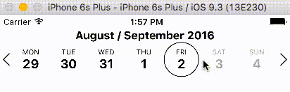
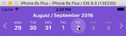
241 | return (
242 |
245 | );
246 | ```
247 |
248 | ##### markedDates Example
249 |
250 |
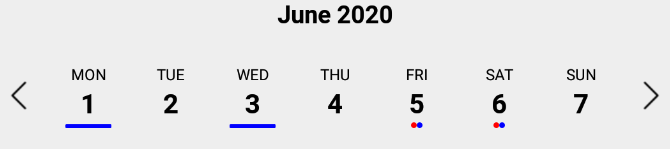
251 |
346 |

347 |
364 |
365 | ```jsx
366 | let customDatesStyles = [];
367 | let startDate = moment();
368 | for (let i=0; i<6; i++) {
369 | customDatesStyles.push({
370 | startDate: startDate.clone().add(i, 'days'), // Single date since no endDate provided
371 | dateNameStyle: styles.dateNameStyle,
372 | dateNumberStyle: styles.dateNumberStyle,
373 | // Random color...
374 | dateContainerStyle: { backgroundColor: `#${(`#00000${(Math.random() * (1 << 24) | 0).toString(16)}`).slice(-6)}` },
375 | });
376 | }
377 |
378 | render() {
379 | return (
380 |
384 | );
385 | }
386 | ```
387 |
388 |
389 | ##### Callback Usage Example:
390 |
391 |
392 |
393 | ```jsx
394 | const customDatesStylesFunc = date => {
395 | if (date.isoWeekday() === 5) { // Fridays
396 | return {
397 | dateNameStyle: {color: 'blue'},
398 | dateNumberStyle: {color: 'purple'},
399 | dateContainerStyle: {color: 'yellow'},
400 | }
401 | }
402 | }
403 |
404 | render() {
405 | return (
406 |
410 | );
411 | }
412 | ```
413 |
414 |
415 |
416 | #### Responsive Sizing
417 |
418 | | Prop | Description | Type | Default |
419 | | ---------------------------- | ---------------------------------------------------------------------------------------------------------------------------------------------------- | ------ | -------- |
420 | | **`maxDayComponentSize`** | Maximum size that CalendarDay will responsively size up to. | Number | **`80`** |
421 | | **`minDayComponentSize`** | Minimum size that CalendarDay will responsively size down to. | Number | **`10`** |
422 | | **`responsiveSizingOffset`** | Adjust the responsive sizing. May be positive (increase size) or negative (decrease size). This value is added to the calculated day component width | Number | **`0`** |
423 | | **`dayComponentHeight`** | Fixed height for the CalendarDay component or custom `dayComponent`. | Number | |
424 |
425 | #### Icon Sizing
426 |
427 | | Prop | Description | Type | Default |
428 | | -------------------- | --------------------------------------------------------------------------------------------------------------------------------------------------------------------------------------- | ---- | ------- |
429 | | **`iconLeft`** | Icon to be used for the left icon. It accepts require statement with url to the image (`require('./img/icon.png')`), or object with remote uri `{uri: 'http://example.com/image.png'}` | Any |
430 | | **`iconRight`** | Icon to be used for the right icon. It accepts require statement with url to the image (`require('./img/icon.png')`), or object with remote uri `{uri: 'http://example.com/image.png'}` | Any |
431 | | **`iconStyle`** | Style that is applied to both left and right icons. It is applied before _iconLeftStyle_ or _iconRightStyle_. | Any |
432 | | **`iconLeftStyle`** | Style for left icon. It will override all of the other styles applied to icons. | Any |
433 | | **`iconRightStyle`** | Style for right icon. It will override all of the other styles applied to icons. | Any |
434 | | **`iconContainer`** | Style for the container of icons. (Example usage is to add `flex` property to it so in the portrait mode, it will shrink the dates strip) | Any |
435 | | **`leftSelector`** | Component for the left selector control. May be an instance of any React component. This overrides the icon\* props above. Passing in an empty array `[]` hides this control. | Any |
436 | | **`rightSelector`** | Component for the right selector control. May be an instance of any React component. This overrides the icon\* props above. Passing in an empty array `[]` hides this control. | Any |
437 |
438 | #### Custom Day component
439 |
440 | | Prop | Description | Type | Default |
441 | | -------------------- | --------------------------------------------------------------------------------------------------------------------------------------------------------------------------------------- | ---- | ------- |
442 | | **`dayComponent`** | User-defined component for the Days. All day-related props are passed to the custom component: https://github.com/BugiDev/react-native-calendar-strip/blob/master/src/CalendarStrip.js#L542 | Any |
443 |
444 | ### Methods
445 |
446 | Methods may be accessed through the instantiated component's [ref](https://reactjs.org/docs/react-component.html).
447 |
448 | | Prop | Description |
449 | | ------------------------------------- | --------------------------------------------------------------------------------- |
450 | | **`getSelectedDate()`** | Returns the currently selected date. If no date is selected, returns undefined. |
451 | | **`setSelectedDate(date)`** | Sets the selected date. `date` may be a Moment object, ISO8601 date string, or any format that Moment is able to parse. It is the responsibility of the caller to select a date that makes sense (e.g. within the current week view). Passing in a value of `0` effectively clears the selected date. `scrollToOnSetSelectedDate` controls whether the scroller repositions to the selected date. |
452 | | **`getNextWeek()`** | Advance to the next week. |
453 | | **`getPreviousWeek()`** | Rewind to the previous week. |
454 | | **`updateWeekView(date)`** | Show the week starting on `date`. |
455 |
456 |
457 | ## Animations
458 |
459 | ### Week Strip Animation
460 |
461 | | Sequence example (dates shown one by one) | Parallel example (dates shown all at once) |
462 | | -------------------------------------------------------------------------------------------------------------------------------------------------------------------------- | ------------------------------------------------------------------------------------------------------------------------------------------------------------------------- |
463 | |  |  |
464 |
465 | #### Week Strip Animation Options
466 |
467 | The `calendarAnimation` prop accepts an object in the following format:
468 |
469 | | Props | Description | Types |
470 | | -------------- | --------------------------------------------------- | ------------------------ |
471 | | **`Type`** | Pick which type of animation you would like to show | `sequence` or `parallel` |
472 | | **`duration`** | duration of animation in milliseconds | Number (ms) |
473 | | **`useNativeDriver`** | Use Animated's native driver (default true) | Bool |
474 |
475 | ### Day Selection Animation
476 |
477 | | Border example | Background example |
478 | | --------------------------------------------------------------------------------------------------------------------------------------------------------------------------- | --------------------------------------------------------------------------------------------------------------------------------------------------------------------- |
479 | |  |  |
480 |
481 | #### Day Selection Animation Options
482 |
483 | The `daySelectionAnimation` prop accepts an object in the following format:
484 |
485 | | Props | Description | Type |
486 | | -------------------------- | ---------------------------------------------------------------------------------------------------------------------- | ------------------------ |
487 | | **`Type`** | Pick which type of animation you would like to show | `border` or `background` |
488 | | **`duration`** | duration of animation in milliseconds | Number (ms) |
489 | | **`borderWidth`** | Selected day's border width. _Required if the type is set to border_. | Number |
490 | | **`borderHighlightColor`** | Selected day's border color. _Required if the type is set to border_. | String |
491 | | **`highlightColor`** | Highlighted color of selected date. _Required if the type is set to background_. | String |
492 | | **`animType`** | optional config options passed to [LayoutAnimation](https://facebook.github.io/react-native/docs/layoutanimation.html) | any |
493 | | **`animUpdateType`** | optional config options passed to [LayoutAnimation](https://facebook.github.io/react-native/docs/layoutanimation.html) | any |
494 | | **`animProperty`** | optional config options passed to [LayoutAnimation](https://facebook.github.io/react-native/docs/layoutanimation.html) | any |
495 | | **`animSpringDamping`** | optional config options passed to [LayoutAnimation](https://facebook.github.io/react-native/docs/layoutanimation.html) | any |
496 |
497 | ## Localization
498 |
499 | | Props | Description | Type |
500 | | ------------ | ---------------- | ------ |
501 | | **`locale`** | Locale for dates | Object |
502 |
503 | This prop is used for adding localization to react-native-calendar-strip component. The localization rules are the same as moments and can be found in [moments documentation](http://momentjs.com/docs/#/i18n/)
504 |
505 | | `locale` Props | Description | Type |
506 | | -------------- | ----------------------------------------------------------- | ------ |
507 | | **`name`** | The name of the locale (ex. 'fr') | String |
508 | | **`config`** | The config object holding all of the localization strings.. | Object |
509 |
510 | #### Build Release info
511 |
512 | To properly make a release build, import the appropriate "Locale" module using the following steps. Not importing the locale module will crash the release build (though the dev build will work).
513 |
514 | 1- import momentJs module:
515 | > $ yarn add moment
516 |
517 | or
518 |
519 | > $ npm install moment
520 |
521 | 2- Go to your index.js and import the specific "Locale" after the main moment import. Ex:
522 | ```
523 | import 'moment';
524 | import 'moment/locale/fr'; // language must match config
525 | import moment from 'moment-timezone'; // only if timezone is needed
526 | ```
527 |
528 | The locale import must match the language specified in the locale config (example below).
529 |
530 | #### Example of one locale object is:
531 |
532 |
533 |
534 | ```jsx
535 | const locale = {
536 | name: 'fr',
537 | config: {
538 | months: 'Janvier_Février_Mars_Avril_Mai_Juin_Juillet_Août_Septembre_Octobre_Novembre_Décembre'.split(
539 | '_'
540 | ),
541 | monthsShort: 'Janv_Févr_Mars_Avr_Mai_Juin_Juil_Août_Sept_Oct_Nov_Déc'.split(
542 | '_'
543 | ),
544 | weekdays: 'Dimanche_Lundi_Mardi_Mercredi_Jeudi_Vendredi_Samedi'.split('_'),
545 | weekdaysShort: 'Dim_Lun_Mar_Mer_Jeu_Ven_Sam'.split('_'),
546 | weekdaysMin: 'Di_Lu_Ma_Me_Je_Ve_Sa'.split('_'),
547 | longDateFormat: {
548 | LT: 'HH:mm',
549 | LTS: 'HH:mm:ss',
550 | L: 'DD/MM/YYYY',
551 | LL: 'D MMMM YYYY',
552 | LLL: 'D MMMM YYYY LT',
553 | LLLL: 'dddd D MMMM YYYY LT'
554 | },
555 | calendar: {
556 | sameDay: "[Aujourd'hui à] LT",
557 | nextDay: '[Demain à] LT',
558 | nextWeek: 'dddd [à] LT',
559 | lastDay: '[Hier à] LT',
560 | lastWeek: 'dddd [dernier à] LT',
561 | sameElse: 'L'
562 | },
563 | relativeTime: {
564 | future: 'dans %s',
565 | past: 'il y a %s',
566 | s: 'quelques secondes',
567 | m: 'une minute',
568 | mm: '%d minutes',
569 | h: 'une heure',
570 | hh: '%d heures',
571 | d: 'un jour',
572 | dd: '%d jours',
573 | M: 'un mois',
574 | MM: '%d mois',
575 | y: 'une année',
576 | yy: '%d années'
577 | },
578 | ordinalParse: /\d{1,2}(er|ème)/,
579 | ordinal: function(number) {
580 | return number + (number === 1 ? 'er' : 'ème');
581 | },
582 | meridiemParse: /PD|MD/,
583 | isPM: function(input) {
584 | return input.charAt(0) === 'M';
585 | },
586 | // in case the meridiem units are not separated around 12, then implement
587 | // this function (look at locale/id.js for an example)
588 | // meridiemHour : function (hour, meridiem) {
589 | // return /* 0-23 hour, given meridiem token and hour 1-12 */
590 | // },
591 | meridiem: function(hours, minutes, isLower) {
592 | return hours < 12 ? 'PD' : 'MD';
593 | },
594 | week: {
595 | dow: 1, // Monday is the first day of the week.
596 | doy: 4 // The week that contains Jan 4th is the first week of the year.
597 | }
598 | }
599 | };
600 | ```
601 |
602 |
603 |
604 |
605 | ## Device Specific Notes
606 |
607 |
608 | - OnePlus devices use OnePlus Slate font by default which causes text being cut off in the date number in react-native-calendar-strip. To overcome this change the default font of the device or use a specific font throughout your app.
609 |
610 |
611 | ## Development with Sample Application
612 |
613 | To facilitate development, the `example` directory has a sample app.
614 |
615 | ```sh
616 | cd example
617 | npm run cp
618 | npm install
619 | npm start
620 | ```
621 |
622 | The CalendarStrip source files are copied from the project root directory into `example/CalendarStrip` using `npm run cp`. If a source file is modified, it must be copied over again with `npm run cp`.
623 |
624 | ## Contributing
625 |
626 | Contributions are welcome!
627 |
628 | 1. Fork it.
629 | 2. Create your feature branch: `git checkout -b my-new-feature`
630 | 3. Commit your changes: `git commit -am 'Add some feature'`
631 | 4. Push to the branch: `git push origin my-new-feature`
632 | 5. Submit a pull request :D
633 |
634 | Or open up [an issue](https://github.com/BugiDev/react-native-calendar-strip/issues).
635 |
636 |
637 | ## Contributors
638 |
639 |
640 |
641 | | [
Bogdan Begovic](https://github.com/BugiDev)
[💬](#question-BugiDev "Answering Questions") [💻](https://github.com/bugidev/react-native-calendar-strip/commits?author=BugiDev "Code") [🎨](#design-BugiDev "Design") [📖](https://github.com/bugidev/react-native-calendar-strip/commits?author=BugiDev "Documentation") [💡](#example-BugiDev "Examples") [🔧](#tool-BugiDev "Tools") | [
Peace](https://github.com/peacechen)
[💬](#question-peacechen "Answering Questions") [🐛](https://github.com/bugidev/react-native-calendar-strip/issues?q=author%3Apeacechen "Bug reports") [💻](https://github.com/bugidev/react-native-calendar-strip/commits?author=peacechen "Code") [📖](https://github.com/bugidev/react-native-calendar-strip/commits?author=peacechen "Documentation") [👀](#review-peacechen "Reviewed Pull Requests") | [
Chris Burns](http://www.usebillo.com)
[💬](#question-Burnsy "Answering Questions") [🐛](https://github.com/bugidev/react-native-calendar-strip/issues?q=author%3ABurnsy "Bug reports") [💻](https://github.com/bugidev/react-native-calendar-strip/commits?author=Burnsy "Code") [📖](https://github.com/bugidev/react-native-calendar-strip/commits?author=Burnsy "Documentation") [🔧](#tool-Burnsy "Tools") [💡](#example-Burnsy "Examples") [👀](#review-Burnsy "Reviewed Pull Requests") | [
samcolby](https://github.com/samcolby)
[💻](https://github.com/bugidev/react-native-calendar-strip/commits?author=samcolby "Code") [⚠️](https://github.com/bugidev/react-native-calendar-strip/commits?author=samcolby "Tests") | [
Florian Biebel](https://chromosom23.de)
[💻](https://github.com/bugidev/react-native-calendar-strip/commits?author=1ne8ight7even "Code") | [
Vitaliy Zhukov](http://intspirit.com/)
[💻](https://github.com/bugidev/react-native-calendar-strip/commits?author=Vitall "Code") | [
lbrdar](https://github.com/lbrdar)
[💻](https://github.com/bugidev/react-native-calendar-strip/commits?author=lbrdar "Code") |
642 | | :---: | :---: | :---: | :---: | :---: | :---: | :---: |
643 | | [
Dimka Vasilyev](https://github.com/gHashTag)
[💻](https://github.com/bugidev/react-native-calendar-strip/commits?author=gHashTag "Code") | [
Eugene](https://github.com/hellpirat)
[💻](https://github.com/bugidev/react-native-calendar-strip/commits?author=hellpirat "Code") |
644 |
645 | Thanks goes to these wonderful people ([emoji key](https://github.com/kentcdodds/all-contributors#emoji-key)):
646 |
647 | ## Discussion and Collaboration
648 |
649 | In addition to the [Github Issues](https://github.com/BugiDev/react-native-calendar-strip/issues) page, there is a [Discord group](https://discord.gg/RvFM97v) for React Native with a channel specifically for [react-native-calendar-strip](https://discordapp.com/channels/413352084981678082/413360340579909633). Thanks @MichelDiz for setting that up.
650 |
651 | ## License
652 |
653 | Licensed under the MIT License.
654 |
--------------------------------------------------------------------------------
/__tests__/CalendarHeader.js:
--------------------------------------------------------------------------------
1 | import React from "react";
2 | import { configure, shallow } from "enzyme";
3 | import Adapter from "enzyme-adapter-react-16";
4 | import moment from "moment";
5 |
6 | import CalendarHeader from "../src/CalendarHeader";
7 |
8 | configure({ adapter: new Adapter() });
9 |
10 | const today = moment();
11 |
12 | describe("CalendarHeader Component", () => {
13 | it("should render without issues", () => {
14 | const component = shallow(
15 |
22 | );
23 |
24 | expect(component).toBeTruthy();
25 | });
26 |
27 | it("should render custom header without issues", () => {
28 | const component = shallow(
29 |
37 | );
38 |
39 | expect(component).toBeTruthy();
40 | });
41 | });
42 |
--------------------------------------------------------------------------------
/__tests__/Scroller.js:
--------------------------------------------------------------------------------
1 | import React from "react";
2 | import { configure, shallow } from "enzyme";
3 | import Adapter from "enzyme-adapter-react-16";
4 | import moment from "moment";
5 |
6 | import CalendarScroller from "../src/Scroller";
7 |
8 | configure({ adapter: new Adapter() });
9 |
10 | const today = moment();
11 |
12 | describe("CalendarScroller Component", () => {
13 | it("should render without issues", () => {
14 | const component = shallow(
15 |
19 | );
20 |
21 | expect(component).toBeTruthy();
22 | });
23 |
24 | });
25 |
--------------------------------------------------------------------------------
/__tests__/WeekSelector.js:
--------------------------------------------------------------------------------
1 | import React from "react";
2 | import { configure, shallow } from "enzyme";
3 | import Adapter from "enzyme-adapter-react-16";
4 | import moment from "moment";
5 |
6 | import WeekSelector from "../src/WeekSelector";
7 |
8 | configure({ adapter: new Adapter() });
9 |
10 | const today = moment();
11 |
12 | describe("WeekSelector Component", () => {
13 | it("should render without issues", () => {
14 | const component = shallow(
15 |
21 | );
22 |
23 | expect(component).toBeTruthy();
24 | });
25 |
26 | });
27 |
--------------------------------------------------------------------------------
/example/.expo-shared/assets.json:
--------------------------------------------------------------------------------
1 | {
2 | "12bb71342c6255bbf50437ec8f4441c083f47cdb74bd89160c15e4f43e52a1cb": true,
3 | "40b842e832070c58deac6aa9e08fa459302ee3f9da492c7e77d93d2fbf4a56fd": true
4 | }
5 |
--------------------------------------------------------------------------------
/example/.gitignore:
--------------------------------------------------------------------------------
1 | node_modules/**/*
2 | .expo/*
3 | npm-debug.*
4 | *.jks
5 | *.p8
6 | *.p12
7 | *.key
8 | *.mobileprovision
9 | *.orig.*
10 | web-build/
11 | web-report/
12 |
13 | # macOS
14 | .DS_Store
15 |
--------------------------------------------------------------------------------
/example/App.js:
--------------------------------------------------------------------------------
1 | /**
2 | * Sample React Native Calendar Strip
3 | * https://github.com/BugiDev/react-native-calendar-strip
4 | * @flow
5 | */
6 |
7 | import React, { Component } from 'react';
8 | import { View, Text, Button } from 'react-native';
9 | import CalendarStrip from './CalendarStrip/CalendarStrip';
10 | import moment from 'moment';
11 |
12 | export default class App extends Component<{}> {
13 | constructor(props) {
14 | super(props);
15 |
16 | let startDate = moment(); // today
17 |
18 | // Create a week's worth of custom date styles and marked dates.
19 | let customDatesStyles = [];
20 | let markedDates = [];
21 | for (let i=0; i<7; i++) {
22 | let date = startDate.clone().add(i, 'days');
23 |
24 | customDatesStyles.push({
25 | startDate: date, // Single date since no endDate provided
26 | dateNameStyle: {color: 'blue'},
27 | dateNumberStyle: {color: 'purple'},
28 | highlightDateNameStyle: {color: 'pink'},
29 | highlightDateNumberStyle: {color: 'yellow'},
30 | // Random color...
31 | dateContainerStyle: { backgroundColor: `#${(`#00000${(Math.random() * (1 << 24) | 0).toString(16)}`).slice(-6)}` },
32 | });
33 |
34 | let dots = [];
35 | let lines = [];
36 |
37 | if (i % 2) {
38 | lines.push({
39 | color: 'cyan',
40 | selectedColor: 'orange',
41 | });
42 | }
43 | else {
44 | dots.push({
45 | color: 'red',
46 | selectedColor: 'yellow',
47 | });
48 | }
49 | markedDates.push({
50 | date,
51 | dots,
52 | lines
53 | });
54 | }
55 |
56 | this.state = {
57 | selectedDate: undefined,
58 | customDatesStyles,
59 | markedDates,
60 | startDate,
61 | };
62 | }
63 |
64 | datesBlacklistFunc = date => {
65 | return date.isoWeekday() === 6; // disable Saturdays
66 | }
67 |
68 | onDateSelected = selectedDate => {
69 | this.setState({ selectedDate });
70 | this.setState({ formattedDate: selectedDate.format('YYYY-MM-DD')});
71 | }
72 |
73 | setSelectedDateNextWeek = date => {
74 | const selectedDate = moment(this.state.selectedDate).add(1, 'week');
75 | const formattedDate = selectedDate.format('YYYY-MM-DD');
76 | this.setState({ selectedDate, formattedDate });
77 | }
78 |
79 | setSelectedDatePrevWeek = date => {
80 | const selectedDate = moment(this.state.selectedDate).subtract(1, 'week');
81 | const formattedDate = selectedDate.format('YYYY-MM-DD');
82 | this.setState({ selectedDate, formattedDate });
83 | }
84 |
85 | render() {
86 | return (
87 |
88 |
108 |
109 | Selected Date: {this.state.formattedDate}
110 |
111 |
112 |
117 |
122 |
123 |
124 | );
125 | }
126 | }
127 |
--------------------------------------------------------------------------------
/example/app.json:
--------------------------------------------------------------------------------
1 | {
2 | "expo": {
3 | "name": "CalendarStrip example",
4 | "slug": "example",
5 | "platforms": [
6 | "ios",
7 | "android",
8 | "web"
9 | ],
10 | "version": "1.0.0",
11 | "orientation": "default",
12 | "icon": "./assets/icon.png",
13 | "splash": {
14 | "image": "./assets/icon.png",
15 | "resizeMode": "contain",
16 | "backgroundColor": "#ffffff"
17 | },
18 | "updates": {
19 | "fallbackToCacheTimeout": 0
20 | },
21 | "assetBundlePatterns": [
22 | "**/*"
23 | ],
24 | "ios": {
25 | "supportsTablet": true
26 | }
27 | }
28 | }
29 |
--------------------------------------------------------------------------------
/example/assets/icon.png:
--------------------------------------------------------------------------------
https://raw.githubusercontent.com/BugiDev/react-native-calendar-strip/509e2feedcc9cd173d1dc3b4a680500b60ab98cb/example/assets/icon.png
--------------------------------------------------------------------------------
/example/babel.config.js:
--------------------------------------------------------------------------------
1 | module.exports = function(api) {
2 | api.cache(true);
3 | return {
4 | presets: ['babel-preset-expo'],
5 | };
6 | };
7 |
--------------------------------------------------------------------------------
/example/package.json:
--------------------------------------------------------------------------------
1 | {
2 | "main": "node_modules/expo/AppEntry.js",
3 | "scripts": {
4 | "start": "expo start",
5 | "cp": "cpx \"../src/**\" CalendarStrip -u",
6 | "android": "expo start --android",
7 | "ios": "expo start --ios",
8 | "web": "expo start --web",
9 | "eject": "expo eject"
10 | },
11 | "dependencies": {
12 | "expo": "~37.0.3",
13 | "moment": "*",
14 | "react": "~16.9.0",
15 | "react-dom": "~16.9.0",
16 | "react-native": "https://github.com/expo/react-native/archive/sdk-37.0.1.tar.gz",
17 | "react-native-web": "~0.11.7",
18 | "recyclerlistview": "^3.0.0"
19 | },
20 | "devDependencies": {
21 | "@deboxsoft/cpx": "^1.5.0",
22 | "babel-preset-expo": "~8.1.0",
23 | "@babel/core": "^7.8.6"
24 | },
25 | "private": true
26 | }
27 |
--------------------------------------------------------------------------------
/index.d.ts:
--------------------------------------------------------------------------------
1 | import { Component, ReactNode, ComponentProps, RefObject } from "react";
2 | import { Duration, Moment } from "moment";
3 | import {
4 | StyleProp,
5 | ViewStyle,
6 | TextStyle,
7 | GestureResponderEvent
8 | } from "react-native";
9 | import { RecyclerListView } from 'recyclerlistview';
10 |
11 | interface IDaySelectionAnimationBorder {
12 | type: "border";
13 | duration: number;
14 | borderWidth: number;
15 | borderHighlightColor: string;
16 | animType?: any;
17 | animUpdateType?: any;
18 | animProperty?: any;
19 | animSpringDamping?: any;
20 | }
21 |
22 | interface IDaySelectionAnimationBackground {
23 | type: "background";
24 | duration: number;
25 | highlightColor: string;
26 | animType?: any;
27 | animUpdateType?: any;
28 | animProperty?: any;
29 | animSpringDamping?: any;
30 | }
31 |
32 | interface IDayComponentProps {
33 | date: Duration;
34 | marking?: any;
35 | selected?: boolean;
36 | enabled: boolean;
37 | showDayName?: boolean;
38 | showDayNumber?: boolean;
39 | onDateSelected?: (event: GestureResponderEvent) => void;
40 | calendarColor?: string;
41 | dateNameStyle?: string;
42 | dateNumberStyle?: string;
43 | dayContainerStyle?: StyleProp;
44 | weekendDateNameStyle?: TextStyle;
45 | weekendDateNumberStyle?: TextStyle;
46 | highlightDateContainerStyle?: StyleProp;
47 | highlightDateNameStyle?: TextStyle;
48 | highlightDateNumberStyle?: TextStyle;
49 | disabledDateNameStyle?: TextStyle;
50 | disabledDateNumberStyle?: TextStyle;
51 | styleWeekend?: boolean;
52 | daySelectionAnimation?: TDaySelectionAnimation;
53 | customStyle?: ViewStyle;
54 | size: number;
55 | allowDayTextScaling?: boolean;
56 | markedDatesStyle?: TextStyle;
57 | markedDates?: any[] | ((date: Moment) => void);
58 | upperCaseDays?: boolean;
59 | }
60 |
61 | type TDaySelectionAnimation =
62 | | IDaySelectionAnimationBorder
63 | | IDaySelectionAnimationBackground;
64 |
65 | type TDateRange = {
66 | start: Moment;
67 | end: Moment;
68 | };
69 |
70 | interface CalendarStripProps {
71 | style: StyleProp;
72 | innerStyle?: StyleProp;
73 | calendarColor?: string;
74 |
75 | numDaysInWeek?: number;
76 | scrollable?: boolean;
77 | scrollerPaging?: boolean;
78 | externalScrollView?: ComponentProps['externalScrollView'];
79 | startingDate?: Moment | Date;
80 | selectedDate?: Moment | Date;
81 | onDateSelected?: ((date: Moment) => void);
82 | onWeekChanged?: ((start: Moment, end: Moment) => void);
83 | onWeekScrollStart?: ((start: Moment, end: Moment) => void);
84 | onWeekScrollEnd?: ((start: Moment, end: Moment) => void);
85 | onHeaderSelected?: ((dates: {weekStartDate: Moment, weekEndDate: Moment}) => void);
86 | updateWeek?: boolean;
87 | useIsoWeekday?: boolean;
88 | minDate?: Moment | Date;
89 | maxDate?: Moment | Date;
90 | datesWhitelist?: TDateRange[] | ((date: Moment) => void);
91 | datesBlacklist?: TDateRange[] | ((date: Moment) => void);
92 | markedDates?: any[] | ((date: Moment) => void);
93 | scrollToOnSetSelectedDate?: boolean;
94 |
95 | showMonth?: boolean;
96 | showDayName?: boolean;
97 | showDayNumber?: boolean;
98 | showDate?: boolean;
99 |
100 | leftSelector?: any;
101 | rightSelector?: any;
102 | iconLeft?: any;
103 | iconRight?: any;
104 | iconStyle?: any;
105 | iconLeftStyle?: any;
106 | iconRightStyle?: any;
107 | iconContainer?: any;
108 |
109 | maxDayComponentSize?: number;
110 | minDayComponentSize?: number;
111 | responsiveSizingOffset?: number;
112 | dayComponentHeight?: number;
113 |
114 | calendarHeaderContainerStyle?: StyleProp;
115 | calendarHeaderStyle?: StyleProp;
116 | calendarHeaderFormat?: string;
117 | calendarHeaderPosition?: "below" | "above";
118 |
119 | calendarAnimation?: {
120 | duration: number;
121 | type: "sequence" | "parallel";
122 | };
123 | daySelectionAnimation?: TDaySelectionAnimation;
124 |
125 | customDatesStyles?: any[] | ((date: Moment) => void);
126 |
127 | dayComponent?: (props: IDayComponentProps) => ReactNode;
128 |
129 | dayContainerStyle?: StyleProp;
130 | dateNameStyle?: StyleProp;
131 | dateNumberStyle?: StyleProp;
132 | dayContainerStyle?: StyleProp;
133 | weekendDateNameStyle?: StyleProp;
134 | weekendDateNumberStyle?: StyleProp;
135 | highlightDateContainerStyle?: StyleProp;
136 | highlightDateNameStyle?: StyleProp;
137 | highlightDateNumberStyle?: StyleProp;
138 | highlightDateNumberContainerStyle?: StyleProp;
139 | disabledDateNameStyle?: StyleProp;
140 | disabledDateNumberStyle?: StyleProp;
141 | markedDatesStyle?: StyleProp;
142 | disabledDateOpacity?: number;
143 | styleWeekend?: boolean;
144 | upperCaseDays?: boolean;
145 |
146 | locale?: object;
147 | shouldAllowFontScaling?: boolean;
148 | useNativeDriver?: boolean;
149 |
150 | headerText?: string;
151 |
152 | ref?: RefObject;
153 | }
154 |
155 | export default class ReactNativeCalendarStrip extends Component {
156 | getSelectedDate: () => undefined | Date | string;
157 | setSelectedDate: (date: Moment | string) => void;
158 | getNextWeek: () => void;
159 | getPreviousWeek: () => void;
160 | updateWeekView: (date: Moment | string) => void;
161 | }
162 |
--------------------------------------------------------------------------------
/index.js:
--------------------------------------------------------------------------------
1 | /**
2 | * Created by bogdanbegovic on 8/29/16.
3 | */
4 | const Calendar = require("./src/CalendarStrip");
5 | module.exports = Calendar;
6 |
--------------------------------------------------------------------------------
/package.json:
--------------------------------------------------------------------------------
1 | {
2 | "name": "react-native-calendar-strip",
3 | "description": "Easy to use and visually stunning calendar component for React Native",
4 | "author": "Bogdan Begovic ",
5 | "contributors": [
6 | "Christopher Burns (https://github.com/Burnsy)",
7 | "Florian Biebel (https://github.com/1ne8ight7even)",
8 | "Peace Chen (https://github.com/peacechen)",
9 | "Sam Colby (https://github.com/samcolby)",
10 | "Vitaliy Zhukov (https://github.com/Vitall)",
11 | "Dimka Vasilyev (https://github.com/gHashTag)",
12 | "Quinton Chester (https://github.com/QuintonC)"
13 | ],
14 | "license": "MIT",
15 | "homepage": "https://github.com/BugiDev/react-native-calendar-strip#readme",
16 | "repository": {
17 | "type": "git",
18 | "url": "git+https://github.com/BugiDev/react-native-calendar-strip.git"
19 | },
20 | "bugs": {
21 | "url": "https://github.com/BugiDev/react-native-calendar-strip/issues"
22 | },
23 | "version": "2.2.6",
24 | "main": "index.js",
25 | "directories": {
26 | "example": "example"
27 | },
28 | "scripts": {
29 | "eslint": "eslint src/**/*.js __tests__/**/*.js --fix",
30 | "test": "npm run eslint && jest",
31 | "test:coverage": "jest --coverage",
32 | "test:watch": "jest --watch",
33 | "contributors:add": "./node_modules/.bin/all-contributors add",
34 | "contributors:generate": "./node_modules/.bin/all-contributors generate",
35 | "postinstall": "node-git-hooks"
36 | },
37 | "dependencies": {
38 | "moment": ">=2.0.0",
39 | "node-git-hooks": "^1.0.1",
40 | "prop-types": "^15.6.0",
41 | "recyclerlistview": "^3.0.0"
42 | },
43 | "peerDependencies": {
44 | "react": "*",
45 | "react-native": "*"
46 | },
47 | "devDependencies": {
48 | "@types/react": "^17.0.0",
49 | "@types/react-native": "^0.63.37",
50 | "all-contributors-cli": "^4.10.1",
51 | "babel-eslint": "^8.0.3",
52 | "babel-jest": "^26.6.3",
53 | "babel-preset-react-native": "^4.0.0",
54 | "enzyme": "^3.2.0",
55 | "enzyme-adapter-react-16": "^1.15.2",
56 | "enzyme-to-json": "^3.3.0",
57 | "eslint": "^4.13.1",
58 | "eslint-plugin-import": "^2.7.0",
59 | "eslint-plugin-react": "^7.5.1",
60 | "jest": "^26.6.3",
61 | "react": "^16.13.1",
62 | "react-addons-test-utils": "^15.6.2",
63 | "react-dom": "^16.2.0",
64 | "react-native": "^0.62.0",
65 | "react-test-renderer": "^16.2.0"
66 | },
67 | "keywords": [
68 | "RN",
69 | "calendar",
70 | "calendar strip",
71 | "calendar-strip",
72 | "native",
73 | "react",
74 | "react native",
75 | "react native calendar",
76 | "react native calendar strip",
77 | "react-native",
78 | "react-native-calendar",
79 | "react-native-calendar-strip",
80 | "rn",
81 | "strip"
82 | ],
83 | "jest": {
84 | "preset": "react-native",
85 | "transform": {
86 | "^.+\\.(js)$": "/node_modules/react-native/jest/preprocessor.js"
87 | },
88 | "verbose": true,
89 | "coverageDirectory": "./coverage/",
90 | "collectCoverageFrom": [
91 | "src/**/*.js",
92 | "!src/img.js",
93 | "!example/*.js"
94 | ],
95 | "modulePathIgnorePatterns": [
96 | "example",
97 | "npm-cache",
98 | ".npm"
99 | ],
100 | "collectCoverage": false,
101 | "globals": {
102 | "__DEV__": true
103 | }
104 | }
105 | }
106 |
--------------------------------------------------------------------------------
/src/Calendar.style.js:
--------------------------------------------------------------------------------
1 | /**
2 | * Created by bogdanbegovic on 8/26/16.
3 | */
4 |
5 | import { StyleSheet } from "react-native";
6 |
7 | export default StyleSheet.create({
8 | //CALENDAR STYLES
9 | calendarContainer: {
10 | overflow: "hidden"
11 | },
12 | datesStrip: {
13 | flexDirection: "row",
14 | flex: 1,
15 | alignItems: "center",
16 | justifyContent: "space-between"
17 | },
18 | calendarDates: {
19 | flex: 1,
20 | flexDirection: "row",
21 | justifyContent: "center",
22 | alignItems: "center"
23 | },
24 | calendarHeader: {
25 | textAlign: "center",
26 | fontWeight: "bold",
27 | alignSelf: "center"
28 | },
29 | iconContainer: {
30 | justifyContent: "center",
31 | alignItems: "center",
32 | alignSelf: "center"
33 | },
34 | icon: {
35 | resizeMode: "contain"
36 | },
37 |
38 | //CALENDAR DAY
39 | dateRootContainer: {
40 | flex: 1,
41 | },
42 | dateContainer: {
43 | justifyContent: "center",
44 | alignItems: "center",
45 | alignSelf: "center"
46 | },
47 | dateName: {
48 | textAlign: "center"
49 | },
50 | weekendDateName: {
51 | color: "#A7A7A7",
52 | textAlign: "center"
53 | },
54 | dateNumber: {
55 | fontWeight: "bold",
56 | textAlign: "center"
57 | },
58 | weekendDateNumber: {
59 | color: "#A7A7A7",
60 | fontWeight: "bold",
61 | textAlign: "center"
62 | },
63 | dot: {
64 | width: 6,
65 | height: 6,
66 | marginTop: 1,
67 | borderRadius: 5,
68 | opacity: 0
69 | },
70 |
71 | // CALENDAR DOTS
72 | dotsContainer: {
73 | flexDirection: 'row',
74 | justifyContent: 'center'
75 | },
76 | visibleDot: {
77 | opacity: 1,
78 | backgroundColor: 'blue'
79 | },
80 | selectedDot: {
81 | backgroundColor: 'blue'
82 | },
83 |
84 | // Calendar Lines
85 | line: {
86 | height: 4,
87 | marginTop: 3,
88 | borderRadius: 1,
89 | opacity: 0
90 | },
91 | linesContainer: {
92 | justifyContent: 'center'
93 | },
94 | visibleLine: {
95 | opacity: 1,
96 | backgroundColor: 'blue'
97 | },
98 | selectedLine: {
99 | backgroundColor: 'blue'
100 | },
101 | });
102 |
--------------------------------------------------------------------------------
/src/CalendarDay.js:
--------------------------------------------------------------------------------
1 | /**
2 | * Created by bogdanbegovic on 8/20/16.
3 | */
4 |
5 | import React, { Component } from "react";
6 | import PropTypes from "prop-types";
7 | import moment from "moment";
8 |
9 | import { Text, View, Animated, Easing, LayoutAnimation, TouchableOpacity } from "react-native";
10 | import styles from "./Calendar.style.js";
11 |
12 | class CalendarDay extends Component {
13 | static propTypes = {
14 | date: PropTypes.object.isRequired,
15 | selectedDate: PropTypes.any,
16 | onDateSelected: PropTypes.func.isRequired,
17 | dayComponent: PropTypes.any,
18 | datesWhitelist: PropTypes.oneOfType([PropTypes.array, PropTypes.func]),
19 | datesBlacklist: PropTypes.oneOfType([PropTypes.array, PropTypes.func]),
20 |
21 | markedDates: PropTypes.oneOfType([PropTypes.array, PropTypes.func]),
22 |
23 | showDayName: PropTypes.bool,
24 | showDayNumber: PropTypes.bool,
25 |
26 | calendarColor: PropTypes.string,
27 |
28 | width: PropTypes.number,
29 | height: PropTypes.number,
30 |
31 | dateNameStyle: PropTypes.any,
32 | dateNumberStyle: PropTypes.any,
33 | dayContainerStyle: PropTypes.any,
34 | weekendDateNameStyle: PropTypes.any,
35 | weekendDateNumberStyle: PropTypes.any,
36 | highlightDateContainerStyle: PropTypes.any,
37 | highlightDateNameStyle: PropTypes.any,
38 | highlightDateNumberStyle: PropTypes.any,
39 | highlightDateNumberContainerStyle: PropTypes.any,
40 | disabledDateNameStyle: PropTypes.any,
41 | disabledDateNumberStyle: PropTypes.any,
42 | disabledDateOpacity: PropTypes.number,
43 | styleWeekend: PropTypes.bool,
44 | customDatesStyles: PropTypes.oneOfType([PropTypes.array, PropTypes.func]),
45 | markedDatesStyle: PropTypes.object,
46 | allowDayTextScaling: PropTypes.bool,
47 |
48 | calendarAnimation: PropTypes.object,
49 | registerAnimation: PropTypes.func.isRequired,
50 | daySelectionAnimation: PropTypes.object,
51 | useNativeDriver: PropTypes.bool,
52 | scrollable: PropTypes.bool,
53 | upperCaseDays: PropTypes.bool,
54 | };
55 |
56 | // Reference: https://medium.com/@Jpoliachik/react-native-s-layoutanimation-is-awesome-4a4d317afd3e
57 | static defaultProps = {
58 | daySelectionAnimation: {
59 | type: "", // animations disabled by default
60 | duration: 300,
61 | borderWidth: 1,
62 | borderHighlightColor: "black",
63 | highlightColor: "yellow",
64 | animType: LayoutAnimation.Types.easeInEaseOut,
65 | animUpdateType: LayoutAnimation.Types.easeInEaseOut,
66 | animProperty: LayoutAnimation.Properties.opacity,
67 | animSpringDamping: undefined // Only applicable for LayoutAnimation.Types.spring,
68 | },
69 | styleWeekend: true,
70 | showDayName: true,
71 | showDayNumber: true,
72 | upperCaseDays: true,
73 | width: 0, // Default width and height to avoid calcSizes() *sometimes* doing Math.round(undefined) to cause NaN
74 | height: 0
75 | };
76 |
77 | constructor(props) {
78 | super(props);
79 |
80 | this.state = {
81 | enabled: this.isDateAllowed(props.date, props.datesBlacklist, props.datesWhitelist),
82 | selected: this.isDateSelected(props.date, props.selectedDate),
83 | customStyle: this.getCustomDateStyle(props.date, props.customDatesStyles),
84 | marking: this.getDateMarking(props.date, props.markedDates),
85 | animatedValue: new Animated.Value(0),
86 | ...this.calcSizes(props)
87 | };
88 |
89 | if (!props.scrollable) {
90 | props.registerAnimation(this.createAnimation());
91 | }
92 | }
93 |
94 | componentDidUpdate(prevProps, prevState) {
95 | let newState = {};
96 | let doStateUpdate = false;
97 | let hasDateChanged = prevProps.date !== this.props.date;
98 |
99 | if ((this.props.selectedDate !== prevProps.selectedDate) || hasDateChanged) {
100 | if (this.props.daySelectionAnimation.type !== "" && !this.props.scrollable) {
101 | let configurableAnimation = {
102 | duration: this.props.daySelectionAnimation.duration || 300,
103 | create: {
104 | type:
105 | this.props.daySelectionAnimation.animType ||
106 | LayoutAnimation.Types.easeInEaseOut,
107 | property:
108 | this.props.daySelectionAnimation.animProperty ||
109 | LayoutAnimation.Properties.opacity
110 | },
111 | update: {
112 | type:
113 | this.props.daySelectionAnimation.animUpdateType ||
114 | LayoutAnimation.Types.easeInEaseOut,
115 | springDamping: this.props.daySelectionAnimation.animSpringDamping
116 | },
117 | delete: {
118 | type:
119 | this.props.daySelectionAnimation.animType ||
120 | LayoutAnimation.Types.easeInEaseOut,
121 | property:
122 | this.props.daySelectionAnimation.animProperty ||
123 | LayoutAnimation.Properties.opacity
124 | }
125 | };
126 | LayoutAnimation.configureNext(configurableAnimation);
127 | }
128 | newState.selected = this.isDateSelected(this.props.date, this.props.selectedDate);
129 | doStateUpdate = true;
130 | }
131 |
132 | if (prevProps.width !== this.props.width || prevProps.height !== this.props.height) {
133 | newState = { ...newState, ...this.calcSizes(this.props) };
134 | doStateUpdate = true;
135 | }
136 |
137 | if ((prevProps.customDatesStyles !== this.props.customDatesStyles) || hasDateChanged) {
138 | newState = { ...newState, customStyle: this.getCustomDateStyle(this.props.date, this.props.customDatesStyles) };
139 | doStateUpdate = true;
140 | }
141 |
142 | if ((prevProps.markedDates !== this.props.markedDates) || hasDateChanged) {
143 | newState = { ...newState, marking: this.getDateMarking(this.props.date, this.props.markedDates) };
144 | doStateUpdate = true;
145 | }
146 |
147 | if ((prevProps.datesBlacklist !== this.props.datesBlacklist) ||
148 | (prevProps.datesWhitelist !== this.props.datesWhitelist) ||
149 | hasDateChanged)
150 | {
151 | newState = { ...newState, enabled: this.isDateAllowed(this.props.date, this.props.datesBlacklist, this.props.datesWhitelist) };
152 | doStateUpdate = true;
153 | }
154 |
155 | if (doStateUpdate) {
156 | this.setState(newState);
157 | }
158 | }
159 |
160 | calcSizes = props => {
161 | return {
162 | containerWidth: Math.round(props.width),
163 | containerHeight: Math.round(props.height),
164 | containerBorderRadius: Math.round(props.width / 2),
165 | dateNameFontSize: Math.round(props.width / 5),
166 | dateNumberFontSize: Math.round(props.width / 2.9)
167 | };
168 | }
169 |
170 | //Function to check if provided date is the same as selected one, hence date is selected
171 | //using isSame moment query with "day" param so that it check years, months and day
172 | isDateSelected = (date, selectedDate) => {
173 | if (!date || !selectedDate) {
174 | return date === selectedDate;
175 | }
176 | return date.isSame(selectedDate, "day");
177 | }
178 |
179 | // Check whether date is allowed
180 | isDateAllowed = (date, datesBlacklist, datesWhitelist) => {
181 | // datesBlacklist entries override datesWhitelist
182 | if (Array.isArray(datesBlacklist)) {
183 | for (let disallowed of datesBlacklist) {
184 | // Blacklist start/end object
185 | if (disallowed.start && disallowed.end) {
186 | if (date.isBetween(disallowed.start, disallowed.end, "day", "[]")) {
187 | return false;
188 | }
189 | } else {
190 | if (date.isSame(disallowed, "day")) {
191 | return false;
192 | }
193 | }
194 | }
195 | } else if (datesBlacklist instanceof Function) {
196 | return !datesBlacklist(date);
197 | }
198 |
199 | // Whitelist
200 | if (Array.isArray(datesWhitelist)) {
201 | for (let allowed of datesWhitelist) {
202 | // start/end object
203 | if (allowed.start && allowed.end) {
204 | if (date.isBetween(allowed.start, allowed.end, "day", "[]")) {
205 | return true;
206 | }
207 | } else {
208 | if (date.isSame(allowed, "day")) {
209 | return true;
210 | }
211 | }
212 | }
213 | return false;
214 | } else if (datesWhitelist instanceof Function) {
215 | return datesWhitelist(date);
216 | }
217 |
218 | return true;
219 | }
220 |
221 | getCustomDateStyle = (date, customDatesStyles) => {
222 | if (Array.isArray(customDatesStyles)) {
223 | for (let customDateStyle of customDatesStyles) {
224 | if (customDateStyle.endDate) {
225 | // Range
226 | if (
227 | date.isBetween(
228 | customDateStyle.startDate,
229 | customDateStyle.endDate,
230 | "day",
231 | "[]"
232 | )
233 | ) {
234 | return customDateStyle;
235 | }
236 | } else {
237 | // Single date
238 | if (date.isSame(customDateStyle.startDate, "day")) {
239 | return customDateStyle;
240 | }
241 | }
242 | }
243 | } else if (customDatesStyles instanceof Function) {
244 | return customDatesStyles(date);
245 | }
246 | }
247 |
248 | getDateMarking = (day, markedDates) => {
249 | if (Array.isArray(markedDates)) {
250 | if (markedDates.length === 0) {
251 | return {};
252 | }
253 | return markedDates.find(md => moment(day).isSame(md.date, "day")) || {};
254 | } else if (markedDates instanceof Function) {
255 | return markedDates(day) || {};
256 | }
257 | }
258 |
259 | createAnimation = () => {
260 | const {
261 | calendarAnimation,
262 | useNativeDriver,
263 | } = this.props
264 |
265 | if (calendarAnimation) {
266 | this.animation = Animated.timing(this.state.animatedValue, {
267 | toValue: 1,
268 | duration: calendarAnimation.duration,
269 | easing: Easing.linear,
270 | useNativeDriver,
271 | });
272 |
273 | // Individual CalendarDay animation starts have unpredictable timing
274 | // when used with delays in RN Animated.
275 | // Send animation to parent to collect and start together.
276 | return this.animation;
277 | }
278 | }
279 |
280 | renderMarking() {
281 | if (!this.props.markedDates || this.props.markedDates.length === 0) {
282 | return;
283 | }
284 | const marking = this.state.marking;
285 |
286 | if (marking.dots && Array.isArray(marking.dots) && marking.dots.length > 0) {
287 | return this.renderDots(marking);
288 | }
289 | if (marking.lines && Array.isArray(marking.lines) && marking.lines.length > 0) {
290 | return this.renderLines(marking);
291 | }
292 |
293 | return ( // default empty spacer
294 |
295 |
296 |
297 | );
298 | }
299 |
300 | renderDots(marking) {
301 | const baseDotStyle = [styles.dot, styles.visibleDot];
302 | const markedDatesStyle = this.props.markedDatesStyle || {};
303 | const formattedDate = this.props.date.format('YYYY-MM-DD');
304 | let validDots = ; // default empty view for no dots case
305 |
306 | // Filter dots and process only those which have color property
307 | validDots = marking.dots
308 | .filter(d => (d && d.color))
309 | .map((dot, index) => {
310 | const selectedColor = dot.selectedColor || dot.selectedDotColor; // selectedDotColor deprecated
311 | const backgroundColor = this.state.selected && selectedColor ? selectedColor : dot.color;
312 | return (
313 |
321 | );
322 | });
323 |
324 | return (
325 |
326 | {validDots}
327 |
328 | );
329 | }
330 |
331 | renderLines(marking) {
332 | const baseLineStyle = [styles.line, styles.visibleLine];
333 | const markedDatesStyle = this.props.markedDatesStyle || {};
334 | let validLines = ; // default empty view
335 |
336 | // Filter lines and process only those which have color property
337 | validLines = marking.lines
338 | .filter(d => (d && d.color))
339 | .map((line, index) => {
340 | const backgroundColor = this.state.selected && line.selectedColor ? line.selectedColor : line.color;
341 | const width = this.props.width * 0.6;
342 | return (
343 |
351 | );
352 | });
353 |
354 | return (
355 |
356 | {validLines}
357 |
358 | );
359 | }
360 |
361 | render() {
362 | // Defaults for disabled state
363 | const {
364 | date,
365 | dateNameStyle,
366 | dateNumberStyle,
367 | dayContainerStyle,
368 | disabledDateNameStyle,
369 | disabledDateNumberStyle,
370 | disabledDateOpacity,
371 | calendarAnimation,
372 | daySelectionAnimation,
373 | highlightDateNameStyle,
374 | highlightDateNumberStyle,
375 | highlightDateNumberContainerStyle,
376 | highlightDateContainerStyle,
377 | styleWeekend,
378 | weekendDateNameStyle,
379 | weekendDateNumberStyle,
380 | onDateSelected,
381 | showDayName,
382 | showDayNumber,
383 | allowDayTextScaling,
384 | dayComponent: DayComponent,
385 | scrollable,
386 | upperCaseDays,
387 | } = this.props;
388 | const {
389 | enabled,
390 | selected,
391 | containerHeight,
392 | containerWidth,
393 | containerBorderRadius,
394 | customStyle,
395 | dateNameFontSize,
396 | dateNumberFontSize,
397 | } = this.state;
398 |
399 | let _dateNameStyle = [styles.dateName, enabled ? dateNameStyle : disabledDateNameStyle];
400 | let _dateNumberStyle = [styles.dateNumber, enabled ? dateNumberStyle : disabledDateNumberStyle];
401 | let _dateViewStyle = enabled
402 | ? [{ backgroundColor: "transparent" }]
403 | : [{ opacity: disabledDateOpacity }];
404 | let _customHighlightDateNameStyle;
405 | let _customHighlightDateNumberStyle;
406 | let _dateNumberContainerStyle = [];
407 |
408 | if (customStyle) {
409 | _dateNameStyle.push(customStyle.dateNameStyle);
410 | _dateNumberStyle.push(customStyle.dateNumberStyle);
411 | _dateViewStyle.push(customStyle.dateContainerStyle);
412 | _customHighlightDateNameStyle = customStyle.highlightDateNameStyle;
413 | _customHighlightDateNumberStyle = customStyle.highlightDateNumberStyle;
414 | }
415 | if (enabled && selected) {
416 | // Enabled state
417 | //The user can disable animation, so that is why I use selection type
418 | //If it is background, the user have to input colors for animation
419 | //If it is border, the user has to input color for border animation
420 | switch (daySelectionAnimation.type) {
421 | case "background":
422 | _dateViewStyle.push({ backgroundColor: daySelectionAnimation.highlightColor });
423 | break;
424 | case "border":
425 | _dateViewStyle.push({
426 | borderColor: daySelectionAnimation.borderHighlightColor,
427 | borderWidth: daySelectionAnimation.borderWidth
428 | });
429 | break;
430 | default:
431 | // No animation styling by default
432 | break;
433 | }
434 |
435 | _dateNameStyle = [styles.dateName, dateNameStyle];
436 | _dateNumberStyle = [styles.dateNumber, dateNumberStyle];
437 | if (styleWeekend &&
438 | (date.isoWeekday() === 6 || date.isoWeekday() === 7)
439 | ) {
440 | _dateNameStyle = [
441 | styles.weekendDateName,
442 | weekendDateNameStyle
443 | ];
444 | _dateNumberStyle = [
445 | styles.weekendDateNumber,
446 | weekendDateNumberStyle
447 | ];
448 | }
449 |
450 | _dateViewStyle.push(highlightDateContainerStyle);
451 | _dateNameStyle = [
452 | styles.dateName,
453 | highlightDateNameStyle,
454 | _customHighlightDateNameStyle
455 | ];
456 | _dateNumberStyle = [
457 | styles.dateNumber,
458 | highlightDateNumberStyle,
459 | _customHighlightDateNumberStyle
460 | ];
461 | _dateNumberContainerStyle.push(highlightDateNumberContainerStyle);
462 | }
463 |
464 | let responsiveDateContainerStyle = {
465 | width: containerWidth,
466 | height: containerHeight,
467 | borderRadius: containerBorderRadius,
468 | };
469 |
470 | let containerStyle = selected
471 | ? { ...dayContainerStyle, ...highlightDateContainerStyle }
472 | : dayContainerStyle;
473 |
474 | let day;
475 | if (DayComponent) {
476 | day = ();
477 | }
478 | else {
479 | day = (
480 |
484 |
492 | {showDayName && (
493 |
497 | {upperCaseDays ? date.format("ddd").toUpperCase() : date.format("ddd")}
498 |
499 | )}
500 | {showDayNumber && (
501 |
502 |
509 | {date.date()}
510 |
511 |
512 |
513 | )}
514 | { this.renderMarking() }
515 |
516 |
517 | );
518 | }
519 |
520 | return calendarAnimation && !scrollable ? (
521 |
525 | {day}
526 |
527 | ) : (
528 |
529 | {day}
530 |
531 | );
532 | }
533 | }
534 |
535 | export default CalendarDay;
536 |
--------------------------------------------------------------------------------
/src/CalendarHeader.js:
--------------------------------------------------------------------------------
1 | import React, { Component } from "react";
2 | import PropTypes from "prop-types";
3 | import { Text, TouchableOpacity } from "react-native";
4 |
5 | import styles from "./Calendar.style.js";
6 |
7 | class CalendarHeader extends Component {
8 | static propTypes = {
9 | calendarHeaderFormat: PropTypes.string.isRequired,
10 | calendarHeaderContainerStyle: PropTypes.oneOfType([
11 | PropTypes.object,
12 | PropTypes.number
13 | ]),
14 | calendarHeaderStyle: PropTypes.oneOfType([
15 | PropTypes.object,
16 | PropTypes.number
17 | ]),
18 | weekStartDate: PropTypes.object,
19 | weekEndDate: PropTypes.object,
20 | allowHeaderTextScaling: PropTypes.bool,
21 | fontSize: PropTypes.number,
22 | headerText: PropTypes.string,
23 | onHeaderSelected: PropTypes.func,
24 | };
25 |
26 | shouldComponentUpdate(nextProps) {
27 | return JSON.stringify(this.props) !== JSON.stringify(nextProps);
28 | }
29 |
30 | //Function that formats the calendar header
31 | //It also formats the month section if the week is in between months
32 | formatCalendarHeader(calendarHeaderFormat) {
33 | if (!this.props.weekStartDate || !this.props.weekEndDate) {
34 | return "";
35 | }
36 |
37 | const firstDay = this.props.weekStartDate;
38 | const lastDay = this.props.weekEndDate;
39 | let monthFormatting = "";
40 | //Parsing the month part of the user defined formating
41 | if ((calendarHeaderFormat.match(/Mo/g) || []).length > 0) {
42 | monthFormatting = "Mo";
43 | } else {
44 | if ((calendarHeaderFormat.match(/M/g) || []).length > 0) {
45 | for (
46 | let i = (calendarHeaderFormat.match(/M/g) || []).length;
47 | i > 0;
48 | i--
49 | ) {
50 | monthFormatting += "M";
51 | }
52 | }
53 | }
54 |
55 | if (firstDay.month() === lastDay.month()) {
56 | return firstDay.format(calendarHeaderFormat);
57 | } else if (firstDay.year() !== lastDay.year()) {
58 | return `${firstDay.format(calendarHeaderFormat)} / ${lastDay.format(
59 | calendarHeaderFormat
60 | )}`;
61 | }
62 |
63 | return `${
64 | monthFormatting.length > 1 ? firstDay.format(monthFormatting) : ""
65 | } ${monthFormatting.length > 1 ? "/" : ""} ${lastDay.format(
66 | calendarHeaderFormat
67 | )}`;
68 | }
69 |
70 | render() {
71 | const {
72 | calendarHeaderFormat,
73 | onHeaderSelected,
74 | calendarHeaderContainerStyle,
75 | calendarHeaderStyle,
76 | fontSize,
77 | allowHeaderTextScaling,
78 | weekStartDate: _weekStartDate,
79 | weekEndDate: _weekEndDate,
80 | headerText,
81 | } = this.props;
82 | const _headerText = headerText || this.formatCalendarHeader(calendarHeaderFormat);
83 | const weekStartDate = _weekStartDate && _weekStartDate.clone();
84 | const weekEndDate = _weekEndDate && _weekEndDate.clone();
85 |
86 | return (
87 |
92 |
100 | {_headerText}
101 |
102 |
103 | );
104 | }
105 | }
106 |
107 | export default CalendarHeader;
108 |
--------------------------------------------------------------------------------
/src/CalendarStrip.js:
--------------------------------------------------------------------------------
1 | /**
2 | * Created by bogdanbegovic on 8/20/16.
3 | */
4 |
5 | import React, { Component } from "react";
6 | import PropTypes from "prop-types";
7 | import { View, Animated, PixelRatio } from "react-native";
8 |
9 | import moment from "moment";
10 |
11 | import CalendarHeader from "./CalendarHeader";
12 | import CalendarDay from "./CalendarDay";
13 | import WeekSelector from "./WeekSelector";
14 | import Scroller from "./Scroller";
15 | import styles from "./Calendar.style.js";
16 |
17 | /*
18 | * Class CalendarStrip that is representing the whole calendar strip and contains CalendarDay elements
19 | *
20 | */
21 | class CalendarStrip extends Component {
22 | static propTypes = {
23 | style: PropTypes.any,
24 | innerStyle: PropTypes.any,
25 | calendarColor: PropTypes.string,
26 |
27 | numDaysInWeek: PropTypes.number,
28 | scrollable: PropTypes.bool,
29 | scrollerPaging: PropTypes.bool,
30 | externalScrollView: PropTypes.func,
31 | startingDate: PropTypes.any,
32 | selectedDate: PropTypes.any,
33 | onDateSelected: PropTypes.func,
34 | onWeekChanged: PropTypes.func,
35 | onWeekScrollStart: PropTypes.func,
36 | onWeekScrollEnd: PropTypes.func,
37 | onHeaderSelected: PropTypes.func,
38 | updateWeek: PropTypes.bool,
39 | useIsoWeekday: PropTypes.bool,
40 | minDate: PropTypes.any,
41 | maxDate: PropTypes.any,
42 | datesWhitelist: PropTypes.oneOfType([PropTypes.array, PropTypes.func]),
43 | datesBlacklist: PropTypes.oneOfType([PropTypes.array, PropTypes.func]),
44 | headerText: PropTypes.string,
45 |
46 | markedDates: PropTypes.oneOfType([PropTypes.array, PropTypes.func]),
47 | scrollToOnSetSelectedDate: PropTypes.bool,
48 |
49 | showMonth: PropTypes.bool,
50 | showDayName: PropTypes.bool,
51 | showDayNumber: PropTypes.bool,
52 | showDate: PropTypes.bool,
53 |
54 | dayComponent: PropTypes.any,
55 | leftSelector: PropTypes.any,
56 | rightSelector: PropTypes.any,
57 | iconLeft: PropTypes.any,
58 | iconRight: PropTypes.any,
59 | iconStyle: PropTypes.any,
60 | iconLeftStyle: PropTypes.any,
61 | iconRightStyle: PropTypes.any,
62 | iconContainer: PropTypes.any,
63 |
64 | maxDayComponentSize: PropTypes.number,
65 | minDayComponentSize: PropTypes.number,
66 | dayComponentHeight: PropTypes.number,
67 | responsiveSizingOffset: PropTypes.number,
68 |
69 | calendarHeaderContainerStyle: PropTypes.any,
70 | calendarHeaderStyle: PropTypes.any,
71 | calendarHeaderFormat: PropTypes.string,
72 | calendarHeaderPosition: PropTypes.oneOf(["above", "below"]),
73 |
74 | calendarAnimation: PropTypes.object,
75 | daySelectionAnimation: PropTypes.object,
76 |
77 | customDatesStyles: PropTypes.oneOfType([PropTypes.array, PropTypes.func]),
78 |
79 | dateNameStyle: PropTypes.any,
80 | dateNumberStyle: PropTypes.any,
81 | dayContainerStyle: PropTypes.any,
82 | weekendDateNameStyle: PropTypes.any,
83 | weekendDateNumberStyle: PropTypes.any,
84 | highlightDateNameStyle: PropTypes.any,
85 | highlightDateNumberStyle: PropTypes.any,
86 | highlightDateNumberContainerStyle: PropTypes.any,
87 | highlightDateContainerStyle: PropTypes.any,
88 | disabledDateNameStyle: PropTypes.any,
89 | disabledDateNumberStyle: PropTypes.any,
90 | markedDatesStyle: PropTypes.object,
91 | disabledDateOpacity: PropTypes.number,
92 | styleWeekend: PropTypes.bool,
93 |
94 | locale: PropTypes.object,
95 | shouldAllowFontScaling: PropTypes.bool,
96 | useNativeDriver: PropTypes.bool,
97 | upperCaseDays: PropTypes.bool,
98 | };
99 |
100 | static defaultProps = {
101 | numDaysInWeek: 7,
102 | useIsoWeekday: true,
103 | showMonth: true,
104 | showDate: true,
105 | updateWeek: true,
106 | iconLeft: require("./img/left-arrow-black.png"),
107 | iconRight: require("./img/right-arrow-black.png"),
108 | calendarHeaderFormat: "MMMM YYYY",
109 | calendarHeaderPosition: "above",
110 | datesWhitelist: undefined,
111 | datesBlacklist: undefined,
112 | disabledDateOpacity: 0.3,
113 | customDatesStyles: [],
114 | responsiveSizingOffset: 0,
115 | innerStyle: { flex: 1 },
116 | maxDayComponentSize: 80,
117 | minDayComponentSize: 10,
118 | shouldAllowFontScaling: true,
119 | markedDates: [],
120 | useNativeDriver: true,
121 | scrollToOnSetSelectedDate: true,
122 | upperCaseDays: true,
123 | };
124 |
125 | constructor(props) {
126 | super(props);
127 | this.numDaysScroll = 366; // prefer even number divisible by 3
128 |
129 | if (props.locale) {
130 | if (props.locale.name && props.locale.config) {
131 | moment.updateLocale(props.locale.name, props.locale.config);
132 | } else {
133 | throw new Error(
134 | "Locale prop is not in the correct format. \b Locale has to be in form of object, with params NAME and CONFIG!"
135 | );
136 | }
137 | }
138 |
139 | const startingDate = this.getInitialStartingDate();
140 | const selectedDate = this.setLocale(this.props.selectedDate);
141 |
142 | this.state = {
143 | startingDate,
144 | selectedDate,
145 | datesList: [],
146 | dayComponentWidth: 0,
147 | height: 0,
148 | monthFontSize: 0,
149 | selectorSize: 0,
150 | numVisibleDays: props.numDaysInWeek,
151 | };
152 |
153 | this.animations = [];
154 | this.layout = {};
155 | }
156 |
157 | //Receiving props and set date states, minimizing state updates.
158 | componentDidUpdate(prevProps, prevState) {
159 | let startingDate = {};
160 | let selectedDate = {};
161 | let days = {};
162 | let updateState = false;
163 |
164 | if (!this.compareDates(prevProps.startingDate, this.props.startingDate) ||
165 | !this.compareDates(prevProps.selectedDate, this.props.selectedDate) ||
166 | prevProps.datesBlacklist !== this.props.datesBlacklist ||
167 | prevProps.datesWhitelist !== this.props.datesWhitelist ||
168 | prevProps.markedDates !== this.props.markedDates ||
169 | prevProps.customDatesStyles !== this.props.customDatesStyles )
170 | {
171 | // Protect against undefined startingDate prop
172 | let _startingDate = this.props.startingDate || this.state.startingDate;
173 |
174 | startingDate = { startingDate: this.setLocale(_startingDate)};
175 | selectedDate = { selectedDate: this.setLocale(this.props.selectedDate)};
176 | days = this.createDays(startingDate.startingDate, selectedDate.selectedDate);
177 | updateState = true;
178 | }
179 |
180 | if (updateState) {
181 | this.setState({...startingDate, ...selectedDate, ...days });
182 | }
183 | }
184 |
185 | shouldComponentUpdate(nextProps, nextState) {
186 | // Extract selector icons since JSON.stringify fails on React component circular refs
187 | let _nextProps = Object.assign({}, nextProps);
188 | let _props = Object.assign({}, this.props);
189 |
190 | delete _nextProps.leftSelector;
191 | delete _nextProps.rightSelector;
192 | delete _props.leftSelector;
193 | delete _props.rightSelector;
194 |
195 | return (
196 | JSON.stringify(this.state) !== JSON.stringify(nextState) ||
197 | JSON.stringify(_props) !== JSON.stringify(_nextProps) ||
198 | this.props.leftSelector !== nextProps.leftSelector ||
199 | this.props.rightSelector !== nextProps.rightSelector
200 | );
201 | }
202 |
203 | // Check whether two datetimes are of the same value. Supports Moment date,
204 | // JS date, or ISO 8601 strings.
205 | // Returns true if the datetimes values are the same; false otherwise.
206 | compareDates = (date1, date2) => {
207 | if (date1 && date1.valueOf && date2 && date2.valueOf)
208 | {
209 | return moment(date1).isSame(date2, "day");
210 | } else {
211 | return JSON.stringify(date1) === JSON.stringify(date2);
212 | }
213 | }
214 |
215 | //Function that checks if the locale is passed to the component and sets it to the passed date
216 | setLocale = date => {
217 | let _date = date && moment(date);
218 | if (_date) {
219 | _date.set({ hour: 12}); // keep date the same regardless of timezone shifts
220 | if (this.props.locale) {
221 | _date = _date.locale(this.props.locale.name);
222 | }
223 | }
224 | return _date;
225 | }
226 |
227 | getInitialStartingDate = () => {
228 | if (this.props.startingDate) {
229 | return this.setLocale(this.props.startingDate);
230 | } else {
231 | // Fallback when startingDate isn't provided. However selectedDate
232 | // may also be undefined, defaulting to today's date.
233 | let date = this.setLocale(moment(this.props.selectedDate));
234 | return this.props.useIsoWeekday ? date.startOf("isoweek") : date;
235 | }
236 | }
237 |
238 | //Set startingDate to the previous week
239 | getPreviousWeek = () => {
240 | if (this.props.scrollable) {
241 | this.scroller.scrollLeft();
242 | return;
243 | }
244 | this.animations = [];
245 | const previousWeekStartDate = this.state.startingDate.clone().subtract(1, "w");
246 | const days = this.createDays(previousWeekStartDate);
247 | this.setState({ startingDate: previousWeekStartDate, ...days });
248 | }
249 |
250 | //Set startingDate to the next week
251 | getNextWeek = () => {
252 | if (this.props.scrollable) {
253 | this.scroller.scrollRight();
254 | return;
255 | }
256 | this.animations = [];
257 | const nextWeekStartDate = this.state.startingDate.clone().add(1, "w");
258 | const days = this.createDays(nextWeekStartDate);
259 | this.setState({ startingDate: nextWeekStartDate, ...days });
260 | }
261 |
262 | // Set the current visible week to the selectedDate
263 | // When date param is undefined, an update always occurs (e.g. initialize)
264 | updateWeekStart = (newStartDate, originalStartDate = this.state.startingDate) => {
265 | if (!this.props.updateWeek) {
266 | return originalStartDate;
267 | }
268 | let startingDate = moment(newStartDate).startOf("day");
269 | let daysDiff = startingDate.diff(originalStartDate.startOf("day"), "days");
270 | if (daysDiff === 0) {
271 | return originalStartDate;
272 | }
273 | let addOrSubtract = daysDiff > 0 ? "add" : "subtract";
274 | let adjustWeeks = daysDiff / 7;
275 | adjustWeeks =
276 | adjustWeeks > 0
277 | ? Math.floor(adjustWeeks)
278 | : Math.ceil(Math.abs(adjustWeeks));
279 | startingDate = originalStartDate[addOrSubtract](adjustWeeks, "w");
280 |
281 | return this.setLocale(startingDate);
282 | }
283 |
284 | // updateWeekView allows external callers to update the visible week.
285 | updateWeekView = date => {
286 | if (this.props.scrollable) {
287 | this.scroller.scrollToDate(date);
288 | return;
289 | }
290 |
291 | this.animations = [];
292 | let startingDate = moment(date);
293 | startingDate = this.props.useIsoWeekday ? startingDate.startOf("isoweek") : startingDate;
294 | const days = this.createDays(startingDate);
295 | this.setState({startingDate, ...days});
296 | }
297 |
298 | //Handling press on date/selecting date
299 | onDateSelected = selectedDate => {
300 | let newState;
301 | if (this.props.scrollable) {
302 | newState = { selectedDate };
303 | }
304 | else {
305 | newState = {
306 | selectedDate,
307 | ...this.createDays(this.state.startingDate, selectedDate),
308 | };
309 | }
310 | this.setState(() => newState);
311 | const _selectedDate = selectedDate && selectedDate.clone();
312 | this.props.onDateSelected && this.props.onDateSelected(_selectedDate);
313 | }
314 |
315 | // Get the currently selected date (Moment JS object)
316 | getSelectedDate = () => {
317 | if (!this.state.selectedDate || this.state.selectedDate.valueOf() === 0) {
318 | return; // undefined (no date has been selected yet)
319 | }
320 | return this.state.selectedDate;
321 | }
322 |
323 | // Set the selected date. To clear the currently selected date, pass in 0.
324 | setSelectedDate = date => {
325 | let mDate = moment(date);
326 | this.onDateSelected(mDate);
327 | if (this.props.scrollToOnSetSelectedDate) {
328 | // Scroll to selected date, centered in the week
329 | const scrolledDate = moment(mDate);
330 | scrolledDate.subtract(Math.floor(this.props.numDaysInWeek / 2), "days");
331 | this.scroller.scrollToDate(scrolledDate);
332 | }
333 | }
334 |
335 | // Gather animations from each day. Sequence animations must be started
336 | // together to work around bug in RN Animated with individual starts.
337 | registerAnimation = animation => {
338 | this.animations.push(animation);
339 | if (this.animations.length >= this.state.days.length) {
340 | if (this.props.calendarAnimation?.type.toLowerCase() === "sequence") {
341 | Animated.sequence(this.animations).start();
342 | }
343 | else {
344 | Animated.parallel(this.animations).start();
345 | }
346 | }
347 | }
348 |
349 | // Responsive sizing based on container width.
350 | // Debounce to prevent rapid succession of onLayout calls from thrashing.
351 | onLayout = event => {
352 | if (event.nativeEvent.layout.width === this.layout.width) {
353 | return;
354 | }
355 | if (this.onLayoutTimer) {
356 | clearTimeout(this.onLayoutTimer);
357 | }
358 | this.layout = event.nativeEvent.layout;
359 | this.onLayoutTimer = setTimeout(() => {
360 | this.onLayoutDebounce(this.layout);
361 | this.onLayoutTimer = null;
362 | }, 100);
363 | }
364 |
365 | onLayoutDebounce = layout => {
366 | const {
367 | numDaysInWeek,
368 | responsiveSizingOffset,
369 | maxDayComponentSize,
370 | minDayComponentSize,
371 | showMonth,
372 | showDate,
373 | scrollable,
374 | dayComponentHeight,
375 | } = this.props;
376 | let csWidth = PixelRatio.roundToNearestPixel(layout.width);
377 | let dayComponentWidth = csWidth / numDaysInWeek + responsiveSizingOffset;
378 | dayComponentWidth = Math.min(dayComponentWidth, maxDayComponentSize);
379 | dayComponentWidth = Math.max(dayComponentWidth, minDayComponentSize);
380 | let numVisibleDays = numDaysInWeek;
381 | let marginHorizontal;
382 | if (scrollable) {
383 | numVisibleDays = Math.floor(csWidth / dayComponentWidth);
384 | // Scroller requires spacing between days
385 | marginHorizontal = Math.round(dayComponentWidth * 0.05);
386 | dayComponentWidth = Math.round(dayComponentWidth * 0.9);
387 | }
388 | let monthFontSize = Math.round(dayComponentWidth / 3.2);
389 | let selectorSize = Math.round(dayComponentWidth / 2.5);
390 | let height = showMonth ? monthFontSize : 0;
391 | height += showDate ? dayComponentHeight || dayComponentWidth : 0;
392 | selectorSize = Math.min(selectorSize, height);
393 |
394 | this.setState({
395 | dayComponentWidth,
396 | dayComponentHeight: dayComponentHeight || dayComponentWidth,
397 | height,
398 | monthFontSize,
399 | selectorSize,
400 | marginHorizontal,
401 | numVisibleDays,
402 | },
403 | () => this.setState( {...this.createDays(this.state.startingDate)} ));
404 | }
405 |
406 | getItemLayout = (data, index) => {
407 | const length = this.state.height * 1.05; //include margin
408 | return { length, offset: length * index, index }
409 | }
410 |
411 | updateMonthYear = (weekStartDate, weekEndDate) => {
412 | this.setState({
413 | weekStartDate,
414 | weekEndDate,
415 | });
416 | }
417 |
418 | createDayProps = selectedDate => {
419 | return {
420 | selectedDate,
421 | onDateSelected: this.onDateSelected,
422 | scrollable: this.props.scrollable,
423 | datesWhitelist: this.props.datesWhitelist,
424 | datesBlacklist: this.props.datesBlacklist,
425 | showDayName: this.props.showDayName,
426 | showDayNumber: this.props.showDayNumber,
427 | dayComponent: this.props.dayComponent,
428 | calendarColor: this.props.calendarColor,
429 | dateNameStyle: this.props.dateNameStyle,
430 | dateNumberStyle: this.props.dateNumberStyle,
431 | dayContainerStyle: this.props.dayContainerStyle,
432 | weekendDateNameStyle: this.props.weekendDateNameStyle,
433 | weekendDateNumberStyle: this.props.weekendDateNumberStyle,
434 | highlightDateNameStyle: this.props.highlightDateNameStyle,
435 | highlightDateNumberStyle: this.props.highlightDateNumberStyle,
436 | highlightDateNumberContainerStyle: this.props.highlightDateNumberContainerStyle,
437 | highlightDateContainerStyle: this.props.highlightDateContainerStyle,
438 | disabledDateNameStyle: this.props.disabledDateNameStyle,
439 | disabledDateNumberStyle: this.props.disabledDateNumberStyle,
440 | markedDatesStyle: this.props.markedDatesStyle,
441 | disabledDateOpacity: this.props.disabledDateOpacity,
442 | styleWeekend: this.props.styleWeekend,
443 | calendarAnimation: this.props.calendarAnimation,
444 | registerAnimation: this.registerAnimation,
445 | daySelectionAnimation: this.props.daySelectionAnimation,
446 | useNativeDriver: this.props.useNativeDriver,
447 | customDatesStyles: this.props.customDatesStyles,
448 | markedDates: this.props.markedDates,
449 | height: this.state.dayComponentHeight,
450 | width: this.state.dayComponentWidth,
451 | marginHorizontal: this.state.marginHorizontal,
452 | allowDayTextScaling: this.props.shouldAllowFontScaling,
453 | upperCaseDays: this.props.upperCaseDays,
454 | }
455 | }
456 |
457 | createDays = (startingDate, selectedDate = this.state.selectedDate) => {
458 | const {
459 | numDaysInWeek,
460 | useIsoWeekday,
461 | scrollable,
462 | minDate,
463 | maxDate,
464 | onWeekChanged,
465 | } = this.props;
466 | let _startingDate = startingDate;
467 | let days = [];
468 | let datesList = [];
469 | let numDays = numDaysInWeek;
470 | let initialScrollerIndex;
471 |
472 | if (scrollable) {
473 | numDays = this.numDaysScroll;
474 | // Center start date in scroller.
475 | _startingDate = startingDate.clone().subtract(numDays/2, "days");
476 | if (minDate && _startingDate.isBefore(minDate, "day")) {
477 | _startingDate = moment(minDate);
478 | }
479 | }
480 |
481 | for (let i = 0; i < numDays; i++) {
482 | let date;
483 | if (useIsoWeekday) {
484 | // isoWeekday starts from Monday
485 | date = this.setLocale(_startingDate.clone().isoWeekday(i + 1));
486 | } else {
487 | date = this.setLocale(_startingDate.clone().add(i, "days"));
488 | }
489 | if (scrollable) {
490 | if (maxDate && date.isAfter(maxDate, "day")) {
491 | break;
492 | }
493 | if (date.isSame(startingDate, "day")) {
494 | initialScrollerIndex = i;
495 | }
496 | datesList.push({date});
497 | }
498 | else {
499 | days.push(this.renderDay({
500 | date,
501 | key: date.format("YYYY-MM-DD"),
502 | ...this.createDayProps(selectedDate),
503 | }));
504 | datesList.push({date});
505 | }
506 | }
507 |
508 | const newState = {
509 | days,
510 | datesList,
511 | initialScrollerIndex,
512 | };
513 |
514 | if (!scrollable) {
515 | const weekStartDate = datesList[0].date;
516 | const weekEndDate = datesList[this.state.numVisibleDays - 1].date;
517 | newState.weekStartDate = weekStartDate;
518 | newState.weekEndDate = weekEndDate;
519 |
520 | const _weekStartDate = weekStartDate && weekStartDate.clone();
521 | const _weekEndDate = weekEndDate && weekEndDate.clone();
522 | onWeekChanged && onWeekChanged(_weekStartDate, _weekEndDate);
523 | }
524 | // else Scroller sets weekStart/EndDate and fires onWeekChanged.
525 |
526 | return newState;
527 | }
528 |
529 | renderDay(props) {
530 | return (
531 |
532 | );
533 | }
534 |
535 | renderHeader() {
536 | return ( this.props.showMonth &&
537 |
548 | );
549 | }
550 |
551 | renderWeekView(days) {
552 | if (this.props.scrollable && this.state.datesList.length) {
553 | return (
554 | this.scroller = scroller}
556 | data={this.state.datesList}
557 | pagingEnabled={this.props.scrollerPaging}
558 | renderDay={this.renderDay}
559 | renderDayParams={{...this.createDayProps(this.state.selectedDate)}}
560 | maxSimultaneousDays={this.numDaysScroll}
561 | initialRenderIndex={this.state.initialScrollerIndex}
562 | minDate={this.props.minDate}
563 | maxDate={this.props.maxDate}
564 | updateMonthYear={this.updateMonthYear}
565 | onWeekChanged={this.props.onWeekChanged}
566 | onWeekScrollStart={this.props.onWeekScrollStart}
567 | onWeekScrollEnd={this.props.onWeekScrollEnd}
568 | externalScrollView={this.props.externalScrollView}
569 | />
570 | );
571 | }
572 |
573 | return days;
574 | }
575 |
576 | render() {
577 | // calendarHeader renders above or below of the dates & left/right selectors if dates are shown.
578 | // However if dates are hidden, the header shows between the left/right selectors.
579 | return (
580 |
587 |
588 | {this.props.showDate && this.props.calendarHeaderPosition === "above" &&
589 | this.renderHeader()
590 | }
591 |
592 |
593 |
605 |
606 |
607 | {this.props.showDate ? (
608 | this.renderWeekView(this.state.days)
609 | ) : (
610 | this.renderHeader()
611 | )}
612 |
613 |
614 |
626 |
627 |
628 | {this.props.showDate && this.props.calendarHeaderPosition === "below" &&
629 | this.renderHeader()
630 | }
631 |
632 |
633 | );
634 | }
635 | }
636 |
637 | export default CalendarStrip;
638 |
--------------------------------------------------------------------------------
/src/Scroller.js:
--------------------------------------------------------------------------------
1 | // This is a bi-directional infinite scroller.
2 | // As the beginning & end are reached, the dates are recalculated and the current
3 | // index adjusted to match the previous visible date.
4 | // RecyclerListView helps to efficiently recycle instances, but the data that
5 | // it's fed is finite. Hence the data must be shifted at the ends to appear as
6 | // an infinite scroller.
7 |
8 | import React, { Component } from "react";
9 | import { View } from "react-native";
10 | import PropTypes from "prop-types";
11 | import { RecyclerListView, DataProvider, LayoutProvider } from "recyclerlistview";
12 | import moment from "moment";
13 |
14 | export default class CalendarScroller extends Component {
15 | static propTypes = {
16 | data: PropTypes.array.isRequired,
17 | initialRenderIndex: PropTypes.number,
18 | renderDay: PropTypes.func,
19 | renderDayParams: PropTypes.object.isRequired,
20 | minDate: PropTypes.any,
21 | maxDate: PropTypes.any,
22 | maxSimultaneousDays: PropTypes.number,
23 | updateMonthYear: PropTypes.func,
24 | onWeekChanged: PropTypes.func,
25 | onWeekScrollStart: PropTypes.func,
26 | onWeekScrollEnd: PropTypes.func,
27 | externalScrollView: PropTypes.func,
28 | pagingEnabled: PropTypes.bool
29 | }
30 |
31 | static defaultProps = {
32 | data: [],
33 | renderDayParams: {},
34 | };
35 |
36 | constructor(props) {
37 | super(props);
38 |
39 | this.timeoutResetPositionId = null;
40 |
41 | this.updateLayout = renderDayParams => {
42 | const itemHeight = renderDayParams.height;
43 | const itemWidth = renderDayParams.width + renderDayParams.marginHorizontal * 2;
44 |
45 | const layoutProvider = new LayoutProvider(
46 | index => 0, // only 1 view type
47 | (type, dim) => {
48 | dim.width = itemWidth;
49 | dim.height = itemHeight;
50 | }
51 | );
52 |
53 | return { layoutProvider, itemHeight, itemWidth };
54 | }
55 |
56 | this.dataProvider = new DataProvider((r1, r2) => {
57 | return r1 !== r2;
58 | });
59 |
60 | this.updateDaysData = data => {
61 | return {
62 | data,
63 | numDays: data.length,
64 | dataProvider: this.dataProvider.cloneWithRows(data),
65 | }
66 | }
67 |
68 | this.state = {
69 | ...this.updateLayout(props.renderDayParams),
70 | ...this.updateDaysData(props.data),
71 | numVisibleItems: 1, // updated in onLayout
72 | };
73 | }
74 |
75 | componentWillUnmount() {
76 | if (this.timeoutResetPositionId !== null) {
77 | clearTimeout(this.timeoutResetPositionId);
78 | this.timeoutResetPositionId = null;
79 | }
80 | }
81 |
82 | componentDidUpdate(prevProps, prevState) {
83 | let newState = {};
84 | let updateState = false;
85 |
86 | const {
87 | width,
88 | height,
89 | selectedDate
90 | } = this.props.renderDayParams;
91 | if (width !== prevProps.renderDayParams.width || height !== prevProps.renderDayParams.height) {
92 | updateState = true;
93 | newState = this.updateLayout(this.props.renderDayParams);
94 | }
95 |
96 | if (selectedDate !== prevProps.renderDayParams.selectedDate) {
97 | this.scrollToDate(selectedDate);
98 | }
99 |
100 | if (this.props.data !== prevProps.data) {
101 | updateState = true;
102 | newState = {...newState, ...this.updateDaysData(this.props.data)};
103 | }
104 |
105 | if (updateState) {
106 | this.setState(newState);
107 | }
108 | }
109 |
110 | // Scroll left, guarding against start index.
111 | scrollLeft = () => {
112 | if (this.state.visibleStartIndex === 0) {
113 | return;
114 | }
115 | const newIndex = Math.max(this.state.visibleStartIndex - this.state.numVisibleItems, 0);
116 | this.rlv.scrollToIndex(newIndex, true);
117 | }
118 |
119 | // Scroll right, guarding against end index.
120 | scrollRight = () => {
121 | const newIndex = this.state.visibleStartIndex + this.state.numVisibleItems;
122 | if (newIndex >= (this.state.numDays - 1)) {
123 | this.rlv.scrollToEnd(true); // scroll to the very end, including padding
124 | return;
125 | }
126 | this.rlv.scrollToIndex(newIndex, true);
127 | }
128 |
129 | // Scroll to given date, and check against min and max date if available.
130 | scrollToDate = (date) => {
131 | let targetDate = moment(date).subtract(Math.round(this.state.numVisibleItems / 2) - 1, "days");
132 | const {
133 | minDate,
134 | maxDate,
135 | } = this.props;
136 |
137 | // Falls back to min or max date when the given date exceeds the available dates
138 | if (minDate && targetDate.isBefore(minDate, "day")) {
139 | targetDate = minDate;
140 | } else if (maxDate && targetDate.isAfter(maxDate, "day")) {
141 | targetDate = maxDate;
142 | }
143 |
144 | for (let i = 0; i < this.state.data.length; i++) {
145 | if (this.state.data[i].date.isSame(targetDate, "day")) {
146 | this.rlv?.scrollToIndex(i, true);
147 | break;
148 | }
149 | }
150 | }
151 |
152 | // Shift dates when end of list is reached.
153 | shiftDaysForward = (visibleStartDate = this.state.visibleStartDate) => {
154 | const prevVisStart = visibleStartDate.clone();
155 | const newStartDate = prevVisStart.clone().subtract(Math.floor(this.state.numDays / 3), "days");
156 | this.updateDays(prevVisStart, newStartDate);
157 | }
158 |
159 | // Shift dates when beginning of list is reached.
160 | shiftDaysBackward = (visibleStartDate) => {
161 | const prevVisStart = visibleStartDate.clone();
162 | const newStartDate = prevVisStart.clone().subtract(Math.floor(this.state.numDays * 2/3), "days");
163 | this.updateDays(prevVisStart, newStartDate);
164 | }
165 |
166 | updateDays = (prevVisStart, newStartDate) => {
167 | if (this.shifting) {
168 | return;
169 | }
170 | const {
171 | minDate,
172 | maxDate,
173 | } = this.props;
174 | const data = [];
175 | let _newStartDate = newStartDate;
176 | if (minDate && newStartDate.isBefore(minDate, "day")) {
177 | _newStartDate = moment(minDate);
178 | }
179 | for (let i = 0; i < this.state.numDays; i++) {
180 | let date = _newStartDate.clone().add(i, "days");
181 | if (maxDate && date.isAfter(maxDate, "day")) {
182 | break;
183 | }
184 | data.push({date});
185 | }
186 | // Prevent reducing range when the minDate - maxDate range is small.
187 | if (data.length < this.props.maxSimultaneousDays) {
188 | return;
189 | }
190 |
191 | // Scroll to previous date
192 | for (let i = 0; i < data.length; i++) {
193 | if (data[i].date.isSame(prevVisStart, "day")) {
194 | this.shifting = true;
195 | this.rlv.scrollToIndex(i, false);
196 | // RecyclerListView sometimes returns position to old index after
197 | // moving to the new one. Set position again after delay.
198 | this.timeoutResetPositionId = setTimeout(() => {
199 | this.timeoutResetPositionId = null;
200 | this.rlv.scrollToIndex(i, false);
201 | this.shifting = false; // debounce
202 | }, 800);
203 | break;
204 | }
205 | }
206 | this.setState({
207 | data,
208 | dataProvider: this.dataProvider.cloneWithRows(data),
209 | });
210 | }
211 |
212 | // Track which dates are visible.
213 | onVisibleIndicesChanged = (all, now, notNow) => {
214 | const {
215 | data,
216 | numDays,
217 | numVisibleItems,
218 | visibleStartDate: _visStartDate,
219 | visibleEndDate: _visEndDate,
220 | } = this.state;
221 | const visibleStartIndex = all[0];
222 | const visibleStartDate = data[visibleStartIndex] ? data[visibleStartIndex].date : moment();
223 | const visibleEndIndex = Math.min(visibleStartIndex + numVisibleItems - 1, data.length - 1);
224 | const visibleEndDate = data[visibleEndIndex] ? data[visibleEndIndex].date : moment();
225 |
226 | const {
227 | updateMonthYear,
228 | onWeekChanged,
229 | } = this.props;
230 |
231 | // Fire month/year update on both week and month changes. This is
232 | // necessary for the header and onWeekChanged updates.
233 | if (!_visStartDate || !_visEndDate ||
234 | !visibleStartDate.isSame(_visStartDate, "week") ||
235 | !visibleEndDate.isSame(_visEndDate, "week") ||
236 | !visibleStartDate.isSame(_visStartDate, "month") ||
237 | !visibleEndDate.isSame(_visEndDate, "month") )
238 | {
239 | const visStart = visibleStartDate && visibleStartDate.clone();
240 | const visEnd = visibleEndDate && visibleEndDate.clone();
241 | onWeekChanged && onWeekChanged(visStart, visEnd);
242 | }
243 |
244 | // Always update weekstart/end for WeekSelectors.
245 | updateMonthYear && updateMonthYear(visibleStartDate, visibleEndDate);
246 |
247 | if (visibleStartIndex === 0) {
248 | this.shiftDaysBackward(visibleStartDate);
249 | } else {
250 | const minEndOffset = numDays - numVisibleItems;
251 | if (minEndOffset > numVisibleItems) {
252 | for (let a of all) {
253 | if (a > minEndOffset) {
254 | this.shiftDaysForward(visibleStartDate);
255 | break;
256 | }
257 | }
258 | }
259 | }
260 | this.setState({
261 | visibleStartDate,
262 | visibleEndDate,
263 | visibleStartIndex,
264 | });
265 | }
266 |
267 | onScrollStart = (event) => {
268 | const {onWeekScrollStart} = this.props;
269 | const {prevStartDate, prevEndDate} = this.state;
270 |
271 | if (onWeekScrollStart && prevStartDate && prevEndDate) {
272 | onWeekScrollStart(prevStartDate.clone(), prevEndDate.clone());
273 | }
274 | }
275 |
276 | onScrollEnd = () => {
277 | const {onWeekScrollEnd} = this.props;
278 | const {visibleStartDate, visibleEndDate, prevEndDate} = this.state;
279 |
280 | if (onWeekScrollEnd && visibleStartDate && visibleEndDate) {
281 | if (!visibleEndDate.isSame(prevEndDate, "day")) {
282 | onWeekScrollEnd(visibleStartDate.clone(), visibleEndDate.clone());
283 | }
284 | }
285 | }
286 |
287 | onScrollBeginDrag = () => {
288 | const {
289 | onWeekScrollStart,
290 | onWeekScrollEnd,
291 | } = this.props;
292 | // Prev dates required only if scroll callbacks are defined
293 | if (!onWeekScrollStart && !onWeekScrollEnd) {
294 | return;
295 | }
296 | const {
297 | data,
298 | visibleStartDate,
299 | visibleEndDate,
300 | visibleStartIndex,
301 | visibleEndIndex,
302 | } = this.state;
303 | const prevStartDate = visibleStartDate ? visibleStartDate
304 | : (data[visibleStartIndex] ? data[visibleStartIndex].date : moment());
305 | const prevEndDate = visibleEndDate ? visibleEndDate
306 | : (data[visibleEndIndex] ? data[visibleEndIndex].date : moment());
307 |
308 | this.setState({
309 | prevStartDate,
310 | prevEndDate,
311 | });
312 | }
313 |
314 | onLayout = event => {
315 | let width = event.nativeEvent.layout.width;
316 | this.setState({
317 | numVisibleItems: Math.round(width / this.state.itemWidth),
318 | });
319 | }
320 |
321 | rowRenderer = (type, data, i, extState) => {
322 | return this.props.renderDay && this.props.renderDay({...data, ...extState});
323 | }
324 |
325 | render() {
326 | if (!this.state.data || this.state.numDays === 0 || !this.state.itemHeight) {
327 | return null;
328 | }
329 |
330 | const pagingProps = this.props.pagingEnabled ? {
331 | decelerationRate: 0,
332 | snapToInterval: this.state.itemWidth * this.state.numVisibleItems
333 | } : {};
334 |
335 | return (
336 |
340 | this.rlv = rlv}
342 | layoutProvider={this.state.layoutProvider}
343 | dataProvider={this.state.dataProvider}
344 | rowRenderer={this.rowRenderer}
345 | extendedState={this.props.renderDayParams}
346 | initialRenderIndex={this.props.initialRenderIndex}
347 | onVisibleIndicesChanged={this.onVisibleIndicesChanged}
348 | isHorizontal
349 | externalScrollView={this.props.externalScrollView}
350 | scrollViewProps={{
351 | showsHorizontalScrollIndicator: false,
352 | contentContainerStyle: { paddingRight: this.state.itemWidth / 2 },
353 | onMomentumScrollBegin: this.onScrollStart,
354 | onMomentumScrollEnd: this.onScrollEnd,
355 | onScrollBeginDrag: this.onScrollBeginDrag,
356 | ...pagingProps
357 | }}
358 | />
359 |
360 | );
361 | }
362 | }
363 |
--------------------------------------------------------------------------------
/src/WeekSelector.js:
--------------------------------------------------------------------------------
1 | import React, { Component } from "react";
2 | import PropTypes from "prop-types";
3 | import { Image, TouchableOpacity } from "react-native";
4 |
5 | import moment from "moment";
6 |
7 | import styles from "./Calendar.style.js";
8 |
9 | class WeekSelector extends Component {
10 | static propTypes = {
11 | controlDate: PropTypes.any,
12 | iconComponent: PropTypes.any,
13 | iconContainerStyle: PropTypes.oneOfType([
14 | PropTypes.object,
15 | PropTypes.number
16 | ]),
17 | iconInstanceStyle: PropTypes.oneOfType([
18 | PropTypes.object,
19 | PropTypes.number
20 | ]),
21 | iconStyle: PropTypes.oneOfType([
22 | PropTypes.object,
23 | PropTypes.number,
24 | PropTypes.array
25 | ]),
26 | imageSource: PropTypes.oneOfType([PropTypes.string, PropTypes.object, PropTypes.number]),
27 | size: PropTypes.number,
28 | onPress: PropTypes.func,
29 | weekStartDate: PropTypes.object,
30 | weekEndDate: PropTypes.object
31 | };
32 |
33 | shouldComponentUpdate(nextProps) {
34 | // Extract iconComponent since JSON.stringify fails on React component circular refs
35 | let _nextProps = Object.assign({}, nextProps);
36 | let _props = Object.assign({}, this.props);
37 |
38 | delete _nextProps.iconComponent;
39 | delete _props.iconComponent;
40 |
41 | return (
42 | JSON.stringify(_props) !== JSON.stringify(_nextProps) ||
43 | this.props.iconComponent !== nextProps.iconComponent
44 | );
45 | }
46 |
47 | isEnabled(controlDate, weekStartDate, weekEndDate) {
48 | if (controlDate) {
49 | return !moment(controlDate).isBetween(
50 | weekStartDate,
51 | weekEndDate,
52 | "day",
53 | "[]"
54 | );
55 | }
56 | return true;
57 | }
58 |
59 | render() {
60 | const {
61 | controlDate,
62 | iconContainerStyle,
63 | iconComponent,
64 | iconInstanceStyle,
65 | iconStyle,
66 | imageSource,
67 | onPress,
68 | weekEndDate,
69 | weekStartDate,
70 | size
71 | } = this.props;
72 |
73 | const enabled = this.isEnabled(controlDate, weekStartDate, weekEndDate);
74 | const opacity = { opacity: enabled ? 1 : 0 };
75 |
76 | let component;
77 | if (React.isValidElement(iconComponent)) {
78 | component = React.cloneElement(iconComponent, {
79 | style: [iconComponent.props.style, { opacity: opacity.opacity }]
80 | });
81 | } else if (Array.isArray(iconComponent)) {
82 | component = iconComponent;
83 | } else {
84 | let imageSize = { width: size, height: size };
85 | component = (
86 |
96 | );
97 | }
98 |
99 | return (
100 |
105 | {component}
106 |
107 | );
108 | }
109 | }
110 |
111 | export default WeekSelector;
112 |
--------------------------------------------------------------------------------
/src/img/left-arrow-black.png:
--------------------------------------------------------------------------------
https://raw.githubusercontent.com/BugiDev/react-native-calendar-strip/509e2feedcc9cd173d1dc3b4a680500b60ab98cb/src/img/left-arrow-black.png
--------------------------------------------------------------------------------
/src/img/right-arrow-black.png:
--------------------------------------------------------------------------------
https://raw.githubusercontent.com/BugiDev/react-native-calendar-strip/509e2feedcc9cd173d1dc3b4a680500b60ab98cb/src/img/right-arrow-black.png
--------------------------------------------------------------------------------
/tsconfig.json:
--------------------------------------------------------------------------------
1 | {
2 | "compilerOptions": {
3 | "skipLibCheck": true,
4 | "noEmit": true,
5 | "esModuleInterop": true
6 | }
7 | }
8 |
--------------------------------------------------------------------------------
 9 |
10 |
11 |
9 |
10 |
11 |  12 |
13 |
14 |
12 |
13 |
14 |  15 |
16 |
17 |
15 |
16 |
17 |  18 |
19 |
20 |
18 |
19 |
20 |  21 |
22 |
21 |
22 |  23 |
23 |  28 |
28 |  31 |
31 |  34 |
34 |