├── .github
└── workflows
│ └── dart.yml
├── .gitignore
├── .gitmodules
├── .metadata
├── CHANGELOG.md
├── LICENSE
├── README.md
├── images
└── .keep
├── lib
├── breakpoints.dart
├── responsive_grid.dart
├── responsive_layout.dart
├── responsive_text.dart
└── responsive_toolkit.dart
├── pubspec.yaml
└── test
├── flutter_test_config.dart
├── goldens
├── auto_columns.png
├── fill_columns.png
├── responsive_row_breakpoints.png
├── responsive_text_fluid_text.png
└── span_columns.png
├── responsive_grid_test.dart
├── responsive_layout_test.dart
└── responsive_text_test.dart
/.github/workflows/dart.yml:
--------------------------------------------------------------------------------
1 | # This workflow uses actions that are not certified by GitHub.
2 | # They are provided by a third-party and are governed by
3 | # separate terms of service, privacy policy, and support
4 | # documentation.
5 |
6 | name: Dart
7 |
8 | on:
9 | push:
10 | branches: [master]
11 | pull_request:
12 | branches: [master]
13 |
14 | jobs:
15 | build:
16 | runs-on: macos-latest
17 |
18 | steps:
19 | - uses: actions/checkout@v2
20 |
21 | - uses: actions/setup-java@v1
22 | with:
23 | java-version: "12.x"
24 |
25 | - uses: subosito/flutter-action@v2
26 | with:
27 | flutter-version: '3.10.4'
28 | channel: 'stable'
29 |
30 | - run: flutter pub get
31 |
32 | - run: flutter test
33 |
--------------------------------------------------------------------------------
/.gitignore:
--------------------------------------------------------------------------------
1 | # Miscellaneous
2 | *.class
3 | *.log
4 | *.pyc
5 | *.swp
6 | .DS_Store
7 | .atom/
8 | .buildlog/
9 | .history
10 | .svn/
11 | .vscode/
12 |
13 | # IntelliJ related
14 | *.iml
15 | *.ipr
16 | *.iws
17 | .idea/
18 |
19 | # The .vscode folder contains launch configuration and tasks you configure in
20 | # VS Code which you may wish to be included in version control, so this line
21 | # is commented out by default.
22 | #.vscode/
23 |
24 | # Flutter/Dart/Pub related
25 | **/doc/api/
26 | .dart_tool/
27 | .flutter-plugins
28 | .flutter-plugins-dependencies
29 | .packages
30 | .pub-cache/
31 | .pub/
32 | pubspec.lock
33 | build/
34 | doc/
35 | **/failures/*.png
36 |
37 | # Android related
38 | **/android/**/gradle-wrapper.jar
39 | **/android/.gradle
40 | **/android/captures/
41 | **/android/gradlew
42 | **/android/gradlew.bat
43 | **/android/local.properties
44 | **/android/**/GeneratedPluginRegistrant.java
45 |
46 | # iOS/XCode related
47 | **/ios/**/*.mode1v3
48 | **/ios/**/*.mode2v3
49 | **/ios/**/*.moved-aside
50 | **/ios/**/*.pbxuser
51 | **/ios/**/*.perspectivev3
52 | **/ios/**/*sync/
53 | **/ios/**/.sconsign.dblite
54 | **/ios/**/.tags*
55 | **/ios/**/.vagrant/
56 | **/ios/**/DerivedData/
57 | **/ios/**/Icon?
58 | **/ios/**/Pods/
59 | **/ios/**/.symlinks/
60 | **/ios/**/profile
61 | **/ios/**/xcuserdata
62 | **/ios/.generated/
63 | **/ios/Flutter/App.framework
64 | **/ios/Flutter/Flutter.framework
65 | **/ios/Flutter/Flutter.podspec
66 | **/ios/Flutter/Generated.xcconfig
67 | **/ios/Flutter/ephemeral
68 | **/ios/Flutter/app.flx
69 | **/ios/Flutter/app.zip
70 | **/ios/Flutter/flutter_assets/
71 | **/ios/Flutter/flutter_export_environment.sh
72 | **/ios/ServiceDefinitions.json
73 | **/ios/Runner/GeneratedPluginRegistrant.*
74 |
75 | # Exceptions to above rules.
76 | !**/ios/**/default.mode1v3
77 | !**/ios/**/default.mode2v3
78 | !**/ios/**/default.pbxuser
79 | !**/ios/**/default.perspectivev3
80 |
--------------------------------------------------------------------------------
/.gitmodules:
--------------------------------------------------------------------------------
1 | [submodule "example"]
2 | path = example
3 | url = https://github.com/Calpoog/responsive_toolkit_example
4 |
--------------------------------------------------------------------------------
/.metadata:
--------------------------------------------------------------------------------
1 | # This file tracks properties of this Flutter project.
2 | # Used by Flutter tool to assess capabilities and perform upgrades etc.
3 | #
4 | # This file should be version controlled and should not be manually edited.
5 |
6 | version:
7 | revision: 02c026b03cd31dd3f867e5faeb7e104cce174c5f
8 | channel: stable
9 |
10 | project_type: package
11 |
--------------------------------------------------------------------------------
/CHANGELOG.md:
--------------------------------------------------------------------------------
1 | ## 0.0.6
2 |
3 | - Removed internal use of `LayoutBuilder`
4 | - Removed unused flutter asset in pubspec to eliminate build errors
5 |
6 | ## 0.0.5
7 |
8 | - Added FluidText for responsive typography
9 |
10 | ## 0.0.4
11 |
12 | - Minimal changes to fix problems and pub points
13 |
14 | ## 0.0.3
15 |
16 | - Added responsive grid system
17 |
18 | ## 0.0.2
19 |
20 | - Added example application
21 |
22 | ## 0.0.1
23 |
24 | - Initial pre-release
25 |
--------------------------------------------------------------------------------
/LICENSE:
--------------------------------------------------------------------------------
1 | The MIT License (MIT)
2 |
3 | Copyright (c) 2021 Calvin Goodman
4 |
5 | Permission is hereby granted, free of charge, to any person obtaining a copy of
6 | this software and associated documentation files (the "Software"), to deal in
7 | the Software without restriction, including without limitation the rights to
8 | use, copy, modify, merge, publish, distribute, sublicense, and/or sell copies of
9 | the Software, and to permit persons to whom the Software is furnished to do so,
10 | subject to the following conditions:
11 |
12 | The above copyright notice and this permission notice shall be included in all
13 | copies or substantial portions of the Software.
14 |
15 | THE SOFTWARE IS PROVIDED "AS IS", WITHOUT WARRANTY OF ANY KIND, EXPRESS OR
16 | IMPLIED, INCLUDING BUT NOT LIMITED TO THE WARRANTIES OF MERCHANTABILITY, FITNESS
17 | FOR A PARTICULAR PURPOSE AND NONINFRINGEMENT. IN NO EVENT SHALL THE AUTHORS OR
18 | COPYRIGHT HOLDERS BE LIABLE FOR ANY CLAIM, DAMAGES OR OTHER LIABILITY, WHETHER
19 | IN AN ACTION OF CONTRACT, TORT OR OTHERWISE, ARISING FROM, OUT OF OR IN
20 | CONNECTION WITH THE SOFTWARE OR THE USE OR OTHER DEALINGS IN THE SOFTWARE.
--------------------------------------------------------------------------------
/README.md:
--------------------------------------------------------------------------------
1 | # responsive_toolkit
2 |
3 | [](https://github.com/Calpoog/responsive_toolkit)
4 | [](https://pub.dev/packages/responsive_toolkit)
5 | [](https://github.com/Calpoog/responsive_toolkit)
6 | [](https://github.com/Calpoog/responsive_toolkit/issues)
7 | [](https://github.com/Calpoog/responsive_toolkit)
8 | [](https://github.com/Calpoog/responsive_toolkit)
9 | [](https://libraries.io/github/Calpoog/responsive_toolkit)
10 | [](https://libraries.io/github/Calpoog/responsive_toolkit)
11 |
12 | A flutter package for simplifying responsive layout changes.
13 |
14 | Flutter's goal is to allow us to build software for any screen. Mobile
15 | development typically depends on separate templates for varying screen sizes.
16 | The web has to deal with even more screen size scenarios using CSS breakpoints.
17 | Flutter Responsive provides you with tools to create responsive layouts
18 | for any number of screen sizes and with whatever size names you prefer.
19 |
20 |
21 |  22 |
23 |
22 |
23 |
24 |
25 | - [responsive_toolkit](#responsive_toolkit)
26 | - [Installation](#installation)
27 | - [Responsive layouts](#responsive-layouts)
28 | - [`ResponsiveLayout` Widget](#responsivelayout-widget)
29 | - [`ResponsiveLayout.value` Utility Method](#responsivelayoutvalue-utility-method)
30 | - [Controlling the breakpoint axis](#controlling-the-breakpoint-axis)
31 | - [Using contraints instead of screen size](#using-contraints-instead-of-screen-size)
32 | - [Creating your own breakpoints](#creating-your-own-breakpoints)
33 | - [Responsive grid](#responsive-grid)
34 | - [`ResponsiveRow` Widget](#responsiverow-widget)
35 | - [Why use responsive grid](#why-use-responsive-grid)
36 | - [`ResponsiveColumn`](#responsivecolumn)
37 | - [Column types](#column-types)
38 | - [Visual column layout reference](#visual-column-layout-reference)
39 | - [Using `Breakpoints` with responsive grid](#using-breakpoints-with-responsive-grid)
40 | - [Changing the number of columns in the grid system](#changing-the-number-of-columns-in-the-grid-system)
41 | - [Fluid typography](#fluid-typography)
42 | - [`FluidText` Widget](#fluidtext-widget)
43 |
44 |
45 |
46 | ## Installation
47 |
48 | Add `responsive_toolkit` to your list of dependencies in `pubspec.yaml`
49 |
50 | ```yaml
51 | dependencies:
52 | responsive_toolkit: ^0.0.5
53 | ```
54 |
55 | ## Responsive layouts
56 |
57 | ### `ResponsiveLayout` Widget
58 |
59 | To start building different layouts depending on the screen size, use the
60 | `ResponsiveLayout` widget. This allows you to specify separate Widgets to
61 | render for each of the provided screen sizes (breakpoints). All responsive
62 | utilities use the `Breakpoints` class to specify the mapping from breakpoint
63 | sizes to other values and Widgets.
64 |
65 | ```dart
66 | // Import the package
67 | import 'package:responsive_toolkit/responsive_toolkit.dart';
68 |
69 | // Use responsive layout widget
70 | ResponsiveLayout(
71 | Breakpoints(
72 | xs: Text('xs'),
73 | sm: Text('sm'),
74 | md: Text('md'),
75 | lg: Text('lg'),
76 | xl: Text('xl'),
77 | xxl: Text('xxl'),
78 | ),
79 | )
80 | ```
81 |
82 | The default breakpoints used for xs through xxl are as follows:
83 |
84 | - xs: < 576
85 | - sm: >= 576
86 | - md: >= 768
87 | - lg: >= 992
88 | - xl: >= 1200
89 | - xxl: >= 1400
90 |
91 | Not all breakpoints need to be specified. The smallest size `xs` _must_ be provided, as
92 | it is always the fallback Widget when the screen width does not match another breakpoint.
93 | When a screen width falls in the range of a size that was not provided, the next smallest
94 | size and Widget are used. In other words, the breakpoints match >= to the widths specified
95 | above, up to the width of the next provided breakpoint. In the following example, a screen size
96 | of 900px would use the Widget provided for the `xs` screen size:
97 |
98 | ```dart
99 | ResponsiveLayout(
100 | Breakpoints(
101 | xs: Text('xs'), // < 992
102 | lg: Text('lg'), // >= 992
103 | xl: Text('xl'), // >= 1200
104 | ),
105 | )
106 | ```
107 |
108 | In some scenarios there may be a one-off width at which you need to adjust your layout without
109 | adding a new breakpoint to the existing 6. You can accomplish this using the `custom` argument.
110 | This argument is a mapping of `int` screen widths (using a >= calculation) to Widget for display.
111 |
112 | ```dart
113 | ResponsiveLayout(
114 | Breakpoints(
115 | xs: Text('xs'), // < 456
116 | lg: Text('lg'), // >= 992
117 | xl: Text('xl'), // >= 1200
118 | custom: {
119 | 456: Text('>= 456'),
120 | },
121 | ),
122 | )
123 | ```
124 |
125 | Because all of the Widgets provided as arguments are constructed before `ResponsiveLayout` but only
126 | one is displayed, you may want to use `WidgetBuilder`s for performance reasons. In this case,
127 | use the named constructor `ResponsiveLayout.builder`. The builder is not called until a breakpoint
128 | has been chosen so only one Widget will ever be constructed when the layout updates.
129 |
130 | ```dart
131 | ResponsiveLayout.builder(
132 | Breakpoints(
133 | xs: (BuildContext context) => Text('xs'), // < 456
134 | lg: (BuildContext context) => Text('lg'), // >= 992
135 | xl: (BuildContext context) => Text('xl'), // >= 1200
136 | custom: {
137 | 456: (BuildContext context) => Text('>= 456'),
138 | },
139 | ),
140 | )
141 | ```
142 |
143 |
144 |
145 | ### `ResponsiveLayout.value` Utility Method
146 |
147 | In many scenarios you won't need a full different layout for the responsive design you are
148 | trying to accomplish. For instance: you may want to change only a `Text` Widget's `fontSize` on
149 | different screen widths. This could create a lot of repeated code:
150 |
151 | ```dart
152 | ResponsiveLayout(
153 | Breakpoints(
154 | xs: Text('Some text', style: TextStyle(fontSize: 10),),
155 | md: Text('Some text', style: TextStyle(fontSize: 14),),
156 | xl: Text('Some text', style: TextStyle(fontSize: 18),),
157 | custom: {
158 | 456: Text('Some text', style: TextStyle(fontSize: 12)),
159 | },
160 | ),
161 | ),
162 | ```
163 |
164 | In this case, use `ResponsiveLayout.value` to return values of _any_ kind based on screen width.
165 |
166 | ```dart
167 | Text(
168 | 'Some text',
169 | style: TextStyle(
170 | fontSize: ResponsiveLayout.value(
171 | context, // A BuildContext
172 | Breakpoints(
173 | xs: 10,
174 | md: 14,
175 | xl: 18,
176 | custom: {456: 12},
177 | ),
178 | ),
179 | ),
180 | ),
181 | ```
182 |
183 | Now, only the values that change depending on screen width are calculated with no repeated code.
184 |
185 | If you'd like to make a choice between multiple values based on screen size without
186 | `ResponsiveLayout.value` you can also use the `choose` method on the `Breakpoints` class. In
187 | this case you can control what width is used for the choice more explicitly.
188 |
189 | ```dart
190 | final int fontSize = Breakpoints(
191 | xs: 10,
192 | md: 14,
193 | xl: 18,
194 | custom: {456: 12},
195 | ).choose(MediaQuery.of(context).size.width);
196 | ```
197 |
198 | ### Controlling the breakpoint axis
199 |
200 | Up until this point we've mostly talked about screen sizes in terms of width (this is most common).
201 | However, you may want to control layout in the vertical axis as well. `ResponsiveLayout`,
202 | `ResponsiveLayout.builder` and `ResponsiveLayout.value` all support an `axis` argument. This
203 | defaults to `Axis.horizontal` (breakpoints on screen width), but you can also use
204 | `Axis.vertical` to have your breakpoints operate on screen height. Usually you'll have different
205 | expectations for what sizes breakpoints use in the vertical axis. Because cases like this are more
206 | rare, you may be able to just use the `custom` argument. If you need to use different breakpoints for
207 | the vertical axis more frequently, consider creating your own as shown in
208 | [creating your own breakpoints](#creating-your-own-breakpoints).
209 |
210 | ```dart
211 | ResponsiveLayout(
212 | Breakpoints(
213 | xs: ..., // xs still required (covers 0-300)
214 | custom: {
215 | 300: ...,
216 | 500: ...,
217 | }
218 | ),
219 | axis: Axis.vertical,
220 | ),
221 | ```
222 |
223 | ### Using contraints instead of screen size
224 |
225 | It may make sense for some layouts to be dependent on their allotted max width or height. In this
226 | case you can use `ResponsiveConstraintLayout` that has an API much like `ResponsiveLayout`
227 | (there is no `.value()` utility method).
228 | However, the `ResponsiveConstraintLayout` chooses which Widget to display using the breakpoints
229 | based on the constraints (max width or height) passed to it from parent Widgets. This can be quite
230 | useful in scenarios where you may not know where a Widget will be placed and therefore can't know
231 | what sizes it may be expected to display correctly in. If your Widget starts looking bad when
232 | displayed less than 300px wide – you can control that explicitly.
233 |
234 | ```dart
235 | ResponsiveConstraintLayout(
236 | Breakpoints(
237 | xs: ...,
238 | custom: {
239 | 300: ...,
240 | 500: ...,
241 | }
242 | ),
243 | ),
244 | ```
245 |
246 |
247 |
248 | ## Creating your own breakpoints
249 |
250 | Sometimes 6 isn't enough. Sometimes you want to rename the sizes and change their widths.
251 | In this case you'll need to create your own class.
252 |
253 | The `Breakpoints` class is actually an extension of another class that allows for _any_
254 | number of breakpoints. You can extend this base class to create your own names and sizes
255 | (you can even change the name of the `custom` argument or eliminate it entirely to enforce a design system).
256 | For instance if you wanted names based on screen sizes identifying device type you can copy
257 | `Breakpoints` code and tweak accordingly:
258 |
259 | ```dart
260 | class MyBreakpoints extends BaseBreakpoints {
261 | MyBreakpoints({
262 | required T watch, // **
263 | T? phone, // **
264 | T? tablet, // **
265 | T? desktop, // **
266 | Map? custom,
267 | }) : super(
268 | breakpoints: [0, 200, 600, 900], // **
269 | values: [watch, phone, tablet, desktop], // **
270 | custom: custom,
271 | );
272 | }
273 | ```
274 |
275 | and use your new Widget accordingly with `ResponsiveLayout` (including `.builder` and `.value`):
276 |
277 | ```dart
278 | ResponsiveLayout(
279 | MyBreakpoints(
280 | watch: Text('Watch'),
281 | phone: Text('Phone'),
282 | tablet: Text('Tablet'),
283 | desktop: Text('Desktop'),
284 | custom: { 1600: Text('>= 1600') },
285 | ),
286 | );
287 | ```
288 |
289 | When extending `BaseBreakpoints`, the first breakpoint size **must** be 0. This is enforced by the call to `super()` but make sure to have a 0 in the breakpoints list argument. The base class also enforces that the smallest breakpoint's Widget/value **must** not be null. Make sure to prevent any errors by using `required` for the smallest breakpoint argument in your extending class.
290 |
291 |
292 |
293 | ## Responsive grid
294 |
295 | Web developers will be familiar with the concept of a 12 column grid system (Or Android devs may be more familiar with [GridLayout](https://developer.android.com/reference/android/widget/GridLayout)). This is a popular format for providing consistency in design that translates well to code. The columns can span any number of the 12 slots of the grid, offset to create space, and reorder independently of widget code order – all controllable with breakpoints to provide the best layout for the current screen. The toolkit provides a full-fledged responsive grid system including everything previously stated **as well as** auto-width and fill-width (filling remaining row space) columns with wrapping capabilities.
296 |
297 |
298 |
299 | ### `ResponsiveRow` Widget
300 |
301 | A grid consists of a series of rows and columns. The `ResponsiveRow` Widget wraps a group of `ResponsiveColumn` objects that collectively represent a full grid. As with web-based grid systems like Bootstrap grid, a `ResponsiveRow` is not visually limited to a single run of items on the screen (like a Flutter `Row` Widget would be). This is important as you control how much space each column takes up as well as its offset, which allows for precise control of when Widgets wrap to prevent bad visuals and overflow errors.
302 |
303 | A simple responsive row with a single column that takes up half the screen would be created like this:
304 |
305 | ```dart
306 | ResponsiveRow(
307 | columns: [
308 | ResponsiveColumn.span(
309 | span: 6,
310 | child: Container(
311 | color: Colors.green,
312 | padding: EdgeInsets.all(16.0),
313 | child: Text('A column'),
314 | ),
315 | ),
316 | ],
317 | );
318 | ```
319 |
320 | > **_NOTE:_** A "column" refers more precisely to a grid cell (this is a common responsive grid convention). Despite it being a column, to lay out a vertical series of children within it, use a Flutter `Column` as its child.
321 |
322 |
323 |
324 | A row lays out its columns in a left to right, top to bottom fashion. If the width of a column is too wide to fit on the same line as the previous columns, it will wrap to a new line. The following arguments to `ResponsiveRow` help to fully control how the columns are laid out. Many of these will be familiar as their concepts apply to Flutter Widgets like `Wrap`, `Flex`, `Row` and `Column`.
325 |
326 | - `maxColumns`: The number of columns the grid system should support (defaults to 12).
327 | - `spacing`: The space between columns in the horizontal direction (default 0).
328 | - `runSpacing`: The space between runs when columns wrap to a new line within the `ResponsiveRow` (default 0).
329 | - `alignment`: How the remaining space in a run is distributed (default is `ResponsiveAlignment.start`).
330 | - `crossAxisAlignment`: How the columns within a run are aligned to one another vertically (default is `ResponsiveCrossAlignment.start`).
331 | - `runAlignment`: How the runs are aligned vertically within the `ResponsiveRow` when the total run height is less than the height of the row (default is `ResponsiveAlignment.start`).
332 | - `clipBehavior`: How to clip columns that overflow the row (default is `Clip.none`).
333 | - `breakOnConstraints`: When using columns with breakpoints, whether to use the parent constraints to determine breakpoints instead of screen width (default is `false`).
334 |
335 | > **_NOTE:_** A "run" refers to each new line of children within the `ResponsiveRow`. "Row" is used to refer to the Widget as a whole.
336 |
337 |
338 |
339 | ### Why use responsive grid
340 |
341 | You may be thinking "why can't I use a `Row` or `Wrap` for this?" The answer is `ResponsiveRow` and `ResponsiveColumn` together support all of those features plus more. There's a reason many web developers and designers continue to use responsive grids!
342 |
343 | | Supports | `Row` | `Wrap` | `ResponsiveRow` |
344 | | ----------------------------------------------------- | :----------------: | :----------------: | :----------------: |
345 | | Auto width columns | :white_check_mark: | :white_check_mark: | :white_check_mark: |
346 | | Fixed width columns | :white_check_mark: | :white_check_mark: | :white_check_mark: |
347 | | Fill width columns | :white_check_mark: | :x: | :white_check_mark: |
348 | | Match child heights
`CrossAxisAlignment.stretch` | :white_check_mark: | :x: | :white_check_mark: |
349 | | Wrapping | :x: | :white_check_mark: | :white_check_mark: |
350 | | 12 column paradigm | :x: | :x: | :white_check_mark: |
351 | | Breakpoints | :x: | :x: | :white_check_mark: |
352 |
353 |
354 |
355 | ### `ResponsiveColumn`
356 |
357 | `ResponsiveColumn` is actually a definition of a column rather than a Widget. It cannot be rendered independently of `ResponsiveRow`. Understanding columns, how they're sized and when they wrap is fundamental to taking full advantage of responsive grids.
358 |
359 | #### Column types
360 |
361 | There are 3 types of columns which match expectations set by other frameworks and also provide ultimate layout flexibility.
362 |
363 | **Span**
364 | A column that *spans* a portion of a 12 column grid. A span of 6 would mean it consumes half the width of the row. Similar to Android's android:layout_columnSpan
365 |
366 | `ResponsiveColumn.span(span: 6, child: ...)`
367 |
368 | ---
369 | **Auto**
370 | A column that sizes itself to its child.
371 |
372 | `ResponsiveColumn.auto(child: ...)`
373 |
374 | ---
375 | **Fill**
376 | A column that fills the remaining space in the run. If multiple fill columns are present the remaining space is divided equally among them (similar to them having a flex factor of 1). Fill columns cannot be made smaller than the `minIntrinsicWidth` of their child. For instance, if dividing the remaining space between 3 fill columns causes one to drop below its child's `minIntrinsicWidth`, it will remain at its minimum size and the other fill columns will continue to distribute their widths evenly. The result would be that one or more fill columns are different sizes than the others (this is expected flex behavior on web). Only once all fill columns in a run would be sized below their `minIntrisicWidth` will the last column in the row wrap to a new run.
377 |
378 | `ResponsiveColumn.fill(child: ...)`
379 |
380 | ---
381 |
382 | Each type of column also supports the ability to `offset`, `order`, and control its alignment within the row's cross axis (`crossAxisAlignment`).
383 |
384 | The `span` argument determines how many columns the child will span. It must be >0 and <=`maxColumns` of the containing `ResponsiveRow`. Span only affects layout when the `type` is `ResponsiveColumnType.span`.
385 |
386 | The `offset` argument will push the column to the right by the number of columns specified. It must be >0 and <`maxColumns` of the containing `ResponsiveRow`.
387 |
388 | The `order` argument allows the column to move to a different position within the `ResponsiveRow`. The `order` is relative to the `order` argument of the sibling columns. By default each column has an order of 0.
389 |
390 | The `crossAxisAlignment` argument allows the column to control its position in the vertical direction independently of the value of `crossAxisAlignment` on the parent `ResponsiveRow`. For instance, the row defaults to `ResponsiveCrossAlignment.start` but an individual column can align itself to the bottom with `ResponsiveCrossAlignment.end`.
391 |
392 |
393 |
394 | ### Visual column layout reference
395 | 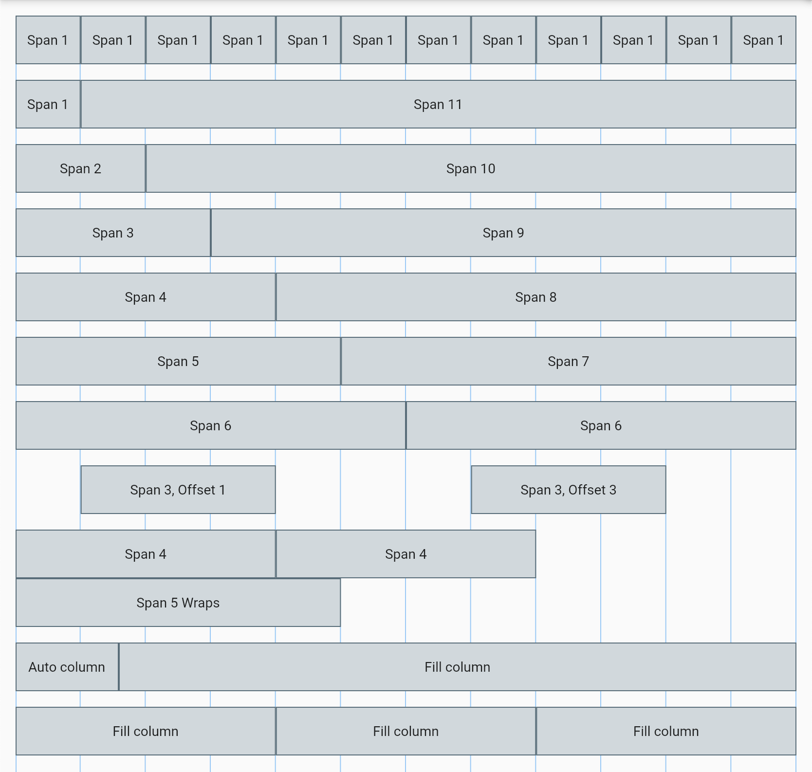 396 |
397 |
398 |
396 |
397 |
398 |
399 |
400 | ### Using `Breakpoints` with responsive grid
401 |
402 | Out of the box, `ResponsiveRow` provides a lot of flexibility to create layouts. But the most important aspect of responsive design is responding to changes in the screen width. This is where responsive grids really shine. All the above arguments (and column type) can be controlled individually at every breakpoint.
403 |
404 | The following example shows how you'd show 4 equal-width Widgets next to one another on large screens, 2 on medium, and stacked on smaller screens.
405 | ```dart
406 | final int span = ResponsiveLayout.value(context, Breakpoints(xs: 12, md: 6, lg: 3));
407 |
408 | ResponsiveRow(
409 | columns: [
410 | ResponsiveColumn.span(span: span, child: Center(child: Text('Column 1'))),
411 | ResponsiveColumn.span(span: span, child: Center(child: Text('Column 2'))),
412 | ResponsiveColumn.span(span: span, child: Center(child: Text('Column 3'))),
413 | ResponsiveColumn.span(span: span, child: Center(child: Text('Column 4'))),
414 | ],
415 | )
416 | ```
417 | The other column arguments can all be controlled using a responsive value in the same way. However, if you need to control the column type, or to control multiple arguments together, you'll want to use the generic `ResponsiveColumn` constructor and `ResponsiveColumnConfig` object. This saves you from creating separate `ResponsiveLayout.value` with their own `Breakpoints` object for each column property.
418 |
419 | `ResponsiveRow` takes a `Breakpoints` object of `ResponsiveColumnConfig` and a child. The following example shows how multiple properties of the column can be adjusted at once depending on the screen size.
420 |
421 | ```dart
422 | final int span = ResponsiveLayout.value(context, Breakpoints(xs: 12, md: 6, lg: 3));
423 |
424 | ResponsiveRow(
425 | columns: [
426 | ResponsiveColumn(
427 | Breakpoints(
428 | xs: ResponsiveColumnConfig(
429 | span: 4,
430 | offset: 2,
431 | order: 1,
432 | crossAxisAlignment: ResponsiveCrossAlignment.center,
433 | ),
434 | md: ResponsiveColumnConfig(
435 | type: ResponsiveColumnType.fill,
436 | order: 2,
437 | ),
438 | ),
439 | child: Container(child: Text('Column 1'), color: Colors.grey, width: double.infinity),
440 | ),
441 | ResponsiveColumn(
442 | Breakpoints(
443 | xs: ResponsiveColumnConfig(
444 | span: 2,
445 | offset: 3,
446 | order: 2,
447 | crossAxisAlignment: ResponsiveCrossAlignment.end,
448 | ),
449 | md: ResponsiveColumnConfig(
450 | type: ResponsiveColumnType.fill,
451 | order: 1,
452 | ),
453 | ),
454 | child: Container(child: Text('Column 2'), color: Colors.grey, width: double.infinity),
455 | ),
456 | ],
457 | ),
458 | ```
459 |
460 | The `ResponsiveColumnConfig` are composable, meaning that properties not defined in one are composed up from the smallest breakpoint to the one currently being shown. In the above example, when the screen is size `md`, the `offset` is still from the config given for the `xs` breakpoint (because no offset was specified for `md`). If a property isn't provided in *any* of the breakpoints, it will be a column with the defaults of `offset`/`order` 0 and `type` `ResponsiveColumnType.auto`.
461 |
462 |
463 |
464 | ### Changing the number of columns in the grid system
465 |
466 | A 12-column grid is a standard because it supports many common scenarios for layouts. It can create layouts with up to 12 individual columns, but also easily creates equal-width column layouts of 1,2,3,4, and 6 columns. A relatively-common scenario that often appears is laying out 5 equal-width columns. In this case you'd have to change the 12-column layout to a multiple of 5. This is easy to accomplish with the `maxColumns` property on `ResponsiveRow`.
467 |
468 | This example generates 5 equal-width columns using a `span` of 2 in a 10-column grid system.
469 | ```dart
470 | ResponsiveRow(
471 | maxColumns: 10,
472 | columns:
473 | List.generate(5, (i) => ResponsiveColumn.span(
474 | span: 2,
475 | child: Container(child: Text('Column $i')),
476 | ),
477 | ),
478 | ),
479 | ```
480 |
481 |
482 |
483 | ## Fluid typography
484 |
485 | Text sizing is a common variable which is adjusted across screen sizes. Text sizes are often adjusted on a per-breakpoint basis and stay consistent throughout each breakpoint. However, a more modern approach often uses the concept of fluid text size. This can make designing for screens more consistent in how text behaves and wraps. Fluid typography uses a minimum and maximum font size which is linearly scaled between a min and max screen width.
486 |
487 | 
488 |
489 |
490 |
491 | ### `FluidText` Widget
492 |
493 | The `FluidText` widget takes 4 required paramaters to define its behavior. It also accepts all parameters from the existing `Text` widget.
494 |
495 | ```dart
496 | FluidText(
497 | 'This text scales from 16 to 36 font size between 375-1024 pixel screen width.',
498 | minFontSize: 16,
499 | maxFontSize: 36,
500 | minWidth: 375,
501 | maxWidth: 1024,
502 | ),
503 | ```
504 |
505 | `FluidText` also supports `RichText` behavior using the `rich()` named constructor.
506 |
507 | ```dart
508 | FluidText.rich(
509 | TextSpan(
510 | text: 'This rich text',
511 | style: const TextStyle(
512 | color: Colors.red,
513 | fontWeight: FontWeight.bold,
514 | ),
515 | children: [
516 | const TextSpan(
517 | text: ' scales in the',
518 | style: const TextStyle(color: Colors.blue),
519 | ),
520 | const TextSpan(
521 | text: ' same way',
522 | style: const TextStyle(fontWeight: FontWeight.w100),
523 | ),
524 | ],
525 | ),
526 | minFontSize: 16,
527 | maxFontSize: 36,
528 | minWidth: 375,
529 | maxWidth: 1024,
530 | ),
531 | ```
532 |
--------------------------------------------------------------------------------
/images/.keep:
--------------------------------------------------------------------------------
https://raw.githubusercontent.com/Calpoog/responsive_toolkit/d1d0d25b2b8ba9be1eb04fb159f797959666d77f/images/.keep
--------------------------------------------------------------------------------
/lib/breakpoints.dart:
--------------------------------------------------------------------------------
1 | import 'responsive_grid.dart';
2 |
3 | /// A set of breakpoints and associated values.
4 | ///
5 | /// The xs breakpoint is required.
6 | class Breakpoints extends BaseBreakpoints {
7 | Breakpoints({
8 | required T xs,
9 | T? sm,
10 | T? md,
11 | T? lg,
12 | T? xl,
13 | T? xxl,
14 | Map? custom,
15 | }) : super(
16 | breakpoints: [0, 576, 768, 992, 1200, 1400],
17 | values: [xs, sm, md, lg, xl, xxl],
18 | custom: custom,
19 | );
20 | }
21 |
22 | /// A set of breakpoints and associated values.
23 | ///
24 | /// The smallest breakpoint must be 0. The value provided for the smallest
25 | /// breakpoint must not be null.
26 | ///
27 | /// Extend this class to create custom breakpoint names and sizes.
28 | class BaseBreakpoints {
29 | /// The integer widths at which layout changes will occur.
30 | final List breakpoints = [];
31 |
32 | /// The values used at each breakpoint.
33 | final List values;
34 |
35 | /// Creates a new set of breakpoints and associated values.
36 | BaseBreakpoints({
37 | required List breakpoints,
38 | required this.values,
39 | Map? custom,
40 | }) {
41 | // Check conditions – an extending class could try to break these rules
42 | if (breakpoints.first != 0) {
43 | throw ArgumentError('The smallest breakpoint width must be 0.');
44 | }
45 | if (values.first == null) {
46 | throw ArgumentError('The smallest breakpoint value cannot be null.');
47 | }
48 |
49 | _combineCustomBreakpoints(breakpoints, custom);
50 | }
51 |
52 | // Combine the custom breakpoints into the existing breakpoint and values
53 | // lists
54 | _combineCustomBreakpoints(List bps, Map? custom) {
55 | breakpoints.addAll(bps);
56 | if (custom != null) {
57 | custom.keys.forEach((size) {
58 | for (int i = 0; i < breakpoints.length; i++) {
59 | if (size < breakpoints[i]) {
60 | breakpoints.insert(i, size);
61 | values.insert(i, custom[size]!);
62 | return;
63 | }
64 | }
65 | breakpoints.add(size);
66 | values.add(custom[size]!);
67 | });
68 | }
69 |
70 | if (values.first is Composable) {
71 | for (int i = breakpoints.length - 1; i >= 0; i--) {
72 | if (values[i] != null) {
73 | values[i] = (values[i] as Composable).compose(
74 | values
75 | .sublist(0, i)
76 | .where((value) => value != null)
77 | .map((e) => e!)
78 | .toList(),
79 | );
80 | }
81 | }
82 | }
83 | }
84 |
85 | /// Returns a new [BaseBreakpoints] with its [values] mapped to a new type.
86 | BaseBreakpoints map(V Function(T?) f) {
87 | return BaseBreakpoints(
88 | breakpoints: breakpoints,
89 | values: values.map((v) => f(v)).toList(),
90 | );
91 | }
92 |
93 | /// Chooses a value based on which of [breakpoints] is satisfied by [width].
94 | T choose(double width) {
95 | for (int i = breakpoints.length - 1; i >= 0; i--) {
96 | if (width >= breakpoints[i] && values[i] != null) {
97 | // It's been checked above that the value is non-null
98 | return values[i]!;
99 | }
100 | }
101 | // it is enforced that the smallest breakpoint Widget/value must be provided
102 | return values[0]!;
103 | }
104 | }
105 |
--------------------------------------------------------------------------------
/lib/responsive_grid.dart:
--------------------------------------------------------------------------------
1 | import 'dart:math' as math;
2 |
3 | import 'package:flutter/foundation.dart';
4 | import 'package:flutter/rendering.dart';
5 | import 'package:flutter/widgets.dart';
6 | import 'package:responsive_toolkit/breakpoints.dart';
7 |
8 | /// A type of responsive column to determine layout in a [ResponsiveRow].
9 | enum ResponsiveColumnType { span, auto, fill }
10 |
11 | /// How [ResponsiveRow] should align objects.
12 | ///
13 | /// Used both to align columns within a run in the main axis as well as to
14 | /// align the runs themselves in the cross axis.
15 | enum ResponsiveAlignment {
16 | /// Place the objects as close to the start of the axis as possible.
17 | start,
18 |
19 | /// Place the objects as close to the end of the axis as possible.
20 | end,
21 |
22 | /// Place the objects as close to the middle of the axis as possible.
23 | center,
24 |
25 | /// Place the free space evenly between the objects.
26 | spaceBetween,
27 |
28 | /// Place the free space evenly between the objects as well as half of that
29 | /// space before and after the first and last objects.
30 | spaceAround,
31 |
32 | /// Place the free space evenly between the objects as well as before and
33 | /// after the first and last objects.
34 | spaceEvenly,
35 | }
36 |
37 | /// How [Responsive] should align columns within a run in the cross axis.
38 | enum ResponsiveCrossAlignment {
39 | /// Place the columns as close to the start of the run in the cross axis as
40 | /// possible.
41 | start,
42 |
43 | /// Place the columns as close to the end of the run in the cross axis as
44 | /// possible.
45 | end,
46 |
47 | /// Place the columns as close to the middle of the run in the cross axis as
48 | /// possible.
49 | center,
50 |
51 | /// Each column will be made to match in height to the tallest column before
52 | /// stetching. The columns will be placed to the start of the run in the cross
53 | /// axis.
54 | stretch,
55 | }
56 |
57 | /// A composable object allowing multiple defitions to be "stacked" where
58 | /// defined properties override existing properties.
59 | abstract class Composable {
60 | /// Creates a new [T] by composing non-null properties of this onto [base]s
61 | /// with any completely undefined properties taken from [fallback]
62 | T compose(List base, [T fallback]);
63 | }
64 |
65 | /// A collection of [ResponsiveColumn] properties intended for use with
66 | /// `Breakpoints`.
67 | ///
68 | /// If [span] is provided, [type] is automatically set to
69 | /// `ResponsiveColumnType.span`.
70 | ///
71 | /// If [span] is provided and [type] is not `ResponsiveColumnType.span`, the
72 | /// [span] is ignored and will be treated as a [type] column.
73 | class ResponsiveColumnConfig implements Composable {
74 | /// The type of column which controls how it fills the row
75 | final ResponsiveColumnType? type;
76 |
77 | /// The number of columns to span
78 | final int? span;
79 |
80 | /// The number of columns to offset (pushes from the left)
81 | final int? offset;
82 |
83 | /// The position of this column within [ResponsiveRow] relative to the [order]
84 | /// property of the other columns.
85 | final int? order;
86 |
87 | /// The alignment of this column within [ResponsiveRow] in the cross axis
88 | /// (vertical direction).
89 | final ResponsiveCrossAlignment? crossAxisAlignment;
90 |
91 | /// Creates a definition for the display of a [ResponsiveColumn]
92 | const ResponsiveColumnConfig({
93 | final ResponsiveColumnType? type,
94 | this.span,
95 | this.offset,
96 | this.order,
97 | this.crossAxisAlignment,
98 | }) : this.type = type ?? (span == null ? null : ResponsiveColumnType.span);
99 |
100 | /// Creates a new `ResponsiveColumnConfig` by composing non-null properties of
101 | /// this onto [base]s with any completely undefined properties taken from
102 | /// [fallback]
103 | @override
104 | ResponsiveColumnConfig compose(List base,
105 | [ResponsiveColumnConfig fallback = const ResponsiveColumnConfig(
106 | type: ResponsiveColumnType.auto, span: 0, offset: 0, order: 0)]) {
107 | List chain = base
108 | ..insert(0, fallback)
109 | ..add(this);
110 | return chain.reduce(
111 | (result, element) => ResponsiveColumnConfig(
112 | type: element.type ?? result.type,
113 | span: element.span ?? result.span,
114 | offset: element.offset ?? result.offset,
115 | order: element.order ?? result.order,
116 | crossAxisAlignment:
117 | element.crossAxisAlignment ?? result.crossAxisAlignment,
118 | ),
119 | );
120 | }
121 |
122 | @override
123 | String toString() {
124 | return 'ResponsiveColumnConfig(type: $type, span: $span, offset: $offset, order: $order)';
125 | }
126 | }
127 |
128 | /// A definition of a column's layout and child for use in [ResponsiveRow].
129 | class ResponsiveColumn {
130 | /// The breakpoints at which the column's configurable properties can change.
131 | final Breakpoints breakpoints;
132 |
133 | /// The child to display in the column.
134 | final Widget child;
135 |
136 | /// Creates a consistent [ResponsiveColumn] from the multiple different ways
137 | /// to call via other constructors.
138 | ResponsiveColumn._({
139 | required ResponsiveColumnType type,
140 | int span = 0,
141 | int offset = 0,
142 | int order = 0,
143 | ResponsiveCrossAlignment? crossAxisAlignment,
144 | required this.child,
145 | }) : breakpoints = Breakpoints(
146 | xs: ResponsiveColumnConfig(
147 | type: type,
148 | span: span,
149 | offset: offset,
150 | order: order,
151 | crossAxisAlignment: crossAxisAlignment,
152 | ),
153 | );
154 |
155 | /// Creates a responsive column with its properties defined in [breakpoints].
156 | ResponsiveColumn(
157 | this.breakpoints, {
158 | required this.child,
159 | });
160 |
161 | /// Creates a column that takes [span] columns of space in the run of a
162 | /// [ResponsiveRow]
163 | ResponsiveColumn.span({
164 | required int span,
165 | int offset = 0,
166 | int order = 0,
167 | ResponsiveCrossAlignment? crossAxisAlignment,
168 | required Widget child,
169 | }) : this._(
170 | child: child,
171 | type: ResponsiveColumnType.span,
172 | offset: offset,
173 | order: order,
174 | span: span,
175 | crossAxisAlignment: crossAxisAlignment,
176 | );
177 |
178 | /// Creates a column that takes the space of its child in the run of a
179 | /// [ResponsiveRow]
180 | ResponsiveColumn.auto({
181 | int offset = 0,
182 | int order = 0,
183 | ResponsiveCrossAlignment? crossAxisAlignment,
184 | required Widget child,
185 | }) : this._(
186 | child: child,
187 | type: ResponsiveColumnType.auto,
188 | offset: offset,
189 | order: order,
190 | crossAxisAlignment: crossAxisAlignment,
191 | );
192 |
193 | /// Creates a column that fills the remaining space in the run of a
194 | /// [ResponsiveRow]
195 | ///
196 | /// A fill column won't become smaller than the `minIntrinsicWidth` of its
197 | /// child.
198 | ///
199 | /// If a run contains one or multiple fill columns, a column will not wrap
200 | /// until all fill columns have been reduced to their smallest size based on
201 | /// their children.
202 | ResponsiveColumn.fill({
203 | int offset = 0,
204 | int order = 0,
205 | ResponsiveCrossAlignment? crossAxisAlignment,
206 | required Widget child,
207 | }) : this._(
208 | child: child,
209 | type: ResponsiveColumnType.fill,
210 | offset: offset,
211 | order: order,
212 | crossAxisAlignment: crossAxisAlignment,
213 | );
214 | }
215 |
216 | /// The parent data used for row layout algorithm.
217 | class _ResponsiveWrapParentData extends ContainerBoxParentData {
218 | ResponsiveColumnConfig? _column;
219 | double _minIntrinsicWidth = 0.0;
220 | double _explicitWidth = 0.0;
221 | }
222 |
223 | /// Information about a run in a [ResponsiveRow]
224 | class _RunMetrics {
225 | double mainAxisExtent = 0;
226 | double crossAxisExtent = 0;
227 | final List children = [];
228 | }
229 |
230 | /// A series of [ResponsiveColumn] which lays out left to right, top to bottom,
231 | /// while wrapping columns based on their responsive grid properties.
232 | ///
233 | /// By default, when using `Breakpoints`, the layout is based on the
234 | /// `MediaQuery.of(context).size.width`.
235 | class ResponsiveRow extends StatelessWidget {
236 | /// A list of [ResponsiveColumn] objects which define the layout and children
237 | /// of the row.
238 | final List columns;
239 |
240 | /// The number of columns the grid system supports.
241 | ///
242 | /// Defaults to 12.
243 | ///
244 | /// This is not the number of columns that [columns] can hold, but instead the
245 | /// number of columns the grid can support when using a [ResponsiveColumn]'s
246 | /// [span] property and type.
247 | final int maxColumns;
248 |
249 | /// How the columns within a run should be placed in the main axis.
250 | ///
251 | /// For example, if [alignment] is [ResponsiveAlignment.center], the columns in
252 | /// each run are grouped together in the center of their run in the main axis.
253 | ///
254 | /// Defaults to [ResponsiveAlignment.start].
255 | ///
256 | /// See also:
257 | ///
258 | /// * [runAlignment], which controls how the runs are placed relative to each
259 | /// other in the cross axis.
260 | /// * [crossAxisAlignment], which controls how the columns within each run
261 | /// are placed relative to each other in the cross axis.
262 | final ResponsiveAlignment alignment;
263 |
264 | /// How much space to place between columns in a run in the main axis.
265 | ///
266 | /// For example, if [spacing] is 10.0, the columns will be spaced at least
267 | /// 10.0 logical pixels apart in the main axis.
268 | ///
269 | /// If there is additional free space in a run (e.g., because the row has a
270 | /// minimum size that is not filled or because some runs are longer than
271 | /// others), the additional free space will be allocated according to the
272 | /// [alignment].
273 | ///
274 | /// Defaults to 0.0.
275 | final double spacing;
276 |
277 | /// How the runs themselves should be placed in the cross axis.
278 | ///
279 | /// For example, if [runAlignment] is [ResponsiveAlignment.center], the runs are
280 | /// grouped together in the center of the overall [ResponsiveRow] in the cross
281 | /// axis.
282 | ///
283 | /// Defaults to [ResponsiveAlignment.start].
284 | ///
285 | /// See also:
286 | ///
287 | /// * [alignment], which controls how the columns within each run are placed
288 | /// relative to each other in the main axis.
289 | /// * [crossAxisAlignment], which controls how the columns within each run
290 | /// are placed relative to each other in the cross axis.
291 | final ResponsiveAlignment runAlignment;
292 |
293 | /// How much space to place between the runs themselves in the cross axis.
294 | ///
295 | /// For example, if [runSpacing] is 10.0, the runs will be spaced at least
296 | /// 10.0 logical pixels apart in the cross axis.
297 | ///
298 | /// If there is additional free space (e.g., because the [ResponsiveRow] has a
299 | /// minimum size that is not filled), the additional free space will be
300 | /// allocated according to the [runAlignment].
301 | ///
302 | /// Defaults to 0.0.
303 | final double runSpacing;
304 |
305 | /// How the columns within a run should be aligned relative to each other in
306 | /// the cross axis.
307 | ///
308 | /// For example, if this is set to [ResponsiveCrossAlignment.end], then the
309 | /// children within each run will have their bottom edges aligned to the
310 | /// bottom edge of the run.
311 | ///
312 | /// Defaults to [ResponsiveCrossAlignment.start].
313 | ///
314 | /// See also:
315 | ///
316 | /// * [alignment], which controls how the columns within each run are placed
317 | /// relative to each other in the main axis.
318 | /// * [runAlignment], which controls how the runs are placed relative to each
319 | /// other in the cross axis.
320 | final ResponsiveCrossAlignment crossAxisAlignment;
321 |
322 | /// How content that overflows the row is clipped.
323 | ///
324 | /// Defaults to `Clip.none`.
325 | ///
326 | /// e.g. if the constraints to the row force it smaller than the total height
327 | /// of all its runs, some columns will overflow the bottom of the row.
328 | final Clip clipBehavior;
329 |
330 | /// Whether to choose breakpoints for its columns based on incoming
331 | /// constraints.
332 | ///
333 | /// Defaults to `false` (uses `MediaQuery.of(context).size.width`).
334 | final bool breakOnConstraints;
335 |
336 | /// Creates a row of responsive columns
337 | ///
338 | /// [maxColumns] must be greater than 1.
339 | ResponsiveRow({
340 | Key? key,
341 | required this.columns,
342 | this.alignment = ResponsiveAlignment.start,
343 | this.spacing = 0.0,
344 | this.runAlignment = ResponsiveAlignment.start,
345 | this.runSpacing = 0.0,
346 | this.crossAxisAlignment = ResponsiveCrossAlignment.start,
347 | this.clipBehavior = Clip.none,
348 | this.breakOnConstraints = false,
349 | this.maxColumns = 12,
350 | }) : assert(maxColumns > 1);
351 |
352 | @override
353 | Widget build(BuildContext context) {
354 | return _ResponsiveRow(
355 | screenSize: breakOnConstraints ? null : MediaQuery.of(context).size,
356 | columns: columns,
357 | alignment: alignment,
358 | spacing: spacing,
359 | runAlignment: runAlignment,
360 | runSpacing: runSpacing,
361 | crossAxisAlignment: crossAxisAlignment,
362 | clipBehavior: clipBehavior,
363 | maxColumns: maxColumns,
364 | );
365 | }
366 | }
367 |
368 | /// The true responsive row containing layout logic to size based on children.
369 | class _ResponsiveRow extends MultiChildRenderObjectWidget {
370 | final List columns;
371 | final ResponsiveAlignment alignment;
372 | final double spacing;
373 | final ResponsiveAlignment runAlignment;
374 | final double runSpacing;
375 | final ResponsiveCrossAlignment crossAxisAlignment;
376 | final Clip clipBehavior;
377 | final Size? screenSize;
378 | final int maxColumns;
379 |
380 | _ResponsiveRow({
381 | Key? key,
382 | required this.columns,
383 | this.screenSize,
384 | this.maxColumns = 12,
385 | this.alignment = ResponsiveAlignment.start,
386 | this.spacing = 0.0,
387 | this.runAlignment = ResponsiveAlignment.start,
388 | this.runSpacing = 0.0,
389 | this.crossAxisAlignment = ResponsiveCrossAlignment.start,
390 | this.clipBehavior = Clip.none,
391 | }) : super(key: key, children: columns.map((col) => col.child).toList());
392 |
393 | @override
394 | _ResponsiveRenderWrap createRenderObject(BuildContext context) {
395 | return _ResponsiveRenderWrap(
396 | screenSize: screenSize,
397 | maxColumns: maxColumns,
398 | columns: columns,
399 | alignment: alignment,
400 | spacing: spacing,
401 | runAlignment: runAlignment,
402 | runSpacing: runSpacing,
403 | crossAxisAlignment: crossAxisAlignment,
404 | clipBehavior: clipBehavior,
405 | );
406 | }
407 |
408 | @override
409 | void updateRenderObject(
410 | BuildContext context, _ResponsiveRenderWrap renderObject) {
411 | renderObject
412 | ..screenSize = screenSize
413 | ..maxColumns = maxColumns
414 | ..columns = columns
415 | ..alignment = alignment
416 | ..spacing = spacing
417 | ..runAlignment = runAlignment
418 | ..runSpacing = runSpacing
419 | ..crossAxisAlignment = crossAxisAlignment
420 | ..clipBehavior = clipBehavior;
421 | }
422 | }
423 |
424 | /// A heavily modified version of wrap to support fill columns, breakpoints,
425 | /// and 12*-column grid.
426 | class _ResponsiveRenderWrap extends RenderBox
427 | with
428 | ContainerRenderObjectMixin,
429 | RenderBoxContainerDefaultsMixin {
430 | /// Creates a wrap render object.
431 | ///
432 | /// By default, the wrap layout is horizontal and both the children and the
433 | /// runs are aligned to the start.
434 | _ResponsiveRenderWrap({
435 | required List columns,
436 | Size? screenSize,
437 | required int maxColumns,
438 | List? children,
439 | ResponsiveAlignment alignment = ResponsiveAlignment.start,
440 | double spacing = 0.0,
441 | ResponsiveAlignment runAlignment = ResponsiveAlignment.start,
442 | double runSpacing = 0.0,
443 | ResponsiveCrossAlignment crossAxisAlignment =
444 | ResponsiveCrossAlignment.start,
445 | Clip clipBehavior = Clip.none,
446 | }) : _maxColumns = maxColumns,
447 | _columns = columns,
448 | _alignment = alignment,
449 | _spacing = spacing,
450 | _runAlignment = runAlignment,
451 | _runSpacing = runSpacing,
452 | _crossAxisAlignment = crossAxisAlignment,
453 | _clipBehavior = clipBehavior {
454 | _screenSize = screenSize;
455 | addAll(children);
456 | }
457 |
458 | int get maxColumns => _maxColumns;
459 | int _maxColumns;
460 | set maxColumns(int value) {
461 | if (_maxColumns == value) return;
462 | _maxColumns = value;
463 | markNeedsLayout();
464 | }
465 |
466 | Size? get screenSize => _screenSize;
467 | Size? _screenSize;
468 | set screenSize(Size? value) {
469 | if (_screenSize == value) return;
470 | _screenSize = value ?? constraints.biggest;
471 | markNeedsLayout();
472 | }
473 |
474 | List get columns => _columns;
475 | List _columns;
476 | set columns(List value) {
477 | if (_columns == value) return;
478 | _columns = value;
479 | markNeedsLayout();
480 | }
481 |
482 | ResponsiveAlignment get alignment => _alignment;
483 | ResponsiveAlignment _alignment;
484 | set alignment(ResponsiveAlignment value) {
485 | if (_alignment == value) return;
486 | _alignment = value;
487 | markNeedsLayout();
488 | }
489 |
490 | double get spacing => _spacing;
491 | double _spacing;
492 | set spacing(double value) {
493 | if (_spacing == value) return;
494 | _spacing = value;
495 | markNeedsLayout();
496 | }
497 |
498 | ResponsiveAlignment get runAlignment => _runAlignment;
499 | ResponsiveAlignment _runAlignment;
500 | set runAlignment(ResponsiveAlignment value) {
501 | if (_runAlignment == value) return;
502 | _runAlignment = value;
503 | markNeedsLayout();
504 | }
505 |
506 | double get runSpacing => _runSpacing;
507 | double _runSpacing;
508 | set runSpacing(double value) {
509 | if (_runSpacing == value) return;
510 | _runSpacing = value;
511 | markNeedsLayout();
512 | }
513 |
514 | ResponsiveCrossAlignment get crossAxisAlignment => _crossAxisAlignment;
515 | ResponsiveCrossAlignment _crossAxisAlignment;
516 | set crossAxisAlignment(ResponsiveCrossAlignment value) {
517 | if (_crossAxisAlignment == value) return;
518 | _crossAxisAlignment = value;
519 | markNeedsLayout();
520 | }
521 |
522 | Clip get clipBehavior => _clipBehavior;
523 | Clip _clipBehavior = Clip.none;
524 | set clipBehavior(Clip value) {
525 | if (value != _clipBehavior) {
526 | _clipBehavior = value;
527 | markNeedsPaint();
528 | markNeedsSemanticsUpdate();
529 | }
530 | }
531 |
532 | @override
533 | void setupParentData(RenderBox child) {
534 | if (child.parentData is! _ResponsiveWrapParentData)
535 | child.parentData = _ResponsiveWrapParentData();
536 | }
537 |
538 | @override
539 | double computeMinIntrinsicWidth(double height) {
540 | double width = 0.0;
541 | RenderBox? child = firstChild;
542 | while (child != null) {
543 | width = math.max(width, child.getMinIntrinsicWidth(double.infinity));
544 | child = childAfter(child);
545 | }
546 | return width;
547 | }
548 |
549 | @override
550 | double computeMaxIntrinsicWidth(double height) {
551 | double width = 0.0;
552 | RenderBox? child = firstChild;
553 | while (child != null) {
554 | width += child.getMaxIntrinsicWidth(double.infinity);
555 | child = childAfter(child);
556 | }
557 | return width;
558 | }
559 |
560 | @override
561 | double computeMinIntrinsicHeight(double width) {
562 | return computeDryLayout(BoxConstraints(maxWidth: width)).height;
563 | }
564 |
565 | @override
566 | double computeMaxIntrinsicHeight(double width) {
567 | return computeDryLayout(BoxConstraints(maxWidth: width)).height;
568 | }
569 |
570 | @override
571 | double? computeDistanceToActualBaseline(TextBaseline baseline) {
572 | return defaultComputeDistanceToHighestActualBaseline(baseline);
573 | }
574 |
575 | double _getMainAxisExtent(Size childSize) {
576 | return childSize.width;
577 | }
578 |
579 | double _getCrossAxisExtent(Size childSize) {
580 | return childSize.height;
581 | }
582 |
583 | double _getChildCrossAxisOffset(ResponsiveColumnConfig column,
584 | double runCrossAxisExtent, double childCrossAxisExtent) {
585 | final double freeSpace = runCrossAxisExtent - childCrossAxisExtent;
586 | final ResponsiveCrossAlignment align =
587 | column.crossAxisAlignment ?? crossAxisAlignment;
588 | switch (align) {
589 | case ResponsiveCrossAlignment.start:
590 | case ResponsiveCrossAlignment.stretch:
591 | return 0.0;
592 | case ResponsiveCrossAlignment.end:
593 | return freeSpace;
594 | case ResponsiveCrossAlignment.center:
595 | return freeSpace / 2.0;
596 | }
597 | }
598 |
599 | double _getWidth(int size, double mainAxisLimit) {
600 | return size / maxColumns * mainAxisLimit;
601 | }
602 |
603 | _ResponsiveWrapParentData _getParentData(RenderBox child) {
604 | return child.parentData as _ResponsiveWrapParentData;
605 | }
606 |
607 | _resetParentData(RenderBox child) {
608 | final parentData = child.parentData as _ResponsiveWrapParentData;
609 | parentData._explicitWidth = 0.0;
610 | parentData._minIntrinsicWidth = 0.0;
611 | }
612 |
613 | bool _hasVisualOverflow = false;
614 |
615 | @override
616 | Size computeDryLayout(BoxConstraints constraints) {
617 | return _performLayout(dry: true)!;
618 | }
619 |
620 | @override
621 | void performLayout() {
622 | _performLayout();
623 | }
624 |
625 | Size _layoutChild(RenderBox child, BoxConstraints constraints,
626 | {bool dry = false}) {
627 | late final Size childSize;
628 | if (dry) {
629 | childSize = child.getDryLayout(constraints);
630 | } else {
631 | child.layout(constraints, parentUsesSize: true);
632 | childSize = child.size;
633 | }
634 | return childSize;
635 | }
636 |
637 | Size? _performLayout({bool dry = false}) {
638 | final BoxConstraints constraints = this.constraints;
639 | late final Size size;
640 |
641 | _hasVisualOverflow = false;
642 | RenderBox? child = firstChild;
643 | if (child == null) {
644 | size = constraints.smallest;
645 | if (!dry) {
646 | this.size = size;
647 | }
648 | return size;
649 | }
650 |
651 | final double spacing = this.spacing;
652 | final double runSpacing = this.runSpacing;
653 | final List<_RunMetrics> runMetrics = [_RunMetrics()];
654 |
655 | double mainAxisLimit = constraints.maxWidth + spacing;
656 | double mainAxisExtent = 0.0;
657 | double crossAxisExtent = 0.0;
658 |
659 | int childIndex = 0;
660 | // Choose breakpoints up front because order changes layout
661 | while (child != null) {
662 | final childParentData = _getParentData(child);
663 | childParentData._column = columns
664 | .elementAt(childIndex)
665 | .breakpoints
666 | .choose(_screenSize?.width ?? constraints.biggest.width);
667 | assert(
668 | childParentData._column!.span! >= 0 &&
669 | childParentData._column!.span! <= maxColumns,
670 | 'Column with config ${childParentData._column} has a span outside the range [0, $maxColumns]');
671 | assert(
672 | childParentData._column!.offset! >= 0 &&
673 | childParentData._column!.offset! < maxColumns,
674 | 'Column with config ${childParentData._column} has an offset outside the range [0, ${maxColumns - 1}]');
675 | child = childParentData.nextSibling;
676 | childIndex++;
677 | }
678 |
679 | getChildrenAsList()
680 | ..sort((a, b) =>
681 | _getParentData(a)._column!.order! - _getParentData(b)._column!.order!)
682 | ..forEach((child) {
683 | _resetParentData(child);
684 | final _ResponsiveWrapParentData childParentData = _getParentData(child);
685 | final ResponsiveColumnConfig column = childParentData._column!;
686 |
687 | // The buffer space (offset and spacing) included for fit calculations
688 | double buffer = _getWidth(column.offset!, mainAxisLimit) + spacing;
689 |
690 | double childMainAxisExtent = 0.0;
691 | double childCrossAxisExtent = 0.0;
692 | if (column.type == ResponsiveColumnType.fill) {
693 | childMainAxisExtent =
694 | child.getMinIntrinsicWidth(constraints.maxHeight);
695 | childParentData._explicitWidth = childMainAxisExtent;
696 | // Remember the min width for later to redistribute free space
697 | childParentData._minIntrinsicWidth = childMainAxisExtent;
698 | // For the purposes of "what fits" in the run, the buffer is included
699 | childMainAxisExtent += buffer;
700 | } else {
701 | late final Size childSize;
702 | if (column.type == ResponsiveColumnType.auto) {
703 | // Auto columns are constrained to a full run width always
704 | childSize = _layoutChild(
705 | child, BoxConstraints(maxWidth: constraints.maxWidth - buffer),
706 | dry: dry);
707 | childParentData._explicitWidth = _getMainAxisExtent(childSize);
708 | childMainAxisExtent = childParentData._explicitWidth + buffer;
709 | }
710 | // A span column is always the size it specifies (it's guaranteed to be < run width)
711 | else {
712 | childMainAxisExtent =
713 | _getWidth(column.span!, mainAxisLimit) - spacing;
714 | childParentData._explicitWidth = childMainAxisExtent;
715 | childSize = _layoutChild(
716 | child, BoxConstraints.tightFor(width: childMainAxisExtent),
717 | dry: dry);
718 | childMainAxisExtent += buffer;
719 | }
720 | childCrossAxisExtent = _getCrossAxisExtent(childSize);
721 | }
722 |
723 | // Save some data for later on the child
724 | childParentData._column = column;
725 |
726 | // A column runs over the remaining space
727 | if ((runMetrics.last.mainAxisExtent + childMainAxisExtent)
728 | .roundToDouble() >
729 | mainAxisLimit.roundToDouble()) {
730 | _layoutFillColumns(runMetrics.last, mainAxisLimit, dry: dry);
731 | mainAxisExtent =
732 | math.max(mainAxisExtent, runMetrics.last.mainAxisExtent);
733 | crossAxisExtent += runMetrics.last.crossAxisExtent + runSpacing;
734 | runMetrics.add(_RunMetrics());
735 | }
736 |
737 | // Update run metrics
738 | runMetrics.last
739 | ..mainAxisExtent += childMainAxisExtent
740 | ..crossAxisExtent =
741 | math.max(runMetrics.last.crossAxisExtent, childCrossAxisExtent)
742 | ..children.add(child);
743 | });
744 |
745 | _layoutFillColumns(runMetrics.last, mainAxisLimit, dry: dry);
746 | mainAxisExtent = math.max(mainAxisExtent, runMetrics.last.mainAxisExtent);
747 | crossAxisExtent += runMetrics.last.crossAxisExtent;
748 |
749 | final int runCount = runMetrics.length;
750 |
751 | size = constraints.constrain(Size(mainAxisExtent, crossAxisExtent));
752 | if (dry) {
753 | return size;
754 | } else {
755 | this.size = size;
756 | }
757 |
758 | double containerMainAxisExtent = size.width;
759 | double containerCrossAxisExtent = size.height;
760 |
761 | _hasVisualOverflow = containerMainAxisExtent < mainAxisExtent ||
762 | containerCrossAxisExtent < crossAxisExtent;
763 |
764 | final double crossAxisFreeSpace =
765 | math.max(0.0, containerCrossAxisExtent - crossAxisExtent);
766 | double runLeadingSpace = 0.0;
767 | double runBetweenSpace = 0.0;
768 | switch (runAlignment) {
769 | case ResponsiveAlignment.start:
770 | break;
771 | case ResponsiveAlignment.end:
772 | runLeadingSpace = crossAxisFreeSpace;
773 | break;
774 | case ResponsiveAlignment.center:
775 | runLeadingSpace = crossAxisFreeSpace / 2.0;
776 | break;
777 | case ResponsiveAlignment.spaceBetween:
778 | runBetweenSpace =
779 | runCount > 1 ? crossAxisFreeSpace / (runCount - 1) : 0.0;
780 | break;
781 | case ResponsiveAlignment.spaceAround:
782 | runBetweenSpace = crossAxisFreeSpace / runCount;
783 | runLeadingSpace = runBetweenSpace / 2.0;
784 | break;
785 | case ResponsiveAlignment.spaceEvenly:
786 | runBetweenSpace = crossAxisFreeSpace / (runCount + 1);
787 | runLeadingSpace = runBetweenSpace;
788 | break;
789 | }
790 |
791 | runBetweenSpace += runSpacing;
792 | double crossAxisOffset = runLeadingSpace;
793 |
794 | for (int i = 0; i < runCount; ++i) {
795 | final _RunMetrics metrics = runMetrics[i];
796 | final double runMainAxisExtent = metrics.mainAxisExtent;
797 | final double runCrossAxisExtent = metrics.crossAxisExtent;
798 | final int childCount = metrics.children.length;
799 |
800 | final double mainAxisFreeSpace =
801 | math.max(0.0, containerMainAxisExtent - runMainAxisExtent + spacing);
802 | double childLeadingSpace = 0.0;
803 | double childBetweenSpace = 0.0;
804 |
805 | switch (alignment) {
806 | case ResponsiveAlignment.start:
807 | break;
808 | case ResponsiveAlignment.end:
809 | childLeadingSpace = mainAxisFreeSpace;
810 | break;
811 | case ResponsiveAlignment.center:
812 | childLeadingSpace = mainAxisFreeSpace / 2.0;
813 | break;
814 | case ResponsiveAlignment.spaceBetween:
815 | childBetweenSpace =
816 | childCount > 1 ? mainAxisFreeSpace / (childCount - 1) : 0.0;
817 | break;
818 | case ResponsiveAlignment.spaceAround:
819 | childBetweenSpace = mainAxisFreeSpace / childCount;
820 | childLeadingSpace = childBetweenSpace / 2.0;
821 | break;
822 | case ResponsiveAlignment.spaceEvenly:
823 | childBetweenSpace = mainAxisFreeSpace / (childCount + 1);
824 | childLeadingSpace = childBetweenSpace;
825 | break;
826 | }
827 |
828 | childBetweenSpace += spacing;
829 | double childMainPosition = childLeadingSpace;
830 |
831 | metrics.children.forEach((child) {
832 | final _ResponsiveWrapParentData childParentData = _getParentData(child);
833 | final ResponsiveColumnConfig column = childParentData._column!;
834 | final double childMainAxisOffset =
835 | _getWidth(childParentData._column!.offset!, mainAxisLimit);
836 | final double childCrossAxisExtent = _getCrossAxisExtent(child.size);
837 | final double childCrossAxisOffset = _getChildCrossAxisOffset(
838 | column, runCrossAxisExtent, childCrossAxisExtent);
839 | childParentData.offset = Offset(
840 | childMainPosition + childMainAxisOffset,
841 | crossAxisOffset + childCrossAxisOffset,
842 | );
843 | childMainPosition += childParentData._explicitWidth +
844 | childMainAxisOffset +
845 | childBetweenSpace;
846 |
847 | // If the cross axis is supposed to stretch – re-layout children that aren't full height
848 | final align = column.crossAxisAlignment ?? crossAxisAlignment;
849 | if (align == ResponsiveCrossAlignment.stretch &&
850 | childCrossAxisExtent < runCrossAxisExtent) {
851 | child.layout(BoxConstraints.tightFor(
852 | width: _getMainAxisExtent(child.size),
853 | height: runCrossAxisExtent));
854 | }
855 | });
856 |
857 | crossAxisOffset += runCrossAxisExtent + runBetweenSpace;
858 | }
859 |
860 | return size;
861 | }
862 |
863 | _layoutFillColumns(_RunMetrics run, double mainAxisLimit,
864 | {bool dry = false}) {
865 | final fillColumns = run.children
866 | .where((column) =>
867 | _getParentData(column)._column!.type == ResponsiveColumnType.fill)
868 | .toList();
869 |
870 | // Fill columns in a single run are allowed to be different widths if their
871 | // min width prevents one from getting smaller
872 | // Remaining gets space gets distributed from smallest to largest until they
873 | // are all equal width, then distributed further evenly among them.
874 |
875 | if (fillColumns.length > 0) {
876 | double freeSpace = mainAxisLimit - run.mainAxisExtent;
877 |
878 | // Space distribution logic only matters when there's more than one in the row
879 | if (fillColumns.length > 1) {
880 | final List sorted = List.from(fillColumns);
881 | sorted.sort((a, b) {
882 | final double diff = _getParentData(a)._minIntrinsicWidth -
883 | _getParentData(b)._minIntrinsicWidth;
884 |
885 | return diff < 0 ? -1 : (diff > 0 ? 1 : 0);
886 | });
887 |
888 | for (int i = 0; i < sorted.length; i++) {
889 | final double a = _getParentData(sorted[i])._minIntrinsicWidth;
890 | final double b = i == sorted.length - 1
891 | ? double.infinity
892 | : _getParentData(sorted[i + 1])._minIntrinsicWidth;
893 | final double diff = b - a;
894 | final int multiplier = i + 1;
895 | final double adj = math.min(diff * multiplier, freeSpace);
896 |
897 | for (int j = i; j >= 0; j--) {
898 | final childParentData = _getParentData(sorted[j]);
899 | childParentData._explicitWidth += adj / multiplier;
900 | }
901 | freeSpace -= adj;
902 |
903 | if (freeSpace == 0) break;
904 | }
905 | } else {
906 | _getParentData(fillColumns.first)._explicitWidth += freeSpace;
907 | }
908 |
909 | fillColumns.forEach((child) {
910 | final Size childSize = _layoutChild(
911 | child,
912 | BoxConstraints.tightFor(
913 | width: _getParentData(child)._explicitWidth),
914 | dry: dry);
915 | // Update run metrics now that a child in the run was sized
916 | run.crossAxisExtent =
917 | math.max(run.crossAxisExtent, _getCrossAxisExtent(childSize));
918 | });
919 | // The run main axis is always full size because it had at least one fill column
920 | run.mainAxisExtent = mainAxisLimit;
921 | }
922 | }
923 |
924 | @override
925 | bool hitTestChildren(BoxHitTestResult result, {required Offset position}) {
926 | return defaultHitTestChildren(result, position: position);
927 | }
928 |
929 | @override
930 | void paint(PaintingContext context, Offset offset) {
931 | if (_hasVisualOverflow && clipBehavior != Clip.none) {
932 | _clipRectLayer = context.pushClipRect(
933 | needsCompositing,
934 | offset,
935 | Offset.zero & size,
936 | defaultPaint,
937 | clipBehavior: clipBehavior,
938 | oldLayer: _clipRectLayer,
939 | );
940 | } else {
941 | _clipRectLayer = null;
942 | defaultPaint(context, offset);
943 | }
944 | }
945 |
946 | ClipRectLayer? _clipRectLayer;
947 |
948 | @override
949 | void debugFillProperties(DiagnosticPropertiesBuilder properties) {
950 | super.debugFillProperties(properties);
951 | properties.add(IterableProperty('columns', columns));
952 | properties.add(EnumProperty('alignment', alignment));
953 | properties.add(DoubleProperty('spacing', spacing));
954 | properties
955 | .add(EnumProperty('runAlignment', runAlignment));
956 | properties.add(DoubleProperty('runSpacing', runSpacing));
957 | properties.add(DoubleProperty('crossAxisAlignment', runSpacing));
958 | }
959 | }
960 |
--------------------------------------------------------------------------------
/lib/responsive_layout.dart:
--------------------------------------------------------------------------------
1 | import 'package:flutter/widgets.dart';
2 |
3 | import 'breakpoints.dart';
4 |
5 | /// A Widget that chooses another Widget to display based on the screen size.
6 | ///
7 | /// The default screen axis is horizontal (screen width). The displayed Widget
8 | /// is chosen based on the greatest provided breakpoint that satisfies
9 | /// `current screen [axis] size > breakpoint`
10 | ///
11 | /// The default breakpoints are:
12 | /// * xs: < 576
13 | /// * sm: >= 578
14 | /// * md: >= 768
15 | /// * lg: >= 992
16 | /// * xl: >= 1200
17 | /// * xxl: >= 1400
18 | ///
19 | /// A Text Widget reading '>= 768' will be displayed by the following example
20 | /// if the screen width is 800px. If the width was 1150px the result would still
21 | /// be the same as no 'lg' breakpoint was provided and it defaults to the
22 | /// next smallest. One-off sizes can be provided using a [custom] mapping.
23 | /// ```
24 | /// ResponsiveLayout(
25 | /// Breakpoints(
26 | /// sm: Text('>= 576'),
27 | /// md: Text('>= 768'),
28 | /// xl: Text('>= 1200'),
29 | /// custom: { 1600: Text('>= 1600') },
30 | /// ),
31 | /// );
32 | /// ```
33 | ///
34 | /// WidgetBuilders can be used instead of Widgets to avoid building the Widget
35 | /// prior to [ResponsiveLayout] deciding which to display.
36 | /// ```
37 | /// ResponsiveLayout.builder(
38 | /// Breakpoints(
39 | /// sm: (context) => Text('>= 576'),
40 | /// md: (context) => Text('>= 768'),
41 | /// xl: (context) => Text('>= 1200'),
42 | /// custom: { 1600: (context) => Text('>= 1600') },
43 | /// ),
44 | /// );
45 | /// ```
46 | class ResponsiveLayout extends StatelessWidget {
47 | final BaseBreakpoints _breakpoints;
48 | final Axis axis;
49 |
50 | /// Creates a Widget that chooses another Widget to display based on the
51 | /// screen size.
52 | ResponsiveLayout(
53 | BaseBreakpoints breakpoints, {
54 | this.axis = Axis.horizontal,
55 | Key? key,
56 | }) : _breakpoints = breakpoints.map(
57 | (widget) => widget == null ? null : (BuildContext _) => widget);
58 |
59 | /// Creates a Widget that chooses another Widget to display based on the
60 | /// screen size using a WidgetBuilder.
61 | ResponsiveLayout.builder(
62 | BaseBreakpoints breakpoints, {
63 | this.axis = Axis.horizontal,
64 | Key? key,
65 | }) : _breakpoints = breakpoints;
66 |
67 | static T value(
68 | BuildContext context,
69 | BaseBreakpoints breakpoints, {
70 | Axis axis = Axis.horizontal,
71 | }) {
72 | final Size size = MediaQuery.of(context).size;
73 | return breakpoints.choose(
74 | axis == Axis.horizontal ? size.width : size.height,
75 | )!;
76 | }
77 |
78 | @override
79 | Widget build(BuildContext context) {
80 | final Size size = MediaQuery.of(context).size;
81 | return _breakpoints.choose(
82 | axis == Axis.horizontal ? size.width : size.height,
83 | )!(context);
84 | }
85 | }
86 |
87 | /// A Widget that chooses another Widget to display based on the max constraint
88 | /// on [axis]
89 | ///
90 | /// The default screen axis is horizontal (screen width). The displayed Widget
91 | /// is chosen based on the greatest provided breakpoint that satisfies
92 | /// `current constraint max width/height > breakpoint`
93 | ///
94 | /// The default breakpoints are:
95 | /// * xs: < 576
96 | /// * sm: >= 578
97 | /// * md: >= 768
98 | /// * lg: >= 992
99 | /// * xl: >= 1200
100 | /// * xxl: >= 1400
101 | ///
102 | /// A Text Widget reading '>= 768' will be displayed by the following example
103 | /// if the constrain max width is 800px. If the width was 1150px the result
104 | /// would still be the same as no 'lg' breakpoint was provided and it defaults
105 | /// to the next smallest. One-off sizes can be provided using a [custom]
106 | /// mapping.
107 | /// ```
108 | /// ResponsiveConstraintLayout(
109 | /// Breakpoints(
110 | /// sm: Text('>= 576'),
111 | /// md: Text('>= 768'),
112 | /// xl: Text('>= 1200'),
113 | /// custom: { 1600: Text('>= 1600') },
114 | /// ),
115 | /// );
116 | /// ```
117 | ///
118 | /// WidgetBuilders can be used instead of Widgets to avoid building the Widget
119 | /// prior to [ResponsiveConstraintLayout] deciding which to display.
120 | /// ```
121 | /// ResponsiveConstraintLayout.builder(
122 | /// Breakpoints(
123 | /// sm: (context) => Text('>= 576'),
124 | /// md: (context) => Text('>= 768'),
125 | /// xl: (context) => Text('>= 1200'),
126 | /// custom: { 1600: (context) => Text('>= 1600') },
127 | /// ),
128 | /// );
129 | /// ```
130 | class ResponsiveConstraintLayout extends ResponsiveLayout {
131 | /// Creates a Widget that chooses another Widget to display based on
132 | /// constraint breakpoints.
133 | ResponsiveConstraintLayout(
134 | BaseBreakpoints breakpoints, {
135 | Axis axis = Axis.horizontal,
136 | Key? key,
137 | }) : super(breakpoints, axis: axis, key: key);
138 |
139 | /// Creates a Widget that chooses another Widget to display based on
140 | /// constraint breakpoints using a WidgetBuilder.
141 | ResponsiveConstraintLayout.builder(
142 | BaseBreakpoints breakpoints, {
143 | Axis axis = Axis.horizontal,
144 | Key? key,
145 | }) : super.builder(breakpoints, axis: axis, key: key);
146 |
147 | @override
148 | Widget build(BuildContext context) {
149 | return LayoutBuilder(
150 | builder: (_, constraints) => _breakpoints.choose(
151 | axis == Axis.horizontal ? constraints.maxWidth : constraints.maxHeight,
152 | )!(context),
153 | );
154 | }
155 | }
156 |
--------------------------------------------------------------------------------
/lib/responsive_text.dart:
--------------------------------------------------------------------------------
1 | import 'package:flutter/material.dart';
2 |
3 | class FluidText extends Text {
4 | final int minWidth;
5 | final int maxWidth;
6 | final double minFontSize;
7 | final double maxFontSize;
8 | final TextStyle _style;
9 |
10 | FluidText(
11 | super.data, {
12 | required this.minWidth,
13 | required this.maxWidth,
14 | required this.minFontSize,
15 | required this.maxFontSize,
16 | super.key,
17 | TextStyle? style,
18 | super.strutStyle,
19 | super.textAlign,
20 | super.textDirection,
21 | super.locale,
22 | super.softWrap,
23 | super.overflow,
24 | super.textScaleFactor,
25 | super.maxLines,
26 | super.semanticsLabel,
27 | super.textWidthBasis,
28 | super.textHeightBehavior,
29 | }) : _style = style ?? TextStyle();
30 |
31 | FluidText.rich(
32 | InlineSpan textSpan, {
33 | required this.minWidth,
34 | required this.maxWidth,
35 | required this.minFontSize,
36 | required this.maxFontSize,
37 | super.key,
38 | super.style,
39 | super.strutStyle,
40 | super.textAlign,
41 | super.textDirection,
42 | super.locale,
43 | super.softWrap,
44 | super.overflow,
45 | super.textScaleFactor,
46 | super.maxLines,
47 | super.semanticsLabel,
48 | super.textWidthBasis,
49 | super.textHeightBehavior,
50 | }) : _style = style ?? TextStyle(),
51 | super.rich(textSpan);
52 |
53 | @override
54 | Widget build(BuildContext context) {
55 | final width = MediaQuery.of(context).size.width;
56 |
57 | return DefaultTextStyle.merge(
58 | style: _style.merge(TextStyle(
59 | fontSize: minFontSize +
60 | (maxFontSize - minFontSize) *
61 | ((width - minWidth) / (maxWidth - minWidth)).clamp(0, 1))),
62 | child: Builder(builder: (context) => super.build(context)),
63 | );
64 | }
65 | }
66 |
--------------------------------------------------------------------------------
/lib/responsive_toolkit.dart:
--------------------------------------------------------------------------------
1 | library responsive_toolkit;
2 |
3 | export 'breakpoints.dart';
4 | export 'responsive_layout.dart';
5 | export 'responsive_grid.dart';
6 | export 'responsive_text.dart';
7 |
--------------------------------------------------------------------------------
/pubspec.yaml:
--------------------------------------------------------------------------------
1 | name: responsive_toolkit
2 | description: Easy-to-use responsive tools for Flutter. Simplify layouts across screens of any size and shape.
3 | version: 0.0.6
4 | homepage: https://github.com/Calpoog/responsive_toolkit
5 |
6 | environment:
7 | sdk: ">=2.17.0 <4.0.0"
8 |
9 | dependencies:
10 | flutter:
11 | sdk: flutter
12 |
13 | dev_dependencies:
14 | golden_toolkit: ^0.15.0
15 | flutter_test:
16 | sdk: flutter
17 |
18 | flutter:
19 |
--------------------------------------------------------------------------------
/test/flutter_test_config.dart:
--------------------------------------------------------------------------------
1 | import 'dart:async';
2 |
3 | import 'package:golden_toolkit/golden_toolkit.dart';
4 |
5 | Future testExecutable(FutureOr Function() testMain) async {
6 | await loadAppFonts();
7 | return testMain();
8 | }
9 |
--------------------------------------------------------------------------------
/test/goldens/auto_columns.png:
--------------------------------------------------------------------------------
https://raw.githubusercontent.com/Calpoog/responsive_toolkit/d1d0d25b2b8ba9be1eb04fb159f797959666d77f/test/goldens/auto_columns.png
--------------------------------------------------------------------------------
/test/goldens/fill_columns.png:
--------------------------------------------------------------------------------
https://raw.githubusercontent.com/Calpoog/responsive_toolkit/d1d0d25b2b8ba9be1eb04fb159f797959666d77f/test/goldens/fill_columns.png
--------------------------------------------------------------------------------
/test/goldens/responsive_row_breakpoints.png:
--------------------------------------------------------------------------------
https://raw.githubusercontent.com/Calpoog/responsive_toolkit/d1d0d25b2b8ba9be1eb04fb159f797959666d77f/test/goldens/responsive_row_breakpoints.png
--------------------------------------------------------------------------------
/test/goldens/responsive_text_fluid_text.png:
--------------------------------------------------------------------------------
https://raw.githubusercontent.com/Calpoog/responsive_toolkit/d1d0d25b2b8ba9be1eb04fb159f797959666d77f/test/goldens/responsive_text_fluid_text.png
--------------------------------------------------------------------------------
/test/goldens/span_columns.png:
--------------------------------------------------------------------------------
https://raw.githubusercontent.com/Calpoog/responsive_toolkit/d1d0d25b2b8ba9be1eb04fb159f797959666d77f/test/goldens/span_columns.png
--------------------------------------------------------------------------------
/test/responsive_grid_test.dart:
--------------------------------------------------------------------------------
1 | import 'package:flutter/material.dart';
2 | import 'package:flutter_test/flutter_test.dart';
3 | import 'package:golden_toolkit/golden_toolkit.dart';
4 |
5 | import 'package:responsive_toolkit/responsive_toolkit.dart';
6 |
7 | const text = 'Test';
8 | const textLong = text + text + text;
9 | final colors = [
10 | Colors.white,
11 | Colors.blue.shade50,
12 | Colors.blue.shade100,
13 | Colors.blue.shade200,
14 | Colors.blue.shade300,
15 | Colors.blue.shade400,
16 | Colors.blue.shade500,
17 | Colors.blue.shade600,
18 | Colors.blue.shade700,
19 | Colors.blue.shade800,
20 | Colors.blue.shade900,
21 | Colors.black,
22 | ];
23 |
24 | ResponsiveColumn span(int span, {int offset = 0}) =>
25 | ResponsiveColumn.span(span: span, offset: offset, child: container());
26 | ResponsiveColumn auto({String text = text, int offset = 0, double? height}) =>
27 | ResponsiveColumn.auto(
28 | offset: offset, child: container(text: text, height: height));
29 | ResponsiveColumn fill({String? text, int offset = 0, Widget? child}) =>
30 | ResponsiveColumn.fill(
31 | offset: offset,
32 | child: child ?? (text == null ? SizedBox.shrink() : Text(text)));
33 |
34 | Widget container(
35 | {Color color = Colors.grey,
36 | Widget? child,
37 | String? text,
38 | double? width,
39 | double? height = 50.0}) =>
40 | Container(
41 | height: height,
42 | width: width,
43 | decoration: BoxDecoration(color: color, border: Border.all()),
44 | child: child ?? (text == null ? null : Text(text)),
45 | );
46 |
47 | Widget full(child) => Container(
48 | width: double.infinity,
49 | child: DefaultTextStyle(
50 | style: TextStyle(fontFamily: 'Ahem'),
51 | child: child,
52 | ));
53 |
54 | Widget content(double width, [double height = 50]) => Align(
55 | alignment: Alignment.center,
56 | child: Container(
57 | color: Colors.green,
58 | height: height,
59 | width: width,
60 | ),
61 | );
62 |
63 | void main() {
64 | group('ResponsiveRow Breakpoints', () {
65 | testGoldens('fills match goldens', (WidgetTester tester) async {
66 | final builder = DeviceBuilder()
67 | ..overrideDevicesForAllScenarios(devices: [
68 | Device(name: 'xs', size: Size(400, 70)),
69 | Device(name: 'sm', size: Size(600, 70)),
70 | Device(name: 'md', size: Size(800, 70)),
71 | Device(name: 'lg', size: Size(1000, 70)),
72 | Device(name: 'xl', size: Size(1300, 70)),
73 | Device(name: 'xxl', size: Size(1500, 70)),
74 | ]);
75 |
76 | builder.addScenario(
77 | name: 'Span and offset',
78 | widget: ResponsiveRow(
79 | breakOnConstraints: true,
80 | columns: [
81 | ResponsiveColumn(
82 | Breakpoints(
83 | xs: ResponsiveColumnConfig(span: 12),
84 | sm: ResponsiveColumnConfig(span: 10, offset: 2),
85 | md: ResponsiveColumnConfig(span: 8, offset: 4),
86 | lg: ResponsiveColumnConfig(span: 6, offset: 6),
87 | xl: ResponsiveColumnConfig(span: 4, offset: 8),
88 | xxl: ResponsiveColumnConfig(span: 2, offset: 10),
89 | ),
90 | child: container()),
91 | ],
92 | ),
93 | );
94 |
95 | builder.addScenario(
96 | name: 'Swapping types',
97 | widget: ResponsiveRow(
98 | breakOnConstraints: true,
99 | columns: [
100 | ResponsiveColumn(
101 | Breakpoints(
102 | xs: ResponsiveColumnConfig(), // auto
103 | sm: ResponsiveColumnConfig(type: ResponsiveColumnType.fill),
104 | md: ResponsiveColumnConfig(type: ResponsiveColumnType.auto),
105 | lg: ResponsiveColumnConfig(type: ResponsiveColumnType.fill),
106 | xl: ResponsiveColumnConfig(type: ResponsiveColumnType.auto),
107 | xxl: ResponsiveColumnConfig(type: ResponsiveColumnType.fill),
108 | ),
109 | child: container(text: 'Hello'),
110 | ),
111 | ResponsiveColumn.span(span: 1, child: container()),
112 | ],
113 | ),
114 | );
115 |
116 | builder.addScenario(
117 | name: 'Reordering',
118 | widget: ResponsiveRow(
119 | breakOnConstraints: true,
120 | columns: [
121 | ResponsiveColumn(
122 | Breakpoints(
123 | xs: ResponsiveColumnConfig(span: 1), // auto
124 | sm: ResponsiveColumnConfig(span: 1, order: 2),
125 | md: ResponsiveColumnConfig(span: 1, order: 4),
126 | lg: ResponsiveColumnConfig(span: 1, order: 6),
127 | xl: ResponsiveColumnConfig(span: 1, order: 8),
128 | xxl: ResponsiveColumnConfig(span: 1, order: 10),
129 | ),
130 | child: container(color: colors.last)),
131 | ...List.generate(
132 | 11,
133 | (i) => ResponsiveColumn.span(
134 | span: 1, order: i, child: container(color: colors[i]))),
135 | ],
136 | ),
137 | );
138 |
139 | await tester.pumpDeviceBuilder(builder);
140 |
141 | await screenMatchesGolden(tester, 'responsive_row_breakpoints');
142 | });
143 | });
144 |
145 | group('ResponsiveColumn', () {
146 | testWidgets('config sets type to span if not provided',
147 | (WidgetTester tester) async {
148 | final col = ResponsiveColumnConfig(span: 2);
149 | expect(col.type, equals(ResponsiveColumnType.span));
150 | });
151 |
152 | testWidgets('config sets type to span if not provided when composed',
153 | (WidgetTester tester) async {
154 | final col = ResponsiveColumn(
155 | Breakpoints(
156 | xs: ResponsiveColumnConfig(),
157 | md: ResponsiveColumnConfig(type: ResponsiveColumnType.fill),
158 | xl: ResponsiveColumnConfig(span: 2),
159 | ),
160 | child: container(),
161 | );
162 |
163 | ResponsiveColumnConfig config = col.breakpoints.values[4]!;
164 | expect(config.type, equals(ResponsiveColumnType.span));
165 | });
166 |
167 | testWidgets('accepts a single breakpoint', (WidgetTester tester) async {
168 | final col = ResponsiveColumn(
169 | Breakpoints(xs: ResponsiveColumnConfig(span: 2)),
170 | child: container(),
171 | );
172 |
173 | ResponsiveColumnConfig config = col.breakpoints.values.first!;
174 | expect(config.type, equals(ResponsiveColumnType.span));
175 | expect(config.span, equals(2));
176 | expect(config.offset, equals(0));
177 | expect(config.order, equals(0));
178 | });
179 |
180 | testWidgets('can compose multiple breakpoints',
181 | (WidgetTester tester) async {
182 | final col = ResponsiveColumn(
183 | Breakpoints(
184 | xs: ResponsiveColumnConfig(span: 2),
185 | md: ResponsiveColumnConfig(span: 3, type: ResponsiveColumnType.fill),
186 | xl: ResponsiveColumnConfig(type: ResponsiveColumnType.span, order: 4),
187 | ),
188 | child: container(),
189 | );
190 |
191 | ResponsiveColumnConfig md = col.breakpoints.values[2]!;
192 | expect(md.type, equals(ResponsiveColumnType.fill));
193 | expect(md.span, equals(3));
194 | expect(md.offset, equals(0));
195 | expect(md.order, equals(0));
196 |
197 | ResponsiveColumnConfig xl = col.breakpoints.values[4]!;
198 | expect(xl.type, equals(ResponsiveColumnType.span));
199 | expect(xl.span, equals(3));
200 | expect(xl.offset, equals(0));
201 | expect(xl.order, equals(4));
202 | });
203 | });
204 |
205 | group('ResponsiveRow', () {
206 | testGoldens('spans match goldens', (WidgetTester tester) async {
207 | final golden = GoldenBuilder.column(wrap: full);
208 | golden.addScenario(
209 | '12 columns',
210 | ResponsiveRow(
211 | columns: List.filled(12, span(1)),
212 | ));
213 |
214 | for (int i = 1; i < 12; i++) {
215 | golden.addScenario(
216 | '$i/${12 - i} columns',
217 | ResponsiveRow(columns: [
218 | ResponsiveColumn.span(span: i, child: container()),
219 | ResponsiveColumn.span(span: 12 - i, child: container())
220 | ]));
221 | }
222 |
223 | for (int i = 1; i < 12; i++) {
224 | golden.addScenario(
225 | '$i offset',
226 | ResponsiveRow(columns: [
227 | ResponsiveColumn.span(span: 1, offset: i, child: container()),
228 | ]));
229 | }
230 |
231 | golden.addScenario(
232 | 'Wrapping span columns',
233 | ResponsiveRow(
234 | columns: [span(7), span(6)],
235 | ));
236 |
237 | golden.addScenario(
238 | 'Muliple runs wrapping span columns',
239 | ResponsiveRow(
240 | columns: [span(7), span(3), span(3), span(8), span(5)],
241 | ));
242 |
243 | golden.addScenario(
244 | 'Span with fill',
245 | ResponsiveRow(columns: [
246 | span(4),
247 | fill(child: container()),
248 | ]),
249 | );
250 |
251 | golden.addScenario(
252 | 'Span with multiple fills',
253 | ResponsiveRow(columns: [
254 | span(4),
255 | fill(child: container()),
256 | fill(child: container()),
257 | fill(child: container()),
258 | ]),
259 | );
260 |
261 | golden.addScenario(
262 | 'Fill before span',
263 | ResponsiveRow(columns: [
264 | fill(child: container()),
265 | span(4),
266 | ]),
267 | );
268 |
269 | golden.addScenario(
270 | 'Supports other column counts',
271 | ResponsiveRow(
272 | maxColumns: 10,
273 | columns: List.generate(
274 | 10,
275 | (i) => ResponsiveColumn.span(
276 | span: 1, order: 1, child: container(color: colors[i]))),
277 | ),
278 | );
279 |
280 | golden.addScenario(
281 | '12 ordinal 1 columns',
282 | ResponsiveRow(
283 | columns: List.generate(
284 | 12,
285 | (i) => ResponsiveColumn.span(
286 | span: 1, order: 1, child: container(color: colors[i]))),
287 | ),
288 | );
289 |
290 | List ordered = List.generate(
291 | 11,
292 | (i) => ResponsiveColumn.span(
293 | span: 1, order: i + 1, child: container(color: colors[i])));
294 |
295 | golden.addScenario(
296 | 'One column reordered to front',
297 | ResponsiveRow(
298 | columns: List.from(ordered)
299 | ..add(ResponsiveColumn.span(
300 | span: 1, order: 0, child: container(color: colors[11]))),
301 | ),
302 | );
303 |
304 | golden.addScenario(
305 | 'One column reordered to middle',
306 | ResponsiveRow(
307 | columns: List.from(ordered)
308 | ..add(ResponsiveColumn.span(
309 | span: 1, order: 5, child: container(color: colors[11]))),
310 | ),
311 | );
312 |
313 | final spans = List.generate(
314 | 12,
315 | (i) => ResponsiveColumn.span(
316 | span: 2, child: container(height: 10 * (i + 1))));
317 | golden.addScenario(
318 | 'Cross axis alignment start',
319 | ResponsiveRow(
320 | columns: spans,
321 | ),
322 | );
323 |
324 | golden.addScenario(
325 | 'Cross axis alignment end',
326 | ResponsiveRow(
327 | crossAxisAlignment: ResponsiveCrossAlignment.end,
328 | columns: spans,
329 | ),
330 | );
331 |
332 | golden.addScenario(
333 | 'Cross axis alignment center',
334 | ResponsiveRow(
335 | crossAxisAlignment: ResponsiveCrossAlignment.center,
336 | columns: spans,
337 | ),
338 | );
339 |
340 | golden.addScenario(
341 | 'Cross axis alignment stretch',
342 | ResponsiveRow(
343 | crossAxisAlignment: ResponsiveCrossAlignment.stretch,
344 | columns: spans,
345 | ),
346 | );
347 |
348 | await tester.pumpWidgetBuilder(
349 | golden.build(),
350 | surfaceSize: Size(1200, 4500),
351 | );
352 |
353 | await screenMatchesGolden(tester, 'span_columns');
354 | });
355 |
356 | testGoldens('autos match goldens', (WidgetTester tester) async {
357 | final golden = GoldenBuilder.column(wrap: full);
358 | golden.addScenario(
359 | 'Auto columns',
360 | ResponsiveRow(columns: [
361 | auto(),
362 | auto(text: text),
363 | ]),
364 | );
365 |
366 | golden.addScenario(
367 | 'Wrapping auto columns',
368 | ResponsiveRow(columns: List.filled(10, auto(text: textLong))),
369 | );
370 |
371 | golden.addScenario(
372 | 'Offset auto columns',
373 | ResponsiveRow(columns: [
374 | auto(offset: 1, text: textLong),
375 | auto(offset: 2, text: textLong),
376 | auto(offset: 3, text: textLong),
377 | ]),
378 | );
379 |
380 | golden.addScenario(
381 | 'Auto columns with fill',
382 | ResponsiveRow(columns: [
383 | auto(text: textLong),
384 | fill(child: container()),
385 | ]),
386 | );
387 |
388 | golden.addScenario(
389 | 'Auto columns with multiple fills',
390 | ResponsiveRow(columns: [
391 | auto(text: textLong),
392 | fill(child: container()),
393 | fill(child: container()),
394 | fill(child: container()),
395 | ]),
396 | );
397 |
398 | final autos = List.generate(12,
399 | (i) => auto(height: 10 * (i + 1), text: 'XX'.padLeft(i * 2, 'X')));
400 | golden.addScenario(
401 | 'Cross axis alignment start',
402 | ResponsiveRow(
403 | columns: autos,
404 | ),
405 | );
406 |
407 | golden.addScenario(
408 | 'Cross axis alignment end',
409 | ResponsiveRow(
410 | crossAxisAlignment: ResponsiveCrossAlignment.end,
411 | columns: autos,
412 | ),
413 | );
414 |
415 | golden.addScenario(
416 | 'Cross axis alignment center',
417 | ResponsiveRow(
418 | crossAxisAlignment: ResponsiveCrossAlignment.center,
419 | columns: autos,
420 | ),
421 | );
422 |
423 | golden.addScenario(
424 | 'Cross axis alignment stretch',
425 | ResponsiveRow(
426 | crossAxisAlignment: ResponsiveCrossAlignment.stretch,
427 | columns: autos,
428 | ),
429 | );
430 |
431 | await tester.pumpWidgetBuilder(
432 | golden.build(),
433 | surfaceSize: Size(1200, 4000),
434 | );
435 |
436 | await screenMatchesGolden(tester, 'auto_columns');
437 | });
438 |
439 | testGoldens('fills match goldens', (WidgetTester tester) async {
440 | final golden = GoldenBuilder.column(wrap: full);
441 |
442 | golden.addScenario(
443 | 'Fill columns reduced to their min widths',
444 | ResponsiveRow(
445 | columns: [
446 | fill(child: container(child: content(50))),
447 | fill(child: container(child: content(100))),
448 | fill(child: container(child: content(200))),
449 | fill(child: container(child: content(300))),
450 | fill(child: container(child: content(300))),
451 | ],
452 | ),
453 | );
454 |
455 | golden.addScenario(
456 | 'Fill columns wrap when all min widths break',
457 | ResponsiveRow(
458 | columns: [
459 | fill(child: container(child: content(50))),
460 | fill(child: container(child: content(100))),
461 | fill(child: container(child: content(200))),
462 | fill(child: container(child: content(300))),
463 | fill(child: container(child: content(600))),
464 | ],
465 | ),
466 | );
467 |
468 | final fills = List.generate(
469 | 4,
470 | (i) => ResponsiveColumn.fill(
471 | crossAxisAlignment: i == 1 ? ResponsiveCrossAlignment.end : null,
472 | child: Container(
473 | decoration:
474 | BoxDecoration(color: Colors.grey, border: Border.all()),
475 | child: content(50, 10 * (i + 1))),
476 | ),
477 | );
478 | golden.addScenario(
479 | 'Cross axis alignment start',
480 | ResponsiveRow(
481 | columns: fills,
482 | ),
483 | );
484 |
485 | golden.addScenario(
486 | 'Cross axis alignment end',
487 | ResponsiveRow(
488 | crossAxisAlignment: ResponsiveCrossAlignment.end,
489 | columns: fills,
490 | ),
491 | );
492 |
493 | golden.addScenario(
494 | 'Cross axis alignment center',
495 | ResponsiveRow(
496 | crossAxisAlignment: ResponsiveCrossAlignment.center,
497 | columns: fills,
498 | ),
499 | );
500 |
501 | golden.addScenario(
502 | 'Cross axis alignment stretch',
503 | ResponsiveRow(
504 | crossAxisAlignment: ResponsiveCrossAlignment.stretch,
505 | columns: fills,
506 | ),
507 | );
508 |
509 | await tester.pumpWidgetBuilder(
510 | golden.build(),
511 | surfaceSize: Size(1200, 4000),
512 | );
513 |
514 | await screenMatchesGolden(tester, 'fill_columns');
515 | });
516 | });
517 | }
518 |
--------------------------------------------------------------------------------
/test/responsive_layout_test.dart:
--------------------------------------------------------------------------------
1 | import 'package:flutter/material.dart';
2 | import 'package:flutter_test/flutter_test.dart';
3 |
4 | import 'package:responsive_toolkit/responsive_toolkit.dart';
5 |
6 | void main() {
7 | group('ResponsiveLayout', () {
8 | final Map sizes = {
9 | 'xs': 300,
10 | 'sm': 600,
11 | 'md': 800,
12 | 'lg': 1000,
13 | 'xl': 1250,
14 | 'xxl': 1500
15 | };
16 |
17 | sizes.forEach((name, width) {
18 | testWidgets('shows $name widget', (WidgetTester tester) async {
19 | tester.view.physicalSize = Size(width, 500);
20 | tester.view.devicePixelRatio = 1;
21 | await tester.pumpWidget(wrap(ResponsiveLayout(
22 | Breakpoints(
23 | xs: Text('xs'),
24 | sm: Text('sm'),
25 | md: Text('md'),
26 | lg: Text('lg'),
27 | xl: Text('xl'),
28 | xxl: Text('xxl'),
29 | ),
30 | )));
31 |
32 | expect(find.text(name), findsOneWidget);
33 | expect(find.byType(Text), findsOneWidget);
34 | });
35 | });
36 |
37 | testWidgets('shows xs widget when only xs and lg are specified',
38 | (WidgetTester tester) async {
39 | tester.view.physicalSize = Size(800, 500);
40 | await tester.pumpWidget(wrap(ResponsiveLayout(
41 | Breakpoints(
42 | xs: Text('xs'),
43 | lg: Text('lg'),
44 | ),
45 | )));
46 |
47 | expect(find.text('xs'), findsOneWidget);
48 | expect(find.byType(Text), findsOneWidget);
49 | });
50 |
51 | testWidgets('changes rendered widget when screen size changes',
52 | (WidgetTester tester) async {
53 | await tester.pumpWidget(wrap(ResponsiveLayout(
54 | Breakpoints(
55 | xs: Text('xs'),
56 | lg: Text('lg'),
57 | ),
58 | )));
59 |
60 | expect(find.text('xs'), findsOneWidget);
61 |
62 | tester.view.physicalSize = Size(1000, 500);
63 |
64 | await tester.pump();
65 |
66 | expect(find.text('lg'), findsOneWidget);
67 | });
68 |
69 | testWidgets('can use custom sizes', (WidgetTester tester) async {
70 | tester.view.physicalSize = Size(500, 500);
71 | await tester.pumpWidget(wrap(ResponsiveLayout(
72 | Breakpoints(
73 | xs: Text('xs'),
74 | lg: Text('lg'),
75 | custom: {
76 | 700: Text('700'),
77 | 800: Text('800'),
78 | 1050: Text('1050'),
79 | },
80 | ),
81 | )));
82 |
83 | expect(find.text('xs'), findsOneWidget);
84 |
85 | tester.view.physicalSize = Size(750, 500);
86 | await tester.pump();
87 | expect(find.text('700'), findsOneWidget);
88 |
89 | tester.view.physicalSize = Size(850, 500);
90 | await tester.pump();
91 | expect(find.text('800'), findsOneWidget);
92 |
93 | tester.view.physicalSize = Size(1000, 500);
94 | await tester.pump();
95 | expect(find.text('lg'), findsOneWidget);
96 |
97 | tester.view.physicalSize = Size(1100, 500);
98 | await tester.pump();
99 | expect(find.text('1050'), findsOneWidget);
100 | });
101 |
102 | testWidgets('.builder works using WidgetBuilders',
103 | (WidgetTester tester) async {
104 | tester.view.physicalSize = Size(300, 500);
105 | await tester.pumpWidget(wrap(ResponsiveLayout.builder(
106 | Breakpoints(
107 | xs: (_) => Text('xs'),
108 | lg: (_) => Text('lg'),
109 | ),
110 | )));
111 |
112 | expect(find.text('xs'), findsOneWidget);
113 |
114 | tester.view.physicalSize = Size(1000, 500);
115 |
116 | await tester.pump();
117 |
118 | expect(find.text('lg'), findsOneWidget);
119 | });
120 |
121 | testWidgets('.builder can use custom sizes', (WidgetTester tester) async {
122 | tester.view.physicalSize = Size(500, 500);
123 | await tester.pumpWidget(wrap(ResponsiveLayout.builder(
124 | Breakpoints(
125 | xs: (_) => Text('xs'),
126 | lg: (_) => Text('lg'),
127 | custom: {
128 | 700: (_) => Text('700'),
129 | 800: (_) => Text('800'),
130 | 1050: (_) => Text('1050'),
131 | },
132 | ),
133 | )));
134 |
135 | expect(find.text('xs'), findsOneWidget);
136 |
137 | tester.view.physicalSize = Size(750, 500);
138 | await tester.pump();
139 | expect(find.text('700'), findsOneWidget);
140 |
141 | tester.view.physicalSize = Size(850, 500);
142 | await tester.pump();
143 | expect(find.text('800'), findsOneWidget);
144 |
145 | tester.view.physicalSize = Size(1000, 500);
146 | await tester.pump();
147 | expect(find.text('lg'), findsOneWidget);
148 |
149 | tester.view.physicalSize = Size(1100, 500);
150 | await tester.pump();
151 | expect(find.text('1050'), findsOneWidget);
152 | });
153 |
154 | sizes.forEach((name, width) {
155 | testWidgets('.value changes Text to $name', (WidgetTester tester) async {
156 | tester.view.physicalSize = Size(width, 500);
157 | tester.view.devicePixelRatio = 1;
158 | await tester.pumpWidget(
159 | wrap(
160 | Builder(
161 | builder: (BuildContext context) => Text(
162 | ResponsiveLayout.value(
163 | context,
164 | Breakpoints(
165 | xs: 'xs',
166 | sm: 'sm',
167 | md: 'md',
168 | lg: 'lg',
169 | xl: 'xl',
170 | xxl: 'xxl',
171 | ),
172 | ),
173 | ),
174 | ),
175 | ),
176 | );
177 |
178 | expect(find.text(name), findsOneWidget);
179 | expect(find.byType(Text), findsOneWidget);
180 | });
181 | });
182 |
183 | testWidgets('.value can use custom sizes', (WidgetTester tester) async {
184 | tester.view.physicalSize = Size(500, 500);
185 | await tester.pumpWidget(
186 | wrap(
187 | Builder(
188 | builder: (BuildContext context) => Text(
189 | ResponsiveLayout.value(
190 | context,
191 | Breakpoints(
192 | xs: 'xs',
193 | lg: 'lg',
194 | custom: {
195 | 700: '700',
196 | 800: '800',
197 | 1050: '1050',
198 | },
199 | ),
200 | ),
201 | ),
202 | ),
203 | ),
204 | );
205 |
206 | expect(find.text('xs'), findsOneWidget);
207 |
208 | tester.view.physicalSize = Size(750, 500);
209 | await tester.pump();
210 | expect(find.text('700'), findsOneWidget);
211 |
212 | tester.view.physicalSize = Size(850, 500);
213 | await tester.pump();
214 | expect(find.text('800'), findsOneWidget);
215 |
216 | tester.view.physicalSize = Size(1000, 500);
217 | await tester.pump();
218 | expect(find.text('lg'), findsOneWidget);
219 |
220 | tester.view.physicalSize = Size(1100, 500);
221 | await tester.pump();
222 | expect(find.text('1050'), findsOneWidget);
223 | });
224 |
225 | testWidgets('changes rendered widget on vertical axes',
226 | (WidgetTester tester) async {
227 | tester.view.physicalSize = Size(500, 500);
228 | await tester.pumpWidget(wrap(ResponsiveLayout(
229 | Breakpoints(
230 | xs: Text('xs vertical'),
231 | lg: Text('lg vertical'),
232 | ),
233 | axis: Axis.vertical,
234 | )));
235 |
236 | expect(find.text('xs vertical'), findsOneWidget);
237 |
238 | tester.view.physicalSize = Size(500, 1000);
239 |
240 | await tester.pump();
241 |
242 | expect(find.text('lg vertical'), findsOneWidget);
243 | });
244 | });
245 |
246 | group('ResponsiveConstraintLayout', () {
247 | testWidgets('changes rendered widget on horizontal axis',
248 | (WidgetTester tester) async {
249 | tester.view.physicalSize = Size(500, 500);
250 |
251 | final widget = wrap(
252 | Row(
253 | children: [
254 | Expanded(
255 | child: ResponsiveConstraintLayout(
256 | Breakpoints(
257 | xs: Text('xs'),
258 | sm: Text('sm'),
259 | lg: Text('lg'),
260 | custom: {300: Text('300')},
261 | ),
262 | ),
263 | ),
264 | Expanded(
265 | child: Container(),
266 | ),
267 | ],
268 | ),
269 | );
270 | await tester.pumpWidget(widget);
271 |
272 | expect(find.text('xs'), findsOneWidget);
273 |
274 | tester.view.physicalSize = Size(700, 500);
275 | await tester.pump();
276 | expect(find.text('300'), findsOneWidget);
277 |
278 | tester.view.physicalSize = Size(1200, 500);
279 | await tester.pump();
280 | expect(find.text('sm'), findsOneWidget);
281 |
282 | tester.view.physicalSize = Size(2000, 500);
283 | await tester.pump();
284 | expect(find.text('lg'), findsOneWidget);
285 | });
286 |
287 | testWidgets('changes rendered widget on vertical axis',
288 | (WidgetTester tester) async {
289 | tester.view.physicalSize = Size(500, 500);
290 |
291 | final widget = wrap(
292 | Column(
293 | children: [
294 | Expanded(
295 | child: ResponsiveConstraintLayout(
296 | Breakpoints(
297 | xs: Text('xs'),
298 | sm: Text('sm'),
299 | lg: Text('lg'),
300 | custom: {300: Text('300')},
301 | ),
302 | axis: Axis.vertical,
303 | ),
304 | ),
305 | Expanded(
306 | child: Container(),
307 | ),
308 | ],
309 | ),
310 | );
311 | await tester.pumpWidget(widget);
312 |
313 | expect(find.text('xs'), findsOneWidget);
314 |
315 | tester.view.physicalSize = Size(500, 700);
316 | await tester.pump();
317 | expect(find.text('300'), findsOneWidget);
318 |
319 | tester.view.physicalSize = Size(500, 1200);
320 | await tester.pump();
321 | expect(find.text('sm'), findsOneWidget);
322 |
323 | tester.view.physicalSize = Size(500, 2000);
324 | await tester.pump();
325 | expect(find.text('lg'), findsOneWidget);
326 | });
327 | });
328 |
329 | group('Extended Classes', () {
330 | final Map sizes = {
331 | 'watch': 100,
332 | 'phone': 400,
333 | 'tablet': 800,
334 | 'desktop': 1200,
335 | };
336 |
337 | sizes.forEach((name, width) {
338 | testWidgets('MyResponsiveLayout shows $name widget',
339 | (WidgetTester tester) async {
340 | tester.view.physicalSize = Size(width, 500);
341 | tester.view.devicePixelRatio = 1;
342 | await tester.pumpWidget(wrap(ResponsiveLayout(
343 | MyBreakpoints(
344 | watch: Text('watch'),
345 | phone: Text('phone'),
346 | tablet: Text('tablet'),
347 | desktop: Text('desktop'),
348 | ),
349 | )));
350 |
351 | expect(find.text(name), findsOneWidget);
352 | expect(find.byType(Text), findsOneWidget);
353 | });
354 | });
355 |
356 | testWidgets('NoZeroBreakpoints throws errors', (WidgetTester tester) async {
357 | expect(
358 | () => NoZeroBreakpoints(
359 | watch: Text('watch'),
360 | phone: Text('phone'),
361 | tablet: Text('tablet'),
362 | desktop: Text('desktop'),
363 | ),
364 | throwsArgumentError);
365 | });
366 |
367 | testWidgets('NullSmallestSizeResponsiveLayout throws errors',
368 | (WidgetTester tester) async {
369 | expect(
370 | () => NullSmallestBreakpoints(
371 | phone: Text('phone'),
372 | tablet: Text('tablet'),
373 | desktop: Text('desktop'),
374 | ),
375 | throwsArgumentError);
376 | });
377 | });
378 | }
379 |
380 | Widget wrap(Widget widget) {
381 | return MaterialApp(home: widget);
382 | }
383 |
384 | class MyBreakpoints extends BaseBreakpoints {
385 | MyBreakpoints({
386 | required T watch,
387 | T? phone,
388 | T? tablet,
389 | T? desktop,
390 | Map? custom,
391 | }) : super(
392 | breakpoints: [0, 200, 600, 900],
393 | values: [watch, phone, tablet, desktop],
394 | custom: custom,
395 | );
396 | }
397 |
398 | class NoZeroBreakpoints extends BaseBreakpoints {
399 | NoZeroBreakpoints({
400 | required T watch,
401 | T? phone,
402 | T? tablet,
403 | T? desktop,
404 | Map? custom,
405 | }) : super(
406 | breakpoints: [50, 200, 600, 900],
407 | values: [watch, phone, tablet, desktop],
408 | custom: custom,
409 | );
410 | }
411 |
412 | class NullSmallestBreakpoints extends BaseBreakpoints {
413 | NullSmallestBreakpoints({
414 | T? watch,
415 | T? phone,
416 | T? tablet,
417 | T? desktop,
418 | Map? custom,
419 | }) : super(
420 | breakpoints: [0, 200, 600, 900],
421 | values: [watch, phone, tablet, desktop],
422 | custom: custom,
423 | );
424 | }
425 |
--------------------------------------------------------------------------------
/test/responsive_text_test.dart:
--------------------------------------------------------------------------------
1 | import 'package:flutter/material.dart';
2 | import 'package:flutter_test/flutter_test.dart';
3 | import 'package:golden_toolkit/golden_toolkit.dart';
4 |
5 | import 'package:responsive_toolkit/responsive_toolkit.dart';
6 |
7 | void main() {
8 | group('FluidText', () {
9 | testGoldens('spans match goldens', (WidgetTester tester) async {
10 | final builder = GoldenBuilder.column();
11 |
12 | final text = FluidText(
13 | 'Test',
14 | minWidth: 200,
15 | maxWidth: 500,
16 | minFontSize: 10,
17 | maxFontSize: 30,
18 | );
19 |
20 | builder.addScenario('100 (below minWidth)', wrap(text, 100));
21 | builder.addScenario('200 (at minWidth)', wrap(text, 200));
22 | builder.addScenario('300 (in range)', wrap(text, 300));
23 | builder.addScenario('400 (in range)', wrap(text, 400));
24 | builder.addScenario('500 (at maxWidth)', wrap(text, 500));
25 | builder.addScenario('600 (above maxWidth)', wrap(text, 600));
26 |
27 | await tester.pumpWidgetBuilder(
28 | builder.build(),
29 | surfaceSize: Size(200, 6 * 70),
30 | );
31 |
32 | await screenMatchesGolden(tester, 'responsive_text_fluid_text');
33 | });
34 | });
35 | }
36 |
37 | Widget wrap(Widget widget, double width) {
38 | return MediaQuery(
39 | child: widget,
40 | data: MediaQueryData(size: Size(width, 70)),
41 | );
42 | }
43 |
--------------------------------------------------------------------------------