├── assets
└── preview.png
├── manifest.json
├── Translucence.theme.css
└── README.md
/assets/preview.png:
--------------------------------------------------------------------------------
https://raw.githubusercontent.com/CapnKitten/Translucence/HEAD/assets/preview.png
--------------------------------------------------------------------------------
/manifest.json:
--------------------------------------------------------------------------------
1 | {
2 | "name": "Translucence",
3 | "description": "A translucent/frosted glass Discord theme",
4 | "version": "1.0.6.3",
5 | "author": "CapnKitten",
6 | "theme": "Translucence.theme.css",
7 | "license": "MIT"
8 | }
9 |
--------------------------------------------------------------------------------
/Translucence.theme.css:
--------------------------------------------------------------------------------
1 | /**
2 | * @name Translucence
3 | * @version 1.0.7
4 | * @description A translucent/frosted glass Discord theme
5 | * @author CapnKitten
6 | *
7 | * @website http://github.com/CapnKitten
8 | * @source https://github.com/CapnKitten/BetterDiscord/blob/master/Themes/Translucence/css/source.css
9 | * @donate https://paypal.me/capnkitten
10 | * @invite jzJkA6Z
11 | */
12 |
13 | @import url(https://capnkitten.github.io/BetterDiscord/Themes/Translucence/css/source.css);
14 |
15 | :root {
16 | /* APP ELEMENTS */
17 | --app-bg: url(https://i.ibb.co/5h7854Wy/bgmVeyt.jpg);
18 | --app-blur: 6px;
19 | --app-margin: 24px;
20 | --app-radius: 8px;
21 |
22 | /* ACCENT HSL AND TEXT COLOR SETTINGS */
23 | --accent-hue: 156;
24 | --accent-saturation: 77.5%;
25 | --accent-lightness: 47.1%;
26 | --accent-opacity: 1;
27 | --accent-text-color: hsl(0,0%,0%);
28 |
29 | /* SIDEBARS AND CHAT AREA COLOR SETTINGS */
30 | --sidebar-color: hsl(0,0%,0%,0.4);
31 | --main-content-color: hsl(0,0%,0%,0.2);
32 |
33 | /* MESSAGE SETTINGS */
34 | --message-color: hsl(0,0%,0%,0.4);
35 | --message-radius: 8px;
36 | --message-padding-top: 8px;
37 | --message-padding-side: 8px;
38 |
39 | /* REPLY HSL COLOR SETTINGS */
40 | --reply-hue: 226;
41 | --reply-saturation: 77.4%;
42 | --reply-lightness: 61.8%;
43 | --reply-opacity: 1;
44 |
45 | /* TEXTAREA SETTINGS */
46 | --textarea-color: 255,255,255;
47 | --textarea-alpha: 0.1;
48 | --textarea-alpha-focus: 0.15;
49 | --textarea-text-color: hsl(0,0%,100%);
50 | --textarea-radius: 22px;
51 |
52 | /* CARD SETTINGS */
53 | --card-color: hsl(0,0%,0%,0.4);
54 | --card-color-hover: hsl(0,0%,0%,0.5);
55 | --card-color-select: hsl(0,0%,0%,0.7);
56 |
57 | /* BUTTON SETTINGS */
58 | --button-height: 32px;
59 | --button-padding: 0 16px;
60 | --button-action-color: hsl(0,0%,0%);
61 | --button-radius: 16px;
62 | }
63 |
64 | @supports (color:color-mix(in lch,red,blue)) {
65 | .visual-refresh .theme-dark,
66 | .visual-refresh.theme-dark {
67 | /* TEXT COLOR SETTINGS */
68 | --text-primary: hsl(0,0%,100%);
69 | --text-secondary: hsl(0,0%,77%);
70 |
71 | /* CHANNEL COLOR SETTINGS */
72 | --channels-default: hsl(0,0%,62%);
73 | --channel-icon: hsl(0,0%,62%);
74 |
75 | /* ICON COLOR SETTINGS */
76 | --icon-primary: hsl(0,0%,96%);
77 | --icon-secondary: hsl(0,0%,84%);
78 | --icon-tertiary: hsl(0,0%,71%);
79 |
80 | /* INTERACTIVE COLOR SETTINGS */
81 | --interactive-normal: hsl(0,0%,79%);
82 | --interactive-hover: hsl(0,0%,91%);
83 | --interactive-active: hsl(0,0%,100%);
84 | --interactive-muted: hsl(0,0%,43%);
85 |
86 | /* BACKGROUND MODIFIER SETTINGS */
87 | --background-modifier-hover: hsl(0,0%,100%,0.075);
88 | --background-modifier-selected: hsl(0,0%,100%,0.125);
89 | }
90 | }
91 |
--------------------------------------------------------------------------------
/README.md:
--------------------------------------------------------------------------------
1 | # Translucence Theme - [![Paypal][paypal-logo]][paypal-url] [![GitHub][github-logo]][github-url] [![Discord][discord-logo]][discord-url]
2 | #### A translucent/frosted glass Discord theme
3 |
4 |
5 | Current version: v1.0.6.3 (26/02/2021)
6 |
7 | [BetterDiscord download](https://betterdiscord.app/theme/Translucence)
8 |
9 | [View source files](https://github.com/CapnKitten/BetterDiscord/tree/master/Themes/Translucence)
10 |
11 | Vencord link
12 | ```
13 | https://capnkitten.github.io/BetterDiscord/Themes/Translucence/css/source.css
14 | ```
15 |
16 | ## Previews
17 |
18 | #### Main chat area
19 |
20 | 
21 |
22 | #### User server info
23 |
24 | 
25 |
26 | #### User info popout
27 |
28 | 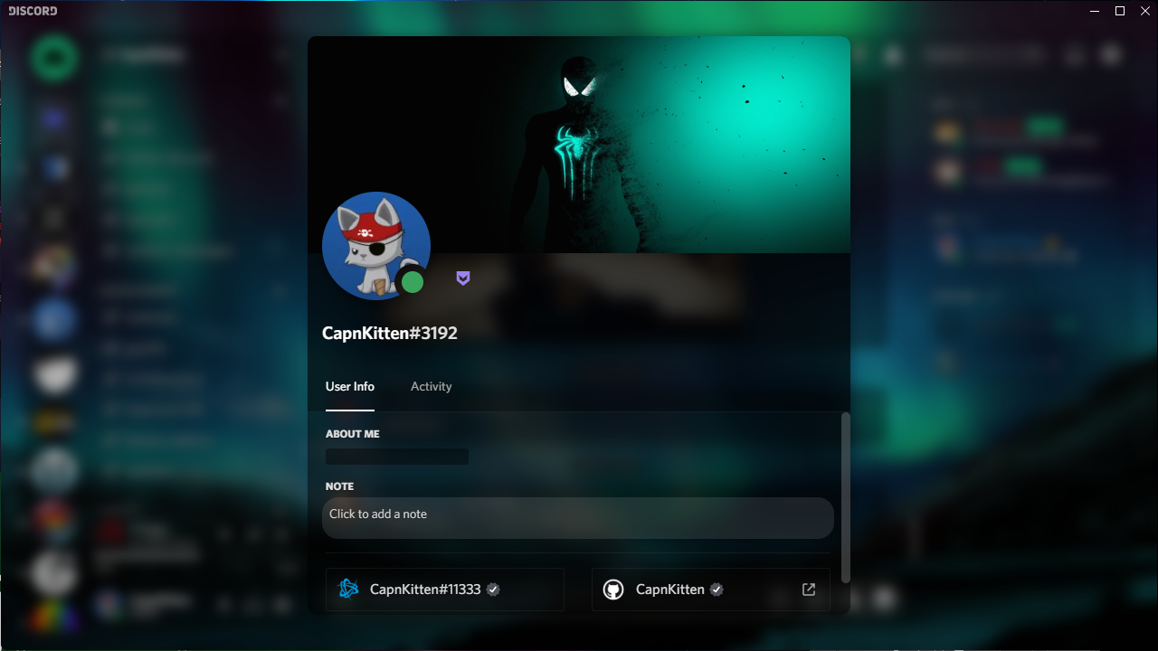
29 |
30 | #### User settings
31 |
32 | 
33 |
34 | #### DMs
35 |
36 | 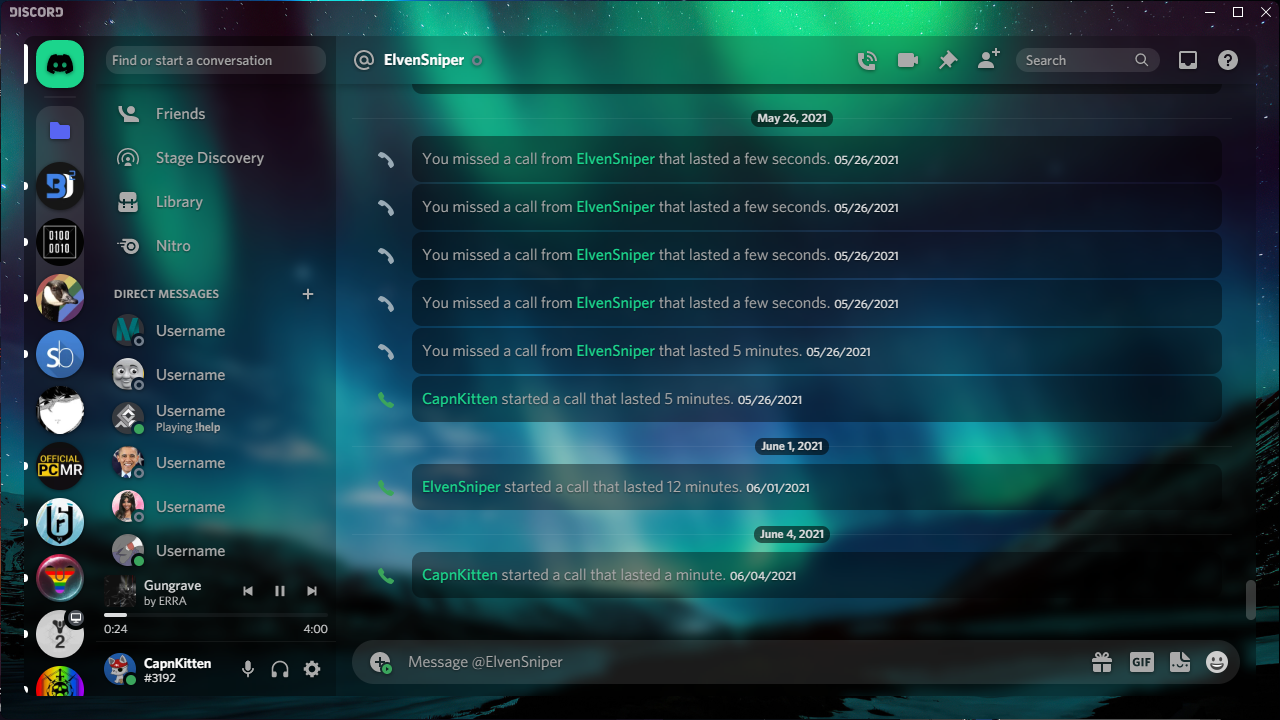
37 |
38 | ## Variables
39 |
40 | #### App elements
41 | - `--app-bg` - The background image for the entire Discord app. Default: `url(https://i.imgur.com/U8bSjj5.jpg)`
42 | - `--app-blur` - The strength of the blur for every element that has one. Default: `6px`
43 | - `--app-margin` - The margin surrounding the content area. Default: `24px`
44 | - `--app-radius` - The border radius of the app and every element that has a border radius. Default: `8px`
45 | - `--sidebar-color` - The background color of the sidebars. Default: `rgba(0,0,0, 0.4)`
46 | - `--main-content-color` - The background color of the main content areas. Default: `rgba(0,0,0, 0.2)`
47 |
48 | #### Accent color
49 | - `--accent-hue` - The hue value for the accent color of the theme. Default: `156`
50 | - `--accent-saturation` - The saturation value for the accent color of the theme. Default: `77.5%`
51 | - `--accent-lightness` - The lightness value for the accent color of the theme. Default: `47.1%`
52 | - `--accent-opacity` - The opacity of everything, excluding text, that uses the accent color. Default: `1`
53 | - `--accent-text-color` - The text color for buttons and other various elements with the accent background color. Default: `#000`
54 |
55 | #### Messages
56 | - `--message-color` - The background color for messages. Default: `rgba(0,0,0, 0.4)`
57 | - `--message-radius` - The border radius for messages. Default: `8px`
58 | - `--message-padding-top` - The top and bottom padding for messages. Default: `8px`
59 | - `--message-padding-side` - The left and right padding for messages. Default: `8px`
60 | - `--mention-hue` - The hue value for the message mention color. Default: `156`
61 | - `--mention-saturation` - The saturation value for the message mention color. Default: `77.5%`
62 | - `--mention-lightness` - The lightness value for the message mention color. Default: `47.1%`
63 | - `--mention-opacity` - The opacity of the message mention color. Default: `1`
64 | - `--reply-hue` - The hue value for the reply message color. Default: `226`
65 | - `--reply-saturation` - The saturation value for the reply message color. Default: `77.6%`
66 | - `--reply-lightness` - The lightness value for the reply message color. Default: `61.8%`
67 | - `--reply-opacity` - The opacity of the reply message color. Default: `1`
68 |
69 | #### Textareas and inputs
70 | - `--textarea-color` - The background color for any textareas and inputs. Default: `0,0,0`
71 | - `--textarea-alpha` - The opacity for any textareas and inputs. Default: `0.15`
72 | - `--textarea-text-color` - The text color for textareas and inputs. Default: `#fff`
73 | - `--textarea-radius` - The border radius for textareas (not inputs). Default: `22px`
74 | - `--input-height` - The height for inputs. Default: `36px`
75 | - `--input-radius` - The border radius for inputs (not textareas). Default: `18px`
76 |
77 | #### Cards
78 | - `--card-color` - The background color for cards. Default: `rgba(0,0,0, 0.4)`
79 | - `--card-color-hover` - The background color for hovering over cards (if there is a hover animation). Default: `rgba(0,0,0, 0.5)`
80 | - `--card-radius` - The border radius for cards. Default: `8px`
81 |
82 | #### Buttons
83 | - `--button-height` - The height for buttons. Default: `32px`
84 | - `--button-padding` - The padding for buttons. Default: `0 16px`
85 | - `--button-color` - The background color for most buttons. Default: `#d73d3d`
86 | - `--button-action-color` - The background color for hovering and clicking on buttons (has a lowered opacity). Default: `#000`
87 | - `--button-text-color` - The text color for any buttons that use `--button-color`. Default: `#000`
88 | - `--button-radius` - The border radius for buttons. Default: `8px`
89 |
90 | #### Popouts and modals
91 | - `--popout-color` - The background color for modals/popouts. Default: `rgba(0,0,0, 0.55)`
92 | - `--popout-blur` - The blur strength for modals/popouts. Default: `5px`
93 | - `--popout-header-opacity` - The header opacity for modals/popouts. Default: `0.3`
94 | - `--popout-header-shadow`- The shadow for headers in modals/popouts. Default: `0px 3px 9px 0px rgba(0,0,0, 0.25)`
95 | - `--popout-radius` - The border radius for modals/popouts. Default: `8px`
96 | - `--popout-shadow` - The shadow for modals/popouts. Default: `0 8px 10px 1px rgba(0,0,0, 0.14)`
97 |
98 | [paypal-logo]: https://img.shields.io/static/v1?label=PayPal&message=Donate&style=flat&logo=paypal&color=blue
99 | [paypal-url]: https://paypal.me/capnkitten
100 |
101 | [github-logo]: https://img.shields.io/static/v1?label=GitHub&message=Sponsor&style=flat&logo=github&color=black
102 | [github-url]: https://github.com/sponsors/CapnKitten
103 |
104 | [discord-logo]: https://img.shields.io/static/v1?label=Discord&message=Server&style=flat&logo=discord&color=blue
105 | [discord-url]: https://discord.gg/jzJkA6Z
106 |
--------------------------------------------------------------------------------