21 | 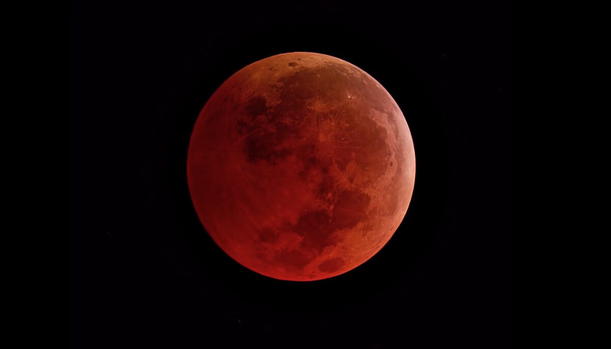 25 |
25 |
26 |
27 |
25 | 28 | 32 | A Super Blood Moon Is Nicer Than It Sounds 33 | 34 |
35 |36 | Find out what a super blood Moon is, and celebrate a milestone in Mars exploration. 37 |
38 ||
22 |
23 |
42 |
24 |
29 |
30 |
28 | 31 | 35 | A Super Blood Moon Is Nicer Than It Sounds 36 | 37 |38 |39 | Find out what a super blood Moon is, and celebrate a milestone in Mars exploration. 40 | 41 | |
43 |
44 |
45 |
64 |
46 |
51 |
52 | 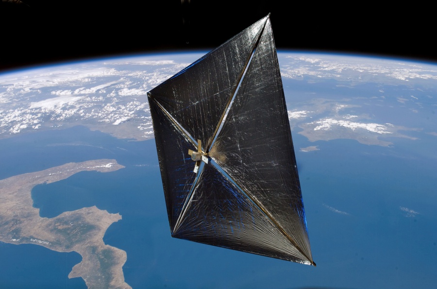 50 |
50 | 53 | 57 | Solar Cruiser, NASA's Large Solar Sail Test 58 | 59 |60 |61 | The biggest solar sail yet will create an artificial orbit between the Earth and Sun. 62 | 63 | |
65 |
66 |
67 |
84 |
68 |
73 |
74 | 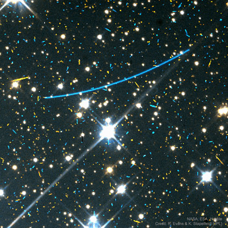 72 |
72 | 75 | 79 | NEA Scout, NASA's Solar Sail Mission to an Asteroid 80 | 81 |82 |NEA Scout will use a solar sail to leave the Moon's orbit and visit a near-Earth asteroid. 83 | |
85 |
|
88 |
89 |
108 |
90 |
95 |
96 | 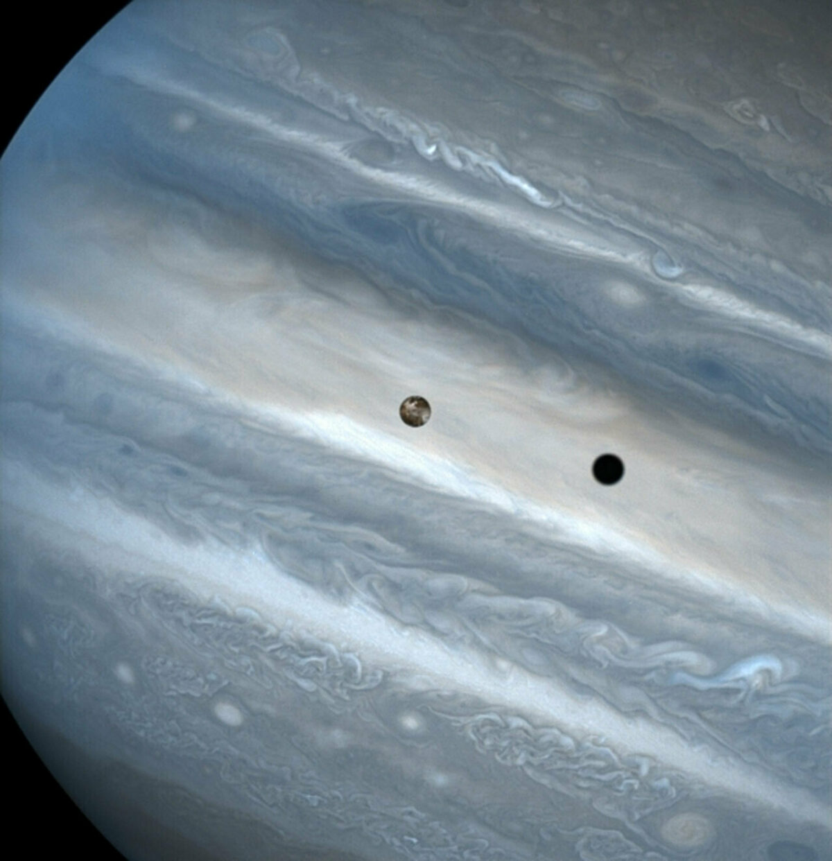 94 |
94 | 97 | 101 | The companions of the planets 102 | 103 |104 |105 | Turn your minds to the moons of our solar system, the missions to explore them, and the awe they inspire in us. 106 | 107 | |
109 |
110 |
111 |
130 |
112 |
117 |
118 | 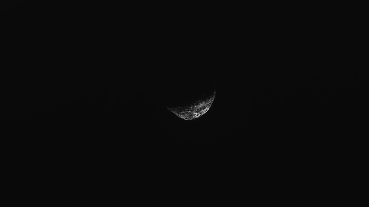 116 |
116 | 119 | 123 | Seeking Small Worlds 124 | 125 |126 |127 | A spacecraft leaves one asteroid as planetary defense experts turn to others. 128 | 129 | |
131 |
25 | 36 | Find out what a super blood Moon is, and celebrate a milestone in Mars exploration. 37 |
38 |
45 | 56 | The biggest solar sail yet will create an artificial orbit between the Earth and Sun. 57 |
58 |
65 | NEA Scout will use a solar sail to leave the Moon's orbit and visit a near-Earth asteroid.
76 |
84 | 95 | Turn your minds to the moons of our solar system, the missions to explore them, and the awe they inspire in us. 96 |
97 |
104 | 115 | A spacecraft leaves one asteroid as planetary defense experts turn to others. 116 |
117 |
25 | 36 | Find out what a super blood Moon is, and celebrate a milestone in Mars exploration. 37 |
38 |
45 | 56 | The biggest solar sail yet will create an artificial orbit between the Earth and Sun. 57 |
58 |
65 | NEA Scout will use a solar sail to leave the Moon's orbit and visit a near-Earth asteroid.
76 |
83 | 94 | Turn your minds to the moons of our solar system, the missions to explore them, and the awe they inspire in us. 95 |
96 |
103 | 114 | A spacecraft leaves one asteroid as planetary defense experts turn to others. 115 |
116 |
34 | 45 | Find out what a super blood Moon is, and celebrate a milestone in Mars exploration. 46 |
47 |
54 | 65 | The biggest solar sail yet will create an artificial orbit between the Earth and Sun. 66 |
67 |
74 | NEA Scout will use a solar sail to leave the Moon's orbit and visit a near-Earth asteroid.
85 |
92 | 103 | Turn your minds to the moons of our solar system, the missions to explore them, and the awe they inspire in us. 104 |
105 |
112 | 123 | A spacecraft leaves one asteroid as planetary defense experts turn to others. 124 |
125 | 128 | Subscribe to Codely
129 |
25 |
128 | Subscribe to Codely
129 |
25 | 36 | Find out what a super blood Moon is, and celebrate a milestone in Mars exploration. 37 |
38 |
45 | 56 | The biggest solar sail yet will create an artificial orbit between the Earth and Sun. 57 |
58 |
65 | NEA Scout will use a solar sail to leave the Moon's orbit and visit a near-Earth asteroid.
76 |
83 | 94 | Turn your minds to the moons of our solar system, the missions to explore them, and the awe they inspire in us. 95 |
96 |
103 | 114 | A spacecraft leaves one asteroid as planetary defense experts turn to others. 115 |
116 |
119 | Subscribe to Codely
120 |
25 | 36 | Find out what a super blood Moon is, and celebrate a milestone in Mars exploration. 37 |
38 |
45 | 56 | The biggest solar sail yet will create an artificial orbit between the Earth and Sun. 57 |
58 |
65 | NEA Scout will use a solar sail to leave the Moon's orbit and visit a near-Earth asteroid.
76 |
83 | 94 | Turn your minds to the moons of our solar system, the missions to explore them, and the awe they inspire in us. 95 |
96 |
103 | 114 | A spacecraft leaves one asteroid as planetary defense experts turn to others. 115 |
116 |
119 | Subscribe to Codely
120 |  21 |
21 |  24 |
24 |  27 |
27 |  30 |
30 |  33 |
33 |  36 |
36 |  39 |
39 |  42 |
25 |
42 |
25 | 36 | Find out what a super blood Moon is, and celebrate a milestone in Mars exploration. 37 |
38 |
45 | 56 | The biggest solar sail yet will create an artificial orbit between the Earth and Sun. 57 | Solar Cruiser is a NASA mission launching in 2025 to test a large solar sail at an artificial orbit between the Earth and Sun. 58 | Solar sails use the gentle push of sunlight for propulsion, giving them unlimited fuel to reach unique orbits and perhaps one day visit other stars. 59 | Solar Cruiser’s sail will be the largest ever tested in space, covering an area of more than six tennis courts. 60 |
61 |
68 | NEA Scout will use a solar sail to leave the Moon's orbit and visit a near-Earth asteroid.
79 |
86 | 97 | Turn your minds to the moons of our solar system, the missions to explore them, and the awe they inspire in us. 98 |
99 |
106 | 117 | A spacecraft leaves one asteroid as planetary defense experts turn to others. 118 |
119 |
25 | 36 | Find out what a super blood Moon is, and celebrate a milestone in Mars exploration. 37 |
38 |
45 | 56 | The biggest solar sail yet will create an artificial orbit between the Earth and Sun. 57 |
58 |
65 | NEA Scout will use a solar sail to leave the Moon's orbit and visit a near-Earth asteroid.
76 |
83 | 94 | Turn your minds to the moons of our solar system, the missions to explore them, and the awe they inspire in us. 95 |
96 |
103 | 114 | A spacecraft leaves one asteroid as planetary defense experts turn to others. 115 |
116 |
25 | 36 | Find out what a super blood Moon is, and celebrate a milestone in Mars exploration. 37 |
38 |
45 | 56 | The biggest solar sail yet will create an artificial orbit between the Earth and Sun. 57 |
58 |
65 | NEA Scout will use a solar sail to leave the Moon's orbit and visit a near-Earth asteroid.
76 |
83 | 94 | Turn your minds to the moons of our solar system, the missions to explore them, and the awe they inspire in us. 95 |
96 |
103 | 114 | A spacecraft leaves one asteroid as planetary defense experts turn to others. 115 |
116 |18 | In war 19 | truth 20 | is the first casuality 21 | by Aeschylus 22 |23 |