 2 |
3 | [](https://swiftpackageindex.com/FlineDev/HandySwiftUI)
4 |
5 | # HandySwiftUI
6 |
7 | The goal of this library is to **provide handy UI features** that didn't make it into the SwiftUI (yet).
8 |
9 | Checkout [HandySwift](https://github.com/FlineDev/HandySwift) for handy Swift features that should have been part of the Swift standard library in the first place.
10 |
11 |
12 | ## Documentation
13 |
14 | Learn how you can make the most of HandySwiftUI by reading the guides inside the documentation:
15 |
16 | [📖 Open HandySwiftUI Documentation](https://swiftpackageindex.com/FlineDev/HandySwiftUI/documentation/handyswiftui)
17 |
18 |
19 |
2 |
3 | [](https://swiftpackageindex.com/FlineDev/HandySwiftUI)
4 |
5 | # HandySwiftUI
6 |
7 | The goal of this library is to **provide handy UI features** that didn't make it into the SwiftUI (yet).
8 |
9 | Checkout [HandySwift](https://github.com/FlineDev/HandySwift) for handy Swift features that should have been part of the Swift standard library in the first place.
10 |
11 |
12 | ## Documentation
13 |
14 | Learn how you can make the most of HandySwiftUI by reading the guides inside the documentation:
15 |
16 | [📖 Open HandySwiftUI Documentation](https://swiftpackageindex.com/FlineDev/HandySwiftUI/documentation/handyswiftui)
17 |
18 |
19 | 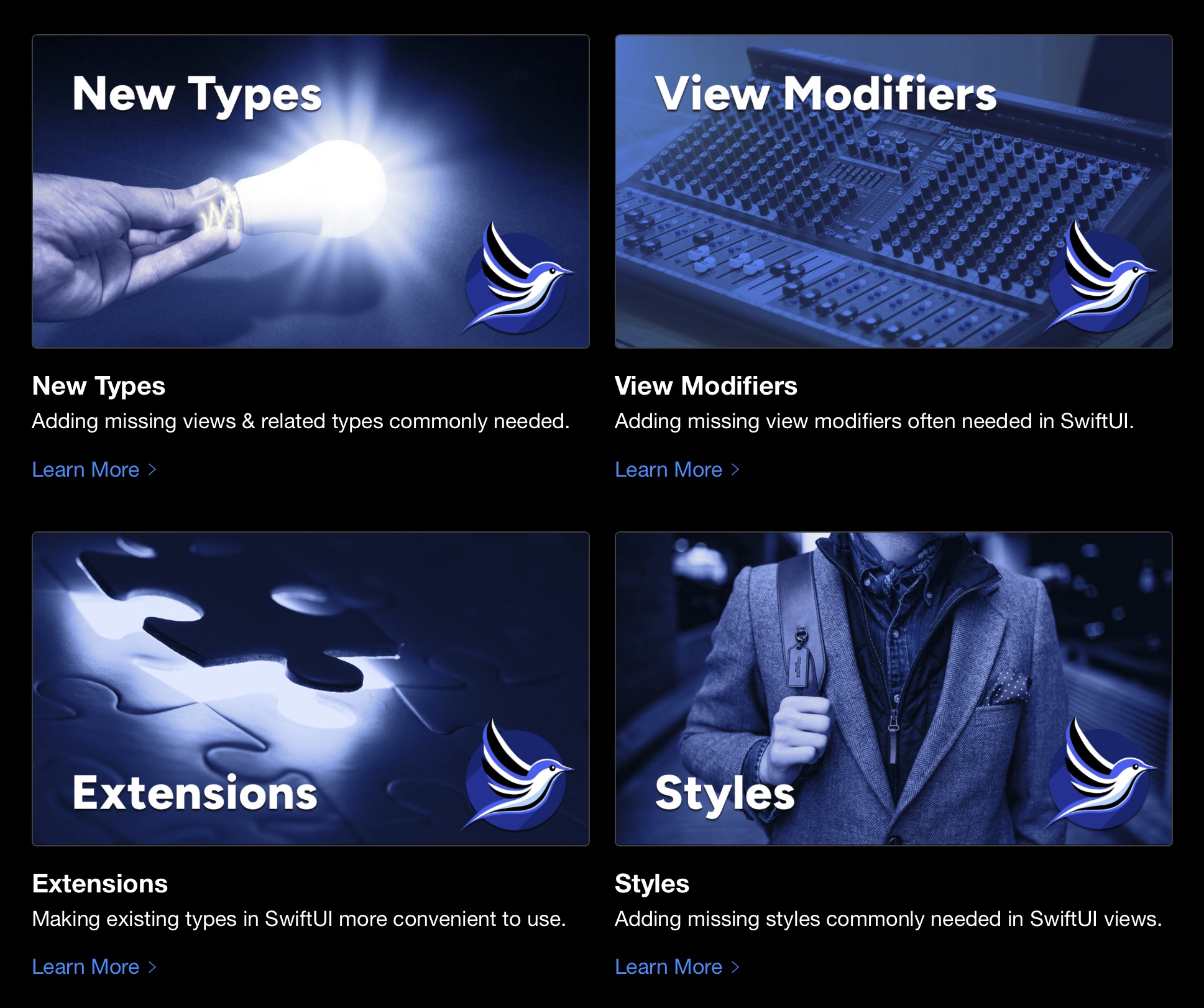 20 |
21 |
22 |
23 | ## Showcase
24 |
25 | I created this library for my own Indie apps (download & rate them to show your appreciation):
26 |
27 |
20 |
21 |
22 |
23 | ## Showcase
24 |
25 | I created this library for my own Indie apps (download & rate them to show your appreciation):
26 |
27 | | App Icon | 30 |App Name & Description | 31 |Supported Platforms | 32 |
|---|---|---|
35 |
36 |  37 |
38 |
37 |
38 | |
39 |
40 |
41 | TranslateKit: App Localization
42 |
43 | 44 | AI-powered app localization with unmatched accuracy. Fast & easy: AI & proofreading, 125+ languages, market insights. Budget-friendly, free to try. 45 | |
46 | Mac | 47 |
50 |
51 |  52 |
53 |
52 |
53 | |
54 |
55 |
56 | FreemiumKit: In-App Purchases for Indies
57 |
58 | 59 | Simple In-App Purchases and Subscriptions: Automation, Paywalls, A/B Testing, Live Notifications, PPP, and more. 60 | |
61 | iPhone, iPad, Mac, Vision | 62 |
65 |
66 |  67 |
68 |
67 |
68 | |
69 |
70 |
71 | Pleydia Organizer: Movie & Series Renamer
72 |
73 | 74 | Simple, fast, and smart media management for your Movie, TV Show and Anime collection. 75 | |
76 | Mac | 77 |
80 |
81 |  82 |
83 |
82 |
83 | |
84 |
85 |
86 | FreelanceKit: Project Time Tracking
87 |
88 | 89 | Simple & affordable time tracking with a native experience for all devices. iCloud sync & CSV export included. 90 | |
91 | iPhone, iPad, Mac, Vision | 92 |
95 |
96 |  97 |
98 |
97 |
98 | |
99 |
100 |
101 | CrossCraft: Custom Crosswords
102 |
103 | 104 | Create themed & personalized crosswords. Solve them yourself or share them to challenge others. 105 | |
106 | iPhone, iPad, Mac, Vision | 107 |
110 |
111 |  112 |
113 |
112 |
113 | |
114 |
115 |
116 | FocusBeats: Pomodoro + Music
117 |
118 | 119 | Deep Focus with proven Pomodoro method & select Apple Music playlists & themes. Automatically pauses music during breaks. 120 | |
121 | iPhone, iPad, Mac, Vision | 122 |
125 |
126 |  127 |
128 |
127 |
128 | |
129 |
130 |
131 | Posters: Discover Movies at Home
132 |
133 | 134 | Auto-updating & interactive posters for your home with trailers, showtimes, and links to streaming services. 135 | |
136 | Vision | 137 |