22 | Display utility classes that apply to all breakpoints, from xs to xl, have no breakpoint abbreviation in them. This is because those classes are applied from min-width: 0; and up, and thus are not bound by a media query. The remaining breakpoints, however, do include a breakpoint abbreviation.
23 |
24 | As such, the classes are named using the format:
25 |
26 |
27 |
.d-{value} for xs.
28 |
.d-{breakpoint}-{value} for sm, md, lg, and xl.
29 |
30 |
31 |
32 |
33 |
none
34 |
inline
35 |
inline-block
36 |
block
37 |
table
38 |
table-cell
39 |
table-row
40 |
flex
41 |
inline-flex
42 |
43 |
44 |
Set the visibility of elements with our visibility utilities. These utility classes do not modify the display value at all and do not affect layout – .invisible elements still take up space in the page. Content will be hidden both visually and for assistive technology/screen reader users.
45 |
Contextual text classes also work well on anchors with the provided hover and focus states. Note that the .text-white and .text-muted class has no additional link styling beyond underline.
Similar to the contextual text color classes, easily set the background of an element to any contextual class. Anchor components will darken on hover, just like the text classes. Background utilities do not set color, so in some cases you’ll want to use .text-* utilities.
49 | A simple primary alert with an example link. Give it a click if you like.
50 |
51 |
52 | A simple secondary alert with an example link. Give it a click if you like.
53 |
54 |
55 | A simple success alert with an example link. Give it a click if you like.
56 |
57 |
58 | A simple danger alert with an example link. Give it a click if you like.
59 |
60 |
61 | A simple warning alert with an example link. Give it a click if you like.
62 |
63 |
64 | A simple info alert with an example link. Give it a click if you like.
65 |
66 |
67 | A simple light alert with an example link. Give it a click if you like.
68 |
69 |
70 | A simple dark alert with an example link. Give it a click if you like.
71 |
72 |
More Content
73 |
74 |
Well done!
75 |
Aww yeah, you successfully read this important alert message. This example text is going to run a bit longer so that you can see how spacing within an alert works with this kind of content.
76 |
77 |
Whenever you need to, be sure to use margin utilities to keep things nice and tidy.
22 | Display utility classes that apply to all breakpoints, from xs to xl, have no breakpoint abbreviation in them. This is because those classes are applied from min-width: 0; and up, and thus are not bound by a media query. The remaining breakpoints, however, do include a breakpoint abbreviation.
23 |
24 |
25 |
26 |
Heading
27 |
Example
28 |
29 |
30 |
31 |
32 |
33 |
<h1></h1>
34 |
35 |
36 |
h1. Bootstrap heading
37 |
38 |
39 |
40 |
<h2></h2>
41 |
42 |
43 |
h2. Bootstrap heading
44 |
45 |
46 |
47 |
<h3></h3>
48 |
49 |
50 |
h3. Bootstrap heading
51 |
52 |
53 |
54 |
<h4></h4>
55 |
56 |
57 |
h4. Bootstrap heading
58 |
59 |
60 |
61 |
<h5></h5>
62 |
63 |
64 |
h5. Bootstrap heading
65 |
66 |
67 |
68 |
<h6></h6>
69 |
70 |
71 |
h6. Bootstrap heading
72 |
73 |
74 |
75 |
h1. Bootstrap heading
76 |
h2. Bootstrap heading
77 |
h3. Bootstrap heading
78 |
h4. Bootstrap heading
79 |
h5. Bootstrap heading
80 |
h6. Bootstrap heading
81 |
Traditional heading elements are designed to work best in the meat of your page content. When you need a heading to stand out, consider using a display heading—a larger, slightly more opinionated heading style. Keep in mind these headings are not responsive by default, but it’s possible to enable responsive font sizes.
82 |
Display 1
83 |
Display 2
84 |
Display 3
85 |
Display 4
86 |
Lead
87 |
Make a paragraph stand out by adding .lead.
88 |
89 | Vivamus sagittis lacus vel augue laoreet rutrum faucibus dolor auctor. Duis mollis, est non commodo luctus.
90 |
91 |
Inline Text
92 |
You can use the mark tag to highlight text.
93 |
This line of text is meant to be treated as deleted text.
94 |
This line of text is meant to be treated as no longer accurate.
95 |
This line of text is meant to be treated as an addition to the document.
96 |
This line of text will render as underlined
97 |
This line of text is meant to be treated as fine print.
22 | Bootstrap includes a wide range of shorthand responsive margin and padding utility classes to modify an element’s appearance.
23 |
Notation
24 |
25 |
Spacing utilities that apply to all breakpoints, from xs to xl, have no breakpoint abbreviation in them. This is because those classes are applied from min-width: 0 and up, and thus are not bound by a media query. The remaining breakpoints, however, do include a breakpoint abbreviation.
26 |
27 |
The classes are named using the format {property}{sides}-{size} for xs and {property}{sides}-{breakpoint}-{size} for sm, md, lg, and xl.
28 |
29 |
Where property is one of:
30 |
31 |
32 |
m - for classes that set margin
33 |
p - for classes that set padding
34 |
35 |
36 |
Where sides is one of:
37 |
38 |
39 |
t - for classes that set margin-top or padding-top
40 |
b - for classes that set margin-bottom or padding-bottom
41 |
l - for classes that set margin-left or padding-left
42 |
r - for classes that set margin-right or padding-right
43 |
x - for classes that set both *-left and *-right
44 |
y - for classes that set both *-top and *-bottom
45 |
blank - for classes that set a margin or padding on all 4 sides of the element
46 |
47 |
48 |
Where size is one of:
49 |
50 |
51 |
0 - for classes that eliminate the margin or padding by setting it to 0
52 |
1 - (by default) for classes that set the margin or padding to .25
53 |
2 - (by default) for classes that set the margin or padding to .5
54 |
3 - (by default) for classes that set the margin or padding to 1
55 |
4 - (by default) for classes that set the margin or padding to 1.5
56 |
5 - (by default) for classes that set the margin or padding to 3
57 |
auto - for classes that set the margin to auto
58 |
59 |
Text Alignment
60 |
.text-left - Left aligned text on all viewport sizes.
61 |
.text-center - Center aligned text on all viewport sizes.
62 |
.text-right - Right aligned text on all viewport sizes.
63 |
64 |
.text-sm-left - Left aligned text on viewports sized SM (small) or wider.
65 |
.text-md-left - Left aligned text on viewports sized MD (medium) or wider.
66 |
.text-lg-left - Left aligned text on viewports sized LG (large) or wider.
67 |
.text-xl-left - Left aligned text on viewports sized XL (extra-large) or wider.
Due to the widespread use of tables across third-party widgets like calendars and date pickers, we’ve designed our tables to be opt-in. Just add the base class .table to any
, then extend with custom styles or our various included modifier classes.
23 |
24 |
25 |
26 |
27 |
#
28 |
First
29 |
Last
30 |
Handle
31 |
32 |
33 |
34 |
35 |
1
36 |
Mark
37 |
Otto
38 |
@mdo
39 |
40 |
41 |
2
42 |
Jacob
43 |
Thornton
44 |
@fat
45 |
46 |
47 |
3
48 |
Larry
49 |
the Bird
50 |
@twitter
51 |
52 |
53 |
54 |
You can also invert the colors—with light text on dark backgrounds—with .table-dark.
55 |
56 |
57 |
58 |
#
59 |
First
60 |
Last
61 |
Handle
62 |
63 |
64 |
65 |
66 |
1
67 |
Mark
68 |
Otto
69 |
@mdo
70 |
71 |
72 |
2
73 |
Jacob
74 |
Thornton
75 |
@fat
76 |
77 |
78 |
3
79 |
Larry
80 |
the Bird
81 |
@twitter
82 |
83 |
84 |
85 |
Table head options
86 |
Similar to tables and dark tables, use the modifier classes .thead-light or .thead-dark to make s appear light or dark gray.
87 |
88 |
89 |
90 |
#
91 |
First
92 |
Last
93 |
Handle
94 |
95 |
96 |
97 |
98 |
1
99 |
Mark
100 |
Otto
101 |
@mdo
102 |
103 |
104 |
2
105 |
Jacob
106 |
Thornton
107 |
@fat
108 |
109 |
110 |
3
111 |
Larry
112 |
the Bird
113 |
@twitter
114 |
115 |
116 |
117 |
118 |
119 |
120 |
121 |
#
122 |
First
123 |
Last
124 |
Handle
125 |
126 |
127 |
128 |
129 |
1
130 |
Mark
131 |
Otto
132 |
@mdo
133 |
134 |
135 |
2
136 |
Jacob
137 |
Thornton
138 |
@fat
139 |
140 |
141 |
3
142 |
Larry
143 |
the Bird
144 |
@twitter
145 |
146 |
147 |
148 |
Striped rows
149 |
Use .table-striped to add zebra-striping to any table row within the .
150 |
151 |
152 |
153 |
#
154 |
First
155 |
Last
156 |
Handle
157 |
158 |
159 |
160 |
161 |
1
162 |
Mark
163 |
Otto
164 |
@mdo
165 |
166 |
167 |
2
168 |
Jacob
169 |
Thornton
170 |
@fat
171 |
172 |
173 |
3
174 |
Larry
175 |
the Bird
176 |
@twitter
177 |
178 |
179 |
180 |
181 |
182 |
183 |
#
184 |
First
185 |
Last
186 |
Handle
187 |
188 |
189 |
190 |
191 |
1
192 |
Mark
193 |
Otto
194 |
@mdo
195 |
196 |
197 |
2
198 |
Jacob
199 |
Thornton
200 |
@fat
201 |
202 |
203 |
3
204 |
Larry
205 |
the Bird
206 |
@twitter
207 |
208 |
209 |
210 |
Borderless table
211 | Add .table-borderless for a table without borders.
212 |
213 |
214 |
Use Material Bootstrap inputs to replace the standard text inputs. The component is available in Bootstrap and Material styles and supports different rendering modes.
22 |
23 |
Input
24 |
25 | The Input elements below are created with the "bootstrap-input" tag. The "style-mode" property of each input is set to "primary", "success", "info", "warning" or "danger".
26 |
27 |
28 |
29 |
30 |
31 |
32 |
33 |
34 |
35 |
36 |
37 |
38 |
39 |
40 |
41 |
42 |
43 |
44 |
Textarea
45 |
46 | The Textarea elements below are created with the "bootstrap-textarea" tag. The "style-mode" property of each input is set to "primary", "success", "info", "warning" or "danger".
47 |
48 |
49 |
50 |
51 |
52 |
53 |
54 |
55 |
56 |
57 |
58 |
59 |
60 |
61 |
62 |
63 |
64 |
65 |
Material Design
66 |
Input
67 |
68 | The Input elements below are created with the "bootstrap-input" tag. By default, they are outlined. The "style-mode" property of each input is set to "primary", "success", "info", "warning" or "danger".
69 |
70 |
71 |
72 |
73 |
74 |
75 |
76 |
77 |
78 |
79 |
80 |
81 |
82 |
83 |
84 |
85 |
86 |
87 |
Textarea
88 |
89 | The Textarea elements below are created with the "bootstrap-textarea" tag. The "style-mode" property of each input is set to "primary", "success", "info", "warning" or "danger".
90 |
91 |
92 |
93 |
94 |
95 |
96 |
97 |
98 |
99 |
100 |
101 |
102 |
103 |
104 |
105 |
106 |
107 |
108 |
Outlined Inputs
109 |
Input
110 |
111 | The Input elements below are created with the "bootstrap-input" tag. The "style-mode" property of each input is set to "primary", "success", "info", "warning" or "danger".
112 |
113 |
114 |
115 |
116 |
117 |
118 |
119 |
120 |
121 |
122 |
123 |
124 |
125 |
126 |
127 |
128 |
129 |
130 |
Textarea
131 |
132 | The Textarea elements below have "outlined" attribute.
133 |
134 |
135 |
136 |
137 |
138 |
139 |
140 |
141 |
142 |
143 |
144 |
145 |
146 |
147 |
148 |
149 |
150 |
151 |
Filled Inputs
152 |
Input
153 |
154 | The Input elements below have "filled" attribute.
155 |
156 |
157 |
158 |
159 |
160 |
161 |
162 |
163 |
164 |
165 |
166 |
167 |
168 |
169 |
170 |
171 |
172 |
173 |
Textarea
174 |
175 | The Textarea elements below are created with the "bootstrap-textarea" tag. The "style-mode" property of each input is set to "primary", "success", "info", "warning" or "danger".
176 |
177 |
178 |
179 |
180 |
181 |
182 |
183 |
184 |
185 |
186 |
187 |
188 |
189 |
190 |
191 |
192 |
193 |
194 |
195 |
196 |
--------------------------------------------------------------------------------
/README.md:
--------------------------------------------------------------------------------
1 | # [Material Design Bootstrap Web Components | FREE](https://www.htmlelements.com)[](https://twitter.com/intent/tweet?text=Get%20over%2020%20free%20custom%20elements%20based%20on%20SmartHTMLElements%20&url=https://www.htmlelements.com/&via=htmlelements&hashtags=bootstrap,design,templates,autocomplete,bootstrap-components,typeahead,developers,webcomponents,customelements,polymer,material)
2 |
3 | ## Installation
4 |
5 | ```javascript
6 | npm install @smarthtmlelemnets/smart-bootstrap
7 | ```
8 |
9 | ## CSS
10 |
11 | Copy-paste the stylesheet into your before all othernpm stylesheets to load our CSS.
12 |
13 | ```html
14 |
15 | ```
16 |
17 | or
18 |
19 | ```html
20 | import 'src/styles/smart.bootstrap.css';
21 | ```
22 |
23 | ## Javascript
24 |
25 | ```html
26 |
27 |
28 | ```
29 |
30 | or
31 |
32 | ```html
33 | import 'src/smart.element.js'
34 | import 'src/smart.bootstrap.js'
35 | ```
36 |
37 |
38 | ## Overview
39 |
40 | The package extends Bootstrap by adding Material Design and CSS3 Variables for Styling.
41 |
42 | The Boostrap components are rewritten from scratch and are built as Web Components by using the ```Smart Framework```.
43 |
44 | The Bootstrap SCSS is rewritten with CSS3 Variables and Material Design is added.
45 |
46 | ## Components
47 |
48 | 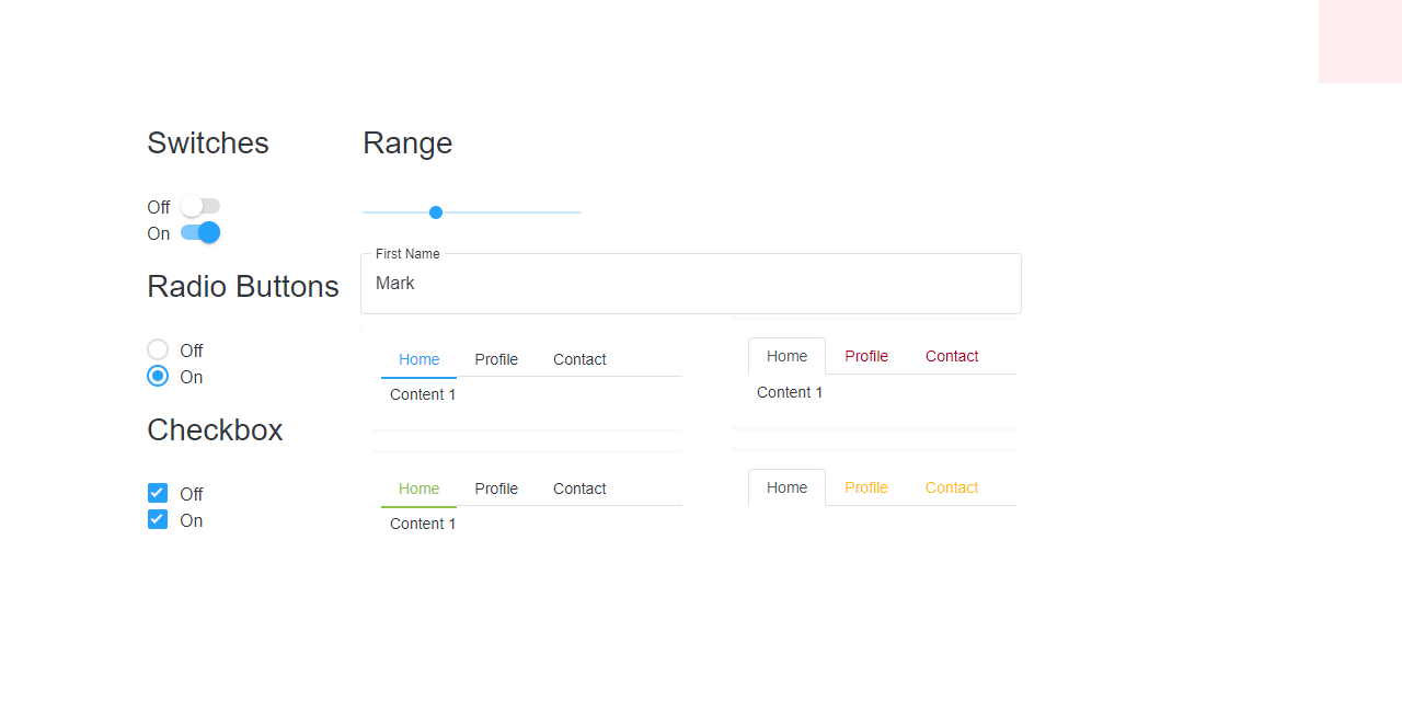
49 |
50 | [Demo ↗](https://www.htmlelements.com/bootstrap/)
51 |
52 | Material Design Bootstrap Button Web Component
53 |
54 | 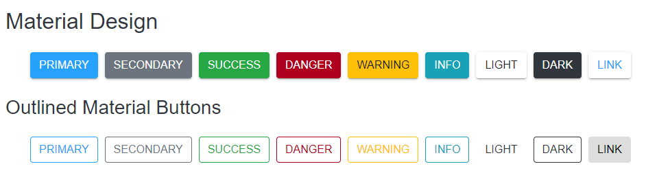
55 |
56 | ```html
57 | Primary
58 | Secondary
59 | Success
60 | Danger
61 | Warning
62 | Info
63 | Light
64 | Dark
65 | Link
66 | ```
67 |
68 | Material Design Bootstrap CheckBox Web Component
69 |
70 | 
71 |
72 | ```html
73 | Checked
74 | Unchecked
75 | ```
76 |
77 | Material Design Bootstrap Radio Button Web Component
78 |
79 | ```html
80 | Active
81 | Radio
82 | Radio
83 | ```
84 |
85 | Material Design Bootstrap DropDown Web Component
86 |
87 | 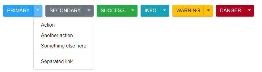
88 |
89 | ```html
90 |
91 | Action
92 | Another action
93 | Something else here
94 |
95 | ```
96 |
97 | Material Design Bootstrap Split Button Web Component
98 |
99 | ```html
100 |
101 | Action
102 | Another action
103 | Something else here
104 |
105 | ```
106 |
107 | Material Design Bootstrap Input Group Web Component
108 |
109 | 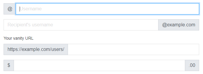
110 |
111 | ```html
112 |
113 | @
114 |
116 |
117 |
118 |
120 | @example.com
121 |
122 |
123 |
124 | https://example.com/users/
125 |
126 |
127 | $
128 |
129 | .00
130 |
131 |
132 | With textarea
133 |
134 |
135 | ```
136 |
137 | Material Design Bootstrap Modal Web Component
138 |
139 | 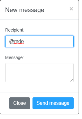
140 |
141 | ```html
142 |
143 |
Use Material Bootstrap custom button styles for actions in forms, dialogs, and more with support for multiple
22 | sizes, states, and more.
23 |
24 |
Buttons
25 |
26 |
Material Bootstrap includes several predefined button styles, each serving its own semantic purpose, with a
27 | few extras thrown in for more control.
28 |
29 | Primary
30 | Secondary
31 | Success
32 | Danger
33 | Warning
34 | Info
35 | Light
36 | Dark
37 | Link
38 |
39 |
40 |
41 | StyleMode property allows the user to change the style of the elements.
42 |
43 |
44 |
Outlined Buttons
45 |
46 | In need of a button, but not the hefty background colors they bring? Just add the class
47 | outlined to remove all background images and colors on any button.
48 |
49 |
50 | Primary
51 | Secondary
52 | Success
53 | Danger
54 | Warning
55 | Info
56 | Light
57 | Dark
58 | Link
59 |
60 |
61 |
62 |
63 | Setting the outlined property the elements turn into outlined buttons with no filling untill
64 | hovered.
65 |
66 |
67 |
Buttons Sizes
68 |
69 | Fancy larger or smaller buttons? Just set the sizeMode property to 'sm' or 'lg' for
70 | additional sizes.
71 |
72 |
73 | Large Button
74 | Large Button
75 |
76 |
77 |
78 | Small Button
79 | Small Button
80 |
81 |
82 |
83 | Buttons can be reset back to normal if SizeMode is set to an empty string.
84 |
85 |
86 |
Disabled Buttons
87 |
88 | Primary
89 | Secondary
90 |
91 |
92 |
93 | To disable/enable an element just set the disabled property.
94 |
95 |
96 |
Material Bootstrap Checkbox
97 |
98 | Checkboxes are buttons that can be toggled. The checked state of these buttons can be updated via
99 | click or by setting the checked property to true.
100 | Checkboxes like the other toggle buttons can be pre-checked.
101 |
102 |
103 | Checked
104 | Unchecked
105 |
106 |
107 |
108 | Appling/Removing the checked attribute will toggle the state of the button.
109 |
110 |
111 |
Material Bootstrap Toggle Button
112 |
113 | Checked
114 | Unchecked
115 |
116 |
117 |
118 |
119 | Add the checked attribute to toggle a button’s active state. If you’re pre-toggling a button,
120 | you must manually add the checked attribute to the button.
121 |
122 |
123 |
Material Bootstrap Radio Button
124 |
125 | Active
126 | Radio
127 | Radio
128 |
129 |
130 |
131 |
132 | Radio buttons are group elements that allow only one of them to be checked. Similar to the other
133 | toggle elements to set a button into checked state the property checked has to be applied to
134 | the element.
135 | All elements that have the same group property are considered to be in the same group.
136 | group can be set on initialization.
137 |
138 |
139 |
Material Design
140 |
141 |
142 | Primary
143 | Secondary
144 | Success
145 | Danger
146 | Warning
147 | Info
148 | Light
149 | Dark
150 | Link
151 |
152 |
Outlined Material Buttons
153 |
154 | Primary
155 | Secondary
156 | Success
157 | Danger
158 | Warning
159 | Info
160 | Light
161 | Dark
162 | Link
163 |
Set the direction of flex items in a flex container with direction utilities. In most cases you can omit the horizontal class here as the browser default is row. However, you may encounter situations where you needed to explicitly set this value (like responsive layouts).
29 |
30 |
Use .flex-row to set a horizontal direction (the browser default), or .flex-row-reverse to start the horizontal direction from the opposite side.
31 |
32 |
Flex item 1
33 |
Flex item 2
34 |
Flex item 3
35 |
36 |
37 |
Flex item 1
38 |
Flex item 2
39 |
Flex item 3
40 |
41 |
Use .flex-column to set a vertical direction, or .flex-column-reverse to start the vertical direction from the opposite side.
42 |
43 |
Flex item 1
44 |
Flex item 2
45 |
Flex item 3
46 |
47 |
48 |
Flex item 1
49 |
Flex item 2
50 |
Flex item 3
51 |
52 |
Justify Content
53 |
Use justify-content utilities on flexbox containers to change the alignment of flex items on the main axis (the x-axis to start, y-axis if flex-direction: column). Choose from start (browser default), end, center, between, or around.
54 |
55 |
56 |
Flex item
57 |
Flex item
58 |
Flex item
59 |
60 |
61 |
Flex item
62 |
Flex item
63 |
Flex item
64 |
65 |
66 |
Flex item
67 |
Flex item
68 |
Flex item
69 |
70 |
71 |
Flex item
72 |
Flex item
73 |
Flex item
74 |
75 |
76 |
Flex item
77 |
Flex item
78 |
Flex item
79 |
80 |
Align items
81 |
Use align-items utilities on flexbox containers to change the alignment of flex items on the cross axis (the y-axis to start, x-axis if flex-direction: column). Choose from start, end, center, baseline, or stretch (browser default).
82 |
83 |
Flex item
84 |
Flex item
85 |
Flex item
86 |
87 |
88 |
Flex item
89 |
Flex item
90 |
Flex item
91 |
92 |
93 |
Flex item
94 |
Flex item
95 |
Flex item
96 |
97 |
98 |
Flex item
99 |
Flex item
100 |
Flex item
101 |
102 |
Align self
103 |
104 |
105 |
Flex item
106 |
Aligned flex item
107 |
Flex item
108 |
109 |
110 |
Flex item
111 |
Aligned flex item
112 |
Flex item
113 |
114 |
115 |
Flex item
116 |
Aligned flex item
117 |
Flex item
118 |
119 |
120 |
Flex item
121 |
Aligned flex item
122 |
Flex item
123 |
124 |
125 |
Flex item
126 |
Aligned flex item
127 |
Flex item
128 |
129 |
Fill
130 |
131 |
Flex item with a lot of content
132 |
Flex item
133 |
Flex item
134 |
135 |
With align-items
136 |
137 |
Flex item
138 |
Flex item
139 |
Flex item
140 |
141 |
142 |
143 |
Flex item
144 |
Flex item
145 |
Flex item
146 |
147 |
Order
148 |
Change the visual order of specific flex items with a handful of order utilities. We only provide options for making an item first or last, as well as a reset to use the DOM order. As order takes any integer value (e.g., 5), add custom CSS for any additional values needed.
149 |
150 |
151 |
First flex item
152 |
Second flex item
153 |
Third flex item
154 |
155 |
Use align-content utilities on flexbox containers to align flex items together on the cross axis. Choose from start (browser default), end, center, between, around, or stretch. To demonstrate these utilities, we’ve enforced flex-wrap: wrap and increased the number of flex items.
156 |
157 |
Flex item
158 |
Flex item
159 |
Flex item
160 |
Flex item
161 |
Flex item
162 |
Flex item
163 |
Flex item
164 |
Flex item
165 |
Flex item
166 |
Flex item
167 |
Flex item
168 |
Flex item
169 |
Flex item
170 |
Flex item
171 |
Flex item
172 |
173 |
174 |
Flex item
175 |
Flex item
176 |
Flex item
177 |
Flex item
178 |
Flex item
179 |
Flex item
180 |
Flex item
181 |
Flex item
182 |
Flex item
183 |
Flex item
184 |
Flex item
185 |
Flex item
186 |
Flex item
187 |
Flex item
188 |
Flex item
189 |
190 |
191 |
192 |
193 |
194 |
--------------------------------------------------------------------------------
/LICENSE:
--------------------------------------------------------------------------------
1 | Apache License
2 | Version 2.0, January 2004
3 | http://www.apache.org/licenses/
4 |
5 | TERMS AND CONDITIONS FOR USE, REPRODUCTION, AND DISTRIBUTION
6 |
7 | 1. Definitions.
8 |
9 | "License" shall mean the terms and conditions for use, reproduction,
10 | and distribution as defined by Sections 1 through 9 of this document.
11 |
12 | "Licensor" shall mean the copyright owner or entity authorized by
13 | the copyright owner that is granting the License.
14 |
15 | "Legal Entity" shall mean the union of the acting entity and all
16 | other entities that control, are controlled by, or are under common
17 | control with that entity. For the purposes of this definition,
18 | "control" means (i) the power, direct or indirect, to cause the
19 | direction or management of such entity, whether by contract or
20 | otherwise, or (ii) ownership of fifty percent (50%) or more of the
21 | outstanding shares, or (iii) beneficial ownership of such entity.
22 |
23 | "You" (or "Your") shall mean an individual or Legal Entity
24 | exercising permissions granted by this License.
25 |
26 | "Source" form shall mean the preferred form for making modifications,
27 | including but not limited to software source code, documentation
28 | source, and configuration files.
29 |
30 | "Object" form shall mean any form resulting from mechanical
31 | transformation or translation of a Source form, including but
32 | not limited to compiled object code, generated documentation,
33 | and conversions to other media types.
34 |
35 | "Work" shall mean the work of authorship, whether in Source or
36 | Object form, made available under the License, as indicated by a
37 | copyright notice that is included in or attached to the work
38 | (an example is provided in the Appendix below).
39 |
40 | "Derivative Works" shall mean any work, whether in Source or Object
41 | form, that is based on (or derived from) the Work and for which the
42 | editorial revisions, annotations, elaborations, or other modifications
43 | represent, as a whole, an original work of authorship. For the purposes
44 | of this License, Derivative Works shall not include works that remain
45 | separable from, or merely link (or bind by name) to the interfaces of,
46 | the Work and Derivative Works thereof.
47 |
48 | "Contribution" shall mean any work of authorship, including
49 | the original version of the Work and any modifications or additions
50 | to that Work or Derivative Works thereof, that is intentionally
51 | submitted to Licensor for inclusion in the Work by the copyright owner
52 | or by an individual or Legal Entity authorized to submit on behalf of
53 | the copyright owner. For the purposes of this definition, "submitted"
54 | means any form of electronic, verbal, or written communication sent
55 | to the Licensor or its representatives, including but not limited to
56 | communication on electronic mailing lists, source code control systems,
57 | and issue tracking systems that are managed by, or on behalf of, the
58 | Licensor for the purpose of discussing and improving the Work, but
59 | excluding communication that is conspicuously marked or otherwise
60 | designated in writing by the copyright owner as "Not a Contribution."
61 |
62 | "Contributor" shall mean Licensor and any individual or Legal Entity
63 | on behalf of whom a Contribution has been received by Licensor and
64 | subsequently incorporated within the Work.
65 |
66 | 2. Grant of Copyright License. Subject to the terms and conditions of
67 | this License, each Contributor hereby grants to You a perpetual,
68 | worldwide, non-exclusive, no-charge, royalty-free, irrevocable
69 | copyright license to reproduce, prepare Derivative Works of,
70 | publicly display, publicly perform, sublicense, and distribute the
71 | Work and such Derivative Works in Source or Object form.
72 |
73 | 3. Grant of Patent License. Subject to the terms and conditions of
74 | this License, each Contributor hereby grants to You a perpetual,
75 | worldwide, non-exclusive, no-charge, royalty-free, irrevocable
76 | (except as stated in this section) patent license to make, have made,
77 | use, offer to sell, sell, import, and otherwise transfer the Work,
78 | where such license applies only to those patent claims licensable
79 | by such Contributor that are necessarily infringed by their
80 | Contribution(s) alone or by combination of their Contribution(s)
81 | with the Work to which such Contribution(s) was submitted. If You
82 | institute patent litigation against any entity (including a
83 | cross-claim or counterclaim in a lawsuit) alleging that the Work
84 | or a Contribution incorporated within the Work constitutes direct
85 | or contributory patent infringement, then any patent licenses
86 | granted to You under this License for that Work shall terminate
87 | as of the date such litigation is filed.
88 |
89 | 4. Redistribution. You may reproduce and distribute copies of the
90 | Work or Derivative Works thereof in any medium, with or without
91 | modifications, and in Source or Object form, provided that You
92 | meet the following conditions:
93 |
94 | (a) You must give any other recipients of the Work or
95 | Derivative Works a copy of this License; and
96 |
97 | (b) You must cause any modified files to carry prominent notices
98 | stating that You changed the files; and
99 |
100 | (c) You must retain, in the Source form of any Derivative Works
101 | that You distribute, all copyright, patent, trademark, and
102 | attribution notices from the Source form of the Work,
103 | excluding those notices that do not pertain to any part of
104 | the Derivative Works; and
105 |
106 | (d) If the Work includes a "NOTICE" text file as part of its
107 | distribution, then any Derivative Works that You distribute must
108 | include a readable copy of the attribution notices contained
109 | within such NOTICE file, excluding those notices that do not
110 | pertain to any part of the Derivative Works, in at least one
111 | of the following places: within a NOTICE text file distributed
112 | as part of the Derivative Works; within the Source form or
113 | documentation, if provided along with the Derivative Works; or,
114 | within a display generated by the Derivative Works, if and
115 | wherever such third-party notices normally appear. The contents
116 | of the NOTICE file are for informational purposes only and
117 | do not modify the License. You may add Your own attribution
118 | notices within Derivative Works that You distribute, alongside
119 | or as an addendum to the NOTICE text from the Work, provided
120 | that such additional attribution notices cannot be construed
121 | as modifying the License.
122 |
123 | You may add Your own copyright statement to Your modifications and
124 | may provide additional or different license terms and conditions
125 | for use, reproduction, or distribution of Your modifications, or
126 | for any such Derivative Works as a whole, provided Your use,
127 | reproduction, and distribution of the Work otherwise complies with
128 | the conditions stated in this License.
129 |
130 | 5. Submission of Contributions. Unless You explicitly state otherwise,
131 | any Contribution intentionally submitted for inclusion in the Work
132 | by You to the Licensor shall be under the terms and conditions of
133 | this License, without any additional terms or conditions.
134 | Notwithstanding the above, nothing herein shall supersede or modify
135 | the terms of any separate license agreement you may have executed
136 | with Licensor regarding such Contributions.
137 |
138 | 6. Trademarks. This License does not grant permission to use the trade
139 | names, trademarks, service marks, or product names of the Licensor,
140 | except as required for reasonable and customary use in describing the
141 | origin of the Work and reproducing the content of the NOTICE file.
142 |
143 | 7. Disclaimer of Warranty. Unless required by applicable law or
144 | agreed to in writing, Licensor provides the Work (and each
145 | Contributor provides its Contributions) on an "AS IS" BASIS,
146 | WITHOUT WARRANTIES OR CONDITIONS OF ANY KIND, either express or
147 | implied, including, without limitation, any warranties or conditions
148 | of TITLE, NON-INFRINGEMENT, MERCHANTABILITY, or FITNESS FOR A
149 | PARTICULAR PURPOSE. You are solely responsible for determining the
150 | appropriateness of using or redistributing the Work and assume any
151 | risks associated with Your exercise of permissions under this License.
152 |
153 | 8. Limitation of Liability. In no event and under no legal theory,
154 | whether in tort (including negligence), contract, or otherwise,
155 | unless required by applicable law (such as deliberate and grossly
156 | negligent acts) or agreed to in writing, shall any Contributor be
157 | liable to You for damages, including any direct, indirect, special,
158 | incidental, or consequential damages of any character arising as a
159 | result of this License or out of the use or inability to use the
160 | Work (including but not limited to damages for loss of goodwill,
161 | work stoppage, computer failure or malfunction, or any and all
162 | other commercial damages or losses), even if such Contributor
163 | has been advised of the possibility of such damages.
164 |
165 | 9. Accepting Warranty or Additional Liability. While redistributing
166 | the Work or Derivative Works thereof, You may choose to offer,
167 | and charge a fee for, acceptance of support, warranty, indemnity,
168 | or other liability obligations and/or rights consistent with this
169 | License. However, in accepting such obligations, You may act only
170 | on Your own behalf and on Your sole responsibility, not on behalf
171 | of any other Contributor, and only if You agree to indemnify,
172 | defend, and hold each Contributor harmless for any liability
173 | incurred by, or claims asserted against, such Contributor by reason
174 | of your accepting any such warranty or additional liability.
175 |
176 | END OF TERMS AND CONDITIONS
177 |
178 | APPENDIX: How to apply the Apache License to your work.
179 |
180 | To apply the Apache License to your work, attach the following
181 | boilerplate notice, with the fields enclosed by brackets "[]"
182 | replaced with your own identifying information. (Don't include
183 | the brackets!) The text should be enclosed in the appropriate
184 | comment syntax for the file format. We also recommend that a
185 | file or class name and description of purpose be included on the
186 | same "printed page" as the copyright notice for easier
187 | identification within third-party archives.
188 |
189 | Copyright [2019] [jQWidgets LTD]
190 |
191 | Licensed under the Apache License, Version 2.0 (the "License");
192 | you may not use this file except in compliance with the License.
193 | You may obtain a copy of the License at
194 |
195 | http://www.apache.org/licenses/LICENSE-2.0
196 |
197 | Unless required by applicable law or agreed to in writing, software
198 | distributed under the License is distributed on an "AS IS" BASIS,
199 | WITHOUT WARRANTIES OR CONDITIONS OF ANY KIND, either express or implied.
200 | See the License for the specific language governing permissions and
201 | limitations under the License.
202 |
--------------------------------------------------------------------------------
/inputgroup/index.htm:
--------------------------------------------------------------------------------
1 |
2 |
3 |
4 | Material Bootstrap Inputs Group | https://www.htmlelements.com
5 |
6 |
7 |
8 |
9 |
10 |
11 |
12 |
13 |
14 |
15 |
16 |
17 |
18 |
19 |
20 |
Material Bootstrap Input Groups
21 |
Easily extend form controls by adding text, buttons, or button groups on either side of textual
22 | inputs, custom selects, and custom file inputs.
23 |
24 |
25 |
Basic example
26 |
27 | Place one add-on or button on either side of an input. You may also place one on both sides of an
28 | input. Remember to place <label>s outside the input group.
29 |
60 | Input groups wrap by default via flex-wrap: wrap in order to accommodate custom form field
61 | validation within an input group. You may disable this with the noWrap property.
62 |
63 |
64 |
65 |
66 | @
67 |
69 |
70 |
71 |
72 |
Sizing
73 |
74 | Add the sizeMode property in order to change the size of the input group.
75 |
22 | Dropdowns are toggleable, contextual overlays for displaying lists of links and more.
23 | They’re toggled by clicking, not by hovering; this is an intentional design decision.
24 | Dropdowns are built using the Smart Framework's DropDownPositioning API, which provides
25 | dynamic positioning and viewport detection.
26 | No additional references are required since the API is part of the base class
27 | smart.element.js.
28 |
29 |
30 |
31 | Smart.Core’s dropdowns are designed to be generic and applicable to a variety of situations and
32 | markup structures.
33 | For instance, it is possible to create dropdowns that contain additional inputs and form controls,
34 | such as search fields or login forms.
35 | However, Material Bootstrap does add built-in support for most standard keyboard menu interactions, such as
36 | the ability to move through individual .dropdown-item elements using the cursor keys and close the
37 | menu with the ESC key.
38 |
39 |
40 |
41 | In order for a DropDown item to visually appear as an item it is neccessary to add the class
42 | .dropdown-item.
43 |
Optionally you can use <button> elements in your dropdowns instead of just <a>'s.
290 |
291 |
292 |
293 |
294 |
295 |
296 |
297 |
298 |
299 |
300 |
Custom alignment
301 |
If you want to use custom positioning instead of the dynamic, create a callback and pass it to the
302 | customDropDownPositionCallback property.
303 |
304 |
To align right the dropdown menu with the given breakpoint or larger, add
305 | .dropdown-menu{-sm|-md|-lg|-xl}-right to the drop down.
306 |
307 |
309 |
310 |
311 |
312 |
313 |
314 |
315 |
316 |
To align left the dropdown menu with the given breakpoint or larger, add .dropdown-menu-right and
317 | .dropdown-menu{-sm|-md|-lg|-xl}-left to the drop down.
Use Smart's Material Bootstrap JavaScript modal to add dialogs to your site for lightboxes, user
22 | notifications, or completely custom content.
23 |
24 |
How it works
25 |
Before getting started with Smart.Core’s modal component, be sure to read the following as our menu
26 | options have recently changed.
27 |
28 |
29 | Modals are built with HTML, CSS, and JavaScript. They’re positioned over everything else in the
30 | document and remove scroll from the
31 |
32 | body so that modal content scrolls instead.
33 |
34 |
35 | Clicking on the modal “backdrop” will automatically close the modal.
36 |
37 |
38 | Material Bootstrap only supports one modal window at a time. Nested modals aren’t supported as we believe
39 | them to be poor user experiences.
40 |
41 |
42 | Modals use position: fixed, which can sometimes be a bit particular about its rendering.
43 | Whenever possible, place your modal HTML in a top-level position to avoid potential interference
44 | from other elements.
45 | You’ll likely run into issues when nesting a .modal within another fixed element.
46 |
47 |
48 | Once again, due to position: fixed, there are some caveats with using modals on mobile devices.
49 | See our browser support docs for details.
50 |
51 |
52 | Due to how HTML5 defines its semantics, the autofocus HTML attribute has no effect in Material Bootstrap
53 | modals. To achieve the same effect, use some custom JavaScript:
54 |
55 |
56 |
57 | Below is a static modal example (meaning its position and display have been overridden). Included
58 | are the modal header, modal body (required for padding), and modal footer (optional). We ask that
59 | you include modal headers with dismiss actions whenever possible, or provide another explicit
60 | dismiss action.
61 |
62 |
63 |
64 |
65 |
66 |
Modal title
67 |
70 |
71 |
72 |
Modal body text goes here.
73 |
74 |
78 |
79 |
80 |
81 |
82 |
Live demo
83 |
84 |
85 | Toggle a working modal demo by clicking the button below. It will slide down and fade in from the
86 | top of the page.
87 |
88 |
89 |
90 |
91 |
Modal title
92 |
93 | ×
94 |
95 |
96 |
97 |
Modal body text goes here.
98 |
99 |
103 |
104 |
105 |
106 | Launch demo modal
107 |
108 |
109 |
110 |
111 |
Scrolling long content
112 |
113 |
114 | When modals become too long for the user’s viewport or device, they scroll independent of the page
115 | itself. By default all modals are with auto height.
116 |
117 |
118 |
119 |
120 |
Modal title
121 |
122 | ×
123 |
124 |
125 |
126 |
Cras mattis consectetur purus sit amet fermentum. Cras justo odio, dapibus ac facilisis in,
127 | egestas eget quam. Morbi leo risus, porta ac consectetur ac, vestibulum at eros.
128 |
Praesent commodo cursus magna, vel scelerisque nisl consectetur et. Vivamus sagittis lacus
129 | vel augue laoreet rutrum faucibus dolor auctor.
130 |
Aenean lacinia bibendum nulla sed consectetur. Praesent commodo cursus magna, vel scelerisque
131 | nisl consectetur et. Donec sed odio dui. Donec ullamcorper nulla non metus auctor fringilla.
132 |
133 |
Cras mattis consectetur purus sit amet fermentum. Cras justo odio, dapibus ac facilisis in,
134 | egestas eget quam. Morbi leo risus, porta ac consectetur ac, vestibulum at eros.
135 |
Praesent commodo cursus magna, vel scelerisque nisl consectetur et. Vivamus sagittis lacus
136 | vel augue laoreet rutrum faucibus dolor auctor.
137 |
Aenean lacinia bibendum nulla sed consectetur. Praesent commodo cursus magna, vel scelerisque
138 | nisl consectetur et. Donec sed odio dui. Donec ullamcorper nulla non metus auctor fringilla.
139 |
140 |
Cras mattis consectetur purus sit amet fermentum. Cras justo odio, dapibus ac facilisis in,
141 | egestas eget quam. Morbi leo risus, porta ac consectetur ac, vestibulum at eros.
142 |
Praesent commodo cursus magna, vel scelerisque nisl consectetur et. Vivamus sagittis lacus
143 | vel augue laoreet rutrum faucibus dolor auctor.
144 |
Aenean lacinia bibendum nulla sed consectetur. Praesent commodo cursus magna, vel scelerisque
145 | nisl consectetur et. Donec sed odio dui. Donec ullamcorper nulla non metus auctor fringilla.
146 |
147 |
Cras mattis consectetur purus sit amet fermentum. Cras justo odio, dapibus ac facilisis in,
148 | egestas eget quam. Morbi leo risus, porta ac consectetur ac, vestibulum at eros.
149 |
Praesent commodo cursus magna, vel scelerisque nisl consectetur et. Vivamus sagittis lacus
150 | vel augue laoreet rutrum faucibus dolor auctor.
151 |
Aenean lacinia bibendum nulla sed consectetur. Praesent commodo cursus magna, vel scelerisque
152 | nisl consectetur et. Donec sed odio dui. Donec ullamcorper nulla non metus auctor fringilla.
153 |
154 |
Cras mattis consectetur purus sit amet fermentum. Cras justo odio, dapibus ac facilisis in,
155 | egestas eget quam. Morbi leo risus, porta ac consectetur ac, vestibulum at eros.
156 |
Praesent commodo cursus magna, vel scelerisque nisl consectetur et. Vivamus sagittis lacus
157 | vel augue laoreet rutrum faucibus dolor auctor.
158 |
Aenean lacinia bibendum nulla sed consectetur. Praesent commodo cursus magna, vel scelerisque
159 | nisl consectetur et. Donec sed odio dui. Donec ullamcorper nulla non metus auctor fringilla.
160 |
161 |
Cras mattis consectetur purus sit amet fermentum. Cras justo odio, dapibus ac facilisis in,
162 | egestas eget quam. Morbi leo risus, porta ac consectetur ac, vestibulum at eros.
163 |
Praesent commodo cursus magna, vel scelerisque nisl consectetur et. Vivamus sagittis lacus
164 | vel augue laoreet rutrum faucibus dolor auctor.
165 |
Aenean lacinia bibendum nulla sed consectetur. Praesent commodo cursus magna, vel scelerisque
166 | nisl consectetur et. Donec sed odio dui. Donec ullamcorper nulla non metus auctor fringilla.
167 |
168 |
169 |
173 |
174 |
175 |
176 | Launch demo modal
177 |
178 |
179 |
180 |
181 |
182 | You can also create a scrollable modal that allows scroll the modal body by setting the
183 | scrollable property:
184 |
185 |
186 |
187 |
188 |
Modal title
189 |
190 | ×
191 |
192 |
193 |
194 |
Cras mattis consectetur purus sit amet fermentum. Cras justo odio, dapibus ac facilisis in,
195 | egestas eget quam. Morbi leo risus, porta ac consectetur ac, vestibulum at eros.
196 |
Praesent commodo cursus magna, vel scelerisque nisl consectetur et. Vivamus sagittis lacus
197 | vel augue laoreet rutrum faucibus dolor auctor.
198 |
Aenean lacinia bibendum nulla sed consectetur. Praesent commodo cursus magna, vel scelerisque
199 | nisl consectetur et. Donec sed odio dui. Donec ullamcorper nulla non metus auctor fringilla.
200 |
201 |
Cras mattis consectetur purus sit amet fermentum. Cras justo odio, dapibus ac facilisis in,
202 | egestas eget quam. Morbi leo risus, porta ac consectetur ac, vestibulum at eros.
203 |
Praesent commodo cursus magna, vel scelerisque nisl consectetur et. Vivamus sagittis lacus
204 | vel augue laoreet rutrum faucibus dolor auctor.
205 |
Aenean lacinia bibendum nulla sed consectetur. Praesent commodo cursus magna, vel scelerisque
206 | nisl consectetur et. Donec sed odio dui. Donec ullamcorper nulla non metus auctor fringilla.
207 |
208 |
Cras mattis consectetur purus sit amet fermentum. Cras justo odio, dapibus ac facilisis in,
209 | egestas eget quam. Morbi leo risus, porta ac consectetur ac, vestibulum at eros.
210 |
Praesent commodo cursus magna, vel scelerisque nisl consectetur et. Vivamus sagittis lacus
211 | vel augue laoreet rutrum faucibus dolor auctor.
212 |
Aenean lacinia bibendum nulla sed consectetur. Praesent commodo cursus magna, vel scelerisque
213 | nisl consectetur et. Donec sed odio dui. Donec ullamcorper nulla non metus auctor fringilla.
214 |
215 |
Cras mattis consectetur purus sit amet fermentum. Cras justo odio, dapibus ac facilisis in,
216 | egestas eget quam. Morbi leo risus, porta ac consectetur ac, vestibulum at eros.
217 |
Praesent commodo cursus magna, vel scelerisque nisl consectetur et. Vivamus sagittis lacus
218 | vel augue laoreet rutrum faucibus dolor auctor.
219 |
Aenean lacinia bibendum nulla sed consectetur. Praesent commodo cursus magna, vel scelerisque
220 | nisl consectetur et. Donec sed odio dui. Donec ullamcorper nulla non metus auctor fringilla.
221 |
222 |
Cras mattis consectetur purus sit amet fermentum. Cras justo odio, dapibus ac facilisis in,
223 | egestas eget quam. Morbi leo risus, porta ac consectetur ac, vestibulum at eros.
224 |
Praesent commodo cursus magna, vel scelerisque nisl consectetur et. Vivamus sagittis lacus
225 | vel augue laoreet rutrum faucibus dolor auctor.
226 |
Aenean lacinia bibendum nulla sed consectetur. Praesent commodo cursus magna, vel scelerisque
227 | nisl consectetur et. Donec sed odio dui. Donec ullamcorper nulla non metus auctor fringilla.
228 |
229 |
Cras mattis consectetur purus sit amet fermentum. Cras justo odio, dapibus ac facilisis in,
230 | egestas eget quam. Morbi leo risus, porta ac consectetur ac, vestibulum at eros.
231 |
Praesent commodo cursus magna, vel scelerisque nisl consectetur et. Vivamus sagittis lacus
232 | vel augue laoreet rutrum faucibus dolor auctor.
233 |
Aenean lacinia bibendum nulla sed consectetur. Praesent commodo cursus magna, vel scelerisque
234 | nisl consectetur et. Donec sed odio dui. Donec ullamcorper nulla non metus auctor fringilla.
235 |
236 |
237 |
241 |
242 |
243 |
245 | Launch demo modal
246 |
247 |
248 |
249 |
250 |
Vertically centered
251 |
252 |
253 | Add the centered property to vertically center the modal.
254 |
255 |
256 |
257 |
258 |
Modal title
259 |
260 | ×
261 |
262 |
263 |
264 |
Cras mattis consectetur purus sit amet fermentum. Cras justo odio, dapibus ac facilisis in,
265 | egestas eget quam. Morbi leo risus, porta ac consectetur ac, vestibulum at eros.
266 |
267 |
271 |
272 |
273 |
274 |
Modal title
275 |
276 | ×
277 |
278 |
279 |
280 |
Cras mattis consectetur purus sit amet fermentum. Cras justo odio, dapibus ac facilisis in,
281 | egestas eget quam. Morbi leo risus, porta ac consectetur ac, vestibulum at eros.
282 |
Praesent commodo cursus magna, vel scelerisque nisl consectetur et. Vivamus sagittis lacus
283 | vel augue laoreet rutrum faucibus dolor auctor.
284 |
Aenean lacinia bibendum nulla sed consectetur. Praesent commodo cursus magna, vel scelerisque
285 | nisl consectetur et. Donec sed odio dui. Donec ullamcorper nulla non metus auctor fringilla.
286 |
287 |
Cras mattis consectetur purus sit amet fermentum. Cras justo odio, dapibus ac facilisis in,
288 | egestas eget quam. Morbi leo risus, porta ac consectetur ac, vestibulum at eros.
289 |
Praesent commodo cursus magna, vel scelerisque nisl consectetur et. Vivamus sagittis lacus
290 | vel augue laoreet rutrum faucibus dolor auctor.
310 | Have a bunch of buttons that all trigger the same modal with slightly different contents?
311 | Below is a live demo followed by example HTML and JavaScript. For more information, read the modal
312 | events docs for details on relatedTarget.
313 |
314 |
315 | Have a bunch of buttons that all trigger the same modal with slightly different contents?
316 | Below is a live demo followed by example HTML and JavaScript. For more information, read the modal
317 | events docs for details on relatedTarget.
318 |
319 |
320 |
321 |
322 |
New message
323 |
324 | ×
325 |
326 |
327 |
328 |
338 |
339 |
343 |
344 |
345 | Open modal for @mdo
347 | Open modal for @fat
349 | Open modal for @getbootstrap
351 |
352 |
353 |
354 |
355 | Changing the content of the input inside the modal is simple as that:
356 |
386 | Animation is purely made via CSS. The default animation depends on the CSS class fade.
387 | Removing that class will disable it.
388 |
389 |
390 |
391 |
392 | <bootstrap-modal> Empty Modal with no Animation </bootstrap-modal>
393 |
394 |
395 |
396 |
397 |
Optional Sizes
398 |
Modals have three optional sizes, available via modifier classes to be placed on a Modal
399 | These sizes kick in at certain breakpoints to avoid horizontal scrollbars on narrower viewports.
400 |
401 |
402 |
403 |
404 |
Size
405 |
Class
406 |
Modal max-width
407 |
408 |
409 |
410 |
411 |
Small
412 |
.modal-sm
413 |
300px
414 |
415 |
416 |
Default
417 |
None
418 |
500px
419 |
420 |
421 |
Large
422 |
.modal-lg
423 |
800px
424 |
425 |
426 |
Extra large
427 |
.modal-xl
428 |
1140px
429 |
430 |
431 |
432 |
433 |
434 |
435 |
Extra large modal
436 |
437 | ×
438 |
439 |
440 |
441 |
Modals have three optional sizes, available via modifier classes to be placed on a Modal
442 | These sizes kick in at certain breakpoints to avoid horizontal scrollbars on narrower viewports.
443 |
444 |
445 |
446 |
447 |
448 | Extra large modal
450 | Large modal
452 | Small modal
454 |
455 |
456 |
457 |
Usage
458 |
459 | The modal plugin toggles your hidden content on demand. It also
460 | adds .modal-open to the <body> to override default scrolling behavior and generates a
461 | .modal-backdrop to provide a click area for dismissing shown modals when clicking outside the modal.
462 |
463 |
464 |
Properties
465 |
The following properties are available:
466 |
467 |
468 |
469 |
470 |
Name
471 |
Type
472 |
Default
473 |
Description
474 |
475 |
476 |
477 |
478 |
backdrop
479 |
string
480 |
true
481 |
Includes a modal-backdrop element. Alternatively, specify static for a
482 | backdrop which doesn't close the modal on click or 'none' if you don't want to have a
483 | .modal-backdrop element.
484 |
485 |
486 |
focus
487 |
boolean
488 |
true
489 |
Puts the modal in focus if true.
490 |
491 |
492 |
keyboard
493 |
boolean
494 |
true
495 |
Closes the modal when escape key is pressed
496 |
497 |
498 |
opened
499 |
boolean
500 |
false
501 |
Shows the modal when initialized.
502 |
503 |
504 |
centered
505 |
boolean
506 |
false
507 |
Determines if the Modal is center or not.
508 |
509 |
510 |
scrollable
511 |
boolean
512 |
false
513 |
Determines if the Modal's body is scrollable or not.
514 |
515 |
516 |
sizeMode
517 |
string
518 |
''
519 |
Determines the size of the modal. Possible values are: 'xl', 'lg', 'sm', ''. Empty
520 | string is the default size ( medium ).
521 |
522 |
523 |
524 |
525 |
Proeprties can be set as attributes on the Tag of the HTML element or during the window.onload stage
526 | via Javascript.
527 |
528 |
Methods
529 |
530 |
toggle
531 |
Manually toggles the modal. If the modal is opened this method will close it and vice versa.
532 |
533 |
document.querySelector('bootstra-modal').toggle()
534 |
535 |
536 |
show
537 |
Manually opens the modal.
538 |
539 |
document.querySelector('bootstra-modal').show()
540 |
541 |
542 |
hide
543 |
Manually opens the modal.
544 |
545 |
document.querySelector('bootstra-modal').hide()
546 |
547 |
548 |
handleUpdate
549 |
Manually readjust the modal’s position if the height of a modal changes while it is open (i.e. in
550 | case a scrollbar appears).
Smart's "bootstrap-modal" class exposes a few events for hooking into modal functionality. All modal
564 | events
565 | are fired at the modal itself (i.e. at the <bootstrap-modal>)
566 |
567 |
568 |
569 |
570 |
Event Type
571 |
Description
572 |
573 |
574 |
575 |
576 |
show
577 |
This event fires immediately when the show instance method is called.
578 |
579 |
580 |
shown
581 |
This event is fired when the modal has been made visible to the user (will wait for CSS
582 | transitions to complete).
583 |
584 |
585 |
hide
586 |
This event is fired immediately when the hide instance method has been
587 | called.
588 |
589 |
590 |
hidden
591 |
This event is fired when the modal has finished being hidden from the user (will wait
592 | for CSS transitions to complete).
There are three types of Tab controls : nav, tab and pills. The tabType property determines
23 | the type. By default it's set to 'tabs'.
24 |
25 |
Navs
26 |
27 |
28 | Navigation available in Smart.Core share general markup and styles, from the base .nav class to the
29 | active and disabled states. Swap modifier classes to switch between each style.
30 |
31 |
32 |
33 | Navigation available in Smart.Core share general markup and styles, from the base .nav class to the
34 | active and disabled states. Swap modifier classes to switch between each style.
35 |
50 | Change the horizontal alignment of your nav with flexbox utilities. By default, navs are
51 | left-aligned, but you can easily change them to center or right aligned via the align
52 | property.
53 |
Here's the default appearance of the Smart's core Tabs control. Setting the tabType
106 | property to 'tabs' will also change the the element to it's default state.
137 | Force your Tab contents to extend the full available width one of two modifier classes. To
138 | proportionately fill all available space with your .nav-items, set the fill property. Notice
139 | that all
140 | horizontal space is occupied, but not every nav item has the same width.
141 |
155 | For equal-width elements, set the justified property. All horizontal space will be occupied
156 | by nav links,
157 | but unlike the fill above, every nav item will be the same width.
158 |
173 | If you’re using navs to provide a navigation bar, be sure to add a role="navigation" to the element.
174 |
175 | Note that navigation bars, even if visually styled as tabs with the tabType="tabs" property,
176 | should not be given role="tablist", role="tab" or role="tabpanel" attributes. These are
177 | only appropriate for dynamic tabbed interfaces, as described in the WAI ARIA Authoring
178 | Practices. See JavaScript behavior for dynamic tabbed interfaces in this section for an
179 | example.
180 |
227 | Dynamic tabbed interfaces, as described in the WAI ARIA Authoring Practices, require role="tablist",
228 | role="tab", role="tabpanel", and additional aria- attributes in order to convey their structure,
229 | functionality and current state to users of assistive technologies (such as screen readers).
230 |
231 | Note that dynamic tabbed interfaces should not contain dropdown menus, as this causes both usability
232 | and accessibility issues. From a usability perspective, the fact that the currently displayed tab’s
233 | trigger element is not immediately visible (as it’s inside the closed dropdown menu) can cause
234 | confusion. From an accessibility point of view, there is currently no sensible way to map this sort
235 | of construct to a standard WAI ARIA pattern, meaning that it cannot be easily made understandable to
236 | users of assistive technologies.
237 |
250 | Raw denim you probably haven't heard of them jean shorts Austin. Nesciunt tofu stumptown
251 | aliqua, retro synth master cleanse. Mustache cliche tempor, williamsburg carles vegan
252 | helvetica. Reprehenderit butcher retro keffiyeh dreamcatcher synth. Cosby sweater eu
253 | banh mi, qui irure terry richardson ex squid. Aliquip placeat salvia cillum iphone.
254 | Seitan aliquip quis cardigan american apparel, butcher voluptate nisi qui.
255 |
256 |
257 | Food truck fixie locavore, accusamus mcsweeney's marfa nulla single-origin coffee squid.
258 | Exercitation +1 labore velit, blog sartorial PBR leggings next level wes anderson
259 | artisan four loko farm-to-table craft beer twee. Qui photo booth letterpress, commodo
260 | enim craft beer mlkshk aliquip jean shorts ullamco ad vinyl cillum PBR. Homo nostrud
261 | organic, assumenda labore aesthetic magna delectus mollit. Keytar helvetica VHS salvia
262 | yr, vero magna velit sapiente labore stumptown. Vegan fanny pack odio cillum wes
263 | anderson 8-bit, sustainable jean shorts beard ut DIY ethical culpa terry richardson
264 | biodiesel. Art party scenester stumptown, tumblr butcher vero sint qui sapiente
265 | accusamus tattooed echo park.
266 |
267 |
268 | Etsy mixtape wayfarers, ethical wes anderson tofu before they sold out mcsweeney's
269 | organic lomo retro fanny pack lo-fi farm-to-table readymade. Messenger bag gentrify
270 | pitchfork tattooed craft beer, iphone skateboard locavore carles etsy salvia banksy
271 | hoodie helvetica. DIY synth PBR banksy irony. Leggings gentrify squid 8-bit cred
272 | pitchfork. Williamsburg banh mi whatever gluten-free, carles pitchfork biodiesel fixie
273 | etsy retro mlkshk vice blog. Scenester cred you probably haven't heard of them, vinyl
274 | craft beer blog stumptown. Pitchfork sustainable tofu synth chambray yr.
275 |
294 | Raw denim you probably haven't heard of them jean shorts Austin. Nesciunt tofu stumptown
295 | aliqua, retro synth master cleanse. Mustache cliche tempor, williamsburg carles vegan
296 | helvetica. Reprehenderit butcher retro keffiyeh dreamcatcher synth. Cosby sweater eu
297 | banh mi, qui irure terry richardson ex squid. Aliquip placeat salvia cillum iphone.
298 | Seitan aliquip quis cardigan american apparel, butcher voluptate nisi qui.
299 |
300 |
301 | Food truck fixie locavore, accusamus mcsweeney's marfa nulla single-origin coffee squid.
302 | Exercitation +1 labore velit, blog sartorial PBR leggings next level wes anderson
303 | artisan four loko farm-to-table craft beer twee. Qui photo booth letterpress, commodo
304 | enim craft beer mlkshk aliquip jean shorts ullamco ad vinyl cillum PBR. Homo nostrud
305 | organic, assumenda labore aesthetic magna delectus mollit. Keytar helvetica VHS salvia
306 | yr, vero magna velit sapiente labore stumptown. Vegan fanny pack odio cillum wes
307 | anderson 8-bit, sustainable jean shorts beard ut DIY ethical culpa terry richardson
308 | biodiesel. Art party scenester stumptown, tumblr butcher vero sint qui sapiente
309 | accusamus tattooed echo park.
310 |
311 |
312 | Etsy mixtape wayfarers, ethical wes anderson tofu before they sold out mcsweeney's
313 | organic lomo retro fanny pack lo-fi farm-to-table readymade. Messenger bag gentrify
314 | pitchfork tattooed craft beer, iphone skateboard locavore carles etsy salvia banksy
315 | hoodie helvetica. DIY synth PBR banksy irony. Leggings gentrify squid 8-bit cred
316 | pitchfork. Williamsburg banh mi whatever gluten-free, carles pitchfork biodiesel fixie
317 | etsy retro mlkshk vice blog. Scenester cred you probably haven't heard of them, vinyl
318 | craft beer blog stumptown. Pitchfork sustainable tofu synth chambray yr.
319 |