├── .github
└── FUNDING.yml
├── src
├── DemoApp
│ ├── App.xaml.cs
│ ├── App.xaml
│ ├── DemoApp.csproj
│ ├── AssemblyInfo.cs
│ ├── MainWindow.xaml.cs
│ └── MainWindow.xaml
├── NavigationBar
│ ├── NavigationBar.csproj.user
│ ├── NavigationBar.csproj
│ ├── Properties
│ │ └── AssemblyInfo.cs
│ ├── MagicBar.cs
│ └── Themes
│ │ └── Generic.xaml
└── NavigationBar.sln
├── temp.md
├── .gitignore
├── KR.md
├── LICENSE
├── README.zh-CN.md
├── README.ko.md
└── README.md
/.github/FUNDING.yml:
--------------------------------------------------------------------------------
1 | github: [vickyqu115]
2 |
--------------------------------------------------------------------------------
/src/DemoApp/App.xaml.cs:
--------------------------------------------------------------------------------
1 | using System.Configuration;
2 | using System.Data;
3 | using System.Windows;
4 |
5 | namespace DemoApp
6 | {
7 | ///
8 | /// Interaction logic for App.xaml
9 | ///
10 | public partial class App : Application
11 | {
12 | }
13 |
14 | }
15 |
--------------------------------------------------------------------------------
/src/NavigationBar/NavigationBar.csproj.user:
--------------------------------------------------------------------------------
1 |
2 |
3 |
4 |
5 |
6 | Designer
7 |
8 |
9 |
--------------------------------------------------------------------------------
/src/DemoApp/App.xaml:
--------------------------------------------------------------------------------
1 |
6 |
7 |
8 |
9 |
10 |
--------------------------------------------------------------------------------
/src/NavigationBar/NavigationBar.csproj:
--------------------------------------------------------------------------------
1 |
2 |
3 |
4 | net8.0-windows
5 | true
6 | enable
7 |
8 |
9 |
10 |
11 |
12 |
13 |
14 |
--------------------------------------------------------------------------------
/src/DemoApp/DemoApp.csproj:
--------------------------------------------------------------------------------
1 |
2 |
3 |
4 | WinExe
5 | net8.0-windows
6 | enable
7 | enable
8 | true
9 |
10 |
11 |
12 |
13 |
14 |
15 |
16 |
--------------------------------------------------------------------------------
/src/DemoApp/AssemblyInfo.cs:
--------------------------------------------------------------------------------
1 | using System.Windows;
2 |
3 | [assembly: ThemeInfo(
4 | ResourceDictionaryLocation.None, //where theme specific resource dictionaries are located
5 | //(used if a resource is not found in the page,
6 | // or application resource dictionaries)
7 | ResourceDictionaryLocation.SourceAssembly //where the generic resource dictionary is located
8 | //(used if a resource is not found in the page,
9 | // app, or any theme specific resource dictionaries)
10 | )]
11 |
--------------------------------------------------------------------------------
/temp.md:
--------------------------------------------------------------------------------
1 | #### 제목
2 | WPF에서도 CSS 못지 않게 놀라운 애니메이션을 구현할 수 있습니다.
3 |
4 | #### 이 기술에 대해
5 | WPF의 애니메이션 기술은 다양하게 제공하지만 메뉴와 같은 복잡한 애니메이션 구성을 할 경우 구현 방법이 매우 어렵습니다. 따라서 이번 내용에서는 ListBox와 같은 하위 자식이 명확하게 나뉘어져 있는 ItemsControl 계열의 구조에서 어떻게 러블리한 애니메이션 동작을 구현하는지에 대해 자세하고 수준 높게 설명하고 있습니다.
6 |
7 | #### 프로젝트 구성
8 | - DemoApp: WPF Application
9 | - NavigationBar: WPF CustomControl Library
10 |
11 | 이 컨트롤은 복잡한 커스터마이징이 들어가기 때문에 WPF Application에서 직접 구현하지 않고 별도의 CustomControl Library 프로젝트를 통해 재사용가능한 모듈 라이브러리로 구성하고 있습니다. 따라서 Application 프로젝트인 DemoApp은 단순 실행만을 위한 프로젝트로 사용됩니다.
12 |
13 | #### 개발환경
14 | - Windows 11 OS
15 | - WPF (WIndows Presentation Foundation)
16 | - Visual Studio 2022
17 | - NET 8.0
18 |
19 |
20 |
21 |
22 |
--------------------------------------------------------------------------------
/src/DemoApp/MainWindow.xaml.cs:
--------------------------------------------------------------------------------
1 | using System.Text;
2 | using System.Windows;
3 | using System.Windows.Controls;
4 | using System.Windows.Data;
5 | using System.Windows.Documents;
6 | using System.Windows.Input;
7 | using System.Windows.Media;
8 | using System.Windows.Media.Imaging;
9 | using System.Windows.Navigation;
10 | using System.Windows.Shapes;
11 |
12 | namespace DemoApp
13 | {
14 | ///
15 | /// Interaction logic for MainWindow.xaml
16 | ///
17 | public partial class MainWindow : Window
18 | {
19 | public MainWindow()
20 | {
21 | InitializeComponent();
22 |
23 | Loaded += MainWindow_Loaded;
24 | }
25 |
26 | private void MainWindow_Loaded(object sender, RoutedEventArgs e)
27 | {
28 | bar.SelectedIndex = 2;
29 | }
30 | }
31 | }
--------------------------------------------------------------------------------
/src/NavigationBar/Properties/AssemblyInfo.cs:
--------------------------------------------------------------------------------
1 | using System.Runtime.InteropServices;
2 |
3 | [assembly: System.Windows.ThemeInfo(System.Windows.ResourceDictionaryLocation.None, System.Windows.ResourceDictionaryLocation.SourceAssembly)]
4 |
5 | // In SDK-style projects such as this one, several assembly attributes that were historically
6 | // defined in this file are now automatically added during build and populated with
7 | // values defined in project properties. For details of which attributes are included
8 | // and how to customise this process see: https://aka.ms/assembly-info-properties
9 |
10 |
11 | // Setting ComVisible to false makes the types in this assembly not visible to COM
12 | // components. If you need to access a type in this assembly from COM, set the ComVisible
13 | // attribute to true on that type.
14 |
15 | [assembly: ComVisible(false)]
16 |
17 | // The following GUID is for the ID of the typelib if this project is exposed to COM.
18 |
19 | [assembly: Guid("7c456116-15ae-444d-ae84-4e38482e8e4c")]
20 |
--------------------------------------------------------------------------------
/src/DemoApp/MainWindow.xaml:
--------------------------------------------------------------------------------
1 |
11 |
12 |
13 |
14 |
15 |
16 |
17 |
18 |
19 |
20 |
21 |
--------------------------------------------------------------------------------
/src/NavigationBar.sln:
--------------------------------------------------------------------------------
1 |
2 | Microsoft Visual Studio Solution File, Format Version 12.00
3 | # Visual Studio Version 17
4 | VisualStudioVersion = 17.9.34310.174
5 | MinimumVisualStudioVersion = 10.0.40219.1
6 | Project("{FAE04EC0-301F-11D3-BF4B-00C04F79EFBC}") = "NavigationBar", "NavigationBar\NavigationBar.csproj", "{844586E9-C263-460A-8889-1DF3B17B2ADD}"
7 | EndProject
8 | Project("{FAE04EC0-301F-11D3-BF4B-00C04F79EFBC}") = "DemoApp", "DemoApp\DemoApp.csproj", "{AED5B0EC-6E27-46AA-902A-44FD35F42F18}"
9 | EndProject
10 | Global
11 | GlobalSection(SolutionConfigurationPlatforms) = preSolution
12 | Debug|Any CPU = Debug|Any CPU
13 | Release|Any CPU = Release|Any CPU
14 | EndGlobalSection
15 | GlobalSection(ProjectConfigurationPlatforms) = postSolution
16 | {844586E9-C263-460A-8889-1DF3B17B2ADD}.Debug|Any CPU.ActiveCfg = Debug|Any CPU
17 | {844586E9-C263-460A-8889-1DF3B17B2ADD}.Debug|Any CPU.Build.0 = Debug|Any CPU
18 | {844586E9-C263-460A-8889-1DF3B17B2ADD}.Release|Any CPU.ActiveCfg = Release|Any CPU
19 | {844586E9-C263-460A-8889-1DF3B17B2ADD}.Release|Any CPU.Build.0 = Release|Any CPU
20 | {AED5B0EC-6E27-46AA-902A-44FD35F42F18}.Debug|Any CPU.ActiveCfg = Debug|Any CPU
21 | {AED5B0EC-6E27-46AA-902A-44FD35F42F18}.Debug|Any CPU.Build.0 = Debug|Any CPU
22 | {AED5B0EC-6E27-46AA-902A-44FD35F42F18}.Release|Any CPU.ActiveCfg = Release|Any CPU
23 | {AED5B0EC-6E27-46AA-902A-44FD35F42F18}.Release|Any CPU.Build.0 = Release|Any CPU
24 | EndGlobalSection
25 | GlobalSection(SolutionProperties) = preSolution
26 | HideSolutionNode = FALSE
27 | EndGlobalSection
28 | GlobalSection(ExtensibilityGlobals) = postSolution
29 | SolutionGuid = {17B3F628-F00A-40E5-B254-D0AD3A7074F5}
30 | EndGlobalSection
31 | EndGlobal
32 |
--------------------------------------------------------------------------------
/src/NavigationBar/MagicBar.cs:
--------------------------------------------------------------------------------
1 | using Jamesnet.Wpf.Animation;
2 | using Jamesnet.Wpf.Controls;
3 | using System;
4 | using System.Collections.Generic;
5 | using System.Linq;
6 | using System.Text;
7 | using System.Threading.Tasks;
8 | using System.Windows;
9 | using System.Windows.Controls;
10 | using System.Windows.Data;
11 | using System.Windows.Documents;
12 | using System.Windows.Input;
13 | using System.Windows.Media;
14 | using System.Windows.Media.Animation;
15 | using System.Windows.Media.Imaging;
16 | using System.Windows.Navigation;
17 | using System.Windows.Shapes;
18 |
19 | namespace NavigationBar
20 | {
21 |
22 | public class MagicBar : ListBox
23 | {
24 | private ValueItem _vi;
25 | private Storyboard _sb;
26 |
27 | static MagicBar()
28 | {
29 | DefaultStyleKeyProperty.OverrideMetadata(typeof(MagicBar), new FrameworkPropertyMetadata(typeof(MagicBar)));
30 | }
31 |
32 | public override void OnApplyTemplate()
33 | {
34 | base.OnApplyTemplate();
35 | Grid grid = (Grid)GetTemplateChild("PART_Circle");
36 |
37 | InitStoryboard(grid);
38 | }
39 |
40 | private void InitStoryboard(Grid circle)
41 | {
42 | _vi = new();
43 | _sb = new();
44 |
45 | _vi.Mode = EasingFunctionBaseMode.QuinticEaseInOut;
46 | _vi.Property = new PropertyPath(Canvas.LeftProperty);
47 | _vi.Duration = new Duration(new TimeSpan(0, 0, 0, 0, 500));
48 |
49 | Storyboard.SetTarget(_vi, circle);
50 | Storyboard.SetTargetProperty(_vi, _vi.Property);
51 |
52 | _sb.Children.Add(_vi);
53 | }
54 |
55 | protected override void OnSelectionChanged(SelectionChangedEventArgs e)
56 | {
57 | base.OnSelectionChanged(e);
58 |
59 | _vi.To = SelectedIndex * 80;
60 | _sb.Begin();
61 | }
62 | }
63 | }
64 |
--------------------------------------------------------------------------------
/src/NavigationBar/Themes/Generic.xaml:
--------------------------------------------------------------------------------
1 |
6 |
7 |
8 |
9 |
10 |
11 |
12 |
13 |
14 |
15 |
16 |
17 |
18 |
19 |
20 |
21 |
27 |
28 |
36 |
37 |
61 |
62 |
63 | M0,0 L100,0 C95.167503,0 91.135628,3.4278221 90.203163,7.9846497 L90.152122,8.2704506 89.963921,9.1416779 C85.813438,27.384438 69.496498,41 50,41 30.5035,41 14.186564,27.384438 10.036079,9.1416779 L9.8478823,8.2704926 9.7968359,7.9846497 C8.8643732,3.4278221 4.8324914,0 0,0 z
64 |
65 |
66 |
73 |
74 |
79 |
80 |
85 |
86 |
121 |
122 |
--------------------------------------------------------------------------------
/.gitignore:
--------------------------------------------------------------------------------
1 | ## Ignore Visual Studio temporary files, build results, and
2 | ## files generated by popular Visual Studio add-ons.
3 | ##
4 | ## Get latest from https://github.com/github/gitignore/blob/main/VisualStudio.gitignore
5 |
6 | # User-specific files
7 | *.rsuser
8 | *.suo
9 | *.user
10 | *.userosscache
11 | *.sln.docstates
12 |
13 | # User-specific files (MonoDevelop/Xamarin Studio)
14 | *.userprefs
15 |
16 | # Mono auto generated files
17 | mono_crash.*
18 |
19 | # Build results
20 | [Dd]ebug/
21 | [Dd]ebugPublic/
22 | [Rr]elease/
23 | [Rr]eleases/
24 | x64/
25 | x86/
26 | [Ww][Ii][Nn]32/
27 | [Aa][Rr][Mm]/
28 | [Aa][Rr][Mm]64/
29 | bld/
30 | [Bb]in/
31 | [Oo]bj/
32 | [Ll]og/
33 | [Ll]ogs/
34 |
35 | # Visual Studio 2015/2017 cache/options directory
36 | .vs/
37 | # Uncomment if you have tasks that create the project's static files in wwwroot
38 | #wwwroot/
39 |
40 | # Visual Studio 2017 auto generated files
41 | Generated\ Files/
42 |
43 | # MSTest test Results
44 | [Tt]est[Rr]esult*/
45 | [Bb]uild[Ll]og.*
46 |
47 | # NUnit
48 | *.VisualState.xml
49 | TestResult.xml
50 | nunit-*.xml
51 |
52 | # Build Results of an ATL Project
53 | [Dd]ebugPS/
54 | [Rr]eleasePS/
55 | dlldata.c
56 |
57 | # Benchmark Results
58 | BenchmarkDotNet.Artifacts/
59 |
60 | # .NET Core
61 | project.lock.json
62 | project.fragment.lock.json
63 | artifacts/
64 |
65 | # ASP.NET Scaffolding
66 | ScaffoldingReadMe.txt
67 |
68 | # StyleCop
69 | StyleCopReport.xml
70 |
71 | # Files built by Visual Studio
72 | *_i.c
73 | *_p.c
74 | *_h.h
75 | *.ilk
76 | *.meta
77 | *.obj
78 | *.iobj
79 | *.pch
80 | *.pdb
81 | *.ipdb
82 | *.pgc
83 | *.pgd
84 | *.rsp
85 | *.sbr
86 | *.tlb
87 | *.tli
88 | *.tlh
89 | *.tmp
90 | *.tmp_proj
91 | *_wpftmp.csproj
92 | *.log
93 | *.tlog
94 | *.vspscc
95 | *.vssscc
96 | .builds
97 | *.pidb
98 | *.svclog
99 | *.scc
100 |
101 | # Chutzpah Test files
102 | _Chutzpah*
103 |
104 | # Visual C++ cache files
105 | ipch/
106 | *.aps
107 | *.ncb
108 | *.opendb
109 | *.opensdf
110 | *.sdf
111 | *.cachefile
112 | *.VC.db
113 | *.VC.VC.opendb
114 |
115 | # Visual Studio profiler
116 | *.psess
117 | *.vsp
118 | *.vspx
119 | *.sap
120 |
121 | # Visual Studio Trace Files
122 | *.e2e
123 |
124 | # TFS 2012 Local Workspace
125 | $tf/
126 |
127 | # Guidance Automation Toolkit
128 | *.gpState
129 |
130 | # ReSharper is a .NET coding add-in
131 | _ReSharper*/
132 | *.[Rr]e[Ss]harper
133 | *.DotSettings.user
134 |
135 | # TeamCity is a build add-in
136 | _TeamCity*
137 |
138 | # DotCover is a Code Coverage Tool
139 | *.dotCover
140 |
141 | # AxoCover is a Code Coverage Tool
142 | .axoCover/*
143 | !.axoCover/settings.json
144 |
145 | # Coverlet is a free, cross platform Code Coverage Tool
146 | coverage*.json
147 | coverage*.xml
148 | coverage*.info
149 |
150 | # Visual Studio code coverage results
151 | *.coverage
152 | *.coveragexml
153 |
154 | # NCrunch
155 | _NCrunch_*
156 | .*crunch*.local.xml
157 | nCrunchTemp_*
158 |
159 | # MightyMoose
160 | *.mm.*
161 | AutoTest.Net/
162 |
163 | # Web workbench (sass)
164 | .sass-cache/
165 |
166 | # Installshield output folder
167 | [Ee]xpress/
168 |
169 | # DocProject is a documentation generator add-in
170 | DocProject/buildhelp/
171 | DocProject/Help/*.HxT
172 | DocProject/Help/*.HxC
173 | DocProject/Help/*.hhc
174 | DocProject/Help/*.hhk
175 | DocProject/Help/*.hhp
176 | DocProject/Help/Html2
177 | DocProject/Help/html
178 |
179 | # Click-Once directory
180 | publish/
181 |
182 | # Publish Web Output
183 | *.[Pp]ublish.xml
184 | *.azurePubxml
185 | # Note: Comment the next line if you want to checkin your web deploy settings,
186 | # but database connection strings (with potential passwords) will be unencrypted
187 | *.pubxml
188 | *.publishproj
189 |
190 | # Microsoft Azure Web App publish settings. Comment the next line if you want to
191 | # checkin your Azure Web App publish settings, but sensitive information contained
192 | # in these scripts will be unencrypted
193 | PublishScripts/
194 |
195 | # NuGet Packages
196 | *.nupkg
197 | # NuGet Symbol Packages
198 | *.snupkg
199 | # The packages folder can be ignored because of Package Restore
200 | **/[Pp]ackages/*
201 | # except build/, which is used as an MSBuild target.
202 | !**/[Pp]ackages/build/
203 | # Uncomment if necessary however generally it will be regenerated when needed
204 | #!**/[Pp]ackages/repositories.config
205 | # NuGet v3's project.json files produces more ignorable files
206 | *.nuget.props
207 | *.nuget.targets
208 |
209 | # Microsoft Azure Build Output
210 | csx/
211 | *.build.csdef
212 |
213 | # Microsoft Azure Emulator
214 | ecf/
215 | rcf/
216 |
217 | # Windows Store app package directories and files
218 | AppPackages/
219 | BundleArtifacts/
220 | Package.StoreAssociation.xml
221 | _pkginfo.txt
222 | *.appx
223 | *.appxbundle
224 | *.appxupload
225 |
226 | # Visual Studio cache files
227 | # files ending in .cache can be ignored
228 | *.[Cc]ache
229 | # but keep track of directories ending in .cache
230 | !?*.[Cc]ache/
231 |
232 | # Others
233 | ClientBin/
234 | ~$*
235 | *~
236 | *.dbmdl
237 | *.dbproj.schemaview
238 | *.jfm
239 | *.pfx
240 | *.publishsettings
241 | orleans.codegen.cs
242 |
243 | # Including strong name files can present a security risk
244 | # (https://github.com/github/gitignore/pull/2483#issue-259490424)
245 | #*.snk
246 |
247 | # Since there are multiple workflows, uncomment next line to ignore bower_components
248 | # (https://github.com/github/gitignore/pull/1529#issuecomment-104372622)
249 | #bower_components/
250 |
251 | # RIA/Silverlight projects
252 | Generated_Code/
253 |
254 | # Backup & report files from converting an old project file
255 | # to a newer Visual Studio version. Backup files are not needed,
256 | # because we have git ;-)
257 | _UpgradeReport_Files/
258 | Backup*/
259 | UpgradeLog*.XML
260 | UpgradeLog*.htm
261 | ServiceFabricBackup/
262 | *.rptproj.bak
263 |
264 | # SQL Server files
265 | *.mdf
266 | *.ldf
267 | *.ndf
268 |
269 | # Business Intelligence projects
270 | *.rdl.data
271 | *.bim.layout
272 | *.bim_*.settings
273 | *.rptproj.rsuser
274 | *- [Bb]ackup.rdl
275 | *- [Bb]ackup ([0-9]).rdl
276 | *- [Bb]ackup ([0-9][0-9]).rdl
277 |
278 | # Microsoft Fakes
279 | FakesAssemblies/
280 |
281 | # GhostDoc plugin setting file
282 | *.GhostDoc.xml
283 |
284 | # Node.js Tools for Visual Studio
285 | .ntvs_analysis.dat
286 | node_modules/
287 |
288 | # Visual Studio 6 build log
289 | *.plg
290 |
291 | # Visual Studio 6 workspace options file
292 | *.opt
293 |
294 | # Visual Studio 6 auto-generated workspace file (contains which files were open etc.)
295 | *.vbw
296 |
297 | # Visual Studio 6 auto-generated project file (contains which files were open etc.)
298 | *.vbp
299 |
300 | # Visual Studio 6 workspace and project file (working project files containing files to include in project)
301 | *.dsw
302 | *.dsp
303 |
304 | # Visual Studio 6 technical files
305 | *.ncb
306 | *.aps
307 |
308 | # Visual Studio LightSwitch build output
309 | **/*.HTMLClient/GeneratedArtifacts
310 | **/*.DesktopClient/GeneratedArtifacts
311 | **/*.DesktopClient/ModelManifest.xml
312 | **/*.Server/GeneratedArtifacts
313 | **/*.Server/ModelManifest.xml
314 | _Pvt_Extensions
315 |
316 | # Paket dependency manager
317 | .paket/paket.exe
318 | paket-files/
319 |
320 | # FAKE - F# Make
321 | .fake/
322 |
323 | # CodeRush personal settings
324 | .cr/personal
325 |
326 | # Python Tools for Visual Studio (PTVS)
327 | __pycache__/
328 | *.pyc
329 |
330 | # Cake - Uncomment if you are using it
331 | # tools/**
332 | # !tools/packages.config
333 |
334 | # Tabs Studio
335 | *.tss
336 |
337 | # Telerik's JustMock configuration file
338 | *.jmconfig
339 |
340 | # BizTalk build output
341 | *.btp.cs
342 | *.btm.cs
343 | *.odx.cs
344 | *.xsd.cs
345 |
346 | # OpenCover UI analysis results
347 | OpenCover/
348 |
349 | # Azure Stream Analytics local run output
350 | ASALocalRun/
351 |
352 | # MSBuild Binary and Structured Log
353 | *.binlog
354 |
355 | # NVidia Nsight GPU debugger configuration file
356 | *.nvuser
357 |
358 | # MFractors (Xamarin productivity tool) working folder
359 | .mfractor/
360 |
361 | # Local History for Visual Studio
362 | .localhistory/
363 |
364 | # Visual Studio History (VSHistory) files
365 | .vshistory/
366 |
367 | # BeatPulse healthcheck temp database
368 | healthchecksdb
369 |
370 | # Backup folder for Package Reference Convert tool in Visual Studio 2017
371 | MigrationBackup/
372 |
373 | # Ionide (cross platform F# VS Code tools) working folder
374 | .ionide/
375 |
376 | # Fody - auto-generated XML schema
377 | FodyWeavers.xsd
378 |
379 | # VS Code files for those working on multiple tools
380 | .vscode/*
381 | !.vscode/settings.json
382 | !.vscode/tasks.json
383 | !.vscode/launch.json
384 | !.vscode/extensions.json
385 | *.code-workspace
386 |
387 | # Local History for Visual Studio Code
388 | .history/
389 |
390 | # Windows Installer files from build outputs
391 | *.cab
392 | *.msi
393 | *.msix
394 | *.msm
395 | *.msp
396 |
397 | # JetBrains Rider
398 | *.sln.iml
399 |
--------------------------------------------------------------------------------
/KR.md:
--------------------------------------------------------------------------------
1 | ## (Magic) NavigationBar 컨트롤 소개
2 |  3 |
4 | WPF 애플리케이션은 전통적으로 메뉴 구성을 통해 여러 화면을 연결하고, 이를 통합하여 제공하는 프로그램 방식을 선호합니다. 따라서 메뉴 또는 Navigation으로 불리는 이 기술은 WPF의 핵심 구현 중 하나입니다. 또한 프로젝트의 아키텍처(설계)와도 직접적인 연관이 있기 때문에 이를 좀 더 신경 써서 구현한다면 프로젝트의 품질 향상에도 긍정적인 효과를 기대할 수 있습니다.
5 |
6 | 이 컨트롤은 모바일에 특화된 디자인과 애니메이션을 구성하고 있지만, WPF에서 제공하는 ListBox와 Animation 기술을 사용한다면 구조적으로도 뛰어나고 우아하게 구현할 수 있습니다. 또한 AvaloniaUI, Uno, OpenSilver, MAUI와 같은 Cross-Platform에서도 이와 유사한 방식으로 구현할 수 있기 때문에 다양한 플랫폼을 통해 이 프로젝트가 연구, 응용되는 것을 기대합니다.
7 |
8 | 그리고 WPF 구현의 유연함과 우수성을 널리 알리고 또 기술을 공유하는 것에도 목적을 두고 있습니다. 이번 프로젝트를 통해 WPF의 매력을 한번 깊이 있게 경험해보시기 바랍니다.
9 |
10 |
11 |
12 | ## Tutorial 영상과 CodeProject Article을 통한 학습 제공
13 |
14 | 이 컨트롤은 약 30분 분량의 Tutorial 영상을 제공하고 있습니다. 영어와 중국어 음성을 제공하고 있으며, 한국어 자막도 지원하고 있습니다. Tutorial 영상을 만드는 데에는 생각보다 많은 시간과 노력이 필요하며, 영상을 제작함에 있어 큰 어려움을 겪고 있지만 여러분의 응원과 격려가 큰 동기부여가 되어가고 있습니다.
15 |
16 | 아래 선호하는 플랫폼을 통해 추가적으로 학습할 수 있습니다.
17 |
18 | - Youtube: [영어(한국어) Tutorial 영상](https://www.youtube.com/watch?v=dxuLWlukthg)
19 | - BiliBili: [중국어 Tutorial 영상](https://www.bilibili.com/video/BV1Ui4y1a717)
20 | - CodeProject: [영문 Article 개시](https://www.codeproject.com/Articles/5375482/Customizing-ListBox-for-a-Smooth-Animated-Navigati)
21 |
22 | 그 밖에도 ThemeSwitch, Lol-PlayButton 등의 Tutorial 영상이 있으니 함께 살펴보시길 바랍니다.
23 |
24 | ## Cross Platform 소스코드 소개
25 | WPF뿐만 아니라 다양한 Cross-Platform에서도 이 프로젝트를 함께할 수 있습니다. [Lukewire129](https://github.com/lukewire129), [furesoft](https://github.com/furesoft)님의 MAUI/AvaloniaUI 버전을 [Discussions](https://github.com/vickyqu115/navigationbar/discussions)을 통해 확인할 수 있습니다.
26 | - [MAUI (Lukewire129)](https://github.com/vickyqu115/navigationbar/discussions/3)
27 | - [Avalonia Version (Lukewire129)](https://github.com/vickyqu115/navigationbar/discussions/4)
28 | - [Avalonia Version (furesoft)](https://github.com/vickyqu115/navigationbar/discussions/2)
29 |
30 | ## 디자인과 구조의 철학
31 |
32 | 이 컨트롤 방식은 웹 또는 모바일을 통해 널리 사용되고 있는 Navigation 구성 중 하나입니다. 따라서 IOS, Android 또는 HTML/CSS 기술을 통해 구현하는 것을 주위에서도 흔히 볼 수 있습니다. CSS/HTML, Javascript 기술을 통해 이를 구현할 경우 구조와 Animation 동작 등의 기능을 상대적으로 손쉽게 구현할 수 있습니다. 그에 반면, WPF에서는 XAML을 통한 디자인부터 이벤트와 애니메이션 구현까지 비교적으로 좀 더 복잡하게 느껴 질 수 가 있습니다. 따라서 이번 컨트롤의 구현의 핵심은 WPF의 특성을 잘 살려, 구조적으로 우수한 WPF의 강점을 느낄 수 있도록 수준 높은 구현 방법을 제공합니다.
33 |
34 | 이 프로젝트는 Source code의 Refactoring을 통해 품질에 많은 신경을 쓰고 있습니다. 계층적인 XAML 구조를 최소화/최적화 하며, CustomControl 활용을 통해 XAML과 Behind code간의 상호작용을 통해 코드의 품질을 높이는 데에 중점을 두고 있습니다. 따라서 단순 기능을 포함한 컨트롤을 제공하는 것이 아니라, 기술의 영감을 전하고 다양하게 응용을 해 나아갈 수 있도록 구조적인 철학에 대해서도 설명하고 있습니다.
35 |
36 |
37 |
38 | ## 프로젝트 개요
39 | #### MagicBar.cs
40 |
41 | 이번 프로젝트에서 핵심 컨트롤이 될 MagicBar는 ListBox 컨트롤을 상속 받는 CustomControl입니다. 대부분의 개발 상황에서는 UserControl을 선택하는 것이 일반적이지만, 지금과 같이 복합적인 기능과 애니메이션, 그리고 반복되는 요소들을 포함하게 되는 기능의 경우 UserControl보다 작은 규모의 Control(CustomControl) 단위로 나누어 구현하는 것이 효과적입니다.
42 |
43 | CustomControl에 대한 준비가 되어있지 않은 경우 아래 내용을 잘 읽어보시기 바랍니다.
44 |
45 | > 단 CustomControl의 방식 자체는 기술적으로 난이도가 높으며, Windows Forms 환경과 같은 기존의 전통적인 데스크톱 방식과도 개념적으로 많이 차이가 있기 때문에 이를 쉽게 접근하기에는 다소 어려운 것이 현실입니다. 또한 참고를 위한 References 자료를 찾는 데도 어려움이 많습니다. 하지만 이는 WPF 기술력을 한 단계 더 끌어올리기 위해 거쳐야 할 중요한 과정 중 하나입니다. 이번 기회에 CustomControl 구현 방식에 대해 열린 마음으로 도전해보는 것을 기대합니다.
46 |
47 | #### Generic.xaml
48 |
49 | CustomControl은 XAML Design 영역을 분리하여 관리하는 것이 특징입니다. 따라서 XAML 영역과 컨트롤(Class)간의 직접적인 상호작용을 제공하지 않습니다. 따라서 두 영역 간의 상호작용을 또 다른 우회적인 방법을 통해 지원합니다. 첫 번째 방법으로는 OnApplyTemplate 시점을 통한 Template 영역을 탐색하는 방식입니다. 두 번째 방법으로는 DependencyProperty 선언을 통해 바인딩을 확장하는 방식입니다.
50 |
51 | 이러한 구조적인 특성을 통해 디자인과 코드를 완벽하게 분리하여 코드의 재 사용성과 확장성을 향상 시키고 WPF 본연의 전통적인 구조를 제대로 이해할 수 있게 됩니다. 우리가 사용하는 WPF의 모든 컨트롤 또한 이와 동일한 방식을 가지고 있습니다. 이를 확인하기 위해서는 GitHub Repository 저장소를 통해 무료로 공개하고 있는 [dotnet/wpf](https://github.com/dotnet/wpf) 오픈소스를 직접 살펴보는 것이 가능합니다.
52 |
53 |
54 |
55 |
56 | ## 1. XAML 구성
57 |
58 | #### Geometry 소개
59 |
60 | Geometry는 WPF에서 제공하는 디자인 요소 중 하나이며, Vector 기반의 디자인을 사용하기 위해 제공되는 요소입니다. 과거 전통적인 개발 방식에서는 png, jpeg와 같은 비트맵 이미지를 선호했었다면, 현재는 Vector 기반의 디자인을 점차 선호하고 있는 것이 현실입니다. 이는 컴퓨터 성능 향상과 모니터 해상도의 발전, 그리고 디자인 트렌드의 변화를 이유로 생각할 수 있습니다. 따라서 이번 컨트롤에서도 Geometry 요소가 차지하는 비중이 큽니다. 후반부의 Circle 구현 과정에서 이를 더 자세하게 설명하고 있습니다.
61 |
62 | #### Animation 요소와 ItemsPresenter 분리
63 |
64 | MagicBar는 ListBox 컨트롤을 상속 받고, ItemsControl 특성을 통해 제공되는 ItemsPresenter 요소를 사용하는 것이 특징입니다. 하지만 ItemsPresenter 요소에 포함된 하위 자식 항목 간의 상호작용은 불가능합니다. 이는 자식 항목 간의 Animation 동작을 이어 가는 것 또한 불가능하다는 의미입니다.
65 |
66 | ItemsPresenter 요소는 ItemsPanelTemplate을 통해 지정된 Panel 종류에 따라 ListBoxItem의 동작 방식이 결정됩니다. 따라서 어떠한 Panel 레이아웃을 선택하는지에 따라 ListBoxItem 동작 방식에 영향을 주게 됩니다. StackPanel의 경우에는 Children 컬렉션을 통해 추가된 자식 요소의 순서를 통해 위치가 결정되며, Grid의 경우에는 Row/Column 설정에 따라 배치가 결정됩니다.
67 |
68 | 따라서 자식 요소 간의 Animation 동작을 연계하는 것이 구조적으로 불가능합니다.
69 |
70 | > 단 예외도 존재합니다. Canvas의 경우에는 좌표 개념을 사용하기 때문에, 이 좌표를 통해 Animation의 상호작용을 하는 것이 가능하나, 모든 컨트롤에 대한 처리가 필요하기 때문에 복잡한 계산과 함께 정교한 구현이 필요합니다. 그러나 이보다도 더 좋은 구현 방법이 있기 때문에 이번 내용에서는 Canvas 컨트롤에 대한 내용은 배제합니다.
71 |
72 | #### ListBox ControlTemplate 계층 구조
73 |
74 | 보통 ListBox 컨트롤을 구현할 때, 하위 자식 요소인 ListBoxItem 컨트롤을 더 비중 있게 활용하는 것이 일반적이지만, 이번 컨트롤의 핵심 기능인 Circle 구조가 ItemsPresenter 요소의 영역 바깥에 자리해야 하기 때문에 ListBox 컨트롤에서 복합적인 Template을 구성하는 것이 핵심입니다.
75 |
76 | 따라서 ControlTemplate의 계층 구조는 다음과 같습니다.
77 |
78 | > 아래는 실제 Source code 내용과는 다르며, 핵심 내용과 개념을 보기 쉽게 단순화한 것입니다. Circle 부분은 본문에서 "PART_Circle"을 통해 쉽게 찾을 수 있습니다.
79 |
80 | ```xaml
81 |
82 |
83 |
84 |
85 |
86 |
87 | ```
88 |
89 | 위에서 보는 것과 같이 ItemsPresenter와 Circle의 위치가 계층적으로 동일한 레벨에 위치하도록 하는 것이 핵심입니다. 이를 통해 Circle 요소의 Animiation 범위를 마치 ItemsPresenter 자식 요소를 자유롭게 넘나드는 것처럼 배치하는 것이 핵심 포인트입니다. 또한 ListBoxItem 요소의 아이콘과 텍스트가 시각적으로 Circle을 가리지 않도록 해야 하기 때문에 ItemsPresenter 요소를 Circle 보다 앞(Front)으로 배치하는 것입니다.
90 |
91 | 이론적인 이야기를 나누었으니, 실제 구현된 소스코드를 통해 자세하게 비교해보겠습니다.
92 | > x:Name="PART_Circle" 영역이 바로 Circle에 해당됩니다.
93 | ```xaml
94 |
129 | ```
130 |
131 | #### ListBoxItem Template 구성
132 |
133 | 앞서 살펴봤던 ListBox 컨트롤의 Template과는 달리 ListBoxItem 구성은 비교적 간단합니다. 또한 Circle Animation 요소와도 전혀 관련이 없기 때문에 단순하게 메뉴 항목의 아이콘과 텍스트 만을 구성하게 됩니다.
134 |
135 | ```xaml
136 |
150 | ```
151 |
152 | 이 외에도, 아이콘과 텍스트의 위치와 색상을 변경하는 Animation이 추가로 포함되게 됩니다. 그리고 앞서 언급을 한 것처럼, 실제로 이번 ListBoxItem 요소에서는 특별한 기능을 구현할 필요가 없습니다.
153 |
154 | > JamesIcon은 NuGet을 통해 제공하는 Jamesnet.Wpf 라이브러리를 통해 제공하는 컨트롤이며, 기본적으로 다양한 아이콘을 제공하고 있습니다. 이를 대체하기 위해서는 Path 컨트롤을 사용하여 Geometry 디자인을 직접 구현하거나, 배경이 투명(Transparent)한 이미지를 사용하는 것이 가능합니다.
155 |
156 | #### JamesIcon 스타일
157 |
158 | JamesIcon은 내부적으로 Path 컨트롤을 포함하고 있으며, 외부에서도 유연하게 디자인을 정의할 수 있도록 다양한 DependencyProperty 속성을 제공합니다. 대표적으로는 Icon, Width, Height, Fill 등의 속성을 찾아볼 수 있습니다.
159 |
160 | > Vector 기반의 Geometry 아이콘은 일관성 있는 디자인을 제공하기 때문에 컨트롤의 품질을 높일 수 있는 방법 중 하나입니다. 따라서 이러한 차이를 한번 잘 살펴보시길 바랍니다.
161 |
162 | ```xaml
163 |
169 | ```
170 |
171 | #### RelativeSource 바인딩
172 |
173 | JamesIcon 스타일은 Template으로부터 분리되기 때문에 위와 같이 TemplateBinding Tag 바인딩을 활용하는 것이 불가능합니다.
174 |
175 | ```xaml
176 | // 불가능한 바인딩 방식
177 |
178 | ```
179 |
180 | 따라서 아래와 같이 RelativeSource 바인딩을 통해 상위 부모 요소인 ListBoxItem을 탐색하여 Tag 속성을 바인딩을 합니다.
181 |
182 | ```xaml
183 | <... Value="{Binding RelativeSource={RelativeSource AncestorType=ListBoxItem}, Path=Tag}"/>
184 | ```
185 |
186 | RelativeSource 바인딩을 사용함으로써, ListBoxItem 영역 내에 처음 정의된 아이콘의 TemplateBinding을 JamesIcon 영역으로 개별적으로 이동시킬 수 있습니다. 이 접근법은 각 구성 요소(JamesIcon)가 자체 정의와 스타일을 가질 수 있게 하여, 코드를 더 모듈화하고 유지 관리하기 쉽고 재사용 가능하게 만듭니다. 바인딩과 스타일을 각각의 영역으로 분리함으로써 전체 코드 구조를 명확하게 하여 이해하고 수정하기 쉽게 만듭니다. 또한, 이러한 분리는 더 큰 유연성을 제공하여, 다른 구성 요소에 영향을 주지 않고 개별 구성 요소의 스타일과 행동을 조정할 수 있습니다.
187 |
188 |
189 |
190 | ## 2. Microsoft Blend: Geometry 디자인
191 |
3 |
4 | WPF 애플리케이션은 전통적으로 메뉴 구성을 통해 여러 화면을 연결하고, 이를 통합하여 제공하는 프로그램 방식을 선호합니다. 따라서 메뉴 또는 Navigation으로 불리는 이 기술은 WPF의 핵심 구현 중 하나입니다. 또한 프로젝트의 아키텍처(설계)와도 직접적인 연관이 있기 때문에 이를 좀 더 신경 써서 구현한다면 프로젝트의 품질 향상에도 긍정적인 효과를 기대할 수 있습니다.
5 |
6 | 이 컨트롤은 모바일에 특화된 디자인과 애니메이션을 구성하고 있지만, WPF에서 제공하는 ListBox와 Animation 기술을 사용한다면 구조적으로도 뛰어나고 우아하게 구현할 수 있습니다. 또한 AvaloniaUI, Uno, OpenSilver, MAUI와 같은 Cross-Platform에서도 이와 유사한 방식으로 구현할 수 있기 때문에 다양한 플랫폼을 통해 이 프로젝트가 연구, 응용되는 것을 기대합니다.
7 |
8 | 그리고 WPF 구현의 유연함과 우수성을 널리 알리고 또 기술을 공유하는 것에도 목적을 두고 있습니다. 이번 프로젝트를 통해 WPF의 매력을 한번 깊이 있게 경험해보시기 바랍니다.
9 |
10 |
11 |
12 | ## Tutorial 영상과 CodeProject Article을 통한 학습 제공
13 |
14 | 이 컨트롤은 약 30분 분량의 Tutorial 영상을 제공하고 있습니다. 영어와 중국어 음성을 제공하고 있으며, 한국어 자막도 지원하고 있습니다. Tutorial 영상을 만드는 데에는 생각보다 많은 시간과 노력이 필요하며, 영상을 제작함에 있어 큰 어려움을 겪고 있지만 여러분의 응원과 격려가 큰 동기부여가 되어가고 있습니다.
15 |
16 | 아래 선호하는 플랫폼을 통해 추가적으로 학습할 수 있습니다.
17 |
18 | - Youtube: [영어(한국어) Tutorial 영상](https://www.youtube.com/watch?v=dxuLWlukthg)
19 | - BiliBili: [중국어 Tutorial 영상](https://www.bilibili.com/video/BV1Ui4y1a717)
20 | - CodeProject: [영문 Article 개시](https://www.codeproject.com/Articles/5375482/Customizing-ListBox-for-a-Smooth-Animated-Navigati)
21 |
22 | 그 밖에도 ThemeSwitch, Lol-PlayButton 등의 Tutorial 영상이 있으니 함께 살펴보시길 바랍니다.
23 |
24 | ## Cross Platform 소스코드 소개
25 | WPF뿐만 아니라 다양한 Cross-Platform에서도 이 프로젝트를 함께할 수 있습니다. [Lukewire129](https://github.com/lukewire129), [furesoft](https://github.com/furesoft)님의 MAUI/AvaloniaUI 버전을 [Discussions](https://github.com/vickyqu115/navigationbar/discussions)을 통해 확인할 수 있습니다.
26 | - [MAUI (Lukewire129)](https://github.com/vickyqu115/navigationbar/discussions/3)
27 | - [Avalonia Version (Lukewire129)](https://github.com/vickyqu115/navigationbar/discussions/4)
28 | - [Avalonia Version (furesoft)](https://github.com/vickyqu115/navigationbar/discussions/2)
29 |
30 | ## 디자인과 구조의 철학
31 |
32 | 이 컨트롤 방식은 웹 또는 모바일을 통해 널리 사용되고 있는 Navigation 구성 중 하나입니다. 따라서 IOS, Android 또는 HTML/CSS 기술을 통해 구현하는 것을 주위에서도 흔히 볼 수 있습니다. CSS/HTML, Javascript 기술을 통해 이를 구현할 경우 구조와 Animation 동작 등의 기능을 상대적으로 손쉽게 구현할 수 있습니다. 그에 반면, WPF에서는 XAML을 통한 디자인부터 이벤트와 애니메이션 구현까지 비교적으로 좀 더 복잡하게 느껴 질 수 가 있습니다. 따라서 이번 컨트롤의 구현의 핵심은 WPF의 특성을 잘 살려, 구조적으로 우수한 WPF의 강점을 느낄 수 있도록 수준 높은 구현 방법을 제공합니다.
33 |
34 | 이 프로젝트는 Source code의 Refactoring을 통해 품질에 많은 신경을 쓰고 있습니다. 계층적인 XAML 구조를 최소화/최적화 하며, CustomControl 활용을 통해 XAML과 Behind code간의 상호작용을 통해 코드의 품질을 높이는 데에 중점을 두고 있습니다. 따라서 단순 기능을 포함한 컨트롤을 제공하는 것이 아니라, 기술의 영감을 전하고 다양하게 응용을 해 나아갈 수 있도록 구조적인 철학에 대해서도 설명하고 있습니다.
35 |
36 |
37 |
38 | ## 프로젝트 개요
39 | #### MagicBar.cs
40 |
41 | 이번 프로젝트에서 핵심 컨트롤이 될 MagicBar는 ListBox 컨트롤을 상속 받는 CustomControl입니다. 대부분의 개발 상황에서는 UserControl을 선택하는 것이 일반적이지만, 지금과 같이 복합적인 기능과 애니메이션, 그리고 반복되는 요소들을 포함하게 되는 기능의 경우 UserControl보다 작은 규모의 Control(CustomControl) 단위로 나누어 구현하는 것이 효과적입니다.
42 |
43 | CustomControl에 대한 준비가 되어있지 않은 경우 아래 내용을 잘 읽어보시기 바랍니다.
44 |
45 | > 단 CustomControl의 방식 자체는 기술적으로 난이도가 높으며, Windows Forms 환경과 같은 기존의 전통적인 데스크톱 방식과도 개념적으로 많이 차이가 있기 때문에 이를 쉽게 접근하기에는 다소 어려운 것이 현실입니다. 또한 참고를 위한 References 자료를 찾는 데도 어려움이 많습니다. 하지만 이는 WPF 기술력을 한 단계 더 끌어올리기 위해 거쳐야 할 중요한 과정 중 하나입니다. 이번 기회에 CustomControl 구현 방식에 대해 열린 마음으로 도전해보는 것을 기대합니다.
46 |
47 | #### Generic.xaml
48 |
49 | CustomControl은 XAML Design 영역을 분리하여 관리하는 것이 특징입니다. 따라서 XAML 영역과 컨트롤(Class)간의 직접적인 상호작용을 제공하지 않습니다. 따라서 두 영역 간의 상호작용을 또 다른 우회적인 방법을 통해 지원합니다. 첫 번째 방법으로는 OnApplyTemplate 시점을 통한 Template 영역을 탐색하는 방식입니다. 두 번째 방법으로는 DependencyProperty 선언을 통해 바인딩을 확장하는 방식입니다.
50 |
51 | 이러한 구조적인 특성을 통해 디자인과 코드를 완벽하게 분리하여 코드의 재 사용성과 확장성을 향상 시키고 WPF 본연의 전통적인 구조를 제대로 이해할 수 있게 됩니다. 우리가 사용하는 WPF의 모든 컨트롤 또한 이와 동일한 방식을 가지고 있습니다. 이를 확인하기 위해서는 GitHub Repository 저장소를 통해 무료로 공개하고 있는 [dotnet/wpf](https://github.com/dotnet/wpf) 오픈소스를 직접 살펴보는 것이 가능합니다.
52 |
53 |
54 |
55 |
56 | ## 1. XAML 구성
57 |
58 | #### Geometry 소개
59 |
60 | Geometry는 WPF에서 제공하는 디자인 요소 중 하나이며, Vector 기반의 디자인을 사용하기 위해 제공되는 요소입니다. 과거 전통적인 개발 방식에서는 png, jpeg와 같은 비트맵 이미지를 선호했었다면, 현재는 Vector 기반의 디자인을 점차 선호하고 있는 것이 현실입니다. 이는 컴퓨터 성능 향상과 모니터 해상도의 발전, 그리고 디자인 트렌드의 변화를 이유로 생각할 수 있습니다. 따라서 이번 컨트롤에서도 Geometry 요소가 차지하는 비중이 큽니다. 후반부의 Circle 구현 과정에서 이를 더 자세하게 설명하고 있습니다.
61 |
62 | #### Animation 요소와 ItemsPresenter 분리
63 |
64 | MagicBar는 ListBox 컨트롤을 상속 받고, ItemsControl 특성을 통해 제공되는 ItemsPresenter 요소를 사용하는 것이 특징입니다. 하지만 ItemsPresenter 요소에 포함된 하위 자식 항목 간의 상호작용은 불가능합니다. 이는 자식 항목 간의 Animation 동작을 이어 가는 것 또한 불가능하다는 의미입니다.
65 |
66 | ItemsPresenter 요소는 ItemsPanelTemplate을 통해 지정된 Panel 종류에 따라 ListBoxItem의 동작 방식이 결정됩니다. 따라서 어떠한 Panel 레이아웃을 선택하는지에 따라 ListBoxItem 동작 방식에 영향을 주게 됩니다. StackPanel의 경우에는 Children 컬렉션을 통해 추가된 자식 요소의 순서를 통해 위치가 결정되며, Grid의 경우에는 Row/Column 설정에 따라 배치가 결정됩니다.
67 |
68 | 따라서 자식 요소 간의 Animation 동작을 연계하는 것이 구조적으로 불가능합니다.
69 |
70 | > 단 예외도 존재합니다. Canvas의 경우에는 좌표 개념을 사용하기 때문에, 이 좌표를 통해 Animation의 상호작용을 하는 것이 가능하나, 모든 컨트롤에 대한 처리가 필요하기 때문에 복잡한 계산과 함께 정교한 구현이 필요합니다. 그러나 이보다도 더 좋은 구현 방법이 있기 때문에 이번 내용에서는 Canvas 컨트롤에 대한 내용은 배제합니다.
71 |
72 | #### ListBox ControlTemplate 계층 구조
73 |
74 | 보통 ListBox 컨트롤을 구현할 때, 하위 자식 요소인 ListBoxItem 컨트롤을 더 비중 있게 활용하는 것이 일반적이지만, 이번 컨트롤의 핵심 기능인 Circle 구조가 ItemsPresenter 요소의 영역 바깥에 자리해야 하기 때문에 ListBox 컨트롤에서 복합적인 Template을 구성하는 것이 핵심입니다.
75 |
76 | 따라서 ControlTemplate의 계층 구조는 다음과 같습니다.
77 |
78 | > 아래는 실제 Source code 내용과는 다르며, 핵심 내용과 개념을 보기 쉽게 단순화한 것입니다. Circle 부분은 본문에서 "PART_Circle"을 통해 쉽게 찾을 수 있습니다.
79 |
80 | ```xaml
81 |
82 |
83 |
84 |
85 |
86 |
87 | ```
88 |
89 | 위에서 보는 것과 같이 ItemsPresenter와 Circle의 위치가 계층적으로 동일한 레벨에 위치하도록 하는 것이 핵심입니다. 이를 통해 Circle 요소의 Animiation 범위를 마치 ItemsPresenter 자식 요소를 자유롭게 넘나드는 것처럼 배치하는 것이 핵심 포인트입니다. 또한 ListBoxItem 요소의 아이콘과 텍스트가 시각적으로 Circle을 가리지 않도록 해야 하기 때문에 ItemsPresenter 요소를 Circle 보다 앞(Front)으로 배치하는 것입니다.
90 |
91 | 이론적인 이야기를 나누었으니, 실제 구현된 소스코드를 통해 자세하게 비교해보겠습니다.
92 | > x:Name="PART_Circle" 영역이 바로 Circle에 해당됩니다.
93 | ```xaml
94 |
129 | ```
130 |
131 | #### ListBoxItem Template 구성
132 |
133 | 앞서 살펴봤던 ListBox 컨트롤의 Template과는 달리 ListBoxItem 구성은 비교적 간단합니다. 또한 Circle Animation 요소와도 전혀 관련이 없기 때문에 단순하게 메뉴 항목의 아이콘과 텍스트 만을 구성하게 됩니다.
134 |
135 | ```xaml
136 |
150 | ```
151 |
152 | 이 외에도, 아이콘과 텍스트의 위치와 색상을 변경하는 Animation이 추가로 포함되게 됩니다. 그리고 앞서 언급을 한 것처럼, 실제로 이번 ListBoxItem 요소에서는 특별한 기능을 구현할 필요가 없습니다.
153 |
154 | > JamesIcon은 NuGet을 통해 제공하는 Jamesnet.Wpf 라이브러리를 통해 제공하는 컨트롤이며, 기본적으로 다양한 아이콘을 제공하고 있습니다. 이를 대체하기 위해서는 Path 컨트롤을 사용하여 Geometry 디자인을 직접 구현하거나, 배경이 투명(Transparent)한 이미지를 사용하는 것이 가능합니다.
155 |
156 | #### JamesIcon 스타일
157 |
158 | JamesIcon은 내부적으로 Path 컨트롤을 포함하고 있으며, 외부에서도 유연하게 디자인을 정의할 수 있도록 다양한 DependencyProperty 속성을 제공합니다. 대표적으로는 Icon, Width, Height, Fill 등의 속성을 찾아볼 수 있습니다.
159 |
160 | > Vector 기반의 Geometry 아이콘은 일관성 있는 디자인을 제공하기 때문에 컨트롤의 품질을 높일 수 있는 방법 중 하나입니다. 따라서 이러한 차이를 한번 잘 살펴보시길 바랍니다.
161 |
162 | ```xaml
163 |
169 | ```
170 |
171 | #### RelativeSource 바인딩
172 |
173 | JamesIcon 스타일은 Template으로부터 분리되기 때문에 위와 같이 TemplateBinding Tag 바인딩을 활용하는 것이 불가능합니다.
174 |
175 | ```xaml
176 | // 불가능한 바인딩 방식
177 |
178 | ```
179 |
180 | 따라서 아래와 같이 RelativeSource 바인딩을 통해 상위 부모 요소인 ListBoxItem을 탐색하여 Tag 속성을 바인딩을 합니다.
181 |
182 | ```xaml
183 | <... Value="{Binding RelativeSource={RelativeSource AncestorType=ListBoxItem}, Path=Tag}"/>
184 | ```
185 |
186 | RelativeSource 바인딩을 사용함으로써, ListBoxItem 영역 내에 처음 정의된 아이콘의 TemplateBinding을 JamesIcon 영역으로 개별적으로 이동시킬 수 있습니다. 이 접근법은 각 구성 요소(JamesIcon)가 자체 정의와 스타일을 가질 수 있게 하여, 코드를 더 모듈화하고 유지 관리하기 쉽고 재사용 가능하게 만듭니다. 바인딩과 스타일을 각각의 영역으로 분리함으로써 전체 코드 구조를 명확하게 하여 이해하고 수정하기 쉽게 만듭니다. 또한, 이러한 분리는 더 큰 유연성을 제공하여, 다른 구성 요소에 영향을 주지 않고 개별 구성 요소의 스타일과 행동을 조정할 수 있습니다.
187 |
188 |
189 |
190 | ## 2. Microsoft Blend: Geometry 디자인
191 |  192 |
193 | Microsoft Blend는 과거 Expression Blend의 후속 버전입니다. 특정 기능들은 축소되었지만, 계속해서 명목을 이어오고 있습니다. 이 프로그램은 Visual Studio 설치 과정을 통해 추가할 수 있습니다. 만약 이 프로그램을 찾을 수 없는 경우 Visual Studio Installer 프로그램을 통해 항목을 추가하는 것이 가능합니다.
194 |
195 | Microsoft Blend는 Visual Studio와 거의 대부분의 기능이 유사하지만 디자인에 특화된 몇 몇의 기능들을 추가로 포함하고 있습니다. 그 중에서도 Geometry 관련 기능들을 제공하고 있는데 이는 Adobe 사의 Illustrator 프로그램과도 부분적으로 유사함을 지니고 있는 것이 특징입니다.
196 |
197 | WPF 개발 과정에서 Microsoft Blend 활용이 꼭 필수적인 요소는 아닙니다. 또한 개발자가 아닌 디자이너의 전유물도 아닙니다. 이 프로그램은 오히려 개발자들이 광범위한 디자인 학습 없이도 전문적이고 매력적인 디자인 요소를 생성 가능한 도구로써 활용 가치가 있습니다.
198 |
199 | > 다만 Microsoft Blend 프로그램을 통해 제공하는 디자인 기능을 Figma, Illustrator 환경에서 대부분 더 강력하게 사용할 수 있기 때문에 굳이 이를 배우고자 할 필요는 없습니다. 하지만 Geometry와 관련된 몇 몇 기능들은 별도의 학습 없이도 손쉽게 사용할 수 있으므로 유심히 살펴보시기를 바랍니다.
200 |
201 | #### 서클(🔵) 디자인 분석
202 |
203 | MagicBar 컨트롤의 Circle은 메뉴가 변경될 때 시각적으로 동작하는 이 프로젝트의 중요한 포인트입니다. 부드러운 Animation 구현을 통해 현대적이고 트렌디한 디자인 요소를 포함하고 있습니다.
204 |
205 | Circle 요소를 반드시 Geometry 기반으로 구현할 필요는 없습니다. 이미지를 사용할 경우 좀 더 손쉽게 구현하는 것이 가능합니다. 하지만 Quality 적인 측면에서 보면 사이즈 변화에 따른 해상도 변화에 영향 받지 않고 섬세한 부분을 더욱 디테일하게 구현하는 것이 가능하기 때문에 Geometry 디자인 요소의 수요가 점점 늘어나고 있는 것입니다.
206 |
207 | > 아래의 이미지처럼 사이즈를 변경하거나 아무리 키우고 줄여도 선명한 결과를 얻을 수 있는 것이 특징입니다.
208 |
209 |
192 |
193 | Microsoft Blend는 과거 Expression Blend의 후속 버전입니다. 특정 기능들은 축소되었지만, 계속해서 명목을 이어오고 있습니다. 이 프로그램은 Visual Studio 설치 과정을 통해 추가할 수 있습니다. 만약 이 프로그램을 찾을 수 없는 경우 Visual Studio Installer 프로그램을 통해 항목을 추가하는 것이 가능합니다.
194 |
195 | Microsoft Blend는 Visual Studio와 거의 대부분의 기능이 유사하지만 디자인에 특화된 몇 몇의 기능들을 추가로 포함하고 있습니다. 그 중에서도 Geometry 관련 기능들을 제공하고 있는데 이는 Adobe 사의 Illustrator 프로그램과도 부분적으로 유사함을 지니고 있는 것이 특징입니다.
196 |
197 | WPF 개발 과정에서 Microsoft Blend 활용이 꼭 필수적인 요소는 아닙니다. 또한 개발자가 아닌 디자이너의 전유물도 아닙니다. 이 프로그램은 오히려 개발자들이 광범위한 디자인 학습 없이도 전문적이고 매력적인 디자인 요소를 생성 가능한 도구로써 활용 가치가 있습니다.
198 |
199 | > 다만 Microsoft Blend 프로그램을 통해 제공하는 디자인 기능을 Figma, Illustrator 환경에서 대부분 더 강력하게 사용할 수 있기 때문에 굳이 이를 배우고자 할 필요는 없습니다. 하지만 Geometry와 관련된 몇 몇 기능들은 별도의 학습 없이도 손쉽게 사용할 수 있으므로 유심히 살펴보시기를 바랍니다.
200 |
201 | #### 서클(🔵) 디자인 분석
202 |
203 | MagicBar 컨트롤의 Circle은 메뉴가 변경될 때 시각적으로 동작하는 이 프로젝트의 중요한 포인트입니다. 부드러운 Animation 구현을 통해 현대적이고 트렌디한 디자인 요소를 포함하고 있습니다.
204 |
205 | Circle 요소를 반드시 Geometry 기반으로 구현할 필요는 없습니다. 이미지를 사용할 경우 좀 더 손쉽게 구현하는 것이 가능합니다. 하지만 Quality 적인 측면에서 보면 사이즈 변화에 따른 해상도 변화에 영향 받지 않고 섬세한 부분을 더욱 디테일하게 구현하는 것이 가능하기 때문에 Geometry 디자인 요소의 수요가 점점 늘어나고 있는 것입니다.
206 |
207 | > 아래의 이미지처럼 사이즈를 변경하거나 아무리 키우고 줄여도 선명한 결과를 얻을 수 있는 것이 특징입니다.
208 |
209 |  210 |
211 | Circle 디자인을 유심히 살펴보면 검정색 원과 녹색 원을 겹쳐서 시각적인 공간감을 표현하고 있습니다. 또한 MagicBar 영역으로 자연스럽게 연출 되도록 양 쪽 라인을 곡선으로 Round 처리를 한 것을 볼 수 있습니다. 이것은 시각적으로도 부드럽게 보이며 Animation 동작을 통해 더욱 우아하게 보일 수 있습니다. 하지만 이(Arc)를 구현하는 것은 생각보다 쉽지 않는 작업이기 때문에 실전 도입 과정에서 폐기되는 경우를 종종 볼 수 있습니다.
212 |
213 | 그러나 이때 Microsoft Blend가 이 특별한 모양을 쉽게 그리는 데 유용합니다.
214 |
215 | #### 그리기 방법:
216 |
217 | 디자인 과정은 아래쪽에 볼록한 아크가 있는 큰 원을 그린 다음, 큰 원의 양쪽에 같은 높이에 작은 원을 추가하는 것을 포함합니다. 큰 원의 지름을 조정함으로써 큰 원과 작은 원이 완벽하게 교차하게 합니다.
218 |
219 |
210 |
211 | Circle 디자인을 유심히 살펴보면 검정색 원과 녹색 원을 겹쳐서 시각적인 공간감을 표현하고 있습니다. 또한 MagicBar 영역으로 자연스럽게 연출 되도록 양 쪽 라인을 곡선으로 Round 처리를 한 것을 볼 수 있습니다. 이것은 시각적으로도 부드럽게 보이며 Animation 동작을 통해 더욱 우아하게 보일 수 있습니다. 하지만 이(Arc)를 구현하는 것은 생각보다 쉽지 않는 작업이기 때문에 실전 도입 과정에서 폐기되는 경우를 종종 볼 수 있습니다.
212 |
213 | 그러나 이때 Microsoft Blend가 이 특별한 모양을 쉽게 그리는 데 유용합니다.
214 |
215 | #### 그리기 방법:
216 |
217 | 디자인 과정은 아래쪽에 볼록한 아크가 있는 큰 원을 그린 다음, 큰 원의 양쪽에 같은 높이에 작은 원을 추가하는 것을 포함합니다. 큰 원의 지름을 조정함으로써 큰 원과 작은 원이 완벽하게 교차하게 합니다.
218 |
219 |  220 |
221 | 다음으로, 병합 기능을 사용하여 먼저 큰 원의 필요 없는 부분을 잘라내고, 빼기 기능을 사용하여 작은 원의 원하지 않는 부분을 제거하여, 교차점에서 아크 모양만 남깁니다. 마지막으로 사각형을 추가하고 필요 없는 부분을 제거하여 독특하고 자연스러운 아크 모양을 만듭니다.
222 |
223 | 
224 |
225 | 이러한 디자인 요소를 구현하는 방법은 복잡한 그래픽을 처리할 때 Microsoft Blend의 사용 방법 뿐만이 아니라, 디자인 문제를 생각하고 해결하는데 있어서 새로운 관점을 제공합니다. 이 접근 방식을 통해 서클은 미적으로 매력적일 뿐만 아니라 기술적으로도 혁신적인 품질 향상을 이루게 됩니다.
226 |
227 |
228 |
229 | ## 3. Animation: ListBoxItem
230 |
231 | 아이콘과 텍스트를 구성하는 ListBoxItem 영역의 Animation 동작은 비교적 간단합니다. IsSelected=true 시점에 구성 요소들을 상단으로 이동함과 동시에 Opacity 투명도를 조정하는 것이 특징입니다.
232 |
233 | > 아래 이미지를 통해 Animation 동작 경로와 효과를 잘 살펴보시기 바랍니다.
234 |
235 |
220 |
221 | 다음으로, 병합 기능을 사용하여 먼저 큰 원의 필요 없는 부분을 잘라내고, 빼기 기능을 사용하여 작은 원의 원하지 않는 부분을 제거하여, 교차점에서 아크 모양만 남깁니다. 마지막으로 사각형을 추가하고 필요 없는 부분을 제거하여 독특하고 자연스러운 아크 모양을 만듭니다.
222 |
223 | 
224 |
225 | 이러한 디자인 요소를 구현하는 방법은 복잡한 그래픽을 처리할 때 Microsoft Blend의 사용 방법 뿐만이 아니라, 디자인 문제를 생각하고 해결하는데 있어서 새로운 관점을 제공합니다. 이 접근 방식을 통해 서클은 미적으로 매력적일 뿐만 아니라 기술적으로도 혁신적인 품질 향상을 이루게 됩니다.
226 |
227 |
228 |
229 | ## 3. Animation: ListBoxItem
230 |
231 | 아이콘과 텍스트를 구성하는 ListBoxItem 영역의 Animation 동작은 비교적 간단합니다. IsSelected=true 시점에 구성 요소들을 상단으로 이동함과 동시에 Opacity 투명도를 조정하는 것이 특징입니다.
232 |
233 | > 아래 이미지를 통해 Animation 동작 경로와 효과를 잘 살펴보시기 바랍니다.
234 |
235 |  236 |
237 | 위의 이미지 처럼 ListBox 컨트롤의 IsSelected 값이 변경될 때마다 Animation이 동작하는 것을 확인할 수 있습니다. 또한 아이콘과 텍스트의 동작 범위가 ListBoxItem 영역을 벗어나지 않기 때문에 XAML 안에서 직접 정적인 Storyboard 요소를 구현하여 사용하는 것이 좋습니다.
238 |
239 | > 이 때 동작에 대한 제어는 Trigger 또는 VisualStateManager 모듈을 통해 사용하는 것이 가능하며, 이 컨트롤에서는 단순 IsSelected 처리에 대한 동작만을 처리할 것이므로 간단하게 사용하기에 편한 Trigger 모듈 방식을 사용합니다.
240 |
241 | #### Storyboard
242 |
243 | ListBoxItem 영역에서의 Animation 동작 방식은 IsSelected 값이 true일 때와 false일 때 두 가지 경우의 수에 대한 시나리오를 준비해야 합니다.
244 |
245 | ```xaml
246 |
247 |
248 |
249 |
250 |
251 |
252 |
253 |
254 |
255 |
256 |
257 |
258 |
259 | ```
260 |
261 | > Selected에서는 이동 경로를, UnSelected에서는 되돌아오는 경로를 지정하는 것이 포인트입니다.
262 |
263 | #### Trigger
264 |
265 | 최종적으로 (Selected/UnSelected) Storyboard를 각각 동작 시키기 위한 BeginStoryboard를 Trigger 방식을 통해 선언하는 것으로 ListBoxItem 영역에서의 Animation 구현을 마무리합니다.
266 |
267 | > 일반적인 Trigger 속성 변경과는 다르게 애니메이션은 복귀 시나리오가 함께 존재해야 합니다.
268 |
269 | ```xaml
270 |
271 |
272 |
273 |
274 |
275 |
276 |
277 |
278 |
279 |
280 | ```
281 | ListBoxItem 영역에서의 Animation을 구성하는 방법은 비교적 간단하게 구현됩니다. 하지만 다음으로 소개하는 Circle 원형 요소의 움직임을 구현하는 Animation에서는 동적인 계산이 필요하기 때문에 좀 더 복잡한 구현이 필요합니다.
282 |
283 |
284 |
285 | ### 4. Circle (원형) 구성 요소의 움직임
286 |
287 | 이번에는 Circle 원형 구성요소의 움직임을 Animation으로 구현할 차례입니다. 아래는 동적인 Circle 위치 이동을 보여주는 영상입니다.
288 |
289 | 
290 |
291 |
292 | Circle (원형) 구성 요소의 움직임은 클릭된 위치에 따라 정확하게 계산되어야 하므로 XAML에서 구현할 수 없으며 C# 코드에서 동적인 움직임을 처리해야 합니다. 따라서 XAML과 Code Behind 간의 연결을 위한 방법이 필요합니다.
293 |
294 | #### OnApplyTemplate
295 |
296 | 이 메서드는 MagicBar 컨트롤 내부에 있는 Circle 영역을 가져오기 위한 메서드입니다. 이 메서드는 컨트롤과 Template 간의 연결 시점에 내부에서 호출이 됩니다. 따라서 MagicBar 클래스에서 미리 override를 통해 기능을 구현합니다.
297 |
298 | 그런 다음 GetTemplateChild 메소드를 사용하여 "PART_Circle"이라는 이름의 약속된 Circle 요소를 검색합니다. 이 Grid는 상호작용 중에 Animation 효과를 표시하는 대상 요소가 됩니다.
299 |
300 | ```csharp
301 | public override void OnApplyTemplate()
302 | {
303 | base.OnApplyTemplate();
304 | Grid grid = (Grid)GetTemplateChild("PART_Circle");
305 |
306 | InitStoryboard(grid);
307 | }
308 | ```
309 |
310 | #### InitStoryboard
311 |
312 | 이 메서드는 애니메이션을 초기화하는 역할을 합니다. ValueItem (_vi) 및 Storyboard (_sb)의 인스턴스를 먼저 생성합니다. ValueItem에 설정된 Animation 효과는 QuinticEaseInOut으로, 애니메이션의 시작과 끝에서 느려지고 중간에 가속되어 애니메이션을 부드럽고 자연스럽게 보이게 합니다.
313 |
314 | 그리고 Circle의 이동 경로를 위해 Canvas.LeftProperty을 타겟 속성으로 지정합니다. 이는 대상 요소의 수평 위치를 변경한다는 것을 의미합니다. 애니메이션의 지속 시간은 0.5초로 설정됩니다. 마지막으로, 애니메이션 대상은 Circle 원형 (Grid) 요소로 설정되며, 정의된 애니메이션은 최종적으로 스토리보드에 추가됩니다.
315 |
316 | ```csharp
317 | private void InitStoryboard(Grid circle)
318 | {
319 | _vi = new();
320 | _sb = new();
321 |
322 | _vi.Mode = EasingFunctionBaseMode.QuinticEaseInOut;
323 | _vi.Property = new PropertyPath(Canvas.LeftProperty);
324 | _vi.Duration = new Duration(new TimeSpan(0, 0, 0, 0, 500));
325 |
326 | Storyboard.SetTarget(_vi, circle);
327 | Storyboard.SetTargetProperty(_vi, _vi.Property);
328 |
329 | _sb.Children.Add(_vi);
330 | }
331 | ```
332 | #### OnSelectionChanged
333 |
334 | 이제 Circle 원형을 움직이기 위한 시나리오를 구현해야 합니다. 따라서 "PART_Circle" (Grid) 요소를 핸들링 하기 위해 MagicBar 클래스에서 OnSelectionChanged 이벤트 메서드를 구현하고 스토리보드를 동작(Begin)하기 위한 코드를 구현할 차례입니다.
335 |
336 | > MagicBar 컨트롤은 CustomControl 형태로써 ListBox로부터 파생된 override 기능을 유연하게 구현할 수 있는 구조를 지니고 있는 것이 장점입니다.
337 |
338 | ```csharp
339 | protected override void OnSelectionChanged(SelectionChangedEventArgs e)
340 | {
341 | base.OnSelectionChanged(e);
342 |
343 | _vi.To = SelectedIndex * 80;
344 | _sb.Begin();
345 | }
346 | ```
347 |
348 | 이 메서드에서는 선택된 메뉴가 변경될 떄마다 SelectedIndex 값을 통해 위치를 동적으로 계산하여 To 값을 변경하는 로직을 구현합니다.
349 |
350 | ### 5. 마무리: CustomControl 전체 소스코드 확인
351 | 마지막으로, MagicBar 컨트롤의 XAML/Csharp 코드의 전체 구성을 살펴볼 차례입니다. 이 컨트롤이 CustomControl 구조하에 얼마나 간결하고 우아하게 구현되어 있는지 한눈에 볼 시간입니다.
352 |
353 | #### Generic.xaml
354 | > 다양한 기능이 구현되었지만, XAML 구조를 최대한 간결화시킨 모습을 살펴볼 수 있습니다. 특히 MagicBar에 포함된 ControlTemplate 구조는 복잡한 레이어 계층을 단순화 하여 한 눈에 볼 수 있도록 구성한 것이 특징입니다. 그 외에도 Storyboard, Geometry, TextBlock, JamesIcon과 같은 작은 요소들 까지도 규칙적으로 정리된 모습입니다.
355 |
356 | ```xaml
357 |
362 |
363 |
364 |
365 |
366 |
367 |
368 |
369 |
370 |
371 |
372 |
373 |
374 |
375 |
376 |
377 |
383 |
384 |
392 |
393 |
417 |
418 |
419 | M0,0 L100,0 C95.167503,0 91.135628,3.4278221 90.203163,7.9846497 L90.152122,8.2704506 89.963921,9.1416779 C85.813438,27.384438 69.496498,41 50,41 30.5035,41 14.186564,27.384438 10.036079,9.1416779 L9.8478823,8.2704926 9.7968359,7.9846497 C8.8643732,3.4278221 4.8324914,0 0,0 z
420 |
421 |
422 |
429 |
430 |
435 |
436 |
441 |
442 |
477 |
478 | ```
479 |
480 | #### MagicBar.cs
481 | > OnApplyTemplate을 통해 단절되어 있는 Controltemplate 요소를 찾아내는 과정은 WPF의 상징과도 같은 매우 중요하고 근본적인 작업입니다. 약속된 PART_Circle 객체(Grid)를 찾아와서, 메뉴가 변경될 때마다 Circle의 이동(Move) 애니메이션을 동적으로 구성하여 동작시키는 행위는 WPF의 생명력을 매우 활동적으로 보일 수 있도록 하게 됩니다.
482 |
483 | ```csharp
484 | using Jamesnet.Wpf.Animation;
485 | using Jamesnet.Wpf.Controls;
486 | using System;
487 | using System.Collections.Generic;
488 | using System.Linq;
489 | using System.Text;
490 | using System.Threading.Tasks;
491 | using System.Windows;
492 | using System.Windows.Controls;
493 | using System.Windows.Data;
494 | using System.Windows.Documents;
495 | using System.Windows.Input;
496 | using System.Windows.Media;
497 | using System.Windows.Media.Animation;
498 | using System.Windows.Media.Imaging;
499 | using System.Windows.Navigation;
500 | using System.Windows.Shapes;
501 | namespace NavigationBar
502 | {
503 |
504 | public class MagicBar : ListBox
505 | {
506 | private ValueItem _vi;
507 | private Storyboard _sb;
508 |
509 | static MagicBar()
510 | {
511 | DefaultStyleKeyProperty.OverrideMetadata(typeof(MagicBar), new FrameworkPropertyMetadata(typeof(MagicBar)));
512 | }
513 |
514 | public override void OnApplyTemplate()
515 | {
516 | base.OnApplyTemplate();
517 | Grid grid = (Grid)GetTemplateChild("PART_Circle");
518 |
519 | InitStoryboard(grid);
520 | }
521 |
522 | private void InitStoryboard(Grid circle)
523 | {
524 | _vi = new();
525 | _sb = new();
526 |
527 | _vi.Mode = EasingFunctionBaseMode.QuinticEaseInOut;
528 | _vi.Property = new PropertyPath(Canvas.LeftProperty);
529 | _vi.Duration = new Duration(new TimeSpan(0, 0, 0, 0, 500));
530 |
531 | Storyboard.SetTarget(_vi, circle);
532 | Storyboard.SetTargetProperty(_vi, _vi.Property);
533 |
534 | _sb.Children.Add(_vi);
535 | }
536 |
537 | protected override void OnSelectionChanged(SelectionChangedEventArgs e)
538 | {
539 | base.OnSelectionChanged(e);
540 |
541 | _vi.To = SelectedIndex * 80;
542 | _sb.Begin();
543 | }
544 | }
545 | }
546 | ```
547 |
548 | 이처럼, 평소에는 UserControl을 통해 구현할 만한 규모의 기능을 컨트롤 단위의 CustomControl 방식으로 구현한다면 더욱 세련되고 효율적인 모듈화를 이뤄낼 수 있습니다.
549 |
550 | 이로써 주요 기능들에 대한 설명을 마칩니다. 이 컨트롤의 자세한 내용은 GitHub 소스코드를 통해서도 무료로 다운로드할 수 있으며, [유튜브](https://youtube.com/@jamesnet214) 또는 [빌리빌리](https://bil)를 통해 각각 영어/중국어로 상세하게 제공되고 있으니 XAML 기반의 플랫폼에서 다양하게 연구되고 활용되기를 기대합니다.
551 |
552 |
--------------------------------------------------------------------------------
/LICENSE:
--------------------------------------------------------------------------------
1 | GNU GENERAL PUBLIC LICENSE
2 | Version 3, 29 June 2007
3 |
4 | Copyright (C) 2007 Free Software Foundation, Inc.
5 | Everyone is permitted to copy and distribute verbatim copies
6 | of this license document, but changing it is not allowed.
7 |
8 | Preamble
9 |
10 | The GNU General Public License is a free, copyleft license for
11 | software and other kinds of works.
12 |
13 | The licenses for most software and other practical works are designed
14 | to take away your freedom to share and change the works. By contrast,
15 | the GNU General Public License is intended to guarantee your freedom to
16 | share and change all versions of a program--to make sure it remains free
17 | software for all its users. We, the Free Software Foundation, use the
18 | GNU General Public License for most of our software; it applies also to
19 | any other work released this way by its authors. You can apply it to
20 | your programs, too.
21 |
22 | When we speak of free software, we are referring to freedom, not
23 | price. Our General Public Licenses are designed to make sure that you
24 | have the freedom to distribute copies of free software (and charge for
25 | them if you wish), that you receive source code or can get it if you
26 | want it, that you can change the software or use pieces of it in new
27 | free programs, and that you know you can do these things.
28 |
29 | To protect your rights, we need to prevent others from denying you
30 | these rights or asking you to surrender the rights. Therefore, you have
31 | certain responsibilities if you distribute copies of the software, or if
32 | you modify it: responsibilities to respect the freedom of others.
33 |
34 | For example, if you distribute copies of such a program, whether
35 | gratis or for a fee, you must pass on to the recipients the same
36 | freedoms that you received. You must make sure that they, too, receive
37 | or can get the source code. And you must show them these terms so they
38 | know their rights.
39 |
40 | Developers that use the GNU GPL protect your rights with two steps:
41 | (1) assert copyright on the software, and (2) offer you this License
42 | giving you legal permission to copy, distribute and/or modify it.
43 |
44 | For the developers' and authors' protection, the GPL clearly explains
45 | that there is no warranty for this free software. For both users' and
46 | authors' sake, the GPL requires that modified versions be marked as
47 | changed, so that their problems will not be attributed erroneously to
48 | authors of previous versions.
49 |
50 | Some devices are designed to deny users access to install or run
51 | modified versions of the software inside them, although the manufacturer
52 | can do so. This is fundamentally incompatible with the aim of
53 | protecting users' freedom to change the software. The systematic
54 | pattern of such abuse occurs in the area of products for individuals to
55 | use, which is precisely where it is most unacceptable. Therefore, we
56 | have designed this version of the GPL to prohibit the practice for those
57 | products. If such problems arise substantially in other domains, we
58 | stand ready to extend this provision to those domains in future versions
59 | of the GPL, as needed to protect the freedom of users.
60 |
61 | Finally, every program is threatened constantly by software patents.
62 | States should not allow patents to restrict development and use of
63 | software on general-purpose computers, but in those that do, we wish to
64 | avoid the special danger that patents applied to a free program could
65 | make it effectively proprietary. To prevent this, the GPL assures that
66 | patents cannot be used to render the program non-free.
67 |
68 | The precise terms and conditions for copying, distribution and
69 | modification follow.
70 |
71 | TERMS AND CONDITIONS
72 |
73 | 0. Definitions.
74 |
75 | "This License" refers to version 3 of the GNU General Public License.
76 |
77 | "Copyright" also means copyright-like laws that apply to other kinds of
78 | works, such as semiconductor masks.
79 |
80 | "The Program" refers to any copyrightable work licensed under this
81 | License. Each licensee is addressed as "you". "Licensees" and
82 | "recipients" may be individuals or organizations.
83 |
84 | To "modify" a work means to copy from or adapt all or part of the work
85 | in a fashion requiring copyright permission, other than the making of an
86 | exact copy. The resulting work is called a "modified version" of the
87 | earlier work or a work "based on" the earlier work.
88 |
89 | A "covered work" means either the unmodified Program or a work based
90 | on the Program.
91 |
92 | To "propagate" a work means to do anything with it that, without
93 | permission, would make you directly or secondarily liable for
94 | infringement under applicable copyright law, except executing it on a
95 | computer or modifying a private copy. Propagation includes copying,
96 | distribution (with or without modification), making available to the
97 | public, and in some countries other activities as well.
98 |
99 | To "convey" a work means any kind of propagation that enables other
100 | parties to make or receive copies. Mere interaction with a user through
101 | a computer network, with no transfer of a copy, is not conveying.
102 |
103 | An interactive user interface displays "Appropriate Legal Notices"
104 | to the extent that it includes a convenient and prominently visible
105 | feature that (1) displays an appropriate copyright notice, and (2)
106 | tells the user that there is no warranty for the work (except to the
107 | extent that warranties are provided), that licensees may convey the
108 | work under this License, and how to view a copy of this License. If
109 | the interface presents a list of user commands or options, such as a
110 | menu, a prominent item in the list meets this criterion.
111 |
112 | 1. Source Code.
113 |
114 | The "source code" for a work means the preferred form of the work
115 | for making modifications to it. "Object code" means any non-source
116 | form of a work.
117 |
118 | A "Standard Interface" means an interface that either is an official
119 | standard defined by a recognized standards body, or, in the case of
120 | interfaces specified for a particular programming language, one that
121 | is widely used among developers working in that language.
122 |
123 | The "System Libraries" of an executable work include anything, other
124 | than the work as a whole, that (a) is included in the normal form of
125 | packaging a Major Component, but which is not part of that Major
126 | Component, and (b) serves only to enable use of the work with that
127 | Major Component, or to implement a Standard Interface for which an
128 | implementation is available to the public in source code form. A
129 | "Major Component", in this context, means a major essential component
130 | (kernel, window system, and so on) of the specific operating system
131 | (if any) on which the executable work runs, or a compiler used to
132 | produce the work, or an object code interpreter used to run it.
133 |
134 | The "Corresponding Source" for a work in object code form means all
135 | the source code needed to generate, install, and (for an executable
136 | work) run the object code and to modify the work, including scripts to
137 | control those activities. However, it does not include the work's
138 | System Libraries, or general-purpose tools or generally available free
139 | programs which are used unmodified in performing those activities but
140 | which are not part of the work. For example, Corresponding Source
141 | includes interface definition files associated with source files for
142 | the work, and the source code for shared libraries and dynamically
143 | linked subprograms that the work is specifically designed to require,
144 | such as by intimate data communication or control flow between those
145 | subprograms and other parts of the work.
146 |
147 | The Corresponding Source need not include anything that users
148 | can regenerate automatically from other parts of the Corresponding
149 | Source.
150 |
151 | The Corresponding Source for a work in source code form is that
152 | same work.
153 |
154 | 2. Basic Permissions.
155 |
156 | All rights granted under this License are granted for the term of
157 | copyright on the Program, and are irrevocable provided the stated
158 | conditions are met. This License explicitly affirms your unlimited
159 | permission to run the unmodified Program. The output from running a
160 | covered work is covered by this License only if the output, given its
161 | content, constitutes a covered work. This License acknowledges your
162 | rights of fair use or other equivalent, as provided by copyright law.
163 |
164 | You may make, run and propagate covered works that you do not
165 | convey, without conditions so long as your license otherwise remains
166 | in force. You may convey covered works to others for the sole purpose
167 | of having them make modifications exclusively for you, or provide you
168 | with facilities for running those works, provided that you comply with
169 | the terms of this License in conveying all material for which you do
170 | not control copyright. Those thus making or running the covered works
171 | for you must do so exclusively on your behalf, under your direction
172 | and control, on terms that prohibit them from making any copies of
173 | your copyrighted material outside their relationship with you.
174 |
175 | Conveying under any other circumstances is permitted solely under
176 | the conditions stated below. Sublicensing is not allowed; section 10
177 | makes it unnecessary.
178 |
179 | 3. Protecting Users' Legal Rights From Anti-Circumvention Law.
180 |
181 | No covered work shall be deemed part of an effective technological
182 | measure under any applicable law fulfilling obligations under article
183 | 11 of the WIPO copyright treaty adopted on 20 December 1996, or
184 | similar laws prohibiting or restricting circumvention of such
185 | measures.
186 |
187 | When you convey a covered work, you waive any legal power to forbid
188 | circumvention of technological measures to the extent such circumvention
189 | is effected by exercising rights under this License with respect to
190 | the covered work, and you disclaim any intention to limit operation or
191 | modification of the work as a means of enforcing, against the work's
192 | users, your or third parties' legal rights to forbid circumvention of
193 | technological measures.
194 |
195 | 4. Conveying Verbatim Copies.
196 |
197 | You may convey verbatim copies of the Program's source code as you
198 | receive it, in any medium, provided that you conspicuously and
199 | appropriately publish on each copy an appropriate copyright notice;
200 | keep intact all notices stating that this License and any
201 | non-permissive terms added in accord with section 7 apply to the code;
202 | keep intact all notices of the absence of any warranty; and give all
203 | recipients a copy of this License along with the Program.
204 |
205 | You may charge any price or no price for each copy that you convey,
206 | and you may offer support or warranty protection for a fee.
207 |
208 | 5. Conveying Modified Source Versions.
209 |
210 | You may convey a work based on the Program, or the modifications to
211 | produce it from the Program, in the form of source code under the
212 | terms of section 4, provided that you also meet all of these conditions:
213 |
214 | a) The work must carry prominent notices stating that you modified
215 | it, and giving a relevant date.
216 |
217 | b) The work must carry prominent notices stating that it is
218 | released under this License and any conditions added under section
219 | 7. This requirement modifies the requirement in section 4 to
220 | "keep intact all notices".
221 |
222 | c) You must license the entire work, as a whole, under this
223 | License to anyone who comes into possession of a copy. This
224 | License will therefore apply, along with any applicable section 7
225 | additional terms, to the whole of the work, and all its parts,
226 | regardless of how they are packaged. This License gives no
227 | permission to license the work in any other way, but it does not
228 | invalidate such permission if you have separately received it.
229 |
230 | d) If the work has interactive user interfaces, each must display
231 | Appropriate Legal Notices; however, if the Program has interactive
232 | interfaces that do not display Appropriate Legal Notices, your
233 | work need not make them do so.
234 |
235 | A compilation of a covered work with other separate and independent
236 | works, which are not by their nature extensions of the covered work,
237 | and which are not combined with it such as to form a larger program,
238 | in or on a volume of a storage or distribution medium, is called an
239 | "aggregate" if the compilation and its resulting copyright are not
240 | used to limit the access or legal rights of the compilation's users
241 | beyond what the individual works permit. Inclusion of a covered work
242 | in an aggregate does not cause this License to apply to the other
243 | parts of the aggregate.
244 |
245 | 6. Conveying Non-Source Forms.
246 |
247 | You may convey a covered work in object code form under the terms
248 | of sections 4 and 5, provided that you also convey the
249 | machine-readable Corresponding Source under the terms of this License,
250 | in one of these ways:
251 |
252 | a) Convey the object code in, or embodied in, a physical product
253 | (including a physical distribution medium), accompanied by the
254 | Corresponding Source fixed on a durable physical medium
255 | customarily used for software interchange.
256 |
257 | b) Convey the object code in, or embodied in, a physical product
258 | (including a physical distribution medium), accompanied by a
259 | written offer, valid for at least three years and valid for as
260 | long as you offer spare parts or customer support for that product
261 | model, to give anyone who possesses the object code either (1) a
262 | copy of the Corresponding Source for all the software in the
263 | product that is covered by this License, on a durable physical
264 | medium customarily used for software interchange, for a price no
265 | more than your reasonable cost of physically performing this
266 | conveying of source, or (2) access to copy the
267 | Corresponding Source from a network server at no charge.
268 |
269 | c) Convey individual copies of the object code with a copy of the
270 | written offer to provide the Corresponding Source. This
271 | alternative is allowed only occasionally and noncommercially, and
272 | only if you received the object code with such an offer, in accord
273 | with subsection 6b.
274 |
275 | d) Convey the object code by offering access from a designated
276 | place (gratis or for a charge), and offer equivalent access to the
277 | Corresponding Source in the same way through the same place at no
278 | further charge. You need not require recipients to copy the
279 | Corresponding Source along with the object code. If the place to
280 | copy the object code is a network server, the Corresponding Source
281 | may be on a different server (operated by you or a third party)
282 | that supports equivalent copying facilities, provided you maintain
283 | clear directions next to the object code saying where to find the
284 | Corresponding Source. Regardless of what server hosts the
285 | Corresponding Source, you remain obligated to ensure that it is
286 | available for as long as needed to satisfy these requirements.
287 |
288 | e) Convey the object code using peer-to-peer transmission, provided
289 | you inform other peers where the object code and Corresponding
290 | Source of the work are being offered to the general public at no
291 | charge under subsection 6d.
292 |
293 | A separable portion of the object code, whose source code is excluded
294 | from the Corresponding Source as a System Library, need not be
295 | included in conveying the object code work.
296 |
297 | A "User Product" is either (1) a "consumer product", which means any
298 | tangible personal property which is normally used for personal, family,
299 | or household purposes, or (2) anything designed or sold for incorporation
300 | into a dwelling. In determining whether a product is a consumer product,
301 | doubtful cases shall be resolved in favor of coverage. For a particular
302 | product received by a particular user, "normally used" refers to a
303 | typical or common use of that class of product, regardless of the status
304 | of the particular user or of the way in which the particular user
305 | actually uses, or expects or is expected to use, the product. A product
306 | is a consumer product regardless of whether the product has substantial
307 | commercial, industrial or non-consumer uses, unless such uses represent
308 | the only significant mode of use of the product.
309 |
310 | "Installation Information" for a User Product means any methods,
311 | procedures, authorization keys, or other information required to install
312 | and execute modified versions of a covered work in that User Product from
313 | a modified version of its Corresponding Source. The information must
314 | suffice to ensure that the continued functioning of the modified object
315 | code is in no case prevented or interfered with solely because
316 | modification has been made.
317 |
318 | If you convey an object code work under this section in, or with, or
319 | specifically for use in, a User Product, and the conveying occurs as
320 | part of a transaction in which the right of possession and use of the
321 | User Product is transferred to the recipient in perpetuity or for a
322 | fixed term (regardless of how the transaction is characterized), the
323 | Corresponding Source conveyed under this section must be accompanied
324 | by the Installation Information. But this requirement does not apply
325 | if neither you nor any third party retains the ability to install
326 | modified object code on the User Product (for example, the work has
327 | been installed in ROM).
328 |
329 | The requirement to provide Installation Information does not include a
330 | requirement to continue to provide support service, warranty, or updates
331 | for a work that has been modified or installed by the recipient, or for
332 | the User Product in which it has been modified or installed. Access to a
333 | network may be denied when the modification itself materially and
334 | adversely affects the operation of the network or violates the rules and
335 | protocols for communication across the network.
336 |
337 | Corresponding Source conveyed, and Installation Information provided,
338 | in accord with this section must be in a format that is publicly
339 | documented (and with an implementation available to the public in
340 | source code form), and must require no special password or key for
341 | unpacking, reading or copying.
342 |
343 | 7. Additional Terms.
344 |
345 | "Additional permissions" are terms that supplement the terms of this
346 | License by making exceptions from one or more of its conditions.
347 | Additional permissions that are applicable to the entire Program shall
348 | be treated as though they were included in this License, to the extent
349 | that they are valid under applicable law. If additional permissions
350 | apply only to part of the Program, that part may be used separately
351 | under those permissions, but the entire Program remains governed by
352 | this License without regard to the additional permissions.
353 |
354 | When you convey a copy of a covered work, you may at your option
355 | remove any additional permissions from that copy, or from any part of
356 | it. (Additional permissions may be written to require their own
357 | removal in certain cases when you modify the work.) You may place
358 | additional permissions on material, added by you to a covered work,
359 | for which you have or can give appropriate copyright permission.
360 |
361 | Notwithstanding any other provision of this License, for material you
362 | add to a covered work, you may (if authorized by the copyright holders of
363 | that material) supplement the terms of this License with terms:
364 |
365 | a) Disclaiming warranty or limiting liability differently from the
366 | terms of sections 15 and 16 of this License; or
367 |
368 | b) Requiring preservation of specified reasonable legal notices or
369 | author attributions in that material or in the Appropriate Legal
370 | Notices displayed by works containing it; or
371 |
372 | c) Prohibiting misrepresentation of the origin of that material, or
373 | requiring that modified versions of such material be marked in
374 | reasonable ways as different from the original version; or
375 |
376 | d) Limiting the use for publicity purposes of names of licensors or
377 | authors of the material; or
378 |
379 | e) Declining to grant rights under trademark law for use of some
380 | trade names, trademarks, or service marks; or
381 |
382 | f) Requiring indemnification of licensors and authors of that
383 | material by anyone who conveys the material (or modified versions of
384 | it) with contractual assumptions of liability to the recipient, for
385 | any liability that these contractual assumptions directly impose on
386 | those licensors and authors.
387 |
388 | All other non-permissive additional terms are considered "further
389 | restrictions" within the meaning of section 10. If the Program as you
390 | received it, or any part of it, contains a notice stating that it is
391 | governed by this License along with a term that is a further
392 | restriction, you may remove that term. If a license document contains
393 | a further restriction but permits relicensing or conveying under this
394 | License, you may add to a covered work material governed by the terms
395 | of that license document, provided that the further restriction does
396 | not survive such relicensing or conveying.
397 |
398 | If you add terms to a covered work in accord with this section, you
399 | must place, in the relevant source files, a statement of the
400 | additional terms that apply to those files, or a notice indicating
401 | where to find the applicable terms.
402 |
403 | Additional terms, permissive or non-permissive, may be stated in the
404 | form of a separately written license, or stated as exceptions;
405 | the above requirements apply either way.
406 |
407 | 8. Termination.
408 |
409 | You may not propagate or modify a covered work except as expressly
410 | provided under this License. Any attempt otherwise to propagate or
411 | modify it is void, and will automatically terminate your rights under
412 | this License (including any patent licenses granted under the third
413 | paragraph of section 11).
414 |
415 | However, if you cease all violation of this License, then your
416 | license from a particular copyright holder is reinstated (a)
417 | provisionally, unless and until the copyright holder explicitly and
418 | finally terminates your license, and (b) permanently, if the copyright
419 | holder fails to notify you of the violation by some reasonable means
420 | prior to 60 days after the cessation.
421 |
422 | Moreover, your license from a particular copyright holder is
423 | reinstated permanently if the copyright holder notifies you of the
424 | violation by some reasonable means, this is the first time you have
425 | received notice of violation of this License (for any work) from that
426 | copyright holder, and you cure the violation prior to 30 days after
427 | your receipt of the notice.
428 |
429 | Termination of your rights under this section does not terminate the
430 | licenses of parties who have received copies or rights from you under
431 | this License. If your rights have been terminated and not permanently
432 | reinstated, you do not qualify to receive new licenses for the same
433 | material under section 10.
434 |
435 | 9. Acceptance Not Required for Having Copies.
436 |
437 | You are not required to accept this License in order to receive or
438 | run a copy of the Program. Ancillary propagation of a covered work
439 | occurring solely as a consequence of using peer-to-peer transmission
440 | to receive a copy likewise does not require acceptance. However,
441 | nothing other than this License grants you permission to propagate or
442 | modify any covered work. These actions infringe copyright if you do
443 | not accept this License. Therefore, by modifying or propagating a
444 | covered work, you indicate your acceptance of this License to do so.
445 |
446 | 10. Automatic Licensing of Downstream Recipients.
447 |
448 | Each time you convey a covered work, the recipient automatically
449 | receives a license from the original licensors, to run, modify and
450 | propagate that work, subject to this License. You are not responsible
451 | for enforcing compliance by third parties with this License.
452 |
453 | An "entity transaction" is a transaction transferring control of an
454 | organization, or substantially all assets of one, or subdividing an
455 | organization, or merging organizations. If propagation of a covered
456 | work results from an entity transaction, each party to that
457 | transaction who receives a copy of the work also receives whatever
458 | licenses to the work the party's predecessor in interest had or could
459 | give under the previous paragraph, plus a right to possession of the
460 | Corresponding Source of the work from the predecessor in interest, if
461 | the predecessor has it or can get it with reasonable efforts.
462 |
463 | You may not impose any further restrictions on the exercise of the
464 | rights granted or affirmed under this License. For example, you may
465 | not impose a license fee, royalty, or other charge for exercise of
466 | rights granted under this License, and you may not initiate litigation
467 | (including a cross-claim or counterclaim in a lawsuit) alleging that
468 | any patent claim is infringed by making, using, selling, offering for
469 | sale, or importing the Program or any portion of it.
470 |
471 | 11. Patents.
472 |
473 | A "contributor" is a copyright holder who authorizes use under this
474 | License of the Program or a work on which the Program is based. The
475 | work thus licensed is called the contributor's "contributor version".
476 |
477 | A contributor's "essential patent claims" are all patent claims
478 | owned or controlled by the contributor, whether already acquired or
479 | hereafter acquired, that would be infringed by some manner, permitted
480 | by this License, of making, using, or selling its contributor version,
481 | but do not include claims that would be infringed only as a
482 | consequence of further modification of the contributor version. For
483 | purposes of this definition, "control" includes the right to grant
484 | patent sublicenses in a manner consistent with the requirements of
485 | this License.
486 |
487 | Each contributor grants you a non-exclusive, worldwide, royalty-free
488 | patent license under the contributor's essential patent claims, to
489 | make, use, sell, offer for sale, import and otherwise run, modify and
490 | propagate the contents of its contributor version.
491 |
492 | In the following three paragraphs, a "patent license" is any express
493 | agreement or commitment, however denominated, not to enforce a patent
494 | (such as an express permission to practice a patent or covenant not to
495 | sue for patent infringement). To "grant" such a patent license to a
496 | party means to make such an agreement or commitment not to enforce a
497 | patent against the party.
498 |
499 | If you convey a covered work, knowingly relying on a patent license,
500 | and the Corresponding Source of the work is not available for anyone
501 | to copy, free of charge and under the terms of this License, through a
502 | publicly available network server or other readily accessible means,
503 | then you must either (1) cause the Corresponding Source to be so
504 | available, or (2) arrange to deprive yourself of the benefit of the
505 | patent license for this particular work, or (3) arrange, in a manner
506 | consistent with the requirements of this License, to extend the patent
507 | license to downstream recipients. "Knowingly relying" means you have
508 | actual knowledge that, but for the patent license, your conveying the
509 | covered work in a country, or your recipient's use of the covered work
510 | in a country, would infringe one or more identifiable patents in that
511 | country that you have reason to believe are valid.
512 |
513 | If, pursuant to or in connection with a single transaction or
514 | arrangement, you convey, or propagate by procuring conveyance of, a
515 | covered work, and grant a patent license to some of the parties
516 | receiving the covered work authorizing them to use, propagate, modify
517 | or convey a specific copy of the covered work, then the patent license
518 | you grant is automatically extended to all recipients of the covered
519 | work and works based on it.
520 |
521 | A patent license is "discriminatory" if it does not include within
522 | the scope of its coverage, prohibits the exercise of, or is
523 | conditioned on the non-exercise of one or more of the rights that are
524 | specifically granted under this License. You may not convey a covered
525 | work if you are a party to an arrangement with a third party that is
526 | in the business of distributing software, under which you make payment
527 | to the third party based on the extent of your activity of conveying
528 | the work, and under which the third party grants, to any of the
529 | parties who would receive the covered work from you, a discriminatory
530 | patent license (a) in connection with copies of the covered work
531 | conveyed by you (or copies made from those copies), or (b) primarily
532 | for and in connection with specific products or compilations that
533 | contain the covered work, unless you entered into that arrangement,
534 | or that patent license was granted, prior to 28 March 2007.
535 |
536 | Nothing in this License shall be construed as excluding or limiting
537 | any implied license or other defenses to infringement that may
538 | otherwise be available to you under applicable patent law.
539 |
540 | 12. No Surrender of Others' Freedom.
541 |
542 | If conditions are imposed on you (whether by court order, agreement or
543 | otherwise) that contradict the conditions of this License, they do not
544 | excuse you from the conditions of this License. If you cannot convey a
545 | covered work so as to satisfy simultaneously your obligations under this
546 | License and any other pertinent obligations, then as a consequence you may
547 | not convey it at all. For example, if you agree to terms that obligate you
548 | to collect a royalty for further conveying from those to whom you convey
549 | the Program, the only way you could satisfy both those terms and this
550 | License would be to refrain entirely from conveying the Program.
551 |
552 | 13. Use with the GNU Affero General Public License.
553 |
554 | Notwithstanding any other provision of this License, you have
555 | permission to link or combine any covered work with a work licensed
556 | under version 3 of the GNU Affero General Public License into a single
557 | combined work, and to convey the resulting work. The terms of this
558 | License will continue to apply to the part which is the covered work,
559 | but the special requirements of the GNU Affero General Public License,
560 | section 13, concerning interaction through a network will apply to the
561 | combination as such.
562 |
563 | 14. Revised Versions of this License.
564 |
565 | The Free Software Foundation may publish revised and/or new versions of
566 | the GNU General Public License from time to time. Such new versions will
567 | be similar in spirit to the present version, but may differ in detail to
568 | address new problems or concerns.
569 |
570 | Each version is given a distinguishing version number. If the
571 | Program specifies that a certain numbered version of the GNU General
572 | Public License "or any later version" applies to it, you have the
573 | option of following the terms and conditions either of that numbered
574 | version or of any later version published by the Free Software
575 | Foundation. If the Program does not specify a version number of the
576 | GNU General Public License, you may choose any version ever published
577 | by the Free Software Foundation.
578 |
579 | If the Program specifies that a proxy can decide which future
580 | versions of the GNU General Public License can be used, that proxy's
581 | public statement of acceptance of a version permanently authorizes you
582 | to choose that version for the Program.
583 |
584 | Later license versions may give you additional or different
585 | permissions. However, no additional obligations are imposed on any
586 | author or copyright holder as a result of your choosing to follow a
587 | later version.
588 |
589 | 15. Disclaimer of Warranty.
590 |
591 | THERE IS NO WARRANTY FOR THE PROGRAM, TO THE EXTENT PERMITTED BY
592 | APPLICABLE LAW. EXCEPT WHEN OTHERWISE STATED IN WRITING THE COPYRIGHT
593 | HOLDERS AND/OR OTHER PARTIES PROVIDE THE PROGRAM "AS IS" WITHOUT WARRANTY
594 | OF ANY KIND, EITHER EXPRESSED OR IMPLIED, INCLUDING, BUT NOT LIMITED TO,
595 | THE IMPLIED WARRANTIES OF MERCHANTABILITY AND FITNESS FOR A PARTICULAR
596 | PURPOSE. THE ENTIRE RISK AS TO THE QUALITY AND PERFORMANCE OF THE PROGRAM
597 | IS WITH YOU. SHOULD THE PROGRAM PROVE DEFECTIVE, YOU ASSUME THE COST OF
598 | ALL NECESSARY SERVICING, REPAIR OR CORRECTION.
599 |
600 | 16. Limitation of Liability.
601 |
602 | IN NO EVENT UNLESS REQUIRED BY APPLICABLE LAW OR AGREED TO IN WRITING
603 | WILL ANY COPYRIGHT HOLDER, OR ANY OTHER PARTY WHO MODIFIES AND/OR CONVEYS
604 | THE PROGRAM AS PERMITTED ABOVE, BE LIABLE TO YOU FOR DAMAGES, INCLUDING ANY
605 | GENERAL, SPECIAL, INCIDENTAL OR CONSEQUENTIAL DAMAGES ARISING OUT OF THE
606 | USE OR INABILITY TO USE THE PROGRAM (INCLUDING BUT NOT LIMITED TO LOSS OF
607 | DATA OR DATA BEING RENDERED INACCURATE OR LOSSES SUSTAINED BY YOU OR THIRD
608 | PARTIES OR A FAILURE OF THE PROGRAM TO OPERATE WITH ANY OTHER PROGRAMS),
609 | EVEN IF SUCH HOLDER OR OTHER PARTY HAS BEEN ADVISED OF THE POSSIBILITY OF
610 | SUCH DAMAGES.
611 |
612 | 17. Interpretation of Sections 15 and 16.
613 |
614 | If the disclaimer of warranty and limitation of liability provided
615 | above cannot be given local legal effect according to their terms,
616 | reviewing courts shall apply local law that most closely approximates
617 | an absolute waiver of all civil liability in connection with the
618 | Program, unless a warranty or assumption of liability accompanies a
619 | copy of the Program in return for a fee.
620 |
621 | END OF TERMS AND CONDITIONS
622 |
623 | How to Apply These Terms to Your New Programs
624 |
625 | If you develop a new program, and you want it to be of the greatest
626 | possible use to the public, the best way to achieve this is to make it
627 | free software which everyone can redistribute and change under these terms.
628 |
629 | To do so, attach the following notices to the program. It is safest
630 | to attach them to the start of each source file to most effectively
631 | state the exclusion of warranty; and each file should have at least
632 | the "copyright" line and a pointer to where the full notice is found.
633 |
634 |
635 | Copyright (C)
636 |
637 | This program is free software: you can redistribute it and/or modify
638 | it under the terms of the GNU General Public License as published by
639 | the Free Software Foundation, either version 3 of the License, or
640 | (at your option) any later version.
641 |
642 | This program is distributed in the hope that it will be useful,
643 | but WITHOUT ANY WARRANTY; without even the implied warranty of
644 | MERCHANTABILITY or FITNESS FOR A PARTICULAR PURPOSE. See the
645 | GNU General Public License for more details.
646 |
647 | You should have received a copy of the GNU General Public License
648 | along with this program. If not, see .
649 |
650 | Also add information on how to contact you by electronic and paper mail.
651 |
652 | If the program does terminal interaction, make it output a short
653 | notice like this when it starts in an interactive mode:
654 |
655 | Copyright (C)
656 | This program comes with ABSOLUTELY NO WARRANTY; for details type `show w'.
657 | This is free software, and you are welcome to redistribute it
658 | under certain conditions; type `show c' for details.
659 |
660 | The hypothetical commands `show w' and `show c' should show the appropriate
661 | parts of the General Public License. Of course, your program's commands
662 | might be different; for a GUI interface, you would use an "about box".
663 |
664 | You should also get your employer (if you work as a programmer) or school,
665 | if any, to sign a "copyright disclaimer" for the program, if necessary.
666 | For more information on this, and how to apply and follow the GNU GPL, see
667 | .
668 |
669 | The GNU General Public License does not permit incorporating your program
670 | into proprietary programs. If your program is a subroutine library, you
671 | may consider it more useful to permit linking proprietary applications with
672 | the library. If this is what you want to do, use the GNU Lesser General
673 | Public License instead of this License. But first, please read
674 | .
675 |
--------------------------------------------------------------------------------
/README.zh-CN.md:
--------------------------------------------------------------------------------
1 | # NavigationBar [](README.md) [](README.zh-CN.md) [](README.ko.md)
2 |
3 | 一个基于WPF ListBox的高级CustomControl,用于创建动画效果的移动风格导航栏
4 |
5 | [](https://opensource.org/licenses/MIT)
6 | [](https://dotnet.microsoft.com/download)
7 | [](https://github.com/vickyqu115/navigationbar/stargazers)
8 | [](https://github.com/vickyqu115/navigationbar/issues)
9 |
10 | ## 项目概述
11 |
12 | NavigationBar是一个自定义WPF控件,展示了创建移动风格导航界面的高级技术。它展示了WPF在实现复杂UI行为和动画方面的强大功能和灵活性,特别关注CustomControl开发和高效动画设计。
13 |
14 |
236 |
237 | 위의 이미지 처럼 ListBox 컨트롤의 IsSelected 값이 변경될 때마다 Animation이 동작하는 것을 확인할 수 있습니다. 또한 아이콘과 텍스트의 동작 범위가 ListBoxItem 영역을 벗어나지 않기 때문에 XAML 안에서 직접 정적인 Storyboard 요소를 구현하여 사용하는 것이 좋습니다.
238 |
239 | > 이 때 동작에 대한 제어는 Trigger 또는 VisualStateManager 모듈을 통해 사용하는 것이 가능하며, 이 컨트롤에서는 단순 IsSelected 처리에 대한 동작만을 처리할 것이므로 간단하게 사용하기에 편한 Trigger 모듈 방식을 사용합니다.
240 |
241 | #### Storyboard
242 |
243 | ListBoxItem 영역에서의 Animation 동작 방식은 IsSelected 값이 true일 때와 false일 때 두 가지 경우의 수에 대한 시나리오를 준비해야 합니다.
244 |
245 | ```xaml
246 |
247 |
248 |
249 |
250 |
251 |
252 |
253 |
254 |
255 |
256 |
257 |
258 |
259 | ```
260 |
261 | > Selected에서는 이동 경로를, UnSelected에서는 되돌아오는 경로를 지정하는 것이 포인트입니다.
262 |
263 | #### Trigger
264 |
265 | 최종적으로 (Selected/UnSelected) Storyboard를 각각 동작 시키기 위한 BeginStoryboard를 Trigger 방식을 통해 선언하는 것으로 ListBoxItem 영역에서의 Animation 구현을 마무리합니다.
266 |
267 | > 일반적인 Trigger 속성 변경과는 다르게 애니메이션은 복귀 시나리오가 함께 존재해야 합니다.
268 |
269 | ```xaml
270 |
271 |
272 |
273 |
274 |
275 |
276 |
277 |
278 |
279 |
280 | ```
281 | ListBoxItem 영역에서의 Animation을 구성하는 방법은 비교적 간단하게 구현됩니다. 하지만 다음으로 소개하는 Circle 원형 요소의 움직임을 구현하는 Animation에서는 동적인 계산이 필요하기 때문에 좀 더 복잡한 구현이 필요합니다.
282 |
283 |
284 |
285 | ### 4. Circle (원형) 구성 요소의 움직임
286 |
287 | 이번에는 Circle 원형 구성요소의 움직임을 Animation으로 구현할 차례입니다. 아래는 동적인 Circle 위치 이동을 보여주는 영상입니다.
288 |
289 | 
290 |
291 |
292 | Circle (원형) 구성 요소의 움직임은 클릭된 위치에 따라 정확하게 계산되어야 하므로 XAML에서 구현할 수 없으며 C# 코드에서 동적인 움직임을 처리해야 합니다. 따라서 XAML과 Code Behind 간의 연결을 위한 방법이 필요합니다.
293 |
294 | #### OnApplyTemplate
295 |
296 | 이 메서드는 MagicBar 컨트롤 내부에 있는 Circle 영역을 가져오기 위한 메서드입니다. 이 메서드는 컨트롤과 Template 간의 연결 시점에 내부에서 호출이 됩니다. 따라서 MagicBar 클래스에서 미리 override를 통해 기능을 구현합니다.
297 |
298 | 그런 다음 GetTemplateChild 메소드를 사용하여 "PART_Circle"이라는 이름의 약속된 Circle 요소를 검색합니다. 이 Grid는 상호작용 중에 Animation 효과를 표시하는 대상 요소가 됩니다.
299 |
300 | ```csharp
301 | public override void OnApplyTemplate()
302 | {
303 | base.OnApplyTemplate();
304 | Grid grid = (Grid)GetTemplateChild("PART_Circle");
305 |
306 | InitStoryboard(grid);
307 | }
308 | ```
309 |
310 | #### InitStoryboard
311 |
312 | 이 메서드는 애니메이션을 초기화하는 역할을 합니다. ValueItem (_vi) 및 Storyboard (_sb)의 인스턴스를 먼저 생성합니다. ValueItem에 설정된 Animation 효과는 QuinticEaseInOut으로, 애니메이션의 시작과 끝에서 느려지고 중간에 가속되어 애니메이션을 부드럽고 자연스럽게 보이게 합니다.
313 |
314 | 그리고 Circle의 이동 경로를 위해 Canvas.LeftProperty을 타겟 속성으로 지정합니다. 이는 대상 요소의 수평 위치를 변경한다는 것을 의미합니다. 애니메이션의 지속 시간은 0.5초로 설정됩니다. 마지막으로, 애니메이션 대상은 Circle 원형 (Grid) 요소로 설정되며, 정의된 애니메이션은 최종적으로 스토리보드에 추가됩니다.
315 |
316 | ```csharp
317 | private void InitStoryboard(Grid circle)
318 | {
319 | _vi = new();
320 | _sb = new();
321 |
322 | _vi.Mode = EasingFunctionBaseMode.QuinticEaseInOut;
323 | _vi.Property = new PropertyPath(Canvas.LeftProperty);
324 | _vi.Duration = new Duration(new TimeSpan(0, 0, 0, 0, 500));
325 |
326 | Storyboard.SetTarget(_vi, circle);
327 | Storyboard.SetTargetProperty(_vi, _vi.Property);
328 |
329 | _sb.Children.Add(_vi);
330 | }
331 | ```
332 | #### OnSelectionChanged
333 |
334 | 이제 Circle 원형을 움직이기 위한 시나리오를 구현해야 합니다. 따라서 "PART_Circle" (Grid) 요소를 핸들링 하기 위해 MagicBar 클래스에서 OnSelectionChanged 이벤트 메서드를 구현하고 스토리보드를 동작(Begin)하기 위한 코드를 구현할 차례입니다.
335 |
336 | > MagicBar 컨트롤은 CustomControl 형태로써 ListBox로부터 파생된 override 기능을 유연하게 구현할 수 있는 구조를 지니고 있는 것이 장점입니다.
337 |
338 | ```csharp
339 | protected override void OnSelectionChanged(SelectionChangedEventArgs e)
340 | {
341 | base.OnSelectionChanged(e);
342 |
343 | _vi.To = SelectedIndex * 80;
344 | _sb.Begin();
345 | }
346 | ```
347 |
348 | 이 메서드에서는 선택된 메뉴가 변경될 떄마다 SelectedIndex 값을 통해 위치를 동적으로 계산하여 To 값을 변경하는 로직을 구현합니다.
349 |
350 | ### 5. 마무리: CustomControl 전체 소스코드 확인
351 | 마지막으로, MagicBar 컨트롤의 XAML/Csharp 코드의 전체 구성을 살펴볼 차례입니다. 이 컨트롤이 CustomControl 구조하에 얼마나 간결하고 우아하게 구현되어 있는지 한눈에 볼 시간입니다.
352 |
353 | #### Generic.xaml
354 | > 다양한 기능이 구현되었지만, XAML 구조를 최대한 간결화시킨 모습을 살펴볼 수 있습니다. 특히 MagicBar에 포함된 ControlTemplate 구조는 복잡한 레이어 계층을 단순화 하여 한 눈에 볼 수 있도록 구성한 것이 특징입니다. 그 외에도 Storyboard, Geometry, TextBlock, JamesIcon과 같은 작은 요소들 까지도 규칙적으로 정리된 모습입니다.
355 |
356 | ```xaml
357 |
362 |
363 |
364 |
365 |
366 |
367 |
368 |
369 |
370 |
371 |
372 |
373 |
374 |
375 |
376 |
377 |
383 |
384 |
392 |
393 |
417 |
418 |
419 | M0,0 L100,0 C95.167503,0 91.135628,3.4278221 90.203163,7.9846497 L90.152122,8.2704506 89.963921,9.1416779 C85.813438,27.384438 69.496498,41 50,41 30.5035,41 14.186564,27.384438 10.036079,9.1416779 L9.8478823,8.2704926 9.7968359,7.9846497 C8.8643732,3.4278221 4.8324914,0 0,0 z
420 |
421 |
422 |
429 |
430 |
435 |
436 |
441 |
442 |
477 |
478 | ```
479 |
480 | #### MagicBar.cs
481 | > OnApplyTemplate을 통해 단절되어 있는 Controltemplate 요소를 찾아내는 과정은 WPF의 상징과도 같은 매우 중요하고 근본적인 작업입니다. 약속된 PART_Circle 객체(Grid)를 찾아와서, 메뉴가 변경될 때마다 Circle의 이동(Move) 애니메이션을 동적으로 구성하여 동작시키는 행위는 WPF의 생명력을 매우 활동적으로 보일 수 있도록 하게 됩니다.
482 |
483 | ```csharp
484 | using Jamesnet.Wpf.Animation;
485 | using Jamesnet.Wpf.Controls;
486 | using System;
487 | using System.Collections.Generic;
488 | using System.Linq;
489 | using System.Text;
490 | using System.Threading.Tasks;
491 | using System.Windows;
492 | using System.Windows.Controls;
493 | using System.Windows.Data;
494 | using System.Windows.Documents;
495 | using System.Windows.Input;
496 | using System.Windows.Media;
497 | using System.Windows.Media.Animation;
498 | using System.Windows.Media.Imaging;
499 | using System.Windows.Navigation;
500 | using System.Windows.Shapes;
501 | namespace NavigationBar
502 | {
503 |
504 | public class MagicBar : ListBox
505 | {
506 | private ValueItem _vi;
507 | private Storyboard _sb;
508 |
509 | static MagicBar()
510 | {
511 | DefaultStyleKeyProperty.OverrideMetadata(typeof(MagicBar), new FrameworkPropertyMetadata(typeof(MagicBar)));
512 | }
513 |
514 | public override void OnApplyTemplate()
515 | {
516 | base.OnApplyTemplate();
517 | Grid grid = (Grid)GetTemplateChild("PART_Circle");
518 |
519 | InitStoryboard(grid);
520 | }
521 |
522 | private void InitStoryboard(Grid circle)
523 | {
524 | _vi = new();
525 | _sb = new();
526 |
527 | _vi.Mode = EasingFunctionBaseMode.QuinticEaseInOut;
528 | _vi.Property = new PropertyPath(Canvas.LeftProperty);
529 | _vi.Duration = new Duration(new TimeSpan(0, 0, 0, 0, 500));
530 |
531 | Storyboard.SetTarget(_vi, circle);
532 | Storyboard.SetTargetProperty(_vi, _vi.Property);
533 |
534 | _sb.Children.Add(_vi);
535 | }
536 |
537 | protected override void OnSelectionChanged(SelectionChangedEventArgs e)
538 | {
539 | base.OnSelectionChanged(e);
540 |
541 | _vi.To = SelectedIndex * 80;
542 | _sb.Begin();
543 | }
544 | }
545 | }
546 | ```
547 |
548 | 이처럼, 평소에는 UserControl을 통해 구현할 만한 규모의 기능을 컨트롤 단위의 CustomControl 방식으로 구현한다면 더욱 세련되고 효율적인 모듈화를 이뤄낼 수 있습니다.
549 |
550 | 이로써 주요 기능들에 대한 설명을 마칩니다. 이 컨트롤의 자세한 내용은 GitHub 소스코드를 통해서도 무료로 다운로드할 수 있으며, [유튜브](https://youtube.com/@jamesnet214) 또는 [빌리빌리](https://bil)를 통해 각각 영어/중국어로 상세하게 제공되고 있으니 XAML 기반의 플랫폼에서 다양하게 연구되고 활용되기를 기대합니다.
551 |
552 |
--------------------------------------------------------------------------------
/LICENSE:
--------------------------------------------------------------------------------
1 | GNU GENERAL PUBLIC LICENSE
2 | Version 3, 29 June 2007
3 |
4 | Copyright (C) 2007 Free Software Foundation, Inc.
5 | Everyone is permitted to copy and distribute verbatim copies
6 | of this license document, but changing it is not allowed.
7 |
8 | Preamble
9 |
10 | The GNU General Public License is a free, copyleft license for
11 | software and other kinds of works.
12 |
13 | The licenses for most software and other practical works are designed
14 | to take away your freedom to share and change the works. By contrast,
15 | the GNU General Public License is intended to guarantee your freedom to
16 | share and change all versions of a program--to make sure it remains free
17 | software for all its users. We, the Free Software Foundation, use the
18 | GNU General Public License for most of our software; it applies also to
19 | any other work released this way by its authors. You can apply it to
20 | your programs, too.
21 |
22 | When we speak of free software, we are referring to freedom, not
23 | price. Our General Public Licenses are designed to make sure that you
24 | have the freedom to distribute copies of free software (and charge for
25 | them if you wish), that you receive source code or can get it if you
26 | want it, that you can change the software or use pieces of it in new
27 | free programs, and that you know you can do these things.
28 |
29 | To protect your rights, we need to prevent others from denying you
30 | these rights or asking you to surrender the rights. Therefore, you have
31 | certain responsibilities if you distribute copies of the software, or if
32 | you modify it: responsibilities to respect the freedom of others.
33 |
34 | For example, if you distribute copies of such a program, whether
35 | gratis or for a fee, you must pass on to the recipients the same
36 | freedoms that you received. You must make sure that they, too, receive
37 | or can get the source code. And you must show them these terms so they
38 | know their rights.
39 |
40 | Developers that use the GNU GPL protect your rights with two steps:
41 | (1) assert copyright on the software, and (2) offer you this License
42 | giving you legal permission to copy, distribute and/or modify it.
43 |
44 | For the developers' and authors' protection, the GPL clearly explains
45 | that there is no warranty for this free software. For both users' and
46 | authors' sake, the GPL requires that modified versions be marked as
47 | changed, so that their problems will not be attributed erroneously to
48 | authors of previous versions.
49 |
50 | Some devices are designed to deny users access to install or run
51 | modified versions of the software inside them, although the manufacturer
52 | can do so. This is fundamentally incompatible with the aim of
53 | protecting users' freedom to change the software. The systematic
54 | pattern of such abuse occurs in the area of products for individuals to
55 | use, which is precisely where it is most unacceptable. Therefore, we
56 | have designed this version of the GPL to prohibit the practice for those
57 | products. If such problems arise substantially in other domains, we
58 | stand ready to extend this provision to those domains in future versions
59 | of the GPL, as needed to protect the freedom of users.
60 |
61 | Finally, every program is threatened constantly by software patents.
62 | States should not allow patents to restrict development and use of
63 | software on general-purpose computers, but in those that do, we wish to
64 | avoid the special danger that patents applied to a free program could
65 | make it effectively proprietary. To prevent this, the GPL assures that
66 | patents cannot be used to render the program non-free.
67 |
68 | The precise terms and conditions for copying, distribution and
69 | modification follow.
70 |
71 | TERMS AND CONDITIONS
72 |
73 | 0. Definitions.
74 |
75 | "This License" refers to version 3 of the GNU General Public License.
76 |
77 | "Copyright" also means copyright-like laws that apply to other kinds of
78 | works, such as semiconductor masks.
79 |
80 | "The Program" refers to any copyrightable work licensed under this
81 | License. Each licensee is addressed as "you". "Licensees" and
82 | "recipients" may be individuals or organizations.
83 |
84 | To "modify" a work means to copy from or adapt all or part of the work
85 | in a fashion requiring copyright permission, other than the making of an
86 | exact copy. The resulting work is called a "modified version" of the
87 | earlier work or a work "based on" the earlier work.
88 |
89 | A "covered work" means either the unmodified Program or a work based
90 | on the Program.
91 |
92 | To "propagate" a work means to do anything with it that, without
93 | permission, would make you directly or secondarily liable for
94 | infringement under applicable copyright law, except executing it on a
95 | computer or modifying a private copy. Propagation includes copying,
96 | distribution (with or without modification), making available to the
97 | public, and in some countries other activities as well.
98 |
99 | To "convey" a work means any kind of propagation that enables other
100 | parties to make or receive copies. Mere interaction with a user through
101 | a computer network, with no transfer of a copy, is not conveying.
102 |
103 | An interactive user interface displays "Appropriate Legal Notices"
104 | to the extent that it includes a convenient and prominently visible
105 | feature that (1) displays an appropriate copyright notice, and (2)
106 | tells the user that there is no warranty for the work (except to the
107 | extent that warranties are provided), that licensees may convey the
108 | work under this License, and how to view a copy of this License. If
109 | the interface presents a list of user commands or options, such as a
110 | menu, a prominent item in the list meets this criterion.
111 |
112 | 1. Source Code.
113 |
114 | The "source code" for a work means the preferred form of the work
115 | for making modifications to it. "Object code" means any non-source
116 | form of a work.
117 |
118 | A "Standard Interface" means an interface that either is an official
119 | standard defined by a recognized standards body, or, in the case of
120 | interfaces specified for a particular programming language, one that
121 | is widely used among developers working in that language.
122 |
123 | The "System Libraries" of an executable work include anything, other
124 | than the work as a whole, that (a) is included in the normal form of
125 | packaging a Major Component, but which is not part of that Major
126 | Component, and (b) serves only to enable use of the work with that
127 | Major Component, or to implement a Standard Interface for which an
128 | implementation is available to the public in source code form. A
129 | "Major Component", in this context, means a major essential component
130 | (kernel, window system, and so on) of the specific operating system
131 | (if any) on which the executable work runs, or a compiler used to
132 | produce the work, or an object code interpreter used to run it.
133 |
134 | The "Corresponding Source" for a work in object code form means all
135 | the source code needed to generate, install, and (for an executable
136 | work) run the object code and to modify the work, including scripts to
137 | control those activities. However, it does not include the work's
138 | System Libraries, or general-purpose tools or generally available free
139 | programs which are used unmodified in performing those activities but
140 | which are not part of the work. For example, Corresponding Source
141 | includes interface definition files associated with source files for
142 | the work, and the source code for shared libraries and dynamically
143 | linked subprograms that the work is specifically designed to require,
144 | such as by intimate data communication or control flow between those
145 | subprograms and other parts of the work.
146 |
147 | The Corresponding Source need not include anything that users
148 | can regenerate automatically from other parts of the Corresponding
149 | Source.
150 |
151 | The Corresponding Source for a work in source code form is that
152 | same work.
153 |
154 | 2. Basic Permissions.
155 |
156 | All rights granted under this License are granted for the term of
157 | copyright on the Program, and are irrevocable provided the stated
158 | conditions are met. This License explicitly affirms your unlimited
159 | permission to run the unmodified Program. The output from running a
160 | covered work is covered by this License only if the output, given its
161 | content, constitutes a covered work. This License acknowledges your
162 | rights of fair use or other equivalent, as provided by copyright law.
163 |
164 | You may make, run and propagate covered works that you do not
165 | convey, without conditions so long as your license otherwise remains
166 | in force. You may convey covered works to others for the sole purpose
167 | of having them make modifications exclusively for you, or provide you
168 | with facilities for running those works, provided that you comply with
169 | the terms of this License in conveying all material for which you do
170 | not control copyright. Those thus making or running the covered works
171 | for you must do so exclusively on your behalf, under your direction
172 | and control, on terms that prohibit them from making any copies of
173 | your copyrighted material outside their relationship with you.
174 |
175 | Conveying under any other circumstances is permitted solely under
176 | the conditions stated below. Sublicensing is not allowed; section 10
177 | makes it unnecessary.
178 |
179 | 3. Protecting Users' Legal Rights From Anti-Circumvention Law.
180 |
181 | No covered work shall be deemed part of an effective technological
182 | measure under any applicable law fulfilling obligations under article
183 | 11 of the WIPO copyright treaty adopted on 20 December 1996, or
184 | similar laws prohibiting or restricting circumvention of such
185 | measures.
186 |
187 | When you convey a covered work, you waive any legal power to forbid
188 | circumvention of technological measures to the extent such circumvention
189 | is effected by exercising rights under this License with respect to
190 | the covered work, and you disclaim any intention to limit operation or
191 | modification of the work as a means of enforcing, against the work's
192 | users, your or third parties' legal rights to forbid circumvention of
193 | technological measures.
194 |
195 | 4. Conveying Verbatim Copies.
196 |
197 | You may convey verbatim copies of the Program's source code as you
198 | receive it, in any medium, provided that you conspicuously and
199 | appropriately publish on each copy an appropriate copyright notice;
200 | keep intact all notices stating that this License and any
201 | non-permissive terms added in accord with section 7 apply to the code;
202 | keep intact all notices of the absence of any warranty; and give all
203 | recipients a copy of this License along with the Program.
204 |
205 | You may charge any price or no price for each copy that you convey,
206 | and you may offer support or warranty protection for a fee.
207 |
208 | 5. Conveying Modified Source Versions.
209 |
210 | You may convey a work based on the Program, or the modifications to
211 | produce it from the Program, in the form of source code under the
212 | terms of section 4, provided that you also meet all of these conditions:
213 |
214 | a) The work must carry prominent notices stating that you modified
215 | it, and giving a relevant date.
216 |
217 | b) The work must carry prominent notices stating that it is
218 | released under this License and any conditions added under section
219 | 7. This requirement modifies the requirement in section 4 to
220 | "keep intact all notices".
221 |
222 | c) You must license the entire work, as a whole, under this
223 | License to anyone who comes into possession of a copy. This
224 | License will therefore apply, along with any applicable section 7
225 | additional terms, to the whole of the work, and all its parts,
226 | regardless of how they are packaged. This License gives no
227 | permission to license the work in any other way, but it does not
228 | invalidate such permission if you have separately received it.
229 |
230 | d) If the work has interactive user interfaces, each must display
231 | Appropriate Legal Notices; however, if the Program has interactive
232 | interfaces that do not display Appropriate Legal Notices, your
233 | work need not make them do so.
234 |
235 | A compilation of a covered work with other separate and independent
236 | works, which are not by their nature extensions of the covered work,
237 | and which are not combined with it such as to form a larger program,
238 | in or on a volume of a storage or distribution medium, is called an
239 | "aggregate" if the compilation and its resulting copyright are not
240 | used to limit the access or legal rights of the compilation's users
241 | beyond what the individual works permit. Inclusion of a covered work
242 | in an aggregate does not cause this License to apply to the other
243 | parts of the aggregate.
244 |
245 | 6. Conveying Non-Source Forms.
246 |
247 | You may convey a covered work in object code form under the terms
248 | of sections 4 and 5, provided that you also convey the
249 | machine-readable Corresponding Source under the terms of this License,
250 | in one of these ways:
251 |
252 | a) Convey the object code in, or embodied in, a physical product
253 | (including a physical distribution medium), accompanied by the
254 | Corresponding Source fixed on a durable physical medium
255 | customarily used for software interchange.
256 |
257 | b) Convey the object code in, or embodied in, a physical product
258 | (including a physical distribution medium), accompanied by a
259 | written offer, valid for at least three years and valid for as
260 | long as you offer spare parts or customer support for that product
261 | model, to give anyone who possesses the object code either (1) a
262 | copy of the Corresponding Source for all the software in the
263 | product that is covered by this License, on a durable physical
264 | medium customarily used for software interchange, for a price no
265 | more than your reasonable cost of physically performing this
266 | conveying of source, or (2) access to copy the
267 | Corresponding Source from a network server at no charge.
268 |
269 | c) Convey individual copies of the object code with a copy of the
270 | written offer to provide the Corresponding Source. This
271 | alternative is allowed only occasionally and noncommercially, and
272 | only if you received the object code with such an offer, in accord
273 | with subsection 6b.
274 |
275 | d) Convey the object code by offering access from a designated
276 | place (gratis or for a charge), and offer equivalent access to the
277 | Corresponding Source in the same way through the same place at no
278 | further charge. You need not require recipients to copy the
279 | Corresponding Source along with the object code. If the place to
280 | copy the object code is a network server, the Corresponding Source
281 | may be on a different server (operated by you or a third party)
282 | that supports equivalent copying facilities, provided you maintain
283 | clear directions next to the object code saying where to find the
284 | Corresponding Source. Regardless of what server hosts the
285 | Corresponding Source, you remain obligated to ensure that it is
286 | available for as long as needed to satisfy these requirements.
287 |
288 | e) Convey the object code using peer-to-peer transmission, provided
289 | you inform other peers where the object code and Corresponding
290 | Source of the work are being offered to the general public at no
291 | charge under subsection 6d.
292 |
293 | A separable portion of the object code, whose source code is excluded
294 | from the Corresponding Source as a System Library, need not be
295 | included in conveying the object code work.
296 |
297 | A "User Product" is either (1) a "consumer product", which means any
298 | tangible personal property which is normally used for personal, family,
299 | or household purposes, or (2) anything designed or sold for incorporation
300 | into a dwelling. In determining whether a product is a consumer product,
301 | doubtful cases shall be resolved in favor of coverage. For a particular
302 | product received by a particular user, "normally used" refers to a
303 | typical or common use of that class of product, regardless of the status
304 | of the particular user or of the way in which the particular user
305 | actually uses, or expects or is expected to use, the product. A product
306 | is a consumer product regardless of whether the product has substantial
307 | commercial, industrial or non-consumer uses, unless such uses represent
308 | the only significant mode of use of the product.
309 |
310 | "Installation Information" for a User Product means any methods,
311 | procedures, authorization keys, or other information required to install
312 | and execute modified versions of a covered work in that User Product from
313 | a modified version of its Corresponding Source. The information must
314 | suffice to ensure that the continued functioning of the modified object
315 | code is in no case prevented or interfered with solely because
316 | modification has been made.
317 |
318 | If you convey an object code work under this section in, or with, or
319 | specifically for use in, a User Product, and the conveying occurs as
320 | part of a transaction in which the right of possession and use of the
321 | User Product is transferred to the recipient in perpetuity or for a
322 | fixed term (regardless of how the transaction is characterized), the
323 | Corresponding Source conveyed under this section must be accompanied
324 | by the Installation Information. But this requirement does not apply
325 | if neither you nor any third party retains the ability to install
326 | modified object code on the User Product (for example, the work has
327 | been installed in ROM).
328 |
329 | The requirement to provide Installation Information does not include a
330 | requirement to continue to provide support service, warranty, or updates
331 | for a work that has been modified or installed by the recipient, or for
332 | the User Product in which it has been modified or installed. Access to a
333 | network may be denied when the modification itself materially and
334 | adversely affects the operation of the network or violates the rules and
335 | protocols for communication across the network.
336 |
337 | Corresponding Source conveyed, and Installation Information provided,
338 | in accord with this section must be in a format that is publicly
339 | documented (and with an implementation available to the public in
340 | source code form), and must require no special password or key for
341 | unpacking, reading or copying.
342 |
343 | 7. Additional Terms.
344 |
345 | "Additional permissions" are terms that supplement the terms of this
346 | License by making exceptions from one or more of its conditions.
347 | Additional permissions that are applicable to the entire Program shall
348 | be treated as though they were included in this License, to the extent
349 | that they are valid under applicable law. If additional permissions
350 | apply only to part of the Program, that part may be used separately
351 | under those permissions, but the entire Program remains governed by
352 | this License without regard to the additional permissions.
353 |
354 | When you convey a copy of a covered work, you may at your option
355 | remove any additional permissions from that copy, or from any part of
356 | it. (Additional permissions may be written to require their own
357 | removal in certain cases when you modify the work.) You may place
358 | additional permissions on material, added by you to a covered work,
359 | for which you have or can give appropriate copyright permission.
360 |
361 | Notwithstanding any other provision of this License, for material you
362 | add to a covered work, you may (if authorized by the copyright holders of
363 | that material) supplement the terms of this License with terms:
364 |
365 | a) Disclaiming warranty or limiting liability differently from the
366 | terms of sections 15 and 16 of this License; or
367 |
368 | b) Requiring preservation of specified reasonable legal notices or
369 | author attributions in that material or in the Appropriate Legal
370 | Notices displayed by works containing it; or
371 |
372 | c) Prohibiting misrepresentation of the origin of that material, or
373 | requiring that modified versions of such material be marked in
374 | reasonable ways as different from the original version; or
375 |
376 | d) Limiting the use for publicity purposes of names of licensors or
377 | authors of the material; or
378 |
379 | e) Declining to grant rights under trademark law for use of some
380 | trade names, trademarks, or service marks; or
381 |
382 | f) Requiring indemnification of licensors and authors of that
383 | material by anyone who conveys the material (or modified versions of
384 | it) with contractual assumptions of liability to the recipient, for
385 | any liability that these contractual assumptions directly impose on
386 | those licensors and authors.
387 |
388 | All other non-permissive additional terms are considered "further
389 | restrictions" within the meaning of section 10. If the Program as you
390 | received it, or any part of it, contains a notice stating that it is
391 | governed by this License along with a term that is a further
392 | restriction, you may remove that term. If a license document contains
393 | a further restriction but permits relicensing or conveying under this
394 | License, you may add to a covered work material governed by the terms
395 | of that license document, provided that the further restriction does
396 | not survive such relicensing or conveying.
397 |
398 | If you add terms to a covered work in accord with this section, you
399 | must place, in the relevant source files, a statement of the
400 | additional terms that apply to those files, or a notice indicating
401 | where to find the applicable terms.
402 |
403 | Additional terms, permissive or non-permissive, may be stated in the
404 | form of a separately written license, or stated as exceptions;
405 | the above requirements apply either way.
406 |
407 | 8. Termination.
408 |
409 | You may not propagate or modify a covered work except as expressly
410 | provided under this License. Any attempt otherwise to propagate or
411 | modify it is void, and will automatically terminate your rights under
412 | this License (including any patent licenses granted under the third
413 | paragraph of section 11).
414 |
415 | However, if you cease all violation of this License, then your
416 | license from a particular copyright holder is reinstated (a)
417 | provisionally, unless and until the copyright holder explicitly and
418 | finally terminates your license, and (b) permanently, if the copyright
419 | holder fails to notify you of the violation by some reasonable means
420 | prior to 60 days after the cessation.
421 |
422 | Moreover, your license from a particular copyright holder is
423 | reinstated permanently if the copyright holder notifies you of the
424 | violation by some reasonable means, this is the first time you have
425 | received notice of violation of this License (for any work) from that
426 | copyright holder, and you cure the violation prior to 30 days after
427 | your receipt of the notice.
428 |
429 | Termination of your rights under this section does not terminate the
430 | licenses of parties who have received copies or rights from you under
431 | this License. If your rights have been terminated and not permanently
432 | reinstated, you do not qualify to receive new licenses for the same
433 | material under section 10.
434 |
435 | 9. Acceptance Not Required for Having Copies.
436 |
437 | You are not required to accept this License in order to receive or
438 | run a copy of the Program. Ancillary propagation of a covered work
439 | occurring solely as a consequence of using peer-to-peer transmission
440 | to receive a copy likewise does not require acceptance. However,
441 | nothing other than this License grants you permission to propagate or
442 | modify any covered work. These actions infringe copyright if you do
443 | not accept this License. Therefore, by modifying or propagating a
444 | covered work, you indicate your acceptance of this License to do so.
445 |
446 | 10. Automatic Licensing of Downstream Recipients.
447 |
448 | Each time you convey a covered work, the recipient automatically
449 | receives a license from the original licensors, to run, modify and
450 | propagate that work, subject to this License. You are not responsible
451 | for enforcing compliance by third parties with this License.
452 |
453 | An "entity transaction" is a transaction transferring control of an
454 | organization, or substantially all assets of one, or subdividing an
455 | organization, or merging organizations. If propagation of a covered
456 | work results from an entity transaction, each party to that
457 | transaction who receives a copy of the work also receives whatever
458 | licenses to the work the party's predecessor in interest had or could
459 | give under the previous paragraph, plus a right to possession of the
460 | Corresponding Source of the work from the predecessor in interest, if
461 | the predecessor has it or can get it with reasonable efforts.
462 |
463 | You may not impose any further restrictions on the exercise of the
464 | rights granted or affirmed under this License. For example, you may
465 | not impose a license fee, royalty, or other charge for exercise of
466 | rights granted under this License, and you may not initiate litigation
467 | (including a cross-claim or counterclaim in a lawsuit) alleging that
468 | any patent claim is infringed by making, using, selling, offering for
469 | sale, or importing the Program or any portion of it.
470 |
471 | 11. Patents.
472 |
473 | A "contributor" is a copyright holder who authorizes use under this
474 | License of the Program or a work on which the Program is based. The
475 | work thus licensed is called the contributor's "contributor version".
476 |
477 | A contributor's "essential patent claims" are all patent claims
478 | owned or controlled by the contributor, whether already acquired or
479 | hereafter acquired, that would be infringed by some manner, permitted
480 | by this License, of making, using, or selling its contributor version,
481 | but do not include claims that would be infringed only as a
482 | consequence of further modification of the contributor version. For
483 | purposes of this definition, "control" includes the right to grant
484 | patent sublicenses in a manner consistent with the requirements of
485 | this License.
486 |
487 | Each contributor grants you a non-exclusive, worldwide, royalty-free
488 | patent license under the contributor's essential patent claims, to
489 | make, use, sell, offer for sale, import and otherwise run, modify and
490 | propagate the contents of its contributor version.
491 |
492 | In the following three paragraphs, a "patent license" is any express
493 | agreement or commitment, however denominated, not to enforce a patent
494 | (such as an express permission to practice a patent or covenant not to
495 | sue for patent infringement). To "grant" such a patent license to a
496 | party means to make such an agreement or commitment not to enforce a
497 | patent against the party.
498 |
499 | If you convey a covered work, knowingly relying on a patent license,
500 | and the Corresponding Source of the work is not available for anyone
501 | to copy, free of charge and under the terms of this License, through a
502 | publicly available network server or other readily accessible means,
503 | then you must either (1) cause the Corresponding Source to be so
504 | available, or (2) arrange to deprive yourself of the benefit of the
505 | patent license for this particular work, or (3) arrange, in a manner
506 | consistent with the requirements of this License, to extend the patent
507 | license to downstream recipients. "Knowingly relying" means you have
508 | actual knowledge that, but for the patent license, your conveying the
509 | covered work in a country, or your recipient's use of the covered work
510 | in a country, would infringe one or more identifiable patents in that
511 | country that you have reason to believe are valid.
512 |
513 | If, pursuant to or in connection with a single transaction or
514 | arrangement, you convey, or propagate by procuring conveyance of, a
515 | covered work, and grant a patent license to some of the parties
516 | receiving the covered work authorizing them to use, propagate, modify
517 | or convey a specific copy of the covered work, then the patent license
518 | you grant is automatically extended to all recipients of the covered
519 | work and works based on it.
520 |
521 | A patent license is "discriminatory" if it does not include within
522 | the scope of its coverage, prohibits the exercise of, or is
523 | conditioned on the non-exercise of one or more of the rights that are
524 | specifically granted under this License. You may not convey a covered
525 | work if you are a party to an arrangement with a third party that is
526 | in the business of distributing software, under which you make payment
527 | to the third party based on the extent of your activity of conveying
528 | the work, and under which the third party grants, to any of the
529 | parties who would receive the covered work from you, a discriminatory
530 | patent license (a) in connection with copies of the covered work
531 | conveyed by you (or copies made from those copies), or (b) primarily
532 | for and in connection with specific products or compilations that
533 | contain the covered work, unless you entered into that arrangement,
534 | or that patent license was granted, prior to 28 March 2007.
535 |
536 | Nothing in this License shall be construed as excluding or limiting
537 | any implied license or other defenses to infringement that may
538 | otherwise be available to you under applicable patent law.
539 |
540 | 12. No Surrender of Others' Freedom.
541 |
542 | If conditions are imposed on you (whether by court order, agreement or
543 | otherwise) that contradict the conditions of this License, they do not
544 | excuse you from the conditions of this License. If you cannot convey a
545 | covered work so as to satisfy simultaneously your obligations under this
546 | License and any other pertinent obligations, then as a consequence you may
547 | not convey it at all. For example, if you agree to terms that obligate you
548 | to collect a royalty for further conveying from those to whom you convey
549 | the Program, the only way you could satisfy both those terms and this
550 | License would be to refrain entirely from conveying the Program.
551 |
552 | 13. Use with the GNU Affero General Public License.
553 |
554 | Notwithstanding any other provision of this License, you have
555 | permission to link or combine any covered work with a work licensed
556 | under version 3 of the GNU Affero General Public License into a single
557 | combined work, and to convey the resulting work. The terms of this
558 | License will continue to apply to the part which is the covered work,
559 | but the special requirements of the GNU Affero General Public License,
560 | section 13, concerning interaction through a network will apply to the
561 | combination as such.
562 |
563 | 14. Revised Versions of this License.
564 |
565 | The Free Software Foundation may publish revised and/or new versions of
566 | the GNU General Public License from time to time. Such new versions will
567 | be similar in spirit to the present version, but may differ in detail to
568 | address new problems or concerns.
569 |
570 | Each version is given a distinguishing version number. If the
571 | Program specifies that a certain numbered version of the GNU General
572 | Public License "or any later version" applies to it, you have the
573 | option of following the terms and conditions either of that numbered
574 | version or of any later version published by the Free Software
575 | Foundation. If the Program does not specify a version number of the
576 | GNU General Public License, you may choose any version ever published
577 | by the Free Software Foundation.
578 |
579 | If the Program specifies that a proxy can decide which future
580 | versions of the GNU General Public License can be used, that proxy's
581 | public statement of acceptance of a version permanently authorizes you
582 | to choose that version for the Program.
583 |
584 | Later license versions may give you additional or different
585 | permissions. However, no additional obligations are imposed on any
586 | author or copyright holder as a result of your choosing to follow a
587 | later version.
588 |
589 | 15. Disclaimer of Warranty.
590 |
591 | THERE IS NO WARRANTY FOR THE PROGRAM, TO THE EXTENT PERMITTED BY
592 | APPLICABLE LAW. EXCEPT WHEN OTHERWISE STATED IN WRITING THE COPYRIGHT
593 | HOLDERS AND/OR OTHER PARTIES PROVIDE THE PROGRAM "AS IS" WITHOUT WARRANTY
594 | OF ANY KIND, EITHER EXPRESSED OR IMPLIED, INCLUDING, BUT NOT LIMITED TO,
595 | THE IMPLIED WARRANTIES OF MERCHANTABILITY AND FITNESS FOR A PARTICULAR
596 | PURPOSE. THE ENTIRE RISK AS TO THE QUALITY AND PERFORMANCE OF THE PROGRAM
597 | IS WITH YOU. SHOULD THE PROGRAM PROVE DEFECTIVE, YOU ASSUME THE COST OF
598 | ALL NECESSARY SERVICING, REPAIR OR CORRECTION.
599 |
600 | 16. Limitation of Liability.
601 |
602 | IN NO EVENT UNLESS REQUIRED BY APPLICABLE LAW OR AGREED TO IN WRITING
603 | WILL ANY COPYRIGHT HOLDER, OR ANY OTHER PARTY WHO MODIFIES AND/OR CONVEYS
604 | THE PROGRAM AS PERMITTED ABOVE, BE LIABLE TO YOU FOR DAMAGES, INCLUDING ANY
605 | GENERAL, SPECIAL, INCIDENTAL OR CONSEQUENTIAL DAMAGES ARISING OUT OF THE
606 | USE OR INABILITY TO USE THE PROGRAM (INCLUDING BUT NOT LIMITED TO LOSS OF
607 | DATA OR DATA BEING RENDERED INACCURATE OR LOSSES SUSTAINED BY YOU OR THIRD
608 | PARTIES OR A FAILURE OF THE PROGRAM TO OPERATE WITH ANY OTHER PROGRAMS),
609 | EVEN IF SUCH HOLDER OR OTHER PARTY HAS BEEN ADVISED OF THE POSSIBILITY OF
610 | SUCH DAMAGES.
611 |
612 | 17. Interpretation of Sections 15 and 16.
613 |
614 | If the disclaimer of warranty and limitation of liability provided
615 | above cannot be given local legal effect according to their terms,
616 | reviewing courts shall apply local law that most closely approximates
617 | an absolute waiver of all civil liability in connection with the
618 | Program, unless a warranty or assumption of liability accompanies a
619 | copy of the Program in return for a fee.
620 |
621 | END OF TERMS AND CONDITIONS
622 |
623 | How to Apply These Terms to Your New Programs
624 |
625 | If you develop a new program, and you want it to be of the greatest
626 | possible use to the public, the best way to achieve this is to make it
627 | free software which everyone can redistribute and change under these terms.
628 |
629 | To do so, attach the following notices to the program. It is safest
630 | to attach them to the start of each source file to most effectively
631 | state the exclusion of warranty; and each file should have at least
632 | the "copyright" line and a pointer to where the full notice is found.
633 |
634 |
635 | Copyright (C)
636 |
637 | This program is free software: you can redistribute it and/or modify
638 | it under the terms of the GNU General Public License as published by
639 | the Free Software Foundation, either version 3 of the License, or
640 | (at your option) any later version.
641 |
642 | This program is distributed in the hope that it will be useful,
643 | but WITHOUT ANY WARRANTY; without even the implied warranty of
644 | MERCHANTABILITY or FITNESS FOR A PARTICULAR PURPOSE. See the
645 | GNU General Public License for more details.
646 |
647 | You should have received a copy of the GNU General Public License
648 | along with this program. If not, see .
649 |
650 | Also add information on how to contact you by electronic and paper mail.
651 |
652 | If the program does terminal interaction, make it output a short
653 | notice like this when it starts in an interactive mode:
654 |
655 | Copyright (C)
656 | This program comes with ABSOLUTELY NO WARRANTY; for details type `show w'.
657 | This is free software, and you are welcome to redistribute it
658 | under certain conditions; type `show c' for details.
659 |
660 | The hypothetical commands `show w' and `show c' should show the appropriate
661 | parts of the General Public License. Of course, your program's commands
662 | might be different; for a GUI interface, you would use an "about box".
663 |
664 | You should also get your employer (if you work as a programmer) or school,
665 | if any, to sign a "copyright disclaimer" for the program, if necessary.
666 | For more information on this, and how to apply and follow the GNU GPL, see
667 | .
668 |
669 | The GNU General Public License does not permit incorporating your program
670 | into proprietary programs. If your program is a subroutine library, you
671 | may consider it more useful to permit linking proprietary applications with
672 | the library. If this is what you want to do, use the GNU Lesser General
673 | Public License instead of this License. But first, please read
674 | .
675 |
--------------------------------------------------------------------------------
/README.zh-CN.md:
--------------------------------------------------------------------------------
1 | # NavigationBar [](README.md) [](README.zh-CN.md) [](README.ko.md)
2 |
3 | 一个基于WPF ListBox的高级CustomControl,用于创建动画效果的移动风格导航栏
4 |
5 | [](https://opensource.org/licenses/MIT)
6 | [](https://dotnet.microsoft.com/download)
7 | [](https://github.com/vickyqu115/navigationbar/stargazers)
8 | [](https://github.com/vickyqu115/navigationbar/issues)
9 |
10 | ## 项目概述
11 |
12 | NavigationBar是一个自定义WPF控件,展示了创建移动风格导航界面的高级技术。它展示了WPF在实现复杂UI行为和动画方面的强大功能和灵活性,特别关注CustomControl开发和高效动画设计。
13 |
14 |  15 |
15 |  16 |
16 |  17 |
17 |  18 |
18 |  19 |
19 |  20 |
21 | ## 主要特性和实现
22 | #### 1. 高级CustomControl开发
23 | - [x] 扩展WPF ListBox以实现专门的导航功能
24 | - [x] 使用纯XAML和C#实现复杂的UI元素
25 | - [x] 优化的项目结构,通过单独的应用程序和库项目实现模块化
26 |
27 | #### 2. 复杂的动画技术
28 | - [x] 利用Jamesnet.Wpf动画包装类(ValueItem, ThickItem, ColorItem)实现简洁高效的动画
29 | - [x] 自定义动画逻辑,实现导航项目之间的平滑过渡
30 | - [x] 创新设计,使动画在ItemsPresenter外部运行,提高灵活性
31 |
32 | #### 3. 基于XAML的矢量图形
33 | - [x] 在Visual Studio for Blend中使用Path和Geometry创建复杂形状
34 | - [x] 实现基于矢量的图标,实现可扩展和高质量的视觉效果
35 |
36 | #### 4. 高级WPF概念
37 | - [x] 为ListBox设计精妙的ControlTemplate,实现独特的布局和行为
38 | - [x] 实现自定义ItemsPanel,实现灵活的项目布局
39 |
40 | #### 5. 性能优化
41 | - [x] 使用裁剪和布局技术实现高效渲染
42 | - [x] 通过精心的资源管理优化动画性能
43 |
44 | ## 技术深入探讨
45 | - **CustomControl架构**: 展示了WPF中CustomControl的强大功能,允许完全控制行为和外观。
46 | - **ItemsPresenter外部动画**: 创新的方法设计在ItemsPresenter外部运行的动画,这是该控件的关键特性。
47 | - **Jamesnet.Wpf动画集成**: 利用Jamesnet.Wpf的ValueItem, ThickItem和ColorItem实现简化且更易读的动画代码。
48 | - **在Blend中创建Geometry**: 展示了使用Visual Studio for Blend直接创建复杂几何图形的方法,增强了设计过程。
49 | - **ListBox ControlTemplate重新设计**: 完全重新设计ListBox模板,实现独特的导航栏布局和功能。
50 |
51 | ## 技术栈
52 | - WPF (Windows Presentation Foundation)
53 | - .NET 8.0
54 | - C# 10.0
55 | - XAML
56 | - Jamesnet.Wpf (用于动画包装类)
57 |
58 | ## 项目结构
59 | - 用于演示和测试的应用程序项目
60 | - 用于NavigationBar控件的库项目,提高可重用性
61 |
62 | ## 入门指南
63 | ### 先决条件
64 | - Visual Studio 2022或更高版本
65 | - .NET 8.0 SDK
66 |
67 | ### 安装和执行
68 | #### 1. 克隆仓库:
69 |
70 | ```
71 | git clone https://github.com/vickyqu115/navigationbar.git
72 | ```
73 |
74 | #### 2. 打开解决方案
75 | - [x] Visual Studio
76 | - [x] Visual Studio Code
77 | - [x] Blend for Visual Studio
78 | - [x] JetBrains Rider
79 |
80 |
20 |
21 | ## 主要特性和实现
22 | #### 1. 高级CustomControl开发
23 | - [x] 扩展WPF ListBox以实现专门的导航功能
24 | - [x] 使用纯XAML和C#实现复杂的UI元素
25 | - [x] 优化的项目结构,通过单独的应用程序和库项目实现模块化
26 |
27 | #### 2. 复杂的动画技术
28 | - [x] 利用Jamesnet.Wpf动画包装类(ValueItem, ThickItem, ColorItem)实现简洁高效的动画
29 | - [x] 自定义动画逻辑,实现导航项目之间的平滑过渡
30 | - [x] 创新设计,使动画在ItemsPresenter外部运行,提高灵活性
31 |
32 | #### 3. 基于XAML的矢量图形
33 | - [x] 在Visual Studio for Blend中使用Path和Geometry创建复杂形状
34 | - [x] 实现基于矢量的图标,实现可扩展和高质量的视觉效果
35 |
36 | #### 4. 高级WPF概念
37 | - [x] 为ListBox设计精妙的ControlTemplate,实现独特的布局和行为
38 | - [x] 实现自定义ItemsPanel,实现灵活的项目布局
39 |
40 | #### 5. 性能优化
41 | - [x] 使用裁剪和布局技术实现高效渲染
42 | - [x] 通过精心的资源管理优化动画性能
43 |
44 | ## 技术深入探讨
45 | - **CustomControl架构**: 展示了WPF中CustomControl的强大功能,允许完全控制行为和外观。
46 | - **ItemsPresenter外部动画**: 创新的方法设计在ItemsPresenter外部运行的动画,这是该控件的关键特性。
47 | - **Jamesnet.Wpf动画集成**: 利用Jamesnet.Wpf的ValueItem, ThickItem和ColorItem实现简化且更易读的动画代码。
48 | - **在Blend中创建Geometry**: 展示了使用Visual Studio for Blend直接创建复杂几何图形的方法,增强了设计过程。
49 | - **ListBox ControlTemplate重新设计**: 完全重新设计ListBox模板,实现独特的导航栏布局和功能。
50 |
51 | ## 技术栈
52 | - WPF (Windows Presentation Foundation)
53 | - .NET 8.0
54 | - C# 10.0
55 | - XAML
56 | - Jamesnet.Wpf (用于动画包装类)
57 |
58 | ## 项目结构
59 | - 用于演示和测试的应用程序项目
60 | - 用于NavigationBar控件的库项目,提高可重用性
61 |
62 | ## 入门指南
63 | ### 先决条件
64 | - Visual Studio 2022或更高版本
65 | - .NET 8.0 SDK
66 |
67 | ### 安装和执行
68 | #### 1. 克隆仓库:
69 |
70 | ```
71 | git clone https://github.com/vickyqu115/navigationbar.git
72 | ```
73 |
74 | #### 2. 打开解决方案
75 | - [x] Visual Studio
76 | - [x] Visual Studio Code
77 | - [x] Blend for Visual Studio
78 | - [x] JetBrains Rider
79 |
80 |  81 |
81 |  82 |
82 |  83 |
84 | #### 3. 构建和运行
85 | - [x] 设置启动项目
86 | - [x] 按F5或点击运行按钮
87 | - [x] 推荐使用Windows 11
88 |
89 | ## 学习资源
90 | - [详细实现文章](https://jamesnet.dev/article/edit/110)
91 | - [YouTube教程](https://bit.ly/3TVeRhF)
92 | - [BiliBili教程](https://bit.ly/3UvaOsl)
93 | - [CodeProject](https://www.codeproject.com/Articles/5375482/Customizing-ListBox-for-a-Smooth-Animated-Navigati)
94 |
95 | ## 贡献
96 | 欢迎为NavigationBar做出贡献!随时提交问题、创建拉取请求或提出改进建议。
97 |
98 | ## 许可证
99 | 该项目基于MIT许可证分发。有关详细信息,请参阅[LICENSE](LICENSE)文件。
100 |
101 | ## 联系方式
102 | - 网站:https://jamesnet.dev
103 | - 电子邮件:vickyqu115@hotmail.com, james@jamesnet.dev
104 |
105 | 使用NavigationBar探索高级WPF技术,创造引人入胜的导航体验!
106 |
107 | ## Introduction
108 | WPF applications traditionally prefer a programmatic approach that connects multiple screens through menu configurations and presents them in a unified manner. This technique, often referred to as the menu or Navigation, is one of the core implementations in WPF. It also has a direct correlation with the architecture (design) of the project, so paying more attention to its implementation can positively impact the quality of the project.
109 |
110 | This control features a design and animations specialized for mobile, but it can be elegantly and structurally implemented using ListBox and Animation technologies available in WPF. Additionally, it can be similarly implemented in Cross-Platform environments such as AvaloniaUI, Uno, OpenSilver, MAUI, which allows this project to be researched and applied across various platforms.
111 |
112 | The goal is also to widely promote the flexibility and excellence of WPF implementation and share the technology. Through this project, we hope you will deeply experience the charm of WPF.
113 |
114 | ## Cross-Platform Source Code Introduction
115 | This project can be joined not only in WPF but also in various Cross-Platform environments. You can check out the MAUI/AvaloniaUI versions by [Lukewire129](https://github.com/lukewire129), [furesoft](https://github.com/furesoft) and furesoft through [Discussions](https://github.com/vickyqu115/navigationbar/discussions).
116 |
117 | - [MAUI (Lukewire129)](https://github.com/vickyqu115/navigationbar/discussions/3)
118 | - [Avalonia Version (Lukewire129)](https://github.com/vickyqu115/navigationbar/discussions/4)
119 | - [Avalonia Version (furesoft)](https://github.com/vickyqu115/navigationbar/discussions/2)
120 |
121 | ## Design and Structural Philosophy
122 |
123 | 
124 |
125 |
126 | This control style is one used widely through web or mobile navigation configurations. Therefore, it's commonly seen implemented using IOS, Android, or HTML/CSS technologies. Implementing it with CSS/HTML and JavaScript allows for relatively easy construction of structure and animation functions. In contrast, WPF, through XAML, might feel comparatively complex in terms of design, event, and animation implementation. Thus, the key to this control's implementation is to make the most of WPF's characteristics and provide a high-level implementation method that lets users feel the structural strengths of WPF.
127 |
128 | A lot of focus has been put into the quality of the Source code through Refactoring. The project minimizes/optimizes hierarchical XAML structures and emphasizes enhancing code quality through interaction between XAML and Behind code using CustomControl. The control isn't just about providing basic functionality; it's about conveying technical inspiration and encouraging diverse applications through its structural philosophy.
129 |
130 | ## Project Detail
131 |
132 | #### MagicBar.cs
133 | MagicBar, the core control of this project, is a CustomControl inheriting from ListBox control. In most development scenarios, UserControl is the usual choice, but for functions involving complex features, animations, and repetitive elements like in this case, it's more effective to divide and implement them as smaller Control (CustomControl) units.
134 |
135 | If you're not familiar with CustomControl, please read the following:
136 |
137 | > The CustomControl approach itself is technically challenging and conceptually different from traditional desktop methods like Windows Forms, making it somewhat difficult to approach easily. Additionally, finding reference materials for guidance is challenging. However, this is an important process to elevate your WPF technical skills. We encourage you to open-mindedly take on the challenge of CustomControl implementation with this opportunity.
138 |
139 | #### Generic.xaml
140 | CustomControl is characterized by its separation and management of the XAML Design area. Therefore, it doesn't provide direct interaction between the XAML area and the control (Class). Interaction between these two areas is supported through other indirect methods. The first method involves exploring the Template area through the OnApplyTemplate timing. The second method extends binding through DependencyProperty declarations.
141 |
142 | This structural feature allows for a perfect separation of design and code, enhancing code reusability and extensibility, and understanding the traditional structure of WPF in depth. All controls used in WPF follow this same method. To verify this, you can directly explore the open-source dotnet/WPF repository available on GitHub.
143 |
144 | ## 1. XAML Configuration
145 |
146 | #### Introduction to Geometry
147 |
148 | Geometry is one of the design elements provided in WPF, used for vector-based designs. Traditionally, development methods preferred bitmap images like PNG or JPEG, but there's a growing preference for vector-based designs in recent times. This change can be attributed to improvements in computer performance, developments in monitor resolutions, and shifts in design trends. Hence, the role of Geometry elements is significant in this control. The process of implementing the Circle in the latter part is explained in more detail.
149 |
150 | #### Separation of Animation Elements and ItemsPresenter
151 |
152 | MagicBar inherits from the ListBox control and uniquely uses the ItemsPresenter element provided through the ItemsControl feature. However, interaction between child elements within the ItemsPresenter is not possible, implying that continuing Animation actions among child items is also unfeasible.
153 |
154 | The behavior of ListBoxItem is determined by the type of Panel specified through the ItemsPanelTemplate in the ItemsPresenter element. Therefore, the choice of Panel layout significantly affects the behavior of ListBoxItem. In the case of StackPanel, the order of the added child elements in the Children collection determines their position. For Grid, placement is determined by Row/Column settings.
155 |
156 | Thus, linking Animation actions between child elements structurally is not possible.
157 |
158 | > However, there are exceptions. In the case of Canvas, interaction through Animation is possible using the concept of coordinates, but it requires complex calculations and precise implementation for all controls. Yet, better implementation methods exist, so Canvas control content is omitted in this context.
159 |
160 | #### ListBox ControlTemplate Hierarchy
161 | Usually, in implementing ListBox control, greater emphasis is placed on the child element ListBoxItem. However, for this control, the key feature - the Circle structure - needs to be positioned outside the area of the ItemsPresenter element. Therefore, forming a complex Template in the ListBox control is crucial.
162 |
163 | The hierarchy of the ControlTemplate is as follows:
164 |
165 | > The following is a simplified representation for clarity and differs from the actual Source code content. The Circle part can easily be found in the text as "PART_Circle".
166 |
167 | ```xaml
168 |
169 |
170 |
171 |
172 |
173 |
174 | ```
175 |
176 | As seen above, the key is to position the ItemsPresenter and Circle at the same hierarchical level. This arrangement allows the Circle element's Animation range to appear as if freely moving across the ItemsPresenter's child elements. Moreover, it's essential to place the ItemsPresenter element in front of the Circle so that the ListBoxItem element's icons and text do not visually cover the Circle.
177 |
178 | Having discussed the theory, let's now delve into the actual source code for a detailed comparison.
179 |
180 | > The area with x:Name="PART_Circle" corresponds to the Circle.
181 |
182 | ```xaml
183 |
218 | ```
219 |
220 | #### ListBoxItem Template Configuration
221 |
222 | Unlike the ListBox control's Template, the configuration of the ListBoxItem is relatively simple. Also, since it's unrelated to the Circle Animation element, it comprises only the menu item's icon and text.
223 |
224 | ```xaml
225 |
239 | ```
240 |
241 | In addition, Animation that changes the position and color of the icon and text is included. As previously mentioned, no special functionality needs to be implemented in this ListBoxItem element.
242 |
243 | > JamesIcon is a control provided through the Jamesnet.Wpf library available via NuGet, offering various icons. To substitute it, you can either use the Path control for direct Geometry design implementation or use images with a transparent (Transparent) background.
244 |
245 | #### JamesIcon Style
246 |
247 | JamesIcon internally includes a Path control and provides various DependencyProperty attributes to allow flexible design definitions from the outside. Key properties include Icon, Width, Height, Fill, etc.
248 |
249 | > Vector-based Geometry icons offer consistent designs, which is one way to enhance the quality of the control. Therefore, it's worth examining these differences closely.
250 |
251 | ```xaml
252 |
258 | ```
259 |
260 | #### RelativeSource Binding
261 |
262 | Since the JamesIcon style is separated from the Template, it's impossible to use TemplateBinding Tag binding as shown below:
263 |
264 | ```xaml
265 | // Binding method that's not possible
266 |
267 | ```
268 |
269 | Therefore, RelativeSource binding is used to search for the ListBoxItem, the parent element, and bind its Tag property, as shown below:
270 |
271 | ```xaml
272 | <... Value="{Binding RelativeSource={RelativeSource AncestorType=ListBoxItem}, Path=Tag}"/>
273 | ```
274 |
275 | Using RelativeSource binding, the original TemplateBinding of the icon defined within the ListBoxItem area can be individually moved to the JamesIcon area. This approach allows each component (JamesIcon) to have its own definition and style, making the code more modular, easier to maintain, and reusable. Separating bindings and styles into their respective areas clarifies the overall code structure, making it easier to understand and modify. Additionally, this separation provides greater flexibility, allowing individual components' styles and behaviors to be adjusted without affecting other components.
276 |
277 | ## 2. Microsoft Blend: Geometry Design
278 |
279 |
83 |
84 | #### 3. 构建和运行
85 | - [x] 设置启动项目
86 | - [x] 按F5或点击运行按钮
87 | - [x] 推荐使用Windows 11
88 |
89 | ## 学习资源
90 | - [详细实现文章](https://jamesnet.dev/article/edit/110)
91 | - [YouTube教程](https://bit.ly/3TVeRhF)
92 | - [BiliBili教程](https://bit.ly/3UvaOsl)
93 | - [CodeProject](https://www.codeproject.com/Articles/5375482/Customizing-ListBox-for-a-Smooth-Animated-Navigati)
94 |
95 | ## 贡献
96 | 欢迎为NavigationBar做出贡献!随时提交问题、创建拉取请求或提出改进建议。
97 |
98 | ## 许可证
99 | 该项目基于MIT许可证分发。有关详细信息,请参阅[LICENSE](LICENSE)文件。
100 |
101 | ## 联系方式
102 | - 网站:https://jamesnet.dev
103 | - 电子邮件:vickyqu115@hotmail.com, james@jamesnet.dev
104 |
105 | 使用NavigationBar探索高级WPF技术,创造引人入胜的导航体验!
106 |
107 | ## Introduction
108 | WPF applications traditionally prefer a programmatic approach that connects multiple screens through menu configurations and presents them in a unified manner. This technique, often referred to as the menu or Navigation, is one of the core implementations in WPF. It also has a direct correlation with the architecture (design) of the project, so paying more attention to its implementation can positively impact the quality of the project.
109 |
110 | This control features a design and animations specialized for mobile, but it can be elegantly and structurally implemented using ListBox and Animation technologies available in WPF. Additionally, it can be similarly implemented in Cross-Platform environments such as AvaloniaUI, Uno, OpenSilver, MAUI, which allows this project to be researched and applied across various platforms.
111 |
112 | The goal is also to widely promote the flexibility and excellence of WPF implementation and share the technology. Through this project, we hope you will deeply experience the charm of WPF.
113 |
114 | ## Cross-Platform Source Code Introduction
115 | This project can be joined not only in WPF but also in various Cross-Platform environments. You can check out the MAUI/AvaloniaUI versions by [Lukewire129](https://github.com/lukewire129), [furesoft](https://github.com/furesoft) and furesoft through [Discussions](https://github.com/vickyqu115/navigationbar/discussions).
116 |
117 | - [MAUI (Lukewire129)](https://github.com/vickyqu115/navigationbar/discussions/3)
118 | - [Avalonia Version (Lukewire129)](https://github.com/vickyqu115/navigationbar/discussions/4)
119 | - [Avalonia Version (furesoft)](https://github.com/vickyqu115/navigationbar/discussions/2)
120 |
121 | ## Design and Structural Philosophy
122 |
123 | 
124 |
125 |
126 | This control style is one used widely through web or mobile navigation configurations. Therefore, it's commonly seen implemented using IOS, Android, or HTML/CSS technologies. Implementing it with CSS/HTML and JavaScript allows for relatively easy construction of structure and animation functions. In contrast, WPF, through XAML, might feel comparatively complex in terms of design, event, and animation implementation. Thus, the key to this control's implementation is to make the most of WPF's characteristics and provide a high-level implementation method that lets users feel the structural strengths of WPF.
127 |
128 | A lot of focus has been put into the quality of the Source code through Refactoring. The project minimizes/optimizes hierarchical XAML structures and emphasizes enhancing code quality through interaction between XAML and Behind code using CustomControl. The control isn't just about providing basic functionality; it's about conveying technical inspiration and encouraging diverse applications through its structural philosophy.
129 |
130 | ## Project Detail
131 |
132 | #### MagicBar.cs
133 | MagicBar, the core control of this project, is a CustomControl inheriting from ListBox control. In most development scenarios, UserControl is the usual choice, but for functions involving complex features, animations, and repetitive elements like in this case, it's more effective to divide and implement them as smaller Control (CustomControl) units.
134 |
135 | If you're not familiar with CustomControl, please read the following:
136 |
137 | > The CustomControl approach itself is technically challenging and conceptually different from traditional desktop methods like Windows Forms, making it somewhat difficult to approach easily. Additionally, finding reference materials for guidance is challenging. However, this is an important process to elevate your WPF technical skills. We encourage you to open-mindedly take on the challenge of CustomControl implementation with this opportunity.
138 |
139 | #### Generic.xaml
140 | CustomControl is characterized by its separation and management of the XAML Design area. Therefore, it doesn't provide direct interaction between the XAML area and the control (Class). Interaction between these two areas is supported through other indirect methods. The first method involves exploring the Template area through the OnApplyTemplate timing. The second method extends binding through DependencyProperty declarations.
141 |
142 | This structural feature allows for a perfect separation of design and code, enhancing code reusability and extensibility, and understanding the traditional structure of WPF in depth. All controls used in WPF follow this same method. To verify this, you can directly explore the open-source dotnet/WPF repository available on GitHub.
143 |
144 | ## 1. XAML Configuration
145 |
146 | #### Introduction to Geometry
147 |
148 | Geometry is one of the design elements provided in WPF, used for vector-based designs. Traditionally, development methods preferred bitmap images like PNG or JPEG, but there's a growing preference for vector-based designs in recent times. This change can be attributed to improvements in computer performance, developments in monitor resolutions, and shifts in design trends. Hence, the role of Geometry elements is significant in this control. The process of implementing the Circle in the latter part is explained in more detail.
149 |
150 | #### Separation of Animation Elements and ItemsPresenter
151 |
152 | MagicBar inherits from the ListBox control and uniquely uses the ItemsPresenter element provided through the ItemsControl feature. However, interaction between child elements within the ItemsPresenter is not possible, implying that continuing Animation actions among child items is also unfeasible.
153 |
154 | The behavior of ListBoxItem is determined by the type of Panel specified through the ItemsPanelTemplate in the ItemsPresenter element. Therefore, the choice of Panel layout significantly affects the behavior of ListBoxItem. In the case of StackPanel, the order of the added child elements in the Children collection determines their position. For Grid, placement is determined by Row/Column settings.
155 |
156 | Thus, linking Animation actions between child elements structurally is not possible.
157 |
158 | > However, there are exceptions. In the case of Canvas, interaction through Animation is possible using the concept of coordinates, but it requires complex calculations and precise implementation for all controls. Yet, better implementation methods exist, so Canvas control content is omitted in this context.
159 |
160 | #### ListBox ControlTemplate Hierarchy
161 | Usually, in implementing ListBox control, greater emphasis is placed on the child element ListBoxItem. However, for this control, the key feature - the Circle structure - needs to be positioned outside the area of the ItemsPresenter element. Therefore, forming a complex Template in the ListBox control is crucial.
162 |
163 | The hierarchy of the ControlTemplate is as follows:
164 |
165 | > The following is a simplified representation for clarity and differs from the actual Source code content. The Circle part can easily be found in the text as "PART_Circle".
166 |
167 | ```xaml
168 |
169 |
170 |
171 |
172 |
173 |
174 | ```
175 |
176 | As seen above, the key is to position the ItemsPresenter and Circle at the same hierarchical level. This arrangement allows the Circle element's Animation range to appear as if freely moving across the ItemsPresenter's child elements. Moreover, it's essential to place the ItemsPresenter element in front of the Circle so that the ListBoxItem element's icons and text do not visually cover the Circle.
177 |
178 | Having discussed the theory, let's now delve into the actual source code for a detailed comparison.
179 |
180 | > The area with x:Name="PART_Circle" corresponds to the Circle.
181 |
182 | ```xaml
183 |
218 | ```
219 |
220 | #### ListBoxItem Template Configuration
221 |
222 | Unlike the ListBox control's Template, the configuration of the ListBoxItem is relatively simple. Also, since it's unrelated to the Circle Animation element, it comprises only the menu item's icon and text.
223 |
224 | ```xaml
225 |
239 | ```
240 |
241 | In addition, Animation that changes the position and color of the icon and text is included. As previously mentioned, no special functionality needs to be implemented in this ListBoxItem element.
242 |
243 | > JamesIcon is a control provided through the Jamesnet.Wpf library available via NuGet, offering various icons. To substitute it, you can either use the Path control for direct Geometry design implementation or use images with a transparent (Transparent) background.
244 |
245 | #### JamesIcon Style
246 |
247 | JamesIcon internally includes a Path control and provides various DependencyProperty attributes to allow flexible design definitions from the outside. Key properties include Icon, Width, Height, Fill, etc.
248 |
249 | > Vector-based Geometry icons offer consistent designs, which is one way to enhance the quality of the control. Therefore, it's worth examining these differences closely.
250 |
251 | ```xaml
252 |
258 | ```
259 |
260 | #### RelativeSource Binding
261 |
262 | Since the JamesIcon style is separated from the Template, it's impossible to use TemplateBinding Tag binding as shown below:
263 |
264 | ```xaml
265 | // Binding method that's not possible
266 |
267 | ```
268 |
269 | Therefore, RelativeSource binding is used to search for the ListBoxItem, the parent element, and bind its Tag property, as shown below:
270 |
271 | ```xaml
272 | <... Value="{Binding RelativeSource={RelativeSource AncestorType=ListBoxItem}, Path=Tag}"/>
273 | ```
274 |
275 | Using RelativeSource binding, the original TemplateBinding of the icon defined within the ListBoxItem area can be individually moved to the JamesIcon area. This approach allows each component (JamesIcon) to have its own definition and style, making the code more modular, easier to maintain, and reusable. Separating bindings and styles into their respective areas clarifies the overall code structure, making it easier to understand and modify. Additionally, this separation provides greater flexibility, allowing individual components' styles and behaviors to be adjusted without affecting other components.
276 |
277 | ## 2. Microsoft Blend: Geometry Design
278 |
279 |  280 |
281 | Microsoft Blend, the successor to Expression Blend, continues to hold its name despite a reduction in certain features. This program can be added during the installation process of Visual Studio. If you can't find this program, it's possible to add it via the Visual Studio Installer.
282 |
283 | Although Microsoft Blend shares most features with Visual Studio, it includes some additional features specialized in design. Among them are functions related to Geometry, partially resembling features found in Adobe's Illustrator.
284 |
285 | Using Microsoft Blend in WPF development isn't essential, nor is it exclusively for designers. Instead, it serves as a valuable tool for developers to create professional and attractive design elements without extensive design training.
286 |
287 | > However, most of the design features provided by Microsoft Blend can be more powerfully utilized in environments like Figma and Illustrator, so there's no pressing need to learn it. But some features related to Geometry are easy to use without separate training, and thus worth examining closely.
288 |
289 | #### Analysis of Circle (🔵) Design
290 | The Circle in the MagicBar control is a crucial point of this project, visually functioning as the menu changes. It includes smooth Animation, adding a contemporary and trendy design element.
291 |
292 | The Circle element doesn't necessarily have to be implemented based on Geometry. Using an image could be a simpler method. However, in terms of quality, Geometry designs are becoming more popular as they can handle resolution changes due to size variations more delicately.
293 |
294 | > As shown in the image below, a characteristic of Geometry is that you can resize it as much as you want without losing clarity.
295 |
296 |
280 |
281 | Microsoft Blend, the successor to Expression Blend, continues to hold its name despite a reduction in certain features. This program can be added during the installation process of Visual Studio. If you can't find this program, it's possible to add it via the Visual Studio Installer.
282 |
283 | Although Microsoft Blend shares most features with Visual Studio, it includes some additional features specialized in design. Among them are functions related to Geometry, partially resembling features found in Adobe's Illustrator.
284 |
285 | Using Microsoft Blend in WPF development isn't essential, nor is it exclusively for designers. Instead, it serves as a valuable tool for developers to create professional and attractive design elements without extensive design training.
286 |
287 | > However, most of the design features provided by Microsoft Blend can be more powerfully utilized in environments like Figma and Illustrator, so there's no pressing need to learn it. But some features related to Geometry are easy to use without separate training, and thus worth examining closely.
288 |
289 | #### Analysis of Circle (🔵) Design
290 | The Circle in the MagicBar control is a crucial point of this project, visually functioning as the menu changes. It includes smooth Animation, adding a contemporary and trendy design element.
291 |
292 | The Circle element doesn't necessarily have to be implemented based on Geometry. Using an image could be a simpler method. However, in terms of quality, Geometry designs are becoming more popular as they can handle resolution changes due to size variations more delicately.
293 |
294 | > As shown in the image below, a characteristic of Geometry is that you can resize it as much as you want without losing clarity.
295 |
296 |  297 |
298 | If you look closely at the Circle design, you'll see that it creates a sense of space by overlapping a black circle and a green circle. Additionally, rounding the lines on both sides makes it blend naturally into the MagicBar area. This not only looks visually smooth but also appears more elegant when animated. However, implementing this arc can be challenging and is often abandoned during practical implementation.
299 |
300 | But this is where Microsoft Blend becomes useful in easily creating these special shapes.
301 |
302 | #### Drawing Method
303 |
304 | The design process involves drawing a large circle with a convex arc at the bottom, then adding smaller circles of the same height on both sides of the large circle. By adjusting the diameter of the large circle, ensure that the large and small circles intersect perfectly.
305 |
306 |
297 |
298 | If you look closely at the Circle design, you'll see that it creates a sense of space by overlapping a black circle and a green circle. Additionally, rounding the lines on both sides makes it blend naturally into the MagicBar area. This not only looks visually smooth but also appears more elegant when animated. However, implementing this arc can be challenging and is often abandoned during practical implementation.
299 |
300 | But this is where Microsoft Blend becomes useful in easily creating these special shapes.
301 |
302 | #### Drawing Method
303 |
304 | The design process involves drawing a large circle with a convex arc at the bottom, then adding smaller circles of the same height on both sides of the large circle. By adjusting the diameter of the large circle, ensure that the large and small circles intersect perfectly.
305 |
306 |  307 |
308 | Next, use the merge function to cut the unnecessary parts of the large circle and the subtract function to remove unwanted parts of the small circle, leaving only the arc shape at the intersection. Finally, add a rectangle and remove unnecessary parts to create a unique and natural arc shape.
309 |
310 |
307 |
308 | Next, use the merge function to cut the unnecessary parts of the large circle and the subtract function to remove unwanted parts of the small circle, leaving only the arc shape at the intersection. Finally, add a rectangle and remove unnecessary parts to create a unique and natural arc shape.
309 |
310 |  311 |
312 | This method of implementing design elements not only demonstrates how to use Microsoft Blend for complex graphics but also provides a new perspective on thinking and solving design problems. This approach makes the circle not only aesthetically appealing but also technically innovative, enhancing quality.
313 |
314 | ## 3. Animation: ListBoxItem
315 |
316 | The animation behavior in the ListBoxItem area, which includes icons and text, is relatively simple. It features moving components upwards and adjusting opacity transparency when IsSelected is set to true.
317 |
318 | > Please carefully observe the animation path and effects through the image below:
319 |
320 |
321 |
322 | As shown in the image above, the animation is triggered each time the IsSelected value of the ListBox control changes. Additionally, since the movement of the icon and text doesn't go beyond the ListBoxItem area, it's preferable to implement a static Storyboard element directly within XAML.
323 |
324 | > This can be controlled using a Trigger or VisualStateManager module. For this control, a simple Trigger module approach is utilized for handling just the IsSelected action.
325 |
326 | #### Storyboard
327 |
328 | For the ListBoxItem area's animation behavior, it's necessary to prepare scenarios for both when IsSelected is true and when it's false.
329 |
330 | ```xaml
331 |
332 |
333 |
334 |
335 |
336 |
337 |
338 |
339 |
340 |
341 |
342 |
343 |
344 | ```
345 |
346 | > The key here is specifying the movement path in 'Selected' and the return path in 'UnSelected'.
347 |
348 | #### Trigger
349 |
350 | Finally, the implementation of animation in the ListBoxItem area concludes by declaring BeginStoryboard using Trigger to activate the respective (Selected/UnSelected) Storyboards.
351 |
352 | > Unlike typical Trigger property changes, animations require a return scenario as well.
353 |
354 | ```xaml
355 |
356 |
357 |
358 |
359 |
360 |
361 |
362 |
363 |
364 |
365 | ```
366 |
367 | The method of configuring animation in the ListBoxItem area is relatively simple. However, implementing the movement of the Circle component, which is introduced next, requires more complex calculations for dynamic behavior.
368 |
369 | ## 4. Movement of the Circle Component
370 |
371 | Now it's time to implement the animation for the movement of the Circle component. Below is a video showing the dynamic movement of the Circle.
372 |
373 | 
374 |
375 | The movement of the Circle component must be precisely calculated based on the clicked position, so it can't be implemented in XAML and needs to be handled dynamically in C# code. Therefore, a method for connecting XAML and Code Behind is required.
376 |
377 | #### OnApplyTemplate
378 |
379 | This method is used to retrieve the Circle area inside the MagicBar control. It's called internally at the connection point between the control and the template. Hence, it's implemented in the MagicBar class via override.
380 |
381 | Then, the 'PART_Circle' named circle element is searched using the GetTemplateChild method. This Grid will be the target element for displaying the animation effect during interaction.
382 |
383 | ```csharp
384 | public override void OnApplyTemplate()
385 | {
386 | base.OnApplyTemplate();
387 | Grid grid = (Grid)GetTemplateChild("PART_Circle");
388 |
389 | InitStoryboard(grid);
390 | }
391 | ```
392 |
393 | #### InitStoryboard
394 |
395 | This method initializes the animation. Instances of ValueItem (_vi) and Storyboard (_sb) are created first. The animation effect set in ValueItem is QuinticEaseInOut, which slows down at the start and end of the animation, making it look smooth and natural.
396 |
397 | The movement path for the Circle is specified as Canvas.LeftProperty, meaning it changes the horizontal position of the target element. The duration of the animation is set to 0.5 seconds. Finally, the animation target is set as the Circle component (Grid), and the defined animation is added to the storyboard.
398 |
399 | ```csharp
400 | private void InitStoryboard(Grid circle)
401 | {
402 | _vi = new();
403 | _sb = new();
404 |
405 | _vi.Mode = EasingFunctionBaseMode.QuinticEaseInOut;
406 | _vi.Property = new PropertyPath(Canvas.LeftProperty);
407 | _vi.Duration = new Duration(new TimeSpan(0, 0, 0, 0, 500));
408 |
409 | Storyboard.SetTarget(_vi, circle);
410 | Storyboard.SetTargetProperty(_vi, _vi.Property);
411 |
412 | _sb.Children.Add(_vi);
413 | }
414 | ```
415 |
416 | #### OnSelectionChanged
417 |
418 | The scenario for moving the Circle component is now implemented. In the MagicBar class, the OnSelectionChanged event method is implemented to handle the 'PART_Circle' (Grid) element and to execute (Begin) the storyboard.
419 |
420 | > The MagicBar control, being a CustomControl derived from ListBox, has the advantage of flexibly implementing override features.
421 |
422 | ```C#
423 | protected override void OnSelectionChanged(SelectionChangedEventArgs e)
424 | {
425 | base.OnSelectionChanged(e);
426 |
427 | _vi.To = SelectedIndex * 80;
428 | _sb.Begin();
429 | }
430 | ```
431 | In this method, the logic to dynamically calculate and change the To value based on the SelectedIndex is implemented every time the selected menu changes.
432 |
433 | ## 5. Conclusion: Examining the Complete Source Code of the CustomControl
434 |
435 | Finally, it's time to take a look at the complete structure of the XAML/Csharp code for the MagicBar control. This is an opportunity to see how elegantly and succinctly the control is implemented within the CustomControl structure.
436 |
437 | #### Generic.xaml
438 | > Despite the implementation of various features, you can observe the maximally streamlined structure of XAML. Notably, the ControlTemplate structure included in the MagicBar simplifies complex layer hierarchies for easy viewing. Additionally, even small elements like Storyboard, Geometry, TextBlock, and JamesIcon are organized in a regular and systematic manner.
439 |
440 | ```xaml
441 |
446 |
447 |
448 |
449 |
450 |
451 |
452 |
453 |
454 |
455 |
456 |
457 |
458 |
459 |
460 |
461 |
467 |
468 |
476 |
477 |
501 |
502 |
503 | M0,0 L100,0 C95.167503,0 91.135628,3.4278221 90.203163,7.9846497 L90.152122,8.2704506 89.963921,9.1416779 C85.813438,27.384438 69.496498,41 50,41 30.5035,41 14.186564,27.384438 10.036079,9.1416779 L9.8478823,8.2704926 9.7968359,7.9846497 C8.8643732,3.4278221 4.8324914,0 0,0 z
504 |
505 |
506 |
513 |
514 |
519 |
520 |
525 |
526 |
561 |
562 | ```
563 |
564 | #### MagicBar.cs
565 |
566 | > The process of locating the disjointed ControlTemplate elements through OnApplyTemplate is a very important and fundamental task, akin to a symbol of WPF. Finding the designated PART_Circle object (Grid) and dynamically composing and activating the Circle's movement (Move) animation whenever the menu changes serves to vividly demonstrate the vitality and dynamic capabilities of WPF.
567 |
568 | ```csharp
569 | using Jamesnet.Wpf.Animation;
570 | using Jamesnet.Wpf.Controls;
571 | using System;
572 | using System.Collections.Generic;
573 | using System.Linq;
574 | using System.Text;
575 | using System.Threading.Tasks;
576 | using System.Windows;
577 | using System.Windows.Controls;
578 | using System.Windows.Data;
579 | using System.Windows.Documents;
580 | using System.Windows.Input;
581 | using System.Windows.Media;
582 | using System.Windows.Media.Animation;
583 | using System.Windows.Media.Imaging;
584 | using System.Windows.Navigation;
585 | using System.Windows.Shapes;
586 | namespace NavigationBar
587 | {
588 |
589 | public class MagicBar : ListBox
590 | {
591 | private ValueItem _vi;
592 | private Storyboard _sb;
593 |
594 | static MagicBar()
595 | {
596 | DefaultStyleKeyProperty.OverrideMetadata(typeof(MagicBar), new FrameworkPropertyMetadata(typeof(MagicBar)));
597 | }
598 |
599 | public override void OnApplyTemplate()
600 | {
601 | base.OnApplyTemplate();
602 | Grid grid = (Grid)GetTemplateChild("PART_Circle");
603 |
604 | InitStoryboard(grid);
605 | }
606 |
607 | private void InitStoryboard(Grid circle)
608 | {
609 | _vi = new();
610 | _sb = new();
611 |
612 | _vi.Mode = EasingFunctionBaseMode.QuinticEaseInOut;
613 | _vi.Property = new PropertyPath(Canvas.LeftProperty);
614 | _vi.Duration = new Duration(new TimeSpan(0, 0, 0, 0, 500));
615 |
616 | Storyboard.SetTarget(_vi, circle);
617 | Storyboard.SetTargetProperty(_vi, _vi.Property);
618 |
619 | _sb.Children.Add(_vi);
620 | }
621 |
622 | protected override void OnSelectionChanged(SelectionChangedEventArgs e)
623 | {
624 | base.OnSelectionChanged(e);
625 |
626 | _vi.To = SelectedIndex * 80;
627 | _sb.Begin();
628 | }
629 | }
630 | }
631 | ```
632 | As such, by implementing features that would normally be handled through UserControl in a CustomControl approach at the control level, we can achieve more sophisticated and efficient modularization.
633 |
634 | With this, I conclude the explanation of the main features. Detailed information about this control is freely available through the GitHub source code. Additionally, in-depth tutorials are provided in both English and Chinese on YouTube and Bilibili, respectively. I look forward to seeing the diverse research and application of this control in XAML-based platforms.
635 |
636 |
637 | ## 6.Dynamic Navigation Bar Customization Using Model Binding
638 |
639 | This guide explains how to customize the navigation bar by binding a model to `ItemsSource` instead of directly creating `ListBoxItem` elements in XAML. This approach enhances the flexibility and scalability of your application.
640 |
641 |
642 |
643 |
644 |
645 | ### Step 1: Create the Model
646 |
647 | First, define a model to represent the navigation items. This model includes a display name and an icon.
648 |
649 | ```csharp
650 | public class NavigationModel
651 | {
652 | public string DisplayName { get; set; }
653 | public IconType MenuIcon { get; set; }
654 | }
655 | ```
656 |
657 | ### Step 2: Update Binding in Generic.xaml
658 | Modify the binding in your Generic.xaml to reflect the model properties. This allows the navigation bar to display the appropriate text and icon for each item.
659 |
660 | ```xaml
661 |
662 |
663 | ```
664 |
665 | ### Step 3: Update MainWindow.xaml
666 | Remove the manually defined ListBoxItem elements from MainWindow.xaml and ensure the MagicBar control is ready to bind to a source.
667 |
668 | ```xaml
669 |
670 | ```
671 |
672 | ### Step 4: Populate ItemsSource in Code-Behind or ViewModel
673 | In your MainWindow.xaml.cs or a ViewModel file, create a list of NavigationModel items and set it as the ItemsSource for the MagicBar.
674 |
675 |
676 | ```csharp
677 | private void PopulateNavigationItems()
678 | {
679 | List items = new List
680 | {
681 | new NavigationModel { DisplayName = "Microsoft", MenuIcon = IconType.Microsoft },
682 | new NavigationModel { DisplayName = "Apple", MenuIcon = IconType.Apple },
683 | new NavigationModel { DisplayName = "Google", MenuIcon = IconType.Google },
684 | new NavigationModel { DisplayName = "Facebook", MenuIcon = IconType.Facebook },
685 | new NavigationModel { DisplayName = "Instagram", MenuIcon = IconType.Instagram }
686 | };
687 |
688 | bar.ItemsSource = items;
689 | }
690 | ```
691 |
692 | ## Step 5: Adjust the ItemsPanel Template
693 | Finally, customize the ItemsPanel template in Generic.xaml to dynamically adjust the number of columns based on the item count, using a UniformGrid.
694 |
695 | ```xaml
696 |
697 |
698 |
699 | ```
700 |
701 | ## Conclusion
702 | Following these steps allows you to dynamically create a navigation bar with customizable items. This method provides a more scalable and maintainable approach to managing navigation elements in your application.
703 |
704 |
705 | ## Q&A
706 | ### Floating-Point Precision Issue in Magic Navigationbar Tutorial
707 | In the third Magic Navigationbar WPF tutorial video, a viewer raised the following question:
708 |
709 | "I see very thin white lines in the XAML designer of VS. I have seen this white line occasionally in other projects as well."
710 |
711 | 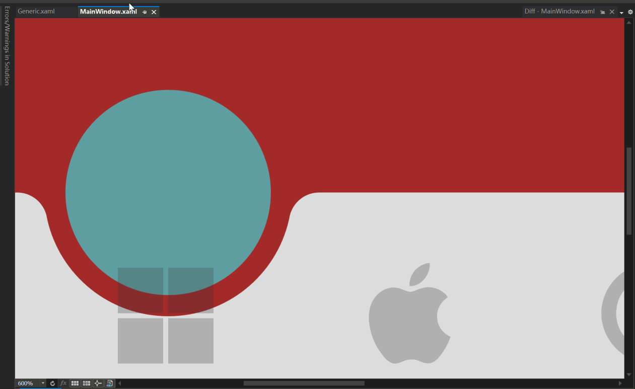
712 |
713 | [Image Source: (ali50m)](https://github.com/vickyqu115/navigationbar/pull/5)
714 |
715 | ### Problem Analysis
716 | 1. The white line is not visible when running at normal size.
717 | 2. The white line appears when the scale is increased beyond a certain level.
718 |
719 | This issue is related to **floating-point arithmetic precision and its impact on graphics when zoomed in**.
720 | While floating-point precision issues are not noticeable in everyday calculations, they become prominent when zoomed in or when precise manipulation is required. When graphics are zoomed in, minor errors are magnified, making them visually prominent.
721 |
722 | ### Why Do Floating-Point Issues Occur When Zooming In?
723 | Floating-point issues become more pronounced when zoomed in due to the following reasons:
724 |
725 | 1. **Smaller Pixel Units:** After zooming in, individual pixel sizes become smaller, requiring more precise calculations.
726 | 2. **More Decimal Places Needed:** When calculating in smaller units, the errors in floating-point arithmetic become more apparent.
727 | 3. **Limitations of Floating-Point Representation:** Floating-point represents real numbers approximately, so when zoomed in, these errors are more noticeable.
728 |
729 | ### Problem Verification
730 | #### No Issue at Normal Size
731 | At normal size, minor floating-point errors are not noticeable. For example, setting the Margin at the top of the Arc to 40 pixels in this project works fine without any issues.
732 |
733 | ```xml
734 |
738 | ```
739 | [Arc at Normal Size]
740 |
741 | 
742 |
743 | #### Issue When Zoomed In
744 | When the graphics are zoomed in, minor floating-point errors are magnified, making them visually prominent.
745 |
746 | [White Line When Zoomed In]
747 |
748 | 
749 |
750 | ### Adjustment Method
751 |
752 | To compensate for the error, you can adjust the Margin value to fit the actual situation. For example, adjust the Margin value to 39.66 pixels to correct the error.
753 |
754 | [Effect After Adjustment]
755 |
756 | 
757 |
758 | ### Limitations and Visual Impact of Floating-Point Precision
759 |
760 | #### Approximation Issue
761 | Computers approximate real numbers with floating-point, so these approximation errors become more pronounced when zoomed in. For example, a Margin value originally set to 40 can cause issues due to minor errors when zoomed in.
762 |
763 | #### Visual Artifacts
764 | Floating-point errors can cause visual artifacts, especially at the boundaries or edges of graphics. This can result in jagged edges or positional deviations.
765 |
766 | ### Solutions for Floating-Point Precision Issues
767 |
768 | To address floating-point precision issues, particularly those that occur when zooming in, the following methods can be used:
769 |
770 | #### 1. Use Fixed-Point Arithmetic
771 | If the required precision range is known exactly, fixed-point arithmetic can be used instead of floating-point to resolve the issue.
772 |
773 | #### 2. Increase Calculation Precision
774 | Use fixed-point arithmetic libraries or fixed-precision data types for calculations.
775 |
776 | #### 3. Avoid Extreme Zooming
777 | If possible, avoid extreme zooming of graphics. Set a reasonable zoom range when designing the application to prevent floating-point errors from becoming prominent.
778 |
779 | #### 4. UseLayoutRounding and SnapsToDevicePixels
780 |
781 | These properties can be used to align boundaries to pixel units. While this may cause performance degradation, it can be easily activated in higher-level controls like Window to solve the issue simply.
782 |
783 | ```text
784 | UseLayoutRounding="True"
785 | SnapsToDevicePixels="True"
786 | ```
787 |
788 | ### Conclusion
789 |
790 | Floating-point precision issues can become prominent when graphics are zoomed in, but these issues can be effectively resolved with appropriate methods and techniques. I hope this explanation helps you understand and resolve floating-point precision issues.
791 |
--------------------------------------------------------------------------------
/README.ko.md:
--------------------------------------------------------------------------------
1 | # NavigationBar [](README.md) [](README.zh-CN.md) [](README.ko.md)
2 |
3 | 애니메이션이 적용된 모바일 스타일의 내비게이션 바를 만들기 위한 정교한 WPF ListBox 기반 CustomControl
4 |
5 | [](https://opensource.org/licenses/MIT)
6 | [](https://dotnet.microsoft.com/download)
7 | [](https://github.com/vickyqu115/navigationbar/stargazers)
8 | [](https://github.com/vickyqu115/navigationbar/issues)
9 |
10 | ## 프로젝트 개요
11 |
12 | NavigationBar는 모바일에서 영감을 받은 내비게이션 인터페이스를 만드는 고급 기술을 보여주는 사용자 정의 WPF 컨트롤입니다. 복잡한 UI 동작과 애니메이션을 구현하는 데 있어 WPF의 강력함과 유연성을 보여주며, 특히 CustomControl 개발과 효율적인 애니메이션 설계에 중점을 둡니다.
13 |
14 |
15 |
16 |
17 |
18 |
19 |
20 |
21 | ## 주요 기능 및 구현 사항
22 | #### 1. 고급 CustomControl 개발
23 | - [x] 특화된 내비게이션 기능을 위한 WPF ListBox 확장
24 | - [x] 순수 XAML과 C#을 사용한 복잡한 UI 요소 구현
25 | - [x] 별도의 애플리케이션 및 라이브러리 프로젝트로 모듈성을 최적화한 프로젝트 구조
26 |
27 | #### 2. 정교한 애니메이션 기법
28 | - [x] 간결하고 효율적인 애니메이션을 위한 Jamesnet.Wpf 애니메이션 래퍼 클래스(ValueItem, ThickItem, ColorItem) 활용
29 | - [x] 내비게이션 항목 간 부드러운 전환을 위한 사용자 정의 애니메이션 로직
30 | - [x] 향상된 유연성을 위해 ItemsPresenter 외부에서 작동하는 혁신적인 애니메이션 설계
31 |
32 | #### 3. XAML 기반 벡터 그래픽
33 | - [x] Visual Studio for Blend에서 Path와 Geometry를 사용한 복잡한 형태 생성
34 | - [x] 확장 가능하고 고품질의 시각적 효과를 위한 벡터 기반 아이콘 구현
35 |
36 | #### 4. 고급 WPF 개념
37 | - [x] 독특한 레이아웃과 동작을 가능하게 하는 ListBox를 위한 정교한 ControlTemplate 설계
38 | - [x] 유연한 항목 레이아웃을 위한 사용자 정의 ItemsPanel 구현
39 |
40 | #### 5. 성능 최적화
41 | - [x] 클리핑 및 레이아웃 기술을 사용한 효율적인 렌더링
42 | - [x] 세심한 리소스 관리를 통한 최적화된 애니메이션 성능
43 |
44 | ## 기술적 심층 분석
45 | - **CustomControl 아키텍처**: WPF에서 CustomControl의 강력함을 보여주며, 동작과 외관을 완전히 제어할 수 있습니다.
46 | - **ItemsPresenter 외부 애니메이션**: ItemsPresenter 외부에서 작동하는 애니메이션을 설계하는 혁신적인 접근 방식으로, 이 컨트롤의 핵심 기능입니다.
47 | - **Jamesnet.Wpf 애니메이션 통합**: Jamesnet.Wpf의 ValueItem, ThickItem, ColorItem을 활용하여 간소화되고 더 읽기 쉬운 애니메이션 코드를 구현합니다.
48 | - **Blend에서의 Geometry 생성**: Visual Studio for Blend를 사용하여 복잡한 geometry를 직접 생성하는 방법을 보여주며, 디자인 프로세스를 향상시킵니다.
49 | - **ListBox ControlTemplate 재설계**: 독특한 내비게이션 바 레이아웃과 기능을 구현하기 위해 ListBox 템플릿을 완전히 개선했습니다.
50 |
51 | ## 기술 스택
52 | - WPF (Windows Presentation Foundation)
53 | - .NET 8.0
54 | - C# 10.0
55 | - XAML
56 | - Jamesnet.Wpf (애니메이션 래퍼 클래스용)
57 |
58 | ## 프로젝트 구조
59 | - 데모 및 테스트를 위한 애플리케이션 프로젝트
60 | - 재사용성을 높이는 NavigationBar 컨트롤을 위한 라이브러리 프로젝트
61 |
62 | ## 시작하기
63 | ### 필요 조건
64 | - Visual Studio 2022 이상
65 | - .NET 8.0 SDK
66 |
67 | ### 설치 및 실행
68 | #### 1. 리포지토리 복제:
69 | ```
70 | git clone https://github.com/vickyqu115/navigationbar.git
71 | ```
72 |
73 | #### 2. 솔루션 열기
74 | - [x] Visual Studio
75 | - [x] Visual Studio Code
76 | - [x] Blend for Visual Studio
77 | - [x] JetBrains Rider
78 |
79 |
80 |
311 |
312 | This method of implementing design elements not only demonstrates how to use Microsoft Blend for complex graphics but also provides a new perspective on thinking and solving design problems. This approach makes the circle not only aesthetically appealing but also technically innovative, enhancing quality.
313 |
314 | ## 3. Animation: ListBoxItem
315 |
316 | The animation behavior in the ListBoxItem area, which includes icons and text, is relatively simple. It features moving components upwards and adjusting opacity transparency when IsSelected is set to true.
317 |
318 | > Please carefully observe the animation path and effects through the image below:
319 |
320 |
321 |
322 | As shown in the image above, the animation is triggered each time the IsSelected value of the ListBox control changes. Additionally, since the movement of the icon and text doesn't go beyond the ListBoxItem area, it's preferable to implement a static Storyboard element directly within XAML.
323 |
324 | > This can be controlled using a Trigger or VisualStateManager module. For this control, a simple Trigger module approach is utilized for handling just the IsSelected action.
325 |
326 | #### Storyboard
327 |
328 | For the ListBoxItem area's animation behavior, it's necessary to prepare scenarios for both when IsSelected is true and when it's false.
329 |
330 | ```xaml
331 |
332 |
333 |
334 |
335 |
336 |
337 |
338 |
339 |
340 |
341 |
342 |
343 |
344 | ```
345 |
346 | > The key here is specifying the movement path in 'Selected' and the return path in 'UnSelected'.
347 |
348 | #### Trigger
349 |
350 | Finally, the implementation of animation in the ListBoxItem area concludes by declaring BeginStoryboard using Trigger to activate the respective (Selected/UnSelected) Storyboards.
351 |
352 | > Unlike typical Trigger property changes, animations require a return scenario as well.
353 |
354 | ```xaml
355 |
356 |
357 |
358 |
359 |
360 |
361 |
362 |
363 |
364 |
365 | ```
366 |
367 | The method of configuring animation in the ListBoxItem area is relatively simple. However, implementing the movement of the Circle component, which is introduced next, requires more complex calculations for dynamic behavior.
368 |
369 | ## 4. Movement of the Circle Component
370 |
371 | Now it's time to implement the animation for the movement of the Circle component. Below is a video showing the dynamic movement of the Circle.
372 |
373 | 
374 |
375 | The movement of the Circle component must be precisely calculated based on the clicked position, so it can't be implemented in XAML and needs to be handled dynamically in C# code. Therefore, a method for connecting XAML and Code Behind is required.
376 |
377 | #### OnApplyTemplate
378 |
379 | This method is used to retrieve the Circle area inside the MagicBar control. It's called internally at the connection point between the control and the template. Hence, it's implemented in the MagicBar class via override.
380 |
381 | Then, the 'PART_Circle' named circle element is searched using the GetTemplateChild method. This Grid will be the target element for displaying the animation effect during interaction.
382 |
383 | ```csharp
384 | public override void OnApplyTemplate()
385 | {
386 | base.OnApplyTemplate();
387 | Grid grid = (Grid)GetTemplateChild("PART_Circle");
388 |
389 | InitStoryboard(grid);
390 | }
391 | ```
392 |
393 | #### InitStoryboard
394 |
395 | This method initializes the animation. Instances of ValueItem (_vi) and Storyboard (_sb) are created first. The animation effect set in ValueItem is QuinticEaseInOut, which slows down at the start and end of the animation, making it look smooth and natural.
396 |
397 | The movement path for the Circle is specified as Canvas.LeftProperty, meaning it changes the horizontal position of the target element. The duration of the animation is set to 0.5 seconds. Finally, the animation target is set as the Circle component (Grid), and the defined animation is added to the storyboard.
398 |
399 | ```csharp
400 | private void InitStoryboard(Grid circle)
401 | {
402 | _vi = new();
403 | _sb = new();
404 |
405 | _vi.Mode = EasingFunctionBaseMode.QuinticEaseInOut;
406 | _vi.Property = new PropertyPath(Canvas.LeftProperty);
407 | _vi.Duration = new Duration(new TimeSpan(0, 0, 0, 0, 500));
408 |
409 | Storyboard.SetTarget(_vi, circle);
410 | Storyboard.SetTargetProperty(_vi, _vi.Property);
411 |
412 | _sb.Children.Add(_vi);
413 | }
414 | ```
415 |
416 | #### OnSelectionChanged
417 |
418 | The scenario for moving the Circle component is now implemented. In the MagicBar class, the OnSelectionChanged event method is implemented to handle the 'PART_Circle' (Grid) element and to execute (Begin) the storyboard.
419 |
420 | > The MagicBar control, being a CustomControl derived from ListBox, has the advantage of flexibly implementing override features.
421 |
422 | ```C#
423 | protected override void OnSelectionChanged(SelectionChangedEventArgs e)
424 | {
425 | base.OnSelectionChanged(e);
426 |
427 | _vi.To = SelectedIndex * 80;
428 | _sb.Begin();
429 | }
430 | ```
431 | In this method, the logic to dynamically calculate and change the To value based on the SelectedIndex is implemented every time the selected menu changes.
432 |
433 | ## 5. Conclusion: Examining the Complete Source Code of the CustomControl
434 |
435 | Finally, it's time to take a look at the complete structure of the XAML/Csharp code for the MagicBar control. This is an opportunity to see how elegantly and succinctly the control is implemented within the CustomControl structure.
436 |
437 | #### Generic.xaml
438 | > Despite the implementation of various features, you can observe the maximally streamlined structure of XAML. Notably, the ControlTemplate structure included in the MagicBar simplifies complex layer hierarchies for easy viewing. Additionally, even small elements like Storyboard, Geometry, TextBlock, and JamesIcon are organized in a regular and systematic manner.
439 |
440 | ```xaml
441 |
446 |
447 |
448 |
449 |
450 |
451 |
452 |
453 |
454 |
455 |
456 |
457 |
458 |
459 |
460 |
461 |
467 |
468 |
476 |
477 |
501 |
502 |
503 | M0,0 L100,0 C95.167503,0 91.135628,3.4278221 90.203163,7.9846497 L90.152122,8.2704506 89.963921,9.1416779 C85.813438,27.384438 69.496498,41 50,41 30.5035,41 14.186564,27.384438 10.036079,9.1416779 L9.8478823,8.2704926 9.7968359,7.9846497 C8.8643732,3.4278221 4.8324914,0 0,0 z
504 |
505 |
506 |
513 |
514 |
519 |
520 |
525 |
526 |
561 |
562 | ```
563 |
564 | #### MagicBar.cs
565 |
566 | > The process of locating the disjointed ControlTemplate elements through OnApplyTemplate is a very important and fundamental task, akin to a symbol of WPF. Finding the designated PART_Circle object (Grid) and dynamically composing and activating the Circle's movement (Move) animation whenever the menu changes serves to vividly demonstrate the vitality and dynamic capabilities of WPF.
567 |
568 | ```csharp
569 | using Jamesnet.Wpf.Animation;
570 | using Jamesnet.Wpf.Controls;
571 | using System;
572 | using System.Collections.Generic;
573 | using System.Linq;
574 | using System.Text;
575 | using System.Threading.Tasks;
576 | using System.Windows;
577 | using System.Windows.Controls;
578 | using System.Windows.Data;
579 | using System.Windows.Documents;
580 | using System.Windows.Input;
581 | using System.Windows.Media;
582 | using System.Windows.Media.Animation;
583 | using System.Windows.Media.Imaging;
584 | using System.Windows.Navigation;
585 | using System.Windows.Shapes;
586 | namespace NavigationBar
587 | {
588 |
589 | public class MagicBar : ListBox
590 | {
591 | private ValueItem _vi;
592 | private Storyboard _sb;
593 |
594 | static MagicBar()
595 | {
596 | DefaultStyleKeyProperty.OverrideMetadata(typeof(MagicBar), new FrameworkPropertyMetadata(typeof(MagicBar)));
597 | }
598 |
599 | public override void OnApplyTemplate()
600 | {
601 | base.OnApplyTemplate();
602 | Grid grid = (Grid)GetTemplateChild("PART_Circle");
603 |
604 | InitStoryboard(grid);
605 | }
606 |
607 | private void InitStoryboard(Grid circle)
608 | {
609 | _vi = new();
610 | _sb = new();
611 |
612 | _vi.Mode = EasingFunctionBaseMode.QuinticEaseInOut;
613 | _vi.Property = new PropertyPath(Canvas.LeftProperty);
614 | _vi.Duration = new Duration(new TimeSpan(0, 0, 0, 0, 500));
615 |
616 | Storyboard.SetTarget(_vi, circle);
617 | Storyboard.SetTargetProperty(_vi, _vi.Property);
618 |
619 | _sb.Children.Add(_vi);
620 | }
621 |
622 | protected override void OnSelectionChanged(SelectionChangedEventArgs e)
623 | {
624 | base.OnSelectionChanged(e);
625 |
626 | _vi.To = SelectedIndex * 80;
627 | _sb.Begin();
628 | }
629 | }
630 | }
631 | ```
632 | As such, by implementing features that would normally be handled through UserControl in a CustomControl approach at the control level, we can achieve more sophisticated and efficient modularization.
633 |
634 | With this, I conclude the explanation of the main features. Detailed information about this control is freely available through the GitHub source code. Additionally, in-depth tutorials are provided in both English and Chinese on YouTube and Bilibili, respectively. I look forward to seeing the diverse research and application of this control in XAML-based platforms.
635 |
636 |
637 | ## 6.Dynamic Navigation Bar Customization Using Model Binding
638 |
639 | This guide explains how to customize the navigation bar by binding a model to `ItemsSource` instead of directly creating `ListBoxItem` elements in XAML. This approach enhances the flexibility and scalability of your application.
640 |
641 |
642 |
643 |
644 |
645 | ### Step 1: Create the Model
646 |
647 | First, define a model to represent the navigation items. This model includes a display name and an icon.
648 |
649 | ```csharp
650 | public class NavigationModel
651 | {
652 | public string DisplayName { get; set; }
653 | public IconType MenuIcon { get; set; }
654 | }
655 | ```
656 |
657 | ### Step 2: Update Binding in Generic.xaml
658 | Modify the binding in your Generic.xaml to reflect the model properties. This allows the navigation bar to display the appropriate text and icon for each item.
659 |
660 | ```xaml
661 |
662 |
663 | ```
664 |
665 | ### Step 3: Update MainWindow.xaml
666 | Remove the manually defined ListBoxItem elements from MainWindow.xaml and ensure the MagicBar control is ready to bind to a source.
667 |
668 | ```xaml
669 |
670 | ```
671 |
672 | ### Step 4: Populate ItemsSource in Code-Behind or ViewModel
673 | In your MainWindow.xaml.cs or a ViewModel file, create a list of NavigationModel items and set it as the ItemsSource for the MagicBar.
674 |
675 |
676 | ```csharp
677 | private void PopulateNavigationItems()
678 | {
679 | List items = new List
680 | {
681 | new NavigationModel { DisplayName = "Microsoft", MenuIcon = IconType.Microsoft },
682 | new NavigationModel { DisplayName = "Apple", MenuIcon = IconType.Apple },
683 | new NavigationModel { DisplayName = "Google", MenuIcon = IconType.Google },
684 | new NavigationModel { DisplayName = "Facebook", MenuIcon = IconType.Facebook },
685 | new NavigationModel { DisplayName = "Instagram", MenuIcon = IconType.Instagram }
686 | };
687 |
688 | bar.ItemsSource = items;
689 | }
690 | ```
691 |
692 | ## Step 5: Adjust the ItemsPanel Template
693 | Finally, customize the ItemsPanel template in Generic.xaml to dynamically adjust the number of columns based on the item count, using a UniformGrid.
694 |
695 | ```xaml
696 |
697 |
698 |
699 | ```
700 |
701 | ## Conclusion
702 | Following these steps allows you to dynamically create a navigation bar with customizable items. This method provides a more scalable and maintainable approach to managing navigation elements in your application.
703 |
704 |
705 | ## Q&A
706 | ### Floating-Point Precision Issue in Magic Navigationbar Tutorial
707 | In the third Magic Navigationbar WPF tutorial video, a viewer raised the following question:
708 |
709 | "I see very thin white lines in the XAML designer of VS. I have seen this white line occasionally in other projects as well."
710 |
711 | 
712 |
713 | [Image Source: (ali50m)](https://github.com/vickyqu115/navigationbar/pull/5)
714 |
715 | ### Problem Analysis
716 | 1. The white line is not visible when running at normal size.
717 | 2. The white line appears when the scale is increased beyond a certain level.
718 |
719 | This issue is related to **floating-point arithmetic precision and its impact on graphics when zoomed in**.
720 | While floating-point precision issues are not noticeable in everyday calculations, they become prominent when zoomed in or when precise manipulation is required. When graphics are zoomed in, minor errors are magnified, making them visually prominent.
721 |
722 | ### Why Do Floating-Point Issues Occur When Zooming In?
723 | Floating-point issues become more pronounced when zoomed in due to the following reasons:
724 |
725 | 1. **Smaller Pixel Units:** After zooming in, individual pixel sizes become smaller, requiring more precise calculations.
726 | 2. **More Decimal Places Needed:** When calculating in smaller units, the errors in floating-point arithmetic become more apparent.
727 | 3. **Limitations of Floating-Point Representation:** Floating-point represents real numbers approximately, so when zoomed in, these errors are more noticeable.
728 |
729 | ### Problem Verification
730 | #### No Issue at Normal Size
731 | At normal size, minor floating-point errors are not noticeable. For example, setting the Margin at the top of the Arc to 40 pixels in this project works fine without any issues.
732 |
733 | ```xml
734 |
738 | ```
739 | [Arc at Normal Size]
740 |
741 | 
742 |
743 | #### Issue When Zoomed In
744 | When the graphics are zoomed in, minor floating-point errors are magnified, making them visually prominent.
745 |
746 | [White Line When Zoomed In]
747 |
748 | 
749 |
750 | ### Adjustment Method
751 |
752 | To compensate for the error, you can adjust the Margin value to fit the actual situation. For example, adjust the Margin value to 39.66 pixels to correct the error.
753 |
754 | [Effect After Adjustment]
755 |
756 | 
757 |
758 | ### Limitations and Visual Impact of Floating-Point Precision
759 |
760 | #### Approximation Issue
761 | Computers approximate real numbers with floating-point, so these approximation errors become more pronounced when zoomed in. For example, a Margin value originally set to 40 can cause issues due to minor errors when zoomed in.
762 |
763 | #### Visual Artifacts
764 | Floating-point errors can cause visual artifacts, especially at the boundaries or edges of graphics. This can result in jagged edges or positional deviations.
765 |
766 | ### Solutions for Floating-Point Precision Issues
767 |
768 | To address floating-point precision issues, particularly those that occur when zooming in, the following methods can be used:
769 |
770 | #### 1. Use Fixed-Point Arithmetic
771 | If the required precision range is known exactly, fixed-point arithmetic can be used instead of floating-point to resolve the issue.
772 |
773 | #### 2. Increase Calculation Precision
774 | Use fixed-point arithmetic libraries or fixed-precision data types for calculations.
775 |
776 | #### 3. Avoid Extreme Zooming
777 | If possible, avoid extreme zooming of graphics. Set a reasonable zoom range when designing the application to prevent floating-point errors from becoming prominent.
778 |
779 | #### 4. UseLayoutRounding and SnapsToDevicePixels
780 |
781 | These properties can be used to align boundaries to pixel units. While this may cause performance degradation, it can be easily activated in higher-level controls like Window to solve the issue simply.
782 |
783 | ```text
784 | UseLayoutRounding="True"
785 | SnapsToDevicePixels="True"
786 | ```
787 |
788 | ### Conclusion
789 |
790 | Floating-point precision issues can become prominent when graphics are zoomed in, but these issues can be effectively resolved with appropriate methods and techniques. I hope this explanation helps you understand and resolve floating-point precision issues.
791 |
--------------------------------------------------------------------------------
/README.ko.md:
--------------------------------------------------------------------------------
1 | # NavigationBar [](README.md) [](README.zh-CN.md) [](README.ko.md)
2 |
3 | 애니메이션이 적용된 모바일 스타일의 내비게이션 바를 만들기 위한 정교한 WPF ListBox 기반 CustomControl
4 |
5 | [](https://opensource.org/licenses/MIT)
6 | [](https://dotnet.microsoft.com/download)
7 | [](https://github.com/vickyqu115/navigationbar/stargazers)
8 | [](https://github.com/vickyqu115/navigationbar/issues)
9 |
10 | ## 프로젝트 개요
11 |
12 | NavigationBar는 모바일에서 영감을 받은 내비게이션 인터페이스를 만드는 고급 기술을 보여주는 사용자 정의 WPF 컨트롤입니다. 복잡한 UI 동작과 애니메이션을 구현하는 데 있어 WPF의 강력함과 유연성을 보여주며, 특히 CustomControl 개발과 효율적인 애니메이션 설계에 중점을 둡니다.
13 |
14 |
15 |
16 |
17 |
18 |
19 |
20 |
21 | ## 주요 기능 및 구현 사항
22 | #### 1. 고급 CustomControl 개발
23 | - [x] 특화된 내비게이션 기능을 위한 WPF ListBox 확장
24 | - [x] 순수 XAML과 C#을 사용한 복잡한 UI 요소 구현
25 | - [x] 별도의 애플리케이션 및 라이브러리 프로젝트로 모듈성을 최적화한 프로젝트 구조
26 |
27 | #### 2. 정교한 애니메이션 기법
28 | - [x] 간결하고 효율적인 애니메이션을 위한 Jamesnet.Wpf 애니메이션 래퍼 클래스(ValueItem, ThickItem, ColorItem) 활용
29 | - [x] 내비게이션 항목 간 부드러운 전환을 위한 사용자 정의 애니메이션 로직
30 | - [x] 향상된 유연성을 위해 ItemsPresenter 외부에서 작동하는 혁신적인 애니메이션 설계
31 |
32 | #### 3. XAML 기반 벡터 그래픽
33 | - [x] Visual Studio for Blend에서 Path와 Geometry를 사용한 복잡한 형태 생성
34 | - [x] 확장 가능하고 고품질의 시각적 효과를 위한 벡터 기반 아이콘 구현
35 |
36 | #### 4. 고급 WPF 개념
37 | - [x] 독특한 레이아웃과 동작을 가능하게 하는 ListBox를 위한 정교한 ControlTemplate 설계
38 | - [x] 유연한 항목 레이아웃을 위한 사용자 정의 ItemsPanel 구현
39 |
40 | #### 5. 성능 최적화
41 | - [x] 클리핑 및 레이아웃 기술을 사용한 효율적인 렌더링
42 | - [x] 세심한 리소스 관리를 통한 최적화된 애니메이션 성능
43 |
44 | ## 기술적 심층 분석
45 | - **CustomControl 아키텍처**: WPF에서 CustomControl의 강력함을 보여주며, 동작과 외관을 완전히 제어할 수 있습니다.
46 | - **ItemsPresenter 외부 애니메이션**: ItemsPresenter 외부에서 작동하는 애니메이션을 설계하는 혁신적인 접근 방식으로, 이 컨트롤의 핵심 기능입니다.
47 | - **Jamesnet.Wpf 애니메이션 통합**: Jamesnet.Wpf의 ValueItem, ThickItem, ColorItem을 활용하여 간소화되고 더 읽기 쉬운 애니메이션 코드를 구현합니다.
48 | - **Blend에서의 Geometry 생성**: Visual Studio for Blend를 사용하여 복잡한 geometry를 직접 생성하는 방법을 보여주며, 디자인 프로세스를 향상시킵니다.
49 | - **ListBox ControlTemplate 재설계**: 독특한 내비게이션 바 레이아웃과 기능을 구현하기 위해 ListBox 템플릿을 완전히 개선했습니다.
50 |
51 | ## 기술 스택
52 | - WPF (Windows Presentation Foundation)
53 | - .NET 8.0
54 | - C# 10.0
55 | - XAML
56 | - Jamesnet.Wpf (애니메이션 래퍼 클래스용)
57 |
58 | ## 프로젝트 구조
59 | - 데모 및 테스트를 위한 애플리케이션 프로젝트
60 | - 재사용성을 높이는 NavigationBar 컨트롤을 위한 라이브러리 프로젝트
61 |
62 | ## 시작하기
63 | ### 필요 조건
64 | - Visual Studio 2022 이상
65 | - .NET 8.0 SDK
66 |
67 | ### 설치 및 실행
68 | #### 1. 리포지토리 복제:
69 | ```
70 | git clone https://github.com/vickyqu115/navigationbar.git
71 | ```
72 |
73 | #### 2. 솔루션 열기
74 | - [x] Visual Studio
75 | - [x] Visual Studio Code
76 | - [x] Blend for Visual Studio
77 | - [x] JetBrains Rider
78 |
79 |
80 |  81 |
82 |
83 |
84 | #### 3. 빌드 및 실행
85 | - [x] 시작 프로젝트 설정
86 | - [x] F5를 누르거나 실행 버튼 클릭
87 | - [x] Windows 11 권장
88 |
89 | ## 학습 자료
90 | - [구현에 대한 상세 아티클](https://jamesnet.dev/article/edit/110)
91 | - [YouTube 튜토리얼](https://bit.ly/3TVeRhF)
92 | - [BiliBili 튜토리얼](https://bit.ly/3UvaOsl)
93 | - [CodeProject](https://www.codeproject.com/Articles/5375482/Customizing-ListBox-for-a-Smooth-Animated-Navigati)
94 |
95 | ## 기여하기
96 | NavigationBar에 대한 기여를 환영합니다! 이슈를 제출하거나, 풀 리퀘스트를 생성하거나, 개선 사항을 제안해 주세요.
97 |
98 | ## 라이선스
99 | 이 프로젝트는 MIT 라이선스 하에 배포됩니다. 자세한 내용은 [LICENSE](LICENSE) 파일을 참조하세요.
100 |
101 | ## 연락처
102 | - 웹사이트: https://jamesnet.dev
103 | - 이메일: vickyqu115@hotmail.com, james@jamesnet.dev
104 |
105 | NavigationBar로 고급 WPF 기술을 탐험하고 매력적인 내비게이션 경험을 만들어보세요!
106 |
107 | ## Introduction
108 | WPF applications traditionally prefer a programmatic approach that connects multiple screens through menu configurations and presents them in a unified manner. This technique, often referred to as the menu or Navigation, is one of the core implementations in WPF. It also has a direct correlation with the architecture (design) of the project, so paying more attention to its implementation can positively impact the quality of the project.
109 |
110 | This control features a design and animations specialized for mobile, but it can be elegantly and structurally implemented using ListBox and Animation technologies available in WPF. Additionally, it can be similarly implemented in Cross-Platform environments such as AvaloniaUI, Uno, OpenSilver, MAUI, which allows this project to be researched and applied across various platforms.
111 |
112 | The goal is also to widely promote the flexibility and excellence of WPF implementation and share the technology. Through this project, we hope you will deeply experience the charm of WPF.
113 |
114 | ## Cross-Platform Source Code Introduction
115 | This project can be joined not only in WPF but also in various Cross-Platform environments. You can check out the MAUI/AvaloniaUI versions by [Lukewire129](https://github.com/lukewire129), [furesoft](https://github.com/furesoft) and furesoft through [Discussions](https://github.com/vickyqu115/navigationbar/discussions).
116 |
117 | - [MAUI (Lukewire129)](https://github.com/vickyqu115/navigationbar/discussions/3)
118 | - [Avalonia Version (Lukewire129)](https://github.com/vickyqu115/navigationbar/discussions/4)
119 | - [Avalonia Version (furesoft)](https://github.com/vickyqu115/navigationbar/discussions/2)
120 |
121 | ## Design and Structural Philosophy
122 |
123 | 
124 |
125 |
126 | This control style is one used widely through web or mobile navigation configurations. Therefore, it's commonly seen implemented using IOS, Android, or HTML/CSS technologies. Implementing it with CSS/HTML and JavaScript allows for relatively easy construction of structure and animation functions. In contrast, WPF, through XAML, might feel comparatively complex in terms of design, event, and animation implementation. Thus, the key to this control's implementation is to make the most of WPF's characteristics and provide a high-level implementation method that lets users feel the structural strengths of WPF.
127 |
128 | A lot of focus has been put into the quality of the Source code through Refactoring. The project minimizes/optimizes hierarchical XAML structures and emphasizes enhancing code quality through interaction between XAML and Behind code using CustomControl. The control isn't just about providing basic functionality; it's about conveying technical inspiration and encouraging diverse applications through its structural philosophy.
129 |
130 | ## Project Detail
131 |
132 | #### MagicBar.cs
133 | MagicBar, the core control of this project, is a CustomControl inheriting from ListBox control. In most development scenarios, UserControl is the usual choice, but for functions involving complex features, animations, and repetitive elements like in this case, it's more effective to divide and implement them as smaller Control (CustomControl) units.
134 |
135 | If you're not familiar with CustomControl, please read the following:
136 |
137 | > The CustomControl approach itself is technically challenging and conceptually different from traditional desktop methods like Windows Forms, making it somewhat difficult to approach easily. Additionally, finding reference materials for guidance is challenging. However, this is an important process to elevate your WPF technical skills. We encourage you to open-mindedly take on the challenge of CustomControl implementation with this opportunity.
138 |
139 | #### Generic.xaml
140 | CustomControl is characterized by its separation and management of the XAML Design area. Therefore, it doesn't provide direct interaction between the XAML area and the control (Class). Interaction between these two areas is supported through other indirect methods. The first method involves exploring the Template area through the OnApplyTemplate timing. The second method extends binding through DependencyProperty declarations.
141 |
142 | This structural feature allows for a perfect separation of design and code, enhancing code reusability and extensibility, and understanding the traditional structure of WPF in depth. All controls used in WPF follow this same method. To verify this, you can directly explore the open-source dotnet/WPF repository available on GitHub.
143 |
144 | ## 1. XAML Configuration
145 |
146 | #### Introduction to Geometry
147 |
148 | Geometry is one of the design elements provided in WPF, used for vector-based designs. Traditionally, development methods preferred bitmap images like PNG or JPEG, but there's a growing preference for vector-based designs in recent times. This change can be attributed to improvements in computer performance, developments in monitor resolutions, and shifts in design trends. Hence, the role of Geometry elements is significant in this control. The process of implementing the Circle in the latter part is explained in more detail.
149 |
150 | #### Separation of Animation Elements and ItemsPresenter
151 |
152 | MagicBar inherits from the ListBox control and uniquely uses the ItemsPresenter element provided through the ItemsControl feature. However, interaction between child elements within the ItemsPresenter is not possible, implying that continuing Animation actions among child items is also unfeasible.
153 |
154 | The behavior of ListBoxItem is determined by the type of Panel specified through the ItemsPanelTemplate in the ItemsPresenter element. Therefore, the choice of Panel layout significantly affects the behavior of ListBoxItem. In the case of StackPanel, the order of the added child elements in the Children collection determines their position. For Grid, placement is determined by Row/Column settings.
155 |
156 | Thus, linking Animation actions between child elements structurally is not possible.
157 |
158 | > However, there are exceptions. In the case of Canvas, interaction through Animation is possible using the concept of coordinates, but it requires complex calculations and precise implementation for all controls. Yet, better implementation methods exist, so Canvas control content is omitted in this context.
159 |
160 | #### ListBox ControlTemplate Hierarchy
161 | Usually, in implementing ListBox control, greater emphasis is placed on the child element ListBoxItem. However, for this control, the key feature - the Circle structure - needs to be positioned outside the area of the ItemsPresenter element. Therefore, forming a complex Template in the ListBox control is crucial.
162 |
163 | The hierarchy of the ControlTemplate is as follows:
164 |
165 | > The following is a simplified representation for clarity and differs from the actual Source code content. The Circle part can easily be found in the text as "PART_Circle".
166 |
167 | ```xaml
168 |
169 |
170 |
171 |
172 |
173 |
174 | ```
175 |
176 | As seen above, the key is to position the ItemsPresenter and Circle at the same hierarchical level. This arrangement allows the Circle element's Animation range to appear as if freely moving across the ItemsPresenter's child elements. Moreover, it's essential to place the ItemsPresenter element in front of the Circle so that the ListBoxItem element's icons and text do not visually cover the Circle.
177 |
178 | Having discussed the theory, let's now delve into the actual source code for a detailed comparison.
179 |
180 | > The area with x:Name="PART_Circle" corresponds to the Circle.
181 |
182 | ```xaml
183 |
218 | ```
219 |
220 | #### ListBoxItem Template Configuration
221 |
222 | Unlike the ListBox control's Template, the configuration of the ListBoxItem is relatively simple. Also, since it's unrelated to the Circle Animation element, it comprises only the menu item's icon and text.
223 |
224 | ```xaml
225 |
239 | ```
240 |
241 | In addition, Animation that changes the position and color of the icon and text is included. As previously mentioned, no special functionality needs to be implemented in this ListBoxItem element.
242 |
243 | > JamesIcon is a control provided through the Jamesnet.Wpf library available via NuGet, offering various icons. To substitute it, you can either use the Path control for direct Geometry design implementation or use images with a transparent (Transparent) background.
244 |
245 | #### JamesIcon Style
246 |
247 | JamesIcon internally includes a Path control and provides various DependencyProperty attributes to allow flexible design definitions from the outside. Key properties include Icon, Width, Height, Fill, etc.
248 |
249 | > Vector-based Geometry icons offer consistent designs, which is one way to enhance the quality of the control. Therefore, it's worth examining these differences closely.
250 |
251 | ```xaml
252 |
258 | ```
259 |
260 | #### RelativeSource Binding
261 |
262 | Since the JamesIcon style is separated from the Template, it's impossible to use TemplateBinding Tag binding as shown below:
263 |
264 | ```xaml
265 | // Binding method that's not possible
266 |
267 | ```
268 |
269 | Therefore, RelativeSource binding is used to search for the ListBoxItem, the parent element, and bind its Tag property, as shown below:
270 |
271 | ```xaml
272 | <... Value="{Binding RelativeSource={RelativeSource AncestorType=ListBoxItem}, Path=Tag}"/>
273 | ```
274 |
275 | Using RelativeSource binding, the original TemplateBinding of the icon defined within the ListBoxItem area can be individually moved to the JamesIcon area. This approach allows each component (JamesIcon) to have its own definition and style, making the code more modular, easier to maintain, and reusable. Separating bindings and styles into their respective areas clarifies the overall code structure, making it easier to understand and modify. Additionally, this separation provides greater flexibility, allowing individual components' styles and behaviors to be adjusted without affecting other components.
276 |
277 | ## 2. Microsoft Blend: Geometry Design
278 |
279 |
280 |
281 | Microsoft Blend, the successor to Expression Blend, continues to hold its name despite a reduction in certain features. This program can be added during the installation process of Visual Studio. If you can't find this program, it's possible to add it via the Visual Studio Installer.
282 |
283 | Although Microsoft Blend shares most features with Visual Studio, it includes some additional features specialized in design. Among them are functions related to Geometry, partially resembling features found in Adobe's Illustrator.
284 |
285 | Using Microsoft Blend in WPF development isn't essential, nor is it exclusively for designers. Instead, it serves as a valuable tool for developers to create professional and attractive design elements without extensive design training.
286 |
287 | > However, most of the design features provided by Microsoft Blend can be more powerfully utilized in environments like Figma and Illustrator, so there's no pressing need to learn it. But some features related to Geometry are easy to use without separate training, and thus worth examining closely.
288 |
289 | #### Analysis of Circle (🔵) Design
290 | The Circle in the MagicBar control is a crucial point of this project, visually functioning as the menu changes. It includes smooth Animation, adding a contemporary and trendy design element.
291 |
292 | The Circle element doesn't necessarily have to be implemented based on Geometry. Using an image could be a simpler method. However, in terms of quality, Geometry designs are becoming more popular as they can handle resolution changes due to size variations more delicately.
293 |
294 | > As shown in the image below, a characteristic of Geometry is that you can resize it as much as you want without losing clarity.
295 |
296 |
297 |
298 | If you look closely at the Circle design, you'll see that it creates a sense of space by overlapping a black circle and a green circle. Additionally, rounding the lines on both sides makes it blend naturally into the MagicBar area. This not only looks visually smooth but also appears more elegant when animated. However, implementing this arc can be challenging and is often abandoned during practical implementation.
299 |
300 | But this is where Microsoft Blend becomes useful in easily creating these special shapes.
301 |
302 | #### Drawing Method
303 |
304 | The design process involves drawing a large circle with a convex arc at the bottom, then adding smaller circles of the same height on both sides of the large circle. By adjusting the diameter of the large circle, ensure that the large and small circles intersect perfectly.
305 |
306 |
307 |
308 | Next, use the merge function to cut the unnecessary parts of the large circle and the subtract function to remove unwanted parts of the small circle, leaving only the arc shape at the intersection. Finally, add a rectangle and remove unnecessary parts to create a unique and natural arc shape.
309 |
310 |
311 |
312 | This method of implementing design elements not only demonstrates how to use Microsoft Blend for complex graphics but also provides a new perspective on thinking and solving design problems. This approach makes the circle not only aesthetically appealing but also technically innovative, enhancing quality.
313 |
314 | ## 3. Animation: ListBoxItem
315 |
316 | The animation behavior in the ListBoxItem area, which includes icons and text, is relatively simple. It features moving components upwards and adjusting opacity transparency when IsSelected is set to true.
317 |
318 | > Please carefully observe the animation path and effects through the image below:
319 |
320 |
321 |
322 | As shown in the image above, the animation is triggered each time the IsSelected value of the ListBox control changes. Additionally, since the movement of the icon and text doesn't go beyond the ListBoxItem area, it's preferable to implement a static Storyboard element directly within XAML.
323 |
324 | > This can be controlled using a Trigger or VisualStateManager module. For this control, a simple Trigger module approach is utilized for handling just the IsSelected action.
325 |
326 | #### Storyboard
327 |
328 | For the ListBoxItem area's animation behavior, it's necessary to prepare scenarios for both when IsSelected is true and when it's false.
329 |
330 | ```xaml
331 |
332 |
333 |
334 |
335 |
336 |
337 |
338 |
339 |
340 |
341 |
342 |
343 |
344 | ```
345 |
346 | > The key here is specifying the movement path in 'Selected' and the return path in 'UnSelected'.
347 |
348 | #### Trigger
349 |
350 | Finally, the implementation of animation in the ListBoxItem area concludes by declaring BeginStoryboard using Trigger to activate the respective (Selected/UnSelected) Storyboards.
351 |
352 | > Unlike typical Trigger property changes, animations require a return scenario as well.
353 |
354 | ```xaml
355 |
356 |
357 |
358 |
359 |
360 |
361 |
362 |
363 |
364 |
365 | ```
366 |
367 | The method of configuring animation in the ListBoxItem area is relatively simple. However, implementing the movement of the Circle component, which is introduced next, requires more complex calculations for dynamic behavior.
368 |
369 | ## 4. Movement of the Circle Component
370 |
371 | Now it's time to implement the animation for the movement of the Circle component. Below is a video showing the dynamic movement of the Circle.
372 |
373 | 
374 |
375 | The movement of the Circle component must be precisely calculated based on the clicked position, so it can't be implemented in XAML and needs to be handled dynamically in C# code. Therefore, a method for connecting XAML and Code Behind is required.
376 |
377 | #### OnApplyTemplate
378 |
379 | This method is used to retrieve the Circle area inside the MagicBar control. It's called internally at the connection point between the control and the template. Hence, it's implemented in the MagicBar class via override.
380 |
381 | Then, the 'PART_Circle' named circle element is searched using the GetTemplateChild method. This Grid will be the target element for displaying the animation effect during interaction.
382 |
383 | ```csharp
384 | public override void OnApplyTemplate()
385 | {
386 | base.OnApplyTemplate();
387 | Grid grid = (Grid)GetTemplateChild("PART_Circle");
388 |
389 | InitStoryboard(grid);
390 | }
391 | ```
392 |
393 | #### InitStoryboard
394 |
395 | This method initializes the animation. Instances of ValueItem (_vi) and Storyboard (_sb) are created first. The animation effect set in ValueItem is QuinticEaseInOut, which slows down at the start and end of the animation, making it look smooth and natural.
396 |
397 | The movement path for the Circle is specified as Canvas.LeftProperty, meaning it changes the horizontal position of the target element. The duration of the animation is set to 0.5 seconds. Finally, the animation target is set as the Circle component (Grid), and the defined animation is added to the storyboard.
398 |
399 | ```csharp
400 | private void InitStoryboard(Grid circle)
401 | {
402 | _vi = new();
403 | _sb = new();
404 |
405 | _vi.Mode = EasingFunctionBaseMode.QuinticEaseInOut;
406 | _vi.Property = new PropertyPath(Canvas.LeftProperty);
407 | _vi.Duration = new Duration(new TimeSpan(0, 0, 0, 0, 500));
408 |
409 | Storyboard.SetTarget(_vi, circle);
410 | Storyboard.SetTargetProperty(_vi, _vi.Property);
411 |
412 | _sb.Children.Add(_vi);
413 | }
414 | ```
415 |
416 | #### OnSelectionChanged
417 |
418 | The scenario for moving the Circle component is now implemented. In the MagicBar class, the OnSelectionChanged event method is implemented to handle the 'PART_Circle' (Grid) element and to execute (Begin) the storyboard.
419 |
420 | > The MagicBar control, being a CustomControl derived from ListBox, has the advantage of flexibly implementing override features.
421 |
422 | ```C#
423 | protected override void OnSelectionChanged(SelectionChangedEventArgs e)
424 | {
425 | base.OnSelectionChanged(e);
426 |
427 | _vi.To = SelectedIndex * 80;
428 | _sb.Begin();
429 | }
430 | ```
431 | In this method, the logic to dynamically calculate and change the To value based on the SelectedIndex is implemented every time the selected menu changes.
432 |
433 | ## 5. Conclusion: Examining the Complete Source Code of the CustomControl
434 |
435 | Finally, it's time to take a look at the complete structure of the XAML/Csharp code for the MagicBar control. This is an opportunity to see how elegantly and succinctly the control is implemented within the CustomControl structure.
436 |
437 | #### Generic.xaml
438 | > Despite the implementation of various features, you can observe the maximally streamlined structure of XAML. Notably, the ControlTemplate structure included in the MagicBar simplifies complex layer hierarchies for easy viewing. Additionally, even small elements like Storyboard, Geometry, TextBlock, and JamesIcon are organized in a regular and systematic manner.
439 |
440 | ```xaml
441 |
446 |
447 |
448 |
449 |
450 |
451 |
452 |
453 |
454 |
455 |
456 |
457 |
458 |
459 |
460 |
461 |
467 |
468 |
476 |
477 |
501 |
502 |
503 | M0,0 L100,0 C95.167503,0 91.135628,3.4278221 90.203163,7.9846497 L90.152122,8.2704506 89.963921,9.1416779 C85.813438,27.384438 69.496498,41 50,41 30.5035,41 14.186564,27.384438 10.036079,9.1416779 L9.8478823,8.2704926 9.7968359,7.9846497 C8.8643732,3.4278221 4.8324914,0 0,0 z
504 |
505 |
506 |
513 |
514 |
519 |
520 |
525 |
526 |
561 |
562 | ```
563 |
564 | #### MagicBar.cs
565 |
566 | > The process of locating the disjointed ControlTemplate elements through OnApplyTemplate is a very important and fundamental task, akin to a symbol of WPF. Finding the designated PART_Circle object (Grid) and dynamically composing and activating the Circle's movement (Move) animation whenever the menu changes serves to vividly demonstrate the vitality and dynamic capabilities of WPF.
567 |
568 | ```csharp
569 | using Jamesnet.Wpf.Animation;
570 | using Jamesnet.Wpf.Controls;
571 | using System;
572 | using System.Collections.Generic;
573 | using System.Linq;
574 | using System.Text;
575 | using System.Threading.Tasks;
576 | using System.Windows;
577 | using System.Windows.Controls;
578 | using System.Windows.Data;
579 | using System.Windows.Documents;
580 | using System.Windows.Input;
581 | using System.Windows.Media;
582 | using System.Windows.Media.Animation;
583 | using System.Windows.Media.Imaging;
584 | using System.Windows.Navigation;
585 | using System.Windows.Shapes;
586 | namespace NavigationBar
587 | {
588 |
589 | public class MagicBar : ListBox
590 | {
591 | private ValueItem _vi;
592 | private Storyboard _sb;
593 |
594 | static MagicBar()
595 | {
596 | DefaultStyleKeyProperty.OverrideMetadata(typeof(MagicBar), new FrameworkPropertyMetadata(typeof(MagicBar)));
597 | }
598 |
599 | public override void OnApplyTemplate()
600 | {
601 | base.OnApplyTemplate();
602 | Grid grid = (Grid)GetTemplateChild("PART_Circle");
603 |
604 | InitStoryboard(grid);
605 | }
606 |
607 | private void InitStoryboard(Grid circle)
608 | {
609 | _vi = new();
610 | _sb = new();
611 |
612 | _vi.Mode = EasingFunctionBaseMode.QuinticEaseInOut;
613 | _vi.Property = new PropertyPath(Canvas.LeftProperty);
614 | _vi.Duration = new Duration(new TimeSpan(0, 0, 0, 0, 500));
615 |
616 | Storyboard.SetTarget(_vi, circle);
617 | Storyboard.SetTargetProperty(_vi, _vi.Property);
618 |
619 | _sb.Children.Add(_vi);
620 | }
621 |
622 | protected override void OnSelectionChanged(SelectionChangedEventArgs e)
623 | {
624 | base.OnSelectionChanged(e);
625 |
626 | _vi.To = SelectedIndex * 80;
627 | _sb.Begin();
628 | }
629 | }
630 | }
631 | ```
632 | As such, by implementing features that would normally be handled through UserControl in a CustomControl approach at the control level, we can achieve more sophisticated and efficient modularization.
633 |
634 | With this, I conclude the explanation of the main features. Detailed information about this control is freely available through the GitHub source code. Additionally, in-depth tutorials are provided in both English and Chinese on YouTube and Bilibili, respectively. I look forward to seeing the diverse research and application of this control in XAML-based platforms.
635 |
636 |
637 | ## 6.Dynamic Navigation Bar Customization Using Model Binding
638 |
639 | This guide explains how to customize the navigation bar by binding a model to `ItemsSource` instead of directly creating `ListBoxItem` elements in XAML. This approach enhances the flexibility and scalability of your application.
640 |
641 |
642 |
643 |
644 |
645 | ### Step 1: Create the Model
646 |
647 | First, define a model to represent the navigation items. This model includes a display name and an icon.
648 |
649 | ```csharp
650 | public class NavigationModel
651 | {
652 | public string DisplayName { get; set; }
653 | public IconType MenuIcon { get; set; }
654 | }
655 | ```
656 |
657 | ### Step 2: Update Binding in Generic.xaml
658 | Modify the binding in your Generic.xaml to reflect the model properties. This allows the navigation bar to display the appropriate text and icon for each item.
659 |
660 | ```xaml
661 |
662 |
663 | ```
664 |
665 | ### Step 3: Update MainWindow.xaml
666 | Remove the manually defined ListBoxItem elements from MainWindow.xaml and ensure the MagicBar control is ready to bind to a source.
667 |
668 | ```xaml
669 |
670 | ```
671 |
672 | ### Step 4: Populate ItemsSource in Code-Behind or ViewModel
673 | In your MainWindow.xaml.cs or a ViewModel file, create a list of NavigationModel items and set it as the ItemsSource for the MagicBar.
674 |
675 |
676 | ```csharp
677 | private void PopulateNavigationItems()
678 | {
679 | List items = new List
680 | {
681 | new NavigationModel { DisplayName = "Microsoft", MenuIcon = IconType.Microsoft },
682 | new NavigationModel { DisplayName = "Apple", MenuIcon = IconType.Apple },
683 | new NavigationModel { DisplayName = "Google", MenuIcon = IconType.Google },
684 | new NavigationModel { DisplayName = "Facebook", MenuIcon = IconType.Facebook },
685 | new NavigationModel { DisplayName = "Instagram", MenuIcon = IconType.Instagram }
686 | };
687 |
688 | bar.ItemsSource = items;
689 | }
690 | ```
691 |
692 | ## Step 5: Adjust the ItemsPanel Template
693 | Finally, customize the ItemsPanel template in Generic.xaml to dynamically adjust the number of columns based on the item count, using a UniformGrid.
694 |
695 | ```xaml
696 |
697 |
698 |
699 | ```
700 |
701 | ## Conclusion
702 | Following these steps allows you to dynamically create a navigation bar with customizable items. This method provides a more scalable and maintainable approach to managing navigation elements in your application.
703 |
704 |
705 | ## Q&A
706 | ### Floating-Point Precision Issue in Magic Navigationbar Tutorial
707 | In the third Magic Navigationbar WPF tutorial video, a viewer raised the following question:
708 |
709 | "I see very thin white lines in the XAML designer of VS. I have seen this white line occasionally in other projects as well."
710 |
711 | 
712 |
713 | [Image Source: (ali50m)](https://github.com/vickyqu115/navigationbar/pull/5)
714 |
715 | ### Problem Analysis
716 | 1. The white line is not visible when running at normal size.
717 | 2. The white line appears when the scale is increased beyond a certain level.
718 |
719 | This issue is related to **floating-point arithmetic precision and its impact on graphics when zoomed in**.
720 | While floating-point precision issues are not noticeable in everyday calculations, they become prominent when zoomed in or when precise manipulation is required. When graphics are zoomed in, minor errors are magnified, making them visually prominent.
721 |
722 | ### Why Do Floating-Point Issues Occur When Zooming In?
723 | Floating-point issues become more pronounced when zoomed in due to the following reasons:
724 |
725 | 1. **Smaller Pixel Units:** After zooming in, individual pixel sizes become smaller, requiring more precise calculations.
726 | 2. **More Decimal Places Needed:** When calculating in smaller units, the errors in floating-point arithmetic become more apparent.
727 | 3. **Limitations of Floating-Point Representation:** Floating-point represents real numbers approximately, so when zoomed in, these errors are more noticeable.
728 |
729 | ### Problem Verification
730 | #### No Issue at Normal Size
731 | At normal size, minor floating-point errors are not noticeable. For example, setting the Margin at the top of the Arc to 40 pixels in this project works fine without any issues.
732 |
733 | ```xml
734 |
738 | ```
739 | [Arc at Normal Size]
740 |
741 | 
742 |
743 | #### Issue When Zoomed In
744 | When the graphics are zoomed in, minor floating-point errors are magnified, making them visually prominent.
745 |
746 | [White Line When Zoomed In]
747 |
748 | 
749 |
750 | ### Adjustment Method
751 |
752 | To compensate for the error, you can adjust the Margin value to fit the actual situation. For example, adjust the Margin value to 39.66 pixels to correct the error.
753 |
754 | [Effect After Adjustment]
755 |
756 | 
757 |
758 | ### Limitations and Visual Impact of Floating-Point Precision
759 |
760 | #### Approximation Issue
761 | Computers approximate real numbers with floating-point, so these approximation errors become more pronounced when zoomed in. For example, a Margin value originally set to 40 can cause issues due to minor errors when zoomed in.
762 |
763 | #### Visual Artifacts
764 | Floating-point errors can cause visual artifacts, especially at the boundaries or edges of graphics. This can result in jagged edges or positional deviations.
765 |
766 | ### Solutions for Floating-Point Precision Issues
767 |
768 | To address floating-point precision issues, particularly those that occur when zooming in, the following methods can be used:
769 |
770 | #### 1. Use Fixed-Point Arithmetic
771 | If the required precision range is known exactly, fixed-point arithmetic can be used instead of floating-point to resolve the issue.
772 |
773 | #### 2. Increase Calculation Precision
774 | Use fixed-point arithmetic libraries or fixed-precision data types for calculations.
775 |
776 | #### 3. Avoid Extreme Zooming
777 | If possible, avoid extreme zooming of graphics. Set a reasonable zoom range when designing the application to prevent floating-point errors from becoming prominent.
778 |
779 | #### 4. UseLayoutRounding and SnapsToDevicePixels
780 |
781 | These properties can be used to align boundaries to pixel units. While this may cause performance degradation, it can be easily activated in higher-level controls like Window to solve the issue simply.
782 |
783 | ```text
784 | UseLayoutRounding="True"
785 | SnapsToDevicePixels="True"
786 | ```
787 |
788 | ### Conclusion
789 |
790 | Floating-point precision issues can become prominent when graphics are zoomed in, but these issues can be effectively resolved with appropriate methods and techniques. I hope this explanation helps you understand and resolve floating-point precision issues.
791 |
--------------------------------------------------------------------------------
/README.md:
--------------------------------------------------------------------------------
1 | # NavigationBar [](README.md) [](README.zh-CN.md) [](README.ko.md)
2 |
3 | A sophisticated WPF ListBox-based CustomControl for creating animated, mobile-style navigation bars
4 |
5 | [](https://opensource.org/licenses/MIT)
6 | [](https://dotnet.microsoft.com/download)
7 | [](https://github.com/vickyqu115/navigationbar/stargazers)
8 | [](https://github.com/vickyqu115/navigationbar/issues)
9 |
10 | ## Project Overview
11 |
12 | NavigationBar is a custom WPF control that demonstrates advanced techniques in creating a mobile-inspired navigation interface. It showcases the power and flexibility of WPF in implementing complex UI behaviors and animations, particularly focusing on CustomControl development and efficient animation design.
13 |
14 |
15 |
16 |
17 |
18 |
19 |
20 |
21 |
22 | ## Key Features and Implementations
23 | #### 1. Advanced CustomControl Development
24 | - [x] Extension of WPF ListBox for specialized navigation functionality
25 | - [x] Implementation of complex UI elements using pure XAML and C#
26 | - [x] Project structure optimized for modularity with separate application and library projects
27 |
28 | #### 2. Sophisticated Animation Techniques
29 | - [x] Utilization of Jamesnet.Wpf animation wrapper classes (ValueItem, ThickItem, ColorItem) for concise and efficient animations
30 | - [x] Custom animation logic for smooth transitions between navigation items
31 | - [x] Innovative design to operate animations outside of ItemsPresenter for enhanced flexibility
32 |
33 | #### 3. XAML-Based Vector Graphics
34 | - [x] Creation of complex shapes using Path and Geometry in Visual Studio for Blend
35 | - [x] Implementation of vector-based icons for scalable and high-quality visuals
36 |
37 | #### 4. Advanced WPF Concepts
38 | - [x] Sophisticated ControlTemplate design for ListBox, enabling unique layout and behavior
39 | - [x] Implementation of custom ItemsPanel for flexible item layout
40 |
41 | #### 5. Performance Optimization
42 | - [x] Efficient rendering using clipping and layout techniques
43 | - [x] Optimized animation performance through careful resource management
44 |
45 | ## Technical Deep Dive
46 | - **CustomControl Architecture**: Demonstrates the power of CustomControl in WPF, allowing for complete control over behavior and appearance.
47 | - **Animation Outside ItemsPresenter**: Innovative approach to design animations that operate outside the ItemsPresenter, a key feature of this control.
48 | - **Jamesnet.Wpf Animation Integration**: Utilizes ValueItem, ThickItem, and ColorItem from Jamesnet.Wpf for simplified and more readable animation code.
49 | - **Geometry Creation in Blend**: Showcases the use of Visual Studio for Blend to create complex geometries directly, enhancing the design process.
50 | - **ListBox ControlTemplate Redesign**: Completely overhauls the ListBox template to achieve a unique navigation bar layout and functionality.
51 |
52 | ## Technology Stack
53 | - WPF (Windows Presentation Foundation)
54 | - .NET 8.0
55 | - C# 10.0
56 | - XAML
57 | - Jamesnet.Wpf (for animation wrapper classes)
58 |
59 | ## Project Structure
60 | - Application project for demo and testing
61 | - Library project for the NavigationBar control, promoting reusability
62 |
63 | ## Getting Started
64 | ### Prerequisites
65 | - Visual Studio 2022 or later
66 | - .NET 8.0 SDK
67 |
68 | ### Installation and Execution
69 | #### 1. Clone the repository:
70 |
71 | ```
72 | git clone https://github.com/vickyqu115/navigationbar.git
73 | ```
74 |
75 | #### 2. Open the solution
76 | - [x] Visual Studio
77 | - [x] Visual Studio Code
78 | - [x] Blend for Visual Studio
79 | - [x] JetBrains Rider
80 |
81 |
82 |
83 |
84 |
85 |
86 | #### 3. Build and Run
87 | - [x] Set the startup project
88 | - [x] Press F5 or click the Run button
89 | - [x] Windows 11 recommended
90 |
91 | ## Learning Resources
92 | - [Detailed Article on Implementation](https://jamesnet.dev/article/edit/110)
93 | - [YouTube Tutorial](https://bit.ly/3TVeRhF)
94 | - [BiliBili Tutorial](https://bit.ly/3UvaOsl)
95 | - [CodeProject](https://www.codeproject.com/Articles/5375482/Customizing-ListBox-for-a-Smooth-Animated-Navigati)
96 |
97 | ## Contributing
98 | Contributions to NavigationBar are welcome! Feel free to submit issues, create pull requests, or suggest improvements.
99 |
100 | ## License
101 | This project is licensed under the MIT License - see the [LICENSE](LICENSE) file for details.
102 |
103 | ## Contact
104 | - Website: https://jamesnet.dev
105 | - Email: vickyqu115@hotmail.com, james@jamesnet.dev
106 |
107 | Explore advanced WPF techniques and create engaging navigation experiences with NavigationBar!
108 |
109 | ## Introduction
110 | WPF applications traditionally prefer a programmatic approach that connects multiple screens through menu configurations and presents them in a unified manner. This technique, often referred to as the menu or Navigation, is one of the core implementations in WPF. It also has a direct correlation with the architecture (design) of the project, so paying more attention to its implementation can positively impact the quality of the project.
111 |
112 | This control features a design and animations specialized for mobile, but it can be elegantly and structurally implemented using ListBox and Animation technologies available in WPF. Additionally, it can be similarly implemented in Cross-Platform environments such as AvaloniaUI, Uno, OpenSilver, MAUI, which allows this project to be researched and applied across various platforms.
113 |
114 | The goal is also to widely promote the flexibility and excellence of WPF implementation and share the technology. Through this project, we hope you will deeply experience the charm of WPF.
115 |
116 | ## Cross-Platform Source Code Introduction
117 | This project can be joined not only in WPF but also in various Cross-Platform environments. You can check out the MAUI/AvaloniaUI versions by [Lukewire129](https://github.com/lukewire129), [furesoft](https://github.com/furesoft) and furesoft through [Discussions](https://github.com/vickyqu115/navigationbar/discussions).
118 |
119 | - [MAUI (Lukewire129)](https://github.com/vickyqu115/navigationbar/discussions/3)
120 | - [Avalonia Version (Lukewire129)](https://github.com/vickyqu115/navigationbar/discussions/4)
121 | - [Avalonia Version (furesoft)](https://github.com/vickyqu115/navigationbar/discussions/2)
122 |
123 | ## Design and Structural Philosophy
124 |
125 | 
126 |
127 |
128 | This control style is one used widely through web or mobile navigation configurations. Therefore, it's commonly seen implemented using IOS, Android, or HTML/CSS technologies. Implementing it with CSS/HTML and JavaScript allows for relatively easy construction of structure and animation functions. In contrast, WPF, through XAML, might feel comparatively complex in terms of design, event, and animation implementation. Thus, the key to this control's implementation is to make the most of WPF's characteristics and provide a high-level implementation method that lets users feel the structural strengths of WPF.
129 |
130 | A lot of focus has been put into the quality of the Source code through Refactoring. The project minimizes/optimizes hierarchical XAML structures and emphasizes enhancing code quality through interaction between XAML and Behind code using CustomControl. The control isn't just about providing basic functionality; it's about conveying technical inspiration and encouraging diverse applications through its structural philosophy.
131 |
132 | ## Project Detail
133 |
134 | #### MagicBar.cs
135 | MagicBar, the core control of this project, is a CustomControl inheriting from ListBox control. In most development scenarios, UserControl is the usual choice, but for functions involving complex features, animations, and repetitive elements like in this case, it's more effective to divide and implement them as smaller Control (CustomControl) units.
136 |
137 | If you're not familiar with CustomControl, please read the following:
138 |
139 | > The CustomControl approach itself is technically challenging and conceptually different from traditional desktop methods like Windows Forms, making it somewhat difficult to approach easily. Additionally, finding reference materials for guidance is challenging. However, this is an important process to elevate your WPF technical skills. We encourage you to open-mindedly take on the challenge of CustomControl implementation with this opportunity.
140 |
141 | #### Generic.xaml
142 | CustomControl is characterized by its separation and management of the XAML Design area. Therefore, it doesn't provide direct interaction between the XAML area and the control (Class). Interaction between these two areas is supported through other indirect methods. The first method involves exploring the Template area through the OnApplyTemplate timing. The second method extends binding through DependencyProperty declarations.
143 |
144 | This structural feature allows for a perfect separation of design and code, enhancing code reusability and extensibility, and understanding the traditional structure of WPF in depth. All controls used in WPF follow this same method. To verify this, you can directly explore the open-source dotnet/WPF repository available on GitHub.
145 |
146 | ## 1. XAML Configuration
147 |
148 | #### Introduction to Geometry
149 |
150 | Geometry is one of the design elements provided in WPF, used for vector-based designs. Traditionally, development methods preferred bitmap images like PNG or JPEG, but there's a growing preference for vector-based designs in recent times. This change can be attributed to improvements in computer performance, developments in monitor resolutions, and shifts in design trends. Hence, the role of Geometry elements is significant in this control. The process of implementing the Circle in the latter part is explained in more detail.
151 |
152 | #### Separation of Animation Elements and ItemsPresenter
153 |
154 | MagicBar inherits from the ListBox control and uniquely uses the ItemsPresenter element provided through the ItemsControl feature. However, interaction between child elements within the ItemsPresenter is not possible, implying that continuing Animation actions among child items is also unfeasible.
155 |
156 | The behavior of ListBoxItem is determined by the type of Panel specified through the ItemsPanelTemplate in the ItemsPresenter element. Therefore, the choice of Panel layout significantly affects the behavior of ListBoxItem. In the case of StackPanel, the order of the added child elements in the Children collection determines their position. For Grid, placement is determined by Row/Column settings.
157 |
158 | Thus, linking Animation actions between child elements structurally is not possible.
159 |
160 | > However, there are exceptions. In the case of Canvas, interaction through Animation is possible using the concept of coordinates, but it requires complex calculations and precise implementation for all controls. Yet, better implementation methods exist, so Canvas control content is omitted in this context.
161 |
162 | #### ListBox ControlTemplate Hierarchy
163 | Usually, in implementing ListBox control, greater emphasis is placed on the child element ListBoxItem. However, for this control, the key feature - the Circle structure - needs to be positioned outside the area of the ItemsPresenter element. Therefore, forming a complex Template in the ListBox control is crucial.
164 |
165 | The hierarchy of the ControlTemplate is as follows:
166 |
167 | > The following is a simplified representation for clarity and differs from the actual Source code content. The Circle part can easily be found in the text as "PART_Circle".
168 |
169 | ```xaml
170 |
171 |
172 |
173 |
174 |
175 |
176 | ```
177 |
178 | As seen above, the key is to position the ItemsPresenter and Circle at the same hierarchical level. This arrangement allows the Circle element's Animation range to appear as if freely moving across the ItemsPresenter's child elements. Moreover, it's essential to place the ItemsPresenter element in front of the Circle so that the ListBoxItem element's icons and text do not visually cover the Circle.
179 |
180 | Having discussed the theory, let's now delve into the actual source code for a detailed comparison.
181 |
182 | > The area with x:Name="PART_Circle" corresponds to the Circle.
183 |
184 | ```xaml
185 |
220 | ```
221 |
222 | #### ListBoxItem Template Configuration
223 |
224 | Unlike the ListBox control's Template, the configuration of the ListBoxItem is relatively simple. Also, since it's unrelated to the Circle Animation element, it comprises only the menu item's icon and text.
225 |
226 | ```xaml
227 |
241 | ```
242 |
243 | In addition, Animation that changes the position and color of the icon and text is included. As previously mentioned, no special functionality needs to be implemented in this ListBoxItem element.
244 |
245 | > JamesIcon is a control provided through the Jamesnet.Wpf library available via NuGet, offering various icons. To substitute it, you can either use the Path control for direct Geometry design implementation or use images with a transparent (Transparent) background.
246 |
247 | #### JamesIcon Style
248 |
249 | JamesIcon internally includes a Path control and provides various DependencyProperty attributes to allow flexible design definitions from the outside. Key properties include Icon, Width, Height, Fill, etc.
250 |
251 | > Vector-based Geometry icons offer consistent designs, which is one way to enhance the quality of the control. Therefore, it's worth examining these differences closely.
252 |
253 | ```xaml
254 |
260 | ```
261 |
262 | #### RelativeSource Binding
263 |
264 | Since the JamesIcon style is separated from the Template, it's impossible to use TemplateBinding Tag binding as shown below:
265 |
266 | ```xaml
267 | // Binding method that's not possible
268 |
269 | ```
270 |
271 | Therefore, RelativeSource binding is used to search for the ListBoxItem, the parent element, and bind its Tag property, as shown below:
272 |
273 | ```xaml
274 | <... Value="{Binding RelativeSource={RelativeSource AncestorType=ListBoxItem}, Path=Tag}"/>
275 | ```
276 |
277 | Using RelativeSource binding, the original TemplateBinding of the icon defined within the ListBoxItem area can be individually moved to the JamesIcon area. This approach allows each component (JamesIcon) to have its own definition and style, making the code more modular, easier to maintain, and reusable. Separating bindings and styles into their respective areas clarifies the overall code structure, making it easier to understand and modify. Additionally, this separation provides greater flexibility, allowing individual components' styles and behaviors to be adjusted without affecting other components.
278 |
279 | ## 2. Microsoft Blend: Geometry Design
280 |
281 |
282 |
283 | Microsoft Blend, the successor to Expression Blend, continues to hold its name despite a reduction in certain features. This program can be added during the installation process of Visual Studio. If you can't find this program, it's possible to add it via the Visual Studio Installer.
284 |
285 | Although Microsoft Blend shares most features with Visual Studio, it includes some additional features specialized in design. Among them are functions related to Geometry, partially resembling features found in Adobe's Illustrator.
286 |
287 | Using Microsoft Blend in WPF development isn't essential, nor is it exclusively for designers. Instead, it serves as a valuable tool for developers to create professional and attractive design elements without extensive design training.
288 |
289 | > However, most of the design features provided by Microsoft Blend can be more powerfully utilized in environments like Figma and Illustrator, so there's no pressing need to learn it. But some features related to Geometry are easy to use without separate training, and thus worth examining closely.
290 |
291 | #### Analysis of Circle (🔵) Design
292 | The Circle in the MagicBar control is a crucial point of this project, visually functioning as the menu changes. It includes smooth Animation, adding a contemporary and trendy design element.
293 |
294 | The Circle element doesn't necessarily have to be implemented based on Geometry. Using an image could be a simpler method. However, in terms of quality, Geometry designs are becoming more popular as they can handle resolution changes due to size variations more delicately.
295 |
296 | > As shown in the image below, a characteristic of Geometry is that you can resize it as much as you want without losing clarity.
297 |
298 |
299 |
300 | If you look closely at the Circle design, you'll see that it creates a sense of space by overlapping a black circle and a green circle. Additionally, rounding the lines on both sides makes it blend naturally into the MagicBar area. This not only looks visually smooth but also appears more elegant when animated. However, implementing this arc can be challenging and is often abandoned during practical implementation.
301 |
302 | But this is where Microsoft Blend becomes useful in easily creating these special shapes.
303 |
304 | #### Drawing Method
305 |
306 | The design process involves drawing a large circle with a convex arc at the bottom, then adding smaller circles of the same height on both sides of the large circle. By adjusting the diameter of the large circle, ensure that the large and small circles intersect perfectly.
307 |
308 |
309 |
310 | Next, use the merge function to cut the unnecessary parts of the large circle and the subtract function to remove unwanted parts of the small circle, leaving only the arc shape at the intersection. Finally, add a rectangle and remove unnecessary parts to create a unique and natural arc shape.
311 |
312 |
313 |
314 | This method of implementing design elements not only demonstrates how to use Microsoft Blend for complex graphics but also provides a new perspective on thinking and solving design problems. This approach makes the circle not only aesthetically appealing but also technically innovative, enhancing quality.
315 |
316 | ## 3. Animation: ListBoxItem
317 |
318 | The animation behavior in the ListBoxItem area, which includes icons and text, is relatively simple. It features moving components upwards and adjusting opacity transparency when IsSelected is set to true.
319 |
320 | > Please carefully observe the animation path and effects through the image below:
321 |
322 |
323 |
324 | As shown in the image above, the animation is triggered each time the IsSelected value of the ListBox control changes. Additionally, since the movement of the icon and text doesn't go beyond the ListBoxItem area, it's preferable to implement a static Storyboard element directly within XAML.
325 |
326 | > This can be controlled using a Trigger or VisualStateManager module. For this control, a simple Trigger module approach is utilized for handling just the IsSelected action.
327 |
328 | #### Storyboard
329 |
330 | For the ListBoxItem area's animation behavior, it's necessary to prepare scenarios for both when IsSelected is true and when it's false.
331 |
332 | ```xaml
333 |
334 |
335 |
336 |
337 |
338 |
339 |
340 |
341 |
342 |
343 |
344 |
345 |
346 | ```
347 |
348 | > The key here is specifying the movement path in 'Selected' and the return path in 'UnSelected'.
349 |
350 | #### Trigger
351 |
352 | Finally, the implementation of animation in the ListBoxItem area concludes by declaring BeginStoryboard using Trigger to activate the respective (Selected/UnSelected) Storyboards.
353 |
354 | > Unlike typical Trigger property changes, animations require a return scenario as well.
355 |
356 | ```xaml
357 |
358 |
359 |
360 |
361 |
362 |
363 |
364 |
365 |
366 |
367 | ```
368 |
369 | The method of configuring animation in the ListBoxItem area is relatively simple. However, implementing the movement of the Circle component, which is introduced next, requires more complex calculations for dynamic behavior.
370 |
371 | ## 4. Movement of the Circle Component
372 |
373 | Now it's time to implement the animation for the movement of the Circle component. Below is a video showing the dynamic movement of the Circle.
374 |
375 | 
376 |
377 | The movement of the Circle component must be precisely calculated based on the clicked position, so it can't be implemented in XAML and needs to be handled dynamically in C# code. Therefore, a method for connecting XAML and Code Behind is required.
378 |
379 | #### OnApplyTemplate
380 |
381 | This method is used to retrieve the Circle area inside the MagicBar control. It's called internally at the connection point between the control and the template. Hence, it's implemented in the MagicBar class via override.
382 |
383 | Then, the 'PART_Circle' named circle element is searched using the GetTemplateChild method. This Grid will be the target element for displaying the animation effect during interaction.
384 |
385 | ```csharp
386 | public override void OnApplyTemplate()
387 | {
388 | base.OnApplyTemplate();
389 | Grid grid = (Grid)GetTemplateChild("PART_Circle");
390 |
391 | InitStoryboard(grid);
392 | }
393 | ```
394 |
395 | #### InitStoryboard
396 |
397 | This method initializes the animation. Instances of ValueItem (_vi) and Storyboard (_sb) are created first. The animation effect set in ValueItem is QuinticEaseInOut, which slows down at the start and end of the animation, making it look smooth and natural.
398 |
399 | The movement path for the Circle is specified as Canvas.LeftProperty, meaning it changes the horizontal position of the target element. The duration of the animation is set to 0.5 seconds. Finally, the animation target is set as the Circle component (Grid), and the defined animation is added to the storyboard.
400 |
401 | ```csharp
402 | private void InitStoryboard(Grid circle)
403 | {
404 | _vi = new();
405 | _sb = new();
406 |
407 | _vi.Mode = EasingFunctionBaseMode.QuinticEaseInOut;
408 | _vi.Property = new PropertyPath(Canvas.LeftProperty);
409 | _vi.Duration = new Duration(new TimeSpan(0, 0, 0, 0, 500));
410 |
411 | Storyboard.SetTarget(_vi, circle);
412 | Storyboard.SetTargetProperty(_vi, _vi.Property);
413 |
414 | _sb.Children.Add(_vi);
415 | }
416 | ```
417 |
418 | #### OnSelectionChanged
419 |
420 | The scenario for moving the Circle component is now implemented. In the MagicBar class, the OnSelectionChanged event method is implemented to handle the 'PART_Circle' (Grid) element and to execute (Begin) the storyboard.
421 |
422 | > The MagicBar control, being a CustomControl derived from ListBox, has the advantage of flexibly implementing override features.
423 |
424 | ```C#
425 | protected override void OnSelectionChanged(SelectionChangedEventArgs e)
426 | {
427 | base.OnSelectionChanged(e);
428 |
429 | _vi.To = SelectedIndex * 80;
430 | _sb.Begin();
431 | }
432 | ```
433 | In this method, the logic to dynamically calculate and change the To value based on the SelectedIndex is implemented every time the selected menu changes.
434 |
435 | ## 5. Conclusion: Examining the Complete Source Code of the CustomControl
436 |
437 | Finally, it's time to take a look at the complete structure of the XAML/Csharp code for the MagicBar control. This is an opportunity to see how elegantly and succinctly the control is implemented within the CustomControl structure.
438 |
439 | #### Generic.xaml
440 | > Despite the implementation of various features, you can observe the maximally streamlined structure of XAML. Notably, the ControlTemplate structure included in the MagicBar simplifies complex layer hierarchies for easy viewing. Additionally, even small elements like Storyboard, Geometry, TextBlock, and JamesIcon are organized in a regular and systematic manner.
441 |
442 | ```xaml
443 |
448 |
449 |
450 |
451 |
452 |
453 |
454 |
455 |
456 |
457 |
458 |
459 |
460 |
461 |
462 |
463 |
469 |
470 |
478 |
479 |
503 |
504 |
505 | M0,0 L100,0 C95.167503,0 91.135628,3.4278221 90.203163,7.9846497 L90.152122,8.2704506 89.963921,9.1416779 C85.813438,27.384438 69.496498,41 50,41 30.5035,41 14.186564,27.384438 10.036079,9.1416779 L9.8478823,8.2704926 9.7968359,7.9846497 C8.8643732,3.4278221 4.8324914,0 0,0 z
506 |
507 |
508 |
515 |
516 |
521 |
522 |
527 |
528 |
563 |
564 | ```
565 |
566 | #### MagicBar.cs
567 |
568 | > The process of locating the disjointed ControlTemplate elements through OnApplyTemplate is a very important and fundamental task, akin to a symbol of WPF. Finding the designated PART_Circle object (Grid) and dynamically composing and activating the Circle's movement (Move) animation whenever the menu changes serves to vividly demonstrate the vitality and dynamic capabilities of WPF.
569 |
570 | ```csharp
571 | using Jamesnet.Wpf.Animation;
572 | using Jamesnet.Wpf.Controls;
573 | using System;
574 | using System.Collections.Generic;
575 | using System.Linq;
576 | using System.Text;
577 | using System.Threading.Tasks;
578 | using System.Windows;
579 | using System.Windows.Controls;
580 | using System.Windows.Data;
581 | using System.Windows.Documents;
582 | using System.Windows.Input;
583 | using System.Windows.Media;
584 | using System.Windows.Media.Animation;
585 | using System.Windows.Media.Imaging;
586 | using System.Windows.Navigation;
587 | using System.Windows.Shapes;
588 | namespace NavigationBar
589 | {
590 |
591 | public class MagicBar : ListBox
592 | {
593 | private ValueItem _vi;
594 | private Storyboard _sb;
595 |
596 | static MagicBar()
597 | {
598 | DefaultStyleKeyProperty.OverrideMetadata(typeof(MagicBar), new FrameworkPropertyMetadata(typeof(MagicBar)));
599 | }
600 |
601 | public override void OnApplyTemplate()
602 | {
603 | base.OnApplyTemplate();
604 | Grid grid = (Grid)GetTemplateChild("PART_Circle");
605 |
606 | InitStoryboard(grid);
607 | }
608 |
609 | private void InitStoryboard(Grid circle)
610 | {
611 | _vi = new();
612 | _sb = new();
613 |
614 | _vi.Mode = EasingFunctionBaseMode.QuinticEaseInOut;
615 | _vi.Property = new PropertyPath(Canvas.LeftProperty);
616 | _vi.Duration = new Duration(new TimeSpan(0, 0, 0, 0, 500));
617 |
618 | Storyboard.SetTarget(_vi, circle);
619 | Storyboard.SetTargetProperty(_vi, _vi.Property);
620 |
621 | _sb.Children.Add(_vi);
622 | }
623 |
624 | protected override void OnSelectionChanged(SelectionChangedEventArgs e)
625 | {
626 | base.OnSelectionChanged(e);
627 |
628 | _vi.To = SelectedIndex * 80;
629 | _sb.Begin();
630 | }
631 | }
632 | }
633 | ```
634 | As such, by implementing features that would normally be handled through UserControl in a CustomControl approach at the control level, we can achieve more sophisticated and efficient modularization.
635 |
636 | With this, I conclude the explanation of the main features. Detailed information about this control is freely available through the GitHub source code. Additionally, in-depth tutorials are provided in both English and Chinese on YouTube and Bilibili, respectively. I look forward to seeing the diverse research and application of this control in XAML-based platforms.
637 |
638 |
639 | ## 6.Dynamic Navigation Bar Customization Using Model Binding
640 |
641 | This guide explains how to customize the navigation bar by binding a model to `ItemsSource` instead of directly creating `ListBoxItem` elements in XAML. This approach enhances the flexibility and scalability of your application.
642 |
643 |
644 |
645 |
646 |
647 | ### Step 1: Create the Model
648 |
649 | First, define a model to represent the navigation items. This model includes a display name and an icon.
650 |
651 | ```csharp
652 | public class NavigationModel
653 | {
654 | public string DisplayName { get; set; }
655 | public IconType MenuIcon { get; set; }
656 | }
657 | ```
658 |
659 | ### Step 2: Update Binding in Generic.xaml
660 | Modify the binding in your Generic.xaml to reflect the model properties. This allows the navigation bar to display the appropriate text and icon for each item.
661 |
662 | ```xaml
663 |
664 |
665 | ```
666 |
667 | ### Step 3: Update MainWindow.xaml
668 | Remove the manually defined ListBoxItem elements from MainWindow.xaml and ensure the MagicBar control is ready to bind to a source.
669 |
670 | ```xaml
671 |
672 | ```
673 |
674 | ### Step 4: Populate ItemsSource in Code-Behind or ViewModel
675 | In your MainWindow.xaml.cs or a ViewModel file, create a list of NavigationModel items and set it as the ItemsSource for the MagicBar.
676 |
677 |
678 | ```csharp
679 | private void PopulateNavigationItems()
680 | {
681 | List items = new List
682 | {
683 | new NavigationModel { DisplayName = "Microsoft", MenuIcon = IconType.Microsoft },
684 | new NavigationModel { DisplayName = "Apple", MenuIcon = IconType.Apple },
685 | new NavigationModel { DisplayName = "Google", MenuIcon = IconType.Google },
686 | new NavigationModel { DisplayName = "Facebook", MenuIcon = IconType.Facebook },
687 | new NavigationModel { DisplayName = "Instagram", MenuIcon = IconType.Instagram }
688 | };
689 |
690 | bar.ItemsSource = items;
691 | }
692 | ```
693 |
694 | ## Step 5: Adjust the ItemsPanel Template
695 | Finally, customize the ItemsPanel template in Generic.xaml to dynamically adjust the number of columns based on the item count, using a UniformGrid.
696 |
697 | ```xaml
698 |
699 |
700 |
701 | ```
702 |
703 | ## Conclusion
704 | Following these steps allows you to dynamically create a navigation bar with customizable items. This method provides a more scalable and maintainable approach to managing navigation elements in your application.
705 |
706 |
707 | ## Q&A
708 | ### Floating-Point Precision Issue in Magic Navigationbar Tutorial
709 | In the third Magic Navigationbar WPF tutorial video, a viewer raised the following question:
710 |
711 | "I see very thin white lines in the XAML designer of VS. I have seen this white line occasionally in other projects as well."
712 |
713 | 
714 |
715 | [Image Source: (ali50m)](https://github.com/vickyqu115/navigationbar/pull/5)
716 |
717 | ### Problem Analysis
718 | 1. The white line is not visible when running at normal size.
719 | 2. The white line appears when the scale is increased beyond a certain level.
720 |
721 | This issue is related to **floating-point arithmetic precision and its impact on graphics when zoomed in**.
722 | While floating-point precision issues are not noticeable in everyday calculations, they become prominent when zoomed in or when precise manipulation is required. When graphics are zoomed in, minor errors are magnified, making them visually prominent.
723 |
724 | ### Why Do Floating-Point Issues Occur When Zooming In?
725 | Floating-point issues become more pronounced when zoomed in due to the following reasons:
726 |
727 | 1. **Smaller Pixel Units:** After zooming in, individual pixel sizes become smaller, requiring more precise calculations.
728 | 2. **More Decimal Places Needed:** When calculating in smaller units, the errors in floating-point arithmetic become more apparent.
729 | 3. **Limitations of Floating-Point Representation:** Floating-point represents real numbers approximately, so when zoomed in, these errors are more noticeable.
730 |
731 | ### Problem Verification
732 | #### No Issue at Normal Size
733 | At normal size, minor floating-point errors are not noticeable. For example, setting the Margin at the top of the Arc to 40 pixels in this project works fine without any issues.
734 |
735 | ```xml
736 |
740 | ```
741 | [Arc at Normal Size]
742 |
743 | 
744 |
745 | #### Issue When Zoomed In
746 | When the graphics are zoomed in, minor floating-point errors are magnified, making them visually prominent.
747 |
748 | [White Line When Zoomed In]
749 |
750 | 
751 |
752 | ### Adjustment Method
753 |
754 | To compensate for the error, you can adjust the Margin value to fit the actual situation. For example, adjust the Margin value to 39.66 pixels to correct the error.
755 |
756 | [Effect After Adjustment]
757 |
758 | 
759 |
760 | ### Limitations and Visual Impact of Floating-Point Precision
761 |
762 | #### Approximation Issue
763 | Computers approximate real numbers with floating-point, so these approximation errors become more pronounced when zoomed in. For example, a Margin value originally set to 40 can cause issues due to minor errors when zoomed in.
764 |
765 | #### Visual Artifacts
766 | Floating-point errors can cause visual artifacts, especially at the boundaries or edges of graphics. This can result in jagged edges or positional deviations.
767 |
768 | ### Solutions for Floating-Point Precision Issues
769 |
770 | To address floating-point precision issues, particularly those that occur when zooming in, the following methods can be used:
771 |
772 | #### 1. Use Fixed-Point Arithmetic
773 | If the required precision range is known exactly, fixed-point arithmetic can be used instead of floating-point to resolve the issue.
774 |
775 | #### 2. Increase Calculation Precision
776 | Use fixed-point arithmetic libraries or fixed-precision data types for calculations.
777 |
778 | #### 3. Avoid Extreme Zooming
779 | If possible, avoid extreme zooming of graphics. Set a reasonable zoom range when designing the application to prevent floating-point errors from becoming prominent.
780 |
781 | #### 4. UseLayoutRounding and SnapsToDevicePixels
782 |
783 | These properties can be used to align boundaries to pixel units. While this may cause performance degradation, it can be easily activated in higher-level controls like Window to solve the issue simply.
784 |
785 | ```text
786 | UseLayoutRounding="True"
787 | SnapsToDevicePixels="True"
788 | ```
789 |
790 | ### Conclusion
791 |
792 | Floating-point precision issues can become prominent when graphics are zoomed in, but these issues can be effectively resolved with appropriate methods and techniques. I hope this explanation helps you understand and resolve floating-point precision issues.
793 |
--------------------------------------------------------------------------------
81 |
82 |
83 |
84 | #### 3. 빌드 및 실행
85 | - [x] 시작 프로젝트 설정
86 | - [x] F5를 누르거나 실행 버튼 클릭
87 | - [x] Windows 11 권장
88 |
89 | ## 학습 자료
90 | - [구현에 대한 상세 아티클](https://jamesnet.dev/article/edit/110)
91 | - [YouTube 튜토리얼](https://bit.ly/3TVeRhF)
92 | - [BiliBili 튜토리얼](https://bit.ly/3UvaOsl)
93 | - [CodeProject](https://www.codeproject.com/Articles/5375482/Customizing-ListBox-for-a-Smooth-Animated-Navigati)
94 |
95 | ## 기여하기
96 | NavigationBar에 대한 기여를 환영합니다! 이슈를 제출하거나, 풀 리퀘스트를 생성하거나, 개선 사항을 제안해 주세요.
97 |
98 | ## 라이선스
99 | 이 프로젝트는 MIT 라이선스 하에 배포됩니다. 자세한 내용은 [LICENSE](LICENSE) 파일을 참조하세요.
100 |
101 | ## 연락처
102 | - 웹사이트: https://jamesnet.dev
103 | - 이메일: vickyqu115@hotmail.com, james@jamesnet.dev
104 |
105 | NavigationBar로 고급 WPF 기술을 탐험하고 매력적인 내비게이션 경험을 만들어보세요!
106 |
107 | ## Introduction
108 | WPF applications traditionally prefer a programmatic approach that connects multiple screens through menu configurations and presents them in a unified manner. This technique, often referred to as the menu or Navigation, is one of the core implementations in WPF. It also has a direct correlation with the architecture (design) of the project, so paying more attention to its implementation can positively impact the quality of the project.
109 |
110 | This control features a design and animations specialized for mobile, but it can be elegantly and structurally implemented using ListBox and Animation technologies available in WPF. Additionally, it can be similarly implemented in Cross-Platform environments such as AvaloniaUI, Uno, OpenSilver, MAUI, which allows this project to be researched and applied across various platforms.
111 |
112 | The goal is also to widely promote the flexibility and excellence of WPF implementation and share the technology. Through this project, we hope you will deeply experience the charm of WPF.
113 |
114 | ## Cross-Platform Source Code Introduction
115 | This project can be joined not only in WPF but also in various Cross-Platform environments. You can check out the MAUI/AvaloniaUI versions by [Lukewire129](https://github.com/lukewire129), [furesoft](https://github.com/furesoft) and furesoft through [Discussions](https://github.com/vickyqu115/navigationbar/discussions).
116 |
117 | - [MAUI (Lukewire129)](https://github.com/vickyqu115/navigationbar/discussions/3)
118 | - [Avalonia Version (Lukewire129)](https://github.com/vickyqu115/navigationbar/discussions/4)
119 | - [Avalonia Version (furesoft)](https://github.com/vickyqu115/navigationbar/discussions/2)
120 |
121 | ## Design and Structural Philosophy
122 |
123 | 
124 |
125 |
126 | This control style is one used widely through web or mobile navigation configurations. Therefore, it's commonly seen implemented using IOS, Android, or HTML/CSS technologies. Implementing it with CSS/HTML and JavaScript allows for relatively easy construction of structure and animation functions. In contrast, WPF, through XAML, might feel comparatively complex in terms of design, event, and animation implementation. Thus, the key to this control's implementation is to make the most of WPF's characteristics and provide a high-level implementation method that lets users feel the structural strengths of WPF.
127 |
128 | A lot of focus has been put into the quality of the Source code through Refactoring. The project minimizes/optimizes hierarchical XAML structures and emphasizes enhancing code quality through interaction between XAML and Behind code using CustomControl. The control isn't just about providing basic functionality; it's about conveying technical inspiration and encouraging diverse applications through its structural philosophy.
129 |
130 | ## Project Detail
131 |
132 | #### MagicBar.cs
133 | MagicBar, the core control of this project, is a CustomControl inheriting from ListBox control. In most development scenarios, UserControl is the usual choice, but for functions involving complex features, animations, and repetitive elements like in this case, it's more effective to divide and implement them as smaller Control (CustomControl) units.
134 |
135 | If you're not familiar with CustomControl, please read the following:
136 |
137 | > The CustomControl approach itself is technically challenging and conceptually different from traditional desktop methods like Windows Forms, making it somewhat difficult to approach easily. Additionally, finding reference materials for guidance is challenging. However, this is an important process to elevate your WPF technical skills. We encourage you to open-mindedly take on the challenge of CustomControl implementation with this opportunity.
138 |
139 | #### Generic.xaml
140 | CustomControl is characterized by its separation and management of the XAML Design area. Therefore, it doesn't provide direct interaction between the XAML area and the control (Class). Interaction between these two areas is supported through other indirect methods. The first method involves exploring the Template area through the OnApplyTemplate timing. The second method extends binding through DependencyProperty declarations.
141 |
142 | This structural feature allows for a perfect separation of design and code, enhancing code reusability and extensibility, and understanding the traditional structure of WPF in depth. All controls used in WPF follow this same method. To verify this, you can directly explore the open-source dotnet/WPF repository available on GitHub.
143 |
144 | ## 1. XAML Configuration
145 |
146 | #### Introduction to Geometry
147 |
148 | Geometry is one of the design elements provided in WPF, used for vector-based designs. Traditionally, development methods preferred bitmap images like PNG or JPEG, but there's a growing preference for vector-based designs in recent times. This change can be attributed to improvements in computer performance, developments in monitor resolutions, and shifts in design trends. Hence, the role of Geometry elements is significant in this control. The process of implementing the Circle in the latter part is explained in more detail.
149 |
150 | #### Separation of Animation Elements and ItemsPresenter
151 |
152 | MagicBar inherits from the ListBox control and uniquely uses the ItemsPresenter element provided through the ItemsControl feature. However, interaction between child elements within the ItemsPresenter is not possible, implying that continuing Animation actions among child items is also unfeasible.
153 |
154 | The behavior of ListBoxItem is determined by the type of Panel specified through the ItemsPanelTemplate in the ItemsPresenter element. Therefore, the choice of Panel layout significantly affects the behavior of ListBoxItem. In the case of StackPanel, the order of the added child elements in the Children collection determines their position. For Grid, placement is determined by Row/Column settings.
155 |
156 | Thus, linking Animation actions between child elements structurally is not possible.
157 |
158 | > However, there are exceptions. In the case of Canvas, interaction through Animation is possible using the concept of coordinates, but it requires complex calculations and precise implementation for all controls. Yet, better implementation methods exist, so Canvas control content is omitted in this context.
159 |
160 | #### ListBox ControlTemplate Hierarchy
161 | Usually, in implementing ListBox control, greater emphasis is placed on the child element ListBoxItem. However, for this control, the key feature - the Circle structure - needs to be positioned outside the area of the ItemsPresenter element. Therefore, forming a complex Template in the ListBox control is crucial.
162 |
163 | The hierarchy of the ControlTemplate is as follows:
164 |
165 | > The following is a simplified representation for clarity and differs from the actual Source code content. The Circle part can easily be found in the text as "PART_Circle".
166 |
167 | ```xaml
168 |
169 |
170 |
171 |
172 |
173 |
174 | ```
175 |
176 | As seen above, the key is to position the ItemsPresenter and Circle at the same hierarchical level. This arrangement allows the Circle element's Animation range to appear as if freely moving across the ItemsPresenter's child elements. Moreover, it's essential to place the ItemsPresenter element in front of the Circle so that the ListBoxItem element's icons and text do not visually cover the Circle.
177 |
178 | Having discussed the theory, let's now delve into the actual source code for a detailed comparison.
179 |
180 | > The area with x:Name="PART_Circle" corresponds to the Circle.
181 |
182 | ```xaml
183 |
218 | ```
219 |
220 | #### ListBoxItem Template Configuration
221 |
222 | Unlike the ListBox control's Template, the configuration of the ListBoxItem is relatively simple. Also, since it's unrelated to the Circle Animation element, it comprises only the menu item's icon and text.
223 |
224 | ```xaml
225 |
239 | ```
240 |
241 | In addition, Animation that changes the position and color of the icon and text is included. As previously mentioned, no special functionality needs to be implemented in this ListBoxItem element.
242 |
243 | > JamesIcon is a control provided through the Jamesnet.Wpf library available via NuGet, offering various icons. To substitute it, you can either use the Path control for direct Geometry design implementation or use images with a transparent (Transparent) background.
244 |
245 | #### JamesIcon Style
246 |
247 | JamesIcon internally includes a Path control and provides various DependencyProperty attributes to allow flexible design definitions from the outside. Key properties include Icon, Width, Height, Fill, etc.
248 |
249 | > Vector-based Geometry icons offer consistent designs, which is one way to enhance the quality of the control. Therefore, it's worth examining these differences closely.
250 |
251 | ```xaml
252 |
258 | ```
259 |
260 | #### RelativeSource Binding
261 |
262 | Since the JamesIcon style is separated from the Template, it's impossible to use TemplateBinding Tag binding as shown below:
263 |
264 | ```xaml
265 | // Binding method that's not possible
266 |
267 | ```
268 |
269 | Therefore, RelativeSource binding is used to search for the ListBoxItem, the parent element, and bind its Tag property, as shown below:
270 |
271 | ```xaml
272 | <... Value="{Binding RelativeSource={RelativeSource AncestorType=ListBoxItem}, Path=Tag}"/>
273 | ```
274 |
275 | Using RelativeSource binding, the original TemplateBinding of the icon defined within the ListBoxItem area can be individually moved to the JamesIcon area. This approach allows each component (JamesIcon) to have its own definition and style, making the code more modular, easier to maintain, and reusable. Separating bindings and styles into their respective areas clarifies the overall code structure, making it easier to understand and modify. Additionally, this separation provides greater flexibility, allowing individual components' styles and behaviors to be adjusted without affecting other components.
276 |
277 | ## 2. Microsoft Blend: Geometry Design
278 |
279 |
280 |
281 | Microsoft Blend, the successor to Expression Blend, continues to hold its name despite a reduction in certain features. This program can be added during the installation process of Visual Studio. If you can't find this program, it's possible to add it via the Visual Studio Installer.
282 |
283 | Although Microsoft Blend shares most features with Visual Studio, it includes some additional features specialized in design. Among them are functions related to Geometry, partially resembling features found in Adobe's Illustrator.
284 |
285 | Using Microsoft Blend in WPF development isn't essential, nor is it exclusively for designers. Instead, it serves as a valuable tool for developers to create professional and attractive design elements without extensive design training.
286 |
287 | > However, most of the design features provided by Microsoft Blend can be more powerfully utilized in environments like Figma and Illustrator, so there's no pressing need to learn it. But some features related to Geometry are easy to use without separate training, and thus worth examining closely.
288 |
289 | #### Analysis of Circle (🔵) Design
290 | The Circle in the MagicBar control is a crucial point of this project, visually functioning as the menu changes. It includes smooth Animation, adding a contemporary and trendy design element.
291 |
292 | The Circle element doesn't necessarily have to be implemented based on Geometry. Using an image could be a simpler method. However, in terms of quality, Geometry designs are becoming more popular as they can handle resolution changes due to size variations more delicately.
293 |
294 | > As shown in the image below, a characteristic of Geometry is that you can resize it as much as you want without losing clarity.
295 |
296 |
297 |
298 | If you look closely at the Circle design, you'll see that it creates a sense of space by overlapping a black circle and a green circle. Additionally, rounding the lines on both sides makes it blend naturally into the MagicBar area. This not only looks visually smooth but also appears more elegant when animated. However, implementing this arc can be challenging and is often abandoned during practical implementation.
299 |
300 | But this is where Microsoft Blend becomes useful in easily creating these special shapes.
301 |
302 | #### Drawing Method
303 |
304 | The design process involves drawing a large circle with a convex arc at the bottom, then adding smaller circles of the same height on both sides of the large circle. By adjusting the diameter of the large circle, ensure that the large and small circles intersect perfectly.
305 |
306 |
307 |
308 | Next, use the merge function to cut the unnecessary parts of the large circle and the subtract function to remove unwanted parts of the small circle, leaving only the arc shape at the intersection. Finally, add a rectangle and remove unnecessary parts to create a unique and natural arc shape.
309 |
310 |
311 |
312 | This method of implementing design elements not only demonstrates how to use Microsoft Blend for complex graphics but also provides a new perspective on thinking and solving design problems. This approach makes the circle not only aesthetically appealing but also technically innovative, enhancing quality.
313 |
314 | ## 3. Animation: ListBoxItem
315 |
316 | The animation behavior in the ListBoxItem area, which includes icons and text, is relatively simple. It features moving components upwards and adjusting opacity transparency when IsSelected is set to true.
317 |
318 | > Please carefully observe the animation path and effects through the image below:
319 |
320 |
321 |
322 | As shown in the image above, the animation is triggered each time the IsSelected value of the ListBox control changes. Additionally, since the movement of the icon and text doesn't go beyond the ListBoxItem area, it's preferable to implement a static Storyboard element directly within XAML.
323 |
324 | > This can be controlled using a Trigger or VisualStateManager module. For this control, a simple Trigger module approach is utilized for handling just the IsSelected action.
325 |
326 | #### Storyboard
327 |
328 | For the ListBoxItem area's animation behavior, it's necessary to prepare scenarios for both when IsSelected is true and when it's false.
329 |
330 | ```xaml
331 |
332 |
333 |
334 |
335 |
336 |
337 |
338 |
339 |
340 |
341 |
342 |
343 |
344 | ```
345 |
346 | > The key here is specifying the movement path in 'Selected' and the return path in 'UnSelected'.
347 |
348 | #### Trigger
349 |
350 | Finally, the implementation of animation in the ListBoxItem area concludes by declaring BeginStoryboard using Trigger to activate the respective (Selected/UnSelected) Storyboards.
351 |
352 | > Unlike typical Trigger property changes, animations require a return scenario as well.
353 |
354 | ```xaml
355 |
356 |
357 |
358 |
359 |
360 |
361 |
362 |
363 |
364 |
365 | ```
366 |
367 | The method of configuring animation in the ListBoxItem area is relatively simple. However, implementing the movement of the Circle component, which is introduced next, requires more complex calculations for dynamic behavior.
368 |
369 | ## 4. Movement of the Circle Component
370 |
371 | Now it's time to implement the animation for the movement of the Circle component. Below is a video showing the dynamic movement of the Circle.
372 |
373 | 
374 |
375 | The movement of the Circle component must be precisely calculated based on the clicked position, so it can't be implemented in XAML and needs to be handled dynamically in C# code. Therefore, a method for connecting XAML and Code Behind is required.
376 |
377 | #### OnApplyTemplate
378 |
379 | This method is used to retrieve the Circle area inside the MagicBar control. It's called internally at the connection point between the control and the template. Hence, it's implemented in the MagicBar class via override.
380 |
381 | Then, the 'PART_Circle' named circle element is searched using the GetTemplateChild method. This Grid will be the target element for displaying the animation effect during interaction.
382 |
383 | ```csharp
384 | public override void OnApplyTemplate()
385 | {
386 | base.OnApplyTemplate();
387 | Grid grid = (Grid)GetTemplateChild("PART_Circle");
388 |
389 | InitStoryboard(grid);
390 | }
391 | ```
392 |
393 | #### InitStoryboard
394 |
395 | This method initializes the animation. Instances of ValueItem (_vi) and Storyboard (_sb) are created first. The animation effect set in ValueItem is QuinticEaseInOut, which slows down at the start and end of the animation, making it look smooth and natural.
396 |
397 | The movement path for the Circle is specified as Canvas.LeftProperty, meaning it changes the horizontal position of the target element. The duration of the animation is set to 0.5 seconds. Finally, the animation target is set as the Circle component (Grid), and the defined animation is added to the storyboard.
398 |
399 | ```csharp
400 | private void InitStoryboard(Grid circle)
401 | {
402 | _vi = new();
403 | _sb = new();
404 |
405 | _vi.Mode = EasingFunctionBaseMode.QuinticEaseInOut;
406 | _vi.Property = new PropertyPath(Canvas.LeftProperty);
407 | _vi.Duration = new Duration(new TimeSpan(0, 0, 0, 0, 500));
408 |
409 | Storyboard.SetTarget(_vi, circle);
410 | Storyboard.SetTargetProperty(_vi, _vi.Property);
411 |
412 | _sb.Children.Add(_vi);
413 | }
414 | ```
415 |
416 | #### OnSelectionChanged
417 |
418 | The scenario for moving the Circle component is now implemented. In the MagicBar class, the OnSelectionChanged event method is implemented to handle the 'PART_Circle' (Grid) element and to execute (Begin) the storyboard.
419 |
420 | > The MagicBar control, being a CustomControl derived from ListBox, has the advantage of flexibly implementing override features.
421 |
422 | ```C#
423 | protected override void OnSelectionChanged(SelectionChangedEventArgs e)
424 | {
425 | base.OnSelectionChanged(e);
426 |
427 | _vi.To = SelectedIndex * 80;
428 | _sb.Begin();
429 | }
430 | ```
431 | In this method, the logic to dynamically calculate and change the To value based on the SelectedIndex is implemented every time the selected menu changes.
432 |
433 | ## 5. Conclusion: Examining the Complete Source Code of the CustomControl
434 |
435 | Finally, it's time to take a look at the complete structure of the XAML/Csharp code for the MagicBar control. This is an opportunity to see how elegantly and succinctly the control is implemented within the CustomControl structure.
436 |
437 | #### Generic.xaml
438 | > Despite the implementation of various features, you can observe the maximally streamlined structure of XAML. Notably, the ControlTemplate structure included in the MagicBar simplifies complex layer hierarchies for easy viewing. Additionally, even small elements like Storyboard, Geometry, TextBlock, and JamesIcon are organized in a regular and systematic manner.
439 |
440 | ```xaml
441 |
446 |
447 |
448 |
449 |
450 |
451 |
452 |
453 |
454 |
455 |
456 |
457 |
458 |
459 |
460 |
461 |
467 |
468 |
476 |
477 |
501 |
502 |
503 | M0,0 L100,0 C95.167503,0 91.135628,3.4278221 90.203163,7.9846497 L90.152122,8.2704506 89.963921,9.1416779 C85.813438,27.384438 69.496498,41 50,41 30.5035,41 14.186564,27.384438 10.036079,9.1416779 L9.8478823,8.2704926 9.7968359,7.9846497 C8.8643732,3.4278221 4.8324914,0 0,0 z
504 |
505 |
506 |
513 |
514 |
519 |
520 |
525 |
526 |
561 |
562 | ```
563 |
564 | #### MagicBar.cs
565 |
566 | > The process of locating the disjointed ControlTemplate elements through OnApplyTemplate is a very important and fundamental task, akin to a symbol of WPF. Finding the designated PART_Circle object (Grid) and dynamically composing and activating the Circle's movement (Move) animation whenever the menu changes serves to vividly demonstrate the vitality and dynamic capabilities of WPF.
567 |
568 | ```csharp
569 | using Jamesnet.Wpf.Animation;
570 | using Jamesnet.Wpf.Controls;
571 | using System;
572 | using System.Collections.Generic;
573 | using System.Linq;
574 | using System.Text;
575 | using System.Threading.Tasks;
576 | using System.Windows;
577 | using System.Windows.Controls;
578 | using System.Windows.Data;
579 | using System.Windows.Documents;
580 | using System.Windows.Input;
581 | using System.Windows.Media;
582 | using System.Windows.Media.Animation;
583 | using System.Windows.Media.Imaging;
584 | using System.Windows.Navigation;
585 | using System.Windows.Shapes;
586 | namespace NavigationBar
587 | {
588 |
589 | public class MagicBar : ListBox
590 | {
591 | private ValueItem _vi;
592 | private Storyboard _sb;
593 |
594 | static MagicBar()
595 | {
596 | DefaultStyleKeyProperty.OverrideMetadata(typeof(MagicBar), new FrameworkPropertyMetadata(typeof(MagicBar)));
597 | }
598 |
599 | public override void OnApplyTemplate()
600 | {
601 | base.OnApplyTemplate();
602 | Grid grid = (Grid)GetTemplateChild("PART_Circle");
603 |
604 | InitStoryboard(grid);
605 | }
606 |
607 | private void InitStoryboard(Grid circle)
608 | {
609 | _vi = new();
610 | _sb = new();
611 |
612 | _vi.Mode = EasingFunctionBaseMode.QuinticEaseInOut;
613 | _vi.Property = new PropertyPath(Canvas.LeftProperty);
614 | _vi.Duration = new Duration(new TimeSpan(0, 0, 0, 0, 500));
615 |
616 | Storyboard.SetTarget(_vi, circle);
617 | Storyboard.SetTargetProperty(_vi, _vi.Property);
618 |
619 | _sb.Children.Add(_vi);
620 | }
621 |
622 | protected override void OnSelectionChanged(SelectionChangedEventArgs e)
623 | {
624 | base.OnSelectionChanged(e);
625 |
626 | _vi.To = SelectedIndex * 80;
627 | _sb.Begin();
628 | }
629 | }
630 | }
631 | ```
632 | As such, by implementing features that would normally be handled through UserControl in a CustomControl approach at the control level, we can achieve more sophisticated and efficient modularization.
633 |
634 | With this, I conclude the explanation of the main features. Detailed information about this control is freely available through the GitHub source code. Additionally, in-depth tutorials are provided in both English and Chinese on YouTube and Bilibili, respectively. I look forward to seeing the diverse research and application of this control in XAML-based platforms.
635 |
636 |
637 | ## 6.Dynamic Navigation Bar Customization Using Model Binding
638 |
639 | This guide explains how to customize the navigation bar by binding a model to `ItemsSource` instead of directly creating `ListBoxItem` elements in XAML. This approach enhances the flexibility and scalability of your application.
640 |
641 |
642 |
643 |
644 |
645 | ### Step 1: Create the Model
646 |
647 | First, define a model to represent the navigation items. This model includes a display name and an icon.
648 |
649 | ```csharp
650 | public class NavigationModel
651 | {
652 | public string DisplayName { get; set; }
653 | public IconType MenuIcon { get; set; }
654 | }
655 | ```
656 |
657 | ### Step 2: Update Binding in Generic.xaml
658 | Modify the binding in your Generic.xaml to reflect the model properties. This allows the navigation bar to display the appropriate text and icon for each item.
659 |
660 | ```xaml
661 |
662 |
663 | ```
664 |
665 | ### Step 3: Update MainWindow.xaml
666 | Remove the manually defined ListBoxItem elements from MainWindow.xaml and ensure the MagicBar control is ready to bind to a source.
667 |
668 | ```xaml
669 |
670 | ```
671 |
672 | ### Step 4: Populate ItemsSource in Code-Behind or ViewModel
673 | In your MainWindow.xaml.cs or a ViewModel file, create a list of NavigationModel items and set it as the ItemsSource for the MagicBar.
674 |
675 |
676 | ```csharp
677 | private void PopulateNavigationItems()
678 | {
679 | List items = new List
680 | {
681 | new NavigationModel { DisplayName = "Microsoft", MenuIcon = IconType.Microsoft },
682 | new NavigationModel { DisplayName = "Apple", MenuIcon = IconType.Apple },
683 | new NavigationModel { DisplayName = "Google", MenuIcon = IconType.Google },
684 | new NavigationModel { DisplayName = "Facebook", MenuIcon = IconType.Facebook },
685 | new NavigationModel { DisplayName = "Instagram", MenuIcon = IconType.Instagram }
686 | };
687 |
688 | bar.ItemsSource = items;
689 | }
690 | ```
691 |
692 | ## Step 5: Adjust the ItemsPanel Template
693 | Finally, customize the ItemsPanel template in Generic.xaml to dynamically adjust the number of columns based on the item count, using a UniformGrid.
694 |
695 | ```xaml
696 |
697 |
698 |
699 | ```
700 |
701 | ## Conclusion
702 | Following these steps allows you to dynamically create a navigation bar with customizable items. This method provides a more scalable and maintainable approach to managing navigation elements in your application.
703 |
704 |
705 | ## Q&A
706 | ### Floating-Point Precision Issue in Magic Navigationbar Tutorial
707 | In the third Magic Navigationbar WPF tutorial video, a viewer raised the following question:
708 |
709 | "I see very thin white lines in the XAML designer of VS. I have seen this white line occasionally in other projects as well."
710 |
711 | 
712 |
713 | [Image Source: (ali50m)](https://github.com/vickyqu115/navigationbar/pull/5)
714 |
715 | ### Problem Analysis
716 | 1. The white line is not visible when running at normal size.
717 | 2. The white line appears when the scale is increased beyond a certain level.
718 |
719 | This issue is related to **floating-point arithmetic precision and its impact on graphics when zoomed in**.
720 | While floating-point precision issues are not noticeable in everyday calculations, they become prominent when zoomed in or when precise manipulation is required. When graphics are zoomed in, minor errors are magnified, making them visually prominent.
721 |
722 | ### Why Do Floating-Point Issues Occur When Zooming In?
723 | Floating-point issues become more pronounced when zoomed in due to the following reasons:
724 |
725 | 1. **Smaller Pixel Units:** After zooming in, individual pixel sizes become smaller, requiring more precise calculations.
726 | 2. **More Decimal Places Needed:** When calculating in smaller units, the errors in floating-point arithmetic become more apparent.
727 | 3. **Limitations of Floating-Point Representation:** Floating-point represents real numbers approximately, so when zoomed in, these errors are more noticeable.
728 |
729 | ### Problem Verification
730 | #### No Issue at Normal Size
731 | At normal size, minor floating-point errors are not noticeable. For example, setting the Margin at the top of the Arc to 40 pixels in this project works fine without any issues.
732 |
733 | ```xml
734 |
738 | ```
739 | [Arc at Normal Size]
740 |
741 | 
742 |
743 | #### Issue When Zoomed In
744 | When the graphics are zoomed in, minor floating-point errors are magnified, making them visually prominent.
745 |
746 | [White Line When Zoomed In]
747 |
748 | 
749 |
750 | ### Adjustment Method
751 |
752 | To compensate for the error, you can adjust the Margin value to fit the actual situation. For example, adjust the Margin value to 39.66 pixels to correct the error.
753 |
754 | [Effect After Adjustment]
755 |
756 | 
757 |
758 | ### Limitations and Visual Impact of Floating-Point Precision
759 |
760 | #### Approximation Issue
761 | Computers approximate real numbers with floating-point, so these approximation errors become more pronounced when zoomed in. For example, a Margin value originally set to 40 can cause issues due to minor errors when zoomed in.
762 |
763 | #### Visual Artifacts
764 | Floating-point errors can cause visual artifacts, especially at the boundaries or edges of graphics. This can result in jagged edges or positional deviations.
765 |
766 | ### Solutions for Floating-Point Precision Issues
767 |
768 | To address floating-point precision issues, particularly those that occur when zooming in, the following methods can be used:
769 |
770 | #### 1. Use Fixed-Point Arithmetic
771 | If the required precision range is known exactly, fixed-point arithmetic can be used instead of floating-point to resolve the issue.
772 |
773 | #### 2. Increase Calculation Precision
774 | Use fixed-point arithmetic libraries or fixed-precision data types for calculations.
775 |
776 | #### 3. Avoid Extreme Zooming
777 | If possible, avoid extreme zooming of graphics. Set a reasonable zoom range when designing the application to prevent floating-point errors from becoming prominent.
778 |
779 | #### 4. UseLayoutRounding and SnapsToDevicePixels
780 |
781 | These properties can be used to align boundaries to pixel units. While this may cause performance degradation, it can be easily activated in higher-level controls like Window to solve the issue simply.
782 |
783 | ```text
784 | UseLayoutRounding="True"
785 | SnapsToDevicePixels="True"
786 | ```
787 |
788 | ### Conclusion
789 |
790 | Floating-point precision issues can become prominent when graphics are zoomed in, but these issues can be effectively resolved with appropriate methods and techniques. I hope this explanation helps you understand and resolve floating-point precision issues.
791 |
--------------------------------------------------------------------------------
/README.md:
--------------------------------------------------------------------------------
1 | # NavigationBar [](README.md) [](README.zh-CN.md) [](README.ko.md)
2 |
3 | A sophisticated WPF ListBox-based CustomControl for creating animated, mobile-style navigation bars
4 |
5 | [](https://opensource.org/licenses/MIT)
6 | [](https://dotnet.microsoft.com/download)
7 | [](https://github.com/vickyqu115/navigationbar/stargazers)
8 | [](https://github.com/vickyqu115/navigationbar/issues)
9 |
10 | ## Project Overview
11 |
12 | NavigationBar is a custom WPF control that demonstrates advanced techniques in creating a mobile-inspired navigation interface. It showcases the power and flexibility of WPF in implementing complex UI behaviors and animations, particularly focusing on CustomControl development and efficient animation design.
13 |
14 |
15 |
16 |
17 |
18 |
19 |
20 |
21 |
22 | ## Key Features and Implementations
23 | #### 1. Advanced CustomControl Development
24 | - [x] Extension of WPF ListBox for specialized navigation functionality
25 | - [x] Implementation of complex UI elements using pure XAML and C#
26 | - [x] Project structure optimized for modularity with separate application and library projects
27 |
28 | #### 2. Sophisticated Animation Techniques
29 | - [x] Utilization of Jamesnet.Wpf animation wrapper classes (ValueItem, ThickItem, ColorItem) for concise and efficient animations
30 | - [x] Custom animation logic for smooth transitions between navigation items
31 | - [x] Innovative design to operate animations outside of ItemsPresenter for enhanced flexibility
32 |
33 | #### 3. XAML-Based Vector Graphics
34 | - [x] Creation of complex shapes using Path and Geometry in Visual Studio for Blend
35 | - [x] Implementation of vector-based icons for scalable and high-quality visuals
36 |
37 | #### 4. Advanced WPF Concepts
38 | - [x] Sophisticated ControlTemplate design for ListBox, enabling unique layout and behavior
39 | - [x] Implementation of custom ItemsPanel for flexible item layout
40 |
41 | #### 5. Performance Optimization
42 | - [x] Efficient rendering using clipping and layout techniques
43 | - [x] Optimized animation performance through careful resource management
44 |
45 | ## Technical Deep Dive
46 | - **CustomControl Architecture**: Demonstrates the power of CustomControl in WPF, allowing for complete control over behavior and appearance.
47 | - **Animation Outside ItemsPresenter**: Innovative approach to design animations that operate outside the ItemsPresenter, a key feature of this control.
48 | - **Jamesnet.Wpf Animation Integration**: Utilizes ValueItem, ThickItem, and ColorItem from Jamesnet.Wpf for simplified and more readable animation code.
49 | - **Geometry Creation in Blend**: Showcases the use of Visual Studio for Blend to create complex geometries directly, enhancing the design process.
50 | - **ListBox ControlTemplate Redesign**: Completely overhauls the ListBox template to achieve a unique navigation bar layout and functionality.
51 |
52 | ## Technology Stack
53 | - WPF (Windows Presentation Foundation)
54 | - .NET 8.0
55 | - C# 10.0
56 | - XAML
57 | - Jamesnet.Wpf (for animation wrapper classes)
58 |
59 | ## Project Structure
60 | - Application project for demo and testing
61 | - Library project for the NavigationBar control, promoting reusability
62 |
63 | ## Getting Started
64 | ### Prerequisites
65 | - Visual Studio 2022 or later
66 | - .NET 8.0 SDK
67 |
68 | ### Installation and Execution
69 | #### 1. Clone the repository:
70 |
71 | ```
72 | git clone https://github.com/vickyqu115/navigationbar.git
73 | ```
74 |
75 | #### 2. Open the solution
76 | - [x] Visual Studio
77 | - [x] Visual Studio Code
78 | - [x] Blend for Visual Studio
79 | - [x] JetBrains Rider
80 |
81 |
82 |
83 |
84 |
85 |
86 | #### 3. Build and Run
87 | - [x] Set the startup project
88 | - [x] Press F5 or click the Run button
89 | - [x] Windows 11 recommended
90 |
91 | ## Learning Resources
92 | - [Detailed Article on Implementation](https://jamesnet.dev/article/edit/110)
93 | - [YouTube Tutorial](https://bit.ly/3TVeRhF)
94 | - [BiliBili Tutorial](https://bit.ly/3UvaOsl)
95 | - [CodeProject](https://www.codeproject.com/Articles/5375482/Customizing-ListBox-for-a-Smooth-Animated-Navigati)
96 |
97 | ## Contributing
98 | Contributions to NavigationBar are welcome! Feel free to submit issues, create pull requests, or suggest improvements.
99 |
100 | ## License
101 | This project is licensed under the MIT License - see the [LICENSE](LICENSE) file for details.
102 |
103 | ## Contact
104 | - Website: https://jamesnet.dev
105 | - Email: vickyqu115@hotmail.com, james@jamesnet.dev
106 |
107 | Explore advanced WPF techniques and create engaging navigation experiences with NavigationBar!
108 |
109 | ## Introduction
110 | WPF applications traditionally prefer a programmatic approach that connects multiple screens through menu configurations and presents them in a unified manner. This technique, often referred to as the menu or Navigation, is one of the core implementations in WPF. It also has a direct correlation with the architecture (design) of the project, so paying more attention to its implementation can positively impact the quality of the project.
111 |
112 | This control features a design and animations specialized for mobile, but it can be elegantly and structurally implemented using ListBox and Animation technologies available in WPF. Additionally, it can be similarly implemented in Cross-Platform environments such as AvaloniaUI, Uno, OpenSilver, MAUI, which allows this project to be researched and applied across various platforms.
113 |
114 | The goal is also to widely promote the flexibility and excellence of WPF implementation and share the technology. Through this project, we hope you will deeply experience the charm of WPF.
115 |
116 | ## Cross-Platform Source Code Introduction
117 | This project can be joined not only in WPF but also in various Cross-Platform environments. You can check out the MAUI/AvaloniaUI versions by [Lukewire129](https://github.com/lukewire129), [furesoft](https://github.com/furesoft) and furesoft through [Discussions](https://github.com/vickyqu115/navigationbar/discussions).
118 |
119 | - [MAUI (Lukewire129)](https://github.com/vickyqu115/navigationbar/discussions/3)
120 | - [Avalonia Version (Lukewire129)](https://github.com/vickyqu115/navigationbar/discussions/4)
121 | - [Avalonia Version (furesoft)](https://github.com/vickyqu115/navigationbar/discussions/2)
122 |
123 | ## Design and Structural Philosophy
124 |
125 | 
126 |
127 |
128 | This control style is one used widely through web or mobile navigation configurations. Therefore, it's commonly seen implemented using IOS, Android, or HTML/CSS technologies. Implementing it with CSS/HTML and JavaScript allows for relatively easy construction of structure and animation functions. In contrast, WPF, through XAML, might feel comparatively complex in terms of design, event, and animation implementation. Thus, the key to this control's implementation is to make the most of WPF's characteristics and provide a high-level implementation method that lets users feel the structural strengths of WPF.
129 |
130 | A lot of focus has been put into the quality of the Source code through Refactoring. The project minimizes/optimizes hierarchical XAML structures and emphasizes enhancing code quality through interaction between XAML and Behind code using CustomControl. The control isn't just about providing basic functionality; it's about conveying technical inspiration and encouraging diverse applications through its structural philosophy.
131 |
132 | ## Project Detail
133 |
134 | #### MagicBar.cs
135 | MagicBar, the core control of this project, is a CustomControl inheriting from ListBox control. In most development scenarios, UserControl is the usual choice, but for functions involving complex features, animations, and repetitive elements like in this case, it's more effective to divide and implement them as smaller Control (CustomControl) units.
136 |
137 | If you're not familiar with CustomControl, please read the following:
138 |
139 | > The CustomControl approach itself is technically challenging and conceptually different from traditional desktop methods like Windows Forms, making it somewhat difficult to approach easily. Additionally, finding reference materials for guidance is challenging. However, this is an important process to elevate your WPF technical skills. We encourage you to open-mindedly take on the challenge of CustomControl implementation with this opportunity.
140 |
141 | #### Generic.xaml
142 | CustomControl is characterized by its separation and management of the XAML Design area. Therefore, it doesn't provide direct interaction between the XAML area and the control (Class). Interaction between these two areas is supported through other indirect methods. The first method involves exploring the Template area through the OnApplyTemplate timing. The second method extends binding through DependencyProperty declarations.
143 |
144 | This structural feature allows for a perfect separation of design and code, enhancing code reusability and extensibility, and understanding the traditional structure of WPF in depth. All controls used in WPF follow this same method. To verify this, you can directly explore the open-source dotnet/WPF repository available on GitHub.
145 |
146 | ## 1. XAML Configuration
147 |
148 | #### Introduction to Geometry
149 |
150 | Geometry is one of the design elements provided in WPF, used for vector-based designs. Traditionally, development methods preferred bitmap images like PNG or JPEG, but there's a growing preference for vector-based designs in recent times. This change can be attributed to improvements in computer performance, developments in monitor resolutions, and shifts in design trends. Hence, the role of Geometry elements is significant in this control. The process of implementing the Circle in the latter part is explained in more detail.
151 |
152 | #### Separation of Animation Elements and ItemsPresenter
153 |
154 | MagicBar inherits from the ListBox control and uniquely uses the ItemsPresenter element provided through the ItemsControl feature. However, interaction between child elements within the ItemsPresenter is not possible, implying that continuing Animation actions among child items is also unfeasible.
155 |
156 | The behavior of ListBoxItem is determined by the type of Panel specified through the ItemsPanelTemplate in the ItemsPresenter element. Therefore, the choice of Panel layout significantly affects the behavior of ListBoxItem. In the case of StackPanel, the order of the added child elements in the Children collection determines their position. For Grid, placement is determined by Row/Column settings.
157 |
158 | Thus, linking Animation actions between child elements structurally is not possible.
159 |
160 | > However, there are exceptions. In the case of Canvas, interaction through Animation is possible using the concept of coordinates, but it requires complex calculations and precise implementation for all controls. Yet, better implementation methods exist, so Canvas control content is omitted in this context.
161 |
162 | #### ListBox ControlTemplate Hierarchy
163 | Usually, in implementing ListBox control, greater emphasis is placed on the child element ListBoxItem. However, for this control, the key feature - the Circle structure - needs to be positioned outside the area of the ItemsPresenter element. Therefore, forming a complex Template in the ListBox control is crucial.
164 |
165 | The hierarchy of the ControlTemplate is as follows:
166 |
167 | > The following is a simplified representation for clarity and differs from the actual Source code content. The Circle part can easily be found in the text as "PART_Circle".
168 |
169 | ```xaml
170 |
171 |
172 |
173 |
174 |
175 |
176 | ```
177 |
178 | As seen above, the key is to position the ItemsPresenter and Circle at the same hierarchical level. This arrangement allows the Circle element's Animation range to appear as if freely moving across the ItemsPresenter's child elements. Moreover, it's essential to place the ItemsPresenter element in front of the Circle so that the ListBoxItem element's icons and text do not visually cover the Circle.
179 |
180 | Having discussed the theory, let's now delve into the actual source code for a detailed comparison.
181 |
182 | > The area with x:Name="PART_Circle" corresponds to the Circle.
183 |
184 | ```xaml
185 |
220 | ```
221 |
222 | #### ListBoxItem Template Configuration
223 |
224 | Unlike the ListBox control's Template, the configuration of the ListBoxItem is relatively simple. Also, since it's unrelated to the Circle Animation element, it comprises only the menu item's icon and text.
225 |
226 | ```xaml
227 |
241 | ```
242 |
243 | In addition, Animation that changes the position and color of the icon and text is included. As previously mentioned, no special functionality needs to be implemented in this ListBoxItem element.
244 |
245 | > JamesIcon is a control provided through the Jamesnet.Wpf library available via NuGet, offering various icons. To substitute it, you can either use the Path control for direct Geometry design implementation or use images with a transparent (Transparent) background.
246 |
247 | #### JamesIcon Style
248 |
249 | JamesIcon internally includes a Path control and provides various DependencyProperty attributes to allow flexible design definitions from the outside. Key properties include Icon, Width, Height, Fill, etc.
250 |
251 | > Vector-based Geometry icons offer consistent designs, which is one way to enhance the quality of the control. Therefore, it's worth examining these differences closely.
252 |
253 | ```xaml
254 |
260 | ```
261 |
262 | #### RelativeSource Binding
263 |
264 | Since the JamesIcon style is separated from the Template, it's impossible to use TemplateBinding Tag binding as shown below:
265 |
266 | ```xaml
267 | // Binding method that's not possible
268 |
269 | ```
270 |
271 | Therefore, RelativeSource binding is used to search for the ListBoxItem, the parent element, and bind its Tag property, as shown below:
272 |
273 | ```xaml
274 | <... Value="{Binding RelativeSource={RelativeSource AncestorType=ListBoxItem}, Path=Tag}"/>
275 | ```
276 |
277 | Using RelativeSource binding, the original TemplateBinding of the icon defined within the ListBoxItem area can be individually moved to the JamesIcon area. This approach allows each component (JamesIcon) to have its own definition and style, making the code more modular, easier to maintain, and reusable. Separating bindings and styles into their respective areas clarifies the overall code structure, making it easier to understand and modify. Additionally, this separation provides greater flexibility, allowing individual components' styles and behaviors to be adjusted without affecting other components.
278 |
279 | ## 2. Microsoft Blend: Geometry Design
280 |
281 |
282 |
283 | Microsoft Blend, the successor to Expression Blend, continues to hold its name despite a reduction in certain features. This program can be added during the installation process of Visual Studio. If you can't find this program, it's possible to add it via the Visual Studio Installer.
284 |
285 | Although Microsoft Blend shares most features with Visual Studio, it includes some additional features specialized in design. Among them are functions related to Geometry, partially resembling features found in Adobe's Illustrator.
286 |
287 | Using Microsoft Blend in WPF development isn't essential, nor is it exclusively for designers. Instead, it serves as a valuable tool for developers to create professional and attractive design elements without extensive design training.
288 |
289 | > However, most of the design features provided by Microsoft Blend can be more powerfully utilized in environments like Figma and Illustrator, so there's no pressing need to learn it. But some features related to Geometry are easy to use without separate training, and thus worth examining closely.
290 |
291 | #### Analysis of Circle (🔵) Design
292 | The Circle in the MagicBar control is a crucial point of this project, visually functioning as the menu changes. It includes smooth Animation, adding a contemporary and trendy design element.
293 |
294 | The Circle element doesn't necessarily have to be implemented based on Geometry. Using an image could be a simpler method. However, in terms of quality, Geometry designs are becoming more popular as they can handle resolution changes due to size variations more delicately.
295 |
296 | > As shown in the image below, a characteristic of Geometry is that you can resize it as much as you want without losing clarity.
297 |
298 |
299 |
300 | If you look closely at the Circle design, you'll see that it creates a sense of space by overlapping a black circle and a green circle. Additionally, rounding the lines on both sides makes it blend naturally into the MagicBar area. This not only looks visually smooth but also appears more elegant when animated. However, implementing this arc can be challenging and is often abandoned during practical implementation.
301 |
302 | But this is where Microsoft Blend becomes useful in easily creating these special shapes.
303 |
304 | #### Drawing Method
305 |
306 | The design process involves drawing a large circle with a convex arc at the bottom, then adding smaller circles of the same height on both sides of the large circle. By adjusting the diameter of the large circle, ensure that the large and small circles intersect perfectly.
307 |
308 |
309 |
310 | Next, use the merge function to cut the unnecessary parts of the large circle and the subtract function to remove unwanted parts of the small circle, leaving only the arc shape at the intersection. Finally, add a rectangle and remove unnecessary parts to create a unique and natural arc shape.
311 |
312 |
313 |
314 | This method of implementing design elements not only demonstrates how to use Microsoft Blend for complex graphics but also provides a new perspective on thinking and solving design problems. This approach makes the circle not only aesthetically appealing but also technically innovative, enhancing quality.
315 |
316 | ## 3. Animation: ListBoxItem
317 |
318 | The animation behavior in the ListBoxItem area, which includes icons and text, is relatively simple. It features moving components upwards and adjusting opacity transparency when IsSelected is set to true.
319 |
320 | > Please carefully observe the animation path and effects through the image below:
321 |
322 |
323 |
324 | As shown in the image above, the animation is triggered each time the IsSelected value of the ListBox control changes. Additionally, since the movement of the icon and text doesn't go beyond the ListBoxItem area, it's preferable to implement a static Storyboard element directly within XAML.
325 |
326 | > This can be controlled using a Trigger or VisualStateManager module. For this control, a simple Trigger module approach is utilized for handling just the IsSelected action.
327 |
328 | #### Storyboard
329 |
330 | For the ListBoxItem area's animation behavior, it's necessary to prepare scenarios for both when IsSelected is true and when it's false.
331 |
332 | ```xaml
333 |
334 |
335 |
336 |
337 |
338 |
339 |
340 |
341 |
342 |
343 |
344 |
345 |
346 | ```
347 |
348 | > The key here is specifying the movement path in 'Selected' and the return path in 'UnSelected'.
349 |
350 | #### Trigger
351 |
352 | Finally, the implementation of animation in the ListBoxItem area concludes by declaring BeginStoryboard using Trigger to activate the respective (Selected/UnSelected) Storyboards.
353 |
354 | > Unlike typical Trigger property changes, animations require a return scenario as well.
355 |
356 | ```xaml
357 |
358 |
359 |
360 |
361 |
362 |
363 |
364 |
365 |
366 |
367 | ```
368 |
369 | The method of configuring animation in the ListBoxItem area is relatively simple. However, implementing the movement of the Circle component, which is introduced next, requires more complex calculations for dynamic behavior.
370 |
371 | ## 4. Movement of the Circle Component
372 |
373 | Now it's time to implement the animation for the movement of the Circle component. Below is a video showing the dynamic movement of the Circle.
374 |
375 | 
376 |
377 | The movement of the Circle component must be precisely calculated based on the clicked position, so it can't be implemented in XAML and needs to be handled dynamically in C# code. Therefore, a method for connecting XAML and Code Behind is required.
378 |
379 | #### OnApplyTemplate
380 |
381 | This method is used to retrieve the Circle area inside the MagicBar control. It's called internally at the connection point between the control and the template. Hence, it's implemented in the MagicBar class via override.
382 |
383 | Then, the 'PART_Circle' named circle element is searched using the GetTemplateChild method. This Grid will be the target element for displaying the animation effect during interaction.
384 |
385 | ```csharp
386 | public override void OnApplyTemplate()
387 | {
388 | base.OnApplyTemplate();
389 | Grid grid = (Grid)GetTemplateChild("PART_Circle");
390 |
391 | InitStoryboard(grid);
392 | }
393 | ```
394 |
395 | #### InitStoryboard
396 |
397 | This method initializes the animation. Instances of ValueItem (_vi) and Storyboard (_sb) are created first. The animation effect set in ValueItem is QuinticEaseInOut, which slows down at the start and end of the animation, making it look smooth and natural.
398 |
399 | The movement path for the Circle is specified as Canvas.LeftProperty, meaning it changes the horizontal position of the target element. The duration of the animation is set to 0.5 seconds. Finally, the animation target is set as the Circle component (Grid), and the defined animation is added to the storyboard.
400 |
401 | ```csharp
402 | private void InitStoryboard(Grid circle)
403 | {
404 | _vi = new();
405 | _sb = new();
406 |
407 | _vi.Mode = EasingFunctionBaseMode.QuinticEaseInOut;
408 | _vi.Property = new PropertyPath(Canvas.LeftProperty);
409 | _vi.Duration = new Duration(new TimeSpan(0, 0, 0, 0, 500));
410 |
411 | Storyboard.SetTarget(_vi, circle);
412 | Storyboard.SetTargetProperty(_vi, _vi.Property);
413 |
414 | _sb.Children.Add(_vi);
415 | }
416 | ```
417 |
418 | #### OnSelectionChanged
419 |
420 | The scenario for moving the Circle component is now implemented. In the MagicBar class, the OnSelectionChanged event method is implemented to handle the 'PART_Circle' (Grid) element and to execute (Begin) the storyboard.
421 |
422 | > The MagicBar control, being a CustomControl derived from ListBox, has the advantage of flexibly implementing override features.
423 |
424 | ```C#
425 | protected override void OnSelectionChanged(SelectionChangedEventArgs e)
426 | {
427 | base.OnSelectionChanged(e);
428 |
429 | _vi.To = SelectedIndex * 80;
430 | _sb.Begin();
431 | }
432 | ```
433 | In this method, the logic to dynamically calculate and change the To value based on the SelectedIndex is implemented every time the selected menu changes.
434 |
435 | ## 5. Conclusion: Examining the Complete Source Code of the CustomControl
436 |
437 | Finally, it's time to take a look at the complete structure of the XAML/Csharp code for the MagicBar control. This is an opportunity to see how elegantly and succinctly the control is implemented within the CustomControl structure.
438 |
439 | #### Generic.xaml
440 | > Despite the implementation of various features, you can observe the maximally streamlined structure of XAML. Notably, the ControlTemplate structure included in the MagicBar simplifies complex layer hierarchies for easy viewing. Additionally, even small elements like Storyboard, Geometry, TextBlock, and JamesIcon are organized in a regular and systematic manner.
441 |
442 | ```xaml
443 |
448 |
449 |
450 |
451 |
452 |
453 |
454 |
455 |
456 |
457 |
458 |
459 |
460 |
461 |
462 |
463 |
469 |
470 |
478 |
479 |
503 |
504 |
505 | M0,0 L100,0 C95.167503,0 91.135628,3.4278221 90.203163,7.9846497 L90.152122,8.2704506 89.963921,9.1416779 C85.813438,27.384438 69.496498,41 50,41 30.5035,41 14.186564,27.384438 10.036079,9.1416779 L9.8478823,8.2704926 9.7968359,7.9846497 C8.8643732,3.4278221 4.8324914,0 0,0 z
506 |
507 |
508 |
515 |
516 |
521 |
522 |
527 |
528 |
563 |
564 | ```
565 |
566 | #### MagicBar.cs
567 |
568 | > The process of locating the disjointed ControlTemplate elements through OnApplyTemplate is a very important and fundamental task, akin to a symbol of WPF. Finding the designated PART_Circle object (Grid) and dynamically composing and activating the Circle's movement (Move) animation whenever the menu changes serves to vividly demonstrate the vitality and dynamic capabilities of WPF.
569 |
570 | ```csharp
571 | using Jamesnet.Wpf.Animation;
572 | using Jamesnet.Wpf.Controls;
573 | using System;
574 | using System.Collections.Generic;
575 | using System.Linq;
576 | using System.Text;
577 | using System.Threading.Tasks;
578 | using System.Windows;
579 | using System.Windows.Controls;
580 | using System.Windows.Data;
581 | using System.Windows.Documents;
582 | using System.Windows.Input;
583 | using System.Windows.Media;
584 | using System.Windows.Media.Animation;
585 | using System.Windows.Media.Imaging;
586 | using System.Windows.Navigation;
587 | using System.Windows.Shapes;
588 | namespace NavigationBar
589 | {
590 |
591 | public class MagicBar : ListBox
592 | {
593 | private ValueItem _vi;
594 | private Storyboard _sb;
595 |
596 | static MagicBar()
597 | {
598 | DefaultStyleKeyProperty.OverrideMetadata(typeof(MagicBar), new FrameworkPropertyMetadata(typeof(MagicBar)));
599 | }
600 |
601 | public override void OnApplyTemplate()
602 | {
603 | base.OnApplyTemplate();
604 | Grid grid = (Grid)GetTemplateChild("PART_Circle");
605 |
606 | InitStoryboard(grid);
607 | }
608 |
609 | private void InitStoryboard(Grid circle)
610 | {
611 | _vi = new();
612 | _sb = new();
613 |
614 | _vi.Mode = EasingFunctionBaseMode.QuinticEaseInOut;
615 | _vi.Property = new PropertyPath(Canvas.LeftProperty);
616 | _vi.Duration = new Duration(new TimeSpan(0, 0, 0, 0, 500));
617 |
618 | Storyboard.SetTarget(_vi, circle);
619 | Storyboard.SetTargetProperty(_vi, _vi.Property);
620 |
621 | _sb.Children.Add(_vi);
622 | }
623 |
624 | protected override void OnSelectionChanged(SelectionChangedEventArgs e)
625 | {
626 | base.OnSelectionChanged(e);
627 |
628 | _vi.To = SelectedIndex * 80;
629 | _sb.Begin();
630 | }
631 | }
632 | }
633 | ```
634 | As such, by implementing features that would normally be handled through UserControl in a CustomControl approach at the control level, we can achieve more sophisticated and efficient modularization.
635 |
636 | With this, I conclude the explanation of the main features. Detailed information about this control is freely available through the GitHub source code. Additionally, in-depth tutorials are provided in both English and Chinese on YouTube and Bilibili, respectively. I look forward to seeing the diverse research and application of this control in XAML-based platforms.
637 |
638 |
639 | ## 6.Dynamic Navigation Bar Customization Using Model Binding
640 |
641 | This guide explains how to customize the navigation bar by binding a model to `ItemsSource` instead of directly creating `ListBoxItem` elements in XAML. This approach enhances the flexibility and scalability of your application.
642 |
643 |
644 |
645 |
646 |
647 | ### Step 1: Create the Model
648 |
649 | First, define a model to represent the navigation items. This model includes a display name and an icon.
650 |
651 | ```csharp
652 | public class NavigationModel
653 | {
654 | public string DisplayName { get; set; }
655 | public IconType MenuIcon { get; set; }
656 | }
657 | ```
658 |
659 | ### Step 2: Update Binding in Generic.xaml
660 | Modify the binding in your Generic.xaml to reflect the model properties. This allows the navigation bar to display the appropriate text and icon for each item.
661 |
662 | ```xaml
663 |
664 |
665 | ```
666 |
667 | ### Step 3: Update MainWindow.xaml
668 | Remove the manually defined ListBoxItem elements from MainWindow.xaml and ensure the MagicBar control is ready to bind to a source.
669 |
670 | ```xaml
671 |
672 | ```
673 |
674 | ### Step 4: Populate ItemsSource in Code-Behind or ViewModel
675 | In your MainWindow.xaml.cs or a ViewModel file, create a list of NavigationModel items and set it as the ItemsSource for the MagicBar.
676 |
677 |
678 | ```csharp
679 | private void PopulateNavigationItems()
680 | {
681 | List items = new List
682 | {
683 | new NavigationModel { DisplayName = "Microsoft", MenuIcon = IconType.Microsoft },
684 | new NavigationModel { DisplayName = "Apple", MenuIcon = IconType.Apple },
685 | new NavigationModel { DisplayName = "Google", MenuIcon = IconType.Google },
686 | new NavigationModel { DisplayName = "Facebook", MenuIcon = IconType.Facebook },
687 | new NavigationModel { DisplayName = "Instagram", MenuIcon = IconType.Instagram }
688 | };
689 |
690 | bar.ItemsSource = items;
691 | }
692 | ```
693 |
694 | ## Step 5: Adjust the ItemsPanel Template
695 | Finally, customize the ItemsPanel template in Generic.xaml to dynamically adjust the number of columns based on the item count, using a UniformGrid.
696 |
697 | ```xaml
698 |
699 |
700 |
701 | ```
702 |
703 | ## Conclusion
704 | Following these steps allows you to dynamically create a navigation bar with customizable items. This method provides a more scalable and maintainable approach to managing navigation elements in your application.
705 |
706 |
707 | ## Q&A
708 | ### Floating-Point Precision Issue in Magic Navigationbar Tutorial
709 | In the third Magic Navigationbar WPF tutorial video, a viewer raised the following question:
710 |
711 | "I see very thin white lines in the XAML designer of VS. I have seen this white line occasionally in other projects as well."
712 |
713 | 
714 |
715 | [Image Source: (ali50m)](https://github.com/vickyqu115/navigationbar/pull/5)
716 |
717 | ### Problem Analysis
718 | 1. The white line is not visible when running at normal size.
719 | 2. The white line appears when the scale is increased beyond a certain level.
720 |
721 | This issue is related to **floating-point arithmetic precision and its impact on graphics when zoomed in**.
722 | While floating-point precision issues are not noticeable in everyday calculations, they become prominent when zoomed in or when precise manipulation is required. When graphics are zoomed in, minor errors are magnified, making them visually prominent.
723 |
724 | ### Why Do Floating-Point Issues Occur When Zooming In?
725 | Floating-point issues become more pronounced when zoomed in due to the following reasons:
726 |
727 | 1. **Smaller Pixel Units:** After zooming in, individual pixel sizes become smaller, requiring more precise calculations.
728 | 2. **More Decimal Places Needed:** When calculating in smaller units, the errors in floating-point arithmetic become more apparent.
729 | 3. **Limitations of Floating-Point Representation:** Floating-point represents real numbers approximately, so when zoomed in, these errors are more noticeable.
730 |
731 | ### Problem Verification
732 | #### No Issue at Normal Size
733 | At normal size, minor floating-point errors are not noticeable. For example, setting the Margin at the top of the Arc to 40 pixels in this project works fine without any issues.
734 |
735 | ```xml
736 |
740 | ```
741 | [Arc at Normal Size]
742 |
743 | 
744 |
745 | #### Issue When Zoomed In
746 | When the graphics are zoomed in, minor floating-point errors are magnified, making them visually prominent.
747 |
748 | [White Line When Zoomed In]
749 |
750 | 
751 |
752 | ### Adjustment Method
753 |
754 | To compensate for the error, you can adjust the Margin value to fit the actual situation. For example, adjust the Margin value to 39.66 pixels to correct the error.
755 |
756 | [Effect After Adjustment]
757 |
758 | 
759 |
760 | ### Limitations and Visual Impact of Floating-Point Precision
761 |
762 | #### Approximation Issue
763 | Computers approximate real numbers with floating-point, so these approximation errors become more pronounced when zoomed in. For example, a Margin value originally set to 40 can cause issues due to minor errors when zoomed in.
764 |
765 | #### Visual Artifacts
766 | Floating-point errors can cause visual artifacts, especially at the boundaries or edges of graphics. This can result in jagged edges or positional deviations.
767 |
768 | ### Solutions for Floating-Point Precision Issues
769 |
770 | To address floating-point precision issues, particularly those that occur when zooming in, the following methods can be used:
771 |
772 | #### 1. Use Fixed-Point Arithmetic
773 | If the required precision range is known exactly, fixed-point arithmetic can be used instead of floating-point to resolve the issue.
774 |
775 | #### 2. Increase Calculation Precision
776 | Use fixed-point arithmetic libraries or fixed-precision data types for calculations.
777 |
778 | #### 3. Avoid Extreme Zooming
779 | If possible, avoid extreme zooming of graphics. Set a reasonable zoom range when designing the application to prevent floating-point errors from becoming prominent.
780 |
781 | #### 4. UseLayoutRounding and SnapsToDevicePixels
782 |
783 | These properties can be used to align boundaries to pixel units. While this may cause performance degradation, it can be easily activated in higher-level controls like Window to solve the issue simply.
784 |
785 | ```text
786 | UseLayoutRounding="True"
787 | SnapsToDevicePixels="True"
788 | ```
789 |
790 | ### Conclusion
791 |
792 | Floating-point precision issues can become prominent when graphics are zoomed in, but these issues can be effectively resolved with appropriate methods and techniques. I hope this explanation helps you understand and resolve floating-point precision issues.
793 |
--------------------------------------------------------------------------------