├── App.js
├── LICENSE
├── README.md
├── demo.gif
├── index.js
├── package.json
└── src
├── arrow.png
├── close.png
├── imageWrapper.js
├── index.d.ts
├── index.js
└── styles.js
/App.js:
--------------------------------------------------------------------------------
1 | import React, { Component } from 'react';
2 | import { View } from 'react-native';
3 | import TimedSlideshow from './src';
4 |
5 | export default class App extends Component {
6 | render() {
7 | return (
8 |
9 | );
10 | }
11 | }
--------------------------------------------------------------------------------
/LICENSE:
--------------------------------------------------------------------------------
1 | MIT License
2 |
3 | Copyright (c) 2019 Luís Mestre
4 |
5 | Permission is hereby granted, free of charge, to any person obtaining a copy
6 | of this software and associated documentation files (the "Software"), to deal
7 | in the Software without restriction, including without limitation the rights
8 | to use, copy, modify, merge, publish, distribute, sublicense, and/or sell
9 | copies of the Software, and to permit persons to whom the Software is
10 | furnished to do so, subject to the following conditions:
11 |
12 | The above copyright notice and this permission notice shall be included in all
13 | copies or substantial portions of the Software.
14 |
15 | THE SOFTWARE IS PROVIDED "AS IS", WITHOUT WARRANTY OF ANY KIND, EXPRESS OR
16 | IMPLIED, INCLUDING BUT NOT LIMITED TO THE WARRANTIES OF MERCHANTABILITY,
17 | FITNESS FOR A PARTICULAR PURPOSE AND NONINFRINGEMENT. IN NO EVENT SHALL THE
18 | AUTHORS OR COPYRIGHT HOLDERS BE LIABLE FOR ANY CLAIM, DAMAGES OR OTHER
19 | LIABILITY, WHETHER IN AN ACTION OF CONTRACT, TORT OR OTHERWISE, ARISING FROM,
20 | OUT OF OR IN CONNECTION WITH THE SOFTWARE OR THE USE OR OTHER DEALINGS IN THE
21 | SOFTWARE.
22 |
--------------------------------------------------------------------------------
/README.md:
--------------------------------------------------------------------------------
1 | # React-Native-Timed-Slideshow
2 |
3 | A Javascript slideshow component for React-Native (Android and iOS).
4 | React-Native-Timed-Slideshow, as the name suggests, is a Slideshow component with timed animation. It uses Animated library from React-Native, with native driver (only native animations).
5 |
6 | ###### Original Concept
7 |
8 | [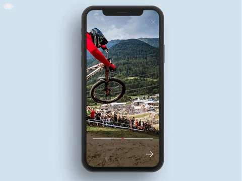](https://cdn.dribbble.com/users/4605/videos/2645/fordribbbs.mp4)
9 |
10 | ###### My Component
11 |
12 | 
13 |
14 | ## Getting Started
15 |
16 | - [Installation](#installation)
17 | - [Basic Usage](#basic-usage)
18 | - [Api](#api)
19 | - [Properties](#properties)
20 | - [Items Properties](#items-properties)
21 | - [Image Wrapper](#image-wrapper)
22 | - [Usage](#usage)
23 | - [Properties](#properties-1)
24 | - [Acknowledgement](#acknowledgement)
25 | - [License](#license)
26 |
27 | ## Installation
28 |
29 | ```bash
30 | npm install react-native-timed-slideshow --save
31 | ```
32 |
33 | ## Basic Usage
34 |
35 | ```javascript
36 | import TimedSlideshow from 'react-native-timed-slideshow';
37 | ```
38 |
39 | ```javascript
40 | render() {
41 | const items = [
42 | {
43 | uri: "http://www.lovethemountains.co.uk/wp-content/uploads/2017/05/New-Outdoor-Sports-and-Music-Festival-For-Wales-4.jpg",
44 | title: "Michael Malik",
45 | text: "Minnesota, USA",
46 | },
47 | {
48 | uri: "http://blog.adrenaline-hunter.com/wp-content/uploads/2018/05/bungee-jumping-barcelona-1680x980.jpg",
49 | title: "Victor Fallon",
50 | text: "Val di Sole, Italy",
51 | duration: 3000
52 | },
53 | {
54 | uri: "https://greatist.com/sites/default/files/Running_Mountain.jpg",
55 | title: "Mary Gomes",
56 | text: "Alps",
57 | fullWidth: true
58 | }
59 | ];
60 |
61 | return (
62 |
63 | );
64 | }
65 | ```
66 |
67 | ## API
68 |
69 | ### Properties
70 |
71 | | **Property** | **Type** | **Default** | **Description** |
72 | | -------------------- | -------- | ------------ | ------------------------------------------------------------------------------------------------------------------------------------------------------------------------------------------------------------------------------------------------------------------------------------------------------------ |
73 | | items | [object] | - | (Required at least 2 items) Sliders items. |
74 | | loop | boolean | true | Boolean that is used to determine if the slideshow should be or not in loop |
75 | | duration | number | 5000 | Each slide duration on screen (in milliseconds) |
76 | | index | number | 0 | First Slide to appear |
77 | | extraSpacing | number | 10% of width | Extra spacing each slide will have. This extra spacing basically represents the width that each image slides (eg. 300) |
78 | | fullWidth\* | boolean | false | Option that makes the image show it's full width in the animation, by using the Image.getSize from React-Native (later calculated to keep the screens ratio), and if true it will override the extraSpacing if it's set |
79 | | progressBarColor | string | null | Option to change progress bar color |
80 | | showProgressBar | boolean | true | Option to show or hide progress bar |
81 | | progressBarDirection | string | null | Three options (fromLeft, fromRight, middle - null) |
82 | | slideDirection | string | "even" | Direction of the each slide animation. Values are "even", "odd", "left", "right". Basically even means first slide goes from left-to-right, second slide goes from right-to-left and so on. Odd is opposite, left means all slides com from left-to-right and right means all slides come from right-to-left | |
83 | | footerStyle | style | null | Footer titles style |
84 | | titleStyle | style | null | Footer titles style |
85 | | textStyle | style | null | Footer text style |
86 | | renderItem | func | null | Complete control of the rendered item, with one object param with 3 params ({ item, index, focusedIndex }) |
87 | | renderFooter | func | null | Complete control of the footer, with one object param with 5 params ({ item, index, focusedIndex, defaultStyle, animation }) the animation param is an object with the following { titleTranslateY, textTranslateY, opacity } |
88 | | renderIcon | func | null | Complete control of the icon rendered in the footer, with on param ({ snapToNext }) function to snap immediately to the next slide |
89 | | renderCloseIcon | func | null | Complete control of the close icon rendered in the "header", with on param ({ wrapperStyle, imageStyle, onPress }) style used in the view with icon, style for the icon, and the onPress function that is passed |
90 | | onClose | func | null | Function that is triggered when the close icon is clicked |
91 |
92 | ### Items Properties
93 |
94 | | **Property** | **Type** | **Description** |
95 | | ------------ | ------------- | --------------------------------------------------------------------------------------------------------------------------------------------------------------------------------------------------------------------- |
96 | | uri | string/number | The image url or number (if local image, the require returns a number instead) |
97 | | title | string | The slide item's title |
98 | | text | string | The slide item's text or description |
99 | | duration | number | The individual slide time, this way you can customize individually how much time each slide can appear on screen |
100 | | direction | string | The individual slide direction animation, Values are "even", "odd", "left", "right" |
101 | | extraSpacing | number | The individual slide extra spacing, this way you can define how much width the image can slide on screen |
102 | | fullWidth\* | boolean | The individual slide width, if true the Image.getSize from React-Native will calculate the image's full width (later calculated to keep the screens ratio), and if true it will override the extraSpacing if it's set |
103 |
104 | \*This function is explained in the React-Native docs in the [Image](https://facebook.github.io/react-native/docs/image#getsize) component if you want to check-out
105 |
106 | ## Image Wrapper
107 |
108 | The Image-Wrapper is a sub-component from Timed-Slideshow, it controls each image individual animation.
109 |
110 | ### Usage
111 |
112 | ```javascript
113 | import { ImageWrapper } from 'react-native-timed-slideshow';
114 | ```
115 |
116 | ```javascript
117 | // Basic Usage
118 |
119 | ```
120 |
121 | #### Properties
122 |
123 | | **Property** | **Type** | **Description** |
124 | | ------------ | ------------- | --------------------------------------------------------------------------------------------------------------------------------------------------------------------------------------------------------------------- |
125 | | uri | string/number | The image url or number (if local image, the require returns a number instead) |
126 | | index | number | The image's index |
127 | | duration | number | Duration of the images animation |
128 | | focusedIndex | number | The focused image index |
129 | | extraSpacing | number | Extra spacing of the images animation |
130 | | fullWidth | boolean | The individual slide width, if true the Image.getSize from React-Native will calculate the image's full width (later calculated to keep the screens ratio), and if true it will override the extraSpacing if it's set |
131 | | direction | string | The individual slide direction animation, Values are "even", "odd", "left", "right" |
132 |
133 | ## Acknowledgement
134 |
135 | [Eric Hoffman](https://dribbble.com/shots/5595078-Santa-Cruz-Bike-Picker) who designed the concept on dribble for [Reform Collective](https://dribbble.com/ReformCollective) and who inspired me to create the component and challenge my knowledge on React-Native and animations in the framework.
136 |
137 | ## License
138 |
139 | MIT.
140 |
--------------------------------------------------------------------------------
/demo.gif:
--------------------------------------------------------------------------------
https://raw.githubusercontent.com/LMestre14/react-native-timed-slideshow/bea254ba64b324bbc2519552b8642520d268fb57/demo.gif
--------------------------------------------------------------------------------
/index.js:
--------------------------------------------------------------------------------
1 | /** @format */
2 |
3 | import {AppRegistry} from 'react-native';
4 | import App from './App';
5 | import {name as appName} from './app.json';
6 |
7 | AppRegistry.registerComponent(appName, () => App);
8 |
--------------------------------------------------------------------------------
/package.json:
--------------------------------------------------------------------------------
1 | {
2 | "name": "react-native-timed-slideshow",
3 | "version": "1.2.1",
4 | "scripts": {
5 | "start": "node node_modules/react-native/local-cli/cli.js start",
6 | "test": "jest"
7 | },
8 | "description": "A Javascript slideshow component for React-Native (Android and iOS). React-Native-Timed-Slideshow, as the name suggests, is a Slideshow component with timed animation. It uses Animated library from React-Native, with native driver (only native animations).",
9 | "main": "src/index.js",
10 | "repository": {
11 | "type": "git",
12 | "url": "git+https://github.com/LMestre14/react-native-timed-slideshow.git"
13 | },
14 | "keywords": [
15 | "slideshow",
16 | "slider",
17 | "timed-slideshow",
18 | "react-native",
19 | "android",
20 | "ios",
21 | "images",
22 | "animation",
23 | "animated"
24 | ],
25 | "author": "Luís Mestre ",
26 | "license": "MIT",
27 | "bugs": {
28 | "url": "https://github.com/LMestre14/react-native-timed-slideshow/issues"
29 | },
30 | "homepage": "https://github.com/LMestre14/react-native-timed-slideshow#readme"
31 | }
32 |
--------------------------------------------------------------------------------
/src/arrow.png:
--------------------------------------------------------------------------------
https://raw.githubusercontent.com/LMestre14/react-native-timed-slideshow/bea254ba64b324bbc2519552b8642520d268fb57/src/arrow.png
--------------------------------------------------------------------------------
/src/close.png:
--------------------------------------------------------------------------------
https://raw.githubusercontent.com/LMestre14/react-native-timed-slideshow/bea254ba64b324bbc2519552b8642520d268fb57/src/close.png
--------------------------------------------------------------------------------
/src/imageWrapper.js:
--------------------------------------------------------------------------------
1 | /**
2 | * @author Luís Mestre
3 | */
4 | import React, { Component } from 'react';
5 | import { View, Image, Animated, Easing } from 'react-native';
6 | import Styles, { width, height, EXTRA_WIDTH } from './styles';
7 |
8 | export default class ImageWrapper extends Component {
9 | static defaultProps = {
10 | uri: null,
11 | index: 0,
12 | duration: 5000,
13 | focusedIndex: 0,
14 | fullWidth: false,
15 | direction: 'par',
16 | extraSpacing: EXTRA_WIDTH,
17 | layoutWidth: width,
18 | };
19 |
20 | constructor(props) {
21 | super(props);
22 |
23 | this.state = {
24 | maxWidth: -1,
25 | imgWidth: props.extraSpacing + props.layoutWidth,
26 | translateX: new Animated.Value(0),
27 | };
28 | }
29 |
30 | // wip
31 | componentWillMount() {
32 | const { uri } = this.props;
33 | if(isNaN(uri)) {
34 | Image.getSize(uri, (imgWidth, imgHeight) => {
35 | try {
36 | let maxWidth = imgWidth * height / imgHeight;
37 | this.setState({ maxWidth });
38 | } catch(err) {
39 |
40 | }
41 | });
42 | }
43 | }
44 |
45 | componentDidMount() {
46 | if(this.props.focusedIndex == this.props.index) {
47 | this.startAnimation();
48 | }
49 | }
50 |
51 | componentWillReceiveProps(nextProps) {
52 | this.state.translateX.stopAnimation(() => {
53 | if(nextProps.focusedIndex == nextProps.index) {
54 | this.startAnimation();
55 | }
56 | });
57 | }
58 |
59 | // true -> left to right
60 | // false -> right to left
61 | getDirection() {
62 | const { index, direction } = this.props;
63 |
64 | switch(direction) {
65 | case 'left': return true;
66 | case 'right': return false;
67 | case 'odd': return (index + 1) % 2;
68 | default: return index % 2;
69 | }
70 | }
71 |
72 | getExtraSpacing() {
73 | const { maxWidth } = this.state;
74 | const { extraSpacing, fullWidth, layoutWidth } = this.props;
75 |
76 | if(maxWidth == -1) return extraSpacing;
77 |
78 | let fullExtraSpacing = this.state.maxWidth - layoutWidth;
79 |
80 | if(fullWidth || extraSpacing > fullExtraSpacing) return fullExtraSpacing;
81 |
82 | return extraSpacing;
83 | }
84 |
85 | startAnimation() {
86 | const { duration } = this.props;
87 |
88 | let extraSpacing = Math.floor(this.getExtraSpacing());
89 |
90 | if(this.getDirection()) extraSpacing *= -1;
91 |
92 | Animated.timing(this.state.translateX, {
93 | toValue: -extraSpacing,
94 | easing: Easing.ease,
95 | useNativeDriver: true,
96 | duration: duration * 1.1,
97 | }).start(() => {
98 | this.setState({ translateX: new Animated.Value(0) });
99 | });
100 | }
101 |
102 | render() {
103 | const { uri, layoutWidth } = this.props;
104 | const { translateX } = this.state;
105 |
106 | const imgWidth = layoutWidth + this.getExtraSpacing();
107 | const direction = this.getDirection() ? 'flex-end' : 'flex-start';
108 |
109 | return (
110 |
111 |
116 |
117 | );
118 | }
119 | }
--------------------------------------------------------------------------------
/src/index.d.ts:
--------------------------------------------------------------------------------
1 | /**
2 | * @author Luís Mestre
3 | */
4 | import { Component } from 'react';
5 | import { TextStyle, ViewStyle, Animated, ImageStyle } from 'react-native';
6 |
7 | type Item = {
8 | /**
9 | * @param {string | number} uri
10 | * The image path for the slide
11 | */
12 | uri: string | number;
13 |
14 | /**
15 | * @param {number} duration
16 | * The duration in milliseconds of the animation
17 | */
18 | duration?: number;
19 |
20 | /**
21 | * @param {number} extraSpacing
22 | * The number of pixels the image will show in animation
23 | */
24 | extraSpacing?: number;
25 |
26 | /**
27 | * @param {boolean} fullWidth
28 | * If true, the animation will show the full image
29 | */
30 | fullWidth?: boolean;
31 |
32 | /**
33 | * @param {string} direction
34 | * The direction the image animation will go
35 | */
36 | direction?: 'even' | 'odd' | 'left' | 'right';
37 | };
38 |
39 | export interface SlideShowProperties {
40 | /**
41 | * @param {[Item]} items Array of objects representing an item.
42 | */
43 | items: [Item];
44 |
45 | /**
46 | * @param {boolean} loop
47 | * If true, items will be displayed in loop
48 | * Default: true
49 | */
50 | loop?: boolean;
51 |
52 | /**
53 | * @param {number} duration
54 | * The duration in milliseconds of the animation of all the slides
55 | * Default: 5000
56 | */
57 | duration?: number;
58 |
59 | /**
60 | * @param {number} index
61 | * The first slide to appear
62 | * Default: 0
63 | */
64 | index: number;
65 |
66 | /**
67 | * @param {number} extraSpacing
68 | * The number of pixels the image will show in animation
69 | * Default: 10% Screen Width
70 | */
71 | extraSpacing?: number;
72 |
73 | /**
74 | * @param {boolean} fullWidth
75 | * If true, the animation will show the full image
76 | * Default: false
77 | */
78 | fullWidth?: boolean;
79 |
80 | /**
81 | * @param {string} progressBarColor
82 | * String to change the progress bar color
83 | * Default: null
84 | */
85 | progressBarColor?: string;
86 |
87 | /**
88 | * @param {boolean} showProgressBar
89 | * Flag to show or hide the progress bar
90 | * Default: true
91 | */
92 | showProgressBar?: boolean;
93 |
94 | /**
95 | * @param {string} progressBarDirection
96 | * Progress bar animation direction
97 | * Default: 'middle'
98 | */
99 | progressBarDirection?: 'fromLeft' | 'fromRight' | 'middle';
100 |
101 | /**
102 | * @param {string} slideDirection
103 | * The direction the image animation will go
104 | * Default: 'even'
105 | */
106 | slideDirection?: 'even' | 'odd' | 'left' | 'right';
107 |
108 | /**
109 | * @param {ViewStyle} footerStyle
110 | * Stylesheet object for the footer main container
111 | * Default: null
112 | */
113 | footerStyle?: ViewStyle;
114 |
115 | /**
116 | * @param {TextStyle} titleStyle
117 | * Stylesheet object for the footer title
118 | * Default: null
119 | */
120 | titleStyle?: TextStyle;
121 |
122 | /**
123 | * @param {TextStyle} textStyle
124 | * Stylesheet object for the footer text
125 | * Default: null
126 | */
127 | textStyle?: TextStyle;
128 |
129 | /**
130 | * @param {function} renderItem
131 | * Function that renders each item
132 | */
133 | renderItem?: ({
134 | item: object,
135 | index: number,
136 | focusedIndex: number
137 | }) => JSX.Element;
138 |
139 | /**
140 | * @param {function} renderFooter
141 | * Function that renders the slideshow footer
142 | */
143 | renderFooter?: ({
144 | item: object,
145 | index: number,
146 | focusedIndex: number,
147 | defaultStyle: ViewStyle,
148 | animation: {
149 | titleTranslateY: Animated,
150 | textTranslateY: Animated,
151 | opacity: Animated
152 | }
153 | }) => JSX.Element;
154 |
155 | /**
156 | * @param {function} renderIcon
157 | * Function that renders the slideshow footers icon for next
158 | */
159 | renderIcon?: ({ snapToNext: Function }) => JSX.Element;
160 |
161 | /**
162 | * @param {function} renderCloseIcon
163 | * Function that renders the slideshow close icon
164 | */
165 | renderCloseIcon?: ({
166 | wrapperStyle: ViewStyle,
167 | imageStyle: ImageStyle,
168 | onPress: Function
169 | }) => JSX.Element;
170 |
171 | /**
172 | * @param {function} onClose
173 | * Callback when user clicks the close button
174 | */
175 | onClose?: (index) => JSX.Element;
176 | }
177 |
178 | export default class TimedSlideshow extends Component {}
179 |
180 | export interface ImageWrapperProperties {
181 | /**
182 | * @param {string | number} uri
183 | * The image path for the slide
184 | */
185 | uri: string | number;
186 |
187 | /**
188 | * @param {number} index
189 | * The slide index
190 | */
191 | index: number;
192 |
193 | /**
194 | * @param {number} focusedIndex
195 | * The focused index on the Timed-Slideshow component. If you are using the component
196 | * out of the timed-slideshow you should map the current focused slide index
197 | */
198 | focusedIndex: number;
199 |
200 | /**
201 | * @param {number} duration
202 | * The duration in milliseconds of the animation
203 | */
204 | duration?: number;
205 |
206 | /**
207 | * @param {number} extraSpacing
208 | * The number of pixels the image will show in animation
209 | */
210 | extraSpacing?: number;
211 |
212 | /**
213 | * @param {boolean} fullWidth
214 | * If true, the animation will show the full image
215 | */
216 | fullWidth?: boolean;
217 |
218 | /**
219 | * @param {string} direction
220 | * The direction the image animation will go
221 | */
222 | direction?: 'even' | 'odd' | 'left' | 'right';
223 |
224 | /**
225 | * @param {number} layoutWidth
226 | * Default value is window with, and when used in Timed-Slideshow component, it uses
227 | * the containers width
228 | */
229 | layoutWidth?: number;
230 | }
231 |
232 | export class ImageWrapper extends Component {}
233 |
--------------------------------------------------------------------------------
/src/index.js:
--------------------------------------------------------------------------------
1 | /**
2 | * @author Luís Mestre
3 | */
4 | import React, { Component } from 'react';
5 | import { Text, View, FlatList, Animated, Easing, Image, TouchableWithoutFeedback, ActivityIndicator } from 'react-native';
6 | import Styles, { width, height, EXTRA_WIDTH } from './styles';
7 |
8 | export { default as ImageWrapper } from './imageWrapper';
9 | import ImageWrapper from './imageWrapper';
10 |
11 | export default class TimedSlideshow extends Component {
12 |
13 | static defaultProps = {
14 | items: [],
15 | duration: 5000,
16 | index: 0,
17 | extraSpacing: EXTRA_WIDTH,
18 | fullWidth: false,
19 | progressBarColor: null,
20 | showProgressBar: true,
21 | slideDirection: 'even',
22 | progressBarDirection: 'middle',
23 | footerStyle: null,
24 | titleStyle: null,
25 | textStyle: null,
26 | renderItem: null,
27 | renderFooter: null,
28 | renderIcon: null,
29 | loop: true,
30 | onClose: null,
31 | }
32 |
33 | constructor(props) {
34 | super(props);
35 |
36 | this.state = {
37 | index: props.index,
38 | layoutWidth: width,
39 | loaded: false,
40 | timer: new Animated.Value(0),
41 | };
42 |
43 | this.snapToNext = this.snapToNext.bind(this);
44 | this.onLayout = this.onLayout.bind(this);
45 | this.renderItem = this.renderItem.bind(this);
46 | this.onClose = this.onClose.bind(this);
47 | }
48 |
49 | componentDidMount() {
50 | // this.animation();
51 | }
52 |
53 | animation() {
54 | const { index } = this.state;
55 | let { duration, items } = this.props;
56 |
57 | if(!!items[index] && !isNaN(items[index].duration)) duration = items[index].duration;
58 |
59 | return Animated.timing(this.state.timer, {
60 | toValue: 1,
61 | easing: Easing.ease,
62 | useNativeDriver: true,
63 | duration,
64 | }).start(({ finished }) => finished && this.snapToNext());
65 | }
66 |
67 | snapToNext() {
68 | const { index, timer } = this.state;
69 | let { items, loop } = this.props;
70 |
71 | let newIndex = (index + 1) % items.length;
72 |
73 | timer.stopAnimation(() => {
74 | if (!loop && newIndex === 0) {
75 | // we reached the start again, stop the loop
76 | }
77 | else {
78 | this.slideShow.scrollToIndex({ animated: true, index: newIndex });
79 | this.setState({ timer: new Animated.Value(0), index: newIndex }, () => {
80 | this.animation();
81 | });
82 | }
83 | });
84 | }
85 |
86 | onLayout({ nativeEvent: { layout: { x, y, width, height }}}) {
87 | try {
88 | this.setState({ layoutWidth: width, loaded: true }, () => {
89 | this.animation();
90 | });
91 | } catch(err) {
92 | this.setState({ loaded: true }, () => {
93 | this.animation();
94 | });
95 | }
96 | }
97 |
98 | renderItem({ item, index }) {
99 | let { duration, extraSpacing, fullWidth, slideDirection, renderItem } = this.props;
100 | const { index: focusedIndex, layoutWidth } = this.state;
101 |
102 | if(typeof renderItem == 'function') return renderItem({ item, index, focusedIndex });
103 |
104 | if(!isNaN(item.duration)) duration = item.duration;
105 |
106 | if(!isNaN(item.extraSpacing)) extraSpacing = item.extraSpacing;
107 |
108 | if(!!item.direction) slideDirection = item.direction;
109 |
110 | if(item.fullWidth != void 0) fullWidth = !!item.fullWidth;
111 |
112 | return (
113 |
123 | );
124 | }
125 |
126 | renderProgressBar() {
127 | const { showProgressBar, progressBarDirection, progressBarColor } = this.props;
128 | const { layoutWidth } = this.state;
129 | if(!showProgressBar) return null;
130 |
131 | let animation = { transform: [{scaleX: this.state.timer}] };
132 |
133 | if(progressBarDirection === 'fromLeft' || progressBarDirection === 'fromRight') {
134 | // Footer container as a width of 100% with paddingHorizontal of 7.5%
135 | let initialValue = layoutWidth * 0.85;
136 |
137 | if(progressBarDirection === 'fromLeft') initialValue *= -1;
138 |
139 | const translateX = this.state.timer.interpolate({
140 | inputRange: [0, 1],
141 | outputRange: [initialValue, 0],
142 | extrapolate: 'clamp',
143 | });
144 |
145 | animation.transform = [{ translateX }];
146 | }
147 |
148 | if (progressBarColor) animation.backgroundColor = progressBarColor;
149 |
150 | return (
151 |
152 |
153 |
154 | );
155 | }
156 |
157 | renderIcon() {
158 | const { renderIcon } = this.props;
159 |
160 | if(typeof renderIcon == 'function') return renderIcon({ snapToNext: this.snapToNext });
161 |
162 | return (
163 |
164 |
165 |
166 | )
167 | }
168 |
169 | onClose() {
170 | const { onClose } = this.props;
171 | const { index } = this.state;
172 | if(typeof onClose == 'function') onClose(index);
173 | }
174 |
175 | renderCloseIcon() {
176 | const { renderCloseIcon } = this.props;
177 | if(typeof renderCloseIcon == 'function') return renderCloseIcon({ wrapperStyle: Styles.closeImgWrapper, imageStyle: Styles.closeImg, onPress: this.onClose });
178 |
179 | return (
180 |
181 |
182 |
186 |
187 |
188 | )
189 | }
190 |
191 | renderFooterContent() {
192 | const { items, renderFooter, loop, titleStyle = {}, textStyle = {} } = this.props;
193 | const { index, timer, focusedIndex } = this.state;
194 |
195 | const item = items[index];
196 |
197 | const titleTranslateY = timer.interpolate({
198 | inputRange: [0, .05],
199 | outputRange: [100, 0],
200 | extrapolate: 'clamp'
201 | });
202 |
203 | const textTranslateY = timer.interpolate({
204 | inputRange: [0, .06],
205 | outputRange: [100, 0],
206 | extrapolate: 'clamp'
207 | });
208 |
209 | let opacity = timer.interpolate({
210 | inputRange: [.9, .95],
211 | outputRange: [1, 0],
212 | extrapolate: 'clamp'
213 | });
214 |
215 | const animation = { titleTranslateY, textTranslateY, opacity };
216 |
217 | if(typeof renderFooter == 'function') return renderFooter({ item, index, focusedIndex, defaultStyle: Styles.footerContentContainer, animation });
218 |
219 | if (!loop) opacity = null;
220 | return (
221 |
222 |
223 |
224 |
225 | {item.title}
226 |
227 |
228 |
229 |
230 |
231 | {item.text}
232 |
233 |
234 |
235 |
236 | {this.renderIcon()}
237 |
238 |
239 | );
240 | }
241 |
242 | renderFooter() {
243 | const { footerStyle } = this.props;
244 | return (
245 |
246 | {this.renderProgressBar()}
247 | {this.renderFooterContent()}
248 |
249 | );
250 | }
251 |
252 | renderContent() {
253 | const { items, index } = this.props;
254 | const { layoutWidth, loaded } = this.state;
255 |
256 | if(!loaded) return (
257 |
258 |
259 |
260 | );
261 |
262 | return (
263 |
264 | this.slideShow = ref}
266 | style={{ flex: 1 }}
267 | data={items}
268 | extraData={this.state}
269 | renderItem={this.renderItem}
270 | initialScrollIndex={index}
271 | horizontal
272 | pagingEnabled
273 | scrollEnabled={false}
274 | getItemLayout={(item, index) => ({ index, length: layoutWidth, offset: layoutWidth * index })}
275 | showsHorizontalScrollIndicator={false}
276 | keyExtractor={(item, index) => `slide_item_${index}`}
277 | />
278 | {this.renderCloseIcon()}
279 | {this.renderFooter()}
280 |
281 | );
282 | }
283 |
284 | render() {
285 | return (
286 |
287 | {this.renderContent()}
288 |
289 | );
290 | }
291 | }
--------------------------------------------------------------------------------
/src/styles.js:
--------------------------------------------------------------------------------
1 | /**
2 | * @author Luís Mestre
3 | */
4 | import { StyleSheet, Platform, Dimensions } from 'react-native';
5 |
6 | export const { width, height } = Dimensions.get("window");
7 |
8 | export const EXTRA_WIDTH = width * 0.1;
9 | const BAR_HEIGHT = StyleSheet.hairlineWidth * 10;
10 | const FOOTER_HEIGHT = height * 0.25;
11 |
12 | export default StyleSheet.create({
13 | // Main Component Styles
14 | root: {
15 | flex: 1,
16 | backgroundColor: 'gray'
17 | },
18 |
19 | // Item Styles
20 | itemContainer: {
21 | flex: 1,
22 | width,
23 | overflow: 'hidden',
24 | backgroundColor: 'transparent',
25 | },
26 |
27 | image: {
28 | height: '100%',
29 | resizeMode: 'cover',
30 | },
31 |
32 | arrowImg: {
33 | width: width * 0.1,
34 | height: width * 0.1,
35 | },
36 |
37 | // Footer Styles
38 | footerContainer: {
39 | position: 'absolute',
40 | bottom: 0,
41 | width: '100%',
42 | height: FOOTER_HEIGHT,
43 | paddingHorizontal: width * 0.075,
44 | paddingVertical: FOOTER_HEIGHT * 0.2,
45 | alignItems: 'center',
46 | justifyContent: 'space-between',
47 | backgroundColor: 'rgba(0,0,0,0.4)'
48 | },
49 |
50 | progressBarContainer: {
51 | width: '100%',
52 | height: BAR_HEIGHT,
53 | borderRadius: BAR_HEIGHT / 2,
54 | backgroundColor: 'rgba(255,255,255,0.4)',
55 | overflow: 'hidden',
56 | },
57 |
58 | progressBar: {
59 | height: '100%',
60 | width: '100%',
61 | borderRadius: BAR_HEIGHT / 2,
62 | backgroundColor: 'red',
63 | },
64 |
65 | footerContentContainer: {
66 | flexDirection: 'row',
67 | justifyContent: 'space-between',
68 | },
69 |
70 | footerTitle: {
71 | fontSize: 30,
72 | color: 'white',
73 | fontWeight: 'bold',
74 | },
75 |
76 | footerText: {
77 | fontSize: 20,
78 | color: 'white',
79 | },
80 |
81 | closeImgWrapper: {
82 | position: 'absolute',
83 | right: 20,
84 | ...Platform.select({
85 | ios: {
86 | top: 45,
87 | shadowColor: '#000',
88 | shadowOpacity: 0.5,
89 | shadowRadius: 2,
90 | shadowOffset: {
91 | width: 0,
92 | height: 2,
93 | },
94 | },
95 | android: {
96 | top: 35,
97 | elevation: 4,
98 | },
99 | }),
100 | },
101 |
102 | closeImg: {
103 | width: 25,
104 | height: 25,
105 | tintColor: 'white',
106 | resizeMode: 'contain',
107 | },
108 | });
--------------------------------------------------------------------------------