├── .github
├── ISSUE_TEMPLATE
│ ├── bug_report.md
│ └── feature_request.md
└── workflows
│ ├── buildAndTest.yml
│ ├── ktlint.yml
│ └── stale.yml
├── .gitignore
├── .idea
├── codeStyles
│ ├── Project.xml
│ └── codeStyleConfig.xml
├── compiler.xml
├── gradle.xml
├── jarRepositories.xml
├── misc.xml
├── runConfigurations.xml
└── vcs.xml
├── CODE_OF_CONDUCT.md
├── CONTRIBUTING.md
├── LICENSE
├── README.md
├── app
├── .gitignore
├── build.gradle
├── proguard-rules.pro
└── src
│ └── main
│ ├── AndroidManifest.xml
│ ├── assets
│ └── KaushanScript-Regular.otf
│ ├── java
│ └── com
│ │ └── mackhartley
│ │ └── roundedprogressbarexample
│ │ ├── MainActivity.kt
│ │ ├── MainActivityViewModel.kt
│ │ ├── NumberTextView.kt
│ │ └── helpers.kt
│ └── res
│ ├── drawable
│ ├── bg_advanced_bar_1.xml
│ ├── bg_advanced_bar_2.xml
│ ├── bg_advanced_bar_4.xml
│ ├── bg_rpb_settings.xml
│ ├── ic_baseline_cloud_upload_24.xml
│ └── ic_baseline_corporate_fare_24.xml
│ ├── layout
│ └── activity_main.xml
│ ├── mipmap-hdpi
│ ├── ic_launcher.png
│ └── ic_launcher_round.png
│ ├── mipmap-mdpi
│ ├── ic_launcher.png
│ └── ic_launcher_round.png
│ ├── mipmap-xhdpi
│ ├── ic_launcher.png
│ └── ic_launcher_round.png
│ ├── mipmap-xxhdpi
│ ├── ic_launcher.png
│ └── ic_launcher_round.png
│ ├── mipmap-xxxhdpi
│ ├── ic_launcher.png
│ └── ic_launcher_round.png
│ └── values
│ ├── colors.xml
│ ├── dimens.xml
│ ├── strings.xml
│ └── styles.xml
├── art
├── readme
│ ├── MiniPic.png
│ └── savesStateOnConfigChange.gif
└── whoUsesRpb
│ ├── Food_Lookup.png
│ ├── Macrotracker.gif
│ └── Screen Shot 2021-04-12 at 11.21.52 PM.png
├── build.gradle
├── exampleXmlLayouts
├── feature2.xml
├── feature3.xml
├── feature4.xml
└── feature5.xml
├── gradle.properties
├── gradle
└── wrapper
│ ├── gradle-wrapper.jar
│ └── gradle-wrapper.properties
├── gradlew
├── gradlew.bat
├── ktlint.gradle
├── roundedprogressbar
├── .gitignore
├── build.gradle
├── consumer-rules.pro
├── proguard-rules.pro
└── src
│ ├── androidTest
│ └── java
│ │ └── com
│ │ └── mackhartley
│ │ └── roundedprogressbar
│ │ └── RoundedProgressBarTest.kt
│ ├── main
│ ├── AndroidManifest.xml
│ ├── java
│ │ └── com
│ │ │ └── mackhartley
│ │ │ └── roundedprogressbar
│ │ │ ├── CornerRadius.kt
│ │ │ ├── DefaultProgressTextFormatter.kt
│ │ │ ├── ProgressTextFormatter.kt
│ │ │ ├── ProgressTextOverlay.kt
│ │ │ ├── RoundedProgressBar.kt
│ │ │ ├── ext
│ │ │ └── DrawableExt.kt
│ │ │ └── utils
│ │ │ └── MiscUtils.kt
│ └── res
│ │ ├── drawable
│ │ └── rounded_progress_bar_drawable.xml
│ │ ├── layout
│ │ └── layout_rounded_progress_bar.xml
│ │ └── values
│ │ ├── attrs.xml
│ │ ├── colors.xml
│ │ ├── dimens.xml
│ │ └── integers.xml
│ └── test
│ └── java
│ └── com
│ └── mackhartley
│ └── roundedprogressbar
│ └── RoundedProgressBarHelpersTest.kt
├── settings.gradle
└── who_uses_rpb.md
/.github/ISSUE_TEMPLATE/bug_report.md:
--------------------------------------------------------------------------------
1 | ---
2 | name: Bug report
3 | about: Create a report to help us improve
4 | title: ''
5 | labels: ''
6 | assignees: ''
7 |
8 | ---
9 |
10 | **Describe the bug**
11 | A clear and concise description of what the bug is.
12 |
13 | **To Reproduce**
14 | Steps to reproduce the behavior:
15 | 1. Go to '...'
16 | 2. Click on '....'
17 | 3. Scroll down to '....'
18 | 4. See error
19 |
20 | **Expected behavior**
21 | A clear and concise description of what you expected to happen.
22 |
23 | **Screenshots**
24 | If applicable, add screenshots to help explain your problem.
25 |
26 | **Additional context**
27 | Add any other context about the problem here.
28 |
--------------------------------------------------------------------------------
/.github/ISSUE_TEMPLATE/feature_request.md:
--------------------------------------------------------------------------------
1 | ---
2 | name: Feature request
3 | about: Suggest an idea for this project
4 | title: ''
5 | labels: ''
6 | assignees: ''
7 |
8 | ---
9 |
10 | **Is your feature request related to a problem? Please describe.**
11 | A clear and concise description of what the problem is. Ex. I'm always frustrated when [...]
12 |
13 | **Describe the solution you'd like**
14 | A clear and concise description of what you want to happen.
15 |
16 | **Additional context**
17 | Add any other context or screenshots about the feature request here.
18 |
--------------------------------------------------------------------------------
/.github/workflows/buildAndTest.yml:
--------------------------------------------------------------------------------
1 | name: Tests
2 | on:
3 | push:
4 | branches:
5 | - master
6 | pull_request:
7 | branches:
8 | - master
9 |
10 | jobs:
11 | run_tests:
12 | runs-on: macos-latest
13 |
14 | # Sets variables for what android environments I want to test
15 | strategy:
16 | matrix:
17 | api-level: [21, 29]
18 |
19 | # Workflow steps
20 | steps:
21 |
22 | # Cancel any previously started (but currently unfinished) workflows
23 | - name: Cancel Previous Runs
24 | uses: styfle/cancel-workflow-action@0.8.0
25 | with:
26 | access_token: ${{ github.token }}
27 |
28 | # Check out repo (under $GITHUB_WORKSPACE) so the job can access it
29 | - uses: actions/checkout@v2
30 |
31 | # Set up JDK
32 | - name: Set up JDK 1.8
33 | uses: actions/setup-java@v1
34 | with:
35 | java-version: 1.8
36 |
37 | # Cache
38 | - name: Cache Gradle packages
39 | uses: actions/cache@v2
40 | with:
41 | path: |
42 | ~/.gradle/caches
43 | ~/.gradle/wrapper
44 | key: ${{ runner.os }}-gradle-${{ hashFiles('**/*.gradle*', '**/gradle-wrapper.properties') }}
45 | restore-keys: |
46 | ${{ runner.os }}-gradle-
47 |
48 | # Verify project can build and basic junit unit tests pass
49 | - name: Build With Gradle and Run Unit Tests
50 | run: ./gradlew build
51 |
52 | # Verify instrumentation tests pass
53 | - name: Run Instrumentation Tests
54 | uses: reactivecircus/android-emulator-runner@v2
55 | with:
56 | api-level: ${{ matrix.api-level }}
57 | arch: x86_64
58 | profile: Nexus 6
59 | script: ./gradlew connectedCheck
60 |
61 | # Clean up cache
62 | - name: Cleanup Gradle Cache
63 | # Remove some files from the Gradle cache, so they aren't cached by GitHub Actions.
64 | # Restoring these files from a GitHub Actions cache might cause problems for future builds.
65 | run: |
66 | rm -f ~/.gradle/caches/modules-2/modules-2.lock
67 | rm -f ~/.gradle/caches/modules-2/gc.properties
68 |
--------------------------------------------------------------------------------
/.github/workflows/ktlint.yml:
--------------------------------------------------------------------------------
1 | name: ktlint
2 |
3 | on:
4 | pull_request:
5 | paths:
6 | - "**/*.kt"
7 | - ".github/workflows/ktlint.yml"
8 |
9 | jobs:
10 | ktlint:
11 | runs-on: ubuntu-latest
12 |
13 | steps:
14 | - name: "checkout"
15 | uses: actions/checkout@v2
16 |
17 | - name: "ktlint"
18 | uses: "vroy/gha-kotlin-linter@v1"
19 |
--------------------------------------------------------------------------------
/.github/workflows/stale.yml:
--------------------------------------------------------------------------------
1 | name: Mark stale issues and pull requests
2 |
3 | on:
4 | schedule:
5 | - cron: "30 1 * * *"
6 |
7 | jobs:
8 | stale:
9 |
10 | runs-on: ubuntu-latest
11 |
12 | steps:
13 | - uses: actions/stale@v3
14 | with:
15 | repo-token: ${{ secrets.GITHUB_TOKEN }}
16 | stale-issue-message: 'This issue has been inactive and is now considered stale.'
17 | stale-pr-message: 'This PR has been inactive and is now considered stale.'
18 | stale-issue-label: 'no-issue-activity'
19 | stale-pr-label: 'no-pr-activity'
20 |
--------------------------------------------------------------------------------
/.gitignore:
--------------------------------------------------------------------------------
1 | *.iml
2 | .gradle
3 | /local.properties
4 | /.idea/caches
5 | /.idea/libraries
6 | /.idea/modules.xml
7 | /.idea/workspace.xml
8 | /.idea/navEditor.xml
9 | /.idea/assetWizardSettings.xml
10 | .DS_Store
11 | /build
12 | /captures
13 | .externalNativeBuild
14 | .cxx
15 |
--------------------------------------------------------------------------------
/.idea/codeStyles/Project.xml:
--------------------------------------------------------------------------------
1 |
2 |
3 |
4 |
5 |
6 |
10 |
11 |
12 |
13 |
19 |
20 |
24 |
25 |
26 |
28 |
29 |
30 |
31 |
32 |
33 |
34 | xmlns:android
35 | ^$
37 |
38 |
39 |
40 |
41 |
42 |
43 |
44 |
45 | xmlns:.*
46 | ^$
48 |
49 |
50 | BY_NAME
51 |
52 |
53 |
54 |
55 |
56 |
57 | .*:id
58 | http://schemas.android.com/apk/res/android
60 |
61 |
62 |
63 |
64 |
65 |
66 |
67 |
68 | .*:name
69 | http://schemas.android.com/apk/res/android
71 |
72 |
73 |
74 |
75 |
76 |
77 |
78 |
79 | name
80 | ^$
82 |
83 |
84 |
85 |
86 |
87 |
88 |
89 |
90 | style
91 | ^$
93 |
94 |
95 |
96 |
97 |
98 |
99 |
100 |
101 | .*
102 | ^$
104 |
105 |
106 | BY_NAME
107 |
108 |
109 |
110 |
111 |
112 |
113 | .*
114 | http://schemas.android.com/apk/res/android
116 |
117 |
118 | ANDROID_ATTRIBUTE_ORDER
119 |
120 |
121 |
122 |
123 |
124 |
125 | .*
126 | .*
128 |
129 |
130 | BY_NAME
131 |
132 |
133 |
134 |
135 |
136 |
137 |
139 |
140 |
--------------------------------------------------------------------------------
/.idea/codeStyles/codeStyleConfig.xml:
--------------------------------------------------------------------------------
1 |
2 |
3 |
5 |
--------------------------------------------------------------------------------
/.idea/compiler.xml:
--------------------------------------------------------------------------------
1 |
2 |
3 |
4 |
6 |
--------------------------------------------------------------------------------
/.idea/gradle.xml:
--------------------------------------------------------------------------------
1 |
2 |
3 |
5 |
6 |
7 |
12 |
13 |
17 |
18 |
21 |
22 |
23 |
--------------------------------------------------------------------------------
/.idea/jarRepositories.xml:
--------------------------------------------------------------------------------
1 |
2 |
3 |
4 |
5 |
9 |
10 |
14 |
15 |
19 |
20 |
24 |
25 |
29 |
30 |
--------------------------------------------------------------------------------
/.idea/misc.xml:
--------------------------------------------------------------------------------
1 |
2 |
3 |
4 |
6 |
7 |
9 |
--------------------------------------------------------------------------------
/.idea/runConfigurations.xml:
--------------------------------------------------------------------------------
1 |
2 |
3 |
4 |
5 |
6 |
10 |
11 |
12 |
--------------------------------------------------------------------------------
/.idea/vcs.xml:
--------------------------------------------------------------------------------
1 |
2 |
3 |
4 |
6 |
--------------------------------------------------------------------------------
/CODE_OF_CONDUCT.md:
--------------------------------------------------------------------------------
1 | # Contributor Covenant Code of Conduct
2 |
3 | ## Our Pledge
4 |
5 | In the interest of fostering an open and welcoming environment, we as
6 | contributors and maintainers pledge to making participation in our project and
7 | our community a harassment-free experience for everyone, regardless of age, body
8 | size, disability, ethnicity, sex characteristics, gender identity and expression,
9 | level of experience, education, socio-economic status, nationality, personal
10 | appearance, race, religion, or sexual identity and orientation.
11 |
12 | ## Our Standards
13 |
14 | Examples of behavior that contributes to creating a positive environment
15 | include:
16 |
17 | * Using welcoming and inclusive language
18 | * Being respectful of differing viewpoints and experiences
19 | * Gracefully accepting constructive criticism
20 | * Focusing on what is best for the community
21 | * Showing empathy towards other community members
22 |
23 | Examples of unacceptable behavior by participants include:
24 |
25 | * The use of sexualized language or imagery and unwelcome sexual attention or
26 | advances
27 | * Trolling, insulting/derogatory comments, and personal or political attacks
28 | * Public or private harassment
29 | * Publishing others' private information, such as a physical or electronic
30 | address, without explicit permission
31 | * Other conduct which could reasonably be considered inappropriate in a
32 | professional setting
33 |
34 | ## Our Responsibilities
35 |
36 | Project maintainers are responsible for clarifying the standards of acceptable
37 | behavior and are expected to take appropriate and fair corrective action in
38 | response to any instances of unacceptable behavior.
39 |
40 | Project maintainers have the right and responsibility to remove, edit, or
41 | reject comments, commits, code, wiki edits, issues, and other contributions
42 | that are not aligned to this Code of Conduct, or to ban temporarily or
43 | permanently any contributor for other behaviors that they deem inappropriate,
44 | threatening, offensive, or harmful.
45 |
46 | ## Scope
47 |
48 | This Code of Conduct applies both within project spaces and in public spaces
49 | when an individual is representing the project or its community. Examples of
50 | representing a project or community include using an official project e-mail
51 | address, posting via an official social media account, or acting as an appointed
52 | representative at an online or offline event. Representation of a project may be
53 | further defined and clarified by project maintainers.
54 |
55 | ## Enforcement
56 |
57 | Instances of abusive, harassing, or otherwise unacceptable behavior may be
58 | reported by contacting the project team at mackh777@gmail.com. All
59 | complaints will be reviewed and investigated and will result in a response that
60 | is deemed necessary and appropriate to the circumstances. The project team is
61 | obligated to maintain confidentiality with regard to the reporter of an incident.
62 | Further details of specific enforcement policies may be posted separately.
63 |
64 | Project maintainers who do not follow or enforce the Code of Conduct in good
65 | faith may face temporary or permanent repercussions as determined by other
66 | members of the project's leadership.
67 |
68 | ## Attribution
69 |
70 | This Code of Conduct is adapted from the [Contributor Covenant][homepage], version 1.4,
71 | available at https://www.contributor-covenant.org/version/1/4/code-of-conduct.html
72 |
73 | [homepage]: https://www.contributor-covenant.org
74 |
75 | For answers to common questions about this code of conduct, see
76 | https://www.contributor-covenant.org/faq
77 |
--------------------------------------------------------------------------------
/CONTRIBUTING.md:
--------------------------------------------------------------------------------
1 | # Contributing
2 |
3 | If you find a bug or have a feature request you are free to open a Github Issue at any time. These will be addressed promptly after being created.
4 |
5 | If you are interested in contributing to the repo that's great! Before doing so, contact me via direct message or a Github Issue to let me know what you would like to add. That way we can avoid overwritting each other's work in the event I am also working on the library.
6 |
--------------------------------------------------------------------------------
/LICENSE:
--------------------------------------------------------------------------------
1 | Apache License
2 | Version 2.0, January 2004
3 | http://www.apache.org/licenses/
4 |
5 | TERMS AND CONDITIONS FOR USE, REPRODUCTION, AND DISTRIBUTION
6 |
7 | 1. Definitions.
8 |
9 | "License" shall mean the terms and conditions for use, reproduction,
10 | and distribution as defined by Sections 1 through 9 of this document.
11 |
12 | "Licensor" shall mean the copyright owner or entity authorized by
13 | the copyright owner that is granting the License.
14 |
15 | "Legal Entity" shall mean the union of the acting entity and all
16 | other entities that control, are controlled by, or are under common
17 | control with that entity. For the purposes of this definition,
18 | "control" means (i) the power, direct or indirect, to cause the
19 | direction or management of such entity, whether by contract or
20 | otherwise, or (ii) ownership of fifty percent (50%) or more of the
21 | outstanding shares, or (iii) beneficial ownership of such entity.
22 |
23 | "You" (or "Your") shall mean an individual or Legal Entity
24 | exercising permissions granted by this License.
25 |
26 | "Source" form shall mean the preferred form for making modifications,
27 | including but not limited to software source code, documentation
28 | source, and configuration files.
29 |
30 | "Object" form shall mean any form resulting from mechanical
31 | transformation or translation of a Source form, including but
32 | not limited to compiled object code, generated documentation,
33 | and conversions to other media types.
34 |
35 | "Work" shall mean the work of authorship, whether in Source or
36 | Object form, made available under the License, as indicated by a
37 | copyright notice that is included in or attached to the work
38 | (an example is provided in the Appendix below).
39 |
40 | "Derivative Works" shall mean any work, whether in Source or Object
41 | form, that is based on (or derived from) the Work and for which the
42 | editorial revisions, annotations, elaborations, or other modifications
43 | represent, as a whole, an original work of authorship. For the purposes
44 | of this License, Derivative Works shall not include works that remain
45 | separable from, or merely link (or bind by name) to the interfaces of,
46 | the Work and Derivative Works thereof.
47 |
48 | "Contribution" shall mean any work of authorship, including
49 | the original version of the Work and any modifications or additions
50 | to that Work or Derivative Works thereof, that is intentionally
51 | submitted to Licensor for inclusion in the Work by the copyright owner
52 | or by an individual or Legal Entity authorized to submit on behalf of
53 | the copyright owner. For the purposes of this definition, "submitted"
54 | means any form of electronic, verbal, or written communication sent
55 | to the Licensor or its representatives, including but not limited to
56 | communication on electronic mailing lists, source code control systems,
57 | and issue tracking systems that are managed by, or on behalf of, the
58 | Licensor for the purpose of discussing and improving the Work, but
59 | excluding communication that is conspicuously marked or otherwise
60 | designated in writing by the copyright owner as "Not a Contribution."
61 |
62 | "Contributor" shall mean Licensor and any individual or Legal Entity
63 | on behalf of whom a Contribution has been received by Licensor and
64 | subsequently incorporated within the Work.
65 |
66 | 2. Grant of Copyright License. Subject to the terms and conditions of
67 | this License, each Contributor hereby grants to You a perpetual,
68 | worldwide, non-exclusive, no-charge, royalty-free, irrevocable
69 | copyright license to reproduce, prepare Derivative Works of,
70 | publicly display, publicly perform, sublicense, and distribute the
71 | Work and such Derivative Works in Source or Object form.
72 |
73 | 3. Grant of Patent License. Subject to the terms and conditions of
74 | this License, each Contributor hereby grants to You a perpetual,
75 | worldwide, non-exclusive, no-charge, royalty-free, irrevocable
76 | (except as stated in this section) patent license to make, have made,
77 | use, offer to sell, sell, import, and otherwise transfer the Work,
78 | where such license applies only to those patent claims licensable
79 | by such Contributor that are necessarily infringed by their
80 | Contribution(s) alone or by combination of their Contribution(s)
81 | with the Work to which such Contribution(s) was submitted. If You
82 | institute patent litigation against any entity (including a
83 | cross-claim or counterclaim in a lawsuit) alleging that the Work
84 | or a Contribution incorporated within the Work constitutes direct
85 | or contributory patent infringement, then any patent licenses
86 | granted to You under this License for that Work shall terminate
87 | as of the date such litigation is filed.
88 |
89 | 4. Redistribution. You may reproduce and distribute copies of the
90 | Work or Derivative Works thereof in any medium, with or without
91 | modifications, and in Source or Object form, provided that You
92 | meet the following conditions:
93 |
94 | (a) You must give any other recipients of the Work or
95 | Derivative Works a copy of this License; and
96 |
97 | (b) You must cause any modified files to carry prominent notices
98 | stating that You changed the files; and
99 |
100 | (c) You must retain, in the Source form of any Derivative Works
101 | that You distribute, all copyright, patent, trademark, and
102 | attribution notices from the Source form of the Work,
103 | excluding those notices that do not pertain to any part of
104 | the Derivative Works; and
105 |
106 | (d) If the Work includes a "NOTICE" text file as part of its
107 | distribution, then any Derivative Works that You distribute must
108 | include a readable copy of the attribution notices contained
109 | within such NOTICE file, excluding those notices that do not
110 | pertain to any part of the Derivative Works, in at least one
111 | of the following places: within a NOTICE text file distributed
112 | as part of the Derivative Works; within the Source form or
113 | documentation, if provided along with the Derivative Works; or,
114 | within a display generated by the Derivative Works, if and
115 | wherever such third-party notices normally appear. The contents
116 | of the NOTICE file are for informational purposes only and
117 | do not modify the License. You may add Your own attribution
118 | notices within Derivative Works that You distribute, alongside
119 | or as an addendum to the NOTICE text from the Work, provided
120 | that such additional attribution notices cannot be construed
121 | as modifying the License.
122 |
123 | You may add Your own copyright statement to Your modifications and
124 | may provide additional or different license terms and conditions
125 | for use, reproduction, or distribution of Your modifications, or
126 | for any such Derivative Works as a whole, provided Your use,
127 | reproduction, and distribution of the Work otherwise complies with
128 | the conditions stated in this License.
129 |
130 | 5. Submission of Contributions. Unless You explicitly state otherwise,
131 | any Contribution intentionally submitted for inclusion in the Work
132 | by You to the Licensor shall be under the terms and conditions of
133 | this License, without any additional terms or conditions.
134 | Notwithstanding the above, nothing herein shall supersede or modify
135 | the terms of any separate license agreement you may have executed
136 | with Licensor regarding such Contributions.
137 |
138 | 6. Trademarks. This License does not grant permission to use the trade
139 | names, trademarks, service marks, or product names of the Licensor,
140 | except as required for reasonable and customary use in describing the
141 | origin of the Work and reproducing the content of the NOTICE file.
142 |
143 | 7. Disclaimer of Warranty. Unless required by applicable law or
144 | agreed to in writing, Licensor provides the Work (and each
145 | Contributor provides its Contributions) on an "AS IS" BASIS,
146 | WITHOUT WARRANTIES OR CONDITIONS OF ANY KIND, either express or
147 | implied, including, without limitation, any warranties or conditions
148 | of TITLE, NON-INFRINGEMENT, MERCHANTABILITY, or FITNESS FOR A
149 | PARTICULAR PURPOSE. You are solely responsible for determining the
150 | appropriateness of using or redistributing the Work and assume any
151 | risks associated with Your exercise of permissions under this License.
152 |
153 | 8. Limitation of Liability. In no event and under no legal theory,
154 | whether in tort (including negligence), contract, or otherwise,
155 | unless required by applicable law (such as deliberate and grossly
156 | negligent acts) or agreed to in writing, shall any Contributor be
157 | liable to You for damages, including any direct, indirect, special,
158 | incidental, or consequential damages of any character arising as a
159 | result of this License or out of the use or inability to use the
160 | Work (including but not limited to damages for loss of goodwill,
161 | work stoppage, computer failure or malfunction, or any and all
162 | other commercial damages or losses), even if such Contributor
163 | has been advised of the possibility of such damages.
164 |
165 | 9. Accepting Warranty or Additional Liability. While redistributing
166 | the Work or Derivative Works thereof, You may choose to offer,
167 | and charge a fee for, acceptance of support, warranty, indemnity,
168 | or other liability obligations and/or rights consistent with this
169 | License. However, in accepting such obligations, You may act only
170 | on Your own behalf and on Your sole responsibility, not on behalf
171 | of any other Contributor, and only if You agree to indemnify,
172 | defend, and hold each Contributor harmless for any liability
173 | incurred by, or claims asserted against, such Contributor by reason
174 | of your accepting any such warranty or additional liability.
175 |
176 | END OF TERMS AND CONDITIONS
177 |
178 | APPENDIX: How to apply the Apache License to your work.
179 |
180 | To apply the Apache License to your work, attach the following
181 | boilerplate notice, with the fields enclosed by brackets "[]"
182 | replaced with your own identifying information. (Don't include
183 | the brackets!) The text should be enclosed in the appropriate
184 | comment syntax for the file format. We also recommend that a
185 | file or class name and description of purpose be included on the
186 | same "printed page" as the copyright notice for easier
187 | identification within third-party archives.
188 |
189 | Copyright 2021 Mack Hartley
190 |
191 | Licensed under the Apache License, Version 2.0 (the "License");
192 | you may not use this file except in compliance with the License.
193 | You may obtain a copy of the License at
194 |
195 | http://www.apache.org/licenses/LICENSE-2.0
196 |
197 | Unless required by applicable law or agreed to in writing, software
198 | distributed under the License is distributed on an "AS IS" BASIS,
199 | WITHOUT WARRANTIES OR CONDITIONS OF ANY KIND, either express or implied.
200 | See the License for the specific language governing permissions and
201 | limitations under the License.
202 |
--------------------------------------------------------------------------------
/README.md:
--------------------------------------------------------------------------------
1 |
2 |
4 | RoundedProgressBar
5 | Easy, Beautiful, Customizable
6 |
7 |
8 |
14 |
15 | Using the `RoundedProgressBar` library you can easily create beautiful progress bars with individually rounded corners, animating progress text and more! Below are several examples of progress bars created with this library.
16 |
19 |
21 |
22 | If you’d like to see if this library is right for your project then try downloading the demo app which is available on the [Google Play Store](https://play.google.com/store/apps/details?id=com.mackhartley.roundedprogressbarexample). There you can fully customize a `RoundedProgressBar` to see if you’re able to achieve the desired look and feel for your project.
23 |
25 |
29 |
30 | Do you use `RoundedProgressBar` in your app? Consider adding a picture or GIF of your usage to [`who_uses_rpb.md`](https://github.com/MackHartley/RoundedProgressBar/blob/master/who_uses_rpb.md). This provides examples to developers on how the library is used and gives your app a bit of **free publicity!**
31 |
32 | # Gradle Setup ⚙️
33 | [](https://jitpack.io/#MackHartley/RoundedProgressBar)
34 |
35 | If you don't have this already, add it to your **root** build.gradle file:
36 | ```
37 | allprojects {
38 | repositories {
39 | ...
40 | maven { url 'https://jitpack.io' }
41 | }
42 | }
43 | ```
44 |
45 | Then you can add the dependency to your **app** build.gradle file:
46 | ```
47 | dependencies {
48 | ...
49 | implementation 'com.github.MackHartley:RoundedProgressBar:3.0.0'
50 | }
51 | ```
52 |
53 | # Notable Features 🌟
54 |
55 | 1) **Full Color Customization** - You can even specify what color the text is depending on which background it draws over. Transparent colors are also supported
56 |
57 | Click here to see code
60 |
61 |
62 | 2) **Complete Text Customization** - The text displayed on the progress bar can be customized to say whatever you want. Additionally you can add padding and even supply your own font for use with the progress bar (`.ttf` and `.otf` formats supported)
63 |
64 | Click here to see code
67 |
68 |
69 | 3) **Low Value Support** - The progress bar looks nice even at low values (This is a common issue when dealing with rounded progress bars)
70 |
71 | Click here to see code
74 |
75 |
76 | 4) **Any Corner Radius Allowed** - Individual corners can even have different radius values
77 |
78 | Click here to see code
81 |
82 |
83 | 5) **Modular** - The `RoundedProgressBar` library can be seamlessly included in custom layouts due to the fact that each corner can have a different radius
84 |
85 | here or here to see code
88 |
89 |
90 | **Additionally**, the `RoundedProgressBar` handles all internal state during configuration changes
91 |
92 | # Public Methods and Xml Attributes 💻
93 | These are the methods which can be called on the `RoundedProgressBar` class:
94 |
95 | ```
96 | setProgressPercentage(progressPercentage: Double, shouldAnimate: Boolean = true)
97 | getProgressPercentage(): Double
98 |
99 | setProgressDrawableColor(@ColorInt newColor: Int) // Sets the color of the 'progress' part of the progress bar
100 | setBackgroundDrawableColor(@ColorInt newColor: Int) // Sets the color of the 'background' part of the progress bar
101 | setProgressTextColor(@ColorInt newColor: Int) // Sets text color for when it is drawn over the progress part of progress bar
102 | setBackgroundTextColor(@ColorInt newColor: Int) // Sets text color for when it is drawn over the background part of progress bar
103 |
104 | setCornerRadius(
105 | topLeftRadius: Float,
106 | topRightRadius: Float,
107 | bottomRightRadius: Float,
108 | bottomLeftRadius: Float
109 | )
110 |
111 | setTextSize(newTextSize: Float)
112 | setTextPadding(newTextPadding: Float) // Sets the padding between the progress text and end (or start) of the progress bar
113 | setAnimationLength(newAnimationLength: Long)
114 |
115 | showProgressText(shouldShowProgressText: Boolean)
116 | setRadiusRestricted(isRestricted: Boolean)
117 | ```
118 |
119 | The `RoundedProgressBar` can also be configured via xml attributes. Below is the full list of attributes along with the methods they map to.
120 | | Xml Attribute | Method |
121 | |---|---|
122 | | `rpbProgress` | `setProgressPercentage(...)` |
123 | | `rpbProgressColor` | `setProgressDrawableColor(...)` |
124 | | `rpbBackgroundColor` | `setBackgroundDrawableColor(...)` |
125 | | `rpbProgressTextColor` | `setProgressTextColor(...)` |
126 | | `rpbBackgroundTextColor` | `setBackgroundTextColor(...)` |
127 | | `rpbCornerRadius` | `setCornerRadius(...)` |
128 | | `rpbCornerRadiusTopLeft` | `setCornerRadius(...)` |
129 | | `rpbCornerRadiusTopRight` | `setCornerRadius(...)` |
130 | | `rpbCornerRadiusBottomRight` | `setCornerRadius(...)` |
131 | | `rpbCornerRadiusBottomLeft` | `setCornerRadius(...)` |
132 | | `rpbTextSize` | `setTextSize(...)` |
133 | | `rpbTextPadding` | `setTextPadding(...)` |
134 | | `rpbAnimationLength` | `setAnimationLength(...)` |
135 | | `rpbShowProgressText` | `showProgressText(...)` |
136 | | `rpbIsRadiusRestricted` | `setRadiusRestricted(...)` |
137 |
138 | # Contributing 🤝
139 | Feel free to open up issues on this repo to report bugs or request features.
140 |
141 | Additionally if you'd like to contribute to the library please feel free to open up a pull request! Just give me a heads up first though (via issues or comments) so we don't overwrite each other in the event I am updating the project.
142 |
143 | **Special thanks to all those who have supported this repo thus far!**
144 |
145 |
146 | Featured in Android Weekly , Android Arsenal and Medium .
152 |
153 |
154 | # License 📄
155 | ```
156 | Copyright 2021 Mack Hartley
157 |
158 | Licensed under the Apache License, Version 2.0 (the "License");
159 | you may not use this file except in compliance with the License.
160 | You may obtain a copy of the License at
161 |
162 | http://www.apache.org/licenses/LICENSE-2.0
163 |
164 | Unless required by applicable law or agreed to in writing, software
165 | distributed under the License is distributed on an "AS IS" BASIS,
166 | WITHOUT WARRANTIES OR CONDITIONS OF ANY KIND, either express or implied.
167 | See the License for the specific language governing permissions and
168 | limitations under the License.
169 | ```
170 |
--------------------------------------------------------------------------------
/app/.gitignore:
--------------------------------------------------------------------------------
1 | /build
--------------------------------------------------------------------------------
/app/build.gradle:
--------------------------------------------------------------------------------
1 | apply plugin: 'com.android.application'
2 | apply plugin: 'kotlin-android'
3 | apply plugin: 'kotlin-android-extensions'
4 |
5 | android {
6 | compileSdkVersion 33
7 | buildToolsVersion "29.0.3"
8 |
9 | defaultConfig {
10 | applicationId "com.mackhartley.roundedprogressbarexample"
11 | minSdkVersion 21
12 | targetSdkVersion 33
13 | versionCode 3
14 | versionName "1.0.2"
15 |
16 | testInstrumentationRunner "androidx.test.runner.AndroidJUnitRunner"
17 | }
18 |
19 | buildTypes {
20 | release {
21 | minifyEnabled false
22 | proguardFiles getDefaultProguardFile('proguard-android-optimize.txt'), 'proguard-rules.pro'
23 | }
24 | }
25 | }
26 |
27 | dependencies {
28 | implementation fileTree(dir: "libs", include: ["*.jar"])
29 | implementation "org.jetbrains.kotlin:kotlin-stdlib:$kotlin_version"
30 | implementation 'androidx.core:core-ktx:1.3.1'
31 | implementation 'androidx.appcompat:appcompat:1.2.0'
32 | implementation 'androidx.constraintlayout:constraintlayout:1.1.3'
33 | testImplementation 'junit:junit:4.12'
34 | androidTestImplementation 'androidx.test.ext:junit:1.1.1'
35 | androidTestImplementation 'androidx.test.espresso:espresso-core:3.2.0'
36 |
37 | implementation project(":roundedprogressbar")
38 | implementation 'com.jaredrummler:colorpicker:1.1.0'
39 | implementation 'com.google.android.material:material:1.3.0'
40 | implementation 'com.github.sephiroth74:NumberSlidingPicker:1.0.3'
41 | implementation 'androidx.lifecycle:lifecycle-extensions:2.2.0'
42 | }
--------------------------------------------------------------------------------
/app/proguard-rules.pro:
--------------------------------------------------------------------------------
1 | # Add project specific ProGuard rules here.
2 | # You can control the set of applied configuration files using the
3 | # proguardFiles setting in build.gradle.
4 | #
5 | # For more details, see
6 | # http://developer.android.com/guide/developing/tools/proguard.html
7 |
8 | # If your project uses WebView with JS, uncomment the following
9 | # and specify the fully qualified class name to the JavaScript interface
10 | # class:
11 | #-keepclassmembers class fqcn.of.javascript.interface.for.webview {
12 | # public *;
13 | #}
14 |
15 | # Uncomment this to preserve the line number information for
16 | # debugging stack traces.
17 | #-keepattributes SourceFile,LineNumberTable
18 |
19 | # If you keep the line number information, uncomment this to
20 | # hide the original source file name.
21 | #-renamesourcefileattribute SourceFile
--------------------------------------------------------------------------------
/app/src/main/AndroidManifest.xml:
--------------------------------------------------------------------------------
1 |
2 |
4 |
5 |
12 |
15 |
16 |
20 |
21 |
22 |
23 |
--------------------------------------------------------------------------------
/app/src/main/assets/KaushanScript-Regular.otf:
--------------------------------------------------------------------------------
https://raw.githubusercontent.com/MackHartley/RoundedProgressBar/06460414f19851118d31cbdeba712d1f71299284/app/src/main/assets/KaushanScript-Regular.otf
--------------------------------------------------------------------------------
/app/src/main/java/com/mackhartley/roundedprogressbarexample/MainActivity.kt:
--------------------------------------------------------------------------------
1 | package com.mackhartley.roundedprogressbarexample
2 |
3 | import android.animation.ObjectAnimator
4 | import android.graphics.Color
5 | import androidx.appcompat.app.AppCompatActivity
6 | import android.os.Bundle
7 | import androidx.core.content.ContextCompat
8 | import androidx.lifecycle.ViewModelProvider
9 | import com.jaredrummler.android.colorpicker.ColorPickerDialog
10 | import com.jaredrummler.android.colorpicker.ColorPickerDialogListener
11 | import com.mackhartley.roundedprogressbar.CornerRadius
12 | import com.mackhartley.roundedprogressbar.ProgressTextFormatter
13 | import com.mackhartley.roundedprogressbar.RoundedProgressBar
14 | import it.sephiroth.android.library.numberpicker.doOnProgressChanged
15 | import kotlinx.android.synthetic.main.activity_main.*
16 | import kotlin.math.roundToInt
17 |
18 | /**
19 | * Disclaimer: This app was quickly built and is intended to demonstrate the functionality of
20 | * the RoundedProgressBar library. It may not follow best design practices in all areas. Please do
21 | * not use it as a judge of good design/architecture.
22 | */
23 | class MainActivity : AppCompatActivity(), ColorPickerDialogListener {
24 |
25 | private val viewModel by lazy { ViewModelProvider(this).get(MainActivityViewModel::class.java) }
26 |
27 | private lateinit var allProgressBars: List
28 |
29 | private companion object {
30 | private const val ID_PROG_COLOR = 1
31 | private const val ID_PROG_TEXT_COLOR = 2
32 | private const val ID_BACKGROUND_COLOR = 3
33 | private const val ID_BACKGROUND_TEXT_COLOR = 4
34 | private const val ID_ACTIVITY_BG_COLOR = 5
35 | }
36 |
37 | override fun onCreate(savedInstanceState: Bundle?) {
38 | super.onCreate(savedInstanceState)
39 | setContentView(R.layout.activity_main)
40 |
41 | button_decrease.setOnClickListener { decreaseProgress() }
42 | button_increase.setOnClickListener { increaseProgress() }
43 | button_change_amount.setOnClickListener {
44 | viewModel.nextAmount()
45 | updateAmountButtonLabel()
46 | }
47 |
48 | // The state for these isn't held by RPB as they aren't RPB specific
49 | updateAmountButtonLabel()
50 | custom_bar_layout.setBackgroundColor(Color.parseColor(viewModel.behindProgBarColor))
51 | setNewProgressBarHeight(viewModel.progressBarHeight)
52 |
53 | allProgressBars = listOf(
54 | custom_bar,
55 | simple_bar_1,
56 | simple_bar_2,
57 | simple_bar_4,
58 | advanced_bar_1,
59 | advanced_bar_3_top,
60 | advanced_bar_3_mid,
61 | advanced_bar_3_bot,
62 | advanced_bar_5,
63 | advanced_bar_6,
64 | advanced_bar_7
65 | )
66 | setProgressBarAttributesProgrammatically(simple_bar_1)
67 | setUpCustomProgressTextExample(advanced_bar_7)
68 |
69 | populateSettings()
70 | initSettingsListeners()
71 | }
72 |
73 | private fun setUpCustomProgressTextExample(advancedBar7: RoundedProgressBar) {
74 |
75 | val exampleCustomFormatter = object : ProgressTextFormatter {
76 | override fun getProgressText(progressValue: Float): String {
77 | return when {
78 | progressValue == 0f -> "0/10, Lets start!"
79 | progressValue <= .1f -> "1/10"
80 | progressValue <= .2f -> "2/10"
81 | progressValue <= .3f -> "3/10"
82 | progressValue <= .4f -> "4/10"
83 | progressValue <= .5f -> "5/10 Almost!"
84 | progressValue <= .6f -> "6/10"
85 | progressValue <= .7f -> "7/10"
86 | progressValue <= .8f -> "8/10"
87 | progressValue <= .9f -> "9/10"
88 | else -> "10/10, Done!"
89 | }
90 | }
91 | }
92 |
93 | advancedBar7.setProgressTextFormatter(exampleCustomFormatter)
94 | }
95 |
96 | private fun updateAmountButtonLabel() {
97 | button_change_amount.text = getNewAmountLabel(viewModel.getCurAmount())
98 | }
99 |
100 | private fun getNewAmountLabel(intVal: Int): String = "+$intVal"
101 |
102 | private fun populateSettings() {
103 | behind_prog_bar_button.text = viewModel.behindProgBarColor
104 | prog_bar_height_field.setProgress(viewModel.progressBarHeight)
105 |
106 | prog_color.text = viewModel.progressColor
107 | prog_text_color.text = viewModel.progressTextColor
108 | background_color.text = viewModel.backgroundColor
109 | background_text_color.text = viewModel.backgroundTextColor
110 |
111 | tl_radius_field.setProgress(viewModel.tlRadius)
112 | tr_radius_field.setProgress(viewModel.trRadius)
113 | br_radius_field.setProgress(viewModel.brRadius)
114 | bl_radius_field.setProgress(viewModel.blRadius)
115 |
116 | text_size_field.setProgress(viewModel.textSize)
117 | text_padding_field.setProgress(viewModel.textPadding)
118 | animation_length_field.setProgress(viewModel.animLength)
119 |
120 | show_text_switch.isChecked = viewModel.showProgText
121 | restrict_radius_switch.isChecked = viewModel.restrictRadius
122 | }
123 |
124 | private fun initSettingsListeners() {
125 | // Not RPB specific
126 | behind_prog_bar_button.setOnClickListener {
127 | ColorPickerDialog.newBuilder()
128 | .setColor(Color.parseColor(viewModel.behindProgBarColor))
129 | .setDialogId(ID_ACTIVITY_BG_COLOR).show(this)
130 | }
131 | prog_bar_height_field.doOnProgressChanged { _, progress, _ ->
132 | viewModel.progressBarHeight = progress
133 | setNewProgressBarHeight(progress)
134 | }
135 |
136 | // Colors
137 | prog_color.setOnClickListener {
138 | ColorPickerDialog.newBuilder()
139 | .setColor(Color.parseColor(viewModel.progressColor))
140 | .setDialogId(ID_PROG_COLOR).show(this)
141 | }
142 | prog_text_color.setOnClickListener {
143 | ColorPickerDialog.newBuilder()
144 | .setColor(Color.parseColor(viewModel.progressTextColor))
145 | .setDialogId(ID_PROG_TEXT_COLOR).show(this)
146 | }
147 | background_color.setOnClickListener {
148 | ColorPickerDialog.newBuilder()
149 | .setColor(Color.parseColor(viewModel.backgroundColor))
150 | .setDialogId(ID_BACKGROUND_COLOR).show(this)
151 | }
152 | background_text_color.setOnClickListener {
153 | ColorPickerDialog.newBuilder()
154 | .setColor(Color.parseColor(viewModel.backgroundTextColor))
155 | .setDialogId(ID_BACKGROUND_TEXT_COLOR).show(this)
156 | }
157 |
158 | // Radius
159 | tl_radius_field.doOnProgressChanged { _, progress, _ ->
160 | viewModel.tlRadius = progress
161 | val radius = convertDpToPix(progress.toFloat(), resources)
162 | custom_bar.setCornerRadius(radius, CornerRadius.TOP_LEFT)
163 | }
164 | tr_radius_field.doOnProgressChanged { _, progress, _ ->
165 | viewModel.trRadius = progress
166 | val radius = convertDpToPix(progress.toFloat(), resources)
167 | custom_bar.setCornerRadius(radius, CornerRadius.TOP_RIGHT)
168 | }
169 | br_radius_field.doOnProgressChanged { _, progress, _ ->
170 | viewModel.brRadius = progress
171 | val radius = convertDpToPix(progress.toFloat(), resources)
172 | custom_bar.setCornerRadius(radius, CornerRadius.BOTTOM_RIGHT)
173 | }
174 | bl_radius_field.doOnProgressChanged { _, progress, _ ->
175 | viewModel.blRadius = progress
176 | val radius = convertDpToPix(progress.toFloat(), resources)
177 | custom_bar.setCornerRadius(radius, CornerRadius.BOTTOM_LEFT)
178 | }
179 |
180 | // Text and Anim
181 | text_size_field.doOnProgressChanged { _, progress, _ ->
182 | viewModel.textSize = progress
183 | val textSize = convertSpToPix(progress.toFloat(), resources)
184 | custom_bar.setTextSize(textSize)
185 | }
186 | text_padding_field.doOnProgressChanged { _, progress, _ ->
187 | viewModel.textPadding = progress
188 | val paddingSize = convertDpToPix(progress.toFloat(), resources)
189 | custom_bar.setTextPadding(paddingSize)
190 | }
191 | animation_length_field.doOnProgressChanged { _, progress, _ ->
192 | viewModel.animLength = progress
193 | custom_bar.setAnimationLength(progress.toLong())
194 | }
195 |
196 | // Show Text and Restrict Radius
197 | show_text_switch.setOnCheckedChangeListener { _, isChecked ->
198 | viewModel.showProgText = isChecked
199 | custom_bar.showProgressText(isChecked)
200 | }
201 | restrict_radius_switch.setOnCheckedChangeListener { _, isChecked ->
202 | viewModel.restrictRadius = isChecked
203 | custom_bar.setRadiusRestricted(isChecked)
204 | }
205 | }
206 |
207 | private fun setNewProgressBarHeight(heightDp: Int) {
208 | val heightInPix = convertDpToPix(heightDp.toFloat(), resources)
209 | val newLayoutParams = custom_bar.layoutParams
210 | newLayoutParams.height = heightInPix.roundToInt()
211 | custom_bar.layoutParams = newLayoutParams
212 | }
213 |
214 | /**
215 | * Example of how to set progress bar attributes programmatically
216 | */
217 | private fun setProgressBarAttributesProgrammatically(roundedProgressBar: RoundedProgressBar) {
218 | roundedProgressBar.setProgressDrawableColor(ContextCompat.getColor(this, R.color.progress_color_s1))
219 | roundedProgressBar.setBackgroundDrawableColor(ContextCompat.getColor(this, R.color.progress_background_color_s1))
220 | roundedProgressBar.setTextSize(resources.getDimension(R.dimen.small_text_size))
221 | roundedProgressBar.setProgressTextColor(ContextCompat.getColor(this, R.color.text_color_s1))
222 | roundedProgressBar.setBackgroundTextColor(ContextCompat.getColor(this, R.color.bg_text_color_s1))
223 | roundedProgressBar.showProgressText(true)
224 | }
225 |
226 | private fun increaseProgress() {
227 | allProgressBars.forEach { changeProgress(it) }
228 | changeProgressAdvBar2()
229 | changeProgressAdvBar3()
230 | }
231 |
232 | private fun decreaseProgress() {
233 | allProgressBars.forEach { changeProgress(it, false) }
234 | changeProgressAdvBar2(false)
235 | changeProgressAdvBar3(false)
236 | }
237 |
238 | private fun changeProgress(roundedProgressBar: RoundedProgressBar, isAddition: Boolean = true) {
239 | val curValue = roundedProgressBar.getProgressPercentage()
240 | var adjustment = viewModel.getCurAmount()
241 | if (!isAddition) adjustment *= -1
242 | roundedProgressBar.setProgressPercentage(curValue + adjustment)
243 | }
244 |
245 | private fun changeProgressAdvBar2(isAddition: Boolean = true) {
246 | val curValue = advanced_bar_2.getProgressPercentage()
247 | var adjustment = viewModel.getCurAmount()
248 | if (!isAddition) adjustment *= -1
249 | advanced_bar_2.setProgressPercentage(curValue + adjustment)
250 | val newValue = advanced_bar_2.getProgressPercentage()
251 | animateDownloadCount(curValue.roundToInt(), newValue.roundToInt())
252 | }
253 |
254 | private fun changeProgressAdvBar3(isAddition: Boolean = true) {
255 | val curValue = advanced_bar_4.getProgressPercentage()
256 | var adjustment = viewModel.getCurAmount()
257 | if (!isAddition) adjustment *= -1
258 | advanced_bar_4.setProgressPercentage(curValue + adjustment)
259 | val newValue = advanced_bar_4.getProgressPercentage()
260 | updateShieldLabel(newValue.roundToInt())
261 | }
262 |
263 | private fun animateDownloadCount(oldValue: Int, newValue: Int) {
264 | val downloadCountMulti = 2.8 // This is just here to make the download number look a bit more realistic in the example
265 | ObjectAnimator.ofInt(
266 | label_advanced_bar_2,
267 | "intVal",
268 | (oldValue * downloadCountMulti).toInt(),
269 | (newValue * downloadCountMulti).toInt()
270 | ).apply {
271 | duration = 200
272 | start()
273 | }
274 | }
275 |
276 | private fun updateShieldLabel(newValue: Int) {
277 | val shieldStatusLabel = when {
278 | newValue >= 75 -> "Shields Full"
279 | newValue >= 50 -> "Shields Worn"
280 | newValue >= 25 -> "Shields Damaged"
281 | newValue > 0 -> "Shields Critical"
282 | else -> "Shields Depleted"
283 | }
284 | label_advanced_bar_4.text = shieldStatusLabel
285 | }
286 |
287 | override fun onColorSelected(dialogId: Int, color: Int) {
288 | when (dialogId) {
289 | ID_PROG_COLOR -> {
290 | val colorStr = colorIntToHexString(color)
291 | prog_color.text = colorStr
292 | viewModel.progressColor = colorStr
293 | custom_bar.setProgressDrawableColor(color)
294 | }
295 | ID_PROG_TEXT_COLOR -> {
296 | val colorStr = colorIntToHexString(color)
297 | prog_text_color.text = colorStr
298 | viewModel.progressTextColor = colorStr
299 | custom_bar.setProgressTextColor(color)
300 | }
301 | ID_BACKGROUND_COLOR -> {
302 | val colorStr = colorIntToHexString(color)
303 | background_color.text = colorStr
304 | viewModel.backgroundColor = colorStr
305 | custom_bar.setBackgroundDrawableColor(color)
306 | }
307 | ID_BACKGROUND_TEXT_COLOR -> {
308 | val colorStr = colorIntToHexString(color)
309 | background_text_color.text = colorStr
310 | viewModel.backgroundTextColor = colorStr
311 | custom_bar.setBackgroundTextColor(color)
312 | }
313 | ID_ACTIVITY_BG_COLOR -> {
314 | val colorStr = colorIntToHexString(color)
315 | behind_prog_bar_button.text = colorStr
316 | custom_bar_layout.setBackgroundColor(color)
317 | viewModel.behindProgBarColor = colorStr
318 | }
319 | }
320 | }
321 |
322 | override fun onDialogDismissed(dialogId: Int) {}
323 | }
--------------------------------------------------------------------------------
/app/src/main/java/com/mackhartley/roundedprogressbarexample/MainActivityViewModel.kt:
--------------------------------------------------------------------------------
1 | package com.mackhartley.roundedprogressbarexample
2 |
3 | import androidx.lifecycle.ViewModel
4 |
5 | class MainActivityViewModel : ViewModel() {
6 |
7 | private var changeAmounts = listOf(1, 10, 25, 50, 100)
8 | private var changeAmountInd: Int = 1
9 |
10 | var behindProgBarColor = "#FFFFFF"
11 | var progressBarHeight = 40
12 |
13 | var progressColor = "#FF9B42"
14 | var progressTextColor = "#000000"
15 | var backgroundColor = "#BBBBBB"
16 | var backgroundTextColor = "#000000"
17 |
18 | var tlRadius = 8
19 | var trRadius = 8
20 | var brRadius = 8
21 | var blRadius = 8
22 |
23 | var textSize = 14
24 | var textPadding = 8
25 | var animLength = 500
26 |
27 | var showProgText = true
28 | var restrictRadius = true
29 |
30 | fun nextAmount() {
31 | changeAmountInd = ((changeAmountInd + 1) % (changeAmounts.size))
32 | }
33 |
34 | fun getCurAmount(): Int = changeAmounts[changeAmountInd]
35 | }
--------------------------------------------------------------------------------
/app/src/main/java/com/mackhartley/roundedprogressbarexample/NumberTextView.kt:
--------------------------------------------------------------------------------
1 | package com.mackhartley.roundedprogressbarexample
2 |
3 | import android.content.Context
4 | import android.util.AttributeSet
5 | import androidx.appcompat.widget.AppCompatTextView
6 |
7 | /**
8 | * This class just lets you easily animate a text view that shows numbers.
9 | */
10 | class NumberTextView @JvmOverloads constructor(
11 | context: Context,
12 | attrs: AttributeSet? = null,
13 | defStyleAttr: Int = 0
14 | ) : AppCompatTextView(context, attrs, defStyleAttr) {
15 | fun setIntVal(value: Int) {
16 | val str = value.toString()
17 | setText(str)
18 | }
19 | }
--------------------------------------------------------------------------------
/app/src/main/java/com/mackhartley/roundedprogressbarexample/helpers.kt:
--------------------------------------------------------------------------------
1 | package com.mackhartley.roundedprogressbarexample
2 |
3 | import android.content.res.Resources
4 | import android.util.TypedValue
5 | import androidx.annotation.ColorInt
6 |
7 | fun colorIntToHexString(@ColorInt color: Int): String {
8 | return String.format("#%06X", 0xFFFFFF and color)
9 | }
10 |
11 | fun convertDpToPix(dp: Float, resources: Resources): Float {
12 | return TypedValue.applyDimension(
13 | TypedValue.COMPLEX_UNIT_DIP,
14 | dp,
15 | resources.displayMetrics
16 | )
17 | }
18 |
19 | fun convertSpToPix(sp: Float, resources: Resources): Float {
20 | return TypedValue.applyDimension(
21 | TypedValue.COMPLEX_UNIT_SP,
22 | sp,
23 | resources.displayMetrics
24 | )
25 | }
--------------------------------------------------------------------------------
/app/src/main/res/drawable/bg_advanced_bar_1.xml:
--------------------------------------------------------------------------------
1 |
2 |
3 |
--------------------------------------------------------------------------------
/app/src/main/res/drawable/bg_advanced_bar_2.xml:
--------------------------------------------------------------------------------
1 |
2 |
3 |
--------------------------------------------------------------------------------
/app/src/main/res/drawable/bg_advanced_bar_4.xml:
--------------------------------------------------------------------------------
1 |
2 |
3 |
--------------------------------------------------------------------------------
/app/src/main/res/drawable/bg_rpb_settings.xml:
--------------------------------------------------------------------------------
1 |
2 |
3 |
--------------------------------------------------------------------------------
/app/src/main/res/drawable/ic_baseline_cloud_upload_24.xml:
--------------------------------------------------------------------------------
1 |
7 |
11 |
--------------------------------------------------------------------------------
/app/src/main/res/drawable/ic_baseline_corporate_fare_24.xml:
--------------------------------------------------------------------------------
1 |
7 |
11 |
--------------------------------------------------------------------------------
/app/src/main/res/layout/activity_main.xml:
--------------------------------------------------------------------------------
1 |
2 |
9 |
10 |
21 |
22 |
48 |
49 |
54 |
55 |
60 |
61 |
114 |
115 |
320 |
321 |
339 |
340 |
350 |
351 |
413 |
414 |
425 |
426 |
447 |
448 |
488 |
489 |
495 |
496 |
532 |
533 |
539 |
540 |
567 |
568 |
577 |
578 |
593 |
594 |
615 |
616 |
617 |
618 |
--------------------------------------------------------------------------------
/app/src/main/res/mipmap-hdpi/ic_launcher.png:
--------------------------------------------------------------------------------
https://raw.githubusercontent.com/MackHartley/RoundedProgressBar/06460414f19851118d31cbdeba712d1f71299284/app/src/main/res/mipmap-hdpi/ic_launcher.png
--------------------------------------------------------------------------------
/app/src/main/res/mipmap-hdpi/ic_launcher_round.png:
--------------------------------------------------------------------------------
https://raw.githubusercontent.com/MackHartley/RoundedProgressBar/06460414f19851118d31cbdeba712d1f71299284/app/src/main/res/mipmap-hdpi/ic_launcher_round.png
--------------------------------------------------------------------------------
/app/src/main/res/mipmap-mdpi/ic_launcher.png:
--------------------------------------------------------------------------------
https://raw.githubusercontent.com/MackHartley/RoundedProgressBar/06460414f19851118d31cbdeba712d1f71299284/app/src/main/res/mipmap-mdpi/ic_launcher.png
--------------------------------------------------------------------------------
/app/src/main/res/mipmap-mdpi/ic_launcher_round.png:
--------------------------------------------------------------------------------
https://raw.githubusercontent.com/MackHartley/RoundedProgressBar/06460414f19851118d31cbdeba712d1f71299284/app/src/main/res/mipmap-mdpi/ic_launcher_round.png
--------------------------------------------------------------------------------
/app/src/main/res/mipmap-xhdpi/ic_launcher.png:
--------------------------------------------------------------------------------
https://raw.githubusercontent.com/MackHartley/RoundedProgressBar/06460414f19851118d31cbdeba712d1f71299284/app/src/main/res/mipmap-xhdpi/ic_launcher.png
--------------------------------------------------------------------------------
/app/src/main/res/mipmap-xhdpi/ic_launcher_round.png:
--------------------------------------------------------------------------------
https://raw.githubusercontent.com/MackHartley/RoundedProgressBar/06460414f19851118d31cbdeba712d1f71299284/app/src/main/res/mipmap-xhdpi/ic_launcher_round.png
--------------------------------------------------------------------------------
/app/src/main/res/mipmap-xxhdpi/ic_launcher.png:
--------------------------------------------------------------------------------
https://raw.githubusercontent.com/MackHartley/RoundedProgressBar/06460414f19851118d31cbdeba712d1f71299284/app/src/main/res/mipmap-xxhdpi/ic_launcher.png
--------------------------------------------------------------------------------
/app/src/main/res/mipmap-xxhdpi/ic_launcher_round.png:
--------------------------------------------------------------------------------
https://raw.githubusercontent.com/MackHartley/RoundedProgressBar/06460414f19851118d31cbdeba712d1f71299284/app/src/main/res/mipmap-xxhdpi/ic_launcher_round.png
--------------------------------------------------------------------------------
/app/src/main/res/mipmap-xxxhdpi/ic_launcher.png:
--------------------------------------------------------------------------------
https://raw.githubusercontent.com/MackHartley/RoundedProgressBar/06460414f19851118d31cbdeba712d1f71299284/app/src/main/res/mipmap-xxxhdpi/ic_launcher.png
--------------------------------------------------------------------------------
/app/src/main/res/mipmap-xxxhdpi/ic_launcher_round.png:
--------------------------------------------------------------------------------
https://raw.githubusercontent.com/MackHartley/RoundedProgressBar/06460414f19851118d31cbdeba712d1f71299284/app/src/main/res/mipmap-xxxhdpi/ic_launcher_round.png
--------------------------------------------------------------------------------
/app/src/main/res/values/colors.xml:
--------------------------------------------------------------------------------
1 |
2 |
3 |
4 | #6200EE
5 | #3700B3
6 | #03DAC5
7 |
8 |
9 | #3A0CA3
10 | #D59DFB
11 | #FFFFFF
12 | #000000
13 |
14 | #5BC8AF
15 | #33000000
16 | #FFFFFF
17 | #000000
18 |
19 | #EF5778
20 | #1C3144
21 | #1C3144
22 | #EF5778
23 |
24 |
25 | #FF5E5B
26 | #FCDEBE
27 | #FAF3DD
28 | #50FFB1
29 |
30 | #000000
31 | #FFFFFF
32 | #FFFFFF
33 | #000000
34 |
35 | #360568
36 | #CEB1E7
37 | @color/progress_background_color_a2
38 | @color/progress_color_a2
39 |
40 | #000000
41 | #ff0000
42 | #ffcc00
43 |
44 | #023E8A
45 | #48CAE4
46 | #FFFFFF
47 | #000000
48 |
49 | #B33026
50 | #55000000
51 | #FFFFFF
52 | #000000
53 |
54 | #0AFF91
55 | #BBBBBB
56 | #000000
57 | #000000
58 |
59 |
--------------------------------------------------------------------------------
/app/src/main/res/values/dimens.xml:
--------------------------------------------------------------------------------
1 |
2 |
3 | 12sp
4 | 16sp
5 | 20sp
6 | 24sp
7 | 32sp
8 |
9 | 12dp
10 | 8dp
11 | 12dp
12 |
--------------------------------------------------------------------------------
/app/src/main/res/values/strings.xml:
--------------------------------------------------------------------------------
1 |
2 | RoundedProgressBar Demo
3 |
--------------------------------------------------------------------------------
/app/src/main/res/values/styles.xml:
--------------------------------------------------------------------------------
1 |
2 |
3 |
9 |
10 |
19 |
20 |
26 |
27 |
33 |
34 |
37 |
38 |
41 |
42 |
45 |
46 |
49 |
50 |
57 |
58 |
--------------------------------------------------------------------------------
/art/readme/MiniPic.png:
--------------------------------------------------------------------------------
https://raw.githubusercontent.com/MackHartley/RoundedProgressBar/06460414f19851118d31cbdeba712d1f71299284/art/readme/MiniPic.png
--------------------------------------------------------------------------------
/art/readme/savesStateOnConfigChange.gif:
--------------------------------------------------------------------------------
https://raw.githubusercontent.com/MackHartley/RoundedProgressBar/06460414f19851118d31cbdeba712d1f71299284/art/readme/savesStateOnConfigChange.gif
--------------------------------------------------------------------------------
/art/whoUsesRpb/Food_Lookup.png:
--------------------------------------------------------------------------------
https://raw.githubusercontent.com/MackHartley/RoundedProgressBar/06460414f19851118d31cbdeba712d1f71299284/art/whoUsesRpb/Food_Lookup.png
--------------------------------------------------------------------------------
/art/whoUsesRpb/Macrotracker.gif:
--------------------------------------------------------------------------------
https://raw.githubusercontent.com/MackHartley/RoundedProgressBar/06460414f19851118d31cbdeba712d1f71299284/art/whoUsesRpb/Macrotracker.gif
--------------------------------------------------------------------------------
/art/whoUsesRpb/Screen Shot 2021-04-12 at 11.21.52 PM.png:
--------------------------------------------------------------------------------
https://raw.githubusercontent.com/MackHartley/RoundedProgressBar/06460414f19851118d31cbdeba712d1f71299284/art/whoUsesRpb/Screen Shot 2021-04-12 at 11.21.52 PM.png
--------------------------------------------------------------------------------
/build.gradle:
--------------------------------------------------------------------------------
1 | // Top-level build file where you can add configuration options common to all sub-projects/modules.
2 | buildscript {
3 | ext.kotlin_version = "1.3.72"
4 | repositories {
5 | google()
6 | jcenter()
7 | }
8 | dependencies {
9 | classpath "com.android.tools.build:gradle:4.0.1"
10 | classpath "org.jetbrains.kotlin:kotlin-gradle-plugin:$kotlin_version"
11 |
12 | // NOTE: Do not place your application dependencies here; they belong
13 | // in the individual module build.gradle files
14 | }
15 | }
16 |
17 | allprojects {
18 | apply from: "$rootDir/ktlint.gradle"
19 | repositories {
20 | google()
21 | jcenter()
22 | maven { url 'https://jitpack.io' }
23 | }
24 | }
25 |
26 | task clean(type: Delete) {
27 | delete rootProject.buildDir
28 | }
--------------------------------------------------------------------------------
/exampleXmlLayouts/feature2.xml:
--------------------------------------------------------------------------------
1 |
6 |
7 |
35 |
36 |
37 |
38 |
39 |
--------------------------------------------------------------------------------
/gradle.properties:
--------------------------------------------------------------------------------
1 | # Project-wide Gradle settings.
2 | # IDE (e.g. Android Studio) users:
3 | # Gradle settings configured through the IDE *will override*
4 | # any settings specified in this file.
5 | # For more details on how to configure your build environment visit
6 | # http://www.gradle.org/docs/current/userguide/build_environment.html
7 | # Specifies the JVM arguments used for the daemon process.
8 | # The setting is particularly useful for tweaking memory settings.
9 | org.gradle.jvmargs=-Xmx2048m
10 | # When configured, Gradle will run in incubating parallel mode.
11 | # This option should only be used with decoupled projects. More details, visit
12 | # http://www.gradle.org/docs/current/userguide/multi_project_builds.html#sec:decoupled_projects
13 | # org.gradle.parallel=true
14 | # AndroidX package structure to make it clearer which packages are bundled with the
15 | # Android operating system, and which are packaged with your app"s APK
16 | # https://developer.android.com/topic/libraries/support-library/androidx-rn
17 | android.useAndroidX=true
18 | # Automatically convert third-party libraries to use AndroidX
19 | android.enableJetifier=true
20 | # Kotlin code style for this project: "official" or "obsolete":
21 | kotlin.code.style=official
--------------------------------------------------------------------------------
/gradle/wrapper/gradle-wrapper.jar:
--------------------------------------------------------------------------------
https://raw.githubusercontent.com/MackHartley/RoundedProgressBar/06460414f19851118d31cbdeba712d1f71299284/gradle/wrapper/gradle-wrapper.jar
--------------------------------------------------------------------------------
/gradle/wrapper/gradle-wrapper.properties:
--------------------------------------------------------------------------------
1 | #Sun Aug 23 13:48:01 PDT 2020
2 | distributionBase=GRADLE_USER_HOME
3 | distributionPath=wrapper/dists
4 | zipStoreBase=GRADLE_USER_HOME
5 | zipStorePath=wrapper/dists
6 | distributionUrl=https\://services.gradle.org/distributions/gradle-6.1.1-all.zip
7 |
--------------------------------------------------------------------------------
/gradlew:
--------------------------------------------------------------------------------
1 | #!/usr/bin/env sh
2 |
3 | ##############################################################################
4 | ##
5 | ## Gradle start up script for UN*X
6 | ##
7 | ##############################################################################
8 |
9 | # Attempt to set APP_HOME
10 | # Resolve links: $0 may be a link
11 | PRG="$0"
12 | # Need this for relative symlinks.
13 | while [ -h "$PRG" ] ; do
14 | ls=`ls -ld "$PRG"`
15 | link=`expr "$ls" : '.*-> \(.*\)$'`
16 | if expr "$link" : '/.*' > /dev/null; then
17 | PRG="$link"
18 | else
19 | PRG=`dirname "$PRG"`"/$link"
20 | fi
21 | done
22 | SAVED="`pwd`"
23 | cd "`dirname \"$PRG\"`/" >/dev/null
24 | APP_HOME="`pwd -P`"
25 | cd "$SAVED" >/dev/null
26 |
27 | APP_NAME="Gradle"
28 | APP_BASE_NAME=`basename "$0"`
29 |
30 | # Add default JVM options here. You can also use JAVA_OPTS and GRADLE_OPTS to pass JVM options to this script.
31 | DEFAULT_JVM_OPTS=""
32 |
33 | # Use the maximum available, or set MAX_FD != -1 to use that value.
34 | MAX_FD="maximum"
35 |
36 | warn () {
37 | echo "$*"
38 | }
39 |
40 | die () {
41 | echo
42 | echo "$*"
43 | echo
44 | exit 1
45 | }
46 |
47 | # OS specific support (must be 'true' or 'false').
48 | cygwin=false
49 | msys=false
50 | darwin=false
51 | nonstop=false
52 | case "`uname`" in
53 | CYGWIN* )
54 | cygwin=true
55 | ;;
56 | Darwin* )
57 | darwin=true
58 | ;;
59 | MINGW* )
60 | msys=true
61 | ;;
62 | NONSTOP* )
63 | nonstop=true
64 | ;;
65 | esac
66 |
67 | CLASSPATH=$APP_HOME/gradle/wrapper/gradle-wrapper.jar
68 |
69 | # Determine the Java command to use to start the JVM.
70 | if [ -n "$JAVA_HOME" ] ; then
71 | if [ -x "$JAVA_HOME/jre/sh/java" ] ; then
72 | # IBM's JDK on AIX uses strange locations for the executables
73 | JAVACMD="$JAVA_HOME/jre/sh/java"
74 | else
75 | JAVACMD="$JAVA_HOME/bin/java"
76 | fi
77 | if [ ! -x "$JAVACMD" ] ; then
78 | die "ERROR: JAVA_HOME is set to an invalid directory: $JAVA_HOME
79 |
80 | Please set the JAVA_HOME variable in your environment to match the
81 | location of your Java installation."
82 | fi
83 | else
84 | JAVACMD="java"
85 | which java >/dev/null 2>&1 || die "ERROR: JAVA_HOME is not set and no 'java' command could be found in your PATH.
86 |
87 | Please set the JAVA_HOME variable in your environment to match the
88 | location of your Java installation."
89 | fi
90 |
91 | # Increase the maximum file descriptors if we can.
92 | if [ "$cygwin" = "false" -a "$darwin" = "false" -a "$nonstop" = "false" ] ; then
93 | MAX_FD_LIMIT=`ulimit -H -n`
94 | if [ $? -eq 0 ] ; then
95 | if [ "$MAX_FD" = "maximum" -o "$MAX_FD" = "max" ] ; then
96 | MAX_FD="$MAX_FD_LIMIT"
97 | fi
98 | ulimit -n $MAX_FD
99 | if [ $? -ne 0 ] ; then
100 | warn "Could not set maximum file descriptor limit: $MAX_FD"
101 | fi
102 | else
103 | warn "Could not query maximum file descriptor limit: $MAX_FD_LIMIT"
104 | fi
105 | fi
106 |
107 | # For Darwin, add options to specify how the application appears in the dock
108 | if $darwin; then
109 | GRADLE_OPTS="$GRADLE_OPTS \"-Xdock:name=$APP_NAME\" \"-Xdock:icon=$APP_HOME/media/gradle.icns\""
110 | fi
111 |
112 | # For Cygwin, switch paths to Windows format before running java
113 | if $cygwin ; then
114 | APP_HOME=`cygpath --path --mixed "$APP_HOME"`
115 | CLASSPATH=`cygpath --path --mixed "$CLASSPATH"`
116 | JAVACMD=`cygpath --unix "$JAVACMD"`
117 |
118 | # We build the pattern for arguments to be converted via cygpath
119 | ROOTDIRSRAW=`find -L / -maxdepth 1 -mindepth 1 -type d 2>/dev/null`
120 | SEP=""
121 | for dir in $ROOTDIRSRAW ; do
122 | ROOTDIRS="$ROOTDIRS$SEP$dir"
123 | SEP="|"
124 | done
125 | OURCYGPATTERN="(^($ROOTDIRS))"
126 | # Add a user-defined pattern to the cygpath arguments
127 | if [ "$GRADLE_CYGPATTERN" != "" ] ; then
128 | OURCYGPATTERN="$OURCYGPATTERN|($GRADLE_CYGPATTERN)"
129 | fi
130 | # Now convert the arguments - kludge to limit ourselves to /bin/sh
131 | i=0
132 | for arg in "$@" ; do
133 | CHECK=`echo "$arg"|egrep -c "$OURCYGPATTERN" -`
134 | CHECK2=`echo "$arg"|egrep -c "^-"` ### Determine if an option
135 |
136 | if [ $CHECK -ne 0 ] && [ $CHECK2 -eq 0 ] ; then ### Added a condition
137 | eval `echo args$i`=`cygpath --path --ignore --mixed "$arg"`
138 | else
139 | eval `echo args$i`="\"$arg\""
140 | fi
141 | i=$((i+1))
142 | done
143 | case $i in
144 | (0) set -- ;;
145 | (1) set -- "$args0" ;;
146 | (2) set -- "$args0" "$args1" ;;
147 | (3) set -- "$args0" "$args1" "$args2" ;;
148 | (4) set -- "$args0" "$args1" "$args2" "$args3" ;;
149 | (5) set -- "$args0" "$args1" "$args2" "$args3" "$args4" ;;
150 | (6) set -- "$args0" "$args1" "$args2" "$args3" "$args4" "$args5" ;;
151 | (7) set -- "$args0" "$args1" "$args2" "$args3" "$args4" "$args5" "$args6" ;;
152 | (8) set -- "$args0" "$args1" "$args2" "$args3" "$args4" "$args5" "$args6" "$args7" ;;
153 | (9) set -- "$args0" "$args1" "$args2" "$args3" "$args4" "$args5" "$args6" "$args7" "$args8" ;;
154 | esac
155 | fi
156 |
157 | # Escape application args
158 | save () {
159 | for i do printf %s\\n "$i" | sed "s/'/'\\\\''/g;1s/^/'/;\$s/\$/' \\\\/" ; done
160 | echo " "
161 | }
162 | APP_ARGS=$(save "$@")
163 |
164 | # Collect all arguments for the java command, following the shell quoting and substitution rules
165 | eval set -- $DEFAULT_JVM_OPTS $JAVA_OPTS $GRADLE_OPTS "\"-Dorg.gradle.appname=$APP_BASE_NAME\"" -classpath "\"$CLASSPATH\"" org.gradle.wrapper.GradleWrapperMain "$APP_ARGS"
166 |
167 | # by default we should be in the correct project dir, but when run from Finder on Mac, the cwd is wrong
168 | if [ "$(uname)" = "Darwin" ] && [ "$HOME" = "$PWD" ]; then
169 | cd "$(dirname "$0")"
170 | fi
171 |
172 | exec "$JAVACMD" "$@"
173 |
--------------------------------------------------------------------------------
/gradlew.bat:
--------------------------------------------------------------------------------
1 | @if "%DEBUG%" == "" @echo off
2 | @rem ##########################################################################
3 | @rem
4 | @rem Gradle startup script for Windows
5 | @rem
6 | @rem ##########################################################################
7 |
8 | @rem Set local scope for the variables with windows NT shell
9 | if "%OS%"=="Windows_NT" setlocal
10 |
11 | set DIRNAME=%~dp0
12 | if "%DIRNAME%" == "" set DIRNAME=.
13 | set APP_BASE_NAME=%~n0
14 | set APP_HOME=%DIRNAME%
15 |
16 | @rem Add default JVM options here. You can also use JAVA_OPTS and GRADLE_OPTS to pass JVM options to this script.
17 | set DEFAULT_JVM_OPTS=
18 |
19 | @rem Find java.exe
20 | if defined JAVA_HOME goto findJavaFromJavaHome
21 |
22 | set JAVA_EXE=java.exe
23 | %JAVA_EXE% -version >NUL 2>&1
24 | if "%ERRORLEVEL%" == "0" goto init
25 |
26 | echo.
27 | echo ERROR: JAVA_HOME is not set and no 'java' command could be found in your PATH.
28 | echo.
29 | echo Please set the JAVA_HOME variable in your environment to match the
30 | echo location of your Java installation.
31 |
32 | goto fail
33 |
34 | :findJavaFromJavaHome
35 | set JAVA_HOME=%JAVA_HOME:"=%
36 | set JAVA_EXE=%JAVA_HOME%/bin/java.exe
37 |
38 | if exist "%JAVA_EXE%" goto init
39 |
40 | echo.
41 | echo ERROR: JAVA_HOME is set to an invalid directory: %JAVA_HOME%
42 | echo.
43 | echo Please set the JAVA_HOME variable in your environment to match the
44 | echo location of your Java installation.
45 |
46 | goto fail
47 |
48 | :init
49 | @rem Get command-line arguments, handling Windows variants
50 |
51 | if not "%OS%" == "Windows_NT" goto win9xME_args
52 |
53 | :win9xME_args
54 | @rem Slurp the command line arguments.
55 | set CMD_LINE_ARGS=
56 | set _SKIP=2
57 |
58 | :win9xME_args_slurp
59 | if "x%~1" == "x" goto execute
60 |
61 | set CMD_LINE_ARGS=%*
62 |
63 | :execute
64 | @rem Setup the command line
65 |
66 | set CLASSPATH=%APP_HOME%\gradle\wrapper\gradle-wrapper.jar
67 |
68 | @rem Execute Gradle
69 | "%JAVA_EXE%" %DEFAULT_JVM_OPTS% %JAVA_OPTS% %GRADLE_OPTS% "-Dorg.gradle.appname=%APP_BASE_NAME%" -classpath "%CLASSPATH%" org.gradle.wrapper.GradleWrapperMain %CMD_LINE_ARGS%
70 |
71 | :end
72 | @rem End local scope for the variables with windows NT shell
73 | if "%ERRORLEVEL%"=="0" goto mainEnd
74 |
75 | :fail
76 | rem Set variable GRADLE_EXIT_CONSOLE if you need the _script_ return code instead of
77 | rem the _cmd.exe /c_ return code!
78 | if not "" == "%GRADLE_EXIT_CONSOLE%" exit 1
79 | exit /b 1
80 |
81 | :mainEnd
82 | if "%OS%"=="Windows_NT" endlocal
83 |
84 | :omega
85 |
--------------------------------------------------------------------------------
/ktlint.gradle:
--------------------------------------------------------------------------------
1 | repositories {
2 | jcenter()
3 | }
4 |
5 | configurations {
6 | ktlint
7 | }
8 |
9 | dependencies {
10 | ktlint "com.github.shyiko:ktlint:0.29.0"
11 | }
12 |
13 | task ktlint(type: JavaExec, group: "verification") {
14 | description = "Check Kotlin code style."
15 | classpath = configurations.ktlint
16 | main = "com.github.shyiko.ktlint.Main"
17 | args "src/**/*.kt"
18 | }
19 |
20 | task ktlintFormat(type: JavaExec, group: "formatting") {
21 | description = "Fix Kotlin code style deviations."
22 | classpath = configurations.ktlint
23 | main = "com.github.shyiko.ktlint.Main"
24 | args "-F", "src/**/*.kt"
25 | }
--------------------------------------------------------------------------------
/roundedprogressbar/.gitignore:
--------------------------------------------------------------------------------
1 | /build
--------------------------------------------------------------------------------
/roundedprogressbar/build.gradle:
--------------------------------------------------------------------------------
1 | apply plugin: 'com.android.library'
2 | apply plugin: 'kotlin-android'
3 | apply plugin: 'kotlin-android-extensions'
4 |
5 | android {
6 | compileSdkVersion 29
7 | buildToolsVersion "29.0.3"
8 |
9 | defaultConfig {
10 | minSdkVersion 21
11 | targetSdkVersion 29
12 | versionCode 1
13 | versionName "1.0"
14 |
15 | testInstrumentationRunner "androidx.test.runner.AndroidJUnitRunner"
16 | consumerProguardFiles "consumer-rules.pro"
17 | }
18 |
19 | buildTypes {
20 | release {
21 | minifyEnabled false
22 | proguardFiles getDefaultProguardFile('proguard-android-optimize.txt'), 'proguard-rules.pro'
23 | }
24 | }
25 | }
26 |
27 | dependencies {
28 | implementation fileTree(dir: "libs", include: ["*.jar"])
29 | implementation "org.jetbrains.kotlin:kotlin-stdlib:$kotlin_version"
30 | implementation 'androidx.core:core-ktx:1.3.1'
31 | implementation 'androidx.appcompat:appcompat:1.2.0'
32 | implementation 'androidx.constraintlayout:constraintlayout:1.1.3'
33 | testImplementation 'junit:junit:4.12'
34 | androidTestImplementation 'androidx.test.ext:junit:1.1.1'
35 | androidTestImplementation 'androidx.test.espresso:espresso-core:3.2.0'
36 | }
--------------------------------------------------------------------------------
/roundedprogressbar/consumer-rules.pro:
--------------------------------------------------------------------------------
https://raw.githubusercontent.com/MackHartley/RoundedProgressBar/06460414f19851118d31cbdeba712d1f71299284/roundedprogressbar/consumer-rules.pro
--------------------------------------------------------------------------------
/roundedprogressbar/proguard-rules.pro:
--------------------------------------------------------------------------------
1 | # Add project specific ProGuard rules here.
2 | # You can control the set of applied configuration files using the
3 | # proguardFiles setting in build.gradle.
4 | #
5 | # For more details, see
6 | # http://developer.android.com/guide/developing/tools/proguard.html
7 |
8 | # If your project uses WebView with JS, uncomment the following
9 | # and specify the fully qualified class name to the JavaScript interface
10 | # class:
11 | #-keepclassmembers class fqcn.of.javascript.interface.for.webview {
12 | # public *;
13 | #}
14 |
15 | # Uncomment this to preserve the line number information for
16 | # debugging stack traces.
17 | #-keepattributes SourceFile,LineNumberTable
18 |
19 | # If you keep the line number information, uncomment this to
20 | # hide the original source file name.
21 | #-renamesourcefileattribute SourceFile
--------------------------------------------------------------------------------
/roundedprogressbar/src/androidTest/java/com/mackhartley/roundedprogressbar/RoundedProgressBarTest.kt:
--------------------------------------------------------------------------------
1 | package com.mackhartley.roundedprogressbar
2 |
3 | import androidx.test.ext.junit.runners.AndroidJUnit4
4 | import androidx.test.platform.app.InstrumentationRegistry
5 |
6 | import org.junit.Test
7 | import org.junit.runner.RunWith
8 |
9 | import org.junit.Assert.assertEquals
10 | import org.junit.Before
11 |
12 | /**
13 | * Tests the functionality of the RoundedProgressBar
14 | * @see RoundedProgressBar
15 | */
16 | @RunWith(AndroidJUnit4::class)
17 | class RoundedProgressBarTest {
18 |
19 | private lateinit var progressBar: RoundedProgressBar
20 |
21 | @Before
22 | fun setUpProgressBar() {
23 | val appContext = InstrumentationRegistry.getInstrumentation().targetContext
24 | progressBar = RoundedProgressBar(appContext)
25 | }
26 |
27 | @Test
28 | fun verifyProgressValueBehavior() {
29 | val expectedStart = 0.0
30 |
31 | val provided1 = 20.0
32 | val expected1 = 20.0
33 |
34 | val provided2 = 33.333
35 | val expected2 = 33.333
36 |
37 | val provided3 = 0.0
38 | val expected3 = 0.0
39 |
40 | val provided4 = 100.0
41 | val expected4 = 100.0
42 |
43 | val provided5 = -10.0
44 | val expected5 = 0.0
45 |
46 | val provided6 = 110.0
47 | val expected6 = 100.0
48 |
49 | val delta = 0.0
50 |
51 | val startingValue = progressBar.getProgressPercentage()
52 | assertEquals(expectedStart, startingValue, delta)
53 |
54 | // 1) Check round number
55 | progressBar.setProgressPercentage(provided1, false)
56 | val progressValue1 = progressBar.getProgressPercentage()
57 | assertEquals(expected1, progressValue1, delta)
58 |
59 | // 2) Check number with decimal
60 | progressBar.setProgressPercentage(provided2, false)
61 | val progressValue2 = progressBar.getProgressPercentage()
62 | assertEquals(expected2, progressValue2, delta)
63 |
64 | // 3) Check setting value to min works
65 | progressBar.setProgressPercentage(provided3, false)
66 | val progressValue3 = progressBar.getProgressPercentage()
67 | assertEquals(expected3, progressValue3, delta)
68 |
69 | // 4) Check setting value to max works
70 | progressBar.setProgressPercentage(provided4, false)
71 | val progressValue4 = progressBar.getProgressPercentage()
72 | assertEquals(expected4, progressValue4, delta)
73 |
74 | // 5) Check setting invalid low value is handled
75 | progressBar.setProgressPercentage(provided5, false)
76 | val progressValue5 = progressBar.getProgressPercentage()
77 | assertEquals(expected5, progressValue5, delta)
78 |
79 | // 6) Check setting invalid high value is handled
80 | progressBar.setProgressPercentage(provided6, false)
81 | val progressValue6 = progressBar.getProgressPercentage()
82 | assertEquals(expected6, progressValue6, delta)
83 | }
84 | }
85 |
--------------------------------------------------------------------------------
/roundedprogressbar/src/main/AndroidManifest.xml:
--------------------------------------------------------------------------------
1 |
3 |
--------------------------------------------------------------------------------
/roundedprogressbar/src/main/java/com/mackhartley/roundedprogressbar/CornerRadius.kt:
--------------------------------------------------------------------------------
1 | package com.mackhartley.roundedprogressbar
2 |
3 | enum class CornerRadius {
4 | TOP_LEFT,
5 | TOP_RIGHT,
6 | BOTTOM_RIGHT,
7 | BOTTOM_LEFT
8 | }
--------------------------------------------------------------------------------
/roundedprogressbar/src/main/java/com/mackhartley/roundedprogressbar/DefaultProgressTextFormatter.kt:
--------------------------------------------------------------------------------
1 | package com.mackhartley.roundedprogressbar
2 |
3 | import com.mackhartley.roundedprogressbar.utils.getPercentageString
4 |
5 | /**
6 | * Default implementation of the [ProgressTextFormatter]. The behavior and options available here
7 | * should suffice for most use cases.
8 | *
9 | * @param onlyShowTrue0 If this is true then 0% will only ever be shown if the [completionRatio]
10 | * is actually 0. This means values like 0.00001 will be shown as 1%. Values of 0.0 will be shown
11 | * as 0%.
12 | * @param onlyShowTrue100 If this is true then 100% will only ever be shown if the [completionRatio]
13 | * is actually 100. This means values like 99.9999 will be shown as 99%. Values of 100.0 will be
14 | * shown as 100%.
15 | *
16 | * The params [onlyShowTrue0] and [onlyShowTrue100] might seem unnecessary, but they can be
17 | * important depending on your use case. For example, consider a scenario where your app rewards
18 | * a user if they complete 1000 tasks. If the user has completed 995 tasks, their completion ratio
19 | * would be 0.995 or 99.5%. Since this class only shows [Integer] values, that 99.5% would be
20 | * rounded up to 100% and then displayed to the user. That might mislead your user into thinking
21 | * they are complete with the challenge even though 5 tasks remain. That would be a bad user
22 | * experience, and in this case you would want [onlyShowTrue100] to be set to true so the user only
23 | * sees 100% when they have completed 1000/1000 tasks.
24 | */
25 | class DefaultProgressTextFormatter(
26 | private val onlyShowTrue0: Boolean = false,
27 | private val onlyShowTrue100: Boolean = false
28 | ) : ProgressTextFormatter {
29 |
30 | companion object {
31 | // Used to calculate the min width of text view. This is done for UX reasons, to
32 | // minimize how often the display number swaps between the inside and external position.
33 | // Without this minimum, 8% could be outside the bar, 9% on inside (since the bar grew)
34 | // and 10% on outside. All that swapping looks less smooth to the user
35 | const val MIN_WIDTH_STRING = "10%"
36 | }
37 |
38 | override val minWidthString: String
39 | get() = MIN_WIDTH_STRING
40 |
41 | override fun getProgressText(progressValue: Float): String {
42 | return getPercentageString(progressValue, onlyShowTrue0, onlyShowTrue100)
43 | }
44 | }
--------------------------------------------------------------------------------
/roundedprogressbar/src/main/java/com/mackhartley/roundedprogressbar/ProgressTextFormatter.kt:
--------------------------------------------------------------------------------
1 | package com.mackhartley.roundedprogressbar
2 |
3 | interface ProgressTextFormatter {
4 |
5 | /**
6 | * @param [progressValue] - Current value of the progress bar (for example, 25% would be 0.25)
7 | * @return Text that should be displayed on the progress bar
8 | */
9 | fun getProgressText(progressValue: Float): String
10 |
11 | /**
12 | * This value sets the minimum width for the progress text view. It is primarily used for
13 | * cosmetic reasons in cases where value N+1 is a longer string than value N
14 | * (for example "10%" vs "9%"). Setting a min width string can avoid having the progress text
15 | * switch sides as frequently. An example of its use can be found in [DefaultProgressTextFormatter]
16 | */
17 | val minWidthString: String
18 | get() = ""
19 | }
--------------------------------------------------------------------------------
/roundedprogressbar/src/main/java/com/mackhartley/roundedprogressbar/ProgressTextOverlay.kt:
--------------------------------------------------------------------------------
1 | package com.mackhartley.roundedprogressbar
2 |
3 | import android.content.Context
4 | import android.graphics.Canvas
5 | import android.graphics.Paint
6 | import android.graphics.Rect
7 | import android.graphics.Typeface
8 | import android.util.AttributeSet
9 | import android.view.View
10 | import androidx.annotation.ColorInt
11 | import androidx.core.content.ContextCompat
12 | import kotlin.math.max
13 |
14 | internal class ProgressTextOverlay @JvmOverloads constructor(
15 | context: Context,
16 | attrs: AttributeSet? = null,
17 | defStyleAttr: Int = 0
18 | ) : View(context, attrs, defStyleAttr) {
19 |
20 | companion object {
21 | const val START_PROGRESS_VALUE = 0f
22 | const val DEFAULT_SHOW_TEXT = true
23 | const val DEFAULT_FONT_PATH = ""
24 | }
25 |
26 | // Default values (Progress text related)
27 | private val defaultTextSize = context.resources.getDimension(R.dimen.rpb_default_text_size)
28 | private val defaultTextColor = R.color.rpb_default_text_color
29 | private val defaultBgTextColor = R.color.rpb_default_text_color
30 | private val defaultShowProgressText = DEFAULT_SHOW_TEXT
31 | private val defaultFontPath = DEFAULT_FONT_PATH
32 |
33 | // ProgressTextOverlay state
34 | private var progressValue: Float = START_PROGRESS_VALUE
35 | private var textSize: Float = defaultTextSize
36 | private var showProgressText: Boolean = defaultShowProgressText
37 | private var textContainerHeight: Float = 0f
38 | private var textContainerWidth: Float = 0f
39 | private var textSidePadding: Float = context.resources.getDimension(R.dimen.rpb_default_text_padding)
40 | private var customFontPath: String = defaultFontPath
41 | private var progressTextFormatter: ProgressTextFormatter = DefaultProgressTextFormatter()
42 |
43 | // Misc member vars
44 | private val progressTextOverlayPaint: Paint
45 | private val backgroundTextOverlayPaint: Paint
46 | private val boundingRect = Rect() // Used for calculating measurements of progress text
47 |
48 | init {
49 | // init text color paint
50 | val newPaint = Paint(Paint.ANTI_ALIAS_FLAG)
51 | newPaint.color = ContextCompat.getColor(context, defaultTextColor)
52 | progressTextOverlayPaint = newPaint
53 |
54 | // init background text color paint
55 | val newAltPaint = Paint(Paint.ANTI_ALIAS_FLAG)
56 | newAltPaint.color = ContextCompat.getColor(context, defaultBgTextColor)
57 | backgroundTextOverlayPaint = newAltPaint
58 |
59 | // init font
60 | if (customFontPath.isNotBlank()) setCustomFontPath(customFontPath)
61 |
62 | reCalculateTextHeight() // Sets the initial text size (MUST BE LAST STEP IN INIT)
63 | }
64 |
65 | override fun onDraw(canvas: Canvas?) {
66 | if (showProgressText) {
67 | super.onDraw(canvas)
68 |
69 | val yPosition = (height) / 2 + (textContainerHeight / 2)
70 |
71 | val progressDrawableWidth = width * progressValue
72 | val requiredTextContainerWidth = textContainerWidth + (2 * textSidePadding)
73 | val xPosition: Float
74 | if (requiredTextContainerWidth < progressDrawableWidth) { // should use inside position
75 | // Inside position = (Position to draw) - (Width of text) - (Padding of text)
76 | xPosition = (width * progressValue) - textContainerWidth - textSidePadding
77 | canvas?.drawText(progressTextFormatter.getProgressText(progressValue), xPosition, yPosition, progressTextOverlayPaint)
78 | } else { // should use outside position
79 | // Outside position = (Position to draw) + (Padding of text)
80 | xPosition = (width * progressValue) + textSidePadding
81 | canvas?.drawText(progressTextFormatter.getProgressText(progressValue), xPosition, yPosition, backgroundTextOverlayPaint)
82 | }
83 | }
84 | }
85 |
86 | /**
87 | * Not used often, mainly when first initializing the view or changing text size
88 | */
89 | private fun reCalculateTextHeight() {
90 | // Todo the setting of these values could be pulled out somewhere so they are called less
91 | progressTextOverlayPaint.textSize = textSize
92 | backgroundTextOverlayPaint.textSize = textSize
93 | val newProgressString = progressTextFormatter.getProgressText(progressValue)
94 |
95 | progressTextOverlayPaint.getTextBounds(newProgressString, 0, newProgressString.length, boundingRect)
96 | val measuredSize = boundingRect.height().toFloat()
97 |
98 | textContainerHeight = measuredSize
99 | }
100 |
101 | /**
102 | * Called often, when initializing the view, changing text size, or updating the displayed
103 | * progress number
104 | */
105 | private fun reCalculateTextWidth() {
106 | // Todo the setting of these values could be pulled out somewhere so they are called less
107 | progressTextOverlayPaint.textSize = textSize
108 | backgroundTextOverlayPaint.textSize = textSize
109 |
110 | val newProgressString = progressTextFormatter.getProgressText(progressValue)
111 | progressTextOverlayPaint.getTextBounds(newProgressString, 0, newProgressString.length, boundingRect)
112 | val measuredSize = boundingRect.width().toFloat()
113 |
114 | progressTextOverlayPaint.getTextBounds(
115 | progressTextFormatter.minWidthString,
116 | 0,
117 | progressTextFormatter.minWidthString.length,
118 | boundingRect
119 | )
120 | val minSizeAllowed = boundingRect.width().toFloat()
121 |
122 | textContainerWidth = max(measuredSize, minSizeAllowed)
123 | }
124 |
125 | // ################################## //
126 | // ######### PUBLIC METHODS ######### //
127 | // ################################## //
128 | fun setProgress(newProgress: Float) {
129 | this.progressValue = newProgress
130 | reCalculateTextWidth() // Need to call this because the text overlay string changes between animations. e.g. 4% -> 12% is a different width
131 | invalidate()
132 | }
133 |
134 | fun setTextSize(newTextSize: Float) {
135 | this.textSize = newTextSize
136 | reCalculateTextHeight()
137 | reCalculateTextWidth()
138 | invalidate()
139 | }
140 |
141 | fun setCustomFontPath(newFontPath: String) {
142 | if (newFontPath.isNotBlank()) {
143 | this.customFontPath = newFontPath
144 | val newTypeface = Typeface.createFromAsset(context.assets, customFontPath)
145 | progressTextOverlayPaint.typeface = newTypeface
146 | backgroundTextOverlayPaint.typeface = newTypeface
147 |
148 | reCalculateTextHeight()
149 | reCalculateTextWidth()
150 | invalidate()
151 | }
152 | }
153 |
154 | /**
155 | * This sets the text color for when the Text Overlay is drawn over the progress bar
156 | */
157 | fun setProgressTextColor(@ColorInt newColor: Int) {
158 | progressTextOverlayPaint.color = newColor
159 | invalidate()
160 | }
161 |
162 | /**
163 | * This sets the text color for when the Text Overlay is drawn over the background. i.e. the
164 | * Text Overlay isn't drawn inside the progress bar
165 | */
166 | fun setBackgroundTextColor(@ColorInt newColor: Int) {
167 | backgroundTextOverlayPaint.color = newColor
168 | invalidate()
169 | }
170 |
171 | fun showProgressText(newShowProgressText: Boolean) {
172 | this.showProgressText = newShowProgressText
173 | invalidate()
174 | }
175 |
176 | fun setTextPadding(newTextPadding: Float) {
177 | this.textSidePadding = newTextPadding
178 | reCalculateTextWidth()
179 | invalidate()
180 | }
181 |
182 | fun setProgressTextFormatter(newProgressTextFormatter: ProgressTextFormatter) {
183 | this.progressTextFormatter = newProgressTextFormatter
184 |
185 | reCalculateTextWidth()
186 | invalidate()
187 | }
188 | }
--------------------------------------------------------------------------------
/roundedprogressbar/src/main/java/com/mackhartley/roundedprogressbar/RoundedProgressBar.kt:
--------------------------------------------------------------------------------
1 | package com.mackhartley.roundedprogressbar
2 |
3 | import android.animation.AnimatorSet
4 | import android.animation.ObjectAnimator
5 | import android.content.Context
6 | import android.content.res.TypedArray
7 | import android.graphics.Path
8 | import android.graphics.Canvas
9 | import android.graphics.drawable.Drawable
10 | import android.graphics.drawable.ShapeDrawable
11 | import android.graphics.drawable.ScaleDrawable
12 | import android.graphics.drawable.LayerDrawable
13 | import android.graphics.drawable.shapes.RectShape
14 | import android.graphics.drawable.shapes.RoundRectShape
15 | import android.os.Parcel
16 | import android.os.Parcelable
17 | import android.util.AttributeSet
18 | import android.util.SparseArray
19 | import android.view.Gravity
20 | import android.view.LayoutInflater
21 | import android.widget.ProgressBar
22 | import androidx.annotation.ColorInt
23 | import androidx.constraintlayout.widget.ConstraintLayout
24 | import androidx.core.content.ContextCompat
25 | import com.mackhartley.roundedprogressbar.ProgressTextOverlay.Companion.DEFAULT_FONT_PATH
26 | import com.mackhartley.roundedprogressbar.ProgressTextOverlay.Companion.DEFAULT_SHOW_TEXT
27 | import com.mackhartley.roundedprogressbar.ext.setDrawableTint
28 | import com.mackhartley.roundedprogressbar.utils.calculateAppropriateCornerRadius
29 | import kotlin.math.roundToInt
30 | import kotlinx.android.synthetic.main.layout_rounded_progress_bar.view.progress_text_overlay
31 | import kotlinx.android.synthetic.main.layout_rounded_progress_bar.view.rounded_progress_bar
32 |
33 | class RoundedProgressBar @JvmOverloads constructor(
34 | context: Context,
35 | attrs: AttributeSet? = null,
36 | defStyleAttr: Int = 0
37 | ) : ConstraintLayout(context, attrs, defStyleAttr) {
38 |
39 | companion object {
40 | private const val MAX_PROGRESS = 100.0
41 | private const val MIN_PROGRESS = 0.0
42 | private const val PROGRESS_BAR_MAX = 100
43 | private const val PROGRESS_SCALAR = 10 // This is done to make the progress bar animation more fine grain and thus smoother
44 | private const val INITIAL_PROGRESS_VALUE = 0
45 | private const val SCALE_DRAWABLE_MULTIPLIER = 100.0
46 | private const val PROG_BACKGROUND_LAYER_INDEX = 0
47 | private const val PROG_DRAWABLE_LAYER_INDEX = 1
48 | private const val NO_CORNER_RADIUS_ATTR_SET = -1f
49 | }
50 |
51 | // Default values (ProgressBar related)
52 | private val defaultProgressValue = INITIAL_PROGRESS_VALUE
53 | @ColorInt private val defaultProgressDrawableColor = ContextCompat.getColor(context, R.color.rpb_default_progress_color)
54 | @ColorInt private val defaultBackgroundDrawableColor = ContextCompat.getColor(context, R.color.rpb_default_progress_bg_color)
55 | private val defaultAnimationLength = context.resources.getInteger(R.integer.rpb_default_animation_duration)
56 | private val defaultCornerRadius = context.resources.getDimension(R.dimen.rpb_default_corner_radius)
57 | private val defaultIsRadiusRestricted = true
58 | // Default values (ProgressTextOverlay related)
59 | private val defaultTextSize: Float = context.resources.getDimension(R.dimen.rpb_default_text_size)
60 | @ColorInt private val defaultProgressTextColor: Int = ContextCompat.getColor(context, R.color.rpb_default_text_color)
61 | @ColorInt private val defaultBackgroundTextColor: Int = ContextCompat.getColor(context, R.color.rpb_default_text_color)
62 | private val defaultShowProgressText: Boolean = DEFAULT_SHOW_TEXT
63 | private val defaultTextPadding: Float = context.resources.getDimension(R.dimen.rpb_default_text_padding)
64 | private val defaultFontPath = DEFAULT_FONT_PATH
65 |
66 | // Instance state (ProgressBar related)
67 | private var curProgress: Double = INITIAL_PROGRESS_VALUE.toDouble()
68 | private var prevTextPositionRatio: Float = INITIAL_PROGRESS_VALUE.toFloat() // Used to keep track of the ProgressTextOverlay position during an animation. Allows for smooth transitions between a current and interrupting animation
69 | @ColorInt private var progressDrawableColor: Int = defaultProgressDrawableColor
70 | @ColorInt private var backgroundDrawableColor: Int = defaultBackgroundDrawableColor
71 | private var animationLength: Long = defaultAnimationLength.toLong()
72 | private var cornerRadiusTL: Float = defaultCornerRadius // Top Left
73 | private var cornerRadiusTR: Float = defaultCornerRadius // Top Right
74 | private var cornerRadiusBR: Float = defaultCornerRadius // Bottom Right
75 | private var cornerRadiusBL: Float = defaultCornerRadius // Bottom Left
76 | private var isRadiusRestricted: Boolean = defaultIsRadiusRestricted
77 | private var lastReportedHeight: Int = 0
78 | private var lastReportedWidth: Int = 0
79 | // Instance state (ProgressTextOverlay related)
80 | private var textSize: Float = defaultTextSize
81 | @ColorInt private var progressTextColor: Int = defaultProgressTextColor
82 | @ColorInt private var backgroundTextColor: Int = defaultBackgroundTextColor
83 | private var showProgressText: Boolean = defaultShowProgressText
84 | private var textPadding: Float = defaultTextPadding
85 | private var customFontPath: String = defaultFontPath
86 |
87 | // Progress bar objects
88 | private val progressBar: ProgressBar
89 | private val progressTextOverlay: ProgressTextOverlay
90 | private var roundedCornersClipPath: Path = Path() // This path is used to clip the progress background and drawable to the desired corner radius
91 |
92 | init {
93 | isSaveEnabled = true
94 | setWillNotDraw(false) // Allows this custom view to override onDraw()
95 |
96 | val view = LayoutInflater.from(context).inflate(R.layout.layout_rounded_progress_bar, this, false)
97 | progressBar = view.rounded_progress_bar
98 | progressTextOverlay = view.progress_text_overlay
99 | progressBar.max = PROGRESS_BAR_MAX * PROGRESS_SCALAR // This is done so animations look smoother
100 |
101 | initAttributes(attrs)
102 | addView(view)
103 | }
104 |
105 | private fun initAttributes(attrs: AttributeSet?) {
106 | if (attrs == null) return
107 | val rpbAttributes = context.obtainStyledAttributes(attrs, R.styleable.RoundedProgressBar)
108 |
109 | // Set progress from xml attributes (If exists and isn't the default value)
110 | val newProgressValue = rpbAttributes.getInteger(R.styleable.RoundedProgressBar_rpbProgress, defaultProgressValue)
111 | if (newProgressValue != defaultProgressValue) setProgressPercentage(newProgressValue.toDouble())
112 |
113 | // Set progress bar color via xml (If exists and isn't the default value)
114 | @ColorInt val newProgressDrawableColor = rpbAttributes.getColor(R.styleable.RoundedProgressBar_rpbProgressColor, defaultProgressDrawableColor)
115 | if (newProgressDrawableColor != defaultProgressDrawableColor) setProgressDrawableColor(newProgressDrawableColor)
116 |
117 | // Set progress bar background via xml (If exists and isn't the default value)
118 | @ColorInt val newBackgroundDrawableColor = rpbAttributes.getColor(R.styleable.RoundedProgressBar_rpbBackgroundColor, defaultBackgroundDrawableColor)
119 | if (newBackgroundDrawableColor != defaultBackgroundDrawableColor) setBackgroundDrawableColor(newBackgroundDrawableColor)
120 |
121 | // Set text size from xml attributes (If exists and isn't the default value)
122 | val newTextSize = rpbAttributes.getDimension(R.styleable.RoundedProgressBar_rpbTextSize, defaultTextSize)
123 | if (newTextSize != defaultTextSize) setTextSize(newTextSize)
124 |
125 | // Set progress bar text color via xml (If exists and isn't the default value)
126 | @ColorInt val newProgressTextColor = rpbAttributes.getColor(R.styleable.RoundedProgressBar_rpbProgressTextColor, defaultProgressTextColor)
127 | if (newProgressTextColor != defaultProgressTextColor) setProgressTextColor(newProgressTextColor)
128 |
129 | // Set background text color via xml (If exists and isn't the default value)
130 | @ColorInt val newBackgroundTextColor = rpbAttributes.getColor(R.styleable.RoundedProgressBar_rpbBackgroundTextColor, defaultBackgroundTextColor)
131 | if (newBackgroundTextColor != defaultBackgroundTextColor) setBackgroundTextColor(newBackgroundTextColor)
132 |
133 | // Show or hide progress text via xml (If exists and isn't the default value)
134 | val newShowProgressText = rpbAttributes.getBoolean(R.styleable.RoundedProgressBar_rpbShowProgressText, defaultShowProgressText)
135 | if (newShowProgressText != defaultShowProgressText) showProgressText(newShowProgressText)
136 |
137 | // Set animation length via xml (If exists and isn't the default value)
138 | val newAnimationLength = rpbAttributes.getInteger(R.styleable.RoundedProgressBar_rpbAnimationLength, defaultAnimationLength)
139 | if (newAnimationLength != defaultAnimationLength) setAnimationLength(newAnimationLength.toLong())
140 |
141 | // Set whether the rounded corner radius can spill into other rounded corner areas
142 | val newIsRadiusRestricted = rpbAttributes.getBoolean(R.styleable.RoundedProgressBar_rpbIsRadiusRestricted, defaultIsRadiusRestricted)
143 | if (newIsRadiusRestricted != defaultIsRadiusRestricted) setRadiusRestricted(newIsRadiusRestricted)
144 |
145 | // Set the side padding for the progress indicator text
146 | val newTextPadding = rpbAttributes.getDimension(R.styleable.RoundedProgressBar_rpbTextPadding, defaultTextPadding)
147 | if (newTextPadding != defaultTextPadding) setTextPadding(newTextPadding)
148 |
149 | // Set a custom font via its path in the assets folder
150 | val newFontPath = rpbAttributes.getString(R.styleable.RoundedProgressBar_rpbCustomFontPath)
151 | if (newFontPath != null && newFontPath != defaultFontPath) setCustomFontPath(newFontPath)
152 |
153 | // Set corner radius via xml (If exists and isn't the default value)
154 | getCornerRadiusFromAttrs(rpbAttributes)
155 |
156 | rpbAttributes.recycle()
157 | }
158 |
159 | /**
160 | * This function gets all the requested corner radius info and ensures the view is updated only
161 | * once for efficiency sake.
162 | */
163 | private fun getCornerRadiusFromAttrs(rpbAttributes: TypedArray) {
164 | var resultingCornerRadiusTL = defaultCornerRadius
165 | var resultingCornerRadiusTR = defaultCornerRadius
166 | var resultingCornerRadiusBR = defaultCornerRadius
167 | var resultingCornerRadiusBL = defaultCornerRadius
168 |
169 | val newBlanketCornerRadius = rpbAttributes.getDimension(R.styleable.RoundedProgressBar_rpbCornerRadius, NO_CORNER_RADIUS_ATTR_SET)
170 | if (newBlanketCornerRadius != NO_CORNER_RADIUS_ATTR_SET) {
171 | resultingCornerRadiusTL = newBlanketCornerRadius
172 | resultingCornerRadiusTR = newBlanketCornerRadius
173 | resultingCornerRadiusBR = newBlanketCornerRadius
174 | resultingCornerRadiusBL = newBlanketCornerRadius
175 | }
176 |
177 | val newCornerRadiusTL = rpbAttributes.getDimension(R.styleable.RoundedProgressBar_rpbCornerRadiusTopLeft, NO_CORNER_RADIUS_ATTR_SET)
178 | if (newCornerRadiusTL != NO_CORNER_RADIUS_ATTR_SET) resultingCornerRadiusTL = newCornerRadiusTL
179 | val newCornerRadiusTR = rpbAttributes.getDimension(R.styleable.RoundedProgressBar_rpbCornerRadiusTopRight, NO_CORNER_RADIUS_ATTR_SET)
180 | if (newCornerRadiusTR != NO_CORNER_RADIUS_ATTR_SET) resultingCornerRadiusTR = newCornerRadiusTR
181 | val newCornerRadiusBR = rpbAttributes.getDimension(R.styleable.RoundedProgressBar_rpbCornerRadiusBottomRight, NO_CORNER_RADIUS_ATTR_SET)
182 | if (newCornerRadiusBR != NO_CORNER_RADIUS_ATTR_SET) resultingCornerRadiusBR = newCornerRadiusBR
183 | val newCornerRadiusBL = rpbAttributes.getDimension(R.styleable.RoundedProgressBar_rpbCornerRadiusBottomLeft, NO_CORNER_RADIUS_ATTR_SET)
184 | if (newCornerRadiusBL != NO_CORNER_RADIUS_ATTR_SET) resultingCornerRadiusBL = newCornerRadiusBL
185 |
186 | setCornerRadius(
187 | resultingCornerRadiusTL,
188 | resultingCornerRadiusTR,
189 | resultingCornerRadiusBR,
190 | resultingCornerRadiusBL
191 | )
192 | }
193 |
194 | override fun onSizeChanged(w: Int, h: Int, oldw: Int, oldh: Int) {
195 | super.onSizeChanged(w, h, oldw, oldh)
196 | lastReportedHeight = h
197 | lastReportedWidth = w
198 | redrawCorners()
199 | }
200 |
201 | private fun redrawCorners() {
202 | setCornerRadius(cornerRadiusTL, cornerRadiusTR, cornerRadiusBR, cornerRadiusBL)
203 | }
204 |
205 | /**
206 | * Clips the progress bar view to the desired corner radius. This gives the background drawable
207 | * a rounded corner and ensures the progress drawable doesn't exceed the outline of the
208 | * progressbar view when at low values
209 | */
210 | override fun onDraw(canvas: Canvas) {
211 | canvas.clipPath(roundedCornersClipPath)
212 | }
213 |
214 | /**
215 | * Recalculates the clip path for the background of this view. When onDraw() is called it will
216 | * then draw the view with the newly modified clip path.
217 | */
218 | private fun updateCanvasClipBounds() {
219 | val height = lastReportedHeight
220 | val width = lastReportedWidth
221 |
222 | val radiusTL = calculateAppropriateCornerRadius(cornerRadiusTL, height, isRadiusRestricted)
223 | val radiusTR = calculateAppropriateCornerRadius(cornerRadiusTR, height, isRadiusRestricted)
224 | val radiusBR = calculateAppropriateCornerRadius(cornerRadiusBR, height, isRadiusRestricted)
225 | val radiusBL = calculateAppropriateCornerRadius(cornerRadiusBL, height, isRadiusRestricted)
226 |
227 | roundedCornersClipPath.reset()
228 | val cornerRadiusList = floatArrayOf(
229 | radiusTL, radiusTL,
230 | radiusTR, radiusTR,
231 | radiusBR, radiusBR,
232 | radiusBL, radiusBL
233 | )
234 | roundedCornersClipPath.addRoundRect(
235 | 0f,
236 | 0f,
237 | width.toFloat(),
238 | height.toFloat(),
239 | cornerRadiusList,
240 | Path.Direction.CW
241 | )
242 | invalidate() // Invalidate the layout to draw the new roundedCornersClipPath
243 | }
244 |
245 | /**
246 | * Creates the drawable that represents the "background" portion of the progress bar (The thing
247 | * that shows up behind the progress portion)
248 | */
249 | private fun createRoundedBackgroundDrawable(): Drawable {
250 | val newBgDrawable = ShapeDrawable(RectShape())
251 | newBgDrawable.setDrawableTint(backgroundDrawableColor)
252 | return newBgDrawable
253 | }
254 |
255 | /**
256 | * Creates the drawable that represents the "completed" portion of the progress bar
257 | */
258 | private fun createRoundedProgressDrawable(): Drawable {
259 | val topLeftRadius = calculateAppropriateCornerRadius(cornerRadiusTL, lastReportedHeight, isRadiusRestricted)
260 | val topRightRadius = calculateAppropriateCornerRadius(cornerRadiusTR, lastReportedHeight, isRadiusRestricted)
261 | val bottomRightRadius = calculateAppropriateCornerRadius(cornerRadiusBR, lastReportedHeight, isRadiusRestricted)
262 | val bottomLeftRadius = calculateAppropriateCornerRadius(cornerRadiusBL, lastReportedHeight, isRadiusRestricted)
263 |
264 | val cornerRadiusValues = floatArrayOf(
265 | topLeftRadius, topLeftRadius,
266 | topRightRadius, topRightRadius,
267 | bottomRightRadius, bottomRightRadius,
268 | bottomLeftRadius, bottomLeftRadius
269 | )
270 |
271 | val roundedDrawable = ShapeDrawable(RoundRectShape(cornerRadiusValues, null, null))
272 | roundedDrawable.setDrawableTint(progressDrawableColor)
273 | return ScaleDrawable(roundedDrawable, Gravity.START, 1f, -1f)
274 | }
275 |
276 | /**
277 | * Gets the current progress level. This is the progress level used internally by the
278 | * ProgressBar class. This method is ONLY used to re-initialize the size of the ScaleDrawable
279 | * drawable in the event a new progress drawable is set (like when changing the corner radius)
280 | * @see ScaleDrawable.setLevel()
281 | */
282 | private fun calculateScaleDrawableLevel(curPercentage: Double): Int {
283 | return (curPercentage * SCALE_DRAWABLE_MULTIPLIER).roundToInt()
284 | }
285 |
286 | /**
287 | * @return a double between @param[MIN_PROGRESS] and @param[MAX_PROGRESS] inclusive
288 | */
289 | private fun getNormalizedValue(progressPercentage: Double): Double {
290 | return when {
291 | progressPercentage < MIN_PROGRESS -> MIN_PROGRESS
292 | progressPercentage > MAX_PROGRESS -> MAX_PROGRESS
293 | else -> progressPercentage
294 | }
295 | }
296 |
297 | /**
298 | * @return the given progress value, but scaled to match the scale of the progress bar
299 | * e.g. 48.0 -> 480
300 | */
301 | private fun getScaledProgressValue(preScaledValue: Double): Int {
302 | return (preScaledValue * PROGRESS_SCALAR).toInt()
303 | }
304 |
305 | /**
306 | * @return the ratio of how long the progress bar is compared to its container. This ratio
307 | * is then used to calculate the position of the @see[ProgressTextOverlay]
308 | */
309 | private fun getTextPositionRatio(progressPercentage: Double): Float {
310 | return (progressPercentage / PROGRESS_BAR_MAX).toFloat()
311 | }
312 |
313 | // ################################## //
314 | // ######### PUBLIC METHODS ######### //
315 | // ################################## //
316 |
317 | /**
318 | * @param[progressPercentage] is a value between 0 and 100 inclusive representing the percent
319 | * completion of the progress bar. Any values outside this range will be normalized to be inside
320 | * the range
321 | * @param[shouldAnimate] if set to false, the progress bar wont animate for this specific call
322 | */
323 | fun setProgressPercentage(progressPercentage: Double, shouldAnimate: Boolean = true) {
324 | val normalizedProgress: Double = getNormalizedValue(progressPercentage)
325 |
326 | // Calculate new progress value for progress bar and the text overlay
327 | val scaledProgressValue = getScaledProgressValue(normalizedProgress)
328 | val textPositionRatio = getTextPositionRatio(normalizedProgress)
329 |
330 | if (shouldAnimate) {
331 | // Update the progress values and animate the changes
332 | val barAnim = ObjectAnimator
333 | .ofInt(progressBar, "progress", scaledProgressValue)
334 | .setDuration(animationLength)
335 | val textAnim = ObjectAnimator
336 | .ofFloat(progressTextOverlay, "progress", prevTextPositionRatio, textPositionRatio)
337 | .setDuration(animationLength)
338 | textAnim.addUpdateListener {
339 | prevTextPositionRatio = (it.animatedValue as? Float) ?: 0f
340 | }
341 | val animSet = AnimatorSet().apply {
342 | play(barAnim).with(textAnim)
343 | }
344 | animSet.start()
345 | } else {
346 | progressBar.progress = scaledProgressValue
347 | progressTextOverlay.setProgress(textPositionRatio)
348 | }
349 |
350 | prevTextPositionRatio = textPositionRatio
351 | curProgress = normalizedProgress
352 | }
353 |
354 | fun getProgressPercentage(): Double {
355 | return curProgress
356 | }
357 |
358 | /**
359 | * Sets the color of the progress drawable for this progress bar.
360 | */
361 | fun setProgressDrawableColor(@ColorInt newColor: Int) {
362 | progressDrawableColor = newColor
363 | val layerToModify = (progressBar.progressDrawable as LayerDrawable)
364 | .getDrawable(PROG_DRAWABLE_LAYER_INDEX)
365 | layerToModify.setDrawableTint(newColor)
366 | }
367 |
368 | /**
369 | * Sets the color of the background drawable for this progress bar.
370 | */
371 | fun setBackgroundDrawableColor(@ColorInt newColor: Int) {
372 | backgroundDrawableColor = newColor
373 | val layerToModify = (progressBar.progressDrawable as LayerDrawable)
374 | .getDrawable(PROG_BACKGROUND_LAYER_INDEX)
375 | layerToModify.setDrawableTint(newColor)
376 | }
377 |
378 | /**
379 | * Sets the text color of text which appears on top of the progress bar (The completed portion)
380 | */
381 | fun setProgressTextColor(@ColorInt newColor: Int) {
382 | progressTextColor = newColor
383 | progressTextOverlay.setProgressTextColor(newColor)
384 | }
385 |
386 | /**
387 | * Sets the text color of text which appears on top of the background
388 | */
389 | fun setBackgroundTextColor(@ColorInt newColor: Int) {
390 | backgroundTextColor = newColor
391 | progressTextOverlay.setBackgroundTextColor(newColor)
392 | }
393 |
394 | /**
395 | * Sets the text size
396 | *
397 | * @param newTextSize should be in units of pixels, not dp
398 | */
399 | fun setTextSize(newTextSize: Float) {
400 | textSize = newTextSize
401 | progressTextOverlay.setTextSize(newTextSize)
402 | }
403 |
404 | /**
405 | * Can be used to hide or show the @see[ProgressTextOverlay] view
406 | */
407 | fun showProgressText(shouldShowProgressText: Boolean) {
408 | showProgressText = shouldShowProgressText
409 | progressTextOverlay.showProgressText(shouldShowProgressText)
410 | }
411 |
412 | fun setAnimationLength(newAnimationLength: Long) {
413 | animationLength = newAnimationLength
414 | }
415 |
416 | /**
417 | * Sets the corner radius for one corner of the progress bar (includes progress background and
418 | * progress drawable)
419 | *
420 | * @param newRadius should be in units of pixels, not dp
421 | */
422 | fun setCornerRadius(newRadius: Float, cornerToModify: CornerRadius) {
423 | when (cornerToModify) {
424 | CornerRadius.TOP_LEFT -> setCornerRadius(newRadius, cornerRadiusTR, cornerRadiusBR, cornerRadiusBL)
425 | CornerRadius.TOP_RIGHT -> setCornerRadius(cornerRadiusTL, newRadius, cornerRadiusBR, cornerRadiusBL)
426 | CornerRadius.BOTTOM_RIGHT -> setCornerRadius(cornerRadiusTL, cornerRadiusTR, newRadius, cornerRadiusBL)
427 | CornerRadius.BOTTOM_LEFT -> setCornerRadius(cornerRadiusTL, cornerRadiusTR, cornerRadiusBR, newRadius)
428 | }
429 | }
430 |
431 | /**
432 | * Sets the corner radius for all corners the progress bar (includes progress background and
433 | * progress drawable)
434 | *
435 | * @param newRadius should be in units of pixels, not dp
436 | */
437 | fun setCornerRadius(newRadius: Float) {
438 | setCornerRadius(newRadius, newRadius, newRadius, newRadius)
439 | }
440 |
441 | /**
442 | * Sets the corner radius for each corner of the progress bar (includes progress background and
443 | * progress drawable)
444 | *
445 | * Note: If you want the progress bar to be FULLY rounded, then just set the corner radius to
446 | * progressBarHeight / 2. Alternatively you can just put a huge value (like 1000dp) and
447 | * the bar will be rounded to the maximum amount, which is height / 2 (if radiusRestricted == true)
448 | *
449 | * @param radiusInDp should be in units of pixels, not dp
450 | */
451 | fun setCornerRadius(
452 | topLeftRadius: Float,
453 | topRightRadius: Float,
454 | bottomRightRadius: Float,
455 | bottomLeftRadius: Float
456 | ) {
457 | cornerRadiusTL = topLeftRadius
458 | cornerRadiusTR = topRightRadius
459 | cornerRadiusBR = bottomRightRadius
460 | cornerRadiusBL = bottomLeftRadius
461 | updateCanvasClipBounds()
462 |
463 | val newProgressDrawable = LayerDrawable(
464 | arrayOf(
465 | createRoundedBackgroundDrawable(),
466 | createRoundedProgressDrawable()
467 | )
468 | )
469 | progressBar.progressDrawable = newProgressDrawable
470 |
471 | // After modifying the progress drawables we need to set the initial value of the
472 | // progress drawable completion level
473 | val currentProgressDrawable = (progressBar.progressDrawable as LayerDrawable)
474 | .getDrawable(PROG_DRAWABLE_LAYER_INDEX)
475 | currentProgressDrawable.level = calculateScaleDrawableLevel(getProgressPercentage())
476 | }
477 |
478 | /**
479 | * Allows corners to be curved past their "area/corner" of the progress bar.
480 | *
481 | * By default, a corner radius curve has a height of less than or equal to
482 | * (progressBar.height / 2). This prevents a corner from rounding into the "area" of a
483 | * different corner. [isRadiusRestricted] is true by default because it is easier to make a
484 | * basic RoundedProgressBar when a corner can't interfere with the area of another corner.
485 | *
486 | * However, you might want to set this to false if you are trying to make a progress bar where
487 | * some rounded corners are much larger than others. The demo app has a progress bar
488 | * of id="simple_bar_4" that shows this behavior.
489 | */
490 | fun setRadiusRestricted(isRestricted: Boolean) {
491 | isRadiusRestricted = isRestricted
492 | redrawCorners()
493 | }
494 |
495 | /**
496 | * Sets the paddingStart (aka paddingLeft) and paddingEnd (aka paddingRight) of the progress
497 | * completion text.
498 | *
499 | * @param newTextPadding should be in units of pixels, not dp
500 | */
501 | fun setTextPadding(newTextPadding: Float) {
502 | textPadding = newTextPadding
503 | progressTextOverlay.setTextPadding(newTextPadding)
504 | }
505 |
506 | fun setProgressTextFormatter(newProgressTextFormatter: ProgressTextFormatter) {
507 | progressTextOverlay.setProgressTextFormatter(newProgressTextFormatter)
508 | }
509 |
510 | /**
511 | * This method allows you to change the font used for the progress overlay text.
512 | *
513 | * @param newFontPath A string representation of the path to your font file (which must be in a
514 | * ttf or otf format). This path should originate from an 'assets' folder. If you do not have an
515 | * assets folder and don't know how to create one read this: https://stackoverflow.com/a/27673773/5759305
516 | */
517 | fun setCustomFontPath(newFontPath: String) {
518 | customFontPath = newFontPath
519 | progressTextOverlay.setCustomFontPath(customFontPath)
520 | }
521 |
522 | // ################################### //
523 | // ### SAVE STATE BOILERPLATE CODE ### //
524 | // ################################### //
525 |
526 | public override fun onSaveInstanceState(): Parcelable? {
527 | val savedState = SavedState(super.onSaveInstanceState())
528 | savedState.savedCurProgress = curProgress
529 | savedState.savedPrevTextPositionRatio = prevTextPositionRatio
530 | savedState.savedProgressDrawableColor = progressDrawableColor
531 | savedState.savedBackgroundDrawableColor = backgroundDrawableColor
532 | savedState.savedAnimationLength = animationLength
533 | savedState.savedCornerRadiusTL = cornerRadiusTL
534 | savedState.savedCornerRadiusTR = cornerRadiusTR
535 | savedState.savedCornerRadiusBR = cornerRadiusBR
536 | savedState.savedCornerRadiusBL = cornerRadiusBL
537 | savedState.savedIsRadiusRestricted = isRadiusRestricted
538 |
539 | savedState.savedTextSize = textSize
540 | savedState.savedProgressTextColor = progressTextColor
541 | savedState.savedBackgroundTextColor = backgroundTextColor
542 | savedState.savedShowProgressText = showProgressText
543 | savedState.savedTextPadding = textPadding
544 | savedState.savedCustomFontPath = customFontPath
545 | return savedState
546 | }
547 |
548 | public override fun onRestoreInstanceState(state: Parcelable) {
549 | if (state is SavedState) {
550 | super.onRestoreInstanceState(state.superState)
551 | // RoundedProgressBar related
552 | curProgress = state.savedCurProgress
553 | prevTextPositionRatio = state.savedPrevTextPositionRatio
554 | progressDrawableColor = state.savedProgressDrawableColor
555 | backgroundDrawableColor = state.savedBackgroundDrawableColor
556 | animationLength = state.savedAnimationLength
557 | cornerRadiusTL = state.savedCornerRadiusTL
558 | cornerRadiusTR = state.savedCornerRadiusTR
559 | cornerRadiusBR = state.savedCornerRadiusBR
560 | cornerRadiusBL = state.savedCornerRadiusBL
561 | isRadiusRestricted = state.savedIsRadiusRestricted
562 | setCornerRadius(cornerRadiusTL, cornerRadiusTR, cornerRadiusBR, cornerRadiusBL)
563 | setBackgroundDrawableColor(backgroundDrawableColor)
564 | setProgressDrawableColor(progressDrawableColor)
565 | setProgressPercentage(curProgress, false)
566 |
567 | // ProgressTextOverlay related
568 | textSize = state.savedTextSize
569 | progressTextColor = state.savedProgressTextColor
570 | backgroundTextColor = state.savedBackgroundTextColor
571 | showProgressText = state.savedShowProgressText
572 | textPadding = state.savedTextPadding
573 | customFontPath = state.savedCustomFontPath
574 | setTextSize(textSize)
575 | setProgressTextColor(progressTextColor)
576 | setBackgroundTextColor(backgroundTextColor)
577 | showProgressText(showProgressText)
578 | setTextPadding(textPadding)
579 | setCustomFontPath(customFontPath)
580 | } else {
581 | super.onRestoreInstanceState(state)
582 | }
583 | }
584 |
585 | // Props to the person who wrote this, saved me from going crazy:
586 | // https://www.netguru.com/codestories/how-to-correctly-save-the-state-of-a-custom-view-in-android
587 | override fun dispatchSaveInstanceState(container: SparseArray) {
588 | dispatchFreezeSelfOnly(container)
589 | }
590 |
591 | override fun dispatchRestoreInstanceState(container: SparseArray) {
592 | dispatchThawSelfOnly(container)
593 | }
594 |
595 | internal class SavedState : BaseSavedState {
596 | // RoundedProgressBar related
597 | var savedCurProgress: Double = 0.0
598 | var savedPrevTextPositionRatio: Float = 0f
599 | @ColorInt var savedProgressDrawableColor: Int = 0
600 | @ColorInt var savedBackgroundDrawableColor: Int = 0
601 | var savedAnimationLength: Long = 0L
602 | var savedCornerRadiusTL: Float = 0f
603 | var savedCornerRadiusTR: Float = 0f
604 | var savedCornerRadiusBR: Float = 0f
605 | var savedCornerRadiusBL: Float = 0f
606 | var savedIsRadiusRestricted: Boolean = true
607 |
608 | // ProgressTextOverlay related
609 | var savedTextSize: Float = 0f
610 | @ColorInt var savedProgressTextColor: Int = 0
611 | @ColorInt var savedBackgroundTextColor: Int = 0
612 | var savedShowProgressText: Boolean = true
613 | var savedTextPadding: Float = 0f
614 | var savedCustomFontPath: String = ""
615 |
616 | constructor(superState: Parcelable?) : super(superState)
617 |
618 | constructor(source: Parcel) : super(source) {
619 | savedCurProgress = source.readDouble()
620 | savedPrevTextPositionRatio = source.readFloat()
621 | savedProgressDrawableColor = source.readInt()
622 | savedBackgroundDrawableColor = source.readInt()
623 | savedAnimationLength = source.readLong()
624 | savedCornerRadiusTL = source.readFloat()
625 | savedCornerRadiusTR = source.readFloat()
626 | savedCornerRadiusBR = source.readFloat()
627 | savedCornerRadiusBL = source.readFloat()
628 | savedIsRadiusRestricted = source.readByte() != 0.toByte()
629 |
630 | savedTextSize = source.readFloat()
631 | savedProgressTextColor = source.readInt()
632 | savedBackgroundTextColor = source.readInt()
633 | savedShowProgressText = source.readByte() != 0.toByte()
634 | savedTextPadding = source.readFloat()
635 | savedCustomFontPath = source.readString() ?: ""
636 | }
637 |
638 | override fun writeToParcel(out: Parcel, flags: Int) {
639 | super.writeToParcel(out, flags)
640 | out.writeDouble(savedCurProgress)
641 | out.writeFloat(savedPrevTextPositionRatio)
642 | out.writeInt(savedProgressDrawableColor)
643 | out.writeInt(savedBackgroundDrawableColor)
644 | out.writeLong(savedAnimationLength)
645 | out.writeFloat(savedCornerRadiusTL)
646 | out.writeFloat(savedCornerRadiusTR)
647 | out.writeFloat(savedCornerRadiusBR)
648 | out.writeFloat(savedCornerRadiusBL)
649 | out.writeByte(if (savedIsRadiusRestricted) 1.toByte() else 0.toByte())
650 |
651 | out.writeFloat(savedTextSize)
652 | out.writeInt(savedProgressTextColor)
653 | out.writeInt(savedBackgroundTextColor)
654 | out.writeByte(if (savedShowProgressText) 1.toByte() else 0.toByte())
655 | out.writeFloat(savedTextPadding)
656 | out.writeString(savedCustomFontPath)
657 | }
658 |
659 | companion object {
660 | @Suppress("UNUSED")
661 | @JvmField
662 | val CREATOR = object : Parcelable.Creator {
663 | override fun createFromParcel(source: Parcel): SavedState {
664 | return SavedState(source)
665 | }
666 |
667 | override fun newArray(size: Int): Array {
668 | return arrayOfNulls(size)
669 | }
670 | }
671 | }
672 | }
673 | }
--------------------------------------------------------------------------------
/roundedprogressbar/src/main/java/com/mackhartley/roundedprogressbar/ext/DrawableExt.kt:
--------------------------------------------------------------------------------
1 | package com.mackhartley.roundedprogressbar.ext
2 |
3 | import android.graphics.drawable.Drawable
4 | import androidx.annotation.ColorInt
5 | import androidx.core.graphics.drawable.DrawableCompat
6 |
7 | fun Drawable.setDrawableTint(@ColorInt color: Int) {
8 | // See: https://stackoverflow.com/questions/11376516/change-drawable-color-programmatically
9 | val targetDrawableCompat = DrawableCompat.wrap(this)
10 | DrawableCompat.setTint(targetDrawableCompat, color)
11 | }
--------------------------------------------------------------------------------
/roundedprogressbar/src/main/java/com/mackhartley/roundedprogressbar/utils/MiscUtils.kt:
--------------------------------------------------------------------------------
1 | package com.mackhartley.roundedprogressbar.utils
2 |
3 | import kotlin.math.roundToInt
4 |
5 | /**
6 | * Ensures corner radius is an appropriate value: 0 <= radius <= (progressBar.height/2)
7 | *
8 | * Except - If "isMaxRadiusRestricted == false" then the corner radius can be:
9 | * 0 <= radius <= progressBar.height
10 | */
11 | fun calculateAppropriateCornerRadius(
12 | requestedRadius: Float,
13 | viewHeight: Int,
14 | isRadiusRestricted: Boolean
15 | ): Float {
16 | val maximumAllowedCornerRadius = viewHeight / 2f // This would be a corner radius of 90 degrees
17 | return when {
18 | requestedRadius < 0 -> 0f
19 | !isRadiusRestricted -> requestedRadius
20 | requestedRadius > maximumAllowedCornerRadius -> maximumAllowedCornerRadius
21 | else -> requestedRadius
22 | }
23 | }
24 |
25 | /**
26 | * Takes the [completionRatio] float and turns it into an integer string (eg 0.415f -> "42%")
27 | *
28 | * @param onlyShowTrue0 If this is true then 0% will only ever be shown if the [completionRatio] is
29 | * actually 0. This means values like 0.2 will be shown as 1%
30 | * @param onlyShowTrue100 If this is true then 100% will only ever be shown if the [completionRatio]
31 | * is actually 100. This means values like 99.8 will be shown as 99%
32 | *
33 | * For more documentation, see [DefaultProgressTextFormatter]
34 | */
35 | fun getPercentageString(
36 | completionRatio: Float,
37 | onlyShowTrue0: Boolean,
38 | onlyShowTrue100: Boolean
39 | ): String {
40 | val percentage = completionRatio * 100
41 |
42 | val intValue: Int = when {
43 | percentage > 0f && percentage < 1f -> {
44 | if (onlyShowTrue0) 1
45 | else percentage.roundToInt()
46 | }
47 | percentage > 99f && percentage < 100f -> {
48 | if (onlyShowTrue100) 99
49 | else percentage.roundToInt()
50 | }
51 | else -> percentage.roundToInt()
52 | }
53 |
54 | return "$intValue%"
55 | }
--------------------------------------------------------------------------------
/roundedprogressbar/src/main/res/drawable/rounded_progress_bar_drawable.xml:
--------------------------------------------------------------------------------
1 |
2 |
3 | -
4 |
5 |
8 |
9 |
10 | -
11 |
12 |
13 |
16 |
17 |
18 |
--------------------------------------------------------------------------------
/roundedprogressbar/src/main/res/layout/layout_rounded_progress_bar.xml:
--------------------------------------------------------------------------------
1 |
2 |
7 |
8 |
--------------------------------------------------------------------------------
/roundedprogressbar/src/main/res/values/attrs.xml:
--------------------------------------------------------------------------------
1 |
2 |
3 |
4 |
25 |
--------------------------------------------------------------------------------
/roundedprogressbar/src/main/res/values/colors.xml:
--------------------------------------------------------------------------------
1 |
2 |
3 |
4 | #BBBBBB
5 | #FF9B42
6 | #000000
7 |
8 |
--------------------------------------------------------------------------------
/roundedprogressbar/src/main/res/values/dimens.xml:
--------------------------------------------------------------------------------
1 |
2 |
3 |
4 | 8dp
5 | 16sp
6 |
7 |
8 | 0dp
9 |
10 |
--------------------------------------------------------------------------------
/roundedprogressbar/src/main/res/values/integers.xml:
--------------------------------------------------------------------------------
1 |
2 |
3 |
4 | @android:integer/config_shortAnimTime
5 |
6 |
--------------------------------------------------------------------------------
/roundedprogressbar/src/test/java/com/mackhartley/roundedprogressbar/RoundedProgressBarHelpersTest.kt:
--------------------------------------------------------------------------------
1 | package com.mackhartley.roundedprogressbar
2 |
3 | import com.mackhartley.roundedprogressbar.utils.calculateAppropriateCornerRadius
4 | import com.mackhartley.roundedprogressbar.utils.getPercentageString
5 | import org.junit.Test
6 |
7 | import org.junit.Assert.assertEquals
8 |
9 | /**
10 | * Tests the functionality of helper functions for the [RoundedProgressBar] and [ProgressTextOverlay]
11 | * @see MiscUtils.kt
12 | */
13 | class RoundedProgressBarHelpersTest {
14 | @Test
15 | fun `min allowed corner radius is calculated correctly`() {
16 | val viewHeight = 20
17 |
18 | val requested1 = 10f // Valid radius
19 | val requested2 = -5f // Invalid radius: Negative number
20 | val requested3 = 100f // Invalid radius: Greater than 1/2 view height
21 | val requested4 = 100f // Set isRadiusRestricted = false for this test
22 |
23 | val expected1 = 10f
24 | val expected2 = 0f
25 | val expected3 = (viewHeight / 2f)
26 | val expected4 = 100f
27 |
28 | assertEquals(expected1, calculateAppropriateCornerRadius(requested1, viewHeight, true))
29 | assertEquals(expected2, calculateAppropriateCornerRadius(requested2, viewHeight, true))
30 | assertEquals(expected3, calculateAppropriateCornerRadius(requested3, viewHeight, true))
31 | assertEquals(expected4, calculateAppropriateCornerRadius(requested4, viewHeight, false))
32 | }
33 |
34 | @Test
35 | fun `progress text to show is formatted correctly`() {
36 | val provided1 = 0f
37 | val expected1 = "0%"
38 | assertEquals(expected1, getPercentageString(provided1, true, true))
39 | assertEquals(expected1, getPercentageString(provided1, false, true))
40 | assertEquals(expected1, getPercentageString(provided1, true, false))
41 | assertEquals(expected1, getPercentageString(provided1, false, false))
42 |
43 | val provided2 = 0.004f
44 | val expected2a = "1%" // Don't show a 0 if the value isn't actually 0 and onlyShowTrue0 == true
45 | val expected2b = "0%"
46 | assertEquals(expected2a, getPercentageString(provided2, true, true))
47 | assertEquals(expected2a, getPercentageString(provided2, true, false))
48 | assertEquals(expected2b, getPercentageString(provided2, false, true))
49 | assertEquals(expected2b, getPercentageString(provided2, false, false))
50 |
51 | val provided3 = 0.005f
52 | val expected3 = "1%"
53 | assertEquals(expected3, getPercentageString(provided3, true, true))
54 | assertEquals(expected3, getPercentageString(provided3, true, false))
55 | assertEquals(expected3, getPercentageString(provided3, false, true))
56 | assertEquals(expected3, getPercentageString(provided3, false, false))
57 |
58 | val provided4 = 0.11f
59 | val expected4 = "11%"
60 | assertEquals(expected4, getPercentageString(provided4, true, true))
61 | assertEquals(expected4, getPercentageString(provided4, true, false))
62 | assertEquals(expected4, getPercentageString(provided4, false, true))
63 | assertEquals(expected4, getPercentageString(provided4, false, false))
64 |
65 | val provided5 = 0.99f
66 | val expected5 = "99%"
67 | assertEquals(expected5, getPercentageString(provided5, true, true))
68 | assertEquals(expected5, getPercentageString(provided5, false, true))
69 | assertEquals(expected5, getPercentageString(provided5, true, false))
70 | assertEquals(expected5, getPercentageString(provided5, false, false))
71 |
72 | val provided6 = 0.994f
73 | val expected6 = "99%"
74 | assertEquals(expected6, getPercentageString(provided6, true, true))
75 | assertEquals(expected6, getPercentageString(provided6, false, true))
76 | assertEquals(expected6, getPercentageString(provided6, true, false))
77 | assertEquals(expected6, getPercentageString(provided6, false, false))
78 |
79 | val provided7 = 0.995f
80 | val expected7a = "99%" // Don't show 100 if the true value isn't actually 100 yet
81 | val expected7b = "100%"
82 | assertEquals(expected7a, getPercentageString(provided7, true, true))
83 | assertEquals(expected7a, getPercentageString(provided7, false, true))
84 | assertEquals(expected7b, getPercentageString(provided7, true, false))
85 | assertEquals(expected7b, getPercentageString(provided7, false, false))
86 |
87 | val provided8 = 1.00f
88 | val expected8 = "100%"
89 | assertEquals(expected8, getPercentageString(provided8, true, true))
90 | assertEquals(expected8, getPercentageString(provided8, false, true))
91 | assertEquals(expected8, getPercentageString(provided8, true, false))
92 | assertEquals(expected8, getPercentageString(provided8, false, false))
93 | }
94 | }
--------------------------------------------------------------------------------
/settings.gradle:
--------------------------------------------------------------------------------
1 | include ':app', ':roundedprogressbar'
2 | rootProject.name = "RoundedProgressBarExample"
--------------------------------------------------------------------------------
/who_uses_rpb.md:
--------------------------------------------------------------------------------
1 | # Who Uses `RoundedProgressBar`?
2 |
3 | If you use `RoundedProgressBar` feel free to show your usage of the library here! This demonstrates to others how the library can be used and gives your app a bit of publicity.
4 |
5 | An example PR to add to this file can be found here: https://github.com/MackHartley/RoundedProgressBar/pull/11 .
6 |
7 | | App Name (With PlayStore Link) | Github Link (If Applicable) | Picture or GIF of Usage |
8 | |---|---|---|
9 | |[MacroTracker](https://play.google.com/store/apps/details?id=com.snowballcorp.macrotracker)|NA|  3 |
3 |  9 |
9 |  10 |
10 |  11 |
11 | 
 13 |
13 |  20 |
20 |  26 |
26 |  28 |
28 |  58 |
58 |  65 |
65 |  72 |
72 | 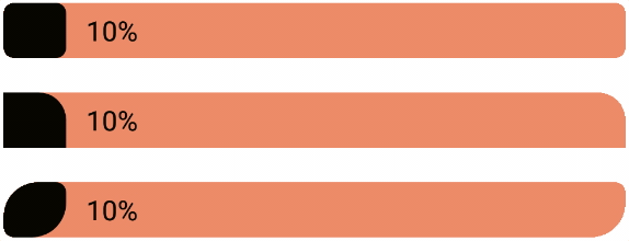 79 |
79 |  86 |
86 |  |
10 | |[Food Lookup](https://play.google.com/store/apps/details?id=com.shervinkoushan.foodlookup)|NA|
|
10 | |[Food Lookup](https://play.google.com/store/apps/details?id=com.shervinkoushan.foodlookup)|NA| |
--------------------------------------------------------------------------------
|
--------------------------------------------------------------------------------