├── src
├── elm.png
├── Internal
│ ├── ProgressIndicator.elm
│ ├── Material
│ │ ├── SortTable.elm
│ │ ├── Snackbar.elm
│ │ ├── Dialog.elm
│ │ ├── PasswordInput.elm
│ │ ├── Palette.elm
│ │ ├── Icon.elm
│ │ ├── Radio.elm
│ │ ├── TextInput.elm
│ │ ├── Tab.elm
│ │ ├── Chip.elm
│ │ ├── Checkbox.elm
│ │ ├── ProgressIndicator.elm
│ │ ├── Switch.elm
│ │ └── List.elm
│ ├── Tab.elm
│ ├── Modal.elm
│ ├── PasswordInput.elm
│ ├── Checkbox.elm
│ ├── Radio.elm
│ ├── TextInput.elm
│ ├── Dialog.elm
│ ├── ExpansionPanel.elm
│ ├── Switch.elm
│ ├── Button.elm
│ └── Select.elm
└── Widget
│ ├── Material
│ └── Typography.elm
│ └── Snackbar.elm
├── elm-analyse.json
├── docs
├── assets
│ ├── elm.png
│ ├── icon.png
│ ├── list.png
│ ├── tab.png
│ ├── appBar.png
│ ├── button.png
│ ├── dialog.png
│ ├── layout.png
│ ├── modal.png
│ ├── radio.png
│ ├── select.png
│ ├── sheet.png
│ ├── switch.png
│ ├── buttonRow.png
│ ├── checkbox.png
│ ├── snackbar.png
│ ├── sortTable.png
│ ├── textInput.png
│ ├── multiSelect.png
│ ├── sortTableV2.png
│ ├── expansionPanel.png
│ ├── material-style.png
│ ├── material
│ │ ├── chip.png
│ │ ├── radio.png
│ │ ├── tab.png
│ │ ├── menuBar.png
│ │ ├── switch.png
│ │ ├── tabBar.png
│ │ ├── cardColumn.png
│ │ ├── checkbox.png
│ │ ├── iconButton.png
│ │ ├── imageItem.png
│ │ ├── insetItem.png
│ │ ├── selectItem.png
│ │ ├── sideSheet.png
│ │ ├── snackbar.png
│ │ ├── sortTable.png
│ │ ├── tabButton.png
│ │ ├── textButton.png
│ │ ├── textInput.png
│ │ ├── alertDialog.png
│ │ ├── insetDivider.png
│ │ ├── insetHeader.png
│ │ ├── multiSelect.png
│ │ ├── toggleButton.png
│ │ ├── containedButton.png
│ │ ├── expansionItem.png
│ │ ├── fullBleedHeader.png
│ │ ├── fullBleedItem.png
│ │ ├── middleDivider.png
│ │ ├── multiLineItem.png
│ │ ├── outlinedButton.png
│ │ ├── fullBleedDivider.png
│ │ └── progressIndicator.png
│ ├── template-style.png
│ └── progressIndicator.png
├── 3.0.0
│ └── index.html
├── index.html
└── 404.html
├── explorer
├── src
│ ├── Ports.elm
│ ├── Theme.elm
│ ├── Main.elm
│ ├── Page.elm
│ └── Page
│ │ ├── ProgressIndicator.elm
│ │ ├── Icon.elm
│ │ ├── Radio.elm
│ │ ├── Switch.elm
│ │ ├── Checkbox.elm
│ │ └── PasswordInput.elm
├── README.md
└── elm.json
├── .gitignore
├── elm-tooling.json
├── package.json
├── tests
├── elm-verify-examples.json
└── VerifyExamples
│ └── Widget
│ ├── Row0.elm
│ ├── CircularProgressIndicator0.elm
│ ├── Column0.elm
│ ├── TextButton0.elm
│ ├── AsItem0.elm
│ ├── Radio0.elm
│ ├── Checkbox0.elm
│ ├── Switch0.elm
│ ├── MultiModal0.elm
│ ├── SingleModal0.elm
│ ├── Button0.elm
│ ├── IconButton0.elm
│ ├── MultiLineItem0.elm
│ ├── Divider0.elm
│ ├── FullBleedItem0.elm
│ ├── ItemList0.elm
│ ├── Select0.elm
│ ├── HeaderItem0.elm
│ ├── ToggleButton0.elm
│ ├── SelectButton0.elm
│ ├── MultiSelect0.elm
│ ├── ButtonRow0.elm
│ ├── Dialog0.elm
│ ├── ToggleRow0.elm
│ ├── InsetItem0.elm
│ ├── ButtonColumn0.elm
│ ├── WrappedButtonRow0.elm
│ ├── SelectItem0.elm
│ ├── ImageItem0.elm
│ ├── TextInput0.elm
│ ├── ExpansionItem0.elm
│ ├── Tab0.elm
│ ├── SortTable0.elm
│ └── SortTableV20.elm
├── .github
├── FUNDING.yml
├── pull_request_template.md
└── workflows
│ └── main.yml
├── CONTRIBUTING.md
├── elm.json
└── LICENSE
/src/elm.png:
--------------------------------------------------------------------------------
https://raw.githubusercontent.com/Orasund/elm-ui-widgets/HEAD/src/elm.png
--------------------------------------------------------------------------------
/elm-analyse.json:
--------------------------------------------------------------------------------
1 | {
2 | "checks": {
3 | "SingleFieldRecord": false
4 | }
5 | }
--------------------------------------------------------------------------------
/docs/assets/elm.png:
--------------------------------------------------------------------------------
https://raw.githubusercontent.com/Orasund/elm-ui-widgets/HEAD/docs/assets/elm.png
--------------------------------------------------------------------------------
/docs/assets/icon.png:
--------------------------------------------------------------------------------
https://raw.githubusercontent.com/Orasund/elm-ui-widgets/HEAD/docs/assets/icon.png
--------------------------------------------------------------------------------
/docs/assets/list.png:
--------------------------------------------------------------------------------
https://raw.githubusercontent.com/Orasund/elm-ui-widgets/HEAD/docs/assets/list.png
--------------------------------------------------------------------------------
/docs/assets/tab.png:
--------------------------------------------------------------------------------
https://raw.githubusercontent.com/Orasund/elm-ui-widgets/HEAD/docs/assets/tab.png
--------------------------------------------------------------------------------
/docs/assets/appBar.png:
--------------------------------------------------------------------------------
https://raw.githubusercontent.com/Orasund/elm-ui-widgets/HEAD/docs/assets/appBar.png
--------------------------------------------------------------------------------
/docs/assets/button.png:
--------------------------------------------------------------------------------
https://raw.githubusercontent.com/Orasund/elm-ui-widgets/HEAD/docs/assets/button.png
--------------------------------------------------------------------------------
/docs/assets/dialog.png:
--------------------------------------------------------------------------------
https://raw.githubusercontent.com/Orasund/elm-ui-widgets/HEAD/docs/assets/dialog.png
--------------------------------------------------------------------------------
/docs/assets/layout.png:
--------------------------------------------------------------------------------
https://raw.githubusercontent.com/Orasund/elm-ui-widgets/HEAD/docs/assets/layout.png
--------------------------------------------------------------------------------
/docs/assets/modal.png:
--------------------------------------------------------------------------------
https://raw.githubusercontent.com/Orasund/elm-ui-widgets/HEAD/docs/assets/modal.png
--------------------------------------------------------------------------------
/docs/assets/radio.png:
--------------------------------------------------------------------------------
https://raw.githubusercontent.com/Orasund/elm-ui-widgets/HEAD/docs/assets/radio.png
--------------------------------------------------------------------------------
/docs/assets/select.png:
--------------------------------------------------------------------------------
https://raw.githubusercontent.com/Orasund/elm-ui-widgets/HEAD/docs/assets/select.png
--------------------------------------------------------------------------------
/docs/assets/sheet.png:
--------------------------------------------------------------------------------
https://raw.githubusercontent.com/Orasund/elm-ui-widgets/HEAD/docs/assets/sheet.png
--------------------------------------------------------------------------------
/docs/assets/switch.png:
--------------------------------------------------------------------------------
https://raw.githubusercontent.com/Orasund/elm-ui-widgets/HEAD/docs/assets/switch.png
--------------------------------------------------------------------------------
/docs/assets/buttonRow.png:
--------------------------------------------------------------------------------
https://raw.githubusercontent.com/Orasund/elm-ui-widgets/HEAD/docs/assets/buttonRow.png
--------------------------------------------------------------------------------
/docs/assets/checkbox.png:
--------------------------------------------------------------------------------
https://raw.githubusercontent.com/Orasund/elm-ui-widgets/HEAD/docs/assets/checkbox.png
--------------------------------------------------------------------------------
/docs/assets/snackbar.png:
--------------------------------------------------------------------------------
https://raw.githubusercontent.com/Orasund/elm-ui-widgets/HEAD/docs/assets/snackbar.png
--------------------------------------------------------------------------------
/docs/assets/sortTable.png:
--------------------------------------------------------------------------------
https://raw.githubusercontent.com/Orasund/elm-ui-widgets/HEAD/docs/assets/sortTable.png
--------------------------------------------------------------------------------
/docs/assets/textInput.png:
--------------------------------------------------------------------------------
https://raw.githubusercontent.com/Orasund/elm-ui-widgets/HEAD/docs/assets/textInput.png
--------------------------------------------------------------------------------
/docs/assets/multiSelect.png:
--------------------------------------------------------------------------------
https://raw.githubusercontent.com/Orasund/elm-ui-widgets/HEAD/docs/assets/multiSelect.png
--------------------------------------------------------------------------------
/docs/assets/sortTableV2.png:
--------------------------------------------------------------------------------
https://raw.githubusercontent.com/Orasund/elm-ui-widgets/HEAD/docs/assets/sortTableV2.png
--------------------------------------------------------------------------------
/docs/assets/expansionPanel.png:
--------------------------------------------------------------------------------
https://raw.githubusercontent.com/Orasund/elm-ui-widgets/HEAD/docs/assets/expansionPanel.png
--------------------------------------------------------------------------------
/docs/assets/material-style.png:
--------------------------------------------------------------------------------
https://raw.githubusercontent.com/Orasund/elm-ui-widgets/HEAD/docs/assets/material-style.png
--------------------------------------------------------------------------------
/docs/assets/material/chip.png:
--------------------------------------------------------------------------------
https://raw.githubusercontent.com/Orasund/elm-ui-widgets/HEAD/docs/assets/material/chip.png
--------------------------------------------------------------------------------
/docs/assets/material/radio.png:
--------------------------------------------------------------------------------
https://raw.githubusercontent.com/Orasund/elm-ui-widgets/HEAD/docs/assets/material/radio.png
--------------------------------------------------------------------------------
/docs/assets/material/tab.png:
--------------------------------------------------------------------------------
https://raw.githubusercontent.com/Orasund/elm-ui-widgets/HEAD/docs/assets/material/tab.png
--------------------------------------------------------------------------------
/docs/assets/template-style.png:
--------------------------------------------------------------------------------
https://raw.githubusercontent.com/Orasund/elm-ui-widgets/HEAD/docs/assets/template-style.png
--------------------------------------------------------------------------------
/docs/assets/material/menuBar.png:
--------------------------------------------------------------------------------
https://raw.githubusercontent.com/Orasund/elm-ui-widgets/HEAD/docs/assets/material/menuBar.png
--------------------------------------------------------------------------------
/docs/assets/material/switch.png:
--------------------------------------------------------------------------------
https://raw.githubusercontent.com/Orasund/elm-ui-widgets/HEAD/docs/assets/material/switch.png
--------------------------------------------------------------------------------
/docs/assets/material/tabBar.png:
--------------------------------------------------------------------------------
https://raw.githubusercontent.com/Orasund/elm-ui-widgets/HEAD/docs/assets/material/tabBar.png
--------------------------------------------------------------------------------
/docs/assets/material/cardColumn.png:
--------------------------------------------------------------------------------
https://raw.githubusercontent.com/Orasund/elm-ui-widgets/HEAD/docs/assets/material/cardColumn.png
--------------------------------------------------------------------------------
/docs/assets/material/checkbox.png:
--------------------------------------------------------------------------------
https://raw.githubusercontent.com/Orasund/elm-ui-widgets/HEAD/docs/assets/material/checkbox.png
--------------------------------------------------------------------------------
/docs/assets/material/iconButton.png:
--------------------------------------------------------------------------------
https://raw.githubusercontent.com/Orasund/elm-ui-widgets/HEAD/docs/assets/material/iconButton.png
--------------------------------------------------------------------------------
/docs/assets/material/imageItem.png:
--------------------------------------------------------------------------------
https://raw.githubusercontent.com/Orasund/elm-ui-widgets/HEAD/docs/assets/material/imageItem.png
--------------------------------------------------------------------------------
/docs/assets/material/insetItem.png:
--------------------------------------------------------------------------------
https://raw.githubusercontent.com/Orasund/elm-ui-widgets/HEAD/docs/assets/material/insetItem.png
--------------------------------------------------------------------------------
/docs/assets/material/selectItem.png:
--------------------------------------------------------------------------------
https://raw.githubusercontent.com/Orasund/elm-ui-widgets/HEAD/docs/assets/material/selectItem.png
--------------------------------------------------------------------------------
/docs/assets/material/sideSheet.png:
--------------------------------------------------------------------------------
https://raw.githubusercontent.com/Orasund/elm-ui-widgets/HEAD/docs/assets/material/sideSheet.png
--------------------------------------------------------------------------------
/docs/assets/material/snackbar.png:
--------------------------------------------------------------------------------
https://raw.githubusercontent.com/Orasund/elm-ui-widgets/HEAD/docs/assets/material/snackbar.png
--------------------------------------------------------------------------------
/docs/assets/material/sortTable.png:
--------------------------------------------------------------------------------
https://raw.githubusercontent.com/Orasund/elm-ui-widgets/HEAD/docs/assets/material/sortTable.png
--------------------------------------------------------------------------------
/docs/assets/material/tabButton.png:
--------------------------------------------------------------------------------
https://raw.githubusercontent.com/Orasund/elm-ui-widgets/HEAD/docs/assets/material/tabButton.png
--------------------------------------------------------------------------------
/docs/assets/material/textButton.png:
--------------------------------------------------------------------------------
https://raw.githubusercontent.com/Orasund/elm-ui-widgets/HEAD/docs/assets/material/textButton.png
--------------------------------------------------------------------------------
/docs/assets/material/textInput.png:
--------------------------------------------------------------------------------
https://raw.githubusercontent.com/Orasund/elm-ui-widgets/HEAD/docs/assets/material/textInput.png
--------------------------------------------------------------------------------
/docs/assets/progressIndicator.png:
--------------------------------------------------------------------------------
https://raw.githubusercontent.com/Orasund/elm-ui-widgets/HEAD/docs/assets/progressIndicator.png
--------------------------------------------------------------------------------
/docs/assets/material/alertDialog.png:
--------------------------------------------------------------------------------
https://raw.githubusercontent.com/Orasund/elm-ui-widgets/HEAD/docs/assets/material/alertDialog.png
--------------------------------------------------------------------------------
/docs/assets/material/insetDivider.png:
--------------------------------------------------------------------------------
https://raw.githubusercontent.com/Orasund/elm-ui-widgets/HEAD/docs/assets/material/insetDivider.png
--------------------------------------------------------------------------------
/docs/assets/material/insetHeader.png:
--------------------------------------------------------------------------------
https://raw.githubusercontent.com/Orasund/elm-ui-widgets/HEAD/docs/assets/material/insetHeader.png
--------------------------------------------------------------------------------
/docs/assets/material/multiSelect.png:
--------------------------------------------------------------------------------
https://raw.githubusercontent.com/Orasund/elm-ui-widgets/HEAD/docs/assets/material/multiSelect.png
--------------------------------------------------------------------------------
/docs/assets/material/toggleButton.png:
--------------------------------------------------------------------------------
https://raw.githubusercontent.com/Orasund/elm-ui-widgets/HEAD/docs/assets/material/toggleButton.png
--------------------------------------------------------------------------------
/docs/assets/material/containedButton.png:
--------------------------------------------------------------------------------
https://raw.githubusercontent.com/Orasund/elm-ui-widgets/HEAD/docs/assets/material/containedButton.png
--------------------------------------------------------------------------------
/docs/assets/material/expansionItem.png:
--------------------------------------------------------------------------------
https://raw.githubusercontent.com/Orasund/elm-ui-widgets/HEAD/docs/assets/material/expansionItem.png
--------------------------------------------------------------------------------
/docs/assets/material/fullBleedHeader.png:
--------------------------------------------------------------------------------
https://raw.githubusercontent.com/Orasund/elm-ui-widgets/HEAD/docs/assets/material/fullBleedHeader.png
--------------------------------------------------------------------------------
/docs/assets/material/fullBleedItem.png:
--------------------------------------------------------------------------------
https://raw.githubusercontent.com/Orasund/elm-ui-widgets/HEAD/docs/assets/material/fullBleedItem.png
--------------------------------------------------------------------------------
/docs/assets/material/middleDivider.png:
--------------------------------------------------------------------------------
https://raw.githubusercontent.com/Orasund/elm-ui-widgets/HEAD/docs/assets/material/middleDivider.png
--------------------------------------------------------------------------------
/docs/assets/material/multiLineItem.png:
--------------------------------------------------------------------------------
https://raw.githubusercontent.com/Orasund/elm-ui-widgets/HEAD/docs/assets/material/multiLineItem.png
--------------------------------------------------------------------------------
/docs/assets/material/outlinedButton.png:
--------------------------------------------------------------------------------
https://raw.githubusercontent.com/Orasund/elm-ui-widgets/HEAD/docs/assets/material/outlinedButton.png
--------------------------------------------------------------------------------
/docs/assets/material/fullBleedDivider.png:
--------------------------------------------------------------------------------
https://raw.githubusercontent.com/Orasund/elm-ui-widgets/HEAD/docs/assets/material/fullBleedDivider.png
--------------------------------------------------------------------------------
/docs/assets/material/progressIndicator.png:
--------------------------------------------------------------------------------
https://raw.githubusercontent.com/Orasund/elm-ui-widgets/HEAD/docs/assets/material/progressIndicator.png
--------------------------------------------------------------------------------
/explorer/src/Ports.elm:
--------------------------------------------------------------------------------
1 | port module Ports exposing (saveSettings)
2 |
3 | import Json.Encode
4 |
5 |
6 | port saveSettings : String -> Cmd msg
7 |
--------------------------------------------------------------------------------
/explorer/README.md:
--------------------------------------------------------------------------------
1 | Explorer
2 | ========
3 |
4 | To run the explorer :
5 |
6 | ```Bash
7 | elm-live -u -- src/Main.elm --output main.js
8 | ```
9 |
--------------------------------------------------------------------------------
/.gitignore:
--------------------------------------------------------------------------------
1 | # elm-package generated files
2 | elm-stuff
3 | # elm-repl generated files
4 | repl-temp-*
5 | # elm-live && build generated file
6 | explorer/main.js
7 | node_modules
--------------------------------------------------------------------------------
/elm-tooling.json:
--------------------------------------------------------------------------------
1 | {
2 | "entrypoints": [
3 | "./src/Main.elm"
4 | ],
5 | "tools": {
6 | "elm": "0.19.1",
7 | "elm-format": "0.8.5",
8 | "elm-test-rs": "1.2.2"
9 | }
10 | }
--------------------------------------------------------------------------------
/package.json:
--------------------------------------------------------------------------------
1 | {
2 | "private": true,
3 | "name": "elm-ui-widget",
4 | "scripts": {
5 | "postinstall": "elm-tooling install"
6 | },
7 | "devDependencies": {
8 | "elm-tooling": "^1.6.0"
9 | },
10 | "postinstall": "elm-tooling install"
11 | }
--------------------------------------------------------------------------------
/tests/elm-verify-examples.json:
--------------------------------------------------------------------------------
1 | {
2 | "root": "../src",
3 | "tests": [
4 | "Widget",
5 | "Widget.Material",
6 | "Widget.Material.Typography",
7 | "Widget.Material.Color",
8 | "Widget.Customize",
9 | "Widget.Layout",
10 | "Widget.ScrollingNav",
11 | "Widget.Snackbar",
12 | "Widget.Icon",
13 | "./README.md"
14 | ]
15 | }
--------------------------------------------------------------------------------
/src/Internal/ProgressIndicator.elm:
--------------------------------------------------------------------------------
1 | module Internal.ProgressIndicator exposing (ProgressIndicatorStyle, circularProgressIndicator)
2 |
3 | import Element exposing (Element)
4 |
5 |
6 | {-| -}
7 | type alias ProgressIndicatorStyle msg =
8 | { elementFunction : Maybe Float -> Element msg
9 | }
10 |
11 |
12 | circularProgressIndicator :
13 | ProgressIndicatorStyle msg
14 | -> Maybe Float
15 | -> Element msg
16 | circularProgressIndicator style maybeProgress =
17 | style.elementFunction maybeProgress
18 |
--------------------------------------------------------------------------------
/src/Internal/Material/SortTable.elm:
--------------------------------------------------------------------------------
1 | module Internal.Material.SortTable exposing (sortTable)
2 |
3 | import Element
4 | import Internal.Material.Button as Button
5 | import Internal.Material.Icon as Icon
6 | import Internal.Material.Palette exposing (Palette)
7 | import Internal.SortTable exposing (SortTableStyle)
8 |
9 |
10 | sortTable : Palette -> SortTableStyle msg
11 | sortTable palette =
12 | { elementTable = []
13 | , content =
14 | { header = Button.textButton palette
15 | , ascIcon = Icon.expand_less
16 | , descIcon = Icon.expand_more
17 | , defaultIcon = always Element.none
18 | }
19 | }
20 |
--------------------------------------------------------------------------------
/docs/3.0.0/index.html:
--------------------------------------------------------------------------------
1 |
2 |
3 |
4 | Main
5 |
6 |
7 |
8 |
9 |
10 |
24 |
25 |
26 |
--------------------------------------------------------------------------------
/docs/index.html:
--------------------------------------------------------------------------------
1 |
2 |
3 |
4 |
5 | Main
6 |
7 |
8 |
9 |
10 |
11 |
25 |
26 |
27 |
--------------------------------------------------------------------------------
/explorer/src/Theme.elm:
--------------------------------------------------------------------------------
1 | module Theme exposing (..)
2 |
3 | import Widget.Material exposing (Palette)
4 |
5 |
6 | type Theme
7 | = MaterialDefault
8 | | MaterialDark
9 |
10 |
11 | allThemeOptions : List Theme
12 | allThemeOptions =
13 | [ MaterialDefault
14 | , MaterialDark
15 | ]
16 |
17 |
18 | themeOptionToString : Theme -> String
19 | themeOptionToString theme =
20 | case theme of
21 | MaterialDefault ->
22 | "Material"
23 |
24 | MaterialDark ->
25 | "Material dark"
26 |
27 |
28 | themeValue : Theme -> Palette
29 | themeValue theme =
30 | case theme of
31 | MaterialDefault ->
32 | Widget.Material.defaultPalette
33 |
34 | MaterialDark ->
35 | Widget.Material.darkPalette
36 |
--------------------------------------------------------------------------------
/.github/FUNDING.yml:
--------------------------------------------------------------------------------
1 | # These are supported funding model platforms
2 |
3 | github: # Replace with up to 4 GitHub Sponsors-enabled usernames e.g., [user1, user2]
4 | patreon: # Replace with a single Patreon username
5 | open_collective: # Replace with a single Open Collective username
6 | ko_fi: # Replace with a single Ko-fi username
7 | tidelift: # Replace with a single Tidelift platform-name/package-name e.g., npm/babel
8 | community_bridge: # Replace with a single Community Bridge project-name e.g., cloud-foundry
9 | liberapay: # Replace with a single Liberapay username
10 | issuehunt: orasund
11 | otechie: # Replace with a single Otechie username
12 | lfx_crowdfunding: # Replace with a single LFX Crowdfunding project-name e.g., cloud-foundry
13 | custom: # Replace with up to 4 custom sponsorship URLs e.g., ['link1', 'link2']
14 |
--------------------------------------------------------------------------------
/CONTRIBUTING.md:
--------------------------------------------------------------------------------
1 | # Contributing to this repository
2 |
3 | This file should give you a general direction where this repository is heading and how you can contribute.
4 |
5 | ## Roadmap
6 |
7 | The idea is that version 4.0.0 should mark the feature-complete release of elm-ui-widgets. This essentially means that we can NOT allow having a major update for some small change. Issues marked as 4.0.0 should have an intermediate fix in 3.X.X. The idea would to let some version of 3.X.X. be feature-complete and to then go over the API one final time.
8 |
9 | Development is quite slow. If you need something, the fasted way is to start a new issue and help out. Any help is welcome.
10 |
11 | ## How to contribute
12 |
13 | Always start with an issue, PRs that are not related to issues will be instantly rejected.
14 |
15 | If you want to help out, just look through all the open issues and pick one you'd like to tackle.
16 |
--------------------------------------------------------------------------------
/tests/VerifyExamples/Widget/Row0.elm:
--------------------------------------------------------------------------------
1 | module VerifyExamples.Widget.Row0 exposing (..)
2 |
3 | -- This file got generated by [elm-verify-examples](https://github.com/stoeffel/elm-verify-examples).
4 | -- Please don't modify this file by hand!
5 |
6 | import Test
7 | import Expect
8 |
9 | import Widget exposing (..)
10 | import Widget.Material as Material
11 | import Element
12 |
13 |
14 |
15 |
16 |
17 |
18 |
19 | spec0 : Test.Test
20 | spec0 =
21 | Test.test "#row: \n\n [ Element.text \"Text 1\"\n , Element.text \"Text 2\"\n ]\n |> Widget.row Material.row\n |> always \"Ignore this line\"\n --> \"Ignore this line\"" <|
22 | \() ->
23 | Expect.equal
24 | (
25 | [ Element.text "Text 1"
26 | , Element.text "Text 2"
27 | ]
28 | |> Widget.row Material.row
29 | |> always "Ignore this line"
30 | )
31 | (
32 | "Ignore this line"
33 | )
--------------------------------------------------------------------------------
/tests/VerifyExamples/Widget/CircularProgressIndicator0.elm:
--------------------------------------------------------------------------------
1 | module VerifyExamples.Widget.CircularProgressIndicator0 exposing (..)
2 |
3 | -- This file got generated by [elm-verify-examples](https://github.com/stoeffel/elm-verify-examples).
4 | -- Please don't modify this file by hand!
5 |
6 | import Test
7 | import Expect
8 |
9 | import Widget exposing (..)
10 | import Widget.Material as Material
11 |
12 |
13 |
14 |
15 |
16 |
17 |
18 | spec0 : Test.Test
19 | spec0 =
20 | Test.test "#circularProgressIndicator: \n\n Just 0.75\n |> Widget.circularProgressIndicator (Material.progressIndicator Material.defaultPalette)\n |> always \"Ignore this line\"\n --> \"Ignore this line\"" <|
21 | \() ->
22 | Expect.equal
23 | (
24 | Just 0.75
25 | |> Widget.circularProgressIndicator (Material.progressIndicator Material.defaultPalette)
26 | |> always "Ignore this line"
27 | )
28 | (
29 | "Ignore this line"
30 | )
--------------------------------------------------------------------------------
/tests/VerifyExamples/Widget/Column0.elm:
--------------------------------------------------------------------------------
1 | module VerifyExamples.Widget.Column0 exposing (..)
2 |
3 | -- This file got generated by [elm-verify-examples](https://github.com/stoeffel/elm-verify-examples).
4 | -- Please don't modify this file by hand!
5 |
6 | import Test
7 | import Expect
8 |
9 | import Widget exposing (..)
10 | import Widget.Material as Material
11 | import Element
12 |
13 |
14 |
15 |
16 |
17 |
18 |
19 | spec0 : Test.Test
20 | spec0 =
21 | Test.test "#column: \n\n [ Element.text \"Text 1\"\n , Element.text \"Text 2\"\n ]\n |> Widget.column Material.column\n |> always \"Ignore this line\"\n --> \"Ignore this line\"" <|
22 | \() ->
23 | Expect.equal
24 | (
25 | [ Element.text "Text 1"
26 | , Element.text "Text 2"
27 | ]
28 | |> Widget.column Material.column
29 | |> always "Ignore this line"
30 | )
31 | (
32 | "Ignore this line"
33 | )
--------------------------------------------------------------------------------
/src/Internal/Tab.elm:
--------------------------------------------------------------------------------
1 | module Internal.Tab exposing (Tab, TabStyle, tab)
2 |
3 | import Element exposing (Attribute, Element)
4 | import Internal.Button exposing (ButtonStyle)
5 | import Internal.Select as Select exposing (Select)
6 |
7 |
8 | {-| -}
9 | type alias TabStyle msg =
10 | { elementColumn : List (Attribute msg)
11 | , content :
12 | { tabs :
13 | { elementRow : List (Attribute msg)
14 | , content : ButtonStyle msg
15 | }
16 | , content : List (Attribute msg)
17 | }
18 | }
19 |
20 |
21 | type alias Tab msg =
22 | { tabs : Select msg
23 | , content : Maybe Int -> Element msg
24 | }
25 |
26 |
27 | tab : TabStyle msg -> Tab msg -> Element msg
28 | tab style { tabs, content } =
29 | [ tabs
30 | |> Select.select
31 | |> List.map (Select.selectButton style.content.tabs.content)
32 | |> Element.row style.content.tabs.elementRow
33 | , tabs.selected
34 | |> content
35 | |> Element.el style.content.content
36 | ]
37 | |> Element.column style.elementColumn
38 |
--------------------------------------------------------------------------------
/tests/VerifyExamples/Widget/TextButton0.elm:
--------------------------------------------------------------------------------
1 | module VerifyExamples.Widget.TextButton0 exposing (..)
2 |
3 | -- This file got generated by [elm-verify-examples](https://github.com/stoeffel/elm-verify-examples).
4 | -- Please don't modify this file by hand!
5 |
6 | import Test
7 | import Expect
8 |
9 | import Widget exposing (..)
10 | import Widget.Material as Material
11 |
12 | type Msg
13 | = Like
14 |
15 |
16 |
17 |
18 |
19 | spec0 : Test.Test
20 | spec0 =
21 | Test.test "#textButton: \n\n textButton (Material.textButton Material.defaultPalette)\n { text = \"Like\"\n , onPress = Just Like\n }\n |> always \"Ignore this line\"\n --> \"Ignore this line\"" <|
22 | \() ->
23 | Expect.equal
24 | (
25 | textButton (Material.textButton Material.defaultPalette)
26 | { text = "Like"
27 | , onPress = Just Like
28 | }
29 | |> always "Ignore this line"
30 | )
31 | (
32 | "Ignore this line"
33 | )
--------------------------------------------------------------------------------
/tests/VerifyExamples/Widget/AsItem0.elm:
--------------------------------------------------------------------------------
1 | module VerifyExamples.Widget.AsItem0 exposing (..)
2 |
3 | -- This file got generated by [elm-verify-examples](https://github.com/stoeffel/elm-verify-examples).
4 | -- Please don't modify this file by hand!
5 |
6 | import Test
7 | import Expect
8 |
9 | import Widget exposing (..)
10 | import Widget.Material as Material
11 | import Element
12 |
13 |
14 |
15 |
16 |
17 |
18 |
19 | spec0 : Test.Test
20 | spec0 =
21 | Test.test "#asItem: \n\n Element.text \"Just a text\"\n |> Widget.asItem\n |> List.singleton\n |> Widget.itemList (Material.cardColumn Material.defaultPalette)\n |> always \"Ignore this line\"\n --> \"Ignore this line\"" <|
22 | \() ->
23 | Expect.equal
24 | (
25 | Element.text "Just a text"
26 | |> Widget.asItem
27 | |> List.singleton
28 | |> Widget.itemList (Material.cardColumn Material.defaultPalette)
29 | |> always "Ignore this line"
30 | )
31 | (
32 | "Ignore this line"
33 | )
--------------------------------------------------------------------------------
/tests/VerifyExamples/Widget/Radio0.elm:
--------------------------------------------------------------------------------
1 | module VerifyExamples.Widget.Radio0 exposing (..)
2 |
3 | -- This file got generated by [elm-verify-examples](https://github.com/stoeffel/elm-verify-examples).
4 | -- Please don't modify this file by hand!
5 |
6 | import Test
7 | import Expect
8 |
9 | import Widget exposing (..)
10 | import Widget.Material as Material
11 |
12 | type Msg
13 | = Activate
14 |
15 |
16 |
17 |
18 |
19 | spec0 : Test.Test
20 | spec0 =
21 | Test.test "#radio: \n\n radio (Material.radio Material.defaultPalette)\n { description = \"Dark Mode\"\n , onPress = Just Activate\n , selected = False\n }\n |> always \"Ignore this line\"\n --> \"Ignore this line\"" <|
22 | \() ->
23 | Expect.equal
24 | (
25 | radio (Material.radio Material.defaultPalette)
26 | { description = "Dark Mode"
27 | , onPress = Just Activate
28 | , selected = False
29 | }
30 | |> always "Ignore this line"
31 | )
32 | (
33 | "Ignore this line"
34 | )
--------------------------------------------------------------------------------
/tests/VerifyExamples/Widget/Checkbox0.elm:
--------------------------------------------------------------------------------
1 | module VerifyExamples.Widget.Checkbox0 exposing (..)
2 |
3 | -- This file got generated by [elm-verify-examples](https://github.com/stoeffel/elm-verify-examples).
4 | -- Please don't modify this file by hand!
5 |
6 | import Test
7 | import Expect
8 |
9 | import Widget exposing (..)
10 | import Widget.Material as Material
11 |
12 | type Msg
13 | = Check Bool
14 |
15 |
16 |
17 |
18 |
19 | spec0 : Test.Test
20 | spec0 =
21 | Test.test "#checkbox: \n\n checkbox (Material.checkbox Material.defaultPalette)\n { description = \"Dark Mode\"\n , onChange = Just Check\n , checked = False\n }\n |> always \"Ignore this line\"\n --> \"Ignore this line\"" <|
22 | \() ->
23 | Expect.equal
24 | (
25 | checkbox (Material.checkbox Material.defaultPalette)
26 | { description = "Dark Mode"
27 | , onChange = Just Check
28 | , checked = False
29 | }
30 | |> always "Ignore this line"
31 | )
32 | (
33 | "Ignore this line"
34 | )
--------------------------------------------------------------------------------
/tests/VerifyExamples/Widget/Switch0.elm:
--------------------------------------------------------------------------------
1 | module VerifyExamples.Widget.Switch0 exposing (..)
2 |
3 | -- This file got generated by [elm-verify-examples](https://github.com/stoeffel/elm-verify-examples).
4 | -- Please don't modify this file by hand!
5 |
6 | import Test
7 | import Expect
8 |
9 | import Widget exposing (..)
10 | import Widget.Material as Material
11 |
12 | type Msg
13 | = Activate
14 |
15 |
16 |
17 |
18 |
19 | spec0 : Test.Test
20 | spec0 =
21 | Test.test "#switch: \n\n switch (Material.switch Material.defaultPalette)\n { description = \"Activate Dark Mode\"\n , onPress = Just Activate\n , active = False\n }\n |> always \"Ignore this line\"\n --> \"Ignore this line\"" <|
22 | \() ->
23 | Expect.equal
24 | (
25 | switch (Material.switch Material.defaultPalette)
26 | { description = "Activate Dark Mode"
27 | , onPress = Just Activate
28 | , active = False
29 | }
30 | |> always "Ignore this line"
31 | )
32 | (
33 | "Ignore this line"
34 | )
--------------------------------------------------------------------------------
/.github/pull_request_template.md:
--------------------------------------------------------------------------------
1 | # Description
2 |
3 | _Please add a detailed description what you did._
4 |
5 | **Pull request solving issue #[your issue].**
6 |
7 | _Please only open Pull Requests for existing issues._
8 |
9 | # Checklist for new Widget
10 |
11 | * [ ] Checked out the Material design specification of the widget
12 | * [ ] Added constructors, Widgets Type and Style Type in `src/Internal/[Your Widget].elm`
13 | * [ ] Added styles in `src/Internal/Material/[Your Widget].elm`
14 | * [ ] In `src/Widget.Material.elm`:
15 | * [ ] Linked each style to its representative in `src/Internal/Material/[Your Widget].elm`
16 | * [ ] Added Documentation
17 | * [ ] In `src/Widget.elm`:
18 | * [ ] Added a copy of the Widget Type
19 | * [ ] Added a copy of the Style Type
20 | * [ ] Linked each constructor to its representative in `src/Internal/[You Widget].elm`
21 | * [ ] Replaced the Widget Type in the type signiture of each constructor with its definition
22 | * [ ] Added Documentation with a small example
23 | * [ ] run `elm-verify-examples && elm-test` to test the example
24 |
25 | **Optional:**
26 | * [ ] Added a Page in `explorer/src/Page/[Your Widget].elm` and added it to `explorer/src/Main.elm`
27 |
--------------------------------------------------------------------------------
/elm.json:
--------------------------------------------------------------------------------
1 | {
2 | "type": "package",
3 | "name": "Orasund/elm-ui-widgets",
4 | "summary": "Collection of reusable views for elm-ui.",
5 | "license": "BSD-3-Clause",
6 | "version": "3.4.0",
7 | "exposed-modules": [
8 | "Widget",
9 | "Widget.Material",
10 | "Widget.Material.Typography",
11 | "Widget.Material.Color",
12 | "Widget.Customize",
13 | "Widget.Layout",
14 | "Widget.Snackbar",
15 | "Widget.Icon"
16 | ],
17 | "elm-version": "0.19.0 <= v < 0.20.0",
18 | "dependencies": {
19 | "avh4/elm-color": "1.0.0 <= v < 2.0.0",
20 | "elm/browser": "1.0.2 <= v < 2.0.0",
21 | "elm/core": "1.0.2 <= v < 2.0.0",
22 | "elm/html": "1.0.0 <= v < 2.0.0",
23 | "elm/svg": "1.0.1 <= v < 2.0.0",
24 | "elm-community/intdict": "3.0.0 <= v < 4.0.0",
25 | "mdgriffith/elm-ui": "1.1.7 <= v < 2.0.0",
26 | "noahzgordon/elm-color-extra": "1.0.2 <= v < 2.0.0",
27 | "turboMaCk/queue": "1.0.2 <= v < 2.0.0"
28 | },
29 | "test-dependencies": {
30 | "elm-explorations/test": "1.2.1 <= v < 2.0.0",
31 | "icidasset/elm-material-icons": "5.0.0 <= v < 6.0.0"
32 | }
33 | }
34 |
--------------------------------------------------------------------------------
/tests/VerifyExamples/Widget/MultiModal0.elm:
--------------------------------------------------------------------------------
1 | module VerifyExamples.Widget.MultiModal0 exposing (..)
2 |
3 | -- This file got generated by [elm-verify-examples](https://github.com/stoeffel/elm-verify-examples).
4 | -- Please don't modify this file by hand!
5 |
6 | import Test
7 | import Expect
8 |
9 | import Widget exposing (..)
10 | import Element
11 |
12 | type Msg
13 | = Close
14 |
15 |
16 |
17 |
18 |
19 | spec0 : Test.Test
20 | spec0 =
21 | Test.test "#multiModal: \n\n Element.layout\n (multiModal\n [ { onDismiss = Just Close\n , content =\n Element.text \"Click outside this window to close it.\"\n }\n ]\n )\n |> always \"Ignore this line\"\n --> \"Ignore this line\"" <|
22 | \() ->
23 | Expect.equal
24 | (
25 | Element.layout
26 | (multiModal
27 | [ { onDismiss = Just Close
28 | , content =
29 | Element.text "Click outside this window to close it."
30 | }
31 | ]
32 | )
33 | |> always "Ignore this line"
34 | )
35 | (
36 | "Ignore this line"
37 | )
--------------------------------------------------------------------------------
/tests/VerifyExamples/Widget/SingleModal0.elm:
--------------------------------------------------------------------------------
1 | module VerifyExamples.Widget.SingleModal0 exposing (..)
2 |
3 | -- This file got generated by [elm-verify-examples](https://github.com/stoeffel/elm-verify-examples).
4 | -- Please don't modify this file by hand!
5 |
6 | import Test
7 | import Expect
8 |
9 | import Widget exposing (..)
10 | import Element
11 |
12 | type Msg
13 | = Close
14 |
15 |
16 |
17 |
18 |
19 | spec0 : Test.Test
20 | spec0 =
21 | Test.test "#singleModal: \n\n Element.layout\n (singleModal\n [ { onDismiss = Just Close\n , content =\n Element.text \"Click outside this window to close it.\"\n }\n ]\n )\n |> always \"Ignore this line\"\n --> \"Ignore this line\"" <|
22 | \() ->
23 | Expect.equal
24 | (
25 | Element.layout
26 | (singleModal
27 | [ { onDismiss = Just Close
28 | , content =
29 | Element.text "Click outside this window to close it."
30 | }
31 | ]
32 | )
33 | |> always "Ignore this line"
34 | )
35 | (
36 | "Ignore this line"
37 | )
--------------------------------------------------------------------------------
/tests/VerifyExamples/Widget/Button0.elm:
--------------------------------------------------------------------------------
1 | module VerifyExamples.Widget.Button0 exposing (..)
2 |
3 | -- This file got generated by [elm-verify-examples](https://github.com/stoeffel/elm-verify-examples).
4 | -- Please don't modify this file by hand!
5 |
6 | import Test
7 | import Expect
8 |
9 | import Widget exposing (..)
10 | import Widget.Icon as Icon
11 | import Material.Icons.Types exposing (Coloring(..))
12 | import Material.Icons as MaterialIcons
13 | import Widget.Material as Material
14 |
15 | type Msg
16 | = Submit
17 |
18 |
19 |
20 |
21 |
22 | spec0 : Test.Test
23 | spec0 =
24 | Test.test "#button: \n\n button (Material.containedButton Material.defaultPalette)\n { text = \"Submit\"\n , icon = MaterialIcons.favorite |> Icon.elmMaterialIcons Color\n , onPress = Just Submit\n }\n |> always \"Ignore this line\"\n --> \"Ignore this line\"" <|
25 | \() ->
26 | Expect.equal
27 | (
28 | button (Material.containedButton Material.defaultPalette)
29 | { text = "Submit"
30 | , icon = MaterialIcons.favorite |> Icon.elmMaterialIcons Color
31 | , onPress = Just Submit
32 | }
33 | |> always "Ignore this line"
34 | )
35 | (
36 | "Ignore this line"
37 | )
--------------------------------------------------------------------------------
/tests/VerifyExamples/Widget/IconButton0.elm:
--------------------------------------------------------------------------------
1 | module VerifyExamples.Widget.IconButton0 exposing (..)
2 |
3 | -- This file got generated by [elm-verify-examples](https://github.com/stoeffel/elm-verify-examples).
4 | -- Please don't modify this file by hand!
5 |
6 | import Test
7 | import Expect
8 |
9 | import Widget exposing (..)
10 | import Widget.Icon as Icon
11 | import Material.Icons.Types exposing (Coloring(..))
12 | import Material.Icons as MaterialIcons
13 | import Widget.Material as Material
14 |
15 | type Msg
16 | = Like
17 |
18 |
19 |
20 |
21 |
22 | spec0 : Test.Test
23 | spec0 =
24 | Test.test "#iconButton: \n\n iconButton (Material.iconButton Material.defaultPalette)\n { text = \"Like\"\n , icon = MaterialIcons.favorite |> Icon.elmMaterialIcons Color\n , onPress = Just Like\n }\n |> always \"Ignore this line\"\n --> \"Ignore this line\"" <|
25 | \() ->
26 | Expect.equal
27 | (
28 | iconButton (Material.iconButton Material.defaultPalette)
29 | { text = "Like"
30 | , icon = MaterialIcons.favorite |> Icon.elmMaterialIcons Color
31 | , onPress = Just Like
32 | }
33 | |> always "Ignore this line"
34 | )
35 | (
36 | "Ignore this line"
37 | )
--------------------------------------------------------------------------------
/tests/VerifyExamples/Widget/MultiLineItem0.elm:
--------------------------------------------------------------------------------
1 | module VerifyExamples.Widget.MultiLineItem0 exposing (..)
2 |
3 | -- This file got generated by [elm-verify-examples](https://github.com/stoeffel/elm-verify-examples).
4 | -- Please don't modify this file by hand!
5 |
6 | import Test
7 | import Expect
8 |
9 | import Widget exposing (..)
10 | import Widget.Material as Material
11 | import Element
12 |
13 |
14 |
15 |
16 |
17 |
18 |
19 | spec0 : Test.Test
20 | spec0 =
21 | Test.test "#multiLineItem: \n\n [ Widget.multiLineItem (Material.multiLineItem Material.defaultPalette)\n { title = \"Title\"\n , onPress = Nothing\n , icon = always Element.none\n , text = \"Item\"\n , content = always Element.none\n }\n ]\n |> Widget.itemList (Material.cardColumn Material.defaultPalette)\n |> always \"Ignore this line\"\n --> \"Ignore this line\"" <|
22 | \() ->
23 | Expect.equal
24 | (
25 | [ Widget.multiLineItem (Material.multiLineItem Material.defaultPalette)
26 | { title = "Title"
27 | , onPress = Nothing
28 | , icon = always Element.none
29 | , text = "Item"
30 | , content = always Element.none
31 | }
32 | ]
33 | |> Widget.itemList (Material.cardColumn Material.defaultPalette)
34 | |> always "Ignore this line"
35 | )
36 | (
37 | "Ignore this line"
38 | )
--------------------------------------------------------------------------------
/LICENSE:
--------------------------------------------------------------------------------
1 | BSD 3-Clause License
2 |
3 | Copyright (c) 2019, Orasund
4 | All rights reserved.
5 |
6 | Redistribution and use in source and binary forms, with or without
7 | modification, are permitted provided that the following conditions are met:
8 |
9 | 1. Redistributions of source code must retain the above copyright notice, this
10 | list of conditions and the following disclaimer.
11 |
12 | 2. Redistributions in binary form must reproduce the above copyright notice,
13 | this list of conditions and the following disclaimer in the documentation
14 | and/or other materials provided with the distribution.
15 |
16 | 3. Neither the name of the copyright holder nor the names of its
17 | contributors may be used to endorse or promote products derived from
18 | this software without specific prior written permission.
19 |
20 | THIS SOFTWARE IS PROVIDED BY THE COPYRIGHT HOLDERS AND CONTRIBUTORS "AS IS"
21 | AND ANY EXPRESS OR IMPLIED WARRANTIES, INCLUDING, BUT NOT LIMITED TO, THE
22 | IMPLIED WARRANTIES OF MERCHANTABILITY AND FITNESS FOR A PARTICULAR PURPOSE ARE
23 | DISCLAIMED. IN NO EVENT SHALL THE COPYRIGHT HOLDER OR CONTRIBUTORS BE LIABLE
24 | FOR ANY DIRECT, INDIRECT, INCIDENTAL, SPECIAL, EXEMPLARY, OR CONSEQUENTIAL
25 | DAMAGES (INCLUDING, BUT NOT LIMITED TO, PROCUREMENT OF SUBSTITUTE GOODS OR
26 | SERVICES; LOSS OF USE, DATA, OR PROFITS; OR BUSINESS INTERRUPTION) HOWEVER
27 | CAUSED AND ON ANY THEORY OF LIABILITY, WHETHER IN CONTRACT, STRICT LIABILITY,
28 | OR TORT (INCLUDING NEGLIGENCE OR OTHERWISE) ARISING IN ANY WAY OUT OF THE USE
29 | OF THIS SOFTWARE, EVEN IF ADVISED OF THE POSSIBILITY OF SUCH DAMAGE.
30 |
--------------------------------------------------------------------------------
/src/Internal/Material/Snackbar.elm:
--------------------------------------------------------------------------------
1 | module Internal.Material.Snackbar exposing (snackbar)
2 |
3 | import Element
4 | import Element.Background as Background
5 | import Element.Border as Border
6 | import Element.Font as Font
7 | import Internal.Material.Button as Button
8 | import Internal.Material.Palette exposing (Palette)
9 | import Widget.Customize as Customize
10 | import Widget.Material.Color as MaterialColor
11 | import Widget.Snackbar exposing (SnackbarStyle)
12 |
13 |
14 | snackbar : Palette -> SnackbarStyle msg
15 | snackbar palette =
16 | { elementRow =
17 | [ MaterialColor.dark
18 | |> MaterialColor.fromColor
19 | |> Background.color
20 | , MaterialColor.dark
21 | |> MaterialColor.accessibleTextColor
22 | |> MaterialColor.fromColor
23 | |> Font.color
24 | , Border.rounded 4
25 | , Element.width <| Element.maximum 344 <| Element.fill
26 | , Element.paddingXY 8 6
27 | , Element.spacing 8
28 | , Border.shadow <| MaterialColor.shadow 2
29 | ]
30 | , content =
31 | { text =
32 | { elementText =
33 | [ Element.centerX
34 | , Element.paddingXY 10 8
35 | ]
36 | }
37 | , button =
38 | Button.textButton palette
39 | |> Customize.elementButton
40 | [ MaterialColor.dark
41 | |> MaterialColor.accessibleWithTextColor palette.primary
42 | |> MaterialColor.fromColor
43 | |> Font.color
44 | ]
45 | }
46 | }
47 |
--------------------------------------------------------------------------------
/src/Internal/Modal.elm:
--------------------------------------------------------------------------------
1 | module Internal.Modal exposing (Modal, multiModal, singleModal)
2 |
3 | import Element exposing (Attribute, Element)
4 | import Element.Background as Background
5 | import Element.Events as Events
6 |
7 |
8 | type alias Modal msg =
9 | { onDismiss : Maybe msg
10 | , content : Element msg
11 | }
12 |
13 |
14 | background : Maybe msg -> List (Attribute msg)
15 | background onDismiss =
16 | [ Element.none
17 | |> Element.el
18 | ([ Element.width <| Element.fill
19 | , Element.height <| Element.fill
20 | , Background.color <| Element.rgba255 0 0 0 0.5
21 | ]
22 | ++ (onDismiss
23 | |> Maybe.map (Events.onClick >> List.singleton)
24 | |> Maybe.withDefault []
25 | )
26 | )
27 | |> Element.inFront
28 | , Element.clip
29 | ]
30 |
31 |
32 | singleModal : List (Modal msg) -> List (Attribute msg)
33 | singleModal =
34 | List.head
35 | >> Maybe.map
36 | (\{ onDismiss, content } ->
37 | background onDismiss ++ [ content |> Element.inFront ]
38 | )
39 | >> Maybe.withDefault []
40 |
41 |
42 | multiModal : List (Modal msg) -> List (Attribute msg)
43 | multiModal list =
44 | case list of
45 | head :: tail ->
46 | (tail
47 | |> List.reverse
48 | |> List.map (\{ content } -> content |> Element.inFront)
49 | )
50 | ++ background head.onDismiss
51 | ++ [ head.content |> Element.inFront ]
52 |
53 | _ ->
54 | []
55 |
--------------------------------------------------------------------------------
/explorer/elm.json:
--------------------------------------------------------------------------------
1 | {
2 | "type": "application",
3 | "source-directories": [
4 | "src",
5 | "../src"
6 | ],
7 | "elm-version": "0.19.1",
8 | "dependencies": {
9 | "direct": {
10 | "avh4/elm-color": "1.0.0",
11 | "capitalist/elm-octicons": "2.3.0",
12 | "danmarcab/material-icons": "1.0.0",
13 | "elm/browser": "1.0.2",
14 | "elm/core": "1.0.5",
15 | "elm/html": "1.0.0",
16 | "elm/json": "1.1.3",
17 | "elm/svg": "1.0.1",
18 | "elm/time": "1.0.0",
19 | "elm/url": "1.0.0",
20 | "elm-explorations/markdown": "1.0.0",
21 | "feathericons/elm-feather": "1.5.0",
22 | "ianmackenzie/elm-units": "2.9.0",
23 | "icidasset/elm-material-icons": "8.0.0",
24 | "insurello/elm-ui-explorer": "2.0.0",
25 | "j-panasiuk/elm-ionicons": "2.0.0",
26 | "jasonliang-dev/elm-heroicons": "1.0.3",
27 | "lattyware/elm-fontawesome": "5.0.0",
28 | "lemol/ant-design-icons-elm": "2.0.0",
29 | "mdgriffith/elm-ui": "1.1.7",
30 | "miyamoen/select-list": "4.1.0",
31 | "noahzgordon/elm-color-extra": "1.0.2",
32 | "pehota/elm-zondicons": "1.0.1",
33 | "turboMaCk/queue": "1.1.0",
34 | "zwilias/elm-rosetree": "1.5.0"
35 | },
36 | "indirect": {
37 | "elm/regex": "1.0.0",
38 | "elm/virtual-dom": "1.0.2",
39 | "fredcy/elm-parseint": "2.0.1"
40 | }
41 | },
42 | "test-dependencies": {
43 | "direct": {},
44 | "indirect": {}
45 | }
46 | }
47 |
--------------------------------------------------------------------------------
/docs/404.html:
--------------------------------------------------------------------------------
1 |
2 |
3 |
4 |
5 |
6 | Single Page Apps for GitHub Pages
7 |
38 |
39 |
40 |
41 |
42 |
43 |
--------------------------------------------------------------------------------
/src/Internal/PasswordInput.elm:
--------------------------------------------------------------------------------
1 | module Internal.PasswordInput exposing
2 | ( PasswordInput
3 | , PasswordInputStyle
4 | , currentPasswordInput
5 | , newPasswordInput
6 | )
7 |
8 | import Element exposing (Attribute, Element)
9 | import Element.Input as Input exposing (Label, Placeholder)
10 |
11 |
12 | {-| -}
13 | type alias PasswordInputStyle msg =
14 | { elementRow : List (Attribute msg)
15 | , content :
16 | { password :
17 | { elementPasswordInput : List (Attribute msg)
18 | }
19 | }
20 | }
21 |
22 |
23 | type alias PasswordInput msg =
24 | { text : String
25 | , placeholder : Maybe (Placeholder msg)
26 | , label : String
27 | , onChange : String -> msg
28 | , show : Bool
29 | }
30 |
31 |
32 | password :
33 | (List (Attribute msg)
34 | ->
35 | { onChange : String -> msg
36 | , text : String
37 | , placeholder : Maybe (Placeholder msg)
38 | , label : Label msg
39 | , show : Bool
40 | }
41 | -> Element msg
42 | )
43 | -> PasswordInputStyle msg
44 | -> PasswordInput msg
45 | -> Element msg
46 | password input style { placeholder, label, text, onChange, show } =
47 | Element.row style.elementRow
48 | [ input style.content.password.elementPasswordInput
49 | { onChange = onChange
50 | , text = text
51 | , placeholder = placeholder
52 | , label = Input.labelHidden label
53 | , show = show
54 | }
55 | ]
56 |
57 |
58 | currentPasswordInput : PasswordInputStyle msg -> PasswordInput msg -> Element msg
59 | currentPasswordInput =
60 | password Input.currentPassword
61 |
62 |
63 | newPasswordInput : PasswordInputStyle msg -> PasswordInput msg -> Element msg
64 | newPasswordInput =
65 | password Input.newPassword
66 |
--------------------------------------------------------------------------------
/src/Internal/Checkbox.elm:
--------------------------------------------------------------------------------
1 | module Internal.Checkbox exposing (Checkbox, CheckboxStyle, checkbox)
2 |
3 | import Element exposing (Attribute, Element)
4 | import Element.Input as Input
5 | import Element.Region as Region
6 | import Html.Attributes
7 |
8 |
9 | type alias CheckboxStyle msg =
10 | { elementButton : List (Attribute msg)
11 | , ifDisabled : List (Attribute msg)
12 | , ifSelected : List (Attribute msg)
13 | , ifDisabledSelected : List (Attribute msg)
14 | , otherwise : List (Attribute msg)
15 | }
16 |
17 |
18 | type alias Checkbox msg =
19 | { description : String
20 | , onChange : Maybe (Bool -> msg)
21 | , checked : Bool
22 | }
23 |
24 |
25 | checkbox : CheckboxStyle msg -> Checkbox msg -> Element msg
26 | checkbox style { onChange, description, checked } =
27 | Input.button
28 | (Element.htmlAttribute
29 | (Html.Attributes.attribute "aria-checked" <|
30 | if checked then
31 | "true"
32 |
33 | else
34 | "false"
35 | )
36 | :: Element.htmlAttribute
37 | (Html.Attributes.attribute "role" "checkbox")
38 | :: style.elementButton
39 | ++ (case ( onChange == Nothing, checked ) of
40 | ( True, True ) ->
41 | style.ifDisabledSelected
42 |
43 | ( True, False ) ->
44 | style.ifDisabled
45 |
46 | ( False, True ) ->
47 | style.ifSelected
48 |
49 | ( False, False ) ->
50 | style.otherwise
51 | )
52 | ++ [ Region.description description
53 | ]
54 | )
55 | { onPress = onChange |> Maybe.map (\tomsg -> tomsg <| not checked)
56 | , label = Element.none
57 | }
58 |
--------------------------------------------------------------------------------
/tests/VerifyExamples/Widget/Divider0.elm:
--------------------------------------------------------------------------------
1 | module VerifyExamples.Widget.Divider0 exposing (..)
2 |
3 | -- This file got generated by [elm-verify-examples](https://github.com/stoeffel/elm-verify-examples).
4 | -- Please don't modify this file by hand!
5 |
6 | import Test
7 | import Expect
8 |
9 | import Widget exposing (..)
10 | import Widget.Material as Material
11 | import Element
12 |
13 |
14 |
15 |
16 |
17 |
18 |
19 | spec0 : Test.Test
20 | spec0 =
21 | Test.test "#divider: \n\n [ Widget.fullBleedItem (Material.fullBleedItem Material.defaultPalette)\n { onPress = Nothing\n , icon = always Element.none\n , text = \"Item\"\n }\n , Widget.divider (Material.insetDivider Material.defaultPalette )\n , Widget.fullBleedItem (Material.fullBleedItem Material.defaultPalette)\n { onPress = Nothing\n , icon = always Element.none\n , text = \"Item\"\n }\n ]\n |> Widget.itemList (Material.cardColumn Material.defaultPalette)\n |> always \"Ignore this line\"\n --> \"Ignore this line\"" <|
22 | \() ->
23 | Expect.equal
24 | (
25 | [ Widget.fullBleedItem (Material.fullBleedItem Material.defaultPalette)
26 | { onPress = Nothing
27 | , icon = always Element.none
28 | , text = "Item"
29 | }
30 | , Widget.divider (Material.insetDivider Material.defaultPalette )
31 | , Widget.fullBleedItem (Material.fullBleedItem Material.defaultPalette)
32 | { onPress = Nothing
33 | , icon = always Element.none
34 | , text = "Item"
35 | }
36 | ]
37 | |> Widget.itemList (Material.cardColumn Material.defaultPalette)
38 | |> always "Ignore this line"
39 | )
40 | (
41 | "Ignore this line"
42 | )
--------------------------------------------------------------------------------
/tests/VerifyExamples/Widget/FullBleedItem0.elm:
--------------------------------------------------------------------------------
1 | module VerifyExamples.Widget.FullBleedItem0 exposing (..)
2 |
3 | -- This file got generated by [elm-verify-examples](https://github.com/stoeffel/elm-verify-examples).
4 | -- Please don't modify this file by hand!
5 |
6 | import Test
7 | import Expect
8 |
9 | import Widget exposing (..)
10 | import Widget.Material as Material
11 | import Element
12 |
13 |
14 |
15 |
16 |
17 |
18 |
19 | spec0 : Test.Test
20 | spec0 =
21 | Test.test "#fullBleedItem: \n\n [ Widget.fullBleedItem (Material.fullBleedItem Material.defaultPalette)\n { onPress = Nothing\n , icon = always Element.none\n , text = \"Item\"\n }\n , Widget.divider (Material.fullBleedDivider Material.defaultPalette )\n , Widget.fullBleedItem (Material.fullBleedItem Material.defaultPalette)\n { onPress = Nothing\n , icon = always Element.none\n , text = \"Item\"\n }\n ]\n |> Widget.itemList (Material.cardColumn Material.defaultPalette)\n |> always \"Ignore this line\"\n --> \"Ignore this line\"" <|
22 | \() ->
23 | Expect.equal
24 | (
25 | [ Widget.fullBleedItem (Material.fullBleedItem Material.defaultPalette)
26 | { onPress = Nothing
27 | , icon = always Element.none
28 | , text = "Item"
29 | }
30 | , Widget.divider (Material.fullBleedDivider Material.defaultPalette )
31 | , Widget.fullBleedItem (Material.fullBleedItem Material.defaultPalette)
32 | { onPress = Nothing
33 | , icon = always Element.none
34 | , text = "Item"
35 | }
36 | ]
37 | |> Widget.itemList (Material.cardColumn Material.defaultPalette)
38 | |> always "Ignore this line"
39 | )
40 | (
41 | "Ignore this line"
42 | )
--------------------------------------------------------------------------------
/tests/VerifyExamples/Widget/ItemList0.elm:
--------------------------------------------------------------------------------
1 | module VerifyExamples.Widget.ItemList0 exposing (..)
2 |
3 | -- This file got generated by [elm-verify-examples](https://github.com/stoeffel/elm-verify-examples).
4 | -- Please don't modify this file by hand!
5 |
6 | import Test
7 | import Expect
8 |
9 | import Widget exposing (..)
10 | import Widget.Material as Material
11 | import Element
12 |
13 |
14 |
15 |
16 |
17 |
18 |
19 | spec0 : Test.Test
20 | spec0 =
21 | Test.test "#itemList: \n\n [ Widget.fullBleedItem (Material.fullBleedItem Material.defaultPalette)\n { onPress = Nothing\n , icon = always Element.none\n , text = \"Item\"\n }\n , \"Header\"\n |> Widget.headerItem (Material.insetHeader Material.defaultPalette )\n , Widget.fullBleedItem (Material.fullBleedItem Material.defaultPalette)\n { onPress = Nothing\n , icon = always Element.none\n , text = \"Item\"\n }\n ]\n |> Widget.itemList (Material.cardColumn Material.defaultPalette)\n |> always \"Ignore this line\"\n --> \"Ignore this line\"" <|
22 | \() ->
23 | Expect.equal
24 | (
25 | [ Widget.fullBleedItem (Material.fullBleedItem Material.defaultPalette)
26 | { onPress = Nothing
27 | , icon = always Element.none
28 | , text = "Item"
29 | }
30 | , "Header"
31 | |> Widget.headerItem (Material.insetHeader Material.defaultPalette )
32 | , Widget.fullBleedItem (Material.fullBleedItem Material.defaultPalette)
33 | { onPress = Nothing
34 | , icon = always Element.none
35 | , text = "Item"
36 | }
37 | ]
38 | |> Widget.itemList (Material.cardColumn Material.defaultPalette)
39 | |> always "Ignore this line"
40 | )
41 | (
42 | "Ignore this line"
43 | )
--------------------------------------------------------------------------------
/tests/VerifyExamples/Widget/Select0.elm:
--------------------------------------------------------------------------------
1 | module VerifyExamples.Widget.Select0 exposing (..)
2 |
3 | -- This file got generated by [elm-verify-examples](https://github.com/stoeffel/elm-verify-examples).
4 | -- Please don't modify this file by hand!
5 |
6 | import Test
7 | import Expect
8 |
9 | import Widget exposing (..)
10 | import Element
11 | import Widget.Material as Material
12 |
13 | type Msg
14 | = ChangedSelected Int
15 |
16 |
17 |
18 |
19 |
20 | spec0 : Test.Test
21 | spec0 =
22 | Test.test "#select: \n\n { selected = Just 1\n , options =\n [ 1, 2, 42 ]\n |> List.map\n (\\int ->\n { text = String.fromInt int\n , icon = always Element.none\n }\n )\n , onSelect = (\\i -> Just <| ChangedSelected i)\n }\n |> Widget.select\n |> Widget.buttonRow\n { elementRow = Material.buttonRow\n , content = Material.toggleButton Material.defaultPalette\n }\n |> always \"Ignore this line\"\n --> \"Ignore this line\"" <|
23 | \() ->
24 | Expect.equal
25 | (
26 | { selected = Just 1
27 | , options =
28 | [ 1, 2, 42 ]
29 | |> List.map
30 | (\int ->
31 | { text = String.fromInt int
32 | , icon = always Element.none
33 | }
34 | )
35 | , onSelect = (\i -> Just <| ChangedSelected i)
36 | }
37 | |> Widget.select
38 | |> Widget.buttonRow
39 | { elementRow = Material.buttonRow
40 | , content = Material.toggleButton Material.defaultPalette
41 | }
42 | |> always "Ignore this line"
43 | )
44 | (
45 | "Ignore this line"
46 | )
--------------------------------------------------------------------------------
/src/Internal/Material/Dialog.elm:
--------------------------------------------------------------------------------
1 | module Internal.Material.Dialog exposing (alertDialog)
2 |
3 | import Element
4 | import Element.Background as Background
5 | import Element.Border as Border
6 | import Internal.Dialog exposing (DialogStyle)
7 | import Internal.Material.Button as Button
8 | import Internal.Material.Palette exposing (Palette)
9 | import Widget.Material.Color as MaterialColor
10 | import Widget.Material.Typography as Typography
11 |
12 |
13 | alertDialog : Palette -> DialogStyle msg
14 | alertDialog palette =
15 | { elementColumn =
16 | [ Border.rounded 4
17 | , Element.fill
18 | |> Element.maximum 560
19 | |> Element.minimum 280
20 | |> Element.width
21 | , Element.height <| Element.minimum 182 <| Element.shrink
22 | , Background.color <| MaterialColor.fromColor <| palette.surface
23 | ]
24 | , content =
25 | { title =
26 | { contentText =
27 | Typography.h6
28 | ++ [ Element.paddingEach
29 | { top = 20
30 | , right = 24
31 | , bottom = 0
32 | , left = 24
33 | }
34 | ]
35 | }
36 | , text =
37 | { contentText =
38 | [ Element.paddingEach
39 | { top = 20
40 | , right = 24
41 | , bottom = 0
42 | , left = 24
43 | }
44 | ]
45 | }
46 | , buttons =
47 | { elementRow =
48 | [ Element.paddingXY 8 8
49 | , Element.spacing 8
50 | , Element.alignRight
51 | , Element.alignBottom
52 | ]
53 | , content =
54 | { accept = Button.containedButton palette
55 | , dismiss = Button.textButton palette
56 | }
57 | }
58 | }
59 | }
60 |
--------------------------------------------------------------------------------
/tests/VerifyExamples/Widget/HeaderItem0.elm:
--------------------------------------------------------------------------------
1 | module VerifyExamples.Widget.HeaderItem0 exposing (..)
2 |
3 | -- This file got generated by [elm-verify-examples](https://github.com/stoeffel/elm-verify-examples).
4 | -- Please don't modify this file by hand!
5 |
6 | import Test
7 | import Expect
8 |
9 | import Widget exposing (..)
10 | import Widget.Material as Material
11 | import Element
12 |
13 |
14 |
15 |
16 |
17 |
18 |
19 | spec0 : Test.Test
20 | spec0 =
21 | Test.test "#headerItem: \n\n [ Widget.fullBleedItem (Material.fullBleedItem Material.defaultPalette)\n { onPress = Nothing\n , icon = always Element.none\n , text = \"Item\"\n }\n , \"Header\"\n |> Widget.headerItem (Material.insetHeader Material.defaultPalette )\n , Widget.fullBleedItem (Material.fullBleedItem Material.defaultPalette)\n { onPress = Nothing\n , icon = always Element.none\n , text = \"Item\"\n }\n ]\n |> Widget.itemList (Material.cardColumn Material.defaultPalette)\n |> always \"Ignore this line\"\n --> \"Ignore this line\"" <|
22 | \() ->
23 | Expect.equal
24 | (
25 | [ Widget.fullBleedItem (Material.fullBleedItem Material.defaultPalette)
26 | { onPress = Nothing
27 | , icon = always Element.none
28 | , text = "Item"
29 | }
30 | , "Header"
31 | |> Widget.headerItem (Material.insetHeader Material.defaultPalette )
32 | , Widget.fullBleedItem (Material.fullBleedItem Material.defaultPalette)
33 | { onPress = Nothing
34 | , icon = always Element.none
35 | , text = "Item"
36 | }
37 | ]
38 | |> Widget.itemList (Material.cardColumn Material.defaultPalette)
39 | |> always "Ignore this line"
40 | )
41 | (
42 | "Ignore this line"
43 | )
--------------------------------------------------------------------------------
/tests/VerifyExamples/Widget/ToggleButton0.elm:
--------------------------------------------------------------------------------
1 | module VerifyExamples.Widget.ToggleButton0 exposing (..)
2 |
3 | -- This file got generated by [elm-verify-examples](https://github.com/stoeffel/elm-verify-examples).
4 | -- Please don't modify this file by hand!
5 |
6 | import Test
7 | import Expect
8 |
9 | import Widget exposing (..)
10 | import Element
11 | import Widget.Material as Material
12 |
13 | type Msg
14 | = ChangedSelected Int
15 |
16 |
17 |
18 |
19 |
20 | spec0 : Test.Test
21 | spec0 =
22 | Test.test "#toggleButton: \n\n { selected = Just 1\n , options =\n [ 1, 2, 42 ]\n |> List.map\n (\\int ->\n { text = String.fromInt int\n , icon = always Element.none\n }\n )\n , onSelect = (\\i -> Just <| ChangedSelected i)\n }\n |> Widget.select\n |> Widget.toggleRow\n { elementRow = Material.toggleRow\n , content = Material.toggleButton Material.defaultPalette\n }\n |> always \"Ignore this line\"\n --> \"Ignore this line\"" <|
23 | \() ->
24 | Expect.equal
25 | (
26 | { selected = Just 1
27 | , options =
28 | [ 1, 2, 42 ]
29 | |> List.map
30 | (\int ->
31 | { text = String.fromInt int
32 | , icon = always Element.none
33 | }
34 | )
35 | , onSelect = (\i -> Just <| ChangedSelected i)
36 | }
37 | |> Widget.select
38 | |> Widget.toggleRow
39 | { elementRow = Material.toggleRow
40 | , content = Material.toggleButton Material.defaultPalette
41 | }
42 | |> always "Ignore this line"
43 | )
44 | (
45 | "Ignore this line"
46 | )
--------------------------------------------------------------------------------
/tests/VerifyExamples/Widget/SelectButton0.elm:
--------------------------------------------------------------------------------
1 | module VerifyExamples.Widget.SelectButton0 exposing (..)
2 |
3 | -- This file got generated by [elm-verify-examples](https://github.com/stoeffel/elm-verify-examples).
4 | -- Please don't modify this file by hand!
5 |
6 | import Test
7 | import Expect
8 |
9 | import Widget exposing (..)
10 | import Element
11 | import Widget.Material as Material
12 |
13 | type Msg
14 | = ChangedSelected Int
15 |
16 |
17 |
18 |
19 |
20 | spec0 : Test.Test
21 | spec0 =
22 | Test.test "#selectButton: \n\n { selected = Just 1\n , options =\n [ 1, 2, 42 ]\n |> List.map\n (\\int ->\n { text = String.fromInt int\n , icon = always Element.none\n }\n )\n , onSelect = (\\i -> Just <| ChangedSelected i)\n }\n |> Widget.select\n |> Widget.buttonRow\n { elementRow = Material.buttonRow\n , content = Material.outlinedButton Material.defaultPalette\n }\n |> always \"Ignore this line\"\n --> \"Ignore this line\"" <|
23 | \() ->
24 | Expect.equal
25 | (
26 | { selected = Just 1
27 | , options =
28 | [ 1, 2, 42 ]
29 | |> List.map
30 | (\int ->
31 | { text = String.fromInt int
32 | , icon = always Element.none
33 | }
34 | )
35 | , onSelect = (\i -> Just <| ChangedSelected i)
36 | }
37 | |> Widget.select
38 | |> Widget.buttonRow
39 | { elementRow = Material.buttonRow
40 | , content = Material.outlinedButton Material.defaultPalette
41 | }
42 | |> always "Ignore this line"
43 | )
44 | (
45 | "Ignore this line"
46 | )
--------------------------------------------------------------------------------
/tests/VerifyExamples/Widget/MultiSelect0.elm:
--------------------------------------------------------------------------------
1 | module VerifyExamples.Widget.MultiSelect0 exposing (..)
2 |
3 | -- This file got generated by [elm-verify-examples](https://github.com/stoeffel/elm-verify-examples).
4 | -- Please don't modify this file by hand!
5 |
6 | import Test
7 | import Expect
8 |
9 | import Widget exposing (..)
10 | import Element
11 | import Set
12 | import Widget.Material as Material
13 |
14 | type Msg
15 | = ChangedSelected Int
16 |
17 |
18 |
19 |
20 |
21 | spec0 : Test.Test
22 | spec0 =
23 | Test.test "#multiSelect: \n\n { selected = [1,2] |> Set.fromList\n , options =\n [ 1, 2, 42 ]\n |> List.map\n (\\int ->\n { text = String.fromInt int\n , icon = always Element.none\n }\n )\n , onSelect = (\\i -> Just <| ChangedSelected i)\n }\n |> Widget.multiSelect\n |> Widget.buttonRow\n { elementRow = Material.buttonRow\n , content = Material.toggleButton Material.defaultPalette\n }\n |> always \"Ignore this line\"\n --> \"Ignore this line\"" <|
24 | \() ->
25 | Expect.equal
26 | (
27 | { selected = [1,2] |> Set.fromList
28 | , options =
29 | [ 1, 2, 42 ]
30 | |> List.map
31 | (\int ->
32 | { text = String.fromInt int
33 | , icon = always Element.none
34 | }
35 | )
36 | , onSelect = (\i -> Just <| ChangedSelected i)
37 | }
38 | |> Widget.multiSelect
39 | |> Widget.buttonRow
40 | { elementRow = Material.buttonRow
41 | , content = Material.toggleButton Material.defaultPalette
42 | }
43 | |> always "Ignore this line"
44 | )
45 | (
46 | "Ignore this line"
47 | )
--------------------------------------------------------------------------------
/tests/VerifyExamples/Widget/ButtonRow0.elm:
--------------------------------------------------------------------------------
1 | module VerifyExamples.Widget.ButtonRow0 exposing (..)
2 |
3 | -- This file got generated by [elm-verify-examples](https://github.com/stoeffel/elm-verify-examples).
4 | -- Please don't modify this file by hand!
5 |
6 | import Test
7 | import Expect
8 |
9 | import Widget exposing (..)
10 | import Widget.Material as Material
11 | import Element
12 |
13 | type Msg =
14 | Select Int
15 |
16 | selected : Maybe Int
17 | selected =
18 | Just 0
19 |
20 |
21 |
22 | spec0 : Test.Test
23 | spec0 =
24 | Test.test "#buttonRow: \n\n Widget.select\n { selected = selected\n , options =\n [ 1, 2, 42 ]\n |> List.map\n (\\int ->\n { text = String.fromInt int\n , icon = always Element.none\n }\n )\n , onSelect = (\\i -> Just (Select i ))\n }\n |> Widget.buttonRow\n { elementRow = Material.row\n , content = Material.outlinedButton Material.defaultPalette\n }\n |> always \"Ignore this line\"\n --> \"Ignore this line\"" <|
25 | \() ->
26 | Expect.equal
27 | (
28 | Widget.select
29 | { selected = selected
30 | , options =
31 | [ 1, 2, 42 ]
32 | |> List.map
33 | (\int ->
34 | { text = String.fromInt int
35 | , icon = always Element.none
36 | }
37 | )
38 | , onSelect = (\i -> Just (Select i ))
39 | }
40 | |> Widget.buttonRow
41 | { elementRow = Material.row
42 | , content = Material.outlinedButton Material.defaultPalette
43 | }
44 | |> always "Ignore this line"
45 | )
46 | (
47 | "Ignore this line"
48 | )
--------------------------------------------------------------------------------
/tests/VerifyExamples/Widget/Dialog0.elm:
--------------------------------------------------------------------------------
1 | module VerifyExamples.Widget.Dialog0 exposing (..)
2 |
3 | -- This file got generated by [elm-verify-examples](https://github.com/stoeffel/elm-verify-examples).
4 | -- Please don't modify this file by hand!
5 |
6 | import Test
7 | import Expect
8 |
9 | import Widget exposing (..)
10 | import Element
11 | import Widget.Material as Material
12 |
13 | type Msg
14 | = Submit
15 | | Close
16 |
17 |
18 |
19 |
20 |
21 | spec0 : Test.Test
22 | spec0 =
23 | Test.test "#dialog: \n\n Element.layout\n (dialog (Material.alertDialog Material.defaultPalette)\n { title = Just \"Accept\"\n , text = \"Are you sure?\"\n , accept =\n { text = \"Accept\"\n , onPress = Just Submit\n }\n |> Just\n , dismiss =\n { text = \"Cancel\"\n , onPress = Just Close\n }\n |> Just\n }\n |> List.singleton\n |> singleModal\n )\n |> always \"Ignore this line\"\n --> \"Ignore this line\"" <|
24 | \() ->
25 | Expect.equal
26 | (
27 | Element.layout
28 | (dialog (Material.alertDialog Material.defaultPalette)
29 | { title = Just "Accept"
30 | , text = "Are you sure?"
31 | , accept =
32 | { text = "Accept"
33 | , onPress = Just Submit
34 | }
35 | |> Just
36 | , dismiss =
37 | { text = "Cancel"
38 | , onPress = Just Close
39 | }
40 | |> Just
41 | }
42 | |> List.singleton
43 | |> singleModal
44 | )
45 | |> always "Ignore this line"
46 | )
47 | (
48 | "Ignore this line"
49 | )
--------------------------------------------------------------------------------
/tests/VerifyExamples/Widget/ToggleRow0.elm:
--------------------------------------------------------------------------------
1 | module VerifyExamples.Widget.ToggleRow0 exposing (..)
2 |
3 | -- This file got generated by [elm-verify-examples](https://github.com/stoeffel/elm-verify-examples).
4 | -- Please don't modify this file by hand!
5 |
6 | import Test
7 | import Expect
8 |
9 | import Widget exposing (..)
10 | import Widget.Material as Material
11 | import Element
12 |
13 | type Msg =
14 | Select Int
15 |
16 | selected : Maybe Int
17 | selected =
18 | Just 0
19 |
20 |
21 |
22 | spec0 : Test.Test
23 | spec0 =
24 | Test.test "#toggleRow: \n\n Widget.select\n { selected = selected\n , options =\n [ 1, 2, 42 ]\n |> List.map\n (\\int ->\n { text = String.fromInt int\n , icon = always Element.none\n }\n )\n , onSelect = (\\i -> Just (Select i ))\n }\n |> Widget.buttonRow\n { elementRow = Material.row\n , content = Material.toggleButton Material.defaultPalette\n }\n |> always \"Ignore this line\"\n --> \"Ignore this line\"" <|
25 | \() ->
26 | Expect.equal
27 | (
28 | Widget.select
29 | { selected = selected
30 | , options =
31 | [ 1, 2, 42 ]
32 | |> List.map
33 | (\int ->
34 | { text = String.fromInt int
35 | , icon = always Element.none
36 | }
37 | )
38 | , onSelect = (\i -> Just (Select i ))
39 | }
40 | |> Widget.buttonRow
41 | { elementRow = Material.row
42 | , content = Material.toggleButton Material.defaultPalette
43 | }
44 | |> always "Ignore this line"
45 | )
46 | (
47 | "Ignore this line"
48 | )
--------------------------------------------------------------------------------
/tests/VerifyExamples/Widget/InsetItem0.elm:
--------------------------------------------------------------------------------
1 | module VerifyExamples.Widget.InsetItem0 exposing (..)
2 |
3 | -- This file got generated by [elm-verify-examples](https://github.com/stoeffel/elm-verify-examples).
4 | -- Please don't modify this file by hand!
5 |
6 | import Test
7 | import Expect
8 |
9 | import Widget exposing (..)
10 | import Widget.Material as Material
11 | import Element
12 |
13 |
14 |
15 |
16 |
17 |
18 |
19 | spec0 : Test.Test
20 | spec0 =
21 | Test.test "#insetItem: \n\n [ Widget.insetItem (Material.insetItem Material.defaultPalette)\n { onPress = Nothing\n , icon = always Element.none\n , text = \"Item\"\n , content = always Element.none\n }\n , Widget.divider (Material.insetDivider Material.defaultPalette )\n , Widget.insetItem (Material.insetItem Material.defaultPalette)\n { onPress = Nothing\n , icon = always Element.none\n , text = \"Item\"\n , content = always Element.none\n }\n ]\n |> Widget.itemList (Material.cardColumn Material.defaultPalette)\n |> always \"Ignore this line\"\n --> \"Ignore this line\"" <|
22 | \() ->
23 | Expect.equal
24 | (
25 | [ Widget.insetItem (Material.insetItem Material.defaultPalette)
26 | { onPress = Nothing
27 | , icon = always Element.none
28 | , text = "Item"
29 | , content = always Element.none
30 | }
31 | , Widget.divider (Material.insetDivider Material.defaultPalette )
32 | , Widget.insetItem (Material.insetItem Material.defaultPalette)
33 | { onPress = Nothing
34 | , icon = always Element.none
35 | , text = "Item"
36 | , content = always Element.none
37 | }
38 | ]
39 | |> Widget.itemList (Material.cardColumn Material.defaultPalette)
40 | |> always "Ignore this line"
41 | )
42 | (
43 | "Ignore this line"
44 | )
--------------------------------------------------------------------------------
/tests/VerifyExamples/Widget/ButtonColumn0.elm:
--------------------------------------------------------------------------------
1 | module VerifyExamples.Widget.ButtonColumn0 exposing (..)
2 |
3 | -- This file got generated by [elm-verify-examples](https://github.com/stoeffel/elm-verify-examples).
4 | -- Please don't modify this file by hand!
5 |
6 | import Test
7 | import Expect
8 |
9 | import Widget exposing (..)
10 | import Widget.Material as Material
11 | import Element
12 |
13 | type Msg =
14 | Select Int
15 |
16 | selected : Maybe Int
17 | selected =
18 | Just 0
19 |
20 |
21 |
22 | spec0 : Test.Test
23 | spec0 =
24 | Test.test "#buttonColumn: \n\n Widget.select\n { selected = selected\n , options =\n [ 1, 2, 42 ]\n |> List.map\n (\\int ->\n { text = String.fromInt int\n , icon = always Element.none\n }\n )\n , onSelect = (\\i -> Just (Select i ))\n }\n |> Widget.buttonColumn\n { elementColumn = Material.column\n , content = Material.toggleButton Material.defaultPalette\n }\n |> always \"Ignore this line\"\n --> \"Ignore this line\"" <|
25 | \() ->
26 | Expect.equal
27 | (
28 | Widget.select
29 | { selected = selected
30 | , options =
31 | [ 1, 2, 42 ]
32 | |> List.map
33 | (\int ->
34 | { text = String.fromInt int
35 | , icon = always Element.none
36 | }
37 | )
38 | , onSelect = (\i -> Just (Select i ))
39 | }
40 | |> Widget.buttonColumn
41 | { elementColumn = Material.column
42 | , content = Material.toggleButton Material.defaultPalette
43 | }
44 | |> always "Ignore this line"
45 | )
46 | (
47 | "Ignore this line"
48 | )
--------------------------------------------------------------------------------
/tests/VerifyExamples/Widget/WrappedButtonRow0.elm:
--------------------------------------------------------------------------------
1 | module VerifyExamples.Widget.WrappedButtonRow0 exposing (..)
2 |
3 | -- This file got generated by [elm-verify-examples](https://github.com/stoeffel/elm-verify-examples).
4 | -- Please don't modify this file by hand!
5 |
6 | import Test
7 | import Expect
8 |
9 | import Widget exposing (..)
10 | import Widget.Material as Material
11 | import Element
12 |
13 | type Msg =
14 | Select Int
15 |
16 | selected : Maybe Int
17 | selected =
18 | Just 0
19 |
20 |
21 |
22 | spec0 : Test.Test
23 | spec0 =
24 | Test.test "#wrappedButtonRow: \n\n Widget.select\n { selected = selected\n , options =\n [ 1, 2, 42 ]\n |> List.map\n (\\int ->\n { text = String.fromInt int\n , icon = always Element.none\n }\n )\n , onSelect = (\\i -> Just (Select i ))\n }\n |> Widget.wrappedButtonRow\n { elementRow = Material.row\n , content = Material.outlinedButton Material.defaultPalette\n }\n |> always \"Ignore this line\"\n --> \"Ignore this line\"" <|
25 | \() ->
26 | Expect.equal
27 | (
28 | Widget.select
29 | { selected = selected
30 | , options =
31 | [ 1, 2, 42 ]
32 | |> List.map
33 | (\int ->
34 | { text = String.fromInt int
35 | , icon = always Element.none
36 | }
37 | )
38 | , onSelect = (\i -> Just (Select i ))
39 | }
40 | |> Widget.wrappedButtonRow
41 | { elementRow = Material.row
42 | , content = Material.outlinedButton Material.defaultPalette
43 | }
44 | |> always "Ignore this line"
45 | )
46 | (
47 | "Ignore this line"
48 | )
--------------------------------------------------------------------------------
/tests/VerifyExamples/Widget/SelectItem0.elm:
--------------------------------------------------------------------------------
1 | module VerifyExamples.Widget.SelectItem0 exposing (..)
2 |
3 | -- This file got generated by [elm-verify-examples](https://github.com/stoeffel/elm-verify-examples).
4 | -- Please don't modify this file by hand!
5 |
6 | import Test
7 | import Expect
8 |
9 | import Widget exposing (..)
10 | import Widget.Material as Material
11 | import Element
12 |
13 | type Msg =
14 | Select Int
15 |
16 |
17 |
18 |
19 |
20 | spec0 : Test.Test
21 | spec0 =
22 | Test.test "#selectItem: \n\n ( { selected = Just 1\n , options =\n [ \"Option 1\", \"Option 2\" ]\n |> List.map\n (\\text ->\n { text = text\n , icon = always Element.none\n }\n )\n , onSelect = (\\int ->\n int\n |> Select\n |> Just\n )\n }\n |> Widget.selectItem (Material.selectItem Material.defaultPalette)\n )\n |> Widget.itemList (Material.cardColumn Material.defaultPalette)\n |> always \"Ignore this line\"\n --> \"Ignore this line\"" <|
23 | \() ->
24 | Expect.equal
25 | (
26 | ( { selected = Just 1
27 | , options =
28 | [ "Option 1", "Option 2" ]
29 | |> List.map
30 | (\text ->
31 | { text = text
32 | , icon = always Element.none
33 | }
34 | )
35 | , onSelect = (\int ->
36 | int
37 | |> Select
38 | |> Just
39 | )
40 | }
41 | |> Widget.selectItem (Material.selectItem Material.defaultPalette)
42 | )
43 | |> Widget.itemList (Material.cardColumn Material.defaultPalette)
44 | |> always "Ignore this line"
45 | )
46 | (
47 | "Ignore this line"
48 | )
--------------------------------------------------------------------------------
/src/Internal/Material/PasswordInput.elm:
--------------------------------------------------------------------------------
1 | module Internal.Material.PasswordInput exposing (passwordInput, passwordInputBase)
2 |
3 | import Element
4 | import Element.Border as Border
5 | import Internal.Material.Palette exposing (Palette)
6 | import Internal.PasswordInput exposing (PasswordInputStyle)
7 | import Widget.Material.Color as MaterialColor
8 |
9 |
10 | passwordInput : Palette -> PasswordInputStyle msg
11 | passwordInput palette =
12 | { elementRow =
13 | (palette.surface
14 | |> MaterialColor.textAndBackground
15 | )
16 | ++ [ Element.spacing 8
17 | , Element.paddingXY 8 0
18 | , Border.width 1
19 | , Border.rounded 4
20 | , palette.on.surface
21 | |> MaterialColor.scaleOpacity 0.14
22 | |> MaterialColor.fromColor
23 | |> Border.color
24 | , Element.focused
25 | [ Border.shadow <| MaterialColor.shadow 4
26 | , palette.primary
27 | |> MaterialColor.fromColor
28 | |> Border.color
29 | ]
30 | , Element.mouseOver [ Border.shadow <| MaterialColor.shadow 2 ]
31 | , Element.width <| Element.px <| 280
32 | ]
33 | , content =
34 | { password =
35 | { elementPasswordInput =
36 | (palette.surface
37 | |> MaterialColor.textAndBackground
38 | )
39 | ++ [ Border.width 0
40 | , Element.mouseOver []
41 | , Element.focused []
42 | , Element.centerY
43 | ]
44 | }
45 | }
46 | }
47 |
48 |
49 | passwordInputBase : Palette -> PasswordInputStyle msg
50 | passwordInputBase palette =
51 | { elementRow =
52 | palette.surface
53 | |> MaterialColor.textAndBackground
54 | , content =
55 | { password =
56 | { elementPasswordInput =
57 | (palette.surface
58 | |> MaterialColor.textAndBackground
59 | )
60 | ++ [ Border.width 0
61 | , Element.mouseOver []
62 | , Element.focused []
63 | ]
64 | }
65 | }
66 | }
67 |
--------------------------------------------------------------------------------
/explorer/src/Main.elm:
--------------------------------------------------------------------------------
1 | module Main exposing (main)
2 |
3 | import Element
4 | import Json.Decode as Decode exposing (Decoder)
5 | import Page.AppBar
6 | import Page.Button
7 | import Page.Checkbox
8 | import Page.Dialog
9 | import Page.Icon
10 | import Page.Item
11 | import Page.Modal
12 | import Page.MultiSelect
13 | import Page.PasswordInput
14 | import Page.ProgressIndicator
15 | import Page.Radio
16 | import Page.Select
17 | import Page.Snackbar
18 | import Page.SortTable
19 | import Page.SortTableV2
20 | import Page.Switch
21 | import Page.Tab
22 | import Page.TextInput
23 | import UIExplorer
24 |
25 |
26 | pages =
27 | UIExplorer.firstPage "Button" Page.Button.page
28 | |> UIExplorer.nextPage "Select" Page.Select.page
29 | |> UIExplorer.nextPage "Multi Select" Page.MultiSelect.page
30 | |> UIExplorer.nextPage "Checkbox" Page.Checkbox.page
31 | |> UIExplorer.nextPage "Switch" Page.Switch.page
32 | |> UIExplorer.nextPage "Radio" Page.Radio.page
33 | |> UIExplorer.nextPage "Tab" Page.Tab.page
34 | |> UIExplorer.nextPage "Password Input" Page.PasswordInput.page
35 | |> UIExplorer.nextPage "Text Input" Page.TextInput.page
36 | |> UIExplorer.nextPage "Sort Table" Page.SortTable.page
37 | |> UIExplorer.nextPage "Sort Table V2" Page.SortTableV2.page
38 | |> UIExplorer.nextPage "Snackbar" Page.Snackbar.page
39 | |> UIExplorer.nextPage "Item" Page.Item.page
40 | |> UIExplorer.nextPage "ProgressIndicator" Page.ProgressIndicator.page
41 | |> UIExplorer.nextPage "Modal" Page.Modal.page
42 | |> UIExplorer.nextPage "App Bar" Page.AppBar.page
43 | |> UIExplorer.nextPage "Icon" Page.Icon.page
44 | |> UIExplorer.nextPage "Dialog" Page.Dialog.page
45 |
46 |
47 | type alias Flags =
48 | { settings : UIExplorer.Settings
49 | , config : UIExplorer.Config
50 | }
51 |
52 |
53 | decodeFlags : Decoder Flags
54 | decodeFlags =
55 | Decode.map2 Flags
56 | UIExplorer.decodeSettings
57 | (UIExplorer.decodeConfig
58 | { relativeUrlPath = []
59 | }
60 | )
61 |
62 |
63 | config : UIExplorer.ApplicationConfig msg Flags
64 | config =
65 | { flagsDecoder = decodeFlags
66 | , layoutOptions = []
67 | , layoutAttributes = []
68 | , sidebarTitle = Element.text "Elm UI Widgets"
69 | }
70 |
71 |
72 | main =
73 | UIExplorer.application config pages
74 |
--------------------------------------------------------------------------------
/src/Internal/Radio.elm:
--------------------------------------------------------------------------------
1 | module Internal.Radio exposing (Radio, RadioStyle, radio)
2 |
3 | import Element exposing (Attribute, Element)
4 | import Element.Input as Input
5 | import Element.Region as Region
6 |
7 |
8 | type alias RadioStyle msg =
9 | { elementButton : List (Attribute msg)
10 | , ifDisabled : List (Attribute msg)
11 | , ifSelected : List (Attribute msg)
12 | , ifDisabledSelected : List (Attribute msg)
13 | , otherwise : List (Attribute msg)
14 | , content :
15 | { element : List (Attribute msg)
16 | , ifDisabled : List (Attribute msg)
17 | , ifSelected : List (Attribute msg)
18 | , ifDisabledSelected : List (Attribute msg)
19 | , otherwise : List (Attribute msg)
20 | }
21 | }
22 |
23 |
24 | type alias Radio msg =
25 | { description : String
26 | , onPress : Maybe msg
27 | , selected : Bool
28 | }
29 |
30 |
31 | radio : RadioStyle msg -> Radio msg -> Element msg
32 | radio style { onPress, description, selected } =
33 | Input.button
34 | (style.elementButton
35 | ++ (case ( onPress == Nothing, selected ) of
36 | ( True, True ) ->
37 | style.ifDisabledSelected
38 |
39 | ( True, False ) ->
40 | style.ifDisabled
41 |
42 | ( False, True ) ->
43 | style.ifSelected
44 |
45 | ( False, False ) ->
46 | style.otherwise
47 | )
48 | ++ [ Region.description description
49 | ]
50 | )
51 | { onPress = onPress
52 | , label =
53 | Element.none
54 | |> Element.el
55 | (style.content.element
56 | ++ (case ( onPress == Nothing, selected ) of
57 | ( True, True ) ->
58 | style.content.ifDisabledSelected
59 |
60 | ( True, False ) ->
61 | style.content.ifDisabled
62 |
63 | ( False, True ) ->
64 | style.content.ifSelected
65 |
66 | ( False, False ) ->
67 | style.content.otherwise
68 | )
69 | )
70 | }
71 |
--------------------------------------------------------------------------------
/explorer/src/Page.elm:
--------------------------------------------------------------------------------
1 | module Page exposing (create, demo, viewTile)
2 |
3 | import Element exposing (Element)
4 | import UIExplorer exposing (Page)
5 | import UIExplorer.Story exposing (StorySelectorModel, StorySelectorMsg)
6 | import UIExplorer.Tile as Tile exposing (Context, Group, Position, Tile, TileMsg)
7 | import Widget.Material.Typography as Typography
8 |
9 |
10 | {-| Creates a Page.
11 |
12 | - `title` - Should match the name of the Page
13 | - `description` - Should match the first paragraph of the documentation.
14 |
15 | -}
16 | create :
17 | { title : String
18 | , description : String
19 | , book : Group ( StorySelectorModel, () ) (TileMsg StorySelectorMsg ()) flags
20 | , demo : Tile model msg flags
21 | }
22 | -> Page ( ( ( (), () ), model ), ( StorySelectorModel, () ) ) (TileMsg (TileMsg (TileMsg () msg1) msg) (TileMsg StorySelectorMsg ())) flags
23 | create config =
24 | Tile.static []
25 | (\_ _ ->
26 | [ config.title |> Element.text |> Element.el Typography.h3
27 | , config.description |> Element.text |> List.singleton |> Element.paragraph []
28 | ]
29 | |> Element.column [ Element.spacing 32 ]
30 | )
31 | |> Tile.first
32 | |> Tile.next config.demo
33 | |> Tile.nextGroup config.book
34 | |> Tile.page
35 |
36 |
37 | viewTile :
38 | String
39 | -> Element msg
40 | ->
41 | { attributes : List (Element.Attribute msg)
42 | , body : Element msg
43 | , position : Tile.Position
44 | , title : Maybe String
45 | }
46 | viewTile title content =
47 | { title = Nothing
48 | , position = Tile.LeftColumnTile
49 | , attributes = []
50 | , body =
51 | Element.column
52 | [ Element.width Element.fill
53 | , Element.spacing 8
54 | ]
55 | [ title
56 | |> Element.text
57 | |> Element.el Typography.caption
58 | , content
59 | ]
60 | }
61 |
62 |
63 | demo :
64 | (Context -> model -> Element msg)
65 | ->
66 | (Context
67 | -> model
68 | -> { title : Maybe String, position : Position, attributes : List b, body : Element msg }
69 | )
70 | demo fun context model =
71 | fun context model
72 | |> (\body ->
73 | { title = Just "Interactive Demo"
74 | , position = Tile.FullWidthTile
75 | , attributes = []
76 | , body = body
77 | }
78 | )
79 |
--------------------------------------------------------------------------------
/src/Internal/TextInput.elm:
--------------------------------------------------------------------------------
1 | module Internal.TextInput exposing
2 | ( TextInput
3 | , TextInputStyle
4 | , emailInput
5 | , searchInput
6 | , spellCheckedInput
7 | , textInput
8 | , usernameInput
9 | )
10 |
11 | import Element exposing (Attribute, Element)
12 | import Element.Input as Input exposing (Label, Placeholder)
13 | import Internal.Button as Button exposing (Button, ButtonStyle)
14 |
15 |
16 | {-| -}
17 | type alias TextInputStyle msg =
18 | { elementRow : List (Attribute msg)
19 | , content :
20 | { chips :
21 | { elementRow : List (Attribute msg)
22 | , content : ButtonStyle msg
23 | }
24 | , text :
25 | { elementTextInput : List (Attribute msg)
26 | }
27 | }
28 | }
29 |
30 |
31 | type alias TextInput msg =
32 | { chips : List (Button msg)
33 | , text : String
34 | , placeholder : Maybe (Placeholder msg)
35 | , label : String
36 | , onChange : String -> msg
37 | }
38 |
39 |
40 | spellCheckedInput : TextInputStyle msg -> TextInput msg -> Element msg
41 | spellCheckedInput =
42 | internal Input.spellChecked
43 |
44 |
45 | searchInput : TextInputStyle msg -> TextInput msg -> Element msg
46 | searchInput =
47 | internal Input.search
48 |
49 |
50 | emailInput : TextInputStyle msg -> TextInput msg -> Element msg
51 | emailInput =
52 | internal Input.email
53 |
54 |
55 | usernameInput : TextInputStyle msg -> TextInput msg -> Element msg
56 | usernameInput =
57 | internal Input.username
58 |
59 |
60 | textInput : TextInputStyle msg -> TextInput msg -> Element msg
61 | textInput =
62 | internal Input.text
63 |
64 |
65 | internal :
66 | (List (Attribute msg)
67 | ->
68 | { onChange : String -> msg
69 | , text : String
70 | , placeholder : Maybe (Placeholder msg)
71 | , label : Label msg
72 | }
73 | -> Element msg
74 | )
75 | -> TextInputStyle msg
76 | -> TextInput msg
77 | -> Element msg
78 | internal fun style { chips, placeholder, label, text, onChange } =
79 | Element.row style.elementRow
80 | [ if chips |> List.isEmpty then
81 | Element.none
82 |
83 | else
84 | chips
85 | |> List.map
86 | (Button.button style.content.chips.content)
87 | |> Element.row style.content.chips.elementRow
88 | , fun style.content.text.elementTextInput
89 | { onChange = onChange
90 | , text = text
91 | , placeholder = placeholder
92 | , label = Input.labelHidden label
93 | }
94 | ]
95 |
--------------------------------------------------------------------------------
/tests/VerifyExamples/Widget/ImageItem0.elm:
--------------------------------------------------------------------------------
1 | module VerifyExamples.Widget.ImageItem0 exposing (..)
2 |
3 | -- This file got generated by [elm-verify-examples](https://github.com/stoeffel/elm-verify-examples).
4 | -- Please don't modify this file by hand!
5 |
6 | import Test
7 | import Expect
8 |
9 | import Widget exposing (..)
10 | import Element.Font as Font
11 | import Widget.Material.Color as MaterialColor
12 | import Widget.Material as Material
13 | import Element
14 |
15 |
16 |
17 |
18 |
19 |
20 |
21 | spec0 : Test.Test
22 | spec0 =
23 | Test.test "#imageItem: \n\n [ Widget.imageItem (Material.imageItem Material.defaultPalette)\n { onPress = Nothing\n , image =\n Element.image [ Element.width <| Element.px <| 40, Element.height <| Element.px <| 40 ]\n { src = \"https://upload.wikimedia.org/wikipedia/commons/thumb/f/f3/Elm_logo.svg/1024px-Elm_logo.svg.png\"\n , description = \"Elm logo\"\n }\n , text = \"Item with Image\"\n , content =\n \\{ size, color } ->\n \"1.\"\n |> Element.text\n |> Element.el\n [ Font.color <| MaterialColor.fromColor color\n , Font.size size\n ]\n }\n ]\n |> Widget.itemList (Material.cardColumn Material.defaultPalette)\n |> always \"Ignore this line\"\n --> \"Ignore this line\"" <|
24 | \() ->
25 | Expect.equal
26 | (
27 | [ Widget.imageItem (Material.imageItem Material.defaultPalette)
28 | { onPress = Nothing
29 | , image =
30 | Element.image [ Element.width <| Element.px <| 40, Element.height <| Element.px <| 40 ]
31 | { src = "https://upload.wikimedia.org/wikipedia/commons/thumb/f/f3/Elm_logo.svg/1024px-Elm_logo.svg.png"
32 | , description = "Elm logo"
33 | }
34 | , text = "Item with Image"
35 | , content =
36 | \{ size, color } ->
37 | "1."
38 | |> Element.text
39 | |> Element.el
40 | [ Font.color <| MaterialColor.fromColor color
41 | , Font.size size
42 | ]
43 | }
44 | ]
45 | |> Widget.itemList (Material.cardColumn Material.defaultPalette)
46 | |> always "Ignore this line"
47 | )
48 | (
49 | "Ignore this line"
50 | )
--------------------------------------------------------------------------------
/tests/VerifyExamples/Widget/TextInput0.elm:
--------------------------------------------------------------------------------
1 | module VerifyExamples.Widget.TextInput0 exposing (..)
2 |
3 | -- This file got generated by [elm-verify-examples](https://github.com/stoeffel/elm-verify-examples).
4 | -- Please don't modify this file by hand!
5 |
6 | import Test
7 | import Expect
8 |
9 | import Widget exposing (..)
10 | import Widget.Material as Material
11 | import Element
12 |
13 | type Msg =
14 | ToggleTextInputChip String
15 | | SetTextInput String
16 |
17 |
18 |
19 |
20 |
21 | spec0 : Test.Test
22 | spec0 =
23 | Test.test "#textInput: \n\n {text = \"Hello World\"}\n |> (\\model ->\n { chips =\n [ \"Cat\", \"Fish\", \"Dog\"]\n |> List.map\n (\\string ->\n { icon = always Element.none\n , text = string\n , onPress =\n string\n |> ToggleTextInputChip\n |> Just\n }\n )\n , text = model.text\n , placeholder = Nothing\n , label = \"Chips\"\n , onChange = SetTextInput\n }\n )\n |> Widget.textInput (Material.textInput Material.defaultPalette)\n |> always \"Ignore this line\"\n --> \"Ignore this line\"" <|
24 | \() ->
25 | Expect.equal
26 | (
27 | {text = "Hello World"}
28 | |> (\model ->
29 | { chips =
30 | [ "Cat", "Fish", "Dog"]
31 | |> List.map
32 | (\string ->
33 | { icon = always Element.none
34 | , text = string
35 | , onPress =
36 | string
37 | |> ToggleTextInputChip
38 | |> Just
39 | }
40 | )
41 | , text = model.text
42 | , placeholder = Nothing
43 | , label = "Chips"
44 | , onChange = SetTextInput
45 | }
46 | )
47 | |> Widget.textInput (Material.textInput Material.defaultPalette)
48 | |> always "Ignore this line"
49 | )
50 | (
51 | "Ignore this line"
52 | )
--------------------------------------------------------------------------------
/src/Internal/Material/Palette.elm:
--------------------------------------------------------------------------------
1 | module Internal.Material.Palette exposing (Palette, darkPalette, defaultPalette, gray, lightGray, swapColor, textGray)
2 |
3 | import Color exposing (Color)
4 | import Widget.Material.Color as MaterialColor
5 |
6 |
7 | type alias Palette =
8 | { primary : Color --Color.rgb255 0x62 0x00 0xEE
9 | , secondary : Color --Color.rgb255 0x03 0xda 0xc6
10 | , background : Color --Color.rgb255 0xFF 0xFF 0xFF
11 | , surface : Color --Color.rgb255 0xFF 0xFF 0xFF
12 | , error : Color --Color.rgb255 0xB0 0x00 0x20
13 | , on :
14 | { primary : Color --Color.rgb255 0xFF 0xFF 0xFF
15 | , secondary : Color --Color.rgb255 0x00 0x00 0x00
16 | , background : Color --Color.rgb255 0x00 0x00 0x00
17 | , surface : Color --Color.rgb255 0x00 0x00 0x00
18 | , error : Color --Color.rgb255 0xFF 0xFF 0xFF
19 | }
20 | }
21 |
22 |
23 | defaultPalette : Palette
24 | defaultPalette =
25 | { primary = Color.rgb255 0x62 0x00 0xEE
26 | , secondary = Color.rgb255 0x03 0xDA 0xC6
27 | , background = Color.rgb255 0xFF 0xFF 0xFF
28 | , surface = Color.rgb255 0xFF 0xFF 0xFF
29 | , error = Color.rgb255 0xB0 0x00 0x20
30 | , on =
31 | { primary = Color.rgb255 0xFF 0xFF 0xFF
32 | , secondary = Color.rgb255 0x00 0x00 0x00
33 | , background = Color.rgb255 0x00 0x00 0x00
34 | , surface = Color.rgb255 0x00 0x00 0x00
35 | , error = Color.rgb255 0xFF 0xFF 0xFF
36 | }
37 | }
38 |
39 |
40 | darkPalette : Palette
41 | darkPalette =
42 | { primary = Color.rgb255 0xBB 0x86 0xFC
43 | , secondary = Color.rgb255 0x03 0xDA 0xC6
44 | , background = Color.rgb255 0x12 0x12 0x12
45 | , surface = Color.rgb255 0x12 0x12 0x12
46 | , error = Color.rgb255 0xCF 0x66 0x79
47 | , on =
48 | { primary = Color.rgb255 0x00 0x00 0x00
49 | , secondary = Color.rgb255 0x00 0x00 0x00
50 | , background = Color.rgb255 0xFF 0xFF 0xFF
51 | , surface = Color.rgb255 0xFF 0xFF 0xFF
52 | , error = Color.rgb255 0x00 0x00 0x00
53 | }
54 | }
55 |
56 |
57 | swapColor : Palette -> Palette
58 | swapColor palette =
59 | let
60 | on =
61 | palette.on
62 | in
63 | { palette
64 | | primary = palette.secondary
65 | , secondary = palette.primary
66 | , on =
67 | { on
68 | | primary = palette.on.secondary
69 | , secondary = palette.on.primary
70 | }
71 | }
72 |
73 |
74 | gray : Palette -> Color
75 | gray palette =
76 | palette.surface
77 | |> MaterialColor.withShade palette.on.surface 0.5
78 |
79 |
80 | lightGray : Palette -> Color
81 | lightGray palette =
82 | palette.surface
83 | |> MaterialColor.withShade palette.on.surface 0.14
84 |
85 |
86 | textGray : Palette -> Color
87 | textGray palette =
88 | palette.surface
89 | |> MaterialColor.withShade palette.on.surface 0.77
90 |
--------------------------------------------------------------------------------
/src/Internal/Material/Icon.elm:
--------------------------------------------------------------------------------
1 | module Internal.Material.Icon exposing (expand_less, expand_more, icon, menu, more_vert, search)
2 |
3 | import Color exposing (Color)
4 | import Element exposing (Element)
5 | import Svg exposing (Svg)
6 | import Svg.Attributes
7 | import Widget.Icon exposing (Icon)
8 |
9 |
10 | icon : { viewBox : String, size : Int, color : Color } -> List (Svg msg) -> Element msg
11 | icon { viewBox, size, color } =
12 | Svg.svg
13 | [ Svg.Attributes.height <| String.fromInt size
14 | , Svg.Attributes.stroke <| Color.toCssString <| color
15 | , Svg.Attributes.fill <| Color.toCssString <| color
16 |
17 | --, Svg.Attributes.strokeLinecap "round"
18 | --, Svg.Attributes.strokeLinejoin "round"
19 | --, Svg.Attributes.strokeWidth "2"
20 | , Svg.Attributes.viewBox viewBox
21 | , Svg.Attributes.width <| String.fromInt size
22 | ]
23 | >> Element.html
24 | >> Element.el []
25 |
26 |
27 | menu : Icon msg
28 | menu { size, color } =
29 | icon
30 | { viewBox = "0 0 48 48"
31 | , size = size
32 | , color = color
33 | }
34 | [ Svg.path
35 | [ Svg.Attributes.d "M6 36h36v-4H6v4zm0-10h36v-4H6v4zm0-14v4h36v-4H6z"
36 | ]
37 | []
38 | ]
39 |
40 |
41 | more_vert : Icon msg
42 | more_vert { size, color } =
43 | icon
44 | { viewBox = "0 0 48 48"
45 | , size = size
46 | , color = color
47 | }
48 | [ Svg.path
49 | [ Svg.Attributes.d "M24 16c2.21 0 4-1.79 4-4s-1.79-4-4-4-4 1.79-4 4 1.79 4 4 4zm0 4c-2.21 0-4 1.79-4 4s1.79 4 4 4 4-1.79 4-4-1.79-4-4-4zm0 12c-2.21 0-4 1.79-4 4s1.79 4 4 4 4-1.79 4-4-1.79-4-4-4z"
50 | ]
51 | []
52 | ]
53 |
54 |
55 | search : Icon msg
56 | search { size, color } =
57 | icon
58 | { viewBox = "0 0 48 48"
59 | , size = size
60 | , color = color
61 | }
62 | [ Svg.path
63 | [ Svg.Attributes.d "M31 28h-1.59l-.55-.55C30.82 25.18 32 22.23 32 19c0-7.18-5.82-13-13-13S6 11.82 6 19s5.82 13 13 13c3.23 0 6.18-1.18 8.45-3.13l.55.55V31l10 9.98L40.98 38 31 28zm-12 0c-4.97 0-9-4.03-9-9s4.03-9 9-9 9 4.03 9 9-4.03 9-9 9z"
64 | ]
65 | []
66 | ]
67 |
68 |
69 | expand_less : Icon msg
70 | expand_less { size, color } =
71 | icon
72 | { viewBox = "0 0 48 48"
73 | , size = size
74 | , color = color
75 | }
76 | [ Svg.path
77 | [ Svg.Attributes.d "M24 16L12 28l2.83 2.83L24 21.66l9.17 9.17L36 28z"
78 | ]
79 | []
80 | ]
81 |
82 |
83 | expand_more : Icon msg
84 | expand_more { size, color } =
85 | icon
86 | { viewBox = "0 0 48 48"
87 | , size = size
88 | , color = color
89 | }
90 | [ Svg.path
91 | [ Svg.Attributes.d "M33.17 17.17L24 26.34l-9.17-9.17L12 20l12 12 12-12z"
92 | ]
93 | []
94 | ]
95 |
--------------------------------------------------------------------------------
/tests/VerifyExamples/Widget/ExpansionItem0.elm:
--------------------------------------------------------------------------------
1 | module VerifyExamples.Widget.ExpansionItem0 exposing (..)
2 |
3 | -- This file got generated by [elm-verify-examples](https://github.com/stoeffel/elm-verify-examples).
4 | -- Please don't modify this file by hand!
5 |
6 | import Test
7 | import Expect
8 |
9 | import Widget exposing (..)
10 | import Widget.Material as Material
11 | import Element
12 |
13 | type Msg =
14 | Toggle Bool
15 |
16 |
17 |
18 |
19 |
20 | spec0 : Test.Test
21 | spec0 =
22 | Test.test "#expansionItem: \n\n let\n isExpanded : Bool\n isExpanded =\n True\n in\n ( ( Widget.fullBleedItem (Material.fullBleedItem Material.defaultPalette)\n { onPress = Nothing\n , icon = always Element.none\n , text = \"Item with Icon\"\n }\n )\n :: Widget.expansionItem (Material.expansionItem Material.defaultPalette )\n { onToggle = Toggle\n , isExpanded = isExpanded\n , icon = always Element.none\n , text = \"Expandable Item\"\n , content =\n [ Widget.fullBleedItem (Material.fullBleedItem Material.defaultPalette)\n { onPress = Nothing\n , icon = always Element.none\n , text = \"Item with Icon\"\n }\n ]\n }\n )\n |> Widget.itemList (Material.cardColumn Material.defaultPalette)\n |> always \"Ignore this line\"\n --> \"Ignore this line\"" <|
23 | \() ->
24 | Expect.equal
25 | (
26 | let
27 | isExpanded : Bool
28 | isExpanded =
29 | True
30 | in
31 | ( ( Widget.fullBleedItem (Material.fullBleedItem Material.defaultPalette)
32 | { onPress = Nothing
33 | , icon = always Element.none
34 | , text = "Item with Icon"
35 | }
36 | )
37 | :: Widget.expansionItem (Material.expansionItem Material.defaultPalette )
38 | { onToggle = Toggle
39 | , isExpanded = isExpanded
40 | , icon = always Element.none
41 | , text = "Expandable Item"
42 | , content =
43 | [ Widget.fullBleedItem (Material.fullBleedItem Material.defaultPalette)
44 | { onPress = Nothing
45 | , icon = always Element.none
46 | , text = "Item with Icon"
47 | }
48 | ]
49 | }
50 | )
51 | |> Widget.itemList (Material.cardColumn Material.defaultPalette)
52 | |> always "Ignore this line"
53 | )
54 | (
55 | "Ignore this line"
56 | )
--------------------------------------------------------------------------------
/.github/workflows/main.yml:
--------------------------------------------------------------------------------
1 | name: CI
2 |
3 | on:
4 | push:
5 | branches:
6 | - "master"
7 | pull_request:
8 |
9 | jobs:
10 | main:
11 | runs-on: ubuntu-latest
12 |
13 | steps:
14 | - uses: actions/checkout@v2
15 |
16 | - uses: actions/setup-node@v2
17 | with:
18 | # Choose your Node.js version here:
19 | node-version: 15.x
20 |
21 | # Re-use node_modules between runs until package.json or package-lock.json changes.
22 | - name: Cache node_modules
23 | id: cache-node_modules
24 | uses: actions/cache@v2
25 | with:
26 | path: node_modules
27 | key: node_modules-${{ hashFiles('package.json', 'package-lock.json') }}
28 |
29 | # Re-use ~/.elm between runs until elm.json, elm-tooling.json or
30 | # review/elm.json changes. The Elm compiler saves downloaded Elm packages
31 | # to ~/.elm, and elm-tooling saves downloaded tool executables there.
32 | - name: Cache ~/.elm
33 | uses: actions/cache@v2
34 | with:
35 | path: ~/.elm
36 | key: elm-${{ hashFiles('example/elm.json', 'example/elm-tooling.json', 'example/review/elm.json') }}
37 |
38 | # Install npm packages, unless we restored them from cache.
39 | # Since `npm ci` removes the node_modules folder before running it’s
40 | # important to skip this step if cache was restored.
41 | # `npm ci` does two things:
42 | # 1. Installs everything in package-lock.json.
43 | # 2. Checks that package.json and package-lock.json are in sync.
44 | # That’s why the cache depends on both package-lock.json and package.json.
45 | - name: npm ci
46 | if: steps.cache-node_modules.outputs.cache-hit != 'true'
47 | env:
48 | # If you have a `"postinstall": "elm-tooling install"` script in your
49 | # package.json, this turns it into a no-op. We’ll run it in the next
50 | # step because of the caching. If elm-tooling.json changes but
51 | # package-lock.json does not, the postinstall script needs running
52 | # but this step won’t.
53 | NO_ELM_TOOLING_INSTALL: 1
54 | run: npm ci
55 |
56 | # Install tools from elm-tooling.json, unless we restored them from
57 | # cache. package-lock.json and elm-tooling.json can change independently,
58 | # so we need to install separately based on what was restored from cache.
59 | # This is run even if we restored ~/.elm from cache to be 100% sure
60 | # node_modules/.bin/ contains links to all your tools. `elm-tooling
61 | # install` runs very fast when there’s nothing new to download so
62 | # skipping the step doesn’t save much time.
63 | - name: elm-tooling install
64 | run: npx --no-install elm-tooling install
65 |
66 | # Finally, run whatever you want.
67 |
68 | - name: elm-verify-examples
69 | run: npx elm-verify-examples
70 |
71 | - name: elm-test
72 | run: npx --no-install elm-test-rs
73 |
--------------------------------------------------------------------------------
/src/Internal/Dialog.elm:
--------------------------------------------------------------------------------
1 | module Internal.Dialog exposing (Dialog, DialogStyle, dialog)
2 |
3 | import Element exposing (Attribute)
4 | import Internal.Button as Button exposing (ButtonStyle, TextButton)
5 | import Internal.Modal exposing (Modal)
6 |
7 |
8 | {-| -}
9 | type alias DialogStyle msg =
10 | { elementColumn : List (Attribute msg)
11 | , content :
12 | { title :
13 | { contentText : List (Attribute msg)
14 | }
15 | , text :
16 | { contentText : List (Attribute msg)
17 | }
18 | , buttons :
19 | { elementRow : List (Attribute msg)
20 | , content :
21 | { accept : ButtonStyle msg
22 | , dismiss : ButtonStyle msg
23 | }
24 | }
25 | }
26 | }
27 |
28 |
29 | type alias Dialog msg =
30 | { title : Maybe String
31 | , text : String
32 | , accept : Maybe (TextButton msg)
33 | , dismiss : Maybe (TextButton msg)
34 | }
35 |
36 |
37 | dialog :
38 | DialogStyle msg
39 | -> Dialog msg
40 | -> Modal msg
41 | dialog style { title, text, accept, dismiss } =
42 | { onDismiss =
43 | case ( accept, dismiss ) of
44 | ( Nothing, Nothing ) ->
45 | Nothing
46 |
47 | ( Nothing, Just { onPress } ) ->
48 | onPress
49 |
50 | ( Just _, _ ) ->
51 | Nothing
52 | , content =
53 | Element.column
54 | ([ Element.centerX
55 | , Element.centerY
56 | ]
57 | ++ style.elementColumn
58 | )
59 | [ title
60 | |> Maybe.map
61 | (Element.text
62 | >> Element.el style.content.title.contentText
63 | )
64 | |> Maybe.withDefault Element.none
65 | , text
66 | |> Element.text
67 | |> List.singleton
68 | |> Element.paragraph style.content.text.contentText
69 | , Element.row
70 | ([ Element.alignRight
71 | , Element.width <| Element.shrink
72 | ]
73 | ++ style.content.buttons.elementRow
74 | )
75 | (case ( accept, dismiss ) of
76 | ( Just acceptButton, Nothing ) ->
77 | acceptButton
78 | |> Button.textButton style.content.buttons.content.accept
79 | |> List.singleton
80 |
81 | ( Just acceptButton, Just dismissButton ) ->
82 | [ dismissButton
83 | |> Button.textButton style.content.buttons.content.dismiss
84 | , acceptButton
85 | |> Button.textButton style.content.buttons.content.accept
86 | ]
87 |
88 | _ ->
89 | []
90 | )
91 | ]
92 | }
93 |
--------------------------------------------------------------------------------
/src/Internal/ExpansionPanel.elm:
--------------------------------------------------------------------------------
1 | module Internal.ExpansionPanel exposing (ExpansionPanel, ExpansionPanelStyle, expansionPanel, expansionPanelItem)
2 |
3 | import Element exposing (Attribute, Element)
4 | import Element.Events as Events
5 | import Internal.Item as Item exposing (Item, ItemStyle)
6 | import Widget.Icon exposing (Icon, IconStyle)
7 |
8 |
9 | {-| Technical Remark:
10 |
11 | - If icons are defined in Svg, they might not display correctly.
12 | To avoid that, make sure to wrap them in `Element.html >> Element.el []`
13 |
14 | -}
15 | type alias ExpansionPanelStyle msg =
16 | { elementColumn : List (Attribute msg)
17 | , content :
18 | { panel :
19 | { elementRow : List (Attribute msg)
20 | , content :
21 | { label :
22 | { elementRow : List (Attribute msg)
23 | , content :
24 | { icon : IconStyle
25 | , text : { elementText : List (Attribute msg) }
26 | }
27 | }
28 | , expandIcon : Icon msg
29 | , collapseIcon : Icon msg
30 | , icon : IconStyle
31 | }
32 | }
33 | , content : { element : List (Attribute msg) }
34 | }
35 | }
36 |
37 |
38 | type alias ExpansionPanel msg =
39 | { onToggle : Bool -> msg
40 | , icon : Icon msg
41 | , text : String
42 | , content : Element msg
43 | , isExpanded : Bool
44 | }
45 |
46 |
47 | expansionPanel :
48 | ExpansionPanelStyle msg
49 | -> ExpansionPanel msg
50 | -> Element msg
51 | expansionPanel style model =
52 | Element.column style.elementColumn <|
53 | [ Element.row
54 | ((Events.onClick <| model.onToggle <| not model.isExpanded)
55 | :: style.content.panel.elementRow
56 | )
57 | [ Element.row style.content.panel.content.label.elementRow
58 | [ model.icon
59 | style.content.panel.content.label.content.icon
60 | , model.text
61 | |> Element.text
62 | |> Element.el style.content.panel.content.label.content.text.elementText
63 | ]
64 | , if model.isExpanded then
65 | style.content.panel.content.collapseIcon
66 | style.content.panel.content.icon
67 |
68 | else
69 | style.content.panel.content.expandIcon
70 | style.content.panel.content.icon
71 | ]
72 | , if model.isExpanded then
73 | Element.el style.content.content.element <| model.content
74 |
75 | else
76 | Element.none
77 | ]
78 |
79 |
80 | expansionPanelItem :
81 | ItemStyle (ExpansionPanelStyle msg) msg
82 | ->
83 | { onToggle : Bool -> msg
84 | , icon : Icon msg
85 | , text : String
86 | , content : Element msg
87 | , isExpanded : Bool
88 | }
89 | -> Item msg
90 | expansionPanelItem style model =
91 | Item.toItem style (\s -> expansionPanel s model)
92 |
--------------------------------------------------------------------------------
/src/Internal/Switch.elm:
--------------------------------------------------------------------------------
1 | module Internal.Switch exposing (Switch, SwitchStyle, switch)
2 |
3 | import Element exposing (Attribute, Element)
4 | import Element.Input as Input
5 | import Element.Region as Region
6 |
7 |
8 | {-| -}
9 | type alias SwitchStyle msg =
10 | { elementButton : List (Attribute msg)
11 | , content :
12 | { element : List (Attribute msg)
13 | , ifDisabled : List (Attribute msg)
14 | , ifActive : List (Attribute msg)
15 | , otherwise : List (Attribute msg)
16 | }
17 | , contentInFront :
18 | { element : List (Attribute msg)
19 | , ifDisabled : List (Attribute msg)
20 | , ifActive : List (Attribute msg)
21 | , otherwise : List (Attribute msg)
22 | , content :
23 | { element : List (Attribute msg)
24 | , ifDisabled : List (Attribute msg)
25 | , ifActive : List (Attribute msg)
26 | , otherwise : List (Attribute msg)
27 | }
28 | }
29 | }
30 |
31 |
32 | type alias Switch msg =
33 | { description : String
34 | , onPress : Maybe msg
35 | , active : Bool
36 | }
37 |
38 |
39 | switch : SwitchStyle msg -> Switch msg -> Element msg
40 | switch style { onPress, description, active } =
41 | Input.button
42 | (style.elementButton
43 | ++ [ Region.description description
44 | , Element.none
45 | |> Element.el
46 | (style.contentInFront.content.element
47 | ++ (if active then
48 | style.contentInFront.content.ifActive
49 |
50 | else if onPress == Nothing then
51 | style.contentInFront.content.ifDisabled
52 |
53 | else
54 | style.contentInFront.content.otherwise
55 | )
56 | )
57 | |> Element.el
58 | (style.contentInFront.element
59 | ++ (if active then
60 | style.contentInFront.ifActive
61 |
62 | else if onPress == Nothing then
63 | style.contentInFront.ifDisabled
64 |
65 | else
66 | style.contentInFront.otherwise
67 | )
68 | )
69 | |> Element.inFront
70 | ]
71 | )
72 | { onPress = onPress
73 | , label =
74 | Element.none
75 | |> Element.el
76 | (style.content.element
77 | ++ (if active then
78 | style.content.ifActive
79 |
80 | else if onPress == Nothing then
81 | style.content.ifDisabled
82 |
83 | else
84 | style.content.otherwise
85 | )
86 | )
87 | }
88 |
--------------------------------------------------------------------------------
/src/Internal/Button.elm:
--------------------------------------------------------------------------------
1 | module Internal.Button exposing (Button, ButtonStyle, TextButton, button, iconButton, textButton)
2 |
3 | import Element exposing (Attribute, Element)
4 | import Element.Input as Input
5 | import Element.Region as Region
6 | import Widget.Icon exposing (Icon, IconStyle)
7 |
8 |
9 | type alias ButtonStyle msg =
10 | { elementButton : List (Attribute msg)
11 | , ifDisabled : List (Attribute msg)
12 | , ifActive : List (Attribute msg)
13 | , otherwise : List (Attribute msg)
14 | , content :
15 | { elementRow : List (Attribute msg)
16 | , content :
17 | { text : { contentText : List (Attribute msg) }
18 | , icon :
19 | { ifDisabled : IconStyle
20 | , ifActive : IconStyle
21 | , otherwise : IconStyle
22 | }
23 | }
24 | }
25 | }
26 |
27 |
28 | type alias Button msg =
29 | { text : String
30 | , onPress : Maybe msg
31 | , icon : Icon msg
32 | }
33 |
34 |
35 | type alias TextButton msg =
36 | { text : String
37 | , onPress : Maybe msg
38 | }
39 |
40 |
41 | iconButton : ButtonStyle msg -> Button msg -> Element msg
42 | iconButton style { onPress, text, icon } =
43 | Input.button
44 | (style.elementButton
45 | ++ (if onPress == Nothing then
46 | style.ifDisabled
47 |
48 | else
49 | style.otherwise
50 | )
51 | ++ [ Region.description text ]
52 | )
53 | { onPress = onPress
54 | , label =
55 | icon
56 | (if onPress == Nothing then
57 | style.content.content.icon.ifDisabled
58 |
59 | else
60 | style.content.content.icon.otherwise
61 | )
62 | |> Element.el style.content.elementRow
63 | }
64 |
65 |
66 | textButton : ButtonStyle msg -> TextButton msg -> Element msg
67 | textButton style { onPress, text } =
68 | button style
69 | { onPress = onPress
70 | , text = text
71 | , icon = always Element.none
72 | }
73 |
74 |
75 | button :
76 | ButtonStyle msg
77 | -> Button msg
78 | -> Element msg
79 | button style { onPress, text, icon } =
80 | Input.button
81 | (style.elementButton
82 | ++ (if onPress == Nothing then
83 | style.ifDisabled
84 |
85 | else
86 | style.otherwise
87 | )
88 | ++ [ Region.description text ]
89 | )
90 | { onPress = onPress
91 | , label =
92 | Element.row style.content.elementRow
93 | [ icon
94 | (if onPress == Nothing then
95 | style.content.content.icon.ifDisabled
96 |
97 | else
98 | style.content.content.icon.otherwise
99 | )
100 | , Element.text text
101 | |> Element.el style.content.content.text.contentText
102 | ]
103 | }
104 |
--------------------------------------------------------------------------------
/src/Internal/Material/Radio.elm:
--------------------------------------------------------------------------------
1 | module Internal.Material.Radio exposing (radio)
2 |
3 | import Color
4 | import Element exposing (Attribute, Decoration)
5 | import Element.Background as Background
6 | import Element.Border as Border
7 | import Internal.Material.Palette as Palette exposing (Palette)
8 | import Internal.Radio exposing (RadioStyle)
9 | import Widget.Material.Color as MaterialColor
10 |
11 |
12 | radio : Palette -> RadioStyle msg
13 | radio palette =
14 | let
15 | rounded : Float -> Color.Color -> List Decoration
16 | rounded opacity color =
17 | let
18 | scaledColor =
19 | MaterialColor.fromColor <|
20 | MaterialColor.scaleOpacity opacity color
21 | in
22 | [ Border.shadow
23 | { offset = ( 0, 0 )
24 | , size = 10
25 | , blur = 0
26 | , color = scaledColor
27 | }
28 | , Background.color scaledColor
29 | ]
30 | in
31 | { elementButton =
32 | [ Element.width <| Element.px 20
33 | , Element.height <| Element.px 20
34 | , Border.rounded 10
35 | , Border.width 2
36 | , Element.focused <| rounded MaterialColor.buttonHoverOpacity palette.on.surface
37 | ]
38 | , ifDisabled =
39 | [ Border.color <|
40 | MaterialColor.fromColor <|
41 | MaterialColor.scaleOpacity MaterialColor.buttonDisabledOpacity palette.on.surface
42 | ]
43 | , ifSelected =
44 | [ Border.color <| MaterialColor.fromColor palette.primary
45 | , Element.mouseDown <| rounded MaterialColor.buttonPressedOpacity palette.primary
46 | , Element.focused <| rounded MaterialColor.buttonFocusOpacity palette.primary
47 | , Element.mouseOver <| rounded MaterialColor.buttonHoverOpacity palette.primary
48 | ]
49 | , ifDisabledSelected =
50 | [ Border.color <|
51 | MaterialColor.fromColor <|
52 | MaterialColor.scaleOpacity MaterialColor.buttonDisabledOpacity palette.on.surface
53 | ]
54 | , otherwise =
55 | [ Border.color <|
56 | MaterialColor.fromColor <|
57 | Palette.gray palette
58 | , Element.mouseDown <| rounded MaterialColor.buttonPressedOpacity palette.on.surface
59 | , Element.focused <| rounded MaterialColor.buttonFocusOpacity palette.on.surface
60 | , Element.mouseOver <| rounded MaterialColor.buttonHoverOpacity palette.on.surface
61 | ]
62 | , content =
63 | { element =
64 | [ Element.width <| Element.px 10
65 | , Element.height <| Element.px 10
66 | , Element.centerX
67 | , Element.centerY
68 | , Border.rounded 5
69 | ]
70 | , ifDisabled = []
71 | , ifSelected =
72 | [ Background.color <|
73 | MaterialColor.fromColor palette.primary
74 | ]
75 | , ifDisabledSelected =
76 | [ Background.color <|
77 | MaterialColor.fromColor <|
78 | MaterialColor.scaleOpacity MaterialColor.buttonDisabledOpacity palette.on.surface
79 | ]
80 | , otherwise = []
81 | }
82 | }
83 |
--------------------------------------------------------------------------------
/src/Widget/Material/Typography.elm:
--------------------------------------------------------------------------------
1 | module Widget.Material.Typography exposing
2 | ( h1, h2, h3, h4, h5, h6
3 | , subtitle1, subtitle2
4 | , body1, body2
5 | , button, caption, overline
6 | )
7 |
8 | {-| An implementation of the Material design typography.
9 |
10 | It is optimized for the _Roboto_ font
11 |
12 |
13 | ## Headline
14 |
15 | @docs h1, h2, h3, h4, h5, h6
16 |
17 |
18 | ## Subtitle
19 |
20 | @docs subtitle1, subtitle2
21 |
22 |
23 | ## Body
24 |
25 | @docs body1, body2
26 |
27 |
28 | ## Miscellaneous
29 |
30 | @docs button, caption, overline
31 |
32 | -}
33 |
34 | import Element exposing (Attribute)
35 | import Element.Font as Font
36 | import Html.Attributes as Attributes
37 |
38 |
39 | {-| Headline 1 for Material Design. Size: 96px
40 | -}
41 | h1 : List (Attribute msg)
42 | h1 =
43 | [ Font.size 96
44 | , Font.extraLight --light
45 | , Font.letterSpacing -1.5
46 | ]
47 |
48 |
49 | {-| Headline 2 for Material Design. Size: 60px
50 | -}
51 | h2 : List (Attribute msg)
52 | h2 =
53 | [ Font.size 60
54 | , Font.extraLight --light
55 | , Font.letterSpacing -0.5
56 | ]
57 |
58 |
59 | {-| Headline 3 for Material Design. Size: 48px
60 | -}
61 | h3 : List (Attribute msg)
62 | h3 =
63 | [ Font.size 48
64 | ]
65 |
66 |
67 | {-| Headline 3 for Material Design. Size: 34px
68 | -}
69 | h4 : List (Attribute msg)
70 | h4 =
71 | [ Font.size 34
72 | , Font.letterSpacing 0.25
73 | ]
74 |
75 |
76 | {-| Headline 3 for Material Design. Size: 24px
77 | -}
78 | h5 : List (Attribute msg)
79 | h5 =
80 | [ Font.size 24
81 | ]
82 |
83 |
84 | {-| Headline 3 for Material Design. Size: 20px
85 | -}
86 | h6 : List (Attribute msg)
87 | h6 =
88 | [ Font.size 20
89 | , Font.semiBold --medium
90 | , Font.letterSpacing 0.15
91 | ]
92 |
93 |
94 | {-| Variant 1 for subtitles for Material Design. Size: 16px
95 | -}
96 | subtitle1 : List (Attribute msg)
97 | subtitle1 =
98 | [ Font.size 16
99 | , Font.letterSpacing 0.15
100 | ]
101 |
102 |
103 | {-| Variant 2 for subtitles for Material Design. Size: 14px
104 | -}
105 | subtitle2 : List (Attribute msg)
106 | subtitle2 =
107 | [ Font.size 14
108 | , Font.semiBold --medium
109 | , Font.letterSpacing 0.1
110 | ]
111 |
112 |
113 | {-| Variant 1 for the default font size: 16px
114 | -}
115 | body1 : List (Attribute msg)
116 | body1 =
117 | [ Font.size 16
118 | , Font.letterSpacing 0.5
119 | ]
120 |
121 |
122 | {-| Variant 2 for the default font size: 14px
123 | -}
124 | body2 : List (Attribute msg)
125 | body2 =
126 | [ Font.size 14
127 | , Font.letterSpacing 0.25
128 | ]
129 |
130 |
131 | {-| Font for Material Design buttons. Size: 14px
132 | -}
133 | button : List (Attribute msg)
134 | button =
135 | [ Element.htmlAttribute <| Attributes.style "text-transform" "uppercase"
136 | , Font.size 14
137 | , Font.semiBold --medium
138 | , Font.letterSpacing 1.25
139 | ]
140 |
141 |
142 | {-| Captions for Material Design. Size: 12px
143 | -}
144 | caption : List (Attribute msg)
145 | caption =
146 | [ Font.size 12
147 | , Font.letterSpacing 0.4
148 | ]
149 |
150 |
151 | {-| overline for Material Design. Size: 10px
152 | -}
153 | overline : List (Attribute msg)
154 | overline =
155 | [ Element.htmlAttribute <| Attributes.style "text-transform" "uppercase"
156 | , Font.size 10
157 | , Font.letterSpacing 1.5
158 | ]
159 |
--------------------------------------------------------------------------------
/tests/VerifyExamples/Widget/Tab0.elm:
--------------------------------------------------------------------------------
1 | module VerifyExamples.Widget.Tab0 exposing (..)
2 |
3 | -- This file got generated by [elm-verify-examples](https://github.com/stoeffel/elm-verify-examples).
4 | -- Please don't modify this file by hand!
5 |
6 | import Test
7 | import Expect
8 |
9 | import Widget exposing (..)
10 | import Widget.Material as Material
11 | import Element
12 |
13 | type Msg =
14 | ChangedTab Int
15 |
16 | selected : Maybe Int
17 | selected =
18 | Just 0
19 |
20 |
21 |
22 | spec0 : Test.Test
23 | spec0 =
24 | Test.test "#tab: \n\n Widget.tab (Material.tab Material.defaultPalette)\n { tabs =\n { selected = selected\n , options =\n [ 1, 2, 3 ]\n |> List.map\n (\\int ->\n { text = \"Tab \" ++ (int |> String.fromInt)\n , icon = always Element.none\n }\n )\n , onSelect =\n (\\s ->\n if s >= 0 && s <= 2 then\n Just (ChangedTab s)\n else\n Nothing\n )\n }\n , content =\n (\\s ->\n case s of\n Just 0 ->\n \"This is Tab 1\" |> Element.text\n Just 1 ->\n \"This is the second tab\" |> Element.text\n Just 2 ->\n \"The third and last tab\" |> Element.text\n _ ->\n \"Please select a tab\" |> Element.text\n )\n }\n |> always \"Ignore this line\"\n --> \"Ignore this line\"" <|
25 | \() ->
26 | Expect.equal
27 | (
28 | Widget.tab (Material.tab Material.defaultPalette)
29 | { tabs =
30 | { selected = selected
31 | , options =
32 | [ 1, 2, 3 ]
33 | |> List.map
34 | (\int ->
35 | { text = "Tab " ++ (int |> String.fromInt)
36 | , icon = always Element.none
37 | }
38 | )
39 | , onSelect =
40 | (\s ->
41 | if s >= 0 && s <= 2 then
42 | Just (ChangedTab s)
43 | else
44 | Nothing
45 | )
46 | }
47 | , content =
48 | (\s ->
49 | case s of
50 | Just 0 ->
51 | "This is Tab 1" |> Element.text
52 | Just 1 ->
53 | "This is the second tab" |> Element.text
54 | Just 2 ->
55 | "The third and last tab" |> Element.text
56 | _ ->
57 | "Please select a tab" |> Element.text
58 | )
59 | }
60 | |> always "Ignore this line"
61 | )
62 | (
63 | "Ignore this line"
64 | )
--------------------------------------------------------------------------------
/src/Internal/Material/TextInput.elm:
--------------------------------------------------------------------------------
1 | module Internal.Material.TextInput exposing (searchInput, textInput, textInputAttributes, textInputBase)
2 |
3 | import Element exposing (Attribute)
4 | import Element.Border as Border
5 | import Internal.Material.Chip as Chip
6 | import Internal.Material.Palette exposing (Palette)
7 | import Internal.TextInput exposing (TextInputStyle)
8 | import Widget.Customize as Customize
9 | import Widget.Material.Color as MaterialColor
10 |
11 |
12 | textInputAttributes : Palette -> List (Attribute msg)
13 | textInputAttributes palette =
14 | (textInput palette).content.text.elementTextInput
15 |
16 |
17 | textInput : Palette -> TextInputStyle msg
18 | textInput palette =
19 | { elementRow =
20 | (palette.surface
21 | |> MaterialColor.textAndBackground
22 | )
23 | ++ [ Element.spacing 8
24 | , Element.paddingXY 8 0
25 | , Border.width 1
26 | , Border.rounded 4
27 | , palette.on.surface
28 | |> MaterialColor.scaleOpacity 0.14
29 | |> MaterialColor.fromColor
30 | |> Border.color
31 | , Element.focused
32 | [ Border.shadow <| MaterialColor.shadow 4
33 | , palette.primary
34 | |> MaterialColor.fromColor
35 | |> Border.color
36 | ]
37 | , Element.width <| Element.px <| 280
38 | , Element.mouseOver [ Border.shadow <| MaterialColor.shadow 2 ]
39 | ]
40 | , content =
41 | { chips =
42 | { elementRow = [ Element.spacing 8 ]
43 | , content = Chip.chip palette
44 | }
45 | , text =
46 | { elementTextInput =
47 | (palette.surface
48 | |> MaterialColor.textAndBackground
49 | )
50 | ++ [ Border.width 0
51 | , Element.mouseOver []
52 | , Element.focused []
53 | , Element.centerY
54 | ]
55 | }
56 | }
57 | }
58 |
59 |
60 | searchInput : Palette -> TextInputStyle msg
61 | searchInput palette =
62 | textInputBase palette
63 | |> Customize.mapElementRow
64 | (always
65 | [ Element.alignRight
66 | , Element.paddingXY 8 8
67 | , Border.rounded 4
68 | ]
69 | )
70 | |> Customize.mapContent
71 | (\record ->
72 | { record
73 | | text =
74 | record.text
75 | |> Customize.elementTextInput
76 | [ Border.width 0
77 | , Element.paddingXY 8 8
78 | , Element.height <| Element.px 32
79 | , Element.width <| Element.maximum 360 <| Element.fill
80 | ]
81 | }
82 | )
83 |
84 |
85 | textInputBase : Palette -> TextInputStyle msg
86 | textInputBase palette =
87 | { elementRow =
88 | palette.surface
89 | |> MaterialColor.textAndBackground
90 | , content =
91 | { chips =
92 | { elementRow = [ Element.spacing 8 ]
93 | , content = Chip.chip palette
94 | }
95 | , text =
96 | { elementTextInput =
97 | (palette.surface
98 | |> MaterialColor.textAndBackground
99 | )
100 | ++ [ Border.width 0
101 | , Element.mouseOver []
102 | , Element.focused []
103 | ]
104 | }
105 | }
106 | }
107 |
--------------------------------------------------------------------------------
/src/Internal/Material/Tab.elm:
--------------------------------------------------------------------------------
1 | module Internal.Material.Tab exposing (tab, tabButton)
2 |
3 | import Element
4 | import Element.Background as Background
5 | import Element.Border as Border
6 | import Element.Font as Font
7 | import Internal.Button exposing (ButtonStyle)
8 | import Internal.Material.Button as Button
9 | import Internal.Material.Palette as Palette exposing (Palette)
10 | import Internal.Tab exposing (TabStyle)
11 | import Widget.Material.Color as MaterialColor
12 | import Widget.Material.Typography as Typography
13 |
14 |
15 | tabButton : Palette -> ButtonStyle msg
16 | tabButton palette =
17 | { elementButton =
18 | Typography.button
19 | ++ [ Element.height <| Element.px 48
20 | , Element.fill
21 | |> Element.maximum 360
22 | |> Element.minimum 90
23 | |> Element.width
24 | , Element.paddingXY 12 16
25 | , Font.color <| MaterialColor.fromColor <| palette.primary
26 | , Element.mouseDown
27 | [ palette.primary
28 | |> MaterialColor.scaleOpacity MaterialColor.buttonPressedOpacity
29 | |> MaterialColor.fromColor
30 | |> Background.color
31 | ]
32 | , Element.focused
33 | [ palette.primary
34 | |> MaterialColor.scaleOpacity MaterialColor.buttonFocusOpacity
35 | |> MaterialColor.fromColor
36 | |> Background.color
37 | ]
38 | , Element.mouseOver
39 | [ palette.primary
40 | |> MaterialColor.scaleOpacity MaterialColor.buttonHoverOpacity
41 | |> MaterialColor.fromColor
42 | |> Background.color
43 | ]
44 | ]
45 | , ifDisabled =
46 | (Button.baseButton palette |> .ifDisabled)
47 | ++ [ Palette.gray palette
48 | |> MaterialColor.fromColor
49 | |> Font.color
50 | , Element.mouseDown []
51 | , Element.mouseOver []
52 | , Element.focused []
53 | ]
54 | , ifActive =
55 | [ Element.height <| Element.px 48
56 | , Border.widthEach
57 | { bottom = 2
58 | , left = 0
59 | , right = 0
60 | , top = 0
61 | }
62 | ]
63 | , otherwise =
64 | []
65 | , content =
66 | { elementRow =
67 | [ Element.spacing <| 8
68 | , Element.centerY
69 | , Element.centerX
70 | ]
71 | , content =
72 | { text = { contentText = [] }
73 | , icon =
74 | { ifActive =
75 | { size = 18
76 | , color = palette.primary
77 | }
78 | , ifDisabled =
79 | { size = 18
80 | , color = Palette.gray palette
81 | }
82 | , otherwise =
83 | { size = 18
84 | , color = palette.primary
85 | }
86 | }
87 | }
88 | }
89 | }
90 |
91 |
92 | tab : Palette -> TabStyle msg
93 | tab palette =
94 | { elementColumn = [ Element.spacing 8, Element.width <| Element.fill ]
95 | , content =
96 | { tabs =
97 | { elementRow =
98 | [ Element.spaceEvenly
99 | , Border.shadow <| MaterialColor.shadow 4
100 | , Element.spacing 8
101 | , Element.width <| Element.fill
102 | ]
103 | , content = tabButton palette
104 | }
105 | , content = [ Element.width <| Element.fill ]
106 | }
107 | }
108 |
--------------------------------------------------------------------------------
/src/Internal/Select.elm:
--------------------------------------------------------------------------------
1 | module Internal.Select exposing (MultiSelect, Select, multiSelect, select, selectButton, toggleButton)
2 |
3 | import Element exposing (Element)
4 | import Element.Input as Input
5 | import Element.Region as Region
6 | import Internal.Button exposing (Button, ButtonStyle)
7 | import Set exposing (Set)
8 | import Widget.Icon exposing (Icon)
9 |
10 |
11 | type alias Select msg =
12 | { selected : Maybe Int
13 | , options :
14 | List
15 | { text : String
16 | , icon : Icon msg
17 | }
18 | , onSelect : Int -> Maybe msg
19 | }
20 |
21 |
22 | type alias MultiSelect msg =
23 | { selected : Set Int
24 | , options :
25 | List
26 | { text : String
27 | , icon : Icon msg
28 | }
29 | , onSelect : Int -> Maybe msg
30 | }
31 |
32 |
33 | selectButton :
34 | ButtonStyle msg
35 | -> ( Bool, Button msg )
36 | -> Element msg
37 | selectButton style ( selected, b ) =
38 | Input.button
39 | (style.elementButton
40 | ++ (if b.onPress == Nothing then
41 | style.ifDisabled
42 |
43 | else if selected then
44 | style.ifActive
45 |
46 | else
47 | style.otherwise
48 | )
49 | ++ [ Region.description b.text ]
50 | )
51 | { onPress = b.onPress
52 | , label =
53 | Element.row style.content.elementRow
54 | [ b.icon
55 | (if b.onPress == Nothing then
56 | style.content.content.icon.ifDisabled
57 |
58 | else if selected then
59 | style.content.content.icon.ifActive
60 |
61 | else
62 | style.content.content.icon.otherwise
63 | )
64 | , Element.text b.text |> Element.el style.content.content.text.contentText
65 | ]
66 | }
67 |
68 |
69 | toggleButton :
70 | ButtonStyle msg
71 | -> ( Bool, Button msg )
72 | -> Element msg
73 | toggleButton style ( selected, b ) =
74 | Input.button
75 | (style.elementButton
76 | ++ (if b.onPress == Nothing then
77 | style.ifDisabled
78 |
79 | else if selected then
80 | style.ifActive
81 |
82 | else
83 | style.otherwise
84 | )
85 | ++ [ Region.description b.text ]
86 | )
87 | { onPress = b.onPress
88 | , label =
89 | b.icon
90 | (if b.onPress == Nothing then
91 | style.content.content.icon.ifDisabled
92 |
93 | else if selected then
94 | style.content.content.icon.ifActive
95 |
96 | else
97 | style.content.content.icon.otherwise
98 | )
99 | |> Element.el style.content.elementRow
100 | }
101 |
102 |
103 | select :
104 | Select msg
105 | -> List ( Bool, Button msg )
106 | select { selected, options, onSelect } =
107 | options
108 | |> List.indexedMap
109 | (\i a ->
110 | ( selected == Just i
111 | , { onPress = i |> onSelect
112 | , text = a.text
113 | , icon = a.icon
114 | }
115 | )
116 | )
117 |
118 |
119 | multiSelect :
120 | MultiSelect msg
121 | -> List ( Bool, Button msg )
122 | multiSelect { selected, options, onSelect } =
123 | options
124 | |> List.indexedMap
125 | (\i a ->
126 | ( selected |> Set.member i
127 | , { onPress = i |> onSelect
128 | , text = a.text
129 | , icon = a.icon
130 | }
131 | )
132 | )
133 |
--------------------------------------------------------------------------------
/tests/VerifyExamples/Widget/SortTable0.elm:
--------------------------------------------------------------------------------
1 | module VerifyExamples.Widget.SortTable0 exposing (..)
2 |
3 | -- This file got generated by [elm-verify-examples](https://github.com/stoeffel/elm-verify-examples).
4 | -- Please don't modify this file by hand!
5 |
6 | import Test
7 | import Expect
8 |
9 | import Widget exposing (..)
10 | import Element
11 | import Widget.Material as Material
12 |
13 | type Msg =
14 | ChangedSorting String
15 |
16 | asc : Bool
17 | asc =
18 | True
19 | sortBy : String
20 | sortBy =
21 | "Id"
22 |
23 |
24 |
25 | spec0 : Test.Test
26 | spec0 =
27 | Test.test "#sortTable: \n\n Widget.sortTable (Material.sortTable Material.defaultPalette)\n { content =\n [ { id = 1, name = \"Antonio\", rating = 2.456, hash = Nothing }\n , { id = 2, name = \"Ana\", rating = 1.34, hash = Just \"45jf\" }\n , { id = 3, name = \"Alfred\", rating = 4.22, hash = Just \"6fs1\" }\n , { id = 4, name = \"Thomas\", rating = 3, hash = Just \"k52f\" }\n ]\n , columns =\n [ Widget.intColumn\n { title = \"Id\"\n , value = .id\n , toString = \\int -> \"#\" ++ String.fromInt int\n , width = Element.fill\n }\n , Widget.stringColumn\n { title = \"Name\"\n , value = .name\n , toString = identity\n , width = Element.fill\n }\n , Widget.floatColumn\n { title = \"Rating\"\n , value = .rating\n , toString = String.fromFloat\n , width = Element.fill\n }\n , Widget.unsortableColumn\n { title = \"Hash\"\n , toString = (\\{hash} -> hash |> Maybe.withDefault \"None\")\n , width = Element.fill\n }\n ]\n , asc = asc\n , sortBy = sortBy\n , onChange = ChangedSorting\n }\n |> always \"Ignore this line\"\n --> \"Ignore this line\"" <|
28 | \() ->
29 | Expect.equal
30 | (
31 | Widget.sortTable (Material.sortTable Material.defaultPalette)
32 | { content =
33 | [ { id = 1, name = "Antonio", rating = 2.456, hash = Nothing }
34 | , { id = 2, name = "Ana", rating = 1.34, hash = Just "45jf" }
35 | , { id = 3, name = "Alfred", rating = 4.22, hash = Just "6fs1" }
36 | , { id = 4, name = "Thomas", rating = 3, hash = Just "k52f" }
37 | ]
38 | , columns =
39 | [ Widget.intColumn
40 | { title = "Id"
41 | , value = .id
42 | , toString = \int -> "#" ++ String.fromInt int
43 | , width = Element.fill
44 | }
45 | , Widget.stringColumn
46 | { title = "Name"
47 | , value = .name
48 | , toString = identity
49 | , width = Element.fill
50 | }
51 | , Widget.floatColumn
52 | { title = "Rating"
53 | , value = .rating
54 | , toString = String.fromFloat
55 | , width = Element.fill
56 | }
57 | , Widget.unsortableColumn
58 | { title = "Hash"
59 | , toString = (\{hash} -> hash |> Maybe.withDefault "None")
60 | , width = Element.fill
61 | }
62 | ]
63 | , asc = asc
64 | , sortBy = sortBy
65 | , onChange = ChangedSorting
66 | }
67 | |> always "Ignore this line"
68 | )
69 | (
70 | "Ignore this line"
71 | )
--------------------------------------------------------------------------------
/src/Widget/Snackbar.elm:
--------------------------------------------------------------------------------
1 | module Widget.Snackbar exposing
2 | ( SnackbarStyle, Snackbar, Message, init, current, timePassed, view
3 | , insert, insertFor, dismiss
4 | )
5 |
6 | {-| 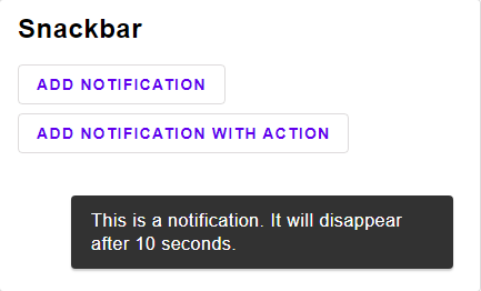
7 |
8 | A [snackbar](https://material.io/components/snackbars/) shows notification, one at a time.
9 |
10 |
11 | # Basics
12 |
13 | @docs SnackbarStyle, Snackbar, Message, init, current, timePassed, view
14 |
15 |
16 | # Operations
17 |
18 | @docs insert, insertFor, dismiss
19 |
20 | -}
21 |
22 | import Element exposing (Attribute, Element)
23 | import Internal.Button as Button exposing (ButtonStyle, TextButton)
24 | import Queue exposing (Queue)
25 |
26 |
27 | {-| -}
28 | type alias SnackbarStyle msg =
29 | { elementRow : List (Attribute msg)
30 | , content :
31 | { text :
32 | { elementText : List (Attribute msg)
33 | }
34 | , button : ButtonStyle msg
35 | }
36 | }
37 |
38 |
39 | {-| A message with maybe some action button
40 | -}
41 | type alias Message msg =
42 | { text : String
43 | , button : Maybe (TextButton msg)
44 | }
45 |
46 |
47 | {-| A snackbar has a queue of Notifications, each with the amount of ms the message should be displayed
48 | -}
49 | type alias Snackbar a =
50 | { queue : Queue ( a, Int )
51 | , current : Maybe ( a, Int )
52 | }
53 |
54 |
55 | {-| Initial state
56 | -}
57 | init : Snackbar a
58 | init =
59 | { queue = Queue.empty
60 | , current = Nothing
61 | }
62 |
63 |
64 | {-| Insert a message that will last for 10 seconds.
65 | -}
66 | insert : a -> Snackbar a -> Snackbar a
67 | insert =
68 | insertFor 10000
69 |
70 |
71 | {-| Insert a message for a specific amount of milliseconds.
72 | -}
73 | insertFor : Int -> a -> Snackbar a -> Snackbar a
74 | insertFor removeIn a model =
75 | case model.current of
76 | Nothing ->
77 | { model | current = Just ( a, removeIn ) }
78 |
79 | Just _ ->
80 | { model | queue = model.queue |> Queue.enqueue ( a, removeIn ) }
81 |
82 |
83 | {-| Dismiss the current message.
84 | -}
85 | dismiss : Snackbar a -> Snackbar a
86 | dismiss model =
87 | { model | current = Nothing }
88 |
89 |
90 | {-| Updates the model. This functions should be called regularly.
91 | The first argument is the milliseconds that passed since the last time the function was called.
92 | -}
93 | timePassed : Int -> Snackbar a -> Snackbar a
94 | timePassed ms model =
95 | case model.current of
96 | Nothing ->
97 | let
98 | ( c, queue ) =
99 | model.queue |> Queue.dequeue
100 | in
101 | { model
102 | | current = c
103 | , queue = queue
104 | }
105 |
106 | Just ( _, removeIn ) ->
107 | if removeIn <= ms then
108 | model |> dismiss
109 |
110 | else
111 | { model | current = model.current |> Maybe.map (Tuple.mapSecond ((+) -ms)) }
112 |
113 |
114 | {-| Returns the current element.
115 | -}
116 | current : Snackbar a -> Maybe a
117 | current model =
118 | model.current |> Maybe.map Tuple.first
119 |
120 |
121 | {-| Views the current Message. (only one at a time)
122 | -}
123 | view :
124 | SnackbarStyle msg
125 | -> (a -> Message msg)
126 | -> Snackbar a
127 | -> Maybe (Element msg)
128 | view style toMessage model =
129 | model
130 | |> current
131 | |> Maybe.map
132 | (toMessage
133 | >> (\{ text, button } ->
134 | [ text
135 | |> Element.text
136 | |> List.singleton
137 | |> Element.paragraph style.content.text.elementText
138 | , button
139 | |> Maybe.map
140 | (Button.textButton style.content.button)
141 | |> Maybe.withDefault Element.none
142 | ]
143 | |> Element.row style.elementRow
144 | )
145 | )
146 |
--------------------------------------------------------------------------------
/explorer/src/Page/ProgressIndicator.elm:
--------------------------------------------------------------------------------
1 | module Page.ProgressIndicator exposing (page)
2 |
3 | {-| This is an example Page. If you want to add your own pages, simple copy and modify this one.
4 | -}
5 |
6 | import Element exposing (Element)
7 | import Material.Icons.Types exposing (Coloring(..))
8 | import Page
9 | import UIExplorer.Story as Story exposing (StorySelectorModel, StorySelectorMsg)
10 | import UIExplorer.Tile as Tile exposing (Context, Tile, TileMsg)
11 | import Widget
12 | import Widget.Material as Material
13 |
14 |
15 | {-| The title of this page
16 | -}
17 | title : String
18 | title =
19 | "Progress Indicator"
20 |
21 |
22 | {-| The description. I've taken this description directly from the [Material-UI-Specification](https://material.io/components/buttons)
23 | -}
24 | description : String
25 | description =
26 | "Progress indicators express an unspecified wait time or display the length of a process."
27 |
28 |
29 | {-| List of view functions. Essentially, anything that takes a Button as input.
30 | -}
31 | viewFunctions =
32 | let
33 | viewIndicator style progress indeterminate { palette } () =
34 | Widget.circularProgressIndicator (style palette)
35 | (indeterminate (toFloat progress / 100))
36 | --Don't forget to change the title
37 | |> Page.viewTile "Widget.circularProgressIndicator"
38 | in
39 | [ viewIndicator ]
40 | |> List.foldl Story.addTile
41 | Story.initStaticTiles
42 |
43 |
44 | {-| Let's you play around with the options.
45 | Note that the order of these stories must follow the order of the arguments from the view functions.
46 | -}
47 | book : Tile.Group ( StorySelectorModel, () ) (TileMsg StorySelectorMsg ()) flags
48 | book =
49 | Story.book (Just "Options")
50 | viewFunctions
51 | --Adding a option for different styles.
52 | |> Story.addStory
53 | (Story.optionListStory "Style"
54 | ( "ProgressIndicator", Material.progressIndicator )
55 | []
56 | )
57 | --Changing the text of the label
58 | |> Story.addStory
59 | (Story.rangeStory "Progress"
60 | { unit = "%", min = 0, max = 100, default = 50 }
61 | )
62 | --Should an event be triggered when pressing the button?
63 | |> Story.addStory
64 | (Story.boolStory "Indeterminate Indicator"
65 | ( always Nothing, Just )
66 | False
67 | )
68 | |> Story.build
69 |
70 |
71 |
72 | {- This next section is essentially just a normal Elm program. -}
73 | --------------------------------------------------------------------------------
74 | -- Interactive Demonstration
75 | --------------------------------------------------------------------------------
76 |
77 |
78 | type Model
79 | = MaybeProgress (Maybe Float)
80 |
81 |
82 | type Msg
83 | = ChangedProgress (Maybe Float)
84 |
85 |
86 | init : ( Model, Cmd Msg )
87 | init =
88 | ( MaybeProgress Nothing
89 | , Cmd.none
90 | )
91 |
92 |
93 | update : Msg -> Model -> ( Model, Cmd Msg )
94 | update msg _ =
95 | case msg of
96 | ChangedProgress maybeFloat ->
97 | ( MaybeProgress maybeFloat
98 | , Cmd.none
99 | )
100 |
101 |
102 | subscriptions : Model -> Sub Msg
103 | subscriptions _ =
104 | Sub.none
105 |
106 |
107 | {-| You can remove the msgMapper. But by doing so, make sure to also change `msg` to `Msg` in the line below.
108 | -}
109 | view : Context -> Model -> Element Msg
110 | view { palette } (MaybeProgress maybeProgress) =
111 | Widget.circularProgressIndicator (Material.progressIndicator palette)
112 | maybeProgress
113 |
114 |
115 |
116 | --------------------------------------------------------------------------------
117 | -- DO NOT MODIFY ANYTHING AFTER THIS LINE
118 | --------------------------------------------------------------------------------
119 |
120 |
121 | demo : Tile Model Msg flags
122 | demo =
123 | { init = always init
124 | , update = update
125 | , view = Page.demo view
126 | , subscriptions = subscriptions
127 | }
128 |
129 |
130 | page =
131 | Page.create
132 | { title = title
133 | , description = description
134 | , book = book
135 | , demo = demo
136 | }
137 |
--------------------------------------------------------------------------------
/src/Internal/Material/Chip.elm:
--------------------------------------------------------------------------------
1 | module Internal.Material.Chip exposing (chip)
2 |
3 | import Element
4 | import Element.Background as Background
5 | import Element.Border as Border
6 | import Element.Font as Font
7 | import Internal.Button exposing (ButtonStyle)
8 | import Internal.Material.Button as Button
9 | import Internal.Material.Palette as Palette exposing (Palette)
10 | import Widget.Material.Color as MaterialColor
11 |
12 |
13 | chip : Palette -> ButtonStyle msg
14 | chip palette =
15 | { elementButton =
16 | [ Element.height <| Element.px 32
17 | , Element.paddingEach
18 | { top = 0
19 | , right = 12
20 | , bottom = 0
21 | , left = 4
22 | }
23 | , Border.rounded <| 16
24 | , Element.mouseDown <|
25 | [ palette
26 | |> Palette.lightGray
27 | |> MaterialColor.withShade palette.on.surface MaterialColor.buttonPressedOpacity
28 | |> MaterialColor.fromColor
29 | |> Background.color
30 | ]
31 | , Element.focused <|
32 | [ palette
33 | |> Palette.lightGray
34 | |> MaterialColor.withShade palette.on.surface MaterialColor.buttonFocusOpacity
35 | |> MaterialColor.fromColor
36 | |> Background.color
37 | ]
38 | , Element.mouseOver <|
39 | [ palette
40 | |> Palette.lightGray
41 | |> MaterialColor.withShade palette.on.surface MaterialColor.buttonHoverOpacity
42 | |> MaterialColor.fromColor
43 | |> Background.color
44 | ]
45 | ]
46 | , ifDisabled =
47 | (Button.baseButton palette |> .ifDisabled)
48 | ++ (palette
49 | |> Palette.lightGray
50 | |> MaterialColor.withShade palette.on.surface MaterialColor.buttonDisabledOpacity
51 | |> MaterialColor.textAndBackground
52 | )
53 | ++ [ Element.mouseDown []
54 | , Element.mouseOver []
55 | , Element.focused []
56 | ]
57 | , ifActive =
58 | [ palette
59 | |> Palette.lightGray
60 | |> MaterialColor.withShade palette.on.surface MaterialColor.buttonSelectedOpacity
61 | |> MaterialColor.fromColor
62 | |> Background.color
63 | , palette
64 | |> Palette.lightGray
65 | |> MaterialColor.accessibleTextColor
66 | |> MaterialColor.fromColor
67 | |> Font.color
68 | , Border.shadow <| MaterialColor.shadow 4
69 | ]
70 | , otherwise =
71 | [ palette
72 | |> Palette.lightGray
73 | |> MaterialColor.fromColor
74 | |> Background.color
75 | , palette
76 | |> Palette.lightGray
77 | |> MaterialColor.accessibleTextColor
78 | |> MaterialColor.fromColor
79 | |> Font.color
80 | ]
81 | , content =
82 | { elementRow =
83 | [ Element.spacing 8
84 | , Element.paddingEach
85 | { top = 0
86 | , right = 0
87 | , bottom = 0
88 | , left = 8
89 | }
90 | , Element.centerY
91 | ]
92 | , content =
93 | { text =
94 | { contentText =
95 | []
96 | }
97 | , icon =
98 | { ifActive =
99 | { size = 18
100 | , color =
101 | palette
102 | |> Palette.lightGray
103 | |> MaterialColor.accessibleTextColor
104 | }
105 | , ifDisabled =
106 | { size = 18
107 | , color =
108 | palette
109 | |> Palette.lightGray
110 | |> MaterialColor.accessibleTextColor
111 | }
112 | , otherwise =
113 | { size = 18
114 | , color =
115 | palette
116 | |> Palette.lightGray
117 | |> MaterialColor.accessibleTextColor
118 | }
119 | }
120 | }
121 | }
122 | }
123 |
--------------------------------------------------------------------------------
/src/Internal/Material/Checkbox.elm:
--------------------------------------------------------------------------------
1 | module Internal.Material.Checkbox exposing (checkbox)
2 |
3 | import Color
4 | import Element exposing (Attribute, Decoration)
5 | import Element.Background as Background
6 | import Element.Border as Border
7 | import Internal.Checkbox exposing (CheckboxStyle)
8 | import Internal.Material.Palette as Palette exposing (Palette)
9 | import Svg exposing (Svg, g, line, polygon, polyline, rect, svg, text, use)
10 | import Svg.Attributes as A exposing (baseProfile, clipRule, cx, cy, d, enableBackground, fill, fillOpacity, fillRule, id, overflow, points, r, x1, x2, xlinkHref, y1, y2)
11 | import Widget.Material.Color as MaterialColor
12 |
13 |
14 | checkbox : Palette -> CheckboxStyle msg
15 | checkbox palette =
16 | let
17 | rounded : Bool -> Float -> Color.Color -> List Decoration
18 | rounded bg opacity color =
19 | let
20 | scaledColor =
21 | MaterialColor.fromColor <|
22 | MaterialColor.scaleOpacity opacity color
23 | in
24 | Border.shadow
25 | { offset = ( 0, 0 )
26 | , size = 10
27 | , blur = 0
28 | , color = scaledColor
29 | }
30 | :: (if bg then
31 | [ Background.color scaledColor ]
32 |
33 | else
34 | []
35 | )
36 |
37 | check visible =
38 | Element.inFront
39 | (Element.el
40 | [ Border.color <| MaterialColor.fromColor palette.on.primary
41 | , Element.transparent (not visible)
42 | , Element.height (Element.px 7)
43 | , Element.width (Element.px 11)
44 | , Element.rotate (degrees -45)
45 | , Element.centerX
46 | , Element.centerY
47 | , Element.moveUp 2
48 | , Border.widthEach
49 | { top = 0
50 | , left = 2
51 | , bottom = 2
52 | , right = 0
53 | }
54 | ]
55 | Element.none
56 | )
57 | in
58 | { elementButton =
59 | [ Element.width <| Element.px 16
60 | , Element.height <| Element.px 16
61 | , Border.rounded 2
62 | , Border.width 2
63 | , Element.focused <| rounded True MaterialColor.buttonHoverOpacity palette.on.surface
64 | ]
65 | , ifDisabled =
66 | [ Border.color <|
67 | MaterialColor.fromColor <|
68 | MaterialColor.scaleOpacity MaterialColor.buttonDisabledOpacity palette.on.surface
69 | , check False
70 | ]
71 | , ifSelected =
72 | [ Border.color <| MaterialColor.fromColor palette.primary
73 | , Background.color <| MaterialColor.fromColor palette.primary
74 | , Element.mouseDown <| rounded False MaterialColor.buttonPressedOpacity palette.primary
75 | , Element.focused <| rounded False MaterialColor.buttonFocusOpacity palette.primary
76 | , Element.mouseOver <| rounded False MaterialColor.buttonHoverOpacity palette.primary
77 | , check True
78 | ]
79 | , ifDisabledSelected =
80 | [ Border.color <|
81 | MaterialColor.fromColor <|
82 | MaterialColor.scaleOpacity MaterialColor.buttonDisabledOpacity palette.on.surface
83 | , Background.color <|
84 | MaterialColor.fromColor <|
85 | MaterialColor.scaleOpacity MaterialColor.buttonDisabledOpacity palette.on.surface
86 | , Element.mouseDown <| rounded False MaterialColor.buttonPressedOpacity palette.on.surface
87 | , Element.focused <| rounded False MaterialColor.buttonFocusOpacity palette.on.surface
88 | , Element.mouseOver <| rounded False MaterialColor.buttonHoverOpacity palette.on.surface
89 | , check True
90 | ]
91 | , otherwise =
92 | [ Border.color <|
93 | MaterialColor.fromColor <|
94 | Palette.gray palette
95 | , Element.mouseDown <| rounded True MaterialColor.buttonPressedOpacity palette.on.surface
96 | , Element.focused <| rounded True MaterialColor.buttonFocusOpacity palette.on.surface
97 | , Element.mouseOver <| rounded True MaterialColor.buttonHoverOpacity palette.on.surface
98 | , check False
99 | ]
100 | }
101 |
--------------------------------------------------------------------------------
/explorer/src/Page/Icon.elm:
--------------------------------------------------------------------------------
1 | module Page.Icon exposing (page)
2 |
3 | {-| This is an example Page. If you want to add your own pages, simple copy and modify this one.
4 | -}
5 |
6 | import Ant.Icons.Svg
7 | import Element exposing (Element)
8 | import FeatherIcons
9 | import FontAwesome.Solid
10 | import FontAwesome.Svg
11 | import Heroicons.Solid
12 | import Ionicon
13 | import Material.Icons
14 | import Material.Icons.Action
15 | import Material.Icons.Types exposing (Coloring(..))
16 | import Octicons
17 | import Page
18 | import UIExplorer.Tile as Tile exposing (Context, Tile)
19 | import Widget
20 | import Widget.Icon
21 | import Widget.Material as Material
22 | import Widget.Material.Typography as Typography
23 | import Zondicons
24 |
25 |
26 | {-| The title of this page
27 | -}
28 | title : String
29 | title =
30 | "Icon"
31 |
32 |
33 | {-| The description. I've taken this description directly from the [Material-UI-Specification](https://material.io/components/buttons)
34 | -}
35 | description : String
36 | description =
37 | "Every icon package on elm-packages is supported."
38 |
39 |
40 |
41 | {- This next section is essentially just a normal Elm program. -}
42 | --------------------------------------------------------------------------------
43 | -- Interactive Demonstration
44 | --------------------------------------------------------------------------------
45 |
46 |
47 | type alias Model =
48 | ()
49 |
50 |
51 | type alias Msg =
52 | ()
53 |
54 |
55 | init : ( Model, Cmd Msg )
56 | init =
57 | ( ()
58 | , Cmd.none
59 | )
60 |
61 |
62 | update : Msg -> Model -> ( Model, Cmd Msg )
63 | update msg _ =
64 | case msg of
65 | () ->
66 | ( ()
67 | , Cmd.none
68 | )
69 |
70 |
71 | subscriptions : Model -> Sub Msg
72 | subscriptions _ =
73 | Sub.none
74 |
75 |
76 | {-| You can remove the msgMapper. But by doing so, make sure to also change `msg` to `Msg` in the line below.
77 | -}
78 | view : Context -> Model -> Element Msg
79 | view { palette } () =
80 | [ ( Material.Icons.done
81 | |> Widget.Icon.elmMaterialIcons Color
82 | , "elm-material-icons"
83 | )
84 | , ( Material.Icons.Action.done
85 | |> Widget.Icon.materialIcons
86 | , "material-icons"
87 | )
88 | , ( FeatherIcons.check
89 | |> Widget.Icon.elmFeather FeatherIcons.toHtml
90 | , "elm-feather"
91 | )
92 | , ( FontAwesome.Solid.check
93 | |> Widget.Icon.elmFontawesome FontAwesome.Svg.viewIcon
94 | , "elm-fontawesome"
95 | )
96 | , ( Ionicon.checkmark
97 | |> Widget.Icon.elmIonicons
98 | , "elm-ionicons"
99 | )
100 | , ( Octicons.check
101 | |> Widget.Icon.elmOcticons
102 | { withSize = Octicons.size
103 | , withColor = Octicons.color
104 | , defaultOptions = Octicons.defaultOptions
105 | }
106 | , "elm-octicons"
107 | )
108 | , ( Heroicons.Solid.check
109 | |> Widget.Icon.elmHeroicons
110 | , "elm-heroicons"
111 | )
112 | , ( Ant.Icons.Svg.checkOutlined
113 | |> Widget.Icon.antDesignIconsElm
114 | , "ant-design-icons-elm"
115 | )
116 | , ( Zondicons.checkmark
117 | |> Widget.Icon.elmZondicons
118 | , "elm-zondicons"
119 | )
120 | ]
121 | |> List.map
122 | (\( icon, text ) ->
123 | Widget.button (Material.containedButton palette)
124 | { text = text
125 | , icon = icon
126 | , onPress = Just ()
127 | }
128 | )
129 | |> Element.wrappedRow [ Element.spacing 10 ]
130 |
131 |
132 |
133 | --------------------------------------------------------------------------------
134 | -- DO NOT MODIFY ANYTHING AFTER THIS LINE
135 | --------------------------------------------------------------------------------
136 |
137 |
138 | demo : Tile Model Msg flags
139 | demo =
140 | { init = always init
141 | , update = update
142 | , view = Page.demo view
143 | , subscriptions = subscriptions
144 | }
145 |
146 |
147 | page =
148 | Tile.static []
149 | (\_ _ ->
150 | [ title |> Element.text |> Element.el Typography.h3
151 | , description |> Element.text |> List.singleton |> Element.paragraph []
152 | ]
153 | |> Element.column [ Element.spacing 32 ]
154 | )
155 | |> Tile.first
156 | |> Tile.next demo
157 | |> Tile.page
158 |
--------------------------------------------------------------------------------
/explorer/src/Page/Radio.elm:
--------------------------------------------------------------------------------
1 | module Page.Radio exposing (page)
2 |
3 | {-| This is an example Page. If you want to add your own pages, simple copy and modify this one.
4 | -}
5 |
6 | import Element exposing (Element)
7 | import Material.Icons.Types exposing (Coloring(..))
8 | import Page
9 | import UIExplorer.Story as Story exposing (StorySelectorModel, StorySelectorMsg)
10 | import UIExplorer.Tile as Tile exposing (Context, Tile, TileMsg)
11 | import Widget
12 | import Widget.Material as Material
13 |
14 |
15 | {-| The title of this page
16 | -}
17 | title : String
18 | title =
19 | "Radio"
20 |
21 |
22 | {-| The description. I've taken this description directly from the [Material-UI-Specification](https://material.io/components/buttons)
23 | -}
24 | description : String
25 | description =
26 | "Radioes toggle the state of a single item on or off."
27 |
28 |
29 | {-| List of view functions. Essentially, anything that takes a Button as input.
30 | -}
31 | viewFunctions =
32 | let
33 | viewRadio style desc selected onPress { palette } () =
34 | Widget.radio (style palette)
35 | { description = desc
36 | , selected = selected
37 | , onPress = onPress
38 | }
39 | --Don't forget to change the title
40 | |> Page.viewTile "Widget.radio"
41 | in
42 | [ viewRadio ]
43 | |> List.foldl Story.addTile
44 | Story.initStaticTiles
45 |
46 |
47 | {-| Let's you play around with the options.
48 | Note that the order of these stories must follow the order of the arguments from the view functions.
49 | -}
50 | book : Tile.Group ( StorySelectorModel, () ) (TileMsg StorySelectorMsg ()) flags
51 | book =
52 | Story.book (Just "Options")
53 | viewFunctions
54 | --Adding a option for different styles.
55 | |> Story.addStory
56 | (Story.optionListStory "Style"
57 | ( "Radio", Material.radio )
58 | []
59 | )
60 | --Changing the text of the label
61 | |> Story.addStory
62 | (Story.textStory "Description"
63 | "Be Awesome"
64 | )
65 | --Change the Icon
66 | |> Story.addStory
67 | (Story.boolStory "Selected"
68 | ( True
69 | , False
70 | )
71 | True
72 | )
73 | --Should an event be triggered when pressing the button?
74 | |> Story.addStory
75 | (Story.boolStory "with event handler"
76 | ( Just (), Nothing )
77 | True
78 | )
79 | |> Story.build
80 |
81 |
82 |
83 | {- This next section is essentially just a normal Elm program. -}
84 | --------------------------------------------------------------------------------
85 | -- Interactive Demonstration
86 | --------------------------------------------------------------------------------
87 |
88 |
89 | type Model
90 | = IsButtonEnabled Bool
91 |
92 |
93 | type Msg
94 | = ToggledButtonStatus
95 |
96 |
97 | init : ( Model, Cmd Msg )
98 | init =
99 | ( IsButtonEnabled False
100 | , Cmd.none
101 | )
102 |
103 |
104 | update : Msg -> Model -> ( Model, Cmd Msg )
105 | update msg (IsButtonEnabled buttonEnabled) =
106 | case msg of
107 | ToggledButtonStatus ->
108 | ( IsButtonEnabled <| not buttonEnabled
109 | , Cmd.none
110 | )
111 |
112 |
113 | subscriptions : Model -> Sub Msg
114 | subscriptions _ =
115 | Sub.none
116 |
117 |
118 | {-| You can remove the msgMapper. But by doing so, make sure to also change `msg` to `Msg` in the line below.
119 | -}
120 | view : Context -> Model -> Element Msg
121 | view { palette } (IsButtonEnabled isButtonEnabled) =
122 | Widget.radio (Material.radio palette)
123 | { description = "click me"
124 | , selected = isButtonEnabled
125 | , onPress =
126 | ToggledButtonStatus
127 | |> Just
128 | }
129 |
130 |
131 |
132 | --------------------------------------------------------------------------------
133 | -- DO NOT MODIFY ANYTHING AFTER THIS LINE
134 | --------------------------------------------------------------------------------
135 |
136 |
137 | demo : Tile Model Msg flags
138 | demo =
139 | { init = always init
140 | , update = update
141 | , view = Page.demo view
142 | , subscriptions = subscriptions
143 | }
144 |
145 |
146 | page =
147 | Page.create
148 | { title = title
149 | , description = description
150 | , book = book
151 | , demo = demo
152 | }
153 |
--------------------------------------------------------------------------------
/explorer/src/Page/Switch.elm:
--------------------------------------------------------------------------------
1 | module Page.Switch exposing (page)
2 |
3 | {-| This is an example Page. If you want to add your own pages, simple copy and modify this one.
4 | -}
5 |
6 | import Element exposing (Element)
7 | import Material.Icons.Types exposing (Coloring(..))
8 | import Page
9 | import UIExplorer.Story as Story exposing (StorySelectorModel, StorySelectorMsg)
10 | import UIExplorer.Tile as Tile exposing (Context, Tile, TileMsg)
11 | import Widget
12 | import Widget.Material as Material
13 |
14 |
15 | {-| The title of this page
16 | -}
17 | title : String
18 | title =
19 | "Switch"
20 |
21 |
22 | {-| The description. I've taken this description directly from the [Material-UI-Specification](https://material.io/components/buttons)
23 | -}
24 | description : String
25 | description =
26 | "Switches toggle the state of a single item on or off."
27 |
28 |
29 | {-| List of view functions. Essentially, anything that takes a Button as input.
30 | -}
31 | viewFunctions =
32 | let
33 | viewSwitch style desc active onPress { palette } () =
34 | Widget.switch (style palette)
35 | { description = desc
36 | , active = active
37 | , onPress = onPress
38 | }
39 | --Don't forget to change the title
40 | |> Page.viewTile "Widget.switch"
41 | in
42 | [ viewSwitch ]
43 | |> List.foldl Story.addTile
44 | Story.initStaticTiles
45 |
46 |
47 | {-| Let's you play around with the options.
48 | Note that the order of these stories must follow the order of the arguments from the view functions.
49 | -}
50 | book : Tile.Group ( StorySelectorModel, () ) (TileMsg StorySelectorMsg ()) flags
51 | book =
52 | Story.book (Just "Options")
53 | viewFunctions
54 | --Adding a option for different styles.
55 | |> Story.addStory
56 | (Story.optionListStory "Style"
57 | ( "Switch", Material.switch )
58 | []
59 | )
60 | --Changing the text of the label
61 | |> Story.addStory
62 | (Story.textStory "Description"
63 | "Be Awesome"
64 | )
65 | --Change the Icon
66 | |> Story.addStory
67 | (Story.boolStory "Active"
68 | ( True
69 | , False
70 | )
71 | True
72 | )
73 | --Should an event be triggered when pressing the button?
74 | |> Story.addStory
75 | (Story.boolStory "with event handler"
76 | ( Just (), Nothing )
77 | True
78 | )
79 | |> Story.build
80 |
81 |
82 |
83 | {- This next section is essentially just a normal Elm program. -}
84 | --------------------------------------------------------------------------------
85 | -- Interactive Demonstration
86 | --------------------------------------------------------------------------------
87 |
88 |
89 | type Model
90 | = IsButtonEnabled Bool
91 |
92 |
93 | type Msg
94 | = ToggledButtonStatus
95 |
96 |
97 | init : ( Model, Cmd Msg )
98 | init =
99 | ( IsButtonEnabled False
100 | , Cmd.none
101 | )
102 |
103 |
104 | update : Msg -> Model -> ( Model, Cmd Msg )
105 | update msg (IsButtonEnabled buttonEnabled) =
106 | case msg of
107 | ToggledButtonStatus ->
108 | ( IsButtonEnabled <| not buttonEnabled
109 | , Cmd.none
110 | )
111 |
112 |
113 | subscriptions : Model -> Sub Msg
114 | subscriptions _ =
115 | Sub.none
116 |
117 |
118 | {-| You can remove the msgMapper. But by doing so, make sure to also change `msg` to `Msg` in the line below.
119 | -}
120 | view : Context -> Model -> Element Msg
121 | view { palette } (IsButtonEnabled isButtonEnabled) =
122 | Widget.switch (Material.switch palette)
123 | { description = "click me"
124 | , active = isButtonEnabled
125 | , onPress =
126 | ToggledButtonStatus
127 | |> Just
128 | }
129 |
130 |
131 |
132 | --------------------------------------------------------------------------------
133 | -- DO NOT MODIFY ANYTHING AFTER THIS LINE
134 | --------------------------------------------------------------------------------
135 |
136 |
137 | demo : Tile Model Msg flags
138 | demo =
139 | { init = always init
140 | , update = update
141 | , view = Page.demo view
142 | , subscriptions = subscriptions
143 | }
144 |
145 |
146 | page =
147 | Page.create
148 | { title = title
149 | , description = description
150 | , book = book
151 | , demo = demo
152 | }
153 |
--------------------------------------------------------------------------------
/explorer/src/Page/Checkbox.elm:
--------------------------------------------------------------------------------
1 | module Page.Checkbox exposing (page)
2 |
3 | {-| This is an example Page. If you want to add your own pages, simple copy and modify this one.
4 | -}
5 |
6 | import Element exposing (Element)
7 | import Material.Icons.Types exposing (Coloring(..))
8 | import Page
9 | import UIExplorer.Story as Story exposing (StorySelectorModel, StorySelectorMsg)
10 | import UIExplorer.Tile as Tile exposing (Context, Tile, TileMsg)
11 | import Widget
12 | import Widget.Material as Material
13 |
14 |
15 | {-| The title of this page
16 | -}
17 | title : String
18 | title =
19 | "Checkbox"
20 |
21 |
22 | {-| The description. I've taken this description directly from the [Material-UI-Specification](https://material.io/components/buttons)
23 | -}
24 | description : String
25 | description =
26 | "Checkboxes toggle the state of a single item on or off."
27 |
28 |
29 | {-| List of view functions. Essentially, anything that takes a Button as input.
30 | -}
31 | viewFunctions =
32 | let
33 | viewCheckbox style desc selected onPress { palette } () =
34 | Widget.checkbox (style palette)
35 | { description = desc
36 | , checked = selected
37 | , onChange = onPress
38 | }
39 | --Don't forget to change the title
40 | |> Page.viewTile "Widget.checkbox"
41 | in
42 | [ viewCheckbox ]
43 | |> List.foldl Story.addTile
44 | Story.initStaticTiles
45 |
46 |
47 | {-| Let's you play around with the options.
48 | Note that the order of these stories must follow the order of the arguments from the view functions.
49 | -}
50 | book : Tile.Group ( StorySelectorModel, () ) (TileMsg StorySelectorMsg ()) flags
51 | book =
52 | Story.book (Just "Options")
53 | viewFunctions
54 | --Adding a option for different styles.
55 | |> Story.addStory
56 | (Story.optionListStory "Style"
57 | ( "Checkbox", Material.checkbox )
58 | []
59 | )
60 | --Changing the text of the label
61 | |> Story.addStory
62 | (Story.textStory "Description"
63 | "Be Awesome"
64 | )
65 | --Change the Icon
66 | |> Story.addStory
67 | (Story.boolStory "Selected"
68 | ( True
69 | , False
70 | )
71 | True
72 | )
73 | --Should an event be triggered when pressing the button?
74 | |> Story.addStory
75 | (Story.boolStory "with event handler"
76 | ( Just (always ()), Nothing )
77 | True
78 | )
79 | |> Story.build
80 |
81 |
82 |
83 | {- This next section is essentially just a normal Elm program. -}
84 | --------------------------------------------------------------------------------
85 | -- Interactive Demonstration
86 | --------------------------------------------------------------------------------
87 |
88 |
89 | type Model
90 | = IsButtonEnabled Bool
91 |
92 |
93 | type Msg
94 | = ToggledButtonStatus
95 |
96 |
97 | init : ( Model, Cmd Msg )
98 | init =
99 | ( IsButtonEnabled False
100 | , Cmd.none
101 | )
102 |
103 |
104 | update : Msg -> Model -> ( Model, Cmd Msg )
105 | update msg (IsButtonEnabled buttonEnabled) =
106 | case msg of
107 | ToggledButtonStatus ->
108 | ( IsButtonEnabled <| not buttonEnabled
109 | , Cmd.none
110 | )
111 |
112 |
113 | subscriptions : Model -> Sub Msg
114 | subscriptions _ =
115 | Sub.none
116 |
117 |
118 | {-| You can remove the msgMapper. But by doing so, make sure to also change `msg` to `Msg` in the line below.
119 | -}
120 | view : Context -> Model -> Element Msg
121 | view { palette } (IsButtonEnabled isButtonEnabled) =
122 | Widget.checkbox (Material.checkbox palette)
123 | { description = "click me"
124 | , checked = isButtonEnabled
125 | , onChange =
126 | always ToggledButtonStatus
127 | |> Just
128 | }
129 |
130 |
131 |
132 | --------------------------------------------------------------------------------
133 | -- DO NOT MODIFY ANYTHING AFTER THIS LINE
134 | --------------------------------------------------------------------------------
135 |
136 |
137 | demo : Tile Model Msg flags
138 | demo =
139 | { init = always init
140 | , update = update
141 | , view = Page.demo view
142 | , subscriptions = subscriptions
143 | }
144 |
145 |
146 | page =
147 | Page.create
148 | { title = title
149 | , description = description
150 | , book = book
151 | , demo = demo
152 | }
153 |
--------------------------------------------------------------------------------
/src/Internal/Material/ProgressIndicator.elm:
--------------------------------------------------------------------------------
1 | module Internal.Material.ProgressIndicator exposing (determinateCircularIcon, indeterminateCircularIcon, progressIndicator)
2 |
3 | import Color
4 | import Element exposing (Attribute, Element)
5 | import Internal.Material.Palette exposing (Palette)
6 | import Internal.ProgressIndicator exposing (ProgressIndicatorStyle)
7 | import Svg
8 | import Svg.Attributes
9 |
10 |
11 | indeterminateCircularIcon : Color.Color -> List (Attribute msg) -> Element msg
12 | indeterminateCircularIcon color attribs =
13 | -- Based on example at https://codepen.io/FezVrasta/pen/oXrgdR
14 | Svg.svg
15 | [ Svg.Attributes.height "48px"
16 | , Svg.Attributes.width "48px"
17 | , Svg.Attributes.viewBox "0 0 66 66"
18 | , Svg.Attributes.xmlSpace "http://www.w3.org/2000/svg"
19 | ]
20 | [ Svg.g []
21 | [ Svg.animateTransform
22 | [ Svg.Attributes.attributeName "transform"
23 | , Svg.Attributes.type_ "rotate"
24 | , Svg.Attributes.values "0 33 33;270 33 33"
25 | , Svg.Attributes.begin "0s"
26 | , Svg.Attributes.dur "1.4s"
27 | , Svg.Attributes.fill "freeze"
28 | , Svg.Attributes.repeatCount "indefinite"
29 | ]
30 | []
31 | , Svg.circle
32 | [ Svg.Attributes.fill "none"
33 | , Svg.Attributes.stroke (Color.toCssString color)
34 | , Svg.Attributes.strokeWidth "5"
35 | , Svg.Attributes.strokeLinecap "square"
36 | , Svg.Attributes.cx "33"
37 | , Svg.Attributes.cy "33"
38 | , Svg.Attributes.r "30"
39 | , Svg.Attributes.strokeDasharray "187"
40 | , Svg.Attributes.strokeDashoffset "610"
41 | ]
42 | [ Svg.animateTransform
43 | [ Svg.Attributes.attributeName "transform"
44 | , Svg.Attributes.type_ "rotate"
45 | , Svg.Attributes.values "0 33 33;135 33 33;450 33 33"
46 | , Svg.Attributes.begin "0s"
47 | , Svg.Attributes.dur "1.4s"
48 | , Svg.Attributes.fill "freeze"
49 | , Svg.Attributes.repeatCount "indefinite"
50 | ]
51 | []
52 | , Svg.animate
53 | [ Svg.Attributes.attributeName "stroke-dashoffset"
54 | , Svg.Attributes.values "187;46.75;187"
55 | , Svg.Attributes.begin "0s"
56 | , Svg.Attributes.dur "1.4s"
57 | , Svg.Attributes.fill "freeze"
58 | , Svg.Attributes.repeatCount "indefinite"
59 | ]
60 | []
61 | ]
62 | ]
63 | ]
64 | |> Element.html
65 | |> Element.el attribs
66 |
67 |
68 | determinateCircularIcon : Color.Color -> List (Attribute msg) -> Float -> Element msg
69 | determinateCircularIcon color attribs progress =
70 | -- With help from https://css-tricks.com/building-progress-ring-quickly/
71 | let
72 | strokeDashoffset =
73 | let
74 | clampedProgress =
75 | clamp 0 1 progress
76 | in
77 | -- 188 is circumference of circle in pixels
78 | 188
79 | - (188 * clampedProgress)
80 | |> round
81 | in
82 | Svg.svg
83 | [ Svg.Attributes.height "48px"
84 | , Svg.Attributes.width "48px"
85 | , Svg.Attributes.viewBox "0 0 66 66"
86 | , Svg.Attributes.xmlSpace "http://www.w3.org/2000/svg"
87 | ]
88 | [ Svg.g []
89 | [ Svg.circle
90 | [ Svg.Attributes.fill "none"
91 | , Svg.Attributes.stroke (Color.toCssString color)
92 | , Svg.Attributes.strokeWidth "5"
93 | , Svg.Attributes.strokeLinecap "butt"
94 | , Svg.Attributes.cx "33"
95 | , Svg.Attributes.cy "33"
96 | , Svg.Attributes.r "30"
97 | , Svg.Attributes.strokeDasharray "188 188"
98 | , Svg.Attributes.strokeDashoffset (String.fromInt strokeDashoffset)
99 | , Svg.Attributes.transform "rotate(-90 33 33)"
100 | ]
101 | []
102 | ]
103 | ]
104 | |> Element.html
105 | |> Element.el attribs
106 |
107 |
108 | {-| A circular progress indicator
109 | -}
110 | progressIndicator : Palette -> ProgressIndicatorStyle msg
111 | progressIndicator palette =
112 | { elementFunction =
113 | \maybeProgress ->
114 | case maybeProgress of
115 | Nothing ->
116 | indeterminateCircularIcon palette.primary []
117 |
118 | Just progress ->
119 | determinateCircularIcon palette.primary [] progress
120 | }
121 |
--------------------------------------------------------------------------------
/tests/VerifyExamples/Widget/SortTableV20.elm:
--------------------------------------------------------------------------------
1 | module VerifyExamples.Widget.SortTableV20 exposing (..)
2 |
3 | -- This file got generated by [elm-verify-examples](https://github.com/stoeffel/elm-verify-examples).
4 | -- Please don't modify this file by hand!
5 |
6 | import Test
7 | import Expect
8 |
9 | import Widget exposing (..)
10 | import Element
11 | import Widget.Material as Material
12 |
13 | type Msg
14 | = ChangedSorting String
15 | | PressedButton String
16 |
17 | asc : Bool
18 | asc =
19 | True
20 | sortBy : String
21 | sortBy =
22 | "Id"
23 |
24 |
25 |
26 | spec0 : Test.Test
27 | spec0 =
28 | Test.test "#sortTableV2: \n\n Widget.sortTableV2 (Material.sortTable Material.defaultPalette)\n { content =\n [ { id = 1, name = \"Antonio\", rating = 2.456, hash = Nothing }\n , { id = 2, name = \"Ana\", rating = 1.34, hash = Just \"45jf\" }\n , { id = 3, name = \"Alfred\", rating = 4.22, hash = Just \"6fs1\" }\n , { id = 4, name = \"Thomas\", rating = 3, hash = Just \"k52f\" }\n ]\n , columns =\n [ Widget.intColumnV2\n { title = \"Id\"\n , value = .id\n , toString = \\int -> \"#\" ++ String.fromInt int\n , width = Element.fill\n }\n , Widget.stringColumnV2\n { title = \"Name\"\n , value = .name\n , toString = identity\n , width = Element.fill\n }\n , Widget.floatColumnV2\n { title = \"Rating\"\n , value = .rating\n , toString = String.fromFloat\n , width = Element.fill\n }\n , Widget.customColumnV2\n { title = \"Action\"\n , value =\n \\{name} ->\n Widget.textButton\n (Material.textButton Material.defaultPalette)\n { text = name\n , onPress = Just <| PressedButton name\n }\n , width = Element.fill\n }\n , Widget.unsortableColumnV2\n { title = \"Hash\"\n , toString = (\\{hash} -> hash |> Maybe.withDefault \"None\")\n , width = Element.fill\n }\n ]\n , asc = asc\n , sortBy = sortBy\n , onChange = ChangedSorting\n }\n |> always \"Ignore this line\"\n --> \"Ignore this line\"" <|
29 | \() ->
30 | Expect.equal
31 | (
32 | Widget.sortTableV2 (Material.sortTable Material.defaultPalette)
33 | { content =
34 | [ { id = 1, name = "Antonio", rating = 2.456, hash = Nothing }
35 | , { id = 2, name = "Ana", rating = 1.34, hash = Just "45jf" }
36 | , { id = 3, name = "Alfred", rating = 4.22, hash = Just "6fs1" }
37 | , { id = 4, name = "Thomas", rating = 3, hash = Just "k52f" }
38 | ]
39 | , columns =
40 | [ Widget.intColumnV2
41 | { title = "Id"
42 | , value = .id
43 | , toString = \int -> "#" ++ String.fromInt int
44 | , width = Element.fill
45 | }
46 | , Widget.stringColumnV2
47 | { title = "Name"
48 | , value = .name
49 | , toString = identity
50 | , width = Element.fill
51 | }
52 | , Widget.floatColumnV2
53 | { title = "Rating"
54 | , value = .rating
55 | , toString = String.fromFloat
56 | , width = Element.fill
57 | }
58 | , Widget.customColumnV2
59 | { title = "Action"
60 | , value =
61 | \{name} ->
62 | Widget.textButton
63 | (Material.textButton Material.defaultPalette)
64 | { text = name
65 | , onPress = Just <| PressedButton name
66 | }
67 | , width = Element.fill
68 | }
69 | , Widget.unsortableColumnV2
70 | { title = "Hash"
71 | , toString = (\{hash} -> hash |> Maybe.withDefault "None")
72 | , width = Element.fill
73 | }
74 | ]
75 | , asc = asc
76 | , sortBy = sortBy
77 | , onChange = ChangedSorting
78 | }
79 | |> always "Ignore this line"
80 | )
81 | (
82 | "Ignore this line"
83 | )
--------------------------------------------------------------------------------
/src/Internal/Material/Switch.elm:
--------------------------------------------------------------------------------
1 | module Internal.Material.Switch exposing (switch)
2 |
3 | import Color
4 | import Element
5 | import Element.Background as Background
6 | import Element.Border as Border
7 | import Html.Attributes as Attributes
8 | import Internal.Material.Palette as Palette exposing (Palette)
9 | import Internal.Switch exposing (SwitchStyle)
10 | import Widget.Material.Color as MaterialColor
11 |
12 |
13 | switch : Palette -> SwitchStyle msg
14 | switch palette =
15 | { elementButton =
16 | [ Element.height <| Element.px 38
17 | , Element.width <| Element.px <| 58 - 18
18 | , Element.mouseDown []
19 | , Element.focused []
20 | , Element.mouseOver []
21 | ]
22 | , content =
23 | { element =
24 | [ Element.height <| Element.px 14
25 | , Element.width <| Element.px 34
26 | , Element.centerY
27 | , Element.centerX
28 | , Border.rounded <| 10
29 | ]
30 | , ifDisabled =
31 | [ Element.htmlAttribute <| Attributes.style "cursor" "not-allowed"
32 | , palette.surface
33 | |> MaterialColor.withShade (Palette.gray palette)
34 | (0.5 * MaterialColor.buttonDisabledOpacity)
35 | |> MaterialColor.fromColor
36 | |> Background.color
37 | ]
38 | , ifActive =
39 | [ palette.primary
40 | |> MaterialColor.scaleOpacity 0.5
41 | |> MaterialColor.fromColor
42 | |> Background.color
43 | ]
44 | , otherwise =
45 | [ Palette.gray palette
46 | |> MaterialColor.scaleOpacity 0.5
47 | |> MaterialColor.fromColor
48 | |> Background.color
49 | ]
50 | }
51 | , contentInFront =
52 | { element =
53 | [ Element.height <| Element.px 38
54 | , Element.width <| Element.px 38
55 | , Border.rounded <| 19
56 | ]
57 | , ifDisabled =
58 | [ Element.htmlAttribute <| Attributes.style "cursor" "not-allowed" ]
59 | , ifActive =
60 | [ Element.mouseDown
61 | [ palette.primary
62 | |> MaterialColor.scaleOpacity MaterialColor.buttonPressedOpacity
63 | |> MaterialColor.fromColor
64 | |> Background.color
65 | ]
66 | , Element.focused
67 | [ palette.primary
68 | |> MaterialColor.scaleOpacity MaterialColor.buttonFocusOpacity
69 | |> MaterialColor.fromColor
70 | |> Background.color
71 | ]
72 | , Element.mouseOver
73 | [ palette.primary
74 | |> MaterialColor.scaleOpacity MaterialColor.buttonHoverOpacity
75 | |> MaterialColor.fromColor
76 | |> Background.color
77 | ]
78 | , Element.alignRight
79 | , Element.moveRight 8
80 | ]
81 | , otherwise =
82 | [ Element.mouseDown
83 | [ Color.gray
84 | |> MaterialColor.scaleOpacity MaterialColor.buttonPressedOpacity
85 | |> MaterialColor.fromColor
86 | |> Background.color
87 | ]
88 | , Element.focused
89 | [ Color.gray
90 | |> MaterialColor.scaleOpacity MaterialColor.buttonFocusOpacity
91 | |> MaterialColor.fromColor
92 | |> Background.color
93 | ]
94 | , Element.mouseOver
95 | [ Color.gray
96 | |> MaterialColor.scaleOpacity MaterialColor.buttonHoverOpacity
97 | |> MaterialColor.fromColor
98 | |> Background.color
99 | ]
100 | , Element.alignLeft
101 | , Element.moveLeft 8
102 | ]
103 | , content =
104 | { element =
105 | [ Element.height <| Element.px 20
106 | , Element.width <| Element.px 20
107 | , Element.centerY
108 | , Element.centerX
109 | , Border.rounded <| 10
110 | , Border.shadow <| MaterialColor.shadow 2
111 | , palette.surface
112 | |> MaterialColor.fromColor
113 | |> Background.color
114 | ]
115 | , ifDisabled =
116 | [ palette.surface
117 | |> MaterialColor.withShade Color.gray MaterialColor.buttonDisabledOpacity
118 | |> MaterialColor.fromColor
119 | |> Background.color
120 | , Element.mouseDown []
121 | , Element.mouseOver []
122 | , Element.focused []
123 | ]
124 | , ifActive =
125 | [ palette.primary
126 | |> MaterialColor.withShade palette.on.primary MaterialColor.buttonHoverOpacity
127 | |> MaterialColor.fromColor
128 | |> Background.color
129 | ]
130 | , otherwise =
131 | [ palette.surface
132 | |> MaterialColor.withShade palette.on.surface MaterialColor.buttonHoverOpacity
133 | |> MaterialColor.fromColor
134 | |> Background.color
135 | ]
136 | }
137 | }
138 | }
139 |
--------------------------------------------------------------------------------
/src/Internal/Material/List.elm:
--------------------------------------------------------------------------------
1 | module Internal.Material.List exposing
2 | ( bottomSheet
3 | , cardColumn
4 | , column
5 | , row
6 | , sideSheet
7 | , toggleRow
8 | , cardAttributes
9 | )
10 |
11 | import Element exposing (Attribute)
12 | import Element.Background as Background
13 | import Element.Border as Border
14 | import Element.Font as Font
15 | import Internal.List exposing (ColumnStyle, RowStyle)
16 | import Internal.Material.Palette as Palette exposing (Palette)
17 | import Widget.Material.Color as MaterialColor
18 |
19 |
20 | row : RowStyle msg
21 | row =
22 | { elementRow =
23 | [ Element.paddingXY 0 8
24 | , Element.spacing 8
25 | ]
26 | , content =
27 | { element = []
28 | , ifSingleton = []
29 | , ifFirst = []
30 | , ifLast = []
31 | , otherwise = []
32 | }
33 | }
34 |
35 |
36 | column : ColumnStyle msg
37 | column =
38 | { elementColumn =
39 | [ Element.paddingXY 0 8
40 | , Element.spacing 8
41 | ]
42 | , content =
43 | { element = []
44 | , ifSingleton = []
45 | , ifFirst = []
46 | , ifLast = []
47 | , otherwise = []
48 | }
49 | }
50 |
51 |
52 | toggleRow : RowStyle msg
53 | toggleRow =
54 | { elementRow = []
55 | , content =
56 | { element = []
57 | , ifSingleton =
58 | [ Border.rounded 2
59 | ]
60 | , ifFirst =
61 | [ Border.roundEach
62 | { topLeft = 2
63 | , topRight = 0
64 | , bottomLeft = 2
65 | , bottomRight = 0
66 | }
67 | ]
68 | , ifLast =
69 | [ Border.roundEach
70 | { topLeft = 0
71 | , topRight = 2
72 | , bottomLeft = 0
73 | , bottomRight = 2
74 | }
75 | ]
76 | , otherwise =
77 | [ Border.rounded 0
78 | ]
79 | }
80 | }
81 |
82 | cardAttributes : Palette -> List (Attribute mag)
83 | cardAttributes palette =
84 | let
85 | style = cardColumn palette
86 | in
87 | style.elementColumn ++ style.content.element
88 |
89 |
90 | cardColumn : Palette -> ColumnStyle msg
91 | cardColumn palette =
92 | { elementColumn =
93 | [ Element.width <| Element.fill
94 | , Element.mouseOver <|
95 | [ Border.shadow <| MaterialColor.shadow 4 ]
96 | , Element.alignTop
97 | , Border.rounded 4
98 | , Border.width 1
99 | , palette.on.surface
100 | |> MaterialColor.scaleOpacity 0.14
101 | |> MaterialColor.fromColor
102 | |> Border.color
103 | ]
104 | , content =
105 | { element =
106 | [ Element.paddingXY 16 12
107 |
108 | -- HOTFIX FOR ISSUE #52
109 | --, Element.height <| Element.minimum 48 <| Element.shrink
110 | , palette.surface
111 | |> MaterialColor.fromColor
112 | |> Background.color
113 | , palette.surface
114 | |> MaterialColor.accessibleTextColor
115 | |> MaterialColor.fromColor
116 | |> Font.color
117 | , palette.on.surface
118 | |> MaterialColor.scaleOpacity 0.14
119 | |> MaterialColor.fromColor
120 | |> Border.color
121 | , Element.width <| Element.minimum 344 <| Element.fill
122 | ]
123 | , ifSingleton =
124 | [ Border.rounded 4
125 | , Border.width 1
126 | ]
127 | , ifFirst =
128 | [ Border.roundEach
129 | { topLeft = 4
130 | , topRight = 4
131 | , bottomLeft = 0
132 | , bottomRight = 0
133 | }
134 | ]
135 | , ifLast =
136 | [ Border.roundEach
137 | { topLeft = 0
138 | , topRight = 0
139 | , bottomLeft = 4
140 | , bottomRight = 4
141 | }
142 | ]
143 | , otherwise =
144 | [ Border.rounded 0
145 | ]
146 | }
147 | }
148 |
149 |
150 | sideSheet : Palette -> ColumnStyle msg
151 | sideSheet palette =
152 | { elementColumn =
153 | (palette.surface |> MaterialColor.textAndBackground)
154 | ++ [ Element.width <| Element.maximum 360 <| Element.fill
155 | , Element.height <| Element.fill
156 | , Element.paddingXY 0 8
157 | , Palette.gray palette
158 | |> MaterialColor.fromColor
159 | |> Border.color
160 | ]
161 | , content =
162 | { element =
163 | [ Element.width <| Element.fill
164 | , Palette.gray palette
165 | |> MaterialColor.fromColor
166 | |> Border.color
167 | ]
168 | , ifSingleton = []
169 | , ifFirst = []
170 | , ifLast = []
171 | , otherwise = []
172 | }
173 | }
174 |
175 |
176 | bottomSheet : Palette -> ColumnStyle msg
177 | bottomSheet palette =
178 | { elementColumn =
179 | (palette.surface |> MaterialColor.textAndBackground)
180 | ++ [ Element.height <| Element.fill
181 | , Element.width <| Element.maximum 360 <| Element.fill
182 | , Element.paddingXY 0 8
183 | ]
184 | , content =
185 | { element =
186 | [ Element.width <| Element.fill ]
187 | , ifSingleton = []
188 | , ifFirst = []
189 | , ifLast = []
190 | , otherwise = []
191 | }
192 | }
193 |
--------------------------------------------------------------------------------
/explorer/src/Page/PasswordInput.elm:
--------------------------------------------------------------------------------
1 | module Page.PasswordInput exposing (Model, Msg, init, page, subscriptions, update, view)
2 |
3 | import Element exposing (Element)
4 | import Element.Input as Input
5 | import Material.Icons.Types exposing (Coloring(..))
6 | import Page
7 | import UIExplorer.Story as Story
8 | import UIExplorer.Tile exposing (Context, Tile)
9 | import Widget
10 | import Widget.Material as Material
11 |
12 |
13 | {-| The title of this page
14 | -}
15 | title : String
16 | title =
17 | "Password Input"
18 |
19 |
20 | {-| The description. I've taken this description directly from the [Material-UI-Specification](https://material.io/components/buttons)
21 | -}
22 | description : String
23 | description =
24 | "If we want to play nicely with a browser's ability to autofill a form, we need to be able to give it a hint about what we're expecting.\n \nThe following inputs are very similar to Input.text, but they give the browser a hint to allow autofill to work correctly."
25 |
26 |
27 | {-| List of view functions. Essentially, anything that takes a Button as input.
28 | -}
29 | viewFunctions =
30 | let
31 | viewCurrentPassword text placeholder label show { palette } () =
32 | Widget.currentPasswordInput (Material.passwordInput palette)
33 | { text = text
34 | , placeholder = placeholder
35 | , label = label
36 | , onChange = always ()
37 | , show = show
38 | }
39 | --Don't forget to change the title
40 | |> Page.viewTile "Widget.currentPasswordInput"
41 |
42 | viewNewPassword text placeholder label show { palette } () =
43 | Widget.newPasswordInput (Material.passwordInput palette)
44 | { text = text
45 | , placeholder = placeholder
46 | , label = label
47 | , onChange = always ()
48 | , show = show
49 | }
50 | --Don't forget to change the title
51 | |> Page.viewTile "Widget.newPasswordInput"
52 | in
53 | [ viewNewPassword, viewCurrentPassword ]
54 | |> List.foldl Story.addTile
55 | Story.initStaticTiles
56 |
57 |
58 | book =
59 | Story.book (Just "Options")
60 | viewFunctions
61 | |> Story.addStory
62 | (Story.textStory "Text"
63 | "123456789"
64 | )
65 | |> Story.addStory
66 | (Story.boolStory "Placeholder"
67 | ( "password"
68 | |> Element.text
69 | |> Input.placeholder []
70 | |> Just
71 | , Nothing
72 | )
73 | True
74 | )
75 | |> Story.addStory
76 | (Story.textStory "Label"
77 | "Password"
78 | )
79 | |> Story.addStory
80 | (Story.boolStory "Show"
81 | ( True
82 | , False
83 | )
84 | True
85 | )
86 | |> Story.build
87 |
88 |
89 |
90 | ---{- This next section is essentially just a normal Elm program. -}
91 | -----------------------------------------------------------------------------
92 | -- Interactive Demonstration
93 | --------------------------------------------------------------------------------
94 |
95 |
96 | type alias Model =
97 | { passwordInput : String
98 | , newInput : String
99 | }
100 |
101 |
102 | type Msg
103 | = SetPasswordInput String
104 | | SetNewPasswordInput String
105 |
106 |
107 | init : ( Model, Cmd Msg )
108 | init =
109 | ( { passwordInput = ""
110 | , newInput = ""
111 | }
112 | , Cmd.none
113 | )
114 |
115 |
116 | update : Msg -> Model -> ( Model, Cmd Msg )
117 | update msg model =
118 | case msg of
119 | SetPasswordInput string ->
120 | ( { model | passwordInput = string }, Cmd.none )
121 |
122 | SetNewPasswordInput string ->
123 | ( { model | newInput = string }, Cmd.none )
124 |
125 |
126 | subscriptions : Model -> Sub Msg
127 | subscriptions _ =
128 | Sub.none
129 |
130 |
131 | view : Context -> Model -> Element Msg
132 | view { palette } model =
133 | [ "Try filling out these fields using autofill" |> Element.text
134 | , [ "Current Password"
135 | |> Element.text
136 | |> Element.el [ Element.width <| Element.fill ]
137 | , Widget.currentPasswordInput (Material.passwordInput palette)
138 | { text = model.passwordInput
139 | , placeholder = Nothing
140 | , label = "Chips"
141 | , onChange = SetPasswordInput
142 | , show = False
143 | }
144 | ]
145 | |> Element.row [ Element.width <| Element.fill, Element.spaceEvenly ]
146 | , [ "New Password"
147 | |> Element.text
148 | |> Element.el [ Element.width <| Element.fill ]
149 | , Widget.newPasswordInput (Material.passwordInput palette)
150 | { text = model.newInput
151 | , placeholder = Nothing
152 | , label = "Chips"
153 | , onChange = SetNewPasswordInput
154 | , show = False
155 | }
156 | ]
157 | |> Element.row [ Element.width <| Element.fill, Element.spaceEvenly ]
158 | , Element.text <|
159 | if (model.newInput /= "") && (model.newInput == model.passwordInput) then
160 | "Yeay, the two passwords match!"
161 |
162 | else
163 | ""
164 | ]
165 | |> Element.column [ Element.width <| Element.fill, Element.spacing 8 ]
166 |
167 |
168 |
169 | --------------------------------------------------------------------------------
170 | -- DO NOT MODIFY ANYTHING AFTER THIS LINE
171 | --------------------------------------------------------------------------------
172 |
173 |
174 | demo : Tile Model Msg flags
175 | demo =
176 | { init = always init
177 | , update = update
178 | , view = Page.demo view
179 | , subscriptions = subscriptions
180 | }
181 |
182 |
183 | page =
184 | Page.create
185 | { title = title
186 | , description = description
187 | , book = book
188 | , demo = demo
189 | }
190 |
--------------------------------------------------------------------------------