├── .eslintrc
├── .gitignore
├── Gruntfile.js
├── LICENSE
├── NOTICE
├── README.md
├── bower.json
├── dist
└── it
│ └── designfuture
│ └── chartjs
│ └── library-preload.js
├── images
├── bar_chart.PNG
├── bubble_chart.PNG
├── line_chart.PNG
├── pie_chart.PNG
├── plot_chart.PNG
└── radar_chart.PNG
├── package-lock.json
├── package.json
├── src
└── it
│ └── designfuture
│ └── chartjs
│ ├── .library
│ ├── BarChartJS.js
│ ├── BarChartJSRenderer.js
│ ├── BaseChartJS.js
│ ├── BaseChartJSRenderer.js
│ ├── BubbleChartJS.js
│ ├── BubbleChartJSRenderer.js
│ ├── LineChartJS.js
│ ├── LineChartJSRenderer.js
│ ├── PieChartJS.js
│ ├── PieChartJSRenderer.js
│ ├── PolarAreaChartJS.js
│ ├── PolarAreaChartJSRenderer.js
│ ├── RadarChartJS.js
│ ├── RadarChartJSRenderer.js
│ └── library.js
└── test
├── demo
├── Component.js
├── controller
│ └── Home.controller.js
├── css
│ └── style.css
├── i18n
│ └── i18n.properties
├── index.html
├── manifest.json
├── model
│ └── models.js
├── thirdparty
│ └── it
│ │ └── designfuture
│ │ └── chartjs
│ │ └── library-preload.js
└── view
│ └── Home.view.xml
└── index.json
/.eslintrc:
--------------------------------------------------------------------------------
1 | {
2 | "env": {
3 | "browser": true
4 | },
5 | "globals": {
6 | "sap": true,
7 | "jQuery": true
8 | },
9 | "rules": {
10 | "block-scoped-var": 1,
11 | "brace-style": [2, "1tbs", { "allowSingleLine": true }],
12 | "consistent-this": 2,
13 | "no-div-regex": 2,
14 | "no-floating-decimal": 2,
15 | "no-self-compare": 2,
16 | "no-mixed-spaces-and-tabs": [2, true],
17 | "no-nested-ternary": 2,
18 | "no-unused-vars": [2, {"vars":"all", "args":"none"}],
19 | "radix": 2,
20 | "keyword-spacing": 2,
21 | "space-unary-ops": 2,
22 | "wrap-iife": [2, "any"],
23 |
24 | "camelcase": 1,
25 | "consistent-return": 1,
26 | "max-nested-callbacks": [1, 3],
27 | "new-cap": 1,
28 | "no-extra-boolean-cast": 1,
29 | "no-lonely-if": 1,
30 | "no-new": 1,
31 | "no-new-wrappers": 1,
32 | "no-redeclare": 1,
33 | "no-unused-expressions": 1,
34 | "no-use-before-define": [1, "nofunc"],
35 | "no-warning-comments": 1,
36 | "strict": 1,
37 | "valid-jsdoc": [1, {
38 | "requireReturn": false
39 | }],
40 | "default-case": 1,
41 |
42 | "dot-notation": 0,
43 | "eol-last": 0,
44 | "eqeqeq": 0,
45 | "no-trailing-spaces": 0,
46 | "no-underscore-dangle": 0,
47 | "quotes": 0,
48 | "key-spacing": 0,
49 | "comma-spacing": 0,
50 | "no-multi-spaces": 0,
51 | "no-shadow": 0,
52 | "no-irregular-whitespace": 0
53 | }
54 | }
55 |
--------------------------------------------------------------------------------
/.gitignore:
--------------------------------------------------------------------------------
1 | node_modules
2 | bower_components
3 | .DS_Store
4 | .idea
--------------------------------------------------------------------------------
/Gruntfile.js:
--------------------------------------------------------------------------------
1 | module.exports = function(grunt) {
2 |
3 | grunt.initConfig({
4 | dir: {
5 | src: 'src',
6 | dest: 'dist',
7 | demo: 'test/demo',
8 | src_chartjs: 'node_modules/chart.js/dist',
9 | bower_components: 'bower_components',
10 | node_modules: 'node_modules'
11 | },
12 |
13 | watch: {
14 | options: {
15 | livereload: true
16 | },
17 | css: {
18 | files: ['<%= dir.src %>/**/*.less', '<%= dir.src %>/**/*.css'],
19 | tasks: ['build']
20 | },
21 | js: {
22 | files: ['<%= dir.src %>/**/*.js', '<%= dir.src %>/**/*.xml', '<%= dir.src %>/**/*.json', '<%= dir.src %>/**/*.html', '<%= dir.src %>/**/*.properties'],
23 | tasks: ['build']
24 | }
25 | },
26 |
27 | copy: {
28 | main: {
29 | expand: true,
30 | cwd: '<%= dir.dest %>/',
31 | src: ['**'],
32 | dest: '<%= dir.demo %>/thirdparty/',
33 | },
34 | },
35 |
36 | clean: {
37 | dist: '<%= dir.dest %>/**'
38 | },
39 |
40 | eslint: {
41 | options: {
42 | configFile: './.eslintrc'
43 | },
44 |
45 | demo: ['<%= dir.demo %>']
46 | },
47 |
48 | connect: {
49 | options: {
50 | port: 8080,
51 | hostname: '*',
52 | livereload: true
53 | },
54 | src: {},
55 | dist: {}
56 | },
57 |
58 | openui5_connect: {
59 | options: {
60 | resources: [
61 | '<%= dir.bower_components %>/openui5-sap.ui.core/resources',
62 | '<%= dir.bower_components %>/openui5-sap.m/resources',
63 | '<%= dir.bower_components %>/openui5-sap.ui.layout/resources',
64 | '<%= dir.bower_components %>/openui5-themelib_sap_belize/resources',
65 | ],
66 | testresources: [
67 | '<%= dir.bower_components %>/openui5-sap.ui.core/test-resources',
68 | '<%= dir.bower_components %>/openui5-sap.m/test-resources',
69 | '<%= dir.bower_components %>/openui5-sap.ui.layout/test-resources',
70 | '<%= dir.bower_components %>/openui5-themelib_sap_belize/test-resources'
71 | ],
72 | },
73 | src: {
74 | options: {
75 | appresources: '<%= dir.demo %>'
76 | }
77 | },
78 | dist: {
79 | options: {
80 | appresources: '<%= dir.demo %>'
81 | }
82 | }
83 | },
84 |
85 | openui5_preload: {
86 | library: {
87 | options: {
88 | resources: [
89 | { cwd: '<%= dir.src %>' },
90 | { cwd: '<%= dir.src_chartjs %>', src: 'Chart.js', prefix: 'it/designfuture/chartjs/3rdparty' }
91 | ],
92 | dest: '<%= dir.dest %>',
93 | compatVersion: '1.44',
94 | compress: false
95 | },
96 | libraries: 'it/designfuture/chartjs'
97 | }
98 | }
99 | });
100 |
101 | // These publins provide necessary tasks
102 | grunt.loadNpmTasks('grunt-contrib-connect');
103 | grunt.loadNpmTasks('grunt-contrib-clean');
104 | grunt.loadNpmTasks('grunt-contrib-copy');
105 | grunt.loadNpmTasks('grunt-openui5');
106 | grunt.loadNpmTasks('grunt-eslint');
107 | grunt.loadNpmTasks('grunt-contrib-watch');
108 |
109 | // Server task
110 | grunt.registerTask('serve', function(target) {
111 | grunt.task.run('openui5_connect:' + (target || 'src') );
112 | grunt.task.run('watch');
113 | });
114 |
115 | // Linting task
116 | grunt.registerTask('lint', ['eslint']);
117 |
118 | // Build task
119 | grunt.registerTask('build_theme', ['clean']);
120 |
121 | // Build task
122 | grunt.registerTask('build', ['clean', 'openui5_preload', 'copy']);
123 |
124 | // Default task
125 | grunt.registerTask('default', [
126 | 'clean',
127 | 'build',
128 | 'serve'
129 | ]);
130 |
131 | };
--------------------------------------------------------------------------------
/LICENSE:
--------------------------------------------------------------------------------
1 | Apache License
2 | Version 2.0, January 2004
3 | http://www.apache.org/licenses/
4 |
5 | TERMS AND CONDITIONS FOR USE, REPRODUCTION, AND DISTRIBUTION
6 |
7 | 1. Definitions.
8 |
9 | "License" shall mean the terms and conditions for use, reproduction,
10 | and distribution as defined by Sections 1 through 9 of this document.
11 |
12 | "Licensor" shall mean the copyright owner or entity authorized by
13 | the copyright owner that is granting the License.
14 |
15 | "Legal Entity" shall mean the union of the acting entity and all
16 | other entities that control, are controlled by, or are under common
17 | control with that entity. For the purposes of this definition,
18 | "control" means (i) the power, direct or indirect, to cause the
19 | direction or management of such entity, whether by contract or
20 | otherwise, or (ii) ownership of fifty percent (50%) or more of the
21 | outstanding shares, or (iii) beneficial ownership of such entity.
22 |
23 | "You" (or "Your") shall mean an individual or Legal Entity
24 | exercising permissions granted by this License.
25 |
26 | "Source" form shall mean the preferred form for making modifications,
27 | including but not limited to software source code, documentation
28 | source, and configuration files.
29 |
30 | "Object" form shall mean any form resulting from mechanical
31 | transformation or translation of a Source form, including but
32 | not limited to compiled object code, generated documentation,
33 | and conversions to other media types.
34 |
35 | "Work" shall mean the work of authorship, whether in Source or
36 | Object form, made available under the License, as indicated by a
37 | copyright notice that is included in or attached to the work
38 | (an example is provided in the Appendix below).
39 |
40 | "Derivative Works" shall mean any work, whether in Source or Object
41 | form, that is based on (or derived from) the Work and for which the
42 | editorial revisions, annotations, elaborations, or other modifications
43 | represent, as a whole, an original work of authorship. For the purposes
44 | of this License, Derivative Works shall not include works that remain
45 | separable from, or merely link (or bind by name) to the interfaces of,
46 | the Work and Derivative Works thereof.
47 |
48 | "Contribution" shall mean any work of authorship, including
49 | the original version of the Work and any modifications or additions
50 | to that Work or Derivative Works thereof, that is intentionally
51 | submitted to Licensor for inclusion in the Work by the copyright owner
52 | or by an individual or Legal Entity authorized to submit on behalf of
53 | the copyright owner. For the purposes of this definition, "submitted"
54 | means any form of electronic, verbal, or written communication sent
55 | to the Licensor or its representatives, including but not limited to
56 | communication on electronic mailing lists, source code control systems,
57 | and issue tracking systems that are managed by, or on behalf of, the
58 | Licensor for the purpose of discussing and improving the Work, but
59 | excluding communication that is conspicuously marked or otherwise
60 | designated in writing by the copyright owner as "Not a Contribution."
61 |
62 | "Contributor" shall mean Licensor and any individual or Legal Entity
63 | on behalf of whom a Contribution has been received by Licensor and
64 | subsequently incorporated within the Work.
65 |
66 | 2. Grant of Copyright License. Subject to the terms and conditions of
67 | this License, each Contributor hereby grants to You a perpetual,
68 | worldwide, non-exclusive, no-charge, royalty-free, irrevocable
69 | copyright license to reproduce, prepare Derivative Works of,
70 | publicly display, publicly perform, sublicense, and distribute the
71 | Work and such Derivative Works in Source or Object form.
72 |
73 | 3. Grant of Patent License. Subject to the terms and conditions of
74 | this License, each Contributor hereby grants to You a perpetual,
75 | worldwide, non-exclusive, no-charge, royalty-free, irrevocable
76 | (except as stated in this section) patent license to make, have made,
77 | use, offer to sell, sell, import, and otherwise transfer the Work,
78 | where such license applies only to those patent claims licensable
79 | by such Contributor that are necessarily infringed by their
80 | Contribution(s) alone or by combination of their Contribution(s)
81 | with the Work to which such Contribution(s) was submitted. If You
82 | institute patent litigation against any entity (including a
83 | cross-claim or counterclaim in a lawsuit) alleging that the Work
84 | or a Contribution incorporated within the Work constitutes direct
85 | or contributory patent infringement, then any patent licenses
86 | granted to You under this License for that Work shall terminate
87 | as of the date such litigation is filed.
88 |
89 | 4. Redistribution. You may reproduce and distribute copies of the
90 | Work or Derivative Works thereof in any medium, with or without
91 | modifications, and in Source or Object form, provided that You
92 | meet the following conditions:
93 |
94 | (a) You must give any other recipients of the Work or
95 | Derivative Works a copy of this License; and
96 |
97 | (b) You must cause any modified files to carry prominent notices
98 | stating that You changed the files; and
99 |
100 | (c) You must retain, in the Source form of any Derivative Works
101 | that You distribute, all copyright, patent, trademark, and
102 | attribution notices from the Source form of the Work,
103 | excluding those notices that do not pertain to any part of
104 | the Derivative Works; and
105 |
106 | (d) If the Work includes a "NOTICE" text file as part of its
107 | distribution, then any Derivative Works that You distribute must
108 | include a readable copy of the attribution notices contained
109 | within such NOTICE file, excluding those notices that do not
110 | pertain to any part of the Derivative Works, in at least one
111 | of the following places: within a NOTICE text file distributed
112 | as part of the Derivative Works; within the Source form or
113 | documentation, if provided along with the Derivative Works; or,
114 | within a display generated by the Derivative Works, if and
115 | wherever such third-party notices normally appear. The contents
116 | of the NOTICE file are for informational purposes only and
117 | do not modify the License. You may add Your own attribution
118 | notices within Derivative Works that You distribute, alongside
119 | or as an addendum to the NOTICE text from the Work, provided
120 | that such additional attribution notices cannot be construed
121 | as modifying the License.
122 |
123 | You may add Your own copyright statement to Your modifications and
124 | may provide additional or different license terms and conditions
125 | for use, reproduction, or distribution of Your modifications, or
126 | for any such Derivative Works as a whole, provided Your use,
127 | reproduction, and distribution of the Work otherwise complies with
128 | the conditions stated in this License.
129 |
130 | 5. Submission of Contributions. Unless You explicitly state otherwise,
131 | any Contribution intentionally submitted for inclusion in the Work
132 | by You to the Licensor shall be under the terms and conditions of
133 | this License, without any additional terms or conditions.
134 | Notwithstanding the above, nothing herein shall supersede or modify
135 | the terms of any separate license agreement you may have executed
136 | with Licensor regarding such Contributions.
137 |
138 | 6. Trademarks. This License does not grant permission to use the trade
139 | names, trademarks, service marks, or product names of the Licensor,
140 | except as required for reasonable and customary use in describing the
141 | origin of the Work and reproducing the content of the NOTICE file.
142 |
143 | 7. Disclaimer of Warranty. Unless required by applicable law or
144 | agreed to in writing, Licensor provides the Work (and each
145 | Contributor provides its Contributions) on an "AS IS" BASIS,
146 | WITHOUT WARRANTIES OR CONDITIONS OF ANY KIND, either express or
147 | implied, including, without limitation, any warranties or conditions
148 | of TITLE, NON-INFRINGEMENT, MERCHANTABILITY, or FITNESS FOR A
149 | PARTICULAR PURPOSE. You are solely responsible for determining the
150 | appropriateness of using or redistributing the Work and assume any
151 | risks associated with Your exercise of permissions under this License.
152 |
153 | 8. Limitation of Liability. In no event and under no legal theory,
154 | whether in tort (including negligence), contract, or otherwise,
155 | unless required by applicable law (such as deliberate and grossly
156 | negligent acts) or agreed to in writing, shall any Contributor be
157 | liable to You for damages, including any direct, indirect, special,
158 | incidental, or consequential damages of any character arising as a
159 | result of this License or out of the use or inability to use the
160 | Work (including but not limited to damages for loss of goodwill,
161 | work stoppage, computer failure or malfunction, or any and all
162 | other commercial damages or losses), even if such Contributor
163 | has been advised of the possibility of such damages.
164 |
165 | 9. Accepting Warranty or Additional Liability. While redistributing
166 | the Work or Derivative Works thereof, You may choose to offer,
167 | and charge a fee for, acceptance of support, warranty, indemnity,
168 | or other liability obligations and/or rights consistent with this
169 | License. However, in accepting such obligations, You may act only
170 | on Your own behalf and on Your sole responsibility, not on behalf
171 | of any other Contributor, and only if You agree to indemnify,
172 | defend, and hold each Contributor harmless for any liability
173 | incurred by, or claims asserted against, such Contributor by reason
174 | of your accepting any such warranty or additional liability.
175 |
176 | END OF TERMS AND CONDITIONS
177 |
178 | APPENDIX: How to apply the Apache License to your work.
179 |
180 | To apply the Apache License to your work, attach the following
181 | boilerplate notice, with the fields enclosed by brackets "{}"
182 | replaced with your own identifying information. (Don't include
183 | the brackets!) The text should be enclosed in the appropriate
184 | comment syntax for the file format. We also recommend that a
185 | file or class name and description of purpose be included on the
186 | same "printed page" as the copyright notice for easier
187 | identification within third-party archives.
188 |
189 | Copyright {yyyy} {name of copyright owner}
190 |
191 | Licensed under the Apache License, Version 2.0 (the "License");
192 | you may not use this file except in compliance with the License.
193 | You may obtain a copy of the License at
194 |
195 | http://www.apache.org/licenses/LICENSE-2.0
196 |
197 | Unless required by applicable law or agreed to in writing, software
198 | distributed under the License is distributed on an "AS IS" BASIS,
199 | WITHOUT WARRANTIES OR CONDITIONS OF ANY KIND, either express or implied.
200 | See the License for the specific language governing permissions and
201 | limitations under the License.
202 |
--------------------------------------------------------------------------------
/NOTICE:
--------------------------------------------------------------------------------
1 | This product bundles flatpickr 2.4.7, which is available under a
2 | "MIT" license. For details, see https://github.com/chmln/flatpickr
--------------------------------------------------------------------------------
/README.md:
--------------------------------------------------------------------------------
1 |
2 | # openui5-chartjs
3 |
4 | openui5-chartjs is a custom OpenUI5 library that wraps [Chart.js](http://www.chartjs.org/).
5 | SAPUI5 already offer a chart library called [VizFrame](https://experience.sap.com/fiori-design-web/chart/), but it does not come for free and it's a little bit outdated if compared to rest of others web framework/library.
6 |
7 | Why I choosed ChartJS?
8 |
9 | - Open source: it's a community maintained project
10 | - 8 chart types: visualize data in 8 different ways; each of them animated and customisable
11 | - HTML5 Canvas: great rendering performance across all modern browsers (IE9+)
12 | - Responsive: redraws charts on window resize for perfect scale granularity
13 | - Huge and detailed [documentation](http://www.chartjs.org/docs/)
14 |
15 | ## Demo
16 |
17 | [Here](https://stermi.github.io/openui5-chartjs/test/demo/) you can find a complete demo of all chart types.
18 |
19 | ## TODO
20 |
21 | - [ ] Upgrade to ChartJS 2.7.17
22 | - [ ] Update the documentation to ChartJS 2.7.1
23 | - [ ] Cover all Chart types
24 | - [ ] Refactor code and add more options
25 |
26 | ## Supported Chart Types
27 | ChartJS support 8 chart types:
28 |
29 | - Line
30 | - Bar
31 | - Radar
32 | - Doughnut and Pie
33 | - Polar Area
34 | - Bubble
35 | - Scatter
36 | - Area
37 |
38 | NB: at the current library state we only support the first 6 chart types. The full coverage will come in the next few releases.
39 |
40 | ## UI5 Custom Controls
41 |
42 | ### BaseChartJS
43 | This component is the base that you should use if you want to create a new Chart type. All other charts extends and inherit from this control.
44 |
45 | #### Properties
46 |
47 | Name | Type | Default | Description
48 | --- | --- | --- | ---
49 | datasets | Object | null | Data to be displayed by the Chart. Data structure will change based on the current Chart type.
50 | labels | Object | null | Labels of the Chart
51 | responsive | Boolean | true | Resizes the chart canvas when its container does.
52 | responsiveAnimationDuration | Number | 0 | Duration in milliseconds it takes to animate to new size after a resize event.
53 | maintainAspectRatio | Boolean | true | Maintain the original canvas aspect ratio `(width / height)` when resizing
54 | events | Array[String] | `["mousemove", "mouseout", "click", "touchstart", "touchmove", "touchend"]` | Events that the chart should listen to for tooltips and hovering
55 | layoutPadding | Number or Object | 0 | The padding to add inside the chart. If this value is a number, it is applied to all sides of the chart (left, top, right, bottom). If this value is an object, the `left` property defines the left padding. Similarly the `right`, `top`, and `bottom` properties can also be specified.
56 | titleDisplay | Boolean | false | Display the title block
57 | titlePosition | String | 'top' | Position of the title. Possible values are 'top', 'left', 'bottom' and 'right'.
58 | titleFullWidth | Boolean | true | Marks that this box should take the full width of the canvas (pushing down other boxes)
59 | titleFontSize | Number | 12 | Font size inherited from global configuration
60 | titleFontFamily | String | "'Helvetica Neue', 'Helvetica', 'Arial', sans-serif" | Font family inherited from global configuration
61 | titleFontColor | Color | "#666" | Font color inherited from global configuration
62 | titleFontStyle | String | 'bold' | Font styling of the title.
63 | titlePadding | Number | 10 | Number of pixels to add above and below the title text
64 | titleText | String | '' | Title text
65 | legendDisplay | Boolean | true | Is the legend displayed
66 | legendPosition | String | 'top' | Position of the legend. Possible values are 'top', 'left', 'bottom' and 'right'.
67 | legendFullWidth | Boolean | true | Marks that this box should take the full width of the canvas (pushing down other boxes)
68 | legendReverse | Boolean | false | Legend will show datasets in reverse order
69 | legendLabelBoxWidth | Number | 40 | Width of coloured box
70 | legendLabelFontSize | Number | 12 | Font size inherited from global configuration
71 | legendLabelFontStyle | String | "normal" | Font style inherited from global configuration
72 | legendLabelFontColor | Color | "#666" | Font color inherited from global configuration
73 | legendLabelFontFamily | String | "'Helvetica Neue', 'Helvetica', 'Arial', sans-serif" | Font family inherited from global configuration
74 | legendLabelPadding | Number | 10 | Padding between rows of colored boxes
75 | legendLabelUsePointStyle | Boolean | false | Label style will match corresponding point style (size is based on fontSize, boxWidth is not used in this case).
76 | tooltipEnabled | Boolean | true | Are tooltips enabled
77 | tooltipMode | String | 'nearest' | Sets which elements appear in the tooltip.
78 | tooltipIntersect | Boolean | true | if true, the tooltip mode applies only when the mouse position intersects with an element. If false, the mode will be applied at all times.
79 | tooltipPosition | String | 'average' | The mode for positioning the tooltip. 'average' mode will place the tooltip at the average position of the items displayed in the tooltip. 'nearest' will place the tooltip at the position of the element closest to the event position. New modes can be defined by adding functions to the Chart.Tooltip.positioners map.
80 | tooltipaBckgroundColor | Color | 'rgba(0,0,0,0.8)' | Background color of the tooltip
81 | tooltipTitleFontFamily | String | "'Helvetica Neue', 'Helvetica', 'Arial', sans-serif" | Font family for tooltip title inherited from global font family
82 | tooltipTitleFontSize | Number | 12 | Font size for tooltip title inherited from global font size
83 | tooltipTitleFontStyle | String | "bold" |
84 | tooltipTitleFontColor | Color | "#fff" | Font color for tooltip title
85 | tooltipTitleSpacing | Number | 2 | Spacing to add to top and bottom of each title line.
86 | tooltipTitleMarginBottom | Number | 6 | Margin to add on bottom of title section
87 | tooltipBodyFontFamily | String | "'Helvetica Neue', 'Helvetica', 'Arial', sans-serif" | Font family for tooltip items inherited from global font family
88 | tooltipBodyFontSize | Number | 12 | Font size for tooltip items inherited from global font size
89 | tooltipBodyFontStyle | String | "normal" |
90 | tooltipBodyFontColor | Color | "#fff" | Font color for tooltip items.
91 | tooltipBodySpacing | Number | 2 | Spacing to add to top and bottom of each tooltip item
92 | tooltipFooterFontFamily | String | "'Helvetica Neue', 'Helvetica', 'Arial', sans-serif" | Font family for tooltip footer inherited from global font family.
93 | tooltipFooterFontSize | Number | 12 | Font size for tooltip footer inherited from global font size.
94 | tooltipFooterFontStyle | String | "bold" | Font style for tooltip footer.
95 | tooltipFooterFontColor | Color | "#fff" | Font color for tooltip footer.
96 | tooltipFooterSpacing | Number | 2 | Spacing to add to top and bottom of each footer line.
97 | tooltipFooterMarginTop | Number | 6 | Margin to add before drawing the footer
98 | tooltipXPadding | Number | 6 | Padding to add on left and right of tooltip
99 | tooltipYPadding | Number | 6 | Padding to add on top and bottom of tooltip
100 | tooltipCaretSize | Number | 5 | Size, in px, of the tooltip arrow
101 | tooltipCornerRadius | Number | 6 | Radius of tooltip corner curves
102 | tooltipMultiKeyBackground | Color | "#fff" | Color to draw behind the colored boxes when multiple items are in the tooltip
103 | tooltipDisplayColors | Boolean | true | if true, color boxes are shown in the tooltip
104 | hoverMode | String | 'nearest' | Sets which elements appear in the tooltip.
105 | hoverIntersect | Boolean | true | if true, the hover mode only applies when the mouse position intersects an item on the chart
106 | hoverAnimationDuration | Number | 400 | Duration in milliseconds it takes to animate hover style changes
107 | animationDuration | Number | 1000 | The number of milliseconds an animation takes.
108 | animationEasing | String | "easeOutQuart" | Easing function to use. Available options are: `'linear'`, `'easeInQuad'`, `'easeOutQuad'`, `'easeInOutQuad'`, `'easeInCubic'`, `'easeOutCubic'`, `'easeInOutCubic'`, `'easeInQuart'`, `'easeOutQuart'`, `'easeInOutQuart'`, `'easeInQuint'`, `'easeOutQuint'`, `'easeInOutQuint'`, `'easeInSine'`, `'easeOutSine'`, `'easeInOutSine'`, `'easeInExpo'`, `'easeOutExpo'`, `'easeInOutExpo'`, `'easeInCirc'`, `'easeOutCirc'`, `'easeInOutCirc'`, `'easeInElastic'`, `'easeOutElastic'`, `'easeInOutElastic'`, `'easeInBack'`, `'easeOutBack'`, `'easeInOutBack'`, `'easeInBounce'`, `'easeOutBounce'`, `'easeInOutBounce'`. See [Robert Penner's easing equations](http://robertpenner.com/easing/).
109 | arcBackgroundColor | Color | 'rgba(0,0,0,0.1)' | Default fill color for arcs. Inherited from the global default
110 | arcBorderColor | Color | '#fff' | Default stroke color for arcs
111 | arcBorderWidth | Number | 2 | Default stroke width for arcs
112 | lineTension | Number | 0.4 | Default bezier curve tension. Set to `0` for no bezier curves.
113 | lineBackgroundColor | Color | 'rgba(0,0,0,0.1)' | Default line fill color
114 | lineBorderWidth | Number | 3 | Default line stroke width
115 | lineBorderColor | Color | 'rgba(0,0,0,0.1)' | Default line stroke color
116 | lineBorderCapStyle | String | 'butt' | Default line cap style. See [MDN](https://developer.mozilla.org/en/docs/Web/API/CanvasRenderingContext2D/lineCap)
117 | lineBorderDash | Array | `[]` | Default line dash. See [MDN](https://developer.mozilla.org/en-US/docs/Web/API/CanvasRenderingContext2D/setLineDash)
118 | lineBorderDashOffset | Number | 0.0 | Default line dash offset. See [MDN](https://developer.mozilla.org/en-US/docs/Web/API/CanvasRenderingContext2D/lineDashOffset)
119 | lineBorderJoinStyle | String | 'miter' | Default line join style. See [MDN](https://developer.mozilla.org/en-US/docs/Web/API/CanvasRenderingContext2D/lineJoin)
120 | lineCapBezierPoints | Boolean | true | If true, bezier control points are kept inside the chart. If false, no restriction is enforced.
121 | lineFill | Boolean or String | true | If true, the fill is assumed to be to zero. String values are 'zero', 'top', and 'bottom' to fill to different locations. If `false`, no fill is added
122 | lineStepped | Boolean | false | If true, the line is shown as a stepped line and 'tension' will be ignored
123 | pointRadius | Number | 3 | Default point radius
124 | pointStyle | String | 'circle' | Default point style
125 | pointBackgroundColor | Color | 'rgba(0,0,0,0.1)' | Default point fill color
126 | pointBorderWidth | Number | 1 | Default point stroke width
127 | pointBorderColor | Color | 'rgba(0,0,0,0.1)' | Default point stroke color
128 | pointHitRadius | Number | 1 | Extra radius added to point radius for hit detection
129 | pointHoverRadius | Number | 4 | Default point radius when hovered
130 | pointHoverBorderWidth | Number | 1 | Default stroke width when hovered
131 | rectangleBackgroundColor | Color | 'rgba(0,0,0,0.1)' | Default bar fill color
132 | rectangleBorderWidth | Number | 0 | Default bar stroke width
133 | rectangleBorderColor | Color | 'rgba(0,0,0,0.1)' | Default bar stroke color
134 | rectangleBorderSkipped | String | 'bottom' | Default skipped (excluded) border for rectangle. Can be one of `bottom`, `left`, `top`, `right`
135 |
136 | #### Events
137 |
138 | Name | Description
139 | --- | ---
140 | onClick | Called if the event is of type 'mouseup' or 'click'. Called in the context of the chart and passed the event and an array of active elements
141 | onHover | Called when any of the events fire. Called in the context of the chart and passed the event and an array of active elements (bars, points, etc)
142 | onResize | Called when a resize occurs. Gets passed two arguments: the chart instance and the new size.
143 | onLegendItemClick | A callback that is called when a 'click' event is registered on top of a label item
144 | onLegendItemHover | A callback that is called when a 'mousemove' event is registered on top of a label item
145 | onAnimationProgress | Callback called at the end of an animation. Passed the same arguments as onProgress
146 | onAnimationComplete | Callback called on each step of an animation. Passed a single argument, an object, containing the chart instance and an object with details of the animation.
147 |
148 | ### LineChartJS
149 |
150 | A line chart is a way of plotting data points on a line. Often, it is used to show trend data, and the comparison of two data sets.
151 |
152 | - [Source Code](https://github.com/StErMi/openui5-chartjs/blob/master/src/it/designfuture/chartjs/LineChartJS.js)
153 | - [Documentation](http://www.chartjs.org/docs/latest/charts/line.html)
154 |
155 | #### XML Example
156 |
157 | 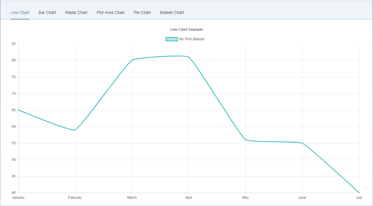
158 |
159 | ```xml
160 |
175 |
176 | ```
177 |
178 | #### Dataset Structure
179 |
180 | The following options can be included in a line chart dataset to configure options for that specific dataset.
181 |
182 | All point* properties can be specified as an array. If these are set to an array value, the first value applies to the first point, the second value to the second point, and so on.
183 |
184 | Property | Type | Usage
185 | --- | --- | ---
186 | data | | The data to plot in a line
187 | label | `String` | The label for the dataset which appears in the legend and tooltips
188 | xAxisID | `String` | The ID of the x axis to plot this dataset on
189 | yAxisID | `String` | The ID of the y axis to plot this dataset on
190 | fill | `Boolean` | If true, fill the area under the line
191 | cubicInterpolationMode | `String` | Algorithm used to interpolate a smooth curve from the discrete data points. Options are 'default' and 'monotone'. The 'default' algorithm uses a custom weighted cubic interpolation, which produces pleasant curves for all types of datasets. The 'monotone' algorithm is more suited to `y = f(x)` datasets : it preserves monotonicity (or piecewise monotonicity) of the dataset being interpolated, and ensures local extremums (if any) stay at input data points. If left untouched (`undefined`), the global `options.elements.line.cubicInterpolationMode` property is used.
192 | lineTension | `Number` | Bezier curve tension of the line. Set to 0 to draw straightlines. This option is ignored if monotone cubic interpolation is used. *Note* This was renamed from 'tension' but the old name still works.
193 | backgroundColor | `Color` | The fill color under the line.
194 | borderWidth | `Number` | The width of the line in pixels
195 | borderColor | `Color` | The color of the line.
196 | borderCapStyle | `String` | Cap style of the line. See [MDN](https://developer.mozilla.org/en-US/docs/Web/API/CanvasRenderingContext2D/lineCap)
197 | borderDash | `Array` | Length and spacing of dashes. See [MDN](https://developer.mozilla.org/en-US/docs/Web/API/CanvasRenderingContext2D/setLineDash)
198 | borderDashOffset | `Number` | Offset for line dashes. See [MDN](https://developer.mozilla.org/en-US/docs/Web/API/CanvasRenderingContext2D/lineDashOffset)
199 | borderJoinStyle | `String` | Line joint style. See [MDN](https://developer.mozilla.org/en-US/docs/Web/API/CanvasRenderingContext2D/lineJoin)
200 | pointBorderColor | `Color or Array` | The border color for points.
201 | pointBackgroundColor | `Color or Array` | The fill color for points
202 | pointBorderWidth | `Number or Array` | The width of the point border in pixels
203 | pointRadius | `Number or Array` | The radius of the point shape. If set to 0, nothing is rendered.
204 | pointHoverRadius | `Number or Array` | The radius of the point when hovered
205 | pointHitRadius | `Number or Array` | The pixel size of the non-displayed point that reacts to mouse events
206 | pointHoverBackgroundColor | `Color or Array` | Point background color when hovered
207 | pointHoverBorderColor | `Color or Array` | Point border color when hovered
208 | pointHoverBorderWidth | `Number or Array` | Border width of point when hovered
209 | pointStyle | `String, Array, Image, Array` | The style of point. Options are 'circle', 'triangle', 'rect', 'rectRounded', 'rectRot', 'cross', 'crossRot', 'star', 'line', and 'dash'. If the option is an image, that image is drawn on the canvas using `drawImage`.
210 | showLine | `Boolean` | If false, the line is not drawn for this dataset
211 | spanGaps | `Boolean` | If true, lines will be drawn between points with no or null data
212 | steppedLine | `Boolean` | If true, the line is shown as a stepped line and 'lineTension' will be ignored
213 |
214 | An example data object using these attributes is shown below.
215 | ```javascript
216 | var data = {
217 | labels: ["January", "February", "March", "April", "May", "June", "July"],
218 | datasets: [
219 | {
220 | label: "My First dataset",
221 | fill: false,
222 | lineTension: 0.1,
223 | backgroundColor: "rgba(75,192,192,0.4)",
224 | borderColor: "rgba(75,192,192,1)",
225 | borderCapStyle: 'butt',
226 | borderDash: [],
227 | borderDashOffset: 0.0,
228 | borderJoinStyle: 'miter',
229 | pointBorderColor: "rgba(75,192,192,1)",
230 | pointBackgroundColor: "#fff",
231 | pointBorderWidth: 1,
232 | pointHoverRadius: 5,
233 | pointHoverBackgroundColor: "rgba(75,192,192,1)",
234 | pointHoverBorderColor: "rgba(220,220,220,1)",
235 | pointHoverBorderWidth: 2,
236 | pointRadius: 1,
237 | pointHitRadius: 10,
238 | data: [65, 59, 80, 81, 56, 55, 40],
239 | spanGaps: false,
240 | }
241 | ]
242 | };
243 | ```
244 |
245 | #### Properties
246 |
247 | Name | Type | Default | Description
248 | --- | --- | --- | ---
249 | showLines | Boolean | true | If false, the lines between points are not drawn
250 | spanGaps | Boolean | false | If true, NaN data does not break the line
251 |
252 | #### Events
253 |
254 | None
255 |
256 | ### BarChartJS
257 |
258 | A bar chart provides a way of showing data values represented as vertical bars. It is sometimes used to show trend data, and the comparison of multiple data sets side by side.
259 |
260 | - [Source Code](https://github.com/StErMi/openui5-chartjs/blob/master/src/it/designfuture/chartjs/BarChartJS.js)
261 | - [Documentation](http://www.chartjs.org/docs/latest/charts/bar.html)
262 |
263 | #### XML Example
264 |
265 | 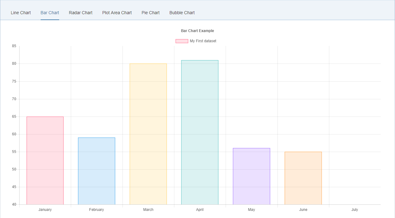
266 |
267 | ```xml
268 |
282 |
283 | ```
284 |
285 | #### Dataset Structure
286 |
287 | The following options can be included in a bar chart dataset to configure options for that specific dataset.
288 |
289 | Some properties can be specified as an array. If these are set to an array value, the first value applies to the first bar, the second value to the second bar, and so on.
290 |
291 | Property | Type | Usage
292 | --- | --- | ---
293 | data | `Array` | The data to plot as bars
294 | label | `String` | The label for the dataset which appears in the legend and tooltips
295 | xAxisID | `String` | The ID of the x axis to plot this dataset on
296 | yAxisID | `String` | The ID of the y axis to plot this dataset on
297 | backgroundColor | `Color or Array` | The fill color of the bars.
298 | borderColor | `Color or Array` | Bar border color
299 | borderWidth | `Number or Array` | Border width of bar in pixels
300 | borderSkipped | `String or Array` | Which edge to skip drawing the border for. Options are 'bottom', 'left', 'top', and 'right'
301 | hoverBackgroundColor | `Color or Array` | Bar background color when hovered
302 | hoverBorderColor | `Color or Array` | Bar border color when hovered
303 | hoverBorderWidth | `Number or Array` | Border width of bar when hovered
304 | stack | `String` | The ID of the group to which this dataset belongs to (when stacked, each group will be a separate stack)
305 |
306 | An example data object using these attributes is shown below.
307 |
308 | ```javascript
309 | var data = {
310 | labels: ["January", "February", "March", "April", "May", "June", "July"],
311 | datasets: [
312 | {
313 | label: "My First dataset",
314 | backgroundColor: [
315 | 'rgba(255, 99, 132, 0.2)',
316 | 'rgba(54, 162, 235, 0.2)',
317 | 'rgba(255, 206, 86, 0.2)',
318 | 'rgba(75, 192, 192, 0.2)',
319 | 'rgba(153, 102, 255, 0.2)',
320 | 'rgba(255, 159, 64, 0.2)'
321 | ],
322 | borderColor: [
323 | 'rgba(255,99,132,1)',
324 | 'rgba(54, 162, 235, 1)',
325 | 'rgba(255, 206, 86, 1)',
326 | 'rgba(75, 192, 192, 1)',
327 | 'rgba(153, 102, 255, 1)',
328 | 'rgba(255, 159, 64, 1)'
329 | ],
330 | borderWidth: 1,
331 | data: [65, 59, 80, 81, 56, 55, 40],
332 | }
333 | ]
334 | };
335 | ```
336 |
337 | #### Properties
338 |
339 | Name | Type | Default | Description
340 | --- | --- | --- | ---
341 | isHorizontal | `Boolean` | false | If the Bar Chart is horizontal
342 | hoverMode | `String` | 'label' | Sets which elements appear in the tooltip.
343 |
344 | #### Events
345 |
346 | None
347 |
348 | ### RadarChartJS
349 |
350 | A radar chart is a way of showing multiple data points and the variation between them.
351 | They are often useful for comparing the points of two or more different data sets.
352 |
353 | - [Source Code](https://github.com/StErMi/openui5-chartjs/blob/master/src/it/designfuture/chartjs/RadarChartJS.js)
354 | - [Documentation](http://www.chartjs.org/docs/latest/charts/radar.html)
355 |
356 | #### XML Example
357 |
358 | 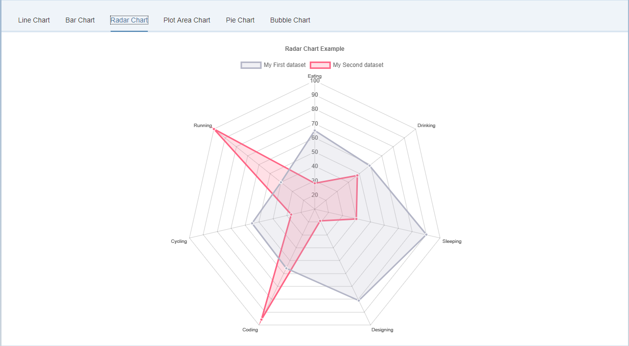
359 |
360 | ```xml
361 |
374 |
375 | ```
376 |
377 | #### Dataset Structure
378 |
379 | The following options can be included in a radar chart dataset to configure options for that specific dataset.
380 |
381 | All point* properties can be specified as an array. If these are set to an array value, the first value applies to the first point, the second value to the second point, and so on.
382 |
383 | Property | Type | Usage
384 | --- | --- | ---
385 | data | `Array` | The data to plot in a line
386 | label | `String` | The label for the dataset which appears in the legend and tooltips
387 | fill | `Boolean` | If true, fill the area under the line
388 | lineTension | `Number` | Bezier curve tension of the line. Set to 0 to draw straightlines. *Note* This was renamed from 'tension' but the old name still works.
389 | backgroundColor | `Color` | The fill color under the line. See [Colors](#chart-configuration-colors)
390 | borderWidth | `Number` | The width of the line in pixels
391 | borderColor | `Color` | The color of the line.
392 | borderCapStyle | `String` | Cap style of the line. See [MDN](https://developer.mozilla.org/en-US/docs/Web/API/CanvasRenderingContext2D/lineCap)
393 | borderDash | `Array` | Length and spacing of dashes. See [MDN](https://developer.mozilla.org/en-US/docs/Web/API/CanvasRenderingContext2D/setLineDash)
394 | borderDashOffset | `Number` | Offset for line dashes. See [MDN](https://developer.mozilla.org/en-US/docs/Web/API/CanvasRenderingContext2D/lineDashOffset)
395 | borderJoinStyle | `String` | Line joint style. See [MDN](https://developer.mozilla.org/en-US/docs/Web/API/CanvasRenderingContext2D/lineJoin)
396 | pointBorderColor | `Color or Array` | The border color for points.
397 | pointBackgroundColor | `Color or Array` | The fill color for points
398 | pointBorderWidth | `Number or Array` | The width of the point border in pixels
399 | pointRadius | `Number or Array` | The radius of the point shape. If set to 0, nothing is rendered.
400 | pointHoverRadius | `Number or Array` | The radius of the point when hovered
401 | pointHitRadius | `Number or Array` | The pixel size of the non-displayed point that reacts to mouse events
402 | pointHoverBackgroundColor | `Color or Array` | Point background color when hovered
403 | pointHoverBorderColor | `Color or Array` | Point border color when hovered
404 | pointHoverBorderWidth | `Number or Array` | Border width of point when hovered
405 | pointStyle | `String or Array` | The style of point. Options include 'circle', 'triangle', 'rect', 'rectRounded', 'rectRot', 'cross', 'crossRot', 'star', 'line', and 'dash'
406 |
407 | An example data object using these attributes is shown below.
408 |
409 | ```javascript
410 | var data = {
411 | labels: ["Eating", "Drinking", "Sleeping", "Designing", "Coding", "Cycling", "Running"],
412 | datasets: [
413 | {
414 | label: "My First dataset",
415 | backgroundColor: "rgba(179,181,198,0.2)",
416 | borderColor: "rgba(179,181,198,1)",
417 | pointBackgroundColor: "rgba(179,181,198,1)",
418 | pointBorderColor: "#fff",
419 | pointHoverBackgroundColor: "#fff",
420 | pointHoverBorderColor: "rgba(179,181,198,1)",
421 | data: [65, 59, 90, 81, 56, 55, 40]
422 | },
423 | {
424 | label: "My Second dataset",
425 | backgroundColor: "rgba(255,99,132,0.2)",
426 | borderColor: "rgba(255,99,132,1)",
427 | pointBackgroundColor: "rgba(255,99,132,1)",
428 | pointBorderColor: "#fff",
429 | pointHoverBackgroundColor: "#fff",
430 | pointHoverBorderColor: "rgba(255,99,132,1)",
431 | data: [28, 48, 40, 19, 96, 27, 100]
432 | }
433 | ]
434 | };
435 | ```
436 |
437 | #### Properties
438 |
439 | Name | Type | Default | Description
440 | --- | --- | --- | ---
441 | startAngle | `Number` | 0 | The number of degrees to rotate the chart clockwise.
442 |
443 | #### Events
444 |
445 | None
446 |
447 | ### PieChartJS
448 |
449 | A radar chart is a way of showing multiple data points and the variation between them.
450 | They are often useful for comparing the points of two or more different data sets.
451 |
452 | - [Source Code](https://github.com/StErMi/openui5-chartjs/blob/master/src/it/designfuture/chartjs/PieChartJS.js)
453 | - [Documentation](http://www.chartjs.org/docs/latest/charts/doughnut.html)
454 |
455 | #### XML Example
456 |
457 | 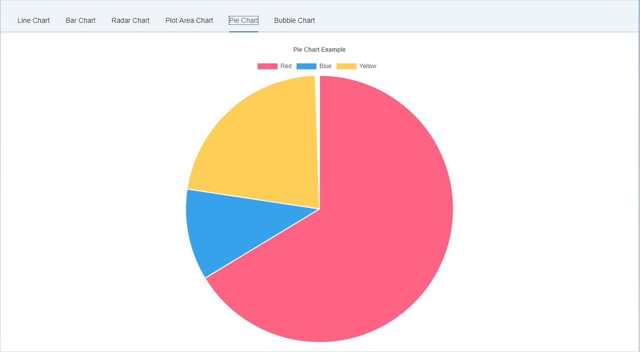
458 |
459 | ```xml
460 |
473 |
474 | ```
475 |
476 | #### Dataset Structure
477 |
478 | Property | Type | Usage
479 | --- | --- | ---
480 | data | `Array` | The data to plot as arcs
481 | label | `String` | The label for the dataset which appears in the legend and tooltips
482 | backgroundColor | `Array` | The fill color of the arcs. See [Colors](#chart-configuration-colors)
483 | borderColor | `Array` | Arc border color
484 | borderWidth | `Array` | Border width of arcs in pixels
485 | hoverBackgroundColor | `Array` | Arc background color when hovered
486 | hoverBorderColor | `Array` | Arc border color when hovered
487 | hoverBorderWidth | `Array` | Border width of arc when hovered
488 |
489 | An example data object using these attributes is shown below.
490 |
491 | ```javascript
492 | var data = {
493 | labels: [
494 | "Red",
495 | "Blue",
496 | "Yellow"
497 | ],
498 | datasets: [
499 | {
500 | data: [300, 50, 100],
501 | backgroundColor: [
502 | "#FF6384",
503 | "#36A2EB",
504 | "#FFCE56"
505 | ],
506 | hoverBackgroundColor: [
507 | "#FF6384",
508 | "#36A2EB",
509 | "#FFCE56"
510 | ]
511 | }]
512 | };
513 | ```
514 |
515 | #### Properties
516 |
517 | Name | Type | Default | Description
518 | --- | --- | --- | ---
519 | isDoughnut | `Boolean` | false | If the Pie Chart doughnut style
520 | cutoutPercentage | Number | 50 - for doughnut, 0 - for pie | The percentage of the chart that is cut out of the middle.
521 | rotation | Number | -0.5 * Math.PI | Starting angle to draw arcs from
522 | circumference | Number | 2 * Math.PI | Sweep to allow arcs to cover
523 | animationAnimateRotate | Boolean |true | If true, will animate the rotation of the chart.
524 | animationAnimateScale | Boolean | false | If true, will animate scaling the Doughnut from the centre.
525 |
526 | #### Events
527 |
528 | None
529 |
530 | ### PolarAreaChartJS
531 |
532 | Polar area charts are similar to pie charts, but each segment has the same angle - the radius of the segment differs depending on the value.
533 | This type of chart is often useful when we want to show a comparison data similar to a pie chart, but also show a scale of values for context.
534 |
535 | - [Source Code](https://github.com/StErMi/openui5-chartjs/blob/master/src/it/designfuture/chartjs/PolarAreaChartJS.js)
536 | - [Documentation](http://www.chartjs.org/docs/latest/charts/polar.html)
537 |
538 | #### XML Example
539 |
540 | 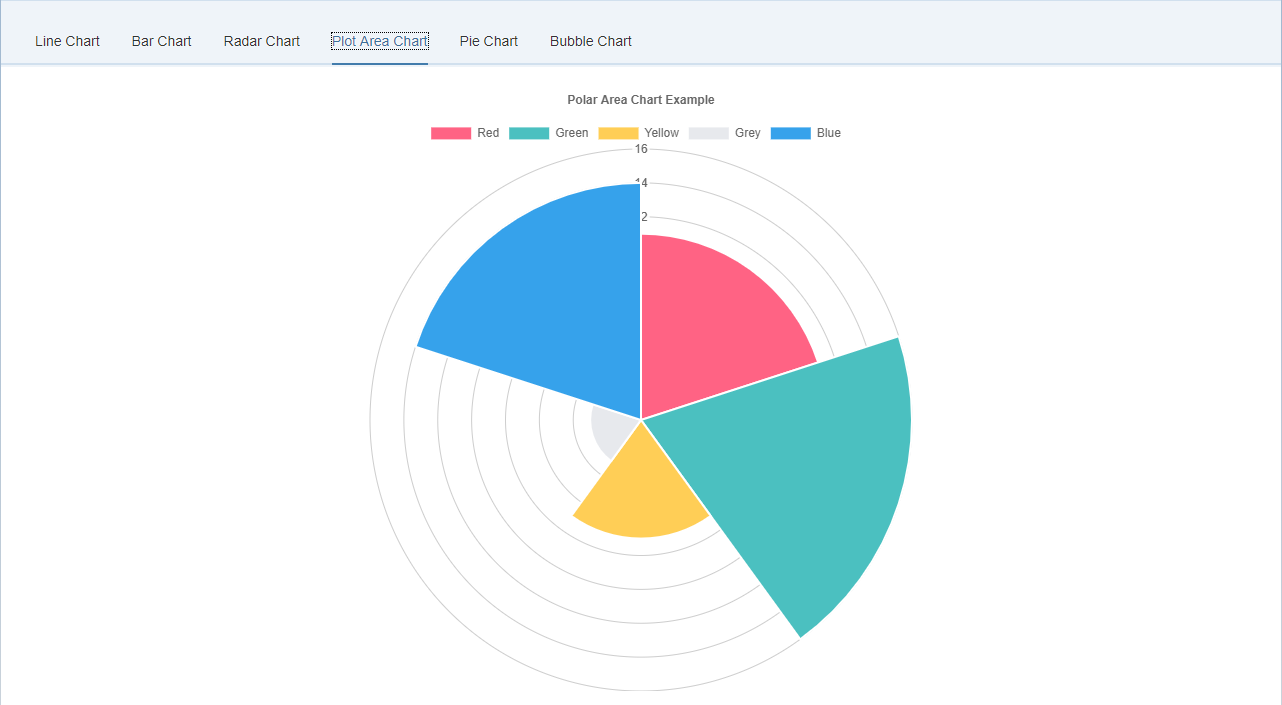
541 |
542 | ```xml
543 |
556 |
557 | ```
558 |
559 | #### Dataset Structure
560 |
561 | The following options can be included in a polar area chart dataset to configure options for that specific dataset.
562 | Some properties are specified as arrays. The first value applies to the first bar, the second value to the second bar, and so on.
563 |
564 | Property | Type | Usage
565 | --- | --- | ---
566 | data | `Array` | The data to plot as arcs
567 | label | `String` | The label for the dataset which appears in the legend and tooltips
568 | backgroundColor | `Array` | The fill color of the arcs.
569 | borderColor | `Array` | Arc border color
570 | borderWidth | `Array` | Border width of arcs in pixels
571 | hoverBackgroundColor | `Array` | Arc background color when hovered
572 | hoverBorderColor | `Array` | Arc border color when hovered
573 | hoverBorderWidth | `Array` | Border width of arc when hovered
574 |
575 | An example data object using these attributes is shown below.
576 |
577 | ```javascript
578 | var data = {
579 | datasets: [{
580 | data: [
581 | 11,
582 | 16,
583 | 7,
584 | 3,
585 | 14
586 | ],
587 | backgroundColor: [
588 | "#FF6384",
589 | "#4BC0C0",
590 | "#FFCE56",
591 | "#E7E9ED",
592 | "#36A2EB"
593 | ],
594 | label: 'My dataset' // for legend
595 | }],
596 | labels: [
597 | "Red",
598 | "Green",
599 | "Yellow",
600 | "Grey",
601 | "Blue"
602 | ]
603 | };
604 | ```
605 |
606 | #### Properties
607 |
608 | Name | Type | Default | Description
609 | --- | --- | --- | ---
610 | startAngle | Number | -0.5 * Math.PI | Sets the starting angle for the first item in a dataset
611 | animationAnimateRotate | Boolean |true | If true, will animate the rotation of the chart.
612 | animationAnimateScale | Boolean | true | If true, will animate scaling the chart.
613 |
614 | #### Events
615 |
616 | None
617 |
618 | ### BubbleChartJS
619 |
620 | A bubble chart is used to display three dimensions of data at the same time. The location of the bubble is determined by the first two dimensions and the corresponding horizontal and vertical axes. The third dimension is represented by the size of the individual bubbles.
621 |
622 | - [Source Code](https://github.com/StErMi/openui5-chartjs/blob/master/src/it/designfuture/chartjs/BubbleChartJS.js)
623 | - [Documentation](http://www.chartjs.org/docs/latest/charts/bubble.html)
624 |
625 | #### XML Example
626 |
627 | 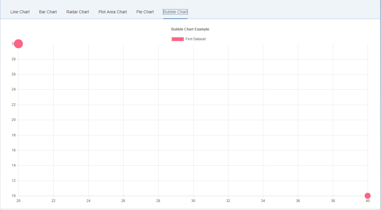
628 |
629 | ```xml
630 |
643 |
644 | ```
645 |
646 | #### Dataset Structure
647 |
648 | Property | Type | Usage
649 | --- | --- | ---
650 | data | `Array` | The data to plot as bubbles. See [Data format](#bubble-chart-data-format)
651 | label | `String` | The label for the dataset which appears in the legend and tooltips
652 | backgroundColor | `Color Array` | The fill color of the bubbles. See [Colors](#chart-configuration-colors)
653 | borderColor | `Color or Array` | The stroke color of the bubbles.
654 | borderWidth | `Number or Array` | The stroke width of bubble in pixels.
655 | hoverBackgroundColor | `Color or Array` | The fill color of the bubbles when hovered.
656 | hoverBorderColor | `Color or Array` | The stroke color of the bubbles when hovered.
657 | hoverBorderWidth | `Number or Array` | The stroke width of the bubbles when hovered.
658 | hoverRadius | `Number or Array` | Additional radius to add to data radius on hover.
659 |
660 | An example data object using these attributes is shown below. This example creates a single dataset with 2 different bubbles.
661 |
662 | ```javascript
663 | var data = {
664 | datasets: [
665 | {
666 | label: 'First Dataset',
667 | data: [
668 | {
669 | x: 20,
670 | y: 30,
671 | r: 15
672 | },
673 | {
674 | x: 40,
675 | y: 10,
676 | r: 10
677 | }
678 | ],
679 | backgroundColor:"#FF6384",
680 | hoverBackgroundColor: "#FF6384",
681 | }]
682 | };
683 | ```
684 |
685 | #### Properties
686 |
687 | Name | Type | Default | Description
688 | --- | --- | --- | ---
689 | startAngle | Number | -0.5 * Math.PI | Sets the starting angle for the first item in a dataset
690 | animationAnimateRotate | Boolean |true | If true, will animate the rotation of the chart.
691 | animationAnimateScale | Boolean | true | If true, will animate scaling the chart.
692 |
693 | #### Events
694 |
695 | None
696 |
--------------------------------------------------------------------------------
/bower.json:
--------------------------------------------------------------------------------
1 | {
2 | "name": "openui5-chartjs",
3 | "description": "chartjs",
4 | "main": "index.js",
5 | "authors": [
6 | "Emanuele Ricci "
7 | ],
8 | "license": "Apache-2.0",
9 | "keywords": [
10 | "chartjs",
11 | "openui5",
12 | "sapui5",
13 | "javascript"
14 | ],
15 | "moduleType": ["amd"],
16 | "homepage": "https://github.com/StErMi/openui5-chartjs",
17 | "ignore": [
18 | "**/.*",
19 | "node_modules",
20 | "bower_components",
21 | "example",
22 | "test",
23 | "tests"
24 | ],
25 | "dependencies": {
26 | "openui5-sap.ui.core": "openui5/packaged-sap.ui.core#1.46.12",
27 | "openui5-sap.m": "openui5/packaged-sap.m#1.46.12",
28 | "openui5-themelib_sap_belize": "openui5/packaged-themelib_sap_belize#1.46.12",
29 | "openui5-sap.ui.layout": "openui5/packaged-sap.ui.layout#1.46.12"
30 | }
31 | }
32 |
--------------------------------------------------------------------------------
/images/bar_chart.PNG:
--------------------------------------------------------------------------------
https://raw.githubusercontent.com/StErMi/openui5-chartjs/57982d7672a43ad42cdf6b042e232b318f97ee67/images/bar_chart.PNG
--------------------------------------------------------------------------------
/images/bubble_chart.PNG:
--------------------------------------------------------------------------------
https://raw.githubusercontent.com/StErMi/openui5-chartjs/57982d7672a43ad42cdf6b042e232b318f97ee67/images/bubble_chart.PNG
--------------------------------------------------------------------------------
/images/line_chart.PNG:
--------------------------------------------------------------------------------
https://raw.githubusercontent.com/StErMi/openui5-chartjs/57982d7672a43ad42cdf6b042e232b318f97ee67/images/line_chart.PNG
--------------------------------------------------------------------------------
/images/pie_chart.PNG:
--------------------------------------------------------------------------------
https://raw.githubusercontent.com/StErMi/openui5-chartjs/57982d7672a43ad42cdf6b042e232b318f97ee67/images/pie_chart.PNG
--------------------------------------------------------------------------------
/images/plot_chart.PNG:
--------------------------------------------------------------------------------
https://raw.githubusercontent.com/StErMi/openui5-chartjs/57982d7672a43ad42cdf6b042e232b318f97ee67/images/plot_chart.PNG
--------------------------------------------------------------------------------
/images/radar_chart.PNG:
--------------------------------------------------------------------------------
https://raw.githubusercontent.com/StErMi/openui5-chartjs/57982d7672a43ad42cdf6b042e232b318f97ee67/images/radar_chart.PNG
--------------------------------------------------------------------------------
/package.json:
--------------------------------------------------------------------------------
1 | {
2 | "name": "openui5-chartjs",
3 | "version": "0.0.1",
4 | "description": "chartjs",
5 | "main": "index.js",
6 | "repository": {
7 | "type": "git",
8 | "url": "https://github.com/StErMi/openui5-chartjs"
9 | },
10 | "keywords": [
11 | "chartjs",
12 | "openui5",
13 | "sapui5",
14 | "javascript"
15 | ],
16 | "author": {
17 | "name": "Emanuele Ricci",
18 | "email": "stermi@gmail.com"
19 | },
20 | "license": "Apache-2.0",
21 | "scripts": {
22 | "test": "echo \"Error: no test specified. Please add some.\" && exit 1",
23 | "postinstall": "bower install",
24 | "start": "grunt"
25 | },
26 | "devDependencies": {
27 | "bower": "^1.8.0",
28 | "chart.js": "2.5.0",
29 | "connect-livereload": "^0.6.0",
30 | "grunt": "^1.0.1",
31 | "grunt-contrib-clean": "^1.0.0",
32 | "grunt-contrib-connect": "^1.0.2",
33 | "grunt-contrib-copy": "^1.0.0",
34 | "grunt-contrib-jshint": "^1.1.0",
35 | "grunt-contrib-uglify": "^2.2.0",
36 | "grunt-contrib-watch": "^1.0.0",
37 | "grunt-eslint": "^19.0.0",
38 | "grunt-openui5": "^0.12.0"
39 | }
40 | }
41 |
--------------------------------------------------------------------------------
/src/it/designfuture/chartjs/.library:
--------------------------------------------------------------------------------
1 |
2 |
3 |
4 | it.designfuture.chartjs
5 | OpenUI5 chartjs
6 | ${copyright}
7 | ${version}
8 |
9 | chartjs
10 |
11 |
12 |
13 | sap.ui.core
14 |
15 |
16 | sap.m
17 |
18 |
19 |
20 |
21 |
22 |
23 |
--------------------------------------------------------------------------------
/src/it/designfuture/chartjs/BarChartJS.js:
--------------------------------------------------------------------------------
1 | // Provides control it.designfuture.chartjs.BarChartJS
2 | sap.ui.define([
3 | "./BaseChartJS",
4 | ], function (BaseChartJS) {
5 | "use strict";
6 |
7 | /**
8 | * BaseChart class
9 | * A bar chart provides a way of showing data values represented as vertical bars.
10 | * It is sometimes used to show trend data, and the comparison of multiple data sets side by side.
11 | *
12 | * @param {string} [sId] id for the new control, generated automatically if no id is given
13 | * @param {object} [mSettings] initial settings for the new control
14 | *
15 | * @class
16 | * BaseChart constructor
17 | * @extends it.designfuture.chartjs.BaseChartJS
18 | * @alias it.designfuture.chartjs.BarChartJS
19 | * @version ${version}
20 | *
21 | * @constructor
22 | * @public
23 | * @since 1.40
24 | * @name it.designfuture.chartjs.BarChartJS
25 | */
26 | var BarChartJS = BaseChartJS.extend("it.designfuture.chartjs.BarChartJS", /** @lends sap.m.BarChartJS.prototype */ {
27 |
28 | metadata : {
29 | library: 'it.designfuture.chartjs',
30 | properties: {
31 | /**
32 | * If the Bar Chart is horizontal
33 | */
34 | isHorizontal : {type : "boolean", group : "Appearance", defaultValue : false},
35 |
36 | ///////////////////////////////////////////////////////////////////////////////////
37 | // HOVER
38 | // The hover configuration is passed into the options.hover namespace.
39 | // The global hover configuration is at Chart.defaults.global.hover.
40 | ///////////////////////////////////////////////////////////////////////////////////
41 |
42 | /**
43 | * Sets which elements appear in the tooltip.
44 | */
45 | hoverMode : {type : "string", group : "Appearance", defaultValue : "label"},
46 |
47 | },
48 | aggregations: {},
49 | events: {}
50 | },
51 |
52 | onBeforeRendering: function() {
53 | this.setChartType(this.getIsHorizontal() ? "horizontalBar" : "bar");
54 | BaseChartJS.prototype.setHoverMode.call(this, this.getHoverMode());
55 | },
56 |
57 | /////////////////////////////////////
58 | // OVERRIDE
59 | /////////////////////////////////////
60 |
61 | addGlobalOptions: function(globalOptions) {
62 | },
63 |
64 | //////////////////////////////////////////////
65 | // GETTER / SETTER
66 | //////////////////////////////////////////////
67 |
68 |
69 |
70 | //////////////////////////////////////////////
71 | // CHART METHODS
72 | //////////////////////////////////////////////
73 |
74 | });
75 |
76 |
77 | return BarChartJS;
78 |
79 | }, /* bExport= */ true);
--------------------------------------------------------------------------------
/src/it/designfuture/chartjs/BarChartJSRenderer.js:
--------------------------------------------------------------------------------
1 | sap.ui.define(['jquery.sap.global', 'sap/ui/core/Renderer', './BaseChartJSRenderer'],
2 | function(jQuery, Renderer, BaseChartJSRenderer) {
3 | "use strict";
4 |
5 |
6 | /**
7 | * BarChartJS renderer.
8 | * @static
9 | * @namespace
10 | */
11 | var BarChartJSRenderer = Renderer.extend(BaseChartJSRenderer);
12 |
13 | /**
14 | * Adds control specific class
15 | *
16 | * @param {sap.ui.core.RenderManager} oRm the RenderManager that can be used for writing to the render output buffer
17 | * @param {sap.ui.core.Control} oControl an object representation of the control that should be rendered
18 | */
19 | BarChartJSRenderer.addOuterClasses = function(oRm, oControl) {
20 | oRm.addClass("opeui5-bar-chartjs");
21 | if( oControl.getIsHorizontal() ) {
22 | oRm.addClass("opeui5-bar-horizontal-chartjs");
23 | }
24 | };
25 |
26 |
27 | return BarChartJSRenderer;
28 |
29 | }, /* bExport= */ true);
--------------------------------------------------------------------------------
/src/it/designfuture/chartjs/BaseChartJS.js:
--------------------------------------------------------------------------------
1 | // Provides control it.designfuture.chartjs.BaseChartJS
2 | sap.ui.define([
3 | "sap/ui/core/Control",
4 | './3rdparty/Chart',
5 | './library'
6 | ], function (Control, ChartJS, library) {
7 | "use strict";
8 |
9 | /**
10 | * BaseChart class, it contains all the common properties, methods and events of a Chart
11 | *
12 | * @param {string} [sId] id for the new control, generated automatically if no id is given
13 | * @param {object} [mSettings] initial settings for the new control
14 | *
15 | * @class
16 | * QRCode Control to render a QR Code
17 | * @extends sap.m.InputBase
18 | * @version ${version}
19 | *
20 | * @constructor
21 | * @public
22 | * @since 1.40
23 | * @name it.designfuture.chartjs.BaseChartJS
24 | */
25 | var BaseChartJS = Control.extend("it.designfuture.chartjs.BaseChartJS", /** @lends sap.m.BaseChartJS.prototype */ {
26 |
27 | __ctx: undefined,
28 | __chart: undefined,
29 |
30 | metadata : {
31 | library: 'it.designfuture.chartjs',
32 | properties: {
33 |
34 | ///////////////////////////////////////////////////////////////////////////////////
35 | // CHART TYPE
36 | ///////////////////////////////////////////////////////////////////////////////////
37 |
38 | /**
39 | * Chart type: line
40 | */
41 | chartType : {type : "string", group : "Appearance", defaultValue : null},
42 |
43 | ///////////////////////////////////////////////////////////////////////////////////
44 | // CALLBACKS / FUNCTIONS
45 | ///////////////////////////////////////////////////////////////////////////////////
46 |
47 | /**
48 | * Generates legend items for each thing in the legend. Default implementation returns the text + styling for the color box.
49 | */
50 | generateLabelsCallback : {type : "object", group : "Appearance", defaultValue : null},
51 |
52 | /**
53 | * Define a function to generate custom tooltip
54 | */
55 | customTooltipCallback : {type : "object", group : "Appearance", defaultValue : null},
56 |
57 | /**
58 | * Allows sorting of tooltip items. Must implement at minimum a function that can be passed to Array.prototype.sort.
59 | * This function can also accept a third parameter that is the data object passed to the chart.
60 | */
61 | tooltipSortFunction : {type : "object", group : "Appearance", defaultValue : undefined},
62 |
63 | /**
64 | * Allows filtering of tooltip items. Must implement at minimum a function that can be passed to Array.prototype.filter.
65 | * This function can also accept a second parameter that is the data object passed to the chart.
66 | */
67 | tooltipFilterFunction : {type : "object", group : "Appearance", defaultValue : undefined},
68 |
69 | /**
70 | * See http://www.chartjs.org/docs/#chart-configuration-tooltip-callbacks
71 | */
72 | tooltipCallbacks : {type : "object", group : "Appearance", defaultValue : {}},
73 |
74 | ///////////////////////////////////////////////////////////////////////////////////
75 | // DATA
76 | ///////////////////////////////////////////////////////////////////////////////////
77 |
78 | /**
79 | * Data to be displayed by the Chart. Data structure will change based on the current Chart type
80 | */
81 | datasets : {type : "object", group : "Appearance", defaultValue : null},
82 |
83 | /**
84 | * Labels of the Chart
85 | */
86 | labels : {type : "object", group : "Appearance", defaultValue : null},
87 |
88 | ///////////////////////////////////////////////////////////////////////////////////
89 | // COMMON
90 | // The following options are applicable to all charts.
91 | // The can be set on the global configuration, or they can be passed to the chart constructor.
92 | ///////////////////////////////////////////////////////////////////////////////////
93 |
94 | /**
95 | * Resizes the chart canvas when its container does.
96 | */
97 | responsive : {type : "boolean", group : "Appearance", defaultValue : true},
98 |
99 | /**
100 | * Duration in milliseconds it takes to animate to new size after a resize event.
101 | */
102 | responsiveAnimationDuration : {type : "int", group : "Appearance", defaultValue : 0},
103 |
104 | /**
105 | * Maintain the original canvas aspect ratio (width / height) when resizing.
106 | */
107 | maintainAspectRatio : {type : "boolean", group : "Appearance", defaultValue : true},
108 |
109 | /**
110 | * Events that the chart should listen to for tooltips and hovering
111 | */
112 | events : {type : "string[]", group : "Appearance", defaultValue : ["mousemove", "mouseout", "click", "touchstart", "touchmove", "touchend"]},
113 |
114 | ///////////////////////////////////////////////////////////////////////////////////
115 | // LAYOUT
116 | // The layout configuration is passed into the options.layout namespace.
117 | // The global options for the chart layout is defined in Chart.defaults.global.layout.
118 | ///////////////////////////////////////////////////////////////////////////////////
119 |
120 | /**
121 | * The padding to add inside the chart. If this value is a number, it is applied to all sides of the chart (left, top, right, bottom).
122 | * If this value is an object, the left property defines the left padding. Similarly the right, top, and bottom properties can also be specified.
123 | */
124 | layoutPadding : {type : "object", group : "Appearance", defaultValue : 0},
125 |
126 | ///////////////////////////////////////////////////////////////////////////////////
127 | // TITLE
128 | // The title configuration is passed into the options.title namespace.
129 | // The global options for the chart title is defined in Chart.defaults.global.title.
130 | ///////////////////////////////////////////////////////////////////////////////////
131 |
132 | /**
133 | * Title text
134 | */
135 | titleText : {type : "string", group : "Appearance", defaultValue : ""},
136 |
137 | /**
138 | * Display the title block
139 | */
140 | titleDisplay : {type : "boolean", group : "Appearance", defaultValue : false},
141 |
142 | /**
143 | * Position of the title. Possible values are 'top', 'left', 'bottom' and 'right'.
144 | */
145 | titlePosition : {type : "string", group : "Appearance", defaultValue : "top"},
146 |
147 | /**
148 | * Marks that this box should take the full width of the canvas (pushing down other boxes)
149 | */
150 | titleFullWidth : {type : "boolean", group : "Appearance", defaultValue : true},
151 |
152 | /**
153 | * Font size inherited from global configuration
154 | */
155 | titleFontSize : {type : "int", group : "Appearance", defaultValue : 12},
156 |
157 | /**
158 | * Font family inherited from global configuration
159 | */
160 | titleFontFamily : {type : "string", group : "Appearance", defaultValue : "'Helvetica Neue', 'Helvetica', 'Arial', sans-serif"},
161 |
162 | /**
163 | * Font color inherited from global configuration
164 | */
165 | titleFontColor : {type : "string", group : "Appearance", defaultValue : "#666"},
166 |
167 | /**
168 | * Font styling of the title.
169 | */
170 | titleFontStyle : {type : "string", group : "Appearance", defaultValue : "bold"},
171 |
172 | /**
173 | * Number of pixels to add above and below the title text
174 | */
175 | titlePadding : {type : "int", group : "Appearance", defaultValue : 10},
176 |
177 | ///////////////////////////////////////////////////////////////////////////////////
178 | // LEGEND
179 | // The legend configuration is passed into the options.legend namespace. The global options for the chart legend
180 | // is defined in Chart.defaults.global.legend.
181 | ///////////////////////////////////////////////////////////////////////////////////
182 |
183 | /**
184 | * Width of coloured box
185 | */
186 | legendDisplay : {type : "boolean", group : "Appearance", defaultValue : true},
187 |
188 | /**
189 | * Position of the legend. Possible values are 'top', 'left', 'bottom' and 'right'.
190 | */
191 | legendPosition : {type : "string", group : "Appearance", defaultValue : "top"},
192 |
193 | /**
194 | * Marks that this box should take the full width of the canvas (pushing down other boxes)
195 | */
196 | legendFullWidth : {type : "boolean", group : "Appearance", defaultValue : true},
197 |
198 | /**
199 | * Legend will show datasets in reverse order
200 | */
201 | legendReverse : {type : "boolean", group : "Appearance", defaultValue : false},
202 |
203 | ///////////////////////////////////////////////////////////////////////////////////
204 | // LEGEND LABEL
205 | // The legend label configuration is nested below the legend configuration using the labels key.
206 | ///////////////////////////////////////////////////////////////////////////////////
207 |
208 | /**
209 | * Width of coloured box
210 | */
211 | legendLabelBoxWidth : {type : "int", group : "Appearance", defaultValue : 40},
212 |
213 | /**
214 | * Font size inherited from global configuration
215 | */
216 | legendLabelFontSize : {type : "int", group : "Appearance", defaultValue : 12},
217 |
218 | /**
219 | * Font family inherited from global configuration
220 | */
221 | legendLabelFontStyle : {type : "string", group : "Appearance", defaultValue : "normal"},
222 |
223 | /**
224 | * Font color inherited from global configuration
225 | */
226 | legendLabelFontColor : {type : "string", group : "Appearance", defaultValue : "#666"},
227 |
228 | /**
229 | * Font family inherited from global configuration
230 | */
231 | legendLabelFontFamily : {type : "string", group : "Appearance", defaultValue : "'Helvetica Neue', 'Helvetica', 'Arial', sans-serif"},
232 |
233 | /**
234 | * Padding between rows of colored boxes
235 | */
236 | legendLabelPadding : {type : "int", group : "Appearance", defaultValue : 10},
237 |
238 | /**
239 | * Label style will match corresponding point style (size is based on fontSize, boxWidth is not used in this case).
240 | */
241 | legendLabelUsePointStyle : {type : "boolean", group : "Appearance", defaultValue : false},
242 |
243 | ///////////////////////////////////////////////////////////////////////////////////
244 | // TOOLTOP
245 | // The tooltip configuration is passed into the options.tooltips namespace.
246 | // The global options for the chart tooltips is defined in Chart.defaults.global.tooltips.
247 | ///////////////////////////////////////////////////////////////////////////////////
248 |
249 | /**
250 | * Are tooltips enabled
251 | */
252 | tooltipEnabled : {type : "boolean", group : "Appearance", defaultValue : true},
253 |
254 | /**
255 | * Sets which elements appear in the tooltip
256 | */
257 | tooltipMode : {type : "string", group : "Appearance", defaultValue : "nearest"},
258 |
259 | /**
260 | * if true, the tooltip mode applies only when the mouse position intersects with an element.
261 | * If false, the mode will be applied at all times.
262 | */
263 | tooltipIntersect : {type : "boolean", group : "Appearance", defaultValue : true},
264 |
265 | /**
266 | * The mode for positioning the tooltip. 'average' mode will place the tooltip at the average position of the items displayed in the tooltip.
267 | * 'nearest' will place the tooltip at the position of the element closest to the event position.
268 | * New modes can be defined by adding functions to the Chart.Tooltip.positioners map.
269 | */
270 | tooltipPosition : {type : "string", group : "Appearance", defaultValue : "average"},
271 |
272 | /**
273 | * Background color of the tooltip
274 | */
275 | tooltipBackgroundColor : {type : "string", group : "Appearance", defaultValue : "rgba(0,0,0,0.8)"},
276 |
277 | /**
278 | * Font family for tooltip title inherited from global font family
279 | */
280 | tooltipTitleFontFamily : {type : "string", group : "Appearance", defaultValue : "'Helvetica Neue', 'Helvetica', 'Arial', sans-serif"},
281 |
282 | /**
283 | * Font size for tooltip title inherited from global font size
284 | */
285 | tooltipTitleFontSize : {type : "int", group : "Appearance", defaultValue : 12},
286 |
287 | /**
288 | * Font size for tooltip title inherited from global font size
289 | */
290 | tooltipTitleFontStyle : {type : "string", group : "Appearance", defaultValue : "bold"},
291 |
292 | /**
293 | * Font color for tooltip title
294 | */
295 | tooltipTitleFontColor : {type : "string", group : "Appearance", defaultValue : "#fff"},
296 |
297 | /**
298 | * Spacing to add to top and bottom of each title line.
299 | */
300 | tooltipTitleSpacing : {type : "int", group : "Appearance", defaultValue : 2},
301 |
302 | /**
303 | * Margin to add on bottom of title section
304 | */
305 | tooltipTitleMarginBottom : {type : "int", group : "Appearance", defaultValue : 2},
306 |
307 | /**
308 | * Font family for tooltip items inherited from global font family
309 | */
310 | tooltipBodyFontFamily : {type : "string", group : "Appearance", defaultValue : "'Helvetica Neue', 'Helvetica', 'Arial', sans-serif"},
311 |
312 | /**
313 | * Font size for tooltip items inherited from global font size
314 | */
315 | tooltipBodyFontSize : {type : "int", group : "Appearance", defaultValue : 12},
316 |
317 | /**
318 | * Font size for tooltip items inherited from global font size
319 | */
320 | tooltipBodyFontStyle : {type : "string", group : "Appearance", defaultValue : "normal"},
321 |
322 | /**
323 | * Font color for tooltip items.
324 | */
325 | tooltipBodyFontColor : {type : "string", group : "Appearance", defaultValue : "#fff"},
326 |
327 | /**
328 | * Spacing to add to top and bottom of each tooltip item
329 | */
330 | tooltipBodySpacing : {type : "int", group : "Appearance", defaultValue : 2},
331 |
332 | /**
333 | * Font family for tooltip footer inherited from global font family.
334 | */
335 | tooltipFooterFontFamily : {type : "string", group : "Appearance", defaultValue : "'Helvetica Neue', 'Helvetica', 'Arial', sans-serif"},
336 |
337 | /**
338 | * Font size for tooltip footer inherited from global font size.
339 | */
340 | tooltipFooterFontSize : {type : "int", group : "Appearance", defaultValue : 12},
341 |
342 | /**
343 | * Font style for tooltip footer.
344 | */
345 | tooltipFooterFontStyle : {type : "string", group : "Appearance", defaultValue : "bold"},
346 |
347 | /**
348 | * #fff
349 | */
350 | tooltipFooterFontColor : {type : "string", group : "Appearance", defaultValue : "#fff"},
351 |
352 | /**
353 | * Spacing to add to top and bottom of each footer line.
354 | */
355 | tooltipFooterSpacing : {type : "int", group : "Appearance", defaultValue : 2},
356 |
357 | /**
358 | * Margin to add before drawing the footer
359 | */
360 | tooltipFooterMarginTop : {type : "int", group : "Appearance", defaultValue : 6},
361 |
362 | /**
363 | * Padding to add on left and right of tooltip
364 | */
365 | tooltipXPadding : {type : "int", group : "Appearance", defaultValue : 6},
366 |
367 | /**
368 | * Padding to add on top and bottom of tooltip
369 | */
370 | tooltipYPadding : {type : "int", group : "Appearance", defaultValue : 6},
371 |
372 | /**
373 | * Size, in px, of the tooltip arrow
374 | */
375 | tooltipCaretSize : {type : "int", group : "Appearance", defaultValue : 5},
376 |
377 | /**
378 | * Radius of tooltip corner curves
379 | */
380 | tooltipCornerRadius : {type : "int", group : "Appearance", defaultValue : 6},
381 |
382 | /**
383 | * Color to draw behind the colored boxes when multiple items are in the tooltip
384 | */
385 | tooltipMultiKeyBackground : {type : "string", group : "Appearance", defaultValue : "#fff"},
386 |
387 | /**
388 | * if true, color boxes are shown in the tooltip
389 | */
390 | tooltipDisplayColors : {type : "boolean", group : "Appearance", defaultValue : true},
391 |
392 | ///////////////////////////////////////////////////////////////////////////////////
393 | // HOVER
394 | // The hover configuration is passed into the options.hover namespace.
395 | // The global hover configuration is at Chart.defaults.global.hover.
396 | ///////////////////////////////////////////////////////////////////////////////////
397 |
398 | /**
399 | * Sets which elements appear in the tooltip.
400 | */
401 | hoverMode : {type : "string", group : "Appearance", defaultValue : "nearest"},
402 |
403 | /**
404 | * if true, the hover mode only applies when the mouse position intersects an item on the chart
405 | */
406 | hoverIntersect : {type : "boolean", group : "Appearance", defaultValue : true},
407 |
408 | /**
409 | * Duration in milliseconds it takes to animate hover style changes
410 | */
411 | hoverAnimationDuration : {type : "int", group : "Appearance", defaultValue : 400},
412 |
413 | ///////////////////////////////////////////////////////////////////////////////////
414 | // ANIMATION
415 | // The following animation options are available. The global options for are defined in Chart.defaults.global.animation.
416 | ///////////////////////////////////////////////////////////////////////////////////
417 |
418 | /**
419 | * The number of milliseconds an animation takes.
420 | */
421 | animationDuration : {type : "int", group : "Appearance", defaultValue : 1000},
422 |
423 | /**
424 | * Easing function to use. Available options are: 'linear', 'easeInQuad', 'easeOutQuad', 'easeInOutQuad', 'easeInCubic',
425 | * 'easeOutCubic', 'easeInOutCubic', 'easeInQuart', 'easeOutQuart', 'easeInOutQuart', 'easeInQuint', 'easeOutQuint',
426 | * 'easeInOutQuint', 'easeInSine', 'easeOutSine', 'easeInOutSine', 'easeInExpo', 'easeOutExpo', 'easeInOutExpo', 'easeInCirc',
427 | * 'easeOutCirc', 'easeInOutCirc', 'easeInElastic', 'easeOutElastic', 'easeInOutElastic', 'easeInBack', 'easeOutBack',
428 | * 'easeInOutBack', 'easeInBounce', 'easeOutBounce', 'easeInOutBounce'
429 | */
430 | animationEasing : {type : "string", group : "Appearance", defaultValue : "easeOutQuart"},
431 |
432 | ///////////////////////////////////////////////////////////////////////////////////
433 | // ARC
434 | // Arcs are used in the polar area, doughnut and pie charts. They can be configured with the following options.
435 | // The global arc options are stored in Chart.defaults.global.elements.arc.
436 | ///////////////////////////////////////////////////////////////////////////////////
437 |
438 | /**
439 | * Default fill color for arcs. Inherited from the global default
440 | */
441 | arcBackgroundColor : {type : "string", group : "Appearance", defaultValue : "rgba(0,0,0,0.1)"},
442 |
443 | /**
444 | * Default stroke color for arcs
445 | */
446 | arcBorderColor : {type : "string", group : "Appearance", defaultValue : "#fff"},
447 |
448 | /**
449 | * Default stroke width for arcs
450 | */
451 | arcBorderWidth : {type : "int", group : "Appearance", defaultValue : 2},
452 |
453 | ///////////////////////////////////////////////////////////////////////////////////
454 | // LINE
455 | // Line elements are used to represent the line in a line chart.
456 | // The global line options are stored in Chart.defaults.global.elements.line.
457 | ///////////////////////////////////////////////////////////////////////////////////
458 |
459 | /**
460 | * Default bezier curve tension. Set to 0 for no bezier curves.
461 | */
462 | lineTension : {type : "int", group : "Appearance", defaultValue : 0.4},
463 |
464 | /**
465 | * Default line fill color
466 | */
467 | lineBackgroundColor : {type : "string", group : "Appearance", defaultValue : "rgba(0,0,0,0.1)"},
468 |
469 | /**
470 | * Default line stroke width
471 | */
472 | lineBorderWidth : {type : "int", group : "Appearance", defaultValue : 3},
473 |
474 | /**
475 | * Default line stroke color
476 | */
477 | lineBorderColor : {type : "string", group : "Appearance", defaultValue : "rgba(0,0,0,0.1)"},
478 |
479 | /**
480 | * Default line cap style.
481 | */
482 | lineBorderCapStyle : {type : "string", group : "Appearance", defaultValue : "butt"},
483 |
484 | /**
485 | * Default line dash.
486 | */
487 | lineBorderDash : {type : "int[]", group : "Appearance", defaultValue : []},
488 |
489 | /**
490 | * Default line dash offset.
491 | */
492 | lineBorderDashOffset : {type : "int", group : "Appearance", defaultValue : 0.0},
493 |
494 | /**
495 | * Default line join style.
496 | */
497 | lineBorderJoinStyle : {type : "string", group : "Appearance", defaultValue : "miter"},
498 |
499 | /**
500 | * If true, bezier control points are kept inside the chart. If false, no restriction is enforced.
501 | */
502 | lineCapBezierPoints : {type : "boolean", group : "Appearance", defaultValue : true},
503 |
504 | /**
505 | * If true, the fill is assumed to be to zero. String values are 'zero', 'top', and 'bottom' to fill to different locations.
506 | * If false, no fill is added
507 | */
508 | lineFill : {type : "object", group : "Appearance", defaultValue : true},
509 |
510 | /**
511 | * If true, the line is shown as a stepped line and 'tension' will be ignored
512 | */
513 | lineStepped : {type : "boolean", group : "Appearance", defaultValue : false},
514 |
515 | ///////////////////////////////////////////////////////////////////////////////////
516 | // POINT
517 | // Point elements are used to represent the points in a line chart or a bubble chart.
518 | // The global point options are stored in Chart.defaults.global.elements.point.
519 | ///////////////////////////////////////////////////////////////////////////////////
520 |
521 | /**
522 | * Default point radius
523 | */
524 | pointRadius : {type : "int", group : "Appearance", defaultValue : 3},
525 |
526 | /**
527 | * Default point style
528 | */
529 | pointStyle : {type : "string", group : "Appearance", defaultValue : "circle"},
530 |
531 | /**
532 | * Default point fill color
533 | */
534 | pointBackgroundColor : {type : "string", group : "Appearance", defaultValue : "rgba(0,0,0,0.1)"},
535 |
536 | /**
537 | * Default point stroke width
538 | */
539 | pointBorderWidth : {type : "int", group : "Appearance", defaultValue : 1},
540 |
541 | /**
542 | * Default point stroke color
543 | */
544 | pointBorderColor : {type : "string", group : "Appearance", defaultValue : "rgba(0,0,0,0.1)"},
545 |
546 | /**
547 | * Extra radius added to point radius for hit detection
548 | */
549 | pointHitRadius : {type : "string", group : "Appearance", defaultValue : "circle"},
550 |
551 | /**
552 | * Default point radius when hovered
553 | */
554 | pointHoverRadius : {type : "int", group : "Appearance", defaultValue : 4},
555 |
556 | /**
557 | * Default stroke width when hovered
558 | */
559 | pointHoverBorderWidth : {type : "int", group : "Appearance", defaultValue : 1},
560 |
561 | ///////////////////////////////////////////////////////////////////////////////////
562 | // RECTANGLE
563 | // Rectangle elements are used to represent the bars in a bar chart.
564 | // The global rectangle options are stored in Chart.defaults.global.elements.rectangle.
565 | ///////////////////////////////////////////////////////////////////////////////////
566 |
567 | /**
568 | * Default bar fill color
569 | */
570 | rectangleBackgroundColor : {type : "string", group : "Appearance", defaultValue : "rgba(0,0,0,0.1)"},
571 |
572 | /**
573 | * Default bar stroke width
574 | */
575 | rectangleBorderWidth : {type : "int", group : "Appearance", defaultValue : 1},
576 |
577 | /**
578 | * Default bar stroke color
579 | */
580 | rectangleBorderColor : {type : "string", group : "Appearance", defaultValue : "rgba(0,0,0,0.1)"},
581 |
582 | /**
583 | * Default skipped (excluded) border for rectangle. Can be one of bottom, left, top, right
584 | */
585 | rectangleBorderSkipped : {type : "string", group : "Appearance", defaultValue : "bottom"},
586 |
587 | ///////////////////////////////////////////////////////////////////////////////////
588 | // SCALE
589 | // Rectangle elements are used to represent the bars in a bar chart.
590 | // The global rectangle options are stored in Chart.defaults.global.elements.rectangle.
591 | ///////////////////////////////////////////////////////////////////////////////////
592 |
593 | /**
594 | * Chart scales. More information: http://www.chartjs.org/docs/#scales-common-configuration
595 | */
596 | scales : {type : "object", group : "Appearance", defaultValue : null},
597 |
598 | },
599 | aggregations: {},
600 | events: {
601 |
602 | /**
603 | * Called if the event is of type 'mouseup' or 'click'. Called in the context of the chart and passed the event and an array of active elements
604 | */
605 | onClick: {
606 | parameters: {
607 | /**
608 | * Event
609 | */
610 | event: { type: "object" },
611 |
612 | /**
613 | * Acive object clicked
614 | */
615 | activeElements: { type: "object[]" }
616 | }
617 | },
618 |
619 | /**
620 | * Called when any of the events fire. Called in the context of the chart and passed the event and an array of active elements (bars, points, etc)
621 | */
622 | onHover: {
623 | parameters: {
624 | /**
625 | * Event
626 | */
627 | event: { type: "object" },
628 |
629 | /**
630 | * Acive object clicked
631 | */
632 | activeElements: { type: "object[]" }
633 | }
634 | },
635 |
636 | /**
637 | * Called when a resize occurs. Gets passed two arguments: the chart instance and the new size.
638 | */
639 | onResize: {
640 | parameters: {
641 | /**
642 | * Chart
643 | */
644 | chart: { type: "object" },
645 |
646 | /**
647 | * New resized size of the chart
648 | */
649 | newSize: { type: "object" }
650 | }
651 | },
652 |
653 | /**
654 | * A callback that is called when a 'click' event is registered on top of a label item
655 | */
656 | onLegendItemClick: {
657 | parameters: {
658 | /**
659 | * Event
660 | */
661 | event: { type: "object" },
662 |
663 | /**
664 | * Legend item clicked
665 | */
666 | legendItem: { type: "object" }
667 | }
668 | },
669 |
670 | /**
671 | * A callback that is called when a 'mousemove' event is registered on top of a label item
672 | */
673 | onLegendItemHover: {
674 | parameters: {
675 | /**
676 | * Event
677 | */
678 | event: { type: "object" },
679 |
680 | /**
681 | * Legend item clicked
682 | */
683 | legendItem: { type: "object" }
684 | }
685 | },
686 |
687 | /**
688 | * Callback called at the end of an animation. Passed the same arguments as onProgress
689 | */
690 | onAnimationProgress: {
691 | parameters: {
692 | /**
693 | * Animation object composed by the chart instance and animaton detail
694 | */
695 | animation: { type: "object" },
696 | }
697 | },
698 |
699 | /**
700 | * Callback called on each step of an animation. Passed a single argument, an object, containing the
701 | * chart instance and an object with details of the animation.
702 | */
703 | onAnimationComplete: {
704 | parameters: {
705 | /**
706 | * Animation object composed by the chart instance and animaton detail
707 | */
708 | animation: { type: "object" },
709 | }
710 | },
711 |
712 |
713 | },
714 | },
715 |
716 | onAfterRendering: function() {
717 | var that = this;
718 | var titleOptions = {
719 | display: this.getTitleDisplay(),
720 | position: this.getTitlePosition(),
721 | text: this.getTitleText()
722 | };
723 |
724 | var layoutOptions = {
725 | padding: this.getLayoutPadding()
726 | };
727 |
728 | var titleOptions = {
729 | display: this.getTitleDisplay(),
730 | position: this.getTitlePosition(),
731 | fullWidth: this.getTitleFullWidth(),
732 | fontSize: this.getTitleFontSize(),
733 | fontFamily: this.getTitleFontFamily(),
734 | fontColor: this.getTitleFontColor(),
735 | fontStyle: this.getTitleFontStyle(),
736 | padding: this.getTitlePadding(),
737 | text: this.getTitleText()
738 | };
739 |
740 | var legendLabelOptions = {
741 | boxWidth: this.getLegendLabelBoxWidth(),
742 | fontSize: this.getLegendLabelFontSize(),
743 | fontStyle: this.getLegendLabelFontStyle(),
744 | fontColor: this.getLegendLabelFontColor(),
745 | fontFamily: this.getLegendLabelFontFamily(),
746 | padding: this.getLegendLabelPadding(),
747 | usePointStyle: this.getLegendLabelUsePointStyle()
748 | };
749 |
750 | if( this.getGenerateLabelsCallback() ) {
751 | legendLabelOptions.generateLabels = this.getGenerateLabelsCallback();
752 | }
753 |
754 | var legendOptions = {
755 | display: this.getLegendDisplay(),
756 | position: this.getLegendPosition(),
757 | fullWidth: this.getLegendFullWidth(),
758 | reverse: this.getLegendReverse(),
759 | labels: legendLabelOptions,
760 | onClick: function(event, legendItem) {
761 | that.fireOnLegendItemClick({event: event, legendItem: legendItem});
762 | },
763 | onHover: function(event, legendItem) {
764 | that.fireOnLegendItemHover({event: event, legendItem: legendItem});
765 | },
766 | };
767 |
768 | var tooltipOptions = {
769 | enabled: this.getTooltipEnabled(),
770 | mode: this.getTooltipMode(),
771 | intersect: this.getTooltipIntersect(),
772 | position: this.getTooltipPosition(),
773 | backgroundColor: this.getTooltipBackgroundColor(),
774 | titleFontFamily: this.getTooltipTitleFontFamily(),
775 | titleFontSize: this.getTooltipTitleFontSize(),
776 | titleFontStyle: this.getTooltipTitleFontStyle(),
777 | titleFontColor: this.getTooltipTitleFontColor(),
778 | titleSpacing: this.getTooltipTitleSpacing(),
779 | titleMarginBottom: this.getTooltipTitleMarginBottom(),
780 | bodyFontFamily: this.getTooltipBodyFontFamily(),
781 | bodyFontSize: this.getTooltipBodyFontSize(),
782 | bodyFontStyle: this.getTooltipBodyFontStyle(),
783 | bodyFontColor: this.getTooltipBodyFontColor(),
784 | bodySpacing: this.getTooltipBodySpacing(),
785 | footerFontFamily: this.getTooltipFooterFontFamily(),
786 | footerFontSize: this.getTooltipFooterFontSize(),
787 | footerFontStyle: this.getTooltipFooterFontStyle(),
788 | footerFontColor: this.getTooltipFooterFontColor(),
789 | footerSpacing: this.getTooltipFooterSpacing(),
790 | footerMarginTop: this.getTooltipFooterMarginTop(),
791 | xPadding: this.getTooltipXPadding(),
792 | yPadding: this.getTooltipYPadding(),
793 | caretSize: this.getTooltipCaretSize(),
794 | cornerRadius: this.getTooltipCornerRadius(),
795 | multiKeyBackground: this.getTooltipMultiKeyBackground(),
796 | displayColors: this.getTooltipDisplayColors(),
797 | custom: this.getCustomTooltipCallback(),
798 | itemSort: this.getTooltipSortFunction(),
799 | filter: this.getTooltipFilterFunction(),
800 | callbacks: this.getTooltipCallbacks()
801 | };
802 |
803 | // if( this.getTooltipCallbacks() ) tooltipOptions.callbacks = this.getTooltipCallbacks();
804 |
805 | var hoverOptions = {
806 | mode: this.getHoverMode(),
807 | intersect: this.getHoverIntersect(),
808 | animationDuration: this.getHoverAnimationDuration(),
809 | };
810 |
811 | var animationOptions = {
812 | duration: this.getAnimationDuration(),
813 | easing: this.getAnimationEasing(),
814 | onProgress: function(animation) {
815 | that.fireOnAnimationProgress({animation: animation});
816 | },
817 | onComplete: function(animation) {
818 | that.fireOnAnimationComplete({animation: animation});
819 | },
820 | };
821 |
822 | var arcOptions = {
823 | backgroundColor: this.getArcBackgroundColor(),
824 | borderColor: this.getArcBorderColor(),
825 | borderWidth: this.getArcBorderWidth()
826 | };
827 |
828 | var lineOptions = {
829 | tension: this.getLineTension(),
830 | backgroundColor: this.getLineBackgroundColor(),
831 | borderWidth: this.getLineBorderWidth(),
832 | borderColor: this.getLineBorderColor(),
833 | borderCapStyle: this.getLineBorderCapStyle(),
834 | borderDash: this.getLineBorderDash(),
835 | borderDashOffset: this.getLineBorderDashOffset(),
836 | borderJoinStyle: this.getLineBorderJoinStyle(),
837 | capBezierPoints: this.getLineCapBezierPoints(),
838 | fill: this.getLineFill(),
839 | stepped: this.getLineStepped()
840 | };
841 |
842 | var pointOptions = {
843 | radius: this.getPointRadius(),
844 | pointStyle: this.getPointStyle(),
845 | backgroundColor: this.getPointBackgroundColor(),
846 | borderWidth: this.getPointBorderWidth(),
847 | borderColor: this.getPointBorderColor(),
848 | hitRadius: this.getPointHitRadius(),
849 | hoverRadius: this.getPointHoverRadius(),
850 | hoverBorderWidth: this.getPointHoverBorderWidth()
851 | };
852 |
853 | var rectangleOptions = {
854 | backgroundColor: this.getRectangleBackgroundColor(),
855 | borderWidth: this.getRectangleBorderWidth(),
856 | borderColor: this.getRectangleBorderColor(),
857 | borderSkipped: this.getRectangleBorderSkipped()
858 | };
859 |
860 | var globalOptions = {
861 | onClick: function(event, activeElements) {
862 | that.fireOnClick({event: event, activeElements: activeElements});
863 | },
864 | onHover: function(event, activeElements) {
865 | that.fireOnHover({event: event, activeElements: activeElements});
866 | },
867 | onResize: function(chart, newSize) {
868 | that.fireOnResize({chart: chart, newSize: newSize});
869 | },
870 | responsive: this.getResponsive(),
871 | responsiveAnimationDuration: this.getResponsiveAnimationDuration(),
872 | maintainAspectRatio: this.getMaintainAspectRatio(),
873 | events: this.getEvents(),
874 | title: titleOptions,
875 | layout: layoutOptions,
876 | legend: legendOptions,
877 | tooltips: tooltipOptions,
878 | hover: hoverOptions,
879 | animation: animationOptions,
880 | arc: arcOptions,
881 | line: lineOptions,
882 | point: pointOptions,
883 | rectangle: rectangleOptions
884 | };
885 |
886 | if( this.getScales() ) {
887 | globalOptions.scales = this.getScales();
888 | }
889 |
890 | this.addGlobalOptions(globalOptions);
891 |
892 | this.__ctx = document.getElementById(this.getId());
893 | this.__chart = new Chart(this.__ctx, {
894 | type: this.getChartType(),
895 | data: {
896 | labels: this.getLabels(),
897 | datasets: this.getDatasets()
898 | },
899 | options: globalOptions
900 | });
901 | },
902 |
903 |
904 |
905 | /////////////////////////////////////
906 | // OVERRIDE
907 | /////////////////////////////////////
908 |
909 | addGlobalOptions: function(globalOptions) {
910 |
911 | },
912 |
913 | //////////////////////////////////////////////
914 | // GETTER / SETTER
915 | //////////////////////////////////////////////
916 |
917 |
918 |
919 | //////////////////////////////////////////////
920 | // CHART METHODS
921 | //////////////////////////////////////////////
922 |
923 |
924 | /**
925 | * Update Chart Datasets
926 | * @public
927 | * @param {object} oDatasets - Chart Datasets
928 | */
929 | setDatasets: function(oDatasets) {
930 | this.setProperty("datasets", oDatasets, true);
931 | if ( this.__chart ) {
932 | this.__chart.data.datasets = oDatasets;
933 | }
934 | this.updateChart();
935 | },
936 |
937 | /**
938 | * Update Chart Labels
939 | * @public
940 | * @param {object} oLabels - Chart Labels
941 | */
942 | setLabels: function(oLabels) {
943 | this.setProperty("labels", oLabels, true);
944 | if ( this.__chart ) {
945 | this.__chart.data.labels = oLabels;
946 | }
947 | this.updateChart();
948 | },
949 |
950 | /**
951 | * Set the Chart Hover Mode
952 | * @public
953 | * @param {string} sHoverMode - Hover mode
954 | */
955 | setHoverMode: function(sHoverMode) {
956 | this.setProperty("hoverMode", sHoverMode, true);
957 | },
958 |
959 | /**
960 | * Use this to destroy any chart instances that are created.
961 | * This will clean up any references stored to the chart object within Chart.js, along with any associated event listeners attached by Chart.js.
962 | * This must be called before the canvas is reused for a new chart.
963 | * @public
964 | */
965 | destroyChart: function() {
966 | if( this.__chart ) {
967 | this.__chart.destroy();
968 | }
969 | },
970 |
971 | /**
972 | * Triggers an update of the chart. This can be safely called after replacing the entire data object.
973 | * This will update all scales, legends, and then re-render the chart.
974 | * @public
975 | * @param {int} iDuration - Time for the animation of the redraw in milliseconds
976 | * @param {boolean} bLazy - If true, the animation can be interrupted by other animations
977 | */
978 | updateChart: function(iDuration, bLazy) {
979 | if( this.__chart ) {
980 | this.__chart.update(iDuration, bLazy);
981 | }
982 | },
983 |
984 | /**
985 | * Reset the chart to it's state before the initial animation. A new animation can then be triggered using update.
986 | * @public
987 | */
988 | reset: function() {
989 | if( this.__chart ) {
990 | this.__chart.reset();
991 | }
992 | },
993 |
994 | /**
995 | * Reset the chart to it's state before the initial animation. A new animation can then be triggered using update.
996 | * @public
997 | * @param {int} iDuration - Time for the animation of the redraw in milliseconds
998 | * @param {boolean} bLazy - If true, the animation can be interrupted by other animations
999 | */
1000 | render: function(iDuration, bLazy) {
1001 | if( this.__chart ) {
1002 | this.__chart.reset(iDuration, bLazy);
1003 | }
1004 | },
1005 |
1006 | /**
1007 | * Use this to stop any current animation loop. This will pause the chart during any current animation frame. Call .render() to re-animate.
1008 | * @public
1009 | * @returns {object} Returns 'this' for chainability
1010 | */
1011 | stop: function() {
1012 | if( this.__chart ) {
1013 | this.__chart.stop();
1014 | }
1015 | return this;
1016 | },
1017 |
1018 | /**
1019 | * Use this to manually resize the canvas element.
1020 | * This is run each time the canvas container is resized, but you can call this method manually if you change the size of the canvas nodes container element.
1021 | * @public
1022 | * @returns {object} Returns 'this' for chainability
1023 | */
1024 | resize: function() {
1025 | if( this.__chart ) {
1026 | this.__chart.resize();
1027 | }
1028 | return this;
1029 | },
1030 |
1031 | /**
1032 | * Will clear the chart canvas. Used extensively internally between animation frames, but you might find it useful.
1033 | * @public
1034 | * @returns {object} Returns 'this' for chainability
1035 | */
1036 | clear: function() {
1037 | if( this.__chart ) {
1038 | this.__chart.clear();
1039 | }
1040 | return this;
1041 | },
1042 |
1043 | /**
1044 | * This returns a base 64 encoded string of the chart in it's current state.
1045 | * @public
1046 | * @returns {object} Returns png data url of the image on the canvas
1047 | */
1048 | toBase64Image: function() {
1049 | if( this.__chart ) {
1050 | return this.__chart.toBase64Image();
1051 | }
1052 | return null;
1053 | },
1054 |
1055 | /**
1056 | * Calling getElementAtEvent(event) on your Chart instance passing an argument of an event, or jQuery event,
1057 | * will return the single element at the event position. If there are multiple items within range, only the first is returned
1058 | * @public
1059 | * @param {object} oEvent - Event or jQuery Event
1060 | * @returns {object} Returns HTML string of a legend for this chart
1061 | */
1062 | getElementAtEvent: function(oEvent) {
1063 | if( this.__chart ) {
1064 | return this.__chart.getElementAtEvent(oEvent);
1065 | }
1066 | return null;
1067 | },
1068 |
1069 | /**
1070 | * Looks for the element under the event point, then returns all elements at the same data index. This is used internally for 'label' mode highlighting.
1071 | * Calling getElementsAtEvent(event) on your Chart instance passing an argument of an event, or jQuery event,
1072 | * will return the point elements that are at that the same position of that event.
1073 | * @public
1074 | * @param {object} oEvent - Event or jQuery Event
1075 | * @returns {object} An array of points on the canvas that are at the same position as the click event.
1076 | */
1077 | getElementsAtEvent: function(oEvent) {
1078 | if( this.__chart ) {
1079 | return this.__chart.getElementsAtEvent(oEvent);
1080 | }
1081 | return null;
1082 | },
1083 |
1084 | /**
1085 | * Looks for the element under the event point, then returns all elements from that dataset. This is used internally for 'dataset' mode highlighting
1086 | * @public
1087 | * @param {object} oEvent - Event or jQuery Event
1088 | * @returns {object} An array of elements
1089 | */
1090 | getDatasetAtEvent: function(oEvent) {
1091 | if( this.__chart ) {
1092 | return this.__chart.getDatasetAtEvent(oEvent);
1093 | }
1094 | return null;
1095 | },
1096 |
1097 | /**
1098 | * Looks for the dataset that matches the current index and returns that metadata. This returned data has all of the metadata that is used to construct the chart.
1099 | * @public
1100 | * @param {int} iIndex - Index
1101 | * @returns {object} The data property of the metadata will contain information about each point, rectangle, etc. depending on the chart type.
1102 | */
1103 | getDatasetMeta: function(iIndex) {
1104 | if( this.__chart ) {
1105 | return this.__chart.getDatasetMeta(iIndex);
1106 | }
1107 | return null;
1108 | },
1109 |
1110 | });
1111 |
1112 |
1113 | /**
1114 | * Override the exit method to free local resources and destroy
1115 | * @public
1116 | */
1117 | BaseChartJS.prototype.exit = function() {
1118 | this.__chart.destroy();
1119 | this.__chart = undefined;
1120 | };
1121 |
1122 | return BaseChartJS;
1123 |
1124 | }, /* bExport= */ true);
--------------------------------------------------------------------------------
/src/it/designfuture/chartjs/BaseChartJSRenderer.js:
--------------------------------------------------------------------------------
1 | sap.ui.define(['jquery.sap.global'],
2 | function(jQuery) {
3 | "use strict";
4 |
5 |
6 | /**
7 | * BaseChartJS renderer.
8 | * @static
9 | * @namespace
10 | */
11 | var BaseChartJSRenderer = {};
12 |
13 | /**
14 | * Renders the HTML for the given control, using the provided {@link sap.ui.core.RenderManager}.
15 | *
16 | * @param {sap.ui.core.RenderManager} oRm The RenderManager that can be used for writing to the render output buffer.
17 | * @param {sap.ui.core.Control} oControl An object representation of the control that should be rendered.
18 | */
19 | BaseChartJSRenderer.render = function(oRM, oControl) {
20 | oRM.write("");
26 |
27 | if (oControl.getHeight() !== undefined && oControl.getHeight() !== null) {
28 | oRM.addStyle("height", oControl.getHeight());
29 | }
30 | if (oControl.getWidth() !== undefined && oControl.getWidth() !== null) {
31 | oRM.addStyle("width", oControl.getWidth());
32 | }
33 | oRM.writeStyles();
34 |
35 | oRM.write("");
36 | };
37 |
38 | /**
39 | * This method is reserved for derived classes to add extra classes for chart container.
40 | *
41 | * @param {sap.ui.core.RenderManager} oRm The RenderManager that can be used for writing to the render output buffer.
42 | * @param {sap.ui.core.Control} oControl An object representation of the control that should be rendered.
43 | */
44 | BaseChartJSRenderer.addOuterClasses = function(oRm, oControl) {};
45 |
46 |
47 | return BaseChartJSRenderer;
48 |
49 | }, /* bExport= */ true);
50 |
--------------------------------------------------------------------------------
/src/it/designfuture/chartjs/BubbleChartJS.js:
--------------------------------------------------------------------------------
1 | // Provides control it.designfuture.chartjs.BubbleChartJS
2 | sap.ui.define([
3 | "./BaseChartJS",
4 | ], function (BaseChartJS) {
5 | "use strict";
6 |
7 | /**
8 | * Constructor for a new Chart.
9 | *
10 | * @param {string} [sId] id for the new control, generated automatically if no id is given
11 | * @param {object} [mSettings] initial settings for the new control
12 | *
13 | * @class
14 | * QRCode Control to render a QR Code
15 | * @extends sap.m.InputBase
16 | * @version ${version}
17 | *
18 | * @constructor
19 | * @public
20 | * @since 1.40
21 | * @name it.designfuture.chartjs.BubbleChartJS
22 | */
23 | var BubbleChartJS = BaseChartJS.extend("it.designfuture.chartjs.BubbleChartJS", {
24 |
25 | metadata : {
26 | //library: 'it.designfuture.chartjs',
27 | properties: {},
28 | aggregations: {},
29 | events: {}
30 | },
31 |
32 | onBeforeRendering: function() {
33 | this.setChartType("bubble");
34 | },
35 |
36 | /////////////////////////////////////
37 | // OVERRIDE
38 | /////////////////////////////////////
39 |
40 | addGlobalOptions: function(globalOptions) {},
41 |
42 | //////////////////////////////////////////////
43 | // GETTER / SETTER
44 | //////////////////////////////////////////////
45 |
46 |
47 | //////////////////////////////////////////////
48 | // CHART METHODS
49 | //////////////////////////////////////////////
50 |
51 | });
52 |
53 |
54 | return BubbleChartJS;
55 |
56 | }, /* bExport= */ true);
--------------------------------------------------------------------------------
/src/it/designfuture/chartjs/BubbleChartJSRenderer.js:
--------------------------------------------------------------------------------
1 | sap.ui.define(['jquery.sap.global', 'sap/ui/core/Renderer', './BaseChartJSRenderer'],
2 | function(jQuery, Renderer, BaseChartJSRenderer) {
3 | "use strict";
4 |
5 |
6 | /**
7 | * BubbleChartJS renderer.
8 | * @static
9 | * @namespace
10 | */
11 | var BubbleChartJSRenderer = Renderer.extend(BaseChartJSRenderer);
12 |
13 | /**
14 | * Adds control specific class
15 | *
16 | * @param {sap.ui.core.RenderManager} oRm the RenderManager that can be used for writing to the render output buffer
17 | * @param {sap.ui.core.Control} oControl an object representation of the control that should be rendered
18 | */
19 | BubbleChartJSRenderer.addOuterClasses = function(oRm, oControl) {
20 | oRm.addClass("opeui5-bubble-chartjs");
21 | };
22 |
23 |
24 | return BubbleChartJSRenderer;
25 |
26 | }, /* bExport= */ true);
--------------------------------------------------------------------------------
/src/it/designfuture/chartjs/LineChartJS.js:
--------------------------------------------------------------------------------
1 | // Provides control it.designfuture.chartjs.LineChartJS
2 | sap.ui.define([
3 | "./BaseChartJS",
4 | ], function (BaseChartJS) {
5 | "use strict";
6 |
7 | /**
8 | * Constructor for a new Chart.
9 | *
10 | * @param {string} [sId] id for the new control, generated automatically if no id is given
11 | * @param {object} [mSettings] initial settings for the new control
12 | *
13 | * @class
14 | * QRCode Control to render a QR Code
15 | * @extends sap.m.InputBase
16 | * @version ${version}
17 | *
18 | * @constructor
19 | * @public
20 | * @since 1.40
21 | * @name it.designfuture.chartjs.LineChartJS
22 | */
23 | var LineChartJS = BaseChartJS.extend("it.designfuture.chartjs.LineChartJS", {
24 |
25 | metadata : {
26 | //library: 'it.designfuture.chartjs',
27 | properties: {
28 |
29 | /**
30 | * If false, the lines between points are not drawn
31 | */
32 | showLines : {type : "boolean", group : "Appearance", defaultValue : true},
33 |
34 | /**
35 | * If true, NaN data does not break the line
36 | */
37 | spanGaps : {type : "boolean", group : "Appearance", defaultValue : false},
38 |
39 | },
40 | aggregations: {},
41 | events: {}
42 | },
43 |
44 | init: function() {
45 | },
46 |
47 | onBeforeRendering: function() {
48 | this.setChartType("line");
49 | },
50 |
51 | /////////////////////////////////////
52 | // OVERRIDE
53 | /////////////////////////////////////
54 |
55 | addGlobalOptions: function(globalOptions) {
56 | globalOptions.showLines = this.getShowLines();
57 | globalOptions.spanGaps = this.getSpanGaps();
58 | },
59 |
60 | //////////////////////////////////////////////
61 | // GETTER / SETTER
62 | //////////////////////////////////////////////
63 |
64 |
65 |
66 | //////////////////////////////////////////////
67 | // CHART METHODS
68 | //////////////////////////////////////////////
69 |
70 | });
71 |
72 |
73 | return LineChartJS;
74 |
75 | }, /* bExport= */ true);
--------------------------------------------------------------------------------
/src/it/designfuture/chartjs/LineChartJSRenderer.js:
--------------------------------------------------------------------------------
1 | sap.ui.define(['jquery.sap.global', 'sap/ui/core/Renderer', './BaseChartJSRenderer'],
2 | function(jQuery, Renderer, BaseChartJSRenderer) {
3 | "use strict";
4 |
5 |
6 | /**
7 | * LineChartJS renderer.
8 | * @static
9 | * @namespace
10 | */
11 | var LineChartJSRenderer = Renderer.extend(BaseChartJSRenderer);
12 |
13 | /**
14 | * Adds control specific class
15 | *
16 | * @param {sap.ui.core.RenderManager} oRm the RenderManager that can be used for writing to the render output buffer
17 | * @param {sap.ui.core.Control} oControl an object representation of the control that should be rendered
18 | */
19 | LineChartJSRenderer.addOuterClasses = function(oRm, oControl) {
20 | oRm.addClass("opeui5-line-chartjs");
21 | };
22 |
23 |
24 | return LineChartJSRenderer;
25 |
26 | }, /* bExport= */ true);
--------------------------------------------------------------------------------
/src/it/designfuture/chartjs/PieChartJS.js:
--------------------------------------------------------------------------------
1 | // Provides control it.designfuture.chartjs.PieChartJS
2 | sap.ui.define([
3 | "./BaseChartJS",
4 | ], function (BaseChartJS) {
5 | "use strict";
6 |
7 | /**
8 | * Constructor for a new Chart.
9 | *
10 | * @param {string} [sId] id for the new control, generated automatically if no id is given
11 | * @param {object} [mSettings] initial settings for the new control
12 | *
13 | * @class
14 | * QRCode Control to render a QR Code
15 | * @extends sap.m.InputBase
16 | * @version ${version}
17 | *
18 | * @constructor
19 | * @public
20 | * @since 1.40
21 | * @name it.designfuture.chartjs.PieChartJS
22 | */
23 | var PieChartJS = BaseChartJS.extend("it.designfuture.chartjs.PieChartJS", {
24 |
25 | DEFAULT_PIE_CUTOUT_PERCENTAGE: 50,
26 | DEFAULT_DOUGHNUT_CUTOUT_PERCENTAGE: 0,
27 |
28 | metadata : {
29 | //library: 'it.designfuture.chartjs',
30 | properties: {
31 | /**
32 | * If the Pie Chart doughnut style
33 | */
34 | isDoughnut : {type : "boolean", group : "Appearance", defaultValue : false},
35 |
36 | ///////////////////////////////////////////////////////////////////////////////////
37 | // GENERAL
38 | // These are the customisation options specific to Pie & Doughnut charts.
39 | // These options are merged with the global chart configuration options, and form the options of the chart.
40 | ///////////////////////////////////////////////////////////////////////////////////
41 |
42 | /**
43 | * The percentage of the chart that is cut out of the middle.
44 | * 50 - for doughnut, 0 - for pie
45 | */
46 | cutoutPercentage : {type : "string", group : "Appearance", defaultValue : null},
47 |
48 | /**
49 | * Starting angle to draw arcs from
50 | */
51 | rotation : {type : "int", group : "Appearance", defaultValue : -0.5 * Math.PI},
52 |
53 | /**
54 | * Sweep to allow arcs to cover
55 | */
56 | circumference : {type : "int", group : "Appearance", defaultValue : 2 * Math.PI},
57 |
58 | ///////////////////////////////////////////////////////////////////////////////////
59 | // ANIMATION
60 | ///////////////////////////////////////////////////////////////////////////////////
61 |
62 | /**
63 | * If true, will animate the rotation of the chart.
64 | */
65 | animationAnimateRotate : {type : "boolean", group : "Appearance", defaultValue : true},
66 |
67 | /**
68 | * If true, will animate scaling the Doughnut from the centre.
69 | */
70 | animationAnimateScale : {type : "boolean", group : "Appearance", defaultValue : false},
71 |
72 | },
73 | aggregations: {},
74 | events: {}
75 | },
76 |
77 | onBeforeRendering: function() {
78 | this.setChartType(this.getIsDoughnut() ? "doughnut" : "pie");
79 | },
80 |
81 | /////////////////////////////////////
82 | // OVERRIDE
83 | /////////////////////////////////////
84 |
85 | addGlobalOptions: function(globalOptions) {
86 | if( this.getCutoutPercentage() === null ) {
87 | globalOptions.cutoutPercentage = this.getIsDoughnut() ? this.DEFAULT_DOUGHNUT_CUTOUT_PERCENTAGE : this.DEFAULT_PIE_CUTOUT_PERCENTAGE;
88 | } else {
89 | globalOptions.cutoutPercentage = this.getCutoutPercentage();
90 | }
91 | globalOptions.rotation = this.getRotation();
92 | globalOptions.circumference = this.getCircumference();
93 | globalOptions.animation.animateRotate = this.getAnimationAnimateRotate();
94 | globalOptions.animation.animateScale = this.getAnimationAnimateScale();
95 | },
96 |
97 | //////////////////////////////////////////////
98 | // GETTER / SETTER
99 | //////////////////////////////////////////////
100 |
101 |
102 |
103 | //////////////////////////////////////////////
104 | // CHART METHODS
105 | //////////////////////////////////////////////
106 |
107 | });
108 |
109 |
110 | return PieChartJS;
111 |
112 | }, /* bExport= */ true);
--------------------------------------------------------------------------------
/src/it/designfuture/chartjs/PieChartJSRenderer.js:
--------------------------------------------------------------------------------
1 | sap.ui.define(['jquery.sap.global', 'sap/ui/core/Renderer', './BaseChartJSRenderer'],
2 | function(jQuery, Renderer, BaseChartJSRenderer) {
3 | "use strict";
4 |
5 |
6 | /**
7 | * PieChartJS renderer.
8 | * @static
9 | * @namespace
10 | */
11 | var PieChartJSRenderer = Renderer.extend(BaseChartJSRenderer);
12 |
13 | /**
14 | * Adds control specific class
15 | *
16 | * @param {sap.ui.core.RenderManager} oRm the RenderManager that can be used for writing to the render output buffer
17 | * @param {sap.ui.core.Control} oControl an object representation of the control that should be rendered
18 | */
19 | PieChartJSRenderer.addOuterClasses = function(oRm, oControl) {
20 | oRm.addClass("opeui5-pie-chartjs");
21 | if( oControl.getIsDoughnut() ) {
22 | oRm.addClass("opeui5-pie-doughnut-chartjs");
23 | }
24 | };
25 |
26 |
27 | return PieChartJSRenderer;
28 |
29 | }, /* bExport= */ true);
--------------------------------------------------------------------------------
/src/it/designfuture/chartjs/PolarAreaChartJS.js:
--------------------------------------------------------------------------------
1 | // Provides control it.designfuture.chartjs.PolarAreaChartJS
2 | sap.ui.define([
3 | "./BaseChartJS",
4 | ], function (BaseChartJS) {
5 | "use strict";
6 |
7 | /**
8 | * Constructor for a new Chart.
9 | *
10 | * @param {string} [sId] id for the new control, generated automatically if no id is given
11 | * @param {object} [mSettings] initial settings for the new control
12 | *
13 | * @class
14 | * QRCode Control to render a QR Code
15 | * @extends sap.m.InputBase
16 | * @version ${version}
17 | *
18 | * @constructor
19 | * @public
20 | * @since 1.40
21 | * @name it.designfuture.chartjs.PolarAreaChartJS
22 | */
23 | var PolarAreaChartJS = BaseChartJS.extend("it.designfuture.chartjs.PolarAreaChartJS", {
24 |
25 | metadata : {
26 | //library: 'it.designfuture.chartjs',
27 | properties: {
28 |
29 | /**
30 | * Sets the starting angle for the first item in a dataset
31 | */
32 | startAngle : {type : "int", group : "Appearance", defaultValue : -0.5 * Math.PI},
33 |
34 | ///////////////////////////////////////////////////////////////////////////////////
35 | // ANIMATION
36 | ///////////////////////////////////////////////////////////////////////////////////
37 |
38 | /**
39 | * If true, will animate the rotation of the chart.
40 | */
41 | animationAnimateRotate : {type : "boolean", group : "Appearance", defaultValue : true},
42 |
43 | /**
44 | * If true, will animate scaling the chart.
45 | */
46 | animationAnimateScale : {type : "boolean", group : "Appearance", defaultValue : true},
47 |
48 | },
49 | aggregations: {},
50 | events: {}
51 | },
52 |
53 | init: function() {
54 | },
55 |
56 | onBeforeRendering: function() {
57 | this.setChartType("polarArea");
58 | },
59 |
60 | /////////////////////////////////////
61 | // OVERRIDE
62 | /////////////////////////////////////
63 |
64 | addGlobalOptions: function(globalOptions) {
65 | globalOptions.startAngle = this.getStartAngle();
66 | globalOptions.animation.animateRotate = this.getAnimationAnimateRotate();
67 | globalOptions.animation.animateScale = this.getAnimationAnimateScale();
68 | },
69 |
70 | //////////////////////////////////////////////
71 | // GETTER / SETTER
72 | //////////////////////////////////////////////
73 |
74 | });
75 |
76 |
77 | return PolarAreaChartJS;
78 |
79 | }, /* bExport= */ true);
--------------------------------------------------------------------------------
/src/it/designfuture/chartjs/PolarAreaChartJSRenderer.js:
--------------------------------------------------------------------------------
1 | sap.ui.define(['jquery.sap.global', 'sap/ui/core/Renderer', './BaseChartJSRenderer'],
2 | function(jQuery, Renderer, BaseChartJSRenderer) {
3 | "use strict";
4 |
5 |
6 | /**
7 | * PolarChartJS renderer.
8 | * @static
9 | * @namespace
10 | */
11 | var PolarAreaChartJSRenderer = Renderer.extend(BaseChartJSRenderer);
12 |
13 | /**
14 | * Adds control specific class
15 | *
16 | * @param {sap.ui.core.RenderManager} oRm the RenderManager that can be used for writing to the render output buffer
17 | * @param {sap.ui.core.Control} oControl an object representation of the control that should be rendered
18 | */
19 | PolarAreaChartJSRenderer.addOuterClasses = function(oRm, oControl) {
20 | oRm.addClass("opeui5-polar-area-chartjs");
21 | };
22 |
23 |
24 | return PolarAreaChartJSRenderer;
25 |
26 | }, /* bExport= */ true);
--------------------------------------------------------------------------------
/src/it/designfuture/chartjs/RadarChartJS.js:
--------------------------------------------------------------------------------
1 | // Provides control it.designfuture.chartjs.RadarChartJS
2 | sap.ui.define([
3 | "./BaseChartJS",
4 | ], function (BaseChartJS) {
5 | "use strict";
6 |
7 | /**
8 | * Constructor for a new Chart.
9 | *
10 | * @param {string} [sId] id for the new control, generated automatically if no id is given
11 | * @param {object} [mSettings] initial settings for the new control
12 | *
13 | * @class
14 | * QRCode Control to render a QR Code
15 | * @extends sap.m.InputBase
16 | * @version ${version}
17 | *
18 | * @constructor
19 | * @public
20 | * @since 1.40
21 | * @name it.designfuture.chartjs.RadarChartJS
22 | */
23 | var RadarChartJS = BaseChartJS.extend("it.designfuture.chartjs.RadarChartJS", {
24 |
25 | metadata : {
26 | //library: 'it.designfuture.chartjs',
27 | properties: {
28 |
29 | /**
30 | * The number of degrees to rotate the chart clockwise.
31 | */
32 | startAngle : {type : "int", group : "Appearance", defaultValue : 0},
33 |
34 | },
35 | aggregations: {},
36 | events: {}
37 | },
38 |
39 | init: function() {
40 | },
41 |
42 | onBeforeRendering: function() {
43 | this.setChartType("radar");
44 | },
45 |
46 | /////////////////////////////////////
47 | // OVERRIDE
48 | /////////////////////////////////////
49 |
50 | addGlobalOptions: function(globalOptions) {
51 | globalOptions.startAngle = this.getStartAngle();
52 | },
53 |
54 | //////////////////////////////////////////////
55 | // GETTER / SETTER
56 | //////////////////////////////////////////////
57 |
58 |
59 |
60 | //////////////////////////////////////////////
61 | // CHART METHODS
62 | //////////////////////////////////////////////
63 |
64 | });
65 |
66 |
67 | return RadarChartJS;
68 |
69 | }, /* bExport= */ true);
--------------------------------------------------------------------------------
/src/it/designfuture/chartjs/RadarChartJSRenderer.js:
--------------------------------------------------------------------------------
1 | sap.ui.define(['jquery.sap.global', 'sap/ui/core/Renderer', './BaseChartJSRenderer'],
2 | function(jQuery, Renderer, BaseChartJSRenderer) {
3 | "use strict";
4 |
5 |
6 | /**
7 | * RadarChartJS renderer.
8 | * @static
9 | * @namespace
10 | */
11 | var RadarChartJSRenderer = Renderer.extend(BaseChartJSRenderer);
12 |
13 | /**
14 | * Adds control specific class
15 | *
16 | * @param {sap.ui.core.RenderManager} oRm the RenderManager that can be used for writing to the render output buffer
17 | * @param {sap.ui.core.Control} oControl an object representation of the control that should be rendered
18 | */
19 | RadarChartJSRenderer.addOuterClasses = function(oRm, oControl) {
20 | oRm.addClass("opeui5-radar-chartjs");
21 | };
22 |
23 |
24 | return RadarChartJSRenderer;
25 |
26 | }, /* bExport= */ true);
--------------------------------------------------------------------------------
/src/it/designfuture/chartjs/library.js:
--------------------------------------------------------------------------------
1 | /*!
2 | * ${copyright}
3 | */
4 |
5 | /**
6 | * Initialization Code and shared classes of library it.designfuture.flatpickr.
7 | */
8 | sap.ui.define([
9 | 'jquery.sap.global',
10 | 'sap/ui/core/library' // library dependency
11 | ], function(jQuery, library) {
12 |
13 | "use strict";
14 |
15 | /**
16 | * Suite controls library.
17 | *
18 | * @namespace
19 | * @name it.designfuture.chartjs
20 | * @author Emanuele Ricci
21 | * @version ${version}
22 | * @public
23 | */
24 |
25 |
26 | // delegate further initialization of this library to the Core
27 | sap.ui.getCore().initLibrary({
28 | name : "it.designfuture.chartjs",
29 | version: "${version}",
30 | noLibraryCSS: true,
31 | dependencies : ["sap.ui.core", "sap.m"],
32 | types: [],
33 | interfaces: [],
34 | controls: [
35 | "it.designfuture.chartjs.BarChartJS",
36 | "it.designfuture.chartjs.BubbleChartJS",
37 | "it.designfuture.chartjs.LineChartJS",
38 | "it.designfuture.chartjs.PieChartJS",
39 | "it.designfuture.chartjs.PolarAreaChartJS",
40 | "it.designfuture.chartjs.RadarChartJS"
41 | ],
42 | elements: []
43 | });
44 |
45 | return it.designfuture.chartjs;
46 |
47 | }, /* bExport= */ false);
--------------------------------------------------------------------------------
/test/demo/Component.js:
--------------------------------------------------------------------------------
1 | sap.ui.define([
2 | "sap/ui/core/UIComponent",
3 | "sap/ui/Device",
4 | "Demo/model/models"
5 | ], function(UIComponent, Device, models) {
6 | "use strict";
7 |
8 | return UIComponent.extend("Demo.Component", {
9 |
10 | metadata: {
11 | manifest: "json"
12 | },
13 |
14 | /**
15 | * The component is initialized by UI5 automatically during the startup of the app and calls the init method once.
16 | * @public
17 | * @override
18 | */
19 | init: function() {
20 | // call the base component's init function
21 | UIComponent.prototype.init.apply(this, arguments);
22 |
23 | // set the device model
24 | this.setModel(models.createDeviceModel(), "device");
25 | }
26 | });
27 | });
--------------------------------------------------------------------------------
/test/demo/controller/Home.controller.js:
--------------------------------------------------------------------------------
1 | sap.ui.define([
2 | "sap/ui/core/mvc/Controller",
3 | "sap/ui/model/json/JSONModel"
4 | ], function(Controller, JSONModel) {
5 | "use strict";
6 |
7 | return Controller.extend("Demo.controller.Home", {
8 |
9 | onInit : function() {
10 | var lineChartData = {
11 | labels: ["January", "February", "March", "April", "May", "June", "July"],
12 | datasets: [
13 | {
14 | label: "My First dataset",
15 | fill: false,
16 | lineTension: 0.1,
17 | backgroundColor: "rgba(75,192,192,0.4)",
18 | borderColor: "rgba(75,192,192,1)",
19 | borderCapStyle: 'butt',
20 | borderDash: [],
21 | borderDashOffset: 0.0,
22 | borderJoinStyle: 'miter',
23 | pointBorderColor: "rgba(75,192,192,1)",
24 | pointBackgroundColor: "#fff",
25 | pointBorderWidth: 1,
26 | pointHoverRadius: 5,
27 | pointHoverBackgroundColor: "rgba(75,192,192,1)",
28 | pointHoverBorderColor: "rgba(220,220,220,1)",
29 | pointHoverBorderWidth: 2,
30 | pointRadius: 1,
31 | pointHitRadius: 10,
32 | data: [65, 59, 80, 81, 56, 55, 40],
33 | spanGaps: false
34 | }
35 | ]
36 | };
37 |
38 | var barChartData = {
39 | labels: ["January", "February", "March", "April", "May", "June", "July"],
40 | datasets: [
41 | {
42 | label: "My First dataset",
43 | backgroundColor: [
44 | 'rgba(255, 99, 132, 0.2)',
45 | 'rgba(54, 162, 235, 0.2)',
46 | 'rgba(255, 206, 86, 0.2)',
47 | 'rgba(75, 192, 192, 0.2)',
48 | 'rgba(153, 102, 255, 0.2)',
49 | 'rgba(255, 159, 64, 0.2)'
50 | ],
51 | borderColor: [
52 | 'rgba(255,99,132,1)',
53 | 'rgba(54, 162, 235, 1)',
54 | 'rgba(255, 206, 86, 1)',
55 | 'rgba(75, 192, 192, 1)',
56 | 'rgba(153, 102, 255, 1)',
57 | 'rgba(255, 159, 64, 1)'
58 | ],
59 | borderWidth: 1,
60 | data: [65, 59, 80, 81, 56, 55, 40],
61 | }
62 | ]
63 | };
64 |
65 | var radarChartData = {
66 | labels: ["Eating", "Drinking", "Sleeping", "Designing", "Coding", "Cycling", "Running"],
67 | datasets: [
68 | {
69 | label: "My First dataset",
70 | backgroundColor: "rgba(179,181,198,0.2)",
71 | borderColor: "rgba(179,181,198,1)",
72 | pointBackgroundColor: "rgba(179,181,198,1)",
73 | pointBorderColor: "#fff",
74 | pointHoverBackgroundColor: "#fff",
75 | pointHoverBorderColor: "rgba(179,181,198,1)",
76 | data: [65, 59, 90, 81, 56, 55, 40]
77 | },
78 | {
79 | label: "My Second dataset",
80 | backgroundColor: "rgba(255,99,132,0.2)",
81 | borderColor: "rgba(255,99,132,1)",
82 | pointBackgroundColor: "rgba(255,99,132,1)",
83 | pointBorderColor: "#fff",
84 | pointHoverBackgroundColor: "#fff",
85 | pointHoverBorderColor: "rgba(255,99,132,1)",
86 | data: [28, 48, 40, 19, 96, 27, 100]
87 | }
88 | ]
89 | };
90 |
91 | var polarAreaChartData = {
92 | labels: [
93 | "Red",
94 | "Green",
95 | "Yellow",
96 | "Grey",
97 | "Blue"
98 | ],
99 | datasets: [{
100 | data: [
101 | 11,
102 | 16,
103 | 7,
104 | 3,
105 | 14
106 | ],
107 | backgroundColor: [
108 | "#FF6384",
109 | "#4BC0C0",
110 | "#FFCE56",
111 | "#E7E9ED",
112 | "#36A2EB"
113 | ],
114 | label: 'My dataset' // for legend
115 | }]
116 | };
117 |
118 | var pieChartData = {
119 | labels: [
120 | "Red",
121 | "Blue",
122 | "Yellow"
123 | ],
124 | datasets: [{
125 | data: [300, 50, 100],
126 | backgroundColor: [
127 | "#FF6384",
128 | "#36A2EB",
129 | "#FFCE56"
130 | ],
131 | hoverBackgroundColor: [
132 | "#FF6384",
133 | "#36A2EB",
134 | "#FFCE56"
135 | ]
136 | }]
137 | };
138 |
139 | var bubbleChartData = {
140 | datasets: [{
141 | label: 'First Dataset',
142 | data: [
143 | {
144 | x: 20,
145 | y: 30,
146 | r: 15
147 | },
148 | {
149 | x: 40,
150 | y: 10,
151 | r: 10
152 | }
153 | ],
154 | backgroundColor:"#FF6384",
155 | hoverBackgroundColor: "#FF6384",
156 | }]
157 | };
158 |
159 | this.getView().setModel( new JSONModel({
160 | lineChart: lineChartData,
161 | barChart: barChartData,
162 | radarChart: radarChartData,
163 | polarAreaChart: polarAreaChartData,
164 | pieChart: pieChartData,
165 | bubbleChart: bubbleChartData
166 | }), "temp");
167 |
168 | },
169 |
170 | /////////////////////////////////////
171 | // METHODS
172 | /////////////////////////////////////
173 |
174 | setupLineChart: function() {
175 | var oChart = this.getView().byId("line_chart");
176 | if( !oChart ) {
177 | return;
178 | }
179 |
180 | oChart.setGenerateLabelsCallback(function(chart){
181 | return Chart.defaults.global.legend.labels.generateLabels(chart);
182 | });
183 | oChart.setCustomTooltipCallback(function(tooltip){
184 | // tooltip will be false if tooltip is not visible or should be hidden
185 | if (!tooltip) {
186 | return;
187 | }
188 | });
189 | oChart.setTooltipSortFunction(function(i0, i1){
190 | var v0 = i0.xLabel; // or yLabel
191 | var v1 = i1.xLabel; // or yLabel
192 | return (v0 < v1) ? -1 : (v0 > v1) ? 1 : 0;
193 | });
194 | oChart.setTooltipCallbacks({
195 | label: function(tooltipItem) {
196 | var label = tooltipItem.yLabel;
197 | return 'Scans : ' + label;
198 | }
199 | });
200 | },
201 |
202 | /////////////////////////////////////
203 | // EVENTS
204 | /////////////////////////////////////
205 |
206 | onAnimationProgress: function(oEvent) {
207 | console.log("onAnimationProgress");
208 | },
209 |
210 | onAnimationComplete: function(oEvent) {
211 | console.log("onAnimationComplete");
212 | },
213 |
214 | onLegendItemClick: function(oEvent) {
215 | console.log("onLegendItemClick");
216 | },
217 |
218 | onLegendItemHover: function(oEvent) {
219 | console.log("onLegendItemHover");
220 | },
221 |
222 | onClick: function(oEvent) {
223 | console.log("onClick");
224 | },
225 |
226 | onHover: function(oEvent) {
227 | console.log("onHover");
228 | },
229 |
230 | onChangeDatasets: function(oEvent) {
231 | this.getView().getModel("temp").setProperty("/lineChart/labels/0/", "trolling?");
232 | },
233 |
234 | onTriggerUpdate: function(oEvent) {
235 | this.getView().byId("line_chart").updateChart();
236 | }
237 |
238 | });
239 | });
--------------------------------------------------------------------------------
/test/demo/css/style.css:
--------------------------------------------------------------------------------
1 | /* Enter your custom styles here */
--------------------------------------------------------------------------------
/test/demo/i18n/i18n.properties:
--------------------------------------------------------------------------------
1 | title=ChartJS Demo
2 | appTitle=ChartJS Demo
3 | appDescription=ChartJS Demo
--------------------------------------------------------------------------------
/test/demo/index.html:
--------------------------------------------------------------------------------
1 |
2 |
3 |
4 |
5 |
6 |
7 |
8 | ChartJS
9 |
10 |
17 |
18 |
28 |
29 |
30 |
31 |
32 |
33 |
--------------------------------------------------------------------------------
/test/demo/manifest.json:
--------------------------------------------------------------------------------
1 | {
2 | "_version": "1.5.0",
3 | "sap.app": {
4 | "id": "Demo",
5 | "type": "application",
6 | "i18n": "i18n/i18n.properties",
7 | "applicationVersion": {
8 | "version": "1.0.0"
9 | },
10 | "title": "{{appTitle}}",
11 | "description": "{{appDescription}}",
12 | "sourceTemplate": {
13 | "id": "ui5template.basicSAPUI5ApplicationProject",
14 | "version": "1.40.12"
15 | }
16 | },
17 |
18 | "sap.ui": {
19 | "technology": "UI5",
20 | "icons": {
21 | "icon": "",
22 | "favIcon": "",
23 | "phone": "",
24 | "phone@2": "",
25 | "tablet": "",
26 | "tablet@2": ""
27 | },
28 | "deviceTypes": {
29 | "desktop": true,
30 | "tablet": true,
31 | "phone": true
32 | },
33 | "supportedThemes": [
34 | "sap_hcb",
35 | "sap_belize"
36 |
37 | ]
38 | },
39 |
40 | "sap.ui5": {
41 | "rootView": {
42 | "viewName": "Demo.view.Home",
43 | "type": "XML"
44 | },
45 | "dependencies": {
46 | "minUI5Version": "1.30.0",
47 | "libs": {
48 | "sap.ui.core": {},
49 | "sap.m": {},
50 | "sap.ui.layout": {},
51 | "it.designfuture.chartjs": {}
52 | }
53 | },
54 | "contentDensities": {
55 | "compact": true,
56 | "cozy": true
57 | },
58 | "models": {
59 | "i18n": {
60 | "type": "sap.ui.model.resource.ResourceModel",
61 | "settings": {
62 | "bundleName": "Demo.i18n.i18n"
63 | }
64 | }
65 | },
66 | "resources": {
67 | "css": [{
68 | "uri": "css/style.css"
69 | }]
70 | },
71 | "resourceRoots": {
72 | "it.designfuture.chartjs": "./thirdparty/it/designfuture/chartjs/"
73 | }
74 | }
75 | }
--------------------------------------------------------------------------------
/test/demo/model/models.js:
--------------------------------------------------------------------------------
1 | sap.ui.define([
2 | "sap/ui/model/json/JSONModel",
3 | "sap/ui/Device"
4 | ], function(JSONModel, Device) {
5 | "use strict";
6 |
7 | return {
8 |
9 | createDeviceModel: function() {
10 | var oModel = new JSONModel(Device);
11 | oModel.setDefaultBindingMode("OneWay");
12 | return oModel;
13 | }
14 |
15 | };
16 | });
--------------------------------------------------------------------------------
/test/demo/view/Home.view.xml:
--------------------------------------------------------------------------------
1 |
4 |
5 |
6 |
7 |
8 |
11 |
12 |
13 |
15 |
30 |
31 |
32 |
33 |
35 |
49 |
50 |
51 |
52 |
54 |
67 |
68 |
69 |
70 |
72 |
85 |
86 |
87 |
88 |
90 |
103 |
104 |
105 |
106 |
108 |
121 |
122 |
123 |
124 |
125 |
126 |
127 |
128 |
129 |
130 |
131 |
132 |
133 |
134 |
135 |
136 |
137 |
138 |
--------------------------------------------------------------------------------
/test/index.json:
--------------------------------------------------------------------------------
1 | {
2 | "it.designfuture.chartjs": {
3 | "icon": "sap-icon://area-chart",
4 | "name": "OpenUI5 ChartJS",
5 | "description": "openui5-chartjs is a custom OpenUI5 library that wraps Chart.js" ,
6 | "source": "https://github.com/StErMi/openui5-chartjs",
7 | "documentation": "https://github.com/StErMi/openui5-chartjs/blob/master/README.md",
8 | "demo": "https://stermi.github.io/openui5-chartjs/test/demo/",
9 | "version": "0.0.1",
10 | "license": "Apache 2.0",
11 | "content": {
12 | "OpenUI5ChartJS": {
13 | "id": "OpenUI5ChartJS",
14 | "name": "OpenUI5 ChartJS",
15 | "type": "control",
16 | "version": "0.0.1",
17 | "description": "openui5-chartjs is a custom OpenUI5 library that wraps Chart.js",
18 | "samples": [{
19 | "id": "OpenUI5ChartJS",
20 | "name": "OpenUI5 ChartJS",
21 | "description": "openui5-chartjs is a custom OpenUI5 library that wraps Chart.js",
22 | "url": "https://stermi.github.io/openui5-chartjs/test/demo/"
23 | }]
24 | }
25 | }
26 | }
27 | }
--------------------------------------------------------------------------------