├── .eslintcache ├── .gitignore ├── LICENSE ├── README.md ├── package-lock.json ├── package.json ├── public ├── favicon.ico ├── index.html ├── logo192.png ├── logo512.png ├── manifest.json ├── react_pomodoro_timer.png └── robots.txt └── src ├── Timer.js ├── _variables.sass ├── components ├── Break │ ├── Break.jsx │ └── break.sass ├── Controls │ ├── Controls.jsx │ └── controls.sass ├── Credits │ ├── Credits.jsx │ └── credits.sass ├── Session │ ├── Session.jsx │ └── session.sass └── ThemeToggle │ ├── ThemeToggle.jsx │ └── themeToggle.sass ├── contexts ├── stateProvider.js └── themeProvider.js ├── hooks └── useClockify.jsx ├── index.js ├── index.sass ├── reducer.js └── timer.sass /.eslintcache: -------------------------------------------------------------------------------- 1 | [{"/Users/davidemandelli/Desktop/Personal/React/react-pomodoro-clock/src/index.js":"1","/Users/davidemandelli/Desktop/Personal/React/react-pomodoro-clock/src/Timer.js":"2","/Users/davidemandelli/Desktop/Personal/React/react-pomodoro-clock/src/components/Session/Session.jsx":"3","/Users/davidemandelli/Desktop/Personal/React/react-pomodoro-clock/src/components/Break/Break.jsx":"4","/Users/davidemandelli/Desktop/Personal/React/react-pomodoro-clock/src/components/Controls/Controls.jsx":"5","/Users/davidemandelli/Desktop/Personal/React/react-pomodoro-clock/src/reducer.js":"6","/Users/davidemandelli/Desktop/Personal/React/react-pomodoro-clock/src/hooks/useClockify.jsx":"7","/Users/davidemandelli/Desktop/Personal/React/react-pomodoro-clock/src/contexts/stateProvider.js":"8","/Users/davidemandelli/Desktop/Personal/React/react-pomodoro-clock/src/contexts/themeProvider.js":"9","/Users/davidemandelli/Desktop/Personal/React/react-pomodoro-clock/src/components/ThemeToggle/ThemeToggle.jsx":"10","/Users/davidemandelli/Desktop/Personal/React/react-pomodoro-clock/src/components/Credits/Credits.jsx":"11"},{"size":624,"mtime":1610321482000,"results":"12","hashOfConfig":"13"},{"size":882,"mtime":1609898419000,"results":"14","hashOfConfig":"13"},{"size":1946,"mtime":1609809329000,"results":"15","hashOfConfig":"13"},{"size":1798,"mtime":1609892004000,"results":"16","hashOfConfig":"13"},{"size":3196,"mtime":1609809326000,"results":"17","hashOfConfig":"13"},{"size":2469,"mtime":1610321391000,"results":"18","hashOfConfig":"13"},{"size":376,"mtime":1609809327000,"results":"19","hashOfConfig":"13"},{"size":364,"mtime":1609809318000,"results":"20","hashOfConfig":"13"},{"size":764,"mtime":1609976164000,"results":"21","hashOfConfig":"13"},{"size":1460,"mtime":1609977380000,"results":"22","hashOfConfig":"13"},{"size":430,"mtime":1610321849000,"results":"23","hashOfConfig":"13"},{"filePath":"24","messages":"25","errorCount":0,"warningCount":0,"fixableErrorCount":0,"fixableWarningCount":0},"1ssru8b",{"filePath":"26","messages":"27","errorCount":0,"warningCount":0,"fixableErrorCount":0,"fixableWarningCount":0},{"filePath":"28","messages":"29","errorCount":0,"warningCount":0,"fixableErrorCount":0,"fixableWarningCount":0},{"filePath":"30","messages":"31","errorCount":0,"warningCount":0,"fixableErrorCount":0,"fixableWarningCount":0},{"filePath":"32","messages":"33","errorCount":0,"warningCount":0,"fixableErrorCount":0,"fixableWarningCount":0},{"filePath":"34","messages":"35","errorCount":0,"warningCount":0,"fixableErrorCount":0,"fixableWarningCount":0},{"filePath":"36","messages":"37","errorCount":0,"warningCount":0,"fixableErrorCount":0,"fixableWarningCount":0},{"filePath":"38","messages":"39","errorCount":0,"warningCount":0,"fixableErrorCount":0,"fixableWarningCount":0},{"filePath":"40","messages":"41","errorCount":0,"warningCount":0,"fixableErrorCount":0,"fixableWarningCount":0},{"filePath":"42","messages":"43","errorCount":0,"warningCount":0,"fixableErrorCount":0,"fixableWarningCount":0},{"filePath":"44","messages":"45","errorCount":0,"warningCount":0,"fixableErrorCount":0,"fixableWarningCount":0},"/Users/davidemandelli/Desktop/Personal/React/react-pomodoro-clock/src/index.js",[],"/Users/davidemandelli/Desktop/Personal/React/react-pomodoro-clock/src/Timer.js",[],"/Users/davidemandelli/Desktop/Personal/React/react-pomodoro-clock/src/components/Session/Session.jsx",[],"/Users/davidemandelli/Desktop/Personal/React/react-pomodoro-clock/src/components/Break/Break.jsx",[],"/Users/davidemandelli/Desktop/Personal/React/react-pomodoro-clock/src/components/Controls/Controls.jsx",[],"/Users/davidemandelli/Desktop/Personal/React/react-pomodoro-clock/src/reducer.js",[],"/Users/davidemandelli/Desktop/Personal/React/react-pomodoro-clock/src/hooks/useClockify.jsx",[],"/Users/davidemandelli/Desktop/Personal/React/react-pomodoro-clock/src/contexts/stateProvider.js",[],"/Users/davidemandelli/Desktop/Personal/React/react-pomodoro-clock/src/contexts/themeProvider.js",[],"/Users/davidemandelli/Desktop/Personal/React/react-pomodoro-clock/src/components/ThemeToggle/ThemeToggle.jsx",[],"/Users/davidemandelli/Desktop/Personal/React/react-pomodoro-clock/src/components/Credits/Credits.jsx",[]] -------------------------------------------------------------------------------- /.gitignore: -------------------------------------------------------------------------------- 1 | # See https://help.github.com/articles/ignoring-files/ for more about ignoring files. 2 | 3 | # dependencies 4 | /node_modules 5 | /.pnp 6 | .pnp.js 7 | 8 | # testing 9 | /coverage 10 | 11 | # production 12 | /build 13 | 14 | # misc 15 | .DS_Store 16 | .env.local 17 | .env.development.local 18 | .env.test.local 19 | .env.production.local 20 | 21 | npm-debug.log* 22 | yarn-debug.log* 23 | yarn-error.log* 24 | -------------------------------------------------------------------------------- /LICENSE: -------------------------------------------------------------------------------- 1 | MIT License 2 | 3 | Copyright (c) 2021 Davide Mandelli 4 | 5 | Permission is hereby granted, free of charge, to any person obtaining a copy 6 | of this software and associated documentation files (the "Software"), to deal 7 | in the Software without restriction, including without limitation the rights 8 | to use, copy, modify, merge, publish, distribute, sublicense, and/or sell 9 | copies of the Software, and to permit persons to whom the Software is 10 | furnished to do so, subject to the following conditions: 11 | 12 | The above copyright notice and this permission notice shall be included in all 13 | copies or substantial portions of the Software. 14 | 15 | THE SOFTWARE IS PROVIDED "AS IS", WITHOUT WARRANTY OF ANY KIND, EXPRESS OR 16 | IMPLIED, INCLUDING BUT NOT LIMITED TO THE WARRANTIES OF MERCHANTABILITY, 17 | FITNESS FOR A PARTICULAR PURPOSE AND NONINFRINGEMENT. IN NO EVENT SHALL THE 18 | AUTHORS OR COPYRIGHT HOLDERS BE LIABLE FOR ANY CLAIM, DAMAGES OR OTHER 19 | LIABILITY, WHETHER IN AN ACTION OF CONTRACT, TORT OR OTHERWISE, ARISING FROM, 20 | OUT OF OR IN CONNECTION WITH THE SOFTWARE OR THE USE OR OTHER DEALINGS IN THE 21 | SOFTWARE. -------------------------------------------------------------------------------- /README.md: -------------------------------------------------------------------------------- 1 | ![Image of React Pomodoro Timer](https://i.postimg.cc/k5Zx8RSV/React-Pomodoro-Timer.png) 
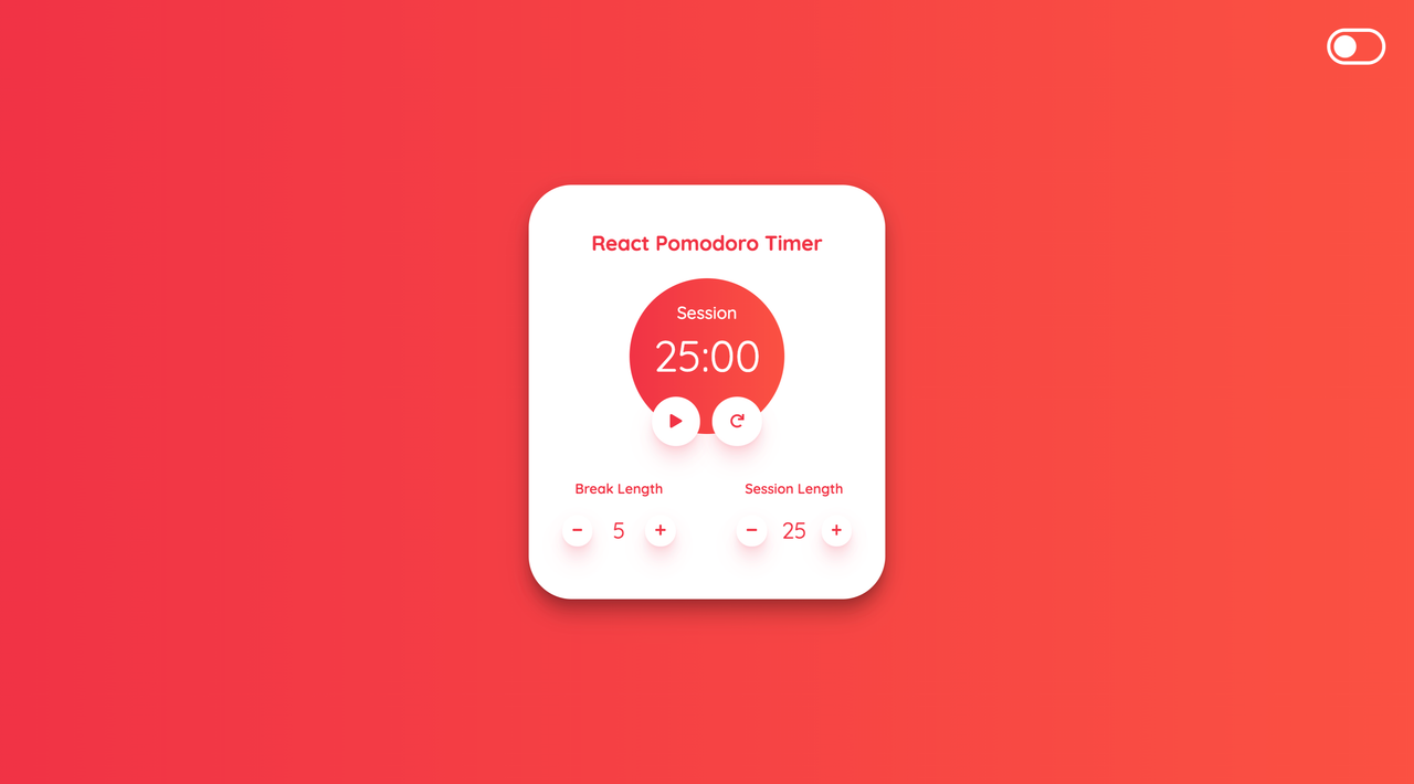
2 | # 🍅 React Pomodoro Timer 3 | > This is a very small project created with the purpose of learning the fundamentals of React.js starting from a simple [Create React App](https://github.com/facebook/create-react-app). 4 | 5 | ## 🎯 About ## 6 | 7 | I've started this project with the idea of reworking one of the ending projects of the Front End Libraries Certification (300 hours) of [FreeCodeCamp](https://www.freecodecamp.org/learn). 8 | I have structured the project with three React components and I have used some native and custom [React hooks](https://reactjs.org/docs/hooks-intro.html) in order to handle various project features and behaviours.
9 | I have also used the [Context API](https://reactjs.org/docs/context.html) in order to be able to dispatch actions and to avoid prop-drilling (or threading). I have then styled everything with a little bit of custom SASS and I have added a theme switcher in order to be able to toggle the dark mode view.
10 | You can set sessions and breaks for a maximum of 60 minutes: for each mode change you will hear an audio notification.
11 | You can even follow the counter mode & timer in your browser tab name without have the focus on that tab. 12 | 13 | ## ▶️ Demo 14 | 15 | Here you can find the demo link: 16 | 17 | - [Netlify](https://react-tomato-clock.netlify.app/) 18 | 19 | ## :sparkles: Features ## 20 | 21 | :heavy_check_mark:  Use of React hooks and custom hooks
22 | :heavy_check_mark:  Use of React Context API
23 | :heavy_check_mark:  Counter state & timer in browser tab name
24 | :heavy_check_mark:  Audio notification when timer ends
25 | :heavy_check_mark:  Theme switcher (light/dark mode)
26 | :heavy_check_mark:  Gets theme preference from local storage
27 | :heavy_check_mark:  Responsive site 28 | 29 | ## :rocket: Technologies ## 30 | 31 | - [React](https://reactjs.org/) 32 | - [React Hooks](https://reactjs.org/docs/hooks-intro.html) 33 | - [React Context API](https://reactjs.org/docs/context.html) 34 | - [SASS with vars switcher](https://sass-lang.com/) 35 | - [Netlify - Responsible for the deploy (have a look below)](https://www.netlify.com/) 36 | 37 | ## Netlify deploy & configuration ## 38 | 39 | > The site is developed with some specific https://netlify.com apis. 40 | 41 | [![Netlify Status](https://api.netlify.com/api/v1/badges/b7827e25-ac49-44f3-b209-68c7b31b4bd3/deploy-status)](https://app.netlify.com/sites/react-tomato-clock/deploys) 42 | 43 | ### Deploy configuration steps 44 | 45 | 1. Connect your GitHub account to Netlify 46 | 3. Select the project 47 | 2. In Settings → Build & Deploy → Set **Build command** to : **_npm run build_** 48 | 3. In Settings → Build & Deploy → Set **Publish directory** to : **_build_** 49 |

50 | 51 | ## :white_check_mark: Requirements ## 52 | 53 | Before starting :checkered_flag:, you need to have [Git](https://git-scm.com) and [Node](https://nodejs.org/en/) installed. 54 | 55 | ## Available Scripts 56 | 57 | In the project directory, you can run: 58 | 59 | ### `npm start` 60 | 61 | Runs the app in the development mode.\ 62 | Open [http://localhost:3000](http://localhost:3000) to view it in the browser. 63 | 64 | The page will reload if you make edits.\ 65 | You will also see any lint errors in the console. 66 | 67 | ### `npm test` 68 | 69 | Launches the test runner in the interactive watch mode.\ 70 | See the section about [running tests](https://facebook.github.io/create-react-app/docs/running-tests) for more information. 71 | 72 | ### `npm run build` 73 | 74 | Builds the app for production to the `build` folder.\ 75 | It correctly bundles React in production mode and optimizes the build for the best performance. 76 | 77 | The build is minified and the filenames include the hashes.\ 78 | Your app is ready to be deployed! 79 | 80 | See the section about [deployment](https://facebook.github.io/create-react-app/docs/deployment) for more information. 81 | 82 | ### `npm run eject` 83 | 84 | **Note: this is a one-way operation. Once you `eject`, you can’t go back!** 85 | 86 | If you aren’t satisfied with the build tool and configuration choices, you can `eject` at any time. This command will remove the single build dependency from your project. 87 | 88 | Instead, it will copy all the configuration files and the transitive dependencies (webpack, Babel, ESLint, etc) right into your project so you have full control over them. All of the commands except `eject` will still work, but they will point to the copied scripts so you can tweak them. At this point you’re on your own. 89 | 90 | You don’t have to ever use `eject`. The curated feature set is suitable for small and middle deployments, and you shouldn’t feel obligated to use this feature. However we understand that this tool wouldn’t be useful if you couldn’t customize it when you are ready for it. 91 | 92 | ## Learn More 93 | 94 | You can learn more in the [Create React App documentation](https://facebook.github.io/create-react-app/docs/getting-started). 95 | 96 | To learn React, check out the [React documentation](https://reactjs.org/). 97 | 98 | ### Code Splitting 99 | 100 | This section has moved here: [https://facebook.github.io/create-react-app/docs/code-splitting](https://facebook.github.io/create-react-app/docs/code-splitting) 101 | 102 | ### Analyzing the Bundle Size 103 | 104 | This section has moved here: [https://facebook.github.io/create-react-app/docs/analyzing-the-bundle-size](https://facebook.github.io/create-react-app/docs/analyzing-the-bundle-size) 105 | 106 | ### Making a Progressive Web App 107 | 108 | This section has moved here: [https://facebook.github.io/create-react-app/docs/making-a-progressive-web-app](https://facebook.github.io/create-react-app/docs/making-a-progressive-web-app) 109 | 110 | ### Advanced Configuration 111 | 112 | This section has moved here: [https://facebook.github.io/create-react-app/docs/advanced-configuration](https://facebook.github.io/create-react-app/docs/advanced-configuration) 113 | 114 | ### Deployment 115 | 116 | This section has moved here: [https://facebook.github.io/create-react-app/docs/deployment](https://facebook.github.io/create-react-app/docs/deployment) 117 | 118 | ### `npm run build` fails to minify 119 | 120 | This section has moved here: [https://facebook.github.io/create-react-app/docs/troubleshooting#npm-run-build-fails-to-minify](https://facebook.github.io/create-react-app/docs/troubleshooting#npm-run-build-fails-to-minify) 121 | -------------------------------------------------------------------------------- /package.json: -------------------------------------------------------------------------------- 1 | { 2 | "name": "react-pomodoro-clock", 3 | "version": "0.1.0", 4 | "private": true, 5 | "dependencies": { 6 | "@fortawesome/fontawesome-svg-core": "^1.2.32", 7 | "@fortawesome/free-solid-svg-icons": "^5.15.1", 8 | "@fortawesome/react-fontawesome": "^0.1.14", 9 | "@testing-library/jest-dom": "^5.11.6", 10 | "@testing-library/react": "^11.2.2", 11 | "@testing-library/user-event": "^12.6.0", 12 | "node-sass": "^4.14.1", 13 | "react": "^17.0.1", 14 | "react-dom": "^17.0.1", 15 | "react-scripts": "4.0.1", 16 | "web-vitals": "^0.2.4" 17 | }, 18 | "scripts": { 19 | "start": "react-scripts start", 20 | "build": "react-scripts build", 21 | "test": "react-scripts test", 22 | "eject": "react-scripts eject" 23 | }, 24 | "eslintConfig": { 25 | "extends": [ 26 | "react-app", 27 | "react-app/jest" 28 | ] 29 | }, 30 | "browserslist": { 31 | "production": [ 32 | ">0.2%", 33 | "not dead", 34 | "not op_mini all" 35 | ], 36 | "development": [ 37 | "last 1 chrome version", 38 | "last 1 firefox version", 39 | "last 1 safari version" 40 | ] 41 | }, 42 | "guppy": { 43 | "id": "a01ae020-9210-11eb-a526-bffe0af5e401", 44 | "name": "react-pomodoro-clock", 45 | "type": "create-react-app", 46 | "color": "#AA00FF", 47 | "icon": null, 48 | "createdAt": 1617188566822 49 | } 50 | } 51 | -------------------------------------------------------------------------------- /public/favicon.ico: -------------------------------------------------------------------------------- https://raw.githubusercontent.com/Th3Wall/react-pomodoro-clock/e1c39063a61f94e772f535414cc3e0efb723d65a/public/favicon.ico -------------------------------------------------------------------------------- /public/index.html: -------------------------------------------------------------------------------- 1 | 2 | 3 | 4 | 5 | 6 | 7 | 8 | 9 | 10 | 11 | 12 | 13 | 14 | 15 | React Pomodoro Timer 16 | 17 | 18 | 19 |
20 | 21 | 22 | -------------------------------------------------------------------------------- /public/logo192.png: -------------------------------------------------------------------------------- https://raw.githubusercontent.com/Th3Wall/react-pomodoro-clock/e1c39063a61f94e772f535414cc3e0efb723d65a/public/logo192.png -------------------------------------------------------------------------------- /public/logo512.png: -------------------------------------------------------------------------------- https://raw.githubusercontent.com/Th3Wall/react-pomodoro-clock/e1c39063a61f94e772f535414cc3e0efb723d65a/public/logo512.png -------------------------------------------------------------------------------- /public/manifest.json: -------------------------------------------------------------------------------- 1 | { 2 | "short_name": "React App", 3 | "name": "Create React App Sample", 4 | "icons": [ 5 | { 6 | "src": "favicon.ico", 7 | "sizes": "64x64 32x32 24x24 16x16", 8 | "type": "image/x-icon" 9 | }, 10 | { 11 | "src": "logo192.png", 12 | "type": "image/png", 13 | "sizes": "192x192" 14 | }, 15 | { 16 | "src": "logo512.png", 17 | "type": "image/png", 18 | "sizes": "512x512" 19 | } 20 | ], 21 | "start_url": ".", 22 | "display": "standalone", 23 | "theme_color": "#000000", 24 | "background_color": "#ffffff" 25 | } 26 | -------------------------------------------------------------------------------- /public/react_pomodoro_timer.png: -------------------------------------------------------------------------------- https://raw.githubusercontent.com/Th3Wall/react-pomodoro-clock/e1c39063a61f94e772f535414cc3e0efb723d65a/public/react_pomodoro_timer.png -------------------------------------------------------------------------------- /public/robots.txt: -------------------------------------------------------------------------------- 1 | # https://www.robotstxt.org/robotstxt.html 2 | User-agent: * 3 | Disallow: 4 | -------------------------------------------------------------------------------- /src/Timer.js: -------------------------------------------------------------------------------- 1 | import './timer.sass'; 2 | import Break from './components/Break/Break' 3 | import Session from './components/Session/Session' 4 | import Controls from './components/Controls/Controls' 5 | import ThemeToggle from './components/ThemeToggle/ThemeToggle'; 6 | import { useStateValue } from './contexts/stateProvider'; 7 | import { useClockify } from './hooks/useClockify'; 8 | 9 | const Timer = () => { 10 | 11 | const [{projectName, timerLabel}] = useStateValue(); 12 | const clockifiedValue = useClockify(); 13 | 14 | return ( 15 |
16 |

{projectName}

17 |

{timerLabel}

18 |

{clockifiedValue}

19 | 20 |
21 | 22 | 23 |
24 | 25 |
26 | ); 27 | } 28 | 29 | export default Timer; 30 | -------------------------------------------------------------------------------- /src/_variables.sass: -------------------------------------------------------------------------------- 1 | $main-font: 'Quicksand', sans-serif 2 | 3 | $white: #ffffff 4 | $black: #000000 5 | $bg-color: #282c34 6 | $box-shadow-color: #f133450c 7 | $dark-box-shadow-color: #7b757517 8 | $timercircle-dark-box-shadow-color: #ffffff33 9 | $gradient-stop-1: #F13346 10 | $gradient-stop-2: #FB5143 11 | $dark-gradient-stop-1: #232526 12 | $dark-gradient-stop-2: #414345 -------------------------------------------------------------------------------- /src/components/Break/Break.jsx: -------------------------------------------------------------------------------- 1 | import './break.sass' 2 | import { FontAwesomeIcon } from '@fortawesome/react-fontawesome' 3 | import { faMinus, faPlus } from '@fortawesome/free-solid-svg-icons' 4 | import { useStateValue } from '../../contexts/stateProvider' 5 | import { actionTypes } from '../../reducer' 6 | 7 | const Break = () => { 8 | 9 | const [{breakValue, busyIndicator}] = useStateValue(); 10 | const [state, dispatch] = useStateValue(); 11 | 12 | const handleDecrement = () => { 13 | dispatch({ 14 | ...state, 15 | type: actionTypes.DECREASE_BREAK_VALUE, 16 | breakValue: breakValue - 1 17 | }) 18 | } 19 | const handleIncrement = () => { 20 | dispatch({ 21 | ...state, 22 | type: actionTypes.INCREASE_BREAK_VALUE, 23 | breakValue: breakValue + 1 24 | }) 25 | } 26 | 27 | return ( 28 |
29 | Break Length 30 |
31 | 40 |

{breakValue}

41 | 50 |
51 |
52 | ) 53 | } 54 | 55 | export default Break; 56 | -------------------------------------------------------------------------------- /src/components/Break/break.sass: -------------------------------------------------------------------------------- 1 | @import '../../_variables' 2 | 3 | .break 4 | display: flex 5 | flex-direction: column 6 | align-items: center 7 | 8 | &__controls 9 | display: flex 10 | justify-content: space-between 11 | align-items: center 12 | text-align: center 13 | 14 | &__length 15 | font-size: 26px 16 | line-height: 1 17 | font-weight: 400 18 | padding: 0 0.4em 19 | min-width: 27px 20 | 21 | &__label 22 | font-weight: 600 -------------------------------------------------------------------------------- /src/components/Controls/Controls.jsx: -------------------------------------------------------------------------------- 1 | import './controls.sass' 2 | import { useEffect, useRef } from 'react'; 3 | import { useClockify } from '../../hooks/useClockify'; 4 | import { FontAwesomeIcon } from '@fortawesome/react-fontawesome' 5 | import { faPlay, faPause, faRedo } from '@fortawesome/free-solid-svg-icons' 6 | import { useStateValue } from '../../contexts/stateProvider'; 7 | import { actionTypes } from '../../reducer'; 8 | 9 | const Controls = () => { 10 | 11 | const [{projectName, timerValue, breakValue, sessionValue, timerLabel, busyIndicator}] = useStateValue(); 12 | const [state, dispatch] = useStateValue(); 13 | // Custom Hook 14 | const clockifiedValue = useClockify(); 15 | const bellSoundUrl = "https://www.soundjay.com/misc/sounds/bell-ringing-05.mp3"; 16 | const audioSoundRef = useRef(); 17 | 18 | const handleReset = () => { 19 | dispatch({ 20 | ...state, 21 | type: actionTypes.RESET_TIMERS 22 | }) 23 | audioSoundRef.current.pause(); 24 | audioSoundRef.current.time = 0; 25 | } 26 | 27 | const handlePlayPause = () => { 28 | dispatch({ 29 | ...state, 30 | type: actionTypes.TOGGLE_ISBUSY_INDICATOR, 31 | busyIndicator: !state.busyIndicator 32 | }) 33 | } 34 | 35 | const handleCount = () => { 36 | dispatch({ 37 | ...state, 38 | type: actionTypes.START_TIMER, 39 | timerValue: timerValue - 1 40 | }) 41 | if (timerValue === 0) audioSoundRef.current.play(); 42 | if (timerValue < 0) { 43 | if (timerLabel === 'Session') { 44 | dispatch({ 45 | ...state, 46 | type: actionTypes.TOGGLE_TIMER_LABEL, 47 | timerLabel: 'Break' 48 | }) 49 | dispatch({ 50 | ...state, 51 | type: actionTypes.START_TIMER, 52 | timerValue: (breakValue * 60) - 1 53 | }) 54 | } else { 55 | dispatch({ 56 | ...state, 57 | type: actionTypes.TOGGLE_TIMER_LABEL, 58 | timerLabel: 'Session' 59 | }) 60 | dispatch({ 61 | ...state, 62 | type: actionTypes.START_TIMER, 63 | timerValue: (sessionValue * 60) - 1 64 | }) 65 | } 66 | } 67 | } 68 | 69 | useEffect(() => { 70 | if (busyIndicator) { 71 | let timerInterval = setInterval(() => { 72 | handleCount(); 73 | document.title = `[${timerLabel}] - ${clockifiedValue}` 74 | }, 1000); 75 | // Clear interval if the component is unmounted 76 | return () => clearInterval(timerInterval); 77 | } else document.title = projectName; 78 | }) 79 | 80 | return ( 81 |
82 | 87 | 92 |
94 | ) 95 | } 96 | 97 | export default Controls; 98 | -------------------------------------------------------------------------------- /src/components/Controls/controls.sass: -------------------------------------------------------------------------------- 1 | @import '../../_variables' 2 | 3 | .controls 4 | &__wrp 5 | display: flex 6 | justify-content: space-between 7 | align-items: center 8 | margin-bottom: 2em 9 | z-index: 3 10 | 11 | button 12 | padding: 1.5em 1.6em 13 | 14 | svg 15 | font-size: 1.2em -------------------------------------------------------------------------------- /src/components/Credits/Credits.jsx: -------------------------------------------------------------------------------- 1 | import './credits.sass'; 2 | import { useStateValue } from "../../contexts/stateProvider"; 3 | 4 | const Credits = () => { 5 | 6 | const [{githubProfileUrl, githubUsername}] = useStateValue(); 7 | 8 | return ( 9 |
10 | Developed with ❤️ by  11 | 12 | {githubUsername} 13 | 14 |
15 | ) 16 | } 17 | 18 | export default Credits 19 | -------------------------------------------------------------------------------- /src/components/Credits/credits.sass: -------------------------------------------------------------------------------- 1 | @import '../../_variables' 2 | 3 | .credits 4 | &__block 5 | margin: 0 auto 6 | margin-top: 20px 7 | padding: 0 8 | text-align: center 9 | 10 | &__link 11 | color: $white 12 | font-weight: 700 -------------------------------------------------------------------------------- /src/components/Session/Session.jsx: -------------------------------------------------------------------------------- 1 | import './session.sass' 2 | import { FontAwesomeIcon } from '@fortawesome/react-fontawesome' 3 | import { faMinus, faPlus } from '@fortawesome/free-solid-svg-icons' 4 | import { useStateValue } from '../../contexts/stateProvider'; 5 | import { actionTypes } from '../../reducer'; 6 | 7 | const Session = () => { 8 | 9 | const [{sessionValue, busyIndicator}] = useStateValue(); 10 | const [state, dispatch] = useStateValue(); 11 | 12 | const handleDecrement = () => { 13 | dispatch({ 14 | ...state, 15 | type: actionTypes.DECREASE_SESSION_VALUE, 16 | sessionValue: sessionValue - 1, 17 | timerValue: (sessionValue - 1) * 60 18 | }) 19 | } 20 | const handleIncrement = () => { 21 | dispatch({ 22 | ...state, 23 | type: actionTypes.INCREASE_SESSION_VALUE, 24 | sessionValue: sessionValue + 1, 25 | timerValue: (sessionValue + 1) * 60 26 | }) 27 | } 28 | 29 | return ( 30 |
31 | Session Length 32 |
33 | 42 |

{sessionValue}

43 | 52 |
53 |
54 | ) 55 | } 56 | 57 | export default Session; 58 | -------------------------------------------------------------------------------- /src/components/Session/session.sass: -------------------------------------------------------------------------------- 1 | @import '../../_variables' 2 | 3 | .session 4 | display: flex 5 | flex-direction: column 6 | align-items: center 7 | 8 | &__controls 9 | display: flex 10 | justify-content: space-between 11 | align-items: center 12 | text-align: center 13 | 14 | &__length 15 | font-size: 26px 16 | line-height: 1 17 | font-weight: 400 18 | padding: 0 0.4em 19 | min-width: 27px 20 | 21 | &__label 22 | font-weight: 600 -------------------------------------------------------------------------------- /src/components/ThemeToggle/ThemeToggle.jsx: -------------------------------------------------------------------------------- 1 | import './themeToggle.sass' 2 | import { useState, useEffect } from 'react'; 3 | 4 | const ThemeToggle = () => { 5 | 6 | const getDefaultTheme = () => { 7 | const selectedTheme = localStorage.getItem('theme'); 8 | localStorage.setItem("theme", selectedTheme || "light"); 9 | return selectedTheme || 'light' 10 | } 11 | 12 | const [checked, setChecked] = useState(localStorage.getItem("theme") === "dark" ? true : false); 13 | useEffect(() => { 14 | document 15 | .getElementsByTagName("HTML")[0] 16 | .setAttribute("data-theme", getDefaultTheme()); 17 | }, []); 18 | 19 | const toggleThemeChange = () => { 20 | if (checked === false) { 21 | localStorage.setItem("theme", "dark"); 22 | document 23 | .getElementsByTagName("HTML")[0] 24 | .setAttribute("data-theme", localStorage.getItem("theme")); 25 | setChecked(true); 26 | } else { 27 | localStorage.setItem("theme", "light"); 28 | document 29 | .getElementsByTagName("HTML")[0] 30 | .setAttribute("data-theme", localStorage.getItem("theme")); 31 | setChecked(false); 32 | } 33 | } 34 | 35 | return ( 36 | 44 | ) 45 | } 46 | 47 | export default ThemeToggle; -------------------------------------------------------------------------------- /src/components/ThemeToggle/themeToggle.sass: -------------------------------------------------------------------------------- 1 | @import '../../_variables' 2 | 3 | .theme-toggler 4 | position: absolute 5 | top: 5vw 6 | right: 5vw 7 | display: inline-block 8 | width: 60px 9 | height: 34px 10 | border: 4px solid white 11 | border-radius: 34px 12 | 13 | input 14 | opacity: 0 15 | width: 0 16 | height: 0 17 | 18 | &:checked + .theme-toggler__slider 19 | background-color: var(--background-gradient-stop-2) 20 | 21 | &:checked + .theme-toggler__slider:before 22 | transform: translateX(26px) 23 | 24 | &:focus + .theme-toggler__slider 25 | box-shadow: 0 0 1px var(--background-gradient-stop-2) 26 | 27 | &__slider 28 | position: absolute 29 | cursor: pointer 30 | top: 0 31 | left: 0 32 | right: 0 33 | bottom: 0 34 | background-color: var(--background-gradient-stop-2) 35 | transition: 0.4s 36 | 37 | &:before 38 | position: absolute 39 | content: "" 40 | height: 26px 41 | width: 26px 42 | left: 4px 43 | bottom: 4px 44 | background-color: $white 45 | transition: 0.4s 46 | 47 | &.round 48 | border-radius: 34px 49 | 50 | &:before 51 | border-radius: 50% 52 | 53 | @media screen and (min-width: 1024px) 54 | .theme-toggler 55 | top: 2vw 56 | right: 2vw -------------------------------------------------------------------------------- /src/contexts/stateProvider.js: -------------------------------------------------------------------------------- 1 | import { createContext, useContext, useReducer } from 'react'; 2 | 3 | export const StateContext = createContext(); 4 | 5 | export const StateProvider = ({ reducer, initialState, children }) => ( 6 | 7 | {children} 8 | 9 | ); 10 | 11 | export const useStateValue = () => useContext(StateContext); -------------------------------------------------------------------------------- /src/contexts/themeProvider.js: -------------------------------------------------------------------------------- 1 | import { createContext, useContext, useState } from "react"; 2 | 3 | const ThemeContext = createContext(); 4 | const ThemeUpdateContext = createContext(); 5 | 6 | export const useTheme = () => { 7 | return useContext(ThemeContext); 8 | } 9 | 10 | export const useThemeUpdate = () => { 11 | return useContext(ThemeUpdateContext); 12 | } 13 | 14 | const ThemeProvider = ({ children }) => { 15 | const [darkTheme, setDarkTheme] = useState(false); 16 | 17 | const toggleTheme = () => { 18 | setDarkTheme((prevDarkTheme) => !prevDarkTheme); 19 | }; 20 | 21 | return ( 22 | 23 | 24 | {children} 25 | 26 | 27 | ); 28 | }; 29 | 30 | export default ThemeProvider; -------------------------------------------------------------------------------- /src/hooks/useClockify.jsx: -------------------------------------------------------------------------------- 1 | import { useStateValue } from '../contexts/stateProvider'; 2 | 3 | export function useClockify() { 4 | const [{timerValue}] = useStateValue(); 5 | 6 | let minutes = Math.floor(timerValue / 60); 7 | let seconds = timerValue - (minutes * 60); 8 | minutes = minutes < 10 ? '0' + minutes : minutes; 9 | seconds = seconds < 10 ? '0' + seconds : seconds; 10 | return `${minutes}:${seconds}`; 11 | } -------------------------------------------------------------------------------- /src/index.js: -------------------------------------------------------------------------------- 1 | import React from 'react'; 2 | import ReactDOM from 'react-dom'; 3 | import './_variables.sass'; 4 | import './index.sass'; 5 | import Timer from './Timer'; 6 | import { StateProvider } from "./contexts/stateProvider"; 7 | import reducer, { initialState } from "./reducer"; 8 | import ThemeProvider from './contexts/themeProvider'; 9 | import Credits from './components/Credits/Credits'; 10 | 11 | ReactDOM.render( 12 | 13 | 14 | 15 | 16 | 17 | 18 | 19 | , 20 | document.getElementById('root') 21 | ); -------------------------------------------------------------------------------- /src/index.sass: -------------------------------------------------------------------------------- 1 | @import './_variables' 2 | @import url('https://fonts.googleapis.com/css2?family=Quicksand:wght@300;400;500;600;700&display=swap') 3 | 4 | root 5 | --text: #{$gradient-stop-1} 6 | --box-shadow-color: #{$box-shadow-color} 7 | --timer-background-color: #{$white} 8 | --button-background-color: #{$white} 9 | --button-color: #{$gradient-stop-1} 10 | --background-gradient-stop-1: #{$gradient-stop-1} 11 | --background-gradient-stop-2: #{$gradient-stop-2} 12 | --timercircle-dark-box-shadow-color: #{$timercircle-dark-box-shadow-color} 13 | 14 | [data-theme='light'] 15 | --background-gradient-stop-1: #{$gradient-stop-1} 16 | --background-gradient-stop-2: #{$gradient-stop-2} 17 | --timer-background-color: #{$white} 18 | --button-background-color: #{$white} 19 | --button-color: #{$gradient-stop-1} 20 | --text: #{$gradient-stop-1} 21 | --box-shadow-color: #{$box-shadow-color} 22 | 23 | [data-theme='dark'] 24 | --background-gradient-stop-1: #{$dark-gradient-stop-1} 25 | --background-gradient-stop-2: #{$dark-gradient-stop-2} 26 | --timer-background-color: #{$dark-gradient-stop-2} 27 | --button-background-color: #{$dark-gradient-stop-2} 28 | --button-color: #{$white} 29 | --text: #{$white} 30 | --box-shadow-color: #{$dark-box-shadow-color} 31 | --timercircle-dark-box-shadow-color: #{$timercircle-dark-box-shadow-color} 32 | 33 | body 34 | margin: 0 35 | padding: 0 36 | font-family: $main-font 37 | background: linear-gradient(90deg, var(--background-gradient-stop-1) 0%, var(--background-gradient-stop-2) 100%) 38 | min-height: 100vh 39 | display: flex 40 | flex-direction: column 41 | align-items: center 42 | justify-content: center 43 | color: $white 44 | 45 | button 46 | appearance: none 47 | box-shadow: none 48 | background: transparent 49 | border: 0 50 | outline: 0 51 | padding: 0.8em 0.9em 52 | margin: 0.5em 53 | border-radius: 50% 54 | background-color: var(--button-background-color) 55 | color: var(--button-color) 56 | box-shadow: 0 2.8px 2.2px var(--box-shadow-color), 0 6.7px 5.3px var(--box-shadow-color), 0 12.5px 10px var(--box-shadow-color), 0 22.3px 17.9px var(--box-shadow-color), -2px 17px 33.4px var(--box-shadow-color), 1px 7px 20px 2px var(--box-shadow-color) 57 | transition: all 0.1s ease-in-out 58 | 59 | &:hover 60 | cursor: pointer 61 | transform: scale(1.1) 62 | 63 | &:disabled 64 | opacity: 0.6 65 | pointer-events: none 66 | box-shadow: none 67 | 68 | svg 69 | color: grey 70 | 71 | svg 72 | pointer-events: none 73 | -------------------------------------------------------------------------------- /src/reducer.js: -------------------------------------------------------------------------------- 1 | export const initialState = { 2 | projectName: 'React Pomodoro Timer', 3 | githubUsername: 'Th3Wall', 4 | githubProfileUrl: 'https://github.com/Th3Wall', 5 | timerLabel: 'Session', 6 | busyIndicator: false, 7 | breakValue: 5, 8 | sessionValue: 25, 9 | // timerValue is the initial value of 25 minnutes multiplied by 60 in order to have it in seconds much more easily decreasable by 1 10 | timerValue: 1500 11 | } 12 | 13 | export const actionTypes = { 14 | SET_PROJECTNAME: 'SET_PROJECTNAME', 15 | RESET_TIMERS: 'RESET_TIMERS', 16 | START_TIMER: 'START_TIMER', 17 | TOGGLE_TIMER_LABEL: 'TOGGLE_TIMER_LABEL', 18 | TOGGLE_ISBUSY_INDICATOR: 'TOGGLE_ISBUSY_INDICATOR', 19 | INCREASE_BREAK_VALUE: 'INCREASE_BREAK_VALUE', 20 | DECREASE_BREAK_VALUE: 'DECREASE_BREAK_VALUE', 21 | INCREASE_SESSION_VALUE: 'INCREASE_SESSION_VALUE', 22 | DECREASE_SESSION_VALUE: 'DECREASE_SESSION_VALUE' 23 | } 24 | 25 | const reducer = (state = initialState, action) => { 26 | switch (action.type) { 27 | case actionTypes.SET_PROJECTNAME: 28 | return { 29 | ...state, 30 | projectName: action.projectName, 31 | timerLabel: action.timerLabel 32 | }; 33 | case actionTypes.INCREASE_BREAK_VALUE: 34 | return { 35 | ...state, 36 | breakValue: action.breakValue 37 | }; 38 | case actionTypes.DECREASE_BREAK_VALUE: 39 | return { 40 | ...state, 41 | breakValue: action.breakValue 42 | }; 43 | case actionTypes.INCREASE_SESSION_VALUE: 44 | return { 45 | ...state, 46 | sessionValue: action.sessionValue, 47 | timerValue: action.timerValue 48 | }; 49 | case actionTypes.DECREASE_SESSION_VALUE: 50 | return { 51 | ...state, 52 | sessionValue: action.sessionValue, 53 | timerValue: action.timerValue 54 | }; 55 | case actionTypes.TOGGLE_ISBUSY_INDICATOR: 56 | return { 57 | ...state, 58 | busyIndicator: action.busyIndicator 59 | }; 60 | case actionTypes.TOGGLE_TIMER_LABEL: 61 | return { 62 | ...state, 63 | timerLabel: action.timerLabel 64 | }; 65 | case actionTypes.START_TIMER: 66 | return { 67 | ...state, 68 | timerValue: action.timerValue 69 | }; 70 | case actionTypes.RESET_TIMERS: 71 | return initialState; 72 | default: 73 | return state; 74 | } 75 | } 76 | 77 | export default reducer; -------------------------------------------------------------------------------- /src/timer.sass: -------------------------------------------------------------------------------- 1 | @import './_variables' 2 | 3 | .timer 4 | display: flex 5 | flex-direction: column 6 | align-items: center 7 | justify-content: center 8 | min-width: 350px 9 | background-color: var(--timer-background-color) 10 | color: var(--text) 11 | padding: 2.5em 2em 12 | border-radius: 50px 13 | box-shadow: 0 2.8px 2.2px rgba(0, 0, 0, 0.034), 0 6.7px 5.3px rgba(0, 0, 0, 0.048), 0 12.5px 10px rgba(0, 0, 0, 0.06), 0 22.3px 17.9px rgba(0, 0, 0, 0.072), -2px 17px 33.4px rgba(0, 0, 0, 0.086), 1px 7px 20px 2px rgba(0, 0, 0, 0.12) 14 | 15 | &__label 16 | z-index: 3 17 | color: $white 18 | font-weight: 500 19 | font-size: 20px 20 | margin-bottom: 15px 21 | line-height: 1 22 | position: relative 23 | 24 | &__time 25 | margin: 0 26 | margin-bottom: 0.3em 27 | font-size: 50px 28 | line-height: 1 29 | font-weight: 400 30 | position: relative 31 | z-index: 1 32 | color: $white 33 | 34 | &::after 35 | content: '' 36 | background: linear-gradient(90deg, var(--background-gradient-stop-1) 0%, var(--background-gradient-stop-2) 100%) 37 | width: 180px 38 | height: 180px 39 | border-radius: 50% 40 | display: block 41 | position: absolute 42 | top: 50% 43 | left: 50% 44 | transform: translate(-50%, -50%) 45 | z-index: -1 46 | 47 | &__controllers 48 | display: flex 49 | align-items: center 50 | justify-content: space-between 51 | width: 100% 52 | 53 | &__maintitle 54 | margin-top: 0.5em 55 | margin-bottom: 1.5em 56 | 57 | [data-theme='dark'] 58 | .timer 59 | &__time 60 | &::after 61 | box-shadow: -1px 1px 24px 2px var(--timercircle-dark-box-shadow-color) 62 | 63 | @media screen and (max-width: 450px) 64 | .timer 65 | width: auto 66 | min-width: unset 67 | margin: 0 auto 68 | padding: 2em 1.5em --------------------------------------------------------------------------------