My name is James Guo. My major is Computer Science. Currently I am a senior undergraduate student.
12 |
I love programming. I signed up for this course to learn more about design.
13 |
I have taken the CSE 204A and I know HTML/CSS/JS pretty well.
14 |
Learn more concepts about design.
15 |
There are interactive parts on computer screens like buttons and input boxes that don't exist on paper.
16 |
Apple. This website implemented a good color choice and very concise.
17 |
WUSTL.edu. This website clearly shows the categories on the navigation bar.
18 |
foundations2021fall.wudesign.me. I was impressed by the names on this page. This web page can dynamically loads the student homework to see if they have already submit it or not.
There is an img element at the beginning of this paragraph of text. Because img tags are inline elements by default, it is making the first line of the paragraph very tall. However, css provides a way to make text flow around the image. We do this with the float property.
18 |
19 |
The float property is applied to the element around which we want text to wrap. It may seem a bit counter-intutive, but in your HTML code, the floated element must come before the text that wraps around it, just like this document. We can float: left; or float: right;, but sadly, we cannot float: center;
20 |
21 |
We can use margin on the floated element to control white-space around it, "pushing away" the text that gets too close.
22 |
23 |
24 |
Create a stylesheet and link it to this document.
25 |
Select the portrait class, and add the rule float: left;
26 |
Set a margin value for the portrait such that it has 2rem breathing-room to the right and bottom, but 0 top and left.
27 |
28 |
29 |
Let's duplicate the img tag above, and place a copy of it at the beginning of this paragraph.
30 |
31 |
32 |
Copy the img tag as indicated. No need to style — it will pick up the same styles as the first img because it has the same class applied.
33 |
34 |
35 |
See how the Instructions block also floated around the image? Floating an element doesn't only make text wrap... it makes everything that follows the element wrap, until the element is no longer in the way. But what if we don't want that? What if we want to make sure the instructions always 'get past' the floated item, no matter what?
36 |
37 |
38 |
Make a selector for .instructions, and add the rule clear: both;
39 |
40 |
41 |
We use the clear property to tell a subsequent element to 'clear' floated items. You can clear: left; to clear any elements that are floated left, clear: right; to clear any elements that are floated right, or clear: both; to clear all floated items regardless of the side they're on.
What could be a more perfect ending to a summertime meal than easy peach cobbler? Savor the flavors of summer with sliced fresh peaches cooking away with butter and spices. The topping can made from pantry ingredients you have on hand and peaches can easily be substituted with any fruit you have depending on the time of year. The tang of the lemon juice paired with the sweetness of the peaches is perfectly balanced with the crisp topping. Want to make dessert even better? A dollop of fresh whipped cream or cold vanilla ice cream truly makes it the perfect way to end a summer night.
12 |
13 |
14 | A cover image of this recipe
15 |
16 |
17 |
18 |
Ingredients
19 |
20 |
½ cup unsalted butter
21 |
1 cup all-purpose flour
22 |
2 cups sugar, divided
23 |
1 tablespoon baking powder
24 |
Pinch of salt
25 |
1 cup milk
26 |
4 cups fresh peach slices
27 |
1 tablespoon lemon juice
28 |
Ground cinnamon or nutmeg (optional)
29 |
30 |
31 |
32 |
Directions
33 |
Step 1
34 |
Melt butter in a 13- x 9-inch baking dish.
35 |
Step 2
36 |
Combine flour, 1 cup sugar, baking powder, and salt; add milk, stirring just until dry ingredients are moistened. Pour batter over butter (do not stir).
37 |
Step 3
38 |
Bring remaining 1 cup sugar, peach slices, and lemon juice to a boil over high heat, stirring constantly; pour over batter (do not stir). Sprinkle with cinnamon, if desired.
39 |
Step 4
40 |
Bake at 375° for 40 to 45 minutes or until golden brown. Serve cobbler warm or cool.
For each section in this document, complete the challenge as described.
16 |
17 |
18 |
19 |
Make the <body> of this document be 800px wide and90% the width of the viewport, whichever is smaller. Center the body on the page no matter how wide the viewport is.
20 |
21 |
22 |
23 |
Make the background-color of this document to #eaf6ff when the viewport width is 640px or more.
24 |
25 |
26 |
27 |
Make the <h1> on this page have a font-size of 1.5rem when the viewport width is below 500px, and 2.5rem when the viewport width is above 640px.
28 |
29 |
30 |
31 |
Turn the following list into a grid of boxes that wrap horizontally (side-by-side until they run out of room and wrap to the next line). Make each <aside>170px wide, with a 10px margin. Set the font-size for the boxes to be 0.8rem. Be sure to remove the bullets associated with the <li> tags, and remove the default padding-left on the <ul>.
32 |
33 |
34 |
35 |
36 |
37 |
38 |
39 |
40 |
41 |
42 |
43 |
44 |
45 |
46 |
47 |
48 |
49 |
As above, make a grid of boxes that wrap horizontally. This time, give each <li> a width of 100%. When the viewport width is greater than 480px, make each <li> be 50% wide. If the viewport is greater than 640px, make each <li> be 25% wide. The grid should be 1-across at small widths, 2-across at medium widths, and 4-across and large widths. Don't set a width on the <aside> elements, but be sure they have a 10px margin.
50 |
Now, set the <ul> to have a margin of -10px left and right, 1rem top and bottom. What happens?
In the mythical continent of Westeros, several powerful families fight for control of the Seven Kingdoms. As conflict erupts in the kingdoms of men, an ancient enemy rises once again to threaten them all. Meanwhile, the last heirs of a recently usurped dynasty plot to take back their homeland from across the Narrow Sea.
After being rescued from an underground bunker in which she lived the past 15 years, Kimmy Schmidt decides to move to New York to have a normal life. She makes friends with her new roommate Titus, and works as a babysitter for Jacqueline Voorhees, the wife of a billionaire with many issues. Even though many obstacles are thrown her way, Kimmy makes the best of her new life while having to adapt to the new world around her.
Make the following design changes without modifying the html in any way.Only modify your own styles.css file.The challenges are progressively more complicated, but each can be accomplished with a single selector. Some challenges will require multiple properties/value pairs.
174 |
175 |
Set the margin-bottom of the header to 3rem.
176 |
Set the line-height of all paragraphs to 1.6.
177 |
Make the font-size of the "See All..." links 0.8em, and make them uppercase.
178 |
Make the font-size of show titles 2.5rem.
179 |
Make the section-titles uppercase, and font-size 1rem.
180 |
Make all title fonts light weight.
181 |
Make the cast images width:100%;.
182 |
Make each castmember element width:25%;. (The element that represents the whole castmember in the list, not just the image.)
183 |
Add a 1px solid black border above each show — without unintentionally adding borders elsewhere.
184 |
Make the navigation tab with the .selected class be bold and black.
185 |
Make the castmember labels 0.8rem.
186 |
Make the actor/actress names bold.
187 |
Make the character names italic.
188 |
Add an asterisk (*) to the last year in the Game of Thrones seasons list.
189 |
Add the text "* Final Season" on the next line after the Game of Thrones season list. Make it 0.7rem, and color it to be #999.
Every element on the page implements the HTML box model, which is the system by which a browser determines the white-space within and around the element. You can think of each element as being an onion, which has a core — the content-box — surrounded by three layers: the padding-box, which is contained by the border-box, which is in turn surrounded by the margin-box.
22 |
23 |
The Chrome Inspector provides a helpful diagram whenever you have an element selected, showing the dimensions of each of these boxes. Let's style .box-layers to demonstrate.
24 |
25 |
26 |
27 |
28 |
Create a css folder and stylesheet, and link it to this document.
29 |
Select the 'box-layers' div above, and add background-color: #eeeeee;.
30 |
31 |
32 |
There is now a light gray box showing immediately behind the paragraphs above. Note that the box is defined by the actual dimensions of the content (the words), and it grows to contain them as needed. This is the content-box.
33 |
34 |
35 |
Add padding: 2rem; to your .box-layers selector.
36 |
37 |
38 |
We can now see that the box has padding between it's 'edge' and the actual content. The content-box itself is still immediately around the content, but there is a new layer surrounding it, the padding-box. Try inspecting in Chrome. Click on the div class="box-layers" element in the document outline,then hover over the word 'padding' the inspector's box-model diagram. You should see a green highlight on the rendered page indicating the element's padding-box. Note that the content-box shrunk to make room for the padding box.
39 |
40 |
41 |
Add border: 10px solid #dddddd; to your .box-layers selector.
42 |
43 |
44 |
We've just added a border, which creates a new layer for the element, the border-box. Inspecting in chrome should highlight the border in yellow. Note that padding and content shrunk again to make room for the border.
45 |
46 |
47 |
Add margin: 4rem; to your .box-layers selector.
48 |
49 |
50 |
This adds the margin-box to the element. In the inspector, we can see the margin as an orange layer. Note once again that the inner layers shrunk to make room for the margin. Also note that the background-color we assigned does not extend into the margin. Margin defines the space 'between' this element and the elements around it.
51 |
52 |
53 |
54 |
55 |
56 |
CSS shorthand for box-model properties
57 |
58 |
We added margin to the box above, but it added it all the way around. What if we only wanted to add space above and below, but not left and right?
59 |
60 |
61 |
Change your margin rule to margin: 4rem 0;
62 |
63 |
64 |
We've just used css to provide two values for margin. The first (4rem) is the vertical margin, the second (0) is the horizontal margin. This same shorthand works with padding.
65 |
66 |
Similarly, if we provide four values, the browser will apply them to the element clockwise from the top (top right bottom left).
67 |
68 |
69 |
Change your padding rule to padding: 2rem 1rem 4rem 1rem;
70 |
71 |
72 |
Additionally, there are css properties (border-top, border-right, padding-bottom, margin-left, etc.) to control each side of the box individually.
73 |
74 |
75 |
Replace your border rule with border-top: 10px solid #dddddd;
76 |
77 |
78 |
Finally, note that the border property is itself a shorthand for three individual properies: border-width, border-style, and border-color.
79 |
80 |
81 |
82 |
83 |
84 |
Margin collapse
85 |
86 |
Consider the paragraphs in this section. There is vertical space between paragraphs, defined by margin.
87 |
88 |
You might control that margin with a style rule like p { margin: 1em 0; }. You might expect such a rule to create a 1em margin above each paragraph and 1em below, making a total space between paragraphs of 2em.
89 |
90 |
In fact, the space between two adjacent paragraphs remains only 1em. The reason is this: when two adjacent boxes both define a margin for the space between, the larger of the two values 'wins' and the other value is ignored.
91 |
92 |
Another quirk of margin-collapse is that margin can spill out of a parent container. Inspect the h2 tag below, which is contained within a div. If you inspect these elements and hover over them in the document outline, you'll find that the div is nestled tightly around the title, but the title's margin is spilling out past the div. This allows us to wrap a semantic element like a section around a block of text without having an unexpected style side effect.
93 |
94 |
95 |
Margin spiller!
96 |
97 |
98 |
However, watch what happens if we add a border to the div!
99 |
100 |
101 |
Create a style rule for .h2-wrapper that sets border: 1px solid black;
102 |
103 |
104 |
If you inspect the h2 now, you'll see it's margin is contained entirely within the div. Adding a border on the parent container cancels the margin-collapse behavior. Adding padding does the same thing.
105 |
106 |
107 |
108 |
109 |
110 |
The box-sizing property
111 |
112 |
A block-level element normally expands to fill the width of it's parent — in this case, the page. We saw earlier that when we added padding, border, and margin to an element, that element "shrunk" to make room for the added layers, and the outer-most layer remained the full width of the page. This behavior is a little bit magical... the browser just assumes we want to keep the overall element within its parent, and adjusts accordingly. Let's see that happen again.
We've wrapped this box with some padding and borders, and it has shrunk the content-box to make room accordingly. But what happens if we explicitly set the width of this element ourselves?
126 |
127 |
128 |
129 |
Add width: 100%; to the ruleset above.
130 |
131 |
132 |
WTF? The box got wider and is now spilling out of the normal page column to the right! We set it to 100% width, which is the default behavior for a block-level element anyway... so what gives?
133 |
134 |
It turns out that by default, setting the width property tells the browser to make the content-box that width. The browser basically says "Oh, you are controlling width of the content box now? No problem, I'll just add these other layers outside now, instead of shrinking the content box to make room for them." The net effect is that by setting width, we can inadvertently make things 'spill out' to the right. This can cause very annoying problems with unintentional horizontal scrolling on the page.
135 |
136 |
There is, however, a solution: the box-sizing property.
137 |
138 |
139 |
Add box-sizing: border-box; to the ruleset.
140 |
141 |
142 |
The box has shrunk down again, and it's edge is realigned with the document edge. The reason is this: box-sizing: border-box; tells the browser that when we set a width, we're talking about the width of the box measured at the outer-edge of it's border-box, not the edge of the content-box. So, the browser applies our width instruction at the border, and shrinks the padding and content boxes as needed to make them fit. Happy alignment once again!
143 |
144 |
145 |
146 |
147 |
148 |
width, height, and overflow
149 |
150 |
As you have deduced from the preceeding section, width and height are settable properties. Let's set width to 50% on the box below.
151 |
152 |
153 |
Create a ruleset for .overflow-example.
154 |
Set width: 50%;
155 |
156 |
157 |
158 |
Lorem ipsum dolor sit amet, consectetur adipiscing elit. Etiam nec scelerisque leo. Duis pellentesque sit amet elit ultricies tincidunt. Proin viverra tempus enim, et tempor quam pulvinar a. Integer interdum at mi id luctus. Aenean fringilla mauris quis sapien pretium, at aliquet diam consectetur. Maecenas non nibh malesuada, feugiat turpis ultrices, lobortis leo. Nam semper bibendum quam, vel pulvinar metus ultricies ut. Fusce aliquam porttitor massa non aliquam. Curabitur tristique tortor quis lacus blandit aliquam. Praesent vel malesuada dolor, ac luctus metus. Nullam vulputate nisl vulputate enim volutpat elementum.
159 |
160 |
161 |
The width of the box shrunk, and the box got taller to accomodate the text within, right? Height of a block-level element will automatically adjust to contain it's contents... until we tell it differently.
162 |
163 |
164 |
Set height: 300px; on the box.
165 |
166 |
167 |
Nooo! We forced the size of the box, and now the content is spilling out! So much horrible spilling. How can we deal with this? The overflow property!
168 |
169 |
170 |
Set overflow: hidden; on the box.
171 |
172 |
173 |
This hides anything that spills past the border box. We can also (shudder) make it scroll:
174 |
175 |
176 |
Set overflow: auto; on the box.
177 |
178 |
179 |
The box is now a scrolling container, allowing the content inside to have it's own scrollbar. Neat. Now... never, ever do this. This is almost always a terrible UX choice, and there is also almost always a better way to solve whatever problem you want to use this for. Pretend I never showed it to you. The takeaway from this section should not be "I can make scrolling containers!" Instead, it should be "Don't set height on the box. Just let it stay flexible, growing automatically to hold it's content."
Responsive Design might better be named "Device-Independent Design" or "Flexible-Width Design." It is the term commonly used to describe a web layout that adjusts itself (or "responds") to the available width of the window in which it is being viewed — from small mobile device screens to 4k displays.
17 |
18 |
Responsive layout is an expected feature of any modern web design, and is perhaps the biggest single factor that makes designing for screens different than designing for print or other media. The good news is that browser default styles are (for the most part) already responsive. That is, an HTML document with no stylesheet will generally display without complaint on any device's browser, and the only user-interaction required to view the content will be vertical scrolling. (Images are a notable exception this statement, but one that is easy to remedy with a simple line of css: img { max-width: 100%; } )
19 |
20 |
21 |
Create a link stylesheet for this document.
22 |
Add the rule: img { max-width: 100%; }.
23 |
24 |
25 |
26 |
27 |
28 |
29 |
The viewport meta-tag
30 |
31 |
In the dark, early days of the internet, web-designers paid little attention to designing responsively, and instead built fixed-width layouts for a 'lowest common denominator' screen size, usually 960px wide. That quickly became untenable with the advent of the iPhone, as well as HD and higher-resolution displays. Unfortunately, millions of pages were built with fixed widths before we got wise. Smaller devices need a way to handle these 'legacy' pages, and a way to distinguish them from pages which use responsive layout. Enter the viewport meta tag. This tag is the way we tell the browser that our page uses responsive layout, and should there not apply the browser's default 'pinch and zoom' feature intended for legacy pages.
32 |
33 |
The tag usually looks like this: meta name="viewport" content="width=device-width, initial-scale=1.0". It belongs in the head of the document, and is critical to proper rendering of your page on a mobile device. From this assignment forward, every page you build should include this tag.
34 |
35 |
36 |
Add the viewport meta tag to this document, in the head, where indicated.
37 |
38 |
39 |
40 |
41 |
42 |
43 |
Testing responsive behavior
44 |
45 |
While we can crudely test a page's responsiveness by simply re-sizing the browser window, the Chrome developer tools give us a better way to emulate small devices, as well as test how a page renders at any width. Open the inspector, and find the "Toggle Device Toolbar" button, shown below.
46 |
47 |
48 |
49 |
You will likely now see this page re-rendered in a narrow view, controlled by the settings in the toolbar now visible above the page.
50 |
51 |
52 |
53 |
54 |
Toggle the button as noted. Try setting the device-type to iPhone X, or iPad, then try Responsive.
55 |
56 |
57 |
The Responsive device option, rather than simulating a specific device, allows you to test a range of widths/heights by grabbing the drag-handles now found at the right and bottom of the page.
58 |
59 |
60 |
Drag the resize-handles and watch the page re-flow.
61 |
Experiement with the zoom selector in the menubar. Make sure to end on 100% for zoom.
62 |
63 |
64 |
65 |
66 |
67 |
68 |
Manage scale by setting limits, rather than setting widths
69 |
70 |
One thing you'll have noticed about this page is that text is going all the way to the edge of the page, with insufficient margin. Lines of text are as wide as the window, no matter how wide that is. This is responsive... but hard to read. We should add some left and right margin space. There's also an upper limit beyond which we really don't need (or want) the line-length to grow. When there's excess space available it might be better to just add left/right margin, rather than expand the content area. When width is limited, we want to remove excess margin first, but the content itself will also need to be narrower. We cannot achieve our goal by setting a fixed width for the content. Instead, let's use css properties and proper unit selection to set some limits, rather than fixed sizes.
71 |
72 |
Let's start by making left and right margins that grow proportionally with the page.
73 |
74 |
75 |
Create a ruleset for the body tag.
76 |
Add margin-left: auto; margin-right: auto;
77 |
Add width: 90%;
78 |
79 |
80 |
This approach is a little odd, but it's very useful. By using auto for the margin values, we can now trust that the page will center the body element in the available space, no matter big or small it is. Setting the width of the body as a percentage means it will grow as the window width grows, and the space left for margin will grow proportionally. You can use the 'Responsive' device-emulation mode to confirm this.
81 |
82 |
Now let's set an upper limit for how wide we want the content to grow. This is often dictated by what we consider to be a comfortable line-length for reading a column of text, so it's appropriate in this case to set our upper limit in relation to the base font-size of the document. The rem unit is perfect for this.
83 |
84 |
85 |
Add max-width: 40rem; to your body ruleset.
86 |
87 |
88 |
The max-width property overrules the width property when needed, so our page now has an upper width limit of 40rem for content. When the available width is larger, margin: auto; is keeping our content centered. When available width is smaller, our content uses 90% of the available width, leaving 5% on each side for margin.
89 |
90 |
This example (controlling content width to prevent over-long lines of text) is a common scenario, but the particular approach we used here is just one way to solve the problem. The important thing is the mindset: how do I want this element to grow as the page width grows, and what limits should it have? Managing how things scale and grow, rather than setting fixed values, is critical to responsive design.
91 |
92 |
93 |
94 |
95 |
96 |
Responsive images
97 |
98 |
The browser does not do a great job handling img elements responsively without some help. By default, it shows images at their actual size. This page already has a style rule applied to prevent img elements from extending beyond their parent containers: img { max-width: 100%; }. In many cases, this is all that's needed to make sure you're images scale appropriately with available width. Having set that rule, you can observe using Chrome's 'responsive' mode that the screenshots above scale down nicely to fit their parent container as we shrink the available width.
99 |
100 |
101 |
102 |
103 |
104 |
Media queries
105 |
106 |
Setting limits only gets us so far. Most of the time, the single-column layout that works best for a mobile device is not ideally suited for wider screens, and we want to take advantage of the available space to build more complex grids and layouts. Media queries allow us to selectively apply style rules based on the current width of the page.
The first line, as we have discussed before, sets the base font-size for the document to be 12pt. The next three lines could be interpreted like this: "When the window width is a minimum of 640px, the base font-size for the document should be 16pt." The media query is just a conditional wrapper around one or more css rulesets. If the condition is met, the rule(s) are applied. Let's add the rules above to this page.
121 |
122 |
123 |
Add the style rules as written above to your stylesheet.
124 |
Use the inspector responsive emulation mode to view the page at different widths. You should see the base font-size increase when width is above 640px, causing all type to get marginally larger.
125 |
126 |
127 |
128 |
129 |
130 |
131 |
Using media queries to modify layout
132 |
133 |
One of the most frequent needs for a responsive page is manage some content that is stacked vertically for narrow views, but arranged side-by-side for wider views. There are many, many ways to accomplish this, but one of the easiest and most powerful is to use flex layout, like we did for grids.
134 |
135 |
In the example below, we have a div element with two children, each of which is also a div. I've added a bit of styling so we can see their boundaries easily, but they are behaving like any generic block-level element: They fill the width of their parent container, and their height is controlled by their content.
136 |
137 |
Let's use flex to made these two containers site side-by-side, but only when there's at lest 640px of available width.
138 |
139 |
140 |
Lorem ipsum dolor sit amet, consectetur adipiscing elit. Proin non nisi porttitor, finibus magna in, pharetra magna. Nunc a convallis ante. Vivamus aliquam rhoncus diam, eget elementum nisi faucibus ultricies.
141 |
Donec quis arcu pharetra, imperdiet felis et, consequat ligula. Maecenas et sem lorem. Nullam in venenatis nulla, in gravida justo. Sed sollicitudin mi sit amet scelerisque facilisis. Maecenas vulputate mattis urna vel mollis. Vestibulum non gravida urna.
142 |
143 |
144 |
145 |
Create a media query, with condition (min-width: 640px).
146 |
Inside the query's curly-braces, create a css selector for .two-columns-example.
147 |
Set display: flex; on .two-columns-example.
148 |
Add another selector for .two-columns-example > *. This should live inside the same media query. Its job is to select both children of .two-columns-example.
149 |
For the children, set width: 50%;
150 |
151 |
152 |
You should now be able to use Chrome 'responsive' mode to watch the behavior of this element change at our 640px break-point: i.e.: the width at which we've decided this element should change its visual behavior.
153 |
154 |
155 |
156 |
157 |
158 |
Guidelines for using media queries
159 |
160 |
Media Queries do not replace your default styles, they add to them. DO NOT define all your styles for one width, then use a media query to "start over again" for a different width. That's a recipe for confusion and massive repetition in your stylesheet. Instead, start with the rules that apply everywhere, and then add media queries ONLY to selectively provide additional rules for the elements that need them. I find it easiest to keep my media queries close to the primary elements they modify in my stylesheet. "Here are the styles for element X, immediately followed by a couple additional styles that apply to the same element at large widths."
161 |
162 |
For various reasons, many designers find it easiest to take a mobile-first approach to building responsive pages. That is, style the page for mobile, then 'grow' the width of the browser a bit, see what starts to have problems visually, and create media queries to address those problems, until you've reached a full-width layout. This approach usually uses @media (min-width) conditions, i.e. "When the window is at least this wide, apply these additional styles." Other designers prefer desktop-first approach, where you build the full complexity of the page first, then use @media (max-width) conditions to selectively simplify things as the page-width decreases. Read max-width as "When the page is no larger than this wide, apply these rules." I prefer the first approach personally, but either works. However, avoid doing both at the same time — this is often a recipe for confusion and frustration!
On every page we've built thus far, the position of every element has been determined by where that element landed in the document flow. Elements at the beginning of the HTML document are positioned at the beginning of the rendered page, then as we proceed toward the bottom of the source code, the finished output is rendered sequentially, more or less like words in word processor. The document flow can be tricky to manage for complex layouts, but it is also incredibly flexible, because it's built around the idea that content determines page height. However much content you have, it always fits!
14 |
15 |
While relying on the document flow to position elements is almost always the right way to go, it is not the only way. CSS provides us with tools for taking control of (and responsibility for) the position of elements directly.
16 |
17 |
We can control the position of an element with a combination of the position property, and the top, right, bottom, and left properties.
18 |
19 |
20 |
21 |
The top, right, bottom, and left properties
22 |
23 |
These properties use a simple numeric value, usually expressed in pixels or as a percent, such as left: 100px;. However, these properties are meaningless in isolation: to change anything, the element must also be positioned using the position property, and how the element is changed depends on position as well.
24 |
25 |
26 |
27 |
28 |
29 |
The position property
30 |
31 |
The position property has five possible values: static, relative, absolute, fixed, and sticky. Setting one of these values always serves two purposes:
32 |
33 |
34 |
35 |
It specifies the positioning model to be used for the element. That is, what method does the browser use to determine where this element goes?
36 |
It determines whether the element is a positioning parent. In other words: should absolutely-positioned descendant elements use this element as a position reference?
37 |
38 |
39 |
Let's look at each possible value in turn.
40 |
41 |
42 |
43 |
position: static;
44 |
45 |
46 |
47 |
Static is the normal value for html elements. It means the element follows the document flow. Elements that are position: static; are not considered to be positioned: the top|right|bottom|left properties have no effect on static elements. Static elements are not positioning parents: they have no special behavior for positioned descendants.
48 |
49 |
50 |
Create and link a stylesheet for this document.
51 |
Create a selector for .static-example .positioned-element, which should select the grey square above. Confirm it's working by setting background-color: green; to change the square's color.
52 |
Set left: 100px; for the square. You'll see no change, because it is, by default, position: static;.
53 |
54 |
55 |
56 |
57 |
58 |
59 |
position: relative;
60 |
61 |
62 |
63 |
Elements set to relative also follow the document flow, but relative elements are different from static elements in two respects. They can be offset from their normal position in the document flow using top|right|bottom|left.
64 |
65 |
66 |
Create a new selector for .relative-example .positioned-element, and change this square to background-color: lightblue;
67 |
Set position: relative;
68 |
Set left: 100px;
69 |
Set top: 50px;
70 |
71 |
Setting left: 100px; on the element will move the element from the left by 100px, offsetting it from the place it would have normally occupied. Likewise, setting a top value moves the element downward from the top. This offset motion leaves a 'hole' behind. See how there is still a gap where the square started, and see how the text after it behaves as though the square is still there. That is, as far as the elements around it are concerned, the offset element is still where it always was: the browser applies the offset after the elements in the normal document flow are rendered.
72 |
73 |
Elements with position: relative; also become the positioning-parent for absolutely-positioned descendant elements. More about that in a moment.
74 |
75 |
76 |
77 |
78 |
79 |
position: absolute;
80 |
81 |
82 |
83 |
Elements set to position: absolute; are ignored by the document flow, as if they don't exist.
84 |
85 |
86 |
Create a new selector for the square in this section. Make it red, and position: absolute;.
87 |
88 |
89 |
See how the text after the element 'slid up' to fill the space? As far as that text is concerned, the square isn't there anymore, it's been removed from the document flow entirely.
90 |
91 |
By default, absolutely-positioned elements sit wherever the document flow would have placed them, but setting any of top|right|bottom|left will cause the element to be repositioned.
92 |
93 |
94 |
Add the rule top: 0;. Don't be alarmed when the square disappears!
95 |
96 |
97 |
We have just instructed the square to be repositioned 10px away from the top... but top of what? This is where the idea of the positioning-parent comes into play. The positioning-parent is the nearest ancestor that is positioned. By "nearest" we mean nearest generationally: the element's immediate parent, or grandparent, or great-grandparent, etc. If no ancestor is positioned, the positioning-parent is the document itself. Scroll to the top of this document, and find the red box sitting 0px from the top edge!
98 |
99 |
Let's give this square a positioning-parent.
100 |
101 |
102 |
Create a selector for .absolute-example, which is the class for this entire section.
103 |
Set position: relative; for the section. Note that the section itself doesn't change it's position, because relative still follows the document flow. But it does make this section a positioning-parent.
104 |
For the red box itself, set right: 0;. This will position it 0px from the right side of the parent container.
105 |
106 |
107 |
The red box is now being positioned in relation to this section, because this section is its positioning-parent. It should now be pushed right up into the upper-right corner of this section.
108 |
109 |
Absolutely-positioned elements are themselves also positioning-parents. That is, this element becomes the positioning reference for its absolutely-positioned children, if it has them.
110 |
111 |
118 |
119 |
120 |
121 |
122 |
123 |
position: fixed;
124 |
125 |
126 |
127 |
Elements with position set to fixed are removed from the document flow as well. But rather than being positioned in relation to a positioning-parent, they are positioned in relation to the browser window itself. This means that when the document scrolls, the fixed-position item does not move with the page.
128 |
129 |
130 |
Select the square in this section. Make it purple.
131 |
Set position: fixed;.
132 |
Set top: 0; and left: 0;.
133 |
134 |
135 |
See how the purple square is now attached to the upper-left corner of the window, regardless of scroll position? We often see this technique used to keep a nav bar at the top of the screen. Let's emulate that.
136 |
137 |
138 |
Add width: 100%; to the selector for the purple square.
139 |
140 |
141 |
We now have a 'nav bar' of sorts, and could put links within it.
142 |
143 |
As with other positioned elements, setting position: fixed; turns this element into a positioning-parent for its absolutely-positioned children, if it has them.
144 |
145 |
146 |
147 |
148 |
149 |
position: sticky;
150 |
151 |
152 |
153 |
Sticky positioning is a hybrid of relative and fixed. A sticky-positioned item will scroll with the page until it hits a threshold specified by top, where it will 'stick', letting the page scroll underneath it. When the bottom of the containing element arrives, it will pull the sticky element off the top of the page with it.
154 |
155 |
156 |
Select the square in this section. Make it orange.
157 |
Set top: 50px;
158 |
159 |
160 |
The square should stay right where it started on the page, until you scroll it up to the top. If you keep scrolling, you should see it pull away as this section leaves the page.
161 |
162 |
As with other positioned elements, setting position: sticky; turns this element into a positioning-parent for its absolutely-positioned children, if it has them.
163 |
164 |
165 |
166 |
167 |
168 |
169 |
170 |
The z-index property
171 |
172 |
When we start removing elements from the document-flow, the possibility of having visually overlapping elements is greatly increased. By default, positioned elements will sit 'in front' of static elements, and positioned elements defined later on the page will be in front of earlier positioned elements. However, the z-index property allows us some control over the layering order. It's akin to the 'bring to front' and 'send to back' options in Illustrator or InDesign.
173 |
174 |
The z-index property uses a numeric value. Positive numbers bring the element 'toward' us, negative numbers push it 'away' from us.
175 |
176 |
Remember how the blue box in the relative example above covered up some of the text? Let's fix it with z-index.
177 |
178 |
179 |
Find your selector for the lightblue box, and set z-index: -1;.
180 |
181 |
182 |
You certainly also noticed that the orange 'sticky' square passed in front of the purple 'navbar' as it was pulled off the page, which felt wrong. That's because they are both positioned items, and the sticky square came later in the document, so is layered higher by default. We can use z-index to fix that, too.
183 |
184 |
185 |
Find your selector for the purple navbar. Set z-index: 9999;
186 |
187 |
188 |
There's nothing magic about the number 9999, it's just a value that brings the navbar very far forward, with the hope that any other z-indexed items on the page will also pass beneath it.
189 |
190 |
It's worth noting that the stacking order defined by z-index is organized by 'stacking context.' The details can be learned from a good reference like the Mozilla Developer Network, but the short version is that z-index on a parent brings all of its child elements too. If element A is z-indexed to be in front of element B, then element A's children cannot be z-indexed to be behind element B, no matter what number you give them.
191 |
192 |
193 |
194 |
As we conclude, I want to reiterate that using positioning means you are assuming responsibility for how the element is placed on the page, and for making sure the element is appropriately-handled at all page-widths. That can be difficult to do, and for that reason, these techniques should not be considered an alternative to the normal document flow. Instead, think of them as tools for controlling UI elements (like the navbar), or for adding small presentation enhancements within the normal document flow.
The img tag is the simplest and most common way to display an image in an html page. It requires a src attribute, which indicates where the browser will find the image, and an alt attribute, which provides a textual version of the image for screen-readers.
Add an img in the first paragraph of this section. Use this src: http://wudesign.me/resources/using-images/images/smiley.jpg.
27 |
Be sure to include the alt attribute, with a meaningful value.
28 |
29 |
30 |
An img element is, by default, an inline element, so it will wrap with other inline elements on the page.
31 |
32 |
33 |
34 |
35 |
36 |
Sizing an img
37 |
38 |
img tags can be sized with CSS. Like other elements, you can add an id, class, or other attributes as you see fit in order to assist with styling. Generally, it is best to set only width or height, not both. If you set only one, the browser will set the other automatically in order to maintain the aspect-ratio of your image source file.
39 |
40 |
41 |
Add an img below this set of instructions. Use src: http://wudesign.me/resources/using-images/images/shelf-cloud-wide.jpg.
42 |
The image will be huge. So, add class="full-screen" to the tag, then use that class as the selector for a style rule that sets width: 100%; on the image.
43 |
44 |
45 |
46 |
47 |
48 |
49 |
50 |
51 |
Cropping an img
52 |
53 |
Sometimes your source image doesn't match the aspect-ratio of the space you need to fill. What if we want to put our wide image into a square? First, let's try just setting both width and height.
54 |
55 |
56 |
Add another img after this set of instructions. Again, use src: http://wudesign.me/resources/using-images/images/shelf-cloud-wide.jpg.
57 |
This time, add class="square" to the tag, and use that class as the selector for a style rule that sets width: 280px; height: 280px; on the image.
58 |
59 |
60 |
61 |
62 |
The image is stretched! Not what we wanted. We need to tell the image to be cropped, not stretched.
63 |
64 |
65 |
On your .square ruleset, add object-fit: cover;
66 |
67 |
68 |
Now the image is cropped, instead of stretched. The cover value tells the browser to scale the image proportionally such that it just covers the entire area of the img tag, but no larger. (You can also use the contain value, which scales the image proportionally to fit entirely inside the area of the imgtag.) The image will be centered by default, but the center is not really the best part of this particular image, so let's reposition it.
69 |
70 |
71 |
On your .square ruleset, add object-position: left center;
72 |
73 |
74 |
The object-position value can have two parts, the first for the horizontal position, the second for vertical position. We can use words like left, right, and top, or numerical values like 100px or 20%.
75 |
76 |
77 |
78 |
79 |
80 |
81 |
82 |
Background images
83 |
84 |
85 |
86 |
Background image syntax
87 |
88 |
The img tag is useful when the image is part of your actual content, but it's often not ideal when using an image as a style element behind other content. CSS provides a mechanism for using images as backgrounds to other elements. Let's add a background image to the example definition below.
89 |
90 |
91 |
Create a css ruleset with selector .background-image-example, and add this rule: background-image: url(http://wudesign.me/resources/using-images/images/shelf-cloud-vertical.jpg);
92 |
93 |
94 |
95 |
Shelf Cloud: A low-hanging, well-defined, wedge-shaped formation that occurs along the leading edge of a gust front in a thunderstorm. Shelf clouds most often form just ahead of intense lines of thunderstorms.
96 |
97 |
98 |
You'll see that the background image only extends as far as the edges of the element being styled — so in this case, only a few sentences. Let's add some padding to that div, so we can see more of the image.
99 |
100 |
101 |
For .background-image-example, set padding: 10% 5% 45% 40%;
102 |
103 |
104 |
105 |
106 |
107 |
108 |
Sizing and positioning background images
109 |
110 |
We can use background-size: cover; to scale the background image to fit its container, similar to object-fit: cover; for img tags. Similarly, we can use background-position to control the position of the image within the frame. The background-position value can have two parts, a horizontal and vertical component, just like object-fit did. In this case, center 20% works nicely.
A number of factors come into play when selecting which file type to use for a given image. Is the image raster (like a photo, comprised of a grid of pixels), or vector (described by mathematical equations, like an illustrator file)? Is it going to be displayed at large sizes and therefore must be well-compressed to minimize download time, or will it be very small, such that compression won't matter as much? Does it require transparency? Must it animate? The following table compares the four most commonly-used image file types.
130 |
131 |
132 | A comparison of image file types
133 |
134 |
135 |
jpg
136 |
gif
137 |
png
138 |
svg
139 |
140 |
141 |
142 |
143 |
144 |
145 |
146 |
147 |
148 |
149 | 36KB
150 |
151 |
152 |
153 | 138KB
154 |
155 |
156 |
157 | 422KB
158 |
159 |
Not applicable, SVG is vector only!
160 |
161 |
162 |
163 | Pros:
164 |
165 |
Very small file size for photos
166 |
167 |
168 |
169 | Pros:
170 |
171 |
Can be animated
172 |
Small file size for solid colors
173 |
174 |
175 |
176 | Pros:
177 |
178 |
Lossless compression
179 |
Full transparency
180 |
Works for photos and graphics
181 |
182 |
183 |
184 | Pros:
185 |
186 |
Lossless compression
187 |
Full transparency
188 |
Infinite scaling
189 |
Usually small file size
190 |
191 |
192 |
193 |
194 |
195 | Cons:
196 |
197 |
Lossy compression
198 |
Adds artifacts in areas of high contrast
199 |
No transparency
200 |
201 |
202 |
203 |
204 | Cons:
205 |
206 |
limited color palette
207 |
High noise/banding
208 |
Larger file size
209 |
1-bit transparency (rough edges)
210 |
211 |
212 |
213 | Cons:
214 |
215 |
Very large file size
216 |
217 |
218 | Cons:
219 |
220 |
No support for raster images
221 |
222 |
223 |
224 |
225 |
226 |
227 |
228 |
229 |
230 |
231 |
Managing file size (and therefore download time) for raster images
232 |
233 |
Image fidelity and file-size are inextricably linked. Both are a function of the number of pixels in the image, and the amount/type of compression applied. These are both variables over which you have control, and which you must control in order to find the right balance between quality and download-time.
234 |
235 |
First, decide what is the maximum width at which this image is displayed? For instance, in this document, the main column is constrained at 800px wide, and will never get wider. An image wider than 800 pixels is therefore unnecessary, we use crop and/or image sizing tools in Photoshop to make the image be 800px wide.
236 |
237 |
Second (at least for a jpg image), we decide how much compression to apply. This is best done using Photoshop's 'Export As...' feature, which opens the image in a window that allows you to try out compression settings while seeing their effet on image quality. In most cases, jpg compression higher than 60% is unnecessary, and 35-45% is often fine.
238 |
239 |
Taking these two steps when preparing an image for use can make a dramatic difference in file size, and therefore download time. It's not uncommon to reduce the file to a 10th or even 100th of it's original uncompressed size, meaning it will download more quickly — by orders of magnitude.
240 |
241 |
242 |
Create an images folder for this project.
243 |
Use a photo of your own, or right-click and "Save Image As..." the wide-angle cloud photo above.
244 |
Open the image in Photoshop, and use File > Export > Export as... to save a jpg version of the image that is appropriately sized and compressed as much as you can before it noticably degrades.
245 |
Save the image into the images folder you created.
246 |
Add an img tag inside the figure element below this set of instructions. The src will be something like src="images/my-image.jpg".
247 |
Create a style rule that sets this image to be width: 100%;
248 |
Put the image's pixel width, the compression setting you used, and the resulting file size into the figcaption.
Lorem ipsum dolor sit amet, consectetur adipiscing elit. Morbi eu nulla felis. Proin est nisi, lobortis vel tincidunt et, pellentesque sed ex. Aenean ac iaculis nibh. Phasellus libero tortor, commodo sed porta vel, aliquam ac velit. Pellentesque habitant morbi tristique senectus et netus et malesuada fames ac turpis egestas. Nam semper, est quis pretium vehicula, risus nisi interdum tortor, at molestie nibh libero sed nulla. Etiam viverra porttitor turpis, sed volutpat neque. Mauris pellentesque dignissim nunc, ac aliquam risus efficitur quis. Pellentesque mattis magna eget interdum iaculis. Etiam rutrum, libero ut facilisis viverra, erat leo eleifend lorem, et porttitor erat nulla id leo. Fusce blandit rhoncus metus non aliquet. Nunc sit amet libero quis enim suscipit pretium. Praesent odio felis, dignissim ac dui a, tristique ornare metus.
18 |
font-weight: 200
19 |
Vivamus vel magna vel mi eleifend ultrices. Nunc eleifend cursus lectus, nec gravida orci. Nulla euismod vel nisl sed tristique. Nulla maximus elit mauris, sit amet feugiat erat imperdiet id. Nullam eu pellentesque tortor. Donec eget finibus magna. Nunc posuere nibh vestibulum auctor auctor. Vestibulum ante ipsum primis in faucibus orci luctus et ultrices posuere cubilia curae; Quisque vel nisi purus. Sed ornare, lorem quis sagittis vestibulum, lectus turpis aliquam purus, et consequat dolor nisl quis sem.
20 |
font-weight: 300
21 |
Sed vestibulum mi rhoncus justo vestibulum, at placerat quam dapibus. Pellentesque semper metus lorem, non porta velit posuere vitae. Pellentesque vel sapien nulla. Proin nec dui tellus. Mauris egestas dui vel imperdiet dictum. Integer sollicitudin, mi sit amet pulvinar sodales, ipsum sapien tincidunt neque, ac blandit leo lacus vitae dui. Aliquam at egestas magna, vitae congue sem. Donec quam erat, vestibulum non turpis a, ornare elementum tortor. Curabitur blandit tellus lacus, quis varius risus sagittis eget. Donec sed convallis felis. Nunc in imperdiet lectus, eu gravida enim.
22 |
font-weight: 400
23 |
Nulla semper, tellus a ultrices tincidunt, dolor odio commodo libero, sed congue libero massa ut quam. Aenean posuere vitae ante eget volutpat. Sed ipsum metus, ornare eget sapien vel, ornare interdum risus. Curabitur efficitur dignissim nibh. Integer iaculis nulla a ipsum mollis, nec eleifend magna imperdiet. Phasellus iaculis ex ut leo congue pharetra. Sed rhoncus commodo massa, a elementum nunc porttitor ut. Aliquam nisi velit, luctus sit amet nisl a, volutpat pretium mauris. Phasellus molestie et urna et tristique. Aenean sit amet sapien diam. Nulla nulla lorem, blandit euismod ligula quis, blandit tempor diam. Vivamus vulputate odio libero, sollicitudin pharetra sapien sagittis id.
24 |
font-weight: 500
25 |
Aliquam euismod ex justo, sit amet molestie elit porta ut. Vivamus sit amet lectus congue risus fermentum sagittis. Sed sit amet magna eget sapien sollicitudin ullamcorper eu eget sem. Donec mollis cursus enim at iaculis. Cras eu rhoncus arcu. Quisque tristique nulla et eros pretium, ut vestibulum dolor placerat. Donec nec libero nec tortor bibendum euismod scelerisque sit amet arcu. Etiam imperdiet ex nec mauris volutpat vehicula sed at ante. In mollis suscipit nisi eu semper.
26 |
font-weight: 600
27 |
In nec purus est. Nulla suscipit purus vel justo facilisis porta quis ut nulla. Nam pulvinar, lectus eu consectetur condimentum, neque sapien aliquam neque, auctor tempus ligula eros nec tortor. Curabitur rutrum vehicula tortor, nec ultrices felis euismod in. Donec at luctus nunc. Mauris quis blandit lectus. Praesent eget dignissim sem. Maecenas vel volutpat lacus. Vivamus id sollicitudin risus, id placerat est. Nunc suscipit ipsum ac turpis semper, ac euismod mi tempus.
28 |
font-weight: 700
29 |
Nunc ac fermentum lacus. Quisque vestibulum sem vel sodales condimentum. Integer quis mattis libero, sit amet hendrerit nunc. Fusce imperdiet quis nunc ac ullamcorper. Nullam eros ligula, vestibulum eu efficitur a, ultrices quis felis. Integer semper tortor ut lacus semper fermentum. Suspendisse eu luctus est, vitae commodo sapien. Nullam in tincidunt enim. Donec mollis pretium turpis sed porttitor. Nullam ut feugiat mi, non rutrum quam.
30 |
font-weight: 800
31 |
Phasellus tincidunt viverra auctor. Fusce consectetur posuere ex vel pellentesque. Nulla nec felis nec justo ultricies pretium id gravida ipsum. Class aptent taciti sociosqu ad litora torquent per conubia nostra, per inceptos himenaeos. Aliquam feugiat eros est, non efficitur enim varius non. Phasellus non odio ac risus accumsan placerat. Praesent nec metus mollis, tincidunt metus in, tempor odio. Sed imperdiet, ex et mattis maximus, sapien quam rutrum massa, sit amet eleifend arcu ipsum in tortor. Curabitur ornare mi a arcu facilisis aliquet. Phasellus commodo lectus non nisi pulvinar tempor. Integer auctor scelerisque justo, vel condimentum velit dapibus pharetra. Donec ut turpis sagittis, tincidunt ipsum at, dignissim ipsum. Aenean sed imperdiet odio. Nam et libero in nunc mollis dictum eget vitae nisl.
32 |
font-weight: 900
33 |
In ut ullamcorper tortor. Nunc molestie finibus enim at venenatis. Nullam nec rutrum metus, at viverra tortor. Mauris sed varius nisi. Morbi sed fermentum leo, nec vehicula velit. Mauris in purus eros. Donec risus lacus, porta id enim ac, convallis pellentesque leo.
34 |
35 |
font-style
36 |
font-style: normal
37 |
Aliquam eget viverra nisl. In nec pulvinar diam. Nam feugiat ligula quis ante ullamcorper, at viverra eros condimentum. Cras id imperdiet odio. Donec pellentesque id ex ac euismod. Mauris lectus eros, faucibus in viverra interdum, pulvinar sit amet turpis. Cras vitae ullamcorper dui, a fermentum est. Vestibulum vel lobortis diam. Suspendisse condimentum non ipsum a vehicula.
38 |
font-style: italic
39 |
Nullam placerat malesuada lacus non commodo. Suspendisse eros ipsum, malesuada sit amet neque et, elementum vestibulum turpis. Phasellus efficitur ut ipsum sit amet interdum. Orci varius natoque penatibus et magnis dis parturient montes, nascetur ridiculus mus. Quisque placerat odio lacus. Mauris in odio ut justo auctor fermentum. Ut ut hendrerit lectus. Interdum et malesuada fames ac ante ipsum primis in faucibus.
40 |
font-style: oblique
41 |
Nulla posuere faucibus tempor. Sed ultricies faucibus nisi in efficitur. Maecenas quis vestibulum ante, sit amet interdum diam. Quisque imperdiet, mi in suscipit semper, est massa rutrum eros, ac tempor ante ex cursus sem. Cras egestas erat nec varius tristique. Maecenas ac mi magna. Mauris a vulputate est, iaculis mollis sapien. Vivamus volutpat lobortis orci id iaculis. Fusce consectetur pretium ligula nec pellentesque. Aliquam ac nisi nec nulla ornare porta quis sed tellus. Phasellus ac sagittis metus. Aliquam nec imperdiet quam, sed dapibus ex. Cras porttitor ipsum ligula, in vehicula purus sagittis ut. Vestibulum id ullamcorper ex. Sed sit amet finibus dolor, pellentesque sagittis ligula.
42 |
43 |
letter-spacing
44 |
letter-spacing: normal
45 |
Pellentesque quis velit sit amet odio vestibulum sodales a id lorem. Interdum et malesuada fames ac ante ipsum primis in faucibus. Duis ac ante hendrerit, blandit ex vitae, vulputate erat. Aliquam vitae venenatis libero, vel maximus sapien. Nulla congue, lorem sed venenatis consectetur, felis augue malesuada mi, eu feugiat augue libero vitae dolor. Nulla semper ligula fringilla, rutrum nunc id, faucibus est. Vivamus sit amet consectetur elit. Sed elementum ac ante ut interdum. Duis vulputate, metus at bibendum convallis, nisi mauris accumsan lectus, non cursus ipsum sapien at ligula. Cras orci massa, faucibus sit amet eleifend eget, malesuada a ex. Donec sodales scelerisque libero, non placerat metus imperdiet eget. Maecenas quam mauris, dignissim in justo nec, facilisis porttitor sem. Aliquam purus magna, viverra id aliquet aliquam, tempus et massa. Cras consequat iaculis sem, sit amet luctus nisl egestas et. Cras volutpat ac libero feugiat ornare.
46 |
letter-spacing: -2px
47 |
Sed et feugiat turpis. Pellentesque ac ultricies urna, nec rutrum quam. Mauris eget felis pellentesque, feugiat purus porttitor, pulvinar ipsum. Sed dui arcu, ornare vel rhoncus et, elementum ac erat. Proin ligula mi, tempus sed justo sed, dictum ornare nisl. Vivamus eget malesuada odio. Cras metus dolor, ultricies non nunc id, malesuada vestibulum nisi. Mauris eu dui rhoncus, congue leo eget, porta orci. Etiam id ullamcorper ex. Donec varius sapien nec elit varius finibus. Vestibulum placerat, dolor quis porta porttitor, nulla turpis malesuada neque, id tincidunt libero orci at erat. Praesent scelerisque lacus eget elit imperdiet, aliquam pharetra metus porttitor. Maecenas laoreet venenatis tellus at sagittis. Fusce eget diam venenatis, aliquam est sed, condimentum ante. Aliquam erat volutpat. Morbi pharetra vehicula mi.
48 |
letter-spacing: 2px
49 |
Mauris ut elit vel libero scelerisque pulvinar vitae nec odio. Fusce ut semper ante, id faucibus neque. Donec sit amet enim sed erat tincidunt dictum sed et nisi. Maecenas vulputate dapibus massa non pretium. Fusce ac justo non velit blandit aliquet eget at dolor. Mauris rhoncus turpis quis dui convallis ullamcorper. Sed non nibh ligula. Suspendisse lectus ex, gravida sit amet ligula commodo, porttitor interdum ligula. Donec viverra semper maximus. Curabitur dapibus ut magna et imperdiet.
50 |
51 |
text-transform
52 |
text-transform: capitalize
53 |
Ut lectus lectus, sodales vel mi sed, euismod pharetra arcu. Mauris elementum, velit eu euismod maximus, risus risus lacinia eros, id cursus nulla magna et urna. Nunc consectetur tortor sed ligula placerat imperdiet. Pellentesque sodales tincidunt nulla, ultricies finibus justo. Sed hendrerit turpis eget dolor convallis, vitae cursus sapien iaculis. Integer eget metus nec purus viverra accumsan a non eros. Vivamus in quam justo. Ut vel sodales ex, vitae auctor nisl. In hac habitasse platea dictumst. Sed bibendum pretium neque vitae pharetra. Nullam vitae libero dignissim, feugiat diam non, pellentesque eros. Curabitur in tellus ut nisi efficitur laoreet pellentesque et felis.
54 |
text-transform: uppercase
55 |
Mauris est magna, imperdiet pharetra volutpat sit amet, sollicitudin non nibh. Nulla sollicitudin libero sed porttitor posuere. Integer quis gravida elit, eu interdum sem. Duis fermentum, justo eget rhoncus facilisis, mi tellus ullamcorper nisl, sit amet viverra lacus purus imperdiet est. Ut vel massa porta, volutpat nunc sed, vehicula eros. Pellentesque risus enim, pulvinar at maximus et, lacinia eu nisi. Donec eu ligula sit amet arcu mattis vehicula at sit amet mi. Suspendisse scelerisque accumsan tristique. In posuere, nibh et tempor tincidunt, neque elit dapibus justo, scelerisque ullamcorper purus ligula eu orci. Ut consequat pellentesque justo non iaculis. Nulla bibendum ultrices arcu, ac cursus magna rutrum eget. Mauris eget maximus lectus. Duis leo ex, vehicula ut sem vitae, ornare tempus ex.
56 |
text-transform: lowercase
57 |
Vestibulum ante ipsum primis in faucibus orci luctus et ultrices posuere cubilia curae; Ut quis eleifend ex. Duis dapibus, nunc ac suscipit consectetur, felis leo venenatis sapien, quis mattis odio est vel velit. Fusce pellentesque erat sed lacus blandit dignissim. Cras blandit accumsan urna, et tempor ex efficitur eu. Aliquam commodo consectetur sem. Aliquam facilisis nunc non nisl euismod commodo. Fusce ultrices leo in pellentesque convallis. Praesent viverra purus sed sagittis pretium.
58 |
text-transform: none
59 |
Sed maximus lorem at ipsum sagittis dapibus. Duis nec nisi eget tellus scelerisque finibus vel eleifend lectus. Suspendisse elementum, lacus ut dignissim ullamcorper, ante nisi maximus massa, vel pretium tortor est hendrerit massa. Phasellus elementum eget dolor in rhoncus. Aenean auctor a odio at auctor. Nulla tristique enim odio. Curabitur augue elit, fringilla ac sodales eget, efficitur faucibus velit. Vestibulum euismod malesuada mi, laoreet facilisis dolor consectetur non. Etiam iaculis dolor purus, vitae aliquam lectus eleifend in. Aenean eget auctor felis, eu tincidunt turpis.
60 |
text-transform: full-width
61 |
Ut fringilla facilisis pulvinar. Nullam enim neque, ultrices vel nunc a, dapibus efficitur nisi. Donec dapibus, odio sit amet condimentum tincidunt, turpis augue dapibus urna, at ornare arcu urna in sem. Morbi dictum ex sed egestas tempus. Ut nec elementum quam. Aenean lacus diam, fermentum eget eleifend ut, vulputate id ipsum. Nullam pharetra, tortor sit amet sagittis eleifend, lacus ante mattis eros, a auctor diam augue nec dui. Pellentesque habitant morbi tristique senectus et netus et malesuada fames ac turpis egestas. Integer venenatis mollis nunc vel ullamcorper. Suspendisse rhoncus neque non justo laoreet iaculis. Aliquam porttitor leo nec ante ornare ullamcorper. Nunc auctor velit arcu, et bibendum arcu sodales eget. In maximus, arcu quis pharetra euismod, orci metus laoreet velit, sed tristique libero dolor vitae libero. Nam a ex euismod, pharetra metus quis, cursus ex.
62 |
63 |
text-decoration
64 |
text-decoration: underline
65 |
Aliquam diam eros, lacinia sit amet dignissim eget, semper ac risus. Suspendisse a ex nulla. Curabitur fermentum, est at consequat gravida, eros urna suscipit neque, id pulvinar mi ex eu enim. Nullam tincidunt sagittis tellus vel semper. Sed in vestibulum ipsum. Duis porta ac sem eget pharetra. Vestibulum vestibulum enim id ante aliquet, porta laoreet sem viverra. Praesent finibus lacus in mauris mattis fringilla. Praesent laoreet, mi nec consequat ultricies, neque lorem efficitur orci, et aliquam ligula dolor vitae enim. Donec nisl diam, hendrerit eget molestie sed, porttitor mollis urna. Phasellus purus felis, convallis eu auctor at, pellentesque et eros. Vivamus id quam nisi.
66 |
text-decoration: underline dotted
67 |
Proin diam enim, consequat at egestas quis, euismod sit amet lacus. Vestibulum pulvinar dictum lacus, nec cursus justo finibus non. Vestibulum id tortor a lacus aliquet vehicula. Nullam viverra lectus id sapien malesuada, tristique rhoncus velit ultricies. Sed eu gravida arcu. Donec tristique in nunc at bibendum. Morbi pretium ligula sit amet nibh ullamcorper efficitur. Ut ex sem, pulvinar pharetra lectus vitae, bibendum dapibus tortor. In metus nulla, ultrices in nisl sed, facilisis aliquam arcu. Interdum et malesuada fames ac ante ipsum primis in faucibus. Fusce ultrices tempor dui a luctus. Aliquam erat volutpat. Quisque elementum lacus mauris, at feugiat justo semper quis. Donec laoreet egestas dolor, ut fringilla libero egestas nec.
68 |
text-decoration: underline dotted red
69 |
Nam at sapien quis diam consequat congue. Integer at varius ante, sed rhoncus sem. Etiam tristique at mauris pretium mattis. Cras ornare efficitur turpis nec pharetra. Nam luctus mattis diam, ac dapibus enim vehicula eget. Sed vel lobortis lectus, ac hendrerit nisl. Suspendisse at tellus magna. Quisque nec cursus justo, non ullamcorper urna.
70 |
text-decoration: green wavy underline
71 |
Aenean tempor nisl nec diam tristique, sit amet dignissim odio imperdiet. In aliquet arcu quam, et porttitor ligula malesuada a. Aliquam erat volutpat. Mauris ut libero lacinia, ornare sapien eu, laoreet turpis. Morbi suscipit commodo neque vel sollicitudin. Maecenas suscipit lectus non ante pulvinar, eget rutrum lacus suscipit. Orci varius natoque penatibus et magnis dis parturient montes, nascetur ridiculus mus. Sed ut lorem ac nisl maximus ultricies eu at nisl. Sed rhoncus magna sit amet egestas auctor. Mauris in nibh hendrerit, tincidunt odio tristique, suscipit sapien. Fusce non nulla id est volutpat tempus. Aliquam nunc libero, ultrices ornare hendrerit ac, dictum a nisi. Aenean neque lectus, molestie mollis erat at, sodales consectetur turpis. Nulla vitae lorem imperdiet, rutrum ipsum vel, porta ante. Nunc vestibulum in lacus quis fermentum. In hac habitasse platea dictumst.
72 |
text-decoration: underline overline #FF3028
73 |
Donec non arcu nec ipsum consequat luctus. Aliquam nec ante ac ante sodales mollis. Pellentesque placerat non purus non pellentesque. Praesent imperdiet lacus orci, id imperdiet nunc rhoncus ac. Vestibulum nec dictum enim. Vivamus ullamcorper dictum leo, lacinia accumsan nunc condimentum quis. Duis sit amet ex hendrerit, blandit velit eu, pulvinar felis. Morbi sodales neque orci, eu tincidunt est semper porta. Nunc venenatis dui diam, a congue odio congue id. Sed bibendum, mauris id malesuada convallis, nunc felis venenatis sapien, in dictum nisi nulla quis purus. Etiam tellus elit, suscipit at suscipit sit amet, scelerisque vitae nulla.
The link at the top of this page is a plain-jane, run-of-the-mill, vanilla, nothing-special link. But it can be so much more! Let's turn it into something to write home about!
23 |
24 |
25 |
26 |
Setting ourselves up
27 |
28 |
To get started, let's use a bit of positioning to keep that link visible on the page where we can see it as we continue working through this exercise.
29 |
30 |
31 |
Create and link a stylesheet for this exercise.
32 |
Make a ruleset that selects the header element, with the following rules:
33 |
position: fixed;
34 |
top: 0;
35 |
left: 0;
36 |
width: 100%;
37 |
height: 200px;
38 |
background: #000;
39 |
40 |
41 |
This made a fixed page header, but it's covering our page content. We can fix that.
42 |
43 |
44 |
Add a selector for the body element, and set padding-top to be the same as our header height.
45 |
46 |
47 |
Now let's center the link in our page header. Instead of using padding or margin to push the link around, let's use absolute positioning. This link is not going to be styled like a standard link, so probably best if we give it a class, rather than just selecting by tag name.
48 |
49 |
50 |
In the html, add class="launch-button" to the a element.
51 |
In your stylesheet, add a selector for .launch-button. Add the following styles:
52 |
position: absolute;
53 |
left: 50%;
54 |
top: 50%;
55 |
56 |
57 |
The link is now in the middle of the header... sorta. It's actually riding a bit low and right, because we haven't actually positioned the link's center, we've positioned it's left and top edges. For the link to be truly centered, we need to offset back toward the top by half the link's height, and toward the left by half the link's width. We could try to measure the link and do the math, but it makes more sense to have the browser do the math for us. We'll do so by using a new css property: transform. The transform property is used to visually transform an element by skewing, rotating, scaling, and/or translating (moving).
58 |
59 |
60 |
Add the following to your .launch-button selector:
61 |
transform: translate(-50%, -50%); (The two numbers correspond to horizontal and vertical.)
62 |
63 |
64 |
The link is now exactly centered... even though we don't know the exact width of either the header or the link itself. It's a useful technique for centering an absolutely-positioned item in its container.
65 |
This approach may seem a bit counter-intuitive, because it looks like we asked the link to shift left by 50%, then back right by 50%. So why didn't it go back to it's starting position? The answer is that when we use a percentage as a unit for positioning we're referring to a percentage of the parent container. For transform, on the other hand, percentages refer to the element being transformed. So what we're really doing here is saying "Move from the left side half the width of the header, (left: 50%;) then move back by half the width of the link ( transform: translate(-50%, -50); ). Similarly, move down from the top by 50% the height of the header, then back up by half the height of the link.
66 |
67 |
The link has been located in our 'hero' position... time to style it.
68 |
69 |
70 |
71 |
72 |
73 |
Making it 'button-y'
74 |
75 |
Let's get rid of some default 'link' styles, and add some 'button' styles.
76 |
77 |
78 |
In the .launch-button ruleset, add:
79 |
text-decoration: none;
80 |
background-color: #aa0000;
81 |
color: white;
82 |
font-size: 20px;
83 |
padding: 15px 30px;
84 |
border-radius: 10px;
85 |
86 |
87 |
No surprises here, we've used all these properties before. Let's reinforce the interactive nature of the button by giving it a :hover state and :active state.
88 |
89 |
90 |
Create a new ruleset for .launch-button:hover. Add:
91 |
background-color: #cc0000;
92 |
box-shadow: 0 0 8px #ff0000;
93 |
Create a new ruleset for .launch-button:active. Add:
94 |
background-color: #750000;
95 |
box-shadow: 0 0 2px #750000;
96 |
97 |
98 |
The box-shadow property is one you may not have used. It's very flexible, and can make all kinds of shadows/glows. You can read the docs to learn more, or you can use a box-shadow generator.
99 |
100 |
Our button now has a fun glow when we hover, and darkens when pressed. It feels like a button... but maybe not a very exciting one.
101 |
102 |
103 |
104 |
105 |
106 |
Adding an icon
107 |
108 |
We've used font-awesome before to add icons. We'll use it here as well... and we're going to use the transform property to have some fun with them. This page already has the font-awesome library added in the head, so we're good to go.
109 |
110 |
111 |
Inside the a class="launch-button" element here in the html page, on a line right after the word "launch" but before the closing /a tag, add the following html:
112 |
The i tag normally italicizes text, but font-awesome has appropriated it for adding icons. We've added two icons: "burn" and "rocket."
120 |
121 |
Now, let's put these icons where we want them to go. I'd like to have the rocket sitting to the right of the text, pointing straight up, with the flame coming out the bottom. The div class="rocket" container will serve as a positioning parent for the icons, and the container itself will also be positioned within the button.
122 |
123 |
124 |
Create a selector for .launch-button .rocket and set:
125 |
position: absolute; This makes it a positioning parent for its descendant elements, in this case, the icons.
126 |
Create a selector for .launch-button .rocket i, which selects both icons. Set:
127 |
position: absolute;
128 |
top: 0;
129 |
left: 0;
130 |
131 |
132 |
The icons are now smashed together in the .rocket container, absolutely-positioned in the same place. Now let's use transform to arrange them the way we want.
133 |
134 |
135 |
Select .launch-button .fa-rocket and set transform: translate(-50%, -50%) rotate(-45deg);. This centers the rocket in its container (just like we did the button in the header), and rotates it to point straight up.
136 |
Select .launch-button .fa-burn and set transform: translate(-50%, -15%) rotate(180deg) scale(0.3);. This centers it horizontally, aligning it with the rocket, but leaves it hanging lower vertically, so it's toward the rocket exhaust nozzle. It also rotates it 180°, and makes it smaller.
137 |
138 |
139 |
The overall rocket is still in the wrong position. Let's make room for it to live next to the button text using padding, then position it in the space we make.
140 |
141 |
142 |
In the .launch-button ruleset, changepadding to 15px 60px 15px 30px;. We're opening a space on the button's right side.
143 |
In our .launch-button .rocket ruleset, add:
144 |
top: 50%; Centers the rocket vertically.
145 |
right: 40px; Positions the rocket 40px from the right edge, in the gap we made.
146 |
147 |
148 |
The flame gets a bit lost, let's use color!
149 |
150 |
151 |
In the .launch-button .fa-burn ruleset add color: orange;.
152 |
153 |
154 |
Seems like the rocket should have some interaction on :hover and :active too, doesn't it? Let's progressively increase engine power as we approach launch!
155 |
156 |
157 |
In .launch-button .fa-burn, change the value for scale to 0.1. The booster will be 'off' by default.
158 |
Add a ruleset for .launch-button:hover .fa-burn. Note how this selector works. It's saying "Select elements with the .fa-burn class that are inside of a hovered.launch-button. So even though we're styling the flame, this ruleset will be applied when the button is hovered, not the flame icon itself.
159 |
Set transform: translate(-50%, -15%) rotate(180deg) scale(0.4);. We're overriding the default transform to make the flame bigger on hover.
160 |
Create another selector for .launch-button:active .fa-burn, and set transform: translate(-50%, 25%) rotate(180deg) scale(0.8);. We're overriding to make the flame still bigger on active. We're also shifting it downward so the whole flame is exposed.
161 |
162 |
163 |
Seems like the whole rocket could also get bigger on hover, to make it pop a bit. We'll scale the container that holds both icons, treating our rocket arrangement as a single element.
164 |
165 |
166 |
Create a selector for .launch-button:hover .rocket to select the .rocket container when the button is hovered. Add transform: scale(1.3);.
167 |
168 |
169 |
170 |
171 |
172 |
173 |
Launching the rocket
174 |
175 |
Could we? Make the rocket actually launch? I think we can!
176 |
177 |
First, let's create an environment to launch into, using a linear-gradient background.
178 |
179 |
180 |
In the selector for the header, replacebackground with background: linear-gradient(to bottom, #000000 40%,#0560aa 80%,#7cd4ef 100%);.
Now, when the button is active, let's push the button back and bring the rocket up and forward.
186 |
187 |
188 |
In .launch-buttonchangetop to 75%. We're moving the whole button downward to make room for it to launch above.
189 |
In the .launch-button:active ruleset, add transform: translate(-50%, -20%) scale(0.7);. We're pushing the button down and scaling it way back when active.
190 |
Now create a .launch-button:active .rocket ruleset to select the rocket, and add transform: rotate(-15deg) translate(60px, -140px) scale(3.5);. We're launching the rocket away from the button.
191 |
192 |
193 |
That's pretty fun! I feel like the label of the button is a little plain though, and it's strange that there's still a gap next to it where the rocket was. Let's clean it up. We'll start by adding a span around the word "Launch" so we can style it safely without affecting the icon style.
194 |
195 |
196 |
Add a span in the html, so Launch becomes <span class="label">Launch</span>.
197 |
Create a ruleset for that label, and add the following styles:
198 |
letter-spacing: 0.1em;
199 |
text-transform: uppercase;
200 |
color: white;
201 |
Now, create a new ruleset to select the label when the button is hovered. Add:
202 |
color: orange;
203 |
text-shadow: 0 0 3px rgb(251, 255, 0, 0.5);
204 |
In the .launch-button:active ruleset, add padding: 15px 30px; to take away the gap when the rocket is safely away.
What's really going to send this thing over the moon (sorry, I'm a dad) is transitioning from one state to the next, instead of just 'jumping' from default to hover to active. CSS lets us do that with the transition property. Strap yourself in. (I'm on fire!)
215 |
216 |
217 |
In the .launch-button ruleset, add transition: transform 0.5s, background-color 0.1s, padding 0.5s, box-shadow 0.1s;. Note how we are giving a list of properties to transition, each with a duration. So padding, for instance, will transition over 0.5 seconds.
218 |
In the .launch-button .rocket ruleset, add transition: transform 0.5s;.
219 |
In the .launch-button .label selector, add transition: color 0.2s, text-shadow 0.2s;.
220 |
In the .launch-button .fa-burn selector, add transition: transform 0.4s;.
221 |
222 |
223 |
Press the button and marvel at what you have made!
224 |
225 |
226 |
227 |
228 |
229 |
Animations
230 |
231 |
You might think we're done... you might want to be done... but no, we have one final area to explore. Transitions are great, but what if you want an animation to keep going?
We've just added a set of keyframes with the name burn. The keyframes define a series of changes to a property or set of properties. But if you look at the page, you won't see any change yet. That's because we have not applied these keyframes to any element.
244 |
245 |
I want to apply them to our flame icon, to give it a 'shaking' effect. However, the flame already has a transform on it, and I don't want to mess with that. The inspector reveals, however, that the actual icon is in a ::before element, because that's how font-awesome does it, which means I can style the ::before element without changing anything about the i tag that contains it.
246 |
247 |
So let's apply this animation.
248 |
249 |
250 |
Create a .launch-button:active .fa-burn::before ruleset, and add:
251 |
display: block; Not sure why, but needs this to animate.
252 |
transform-origin: center bottom; This means "apply the transform around an axis at the base of the flame, not the center of it."
253 |
animation-name: burn; This tells the element that it should use the "burn" keyframes.
254 |
animation-duration: 0.1s; Specifies the time over which a single 'loop' of the keyframes should span.
255 |
animation-iteration-count: infinite; This tells the animation to loop without end (as long as this selector applies).
256 |
animation-direction: alternate; This tells the keyframes to alternate forward and backward in time, 'bouncing' back and forth.
257 |
258 |
259 |
As you appreciate what you've made, be sure to make appropriate rocket-booster noises with your mouth.
260 |
261 |
262 |
263 |
Our mission is complete. In the process of styling this button we've introduced linear gradients, box shadows, text-shadows, transforms, transitions, and animations. It's as far as I will take you for now, but know that each of these things has tremendous capability and flexibility, and you should treat this as only a single example of how and where they might be applied. While we used them for a button, there's nothing that says they can't be used elsewhere, and in infinite combinations. Explore!
There are a number of ways to build grids with HTML and css. Let's look at a few of the most common.
14 |
15 |
We're going to build four grids, each very visually similar, but using different techniques. However, many of the styles will be shared across all four grids, and therefore each grid will have two classes: one that they all share (grid) and one that is specific to the technique (using-floats, using-inline-block, using-flex, or using-grid ). Pay attention to the instructions, because some rules will be applied using the shared class, and some with the specific class!
16 |
17 |
18 |
19 |
Grids using the table element
20 |
21 |
Stop right there! Don't do it. While the table element does indeed produce a grid of cells, its semantic purpose is actually to present data that is tabular, like a spreadsheet of numbers. It is not intended to be used as a layout tool for page content. It also handles responsiveness (the ability of the page to adjust to the width of the window on any device) poorly. So, we're skipping it!
22 |
23 |
24 |
25 |
26 |
27 |
Grids using float
28 |
29 |
It is possible to use the float property to create grids, and it is perhaps the oldest technique for doing so. We'll take a look at how it's done, but be advised that personally I find other grid techniques to be friendlier, and I only use float when I actually need to wrap text around an element.
30 |
31 |
Note that in this example and with others following, we'll use a ul element to represent the grid, and li elements for each cell in the grid. This is because in most cases, a grid is conceptually a list that we're just 'presenting' in rows/columns because it's an effective way to communicate small multiples of a thing — like portraits in a yearbook. Semantically, those portraits are just an alphabetical list.
32 |
33 |
I've started a list below, with a single item. Let's begin by populating the HTML of our list. Don't be alarmed: The pictures are going to be huge. We'll take care of that in a minute when we add css.
34 |
35 |
36 |
Replicate the li element below to make a new li for eight people. You should end up with a single ul containing eight list items, each item with a photo and name.
37 |
38 |
39 |
40 |
41 |
42 |
Abram Siemsen
43 |
44 |
45 |
46 |
Abram Siemsen
47 |
48 |
49 |
50 |
Abram Siemsen
51 |
52 |
53 |
54 |
Abram Siemsen
55 |
56 |
57 |
58 |
Abram Siemsen
59 |
60 |
61 |
62 |
Abram Siemsen
63 |
64 |
65 |
66 |
Abram Siemsen
67 |
68 |
69 |
70 |
Abram Siemsen
71 |
72 |
73 |
74 |
Okay, let's get these images under control so we can see what we're doing.
75 |
76 |
77 |
Create a stylesheet for this exercise, and link it in the document head.
78 |
Add a css ruleset that selects img elements inside .grid. This is the shared class, so this rule will apply to all of the grids we build.
79 |
In the selector, add this rule: width: 150px;
80 |
81 |
82 |
The images are now small, but the list-items are still displaying as a bulleted list. Let's override the default list styles.
83 |
84 |
85 |
Create a ruleset for the .grid class, and add the rule padding: 0;. This should remove default padding on the ul that wraps our grid.
86 |
Create a new ruleset to select the li elements within .grid. Add the rule display: block;.
87 |
88 |
89 |
Bullets are gone, padding is gone, but our images are still not aligning side-by-side. This is where float comes in.
90 |
91 |
92 |
Add a new selector for this specific grid's li. Use .using-floats li. We're using the specific class because this rule applies only to this grid.
93 | Set float: left;. WARNING: This is going to make the page look very broken. It's okay, keep going... but this is why I don't like using floats!
94 |
95 |
96 |
Our elements are now side-by-side, but $#!% went sideways. Remember why? Everything following a floated element tries to wrap around it. That's good, it's what's making our items go side-by-side... but we need to clear the floated elements at the end of the grid. There is a clever technique we can use to do this. We'll use the ::afterpseudo-element to insert an element at the end of the list, and apply our clear: both; rule to it.
97 |
98 |
99 |
Create a ruleset with the selector .using-floats::after.
100 |
Add the rule content: ""; so the pseudo-element exists.
101 |
Add the rule display: block;. This makes pseudo-element the width of its container, even though we cannot see it.
102 |
Add the rule clear: both;.
103 |
104 |
105 |
At this point, our grid starts to look like it makes sense. But lets take a few more steps to tidy things up. We'll apply these rules using the shared grid class, so we don't have to do them again for the next grid.
106 |
107 |
108 |
Create a selector for .grid li and set the following rules:
109 |
width: 25%; Ensures our grid is "4-up" (25% * 4 = 100% of the available width).
110 |
text-align: center; Centers the image and name within each box.
111 |
font-size: 0.8rem; Makes the text a bit smaller.
112 |
margin-bottom: 1rem; Adds some space below each item.
113 |
Finally, in your selector for the img, change the width to width: 90%;. This means "be 90% the width of your parent." The parent li is 25% of the total page width. This ensures the image has a bit of space on either side within its parent item, even on small devices.
114 |
115 |
116 |
We have a serviceable grid! But oh, so many steps to get here. There must be a better way, right?
117 |
118 |
119 |
120 |
121 |
122 |
Grids using inline-block
123 |
124 |
We've discussed how some elements are inline elements and some are block elements.You may have figured out by now that we can control this behavior with the display css property. Even though a code element (for instance) is normally inline, we can force it to be a block element with css like this: code { display: block; }.
125 |
126 |
There exists a 'hybrid' of these two behaviors: display: inline-block;. Elements with this rule applied will be styleable like blocks (all of the padding, margin, etc), but will not expand automatically to fill the width of their parent. Instead, they will only be wide enough to hold their content, and more importantly, they will align themselves horizontally like words, fitting themselves left-to-right until wrapping to a new line. We can use this behavior to make a grid!
127 |
128 |
129 |
Copy the entire ul grid from the previous section, and paste it here, then change it's class list to be class="grid using-inline-block". Note the space, it means there are two classes on this element.
130 |
131 |
132 |
133 |
134 |
135 |
Abram Siemsen
136 |
137 |
138 |
139 |
Abram Siemsen
140 |
141 |
142 |
143 |
Abram Siemsen
144 |
145 |
146 |
147 |
Abram Siemsen
148 |
149 |
150 |
151 |
Abram Siemsen
152 |
153 |
154 |
155 |
Abram Siemsen
156 |
157 |
158 |
159 |
Abram Siemsen
160 |
161 |
162 |
163 |
Abram Siemsen
164 |
165 |
166 |
167 |
Look, we picked up a bunch of existing styles from the shared grid class, so our images are already sized, the text is centered, etc. Hurray for shared classes to avoid repetition!
168 |
169 |
Let's start out like we did for floats, except this time, the li element will be display: inline-block;. Don't forget, we're styling a new grid now, with a different specific class name, so you'll make a new set of selectors to control styles specific to this grid, prefixed with .using-inline-block!
170 |
171 |
172 |
For this grid's li elements, set display: inline-block;. Be sure you aren't styling using the shared .grid li selector! Instead, what we're doing here is overriding the existing rule with a new one.
173 |
174 |
175 |
This grid is shaping up fairly quickly, but there's one quirk. Our shared styles say the li elements should be width: 25%;... so why aren't they 4-up? The answer lies with a rendering detail of inline-block elements. Because inline-block elements wrap like words, it turns out the browser pays attention to the space character between these elements in the HTML code — just like it pays attention to a space between words. What's happening is this: we have 25% + 25% + 25% + 25% for our list items + 3 spaces, which adds up to more than 100%. The last item must therefore fall to the next line.
176 |
177 |
The solution is some creative css!
178 |
179 |
180 |
Create a selector for .using-inline-block, and set font-size: 0;.
181 |
182 |
183 |
We've shrunk the space between the li elements to nothing, so we're back to a perfect 25% × 4. However: if we hadn't explicitly set a font-size for the li elements earlier (remember font-size: 0.8rem;?), our names would have disappeared too, because they'd have inherited font-size: 0; from the surrounding ul. Try using the inspector to 'un-check' the font-size style rule for .grid li and see for yourself.
184 |
185 |
186 |
187 |
188 |
189 |
Grids using flex
190 |
191 |
Flex Layout, or flexbox, is a very powerful collection of layout tools in css.This lesson will not even attempt to get into all the intricacies of flex layout, but we can at least scratch the surface by seeing how it can be used for simple grids like ours. If you want to dig deeper, the Complete Guide to Flexbox is a fantastic resource.
192 |
193 |
To demonstrate, let's copy our grid ul once again.
194 |
195 |
196 |
Copy the entire ul grid from the previous section, and paste it here, then change its class list to be class="grid using-flex".
197 |
198 |
199 |
200 |
201 |
202 |
Abram Siemsen
203 |
204 |
205 |
206 |
Abram Siemsen
207 |
208 |
209 |
210 |
Abram Siemsen
211 |
212 |
213 |
214 |
Abram Siemsen
215 |
216 |
217 |
218 |
Abram Siemsen
219 |
220 |
221 |
222 |
Abram Siemsen
223 |
224 |
225 |
226 |
Abram Siemsen
227 |
228 |
229 |
230 |
Abram Siemsen
231 |
232 |
233 |
234 |
Again, our shared styles are already applied, because this ul has the shared grid class. So all we need to do are add the few specific rules for this technique.
235 |
236 |
237 |
Create a selector for this grid's specific class. Add the following rules:
238 |
display: flex;
239 |
flex-wrap: wrap;
240 |
241 |
242 |
A nice tidy grid once again! In previous methods, the critical rules for making the grid were appled to the child elements, the lis. This time, we're applying a rule to the parent element, the ul. Flex layout can feel a little strange at first because we control children indirectly through rules applied to the parent container, but when you're used to it, it's a very convenient and, uh, flexible (sorry) system. (It's also the approach I normally use for grids myself.)
243 |
244 |
245 |
246 |
247 |
248 |
Grids using grid
249 |
250 |
As with Flex layout, Grid layout is a very involved suite of tools, and we'll just use the most basic example here. For a complete reference, use the Complete Guide to Grid.
251 |
252 |
Let's copy our grid ul a final time.
253 |
254 |
255 |
Copy the entire ul grid from the previous section, and paste it here, then change its class list to be class="grid using-grid".
256 |
257 |
258 |
259 |
260 |
261 |
Abram Siemsen
262 |
263 |
264 |
265 |
Abram Siemsen
266 |
267 |
268 |
269 |
Abram Siemsen
270 |
271 |
272 |
273 |
Abram Siemsen
274 |
275 |
276 |
277 |
Abram Siemsen
278 |
279 |
280 |
281 |
Abram Siemsen
282 |
283 |
284 |
285 |
Abram Siemsen
286 |
287 |
288 |
289 |
Abram Siemsen
290 |
291 |
292 |
293 |
294 |
Create a selector for this grid's ul using it's specific class, and add the following rules:
295 |
display: grid;
296 |
grid-template-columns: 1fr 1fr 1fr 1fr;
297 |
298 |
299 |
The fr unit stands for fraction, so the above rule is instructing our grid to have four columns, each with an equal fraction of the available space.
300 |
301 |
You'll see that our images got tiny. Oops! In this case, our shared rule setting the li elements to be width: 25%; is working against us. Since the grid column rule defines a conceptual parent 'column' in which each li resides, we can tell each li to be 100% of it's parent. We only want to do this for this grid, so we will not modify the shared rule. Instead, we will override it.
302 |
303 |
304 |
Create a selector for .using-grid li, and set width: 100%;.
305 |
306 |
307 |
We are now back to having the images fill their column correctly, and our grid is complete!
308 |
309 |
310 |
311 |
That's the end of our grid examples (finally!), but it's worth noting that an extremely important part of this whole lesson has been the application of a shared class, in the grid class. Doing so helped avoid repititious work, it also helped avoid repetitous stylesheet code. If you find yourself copying entire blocks of css code then only changing the selector and one tiny detail in the ruleset, you're doing it wrong. This is a prime use-case for a shared class!

 14 |
14 |  59 |
59 |  66 |
66 |  73 |
73 |  80 |
80 |  87 |
87 |  94 |
94 |  101 |
101 |  108 |
108 |  137 |
137 |  144 |
144 |  151 |
151 |  158 |
158 | 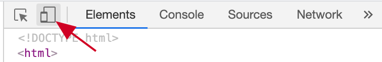 48 |
49 |
48 |
49 | 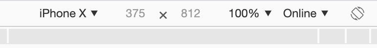 52 |
53 |
52 |
53 |  It requires a
 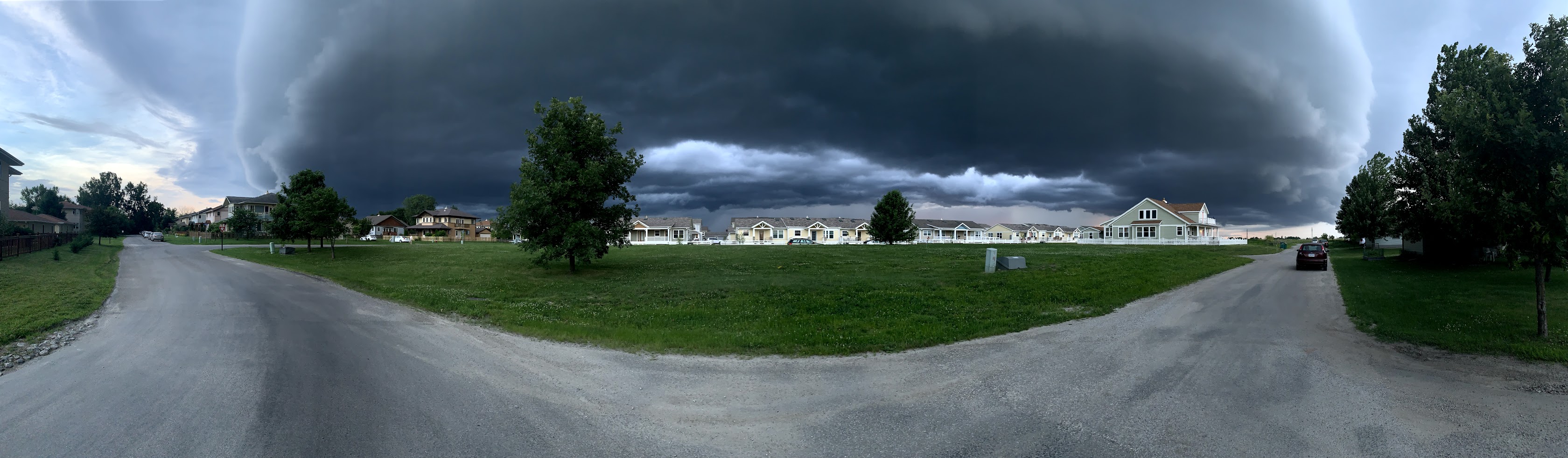 46 |
47 |
46 |
47 | 


 149 | 36KB
150 |
149 | 36KB
150 | 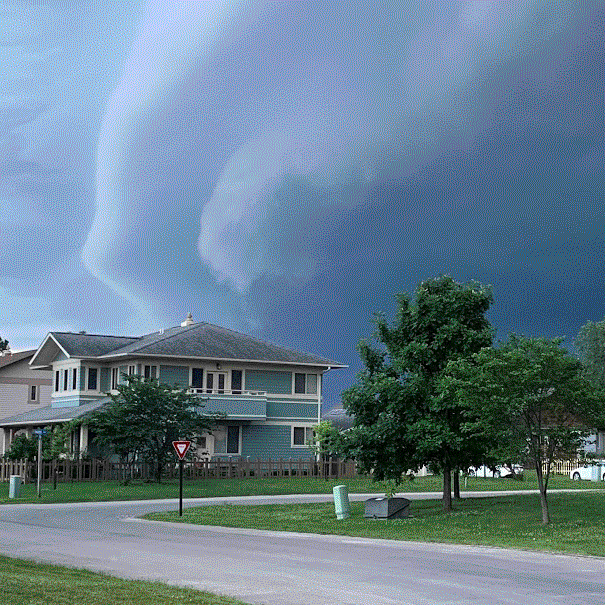 153 | 138KB
154 |
153 | 138KB
154 | 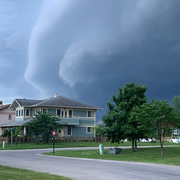 157 | 422KB
158 |
157 | 422KB
158 |  254 |
254 |  256 |
256 |