├── src
├── App.css
├── index.css
├── index.ts
├── main.tsx
├── components
│ ├── Links.tsx
│ ├── Menu.tsx
│ ├── Logo.tsx
│ ├── UserProfile.tsx
│ ├── Sidebar.tsx
│ ├── Submenu.tsx
│ └── MenuItem.tsx
├── App.tsx
└── assets
│ └── react.svg
├── dist
├── main.d.ts
├── App.d.ts
├── index.d.ts
├── components
│ ├── Menu.d.ts
│ ├── Links.d.ts
│ ├── Logo.d.ts
│ ├── UserProfile.d.ts
│ ├── Submenu.d.ts
│ ├── MenuItem.d.ts
│ └── Sidebar.d.ts
└── vite.svg
├── tsconfig.tsbuildinfo
├── .gitignore
├── index.html
├── tsconfig.json
├── vite.config.ts
├── eslint.config.js
├── public
└── vite.svg
├── package.json
└── README.md
/src/App.css:
--------------------------------------------------------------------------------
1 |
--------------------------------------------------------------------------------
/src/index.css:
--------------------------------------------------------------------------------
1 |
--------------------------------------------------------------------------------
/dist/main.d.ts:
--------------------------------------------------------------------------------
1 | export {};
2 |
--------------------------------------------------------------------------------
/dist/App.d.ts:
--------------------------------------------------------------------------------
1 | declare function App(): import("react/jsx-runtime").JSX.Element;
2 | export default App;
3 |
--------------------------------------------------------------------------------
/src/index.ts:
--------------------------------------------------------------------------------
1 | export {Sidebar} from './components/Sidebar'
2 | export {Menu} from './components/Menu'
3 | export {Submenu} from './components/Submenu'
4 | export {MenuItem} from './components/MenuItem'
5 | export {Logo} from './components/Logo'
--------------------------------------------------------------------------------
/dist/index.d.ts:
--------------------------------------------------------------------------------
1 | export { Sidebar } from './components/Sidebar';
2 | export { Menu } from './components/Menu';
3 | export { Submenu } from './components/Submenu';
4 | export { MenuItem } from './components/MenuItem';
5 | export { Logo } from './components/Logo';
6 |
--------------------------------------------------------------------------------
/dist/components/Menu.d.ts:
--------------------------------------------------------------------------------
1 | import * as React from "react";
2 | type MenuProps = {
3 | children: React.ReactNode;
4 | subHeading?: string;
5 | };
6 | declare const Menu: ({ children, subHeading }: MenuProps) => import("react/jsx-runtime").JSX.Element;
7 | export { Menu };
8 |
--------------------------------------------------------------------------------
/src/main.tsx:
--------------------------------------------------------------------------------
1 | import { StrictMode } from 'react'
2 | import { createRoot } from 'react-dom/client'
3 | // import './index.css'
4 | import App from './App'
5 |
6 | createRoot(document.getElementById('root')!).render(
7 |
8 |
9 | ,
10 | )
11 |
--------------------------------------------------------------------------------
/dist/components/Links.d.ts:
--------------------------------------------------------------------------------
1 | import { default as React, ReactNode, ElementType } from 'react';
2 | interface MenuItemProps {
3 | component?: ElementType;
4 | children: ReactNode;
5 | [key: string]: any;
6 | }
7 | declare const Links: React.FC;
8 | export default Links;
9 |
--------------------------------------------------------------------------------
/tsconfig.tsbuildinfo:
--------------------------------------------------------------------------------
1 | {"root":["./src/app.tsx","./src/index.ts","./src/main.tsx","./src/components/links.tsx","./src/components/logo.tsx","./src/components/menu.tsx","./src/components/menuitem.tsx","./src/components/sidebar.tsx","./src/components/submenu.tsx","./src/components/userprofile.tsx"],"version":"5.6.3"}
--------------------------------------------------------------------------------
/dist/components/Logo.d.ts:
--------------------------------------------------------------------------------
1 | import * as React from "react";
2 | type LogoProps = {
3 | children: React.ReactNode;
4 | img?: string;
5 | href?: string;
6 | component?: React.ElementType;
7 | };
8 | declare const Logo: ({ children, img, href, component, }: LogoProps) => import("react/jsx-runtime").JSX.Element;
9 | export { Logo };
10 |
--------------------------------------------------------------------------------
/.gitignore:
--------------------------------------------------------------------------------
1 | # Logs
2 | logs
3 | *.log
4 | npm-debug.log*
5 | yarn-debug.log*
6 | yarn-error.log*
7 | pnpm-debug.log*
8 | lerna-debug.log*
9 |
10 | node_modules
11 | dist-ssr
12 | *.local
13 |
14 | # Editor directories and files
15 | .vscode/*
16 | !.vscode/extensions.json
17 | .idea
18 | .DS_Store
19 | *.suo
20 | *.ntvs*
21 | *.njsproj
22 | *.sln
23 | *.sw?
24 |
--------------------------------------------------------------------------------
/dist/components/UserProfile.d.ts:
--------------------------------------------------------------------------------
1 | interface ProfileProps {
2 | userName?: string;
3 | designation?: string;
4 | userimg?: string;
5 | isCollapse?: boolean;
6 | onLogout?: () => void;
7 | }
8 | declare const Profile: ({ userName, designation, userimg, isCollapse, onLogout, }: ProfileProps) => import("react/jsx-runtime").JSX.Element;
9 | export { Profile };
10 |
--------------------------------------------------------------------------------
/index.html:
--------------------------------------------------------------------------------
1 |
2 |
3 |
4 |
5 |
6 |
7 | Vite + React + TS
8 |
9 |
10 |
11 |
12 |
13 |
14 |
--------------------------------------------------------------------------------
/dist/components/Submenu.d.ts:
--------------------------------------------------------------------------------
1 | import * as React from "react";
2 | type SubmenuProps = {
3 | children: React.ReactNode;
4 | title?: string;
5 | icon?: React.ReactNode;
6 | borderRadius?: string;
7 | textFontSize?: string;
8 | disabled?: boolean;
9 | };
10 | declare const Submenu: ({ children, title, icon, borderRadius, textFontSize, disabled, }: SubmenuProps) => import("react/jsx-runtime").JSX.Element;
11 | export { Submenu };
12 |
--------------------------------------------------------------------------------
/src/components/Links.tsx:
--------------------------------------------------------------------------------
1 | import React, { ReactNode, ElementType } from "react";
2 |
3 | interface MenuItemProps {
4 | component?: ElementType; // Accepts any valid component (default: "a")
5 | children: ReactNode;
6 | [key: string]: any; // Allows passing additional props dynamically
7 | }
8 |
9 | const Links: React.FC = ({
10 | component: Component = "a",
11 | children,
12 | ...props
13 | }) => {
14 | return (
15 |
16 | {children}
17 |
18 | );
19 | };
20 |
21 | export default Links;
22 |
--------------------------------------------------------------------------------
/tsconfig.json:
--------------------------------------------------------------------------------
1 | {
2 | "compilerOptions": {
3 | "target": "ES2020",
4 | "useDefineForClassFields": true,
5 | "lib": ["ES2020", "DOM", "DOM.Iterable"],
6 | "module": "ESNext",
7 | "skipLibCheck": true,
8 | "moduleResolution": "bundler",
9 | "allowImportingTsExtensions": true,
10 | "resolveJsonModule": true,
11 | "isolatedModules": true,
12 | "noEmit": true,
13 | "jsx": "react-jsx",
14 | "strict": true,
15 | "noUnusedLocals": true,
16 | "noUnusedParameters": true,
17 | "noFallthroughCasesInSwitch": true,
18 | "typeRoots": ["./dist/index.d.ts", "node_modules/@types"]
19 | },
20 | "include": ["src", "./index.ts"]
21 | }
--------------------------------------------------------------------------------
/vite.config.ts:
--------------------------------------------------------------------------------
1 | import path from "path";
2 | import { defineConfig } from "vite";
3 | import react from "@vitejs/plugin-react";
4 | import dts from "vite-plugin-dts";
5 |
6 | export default defineConfig({
7 | build: {
8 | lib: {
9 | entry: path.resolve(__dirname, "src/index.ts"),
10 | name: "visudha-ui",
11 | fileName: (format) => `index.${format}.js`,
12 | },
13 | rollupOptions: {
14 | external: ["react", "react-dom"],
15 | output: {
16 | globals: {
17 | react: "React",
18 | "react-dom": "ReactDOM",
19 | },
20 | },
21 | },
22 | sourcemap: false,
23 | emptyOutDir: true,
24 | },
25 | plugins: [react(), dts()],
26 | });
--------------------------------------------------------------------------------
/dist/components/MenuItem.d.ts:
--------------------------------------------------------------------------------
1 | import * as React from "react";
2 | type MenuItemProps = {
3 | children: React.ReactNode;
4 | icon?: React.ReactNode;
5 | component?: React.ElementType;
6 | badge?: boolean;
7 | link?: string;
8 | badgeColor?: "default" | "primary" | "secondary" | "error" | "info" | "success" | "warning";
9 | badgeContent?: string;
10 | textFontSize?: string;
11 | borderRadius?: string;
12 | disabled?: boolean;
13 | badgeType?: "filled" | "outlined";
14 | target?: string;
15 | isSelected?: boolean;
16 | };
17 | declare const MenuItem: ({ children, icon, component, badge, link, badgeColor, badgeContent, textFontSize, borderRadius, disabled, badgeType, target, isSelected, }: MenuItemProps) => import("react/jsx-runtime").JSX.Element;
18 | export { MenuItem };
19 |
--------------------------------------------------------------------------------
/eslint.config.js:
--------------------------------------------------------------------------------
1 | import js from '@eslint/js'
2 | import globals from 'globals'
3 | import reactHooks from 'eslint-plugin-react-hooks'
4 | import reactRefresh from 'eslint-plugin-react-refresh'
5 | import tseslint from 'typescript-eslint'
6 |
7 | export default tseslint.config(
8 | { ignores: ['dist'] },
9 | {
10 | extends: [js.configs.recommended, ...tseslint.configs.recommended],
11 | files: ['**/*.{ts,tsx}'],
12 | languageOptions: {
13 | ecmaVersion: 2020,
14 | globals: globals.browser,
15 | },
16 | plugins: {
17 | 'react-hooks': reactHooks,
18 | 'react-refresh': reactRefresh,
19 | },
20 | rules: {
21 | ...reactHooks.configs.recommended.rules,
22 | 'react-refresh/only-export-components': [
23 | 'warn',
24 | { allowConstantExport: true },
25 | ],
26 | },
27 | },
28 | )
29 |
--------------------------------------------------------------------------------
/dist/components/Sidebar.d.ts:
--------------------------------------------------------------------------------
1 | import * as React from "react";
2 | type SidebarProps = {
3 | children: React.ReactNode;
4 | width?: string;
5 | collapsewidth?: string;
6 | textColor?: string;
7 | isCollapse?: boolean;
8 | themeColor?: string;
9 | themeSecondaryColor?: string;
10 | mode?: "light" | "dark";
11 | direction?: "ltr" | "rtl";
12 | userName?: string;
13 | designation?: string;
14 | showProfile?: boolean;
15 | userimg?: string;
16 | onLogout?: () => void;
17 | };
18 | export declare const SidebarContext: React.Context<{
19 | width: string;
20 | collapsewidth: string;
21 | textColor: string;
22 | isCollapse: boolean;
23 | themeColor: string;
24 | }>;
25 | declare const Sidebar: ({ children, width, collapsewidth, textColor, isCollapse, themeColor, themeSecondaryColor, mode, direction, userName, designation, showProfile, userimg, onLogout, }: SidebarProps) => import("react/jsx-runtime").JSX.Element;
26 | export { Sidebar };
27 |
--------------------------------------------------------------------------------
/src/components/Menu.tsx:
--------------------------------------------------------------------------------
1 | import * as React from "react";
2 | import ListSubheader from "@mui/material/ListSubheader";
3 | import Box from "@mui/material/Box";
4 | import List from "@mui/material/List";
5 | import { SidebarContext } from "./Sidebar";
6 |
7 | type MenuProps = {
8 | children: React.ReactNode;
9 | subHeading?: string;
10 | };
11 |
12 | const Menu = ({ children, subHeading = "menu" }: MenuProps) => {
13 | const customizer = React.useContext(SidebarContext);
14 |
15 | return (
16 |
17 |
32 | {!customizer.isCollapse ? subHeading : "..."}
33 |
34 | }
35 | >
36 | {children}
37 |
38 |
39 | );
40 | };
41 |
42 | export { Menu };
43 |
--------------------------------------------------------------------------------
/dist/vite.svg:
--------------------------------------------------------------------------------
1 |
--------------------------------------------------------------------------------
/public/vite.svg:
--------------------------------------------------------------------------------
1 |
--------------------------------------------------------------------------------
/src/components/Logo.tsx:
--------------------------------------------------------------------------------
1 | import * as React from "react";
2 | import { styled } from "@mui/material/styles";
3 | import Box from "@mui/material/Box";
4 | import Typography from "@mui/material/Typography";
5 | import { SidebarContext } from "./Sidebar";
6 | import Links from "./Links";
7 |
8 | type LogoProps = {
9 | children: React.ReactNode;
10 | img?: string;
11 | href?: string;
12 | component?: React.ElementType;
13 | };
14 |
15 | const Logo = ({
16 | children,
17 | img = "https://adminmart.com/wp-content/uploads/2024/03/logo-admin-mart-news.png",
18 | href = "/",
19 | component,
20 | }: LogoProps) => {
21 | const customizer = React.useContext(SidebarContext);
22 |
23 | const LogoStyled: any = styled("span")(() => ({
24 | whiteSpace: "nowrap",
25 | overflow: customizer.isCollapse ? "hidden" : "visible",
26 | WebkitLineClamp: "1",
27 | display: "block",
28 |
29 | padding: "15px 22px",
30 | textOverflow: "ellipsis",
31 | }));
32 |
33 | return (
34 |
35 |
36 | {img === "" ? (
37 | {children}
38 | ) : (
39 |
47 | )}
48 |
49 |
50 | );
51 | };
52 |
53 | export { Logo };
54 |
--------------------------------------------------------------------------------
/src/components/UserProfile.tsx:
--------------------------------------------------------------------------------
1 | import {
2 | Box,
3 | Avatar,
4 | Typography,
5 | IconButton,
6 | Tooltip,
7 | useTheme,
8 | } from "@mui/material";
9 | import AlbumOutlinedIcon from "@mui/icons-material/AlbumOutlined";
10 |
11 | interface ProfileProps {
12 | userName?: string;
13 | designation?: string;
14 | userimg?: string;
15 | isCollapse?: boolean;
16 | onLogout?: () => void;
17 | }
18 |
19 | const Profile = ({
20 | userName = "",
21 | designation = "",
22 | userimg = "",
23 | isCollapse = false,
24 | onLogout,
25 | }: ProfileProps) => {
26 | const theme = useTheme();
27 | return (
28 |
29 | {isCollapse ? (
30 | ""
31 | ) : (
32 |
43 |
44 |
45 |
46 | {userName}
47 | {designation}
48 |
49 |
50 |
51 |
52 |
53 |
54 |
55 |
56 |
57 | )}
58 |
59 | );
60 | };
61 |
62 | export { Profile };
63 |
--------------------------------------------------------------------------------
/package.json:
--------------------------------------------------------------------------------
1 | {
2 | "name": "react-mui-sidebar",
3 | "version": "1.6.10",
4 | "type": "module",
5 | "description": "react mui sidebar",
6 | "main": "dist/index.umd.js",
7 | "module": "dist/index.es.js",
8 | "types": "dist/index.d.ts",
9 | "exports": {
10 | ".": {
11 | "import": "./dist/index.es.js",
12 | "types": "./dist/index.d.ts"
13 | }
14 | },
15 | "files": [
16 | "/dist"
17 | ],
18 | "publishConfig": {
19 | "access": "public"
20 | },
21 | "scripts": {
22 | "dev": "vite",
23 | "build": "tsc -b && vite build",
24 | "lint": "eslint .",
25 | "preview": "vite preview"
26 | },
27 | "repository": {
28 | "type": "git",
29 | "url": "git+https://github.com/adminmart/react-mui-sidebar.git"
30 | },
31 | "keywords": [
32 | "react-mui-sidebar",
33 | "sidebar",
34 | "react"
35 | ],
36 | "author": "Adminmart Team",
37 | "license": "MIT",
38 | "bugs": {
39 | "url": "https://github.com/adminmart/react-mui-sidebar/issues"
40 | },
41 | "homepage": "https://adminmart.com",
42 | "dependencies": {
43 | "react-router-dom": "^7.2.0",
44 | "vite-plugin-dts": "^4.5.0"
45 | },
46 | "peerDependencies": {
47 | "@types/react": "^17.0.0 || ^18.0.0 || ^19.0.0",
48 | "@types/react-dom": "^17.0.0 || ^18.0.0 || ^19.0.0",
49 | "react": "^17.0.0 || ^18.0.0 || ^19.0.0",
50 | "react-dom": "^17.0.0 || ^18.0.0 || ^19.0.0"
51 | },
52 | "devDependencies": {
53 | "@emotion/react": "^11.14.0",
54 | "@emotion/styled": "^11.14.0",
55 | "@eslint/js": "^9.17.0",
56 | "@mui/icons-material": "^6.4.0",
57 | "@mui/material": "^6.4.0",
58 | "@types/node": "^22.10.7",
59 | "@vitejs/plugin-react": "^4.3.4",
60 | "eslint": "^9.17.0",
61 | "eslint-plugin-react-hooks": "^5.0.0",
62 | "eslint-plugin-react-refresh": "^0.4.16",
63 | "globals": "^15.14.0",
64 | "typescript": "~5.6.2",
65 | "typescript-eslint": "^8.18.2",
66 | "vite": "^6.0.5"
67 | }
68 | }
--------------------------------------------------------------------------------
/src/App.tsx:
--------------------------------------------------------------------------------
1 | import "./App.css";
2 | import { Sidebar } from "./components/Sidebar";
3 | import { Logo } from "./components/Logo";
4 | import { Menu } from "./components/Menu";
5 | import { MenuItem } from "./components/MenuItem";
6 | import { Submenu } from "./components/Submenu";
7 | import AccessAlarms from "@mui/icons-material/AccessAlarms";
8 | import CottageOutlinedIcon from "@mui/icons-material/CottageOutlined";
9 | import { Link, BrowserRouter } from "react-router-dom";
10 |
11 | function App() {
12 | return (
13 |
14 |
15 |
20 | AdminMart
21 |
22 |
41 |
45 |
60 |
61 |
62 | );
63 | }
64 |
65 | export default App;
66 |
--------------------------------------------------------------------------------
/src/components/Sidebar.tsx:
--------------------------------------------------------------------------------
1 | import * as React from "react";
2 | import { Box } from "@mui/material";
3 | import { createTheme, ThemeProvider } from "@mui/material/styles";
4 | import { Profile } from "./UserProfile";
5 |
6 | type SidebarProps = {
7 | children: React.ReactNode;
8 | width?: string;
9 | collapsewidth?: string;
10 | textColor?: string;
11 | isCollapse?: boolean;
12 | themeColor?: string;
13 | themeSecondaryColor?: string;
14 | mode?: "light" | "dark";
15 | direction?: "ltr" | "rtl";
16 | userName?: string;
17 | designation?: string;
18 | showProfile?: boolean;
19 | userimg?: string;
20 | onLogout?: () => void;
21 | };
22 |
23 | export const SidebarContext = React.createContext({
24 | width: "270px",
25 | collapsewidth: "80px",
26 | textColor: "#8D939D",
27 | isCollapse: false,
28 | themeColor: "#5d87ff",
29 | });
30 |
31 | let handleLogout = () => {
32 | alert("Logout Successfully");
33 | };
34 |
35 | const Sidebar = ({
36 | children,
37 | width = "260px",
38 | collapsewidth = "80px",
39 | textColor = "#2b2b2b",
40 | isCollapse = false,
41 | themeColor = "#5d87ff",
42 | themeSecondaryColor = "#49beff",
43 | mode = "light",
44 | direction = "ltr",
45 | userName = "Mathew",
46 | designation = "Designer",
47 | showProfile = true,
48 | userimg = "https://bootstrapdemos.adminmart.com/modernize/dist/assets/images/profile/user-1.jpg",
49 | onLogout = handleLogout,
50 | }: SidebarProps) => {
51 | const [isSidebarHover, _setIsSidebarHover] = React.useState(false);
52 | const toggleWidth = isCollapse && !isSidebarHover ? collapsewidth : width;
53 | // const theme = useTheme();
54 | const myTheme = createTheme({
55 | direction: direction,
56 | palette: {
57 | mode: mode,
58 | primary: {
59 | main: themeColor,
60 | },
61 | secondary: {
62 | main: themeSecondaryColor,
63 | contrastText: "#fff",
64 | },
65 | },
66 | });
67 |
68 | if (mode === "dark") {
69 | textColor = "rgba(255,255,255, 0.9)";
70 | }
71 |
72 | return (
73 |
74 |
83 |
84 |
87 | {children}
88 |
89 | {showProfile ? (
90 |
97 | ) : null}
98 |
99 |
100 |
101 | );
102 | };
103 |
104 | export { Sidebar };
105 |
--------------------------------------------------------------------------------
/src/components/Submenu.tsx:
--------------------------------------------------------------------------------
1 | import * as React from "react";
2 | import List from "@mui/material/List";
3 | import ListItemButton from "@mui/material/ListItemButton";
4 | import ListItemIcon from "@mui/material/ListItemIcon";
5 | import ListItemText from "@mui/material/ListItemText";
6 | import Collapse from "@mui/material/Collapse";
7 | import Typography from "@mui/material/Typography";
8 | import ExpandLess from "@mui/icons-material/ExpandLess";
9 | import ExpandMore from "@mui/icons-material/ExpandMore";
10 | import { styled } from "@mui/material/styles";
11 | import Box from "@mui/material/Box";
12 | import { SidebarContext } from "./Sidebar";
13 | import CircleOutlined from "@mui/icons-material/CircleOutlined";
14 |
15 | type SubmenuProps = {
16 | children: React.ReactNode;
17 | title?: string;
18 | icon?: React.ReactNode;
19 | borderRadius?: string;
20 | textFontSize?: string;
21 | disabled?: boolean;
22 | };
23 |
24 | const Submenu = (
25 | (
26 | {
27 | children,
28 | title = "",
29 | icon,
30 | borderRadius = "8px",
31 | textFontSize = "14px",
32 | disabled = false,
33 | }:SubmenuProps
34 | ) => {
35 | const customizer = React.useContext(SidebarContext);
36 | const [open, setOpen] = React.useState(false);
37 |
38 | const handleClick = () => {
39 | setOpen(!open);
40 | };
41 |
42 | const ListItemStyled = styled(ListItemButton)(() => ({
43 | whiteSpace: "nowrap",
44 | marginBottom: "2px",
45 | padding: "10px 12px",
46 | borderRadius: borderRadius,
47 | color: open ? "#fff" : customizer.textColor,
48 | cursor: disabled ? "default" : "pointer",
49 | opacity: disabled ? "0.6" : "1",
50 | backgroundColor: !open ? "" : customizer.themeColor,
51 | ".MuiListItemIcon-root": {
52 | color: open ? "#fff" : customizer.textColor,
53 | },
54 | "&:hover": {
55 | backgroundColor: open ? customizer.themeColor : customizer.themeColor + 20,
56 | color: open ? "#fff" : customizer.themeColor,
57 | ".MuiListItemIcon-root": {
58 | color: open ? "#fff" : customizer.themeColor,
59 | },
60 | },
61 | }));
62 |
63 | const ListIConStyled = styled(ListItemIcon)(() => ({
64 | display: "flex",
65 | gap: "10px",
66 | marginBottom: "0px",
67 | padding: "0px",
68 | minWidth: "30px",
69 | cursor: "pointer",
70 | color: "inherit",
71 | }));
72 |
73 | return (
74 |
75 |
76 |
77 | {icon ? icon : }
78 |
79 | {!customizer.isCollapse && (
80 | <>
81 |
82 |
83 | {title}
84 |
85 |
86 | {open ? : }
87 |
88 | )}
89 |
90 |
91 |
92 |
93 | {children}
94 |
95 |
96 |
97 | );
98 | }
99 | );
100 |
101 | export {Submenu};
--------------------------------------------------------------------------------
/src/assets/react.svg:
--------------------------------------------------------------------------------
1 |
--------------------------------------------------------------------------------
/src/components/MenuItem.tsx:
--------------------------------------------------------------------------------
1 | import * as React from "react";
2 | import ListItemIcon from "@mui/material/ListItemIcon";
3 | import { styled, useTheme } from "@mui/material/styles";
4 | import ListItemText from "@mui/material/ListItemText";
5 | import Chip from "@mui/material/Chip";
6 | import Typography from "@mui/material/Typography";
7 | import Box from "@mui/material/Box";
8 | import ListItemButton from "@mui/material/ListItemButton";
9 | import { SidebarContext } from "./Sidebar";
10 | import CircleOutlined from "@mui/icons-material/CircleOutlined";
11 | import Links from "./Links";
12 |
13 | type MenuItemProps = {
14 | children: React.ReactNode;
15 | icon?: React.ReactNode;
16 | component?: React.ElementType;
17 | badge?: boolean;
18 | link?: string;
19 | badgeColor?:
20 | | "default"
21 | | "primary"
22 | | "secondary"
23 | | "error"
24 | | "info"
25 | | "success"
26 | | "warning";
27 | badgeContent?: string;
28 | badgeTextColor?: string;
29 | textFontSize?: string;
30 | borderRadius?: string;
31 | disabled?: boolean;
32 | badgeType?: "filled" | "outlined";
33 | target?: string;
34 | isSelected?: boolean;
35 | };
36 |
37 | const MenuItem = ({
38 | children,
39 | icon,
40 | component,
41 | badge = false,
42 | link = "/",
43 | badgeColor = "secondary",
44 | badgeContent = "6",
45 | badgeTextColor = "#fff",
46 | textFontSize = "14px",
47 | borderRadius = "8px",
48 | disabled = false,
49 | badgeType = "filled",
50 | target = "",
51 | isSelected = false,
52 | }: MenuItemProps) => {
53 | const customizer = React.useContext(SidebarContext);
54 | const theme = useTheme();
55 | const ListItemStyled: any = styled(ListItemButton)(() => ({
56 | whiteSpace: "nowrap",
57 | marginBottom: "2px",
58 | padding: "10px 12px",
59 | width: "100%",
60 | textAlign: theme.direction === "ltr" ? "left" : "right",
61 | borderRadius: borderRadius,
62 | color: customizer.textColor,
63 | cursor: disabled ? "default" : "pointer",
64 | opacity: disabled ? "0.6" : "1",
65 | ".MuiListItemIcon-root": {
66 | color: customizer.textColor,
67 | },
68 | "&:hover": {
69 | backgroundColor: disabled ? "#fff" : customizer.themeColor + 20,
70 | color: customizer.themeColor,
71 | ".MuiListItemIcon-root": {
72 | color: customizer.themeColor,
73 | },
74 | },
75 | "&.Mui-selected": {
76 | color: "white",
77 | backgroundColor: customizer.themeColor,
78 | "&:hover": {
79 | backgroundColor: customizer.themeColor,
80 | color: "white",
81 | },
82 | ".MuiListItemIcon-root": {
83 | color: "#fff",
84 | },
85 | },
86 | }));
87 |
88 | const ListIConStyled = styled(ListItemIcon)(() => ({
89 | display: "flex",
90 | justifyContent: "center",
91 | alignItems: "center",
92 | gap: "10px",
93 | marginBottom: "0px",
94 | padding: "0px",
95 | cursor: "pointer",
96 |
97 | color: "inherit",
98 | }));
99 |
100 | return (
101 |
102 |
103 |
108 |
113 | {icon ? icon : }
114 |
115 | {!customizer.isCollapse ? (
116 | <>
117 |
118 |
123 | {children}
124 |
125 |
126 |
127 | {badge && (
128 |
135 | )}
136 |
137 | ) : null}
138 |
139 |
140 |
141 | );
142 | };
143 |
144 | export { MenuItem };
145 |
--------------------------------------------------------------------------------
/README.md:
--------------------------------------------------------------------------------
1 | ## React MUI Sidebar
2 |
3 | React MUI Sidebar helps to create side Navigation.
4 |
5 | # Live Demo
6 |
7 | [Demo](https://react-mui-sidebar.vercel.app)
8 |
9 | ## Authors
10 |
11 | - [@adminmart](https://adminmart.com)
12 |
13 | ## Screenshots
14 |
15 | 
16 |
17 | #
18 |
19 | ## 🧩 Live Example — Dashboard Template
20 |
21 | We’ve built a **complete Admin Dashboard Template** using this npm package!
22 | It’s the perfect example of how you can use `react-mui-sidebar` in a real-world app.
23 |
24 |
25 |
26 | [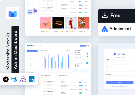](https://adminmart.com/product/modernize-free-nextjs-admin-template/?ref=43)
27 |
28 | 👉 **Check it out here:** [Dashboard Template](https://adminmart.com/product/modernize-free-nextjs-admin-template/?ref=43)
29 |
30 |
31 | ## Installation
32 |
33 | To install react mui sidebar npm package
34 |
35 | ```bash
36 | npm i react-mui-sidebar
37 | ```
38 |
39 | ## Issues
40 |
41 | For any Issues, create new issue on https://github.com/adminmart/react-mui-sidebar/issues
42 |
43 | ## Usage/Examples
44 |
45 | ```javascript
46 | import React from "react";
47 |
48 | import { Sidebar, Menu, MenuItem, Submenu, Logo } from "react-mui-sidebar";
49 | import AccessAlarms from "@mui/icons-material/AccessAlarms";
50 | import CottageOutlinedIcon from "@mui/icons-material/CottageOutlined";
51 | {
52 | /* if you are using react then import link from */
53 | }
54 | import { Link } from "react-router-dom";
55 | {
56 | /* if you are using nextjs then import link from */
57 | }
58 | import Link from "next/link";
59 |
60 | const App = () => {
61 | return (
62 |
63 |
68 | AdminMart
69 |
70 |
89 |
93 |
108 |
109 | );
110 | };
111 |
112 | export default App;
113 | ```
114 |
115 | ## API Reference
116 |
117 | #### Sidebar Api Reference
118 |
119 | ```http
120 |
121 | ```
122 |
123 | | Props | Type | Default | Description |
124 | | :-------------------- | :--------- | :--------------- | ----------------------------------------------------- |
125 | | `width` | `string` | `260px` | set the width of sidebar |
126 | | `textColor` | `string` | `#2b2b2b` | set this color to all MenuItem and SubMenu of sidebar |
127 | | `isCollapse` | `boolean` | `false` | set the Sidebar to mini sidebar |
128 | | `themeColor` | `string` | `#5d87ff` | set the theme primary color |
129 | | `themeSecondaryColor` | `string` | `#49beff` | set the theme secondary color |
130 | | `mode` | `string` | `light` | set the mode of the Sidebar light or Dark |
131 | | `direction` | `string` | `ltr` | set the direction of Sidebar ltr or rtl |
132 | | `userName` | `string` | `Mathew` | set the user name of User Profile |
133 | | `designation` | `string` | `Designer` | set the user designation of User Profile |
134 | | `showProfile` | `boolean` | `true` | show the user profile true or false |
135 | | `userimg` | `string` | `user image url` | set the image of user in User Profile |
136 | | `onLogout` | `function` | `handleLogout` | set the logout function for user logout |
137 |
138 | #### Menu Api Reference
139 |
140 | ```http
141 |
142 | ```
143 |
144 | | Props | Type | Default | Description |
145 | | :----------- | :------- | :------ | ------------------ |
146 | | `subHeading` | `string` | `menu` | menu heading title |
147 |
148 | #### Submenu Api Reference
149 |
150 | ```http
151 |
152 | ```
153 |
154 | | Props | Type | Default | Description |
155 | | :------------- | :---------- | :------------------------------------ | --------------------------------- |
156 | | `title` | `string` | `blank` | title of the submenu |
157 | | `icon` | `component` | `mui icon - ` | set icon of submenu |
158 | | `borderRadius` | `string` | `8px` | set border radius of Submenu |
159 | | `textFontSize` | `string` | `14px` | set text Font Size of the submenu |
160 | | `disabled` | `boolean` | `false` | enable/disable the Submenu |
161 |
162 | #### MenuItem Api Reference
163 |
164 | ```http
165 |
166 | ```
167 |
168 | | Props | Type | Default | Description |
169 | | :--------------- | :---------- | :------------------------------------ | --------------------------------------------------- |
170 | | `icon` | `component` | `mui icon - ` | set icon of menu item |
171 | | `link` | `string` | `#` | pass link for component to redirect |
172 | | `component ` | `component` | `Link ` | set react router link or nextjs Link to apply route |
173 | | `badge` | `boolean` | `false` | set the badge on menu items |
174 | | `badgeColor` | `string` | `primary` | set badge color |
175 | | `badgeTextColor` | `string` | `#ffffff` | set any badge text color |
176 | | `badgeContent` | `string` | `6` | set content on badge |
177 | | `textFontSize` | `string` | `14px` | set font size of menu item |
178 | | `borderRadius` | `string` | `8px` | set border radius of menu item |
179 | | `disabled` | `boolean` | `false` | enable/disable the menu item |
180 | | `badgeType` | `string` | `filled` | set badgeType of menu item filled or outlined |
181 | | `target` | `string` | `` | set target of menu item \_blank |
182 | | `isSelected` | `boolean` | `false` | set selected menu item |
183 |
184 | #### Logo Api Reference
185 |
186 | ```http
187 |
188 | ```
189 |
190 | | Props | Type | Default | Description |
191 | | :----------- | :---------- | :--------- | --------------------------------------------------- |
192 | | `img` | `string` | `Logo url` | set the logo of the sidebar |
193 | | `href` | `string` | `set url` | set any url you wanted to redirect |
194 | | `component ` | `component` | `Link ` | set react router link or nextjs Link to apply route |
195 |
196 |
197 | ## 🔗 Related Sidebars
198 |
199 | Looking for a Tailwind CSS alternative to this Material UI-based sidebar?
200 | Explore our companion package below:
201 |
202 | ### [React Tailwind Sidebar](https://www.npmjs.com/package/react-tailwind-sidebar)
203 |
204 | A modern, responsive, and fully customizable sidebar component built with **React** and **Tailwind CSS** — perfect for creating clean and functional dashboards, admin panels, and web applications.
205 |
206 | ---
207 |
208 | 💡 Both `react-mui-sidebar` and `react-tailwind-sidebar` are crafted to simplify sidebar development — offering flexible layouts, effortless customization, and developer-friendly APIs.
209 |
210 |
211 | ## Contributing
212 |
213 | Contributions are always welcome!
214 |
215 | Please adhere to this project's `code of conduct`.
216 |
217 |
--------------------------------------------------------------------------------