├── Sources
└── CustomToggle
│ ├── CustomToggle.swift
│ ├── ThumbToggle.swift
│ ├── BounceToggle.swift
│ └── IconToggle.swift
├── .gitignore
├── .swiftpm
└── xcode
│ └── package.xcworkspace
│ └── xcshareddata
│ └── IDEWorkspaceChecks.plist
├── Package.swift
├── README.md
└── ContentView.swift
/Sources/CustomToggle/CustomToggle.swift:
--------------------------------------------------------------------------------
1 | public struct CustomToggle {
2 | public private(set) var text = "Hello, World!"
3 |
4 | public init() {
5 | }
6 | }
7 |
--------------------------------------------------------------------------------
/.gitignore:
--------------------------------------------------------------------------------
1 | .DS_Store
2 | /.build
3 | /Packages
4 | /*.xcodeproj
5 | xcuserdata/
6 | DerivedData/
7 | .swiftpm/config/registries.json
8 | .swiftpm/xcode/package.xcworkspace/contents.xcworkspacedata
9 | .netrc
10 |
--------------------------------------------------------------------------------
/.swiftpm/xcode/package.xcworkspace/xcshareddata/IDEWorkspaceChecks.plist:
--------------------------------------------------------------------------------
1 |
2 |
3 |
4 |
5 | IDEDidComputeMac32BitWarning
6 |
7 |
8 |
9 |
--------------------------------------------------------------------------------
/Package.swift:
--------------------------------------------------------------------------------
1 | // swift-tools-version: 5.7
2 | // The swift-tools-version declares the minimum version of Swift required to build this package.
3 |
4 | import PackageDescription
5 |
6 | let package = Package(
7 | name: "CustomToggle",
8 | products: [
9 | // Products define the executables and libraries a package produces, and make them visible to other packages.
10 | .library(
11 | name: "CustomToggle",
12 | targets: ["CustomToggle"]),
13 | ],
14 | dependencies: [
15 | // Dependencies declare other packages that this package depends on.
16 | // .package(url: /* package url */, from: "1.0.0"),
17 | ],
18 | targets: [
19 | // Targets are the basic building blocks of a package. A target can define a module or a test suite.
20 | // Targets can depend on other targets in this package, and on products in packages this package depends on.
21 | .target(
22 | name: "CustomToggle",
23 | dependencies: []),
24 |
25 | ]
26 | )
27 |
--------------------------------------------------------------------------------
/README.md:
--------------------------------------------------------------------------------
1 | # CustomToggle - SwiftUI
2 |
3 | ## Install
4 |
5 | ### Swift Package Manager
6 |
7 | Open `Xcode`, go to `File -> Swift Packages -> Add Package Dependency` and enter `https://github.com/akardas16/CustomToggle.git` as Branch `main`
8 |
9 | You need to add `import CustomToggle`
10 |
11 | ## Usage
12 |
13 | 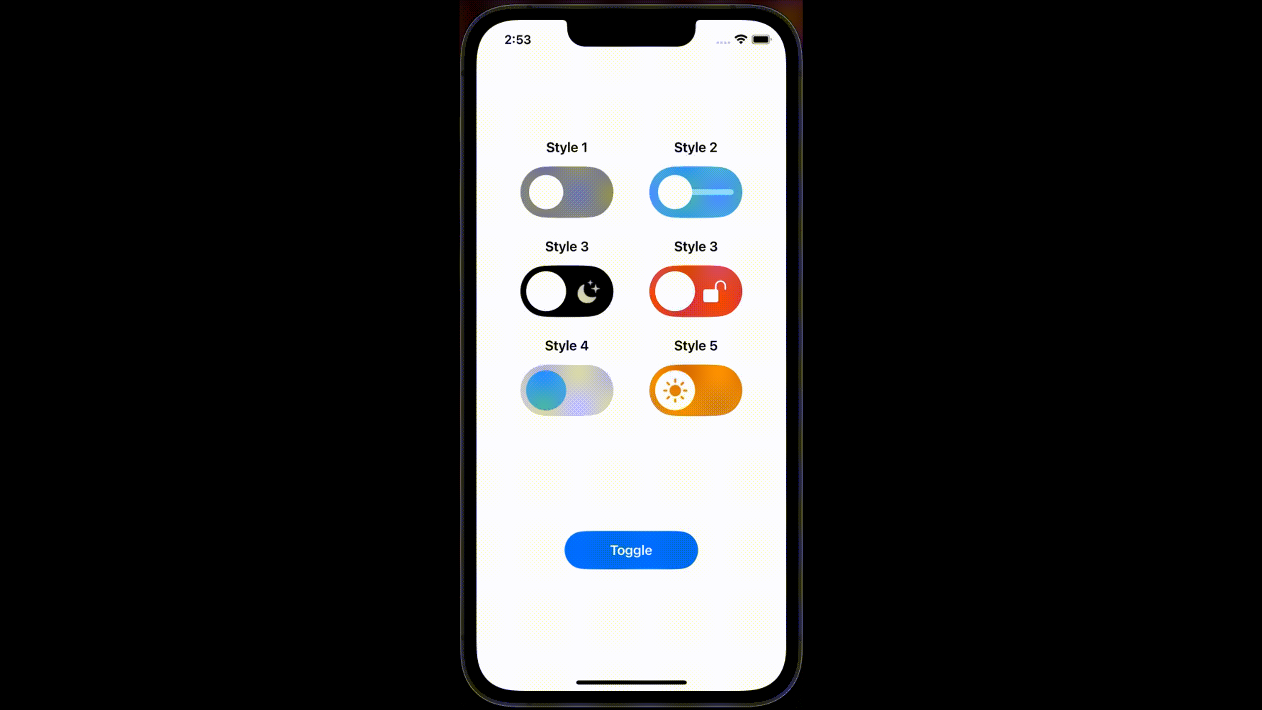
14 |
15 | * See avaliable styles and their usages
16 |
17 | ### Style 1
18 |
19 | ```Swift
20 | BounceToggle(status: $isOpen, colorClose: .gray, colorOpen: .brown, thumbColor: .white)
21 | //.scaleEffect(1.8).padding() // use scaleEffect to resize toggle
22 | ```
23 |
24 | ### Style 2
25 |
26 | ```Swift
27 | BounceToggle(status: $isOpen, colorClose: .cyan, colorOpen: .teal, thumbColor: .white,enableLine: true)
28 | ```
29 |
30 | ### Style 3
31 |
32 | ```Swift
33 | IconToggle(status: $isOpen) // see other parameters to customize fully
34 | ```
35 |
36 | ```Swift
37 | IconToggle(status: $isOpen, iconClose: "lock.fill", iconClsClr: .white, backClose: .red, iconOpen: "lock.open.fill", iconOpnClr: .white, backOpen: .green, thumbColor: .white)
38 | ```
39 |
40 | ### Style 4
41 |
42 | ```Swift
43 | IconToggle(status: $isOpen, backClose: .gray.opacity(0.4), backOpen: .indigo.opacity(0.8), thumbColor: .cyan,disableIcon: true)
44 | ```
45 |
46 | ### Style 5
47 |
48 | ```Swift
49 | ThumbToggle(status: $isOpen, backClose: .orange, backOpen: .black, thumbColor: .white)
50 | ```
51 |
52 | ## Parameters
53 |
54 | | Parameters | Meanings |
55 | | ------------- | ------------- |
56 | | status | shows status of toggle |
57 | | iconClose | shows systemName of icon while toggle closed |
58 | | iconClsClr | shows color of icon while toggle closed |
59 | | iconOpen | shows systemName of icon while toggle opened |
60 | | iconOpnClr | shows color of icon while toggle opened |
61 | | backOpen | shows background color of toggle while opened |
62 | | thumbColor | shows thumb color of toggle |
63 | | enableLine | shows line on center of toggle (see style 2) |
64 |
65 | * Check out `ContentView.swift` to see all styles and usages
66 |
67 | * This library is inspired by Lottie animations. Check out toggle animations on Lottie https://lottiefiles.com/search?q=toggle&category=animations
68 |
--------------------------------------------------------------------------------
/Sources/CustomToggle/ThumbToggle.swift:
--------------------------------------------------------------------------------
1 | //
2 | // ThumbToggle.swift
3 | // CombineApp
4 | //
5 | // Created by Abdullah Kardas�� on 8.09.2022.
6 | //
7 |
8 | import SwiftUI
9 |
10 | @available(iOS 15.0, *)
11 | public struct ThumbToggle: View {
12 |
13 | @Binding public var status:Bool
14 | @State public var isOpen:Bool
15 | public var iconClose:String = "sun.max.fill"
16 | public var iconClsClr:Color = .black.opacity(0.8)
17 | public var backClose:Color = .black
18 |
19 | public var iconOpen:String = "moon.stars.fill"
20 | public var iconOpnClr:Color = .orange
21 | public var backOpen:Color = .blue.opacity(0.6)
22 |
23 |
24 | public var thumbColor:Color = .white
25 |
26 |
27 |
28 | public init(status: Binding, iconClose:String = "sun.max.fill", iconClsClr:Color = .orange, backClose:Color = .black,iconOpen:String = "moon.stars.fill",iconOpnClr:Color = .black.opacity(0.8),backOpen:Color = .blue.opacity(0.6),thumbColor:Color = .white) {
29 | _status = status
30 | self.isOpen = status.wrappedValue
31 | self.iconClose = iconClose
32 | self.iconClsClr = iconClsClr
33 | self.backClose = backClose
34 | self.iconOpen = iconOpen
35 |
36 | self.iconOpnClr = iconOpnClr
37 | self.backOpen = backOpen
38 | self.thumbColor = thumbColor
39 |
40 | }
41 |
42 | public var body: some View {
43 | Capsule(style: .continuous)
44 | .fill(isOpen ? backOpen:backClose)
45 | .animation(.default, value: isOpen)
46 | .frame(width: 65, height: 36)
47 | .overlay(alignment: isOpen ? .trailing:.leading) {
48 | Circle().fill(thumbColor).padding(4).overlay {
49 | Image(systemName: isOpen ? iconOpen:iconClose)
50 | .font(.callout).foregroundColor(isOpen ? iconOpnClr:iconClsClr)
51 | .animation(.default, value: isOpen)
52 | }
53 | }
54 |
55 | .onTapGesture {
56 | withAnimation(.spring(response: 0.6, dampingFraction: 0.52)) {
57 | status.toggle()
58 | }
59 | }.onChange(of: status) { newValue in
60 | withAnimation(.spring(response: 0.6, dampingFraction: 0.52)) {
61 | isOpen = newValue
62 | }
63 | }
64 | }
65 | }
66 |
67 | @available(iOS 13.0.0, *)
68 | struct ThumbToggle_Previews: PreviewProvider {
69 | static var previews: some View {
70 | if #available(iOS 15.0, *) {
71 | ThumbToggle(status: .constant(false))
72 | } else {
73 | // Fallback on earlier versions
74 | }
75 | }
76 | }
77 |
--------------------------------------------------------------------------------
/ContentView.swift:
--------------------------------------------------------------------------------
1 | //
2 | // ContentView.swift
3 |
4 | //
5 | // Created by Abdullah Kardas�� on 7.09.2022.
6 | //
7 |
8 |
9 | import SwiftUI
10 | import CustomToggle
11 |
12 |
13 | // An example view showing the style in action
14 | struct ContentView: View {
15 | @State var isOpen:Bool = false
16 |
17 | var body: some View {
18 | VStack(spacing:24) {
19 |
20 | Spacer()
21 | HStack{
22 | Spacer()
23 | VStack {
24 | Text("Style 1").bold()
25 | BounceToggle(status: $isOpen, colorClose: .gray, colorOpen: .brown, thumbColor: .white)
26 | .scaleEffect(1.8).padding()
27 | }
28 | Spacer()
29 | VStack {
30 | Text("Style 2").bold()
31 | BounceToggle(status: $isOpen, colorClose: .cyan, colorOpen: .teal, thumbColor: .white,enableLine: true)
32 | .scaleEffect(1.8).padding()
33 | }
34 | Spacer()
35 | }
36 |
37 | HStack{
38 | Spacer()
39 | VStack {
40 | Text("Style 3").bold()
41 | IconToggle(status: $isOpen)
42 | .scaleEffect(1.8).padding()
43 | }
44 | Spacer()
45 | VStack {
46 | Text("Style 3").bold()
47 | IconToggle(status: $isOpen, iconClose: "lock.fill", iconClsClr: .white, backClose: .red, iconOpen: "lock.open.fill", iconOpnClr: .white, backOpen: .green, thumbColor: .white)
48 | .scaleEffect(1.8).padding()
49 | }
50 | Spacer()
51 | }
52 |
53 | HStack{
54 | Spacer()
55 | VStack {
56 | Text("Style 4").bold()
57 | IconToggle(status: $isOpen, backClose: .gray.opacity(0.4), backOpen: .indigo.opacity(0.8), thumbColor: .cyan,disableIcon: true)
58 | .scaleEffect(1.8).padding()
59 | }
60 | Spacer()
61 | VStack {
62 | Text("Style 5").bold()
63 | ThumbToggle(status: $isOpen, backClose: .orange, backOpen: .black, thumbColor: .white)
64 | .scaleEffect(1.8).padding()
65 | }
66 | Spacer()
67 | }
68 |
69 | Spacer()
70 | Capsule(style: .continuous).fill(.blue).padding().frame(width: 200, height: 80).overlay {
71 | Text("Toggle").bold().foregroundColor(.white)
72 | }.onTapGesture {
73 | isOpen.toggle()
74 | }
75 | Spacer()
76 |
77 |
78 | }
79 | }
80 | }
81 |
82 | #if DEBUG
83 | struct ContentView_Previews : PreviewProvider {
84 | static var previews: some View {
85 | ContentView()
86 | }
87 | }
88 | #endif
89 |
90 |
91 |
92 |
--------------------------------------------------------------------------------
/Sources/CustomToggle/BounceToggle.swift:
--------------------------------------------------------------------------------
1 | //
2 | // BounceToggle.swift
3 | // CombineApp
4 | //
5 | // Created by Abdullah Kardas�� on 7.09.2022.
6 | //
7 |
8 | import SwiftUI
9 |
10 |
11 | @available(iOS 15, *)
12 | public struct BounceToggle: View {
13 | @Binding public var status:Bool
14 | @State public var isOpen:Bool
15 | @State public var customWidth:CGFloat = 24
16 | public var colorClose:Color = .purple
17 | public var colorOpen:Color = .blue.opacity(0.6)
18 | public var thumbColor:Color = .white
19 | public var enableLine:Bool = false
20 |
21 | public init(status: Binding, colorClose: Color = .purple, colorOpen: Color = .blue.opacity(0.6), thumbColor: Color = .white,enableLine:Bool = false) {
22 | _status = status
23 | self.isOpen = status.wrappedValue
24 | self.colorClose = colorClose
25 | self.colorOpen = colorOpen
26 | self.thumbColor = thumbColor
27 | self.enableLine = enableLine
28 | }
29 |
30 | public var body: some View {
31 | Capsule(style: .continuous)
32 | .fill(isOpen ? colorOpen:colorClose)
33 | .animation(.default, value: isOpen)
34 | .frame(width: 65, height: 36)
35 | .overlay(content: {
36 | if enableLine {
37 | Capsule(style: .continuous).fill(.thinMaterial).frame(maxWidth: .infinity).frame(maxHeight: 4).padding(.horizontal,6)
38 | }
39 | })
40 | .overlay(alignment: isOpen ? .trailing:.leading) {
41 | Capsule(style: .continuous).fill(thumbColor).frame(maxWidth: customWidth).padding(6)
42 | }
43 | .onTapGesture {
44 | withAnimation(.default) {
45 | customWidth = .infinity
46 | status.toggle()
47 | withAnimation(.default.delay(0.3)) {
48 | customWidth = 24
49 | }
50 | }
51 | }
52 | .onChange(of: status) { newValue in
53 | withAnimation(.default) {
54 | customWidth = .infinity
55 | isOpen = newValue
56 | withAnimation(.default.delay(0.3)) {
57 | customWidth = 24
58 | }
59 | }
60 | }
61 |
62 | }
63 | }
64 |
65 | @available(iOS 15, *)
66 | struct BounceToggle_Previews: PreviewProvider {
67 | static var previews: some View {
68 | BounceToggle(status: .constant(false))
69 | }
70 | }
71 |
72 |
73 | @available(iOS 13.0, *)
74 | public struct HiddenView: ViewModifier{
75 | var isHide:Binding
76 |
77 | public func body(content: Content) -> some View {
78 | if isHide.wrappedValue{
79 | content
80 | .hidden()
81 | }
82 | else{
83 | content
84 | }
85 | }
86 | }
87 |
88 | @available(iOS 13.0, *)
89 | extension View{
90 | func hide(isHide:Binding) -> some View{
91 | return self.modifier(HiddenView(isHide: isHide))
92 | }
93 | }
94 |
--------------------------------------------------------------------------------
/Sources/CustomToggle/IconToggle.swift:
--------------------------------------------------------------------------------
1 | //
2 | // IconToggle.swift
3 | // CombineApp
4 | //
5 | // Created by Abdullah Kardas�� on 7.09.2022.
6 | //
7 |
8 | import SwiftUI
9 |
10 | @available(iOS 15.0, *)
11 | public struct IconToggle: View {
12 | @Binding public var status:Bool
13 | @State public var isOpen:Bool
14 | public var iconClose:String = "sun.max.fill"
15 | public var iconClsClr:Color = .white.opacity(0.8)
16 | public var backClose:Color = .black
17 |
18 | public var iconOpen:String = "moon.stars.fill"
19 | public var iconOpnClr:Color = .orange
20 | public var backOpen:Color = .blue.opacity(0.6)
21 |
22 |
23 | public var thumbColor:Color = .white
24 | public var disableIcon:Bool = false
25 |
26 |
27 |
28 | public init(status: Binding, iconClose:String = "sun.max.fill", iconClsClr:Color = .white.opacity(0.8), backClose:Color = .black,iconOpen:String = "moon.stars.fill",iconOpnClr:Color = .orange,backOpen:Color = .blue.opacity(0.6),thumbColor:Color = .white,disableIcon:Bool = false) {
29 | _status = status
30 | self.isOpen = status.wrappedValue
31 | self.iconClose = iconClose
32 | self.iconClsClr = iconClsClr
33 | self.backClose = backClose
34 | self.iconOpen = iconOpen
35 |
36 | self.iconOpnClr = iconOpnClr
37 | self.backOpen = backOpen
38 | self.thumbColor = thumbColor
39 | self.disableIcon = disableIcon
40 | }
41 |
42 | public var body: some View {
43 | Capsule(style: .continuous)
44 | .fill(isOpen ? backOpen:backClose)
45 | .animation(.default, value: isOpen)
46 | .frame(width: 65, height: 36)
47 | .overlay(alignment: isOpen ? .trailing:.leading) {
48 | Circle().fill(thumbColor).padding(4)
49 | }
50 | .overlay(alignment: .center, content: {
51 | if !disableIcon {
52 | HStack {
53 | Spacer()
54 | Image(systemName: iconClose).font(.callout).foregroundColor(iconOpnClr)
55 | .hide(isHide: Binding(get: {return !isOpen},
56 | set: { p in isOpen = p}))
57 | .scaleEffect(isOpen ? 1:0.3)
58 | Spacer()
59 | Image(systemName: iconOpen).font(.callout).foregroundColor(iconClsClr)
60 | .hide(isHide: $isOpen)
61 | .scaleEffect(!isOpen ? 1:0.3)
62 | Spacer()
63 | }
64 | }
65 | })
66 | .onTapGesture {
67 | withAnimation(.spring(response: 0.6, dampingFraction: 0.52)) {
68 | status.toggle()
69 | }
70 | }.onChange(of: status) { newValue in
71 | withAnimation(.spring(response: 0.6, dampingFraction: 0.52)) {
72 | isOpen = newValue
73 | }
74 | }
75 | }
76 | }
77 |
78 | @available(iOS 13.0.0, *)
79 | struct IconToggle_Previews: PreviewProvider {
80 | static var previews: some View {
81 | if #available(iOS 15.0, *) {
82 | IconToggle(status: .constant(false))
83 | } else {
84 | // Fallback on earlier versions
85 | }
86 | }
87 | }
88 |
--------------------------------------------------------------------------------