├── .travis.yml
├── demos
├── script.js
├── index.html
├── demos.config.js
└── Demo.vue
├── src
├── plugin.js
└── VueTimeSelector.vue
├── CHANGELOG.md
├── docs
└── index.html
├── .babelrc
├── styleguide.config.js
├── LICENSE
├── .gitignore
├── webpack.config.js
├── package.json
├── tests
└── VueTimeSelector.test.js
├── dist
├── VueTimeSelector.js
└── vue-timeselector.min.js
└── README.md
/.travis.yml:
--------------------------------------------------------------------------------
1 | language: node_js
2 | node_js:
3 | - "8.10.0"
4 |
--------------------------------------------------------------------------------
/demos/script.js:
--------------------------------------------------------------------------------
1 | import Vue from 'vue';
2 | import Demo from './Demo.vue';
3 |
4 | new Vue({
5 | el: '#app',
6 | render: h => h(Demo)
7 | })
8 |
--------------------------------------------------------------------------------
/src/plugin.js:
--------------------------------------------------------------------------------
1 | import VueTimeSelector from './VueTimeSelector.vue';
2 |
3 | module.exports = {
4 | install: function (Vue, options) {
5 | Vue.component('timeselector', VueTimeSelector);
6 | }
7 | };
8 |
--------------------------------------------------------------------------------
/demos/index.html:
--------------------------------------------------------------------------------
1 |
2 |
3 |
4 |
5 | Vue-Selector
6 |
7 |
8 |
9 |
10 |
11 |
12 |
--------------------------------------------------------------------------------
/CHANGELOG.md:
--------------------------------------------------------------------------------
1 | # Changelog
2 |
3 | ## 0.1.4 - 2018-01-22
4 |
5 | - Add full two-way-binding that allow to preselect a date and change it on the fly
6 | - Change `returnFormat` to act as an emit formater
7 | - Add a `formatedTime` event in order to listen for the formated return (`returnFormat`) date
8 |
--------------------------------------------------------------------------------
/docs/index.html:
--------------------------------------------------------------------------------
1 | Vue Timeselector Style Guide
--------------------------------------------------------------------------------
/.babelrc:
--------------------------------------------------------------------------------
1 | {
2 | "presets": [
3 | [
4 | "@babel/preset-env",
5 | {
6 | "debug": false,
7 | "targets": {
8 | "browsers": [
9 | "last 3 versions"
10 | ]
11 | }
12 | }
13 | ]
14 | ]
15 | }
16 |
--------------------------------------------------------------------------------
/demos/demos.config.js:
--------------------------------------------------------------------------------
1 | const path = require('path');
2 | const merge = require('webpack-merge');
3 | const baseConfig = require('../webpack.config.js');
4 | const HtmlWebPackPlugin = require("html-webpack-plugin");
5 |
6 | module.exports = merge(baseConfig[1], {
7 | devtool: 'eval-source-map',
8 |
9 | entry: {
10 | demos: './demos/script.js'
11 | },
12 |
13 | devServer: {
14 | compress: true,
15 | open: true,
16 | stats: "errors-only",
17 | port: 9900
18 | },
19 |
20 | plugins: [
21 | new HtmlWebPackPlugin({
22 | template: "./demos/index.html",
23 | filename: "index.html"
24 | })
25 | ]
26 | });
27 |
--------------------------------------------------------------------------------
/styleguide.config.js:
--------------------------------------------------------------------------------
1 | const VueLoaderPlugin = require('vue-loader/lib/plugin')
2 | module.exports = {
3 | components: 'src/**/[A-Z]*.vue',
4 | styleguideDir: 'docs',
5 | webpackConfig: {
6 | module: {
7 | rules: [
8 | // Vue loader
9 | {
10 | test: /\.vue$/,
11 | exclude: /node_modules/,
12 | loader: 'vue-loader'
13 | },
14 | // Babel loader, will use your project’s .babelrc
15 | {
16 | test: /\.js?$/,
17 | exclude: /node_modules/,
18 | loader: 'babel-loader'
19 | },
20 | // Other loaders that are needed for your components
21 | {
22 | test: /\.css$/,
23 | loader: 'style-loader!css-loader'
24 | }
25 | ]
26 | },
27 | plugins: [
28 | // add vue-loader plugin
29 | new VueLoaderPlugin()
30 | ]
31 | }
32 | }
33 |
--------------------------------------------------------------------------------
/demos/Demo.vue:
--------------------------------------------------------------------------------
1 |
2 |
3 |
Time: {{ time }}
4 |
5 |
13 |
14 | hours
15 |
16 |
17 |
18 |
19 |
9 |
10 | vue-timeselector is a **Vue (2.x)** component that gives you ability to select a time depending on multiple options. This component has been created in order to be as fully and simply customizable as powerful thanks to props (format, UTC, 12-24h, optional pickers, highlight, interval, native HTML attributes and many more...), events (opened picker, closed picker, cleared input...) and slots (icon, headers...).
11 |
12 | 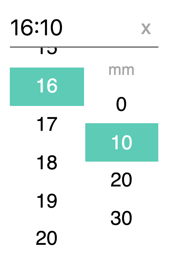
13 |
14 |
15 | ## Install
16 |
17 | ``` bash
18 | npm install vue-timeselector --save
19 | ```
20 | or
21 | ``` bash
22 | yarn add vue-timeselector
23 | ```
24 |
25 | Node bundle installation:
26 | ``` javascript
27 | import Timeselector from 'vue-timeselector';
28 |
29 | export default {
30 | // ...
31 | components: {
32 | Timeselector
33 | }
34 | // ...
35 | }
36 | ```
37 |
38 | **OR**
39 |
40 | Browser bundle installation:
41 | ``` html
42 |
43 |
44 |
45 |
46 |
47 |
50 |
51 | ```
52 |
53 |
54 | ## Usage
55 | ### Basic Usage
56 |
57 | ``` html
58 |
59 |
60 | ```
61 |
62 | Value prop if passed should be a `Date` object in order to inject a preconfigured time or `null` if you want to set the picker default time as `0:0`.
63 |
64 | ``` html
65 |
66 |
67 |
68 |
69 |
70 |
83 |
84 | ```
85 |
86 | Using `v-modal` lets you benefit of the "two-way-binding" thanks to the `input` emitted event included in the prop. But you can also use `:value` prop in order to inject data in vue-timeselector component and listen the `input` event manualy:
87 | ``` html
88 |
89 | ```
90 |
91 | Supports name attribute for normal HTML form submission
92 | ``` html
93 |
94 | ```
95 |
96 | Supports id attribute as well
97 | ``` html
98 |
99 | ```
100 |
101 | Make a use of state attributes like disabled or required
102 | ``` html
103 |
104 | ```
105 |
106 | Choose a placeholder as default views
107 | ``` html
108 |
109 | ```
110 |
111 | Emits events
112 | ``` html
113 |
114 | ```
115 |
116 | **All [props](#available-props) are listed in the props array below**
117 |
118 | **All [events](#events) are listed in the event array below**
119 |
120 | ### Custom modal box
121 |
122 | Vue-timeselector component lets you choose what kind of information you want to display in the modal box (aka the picker). You can choose to give your users access to **hours**, **minutes**, **seconds**. Furthermore, you can disable any of them by using the following props:
123 |
124 | * `:displayHours="false"` - {Boolean} *optionnal* - default: `true`
125 | * `:displayMinutes="false"` - {Boolean} *optionnal* - default: `true`
126 | * `:displaySeconds="false"` - {Boolean} *optionnal* - default: `false`
127 |
128 | Displays options doesn't act on the time format you see in the input field. You need to use custom time formatting props to change it.
129 |
130 | Also, keep in mind that *AM-PM options* appears automatically in the modal box by passing the prop `h24` to `false` (`:h24="false"`) - see [here](#12-hours-in-modal) to learn more about it.
131 |
132 | ### Customized Time Format
133 |
134 | Timeselector give the opportunity to customize time displayed and returned format.
135 |
136 | By default, timeselector displays time as `H:m` (eg, *16:5*) following UTC datetime and 24h format. Time type displayed depends on modals you have chosen in the modalbox props (`:displayHours`, `:displayMinutes`...).
137 |
138 | You can change the separator by setting it in the *separator* props : `:separator="':'"`. Default separator is `:` symbol.
139 |
140 | The best option to fully custom time displayed in the input is to use the *displayFormat* props : `:displayFormat="'HH[h]mm : ss'"`.
141 |
142 | It's possible to escape a letter used for formatting ("h", "H", "m" ...) by surrounding it with brackets, eg. `HH[h]mm` could render *01h35*.
143 | Time may be set to UTC or not in order to display and return UTC time.
144 |
145 | Finally, the component returns a `Date` object and is complient with other format thanks to `returnFormat` props. In combination with `formatedTime` event, this props let you listen for a returned date format that should be configured in the same way as the `displayFormat` props.
146 |
147 | Please, keep in mind that prop makes the component return a String (and not a date anymore). So `UTC` formatting doesn't affect the returned string that is now the absolute number on which user has clicked.
148 | Also, note that the `:value` returned by the component is still a `Date` object. You need `formatedTime` event to listen the formated date.
149 |
150 | ⚠️ (Since 0.1.4, `returnDate` is accessible from `formatedTime` event and not directly from the `:value` anymore)
151 |
152 | ``` html
153 |
154 |
155 | ```
156 |
157 | #### String formatter
158 |
159 | | Token | Desc | Example |
160 | |-------|-----------------------------------------|-----------------|
161 | | H | hour from 0 to 23 (non-zero padded) | 0 1 ... 22 23 |
162 | | HH | hour from 0 to 23 (zero padded) | 00 01 ... 22 23 |
163 | | h | hour from 1 to 12 (non-zero padded) | 1 2 ... 11 12 |
164 | | hh | hour from 1 to 12 (zero padded) | 01 02 ... 11 12 |
165 | | k | hour from 1 to 24 (non-zero padded) | 1 2 ... 23 24 |
166 | | kk | hour from 1 to 24 (zero padded) | 01 02 ... 23 24 |
167 | | m | one digit minutes | 0 1 ... 58 59 |
168 | | mm | two digits minutes | 00 01 ... 58 59 |
169 | | s | one digit seconds | 0 1 ... 58 59 |
170 | | ss | two digits seconds | 00 01 ... 58 59 |
171 | | a | AM-PM Period code | AM/PM |
172 |
173 |
174 | ### 12 hours in modal
175 |
176 | It's easy to set 12h - 24h time mode on vue-timeselector. Just feed the `:h24` prop with a Boolean. If true, the modalbox will display time until 23h, if false, the modalbox will display time until 12h and a AM-PM option as well.
177 |
178 | Don't forget that h24 only affect the modalbox, so you may wish to set `:format` props in a special way in order to display input time in a 12h format (see above).
179 |
180 | ### Interval in modal
181 |
182 | Vue-timeselector allows you to choose the time interval you want to set for each unit of time in the modalbox. You may want to display only hours that are multiples of two, every minute, and the seconds of the group by ten. To achieve this goal, you only have to fill an object with hours `h`, minutes `m`and seconds `s` keys, that you will set in the `interval` prop.
183 |
184 | ``` html
185 |
186 | ```
187 |
188 | Interval prop default value is `{h:1, m:10, s:10}`:
189 |
190 | * **hours: 1**: each hours - eache one unit (0, 1, 2, ...)
191 | * **minutes: 10**: each 10 minutes - eache 10 unit (0, 10, 20, ...)
192 | * **seconds: 10**: each 10 seconds - eache 10 unit (0, 10, 20, ...)
193 |
194 |
195 | ### Highligth time
196 |
197 | Just like interval prop, vue-timeselector allows you to choose an highlight list of times you may want to set for each unit of time in the modalbox. You may want to highlight a special hour, minute or second setting in the modalbox. The `highlight` prop give you the opportunity to do that. And because you may also want to highlight multiple times in the same kind of unit (multiple hours and minutes for exemple), vue-timeselector let you emphasis many of them. To achieve this goal, you only have to fill an object with hours `h`, minutes `m`and seconds `s` keys, and feed them with arrays which contain a list of times you wish your users focus on.
198 |
199 | ``` html
200 |
201 |
202 | ```
203 |
204 | You may fill arrays with specific time number or even with DateTime expression eg `:highlight="{h:[new Date], m: null, s: null}">`. Also you should avoid use disable hour with `h24` prop set to `false` in order to avoid AM-PM time confusion.
205 |
206 | Note that list of numbers are not interval but lists of specific times.
207 |
208 | ### Disable time
209 |
210 | Just like highlight prop, vue-timeselector allows you to choose a disabled list of times you may want to set for each unit of time in the modalbox. You may want to disable a special hour, minute or second setting in the modalbox. The `disable` prop give you the opportunity to do that. And because you may also want to also disable multiple times in the same kind of unit (multiple hours and minutes for exemple), vue-timeselector let you disable many of them. To achieve this goal, you only have to fill an object with hours `h`, minutes `m`and seconds `s` keys, and feed them with arrays which contain a list of times you wish your users focus on.
211 |
212 | ``` html
213 |
214 |
215 | ```
216 |
217 | You may fill arrays with specific time number or even with DateTime expression eg `:highlight="{h:[new Date], m: null, s: null}">`. Also you should avoid use disable hour with `h24` prop set to `false` in order to avoid AM-PM time confusion.
218 |
219 | Note that list of numbers are not interval but lists of specific times.
220 |
221 | ### Slots
222 |
223 | Slots will help you to introduce some code or text inside the picker.
224 |
225 | Slots list:
226 |
227 | - **`hours`**: in order to insert code/text above hours selectbox (default: `HH`)
228 | - **`minutes`**: in order to insert code/text above minutes selectbox (default: `mm`)
229 | - **`seconds`**: in order to insert code/text above seconds selectbox (default: `ss`)
230 | - **`ampm`**: in order to insert code/text above ampm selectbox (default: `AM / PM`)
231 | - **`clear-ico`**: in order to insert another icon into the clear button ad symbol (default: `x`)
232 |
233 | ``` html
234 |
235 |
236 | Hours
237 |
238 |
239 | ```
240 |
241 | ### Style selector (TODO)
242 |
243 | ...
244 |
245 | ### Use classes to curstomize elements
246 | #### Classes structure
247 |
248 | vue-timeselector is built following [BEM](http://getbem.com/) guidelines so it's easy for everyone to overrides the component's styles for each elements and their modifiers. As exemple, you may want to hide the clear button by setting a `display: none` on the `.vtimeselector__clear` element.
249 |
250 | Here is the classes structure:
251 |
252 | ##### Block - Elements
253 |
254 | ```
255 | | .vtimeselector
256 | |
257 | |----- .vtimeselector__input
258 | |----- .vtimeselector__clear
259 | |----- .vtimeselector__box
260 | | |
261 | | | ----- .vtimeselector__box__list .vtimeselector__box__list--hours
262 | | | |
263 | | | | ----- vtimeselector__box__item .vtimeselector__box__item--hours
264 | | | | ----- vtimeselector__box__item .vtimeselector__box__item--hours
265 | | | | ----- ...
266 | | |
267 | | | ----- .vtimeselector__box__list .vtimeselector__box__list--minutes
268 | | | |
269 | | | | ----- vtimeselector__box__item .vtimeselector__box__item--minutes
270 | | | | ----- vtimeselector__box__item .vtimeselector__box__item--minutes
271 | | | | ----- ...
272 | | |
273 | | | ----- .vtimeselector__box__list .vtimeselector__box__list--seconds
274 | | | |
275 | | | | ----- vtimeselector__box__item .vtimeselector__box__item--seconds
276 | | | | ----- vtimeselector__box__item .vtimeselector__box__item--seconds
277 | | | | ----- ..
278 | | |
279 | | | ----- .vtimeselector__box__list .vtimeselector__box__list--ampm
280 | | | |
281 | | | | ----- vtimeselector__box__item .vtimeselector__box__item--ampm
282 | | | | ----- vtimeselector__box__item .vtimeselector__box__item--ampm
283 | | | | ----- ...
284 | ```
285 |
286 | ##### Modifiers
287 |
288 | - **`.vtimeselector__input--is-open`**: Modifier displayed on `.vtimeselector__input` element when the modal is opened
289 |
290 | - **`.vtimeselector__box--is-closed`**: Modifier displayed on `.vtimeselector__box` element when the modal is closed
291 |
292 | - **`.timeselector__box__item--is-highlighted`**: Modifier displayed on `.timeselector__box__item` element when the item is highlighted
293 |
294 | - **`.timeselector__box__item--is-selected`**: Modifier displayed on `.timeselector__box__item` element when the item is selected
295 |
296 | - **`.timeselector__box__item--is-disabled`**: Modifier displayed on `.timeselector__box__item` element when the item is disabled
297 |
298 |
299 | ## Available props
300 |
301 | | Prop | Type | Default | Description |
302 | |-------------------------------|------------------|---------------------|----------------------------------------------------------|
303 | | value | Date / Null | | Date value of the timepicker |
304 | | name | String | | Input name property |
305 | | id | String | | Input id |
306 | | placeholder | String | | Input placeholder text |
307 | | required | Boolean | false | Sets html required attribute on input |
308 | | disabled | Boolean | false | If true, disable timepicker on screen |
309 | | displayHours | Boolean | true | Display hours to the input |
310 | | displayMinutes | Boolean | true | Display minutes to the input |
311 | | displaySeconds | Boolean | false | Display seconds to the input |
312 | | separator | String | ":" | Separator symbol used if no displayFormat |
313 | | padTime | Boolean | true | Pads number with a zero (both input and modal) |
314 | | displayFormat | String | | Time formatting string displayed |
315 | | returnFormat | String | | Time formatting string returned |
316 | | h24 | Boolean | false | Display 24 hours format |
317 | | utc | Boolean | true | Return UTC date format |
318 | | initialView | Boolean | false | Open on the first |
319 | | interval | Object | {h:1, m:10, s:10} | Define hours, minutes and seconds interval to the picker |
320 | | highlight | Object | | Hightligth defined time on hours, minutes and seconds |
321 | | disable | Object | | Disable specific time on hours, minutes and seconds |
322 | | pickerStyle | String | `TODO` | Set the timepicker style |
323 |
324 |
325 | ## Events
326 |
327 | These events are emitted on actions in the timepicker
328 |
329 | | Event | Output | Description |
330 | |-------------------|------------|--------------------------------------|
331 | | opened | Node | The picker is opened |
332 | | closed | Node | The picker is closed |
333 | | selectedHour | Date | An hour has been selected |
334 | | selectedMinute | Date | A minute has been selected |
335 | | selectedSecond | Date | A second has been selected |
336 | | selectedAmpm | String | A ampm field has been selected |
337 | | selectedDisabled | | A disabled time has been selected |
338 | | formatedTime | String | Time formatting string emited |
339 | | input | Date | Input value has been modified |
340 | | cleared | | Selected time has been cleared |
341 |
342 | ## Contributing
343 | ### Tests
344 |
345 | Component tests are made using [Jest](https://jestjs.io/) and are written inside the `tests` folder. You can start a test session by running the following commands:
346 |
347 | ``` bash
348 |
349 | npm test
350 | yarn test
351 |
352 | ```
353 |
354 | ### Demos server
355 |
356 | Also you can start a webpack webdev server **on the demo file** by running the belowing command. It will open a new window at the `9900` port of your local host.
357 |
358 | ``` bash
359 |
360 | npm start
361 | yarn start
362 |
363 | ```
364 |
365 | ### Documentation
366 |
367 | vue-timeselector make a use of [vue-styleguidist](https://vue-styleguidist.github.io/) to generate auto documentation. In order to regenerate it, run the following commands:
368 |
369 | ``` bash
370 | # to start style a guide dev server
371 | npm run styleguide
372 |
373 | # to build a static version
374 | npm run styleguide:build
375 | ```
376 |
377 | **Component's documentation is available [here](https://alexiscolin.github.io/vue-timeselector/)**
378 |
379 | ### Changelog
380 | [See the changelog](https://github.com/alexiscolin/vue-timeselector/blob/master/CHANGELOG.md)
381 |
382 | ### TODO
383 |
384 | * Picker defined style
385 | * Merge returnFormat and displayFormat props
386 | * More tests
387 |
388 | ## License
389 |
390 | [MIT](http://opensource.org/licenses/MIT)
391 |
--------------------------------------------------------------------------------
/src/VueTimeSelector.vue:
--------------------------------------------------------------------------------
1 |
2 |
3 |
14 |
15 | x
16 |
17 |
18 |
19 |
20 | - HH
21 | - {{hour}}
25 |
26 |
27 | - mm
28 | - {{minute}}
32 |
33 |
34 | - ss
35 | - {{second}}
39 |
40 |
41 | - AM / PM
42 | - AM
45 | - PM
48 |
49 |
50 |