├── .gitignore
├── .npmignore
├── LICENSE
├── README.md
├── demo
└── asset
│ └── demo.gif
├── index.js
├── lib
├── RadioButton.component.js
├── RadioButton.style.js
├── RadioGroup.component.js
└── RadioGroup.style.js
├── package-lock.json
└── package.json
/.gitignore:
--------------------------------------------------------------------------------
1 | # node.js
2 | #
3 | node_modules/
4 | npm-debug.log
5 |
--------------------------------------------------------------------------------
/.npmignore:
--------------------------------------------------------------------------------
1 | # node.js
2 | #
3 | node_modules/
4 | npm-debug.log
5 |
--------------------------------------------------------------------------------
/LICENSE:
--------------------------------------------------------------------------------
1 | ISC License (ISC)
2 |
3 | Copyright 2016 Ayushi Nigam
4 |
5 | Permission to use, copy, modify, and/or distribute this software for any purpose with or without fee is hereby granted, provided that the above copyright notice and this permission notice appear in all copies.
6 |
7 | THE SOFTWARE IS PROVIDED "AS IS" AND THE AUTHOR DISCLAIMS ALL WARRANTIES WITH REGARD TO THIS
8 | SOFTWARE INCLUDING ALL IMPLIED WARRANTIES OF MERCHANTABILITY AND FITNESS. IN NO EVENT SHALL THE
9 | AUTHOR BE LIABLE FOR ANY SPECIAL, DIRECT, INDIRECT, OR CONSEQUENTIAL DAMAGES
10 | OR ANY DAMAGES WHATSOEVER RESULTING FROM LOSS OF USE, DATA OR PROFITS,
11 | WHETHER IN AN ACTION OF CONTRACT, NEGLIGENCE OR OTHER TORTIOUS ACTION,
12 | ARISING OUT OF OR IN CONNECTION WITH THE USE OR PERFORMANCE OF THIS SOFTWARE.
13 |
--------------------------------------------------------------------------------
/README.md:
--------------------------------------------------------------------------------
1 | # react-native-custom-radio-group
2 |
3 | A react native radio group component with custom radio button. The component enables single select radio button behaviour with default select option and customization of the button styles.
4 |
5 | Example:
6 | Example uses default styles by RadioGroup
7 | 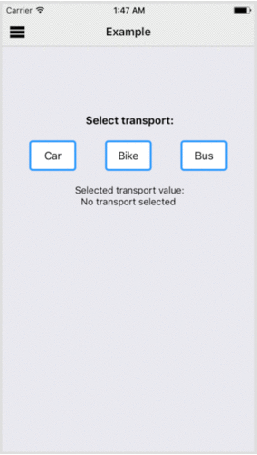
8 |
9 | Installation:
10 | ```javascript
11 | npm install react-native-custom-radio-group --save
12 | ```
13 | Props:
14 | * radioGroupList (Required) : An array of object; object => {label: '', value: ''}
15 | * onChange: CallBack with the value of selected radio button
16 | * initialValue: Value of the option to be initially selected
17 | * containerStyle: Style of the radio group container
18 | * buttonContainerStyle: Base style of the custom button container,
19 | * buttonTextStyle: Base style of the custom button label text,
20 | * buttonContainerActiveStyle: Added style of the custom button container when active,
21 | * buttonContainerInactiveStyle: Added style of the custom button container when inactive,
22 | * buttonTextActiveStyle: Added style of the custom button text when active,
23 | * buttonTextInactiveStyle: Added style of the custom button text when inactive
24 |
25 | Usage:
26 | ```javascript
27 | import React, {Component} from 'react';
28 | import {View, Text} from 'react-native';
29 | import RadioGroup from 'react-native-custom-radio-group';
30 | import {radioGroupList} from './radioGroupList.js'
31 |
32 | export default class MyComponent extends Component {
33 | render () {
34 | return (
35 |
36 | SELECT:
37 |
38 | );
39 | }
40 | }
41 |
42 |
43 | ```
44 | ```javascript
45 | //radioGroupList.js
46 | export const radioGroupList = [{
47 | label: 'Car',
48 | value: 'transport_car'
49 | }, {
50 | label: 'Bike',
51 | value: 'transport_bike'
52 | }, {
53 | label: 'Bus',
54 | value: 'transport_bus'
55 | }];
56 | ```
57 |
--------------------------------------------------------------------------------
/demo/asset/demo.gif:
--------------------------------------------------------------------------------
https://raw.githubusercontent.com/ayushinigam/react-native-custom-radio-group/89d95e900c223e8402fb6d03a01f70c90bbb2e81/demo/asset/demo.gif
--------------------------------------------------------------------------------
/index.js:
--------------------------------------------------------------------------------
1 | import RadioGroup from './lib/RadioGroup.component'
2 |
3 | export default RadioGroup;
4 |
--------------------------------------------------------------------------------
/lib/RadioButton.component.js:
--------------------------------------------------------------------------------
1 | import React, {Component} from 'react';
2 | import Proptypes from 'prop-types';
3 | import {Text, TouchableWithoutFeedback, View } from 'react-native';
4 | import noop from 'lodash.noop';
5 | import styles from './RadioButton.style';
6 |
7 | class RadioButton extends Component {
8 | onToggle = () => {
9 | const {radioSelect, value, index} = this.props;
10 | radioSelect(index, value);
11 | }
12 | render () {
13 | const {active, label, buttonContainerStyle, buttonTextStyle,
14 | buttonContainerActiveStyle, buttonContainerInactiveStyle, buttonTextActiveStyle,
15 | buttonTextInactiveStyle} = this.props;
16 |
17 | const activeContainerStyles = active ? [styles.active, buttonContainerActiveStyle] : [styles.inactive, buttonContainerInactiveStyle];
18 | const activeTextStyles = active ? [styles.activeText, buttonTextActiveStyle] : [styles.inactiveText, buttonTextInactiveStyle];
19 | return (
20 |
21 |
22 | {label}
23 |
24 | );
25 | }
26 | }
27 | RadioButton.defaultProps = {
28 | index: 0,
29 | active: false,
30 | label: '',
31 | value: '',
32 | radioSelect: noop,
33 | buttonContainerStyle: {},
34 | buttonTextStyle: {},
35 | buttonContainerActiveStyle: {},
36 | buttonContainerInactiveStyle: {},
37 | buttonTextActiveStyle: {},
38 | buttonTextInactiveStyle: {}
39 | };
40 | RadioButton.propTypes = {
41 | index: Proptypes.number,
42 | active: Proptypes.bool,
43 | label: Proptypes.string,
44 | value: Proptypes.string,
45 | radioSelect: Proptypes.func,
46 | buttonContainerStyle: Proptypes.object,
47 | buttonTextStyle: Proptypes.object,
48 | buttonContainerActiveStyle: Proptypes.object,
49 | buttonContainerInactiveStyle: Proptypes.object,
50 | buttonTextActiveStyle: Proptypes.object,
51 | buttonTextInactiveStyle: Proptypes.object
52 | };
53 | export default RadioButton;
54 |
--------------------------------------------------------------------------------
/lib/RadioButton.style.js:
--------------------------------------------------------------------------------
1 | export default {
2 | container: {
3 | borderWidth: 3,
4 | borderColor: '#339CFF',
5 | borderRadius: 5,
6 | alignItems: 'center',
7 | justifyContent: 'center',
8 | padding: 10,
9 | width: 70
10 | },
11 | active: {
12 | backgroundColor: '#33CAFF'
13 | },
14 | inactive: {
15 | backgroundColor: '#FFF'
16 | },
17 | text: {
18 | fontSize: 16
19 | },
20 | activeText: {
21 | color: '#FFF',
22 | fontWeight: 'bold'
23 | },
24 | inactiveText: {
25 | color: '#000'
26 | }
27 | };
28 |
--------------------------------------------------------------------------------
/lib/RadioGroup.component.js:
--------------------------------------------------------------------------------
1 | import React, {Component} from 'react';
2 | import Proptypes from 'prop-types';
3 | import {View} from 'react-native';
4 | import map from 'lodash.map';
5 | import noop from 'lodash.noop';
6 | import result from 'lodash.result';
7 | import findindex from 'lodash.findindex';
8 | import RadioButton from './RadioButton.component';
9 | import styles from './RadioGroup.style';
10 |
11 | class RadioGroup extends Component {
12 | state = {
13 | selected: findindex(this.props.radioGroupList, ['value', this.props.initialValue])
14 | }
15 |
16 | radioSelect = (key, value) => {
17 | this.setState({selected: key});
18 | this.props.onChange(value);
19 | }
20 | render () {
21 | const {selected} = this.state;
22 | const {radioGroupList, containerStyle, buttonContainerStyle, buttonTextStyle,
23 | buttonContainerActiveStyle, buttonContainerInactiveStyle, buttonTextActiveStyle,
24 | buttonTextInactiveStyle} = this.props;
25 |
26 | const radioGroup = map(radioGroupList, (radiocomp, index) =>
27 |
28 |
34 | );
35 |
36 | return (
37 |
38 | {radioGroup}
39 | );
40 | }
41 | }
42 | RadioGroup.defaultProps = {
43 | radioGroupList: [], // [{label: '', value: ''}]
44 | onChange: noop, // CallBack with the selected radio button value
45 | initialValue: '', // VALUE of option to be intially selected
46 | containerStyle: {},
47 | buttonContainerStyle: {},
48 | buttonTextStyle: {},
49 | buttonContainerActiveStyle: {},
50 | buttonContainerInactiveStyle: {},
51 | buttonTextActiveStyle: {},
52 | buttonTextInactiveStyle: {}
53 | };
54 | RadioGroup.propTypes = {
55 | radioGroupList: Proptypes.array.isRequired,
56 | onChange: Proptypes.func,
57 | initialValue: Proptypes.string,
58 | containerStyle: Proptypes.object,
59 | buttonContainerStyle: Proptypes.object,
60 | buttonTextStyle: Proptypes.object,
61 | buttonContainerActiveStyle: Proptypes.object,
62 | buttonContainerInactiveStyle: Proptypes.object,
63 | buttonTextActiveStyle: Proptypes.object,
64 | buttonTextInactiveStyle: Proptypes.object
65 | };
66 | export default RadioGroup;
67 |
--------------------------------------------------------------------------------
/lib/RadioGroup.style.js:
--------------------------------------------------------------------------------
1 | export default {
2 | container: {
3 | flexDirection: 'row',
4 | justifyContent: 'space-between'
5 | }
6 | };
7 |
--------------------------------------------------------------------------------
/package-lock.json:
--------------------------------------------------------------------------------
1 | {
2 | "name": "react-native-custom-radio-group",
3 | "version": "1.0.0",
4 | "lockfileVersion": 1,
5 | "requires": true,
6 | "dependencies": {
7 | "lodash.findindex": {
8 | "version": "4.6.0",
9 | "resolved": "https://registry.npmjs.org/lodash.findindex/-/lodash.findindex-4.6.0.tgz",
10 | "integrity": "sha1-oyRd7mH7m24GJLU1ElYku2nBEQY="
11 | },
12 | "lodash.map": {
13 | "version": "4.6.0",
14 | "resolved": "https://registry.npmjs.org/lodash.map/-/lodash.map-4.6.0.tgz",
15 | "integrity": "sha1-dx7Hg540c9nEzeKLGTlMNWL09tM="
16 | },
17 | "lodash.noop": {
18 | "version": "3.0.1",
19 | "resolved": "https://registry.npmjs.org/lodash.noop/-/lodash.noop-3.0.1.tgz",
20 | "integrity": "sha1-OBiPTWUKOkdCWEObluxFsyYXEzw="
21 | },
22 | "lodash.result": {
23 | "version": "4.5.2",
24 | "resolved": "https://registry.npmjs.org/lodash.result/-/lodash.result-4.5.2.tgz",
25 | "integrity": "sha1-y0Wyf7kU6qjY7m8M57KHC4fLcKo="
26 | }
27 | }
28 | }
29 |
--------------------------------------------------------------------------------
/package.json:
--------------------------------------------------------------------------------
1 | {
2 | "name": "react-native-custom-radio-group",
3 | "version": "1.0.1",
4 | "description": "React native radio group with custom component",
5 | "main": "index.js",
6 | "scripts": {
7 | "test": ""
8 | },
9 | "repository": {
10 | "type": "git",
11 | "url": "git+https://github.com/ayushinigam/react-native-custom-radio-group.git"
12 | },
13 | "keywords": [
14 | "react",
15 | "react-native",
16 | "radio",
17 | "custom",
18 | "button",
19 | "group"
20 | ],
21 | "author": "Ayushi Nigam",
22 | "license": "ISC",
23 | "bugs": {
24 | "url": "https://github.com/ayushinigam/react-native-custom-radio-group/issues"
25 | },
26 | "homepage": "https://github.com/ayushinigam/react-native-custom-radio-group#readme",
27 | "dependencies": {
28 | "lodash.findindex": "^4.6.0",
29 | "lodash.map": "^4.6.0",
30 | "lodash.noop": "^3.0.1",
31 | "lodash.result": "^4.5.2"
32 | },
33 | "devDependencies": {}
34 | }
35 |
--------------------------------------------------------------------------------