21 |
22 |
we build brands
23 |
24 |
26 |
27 |
28 |
29 |
30 |
31 |
LET’S TURN
32 |
YOUR
33 |
34 |
STORY
35 |
WELL THOUGHT-OUT.
36 | COVERING YOUR BUSINESS STRATEGY.
37 | RESPONSIVE TO TIME AND TRENDS.
38 |
39 |
40 |
41 |
INTO
42 | A BRAND
43 | THAT LASTS
44 |
45 |
46 |
47 |
48 |
49 |

51 |
52 |
53 |
54 |
55 |

57 |
58 |
59 |
60 |
62 |
63 |
64 |
65 |
66 |
68 |
69 |
70 |
71 |
72 |

74 |
75 |
76 |
77 |
78 |
79 |
80 |
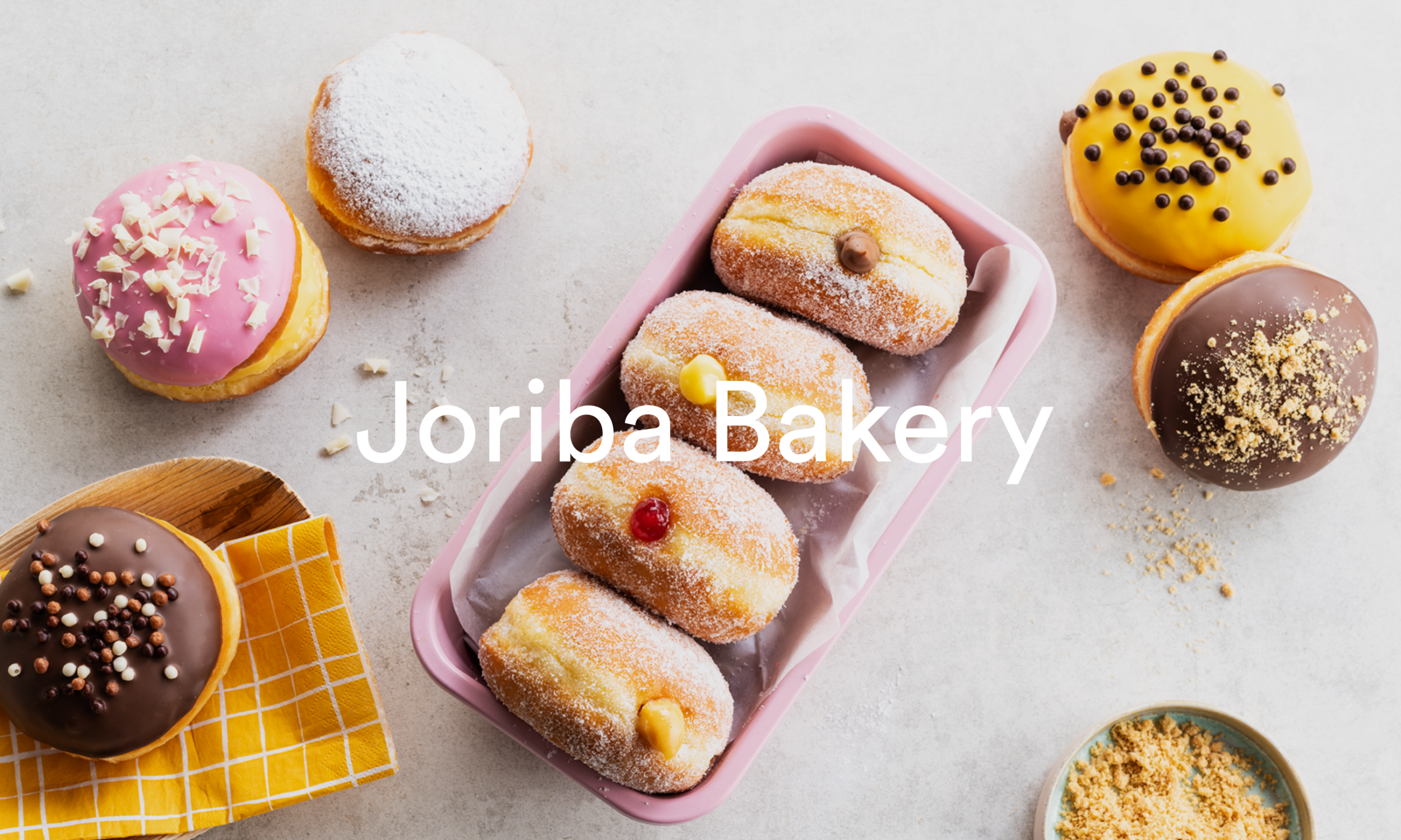
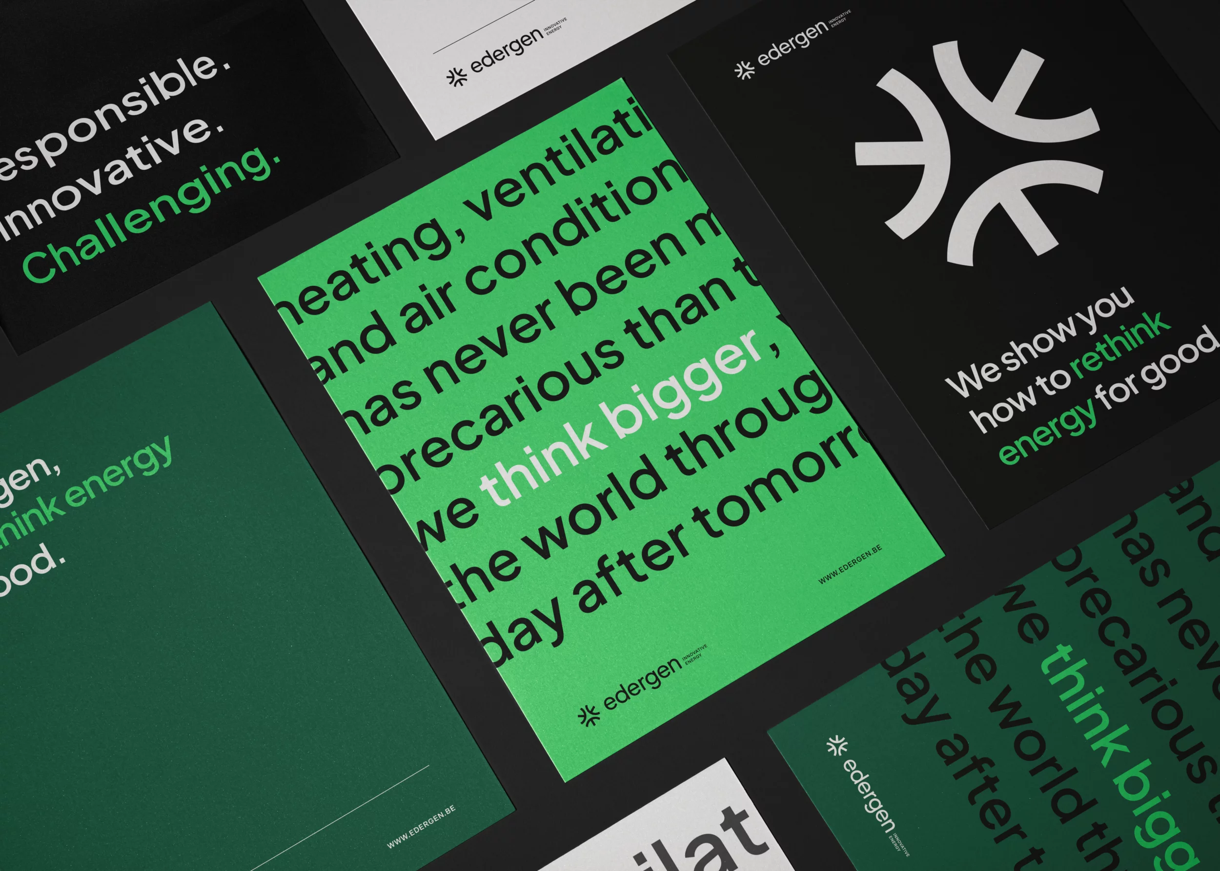
more cases
81 |
82 |
WE’LL BE
YOUR SPARRING
PARTNERS
83 |
THIS IS YOUR TEAM OF BRAND EXPERTS,
READY TO MAKE YOUR BRAND STAND OUT.
84 |
ABOUT MOQO
85 |
86 |
88 |
89 |
90 |
91 |
92 |
BRANDING
93 |
94 |
INSIGHTS
95 |
ENJOY THIS FIVE-MINUTE BREAK TO STAY UP-TO-DATE AND GET INSPIRED.
96 |
97 |
98 |
99 |
100 |

102 |
Lorem ipsum dolor sit amet consectetur adipisicing elit. Ullam, molestias.
103 |
104 |
105 |

107 |
Lorem ipsum dolor sit amet consectetur adipisicing elit. Ullam, molestias.
108 |
109 |
110 |
111 |
more insights
112 |
113 |
114 |
115 |
116 |
LET’S BUILD
YOUR BRAND
117 | THIS IS YOUR TEAM OF BRAND EXPERTS,
READY TO MAKE YOUR BRAND STAND OUT.
118 | ABOUT MOQO
119 |
120 |
159 |
facebook
151 |instagram
152 |linkedin
153 |behance
154 |pinterest
155 |