├── .gitattributes
├── .gitignore
├── LICENSE
├── README.md
├── dist
├── base.98fd6c19.css
├── button.5d2fdfe7.css
├── button.93b3ed9d.css
├── button.9ccad82e.css
├── button.b160bf58.css
├── button.bc1eb4ce.css
├── button.f89f9832.css
├── demo.9ce5c2ea.js
├── demo1.151408fb.js
├── demo2.44794d1a.js
├── demo3.b516845c.js
├── demo4.e22d7780.js
├── demo5.c1b42ce3.js
├── demo6.a93520db.js
├── favicon.26242483.ico
├── index.html
├── index2.html
├── index3.html
├── index4.html
├── index5.html
└── index6.html
├── package.json
└── src
├── css
├── base.css
├── demo1
│ └── button.css
├── demo2
│ └── button.css
├── demo3
│ └── button.css
├── demo4
│ └── button.css
├── demo5
│ └── button.css
└── demo6
│ └── button.css
├── favicon.ico
├── index.html
├── index2.html
├── index3.html
├── index4.html
├── index5.html
├── index6.html
└── js
├── cursor.js
├── demo.js
├── demo1
├── buttonCtrl.js
└── index.js
├── demo2
├── buttonCtrl.js
└── index.js
├── demo3
├── buttonCtrl.js
└── index.js
├── demo4
├── buttonCtrl.js
└── index.js
├── demo5
├── buttonCtrl.js
└── index.js
├── demo6
├── buttonCtrl.js
└── index.js
└── utils.js
/.gitattributes:
--------------------------------------------------------------------------------
1 | # Auto detect text files and perform LF normalization
2 | * text=auto
3 |
--------------------------------------------------------------------------------
/.gitignore:
--------------------------------------------------------------------------------
1 | /node_modules
2 | /.cache
3 | package-lock.json
--------------------------------------------------------------------------------
/LICENSE:
--------------------------------------------------------------------------------
1 | MIT License
2 |
3 | Copyright (c) 2009 - 2020 [Codrops](https://tympanus.net/codrops)
4 |
5 | Permission is hereby granted, free of charge, to any person obtaining a copy
6 | of this software and associated documentation files (the "Software"), to deal
7 | in the Software without restriction, including without limitation the rights
8 | to use, copy, modify, merge, publish, distribute, sublicense, and/or sell
9 | copies of the Software, and to permit persons to whom the Software is
10 | furnished to do so, subject to the following conditions:
11 |
12 | The above copyright notice and this permission notice shall be included in all
13 | copies or substantial portions of the Software.
14 |
15 | THE SOFTWARE IS PROVIDED "AS IS", WITHOUT WARRANTY OF ANY KIND, EXPRESS OR
16 | IMPLIED, INCLUDING BUT NOT LIMITED TO THE WARRANTIES OF MERCHANTABILITY,
17 | FITNESS FOR A PARTICULAR PURPOSE AND NONINFRINGEMENT. IN NO EVENT SHALL THE
18 | AUTHORS OR COPYRIGHT HOLDERS BE LIABLE FOR ANY CLAIM, DAMAGES OR OTHER
19 | LIABILITY, WHETHER IN AN ACTION OF CONTRACT, TORT OR OTHERWISE, ARISING FROM,
20 | OUT OF OR IN CONNECTION WITH THE SOFTWARE OR THE USE OR OTHER DEALINGS IN THE
21 | SOFTWARE.
22 |
--------------------------------------------------------------------------------
/README.md:
--------------------------------------------------------------------------------
1 | # Magnetic Buttons
2 |
3 | A small set of magnetic buttons with some fun hover animations. Inspired by the button animation seen on [Cuberto](https://cuberto.com/services/).
4 |
5 | 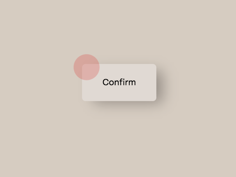
6 |
7 | [Article on Codrops](https://tympanus.net/codrops/?p=50513)
8 |
9 | [Demo](http://tympanus.net/Development/MagneticButtons/)
10 |
11 |
12 | ## Installation
13 |
14 | Install dependencies:
15 |
16 | ```
17 | npm install
18 | ```
19 |
20 | Compile the code for development and start a local server:
21 |
22 | ```
23 | npm start
24 | ```
25 |
26 | Create the build:
27 |
28 | ```
29 | npm run build
30 | ```
31 |
32 |
33 | ## Misc
34 |
35 | Follow Codrops: [Twitter](http://www.twitter.com/codrops), [Facebook](http://www.facebook.com/codrops), [GitHub](https://github.com/codrops), [Instagram](https://www.instagram.com/codropsss/)
36 |
37 | ## License
38 | [MIT](LICENSE)
39 |
40 | Made with :blue_heart: by [Codrops](http://www.codrops.com)
41 |
42 |
43 |
44 |
45 |
46 |
--------------------------------------------------------------------------------
/dist/base.98fd6c19.css:
--------------------------------------------------------------------------------
1 | *,
2 | *::after,
3 | *::before {
4 | box-sizing: border-box;
5 | }
6 |
7 | :root {
8 | font-size: 12px;
9 | }
10 |
11 | body {
12 | margin: 0;
13 | --color-text: #111;
14 | --color-bg: #e5e3df;
15 | --color-link: #000;
16 | --color-link-hover: #000;
17 | color: var(--color-text);
18 | background-color: var(--color-bg);
19 | font-family: tenon, -apple-system, BlinkMacSystemFont, Segoe UI, Helvetica, Arial, sans-serif;
20 | }
21 |
22 | .button {
23 | position: relative;
24 | }
25 |
26 | .active {
27 | cursor: pointer;
28 | }
29 |
30 | /* Fade effect */
31 | .js body {
32 | opacity: 0;
33 | transition: opacity 0.3s;
34 | }
35 |
36 | .js body.render {
37 | opacity: 1;
38 | }
39 |
40 | /* Page Loader */
41 | .js .loading::before,
42 | .js .loading::after {
43 | content: '';
44 | position: fixed;
45 | z-index: 1000;
46 | }
47 |
48 | .js .loading::before {
49 | top: 0;
50 | left: 0;
51 | width: 100%;
52 | height: 100%;
53 | background: var(--color-bg);
54 | }
55 |
56 | .js .loading::after {
57 | top: 50%;
58 | left: 50%;
59 | width: 60px;
60 | height: 60px;
61 | margin: -30px 0 0 -30px;
62 | border-radius: 50%;
63 | opacity: 0.4;
64 | background: var(--color-link);
65 | animation: loaderAnim 0.7s linear infinite alternate forwards;
66 |
67 | }
68 |
69 | @keyframes loaderAnim {
70 | to {
71 | opacity: 1;
72 | transform: scale3d(0.5,0.5,1);
73 | }
74 | }
75 |
76 | a {
77 | text-decoration: underline;
78 | color: var(--color-link);
79 | outline: none;
80 | }
81 |
82 | a:hover,
83 | a:focus {
84 | color: var(--color-link-hover);
85 | outline: none;
86 | text-decoration: none;
87 | }
88 |
89 | main {
90 | background-color: inherit;
91 | display: grid;
92 | height: 100vh;
93 | width: 100%;
94 | padding: 3rem;
95 | align-content: space-between;
96 | grid-column-gap: 5vw;
97 | grid-template-columns: 1fr;
98 | grid-template-rows: auto auto auto;
99 | grid-template-areas: 'header'
100 | 'content'
101 | 'demos';
102 |
103 | }
104 |
105 | .header {
106 | grid-area: header;
107 | display: flex;
108 | flex-wrap: wrap;
109 | text-transform: uppercase;
110 | }
111 |
112 | .header__title {
113 | font-size: 1rem;
114 | margin: 0 7vw 1rem 0;
115 | font-weight: normal;
116 | text-transform: uppercase;
117 | }
118 |
119 | .header__links a:not(:last-child) {
120 | margin-right: 1rem;
121 | }
122 |
123 | .demos {
124 | grid-area: demos;
125 | justify-self: center;
126 | position: relative;
127 | text-align: center;
128 | display: flex;
129 | }
130 |
131 | .demo {
132 | display: block;
133 | width: 14px;
134 | height: 14px;
135 | margin: 0 4px;
136 | border-radius: 50%;
137 | border: 2px solid var(--color-link);
138 | background: var(--color-link);
139 | }
140 |
141 | .demo--current {
142 | border-color: var(--color-link-hover);
143 | background: none;
144 | pointer-events: none;
145 | }
146 |
147 | .demo:hover,
148 | .demo:focus {
149 | opacity: 0.5;
150 | }
151 |
152 | .content {
153 | grid-area: content;
154 | display: flex;
155 | flex-direction: column;
156 | align-items: center;
157 | -webkit-touch-callout: none;
158 | -webkit-user-select: none;
159 | -moz-user-select: none;
160 | -ms-user-select: none;
161 | user-select: none;
162 | }
163 |
164 | .cursor {
165 | display: none;
166 | }
167 |
168 | @media (any-pointer: fine) {
169 | .cursor {
170 | position: fixed;
171 | top: 0;
172 | left: 0;
173 | display: block;
174 | pointer-events: none;
175 | }
176 | .cursor__inner {
177 | fill: var(--cursor-fill);
178 | stroke: var(--cursor-stroke);
179 | stroke-width: var(--cursor-stroke-width);
180 | }
181 | .credits {
182 | padding-left: 25vw;
183 | }
184 | }
185 |
--------------------------------------------------------------------------------
/dist/button.5d2fdfe7.css:
--------------------------------------------------------------------------------
1 | body {
2 | --button-border-radius: 50%;
3 | --button-bg: transparent;
4 | --button-stroke: #ce1352;
5 | --button-stroke-width: 1px;
6 | --button-text: #ffffff;
7 | --button-bg-hover: transparent;
8 | --button-stroke-hover: #ce1352;
9 | --button-stroke-width-hover: 1px;
10 | --button-text-hover: #ffffff;
11 | --cursor-stroke: #fff;
12 | --cursor-fill: #fff;
13 | --cursor-stroke-width: 1px;
14 | --color-text: #ffffff;
15 | --color-bg: #312b35;
16 | --color-link: #89639e;
17 | --color-link-hover: #ce1352;
18 | --button-filler: #ce1352;
19 | }
20 |
21 | .button {
22 | cursor: pointer;
23 | -moz-appearance: none;
24 | -webkit-appearance: none;
25 | color: var(--button-text);
26 | border: 0;
27 | background: none;
28 | width: 10rem;
29 | height: 10rem;
30 | padding: 0;
31 | margin: 1rem;
32 | font-family: inherit;
33 | font-size: 1.7rem;
34 | display: flex;
35 | align-items: center;
36 | justify-content: center;
37 | }
38 |
39 | .button:focus,
40 | .button--hover {
41 | outline: none;
42 | border-width: var(--button-stroke-width-hover);
43 | border-color: var(--button-stroke-hover);
44 | color: var(--button-text-hover);
45 | background: var(--button-bg-hover);
46 | }
47 |
48 | .button__deco {
49 | position: absolute;
50 | top: 0;
51 | left: 0;
52 | width: 100%;
53 | height: 100%;
54 | overflow: hidden;
55 | border-width: var(--button-stroke-width);
56 | border-color: var(--button-stroke);
57 | border-style: solid;
58 | border-radius: var(--button-border-radius);
59 | background: var(--button-bg);
60 | }
61 |
62 | .button__deco-filler {
63 | background: var(--button-filler);
64 | position: absolute;
65 | width: 150%;
66 | height: 200%;
67 | border-radius: 50%;
68 | top: -50%;
69 | left: -25%;
70 | transform: translate3d(0,75%,0);
71 | }
72 |
73 | .button__text,
74 | .button__text-inner {
75 | display: flex;
76 | align-items: center;
77 | justify-content: center;
78 | width: 100%;
79 | height: 100%;
80 | }
--------------------------------------------------------------------------------
/dist/button.93b3ed9d.css:
--------------------------------------------------------------------------------
1 |
2 | body {
3 | --button-border-radius: 7px;
4 | --button-bg: transparent;
5 | --button-stroke: #d8d4cf;
6 | --button-stroke-width: 0px;
7 | --button-text: #000;
8 | --button-bg-hover: #000;
9 | --button-stroke-hover: #000;
10 | --button-stroke-width-hover: 0px;
11 | --button-text-hover: #000;
12 | --button-text-focus: red;
13 | --cursor-stroke: red;
14 | --cursor-fill: red;
15 | --cursor-stroke-width: 0px;
16 | --button-bg-text: #e0d9d2;
17 | --color-bg: #d6ccc1;
18 | }
19 |
20 | .button {
21 | cursor: pointer;
22 | -moz-appearance: none;
23 | -webkit-appearance: none;
24 | border-width: var(--button-stroke-width);
25 | border-color: var(--button-stroke);
26 | border-style: solid;
27 | color: var(--button-text);
28 | background: var(--button-bg);
29 | border-radius: var(--button-border-radius);
30 | min-width: 12rem;
31 | height: 6rem;
32 | padding: 0;
33 | margin: 1rem;
34 | font-family: inherit;
35 | font-size: 1.5rem;
36 | display: flex;
37 | align-items: center;
38 | justify-content: center;
39 | }
40 |
41 | .button:focus,
42 | .button--hover {
43 | outline: none;
44 | border-width: var(--button-stroke-width-hover);
45 | border-color: var(--button-stroke-hover);
46 | color: var(--button-text-hover);
47 | }
48 |
49 | .button:focus {
50 | color: var(--button-text-focus);
51 | }
52 |
53 | .button::before {
54 | content: '';
55 | position: absolute;
56 | top: 5px;
57 | left: 5px;
58 | width: calc(100% - 10px);
59 | height: calc(100% - 10px);
60 | background: rgba(0,0,0,0.3);
61 | filter: blur(13px);
62 | border-radius: var(--button-border-radius);
63 | }
64 |
65 | .button__text,
66 | .button__text-inner {
67 | position: relative;
68 | display: flex;
69 | align-items: center;
70 | justify-content: center;
71 | width: 100%;
72 | height: 100%;
73 | }
74 |
75 | .button__text {
76 | flex: none;
77 | background: var(--button-bg-text);
78 | width: 100%;
79 | height: 100%;
80 | border-radius: var(--button-border-radius);
81 | }
--------------------------------------------------------------------------------
/dist/button.9ccad82e.css:
--------------------------------------------------------------------------------
1 | body {
2 | --button-border-radius: 40px;
3 | --button-bg: transparent;
4 | --button-stroke: #000;
5 | --button-stroke-width: 1px;
6 | --button-text: #000;
7 | --button-bg-hover: #d8d4cf;
8 | --button-stroke-hover: #000;
9 | --button-stroke-width-hover: 1px;
10 | --button-text-hover: #fff;
11 | --cursor-stroke: #fff;
12 | --cursor-fill: #fff;
13 | --cursor-stroke-width: 1px;
14 | --button-filler: #000;
15 | --color-bg: #ccc;
16 | }
17 |
18 | .button {
19 | cursor: pointer;
20 | -moz-appearance: none;
21 | -webkit-appearance: none;
22 | border-width: var(--button-stroke-width);
23 | border-color: var(--button-stroke);
24 | border-style: solid;
25 | color: var(--button-text);
26 | background: var(--button-bg);
27 | border-radius: var(--button-border-radius);
28 | min-width: 14rem;
29 | height: 6rem;
30 | padding: 0;
31 | margin: 1rem;
32 | font-family: inherit;
33 | font-size: 1.5rem;
34 | overflow: hidden;
35 | display: flex;
36 | align-items: center;
37 | justify-content: center;
38 | }
39 |
40 | .button:focus,
41 | .button--hover {
42 | outline: none;
43 | border-width: var(--button-stroke-width-hover);
44 | border-color: var(--button-stroke-hover);
45 | color: var(--button-text-hover);
46 | }
47 |
48 | .button__filler {
49 | background: var(--button-filler);
50 | position: absolute;
51 | width: 150%;
52 | height: 200%;
53 | border-radius: 50%;
54 | top: -50%;
55 | left: -25%;
56 | transform: translate3d(0,75%,0);
57 | }
58 |
59 | .button__text,
60 | .button__text-inner {
61 | display: flex;
62 | align-items: center;
63 | justify-content: center;
64 | width: 100%;
65 | height: 100%;
66 | }
--------------------------------------------------------------------------------
/dist/button.b160bf58.css:
--------------------------------------------------------------------------------
1 | body {
2 | --button-border-radius: 50%;
3 | --button-bg: transparent;
4 | --button-stroke-1: #5a5456;
5 | --button-stroke-2: #5a5456;
6 | --button-stroke-width: 1px;
7 | --button-text: #ffffff;
8 | --button-bg-hover: transparent;
9 | --button-stroke-hover-1: #31a290;
10 | --button-stroke-hover-2: #31a290;
11 | --button-stroke-width-hover: 1px;
12 | --button-text-hover: #fff;
13 | --cursor-stroke: #330ec1;
14 | --cursor-fill: #330ec1;
15 | --cursor-stroke-width: 1px;
16 | --color-text: #ffffff;
17 | --color-bg: #1e1e23;
18 | --color-link: #e20c6a;
19 | --color-link-hover: #5a5456;
20 | }
21 |
22 | .button {
23 | cursor: pointer;
24 | -moz-appearance: none;
25 | -webkit-appearance: none;
26 | border: 0;
27 | color: var(--button-text);
28 | background: none;
29 | width: 10rem;
30 | height: 10rem;
31 | padding: 0;
32 | margin: 1rem;
33 | font-family: inherit;
34 | font-size: 1.5rem;
35 | display: flex;
36 | align-items: center;
37 | justify-content: center;
38 | position: relative;
39 | }
40 |
41 | .button:focus,
42 | .button--hover {
43 | outline: none;
44 | border-color: var(--button-stroke-hover);
45 | color: var(--button-text-hover);
46 | background: var(--button-bg-hover);
47 | }
48 |
49 | .button__deco {
50 | position: absolute;
51 | top: 0;
52 | left: 0;
53 | width: 100%;
54 | height: 100%;
55 | border-width: var(--button-stroke-width);
56 | border-style: solid;
57 | border-radius: var(--button-border-radius);
58 | }
59 |
60 | .button__deco--1 {
61 | border-color: var(--button-stroke-1);
62 | }
63 |
64 | .button--hover .button__deco--1 {
65 | border-color: var(--button-stroke-hover-1);
66 | }
67 |
68 | .button__deco--2 {
69 | border-color: var(--button-stroke-2);
70 | }
71 |
72 | .button--hover .button__deco--2 {
73 | border-color: var(--button-stroke-hover-2);
74 | }
75 |
76 | .button__text,
77 | .button__text-inner {
78 | display: flex;
79 | align-items: center;
80 | justify-content: center;
81 | width: 100%;
82 | height: 100%;
83 | }
84 |
85 | .button__text {
86 | overflow: hidden;
87 | }
--------------------------------------------------------------------------------
/dist/button.bc1eb4ce.css:
--------------------------------------------------------------------------------
1 | body {
2 | --button-border-radius: 7px;
3 | --button-bg: transparent;
4 | --button-stroke: #1c386f;
5 | --button-stroke-width: 2px;
6 | --button-text: #1c386f;
7 | --button-bg-hover: #fff;
8 | --button-stroke-hover: #1c386f;
9 | --button-stroke-width-hover: 2px;
10 | --button-text-hover: #1c386f;
11 | --cursor-stroke: #1c386f;
12 | --cursor-fill: #1c386f;
13 | --cursor-stroke-width: 1px;
14 | --button-deco: #fff;
15 | --color-text: #fff;
16 | --color-bg: #ccc0a3;
17 | --color-link: #1c386f;
18 | --color-link-hover: #fff;
19 | }
20 |
21 | .button-wrap {
22 | position: relative;
23 | perspective: 1000px;
24 | }
25 |
26 | .button {
27 | cursor: pointer;
28 | -moz-appearance: none;
29 | -webkit-appearance: none;
30 | border-width: var(--button-stroke-width);
31 | border-color: var(--button-stroke);
32 | border-style: solid;
33 | color: var(--button-text);
34 | background: var(--button-bg);
35 | border-radius: var(--button-border-radius);
36 | min-width: 18rem;
37 | height: 9rem;
38 | padding: 0;
39 | margin: 1rem;
40 | font-family: inherit;
41 | font-size: 1.5rem;
42 | overflow: hidden;
43 | display: flex;
44 | align-items: center;
45 | justify-content: center;
46 | }
47 |
48 | .button:focus,
49 | .button--hover {
50 | outline: none;
51 | border-width: var(--button-stroke-width-hover);
52 | border-color: var(--button-stroke-hover);
53 | color: var(--button-text-hover);
54 | }
55 |
56 | .button__deco {
57 | background: var(--button-deco);
58 | position: absolute;
59 | width: 150%;
60 | height: 200%;
61 | top: -50%;
62 | left: -25%;
63 | transform: translate3d(0,75%,0);
64 | }
65 |
66 | .button__text,
67 | .button__text-inner {
68 | display: flex;
69 | align-items: center;
70 | justify-content: center;
71 | width: 100%;
72 | height: 100%;
73 | }
--------------------------------------------------------------------------------
/dist/button.f89f9832.css:
--------------------------------------------------------------------------------
1 | body {
2 | --button-border-radius: 7px;
3 | --button-bg: #d8d4cf;
4 | --button-stroke: #d8d4cf;
5 | --button-stroke-width: 1px;
6 | --button-text: #000;
7 | --button-bg-hover: #d8d4cf;
8 | --button-stroke-hover: #000;
9 | --button-stroke-width-hover: 2px;
10 | --button-text-hover: #000;
11 | --cursor-stroke: #000;
12 | --cursor-fill: #000;
13 | --cursor-stroke-width: 1px;
14 | }
15 |
16 | .button {
17 | cursor: pointer;
18 | -moz-appearance: none;
19 | -webkit-appearance: none;
20 | border-width: var(--button-stroke-width);
21 | border-color: var(--button-stroke);
22 | border-style: solid;
23 | color: var(--button-text);
24 | background: var(--button-bg);
25 | border-radius: var(--button-border-radius);
26 | min-width: 12rem;
27 | height: 5rem;
28 | padding: 0;
29 | margin: 1rem;
30 | font-family: inherit;
31 | font-size: 1.5rem;
32 | overflow: hidden;
33 | display: flex;
34 | align-items: center;
35 | justify-content: center;
36 | transition: border-color 0.2s ease;
37 | }
38 |
39 | .button:focus,
40 | .button--hover {
41 | outline: none;
42 | border-width: var(--button-stroke-width-hover);
43 | border-color: var(--button-stroke-hover);
44 | color: var(--button-text-hover);
45 | background: var(--button-bg-hover);
46 | }
47 |
48 | .button__text,
49 | .button__text-inner {
50 | display: flex;
51 | align-items: center;
52 | justify-content: center;
53 | width: 100%;
54 | height: 100%;
55 | }
--------------------------------------------------------------------------------
/dist/demo.9ce5c2ea.js:
--------------------------------------------------------------------------------
1 | // modules are defined as an array
2 | // [ module function, map of requires ]
3 | //
4 | // map of requires is short require name -> numeric require
5 | //
6 | // anything defined in a previous bundle is accessed via the
7 | // orig method which is the require for previous bundles
8 | parcelRequire = (function (modules, cache, entry, globalName) {
9 | // Save the require from previous bundle to this closure if any
10 | var previousRequire = typeof parcelRequire === 'function' && parcelRequire;
11 | var nodeRequire = typeof require === 'function' && require;
12 |
13 | function newRequire(name, jumped) {
14 | if (!cache[name]) {
15 | if (!modules[name]) {
16 | // if we cannot find the module within our internal map or
17 | // cache jump to the current global require ie. the last bundle
18 | // that was added to the page.
19 | var currentRequire = typeof parcelRequire === 'function' && parcelRequire;
20 | if (!jumped && currentRequire) {
21 | return currentRequire(name, true);
22 | }
23 |
24 | // If there are other bundles on this page the require from the
25 | // previous one is saved to 'previousRequire'. Repeat this as
26 | // many times as there are bundles until the module is found or
27 | // we exhaust the require chain.
28 | if (previousRequire) {
29 | return previousRequire(name, true);
30 | }
31 |
32 | // Try the node require function if it exists.
33 | if (nodeRequire && typeof name === 'string') {
34 | return nodeRequire(name);
35 | }
36 |
37 | var err = new Error('Cannot find module \'' + name + '\'');
38 | err.code = 'MODULE_NOT_FOUND';
39 | throw err;
40 | }
41 |
42 | localRequire.resolve = resolve;
43 | localRequire.cache = {};
44 |
45 | var module = cache[name] = new newRequire.Module(name);
46 |
47 | modules[name][0].call(module.exports, localRequire, module, module.exports, this);
48 | }
49 |
50 | return cache[name].exports;
51 |
52 | function localRequire(x){
53 | return newRequire(localRequire.resolve(x));
54 | }
55 |
56 | function resolve(x){
57 | return modules[name][1][x] || x;
58 | }
59 | }
60 |
61 | function Module(moduleName) {
62 | this.id = moduleName;
63 | this.bundle = newRequire;
64 | this.exports = {};
65 | }
66 |
67 | newRequire.isParcelRequire = true;
68 | newRequire.Module = Module;
69 | newRequire.modules = modules;
70 | newRequire.cache = cache;
71 | newRequire.parent = previousRequire;
72 | newRequire.register = function (id, exports) {
73 | modules[id] = [function (require, module) {
74 | module.exports = exports;
75 | }, {}];
76 | };
77 |
78 | var error;
79 | for (var i = 0; i < entry.length; i++) {
80 | try {
81 | newRequire(entry[i]);
82 | } catch (e) {
83 | // Save first error but execute all entries
84 | if (!error) {
85 | error = e;
86 | }
87 | }
88 | }
89 |
90 | if (entry.length) {
91 | // Expose entry point to Node, AMD or browser globals
92 | // Based on https://github.com/ForbesLindesay/umd/blob/master/template.js
93 | var mainExports = newRequire(entry[entry.length - 1]);
94 |
95 | // CommonJS
96 | if (typeof exports === "object" && typeof module !== "undefined") {
97 | module.exports = mainExports;
98 |
99 | // RequireJS
100 | } else if (typeof define === "function" && define.amd) {
101 | define(function () {
102 | return mainExports;
103 | });
104 |
105 | //
23 |
24 |
25 |
26 |
34 |
35 |
40 |
41 |
49 |
50 |
53 |
54 |
55 |
56 |