 |
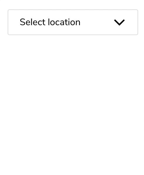
|  10 | __Single-selection searchable__ | __Multi-selection searchable__
11 |
10 | __Single-selection searchable__ | __Multi-selection searchable__
11 | 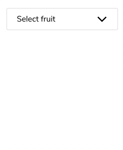 |
|  12 |
13 | # Installation
14 |
15 | `npm install --save reactjs-dropdown-component`
16 |
17 | # Usage
18 |
19 | Import the component you want to use;
20 |
21 | ```javascript
22 | import { DropdownMultiple, Dropdown } from 'reactjs-dropdown-component';
23 | ```
24 |
25 | If you are using NextJS, import them dynamically instead;
26 |
27 | ```javascript
28 | import dynamic from 'next/dynamic';
29 |
30 | const Dropdown = dynamic(
31 | async () => {
32 | const module = await import('reactjs-dropdown-component');
33 | const DD = module.Dropdown;
34 |
35 | return ({ forwardedRef, ...props }) => ;
36 | },
37 | { ssr: false },
38 | );
39 |
40 | const DropdownMultiple = dynamic(
41 | async () => {
42 | const module = await import('reactjs-dropdown-component');
43 | const DDM = module.DropdownMultiple;
44 |
45 | return ({ forwardedRef, ...props }) =>
12 |
13 | # Installation
14 |
15 | `npm install --save reactjs-dropdown-component`
16 |
17 | # Usage
18 |
19 | Import the component you want to use;
20 |
21 | ```javascript
22 | import { DropdownMultiple, Dropdown } from 'reactjs-dropdown-component';
23 | ```
24 |
25 | If you are using NextJS, import them dynamically instead;
26 |
27 | ```javascript
28 | import dynamic from 'next/dynamic';
29 |
30 | const Dropdown = dynamic(
31 | async () => {
32 | const module = await import('reactjs-dropdown-component');
33 | const DD = module.Dropdown;
34 |
35 | return ({ forwardedRef, ...props }) => ;
36 | },
37 | { ssr: false },
38 | );
39 |
40 | const DropdownMultiple = dynamic(
41 | async () => {
42 | const module = await import('reactjs-dropdown-component');
43 | const DDM = module.DropdownMultiple;
44 |
45 | return ({ forwardedRef, ...props }) => Dropdown menu examples
64 | 65 |