├── .gitignore
├── LICENSE
├── README.md
├── package-lock.json
├── package.json
├── public
├── favicon.ico
├── index.html
├── manifest.json
└── prism.js
├── src
├── Examples.js
├── Select.js
├── ToolTipController.js
├── Tooltips
│ ├── ToolTip.js
│ └── ToolTipAdvanced.js
├── index.js
└── styles
│ ├── Tooltip.styl
│ ├── base.styl
│ ├── examples.styl
│ ├── main.css
│ ├── main.styl
│ └── prism.css
└── yarn.lock
/.gitignore:
--------------------------------------------------------------------------------
1 | # See https://help.github.com/articles/ignoring-files/ for more about ignoring files.
2 |
3 | # dependencies
4 | /node_modules
5 | /.pnp
6 | .pnp.js
7 |
8 | # testing
9 | /coverage
10 |
11 | # production
12 | /build
13 |
14 | # misc
15 | .DS_Store
16 | .env.local
17 | .env.development.local
18 | .env.test.local
19 | .env.production.local
20 |
21 | npm-debug.log*
22 | yarn-debug.log*
23 | yarn-error.log*
24 |
--------------------------------------------------------------------------------
/LICENSE:
--------------------------------------------------------------------------------
1 | MIT License
2 |
3 | Copyright (c) 2018 Dogacan Bilgili
4 |
5 | Permission is hereby granted, free of charge, to any person obtaining a copy
6 | of this software and associated documentation files (the "Software"), to deal
7 | in the Software without restriction, including without limitation the rights
8 | to use, copy, modify, merge, publish, distribute, sublicense, and/or sell
9 | copies of the Software, and to permit persons to whom the Software is
10 | furnished to do so, subject to the following conditions:
11 |
12 | The above copyright notice and this permission notice shall be included in all
13 | copies or substantial portions of the Software.
14 |
15 | THE SOFTWARE IS PROVIDED "AS IS", WITHOUT WARRANTY OF ANY KIND, EXPRESS OR
16 | IMPLIED, INCLUDING BUT NOT LIMITED TO THE WARRANTIES OF MERCHANTABILITY,
17 | FITNESS FOR A PARTICULAR PURPOSE AND NONINFRINGEMENT. IN NO EVENT SHALL THE
18 | AUTHORS OR COPYRIGHT HOLDERS BE LIABLE FOR ANY CLAIM, DAMAGES OR OTHER
19 | LIABILITY, WHETHER IN AN ACTION OF CONTRACT, TORT OR OTHERWISE, ARISING FROM,
20 | OUT OF OR IN CONNECTION WITH THE SOFTWARE OR THE USE OR OTHER DEALINGS IN THE
21 | SOFTWARE.
22 |
--------------------------------------------------------------------------------
/README.md:
--------------------------------------------------------------------------------
1 | # React-Tooltip-Controller
2 |
3 | This is a feature-rich React component for controlling tooltips. Not only for tooltips, but you can use it for various interaction requirements.
4 |
5 | It seamlessly integrates into your markup without breaking it.
6 |
7 | Visit the [examples page](https://dbilgili.github.io/React-Tooltip-Controller/) to discover the functionalities.
8 |
9 |
10 | | Basic Tooltip | Animated Tooltip | Advanced Tooltip |
11 | |---|---|---|
12 | | 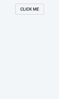 | 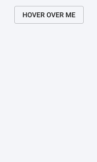 | 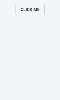 |
13 |
14 |
15 | #### Highlights
16 | - Supports `click`, `hover`, `hover-hold` and `hover-interact` detections.
17 | - Each tooltip can be animated individually.
18 | - Set whether the tooltip closes when clicked on it.
19 | - Close the tooltip manually by assigning a variable.
20 | - Retrieve the state of the tooltip (whether open or not).
21 | - Set a timeout to automatically close the tooltip.
22 | - Position the tooltip relative to the triggering element.
23 | - Automatically center the tooltip along the X axis for dynamically sized elements.
24 |
25 | ## Installing
26 |
27 | `npm install react-tooltip-controller`
28 |
29 | After installing the module, import the following components:
30 |
31 | ```javascript
32 | import {ToolTipController, Select} from 'react-tooltip-controller'
33 | ```
34 |
35 | ## Basic Usage
36 |
37 | ```html
38 |
42 |
43 | // Selects the element controlling the tooltip
44 |
47 |
48 | // Custom tooltip component
49 |
50 |
51 |
52 | ```
53 |
54 | Anything, but `