 '),Object(o.b)("blockquote",null,Object(o.b)("p",{parentName:"blockquote"},"A tiny (~700 byte gzip) WAI-ARIA compliant Floating Action Button for React")),Object(o.b)("blockquote",null,Object(o.b)("p",{parentName:"blockquote"},Object(o.b)("inlineCode",{parentName:"p"},"react-tiny-fab")," v3 now relies on React version 16.8 and up because it is implemented using ",Object(o.b)("a",{href:"https://reactjs.org/docs/hooks-intro.html",parentName:"p"},"React Hooks"))),Object(o.b)("p",null,"Want to use a Floating Action Button without having to import the whole Material Design Components library? Weighing in\nat only around 671 bytes gzipped, React Tiny FAB is a great solution. It is a lightweight, fast, and flexible component."),Object(o.b)("p",null,'
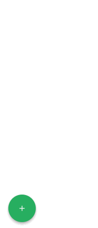 '),Object(o.b)("h2",{id:"docs"},"Docs"),Object(o.b)("p",null,"Please visit here for docs: ",Object(o.b)("a",{href:"https://dericgw.github.io/react-tiny-fab",parentName:"p"},"https://dericgw.github.io/react-tiny-fab")),Object(o.b)("h2",{id:"issues"},"Issues"),Object(o.b)("p",null,"If you find an issue, head over to the ",Object(o.b)("a",{href:"https://github.com/dericgw/react-tiny-fab/issues",parentName:"p"},"Issues")," section and let me\nknow about it. If you want to be super cool, you can submit a PR that fixes the issue."),Object(o.b)("h2",{id:"license-mit"},"License (MIT)"),Object(o.b)("p",null,Object(o.b)("a",{href:"./LICENSE.md",parentName:"p"},"Check it out here.")))}void 0!==s&&s&&s===Object(s)&&Object.isExtensible(s)&&!s.hasOwnProperty("__filemeta")&&Object.defineProperty(s,"__filemeta",{configurable:!0,value:{name:"MDXContent",filename:"README.md"}}),s.isMDXComponent=!0}}]);
2 | //# sourceMappingURL=component---readme-md-212c473131b02372ecb5.js.map
--------------------------------------------------------------------------------
/docs/component---readme-md-212c473131b02372ecb5.js.map:
--------------------------------------------------------------------------------
1 | {"version":3,"sources":["webpack:///../README.md"],"names":["_frontmatter","MDXLayout","DefaultLayout","MDXContent","components","props","mdxType","isMDXComponent"],"mappings":"6OAMaA,G,UAAe,S,2LAE5B,IAKMC,EAAYC,IACH,SAASC,EAAT,GAGZ,IAFDC,EAEC,EAFDA,WACGC,EACF,8BACD,OAAO,YAACJ,EAAD,eAAeI,EAAf,CAAsBD,WAAYA,EAAYE,QAAQ,cAC3D,oIACA,8BAEE,gBAAO,CACL,WAAc,cADhB,gFAKF,8BAEE,gBAAO,CACL,WAAc,cACb,yBAAgB,CACf,WAAc,KADf,kBAFH,+EAME,gBAAO,CACL,KAAQ,4CACR,WAAc,KAFhB,iBAMJ,0QAEA,mIACA,iBAAQ,CACN,GAAM,QADR,QAGA,oDACE,gBAAO,CACL,KAAQ,2CACR,WAAc,KAFhB,6CAIF,iBAAQ,CACN,GAAM,UADR,UAGA,+DACE,gBAAO,CACL,KAAQ,mDACR,WAAc,KAFhB,UADF,+GAOA,iBAAQ,CACN,GAAM,eADR,iBAGA,qBAAG,gBAAO,CACN,KAAQ,eACR,WAAc,KAFf,6B,yLAQPH,EAAWI,gBAAiB","file":"component---readme-md-212c473131b02372ecb5.js","sourcesContent":["import * as React from 'react'\n /* @jsx mdx */\nimport { mdx } from '@mdx-js/react';\n/* @jsx mdx */\n\nimport DefaultLayout from \"/Users/dericcain/Code/react-tiny-fab-ts/node_modules/gatsby-theme-docz/src/base/Layout.js\";\nexport const _frontmatter = {};\n\nconst makeShortcode = name => function MDXDefaultShortcode(props) {\n console.warn(\"Component \" + name + \" was not imported, exported, or provided by MDXProvider as global scope\");\n return ;\n};\n\nconst MDXLayout = DefaultLayout;\nexport default function MDXContent({\n components,\n ...props\n}) {\n return
'),Object(o.b)("h2",{id:"docs"},"Docs"),Object(o.b)("p",null,"Please visit here for docs: ",Object(o.b)("a",{href:"https://dericgw.github.io/react-tiny-fab",parentName:"p"},"https://dericgw.github.io/react-tiny-fab")),Object(o.b)("h2",{id:"issues"},"Issues"),Object(o.b)("p",null,"If you find an issue, head over to the ",Object(o.b)("a",{href:"https://github.com/dericgw/react-tiny-fab/issues",parentName:"p"},"Issues")," section and let me\nknow about it. If you want to be super cool, you can submit a PR that fixes the issue."),Object(o.b)("h2",{id:"license-mit"},"License (MIT)"),Object(o.b)("p",null,Object(o.b)("a",{href:"./LICENSE.md",parentName:"p"},"Check it out here.")))}void 0!==s&&s&&s===Object(s)&&Object.isExtensible(s)&&!s.hasOwnProperty("__filemeta")&&Object.defineProperty(s,"__filemeta",{configurable:!0,value:{name:"MDXContent",filename:"README.md"}}),s.isMDXComponent=!0}}]);
2 | //# sourceMappingURL=component---readme-md-212c473131b02372ecb5.js.map
--------------------------------------------------------------------------------
/docs/component---readme-md-212c473131b02372ecb5.js.map:
--------------------------------------------------------------------------------
1 | {"version":3,"sources":["webpack:///../README.md"],"names":["_frontmatter","MDXLayout","DefaultLayout","MDXContent","components","props","mdxType","isMDXComponent"],"mappings":"6OAMaA,G,UAAe,S,2LAE5B,IAKMC,EAAYC,IACH,SAASC,EAAT,GAGZ,IAFDC,EAEC,EAFDA,WACGC,EACF,8BACD,OAAO,YAACJ,EAAD,eAAeI,EAAf,CAAsBD,WAAYA,EAAYE,QAAQ,cAC3D,oIACA,8BAEE,gBAAO,CACL,WAAc,cADhB,gFAKF,8BAEE,gBAAO,CACL,WAAc,cACb,yBAAgB,CACf,WAAc,KADf,kBAFH,+EAME,gBAAO,CACL,KAAQ,4CACR,WAAc,KAFhB,iBAMJ,0QAEA,mIACA,iBAAQ,CACN,GAAM,QADR,QAGA,oDACE,gBAAO,CACL,KAAQ,2CACR,WAAc,KAFhB,6CAIF,iBAAQ,CACN,GAAM,UADR,UAGA,+DACE,gBAAO,CACL,KAAQ,mDACR,WAAc,KAFhB,UADF,+GAOA,iBAAQ,CACN,GAAM,eADR,iBAGA,qBAAG,gBAAO,CACN,KAAQ,eACR,WAAc,KAFf,6B,yLAQPH,EAAWI,gBAAiB","file":"component---readme-md-212c473131b02372ecb5.js","sourcesContent":["import * as React from 'react'\n /* @jsx mdx */\nimport { mdx } from '@mdx-js/react';\n/* @jsx mdx */\n\nimport DefaultLayout from \"/Users/dericcain/Code/react-tiny-fab-ts/node_modules/gatsby-theme-docz/src/base/Layout.js\";\nexport const _frontmatter = {};\n\nconst makeShortcode = name => function MDXDefaultShortcode(props) {\n console.warn(\"Component \" + name + \" was not imported, exported, or provided by MDXProvider as global scope\");\n return ;\n};\n\nconst MDXLayout = DefaultLayout;\nexport default function MDXContent({\n components,\n ...props\n}) {\n return  `}
`} `}
`}<img alt="React Tiny FAB" src="https://raw.githubusercontent.com/dericgw/react-tiny-fab/master/logo.png" />
A tiny (~700 byte gzip) WAI-ARIA compliant Floating Action Button for React
react-tiny-fabv3 now relies on React version 16.8 and up because it is implemented using React Hooks
Want to use a Floating Action Button without having to import the whole Material Design Components library? Weighing in 2 | at only around 671 bytes gzipped, React Tiny FAB is a great solution. It is a lightweight, fast, and flexible component.
<img alt="React Tiny FAB" src="https://raw.githubusercontent.com/dericgw/react-tiny-fab/master/fab.gif" />
Docs
Please visit here for docs: https://dericgw.github.io/react-tiny-fab
Issues
If you find an issue, head over to the Issues section and let me 3 | know about it. If you want to be super cool, you can submit a PR that fixes the issue.