├── Animated Landing Page Website Template
├── _first-steps.url
├── _open-generator.url
├── ajax-email.php
├── assets
│ ├── img
│ │ ├── appstore.jpg
│ │ ├── background
│ │ │ ├── img-09.jpg
│ │ │ ├── img-14.jpg
│ │ │ ├── img-15.jpg
│ │ │ ├── img-85.jpg
│ │ │ ├── img-89.jpg
│ │ │ └── img-95.jpg
│ │ ├── googleplay.jpg
│ │ ├── image-100.png
│ │ ├── image-89-1.jpg
│ │ └── image-89-2.jpg
│ └── svg
│ │ ├── icons.svg
│ │ ├── play.svg
│ │ ├── video-icon-dark.svg
│ │ └── video-icon.svg
├── css
│ ├── slides.css
│ ├── slides.min.css
│ └── swiper.min.css
├── index.html
├── js
│ ├── plugins.js
│ ├── slides.js
│ ├── slides.min.js
│ ├── soundcloud.min.js
│ └── swiper.min.js
├── manual
│ └── manual.url
├── readme first.txt
└── scss
│ ├── colors.scss
│ ├── dialog.scss
│ ├── flex.scss
│ ├── framework.scss
│ ├── grid.scss
│ ├── layout.scss
│ ├── mixins.scss
│ ├── plumber.scss
│ ├── reset.scss
│ ├── slides.scss
│ ├── typography.scss
│ ├── useful-classes.scss
│ └── variables.scss
├── Horizontal Scroll One Page Template Website
├── _first-steps.url
├── _open-generator.url
├── ajax-email.php
├── assets
│ ├── img
│ │ ├── appstore.jpg
│ │ ├── background
│ │ │ ├── img-26.jpg
│ │ │ ├── img-27.jpg
│ │ │ ├── img-34.jpg
│ │ │ ├── img-60.jpg
│ │ │ ├── img-83.jpg
│ │ │ ├── img-91.jpg
│ │ │ └── img-95.jpg
│ │ ├── gallery-60-1.jpg
│ │ ├── gallery-60-2.jpg
│ │ ├── gallery-60-3.jpg
│ │ ├── googleplay.jpg
│ │ ├── icon-1.png
│ │ ├── icon-2.png
│ │ ├── iphones-34.png
│ │ ├── watch-26-1.png
│ │ └── watch-26-2.png
│ └── svg
│ │ ├── icons.svg
│ │ ├── video-icon-dark.svg
│ │ └── video-icon.svg
├── css
│ ├── slides.css
│ └── slides.min.css
├── index.html
├── js
│ ├── plugins.js
│ ├── slides.js
│ ├── slides.min.js
│ └── swiper.min.js
├── manual
│ └── manual.url
├── readme first.txt
└── scss
│ ├── colors.scss
│ ├── dialog.scss
│ ├── flex.scss
│ ├── framework.scss
│ ├── grid.scss
│ ├── layout.scss
│ ├── mixins.scss
│ ├── plumber.scss
│ ├── reset.scss
│ ├── slides.scss
│ ├── typography.scss
│ ├── useful-classes.scss
│ └── variables.scss
├── Landing Page Website for App
├── _first-steps.url
├── _open-generator.url
├── ajax-email.php
├── assets
│ ├── img
│ │ ├── appstore.jpg
│ │ ├── background
│ │ │ ├── img-27.jpg
│ │ │ ├── img-68.jpg
│ │ │ ├── img-73.jpg
│ │ │ ├── img-75.jpg
│ │ │ ├── img-82.jpg
│ │ │ ├── img-83.jpg
│ │ │ ├── img-89.jpg
│ │ │ └── img-95.jpg
│ │ ├── brand-68-adidas.png
│ │ ├── brand-68-apple.png
│ │ ├── brand-68-audi.png
│ │ ├── brand-68-bbc.png
│ │ ├── brand-68-canon.png
│ │ ├── brand-68-coca-cola.png
│ │ ├── brand-68-facebook.png
│ │ ├── brand-68-google.png
│ │ ├── brand-68-greenpeace.png
│ │ ├── brand-68-microsoft.png
│ │ ├── brand-68-national-geographic.png
│ │ ├── brand-68-nbc.png
│ │ ├── brand-68-nike.png
│ │ ├── brand-68-playstation.png
│ │ ├── brand-68-reebok.png
│ │ ├── brand-68-sony.png
│ │ ├── brand-68-vimeo.png
│ │ ├── brand-68-warner-bros.png
│ │ ├── gallery-75-1.jpg
│ │ ├── gallery-75-2.jpg
│ │ ├── gallery-75-3.jpg
│ │ ├── gallery-75-4.jpg
│ │ ├── gallery-75-5.jpg
│ │ ├── gallery-75-6.jpg
│ │ ├── gallery-75-7.jpg
│ │ ├── googleplay.jpg
│ │ ├── icon-2.png
│ │ ├── image-89-1.jpg
│ │ ├── image-89-2.jpg
│ │ ├── iphone-73.png
│ │ ├── iphone-82-1.png
│ │ ├── iphone-82-2.png
│ │ ├── iphone-82-3.png
│ │ ├── iphone-82-4.png
│ │ ├── watch-26-1.png
│ │ └── watch-26-2.png
│ └── svg
│ │ ├── icons.svg
│ │ ├── video-icon-dark.svg
│ │ └── video-icon.svg
├── css
│ ├── slides.css
│ └── slides.min.css
├── index.html
├── js
│ ├── plugins.js
│ ├── slides.js
│ ├── slides.min.js
│ └── swiper.min.js
├── manual
│ └── manual.url
├── readme first.txt
└── scss
│ ├── colors.scss
│ ├── dialog.scss
│ ├── flex.scss
│ ├── framework.scss
│ ├── grid.scss
│ ├── layout.scss
│ ├── mixins.scss
│ ├── plumber.scss
│ ├── reset.scss
│ ├── slides.scss
│ ├── typography.scss
│ ├── useful-classes.scss
│ └── variables.scss
├── One Page Portfolio Website Template
├── _first-steps.url
├── _open-generator.url
├── ajax-email.php
├── assets
│ ├── img
│ │ ├── background
│ │ │ ├── img-10.jpg
│ │ │ ├── img-56.jpg
│ │ │ ├── img-74.jpg
│ │ │ ├── img-75.jpg
│ │ │ └── img-90.jpg
│ │ ├── gallery-74-1.jpg
│ │ ├── gallery-74-2.jpg
│ │ ├── gallery-74-3.jpg
│ │ ├── gallery-74-4.jpg
│ │ ├── gallery-75-1.jpg
│ │ ├── gallery-75-2.jpg
│ │ ├── gallery-75-3.jpg
│ │ ├── gallery-75-4.jpg
│ │ ├── gallery-75-5.jpg
│ │ ├── gallery-75-6.jpg
│ │ ├── gallery-75-7.jpg
│ │ ├── gallery-90-1.jpg
│ │ ├── gallery-90-2.jpg
│ │ ├── gallery-90-3.jpg
│ │ ├── gallery-90-4.jpg
│ │ └── image-100.png
│ └── svg
│ │ ├── icons.svg
│ │ ├── play.svg
│ │ ├── video-icon-dark.svg
│ │ └── video-icon.svg
├── css
│ ├── slides.css
│ ├── slides.min.css
│ └── swiper.min.css
├── index.html
├── js
│ ├── plugins.js
│ ├── slides.js
│ ├── slides.min.js
│ ├── soundcloud.min.js
│ └── swiper.min.js
├── manual
│ └── manual.url
├── readme first.txt
└── scss
│ ├── colors.scss
│ ├── dialog.scss
│ ├── flex.scss
│ ├── framework.scss
│ ├── grid.scss
│ ├── layout.scss
│ ├── mixins.scss
│ ├── plumber.scss
│ ├── reset.scss
│ ├── slides.scss
│ ├── typography.scss
│ ├── useful-classes.scss
│ └── variables.scss
├── README.md
└── images
├── template-screenshot.jpg
├── template-screenshot2.jpg
├── template-screenshot3.jpg
└── template-screenshot4.jpg
/Animated Landing Page Website Template/_first-steps.url:
--------------------------------------------------------------------------------
1 | [InternetShortcut]
2 | URL=https://designmodo.com/slides/first-steps/
--------------------------------------------------------------------------------
/Animated Landing Page Website Template/_open-generator.url:
--------------------------------------------------------------------------------
1 | [InternetShortcut]
2 | URL=https://designmodo.com/slides/app/
--------------------------------------------------------------------------------
/Animated Landing Page Website Template/ajax-email.php:
--------------------------------------------------------------------------------
1 | \r\n" .
21 | "Reply-To: $name <$email>\r\n" .
22 | "Subject: $emailSubject\r\n" .
23 | "Content-type: text/plain; charset=UTF-8\r\n" .
24 | "MIME-Version: 1.0\r\n" .
25 | "X-Mailer: PHP/" . phpversion() . "\r\n";
26 |
27 | /* PREVENT EMAIL INJECTION */
28 | if ( preg_match("/[\r\n]/", $name) || preg_match("/[\r\n]/", $email) ) {
29 | header($_SERVER['SERVER_PROTOCOL'] . ' 500 Internal Server Error', true, 500);
30 | die("500 Internal Server Error");
31 | }
32 |
33 | /* MESSAGE TEMPLATE */
34 | $mailBody = "Name: $name \n\r" .
35 | "Email: $email \n\r" .
36 | "Subject: $subject \n\r" .
37 | // "Phone: $phone \n\r" .
38 | "Message: $message";
39 |
40 | /* SEND EMAIL */
41 | mail($recipient, $emailSubject, $mailBody, $headers);
42 | }
43 | ?>
--------------------------------------------------------------------------------
/Animated Landing Page Website Template/assets/img/appstore.jpg:
--------------------------------------------------------------------------------
https://raw.githubusercontent.com/designmodo/html-website-templates/e4373e54cede46b6ff6469ae672e9e09d2f221b9/Animated Landing Page Website Template/assets/img/appstore.jpg
--------------------------------------------------------------------------------
/Animated Landing Page Website Template/assets/img/background/img-09.jpg:
--------------------------------------------------------------------------------
https://raw.githubusercontent.com/designmodo/html-website-templates/e4373e54cede46b6ff6469ae672e9e09d2f221b9/Animated Landing Page Website Template/assets/img/background/img-09.jpg
--------------------------------------------------------------------------------
/Animated Landing Page Website Template/assets/img/background/img-14.jpg:
--------------------------------------------------------------------------------
https://raw.githubusercontent.com/designmodo/html-website-templates/e4373e54cede46b6ff6469ae672e9e09d2f221b9/Animated Landing Page Website Template/assets/img/background/img-14.jpg
--------------------------------------------------------------------------------
/Animated Landing Page Website Template/assets/img/background/img-15.jpg:
--------------------------------------------------------------------------------
https://raw.githubusercontent.com/designmodo/html-website-templates/e4373e54cede46b6ff6469ae672e9e09d2f221b9/Animated Landing Page Website Template/assets/img/background/img-15.jpg
--------------------------------------------------------------------------------
/Animated Landing Page Website Template/assets/img/background/img-85.jpg:
--------------------------------------------------------------------------------
https://raw.githubusercontent.com/designmodo/html-website-templates/e4373e54cede46b6ff6469ae672e9e09d2f221b9/Animated Landing Page Website Template/assets/img/background/img-85.jpg
--------------------------------------------------------------------------------
/Animated Landing Page Website Template/assets/img/background/img-89.jpg:
--------------------------------------------------------------------------------
https://raw.githubusercontent.com/designmodo/html-website-templates/e4373e54cede46b6ff6469ae672e9e09d2f221b9/Animated Landing Page Website Template/assets/img/background/img-89.jpg
--------------------------------------------------------------------------------
/Animated Landing Page Website Template/assets/img/background/img-95.jpg:
--------------------------------------------------------------------------------
https://raw.githubusercontent.com/designmodo/html-website-templates/e4373e54cede46b6ff6469ae672e9e09d2f221b9/Animated Landing Page Website Template/assets/img/background/img-95.jpg
--------------------------------------------------------------------------------
/Animated Landing Page Website Template/assets/img/googleplay.jpg:
--------------------------------------------------------------------------------
https://raw.githubusercontent.com/designmodo/html-website-templates/e4373e54cede46b6ff6469ae672e9e09d2f221b9/Animated Landing Page Website Template/assets/img/googleplay.jpg
--------------------------------------------------------------------------------
/Animated Landing Page Website Template/assets/img/image-100.png:
--------------------------------------------------------------------------------
https://raw.githubusercontent.com/designmodo/html-website-templates/e4373e54cede46b6ff6469ae672e9e09d2f221b9/Animated Landing Page Website Template/assets/img/image-100.png
--------------------------------------------------------------------------------
/Animated Landing Page Website Template/assets/img/image-89-1.jpg:
--------------------------------------------------------------------------------
https://raw.githubusercontent.com/designmodo/html-website-templates/e4373e54cede46b6ff6469ae672e9e09d2f221b9/Animated Landing Page Website Template/assets/img/image-89-1.jpg
--------------------------------------------------------------------------------
/Animated Landing Page Website Template/assets/img/image-89-2.jpg:
--------------------------------------------------------------------------------
https://raw.githubusercontent.com/designmodo/html-website-templates/e4373e54cede46b6ff6469ae672e9e09d2f221b9/Animated Landing Page Website Template/assets/img/image-89-2.jpg
--------------------------------------------------------------------------------
/Animated Landing Page Website Template/assets/svg/play.svg:
--------------------------------------------------------------------------------
1 |
4 |
--------------------------------------------------------------------------------
/Animated Landing Page Website Template/assets/svg/video-icon-dark.svg:
--------------------------------------------------------------------------------
1 |
--------------------------------------------------------------------------------
/Animated Landing Page Website Template/assets/svg/video-icon.svg:
--------------------------------------------------------------------------------
1 |
--------------------------------------------------------------------------------
/Animated Landing Page Website Template/manual/manual.url:
--------------------------------------------------------------------------------
1 | [InternetShortcut]
2 | URL=https://designmodo.com/slides/app/manual/
--------------------------------------------------------------------------------
/Animated Landing Page Website Template/readme first.txt:
--------------------------------------------------------------------------------
1 | Created by https://designmodo.com/slides/
--------------------------------------------------------------------------------
/Animated Landing Page Website Template/scss/colors.scss:
--------------------------------------------------------------------------------
1 | /* Colors */
2 | @include generateColors("white", $default-white-color, $default-button-color);
3 | @include generateColors("black", $default-button-color);
4 |
5 | /* Colors by Google Meterial Design (C) */
6 | @include generateColors("red", $red);
7 | @include generateColors("pink", $pink);
8 | @include generateColors("purple", $purple);
9 | @include generateColors("deepPurple", $deepPurple);
10 | @include generateColors("indigo", $indigo);
11 | @include generateColors("blue", $blue);
12 | @include generateColors("cyan", $cyan);
13 | @include generateColors("teal", $teal);
14 | @include generateColors("green", $green);
15 | @include generateColors("lightGreen", $lightGreen);
16 | @include generateColors("lime", $lime);
17 | @include generateColors("yellow", $yellow, $default-button-color);
18 | @include generateColors("amber", $amber);
19 | @include generateColors("orange", $orange);
20 | @include generateColors("deepOrange", $deepOrange);
21 | @include generateColors("brown", $brown);
22 | @include generateColors("gray", $gray);
23 | @include generateColors("blueGray", $blueGray);
24 |
25 | /* Social Colors */
26 | @include generateColors("social-facebook", #3b5998);
27 | @include generateColors("social-twitter", #55acee);
28 | @include generateColors("social-googlePlus", #DD4330);
29 | @include generateColors("social-behance", #105DFB);
30 | @include generateColors("social-medium", #12100E);
31 | @include generateColors("social-stumbleupon", #eb4924);
32 | @include generateColors("social-linkedin", #0077b5);
33 | @include generateColors("social-pinterest", #cc2127);
34 | @include generateColors("social-instagram", #e4405f);
35 | @include generateColors("social-tumblr", #34455D);
36 | @include generateColors("social-dribbble", #ea4c89);
37 | @include generateColors("social-youtube", #cd201f);
38 | @include generateColors("social-delicious", #3399ff);
39 | @include generateColors("social-digg", #000000);
40 | @include generateColors("social-vimeo", #fff, #1ab7ea);
41 | @include generateColors("social-whatsapp", #25D366);
42 | @include generateColors("social-xing", #026466);
43 | @include generateColors("social-youtube", #FC0D1C);
--------------------------------------------------------------------------------
/Animated Landing Page Website Template/scss/dialog.scss:
--------------------------------------------------------------------------------
1 | /*
2 | * _____ _
3 | * | __ \( ) | |
4 | * | | | |_ __ _| | ___ __ _
5 | * | | | | |/ _` | |/ _ \ / _` |
6 | * | |__| | | (_| | | (_) | (_| |
7 | * |_____/|_|\__,_|_|\___/ \__, |
8 | * _/ |
9 | * Dialog Window /__/
10 | *
11 | */
12 |
13 |
14 | .dialogContainer {
15 | pointer-events: none;
16 | }
17 |
18 | .dialogContainer,
19 | .dialog {
20 | position: fixed;
21 | top:0;
22 | right:0;
23 | z-index: 300;
24 | }
25 |
26 | .dialog {
27 | pointer-events: all;
28 | color:#303030;
29 | border-radius: $default-border-radius;
30 | max-width: 350px;
31 | box-shadow: $small-shadow;
32 | cursor:default;
33 | opacity:0.98;
34 | line-height: 1.3;
35 | background:#fff;
36 | margin: 12px 20px;
37 | overflow:hidden;
38 | text-align: left;
39 | transform: translate3d(0, 0, 0);
40 | transition: all 0.75s, height 0s;
41 | transition-timing-function: cubic-bezier(.25,1.37,.44,.93);
42 | -webkit-tap-highlight-color: rgba(0,0,0,0);
43 |
44 | &.rectangular {
45 | border-radius: 0px;
46 | }
47 |
48 | &.rounded {
49 | border-radius: $rounded-border-radius;
50 | }
51 |
52 | &:hover {
53 | opacity: 1;
54 | box-shadow: $large-shadow;
55 | transition:0.35s;
56 | }
57 |
58 | .button.small {
59 | margin-left: 4px;
60 | margin-right: 4px;
61 | }
62 |
63 | .button {
64 | margin-left: 7px;
65 | margin-right: 7px;
66 | }
67 |
68 | .dialogContainer > & {
69 | position:relative;
70 | }
71 |
72 | &.hidden {
73 | display:none;
74 | }
75 |
76 | &.hide {
77 | transform:scale(0.5);
78 | opacity:0 !important;
79 | transition:height 0s, opacity 0.5s, transform 0.5s !important;
80 | }
81 |
82 | &.reveal {
83 | transition: 0s!important;
84 | }
85 |
86 | .close {
87 | padding:12px;
88 | position:absolute;
89 | font-size:0;
90 | top:0;
91 | right:0;
92 | cursor:pointer;
93 | transition:0.35s;
94 | opacity:0;
95 | z-index:10;
96 |
97 | &:after,
98 | &:before {
99 | content: "";
100 | width: 14px;
101 | height: 2px;
102 | border-radius: 2px;
103 | background: #202020;
104 | transform: rotate(45deg);
105 | position: absolute;
106 | right: 6px;
107 | }
108 |
109 | &:before {
110 | transform: rotate(-45deg);
111 | }
112 |
113 | &:active {opacity: 1;}
114 |
115 | &.white {
116 | background:transparent !important;
117 | }
118 |
119 | &.white:after,
120 | &.white:before {
121 | background: #fff;
122 | }
123 | }
124 |
125 | &:hover .close {opacity:0.2;}
126 | .close:hover,
127 | .mobile & .close {opacity:1 !important;}
128 |
129 |
130 | .dialogContent {
131 | padding: 20px;
132 | }
133 |
134 | .avatar {
135 | border-radius:50px;
136 | width:50px;
137 | height:50px;
138 | position:absolute;
139 | top:15px;
140 | }
141 |
142 | .avatar + .text {
143 | width:calc(100% - 70px);
144 | margin-left:70px;
145 | }
146 |
147 | .title {
148 | margin:8px 0;
149 | font-weight: 500;
150 | }
151 |
152 | ul {
153 | display:table;
154 | width:100%;
155 | font-size:0;
156 | font-weight:600;
157 | box-shadow: 0 1px 0px rgba(0,0,0,.1) inset;
158 | }
159 |
160 | .hiddenContent {
161 | overflow:hidden;
162 | display:block;
163 | max-height:0;
164 | opacity:0;
165 | transition: 0.5s;
166 | }
167 |
168 | html:not(.page-loaded) & {
169 | transform:scale(0.5) translateY(100%);
170 | opacity:0;
171 | }
172 |
173 | &:hover .hiddenContent,
174 | &.hover .hiddenContent {
175 | max-height:90px;
176 | opacity:1;
177 | }
178 |
179 | [data-href],
180 | [data-dialog-action="close"]{
181 | cursor: pointer;
182 | }
183 |
184 | li {
185 | height: 50px;
186 | font-size: 16px;
187 | font-weight: 500;
188 | display: table-cell;
189 | width:33.33333%;
190 | text-align: center;
191 | cursor: pointer;
192 | line-height: 1;
193 | vertical-align:middle;
194 | text-decoration:none;
195 | border-bottom:none;
196 | transition:0.25s;
197 | box-shadow: inset 0 -100px 0 rgba(41,41,41,0);
198 |
199 | .material-icons{
200 | position: relative;
201 | margin-bottom: 13px;
202 | top: 6px;
203 | margin-right: 8px;
204 |
205 | &.right {
206 | margin-right: 0;
207 | margin-left: 8px;
208 | }
209 | }
210 |
211 | svg {
212 | width: 20px;
213 | height: 20px;
214 | margin-bottom: -6px;
215 | margin-right: 8px;
216 | position: relative;
217 | top: -2px;
218 |
219 | &.right {
220 | margin-right: 0;
221 | margin-left: 8px;
222 | }
223 | }
224 | }
225 |
226 | li {
227 | border-left:1px solid rgba(0,0,0,.1);
228 | }
229 | li:first-child {
230 | border-left:none;
231 | }
232 |
233 | li:hover {
234 | box-shadow: inset 0 -100px 0 rgba(0,0,0,0.05);
235 | }
236 |
237 | li input {
238 | font-size: 16px;
239 | width:250px;
240 | border: none;
241 | padding: 13px 5px 16px 15px;
242 | outline:none;
243 | margin:1px 0 0 0;
244 | color:#202020;
245 | height:50px;
246 | box-shadow: none !important;
247 |
248 | -webkit-appearance:none;
249 | -moz-appearance:none;
250 | appearance:none;
251 | }
252 |
253 | @media (max-width: 414px) {
254 | margin:10px;
255 | max-width:100%;
256 | }
257 | }
258 |
259 |
260 |
261 | .dialogContainer:not(.bottom) .dialog + .dialog {
262 | margin-bottom:0px;
263 | }
264 |
265 | .dialogContainer.bottom .dialog + .dialog {
266 | margin-top:0px;
267 | }
268 |
269 | .dialogContainer.bottom,
270 | .dialog.bottom {
271 | top:inherit;
272 | bottom:0;
273 | }
274 |
275 | .dialogContainer.left,
276 | .dialog.left {
277 | right:inherit;
278 | left:0;
279 | }
280 |
281 |
282 | /*
283 | .dialogContainer > .dialog:nth-child(1){ -webkit-transition-delay: 0.1s; transition-delay: 0.1s; }
284 | .dialogContainer > .dialog:nth-child(2){ -webkit-transition-delay: 0.2s; transition-delay: 0.2s; }
285 | .dialogContainer > .dialog:nth-child(3){ -webkit-transition-delay: 0.3s; transition-delay: 0.3s; }
286 | .dialogContainer > .dialog:nth-child(4){ -webkit-transition-delay: 0.4s; transition-delay: 0.4s; }
287 | .dialogContainer > .dialog:nth-child(5){ -webkit-transition-delay: 0.5s; transition-delay: 0.5s; }
288 | */
289 |
--------------------------------------------------------------------------------
/Animated Landing Page Website Template/scss/flex.scss:
--------------------------------------------------------------------------------
1 | .flex {
2 | display:flex;
3 | flex-wrap:wrap;
4 | margin-left:-2%;
5 | margin-right:-2%;
6 |
7 | /* default spaces */
8 | & >[class*='col-'] {
9 | padding-left:2%;
10 | padding-right:2%;
11 | }
12 |
13 | &.fixedSpaces {
14 | $gapSpace: 14px;
15 |
16 | margin-left: -$gapSpace;
17 | margin-right: -$gapSpace;
18 |
19 | >[class*='col-'] {
20 | padding-left: $gapSpace;
21 | padding-right: $gapSpace;
22 | }
23 | }
24 |
25 | &.noSpaces {
26 | margin-left:0;
27 | margin-right:0;
28 |
29 | >[class*='col-'] {
30 | padding-left:0;
31 | padding-right:0;
32 | }
33 | }
34 |
35 | /* alignments */
36 | &.verticalCenter {
37 | align-items: center;
38 | }
39 |
40 | &.verticalBottom {
41 | align-items: flex-end;
42 | }
43 |
44 | &.horizontalCenter {
45 | justify-content: center;
46 | }
47 |
48 | &.reverse {
49 | flex-wrap:wrap-reverse;
50 | }
51 |
52 | &.bottom [class*='col-'],
53 | &.reverse.top [class*='col-']{
54 | align-self: flex-end;
55 | }
56 |
57 | &.top [class*='col-'],
58 | &.reverse.bottom [class*='col-'] {
59 | align-self: flex-start;
60 | }
61 |
62 | // generate colums
63 | // .col-1-12 { width: 8.33333%; }
64 | @for $i from 1 through 12 {
65 | $width: (100% / 12) * $i;
66 |
67 | > .col-#{$i}-12 {
68 | width: $width;
69 | }
70 | }
71 |
72 | // generate colums
73 | // .col-1-10 { width: 10%; }
74 | @for $i from 1 through 10 {
75 | $width: (100% / 10) * $i;
76 |
77 | > .col-#{$i}-10 {
78 | width: $width;
79 | }
80 | }
81 | }
82 |
83 | /* ipad landscape and > */
84 | @include media($tablet, "max") {
85 | .flex:not(.later) > [class*='col-']:not([class*='col-phablet-']):not([class*='col-phone-']) { width: 100%; }
86 | .flex > .col-tablet-1-1 { width: 100% !important; }
87 | .flex > .col-tablet-1-2 { width: 50% !important; }
88 | .flex > .col-tablet-1-3 { width: 33.33333333% !important; }
89 | .flex > .col-tablet-2-3 { width: 66.66666666% !important; }
90 | .flex > .col-tablet-1-4 { width: 25% !important; }
91 | .flex > .col-tablet-3-4 { width: 75% !important; }
92 | .flex > .col-tablet-1-5 { width: 20% !important; }
93 | .flex > .col-tablet-2-5 { width: 40% !important; }
94 | .flex > .col-tablet-3-5 { width: 60% !important; }
95 | .flex > .col-tablet-4-5 { width: 80% !important; }
96 | }
97 |
98 | /* phablet landscape and ipad portrait and > */
99 | @include media($phablet, "max") {
100 | .flex.later > [class*='col-']:not([class*='col-phone-']) { width: 100%; }
101 | .flex > .col-phablet-1-1 { width: 100% !important; }
102 | .flex > .col-phablet-1-2 { width: 50% !important; }
103 | .flex > .col-phablet-1-3 { width: 33.33333333% !important; }
104 | .flex > .col-phablet-2-3 { width: 66.66666666% !important; }
105 | .flex > .col-phablet-1-4 { width: 25% !important; }
106 | .flex > .col-phablet-3-4 { width: 75% !important; }
107 | }
108 |
109 | /* phone portrait and > */
110 | @include media($phone, "max") {
111 | .flex > [class*='col-'] { width: 100%; }
112 | .flex > .col-phone-1-1 { width: 100% !important; }
113 | .flex > .col-phone-1-2 { width: 50% !important; }
114 | .flex > .col-phone-1-3 { width: 33.33333333% !important; }
115 | .flex > .col-phone-2-3 { width: 66.66666666% !important; }
116 | }
--------------------------------------------------------------------------------
/Animated Landing Page Website Template/scss/grid.scss:
--------------------------------------------------------------------------------
1 | /* Welcome new Grid! */
2 | .grid {
3 | margin-left:-2%;
4 | margin-right:-2%;
5 |
6 | /* default spaces */
7 | & [class*='col-'] {
8 | display: block;
9 | width: 100%;
10 | padding-left: 2%;
11 | padding-right: 2%;
12 | float: left;
13 | }
14 |
15 | &.fixedSpaces {
16 | $gapSpace: 10px;
17 |
18 | margin-left: -$gapSpace;
19 | margin-right: -$gapSpace;
20 |
21 | >[class*='col-'] {
22 | padding-left: $gapSpace;
23 | padding-right: $gapSpace;
24 | }
25 | }
26 |
27 | &.noSpaces {
28 | margin-left:0;
29 | margin-right:0;
30 |
31 | >[class*='col-'] {
32 | padding-left:0;
33 | padding-right:0;
34 | }
35 | }
36 |
37 | .toLeft[class*='col-'] {
38 | margin-left: 0 !important;
39 | margin-right: auto !important;
40 | }
41 |
42 | .toRight[class*='col-'] {
43 | margin-right: 0 !important;
44 | margin-left: auto !important;
45 | float: right;
46 | }
47 |
48 | .toCenter[class*='col-'] {
49 | margin-left: auto !important;
50 | margin-right: auto !important;
51 | }
52 |
53 | // generate colums
54 | // .col-1-12 { width: 8.33333%; }
55 | @for $i from 1 through 12 {
56 | $width: (100% / 12) * $i;
57 |
58 | > .col-#{$i}-12 {
59 | max-width: $width;
60 | }
61 | }
62 |
63 | // generate colums
64 | // .col-1-10 { width: 10%; }
65 | @for $i from 1 through 10 {
66 | $width: (100% / 10) * $i;
67 |
68 | > .col-#{$i}-10 {
69 | max-width: $width;
70 | }
71 | }
72 |
73 | & + .grid {
74 | margin-top: 20px;
75 | }
76 |
77 | &:after {
78 | content: "";
79 | display: table;
80 | clear: both;
81 | }
82 | }
83 |
84 | @include media($desktop, "max") {
85 | .grid > .col-desktop-1-1 { max-width: 100% !important; }
86 | .grid > .col-desktop-1-2 { max-width: 50% !important; }
87 | .grid > .col-desktop-1-3 { max-width: 33.33333333% !important; }
88 | .grid > .col-desktop-2-3 { max-width: 66.66666666% !important; }
89 | .grid > .col-desktop-1-4 { max-width: 25% !important; }
90 | .grid > .col-desktop-3-4 { max-width: 75% !important; }
91 | }
92 |
93 | /* ipad landscape and > */
94 | @include media($tablet, "max") {
95 | .grid:not(.later) > [class*='col-']:not([class*='col-phablet-']):not([class*='col-phone-']) { max-width: 100%; }
96 | .grid > .col-tablet-1-1 { max-width: 100% !important; }
97 | .grid > .col-tablet-1-2 { max-width: 50% !important; }
98 | .grid > .col-tablet-1-3 { max-width: 33.33333333% !important; }
99 | .grid > .col-tablet-2-3 { max-width: 66.66666666% !important; }
100 | .grid > .col-tablet-1-4 { max-width: 25% !important; }
101 | .grid > .col-tablet-3-4 { max-width: 75% !important; }
102 | .grid > .col-tablet-1-5 { max-width: 20% !important; }
103 | .grid > .col-tablet-2-5 { max-width: 40% !important; }
104 | .grid > .col-tablet-3-5 { max-width: 60% !important; }
105 | .grid > .col-tablet-4-5 { max-width: 80% !important; }
106 | }
107 |
108 | /* phablet landscape and ipad portrait and > */
109 | @include media($phablet, "max") {
110 | .grid.later > [class*='col-']:not([class*='col-phone-']) { max-width: 100%; }
111 | .grid > .col-phablet-1-1 { max-width: 100% !important; }
112 | .grid > .col-phablet-1-2 { max-width: 50% !important; }
113 | .grid > .col-phablet-1-3 { max-width: 33.33333333% !important; }
114 | .grid > .col-phablet-1-4 { max-width: 25% !important; }
115 | .grid > .col-phablet-3-4 { max-width: 75% !important; }
116 | }
117 |
118 | /* phone portrait and > */
119 | @include media($phone, "max") {
120 | .grid > [class*='col-'] { max-width: 100%; }
121 | .grid > .col-phone-1-1 { max-width: 100% !important; }
122 | .grid > .col-phone-1-2 { max-width: 50% !important; }
123 | .grid > .col-phone-1-3 { max-width: 33.33333333% !important; }
124 | .grid > .col-phone-2-3 { max-width: 66.66666666% !important; }
125 | }
--------------------------------------------------------------------------------
/Animated Landing Page Website Template/scss/mixins.scss:
--------------------------------------------------------------------------------
1 | //Mixins Library
2 |
3 | //input placeholder (framework.scss)
4 | @mixin inputPlaceholder($color, $font-weight, $opacity) {
5 | &::-webkit-input-placeholder {
6 | color: $color;
7 | font-weight: $font-weight;
8 | opacity: $opacity;
9 | }
10 | &:-moz-placeholder{
11 | color: $color;
12 | font-weight: $font-weight;
13 | opacity: $opacity;
14 | }
15 | &::-moz-placeholder {
16 | color: $color;
17 | font-weight: $font-weight;
18 | opacity: $opacity;
19 | }
20 | &:-ms-input-placeholder{
21 | color: $color;
22 | font-weight: $font-weight;
23 | opacity: $opacity;
24 | }
25 | }
26 |
27 | //saturate preserving grayscale
28 | @function saturate-maybe($color, $amount) {
29 | @return if(saturation($color) <= 0.01, $color, saturate($color, $amount));
30 | }
31 |
32 | // Color Mixin (colors.scss)
33 | @mixin generateColors($name, $color, $pair: #fff){
34 | .#{$name} {
35 | background: $color !important;
36 |
37 | @if $pair == #fff {
38 | color:$pair !important;
39 |
40 | svg {
41 | fill:$pair !important;
42 | }
43 | } @else {
44 | color:$pair!important;
45 |
46 | svg {
47 | fill:$pair !important;
48 | }
49 | }
50 |
51 | // @if $color == #fff {
52 | // .slide.whiteSlide & {
53 | // /* base: */
54 | // box-shadow: 0 1px 2px 0 rgba(0,0,0,0.10), 0 1px 4px 0 rgba(0,0,0,0.10);
55 | // }
56 | // }
57 | }
58 |
59 | //for stroke buttons
60 | .text-#{$name} {
61 | color: $color !important;
62 |
63 | &.button svg {
64 | fill: $color !important;
65 | }
66 | }
67 |
68 | .stroke.button.#{$name} {
69 | color: $color !important;
70 | border-color: $color !important;
71 |
72 | svg {
73 | fill: $color !important;
74 | }
75 | }
76 | }
77 |
78 | // Insert Media
79 | @mixin media($width, $minOrMax) {
80 | @if $minOrMax == "max" {
81 | $width: $width - 1px;
82 | }
83 |
84 | @media (#{$minOrMax}-width: $width) { @content; }
85 | }
86 |
87 | // Insert Media Range
88 | @mixin mediaRange($width-1, $width-2) {
89 | @media (max-width: $width-1) and (min-width: $width-2) { @content; }
90 | }
--------------------------------------------------------------------------------
/Animated Landing Page Website Template/scss/plumber.scss:
--------------------------------------------------------------------------------
1 | // PLUMBER - Easy baseline grids with SASS
2 | // https://jamonserrano.github.io/plumber-sass
3 | // Copyright 2016 Viktor Honti
4 | // MIT License
5 |
6 | @mixin plumber(
7 | $font-size: null,
8 | $line-height: null,
9 | $leading-top: null,
10 | $leading-bottom: null,
11 | $grid-height: null,
12 | $baseline: null,
13 | $use-baseline-origin: null
14 | ) {
15 | // *** VALIDATE PARAMETERS ***
16 | // font-size
17 | @if not $font-size {
18 | $font-size: -plumber-get-default(font-size);
19 | }
20 | @if not unitless($font-size) or $font-size <= 0 {
21 | @error '$font-size parameter must be a positive unitless number, got #{$font-size} instead';
22 | }
23 |
24 | // line-height
25 | @if not $line-height {
26 | $line-height: -plumber-get-default(line-height);
27 | }
28 | @if not unitless($line-height) or $line-height != round($line-height) or $line-height < 1 {
29 | @error '$line-height parameter must be a positive unitless integer, got #{$line-height} instead';
30 | }
31 |
32 | // leading-top
33 | @if not $leading-top {
34 | $leading-top: -plumber-get-default(leading-top);
35 | }
36 | @if not -plumber-is-integer($leading-top) {
37 | @error '$leading-top parameter must be a non-negative integer, got #{$leading-top} instead.';
38 | }
39 |
40 | // leading-bottom
41 | @if not $leading-bottom {
42 | $leading-bottom: -plumber-get-default(leading-bottom);
43 | }
44 | @if not -plumber-is-integer($leading-bottom) {
45 | @error '$leading-bottom parameter must be a non-negative integer, got #{$leading-bottom} instead';
46 | }
47 |
48 | // grid-height
49 | @if not $grid-height {
50 | $grid-height: -plumber-get-default(grid-height);
51 | }
52 | @if unitless($grid-height) or $grid-height < 0 {
53 | @error '$grid-height parameter must be a positive unit, got #{$grid-height} instead';
54 | }
55 |
56 | // baseline
57 | @if not $baseline {
58 | $baseline: -plumber-get-default(baseline);
59 | }
60 | @if not $baseline {
61 | @error '$baseline must be passed as a parameter or defined in defaults';
62 | } @else if not (unitless($baseline) and $baseline >= 0 and $baseline < 1) {
63 | @error '$baseline parameter must be a unitless fraction between 0 and 1, got #{$baseline} instead';
64 | }
65 |
66 | // use-baseline-origin
67 | @if not $use-baseline-origin {
68 | $use-baseline-origin: -plumber-get-default(use-baseline-origin);
69 | }
70 | @if type-of($use-baseline-origin) != bool {
71 | @error '$use-baseline-origin parameter must be Boolean, got #{$use-baseline-origin} instead';
72 | }
73 |
74 | // *** CALCULATE BASELINE CORRECTION ***
75 | // the distance of the original baseline from the bottom
76 | $baseline-from-bottom: ($line-height - $font-size) / 2 + ($font-size * $baseline);
77 | // the corrected baseline will be on the nearest gridline
78 | $corrected-baseline: round($baseline-from-bottom);
79 | // the difference between the original and the corrected baseline
80 | $baseline-difference: $corrected-baseline - $baseline-from-bottom;
81 |
82 | // if baseline origin is used for leadings substract the distance of the baseline from the edges
83 | @if $use-baseline-origin == true {
84 | $leading-top: $leading-top - ($line-height - $corrected-baseline);
85 | $leading-bottom: $leading-bottom - $corrected-baseline;
86 | }
87 |
88 | // *** CALCULATE FONT SIZE AND LINE HEIGHT
89 | $font-size: $font-size * $grid-height;
90 | $line-height: $line-height * $grid-height;
91 |
92 | // *** CALCULATE MARGINS AND PADDINGS ***
93 | $padding-top: null;
94 | $margin-top: null;
95 | $margin-bottom: null;
96 | $padding-bottom: null;
97 |
98 | @if $baseline-difference < 0 {
99 | // add top leading
100 | $margin-top: $leading-top * $grid-height;
101 | // push the baseline down to the next gridline
102 | $padding-top: - $baseline-difference * $grid-height;
103 | // add the remaining distance to reach the next gridline
104 | $padding-bottom: (1 + $baseline-difference) * $grid-height;
105 | // add bottom leading and remove the 1 excess grid height that comes from pushing down
106 | $margin-bottom: ($leading-bottom - 1) * $grid-height;
107 | } @else {
108 | // add top leading and remove the 1 excess grid height that comes from pulling up
109 | $margin-top: ($leading-top - 1) * $grid-height;
110 | // pull the baseline up to the previous gridline
111 | $padding-top: (1 - $baseline-difference) * $grid-height;
112 | // add the remaining distance to reach the next gridline
113 | $padding-bottom: $baseline-difference * $grid-height;
114 | // add bottom leading
115 | $margin-bottom: $leading-bottom * $grid-height;
116 | }
117 |
118 | // round pixel values to decrease browser inconsistencies
119 | @if unit($grid-height) == "px" {
120 | $line-height: -plumber-round($line-height);
121 | $margin-top: -plumber-round($margin-top);
122 | $padding-top: -plumber-round($padding-top);
123 | $padding-bottom: -plumber-round($padding-bottom);
124 | $margin-bottom: -plumber-round($margin-bottom);
125 | }
126 |
127 | // *** CSS OUTPUT ***
128 | font-size: $font-size;
129 | line-height: $line-height;
130 | margin-top: $margin-top;
131 | padding-top: $padding-top;
132 | padding-bottom: $padding-bottom;
133 | margin-bottom: $margin-bottom;
134 | }
135 |
136 | // *** DEFAULTS ***
137 | // Do not change it here, use the plumber-set-defaults mixin instead!
138 | $-plumber-defaults: (
139 | font-size: 2,
140 | line-height: 3,
141 | leading-top: 0,
142 | leading-bottom: 0,
143 | grid-height: 1rem,
144 | baseline: null,
145 | use-baseline-origin: false,
146 | ) !default;
147 |
148 | // Merge provided settings into the defaults map
149 | @mixin plumber-set-defaults($defaults...) {
150 | $-plumber-defaults: map-merge($-plumber-defaults, keywords($defaults)) !global;
151 | }
152 |
153 | // Get a default value
154 | @function -plumber-get-default($key) {
155 | @return map-get($-plumber-defaults, $key);
156 | }
157 |
158 | // Check if a value is a non-negative integer
159 | @function -plumber-is-integer($value) {
160 | @return (unitless($value) and $value == round($value));
161 | }
162 |
163 | // Round value to the nearest quarter pixel
164 | // This provides reasonable precision and prevents grid creep (by fractions adding up) in most browsers
165 | @function -plumber-round($value) {
166 | @return round($value * 4) / 4;
167 | }
168 |
--------------------------------------------------------------------------------
/Animated Landing Page Website Template/scss/reset.scss:
--------------------------------------------------------------------------------
1 | /* CSS RESET */
2 | html,body,div,span,applet,object,iframe,h1,h2,h3,h4,h5,h6,p,hr,blockquote,pre,a,abbr,acronym,address,big,cite,code,del,dfn,em,img,ins,kbd,q,s,samp,small,strike,strong,sub,sup,tt,var,b,u,i,center,dl,dt,dd,ol,ul,li,fieldset,form,label,legend,table,caption,tbody,tfoot,thead,tr,th,td,article,aside,canvas,details,embed,figure,figcaption,footer,header,hgroup,menu,nav,output,ruby,section,summary,time,mark,audio,video{border:0;vertical-align:baseline;margin:0;padding:0}article,aside,details,figcaption,figure,footer,header,hgroup,menu,nav,section{display:block}ol,ul,li{list-style:none}blockquote,q{quotes:none}blockquote:before,blockquote:after,q:before,q:after{content:none}table{border-collapse:collapse;border-spacing:0}b,strong{font-weight:600}html{position:static!important;top:0!important;box-sizing:border-box;}*,*:before,*:after{box-sizing:inherit;}
--------------------------------------------------------------------------------
/Animated Landing Page Website Template/scss/slides.scss:
--------------------------------------------------------------------------------
1 | /*
2 |
3 | _____ _ _ _____ _____ _____
4 | / ___/| (•) | | / ____// ____/ ____/ v 4.1
5 | | (___ | |_ __| | ___ ____ | | | (___| (___
6 | \___ \| | |/ _` |/ _ / __/ | | \___ \ ___ \
7 | ____) | | | (_| | __\__ \ | |____ ____) |___) |
8 | /_____/|_|_|\__,_|\___/___/ \_____/_____/_____/
9 |
10 |
11 | This file contains styles required for the proper functionality and display
12 | of your Slides Project.
13 |
14 | https://designmodo.com/slides/
15 |
16 | */
17 |
18 | //CSS RESET
19 | @import 'reset';
20 |
21 | //MIXNIS
22 | @import 'mixins';
23 |
24 | //VARIABLES
25 | @import 'variables';
26 |
27 | //FRAMEWORK
28 | @import 'framework';
29 |
30 | //TYPOGRAPHY
31 | @import 'typography';
32 |
33 | //COLORS
34 | @import 'colors';
35 |
36 | //FLEX GRID
37 | @import 'grid';
38 |
39 | //FLEX GRID
40 | @import 'flex';
41 |
42 | //DIALOG WINDOW
43 | @import 'dialog';
44 |
45 | //SLIDES LAYOUT
46 | @import 'layout';
47 |
48 | //USEFUL CLASSES
49 | @import 'useful-classes';
--------------------------------------------------------------------------------
/Animated Landing Page Website Template/scss/typography.scss:
--------------------------------------------------------------------------------
1 | // *** Variables ***
2 | @import "plumber";
3 |
4 | @include plumber-set-defaults(
5 | $font-size: 1,
6 | $baseline: $body-baseline,
7 | $grid-height: $gh
8 | );
9 |
10 | html {
11 |
12 | font-size: 6px;
13 | font-weight: 400;
14 | color: $color-medium;
15 |
16 | @media (max-width: 550px) {
17 | font-size: 5px;
18 | }
19 |
20 | @media (min-width: 767px) {
21 | font-size: 7px;
22 | }
23 |
24 | @media (min-width: 1024px) {
25 | font-size: 6px;
26 | }
27 |
28 | }
29 |
30 | body {
31 | font-size: 15px;
32 | }
33 |
34 | .typography {
35 |
36 | // HEADINGS
37 | .h1, h1,
38 | .h2, h2,
39 | .h3, h3,
40 | .h4, h4,
41 | .h5, h5,
42 | .h6, h6 {
43 | font-style: normal;
44 | letter-spacing: normal;
45 |
46 | // WEIGHT VARIANTS
47 | &.ultraLight {
48 | font-weight: 100;
49 | }
50 | &.light {
51 | font-weight: 300;
52 | }
53 | &.normal {
54 | font-weight: 400;
55 | }
56 | &.semiBold {
57 | font-weight: 500;
58 | letter-spacing: -.05em
59 | }
60 | &.bold {
61 | font-weight: 600;
62 | letter-spacing: -.04em
63 | }
64 | &.ultraBold {
65 | font-weight: 800;
66 | letter-spacing: -.03em
67 | }
68 |
69 | }
70 |
71 | // H1
72 | .h1, h1 {
73 |
74 | @include plumber(
75 | $font-size: 8.4,
76 | $line-height: 10,
77 | $leading-top: 8,
78 | $leading-bottom: 2,
79 | $baseline: $header-baseline
80 | );
81 |
82 | // SIZE VARIANTS
83 | &.small {
84 | @include plumber(
85 | $font-size: 6.4,
86 | $line-height: 6,
87 | $leading-top: 4,
88 | $leading-bottom: 2,
89 | $baseline: $header-baseline
90 | );
91 | }
92 | &.large {
93 | @include plumber(
94 | $font-size: 9.6,
95 | $line-height: 10,
96 | $leading-top: 8,
97 | $leading-bottom: 4,
98 | $baseline: $header-baseline
99 | );
100 | }
101 | &.huge {
102 | @include plumber(
103 | $font-size: 14.6,
104 | $line-height: 15,
105 | $leading-top: 10,
106 | $leading-bottom: 4,
107 | $baseline: $header-baseline
108 | );
109 | }
110 |
111 | }
112 |
113 | // H2
114 | .h2, h2 {
115 |
116 | @include plumber(
117 | $font-size: 7.4,
118 | $line-height: 8,
119 | $leading-top: 6,
120 | $leading-bottom: 2,
121 | $baseline: $header-baseline
122 | );
123 |
124 | // SIZE VARIANTS
125 | &.small {
126 | @include plumber(
127 | $font-size: 5.6,
128 | $line-height: 6,
129 | $leading-top: 4,
130 | $leading-bottom: 0,
131 | $baseline: $header-baseline
132 | );
133 | }
134 | &.large {
135 | @include plumber(
136 | $font-size: 8.8,
137 | $line-height: 9,
138 | $leading-top: 6,
139 | $leading-bottom: 2,
140 | $baseline: $header-baseline
141 | );
142 | }
143 | &.huge {
144 | @include plumber(
145 | $font-size: 11.2,
146 | $line-height: 12,
147 | $leading-top: 8,
148 | $leading-bottom: 2,
149 | $baseline: $header-baseline
150 | );
151 | }
152 |
153 | }
154 |
155 | // H3
156 | .h3, h3 {
157 |
158 | @include plumber(
159 | $font-size: 6.4,
160 | $line-height: 8,
161 | $leading-top: 4,
162 | $leading-bottom: 0,
163 | $baseline: $header-baseline
164 | );
165 |
166 | // SIZE VARIANTS
167 | &.small {
168 | @include plumber(
169 | $font-size: 4.8,
170 | $line-height: 6,
171 | $leading-top: 2,
172 | $leading-bottom: 0,
173 | $baseline: $header-baseline
174 | );
175 | }
176 | &.large {
177 | @include plumber(
178 | $font-size: 8,
179 | $line-height: 10,
180 | $leading-top: 4,
181 | $leading-bottom: 1,
182 | $baseline: $header-baseline
183 | );
184 | }
185 | &.huge {
186 | @include plumber(
187 | $font-size: 9.6,
188 | $line-height: 10,
189 | $leading-top: 6,
190 | $leading-bottom: 2,
191 | $baseline: $header-baseline
192 | );
193 | }
194 |
195 | }
196 |
197 | // H4
198 | .h4, h4 {
199 | @include plumber(
200 | $font-size: 5.2,
201 | $line-height: 6,
202 | $leading-top: 4,
203 | $leading-bottom: 0,
204 | $baseline: $header-baseline
205 | );
206 | }
207 |
208 | // H5
209 | .h5, h5 {
210 | @include plumber(
211 | $font-size: 4.4,
212 | $line-height: 6,
213 | $leading-top: 4,
214 | $leading-bottom: 0,
215 | $baseline: $header-baseline
216 | );
217 | }
218 |
219 | // H6
220 | .h6, h6 {
221 | @include plumber(
222 | $font-size: 4,
223 | $line-height: 4,
224 | $leading-top: 4,
225 | $leading-bottom: 0,
226 | $baseline: $header-baseline
227 | );
228 |
229 | }
230 |
231 |
232 | // P
233 | p, .p, .p:not(.hero)+p, p:not(.hero)+p {
234 |
235 | @include plumber(
236 | $font-size: 3.5,
237 | $line-height: 5,
238 | $leading-top: 0,
239 | $leading-bottom: 2,
240 | $baseline: $body-baseline
241 | );
242 | text-rendering: optimizeLegibility;
243 |
244 | // SIZE VARIANTS
245 | &.micro {
246 | @include plumber(
247 | $font-size: 2.6,
248 | $line-height: 4,
249 | $leading-top: 2,
250 | $leading-bottom: 0,
251 | $baseline: $body-baseline
252 | );
253 | }
254 | &.small {
255 | @include plumber(
256 | $font-size: 3,
257 | $line-height: 4,
258 | $leading-top: 2,
259 | $leading-bottom: 0,
260 | $baseline: $body-baseline
261 | );
262 | }
263 | &.hero {
264 |
265 | @include plumber(
266 | $font-size: 5,
267 | $line-height: 6,
268 | $leading-top: 2,
269 | $leading-bottom: 4,
270 | $baseline: $body-baseline
271 | );
272 | font-weight: 300;
273 | letter-spacing: -0.16rem;
274 | }
275 |
276 | }
277 |
278 | //.slide:not(.whiteSlide) p.hero {font-weight: 400;}
279 |
280 | // ELEMENTS
281 |
282 | & strong {
283 | font-weight: 600;
284 | }
285 |
286 | & em {
287 | font-weight: 500;
288 | }
289 |
290 | & li {
291 |
292 | @include plumber(
293 | $font-size: 3.5,
294 | $line-height: 4,
295 | $leading-top: 0,
296 | $leading-bottom: 1,
297 | $baseline: $body-baseline
298 | );
299 | opacity: 0.8;
300 |
301 | }
302 |
303 | // LISTS
304 | & ul, & ol {
305 | margin: 4rem 4rem 4rem 8rem;
306 | }
307 |
308 | & ul li {
309 | list-style: disc;
310 | }
311 |
312 | & ol li {
313 | list-style: decimal;
314 | }
315 |
316 | // BLOCKQUOTE
317 | & blockquote {
318 |
319 | @include plumber(
320 | $font-size: 3.2,
321 | $line-height: 4,
322 | $leading-top: 6,
323 | $leading-bottom: 5,
324 | $baseline: $body-baseline
325 | );
326 | padding-left: 4rem; padding-right: 4rem;
327 | margin-left: 4rem; margin-right: 4rem;
328 | padding-top: 1rem; padding-bottom: 1rem;
329 | opacity: 0.9;
330 | border-left: 5px solid #EEE;
331 | }
332 |
333 | // Quote
334 | & q {
335 |
336 | @include plumber(
337 | $font-size: 3.2,
338 | $line-height: 4,
339 | $leading-top: 6,
340 | $leading-bottom: 6,
341 | $baseline: $body-baseline
342 | );
343 | padding-left: 4rem; padding-right: 4rem;
344 | opacity: 0.9;
345 | display: block;
346 | }
347 | & q:before, & q:after {
348 | font-size: 5rem;
349 | line-height: 0.1rem;
350 | vertical-align: -1rem;
351 | }
352 | & q:before {
353 | content: "“";
354 | margin-right: 1rem;
355 | }
356 | & q:after {
357 | content: "”";
358 | margin-left: 1rem;
359 | }
360 |
361 | }
362 |
363 | .article p, .article li {
364 |
365 | // Make font-weight lighter on larger screens
366 | @media (min-width: 768px) {
367 | font-weight: 300;
368 | }
369 |
370 | }
371 |
372 | // Make headings lighter on small screens
373 | .article h1, .article .h2, .article .h3, .article h4, .article h5, .article h6 {
374 |
375 | @media (max-width: 550px) {
376 | opacity: 0.8;
377 | }
378 |
379 | }
380 |
381 |
--------------------------------------------------------------------------------
/Animated Landing Page Website Template/scss/useful-classes.scss:
--------------------------------------------------------------------------------
1 | /* Re-usable stuff */
2 | // tables
3 | .table { display: table; width: 100%; height: 100%; }
4 | .cell { display: table-cell; text-align: center; vertical-align: middle; }
5 |
6 | // overflow
7 | .scroll-x { overflow-x: scroll;}
8 | .scroll-y { overflow-y: scroll;}
9 | .overflow-hidden, .scroll-hidden { overflow: hidden;}
10 | .overflow-reset { overflow: auto !important;}
11 |
12 | //fonts
13 | .uppercase { text-transform: uppercase !important; }
14 | .italic { font-style: italic !important;}
15 | .ultraLight, .thin { font-weight: 100 !important;}
16 | .light { font-weight: 300 !important;}
17 | .normal { font-weight: normal !important;}
18 | .semiBold { font-weight: 500 !important;}
19 | .bold { font-weight: 600 !important;}
20 | .ultraBold { font-weight: 900 !important;}
21 | .noText { font-size: 0; }
22 |
23 | //position
24 | .top, .align-top { vertical-align: top !important;}
25 | .left, .align-left { text-align: left !important;}
26 | .right, .align-right { text-align: right !important;}
27 | .center, .align-center { text-align: center !important;}
28 | .middle { vertical-align: middle !important;}
29 | .bottom { vertical-align: bottom !important;}
30 | .rtl { direction: rtl; unicode-bidi: embed;}
31 | .position-left { left: 0; }
32 | .position-top { top: 0; }
33 | .position-bottom { bottom: 0; }
34 | .position-right { right: 0; }
35 | .float-right { float: right !important;}
36 | .float-left { float: left !important;}
37 | .float-none { float: none !important;}
38 |
39 | .slides.firstSlide .hideForFirstSlide,
40 | .slides.lastSlide .hideForLastSlide {
41 | display: none;
42 | }
43 |
44 | //specific
45 | .block { display: block !important;}
46 | .inlineBlock { display: inline-block !important;}
47 | .inline { display: inline !important;}
48 | .relative { position: relative !important;}
49 | .absolute { position: absolute !important;}
50 | .fixed { position: fixed !important;}
51 | .nowrap { white-space: nowrap;}
52 | .wide { width: 100% !important;}
53 | .hidden { display: none; }
54 | .nobr { white-space: nowrap; }
55 |
56 | //move, bitch
57 | [class*='shift-'] {
58 | position: relative;
59 | }
60 |
61 | .shift-up-1 { top: -1px;}
62 | .shift-up-2 { top: -2px;}
63 | .shift-up-3 { top: -3px;}
64 | .shift-up-4 { top: -4px;}
65 | .shift-up-5 { top: -5px;}
66 | .shift-down-1 { top: 1px;}
67 | .shift-down-2 { top: 2px;}
68 | .shift-down-3 { top: 3px;}
69 | .shift-down-4 { top: 4px;}
70 | .shift-down-5 { top: 5px;}
71 | .shift-left-1 { left: -1px;}
72 | .shift-left-2 { left: -2px;}
73 | .shift-left-3 { left: -3px;}
74 | .shift-left-4 { left: -4px;}
75 | .shift-left-5 { left: -5px;}
76 | .shift-right-1 { left: 1px;}
77 | .shift-right-2 { left: 2px;}
78 | .shift-right-3 { left: 3px;}
79 | .shift-right-4 { left: 4px;}
80 | .shift-right-5 { left: 5px;}
81 |
82 | @include media($tablet, max){
83 | .wideForTablet {
84 | width: 100% !important;
85 | margin-left: 0 !important;
86 | margin-right: 0 !important;
87 | }
88 | }
89 | @include media($phablet, max){
90 | .wideForPhablet {
91 | width: 100% !important;
92 | margin-left: 0 !important;
93 | margin-right: 0 !important;
94 | }
95 | }
96 | @include media($phone, max){
97 | .wideForPhone {
98 | width: 100% !important;
99 | margin-left: 0 !important;
100 | margin-right: 0 !important;
101 | }
102 | }
103 |
104 | //roundness
105 | .round { border-radius: 999px !important; }
106 | .rounded { border-radius: $rounded-border-radius !important; }
107 | .rectangular { border-radius: 0 !important; }
108 |
109 | //opacity
110 | .opacity-0 { opacity: 0 !important;}
111 | .opacity-1 { opacity: 0.1 !important;}
112 | .opacity-2 { opacity: 0.2 !important;}
113 | .opacity-3 { opacity: 0.3 !important;}
114 | .opacity-4 { opacity: 0.4 !important;}
115 | .opacity-5 { opacity: 0.5 !important;}
116 | .opacity-6 { opacity: 0.6 !important;}
117 | .opacity-7 { opacity: 0.7 !important;}
118 | .opacity-8 { opacity: 0.8 !important;}
119 | .opacity-9 { opacity: 0.9 !important;}
120 | .opacity-10,
121 | .opaque { opacity: 1 !important;}
122 | .transparent { background: transparent !important }
123 |
124 | // Crop
125 | .crop { margin: 0 !important;}
126 | .cropBottom { margin-bottom: 0 !important;}
127 | .cropTop { margin-top: 0 !important;}
128 | .cropLeft, .cropSides { margin-left: 0 !important;}
129 | .cropRight, .cropSides { margin-right: 0 !important;}
130 |
131 | // Trim
132 | .trim { padding: 0 !important;}
133 | .trimBottom { padding-bottom: 0 !important;}
134 | .trimTop { padding-top: 0 !important;}
135 | .trimLeft, .trimSides { padding-left: 0 !important;}
136 | .trimRight, .trimSides { padding-right: 0 !important;}
137 |
138 | //Padding and Margin Generation
139 | $properties: padding padding-top padding-right padding-bottom padding-left margin margin-top margin-right margin-bottom margin-left;
140 | @each $property in $properties {
141 | $i: index($properties, $property);
142 |
143 | @for $n from 0 through 20 {
144 | $value: 10px * $n;
145 | .#{$property}-#{$n} {
146 | #{$property}: $value !important;
147 | }
148 | }
149 | }
150 |
151 | //Padding and Margin for Tablet
152 | @include media($desktop, min){
153 | @each $property in $properties {
154 | $i: index($properties, $property);
155 |
156 | @for $n from 0 through 20 {
157 | $value: 10px * $n;
158 | .#{$property}-desktop-#{$n} {
159 | #{$property}: $value !important;
160 | }
161 | }
162 | }
163 | }
164 |
165 | //Padding and Margin for Tablet
166 | @include media($tablet, max){
167 | @each $property in $properties {
168 | $i: index($properties, $property);
169 |
170 | @for $n from 0 through 20 {
171 | $value: 10px * $n;
172 | .#{$property}-tablet-#{$n} {
173 | #{$property}: $value !important;
174 | }
175 | }
176 | }
177 | }
178 |
179 | //Padding and Margin for Phablet
180 | @include media($phablet, max){
181 | @each $property in $properties {
182 | $i: index($properties, $property);
183 |
184 | @for $n from 0 through 20 {
185 | $value: 10px * $n;
186 | .#{$property}-phablet-#{$n} {
187 | #{$property}: $value !important;
188 | }
189 | }
190 | }
191 | }
192 |
193 | //Padding and Margin for Phone
194 | @include media($phone, max){
195 | @each $property in $properties {
196 | $i: index($properties, $property);
197 |
198 | @for $n from 0 through 20 {
199 | $value: 10px * $n;
200 | .#{$property}-phone-#{$n} {
201 | #{$property}: $value !important;
202 | }
203 | }
204 | }
205 | }
206 |
207 | .pointer-events { pointer-events: all !important; }
208 | .disable-pointer-events { pointer-events: none !important; }
209 |
210 |
211 | //
212 | .space { padding: 0 20px;}
213 | .pointer,
214 | .cursorPointer { cursor: pointer;}
215 | .cursorZoomIn {
216 | cursor: pointer;
217 | cursor: -moz-zoom-in !important;
218 | cursor: -webkit-zoom-in !important;
219 | }
220 | .cursorZoomOut {
221 | cursor: pointer;
222 | cursor: -moz-zoom-out !important;
223 | cursor: -webkit-zoom-out !important;
224 | }
225 | .cursorGrab {
226 | cursor: move;
227 | cursor: grab !important;
228 | cursor: -moz-grab !important;
229 | cursor: -webkit-grab !important;
230 | }
231 |
232 | .cursorGrab:active {
233 | cursor: grabbing !important;
234 | cursor: -moz-grabbing !important;
235 | cursor: -webkit-grabbing !important;
236 | }
237 |
238 | //background
239 | .pattern .background { background-repeat: repeat; background-size: auto;}
240 | .attachment-fixed { background-attachment: fixed !important; background-size: cover !important;}
241 |
242 |
243 | .disableClick { pointer-events: none;}
244 | .cover { background-size: cover !important;}
245 | .noSelect,.noSelect *, .disableSelect, .disableSelect * { -webkit-touch-callout: none!important; user-select: none!important;}
246 | .selectable,.selectable *, .enableSelect, .enableSelect * { -webkit-touch-callout: auto!important; user-select: auto!important;}
247 | .clearBoth:after { content: ""; clear: both; display: table;}
--------------------------------------------------------------------------------
/Animated Landing Page Website Template/scss/variables.scss:
--------------------------------------------------------------------------------
1 | // FONTS
2 | $body-font: ('Roboto', sans-serif);
3 | $body-baseline: 0.1445;
4 | $header-baseline: 0.1445;
5 |
6 | $gh: 1rem;
7 |
8 | //COLORS
9 | $color-medium: #202020;
10 | $default-button-color: #202020;
11 | $default-dark-color: #202020;
12 | $default-white-color: #fff;
13 | // other colors you can find in the colors.scss file
14 |
15 | //SHADOWS
16 | $small-shadow: 0 1px 4px rgba(0,0,0,0.1), 0 2px 4px rgba(0,0,0,0.1);
17 | $medium-shadow: 0 6px 7px 0 rgba(0, 0, 0, 0.15), 0 0px 5px 0px rgba(0, 0, 0, 0.1);
18 | $large-shadow: 0 10px 40px rgba(0,0,0,0.2);
19 |
20 | //MATERIAL COLORS
21 | $red: #F44336;
22 | $pink: #E91E63;
23 | $purple: #9C27B0;
24 | $deepPurple: #673AB7;
25 | $indigo: #3F51B5;
26 | $blue: #2196F3;
27 | $cyan: #00BCD4;
28 | $teal: #009688;
29 | $green: #4CAF50;
30 | $lightGreen: #8BC34A;
31 | $lime: #CDDC39;
32 | $yellow: #FFEB3B;
33 | $amber: #FFC107;
34 | $orange: #FF9800;
35 | $deepOrange: #FF5722;
36 | $brown: #795548;
37 | $gray: #9D9D9D;
38 | $blueGray: #607D8B;
39 |
40 | //WIDTH
41 | $max-width: 1114px;
42 | $desktop: 1240px;
43 | $tablet: 1024px;
44 | $phablet: 768px;
45 | $phone: 436px;
46 |
47 | //BORDER RADIUS
48 | $default-border-radius: 4px;
49 | $rounded-border-radius: 6px;
50 |
51 | //SLIDE SPEED
52 | $slide-speed-fast: 0.7s;
53 | $slide-speed-normal: 1s;
54 | $slide-speed-slow: 1.4s;
55 |
56 | $slide-transition-smooth: cubic-bezier(.55,.05,.35,.95);
57 | $slide-transition-bounce: cubic-bezier(0.45, 1.15, 0.5, 1);
58 |
59 |
60 | //ELEMENT ANIMATION
61 | $horizontal-distance: 50px;
62 | $vertical-distance: 25px;
63 | $start-delay: 10; //ms
64 |
65 | //default
66 | $default-duration: 800; //ms
67 | $default-delay-step: 150; //ms
68 |
69 | //fast
70 | $fast-duration: 700; //ms
71 | $fast-delay-step: 100; //ms
72 |
73 | //slow
74 | $slow-duration: 1000; //ms
75 | $slow-delay-step: 200; //ms
76 |
77 | //values
78 | $blur-size: 10px;
79 | $small-scale: 0.9;
80 | $large-scale: 1.1;
--------------------------------------------------------------------------------
/Horizontal Scroll One Page Template Website/_first-steps.url:
--------------------------------------------------------------------------------
1 | [InternetShortcut]
2 | URL=https://designmodo.com/slides/first-steps/
--------------------------------------------------------------------------------
/Horizontal Scroll One Page Template Website/_open-generator.url:
--------------------------------------------------------------------------------
1 | [InternetShortcut]
2 | URL=https://designmodo.com/slides/app/
--------------------------------------------------------------------------------
/Horizontal Scroll One Page Template Website/ajax-email.php:
--------------------------------------------------------------------------------
1 | \r\n" .
21 | "Reply-To: $name <$email>\r\n" .
22 | "Subject: $emailSubject\r\n" .
23 | "Content-type: text/plain; charset=UTF-8\r\n" .
24 | "MIME-Version: 1.0\r\n" .
25 | "X-Mailer: PHP/" . phpversion() . "\r\n";
26 |
27 | /* PREVENT EMAIL INJECTION */
28 | if ( preg_match("/[\r\n]/", $name) || preg_match("/[\r\n]/", $email) ) {
29 | header($_SERVER['SERVER_PROTOCOL'] . ' 500 Internal Server Error', true, 500);
30 | die("500 Internal Server Error");
31 | }
32 |
33 | /* MESSAGE TEMPLATE */
34 | $mailBody = "Name: $name \n\r" .
35 | "Email: $email \n\r" .
36 | "Subject: $subject \n\r" .
37 | // "Phone: $phone \n\r" .
38 | "Message: $message";
39 |
40 | /* SEND EMAIL */
41 | mail($recipient, $emailSubject, $mailBody, $headers);
42 | }
43 | ?>
--------------------------------------------------------------------------------
/Horizontal Scroll One Page Template Website/assets/img/appstore.jpg:
--------------------------------------------------------------------------------
https://raw.githubusercontent.com/designmodo/html-website-templates/e4373e54cede46b6ff6469ae672e9e09d2f221b9/Horizontal Scroll One Page Template Website/assets/img/appstore.jpg
--------------------------------------------------------------------------------
/Horizontal Scroll One Page Template Website/assets/img/background/img-26.jpg:
--------------------------------------------------------------------------------
https://raw.githubusercontent.com/designmodo/html-website-templates/e4373e54cede46b6ff6469ae672e9e09d2f221b9/Horizontal Scroll One Page Template Website/assets/img/background/img-26.jpg
--------------------------------------------------------------------------------
/Horizontal Scroll One Page Template Website/assets/img/background/img-27.jpg:
--------------------------------------------------------------------------------
https://raw.githubusercontent.com/designmodo/html-website-templates/e4373e54cede46b6ff6469ae672e9e09d2f221b9/Horizontal Scroll One Page Template Website/assets/img/background/img-27.jpg
--------------------------------------------------------------------------------
/Horizontal Scroll One Page Template Website/assets/img/background/img-34.jpg:
--------------------------------------------------------------------------------
https://raw.githubusercontent.com/designmodo/html-website-templates/e4373e54cede46b6ff6469ae672e9e09d2f221b9/Horizontal Scroll One Page Template Website/assets/img/background/img-34.jpg
--------------------------------------------------------------------------------
/Horizontal Scroll One Page Template Website/assets/img/background/img-60.jpg:
--------------------------------------------------------------------------------
https://raw.githubusercontent.com/designmodo/html-website-templates/e4373e54cede46b6ff6469ae672e9e09d2f221b9/Horizontal Scroll One Page Template Website/assets/img/background/img-60.jpg
--------------------------------------------------------------------------------
/Horizontal Scroll One Page Template Website/assets/img/background/img-83.jpg:
--------------------------------------------------------------------------------
https://raw.githubusercontent.com/designmodo/html-website-templates/e4373e54cede46b6ff6469ae672e9e09d2f221b9/Horizontal Scroll One Page Template Website/assets/img/background/img-83.jpg
--------------------------------------------------------------------------------
/Horizontal Scroll One Page Template Website/assets/img/background/img-91.jpg:
--------------------------------------------------------------------------------
https://raw.githubusercontent.com/designmodo/html-website-templates/e4373e54cede46b6ff6469ae672e9e09d2f221b9/Horizontal Scroll One Page Template Website/assets/img/background/img-91.jpg
--------------------------------------------------------------------------------
/Horizontal Scroll One Page Template Website/assets/img/background/img-95.jpg:
--------------------------------------------------------------------------------
https://raw.githubusercontent.com/designmodo/html-website-templates/e4373e54cede46b6ff6469ae672e9e09d2f221b9/Horizontal Scroll One Page Template Website/assets/img/background/img-95.jpg
--------------------------------------------------------------------------------
/Horizontal Scroll One Page Template Website/assets/img/gallery-60-1.jpg:
--------------------------------------------------------------------------------
https://raw.githubusercontent.com/designmodo/html-website-templates/e4373e54cede46b6ff6469ae672e9e09d2f221b9/Horizontal Scroll One Page Template Website/assets/img/gallery-60-1.jpg
--------------------------------------------------------------------------------
/Horizontal Scroll One Page Template Website/assets/img/gallery-60-2.jpg:
--------------------------------------------------------------------------------
https://raw.githubusercontent.com/designmodo/html-website-templates/e4373e54cede46b6ff6469ae672e9e09d2f221b9/Horizontal Scroll One Page Template Website/assets/img/gallery-60-2.jpg
--------------------------------------------------------------------------------
/Horizontal Scroll One Page Template Website/assets/img/gallery-60-3.jpg:
--------------------------------------------------------------------------------
https://raw.githubusercontent.com/designmodo/html-website-templates/e4373e54cede46b6ff6469ae672e9e09d2f221b9/Horizontal Scroll One Page Template Website/assets/img/gallery-60-3.jpg
--------------------------------------------------------------------------------
/Horizontal Scroll One Page Template Website/assets/img/googleplay.jpg:
--------------------------------------------------------------------------------
https://raw.githubusercontent.com/designmodo/html-website-templates/e4373e54cede46b6ff6469ae672e9e09d2f221b9/Horizontal Scroll One Page Template Website/assets/img/googleplay.jpg
--------------------------------------------------------------------------------
/Horizontal Scroll One Page Template Website/assets/img/icon-1.png:
--------------------------------------------------------------------------------
https://raw.githubusercontent.com/designmodo/html-website-templates/e4373e54cede46b6ff6469ae672e9e09d2f221b9/Horizontal Scroll One Page Template Website/assets/img/icon-1.png
--------------------------------------------------------------------------------
/Horizontal Scroll One Page Template Website/assets/img/icon-2.png:
--------------------------------------------------------------------------------
https://raw.githubusercontent.com/designmodo/html-website-templates/e4373e54cede46b6ff6469ae672e9e09d2f221b9/Horizontal Scroll One Page Template Website/assets/img/icon-2.png
--------------------------------------------------------------------------------
/Horizontal Scroll One Page Template Website/assets/img/iphones-34.png:
--------------------------------------------------------------------------------
https://raw.githubusercontent.com/designmodo/html-website-templates/e4373e54cede46b6ff6469ae672e9e09d2f221b9/Horizontal Scroll One Page Template Website/assets/img/iphones-34.png
--------------------------------------------------------------------------------
/Horizontal Scroll One Page Template Website/assets/img/watch-26-1.png:
--------------------------------------------------------------------------------
https://raw.githubusercontent.com/designmodo/html-website-templates/e4373e54cede46b6ff6469ae672e9e09d2f221b9/Horizontal Scroll One Page Template Website/assets/img/watch-26-1.png
--------------------------------------------------------------------------------
/Horizontal Scroll One Page Template Website/assets/img/watch-26-2.png:
--------------------------------------------------------------------------------
https://raw.githubusercontent.com/designmodo/html-website-templates/e4373e54cede46b6ff6469ae672e9e09d2f221b9/Horizontal Scroll One Page Template Website/assets/img/watch-26-2.png
--------------------------------------------------------------------------------
/Horizontal Scroll One Page Template Website/assets/svg/video-icon-dark.svg:
--------------------------------------------------------------------------------
1 |
--------------------------------------------------------------------------------
/Horizontal Scroll One Page Template Website/assets/svg/video-icon.svg:
--------------------------------------------------------------------------------
1 |
--------------------------------------------------------------------------------
/Horizontal Scroll One Page Template Website/manual/manual.url:
--------------------------------------------------------------------------------
1 | [InternetShortcut]
2 | URL=https://designmodo.com/slides/app/manual/
--------------------------------------------------------------------------------
/Horizontal Scroll One Page Template Website/readme first.txt:
--------------------------------------------------------------------------------
1 | Created by https://designmodo.com/slides/
--------------------------------------------------------------------------------
/Horizontal Scroll One Page Template Website/scss/colors.scss:
--------------------------------------------------------------------------------
1 | /* Colors */
2 | @include generateColors("white", $default-white-color, $default-button-color);
3 | @include generateColors("black", $default-button-color);
4 |
5 | /* Colors by Google Meterial Design (C) */
6 | @include generateColors("red", $red);
7 | @include generateColors("pink", $pink);
8 | @include generateColors("purple", $purple);
9 | @include generateColors("deepPurple", $deepPurple);
10 | @include generateColors("indigo", $indigo);
11 | @include generateColors("blue", $blue);
12 | @include generateColors("cyan", $cyan);
13 | @include generateColors("teal", $teal);
14 | @include generateColors("green", $green);
15 | @include generateColors("lightGreen", $lightGreen);
16 | @include generateColors("lime", $lime);
17 | @include generateColors("yellow", $yellow, $default-button-color);
18 | @include generateColors("amber", $amber);
19 | @include generateColors("orange", $orange);
20 | @include generateColors("deepOrange", $deepOrange);
21 | @include generateColors("brown", $brown);
22 | @include generateColors("gray", $gray);
23 | @include generateColors("blueGray", $blueGray);
24 |
25 | /* Social Colors */
26 | @include generateColors("social-facebook", #3b5998);
27 | @include generateColors("social-twitter", #55acee);
28 | @include generateColors("social-googlePlus", #DD4330);
29 | @include generateColors("social-behance", #105DFB);
30 | @include generateColors("social-medium", #12100E);
31 | @include generateColors("social-stumbleupon", #eb4924);
32 | @include generateColors("social-linkedin", #0077b5);
33 | @include generateColors("social-pinterest", #cc2127);
34 | @include generateColors("social-instagram", #e4405f);
35 | @include generateColors("social-tumblr", #34455D);
36 | @include generateColors("social-dribbble", #ea4c89);
37 | @include generateColors("social-youtube", #cd201f);
38 | @include generateColors("social-delicious", #3399ff);
39 | @include generateColors("social-digg", #000000);
40 | @include generateColors("social-vimeo", #fff, #1ab7ea);
41 | @include generateColors("social-whatsapp", #25D366);
42 | @include generateColors("social-xing", #026466);
43 | @include generateColors("social-youtube", #FC0D1C);
--------------------------------------------------------------------------------
/Horizontal Scroll One Page Template Website/scss/dialog.scss:
--------------------------------------------------------------------------------
1 | /*
2 | * _____ _
3 | * | __ \( ) | |
4 | * | | | |_ __ _| | ___ __ _
5 | * | | | | |/ _` | |/ _ \ / _` |
6 | * | |__| | | (_| | | (_) | (_| |
7 | * |_____/|_|\__,_|_|\___/ \__, |
8 | * _/ |
9 | * Dialog Window /__/
10 | *
11 | */
12 |
13 |
14 | .dialogContainer {
15 | pointer-events: none;
16 | }
17 |
18 | .dialogContainer,
19 | .dialog {
20 | position: fixed;
21 | top:0;
22 | right:0;
23 | z-index: 300;
24 | }
25 |
26 | .dialog {
27 | pointer-events: all;
28 | color:#303030;
29 | border-radius: $default-border-radius;
30 | max-width: 350px;
31 | box-shadow: $small-shadow;
32 | cursor:default;
33 | opacity:0.98;
34 | line-height: 1.3;
35 | background:#fff;
36 | margin: 12px 20px;
37 | overflow:hidden;
38 | text-align: left;
39 | transform: translate3d(0, 0, 0);
40 | transition: all 0.75s, height 0s;
41 | transition-timing-function: cubic-bezier(.25,1.37,.44,.93);
42 | -webkit-tap-highlight-color: rgba(0,0,0,0);
43 |
44 | &.rectangular {
45 | border-radius: 0px;
46 | }
47 |
48 | &.rounded {
49 | border-radius: $rounded-border-radius;
50 | }
51 |
52 | &:hover {
53 | opacity: 1;
54 | box-shadow: $large-shadow;
55 | transition:0.35s;
56 | }
57 |
58 | .button.small {
59 | margin-left: 4px;
60 | margin-right: 4px;
61 | }
62 |
63 | .button {
64 | margin-left: 7px;
65 | margin-right: 7px;
66 | }
67 |
68 | .dialogContainer > & {
69 | position:relative;
70 | }
71 |
72 | &.hidden {
73 | display:none;
74 | }
75 |
76 | &.hide {
77 | transform:scale(0.5);
78 | opacity:0 !important;
79 | transition:height 0s, opacity 0.5s, transform 0.5s !important;
80 | }
81 |
82 | &.reveal {
83 | transition: 0s!important;
84 | }
85 |
86 | .close {
87 | padding:12px;
88 | position:absolute;
89 | font-size:0;
90 | top:0;
91 | right:0;
92 | cursor:pointer;
93 | transition:0.35s;
94 | opacity:0;
95 | z-index:10;
96 |
97 | &:after,
98 | &:before {
99 | content: "";
100 | width: 14px;
101 | height: 2px;
102 | border-radius: 2px;
103 | background: #202020;
104 | transform: rotate(45deg);
105 | position: absolute;
106 | right: 6px;
107 | }
108 |
109 | &:before {
110 | transform: rotate(-45deg);
111 | }
112 |
113 | &:active {opacity: 1;}
114 |
115 | &.white {
116 | background:transparent !important;
117 | }
118 |
119 | &.white:after,
120 | &.white:before {
121 | background: #fff;
122 | }
123 | }
124 |
125 | &:hover .close {opacity:0.2;}
126 | .close:hover,
127 | .mobile & .close {opacity:1 !important;}
128 |
129 |
130 | .dialogContent {
131 | padding: 20px;
132 | }
133 |
134 | .avatar {
135 | border-radius:50px;
136 | width:50px;
137 | height:50px;
138 | position:absolute;
139 | top:15px;
140 | }
141 |
142 | .avatar + .text {
143 | width:calc(100% - 70px);
144 | margin-left:70px;
145 | }
146 |
147 | .title {
148 | margin:8px 0;
149 | font-weight: 500;
150 | }
151 |
152 | ul {
153 | display:table;
154 | width:100%;
155 | font-size:0;
156 | font-weight:600;
157 | box-shadow: 0 1px 0px rgba(0,0,0,.1) inset;
158 | }
159 |
160 | .hiddenContent {
161 | overflow:hidden;
162 | display:block;
163 | max-height:0;
164 | opacity:0;
165 | transition: 0.5s;
166 | }
167 |
168 | html:not(.page-loaded) & {
169 | transform:scale(0.5) translateY(100%);
170 | opacity:0;
171 | }
172 |
173 | &:hover .hiddenContent,
174 | &.hover .hiddenContent {
175 | max-height:90px;
176 | opacity:1;
177 | }
178 |
179 | [data-href],
180 | [data-dialog-action="close"]{
181 | cursor: pointer;
182 | }
183 |
184 | li {
185 | height: 50px;
186 | font-size: 16px;
187 | font-weight: 500;
188 | display: table-cell;
189 | width:33.33333%;
190 | text-align: center;
191 | cursor: pointer;
192 | line-height: 1;
193 | vertical-align:middle;
194 | text-decoration:none;
195 | border-bottom:none;
196 | transition:0.25s;
197 | box-shadow: inset 0 -100px 0 rgba(41,41,41,0);
198 |
199 | .material-icons{
200 | position: relative;
201 | margin-bottom: 13px;
202 | top: 6px;
203 | margin-right: 8px;
204 |
205 | &.right {
206 | margin-right: 0;
207 | margin-left: 8px;
208 | }
209 | }
210 |
211 | svg {
212 | width: 20px;
213 | height: 20px;
214 | margin-bottom: -6px;
215 | margin-right: 8px;
216 | position: relative;
217 | top: -2px;
218 |
219 | &.right {
220 | margin-right: 0;
221 | margin-left: 8px;
222 | }
223 | }
224 | }
225 |
226 | li {
227 | border-left:1px solid rgba(0,0,0,.1);
228 | }
229 | li:first-child {
230 | border-left:none;
231 | }
232 |
233 | li:hover {
234 | box-shadow: inset 0 -100px 0 rgba(0,0,0,0.05);
235 | }
236 |
237 | li input {
238 | font-size: 16px;
239 | width:250px;
240 | border: none;
241 | padding: 13px 5px 16px 15px;
242 | outline:none;
243 | margin:1px 0 0 0;
244 | color:#202020;
245 | height:50px;
246 | box-shadow: none !important;
247 |
248 | -webkit-appearance:none;
249 | -moz-appearance:none;
250 | appearance:none;
251 | }
252 |
253 | @media (max-width: 414px) {
254 | margin:10px;
255 | max-width:100%;
256 | }
257 | }
258 |
259 |
260 |
261 | .dialogContainer:not(.bottom) .dialog + .dialog {
262 | margin-bottom:0px;
263 | }
264 |
265 | .dialogContainer.bottom .dialog + .dialog {
266 | margin-top:0px;
267 | }
268 |
269 | .dialogContainer.bottom,
270 | .dialog.bottom {
271 | top:inherit;
272 | bottom:0;
273 | }
274 |
275 | .dialogContainer.left,
276 | .dialog.left {
277 | right:inherit;
278 | left:0;
279 | }
280 |
281 |
282 | /*
283 | .dialogContainer > .dialog:nth-child(1){ -webkit-transition-delay: 0.1s; transition-delay: 0.1s; }
284 | .dialogContainer > .dialog:nth-child(2){ -webkit-transition-delay: 0.2s; transition-delay: 0.2s; }
285 | .dialogContainer > .dialog:nth-child(3){ -webkit-transition-delay: 0.3s; transition-delay: 0.3s; }
286 | .dialogContainer > .dialog:nth-child(4){ -webkit-transition-delay: 0.4s; transition-delay: 0.4s; }
287 | .dialogContainer > .dialog:nth-child(5){ -webkit-transition-delay: 0.5s; transition-delay: 0.5s; }
288 | */
289 |
--------------------------------------------------------------------------------
/Horizontal Scroll One Page Template Website/scss/flex.scss:
--------------------------------------------------------------------------------
1 | .flex {
2 | display:flex;
3 | flex-wrap:wrap;
4 | margin-left:-2%;
5 | margin-right:-2%;
6 |
7 | /* default spaces */
8 | & >[class*='col-'] {
9 | padding-left:2%;
10 | padding-right:2%;
11 | }
12 |
13 | &.fixedSpaces {
14 | $gapSpace: 14px;
15 |
16 | margin-left: -$gapSpace;
17 | margin-right: -$gapSpace;
18 |
19 | >[class*='col-'] {
20 | padding-left: $gapSpace;
21 | padding-right: $gapSpace;
22 | }
23 | }
24 |
25 | &.noSpaces {
26 | margin-left:0;
27 | margin-right:0;
28 |
29 | >[class*='col-'] {
30 | padding-left:0;
31 | padding-right:0;
32 | }
33 | }
34 |
35 | /* alignments */
36 | &.verticalCenter {
37 | align-items: center;
38 | }
39 |
40 | &.verticalBottom {
41 | align-items: flex-end;
42 | }
43 |
44 | &.horizontalCenter {
45 | justify-content: center;
46 | }
47 |
48 | &.reverse {
49 | flex-wrap:wrap-reverse;
50 | }
51 |
52 | &.bottom [class*='col-'],
53 | &.reverse.top [class*='col-']{
54 | align-self: flex-end;
55 | }
56 |
57 | &.top [class*='col-'],
58 | &.reverse.bottom [class*='col-'] {
59 | align-self: flex-start;
60 | }
61 |
62 | // generate colums
63 | // .col-1-12 { width: 8.33333%; }
64 | @for $i from 1 through 12 {
65 | $width: (100% / 12) * $i;
66 |
67 | > .col-#{$i}-12 {
68 | width: $width;
69 | }
70 | }
71 |
72 | // generate colums
73 | // .col-1-10 { width: 10%; }
74 | @for $i from 1 through 10 {
75 | $width: (100% / 10) * $i;
76 |
77 | > .col-#{$i}-10 {
78 | width: $width;
79 | }
80 | }
81 | }
82 |
83 | /* ipad landscape and > */
84 | @include media($tablet, "max") {
85 | .flex:not(.later) > [class*='col-']:not([class*='col-phablet-']):not([class*='col-phone-']) { width: 100%; }
86 | .flex > .col-tablet-1-1 { width: 100% !important; }
87 | .flex > .col-tablet-1-2 { width: 50% !important; }
88 | .flex > .col-tablet-1-3 { width: 33.33333333% !important; }
89 | .flex > .col-tablet-2-3 { width: 66.66666666% !important; }
90 | .flex > .col-tablet-1-4 { width: 25% !important; }
91 | .flex > .col-tablet-3-4 { width: 75% !important; }
92 | .flex > .col-tablet-1-5 { width: 20% !important; }
93 | .flex > .col-tablet-2-5 { width: 40% !important; }
94 | .flex > .col-tablet-3-5 { width: 60% !important; }
95 | .flex > .col-tablet-4-5 { width: 80% !important; }
96 | }
97 |
98 | /* phablet landscape and ipad portrait and > */
99 | @include media($phablet, "max") {
100 | .flex.later > [class*='col-']:not([class*='col-phone-']) { width: 100%; }
101 | .flex > .col-phablet-1-1 { width: 100% !important; }
102 | .flex > .col-phablet-1-2 { width: 50% !important; }
103 | .flex > .col-phablet-1-3 { width: 33.33333333% !important; }
104 | .flex > .col-phablet-2-3 { width: 66.66666666% !important; }
105 | .flex > .col-phablet-1-4 { width: 25% !important; }
106 | .flex > .col-phablet-3-4 { width: 75% !important; }
107 | }
108 |
109 | /* phone portrait and > */
110 | @include media($phone, "max") {
111 | .flex > [class*='col-'] { width: 100%; }
112 | .flex > .col-phone-1-1 { width: 100% !important; }
113 | .flex > .col-phone-1-2 { width: 50% !important; }
114 | .flex > .col-phone-1-3 { width: 33.33333333% !important; }
115 | .flex > .col-phone-2-3 { width: 66.66666666% !important; }
116 | }
--------------------------------------------------------------------------------
/Horizontal Scroll One Page Template Website/scss/grid.scss:
--------------------------------------------------------------------------------
1 | /* Welcome new Grid! */
2 | .grid {
3 | margin-left:-2%;
4 | margin-right:-2%;
5 |
6 | /* default spaces */
7 | & [class*='col-'] {
8 | display: block;
9 | width: 100%;
10 | padding-left: 2%;
11 | padding-right: 2%;
12 | float: left;
13 | }
14 |
15 | &.fixedSpaces {
16 | $gapSpace: 10px;
17 |
18 | margin-left: -$gapSpace;
19 | margin-right: -$gapSpace;
20 |
21 | >[class*='col-'] {
22 | padding-left: $gapSpace;
23 | padding-right: $gapSpace;
24 | }
25 | }
26 |
27 | &.noSpaces {
28 | margin-left:0;
29 | margin-right:0;
30 |
31 | >[class*='col-'] {
32 | padding-left:0;
33 | padding-right:0;
34 | }
35 | }
36 |
37 | .toLeft[class*='col-'] {
38 | margin-left: 0 !important;
39 | margin-right: auto !important;
40 | }
41 |
42 | .toRight[class*='col-'] {
43 | margin-right: 0 !important;
44 | margin-left: auto !important;
45 | float: right;
46 | }
47 |
48 | .toCenter[class*='col-'] {
49 | margin-left: auto !important;
50 | margin-right: auto !important;
51 | }
52 |
53 | // generate colums
54 | // .col-1-12 { width: 8.33333%; }
55 | @for $i from 1 through 12 {
56 | $width: (100% / 12) * $i;
57 |
58 | > .col-#{$i}-12 {
59 | max-width: $width;
60 | }
61 | }
62 |
63 | // generate colums
64 | // .col-1-10 { width: 10%; }
65 | @for $i from 1 through 10 {
66 | $width: (100% / 10) * $i;
67 |
68 | > .col-#{$i}-10 {
69 | max-width: $width;
70 | }
71 | }
72 |
73 | & + .grid {
74 | margin-top: 20px;
75 | }
76 |
77 | &:after {
78 | content: "";
79 | display: table;
80 | clear: both;
81 | }
82 | }
83 |
84 | @include media($desktop, "max") {
85 | .grid > .col-desktop-1-1 { max-width: 100% !important; }
86 | .grid > .col-desktop-1-2 { max-width: 50% !important; }
87 | .grid > .col-desktop-1-3 { max-width: 33.33333333% !important; }
88 | .grid > .col-desktop-2-3 { max-width: 66.66666666% !important; }
89 | .grid > .col-desktop-1-4 { max-width: 25% !important; }
90 | .grid > .col-desktop-3-4 { max-width: 75% !important; }
91 | }
92 |
93 | /* ipad landscape and > */
94 | @include media($tablet, "max") {
95 | .grid:not(.later) > [class*='col-']:not([class*='col-phablet-']):not([class*='col-phone-']) { max-width: 100%; }
96 | .grid > .col-tablet-1-1 { max-width: 100% !important; }
97 | .grid > .col-tablet-1-2 { max-width: 50% !important; }
98 | .grid > .col-tablet-1-3 { max-width: 33.33333333% !important; }
99 | .grid > .col-tablet-2-3 { max-width: 66.66666666% !important; }
100 | .grid > .col-tablet-1-4 { max-width: 25% !important; }
101 | .grid > .col-tablet-3-4 { max-width: 75% !important; }
102 | .grid > .col-tablet-1-5 { max-width: 20% !important; }
103 | .grid > .col-tablet-2-5 { max-width: 40% !important; }
104 | .grid > .col-tablet-3-5 { max-width: 60% !important; }
105 | .grid > .col-tablet-4-5 { max-width: 80% !important; }
106 | }
107 |
108 | /* phablet landscape and ipad portrait and > */
109 | @include media($phablet, "max") {
110 | .grid.later > [class*='col-']:not([class*='col-phone-']) { max-width: 100%; }
111 | .grid > .col-phablet-1-1 { max-width: 100% !important; }
112 | .grid > .col-phablet-1-2 { max-width: 50% !important; }
113 | .grid > .col-phablet-1-3 { max-width: 33.33333333% !important; }
114 | .grid > .col-phablet-1-4 { max-width: 25% !important; }
115 | .grid > .col-phablet-3-4 { max-width: 75% !important; }
116 | }
117 |
118 | /* phone portrait and > */
119 | @include media($phone, "max") {
120 | .grid > [class*='col-'] { max-width: 100%; }
121 | .grid > .col-phone-1-1 { max-width: 100% !important; }
122 | .grid > .col-phone-1-2 { max-width: 50% !important; }
123 | .grid > .col-phone-1-3 { max-width: 33.33333333% !important; }
124 | .grid > .col-phone-2-3 { max-width: 66.66666666% !important; }
125 | }
--------------------------------------------------------------------------------
/Horizontal Scroll One Page Template Website/scss/mixins.scss:
--------------------------------------------------------------------------------
1 | //Mixins Library
2 |
3 | //input placeholder (framework.scss)
4 | @mixin inputPlaceholder($color, $font-weight, $opacity) {
5 | &::-webkit-input-placeholder {
6 | color: $color;
7 | font-weight: $font-weight;
8 | opacity: $opacity;
9 | }
10 | &:-moz-placeholder{
11 | color: $color;
12 | font-weight: $font-weight;
13 | opacity: $opacity;
14 | }
15 | &::-moz-placeholder {
16 | color: $color;
17 | font-weight: $font-weight;
18 | opacity: $opacity;
19 | }
20 | &:-ms-input-placeholder{
21 | color: $color;
22 | font-weight: $font-weight;
23 | opacity: $opacity;
24 | }
25 | }
26 |
27 | //saturate preserving grayscale
28 | @function saturate-maybe($color, $amount) {
29 | @return if(saturation($color) <= 0.01, $color, saturate($color, $amount));
30 | }
31 |
32 | // Color Mixin (colors.scss)
33 | @mixin generateColors($name, $color, $pair: #fff){
34 | .#{$name} {
35 | background: $color !important;
36 |
37 | @if $pair == #fff {
38 | color:$pair !important;
39 |
40 | svg {
41 | fill:$pair !important;
42 | }
43 | } @else {
44 | color:$pair!important;
45 |
46 | svg {
47 | fill:$pair !important;
48 | }
49 | }
50 |
51 | // @if $color == #fff {
52 | // .slide.whiteSlide & {
53 | // /* base: */
54 | // box-shadow: 0 1px 2px 0 rgba(0,0,0,0.10), 0 1px 4px 0 rgba(0,0,0,0.10);
55 | // }
56 | // }
57 | }
58 |
59 | //for stroke buttons
60 | .text-#{$name} {
61 | color: $color !important;
62 |
63 | &.button svg {
64 | fill: $color !important;
65 | }
66 | }
67 |
68 | .stroke.button.#{$name} {
69 | color: $color !important;
70 | border-color: $color !important;
71 |
72 | svg {
73 | fill: $color !important;
74 | }
75 | }
76 | }
77 |
78 | // Insert Media
79 | @mixin media($width, $minOrMax) {
80 | @if $minOrMax == "max" {
81 | $width: $width - 1px;
82 | }
83 |
84 | @media (#{$minOrMax}-width: $width) { @content; }
85 | }
86 |
87 | // Insert Media Range
88 | @mixin mediaRange($width-1, $width-2) {
89 | @media (max-width: $width-1) and (min-width: $width-2) { @content; }
90 | }
--------------------------------------------------------------------------------
/Horizontal Scroll One Page Template Website/scss/plumber.scss:
--------------------------------------------------------------------------------
1 | // PLUMBER - Easy baseline grids with SASS
2 | // https://jamonserrano.github.io/plumber-sass
3 | // Copyright 2016 Viktor Honti
4 | // MIT License
5 |
6 | @mixin plumber(
7 | $font-size: null,
8 | $line-height: null,
9 | $leading-top: null,
10 | $leading-bottom: null,
11 | $grid-height: null,
12 | $baseline: null,
13 | $use-baseline-origin: null
14 | ) {
15 | // *** VALIDATE PARAMETERS ***
16 | // font-size
17 | @if not $font-size {
18 | $font-size: -plumber-get-default(font-size);
19 | }
20 | @if not unitless($font-size) or $font-size <= 0 {
21 | @error '$font-size parameter must be a positive unitless number, got #{$font-size} instead';
22 | }
23 |
24 | // line-height
25 | @if not $line-height {
26 | $line-height: -plumber-get-default(line-height);
27 | }
28 | @if not unitless($line-height) or $line-height != round($line-height) or $line-height < 1 {
29 | @error '$line-height parameter must be a positive unitless integer, got #{$line-height} instead';
30 | }
31 |
32 | // leading-top
33 | @if not $leading-top {
34 | $leading-top: -plumber-get-default(leading-top);
35 | }
36 | @if not -plumber-is-integer($leading-top) {
37 | @error '$leading-top parameter must be a non-negative integer, got #{$leading-top} instead.';
38 | }
39 |
40 | // leading-bottom
41 | @if not $leading-bottom {
42 | $leading-bottom: -plumber-get-default(leading-bottom);
43 | }
44 | @if not -plumber-is-integer($leading-bottom) {
45 | @error '$leading-bottom parameter must be a non-negative integer, got #{$leading-bottom} instead';
46 | }
47 |
48 | // grid-height
49 | @if not $grid-height {
50 | $grid-height: -plumber-get-default(grid-height);
51 | }
52 | @if unitless($grid-height) or $grid-height < 0 {
53 | @error '$grid-height parameter must be a positive unit, got #{$grid-height} instead';
54 | }
55 |
56 | // baseline
57 | @if not $baseline {
58 | $baseline: -plumber-get-default(baseline);
59 | }
60 | @if not $baseline {
61 | @error '$baseline must be passed as a parameter or defined in defaults';
62 | } @else if not (unitless($baseline) and $baseline >= 0 and $baseline < 1) {
63 | @error '$baseline parameter must be a unitless fraction between 0 and 1, got #{$baseline} instead';
64 | }
65 |
66 | // use-baseline-origin
67 | @if not $use-baseline-origin {
68 | $use-baseline-origin: -plumber-get-default(use-baseline-origin);
69 | }
70 | @if type-of($use-baseline-origin) != bool {
71 | @error '$use-baseline-origin parameter must be Boolean, got #{$use-baseline-origin} instead';
72 | }
73 |
74 | // *** CALCULATE BASELINE CORRECTION ***
75 | // the distance of the original baseline from the bottom
76 | $baseline-from-bottom: ($line-height - $font-size) / 2 + ($font-size * $baseline);
77 | // the corrected baseline will be on the nearest gridline
78 | $corrected-baseline: round($baseline-from-bottom);
79 | // the difference between the original and the corrected baseline
80 | $baseline-difference: $corrected-baseline - $baseline-from-bottom;
81 |
82 | // if baseline origin is used for leadings substract the distance of the baseline from the edges
83 | @if $use-baseline-origin == true {
84 | $leading-top: $leading-top - ($line-height - $corrected-baseline);
85 | $leading-bottom: $leading-bottom - $corrected-baseline;
86 | }
87 |
88 | // *** CALCULATE FONT SIZE AND LINE HEIGHT
89 | $font-size: $font-size * $grid-height;
90 | $line-height: $line-height * $grid-height;
91 |
92 | // *** CALCULATE MARGINS AND PADDINGS ***
93 | $padding-top: null;
94 | $margin-top: null;
95 | $margin-bottom: null;
96 | $padding-bottom: null;
97 |
98 | @if $baseline-difference < 0 {
99 | // add top leading
100 | $margin-top: $leading-top * $grid-height;
101 | // push the baseline down to the next gridline
102 | $padding-top: - $baseline-difference * $grid-height;
103 | // add the remaining distance to reach the next gridline
104 | $padding-bottom: (1 + $baseline-difference) * $grid-height;
105 | // add bottom leading and remove the 1 excess grid height that comes from pushing down
106 | $margin-bottom: ($leading-bottom - 1) * $grid-height;
107 | } @else {
108 | // add top leading and remove the 1 excess grid height that comes from pulling up
109 | $margin-top: ($leading-top - 1) * $grid-height;
110 | // pull the baseline up to the previous gridline
111 | $padding-top: (1 - $baseline-difference) * $grid-height;
112 | // add the remaining distance to reach the next gridline
113 | $padding-bottom: $baseline-difference * $grid-height;
114 | // add bottom leading
115 | $margin-bottom: $leading-bottom * $grid-height;
116 | }
117 |
118 | // round pixel values to decrease browser inconsistencies
119 | @if unit($grid-height) == "px" {
120 | $line-height: -plumber-round($line-height);
121 | $margin-top: -plumber-round($margin-top);
122 | $padding-top: -plumber-round($padding-top);
123 | $padding-bottom: -plumber-round($padding-bottom);
124 | $margin-bottom: -plumber-round($margin-bottom);
125 | }
126 |
127 | // *** CSS OUTPUT ***
128 | font-size: $font-size;
129 | line-height: $line-height;
130 | margin-top: $margin-top;
131 | padding-top: $padding-top;
132 | padding-bottom: $padding-bottom;
133 | margin-bottom: $margin-bottom;
134 | }
135 |
136 | // *** DEFAULTS ***
137 | // Do not change it here, use the plumber-set-defaults mixin instead!
138 | $-plumber-defaults: (
139 | font-size: 2,
140 | line-height: 3,
141 | leading-top: 0,
142 | leading-bottom: 0,
143 | grid-height: 1rem,
144 | baseline: null,
145 | use-baseline-origin: false,
146 | ) !default;
147 |
148 | // Merge provided settings into the defaults map
149 | @mixin plumber-set-defaults($defaults...) {
150 | $-plumber-defaults: map-merge($-plumber-defaults, keywords($defaults)) !global;
151 | }
152 |
153 | // Get a default value
154 | @function -plumber-get-default($key) {
155 | @return map-get($-plumber-defaults, $key);
156 | }
157 |
158 | // Check if a value is a non-negative integer
159 | @function -plumber-is-integer($value) {
160 | @return (unitless($value) and $value == round($value));
161 | }
162 |
163 | // Round value to the nearest quarter pixel
164 | // This provides reasonable precision and prevents grid creep (by fractions adding up) in most browsers
165 | @function -plumber-round($value) {
166 | @return round($value * 4) / 4;
167 | }
168 |
--------------------------------------------------------------------------------
/Horizontal Scroll One Page Template Website/scss/reset.scss:
--------------------------------------------------------------------------------
1 | /* CSS RESET */
2 | html,body,div,span,applet,object,iframe,h1,h2,h3,h4,h5,h6,p,hr,blockquote,pre,a,abbr,acronym,address,big,cite,code,del,dfn,em,img,ins,kbd,q,s,samp,small,strike,strong,sub,sup,tt,var,b,u,i,center,dl,dt,dd,ol,ul,li,fieldset,form,label,legend,table,caption,tbody,tfoot,thead,tr,th,td,article,aside,canvas,details,embed,figure,figcaption,footer,header,hgroup,menu,nav,output,ruby,section,summary,time,mark,audio,video{border:0;vertical-align:baseline;margin:0;padding:0}article,aside,details,figcaption,figure,footer,header,hgroup,menu,nav,section{display:block}ol,ul,li{list-style:none}blockquote,q{quotes:none}blockquote:before,blockquote:after,q:before,q:after{content:none}table{border-collapse:collapse;border-spacing:0}b,strong{font-weight:600}html{position:static!important;top:0!important;box-sizing:border-box;}*,*:before,*:after{box-sizing:inherit;}
--------------------------------------------------------------------------------
/Horizontal Scroll One Page Template Website/scss/slides.scss:
--------------------------------------------------------------------------------
1 | /*
2 |
3 | _____ _ _ _____ _____ _____
4 | / ___/| (•) | | / ____// ____/ ____/ v 4.0.5
5 | | (___ | |_ __| | ___ ____ | | | (___| (___
6 | \___ \| | |/ _` |/ _ / __/ | | \___ \ ___ \
7 | ____) | | | (_| | __\__ \ | |____ ____) |___) |
8 | /_____/|_|_|\__,_|\___/___/ \_____/_____/_____/
9 |
10 |
11 | This file contains styles required for the proper functionality and display
12 | of your Slides Project.
13 |
14 | https://designmodo.com/slides/
15 |
16 | */
17 |
18 | //CSS RESET
19 | @import 'reset';
20 |
21 | //MIXNIS
22 | @import 'mixins';
23 |
24 | //VARIABLES
25 | @import 'variables';
26 |
27 | //FRAMEWORK
28 | @import 'framework';
29 |
30 | //TYPOGRAPHY
31 | @import 'typography';
32 |
33 | //COLORS
34 | @import 'colors';
35 |
36 | //FLEX GRID
37 | @import 'grid';
38 |
39 | //FLEX GRID
40 | @import 'flex';
41 |
42 | //DIALOG WINDOW
43 | @import 'dialog';
44 |
45 | //SLIDES LAYOUT
46 | @import 'layout';
47 |
48 | //USEFUL CLASSES
49 | @import 'useful-classes';
--------------------------------------------------------------------------------
/Horizontal Scroll One Page Template Website/scss/typography.scss:
--------------------------------------------------------------------------------
1 | // *** Variables ***
2 | @import "plumber";
3 |
4 | @include plumber-set-defaults(
5 | $font-size: 1,
6 | $baseline: $body-baseline,
7 | $grid-height: $gh
8 | );
9 |
10 | html {
11 |
12 | font-size: 6px;
13 | font-weight: 400;
14 | color: $color-medium;
15 |
16 | @media (max-width: 550px) {
17 | font-size: 5px;
18 | }
19 |
20 | @media (min-width: 767px) {
21 | font-size: 7px;
22 | }
23 |
24 | @media (min-width: 1024px) {
25 | font-size: 6px;
26 | }
27 |
28 | }
29 |
30 | body {
31 | font-size: 15px;
32 | }
33 |
34 | .typography {
35 |
36 | // HEADINGS
37 | .h1, h1,
38 | .h2, h2,
39 | .h3, h3,
40 | .h4, h4,
41 | .h5, h5,
42 | .h6, h6 {
43 | font-style: normal;
44 | letter-spacing: normal;
45 |
46 | // WEIGHT VARIANTS
47 | &.ultraLight {
48 | font-weight: 100;
49 | }
50 | &.light {
51 | font-weight: 300;
52 | }
53 | &.normal {
54 | font-weight: 400;
55 | }
56 | &.semiBold {
57 | font-weight: 500;
58 | letter-spacing: -.05em
59 | }
60 | &.bold {
61 | font-weight: 600;
62 | letter-spacing: -.04em
63 | }
64 | &.ultraBold {
65 | font-weight: 800;
66 | letter-spacing: -.03em
67 | }
68 |
69 | }
70 |
71 | // H1
72 | .h1, h1 {
73 |
74 | @include plumber(
75 | $font-size: 8.4,
76 | $line-height: 10,
77 | $leading-top: 8,
78 | $leading-bottom: 2,
79 | $baseline: $header-baseline
80 | );
81 |
82 | // SIZE VARIANTS
83 | &.small {
84 | @include plumber(
85 | $font-size: 6.4,
86 | $line-height: 6,
87 | $leading-top: 4,
88 | $leading-bottom: 2,
89 | $baseline: $header-baseline
90 | );
91 | }
92 | &.large {
93 | @include plumber(
94 | $font-size: 9.6,
95 | $line-height: 10,
96 | $leading-top: 8,
97 | $leading-bottom: 4,
98 | $baseline: $header-baseline
99 | );
100 | }
101 | &.huge {
102 | @include plumber(
103 | $font-size: 14.6,
104 | $line-height: 15,
105 | $leading-top: 10,
106 | $leading-bottom: 4,
107 | $baseline: $header-baseline
108 | );
109 | }
110 |
111 | }
112 |
113 | // H2
114 | .h2, h2 {
115 |
116 | @include plumber(
117 | $font-size: 7.4,
118 | $line-height: 8,
119 | $leading-top: 6,
120 | $leading-bottom: 2,
121 | $baseline: $header-baseline
122 | );
123 |
124 | // SIZE VARIANTS
125 | &.small {
126 | @include plumber(
127 | $font-size: 5.6,
128 | $line-height: 6,
129 | $leading-top: 4,
130 | $leading-bottom: 0,
131 | $baseline: $header-baseline
132 | );
133 | }
134 | &.large {
135 | @include plumber(
136 | $font-size: 8.8,
137 | $line-height: 9,
138 | $leading-top: 6,
139 | $leading-bottom: 2,
140 | $baseline: $header-baseline
141 | );
142 | }
143 | &.huge {
144 | @include plumber(
145 | $font-size: 11.2,
146 | $line-height: 12,
147 | $leading-top: 8,
148 | $leading-bottom: 2,
149 | $baseline: $header-baseline
150 | );
151 | }
152 |
153 | }
154 |
155 | // H3
156 | .h3, h3 {
157 |
158 | @include plumber(
159 | $font-size: 6.4,
160 | $line-height: 8,
161 | $leading-top: 4,
162 | $leading-bottom: 0,
163 | $baseline: $header-baseline
164 | );
165 |
166 | // SIZE VARIANTS
167 | &.small {
168 | @include plumber(
169 | $font-size: 4.8,
170 | $line-height: 6,
171 | $leading-top: 2,
172 | $leading-bottom: 0,
173 | $baseline: $header-baseline
174 | );
175 | }
176 | &.large {
177 | @include plumber(
178 | $font-size: 8,
179 | $line-height: 10,
180 | $leading-top: 4,
181 | $leading-bottom: 1,
182 | $baseline: $header-baseline
183 | );
184 | }
185 | &.huge {
186 | @include plumber(
187 | $font-size: 9.6,
188 | $line-height: 10,
189 | $leading-top: 6,
190 | $leading-bottom: 2,
191 | $baseline: $header-baseline
192 | );
193 | }
194 |
195 | }
196 |
197 | // H4
198 | .h4, h4 {
199 | @include plumber(
200 | $font-size: 5.2,
201 | $line-height: 6,
202 | $leading-top: 4,
203 | $leading-bottom: 0,
204 | $baseline: $header-baseline
205 | );
206 | }
207 |
208 | // H5
209 | .h5, h5 {
210 | @include plumber(
211 | $font-size: 4.4,
212 | $line-height: 6,
213 | $leading-top: 4,
214 | $leading-bottom: 0,
215 | $baseline: $header-baseline
216 | );
217 | }
218 |
219 | // H6
220 | .h6, h6 {
221 | @include plumber(
222 | $font-size: 4,
223 | $line-height: 4,
224 | $leading-top: 4,
225 | $leading-bottom: 0,
226 | $baseline: $header-baseline
227 | );
228 |
229 | }
230 |
231 |
232 | // P
233 | p, .p, .p:not(.hero)+p, p:not(.hero)+p {
234 |
235 | @include plumber(
236 | $font-size: 3.5,
237 | $line-height: 5,
238 | $leading-top: 0,
239 | $leading-bottom: 2,
240 | $baseline: $body-baseline
241 | );
242 | text-rendering: optimizeLegibility;
243 |
244 | // SIZE VARIANTS
245 | &.micro {
246 | @include plumber(
247 | $font-size: 2.6,
248 | $line-height: 4,
249 | $leading-top: 2,
250 | $leading-bottom: 0,
251 | $baseline: $body-baseline
252 | );
253 | }
254 | &.small {
255 | @include plumber(
256 | $font-size: 3,
257 | $line-height: 4,
258 | $leading-top: 2,
259 | $leading-bottom: 0,
260 | $baseline: $body-baseline
261 | );
262 | }
263 | &.hero {
264 |
265 | @include plumber(
266 | $font-size: 5,
267 | $line-height: 6,
268 | $leading-top: 2,
269 | $leading-bottom: 4,
270 | $baseline: $body-baseline
271 | );
272 | font-weight: 300;
273 | letter-spacing: -0.16rem;
274 | }
275 |
276 | }
277 |
278 | //.slide:not(.whiteSlide) p.hero {font-weight: 400;}
279 |
280 | // ELEMENTS
281 |
282 | & strong {
283 | font-weight: 600;
284 | }
285 |
286 | & em {
287 | font-weight: 500;
288 | }
289 |
290 | & li {
291 |
292 | @include plumber(
293 | $font-size: 3.5,
294 | $line-height: 4,
295 | $leading-top: 0,
296 | $leading-bottom: 1,
297 | $baseline: $body-baseline
298 | );
299 | opacity: 0.8;
300 |
301 | }
302 |
303 | // LISTS
304 | & ul, & ol {
305 | margin: 4rem 4rem 4rem 8rem;
306 | }
307 |
308 | & ul li {
309 | list-style: disc;
310 | }
311 |
312 | & ol li {
313 | list-style: decimal;
314 | }
315 |
316 | // BLOCKQUOTE
317 | & blockquote {
318 |
319 | @include plumber(
320 | $font-size: 3.2,
321 | $line-height: 4,
322 | $leading-top: 6,
323 | $leading-bottom: 5,
324 | $baseline: $body-baseline
325 | );
326 | padding-left: 4rem; padding-right: 4rem;
327 | margin-left: 4rem; margin-right: 4rem;
328 | padding-top: 1rem; padding-bottom: 1rem;
329 | opacity: 0.9;
330 | border-left: 5px solid #EEE;
331 | }
332 |
333 | // Quote
334 | & q {
335 |
336 | @include plumber(
337 | $font-size: 3.2,
338 | $line-height: 4,
339 | $leading-top: 6,
340 | $leading-bottom: 6,
341 | $baseline: $body-baseline
342 | );
343 | padding-left: 4rem; padding-right: 4rem;
344 | opacity: 0.9;
345 | display: block;
346 | }
347 | & q:before, & q:after {
348 | font-size: 5rem;
349 | line-height: 0.1rem;
350 | vertical-align: -1rem;
351 | }
352 | & q:before {
353 | content: "“";
354 | margin-right: 1rem;
355 | }
356 | & q:after {
357 | content: "”";
358 | margin-left: 1rem;
359 | }
360 |
361 | }
362 |
363 | .article p, .article li {
364 |
365 | // Make font-weight lighter on larger screens
366 | @media (min-width: 768px) {
367 | font-weight: 300;
368 | }
369 |
370 | }
371 |
372 | // Make headings lighter on small screens
373 | .article h1, .article .h2, .article .h3, .article h4, .article h5, .article h6 {
374 |
375 | @media (max-width: 550px) {
376 | opacity: 0.8;
377 | }
378 |
379 | }
380 |
381 |
--------------------------------------------------------------------------------
/Horizontal Scroll One Page Template Website/scss/variables.scss:
--------------------------------------------------------------------------------
1 | // FONTS
2 | $body-font: ('Roboto', sans-serif);
3 | $body-baseline: 0.1445;
4 | $header-baseline: 0.1445;
5 |
6 | $gh: 1rem;
7 |
8 | //COLORS
9 | $color-medium: #202020;
10 | $default-button-color: #202020;
11 | $default-dark-color: #202020;
12 | $default-white-color: #fff;
13 | // other colors you can find in the colors.scss file
14 |
15 | //SHADOWS
16 | $small-shadow: 0 1px 4px rgba(0,0,0,0.1), 0 2px 4px rgba(0,0,0,0.1);
17 | $medium-shadow: 0 6px 7px 0 rgba(0, 0, 0, 0.15), 0 0px 5px 0px rgba(0, 0, 0, 0.1);
18 | $large-shadow: 0 10px 40px rgba(0,0,0,0.2);
19 |
20 | //MATERIAL COLORS
21 | $red: #F44336;
22 | $pink: #E91E63;
23 | $purple: #9C27B0;
24 | $deepPurple: #673AB7;
25 | $indigo: #3F51B5;
26 | $blue: #2196F3;
27 | $cyan: #00BCD4;
28 | $teal: #009688;
29 | $green: #4CAF50;
30 | $lightGreen: #8BC34A;
31 | $lime: #CDDC39;
32 | $yellow: #FFEB3B;
33 | $amber: #FFC107;
34 | $orange: #FF9800;
35 | $deepOrange: #FF5722;
36 | $brown: #795548;
37 | $gray: #9D9D9D;
38 | $blueGray: #607D8B;
39 |
40 | //WIDTH
41 | $max-width: 1114px;
42 | $desktop: 1240px;
43 | $tablet: 1024px;
44 | $phablet: 768px;
45 | $phone: 436px;
46 |
47 | //BORDER RADIUS
48 | $default-border-radius: 4px;
49 | $rounded-border-radius: 6px;
50 |
51 | //SLIDE SPEED
52 | $slide-speed-fast: 0.7s;
53 | $slide-speed-normal: 1s;
54 | $slide-speed-slow: 1.4s;
55 |
56 | $slide-transition-smooth: cubic-bezier(.55,.05,.35,.95);
57 | $slide-transition-bounce: cubic-bezier(0.45, 1.15, 0.5, 1);
58 |
59 |
60 | //ELEMENT ANIMATION
61 | $horizontal-distance: 50px;
62 | $vertical-distance: 25px;
63 | $start-delay: 10; //ms
64 |
65 | //default
66 | $default-duration: 800; //ms
67 | $default-delay-step: 150; //ms
68 |
69 | //fast
70 | $fast-duration: 700; //ms
71 | $fast-delay-step: 100; //ms
72 |
73 | //slow
74 | $slow-duration: 1000; //ms
75 | $slow-delay-step: 200; //ms
76 |
77 | //values
78 | $blur-size: 10px;
79 | $small-scale: 0.9;
80 | $large-scale: 1.1;
--------------------------------------------------------------------------------
/Landing Page Website for App/_first-steps.url:
--------------------------------------------------------------------------------
1 | [InternetShortcut]
2 | URL=https://designmodo.com/slides/first-steps/
--------------------------------------------------------------------------------
/Landing Page Website for App/_open-generator.url:
--------------------------------------------------------------------------------
1 | [InternetShortcut]
2 | URL=https://designmodo.com/slides/app/
--------------------------------------------------------------------------------
/Landing Page Website for App/ajax-email.php:
--------------------------------------------------------------------------------
1 | \r\n" .
21 | "Reply-To: $name <$email>\r\n" .
22 | "Subject: $emailSubject\r\n" .
23 | "Content-type: text/plain; charset=UTF-8\r\n" .
24 | "MIME-Version: 1.0\r\n" .
25 | "X-Mailer: PHP/" . phpversion() . "\r\n";
26 |
27 | /* PREVENT EMAIL INJECTION */
28 | if ( preg_match("/[\r\n]/", $name) || preg_match("/[\r\n]/", $email) ) {
29 | header($_SERVER['SERVER_PROTOCOL'] . ' 500 Internal Server Error', true, 500);
30 | die("500 Internal Server Error");
31 | }
32 |
33 | /* MESSAGE TEMPLATE */
34 | $mailBody = "Name: $name \n\r" .
35 | "Email: $email \n\r" .
36 | "Subject: $subject \n\r" .
37 | // "Phone: $phone \n\r" .
38 | "Message: $message";
39 |
40 | /* SEND EMAIL */
41 | mail($recipient, $emailSubject, $mailBody, $headers);
42 | }
43 | ?>
--------------------------------------------------------------------------------
/Landing Page Website for App/assets/img/appstore.jpg:
--------------------------------------------------------------------------------
https://raw.githubusercontent.com/designmodo/html-website-templates/e4373e54cede46b6ff6469ae672e9e09d2f221b9/Landing Page Website for App/assets/img/appstore.jpg
--------------------------------------------------------------------------------
/Landing Page Website for App/assets/img/background/img-27.jpg:
--------------------------------------------------------------------------------
https://raw.githubusercontent.com/designmodo/html-website-templates/e4373e54cede46b6ff6469ae672e9e09d2f221b9/Landing Page Website for App/assets/img/background/img-27.jpg
--------------------------------------------------------------------------------
/Landing Page Website for App/assets/img/background/img-68.jpg:
--------------------------------------------------------------------------------
https://raw.githubusercontent.com/designmodo/html-website-templates/e4373e54cede46b6ff6469ae672e9e09d2f221b9/Landing Page Website for App/assets/img/background/img-68.jpg
--------------------------------------------------------------------------------
/Landing Page Website for App/assets/img/background/img-73.jpg:
--------------------------------------------------------------------------------
https://raw.githubusercontent.com/designmodo/html-website-templates/e4373e54cede46b6ff6469ae672e9e09d2f221b9/Landing Page Website for App/assets/img/background/img-73.jpg
--------------------------------------------------------------------------------
/Landing Page Website for App/assets/img/background/img-75.jpg:
--------------------------------------------------------------------------------
https://raw.githubusercontent.com/designmodo/html-website-templates/e4373e54cede46b6ff6469ae672e9e09d2f221b9/Landing Page Website for App/assets/img/background/img-75.jpg
--------------------------------------------------------------------------------
/Landing Page Website for App/assets/img/background/img-82.jpg:
--------------------------------------------------------------------------------
https://raw.githubusercontent.com/designmodo/html-website-templates/e4373e54cede46b6ff6469ae672e9e09d2f221b9/Landing Page Website for App/assets/img/background/img-82.jpg
--------------------------------------------------------------------------------
/Landing Page Website for App/assets/img/background/img-83.jpg:
--------------------------------------------------------------------------------
https://raw.githubusercontent.com/designmodo/html-website-templates/e4373e54cede46b6ff6469ae672e9e09d2f221b9/Landing Page Website for App/assets/img/background/img-83.jpg
--------------------------------------------------------------------------------
/Landing Page Website for App/assets/img/background/img-89.jpg:
--------------------------------------------------------------------------------
https://raw.githubusercontent.com/designmodo/html-website-templates/e4373e54cede46b6ff6469ae672e9e09d2f221b9/Landing Page Website for App/assets/img/background/img-89.jpg
--------------------------------------------------------------------------------
/Landing Page Website for App/assets/img/background/img-95.jpg:
--------------------------------------------------------------------------------
https://raw.githubusercontent.com/designmodo/html-website-templates/e4373e54cede46b6ff6469ae672e9e09d2f221b9/Landing Page Website for App/assets/img/background/img-95.jpg
--------------------------------------------------------------------------------
/Landing Page Website for App/assets/img/brand-68-adidas.png:
--------------------------------------------------------------------------------
https://raw.githubusercontent.com/designmodo/html-website-templates/e4373e54cede46b6ff6469ae672e9e09d2f221b9/Landing Page Website for App/assets/img/brand-68-adidas.png
--------------------------------------------------------------------------------
/Landing Page Website for App/assets/img/brand-68-apple.png:
--------------------------------------------------------------------------------
https://raw.githubusercontent.com/designmodo/html-website-templates/e4373e54cede46b6ff6469ae672e9e09d2f221b9/Landing Page Website for App/assets/img/brand-68-apple.png
--------------------------------------------------------------------------------
/Landing Page Website for App/assets/img/brand-68-audi.png:
--------------------------------------------------------------------------------
https://raw.githubusercontent.com/designmodo/html-website-templates/e4373e54cede46b6ff6469ae672e9e09d2f221b9/Landing Page Website for App/assets/img/brand-68-audi.png
--------------------------------------------------------------------------------
/Landing Page Website for App/assets/img/brand-68-bbc.png:
--------------------------------------------------------------------------------
https://raw.githubusercontent.com/designmodo/html-website-templates/e4373e54cede46b6ff6469ae672e9e09d2f221b9/Landing Page Website for App/assets/img/brand-68-bbc.png
--------------------------------------------------------------------------------
/Landing Page Website for App/assets/img/brand-68-canon.png:
--------------------------------------------------------------------------------
https://raw.githubusercontent.com/designmodo/html-website-templates/e4373e54cede46b6ff6469ae672e9e09d2f221b9/Landing Page Website for App/assets/img/brand-68-canon.png
--------------------------------------------------------------------------------
/Landing Page Website for App/assets/img/brand-68-coca-cola.png:
--------------------------------------------------------------------------------
https://raw.githubusercontent.com/designmodo/html-website-templates/e4373e54cede46b6ff6469ae672e9e09d2f221b9/Landing Page Website for App/assets/img/brand-68-coca-cola.png
--------------------------------------------------------------------------------
/Landing Page Website for App/assets/img/brand-68-facebook.png:
--------------------------------------------------------------------------------
https://raw.githubusercontent.com/designmodo/html-website-templates/e4373e54cede46b6ff6469ae672e9e09d2f221b9/Landing Page Website for App/assets/img/brand-68-facebook.png
--------------------------------------------------------------------------------
/Landing Page Website for App/assets/img/brand-68-google.png:
--------------------------------------------------------------------------------
https://raw.githubusercontent.com/designmodo/html-website-templates/e4373e54cede46b6ff6469ae672e9e09d2f221b9/Landing Page Website for App/assets/img/brand-68-google.png
--------------------------------------------------------------------------------
/Landing Page Website for App/assets/img/brand-68-greenpeace.png:
--------------------------------------------------------------------------------
https://raw.githubusercontent.com/designmodo/html-website-templates/e4373e54cede46b6ff6469ae672e9e09d2f221b9/Landing Page Website for App/assets/img/brand-68-greenpeace.png
--------------------------------------------------------------------------------
/Landing Page Website for App/assets/img/brand-68-microsoft.png:
--------------------------------------------------------------------------------
https://raw.githubusercontent.com/designmodo/html-website-templates/e4373e54cede46b6ff6469ae672e9e09d2f221b9/Landing Page Website for App/assets/img/brand-68-microsoft.png
--------------------------------------------------------------------------------
/Landing Page Website for App/assets/img/brand-68-national-geographic.png:
--------------------------------------------------------------------------------
https://raw.githubusercontent.com/designmodo/html-website-templates/e4373e54cede46b6ff6469ae672e9e09d2f221b9/Landing Page Website for App/assets/img/brand-68-national-geographic.png
--------------------------------------------------------------------------------
/Landing Page Website for App/assets/img/brand-68-nbc.png:
--------------------------------------------------------------------------------
https://raw.githubusercontent.com/designmodo/html-website-templates/e4373e54cede46b6ff6469ae672e9e09d2f221b9/Landing Page Website for App/assets/img/brand-68-nbc.png
--------------------------------------------------------------------------------
/Landing Page Website for App/assets/img/brand-68-nike.png:
--------------------------------------------------------------------------------
https://raw.githubusercontent.com/designmodo/html-website-templates/e4373e54cede46b6ff6469ae672e9e09d2f221b9/Landing Page Website for App/assets/img/brand-68-nike.png
--------------------------------------------------------------------------------
/Landing Page Website for App/assets/img/brand-68-playstation.png:
--------------------------------------------------------------------------------
https://raw.githubusercontent.com/designmodo/html-website-templates/e4373e54cede46b6ff6469ae672e9e09d2f221b9/Landing Page Website for App/assets/img/brand-68-playstation.png
--------------------------------------------------------------------------------
/Landing Page Website for App/assets/img/brand-68-reebok.png:
--------------------------------------------------------------------------------
https://raw.githubusercontent.com/designmodo/html-website-templates/e4373e54cede46b6ff6469ae672e9e09d2f221b9/Landing Page Website for App/assets/img/brand-68-reebok.png
--------------------------------------------------------------------------------
/Landing Page Website for App/assets/img/brand-68-sony.png:
--------------------------------------------------------------------------------
https://raw.githubusercontent.com/designmodo/html-website-templates/e4373e54cede46b6ff6469ae672e9e09d2f221b9/Landing Page Website for App/assets/img/brand-68-sony.png
--------------------------------------------------------------------------------
/Landing Page Website for App/assets/img/brand-68-vimeo.png:
--------------------------------------------------------------------------------
https://raw.githubusercontent.com/designmodo/html-website-templates/e4373e54cede46b6ff6469ae672e9e09d2f221b9/Landing Page Website for App/assets/img/brand-68-vimeo.png
--------------------------------------------------------------------------------
/Landing Page Website for App/assets/img/brand-68-warner-bros.png:
--------------------------------------------------------------------------------
https://raw.githubusercontent.com/designmodo/html-website-templates/e4373e54cede46b6ff6469ae672e9e09d2f221b9/Landing Page Website for App/assets/img/brand-68-warner-bros.png
--------------------------------------------------------------------------------
/Landing Page Website for App/assets/img/gallery-75-1.jpg:
--------------------------------------------------------------------------------
https://raw.githubusercontent.com/designmodo/html-website-templates/e4373e54cede46b6ff6469ae672e9e09d2f221b9/Landing Page Website for App/assets/img/gallery-75-1.jpg
--------------------------------------------------------------------------------
/Landing Page Website for App/assets/img/gallery-75-2.jpg:
--------------------------------------------------------------------------------
https://raw.githubusercontent.com/designmodo/html-website-templates/e4373e54cede46b6ff6469ae672e9e09d2f221b9/Landing Page Website for App/assets/img/gallery-75-2.jpg
--------------------------------------------------------------------------------
/Landing Page Website for App/assets/img/gallery-75-3.jpg:
--------------------------------------------------------------------------------
https://raw.githubusercontent.com/designmodo/html-website-templates/e4373e54cede46b6ff6469ae672e9e09d2f221b9/Landing Page Website for App/assets/img/gallery-75-3.jpg
--------------------------------------------------------------------------------
/Landing Page Website for App/assets/img/gallery-75-4.jpg:
--------------------------------------------------------------------------------
https://raw.githubusercontent.com/designmodo/html-website-templates/e4373e54cede46b6ff6469ae672e9e09d2f221b9/Landing Page Website for App/assets/img/gallery-75-4.jpg
--------------------------------------------------------------------------------
/Landing Page Website for App/assets/img/gallery-75-5.jpg:
--------------------------------------------------------------------------------
https://raw.githubusercontent.com/designmodo/html-website-templates/e4373e54cede46b6ff6469ae672e9e09d2f221b9/Landing Page Website for App/assets/img/gallery-75-5.jpg
--------------------------------------------------------------------------------
/Landing Page Website for App/assets/img/gallery-75-6.jpg:
--------------------------------------------------------------------------------
https://raw.githubusercontent.com/designmodo/html-website-templates/e4373e54cede46b6ff6469ae672e9e09d2f221b9/Landing Page Website for App/assets/img/gallery-75-6.jpg
--------------------------------------------------------------------------------
/Landing Page Website for App/assets/img/gallery-75-7.jpg:
--------------------------------------------------------------------------------
https://raw.githubusercontent.com/designmodo/html-website-templates/e4373e54cede46b6ff6469ae672e9e09d2f221b9/Landing Page Website for App/assets/img/gallery-75-7.jpg
--------------------------------------------------------------------------------
/Landing Page Website for App/assets/img/googleplay.jpg:
--------------------------------------------------------------------------------
https://raw.githubusercontent.com/designmodo/html-website-templates/e4373e54cede46b6ff6469ae672e9e09d2f221b9/Landing Page Website for App/assets/img/googleplay.jpg
--------------------------------------------------------------------------------
/Landing Page Website for App/assets/img/icon-2.png:
--------------------------------------------------------------------------------
https://raw.githubusercontent.com/designmodo/html-website-templates/e4373e54cede46b6ff6469ae672e9e09d2f221b9/Landing Page Website for App/assets/img/icon-2.png
--------------------------------------------------------------------------------
/Landing Page Website for App/assets/img/image-89-1.jpg:
--------------------------------------------------------------------------------
https://raw.githubusercontent.com/designmodo/html-website-templates/e4373e54cede46b6ff6469ae672e9e09d2f221b9/Landing Page Website for App/assets/img/image-89-1.jpg
--------------------------------------------------------------------------------
/Landing Page Website for App/assets/img/image-89-2.jpg:
--------------------------------------------------------------------------------
https://raw.githubusercontent.com/designmodo/html-website-templates/e4373e54cede46b6ff6469ae672e9e09d2f221b9/Landing Page Website for App/assets/img/image-89-2.jpg
--------------------------------------------------------------------------------
/Landing Page Website for App/assets/img/iphone-73.png:
--------------------------------------------------------------------------------
https://raw.githubusercontent.com/designmodo/html-website-templates/e4373e54cede46b6ff6469ae672e9e09d2f221b9/Landing Page Website for App/assets/img/iphone-73.png
--------------------------------------------------------------------------------
/Landing Page Website for App/assets/img/iphone-82-1.png:
--------------------------------------------------------------------------------
https://raw.githubusercontent.com/designmodo/html-website-templates/e4373e54cede46b6ff6469ae672e9e09d2f221b9/Landing Page Website for App/assets/img/iphone-82-1.png
--------------------------------------------------------------------------------
/Landing Page Website for App/assets/img/iphone-82-2.png:
--------------------------------------------------------------------------------
https://raw.githubusercontent.com/designmodo/html-website-templates/e4373e54cede46b6ff6469ae672e9e09d2f221b9/Landing Page Website for App/assets/img/iphone-82-2.png
--------------------------------------------------------------------------------
/Landing Page Website for App/assets/img/iphone-82-3.png:
--------------------------------------------------------------------------------
https://raw.githubusercontent.com/designmodo/html-website-templates/e4373e54cede46b6ff6469ae672e9e09d2f221b9/Landing Page Website for App/assets/img/iphone-82-3.png
--------------------------------------------------------------------------------
/Landing Page Website for App/assets/img/iphone-82-4.png:
--------------------------------------------------------------------------------
https://raw.githubusercontent.com/designmodo/html-website-templates/e4373e54cede46b6ff6469ae672e9e09d2f221b9/Landing Page Website for App/assets/img/iphone-82-4.png
--------------------------------------------------------------------------------
/Landing Page Website for App/assets/img/watch-26-1.png:
--------------------------------------------------------------------------------
https://raw.githubusercontent.com/designmodo/html-website-templates/e4373e54cede46b6ff6469ae672e9e09d2f221b9/Landing Page Website for App/assets/img/watch-26-1.png
--------------------------------------------------------------------------------
/Landing Page Website for App/assets/img/watch-26-2.png:
--------------------------------------------------------------------------------
https://raw.githubusercontent.com/designmodo/html-website-templates/e4373e54cede46b6ff6469ae672e9e09d2f221b9/Landing Page Website for App/assets/img/watch-26-2.png
--------------------------------------------------------------------------------
/Landing Page Website for App/assets/svg/video-icon-dark.svg:
--------------------------------------------------------------------------------
1 |
--------------------------------------------------------------------------------
/Landing Page Website for App/assets/svg/video-icon.svg:
--------------------------------------------------------------------------------
1 |
--------------------------------------------------------------------------------
/Landing Page Website for App/manual/manual.url:
--------------------------------------------------------------------------------
1 | [InternetShortcut]
2 | URL=https://designmodo.com/slides/app/manual/
--------------------------------------------------------------------------------
/Landing Page Website for App/readme first.txt:
--------------------------------------------------------------------------------
1 | Created by https://designmodo.com/slides/
--------------------------------------------------------------------------------
/Landing Page Website for App/scss/colors.scss:
--------------------------------------------------------------------------------
1 | /* Colors */
2 | @include generateColors("white", $default-white-color, $default-button-color);
3 | @include generateColors("black", $default-button-color);
4 |
5 | /* Colors by Google Meterial Design (C) */
6 | @include generateColors("red", $red);
7 | @include generateColors("pink", $pink);
8 | @include generateColors("purple", $purple);
9 | @include generateColors("deepPurple", $deepPurple);
10 | @include generateColors("indigo", $indigo);
11 | @include generateColors("blue", $blue);
12 | @include generateColors("cyan", $cyan);
13 | @include generateColors("teal", $teal);
14 | @include generateColors("green", $green);
15 | @include generateColors("lightGreen", $lightGreen);
16 | @include generateColors("lime", $lime);
17 | @include generateColors("yellow", $yellow, $default-button-color);
18 | @include generateColors("amber", $amber);
19 | @include generateColors("orange", $orange);
20 | @include generateColors("deepOrange", $deepOrange);
21 | @include generateColors("brown", $brown);
22 | @include generateColors("gray", $gray);
23 | @include generateColors("blueGray", $blueGray);
24 |
25 | /* Social Colors */
26 | @include generateColors("social-facebook", #3b5998);
27 | @include generateColors("social-twitter", #55acee);
28 | @include generateColors("social-googlePlus", #DD4330);
29 | @include generateColors("social-behance", #105DFB);
30 | @include generateColors("social-medium", #12100E);
31 | @include generateColors("social-stumbleupon", #eb4924);
32 | @include generateColors("social-linkedin", #0077b5);
33 | @include generateColors("social-pinterest", #cc2127);
34 | @include generateColors("social-instagram", #e4405f);
35 | @include generateColors("social-tumblr", #34455D);
36 | @include generateColors("social-dribbble", #ea4c89);
37 | @include generateColors("social-youtube", #cd201f);
38 | @include generateColors("social-delicious", #3399ff);
39 | @include generateColors("social-digg", #000000);
40 | @include generateColors("social-vimeo", #fff, #1ab7ea);
41 | @include generateColors("social-whatsapp", #25D366);
42 | @include generateColors("social-xing", #026466);
43 | @include generateColors("social-youtube", #FC0D1C);
--------------------------------------------------------------------------------
/Landing Page Website for App/scss/dialog.scss:
--------------------------------------------------------------------------------
1 | /*
2 | * _____ _
3 | * | __ \( ) | |
4 | * | | | |_ __ _| | ___ __ _
5 | * | | | | |/ _` | |/ _ \ / _` |
6 | * | |__| | | (_| | | (_) | (_| |
7 | * |_____/|_|\__,_|_|\___/ \__, |
8 | * _/ |
9 | * Dialog Window /__/
10 | *
11 | */
12 |
13 |
14 | .dialogContainer {
15 | pointer-events: none;
16 | }
17 |
18 | .dialogContainer,
19 | .dialog {
20 | position: fixed;
21 | top:0;
22 | right:0;
23 | z-index: 300;
24 | }
25 |
26 | .dialog {
27 | pointer-events: all;
28 | color:#303030;
29 | border-radius: $default-border-radius;
30 | max-width: 350px;
31 | box-shadow: $small-shadow;
32 | cursor:default;
33 | opacity:0.98;
34 | line-height: 1.3;
35 | background:#fff;
36 | margin: 12px 20px;
37 | overflow:hidden;
38 | text-align: left;
39 | transform: translate3d(0, 0, 0);
40 | transition: all 0.75s, height 0s;
41 | transition-timing-function: cubic-bezier(.25,1.37,.44,.93);
42 | -webkit-tap-highlight-color: rgba(0,0,0,0);
43 |
44 | &.rectangular {
45 | border-radius: 0px;
46 | }
47 |
48 | &.rounded {
49 | border-radius: $rounded-border-radius;
50 | }
51 |
52 | &:hover {
53 | opacity: 1;
54 | box-shadow: $large-shadow;
55 | transition:0.35s;
56 | }
57 |
58 | .button.small {
59 | margin-left: 4px;
60 | margin-right: 4px;
61 | }
62 |
63 | .button {
64 | margin-left: 7px;
65 | margin-right: 7px;
66 | }
67 |
68 | .dialogContainer > & {
69 | position:relative;
70 | }
71 |
72 | &.hidden {
73 | display:none;
74 | }
75 |
76 | &.hide {
77 | transform:scale(0.5);
78 | opacity:0 !important;
79 | transition:height 0s, opacity 0.5s, transform 0.5s !important;
80 | }
81 |
82 | &.reveal {
83 | transition: 0s!important;
84 | }
85 |
86 | .close {
87 | padding:12px;
88 | position:absolute;
89 | font-size:0;
90 | top:0;
91 | right:0;
92 | cursor:pointer;
93 | transition:0.35s;
94 | opacity:0;
95 | z-index:10;
96 |
97 | &:after,
98 | &:before {
99 | content: "";
100 | width: 14px;
101 | height: 2px;
102 | border-radius: 2px;
103 | background: #202020;
104 | transform: rotate(45deg);
105 | position: absolute;
106 | right: 6px;
107 | }
108 |
109 | &:before {
110 | transform: rotate(-45deg);
111 | }
112 |
113 | &:active {opacity: 1;}
114 |
115 | &.white {
116 | background:transparent !important;
117 | }
118 |
119 | &.white:after,
120 | &.white:before {
121 | background: #fff;
122 | }
123 | }
124 |
125 | &:hover .close {opacity:0.2;}
126 | .close:hover,
127 | .mobile & .close {opacity:1 !important;}
128 |
129 |
130 | .dialogContent {
131 | padding: 20px;
132 | }
133 |
134 | .avatar {
135 | border-radius:50px;
136 | width:50px;
137 | height:50px;
138 | position:absolute;
139 | top:15px;
140 | }
141 |
142 | .avatar + .text {
143 | width:calc(100% - 70px);
144 | margin-left:70px;
145 | }
146 |
147 | .title {
148 | margin:8px 0;
149 | font-weight: 500;
150 | }
151 |
152 | ul {
153 | display:table;
154 | width:100%;
155 | font-size:0;
156 | font-weight:600;
157 | box-shadow: 0 1px 0px rgba(0,0,0,.1) inset;
158 | }
159 |
160 | .hiddenContent {
161 | overflow:hidden;
162 | display:block;
163 | max-height:0;
164 | opacity:0;
165 | transition: 0.5s;
166 | }
167 |
168 | html:not(.page-loaded) & {
169 | transform:scale(0.5) translateY(100%);
170 | opacity:0;
171 | }
172 |
173 | &:hover .hiddenContent,
174 | &.hover .hiddenContent {
175 | max-height:90px;
176 | opacity:1;
177 | }
178 |
179 | [data-href],
180 | [data-dialog-action="close"]{
181 | cursor: pointer;
182 | }
183 |
184 | li {
185 | height: 50px;
186 | font-size: 16px;
187 | font-weight: 500;
188 | display: table-cell;
189 | width:33.33333%;
190 | text-align: center;
191 | cursor: pointer;
192 | line-height: 1;
193 | vertical-align:middle;
194 | text-decoration:none;
195 | border-bottom:none;
196 | transition:0.25s;
197 | box-shadow: inset 0 -100px 0 rgba(41,41,41,0);
198 |
199 | .material-icons{
200 | position: relative;
201 | margin-bottom: 13px;
202 | top: 6px;
203 | margin-right: 8px;
204 |
205 | &.right {
206 | margin-right: 0;
207 | margin-left: 8px;
208 | }
209 | }
210 |
211 | svg {
212 | width: 20px;
213 | height: 20px;
214 | margin-bottom: -6px;
215 | margin-right: 8px;
216 | position: relative;
217 | top: -2px;
218 |
219 | &.right {
220 | margin-right: 0;
221 | margin-left: 8px;
222 | }
223 | }
224 | }
225 |
226 | li {
227 | border-left:1px solid rgba(0,0,0,.1);
228 | }
229 | li:first-child {
230 | border-left:none;
231 | }
232 |
233 | li:hover {
234 | box-shadow: inset 0 -100px 0 rgba(0,0,0,0.05);
235 | }
236 |
237 | li input {
238 | font-size: 16px;
239 | width:250px;
240 | border: none;
241 | padding: 13px 5px 16px 15px;
242 | outline:none;
243 | margin:1px 0 0 0;
244 | color:#202020;
245 | height:50px;
246 | box-shadow: none !important;
247 |
248 | -webkit-appearance:none;
249 | -moz-appearance:none;
250 | appearance:none;
251 | }
252 |
253 | @media (max-width: 414px) {
254 | margin:10px;
255 | max-width:100%;
256 | }
257 | }
258 |
259 |
260 |
261 | .dialogContainer:not(.bottom) .dialog + .dialog {
262 | margin-bottom:0px;
263 | }
264 |
265 | .dialogContainer.bottom .dialog + .dialog {
266 | margin-top:0px;
267 | }
268 |
269 | .dialogContainer.bottom,
270 | .dialog.bottom {
271 | top:inherit;
272 | bottom:0;
273 | }
274 |
275 | .dialogContainer.left,
276 | .dialog.left {
277 | right:inherit;
278 | left:0;
279 | }
280 |
281 |
282 | /*
283 | .dialogContainer > .dialog:nth-child(1){ -webkit-transition-delay: 0.1s; transition-delay: 0.1s; }
284 | .dialogContainer > .dialog:nth-child(2){ -webkit-transition-delay: 0.2s; transition-delay: 0.2s; }
285 | .dialogContainer > .dialog:nth-child(3){ -webkit-transition-delay: 0.3s; transition-delay: 0.3s; }
286 | .dialogContainer > .dialog:nth-child(4){ -webkit-transition-delay: 0.4s; transition-delay: 0.4s; }
287 | .dialogContainer > .dialog:nth-child(5){ -webkit-transition-delay: 0.5s; transition-delay: 0.5s; }
288 | */
289 |
--------------------------------------------------------------------------------
/Landing Page Website for App/scss/flex.scss:
--------------------------------------------------------------------------------
1 | .flex {
2 | display:flex;
3 | flex-wrap:wrap;
4 | margin-left:-2%;
5 | margin-right:-2%;
6 |
7 | /* default spaces */
8 | & >[class*='col-'] {
9 | padding-left:2%;
10 | padding-right:2%;
11 | }
12 |
13 | &.fixedSpaces {
14 | $gapSpace: 14px;
15 |
16 | margin-left: -$gapSpace;
17 | margin-right: -$gapSpace;
18 |
19 | >[class*='col-'] {
20 | padding-left: $gapSpace;
21 | padding-right: $gapSpace;
22 | }
23 | }
24 |
25 | &.noSpaces {
26 | margin-left:0;
27 | margin-right:0;
28 |
29 | >[class*='col-'] {
30 | padding-left:0;
31 | padding-right:0;
32 | }
33 | }
34 |
35 | /* alignments */
36 | &.verticalCenter {
37 | align-items: center;
38 | }
39 |
40 | &.verticalBottom {
41 | align-items: flex-end;
42 | }
43 |
44 | &.horizontalCenter {
45 | justify-content: center;
46 | }
47 |
48 | &.reverse {
49 | flex-wrap:wrap-reverse;
50 | }
51 |
52 | &.bottom [class*='col-'],
53 | &.reverse.top [class*='col-']{
54 | align-self: flex-end;
55 | }
56 |
57 | &.top [class*='col-'],
58 | &.reverse.bottom [class*='col-'] {
59 | align-self: flex-start;
60 | }
61 |
62 | // generate colums
63 | // .col-1-12 { width: 8.33333%; }
64 | @for $i from 1 through 12 {
65 | $width: (100% / 12) * $i;
66 |
67 | > .col-#{$i}-12 {
68 | width: $width;
69 | }
70 | }
71 |
72 | // generate colums
73 | // .col-1-10 { width: 10%; }
74 | @for $i from 1 through 10 {
75 | $width: (100% / 10) * $i;
76 |
77 | > .col-#{$i}-10 {
78 | width: $width;
79 | }
80 | }
81 | }
82 |
83 | /* ipad landscape and > */
84 | @include media($tablet, "max") {
85 | .flex:not(.later) > [class*='col-']:not([class*='col-phablet-']):not([class*='col-phone-']) { width: 100%; }
86 | .flex > .col-tablet-1-1 { width: 100% !important; }
87 | .flex > .col-tablet-1-2 { width: 50% !important; }
88 | .flex > .col-tablet-1-3 { width: 33.33333333% !important; }
89 | .flex > .col-tablet-2-3 { width: 66.66666666% !important; }
90 | .flex > .col-tablet-1-4 { width: 25% !important; }
91 | .flex > .col-tablet-3-4 { width: 75% !important; }
92 | .flex > .col-tablet-1-5 { width: 20% !important; }
93 | .flex > .col-tablet-2-5 { width: 40% !important; }
94 | .flex > .col-tablet-3-5 { width: 60% !important; }
95 | .flex > .col-tablet-4-5 { width: 80% !important; }
96 | }
97 |
98 | /* phablet landscape and ipad portrait and > */
99 | @include media($phablet, "max") {
100 | .flex.later > [class*='col-']:not([class*='col-phone-']) { width: 100%; }
101 | .flex > .col-phablet-1-1 { width: 100% !important; }
102 | .flex > .col-phablet-1-2 { width: 50% !important; }
103 | .flex > .col-phablet-1-3 { width: 33.33333333% !important; }
104 | .flex > .col-phablet-2-3 { width: 66.66666666% !important; }
105 | .flex > .col-phablet-1-4 { width: 25% !important; }
106 | .flex > .col-phablet-3-4 { width: 75% !important; }
107 | }
108 |
109 | /* phone portrait and > */
110 | @include media($phone, "max") {
111 | .flex > [class*='col-'] { width: 100%; }
112 | .flex > .col-phone-1-1 { width: 100% !important; }
113 | .flex > .col-phone-1-2 { width: 50% !important; }
114 | .flex > .col-phone-1-3 { width: 33.33333333% !important; }
115 | .flex > .col-phone-2-3 { width: 66.66666666% !important; }
116 | }
--------------------------------------------------------------------------------
/Landing Page Website for App/scss/grid.scss:
--------------------------------------------------------------------------------
1 | /* Welcome new Grid! */
2 | .grid {
3 | margin-left:-2%;
4 | margin-right:-2%;
5 |
6 | /* default spaces */
7 | & [class*='col-'] {
8 | display: block;
9 | width: 100%;
10 | padding-left: 2%;
11 | padding-right: 2%;
12 | float: left;
13 | }
14 |
15 | &.fixedSpaces {
16 | $gapSpace: 10px;
17 |
18 | margin-left: -$gapSpace;
19 | margin-right: -$gapSpace;
20 |
21 | >[class*='col-'] {
22 | padding-left: $gapSpace;
23 | padding-right: $gapSpace;
24 | }
25 | }
26 |
27 | &.noSpaces {
28 | margin-left:0;
29 | margin-right:0;
30 |
31 | >[class*='col-'] {
32 | padding-left:0;
33 | padding-right:0;
34 | }
35 | }
36 |
37 | .toLeft[class*='col-'] {
38 | margin-left: 0 !important;
39 | margin-right: auto !important;
40 | }
41 |
42 | .toRight[class*='col-'] {
43 | margin-right: 0 !important;
44 | margin-left: auto !important;
45 | float: right;
46 | }
47 |
48 | .toCenter[class*='col-'] {
49 | margin-left: auto !important;
50 | margin-right: auto !important;
51 | }
52 |
53 | // generate colums
54 | // .col-1-12 { width: 8.33333%; }
55 | @for $i from 1 through 12 {
56 | $width: (100% / 12) * $i;
57 |
58 | > .col-#{$i}-12 {
59 | max-width: $width;
60 | }
61 | }
62 |
63 | // generate colums
64 | // .col-1-10 { width: 10%; }
65 | @for $i from 1 through 10 {
66 | $width: (100% / 10) * $i;
67 |
68 | > .col-#{$i}-10 {
69 | max-width: $width;
70 | }
71 | }
72 |
73 | & + .grid {
74 | margin-top: 20px;
75 | }
76 |
77 | &:after {
78 | content: "";
79 | display: table;
80 | clear: both;
81 | }
82 | }
83 |
84 | @include media($desktop, "max") {
85 | .grid > .col-desktop-1-1 { max-width: 100% !important; }
86 | .grid > .col-desktop-1-2 { max-width: 50% !important; }
87 | .grid > .col-desktop-1-3 { max-width: 33.33333333% !important; }
88 | .grid > .col-desktop-2-3 { max-width: 66.66666666% !important; }
89 | .grid > .col-desktop-1-4 { max-width: 25% !important; }
90 | .grid > .col-desktop-3-4 { max-width: 75% !important; }
91 | }
92 |
93 | /* ipad landscape and > */
94 | @include media($tablet, "max") {
95 | .grid:not(.later) > [class*='col-']:not([class*='col-phablet-']):not([class*='col-phone-']) { max-width: 100%; }
96 | .grid > .col-tablet-1-1 { max-width: 100% !important; }
97 | .grid > .col-tablet-1-2 { max-width: 50% !important; }
98 | .grid > .col-tablet-1-3 { max-width: 33.33333333% !important; }
99 | .grid > .col-tablet-2-3 { max-width: 66.66666666% !important; }
100 | .grid > .col-tablet-1-4 { max-width: 25% !important; }
101 | .grid > .col-tablet-3-4 { max-width: 75% !important; }
102 | .grid > .col-tablet-1-5 { max-width: 20% !important; }
103 | .grid > .col-tablet-2-5 { max-width: 40% !important; }
104 | .grid > .col-tablet-3-5 { max-width: 60% !important; }
105 | .grid > .col-tablet-4-5 { max-width: 80% !important; }
106 | }
107 |
108 | /* phablet landscape and ipad portrait and > */
109 | @include media($phablet, "max") {
110 | .grid.later > [class*='col-']:not([class*='col-phone-']) { max-width: 100%; }
111 | .grid > .col-phablet-1-1 { max-width: 100% !important; }
112 | .grid > .col-phablet-1-2 { max-width: 50% !important; }
113 | .grid > .col-phablet-1-3 { max-width: 33.33333333% !important; }
114 | .grid > .col-phablet-1-4 { max-width: 25% !important; }
115 | .grid > .col-phablet-3-4 { max-width: 75% !important; }
116 | }
117 |
118 | /* phone portrait and > */
119 | @include media($phone, "max") {
120 | .grid > [class*='col-'] { max-width: 100%; }
121 | .grid > .col-phone-1-1 { max-width: 100% !important; }
122 | .grid > .col-phone-1-2 { max-width: 50% !important; }
123 | .grid > .col-phone-1-3 { max-width: 33.33333333% !important; }
124 | .grid > .col-phone-2-3 { max-width: 66.66666666% !important; }
125 | }
--------------------------------------------------------------------------------
/Landing Page Website for App/scss/mixins.scss:
--------------------------------------------------------------------------------
1 | //Mixins Library
2 |
3 | //input placeholder (framework.scss)
4 | @mixin inputPlaceholder($color, $font-weight, $opacity) {
5 | &::-webkit-input-placeholder {
6 | color: $color;
7 | font-weight: $font-weight;
8 | opacity: $opacity;
9 | }
10 | &:-moz-placeholder{
11 | color: $color;
12 | font-weight: $font-weight;
13 | opacity: $opacity;
14 | }
15 | &::-moz-placeholder {
16 | color: $color;
17 | font-weight: $font-weight;
18 | opacity: $opacity;
19 | }
20 | &:-ms-input-placeholder{
21 | color: $color;
22 | font-weight: $font-weight;
23 | opacity: $opacity;
24 | }
25 | }
26 |
27 | //saturate preserving grayscale
28 | @function saturate-maybe($color, $amount) {
29 | @return if(saturation($color) <= 0.01, $color, saturate($color, $amount));
30 | }
31 |
32 | // Color Mixin (colors.scss)
33 | @mixin generateColors($name, $color, $pair: #fff){
34 | .#{$name} {
35 | background: $color !important;
36 |
37 | @if $pair == #fff {
38 | color:$pair !important;
39 |
40 | svg {
41 | fill:$pair !important;
42 | }
43 | } @else {
44 | color:$pair!important;
45 |
46 | svg {
47 | fill:$pair !important;
48 | }
49 | }
50 |
51 | // @if $color == #fff {
52 | // .slide.whiteSlide & {
53 | // /* base: */
54 | // box-shadow: 0 1px 2px 0 rgba(0,0,0,0.10), 0 1px 4px 0 rgba(0,0,0,0.10);
55 | // }
56 | // }
57 | }
58 |
59 | //for stroke buttons
60 | .text-#{$name} {
61 | color: $color !important;
62 |
63 | &.button svg {
64 | fill: $color !important;
65 | }
66 | }
67 |
68 | .stroke.button.#{$name} {
69 | color: $color !important;
70 | border-color: $color !important;
71 |
72 | svg {
73 | fill: $color !important;
74 | }
75 | }
76 | }
77 |
78 | // Insert Media
79 | @mixin media($width, $minOrMax) {
80 | @if $minOrMax == "max" {
81 | $width: $width - 1px;
82 | }
83 |
84 | @media (#{$minOrMax}-width: $width) { @content; }
85 | }
86 |
87 | // Insert Media Range
88 | @mixin mediaRange($width-1, $width-2) {
89 | @media (max-width: $width-1) and (min-width: $width-2) { @content; }
90 | }
--------------------------------------------------------------------------------
/Landing Page Website for App/scss/plumber.scss:
--------------------------------------------------------------------------------
1 | // PLUMBER - Easy baseline grids with SASS
2 | // https://jamonserrano.github.io/plumber-sass
3 | // Copyright 2016 Viktor Honti
4 | // MIT License
5 |
6 | @mixin plumber(
7 | $font-size: null,
8 | $line-height: null,
9 | $leading-top: null,
10 | $leading-bottom: null,
11 | $grid-height: null,
12 | $baseline: null,
13 | $use-baseline-origin: null
14 | ) {
15 | // *** VALIDATE PARAMETERS ***
16 | // font-size
17 | @if not $font-size {
18 | $font-size: -plumber-get-default(font-size);
19 | }
20 | @if not unitless($font-size) or $font-size <= 0 {
21 | @error '$font-size parameter must be a positive unitless number, got #{$font-size} instead';
22 | }
23 |
24 | // line-height
25 | @if not $line-height {
26 | $line-height: -plumber-get-default(line-height);
27 | }
28 | @if not unitless($line-height) or $line-height != round($line-height) or $line-height < 1 {
29 | @error '$line-height parameter must be a positive unitless integer, got #{$line-height} instead';
30 | }
31 |
32 | // leading-top
33 | @if not $leading-top {
34 | $leading-top: -plumber-get-default(leading-top);
35 | }
36 | @if not -plumber-is-integer($leading-top) {
37 | @error '$leading-top parameter must be a non-negative integer, got #{$leading-top} instead.';
38 | }
39 |
40 | // leading-bottom
41 | @if not $leading-bottom {
42 | $leading-bottom: -plumber-get-default(leading-bottom);
43 | }
44 | @if not -plumber-is-integer($leading-bottom) {
45 | @error '$leading-bottom parameter must be a non-negative integer, got #{$leading-bottom} instead';
46 | }
47 |
48 | // grid-height
49 | @if not $grid-height {
50 | $grid-height: -plumber-get-default(grid-height);
51 | }
52 | @if unitless($grid-height) or $grid-height < 0 {
53 | @error '$grid-height parameter must be a positive unit, got #{$grid-height} instead';
54 | }
55 |
56 | // baseline
57 | @if not $baseline {
58 | $baseline: -plumber-get-default(baseline);
59 | }
60 | @if not $baseline {
61 | @error '$baseline must be passed as a parameter or defined in defaults';
62 | } @else if not (unitless($baseline) and $baseline >= 0 and $baseline < 1) {
63 | @error '$baseline parameter must be a unitless fraction between 0 and 1, got #{$baseline} instead';
64 | }
65 |
66 | // use-baseline-origin
67 | @if not $use-baseline-origin {
68 | $use-baseline-origin: -plumber-get-default(use-baseline-origin);
69 | }
70 | @if type-of($use-baseline-origin) != bool {
71 | @error '$use-baseline-origin parameter must be Boolean, got #{$use-baseline-origin} instead';
72 | }
73 |
74 | // *** CALCULATE BASELINE CORRECTION ***
75 | // the distance of the original baseline from the bottom
76 | $baseline-from-bottom: ($line-height - $font-size) / 2 + ($font-size * $baseline);
77 | // the corrected baseline will be on the nearest gridline
78 | $corrected-baseline: round($baseline-from-bottom);
79 | // the difference between the original and the corrected baseline
80 | $baseline-difference: $corrected-baseline - $baseline-from-bottom;
81 |
82 | // if baseline origin is used for leadings substract the distance of the baseline from the edges
83 | @if $use-baseline-origin == true {
84 | $leading-top: $leading-top - ($line-height - $corrected-baseline);
85 | $leading-bottom: $leading-bottom - $corrected-baseline;
86 | }
87 |
88 | // *** CALCULATE FONT SIZE AND LINE HEIGHT
89 | $font-size: $font-size * $grid-height;
90 | $line-height: $line-height * $grid-height;
91 |
92 | // *** CALCULATE MARGINS AND PADDINGS ***
93 | $padding-top: null;
94 | $margin-top: null;
95 | $margin-bottom: null;
96 | $padding-bottom: null;
97 |
98 | @if $baseline-difference < 0 {
99 | // add top leading
100 | $margin-top: $leading-top * $grid-height;
101 | // push the baseline down to the next gridline
102 | $padding-top: - $baseline-difference * $grid-height;
103 | // add the remaining distance to reach the next gridline
104 | $padding-bottom: (1 + $baseline-difference) * $grid-height;
105 | // add bottom leading and remove the 1 excess grid height that comes from pushing down
106 | $margin-bottom: ($leading-bottom - 1) * $grid-height;
107 | } @else {
108 | // add top leading and remove the 1 excess grid height that comes from pulling up
109 | $margin-top: ($leading-top - 1) * $grid-height;
110 | // pull the baseline up to the previous gridline
111 | $padding-top: (1 - $baseline-difference) * $grid-height;
112 | // add the remaining distance to reach the next gridline
113 | $padding-bottom: $baseline-difference * $grid-height;
114 | // add bottom leading
115 | $margin-bottom: $leading-bottom * $grid-height;
116 | }
117 |
118 | // round pixel values to decrease browser inconsistencies
119 | @if unit($grid-height) == "px" {
120 | $line-height: -plumber-round($line-height);
121 | $margin-top: -plumber-round($margin-top);
122 | $padding-top: -plumber-round($padding-top);
123 | $padding-bottom: -plumber-round($padding-bottom);
124 | $margin-bottom: -plumber-round($margin-bottom);
125 | }
126 |
127 | // *** CSS OUTPUT ***
128 | font-size: $font-size;
129 | line-height: $line-height;
130 | margin-top: $margin-top;
131 | padding-top: $padding-top;
132 | padding-bottom: $padding-bottom;
133 | margin-bottom: $margin-bottom;
134 | }
135 |
136 | // *** DEFAULTS ***
137 | // Do not change it here, use the plumber-set-defaults mixin instead!
138 | $-plumber-defaults: (
139 | font-size: 2,
140 | line-height: 3,
141 | leading-top: 0,
142 | leading-bottom: 0,
143 | grid-height: 1rem,
144 | baseline: null,
145 | use-baseline-origin: false,
146 | ) !default;
147 |
148 | // Merge provided settings into the defaults map
149 | @mixin plumber-set-defaults($defaults...) {
150 | $-plumber-defaults: map-merge($-plumber-defaults, keywords($defaults)) !global;
151 | }
152 |
153 | // Get a default value
154 | @function -plumber-get-default($key) {
155 | @return map-get($-plumber-defaults, $key);
156 | }
157 |
158 | // Check if a value is a non-negative integer
159 | @function -plumber-is-integer($value) {
160 | @return (unitless($value) and $value == round($value));
161 | }
162 |
163 | // Round value to the nearest quarter pixel
164 | // This provides reasonable precision and prevents grid creep (by fractions adding up) in most browsers
165 | @function -plumber-round($value) {
166 | @return round($value * 4) / 4;
167 | }
168 |
--------------------------------------------------------------------------------
/Landing Page Website for App/scss/reset.scss:
--------------------------------------------------------------------------------
1 | /* CSS RESET */
2 | html,body,div,span,applet,object,iframe,h1,h2,h3,h4,h5,h6,p,hr,blockquote,pre,a,abbr,acronym,address,big,cite,code,del,dfn,em,img,ins,kbd,q,s,samp,small,strike,strong,sub,sup,tt,var,b,u,i,center,dl,dt,dd,ol,ul,li,fieldset,form,label,legend,table,caption,tbody,tfoot,thead,tr,th,td,article,aside,canvas,details,embed,figure,figcaption,footer,header,hgroup,menu,nav,output,ruby,section,summary,time,mark,audio,video{border:0;vertical-align:baseline;margin:0;padding:0}article,aside,details,figcaption,figure,footer,header,hgroup,menu,nav,section{display:block}ol,ul,li{list-style:none}blockquote,q{quotes:none}blockquote:before,blockquote:after,q:before,q:after{content:none}table{border-collapse:collapse;border-spacing:0}b,strong{font-weight:600}html{position:static!important;top:0!important;box-sizing:border-box;}*,*:before,*:after{box-sizing:inherit;}
--------------------------------------------------------------------------------
/Landing Page Website for App/scss/slides.scss:
--------------------------------------------------------------------------------
1 | /*
2 |
3 | _____ _ _ _____ _____ _____
4 | / ___/| (•) | | / ____// ____/ ____/ v 4.0.5
5 | | (___ | |_ __| | ___ ____ | | | (___| (___
6 | \___ \| | |/ _` |/ _ / __/ | | \___ \ ___ \
7 | ____) | | | (_| | __\__ \ | |____ ____) |___) |
8 | /_____/|_|_|\__,_|\___/___/ \_____/_____/_____/
9 |
10 |
11 | This file contains styles required for the proper functionality and display
12 | of your Slides Project.
13 |
14 | https://designmodo.com/slides/
15 |
16 | */
17 |
18 | //CSS RESET
19 | @import 'reset';
20 |
21 | //MIXNIS
22 | @import 'mixins';
23 |
24 | //VARIABLES
25 | @import 'variables';
26 |
27 | //FRAMEWORK
28 | @import 'framework';
29 |
30 | //TYPOGRAPHY
31 | @import 'typography';
32 |
33 | //COLORS
34 | @import 'colors';
35 |
36 | //FLEX GRID
37 | @import 'grid';
38 |
39 | //FLEX GRID
40 | @import 'flex';
41 |
42 | //DIALOG WINDOW
43 | @import 'dialog';
44 |
45 | //SLIDES LAYOUT
46 | @import 'layout';
47 |
48 | //USEFUL CLASSES
49 | @import 'useful-classes';
--------------------------------------------------------------------------------
/Landing Page Website for App/scss/typography.scss:
--------------------------------------------------------------------------------
1 | // *** Variables ***
2 | @import "plumber";
3 |
4 | @include plumber-set-defaults(
5 | $font-size: 1,
6 | $baseline: $body-baseline,
7 | $grid-height: $gh
8 | );
9 |
10 | html {
11 |
12 | font-size: 6px;
13 | font-weight: 400;
14 | color: $color-medium;
15 |
16 | @media (max-width: 550px) {
17 | font-size: 5px;
18 | }
19 |
20 | @media (min-width: 767px) {
21 | font-size: 7px;
22 | }
23 |
24 | @media (min-width: 1024px) {
25 | font-size: 6px;
26 | }
27 |
28 | }
29 |
30 | body {
31 | font-size: 15px;
32 | }
33 |
34 | .typography {
35 |
36 | // HEADINGS
37 | .h1, h1,
38 | .h2, h2,
39 | .h3, h3,
40 | .h4, h4,
41 | .h5, h5,
42 | .h6, h6 {
43 | font-style: normal;
44 | letter-spacing: normal;
45 |
46 | // WEIGHT VARIANTS
47 | &.ultraLight {
48 | font-weight: 100;
49 | }
50 | &.light {
51 | font-weight: 300;
52 | }
53 | &.normal {
54 | font-weight: 400;
55 | }
56 | &.semiBold {
57 | font-weight: 500;
58 | letter-spacing: -.05em
59 | }
60 | &.bold {
61 | font-weight: 600;
62 | letter-spacing: -.04em
63 | }
64 | &.ultraBold {
65 | font-weight: 800;
66 | letter-spacing: -.03em
67 | }
68 |
69 | }
70 |
71 | // H1
72 | .h1, h1 {
73 |
74 | @include plumber(
75 | $font-size: 8.4,
76 | $line-height: 10,
77 | $leading-top: 8,
78 | $leading-bottom: 2,
79 | $baseline: $header-baseline
80 | );
81 |
82 | // SIZE VARIANTS
83 | &.small {
84 | @include plumber(
85 | $font-size: 6.4,
86 | $line-height: 6,
87 | $leading-top: 4,
88 | $leading-bottom: 2,
89 | $baseline: $header-baseline
90 | );
91 | }
92 | &.large {
93 | @include plumber(
94 | $font-size: 9.6,
95 | $line-height: 10,
96 | $leading-top: 8,
97 | $leading-bottom: 4,
98 | $baseline: $header-baseline
99 | );
100 | }
101 | &.huge {
102 | @include plumber(
103 | $font-size: 14.6,
104 | $line-height: 15,
105 | $leading-top: 10,
106 | $leading-bottom: 4,
107 | $baseline: $header-baseline
108 | );
109 | }
110 |
111 | }
112 |
113 | // H2
114 | .h2, h2 {
115 |
116 | @include plumber(
117 | $font-size: 7.4,
118 | $line-height: 8,
119 | $leading-top: 6,
120 | $leading-bottom: 2,
121 | $baseline: $header-baseline
122 | );
123 |
124 | // SIZE VARIANTS
125 | &.small {
126 | @include plumber(
127 | $font-size: 5.6,
128 | $line-height: 6,
129 | $leading-top: 4,
130 | $leading-bottom: 0,
131 | $baseline: $header-baseline
132 | );
133 | }
134 | &.large {
135 | @include plumber(
136 | $font-size: 8.8,
137 | $line-height: 9,
138 | $leading-top: 6,
139 | $leading-bottom: 2,
140 | $baseline: $header-baseline
141 | );
142 | }
143 | &.huge {
144 | @include plumber(
145 | $font-size: 11.2,
146 | $line-height: 12,
147 | $leading-top: 8,
148 | $leading-bottom: 2,
149 | $baseline: $header-baseline
150 | );
151 | }
152 |
153 | }
154 |
155 | // H3
156 | .h3, h3 {
157 |
158 | @include plumber(
159 | $font-size: 6.4,
160 | $line-height: 8,
161 | $leading-top: 4,
162 | $leading-bottom: 0,
163 | $baseline: $header-baseline
164 | );
165 |
166 | // SIZE VARIANTS
167 | &.small {
168 | @include plumber(
169 | $font-size: 4.8,
170 | $line-height: 6,
171 | $leading-top: 2,
172 | $leading-bottom: 0,
173 | $baseline: $header-baseline
174 | );
175 | }
176 | &.large {
177 | @include plumber(
178 | $font-size: 8,
179 | $line-height: 10,
180 | $leading-top: 4,
181 | $leading-bottom: 1,
182 | $baseline: $header-baseline
183 | );
184 | }
185 | &.huge {
186 | @include plumber(
187 | $font-size: 9.6,
188 | $line-height: 10,
189 | $leading-top: 6,
190 | $leading-bottom: 2,
191 | $baseline: $header-baseline
192 | );
193 | }
194 |
195 | }
196 |
197 | // H4
198 | .h4, h4 {
199 | @include plumber(
200 | $font-size: 5.2,
201 | $line-height: 6,
202 | $leading-top: 4,
203 | $leading-bottom: 0,
204 | $baseline: $header-baseline
205 | );
206 | }
207 |
208 | // H5
209 | .h5, h5 {
210 | @include plumber(
211 | $font-size: 4.4,
212 | $line-height: 6,
213 | $leading-top: 4,
214 | $leading-bottom: 0,
215 | $baseline: $header-baseline
216 | );
217 | }
218 |
219 | // H6
220 | .h6, h6 {
221 | @include plumber(
222 | $font-size: 4,
223 | $line-height: 4,
224 | $leading-top: 4,
225 | $leading-bottom: 0,
226 | $baseline: $header-baseline
227 | );
228 |
229 | }
230 |
231 |
232 | // P
233 | p, .p, .p:not(.hero)+p, p:not(.hero)+p {
234 |
235 | @include plumber(
236 | $font-size: 3.5,
237 | $line-height: 5,
238 | $leading-top: 0,
239 | $leading-bottom: 2,
240 | $baseline: $body-baseline
241 | );
242 | text-rendering: optimizeLegibility;
243 |
244 | // SIZE VARIANTS
245 | &.micro {
246 | @include plumber(
247 | $font-size: 2.6,
248 | $line-height: 4,
249 | $leading-top: 2,
250 | $leading-bottom: 0,
251 | $baseline: $body-baseline
252 | );
253 | }
254 | &.small {
255 | @include plumber(
256 | $font-size: 3,
257 | $line-height: 4,
258 | $leading-top: 2,
259 | $leading-bottom: 0,
260 | $baseline: $body-baseline
261 | );
262 | }
263 | &.hero {
264 |
265 | @include plumber(
266 | $font-size: 5,
267 | $line-height: 6,
268 | $leading-top: 2,
269 | $leading-bottom: 4,
270 | $baseline: $body-baseline
271 | );
272 | font-weight: 300;
273 | letter-spacing: -0.16rem;
274 | }
275 |
276 | }
277 |
278 | //.slide:not(.whiteSlide) p.hero {font-weight: 400;}
279 |
280 | // ELEMENTS
281 |
282 | & strong {
283 | font-weight: 600;
284 | }
285 |
286 | & em {
287 | font-weight: 500;
288 | }
289 |
290 | & li {
291 |
292 | @include plumber(
293 | $font-size: 3.5,
294 | $line-height: 4,
295 | $leading-top: 0,
296 | $leading-bottom: 1,
297 | $baseline: $body-baseline
298 | );
299 | opacity: 0.8;
300 |
301 | }
302 |
303 | // LISTS
304 | & ul, & ol {
305 | margin: 4rem 4rem 4rem 8rem;
306 | }
307 |
308 | & ul li {
309 | list-style: disc;
310 | }
311 |
312 | & ol li {
313 | list-style: decimal;
314 | }
315 |
316 | // BLOCKQUOTE
317 | & blockquote {
318 |
319 | @include plumber(
320 | $font-size: 3.2,
321 | $line-height: 4,
322 | $leading-top: 6,
323 | $leading-bottom: 5,
324 | $baseline: $body-baseline
325 | );
326 | padding-left: 4rem; padding-right: 4rem;
327 | margin-left: 4rem; margin-right: 4rem;
328 | padding-top: 1rem; padding-bottom: 1rem;
329 | opacity: 0.9;
330 | border-left: 5px solid #EEE;
331 | }
332 |
333 | // Quote
334 | & q {
335 |
336 | @include plumber(
337 | $font-size: 3.2,
338 | $line-height: 4,
339 | $leading-top: 6,
340 | $leading-bottom: 6,
341 | $baseline: $body-baseline
342 | );
343 | padding-left: 4rem; padding-right: 4rem;
344 | opacity: 0.9;
345 | display: block;
346 | }
347 | & q:before, & q:after {
348 | font-size: 5rem;
349 | line-height: 0.1rem;
350 | vertical-align: -1rem;
351 | }
352 | & q:before {
353 | content: "“";
354 | margin-right: 1rem;
355 | }
356 | & q:after {
357 | content: "”";
358 | margin-left: 1rem;
359 | }
360 |
361 | }
362 |
363 | .article p, .article li {
364 |
365 | // Make font-weight lighter on larger screens
366 | @media (min-width: 768px) {
367 | font-weight: 300;
368 | }
369 |
370 | }
371 |
372 | // Make headings lighter on small screens
373 | .article h1, .article .h2, .article .h3, .article h4, .article h5, .article h6 {
374 |
375 | @media (max-width: 550px) {
376 | opacity: 0.8;
377 | }
378 |
379 | }
380 |
381 |
--------------------------------------------------------------------------------
/Landing Page Website for App/scss/useful-classes.scss:
--------------------------------------------------------------------------------
1 | /* Re-usable stuff */
2 | // tables
3 | .table { display: table; width: 100%; height: 100%; }
4 | .cell { display: table-cell; text-align: center; vertical-align: middle; }
5 |
6 | // overflow
7 | .scroll-x { overflow-x: scroll;}
8 | .scroll-y { overflow-y: scroll;}
9 | .overflow-hidden, .scroll-hidden { overflow: hidden;}
10 | .overflow-reset { overflow: auto !important;}
11 |
12 | //fonts
13 | .uppercase { text-transform: uppercase !important; }
14 | .italic { font-style: italic !important;}
15 | .ultraLight, .thin { font-weight: 100 !important;}
16 | .light { font-weight: 300 !important;}
17 | .normal { font-weight: normal !important;}
18 | .semiBold { font-weight: 500 !important;}
19 | .bold { font-weight: 600 !important;}
20 | .ultraBold { font-weight: 900 !important;}
21 | .noText { font-size: 0; }
22 |
23 | //position
24 | .top, .align-top { vertical-align: top !important;}
25 | .left, .align-left { text-align: left !important;}
26 | .right, .align-right { text-align: right !important;}
27 | .center, .align-center { text-align: center !important;}
28 | .middle { vertical-align: middle !important;}
29 | .bottom { vertical-align: bottom !important;}
30 | .rtl { direction: rtl; unicode-bidi: embed;}
31 | .position-left { left: 0; }
32 | .position-top { top: 0; }
33 | .position-bottom { bottom: 0; }
34 | .position-right { right: 0; }
35 | .float-right { float: right !important;}
36 | .float-left { float: left !important;}
37 | .float-none { float: none !important;}
38 |
39 | .slides.firstSlide .hideForFirstSlide,
40 | .slides.lastSlide .hideForLastSlide {
41 | display: none;
42 | }
43 |
44 | //specific
45 | .block { display: block !important;}
46 | .inlineBlock { display: inline-block !important;}
47 | .inline { display: inline !important;}
48 | .relative { position: relative !important;}
49 | .absolute { position: absolute !important;}
50 | .fixed { position: fixed !important;}
51 | .nowrap { white-space: nowrap;}
52 | .wide { width: 100% !important;}
53 | .hidden { display: none; }
54 | .nobr { white-space: nowrap; }
55 |
56 | //move, bitch
57 | [class*='shift-'] {
58 | position: relative;
59 | }
60 |
61 | .shift-up-1 { top: -1px;}
62 | .shift-up-2 { top: -2px;}
63 | .shift-up-3 { top: -3px;}
64 | .shift-up-4 { top: -4px;}
65 | .shift-up-5 { top: -5px;}
66 | .shift-down-1 { top: 1px;}
67 | .shift-down-2 { top: 2px;}
68 | .shift-down-3 { top: 3px;}
69 | .shift-down-4 { top: 4px;}
70 | .shift-down-5 { top: 5px;}
71 | .shift-left-1 { left: -1px;}
72 | .shift-left-2 { left: -2px;}
73 | .shift-left-3 { left: -3px;}
74 | .shift-left-4 { left: -4px;}
75 | .shift-left-5 { left: -5px;}
76 | .shift-right-1 { left: 1px;}
77 | .shift-right-2 { left: 2px;}
78 | .shift-right-3 { left: 3px;}
79 | .shift-right-4 { left: 4px;}
80 | .shift-right-5 { left: 5px;}
81 |
82 | @include media($tablet, max){
83 | .wideForTablet {
84 | width: 100% !important;
85 | margin-left: 0 !important;
86 | margin-right: 0 !important;
87 | }
88 | }
89 | @include media($phablet, max){
90 | .wideForPhablet {
91 | width: 100% !important;
92 | margin-left: 0 !important;
93 | margin-right: 0 !important;
94 | }
95 | }
96 | @include media($phone, max){
97 | .wideForPhone {
98 | width: 100% !important;
99 | margin-left: 0 !important;
100 | margin-right: 0 !important;
101 | }
102 | }
103 |
104 | //roundness
105 | .round { border-radius: 999px !important; }
106 | .rounded { border-radius: $rounded-border-radius !important; }
107 | .rectangular { border-radius: 0 !important; }
108 |
109 | //opacity
110 | .opacity-0 { opacity: 0 !important;}
111 | .opacity-1 { opacity: 0.1 !important;}
112 | .opacity-2 { opacity: 0.2 !important;}
113 | .opacity-3 { opacity: 0.3 !important;}
114 | .opacity-4 { opacity: 0.4 !important;}
115 | .opacity-5 { opacity: 0.5 !important;}
116 | .opacity-6 { opacity: 0.6 !important;}
117 | .opacity-7 { opacity: 0.7 !important;}
118 | .opacity-8 { opacity: 0.8 !important;}
119 | .opacity-9 { opacity: 0.9 !important;}
120 | .opacity-10,
121 | .opaque { opacity: 1 !important;}
122 | .transparent { background: transparent !important }
123 |
124 | // Crop
125 | .crop { margin: 0 !important;}
126 | .cropBottom { margin-bottom: 0 !important;}
127 | .cropTop { margin-top: 0 !important;}
128 | .cropLeft, .cropSides { margin-left: 0 !important;}
129 | .cropRight, .cropSides { margin-right: 0 !important;}
130 |
131 | // Trim
132 | .trim { padding: 0 !important;}
133 | .trimBottom { padding-bottom: 0 !important;}
134 | .trimTop { padding-top: 0 !important;}
135 | .trimLeft, .trimSides { padding-left: 0 !important;}
136 | .trimRight, .trimSides { padding-right: 0 !important;}
137 |
138 | //Padding and Margin Generation
139 | $properties: padding padding-top padding-right padding-bottom padding-left margin margin-top margin-right margin-bottom margin-left;
140 | @each $property in $properties {
141 | $i: index($properties, $property);
142 |
143 | @for $n from 0 through 20 {
144 | $value: 10px * $n;
145 | .#{$property}-#{$n} {
146 | #{$property}: $value !important;
147 | }
148 | }
149 | }
150 |
151 | //Padding and Margin for Tablet
152 | @include media($desktop, min){
153 | @each $property in $properties {
154 | $i: index($properties, $property);
155 |
156 | @for $n from 0 through 20 {
157 | $value: 10px * $n;
158 | .#{$property}-desktop-#{$n} {
159 | #{$property}: $value !important;
160 | }
161 | }
162 | }
163 | }
164 |
165 | //Padding and Margin for Tablet
166 | @include media($tablet, max){
167 | @each $property in $properties {
168 | $i: index($properties, $property);
169 |
170 | @for $n from 0 through 20 {
171 | $value: 10px * $n;
172 | .#{$property}-tablet-#{$n} {
173 | #{$property}: $value !important;
174 | }
175 | }
176 | }
177 | }
178 |
179 | //Padding and Margin for Phablet
180 | @include media($phablet, max){
181 | @each $property in $properties {
182 | $i: index($properties, $property);
183 |
184 | @for $n from 0 through 20 {
185 | $value: 10px * $n;
186 | .#{$property}-phablet-#{$n} {
187 | #{$property}: $value !important;
188 | }
189 | }
190 | }
191 | }
192 |
193 | //Padding and Margin for Phone
194 | @include media($phone, max){
195 | @each $property in $properties {
196 | $i: index($properties, $property);
197 |
198 | @for $n from 0 through 20 {
199 | $value: 10px * $n;
200 | .#{$property}-phone-#{$n} {
201 | #{$property}: $value !important;
202 | }
203 | }
204 | }
205 | }
206 |
207 | .pointer-events { pointer-events: all !important; }
208 | .disable-pointer-events { pointer-events: none !important; }
209 |
210 |
211 | //
212 | .space { padding: 0 20px;}
213 | .pointer,
214 | .cursorPointer { cursor: pointer;}
215 | .cursorZoomIn {
216 | cursor: pointer;
217 | cursor: -moz-zoom-in !important;
218 | cursor: -webkit-zoom-in !important;
219 | }
220 | .cursorZoomOut {
221 | cursor: pointer;
222 | cursor: -moz-zoom-out !important;
223 | cursor: -webkit-zoom-out !important;
224 | }
225 | .cursorGrab {
226 | cursor: move;
227 | cursor: grab !important;
228 | cursor: -moz-grab !important;
229 | cursor: -webkit-grab !important;
230 | }
231 |
232 | .cursorGrab:active {
233 | cursor: grabbing !important;
234 | cursor: -moz-grabbing !important;
235 | cursor: -webkit-grabbing !important;
236 | }
237 |
238 | //background
239 | .pattern .background { background-repeat: repeat; background-size: auto;}
240 | .attachment-fixed { background-attachment: fixed !important; background-size: cover !important;}
241 |
242 |
243 | .disableClick { pointer-events: none;}
244 | .cover { background-size: cover !important;}
245 | .noSelect,.noSelect *, .disableSelect, .disableSelect * { -webkit-touch-callout: none!important; user-select: none!important;}
246 | .selectable,.selectable *, .enableSelect, .enableSelect * { -webkit-touch-callout: auto!important; user-select: auto!important;}
247 | .clearBoth:after { content: ""; clear: both; display: table;}
--------------------------------------------------------------------------------
/Landing Page Website for App/scss/variables.scss:
--------------------------------------------------------------------------------
1 | // FONTS
2 | $body-font: ('Roboto', sans-serif);
3 | $body-baseline: 0.1445;
4 | $header-baseline: 0.1445;
5 |
6 | $gh: 1rem;
7 |
8 | //COLORS
9 | $color-medium: #202020;
10 | $default-button-color: #202020;
11 | $default-dark-color: #202020;
12 | $default-white-color: #fff;
13 | // other colors you can find in the colors.scss file
14 |
15 | //SHADOWS
16 | $small-shadow: 0 1px 4px rgba(0,0,0,0.1), 0 2px 4px rgba(0,0,0,0.1);
17 | $medium-shadow: 0 6px 7px 0 rgba(0, 0, 0, 0.15), 0 0px 5px 0px rgba(0, 0, 0, 0.1);
18 | $large-shadow: 0 10px 40px rgba(0,0,0,0.2);
19 |
20 | //MATERIAL COLORS
21 | $red: #F44336;
22 | $pink: #E91E63;
23 | $purple: #9C27B0;
24 | $deepPurple: #673AB7;
25 | $indigo: #3F51B5;
26 | $blue: #2196F3;
27 | $cyan: #00BCD4;
28 | $teal: #009688;
29 | $green: #4CAF50;
30 | $lightGreen: #8BC34A;
31 | $lime: #CDDC39;
32 | $yellow: #FFEB3B;
33 | $amber: #FFC107;
34 | $orange: #FF9800;
35 | $deepOrange: #FF5722;
36 | $brown: #795548;
37 | $gray: #9D9D9D;
38 | $blueGray: #607D8B;
39 |
40 | //WIDTH
41 | $max-width: 1114px;
42 | $desktop: 1240px;
43 | $tablet: 1024px;
44 | $phablet: 768px;
45 | $phone: 436px;
46 |
47 | //BORDER RADIUS
48 | $default-border-radius: 4px;
49 | $rounded-border-radius: 6px;
50 |
51 | //SLIDE SPEED
52 | $slide-speed-fast: 0.7s;
53 | $slide-speed-normal: 1s;
54 | $slide-speed-slow: 1.4s;
55 |
56 | $slide-transition-smooth: cubic-bezier(.55,.05,.35,.95);
57 | $slide-transition-bounce: cubic-bezier(0.45, 1.15, 0.5, 1);
58 |
59 |
60 | //ELEMENT ANIMATION
61 | $horizontal-distance: 50px;
62 | $vertical-distance: 25px;
63 | $start-delay: 10; //ms
64 |
65 | //default
66 | $default-duration: 800; //ms
67 | $default-delay-step: 150; //ms
68 |
69 | //fast
70 | $fast-duration: 700; //ms
71 | $fast-delay-step: 100; //ms
72 |
73 | //slow
74 | $slow-duration: 1000; //ms
75 | $slow-delay-step: 200; //ms
76 |
77 | //values
78 | $blur-size: 10px;
79 | $small-scale: 0.9;
80 | $large-scale: 1.1;
--------------------------------------------------------------------------------
/One Page Portfolio Website Template/_first-steps.url:
--------------------------------------------------------------------------------
1 | [InternetShortcut]
2 | URL=https://designmodo.com/slides/first-steps/
--------------------------------------------------------------------------------
/One Page Portfolio Website Template/_open-generator.url:
--------------------------------------------------------------------------------
1 | [InternetShortcut]
2 | URL=https://designmodo.com/slides/app/
--------------------------------------------------------------------------------
/One Page Portfolio Website Template/ajax-email.php:
--------------------------------------------------------------------------------
1 | \r\n" .
21 | "Reply-To: $name <$email>\r\n" .
22 | "Subject: $emailSubject\r\n" .
23 | "Content-type: text/plain; charset=UTF-8\r\n" .
24 | "MIME-Version: 1.0\r\n" .
25 | "X-Mailer: PHP/" . phpversion() . "\r\n";
26 |
27 | /* PREVENT EMAIL INJECTION */
28 | if ( preg_match("/[\r\n]/", $name) || preg_match("/[\r\n]/", $email) ) {
29 | header($_SERVER['SERVER_PROTOCOL'] . ' 500 Internal Server Error', true, 500);
30 | die("500 Internal Server Error");
31 | }
32 |
33 | /* MESSAGE TEMPLATE */
34 | $mailBody = "Name: $name \n\r" .
35 | "Email: $email \n\r" .
36 | "Subject: $subject \n\r" .
37 | // "Phone: $phone \n\r" .
38 | "Message: $message";
39 |
40 | /* SEND EMAIL */
41 | mail($recipient, $emailSubject, $mailBody, $headers);
42 | }
43 | ?>
--------------------------------------------------------------------------------
/One Page Portfolio Website Template/assets/img/background/img-10.jpg:
--------------------------------------------------------------------------------
https://raw.githubusercontent.com/designmodo/html-website-templates/e4373e54cede46b6ff6469ae672e9e09d2f221b9/One Page Portfolio Website Template/assets/img/background/img-10.jpg
--------------------------------------------------------------------------------
/One Page Portfolio Website Template/assets/img/background/img-56.jpg:
--------------------------------------------------------------------------------
https://raw.githubusercontent.com/designmodo/html-website-templates/e4373e54cede46b6ff6469ae672e9e09d2f221b9/One Page Portfolio Website Template/assets/img/background/img-56.jpg
--------------------------------------------------------------------------------
/One Page Portfolio Website Template/assets/img/background/img-74.jpg:
--------------------------------------------------------------------------------
https://raw.githubusercontent.com/designmodo/html-website-templates/e4373e54cede46b6ff6469ae672e9e09d2f221b9/One Page Portfolio Website Template/assets/img/background/img-74.jpg
--------------------------------------------------------------------------------
/One Page Portfolio Website Template/assets/img/background/img-75.jpg:
--------------------------------------------------------------------------------
https://raw.githubusercontent.com/designmodo/html-website-templates/e4373e54cede46b6ff6469ae672e9e09d2f221b9/One Page Portfolio Website Template/assets/img/background/img-75.jpg
--------------------------------------------------------------------------------
/One Page Portfolio Website Template/assets/img/background/img-90.jpg:
--------------------------------------------------------------------------------
https://raw.githubusercontent.com/designmodo/html-website-templates/e4373e54cede46b6ff6469ae672e9e09d2f221b9/One Page Portfolio Website Template/assets/img/background/img-90.jpg
--------------------------------------------------------------------------------
/One Page Portfolio Website Template/assets/img/gallery-74-1.jpg:
--------------------------------------------------------------------------------
https://raw.githubusercontent.com/designmodo/html-website-templates/e4373e54cede46b6ff6469ae672e9e09d2f221b9/One Page Portfolio Website Template/assets/img/gallery-74-1.jpg
--------------------------------------------------------------------------------
/One Page Portfolio Website Template/assets/img/gallery-74-2.jpg:
--------------------------------------------------------------------------------
https://raw.githubusercontent.com/designmodo/html-website-templates/e4373e54cede46b6ff6469ae672e9e09d2f221b9/One Page Portfolio Website Template/assets/img/gallery-74-2.jpg
--------------------------------------------------------------------------------
/One Page Portfolio Website Template/assets/img/gallery-74-3.jpg:
--------------------------------------------------------------------------------
https://raw.githubusercontent.com/designmodo/html-website-templates/e4373e54cede46b6ff6469ae672e9e09d2f221b9/One Page Portfolio Website Template/assets/img/gallery-74-3.jpg
--------------------------------------------------------------------------------
/One Page Portfolio Website Template/assets/img/gallery-74-4.jpg:
--------------------------------------------------------------------------------
https://raw.githubusercontent.com/designmodo/html-website-templates/e4373e54cede46b6ff6469ae672e9e09d2f221b9/One Page Portfolio Website Template/assets/img/gallery-74-4.jpg
--------------------------------------------------------------------------------
/One Page Portfolio Website Template/assets/img/gallery-75-1.jpg:
--------------------------------------------------------------------------------
https://raw.githubusercontent.com/designmodo/html-website-templates/e4373e54cede46b6ff6469ae672e9e09d2f221b9/One Page Portfolio Website Template/assets/img/gallery-75-1.jpg
--------------------------------------------------------------------------------
/One Page Portfolio Website Template/assets/img/gallery-75-2.jpg:
--------------------------------------------------------------------------------
https://raw.githubusercontent.com/designmodo/html-website-templates/e4373e54cede46b6ff6469ae672e9e09d2f221b9/One Page Portfolio Website Template/assets/img/gallery-75-2.jpg
--------------------------------------------------------------------------------
/One Page Portfolio Website Template/assets/img/gallery-75-3.jpg:
--------------------------------------------------------------------------------
https://raw.githubusercontent.com/designmodo/html-website-templates/e4373e54cede46b6ff6469ae672e9e09d2f221b9/One Page Portfolio Website Template/assets/img/gallery-75-3.jpg
--------------------------------------------------------------------------------
/One Page Portfolio Website Template/assets/img/gallery-75-4.jpg:
--------------------------------------------------------------------------------
https://raw.githubusercontent.com/designmodo/html-website-templates/e4373e54cede46b6ff6469ae672e9e09d2f221b9/One Page Portfolio Website Template/assets/img/gallery-75-4.jpg
--------------------------------------------------------------------------------
/One Page Portfolio Website Template/assets/img/gallery-75-5.jpg:
--------------------------------------------------------------------------------
https://raw.githubusercontent.com/designmodo/html-website-templates/e4373e54cede46b6ff6469ae672e9e09d2f221b9/One Page Portfolio Website Template/assets/img/gallery-75-5.jpg
--------------------------------------------------------------------------------
/One Page Portfolio Website Template/assets/img/gallery-75-6.jpg:
--------------------------------------------------------------------------------
https://raw.githubusercontent.com/designmodo/html-website-templates/e4373e54cede46b6ff6469ae672e9e09d2f221b9/One Page Portfolio Website Template/assets/img/gallery-75-6.jpg
--------------------------------------------------------------------------------
/One Page Portfolio Website Template/assets/img/gallery-75-7.jpg:
--------------------------------------------------------------------------------
https://raw.githubusercontent.com/designmodo/html-website-templates/e4373e54cede46b6ff6469ae672e9e09d2f221b9/One Page Portfolio Website Template/assets/img/gallery-75-7.jpg
--------------------------------------------------------------------------------
/One Page Portfolio Website Template/assets/img/gallery-90-1.jpg:
--------------------------------------------------------------------------------
https://raw.githubusercontent.com/designmodo/html-website-templates/e4373e54cede46b6ff6469ae672e9e09d2f221b9/One Page Portfolio Website Template/assets/img/gallery-90-1.jpg
--------------------------------------------------------------------------------
/One Page Portfolio Website Template/assets/img/gallery-90-2.jpg:
--------------------------------------------------------------------------------
https://raw.githubusercontent.com/designmodo/html-website-templates/e4373e54cede46b6ff6469ae672e9e09d2f221b9/One Page Portfolio Website Template/assets/img/gallery-90-2.jpg
--------------------------------------------------------------------------------
/One Page Portfolio Website Template/assets/img/gallery-90-3.jpg:
--------------------------------------------------------------------------------
https://raw.githubusercontent.com/designmodo/html-website-templates/e4373e54cede46b6ff6469ae672e9e09d2f221b9/One Page Portfolio Website Template/assets/img/gallery-90-3.jpg
--------------------------------------------------------------------------------
/One Page Portfolio Website Template/assets/img/gallery-90-4.jpg:
--------------------------------------------------------------------------------
https://raw.githubusercontent.com/designmodo/html-website-templates/e4373e54cede46b6ff6469ae672e9e09d2f221b9/One Page Portfolio Website Template/assets/img/gallery-90-4.jpg
--------------------------------------------------------------------------------
/One Page Portfolio Website Template/assets/img/image-100.png:
--------------------------------------------------------------------------------
https://raw.githubusercontent.com/designmodo/html-website-templates/e4373e54cede46b6ff6469ae672e9e09d2f221b9/One Page Portfolio Website Template/assets/img/image-100.png
--------------------------------------------------------------------------------
/One Page Portfolio Website Template/assets/svg/play.svg:
--------------------------------------------------------------------------------
1 |
4 |
--------------------------------------------------------------------------------
/One Page Portfolio Website Template/assets/svg/video-icon-dark.svg:
--------------------------------------------------------------------------------
1 |
--------------------------------------------------------------------------------
/One Page Portfolio Website Template/assets/svg/video-icon.svg:
--------------------------------------------------------------------------------
1 |
--------------------------------------------------------------------------------
/One Page Portfolio Website Template/manual/manual.url:
--------------------------------------------------------------------------------
1 | [InternetShortcut]
2 | URL=https://designmodo.com/slides/app/manual/
--------------------------------------------------------------------------------
/One Page Portfolio Website Template/readme first.txt:
--------------------------------------------------------------------------------
1 | Created by https://designmodo.com/slides/
--------------------------------------------------------------------------------
/One Page Portfolio Website Template/scss/colors.scss:
--------------------------------------------------------------------------------
1 | /* Colors */
2 | @include generateColors("white", $default-white-color, $default-button-color);
3 | @include generateColors("black", $default-button-color);
4 |
5 | /* Colors by Google Meterial Design (C) */
6 | @include generateColors("red", $red);
7 | @include generateColors("pink", $pink);
8 | @include generateColors("purple", $purple);
9 | @include generateColors("deepPurple", $deepPurple);
10 | @include generateColors("indigo", $indigo);
11 | @include generateColors("blue", $blue);
12 | @include generateColors("cyan", $cyan);
13 | @include generateColors("teal", $teal);
14 | @include generateColors("green", $green);
15 | @include generateColors("lightGreen", $lightGreen);
16 | @include generateColors("lime", $lime);
17 | @include generateColors("yellow", $yellow, $default-button-color);
18 | @include generateColors("amber", $amber);
19 | @include generateColors("orange", $orange);
20 | @include generateColors("deepOrange", $deepOrange);
21 | @include generateColors("brown", $brown);
22 | @include generateColors("gray", $gray);
23 | @include generateColors("blueGray", $blueGray);
24 |
25 | /* Social Colors */
26 | @include generateColors("social-facebook", #3b5998);
27 | @include generateColors("social-twitter", #55acee);
28 | @include generateColors("social-googlePlus", #DD4330);
29 | @include generateColors("social-behance", #105DFB);
30 | @include generateColors("social-medium", #12100E);
31 | @include generateColors("social-stumbleupon", #eb4924);
32 | @include generateColors("social-linkedin", #0077b5);
33 | @include generateColors("social-pinterest", #cc2127);
34 | @include generateColors("social-instagram", #e4405f);
35 | @include generateColors("social-tumblr", #34455D);
36 | @include generateColors("social-dribbble", #ea4c89);
37 | @include generateColors("social-youtube", #cd201f);
38 | @include generateColors("social-delicious", #3399ff);
39 | @include generateColors("social-digg", #000000);
40 | @include generateColors("social-vimeo", #fff, #1ab7ea);
41 | @include generateColors("social-whatsapp", #25D366);
42 | @include generateColors("social-xing", #026466);
43 | @include generateColors("social-youtube", #FC0D1C);
--------------------------------------------------------------------------------
/One Page Portfolio Website Template/scss/dialog.scss:
--------------------------------------------------------------------------------
1 | /*
2 | * _____ _
3 | * | __ \( ) | |
4 | * | | | |_ __ _| | ___ __ _
5 | * | | | | |/ _` | |/ _ \ / _` |
6 | * | |__| | | (_| | | (_) | (_| |
7 | * |_____/|_|\__,_|_|\___/ \__, |
8 | * _/ |
9 | * Dialog Window /__/
10 | *
11 | */
12 |
13 |
14 | .dialogContainer {
15 | pointer-events: none;
16 | }
17 |
18 | .dialogContainer,
19 | .dialog {
20 | position: fixed;
21 | top:0;
22 | right:0;
23 | z-index: 300;
24 | }
25 |
26 | .dialog {
27 | pointer-events: all;
28 | color:#303030;
29 | border-radius: $default-border-radius;
30 | max-width: 350px;
31 | box-shadow: $small-shadow;
32 | cursor:default;
33 | opacity:0.98;
34 | line-height: 1.3;
35 | background:#fff;
36 | margin: 12px 20px;
37 | overflow:hidden;
38 | text-align: left;
39 | transform: translate3d(0, 0, 0);
40 | transition: all 0.75s, height 0s;
41 | transition-timing-function: cubic-bezier(.25,1.37,.44,.93);
42 | -webkit-tap-highlight-color: rgba(0,0,0,0);
43 |
44 | &.rectangular {
45 | border-radius: 0px;
46 | }
47 |
48 | &.rounded {
49 | border-radius: $rounded-border-radius;
50 | }
51 |
52 | &:hover {
53 | opacity: 1;
54 | box-shadow: $large-shadow;
55 | transition:0.35s;
56 | }
57 |
58 | .button.small {
59 | margin-left: 4px;
60 | margin-right: 4px;
61 | }
62 |
63 | .button {
64 | margin-left: 7px;
65 | margin-right: 7px;
66 | }
67 |
68 | .dialogContainer > & {
69 | position:relative;
70 | }
71 |
72 | &.hidden {
73 | display:none;
74 | }
75 |
76 | &.hide {
77 | transform:scale(0.5);
78 | opacity:0 !important;
79 | transition:height 0s, opacity 0.5s, transform 0.5s !important;
80 | }
81 |
82 | &.reveal {
83 | transition: 0s!important;
84 | }
85 |
86 | .close {
87 | padding:12px;
88 | position:absolute;
89 | font-size:0;
90 | top:0;
91 | right:0;
92 | cursor:pointer;
93 | transition:0.35s;
94 | opacity:0;
95 | z-index:10;
96 |
97 | &:after,
98 | &:before {
99 | content: "";
100 | width: 14px;
101 | height: 2px;
102 | border-radius: 2px;
103 | background: #202020;
104 | transform: rotate(45deg);
105 | position: absolute;
106 | right: 6px;
107 | }
108 |
109 | &:before {
110 | transform: rotate(-45deg);
111 | }
112 |
113 | &:active {opacity: 1;}
114 |
115 | &.white {
116 | background:transparent !important;
117 | }
118 |
119 | &.white:after,
120 | &.white:before {
121 | background: #fff;
122 | }
123 | }
124 |
125 | &:hover .close {opacity:0.2;}
126 | .close:hover,
127 | .mobile & .close {opacity:1 !important;}
128 |
129 |
130 | .dialogContent {
131 | padding: 20px;
132 | }
133 |
134 | .avatar {
135 | border-radius:50px;
136 | width:50px;
137 | height:50px;
138 | position:absolute;
139 | top:15px;
140 | }
141 |
142 | .avatar + .text {
143 | width:calc(100% - 70px);
144 | margin-left:70px;
145 | }
146 |
147 | .title {
148 | margin:8px 0;
149 | font-weight: 500;
150 | }
151 |
152 | ul {
153 | display:table;
154 | width:100%;
155 | font-size:0;
156 | font-weight:600;
157 | box-shadow: 0 1px 0px rgba(0,0,0,.1) inset;
158 | }
159 |
160 | .hiddenContent {
161 | overflow:hidden;
162 | display:block;
163 | max-height:0;
164 | opacity:0;
165 | transition: 0.5s;
166 | }
167 |
168 | html:not(.page-loaded) & {
169 | transform:scale(0.5) translateY(100%);
170 | opacity:0;
171 | }
172 |
173 | &:hover .hiddenContent,
174 | &.hover .hiddenContent {
175 | max-height:90px;
176 | opacity:1;
177 | }
178 |
179 | [data-href],
180 | [data-dialog-action="close"]{
181 | cursor: pointer;
182 | }
183 |
184 | li {
185 | height: 50px;
186 | font-size: 16px;
187 | font-weight: 500;
188 | display: table-cell;
189 | width:33.33333%;
190 | text-align: center;
191 | cursor: pointer;
192 | line-height: 1;
193 | vertical-align:middle;
194 | text-decoration:none;
195 | border-bottom:none;
196 | transition:0.25s;
197 | box-shadow: inset 0 -100px 0 rgba(41,41,41,0);
198 |
199 | .material-icons{
200 | position: relative;
201 | margin-bottom: 13px;
202 | top: 6px;
203 | margin-right: 8px;
204 |
205 | &.right {
206 | margin-right: 0;
207 | margin-left: 8px;
208 | }
209 | }
210 |
211 | svg {
212 | width: 20px;
213 | height: 20px;
214 | margin-bottom: -6px;
215 | margin-right: 8px;
216 | position: relative;
217 | top: -2px;
218 |
219 | &.right {
220 | margin-right: 0;
221 | margin-left: 8px;
222 | }
223 | }
224 | }
225 |
226 | li {
227 | border-left:1px solid rgba(0,0,0,.1);
228 | }
229 | li:first-child {
230 | border-left:none;
231 | }
232 |
233 | li:hover {
234 | box-shadow: inset 0 -100px 0 rgba(0,0,0,0.05);
235 | }
236 |
237 | li input {
238 | font-size: 16px;
239 | width:250px;
240 | border: none;
241 | padding: 13px 5px 16px 15px;
242 | outline:none;
243 | margin:1px 0 0 0;
244 | color:#202020;
245 | height:50px;
246 | box-shadow: none !important;
247 |
248 | -webkit-appearance:none;
249 | -moz-appearance:none;
250 | appearance:none;
251 | }
252 |
253 | @media (max-width: 414px) {
254 | margin:10px;
255 | max-width:100%;
256 | }
257 | }
258 |
259 |
260 |
261 | .dialogContainer:not(.bottom) .dialog + .dialog {
262 | margin-bottom:0px;
263 | }
264 |
265 | .dialogContainer.bottom .dialog + .dialog {
266 | margin-top:0px;
267 | }
268 |
269 | .dialogContainer.bottom,
270 | .dialog.bottom {
271 | top:inherit;
272 | bottom:0;
273 | }
274 |
275 | .dialogContainer.left,
276 | .dialog.left {
277 | right:inherit;
278 | left:0;
279 | }
280 |
281 |
282 | /*
283 | .dialogContainer > .dialog:nth-child(1){ -webkit-transition-delay: 0.1s; transition-delay: 0.1s; }
284 | .dialogContainer > .dialog:nth-child(2){ -webkit-transition-delay: 0.2s; transition-delay: 0.2s; }
285 | .dialogContainer > .dialog:nth-child(3){ -webkit-transition-delay: 0.3s; transition-delay: 0.3s; }
286 | .dialogContainer > .dialog:nth-child(4){ -webkit-transition-delay: 0.4s; transition-delay: 0.4s; }
287 | .dialogContainer > .dialog:nth-child(5){ -webkit-transition-delay: 0.5s; transition-delay: 0.5s; }
288 | */
289 |
--------------------------------------------------------------------------------
/One Page Portfolio Website Template/scss/flex.scss:
--------------------------------------------------------------------------------
1 | .flex {
2 | display:flex;
3 | flex-wrap:wrap;
4 | margin-left:-2%;
5 | margin-right:-2%;
6 |
7 | /* default spaces */
8 | & >[class*='col-'] {
9 | padding-left:2%;
10 | padding-right:2%;
11 | }
12 |
13 | &.fixedSpaces {
14 | $gapSpace: 14px;
15 |
16 | margin-left: -$gapSpace;
17 | margin-right: -$gapSpace;
18 |
19 | >[class*='col-'] {
20 | padding-left: $gapSpace;
21 | padding-right: $gapSpace;
22 | }
23 | }
24 |
25 | &.noSpaces {
26 | margin-left:0;
27 | margin-right:0;
28 |
29 | >[class*='col-'] {
30 | padding-left:0;
31 | padding-right:0;
32 | }
33 | }
34 |
35 | /* alignments */
36 | &.verticalCenter {
37 | align-items: center;
38 | }
39 |
40 | &.verticalBottom {
41 | align-items: flex-end;
42 | }
43 |
44 | &.horizontalCenter {
45 | justify-content: center;
46 | }
47 |
48 | &.reverse {
49 | flex-wrap:wrap-reverse;
50 | }
51 |
52 | &.bottom [class*='col-'],
53 | &.reverse.top [class*='col-']{
54 | align-self: flex-end;
55 | }
56 |
57 | &.top [class*='col-'],
58 | &.reverse.bottom [class*='col-'] {
59 | align-self: flex-start;
60 | }
61 |
62 | // generate colums
63 | // .col-1-12 { width: 8.33333%; }
64 | @for $i from 1 through 12 {
65 | $width: (100% / 12) * $i;
66 |
67 | > .col-#{$i}-12 {
68 | width: $width;
69 | }
70 | }
71 |
72 | // generate colums
73 | // .col-1-10 { width: 10%; }
74 | @for $i from 1 through 10 {
75 | $width: (100% / 10) * $i;
76 |
77 | > .col-#{$i}-10 {
78 | width: $width;
79 | }
80 | }
81 | }
82 |
83 | /* ipad landscape and > */
84 | @include media($tablet, "max") {
85 | .flex:not(.later) > [class*='col-']:not([class*='col-phablet-']):not([class*='col-phone-']) { width: 100%; }
86 | .flex > .col-tablet-1-1 { width: 100% !important; }
87 | .flex > .col-tablet-1-2 { width: 50% !important; }
88 | .flex > .col-tablet-1-3 { width: 33.33333333% !important; }
89 | .flex > .col-tablet-2-3 { width: 66.66666666% !important; }
90 | .flex > .col-tablet-1-4 { width: 25% !important; }
91 | .flex > .col-tablet-3-4 { width: 75% !important; }
92 | .flex > .col-tablet-1-5 { width: 20% !important; }
93 | .flex > .col-tablet-2-5 { width: 40% !important; }
94 | .flex > .col-tablet-3-5 { width: 60% !important; }
95 | .flex > .col-tablet-4-5 { width: 80% !important; }
96 | }
97 |
98 | /* phablet landscape and ipad portrait and > */
99 | @include media($phablet, "max") {
100 | .flex.later > [class*='col-']:not([class*='col-phone-']) { width: 100%; }
101 | .flex > .col-phablet-1-1 { width: 100% !important; }
102 | .flex > .col-phablet-1-2 { width: 50% !important; }
103 | .flex > .col-phablet-1-3 { width: 33.33333333% !important; }
104 | .flex > .col-phablet-2-3 { width: 66.66666666% !important; }
105 | .flex > .col-phablet-1-4 { width: 25% !important; }
106 | .flex > .col-phablet-3-4 { width: 75% !important; }
107 | }
108 |
109 | /* phone portrait and > */
110 | @include media($phone, "max") {
111 | .flex > [class*='col-'] { width: 100%; }
112 | .flex > .col-phone-1-1 { width: 100% !important; }
113 | .flex > .col-phone-1-2 { width: 50% !important; }
114 | .flex > .col-phone-1-3 { width: 33.33333333% !important; }
115 | .flex > .col-phone-2-3 { width: 66.66666666% !important; }
116 | }
--------------------------------------------------------------------------------
/One Page Portfolio Website Template/scss/grid.scss:
--------------------------------------------------------------------------------
1 | /* Welcome new Grid! */
2 | .grid {
3 | margin-left:-2%;
4 | margin-right:-2%;
5 |
6 | /* default spaces */
7 | & [class*='col-'] {
8 | display: block;
9 | width: 100%;
10 | padding-left: 2%;
11 | padding-right: 2%;
12 | float: left;
13 | }
14 |
15 | &.fixedSpaces {
16 | $gapSpace: 10px;
17 |
18 | margin-left: -$gapSpace;
19 | margin-right: -$gapSpace;
20 |
21 | >[class*='col-'] {
22 | padding-left: $gapSpace;
23 | padding-right: $gapSpace;
24 | }
25 | }
26 |
27 | &.noSpaces {
28 | margin-left:0;
29 | margin-right:0;
30 |
31 | >[class*='col-'] {
32 | padding-left:0;
33 | padding-right:0;
34 | }
35 | }
36 |
37 | .toLeft[class*='col-'] {
38 | margin-left: 0 !important;
39 | margin-right: auto !important;
40 | }
41 |
42 | .toRight[class*='col-'] {
43 | margin-right: 0 !important;
44 | margin-left: auto !important;
45 | float: right;
46 | }
47 |
48 | .toCenter[class*='col-'] {
49 | margin-left: auto !important;
50 | margin-right: auto !important;
51 | }
52 |
53 | // generate colums
54 | // .col-1-12 { width: 8.33333%; }
55 | @for $i from 1 through 12 {
56 | $width: (100% / 12) * $i;
57 |
58 | > .col-#{$i}-12 {
59 | max-width: $width;
60 | }
61 | }
62 |
63 | // generate colums
64 | // .col-1-10 { width: 10%; }
65 | @for $i from 1 through 10 {
66 | $width: (100% / 10) * $i;
67 |
68 | > .col-#{$i}-10 {
69 | max-width: $width;
70 | }
71 | }
72 |
73 | & + .grid {
74 | margin-top: 20px;
75 | }
76 |
77 | &:after {
78 | content: "";
79 | display: table;
80 | clear: both;
81 | }
82 | }
83 |
84 | @include media($desktop, "max") {
85 | .grid > .col-desktop-1-1 { max-width: 100% !important; }
86 | .grid > .col-desktop-1-2 { max-width: 50% !important; }
87 | .grid > .col-desktop-1-3 { max-width: 33.33333333% !important; }
88 | .grid > .col-desktop-2-3 { max-width: 66.66666666% !important; }
89 | .grid > .col-desktop-1-4 { max-width: 25% !important; }
90 | .grid > .col-desktop-3-4 { max-width: 75% !important; }
91 | }
92 |
93 | /* ipad landscape and > */
94 | @include media($tablet, "max") {
95 | .grid:not(.later) > [class*='col-']:not([class*='col-phablet-']):not([class*='col-phone-']) { max-width: 100%; }
96 | .grid > .col-tablet-1-1 { max-width: 100% !important; }
97 | .grid > .col-tablet-1-2 { max-width: 50% !important; }
98 | .grid > .col-tablet-1-3 { max-width: 33.33333333% !important; }
99 | .grid > .col-tablet-2-3 { max-width: 66.66666666% !important; }
100 | .grid > .col-tablet-1-4 { max-width: 25% !important; }
101 | .grid > .col-tablet-3-4 { max-width: 75% !important; }
102 | .grid > .col-tablet-1-5 { max-width: 20% !important; }
103 | .grid > .col-tablet-2-5 { max-width: 40% !important; }
104 | .grid > .col-tablet-3-5 { max-width: 60% !important; }
105 | .grid > .col-tablet-4-5 { max-width: 80% !important; }
106 | }
107 |
108 | /* phablet landscape and ipad portrait and > */
109 | @include media($phablet, "max") {
110 | .grid.later > [class*='col-']:not([class*='col-phone-']) { max-width: 100%; }
111 | .grid > .col-phablet-1-1 { max-width: 100% !important; }
112 | .grid > .col-phablet-1-2 { max-width: 50% !important; }
113 | .grid > .col-phablet-1-3 { max-width: 33.33333333% !important; }
114 | .grid > .col-phablet-1-4 { max-width: 25% !important; }
115 | .grid > .col-phablet-3-4 { max-width: 75% !important; }
116 | }
117 |
118 | /* phone portrait and > */
119 | @include media($phone, "max") {
120 | .grid > [class*='col-'] { max-width: 100%; }
121 | .grid > .col-phone-1-1 { max-width: 100% !important; }
122 | .grid > .col-phone-1-2 { max-width: 50% !important; }
123 | .grid > .col-phone-1-3 { max-width: 33.33333333% !important; }
124 | .grid > .col-phone-2-3 { max-width: 66.66666666% !important; }
125 | }
--------------------------------------------------------------------------------
/One Page Portfolio Website Template/scss/mixins.scss:
--------------------------------------------------------------------------------
1 | //Mixins Library
2 |
3 | //input placeholder (framework.scss)
4 | @mixin inputPlaceholder($color, $font-weight, $opacity) {
5 | &::-webkit-input-placeholder {
6 | color: $color;
7 | font-weight: $font-weight;
8 | opacity: $opacity;
9 | }
10 | &:-moz-placeholder{
11 | color: $color;
12 | font-weight: $font-weight;
13 | opacity: $opacity;
14 | }
15 | &::-moz-placeholder {
16 | color: $color;
17 | font-weight: $font-weight;
18 | opacity: $opacity;
19 | }
20 | &:-ms-input-placeholder{
21 | color: $color;
22 | font-weight: $font-weight;
23 | opacity: $opacity;
24 | }
25 | }
26 |
27 | //saturate preserving grayscale
28 | @function saturate-maybe($color, $amount) {
29 | @return if(saturation($color) <= 0.01, $color, saturate($color, $amount));
30 | }
31 |
32 | // Color Mixin (colors.scss)
33 | @mixin generateColors($name, $color, $pair: #fff){
34 | .#{$name} {
35 | background: $color !important;
36 |
37 | @if $pair == #fff {
38 | color:$pair !important;
39 |
40 | svg {
41 | fill:$pair !important;
42 | }
43 | } @else {
44 | color:$pair!important;
45 |
46 | svg {
47 | fill:$pair !important;
48 | }
49 | }
50 |
51 | // @if $color == #fff {
52 | // .slide.whiteSlide & {
53 | // /* base: */
54 | // box-shadow: 0 1px 2px 0 rgba(0,0,0,0.10), 0 1px 4px 0 rgba(0,0,0,0.10);
55 | // }
56 | // }
57 | }
58 |
59 | //for stroke buttons
60 | .text-#{$name} {
61 | color: $color !important;
62 |
63 | &.button svg {
64 | fill: $color !important;
65 | }
66 | }
67 |
68 | .stroke.button.#{$name} {
69 | color: $color !important;
70 | border-color: $color !important;
71 |
72 | svg {
73 | fill: $color !important;
74 | }
75 | }
76 | }
77 |
78 | // Insert Media
79 | @mixin media($width, $minOrMax) {
80 | @if $minOrMax == "max" {
81 | $width: $width - 1px;
82 | }
83 |
84 | @media (#{$minOrMax}-width: $width) { @content; }
85 | }
86 |
87 | // Insert Media Range
88 | @mixin mediaRange($width-1, $width-2) {
89 | @media (max-width: $width-1) and (min-width: $width-2) { @content; }
90 | }
--------------------------------------------------------------------------------
/One Page Portfolio Website Template/scss/plumber.scss:
--------------------------------------------------------------------------------
1 | // PLUMBER - Easy baseline grids with SASS
2 | // https://jamonserrano.github.io/plumber-sass
3 | // Copyright 2016 Viktor Honti
4 | // MIT License
5 |
6 | @mixin plumber(
7 | $font-size: null,
8 | $line-height: null,
9 | $leading-top: null,
10 | $leading-bottom: null,
11 | $grid-height: null,
12 | $baseline: null,
13 | $use-baseline-origin: null
14 | ) {
15 | // *** VALIDATE PARAMETERS ***
16 | // font-size
17 | @if not $font-size {
18 | $font-size: -plumber-get-default(font-size);
19 | }
20 | @if not unitless($font-size) or $font-size <= 0 {
21 | @error '$font-size parameter must be a positive unitless number, got #{$font-size} instead';
22 | }
23 |
24 | // line-height
25 | @if not $line-height {
26 | $line-height: -plumber-get-default(line-height);
27 | }
28 | @if not unitless($line-height) or $line-height != round($line-height) or $line-height < 1 {
29 | @error '$line-height parameter must be a positive unitless integer, got #{$line-height} instead';
30 | }
31 |
32 | // leading-top
33 | @if not $leading-top {
34 | $leading-top: -plumber-get-default(leading-top);
35 | }
36 | @if not -plumber-is-integer($leading-top) {
37 | @error '$leading-top parameter must be a non-negative integer, got #{$leading-top} instead.';
38 | }
39 |
40 | // leading-bottom
41 | @if not $leading-bottom {
42 | $leading-bottom: -plumber-get-default(leading-bottom);
43 | }
44 | @if not -plumber-is-integer($leading-bottom) {
45 | @error '$leading-bottom parameter must be a non-negative integer, got #{$leading-bottom} instead';
46 | }
47 |
48 | // grid-height
49 | @if not $grid-height {
50 | $grid-height: -plumber-get-default(grid-height);
51 | }
52 | @if unitless($grid-height) or $grid-height < 0 {
53 | @error '$grid-height parameter must be a positive unit, got #{$grid-height} instead';
54 | }
55 |
56 | // baseline
57 | @if not $baseline {
58 | $baseline: -plumber-get-default(baseline);
59 | }
60 | @if not $baseline {
61 | @error '$baseline must be passed as a parameter or defined in defaults';
62 | } @else if not (unitless($baseline) and $baseline >= 0 and $baseline < 1) {
63 | @error '$baseline parameter must be a unitless fraction between 0 and 1, got #{$baseline} instead';
64 | }
65 |
66 | // use-baseline-origin
67 | @if not $use-baseline-origin {
68 | $use-baseline-origin: -plumber-get-default(use-baseline-origin);
69 | }
70 | @if type-of($use-baseline-origin) != bool {
71 | @error '$use-baseline-origin parameter must be Boolean, got #{$use-baseline-origin} instead';
72 | }
73 |
74 | // *** CALCULATE BASELINE CORRECTION ***
75 | // the distance of the original baseline from the bottom
76 | $baseline-from-bottom: ($line-height - $font-size) / 2 + ($font-size * $baseline);
77 | // the corrected baseline will be on the nearest gridline
78 | $corrected-baseline: round($baseline-from-bottom);
79 | // the difference between the original and the corrected baseline
80 | $baseline-difference: $corrected-baseline - $baseline-from-bottom;
81 |
82 | // if baseline origin is used for leadings substract the distance of the baseline from the edges
83 | @if $use-baseline-origin == true {
84 | $leading-top: $leading-top - ($line-height - $corrected-baseline);
85 | $leading-bottom: $leading-bottom - $corrected-baseline;
86 | }
87 |
88 | // *** CALCULATE FONT SIZE AND LINE HEIGHT
89 | $font-size: $font-size * $grid-height;
90 | $line-height: $line-height * $grid-height;
91 |
92 | // *** CALCULATE MARGINS AND PADDINGS ***
93 | $padding-top: null;
94 | $margin-top: null;
95 | $margin-bottom: null;
96 | $padding-bottom: null;
97 |
98 | @if $baseline-difference < 0 {
99 | // add top leading
100 | $margin-top: $leading-top * $grid-height;
101 | // push the baseline down to the next gridline
102 | $padding-top: - $baseline-difference * $grid-height;
103 | // add the remaining distance to reach the next gridline
104 | $padding-bottom: (1 + $baseline-difference) * $grid-height;
105 | // add bottom leading and remove the 1 excess grid height that comes from pushing down
106 | $margin-bottom: ($leading-bottom - 1) * $grid-height;
107 | } @else {
108 | // add top leading and remove the 1 excess grid height that comes from pulling up
109 | $margin-top: ($leading-top - 1) * $grid-height;
110 | // pull the baseline up to the previous gridline
111 | $padding-top: (1 - $baseline-difference) * $grid-height;
112 | // add the remaining distance to reach the next gridline
113 | $padding-bottom: $baseline-difference * $grid-height;
114 | // add bottom leading
115 | $margin-bottom: $leading-bottom * $grid-height;
116 | }
117 |
118 | // round pixel values to decrease browser inconsistencies
119 | @if unit($grid-height) == "px" {
120 | $line-height: -plumber-round($line-height);
121 | $margin-top: -plumber-round($margin-top);
122 | $padding-top: -plumber-round($padding-top);
123 | $padding-bottom: -plumber-round($padding-bottom);
124 | $margin-bottom: -plumber-round($margin-bottom);
125 | }
126 |
127 | // *** CSS OUTPUT ***
128 | font-size: $font-size;
129 | line-height: $line-height;
130 | margin-top: $margin-top;
131 | padding-top: $padding-top;
132 | padding-bottom: $padding-bottom;
133 | margin-bottom: $margin-bottom;
134 | }
135 |
136 | // *** DEFAULTS ***
137 | // Do not change it here, use the plumber-set-defaults mixin instead!
138 | $-plumber-defaults: (
139 | font-size: 2,
140 | line-height: 3,
141 | leading-top: 0,
142 | leading-bottom: 0,
143 | grid-height: 1rem,
144 | baseline: null,
145 | use-baseline-origin: false,
146 | ) !default;
147 |
148 | // Merge provided settings into the defaults map
149 | @mixin plumber-set-defaults($defaults...) {
150 | $-plumber-defaults: map-merge($-plumber-defaults, keywords($defaults)) !global;
151 | }
152 |
153 | // Get a default value
154 | @function -plumber-get-default($key) {
155 | @return map-get($-plumber-defaults, $key);
156 | }
157 |
158 | // Check if a value is a non-negative integer
159 | @function -plumber-is-integer($value) {
160 | @return (unitless($value) and $value == round($value));
161 | }
162 |
163 | // Round value to the nearest quarter pixel
164 | // This provides reasonable precision and prevents grid creep (by fractions adding up) in most browsers
165 | @function -plumber-round($value) {
166 | @return round($value * 4) / 4;
167 | }
168 |
--------------------------------------------------------------------------------
/One Page Portfolio Website Template/scss/reset.scss:
--------------------------------------------------------------------------------
1 | /* CSS RESET */
2 | html,body,div,span,applet,object,iframe,h1,h2,h3,h4,h5,h6,p,hr,blockquote,pre,a,abbr,acronym,address,big,cite,code,del,dfn,em,img,ins,kbd,q,s,samp,small,strike,strong,sub,sup,tt,var,b,u,i,center,dl,dt,dd,ol,ul,li,fieldset,form,label,legend,table,caption,tbody,tfoot,thead,tr,th,td,article,aside,canvas,details,embed,figure,figcaption,footer,header,hgroup,menu,nav,output,ruby,section,summary,time,mark,audio,video{border:0;vertical-align:baseline;margin:0;padding:0}article,aside,details,figcaption,figure,footer,header,hgroup,menu,nav,section{display:block}ol,ul,li{list-style:none}blockquote,q{quotes:none}blockquote:before,blockquote:after,q:before,q:after{content:none}table{border-collapse:collapse;border-spacing:0}b,strong{font-weight:600}html{position:static!important;top:0!important;box-sizing:border-box;}*,*:before,*:after{box-sizing:inherit;}
--------------------------------------------------------------------------------
/One Page Portfolio Website Template/scss/slides.scss:
--------------------------------------------------------------------------------
1 | /*
2 |
3 | _____ _ _ _____ _____ _____
4 | / ___/| (•) | | / ____// ____/ ____/ v 4.1
5 | | (___ | |_ __| | ___ ____ | | | (___| (___
6 | \___ \| | |/ _` |/ _ / __/ | | \___ \ ___ \
7 | ____) | | | (_| | __\__ \ | |____ ____) |___) |
8 | /_____/|_|_|\__,_|\___/___/ \_____/_____/_____/
9 |
10 |
11 | This file contains styles required for the proper functionality and display
12 | of your Slides Project.
13 |
14 | https://designmodo.com/slides/
15 |
16 | */
17 |
18 | //CSS RESET
19 | @import 'reset';
20 |
21 | //MIXNIS
22 | @import 'mixins';
23 |
24 | //VARIABLES
25 | @import 'variables';
26 |
27 | //FRAMEWORK
28 | @import 'framework';
29 |
30 | //TYPOGRAPHY
31 | @import 'typography';
32 |
33 | //COLORS
34 | @import 'colors';
35 |
36 | //FLEX GRID
37 | @import 'grid';
38 |
39 | //FLEX GRID
40 | @import 'flex';
41 |
42 | //DIALOG WINDOW
43 | @import 'dialog';
44 |
45 | //SLIDES LAYOUT
46 | @import 'layout';
47 |
48 | //USEFUL CLASSES
49 | @import 'useful-classes';
--------------------------------------------------------------------------------
/One Page Portfolio Website Template/scss/typography.scss:
--------------------------------------------------------------------------------
1 | // *** Variables ***
2 | @import "plumber";
3 |
4 | @include plumber-set-defaults(
5 | $font-size: 1,
6 | $baseline: $body-baseline,
7 | $grid-height: $gh
8 | );
9 |
10 | html {
11 |
12 | font-size: 6px;
13 | font-weight: 400;
14 | color: $color-medium;
15 |
16 | @media (max-width: 550px) {
17 | font-size: 5px;
18 | }
19 |
20 | @media (min-width: 767px) {
21 | font-size: 7px;
22 | }
23 |
24 | @media (min-width: 1024px) {
25 | font-size: 6px;
26 | }
27 |
28 | }
29 |
30 | body {
31 | font-size: 15px;
32 | }
33 |
34 | .typography {
35 |
36 | // HEADINGS
37 | .h1, h1,
38 | .h2, h2,
39 | .h3, h3,
40 | .h4, h4,
41 | .h5, h5,
42 | .h6, h6 {
43 | font-style: normal;
44 | letter-spacing: normal;
45 |
46 | // WEIGHT VARIANTS
47 | &.ultraLight {
48 | font-weight: 100;
49 | }
50 | &.light {
51 | font-weight: 300;
52 | }
53 | &.normal {
54 | font-weight: 400;
55 | }
56 | &.semiBold {
57 | font-weight: 500;
58 | letter-spacing: -.05em
59 | }
60 | &.bold {
61 | font-weight: 600;
62 | letter-spacing: -.04em
63 | }
64 | &.ultraBold {
65 | font-weight: 800;
66 | letter-spacing: -.03em
67 | }
68 |
69 | }
70 |
71 | // H1
72 | .h1, h1 {
73 |
74 | @include plumber(
75 | $font-size: 8.4,
76 | $line-height: 10,
77 | $leading-top: 8,
78 | $leading-bottom: 2,
79 | $baseline: $header-baseline
80 | );
81 |
82 | // SIZE VARIANTS
83 | &.small {
84 | @include plumber(
85 | $font-size: 6.4,
86 | $line-height: 6,
87 | $leading-top: 4,
88 | $leading-bottom: 2,
89 | $baseline: $header-baseline
90 | );
91 | }
92 | &.large {
93 | @include plumber(
94 | $font-size: 9.6,
95 | $line-height: 10,
96 | $leading-top: 8,
97 | $leading-bottom: 4,
98 | $baseline: $header-baseline
99 | );
100 | }
101 | &.huge {
102 | @include plumber(
103 | $font-size: 14.6,
104 | $line-height: 15,
105 | $leading-top: 10,
106 | $leading-bottom: 4,
107 | $baseline: $header-baseline
108 | );
109 | }
110 |
111 | }
112 |
113 | // H2
114 | .h2, h2 {
115 |
116 | @include plumber(
117 | $font-size: 7.4,
118 | $line-height: 8,
119 | $leading-top: 6,
120 | $leading-bottom: 2,
121 | $baseline: $header-baseline
122 | );
123 |
124 | // SIZE VARIANTS
125 | &.small {
126 | @include plumber(
127 | $font-size: 5.6,
128 | $line-height: 6,
129 | $leading-top: 4,
130 | $leading-bottom: 0,
131 | $baseline: $header-baseline
132 | );
133 | }
134 | &.large {
135 | @include plumber(
136 | $font-size: 8.8,
137 | $line-height: 9,
138 | $leading-top: 6,
139 | $leading-bottom: 2,
140 | $baseline: $header-baseline
141 | );
142 | }
143 | &.huge {
144 | @include plumber(
145 | $font-size: 11.2,
146 | $line-height: 12,
147 | $leading-top: 8,
148 | $leading-bottom: 2,
149 | $baseline: $header-baseline
150 | );
151 | }
152 |
153 | }
154 |
155 | // H3
156 | .h3, h3 {
157 |
158 | @include plumber(
159 | $font-size: 6.4,
160 | $line-height: 8,
161 | $leading-top: 4,
162 | $leading-bottom: 0,
163 | $baseline: $header-baseline
164 | );
165 |
166 | // SIZE VARIANTS
167 | &.small {
168 | @include plumber(
169 | $font-size: 4.8,
170 | $line-height: 6,
171 | $leading-top: 2,
172 | $leading-bottom: 0,
173 | $baseline: $header-baseline
174 | );
175 | }
176 | &.large {
177 | @include plumber(
178 | $font-size: 8,
179 | $line-height: 10,
180 | $leading-top: 4,
181 | $leading-bottom: 1,
182 | $baseline: $header-baseline
183 | );
184 | }
185 | &.huge {
186 | @include plumber(
187 | $font-size: 9.6,
188 | $line-height: 10,
189 | $leading-top: 6,
190 | $leading-bottom: 2,
191 | $baseline: $header-baseline
192 | );
193 | }
194 |
195 | }
196 |
197 | // H4
198 | .h4, h4 {
199 | @include plumber(
200 | $font-size: 5.2,
201 | $line-height: 6,
202 | $leading-top: 4,
203 | $leading-bottom: 0,
204 | $baseline: $header-baseline
205 | );
206 | }
207 |
208 | // H5
209 | .h5, h5 {
210 | @include plumber(
211 | $font-size: 4.4,
212 | $line-height: 6,
213 | $leading-top: 4,
214 | $leading-bottom: 0,
215 | $baseline: $header-baseline
216 | );
217 | }
218 |
219 | // H6
220 | .h6, h6 {
221 | @include plumber(
222 | $font-size: 4,
223 | $line-height: 4,
224 | $leading-top: 4,
225 | $leading-bottom: 0,
226 | $baseline: $header-baseline
227 | );
228 |
229 | }
230 |
231 |
232 | // P
233 | p, .p, .p:not(.hero)+p, p:not(.hero)+p {
234 |
235 | @include plumber(
236 | $font-size: 3.5,
237 | $line-height: 5,
238 | $leading-top: 0,
239 | $leading-bottom: 2,
240 | $baseline: $body-baseline
241 | );
242 | text-rendering: optimizeLegibility;
243 |
244 | // SIZE VARIANTS
245 | &.micro {
246 | @include plumber(
247 | $font-size: 2.6,
248 | $line-height: 4,
249 | $leading-top: 2,
250 | $leading-bottom: 0,
251 | $baseline: $body-baseline
252 | );
253 | }
254 | &.small {
255 | @include plumber(
256 | $font-size: 3,
257 | $line-height: 4,
258 | $leading-top: 2,
259 | $leading-bottom: 0,
260 | $baseline: $body-baseline
261 | );
262 | }
263 | &.hero {
264 |
265 | @include plumber(
266 | $font-size: 5,
267 | $line-height: 6,
268 | $leading-top: 2,
269 | $leading-bottom: 4,
270 | $baseline: $body-baseline
271 | );
272 | font-weight: 300;
273 | letter-spacing: -0.16rem;
274 | }
275 |
276 | }
277 |
278 | //.slide:not(.whiteSlide) p.hero {font-weight: 400;}
279 |
280 | // ELEMENTS
281 |
282 | & strong {
283 | font-weight: 600;
284 | }
285 |
286 | & em {
287 | font-weight: 500;
288 | }
289 |
290 | & li {
291 |
292 | @include plumber(
293 | $font-size: 3.5,
294 | $line-height: 4,
295 | $leading-top: 0,
296 | $leading-bottom: 1,
297 | $baseline: $body-baseline
298 | );
299 | opacity: 0.8;
300 |
301 | }
302 |
303 | // LISTS
304 | & ul, & ol {
305 | margin: 4rem 4rem 4rem 8rem;
306 | }
307 |
308 | & ul li {
309 | list-style: disc;
310 | }
311 |
312 | & ol li {
313 | list-style: decimal;
314 | }
315 |
316 | // BLOCKQUOTE
317 | & blockquote {
318 |
319 | @include plumber(
320 | $font-size: 3.2,
321 | $line-height: 4,
322 | $leading-top: 6,
323 | $leading-bottom: 5,
324 | $baseline: $body-baseline
325 | );
326 | padding-left: 4rem; padding-right: 4rem;
327 | margin-left: 4rem; margin-right: 4rem;
328 | padding-top: 1rem; padding-bottom: 1rem;
329 | opacity: 0.9;
330 | border-left: 5px solid #EEE;
331 | }
332 |
333 | // Quote
334 | & q {
335 |
336 | @include plumber(
337 | $font-size: 3.2,
338 | $line-height: 4,
339 | $leading-top: 6,
340 | $leading-bottom: 6,
341 | $baseline: $body-baseline
342 | );
343 | padding-left: 4rem; padding-right: 4rem;
344 | opacity: 0.9;
345 | display: block;
346 | }
347 | & q:before, & q:after {
348 | font-size: 5rem;
349 | line-height: 0.1rem;
350 | vertical-align: -1rem;
351 | }
352 | & q:before {
353 | content: "“";
354 | margin-right: 1rem;
355 | }
356 | & q:after {
357 | content: "”";
358 | margin-left: 1rem;
359 | }
360 |
361 | }
362 |
363 | .article p, .article li {
364 |
365 | // Make font-weight lighter on larger screens
366 | @media (min-width: 768px) {
367 | font-weight: 300;
368 | }
369 |
370 | }
371 |
372 | // Make headings lighter on small screens
373 | .article h1, .article .h2, .article .h3, .article h4, .article h5, .article h6 {
374 |
375 | @media (max-width: 550px) {
376 | opacity: 0.8;
377 | }
378 |
379 | }
380 |
381 |
--------------------------------------------------------------------------------
/One Page Portfolio Website Template/scss/useful-classes.scss:
--------------------------------------------------------------------------------
1 | /* Re-usable stuff */
2 | // tables
3 | .table { display: table; width: 100%; height: 100%; }
4 | .cell { display: table-cell; text-align: center; vertical-align: middle; }
5 |
6 | // overflow
7 | .scroll-x { overflow-x: scroll;}
8 | .scroll-y { overflow-y: scroll;}
9 | .overflow-hidden, .scroll-hidden { overflow: hidden;}
10 | .overflow-reset { overflow: auto !important;}
11 |
12 | //fonts
13 | .uppercase { text-transform: uppercase !important; }
14 | .italic { font-style: italic !important;}
15 | .ultraLight, .thin { font-weight: 100 !important;}
16 | .light { font-weight: 300 !important;}
17 | .normal { font-weight: normal !important;}
18 | .semiBold { font-weight: 500 !important;}
19 | .bold { font-weight: 600 !important;}
20 | .ultraBold { font-weight: 900 !important;}
21 | .noText { font-size: 0; }
22 |
23 | //position
24 | .top, .align-top { vertical-align: top !important;}
25 | .left, .align-left { text-align: left !important;}
26 | .right, .align-right { text-align: right !important;}
27 | .center, .align-center { text-align: center !important;}
28 | .middle { vertical-align: middle !important;}
29 | .bottom { vertical-align: bottom !important;}
30 | .rtl { direction: rtl; unicode-bidi: embed;}
31 | .position-left { left: 0; }
32 | .position-top { top: 0; }
33 | .position-bottom { bottom: 0; }
34 | .position-right { right: 0; }
35 | .float-right { float: right !important;}
36 | .float-left { float: left !important;}
37 | .float-none { float: none !important;}
38 |
39 | .slides.firstSlide .hideForFirstSlide,
40 | .slides.lastSlide .hideForLastSlide {
41 | display: none;
42 | }
43 |
44 | //specific
45 | .block { display: block !important;}
46 | .inlineBlock { display: inline-block !important;}
47 | .inline { display: inline !important;}
48 | .relative { position: relative !important;}
49 | .absolute { position: absolute !important;}
50 | .fixed { position: fixed !important;}
51 | .nowrap { white-space: nowrap;}
52 | .wide { width: 100% !important;}
53 | .hidden { display: none; }
54 | .nobr { white-space: nowrap; }
55 |
56 | //move, bitch
57 | [class*='shift-'] {
58 | position: relative;
59 | }
60 |
61 | .shift-up-1 { top: -1px;}
62 | .shift-up-2 { top: -2px;}
63 | .shift-up-3 { top: -3px;}
64 | .shift-up-4 { top: -4px;}
65 | .shift-up-5 { top: -5px;}
66 | .shift-down-1 { top: 1px;}
67 | .shift-down-2 { top: 2px;}
68 | .shift-down-3 { top: 3px;}
69 | .shift-down-4 { top: 4px;}
70 | .shift-down-5 { top: 5px;}
71 | .shift-left-1 { left: -1px;}
72 | .shift-left-2 { left: -2px;}
73 | .shift-left-3 { left: -3px;}
74 | .shift-left-4 { left: -4px;}
75 | .shift-left-5 { left: -5px;}
76 | .shift-right-1 { left: 1px;}
77 | .shift-right-2 { left: 2px;}
78 | .shift-right-3 { left: 3px;}
79 | .shift-right-4 { left: 4px;}
80 | .shift-right-5 { left: 5px;}
81 |
82 | @include media($tablet, max){
83 | .wideForTablet {
84 | width: 100% !important;
85 | margin-left: 0 !important;
86 | margin-right: 0 !important;
87 | }
88 | }
89 | @include media($phablet, max){
90 | .wideForPhablet {
91 | width: 100% !important;
92 | margin-left: 0 !important;
93 | margin-right: 0 !important;
94 | }
95 | }
96 | @include media($phone, max){
97 | .wideForPhone {
98 | width: 100% !important;
99 | margin-left: 0 !important;
100 | margin-right: 0 !important;
101 | }
102 | }
103 |
104 | //roundness
105 | .round { border-radius: 999px !important; }
106 | .rounded { border-radius: $rounded-border-radius !important; }
107 | .rectangular { border-radius: 0 !important; }
108 |
109 | //opacity
110 | .opacity-0 { opacity: 0 !important;}
111 | .opacity-1 { opacity: 0.1 !important;}
112 | .opacity-2 { opacity: 0.2 !important;}
113 | .opacity-3 { opacity: 0.3 !important;}
114 | .opacity-4 { opacity: 0.4 !important;}
115 | .opacity-5 { opacity: 0.5 !important;}
116 | .opacity-6 { opacity: 0.6 !important;}
117 | .opacity-7 { opacity: 0.7 !important;}
118 | .opacity-8 { opacity: 0.8 !important;}
119 | .opacity-9 { opacity: 0.9 !important;}
120 | .opacity-10,
121 | .opaque { opacity: 1 !important;}
122 | .transparent { background: transparent !important }
123 |
124 | // Crop
125 | .crop { margin: 0 !important;}
126 | .cropBottom { margin-bottom: 0 !important;}
127 | .cropTop { margin-top: 0 !important;}
128 | .cropLeft, .cropSides { margin-left: 0 !important;}
129 | .cropRight, .cropSides { margin-right: 0 !important;}
130 |
131 | // Trim
132 | .trim { padding: 0 !important;}
133 | .trimBottom { padding-bottom: 0 !important;}
134 | .trimTop { padding-top: 0 !important;}
135 | .trimLeft, .trimSides { padding-left: 0 !important;}
136 | .trimRight, .trimSides { padding-right: 0 !important;}
137 |
138 | //Padding and Margin Generation
139 | $properties: padding padding-top padding-right padding-bottom padding-left margin margin-top margin-right margin-bottom margin-left;
140 | @each $property in $properties {
141 | $i: index($properties, $property);
142 |
143 | @for $n from 0 through 20 {
144 | $value: 10px * $n;
145 | .#{$property}-#{$n} {
146 | #{$property}: $value !important;
147 | }
148 | }
149 | }
150 |
151 | //Padding and Margin for Tablet
152 | @include media($desktop, min){
153 | @each $property in $properties {
154 | $i: index($properties, $property);
155 |
156 | @for $n from 0 through 20 {
157 | $value: 10px * $n;
158 | .#{$property}-desktop-#{$n} {
159 | #{$property}: $value !important;
160 | }
161 | }
162 | }
163 | }
164 |
165 | //Padding and Margin for Tablet
166 | @include media($tablet, max){
167 | @each $property in $properties {
168 | $i: index($properties, $property);
169 |
170 | @for $n from 0 through 20 {
171 | $value: 10px * $n;
172 | .#{$property}-tablet-#{$n} {
173 | #{$property}: $value !important;
174 | }
175 | }
176 | }
177 | }
178 |
179 | //Padding and Margin for Phablet
180 | @include media($phablet, max){
181 | @each $property in $properties {
182 | $i: index($properties, $property);
183 |
184 | @for $n from 0 through 20 {
185 | $value: 10px * $n;
186 | .#{$property}-phablet-#{$n} {
187 | #{$property}: $value !important;
188 | }
189 | }
190 | }
191 | }
192 |
193 | //Padding and Margin for Phone
194 | @include media($phone, max){
195 | @each $property in $properties {
196 | $i: index($properties, $property);
197 |
198 | @for $n from 0 through 20 {
199 | $value: 10px * $n;
200 | .#{$property}-phone-#{$n} {
201 | #{$property}: $value !important;
202 | }
203 | }
204 | }
205 | }
206 |
207 | .pointer-events { pointer-events: all !important; }
208 | .disable-pointer-events { pointer-events: none !important; }
209 |
210 |
211 | //
212 | .space { padding: 0 20px;}
213 | .pointer,
214 | .cursorPointer { cursor: pointer;}
215 | .cursorZoomIn {
216 | cursor: pointer;
217 | cursor: -moz-zoom-in !important;
218 | cursor: -webkit-zoom-in !important;
219 | }
220 | .cursorZoomOut {
221 | cursor: pointer;
222 | cursor: -moz-zoom-out !important;
223 | cursor: -webkit-zoom-out !important;
224 | }
225 | .cursorGrab {
226 | cursor: move;
227 | cursor: grab !important;
228 | cursor: -moz-grab !important;
229 | cursor: -webkit-grab !important;
230 | }
231 |
232 | .cursorGrab:active {
233 | cursor: grabbing !important;
234 | cursor: -moz-grabbing !important;
235 | cursor: -webkit-grabbing !important;
236 | }
237 |
238 | //background
239 | .pattern .background { background-repeat: repeat; background-size: auto;}
240 | .attachment-fixed { background-attachment: fixed !important; background-size: cover !important;}
241 |
242 |
243 | .disableClick { pointer-events: none;}
244 | .cover { background-size: cover !important;}
245 | .noSelect,.noSelect *, .disableSelect, .disableSelect * { -webkit-touch-callout: none!important; user-select: none!important;}
246 | .selectable,.selectable *, .enableSelect, .enableSelect * { -webkit-touch-callout: auto!important; user-select: auto!important;}
247 | .clearBoth:after { content: ""; clear: both; display: table;}
--------------------------------------------------------------------------------
/One Page Portfolio Website Template/scss/variables.scss:
--------------------------------------------------------------------------------
1 | // FONTS
2 | $body-font: ('Roboto', sans-serif);
3 | $body-baseline: 0.1445;
4 | $header-baseline: 0.1445;
5 |
6 | $gh: 1rem;
7 |
8 | //COLORS
9 | $color-medium: #202020;
10 | $default-button-color: #202020;
11 | $default-dark-color: #202020;
12 | $default-white-color: #fff;
13 | // other colors you can find in the colors.scss file
14 |
15 | //SHADOWS
16 | $small-shadow: 0 1px 4px rgba(0,0,0,0.1), 0 2px 4px rgba(0,0,0,0.1);
17 | $medium-shadow: 0 6px 7px 0 rgba(0, 0, 0, 0.15), 0 0px 5px 0px rgba(0, 0, 0, 0.1);
18 | $large-shadow: 0 10px 40px rgba(0,0,0,0.2);
19 |
20 | //MATERIAL COLORS
21 | $red: #F44336;
22 | $pink: #E91E63;
23 | $purple: #9C27B0;
24 | $deepPurple: #673AB7;
25 | $indigo: #3F51B5;
26 | $blue: #2196F3;
27 | $cyan: #00BCD4;
28 | $teal: #009688;
29 | $green: #4CAF50;
30 | $lightGreen: #8BC34A;
31 | $lime: #CDDC39;
32 | $yellow: #FFEB3B;
33 | $amber: #FFC107;
34 | $orange: #FF9800;
35 | $deepOrange: #FF5722;
36 | $brown: #795548;
37 | $gray: #9D9D9D;
38 | $blueGray: #607D8B;
39 |
40 | //WIDTH
41 | $max-width: 1114px;
42 | $desktop: 1240px;
43 | $tablet: 1024px;
44 | $phablet: 768px;
45 | $phone: 436px;
46 |
47 | //BORDER RADIUS
48 | $default-border-radius: 4px;
49 | $rounded-border-radius: 6px;
50 |
51 | //SLIDE SPEED
52 | $slide-speed-fast: 0.7s;
53 | $slide-speed-normal: 1s;
54 | $slide-speed-slow: 1.4s;
55 |
56 | $slide-transition-smooth: cubic-bezier(.55,.05,.35,.95);
57 | $slide-transition-bounce: cubic-bezier(0.45, 1.15, 0.5, 1);
58 |
59 |
60 | //ELEMENT ANIMATION
61 | $horizontal-distance: 50px;
62 | $vertical-distance: 25px;
63 | $start-delay: 10; //ms
64 |
65 | //default
66 | $default-duration: 800; //ms
67 | $default-delay-step: 150; //ms
68 |
69 | //fast
70 | $fast-duration: 700; //ms
71 | $fast-delay-step: 100; //ms
72 |
73 | //slow
74 | $slow-duration: 1000; //ms
75 | $slow-delay-step: 200; //ms
76 |
77 | //values
78 | $blur-size: 10px;
79 | $small-scale: 0.9;
80 | $large-scale: 1.1;
--------------------------------------------------------------------------------
/README.md:
--------------------------------------------------------------------------------
1 | # Free Static HTML Website Templates
2 | Free Static HTML Email templates created using the [Slides Website Builder](https://designmodo.com/slides/).
3 |
4 | Here are a few [website templates](https://designmodo.com/website-templates/) you can use for free.
5 |
6 | **Screenshots - Download the Templates to See the Animations**
7 |
8 | 
9 |
10 | 
11 |
12 | 
13 |
14 | 
15 |
16 |
17 | ## [Slides: A Static Website Builder](https://designmodo.com/slides/)
18 |
19 | By the look of the website, you can tell a lot about business, service or persona. Generally, design speaks more than a thousand words. The choice of colors, fonts or photos will determine whether you are worth someone´s attention. Also, it will either help your copy stand out or destroy it.
20 |
21 | What makes one website superior is the right combination of content and design. Being different, unique is always a plus, which is why you need proper tools to make it happen. **Slides is a static website builder that will help you make the difference** and become attractive to the eye of your preferred audience.
22 |
23 | **Slides – Developer´s Little Helper**
24 |
25 | It is always useful to have help while creating a website from scratch. Working with proper apps can save your time and energy. Actually, it can help you channel your ideas properly and turn them into wanted, final result.
26 |
27 | 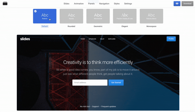
28 |
29 | As a developer-friendly app Slides is offering a piece of mind and less stress while creating your perfect website. **What makes it developer friendly?** First of all, you don´t have to build a website from scratch because all the important stuff you need are built-in for you. Built with HTML, CSS, and JS Slides include code that’s easy to understand and easy to change, no other frameworks are needed.
30 |
31 | **Create Websites With Fully Integrated Info**
32 |
33 | Tutorial - https://www.youtube.com/watch?v=IfKkAo0dSNk
34 |
35 | We are sick of having notifications, messages, and information everywhere which is why Slides app takes care that all the info you need is well integrated. That means you can chat, discuss, show, collect emails and polls, provide directions and more. This awesome collection of integrations will expand your selling capabilities.
36 |
37 | **Play With Powerful Built-In Modules**
38 |
39 | The clean design is not the only amazing thing that comes with [Slides](https://designmodo.com/slides/). This app has a lot of powerful and practical built-in modules that are easy to set up and customize:
40 |
41 | - **Typography** - Perfect set of the typographic elements for blogs and articles.
42 | - **Sound** - Enhance the experience with background music.
43 | - **Popups** - Add video and other content with a new layer.
44 | - **User interface** - Pre-built buttons, inputs, and dropdowns for form elements.
45 | - Drag & drop builder
46 | - Responsive, retina-ready, animated
47 | - Ready-made templates
48 | - Clean Code
49 | - Well Documented
50 | - SCSS Support
51 | - Material Icons
52 | - SEO Friendly
53 | - Multi-page Website
54 | - Popular services integrations
55 |
56 | This app is perfect for those who are willing to design outstanding websites as it offers numerous possibilities for creation.
57 |
58 | **License**
59 |
60 | If you find the tool useful, please share it with your friends or mention us on your website. Use the templates for personal or commercial projects, but don't sell them!
61 |
62 | **Changelog**
63 |
64 | **1.0**
65 |
66 | - Four free templates released.
67 |
68 | **Credits**
69 |
70 | Developed by [Designmodo](https://designmodo.com).
71 |
--------------------------------------------------------------------------------
/images/template-screenshot.jpg:
--------------------------------------------------------------------------------
https://raw.githubusercontent.com/designmodo/html-website-templates/e4373e54cede46b6ff6469ae672e9e09d2f221b9/images/template-screenshot.jpg
--------------------------------------------------------------------------------
/images/template-screenshot2.jpg:
--------------------------------------------------------------------------------
https://raw.githubusercontent.com/designmodo/html-website-templates/e4373e54cede46b6ff6469ae672e9e09d2f221b9/images/template-screenshot2.jpg
--------------------------------------------------------------------------------
/images/template-screenshot3.jpg:
--------------------------------------------------------------------------------
https://raw.githubusercontent.com/designmodo/html-website-templates/e4373e54cede46b6ff6469ae672e9e09d2f221b9/images/template-screenshot3.jpg
--------------------------------------------------------------------------------
/images/template-screenshot4.jpg:
--------------------------------------------------------------------------------
https://raw.githubusercontent.com/designmodo/html-website-templates/e4373e54cede46b6ff6469ae672e9e09d2f221b9/images/template-screenshot4.jpg
--------------------------------------------------------------------------------