├── part3
├── README.md
├── 0_Subsection.md
└── Snippets.md
├── .gitignore
├── .idea
├── markdown-navigator
│ └── profiles_settings.xml
└── markdown-navigator.xml
├── part1
├── 0_Subsection.md
├── 12_TornadoFX_IDEA_Plugin.md
├── 2_Setting_Up.md
├── 1_Why_TornadoFX.md
├── 8_Charts.md
├── 9_Shapes_and_Animation.md
├── 10_FXML.md
├── 6_CSS.md
└── 4_Basic_Controls.md
├── README.md
├── part2
├── 0_Subsection.md
├── Integration.md
├── Layout_Debugger.md
├── Internationalization.md
├── Dependency_Injection.md
├── Property_Delegates.md
├── Scopes.md
├── Config_Settings_and_State.md
├── OSGi.md
├── EventBus.md
├── JSON_and_REST.md
├── Wizard.md
└── Advanced_Data_Controls.md
└── SUMMARY.md
/part3/README.md:
--------------------------------------------------------------------------------
1 |
--------------------------------------------------------------------------------
/.gitignore:
--------------------------------------------------------------------------------
1 | # Created by .ignore support plugin (hsz.mobi)
2 |
--------------------------------------------------------------------------------
/.idea/markdown-navigator/profiles_settings.xml:
--------------------------------------------------------------------------------
1 |
2 |
--------------------------------------------------------------------------------
/part1/0_Subsection.md:
--------------------------------------------------------------------------------
1 | # Part 1: TornadoFX Fundamentals
2 |
3 | This section will cover everything you will need to get started with TornadoFX. These sections are somewhat designed to be read sequentially, as concepts may build on top of each other.
4 |
--------------------------------------------------------------------------------
/part3/0_Subsection.md:
--------------------------------------------------------------------------------
1 | # Part 3: Cook book
2 |
3 | This part of the guide will contain small recipies and tricks describing how to do different things with the framework. Our hope is that the community will contribute as they discover how to perform certain tasks :\)
4 |
5 |
--------------------------------------------------------------------------------
/README.md:
--------------------------------------------------------------------------------
1 | 
2 |
3 | # TornadoFX Guide
4 |
5 | This is a continual effort to fully document the [TornadoFX](https://github.com/edvin/tornadofx) framework in the format of a book.
6 |
7 |
8 |
9 |
--------------------------------------------------------------------------------
/part2/0_Subsection.md:
--------------------------------------------------------------------------------
1 | # Part 2: Advanced Features
2 |
3 | This section moves beyond the core features of TornadoFX, and showcases advanced features and specific framework capabilities. These chapters are not meant to be read sequentially, but rather cherrypicked for your specific interests and needs.
4 |
--------------------------------------------------------------------------------
/SUMMARY.md:
--------------------------------------------------------------------------------
1 | # Summary
2 |
3 | * [Introduction](README.md)
4 | * [Part 1: TornadoFX Fundamentals](part1/0_Subsection.md)
5 | * [1. Why TornadoFX?](part1/1_Why_TornadoFX.md)
6 | * [2. Setting Up](part1/2_Setting_Up.md)
7 | * [3. Components](part1/3_Components.md)
8 | * [4. Basic Controls](part1/4_Basic_Controls.md)
9 | * [5. Data Controls](part1/5_Data_Controls.md)
10 | * [6. Type Safe CSS](part1/6_CSS.md)
11 | * [7. Layouts and Menus](part1/7_Layouts_and_Menus.md)
12 | * [8. Charts](part1/8_Charts.md)
13 | * [9. Shapes and Animation](part1/9_Shapes_and_Animation.md)
14 | * [10. FXML](part1/10_FXML.md)
15 | * [11. Editing Models and Validation](part1/11_Editing_Models_and_Validation.md)
16 | * [12. TornadoFX IDEA Plugin](part1/12_TornadoFX_IDEA_Plugin.md)
17 | * [Part 2: TornadoFX Advanced Features](part2/0_Subsection.md)
18 | * [Property Delegates](part2/Property_Delegates.md)
19 | * [Advanced Data Controls](part2/Advanced_Data_Controls.md)
20 | * [OSGi](part2/OSGi.md)
21 | * [Scopes](part2/Scopes.md)
22 | * [EventBus](part2/EventBus.md)
23 | * [Workspaces](part2/Workspaces.md)
24 | * [Layout Debugger](part2/Layout_Debugger.md)
25 | * [Internationalization](part2/Internationalization.md)
26 | * [Config Settings and State](part2/Config_Settings_and_State.md)
27 | * [JSON and REST](part2/JSON_and_REST.md)
28 | * [Dependency Injection](part2/Dependency_Injection.md)
29 | * [Wizard](part2/Wizard.md)
30 | * [Integrating with other tech](part2/Integration.md)
31 | * [Part 3: Cook Book](part3/0_Subsection.md)
32 | * [Snippets](part3/Snippets.md)
33 |
34 |
--------------------------------------------------------------------------------
/part2/Integration.md:
--------------------------------------------------------------------------------
1 | ## Integrate with existing JavaFX Applications
2 |
3 | TornadoFX can happily coexist with an existing Application written in either Kotlin or Java. This enables a gradual migration instead of performing a complete rewrite before you can benefit from TornadoFX in your apps. Feel free to skip this section if it doesn't apply to you.
4 |
5 | **Note**: This feature is available as of version 1.4.3
6 |
7 | To make TornadoFX aware of your application, perform a call to `registerApplication` in your `Application` class `start()` method:
8 |
9 | ```java
10 | public class LegacyApp extends Application {
11 | public void start(Stage primaryStage) throws Exception {
12 | // Register JavaFX app with the TornadoFX runtime
13 | FX.registerApplication(this, primaryStage);
14 | }
15 | }
16 | ```
17 | > Existing JavaFX Application written in Java
18 |
19 | ### Accessing TornadoFX Views from plain old JavaFX
20 |
21 | Let's say you have created your first TornadoFX View and would like to integrate the root node of that `View` into a plain JavaFX view. You could actually just instantiate the View and put the root Node wherever you like, but since `View` is a singleton, you want to make sure you only ever instantiate a single instance. For this, you can use the `FX.find` function.
22 |
23 | First let's create a simple TornadoFX View, and this time let's write it in plain Java instead of Kotlin. We don't expect that people will write TornadoFX apps in Java, but it is indeed possible :)
24 |
25 | ```java
26 | public class MyView extends View {
27 | public HBox getRoot() {
28 | return new HBox(new Label("I'm a TornadoFX View written in Java"));
29 | }
30 | }
31 | ```
32 | > TornadoFX View written in Java (!!)
33 |
34 | ```java
35 | // Create a BorderPane for our Scene
36 | BorderPane root = new BorderPane();
37 |
38 | // Lookup a TornadoFX view and set it's root as the center node
39 | HBox fxView = FX.find(MyView.class).getRoot();
40 | root.setCenter(fxView);
41 | ```
42 |
43 | The same mechanics can be used to access TornadoFX Controllers. For Fragments, simply instantiate them and put the root node where you like.
44 |
45 | ### Bootstrapping TornadoFX from Swing
46 |
47 | You can even start a TornadoFX app inside your existing Swing applications!
48 |
49 | ```kotlin
50 | public class SwingApp {
51 | private static void createAndShowGUI() {
52 | // initialize toolkit
53 | JFXPanel wrapper = new JFXPanel();
54 |
55 | // Init TornadoFX Application
56 | Platform.runLater(() -> {
57 | Stage stage = new Stage();
58 | MyApp app = new MyApp();
59 | app.start(stage);
60 | });
61 | }
62 |
63 | public static void main(String[] args) {
64 | SwingUtilities.invokeLater(SwingApp::createAndShowGUI);
65 | }
66 | }
67 | ```
68 |
69 | ### Integrate with existing Dependency Injection frameworks
70 |
71 | You can access your existing beans exposed via any dependency injection framework by implementing a SAM class called `DIContainer` and registering it via `FX.setDicontainer()`. More information on the next page.
--------------------------------------------------------------------------------
/part2/Layout_Debugger.md:
--------------------------------------------------------------------------------
1 |
2 | ## Layout Debugger
3 |
4 | When you're creating layouts or working on CSS it some times help to be able to visualise the scene graph and make live changes to the node properties of your layout. The absolutely best tool for this job is definitely the [Scenic View](http://fxexperience.com/scenic-view/) tool from [FX Experience](http://fxexperience.com/), but some times you just need to get a quick overview as fast as possible.
5 |
6 | ### Debugging a scene
7 |
8 | Simply hit **Alt-Meta-J** to bring up the built in debugging tool *Layout Debugger*. The debugger attaches to the currently active `Scene` and opens a new window that shows you the current scene graph and properties for the currently selected node.
9 |
10 | ### Usage
11 |
12 | While the debugger is active you can hover over any node in your View and it will be automatically highlighted in the debugger window. Clicking a node will also show you the properties of that node. Some of the properties are editable, like `backgroundColor`, `text`, `padding` etc.
13 |
14 | When you hover over the node tree in the debugger, the corresponding node is also highlighted directly in the View.
15 |
16 | 
17 |
18 | ### Stop a debugging session
19 |
20 | Close the debugger window by hitting `Esc` and the debugger session ends. You can debug multiple scenes simultaneously, each debugging session will open a new window corresponding to the scene you debug.
21 |
22 | ### Configurable shortcut
23 |
24 | The default shortcut for the debugger can be changed by setting an instance of `KeyCodeCombination` into `FX.layoutDebuggerShortcut`. You can even change the shortcut while the app is running. A good place to configure the shortcut would be in the `init` block of your `App` class.
25 |
26 | ### Adding features
27 |
28 | While this debugger tool is in no way a replacement for Scenic View, we will add features based on *reasonable* [feature requests](https://github.com/edvin/tornadofx/issues). If the feature adds value for simple debugging purposes and can be implemented in a small amount of code, we will try to add it, or better yet, submit a [pull request](https://github.com/edvin/tornadofx/pulls). Have a look at the [source code](https://github.com/edvin/tornadofx/blob/master/src/main/java/tornadofx/LayoutDebugger.kt) to familiarise yourself with the tool.
29 |
30 |
31 | ### Entering fullscreen
32 |
33 | To enter fullscreen you need to get a hold of the current `stage` and call `stage.isFullScreen = true`. The primary stage is the active stage unless you opened a modal window via `view.openModal()` or manually created a stage. The primary stage is available in the variable `FX.primaryStage`. To open the application in fullscreen on startup you should override `start` in your app class:
34 |
35 | ```kotlin
36 | class MyApp : App(MyView::class) {
37 | override fun start(stage: Stage) {
38 | super.start(stage)
39 | stage.isFullScreen = true
40 | }
41 | }
42 | ```
43 |
44 | In the following example we toggle fullscreen mode in a modal window via a button:
45 |
46 | ```kotlin
47 | button("Toggle fullscreen") {
48 | setOnAction {
49 | with (modalStage) { isFullScreen = !isFullScreen }
50 | }
51 | }
52 | ```
53 |
54 | # Logging
55 |
56 | `Component` has a lazy initialized instance of `java.util.Logger` named `log`. Usage:
57 |
58 | ```kotlin
59 | log.info { "Log message here" }
60 | ```
61 |
62 | TornadoFX makes no changes to the logging capabilities of `java.util.Logger`. See the [javadoc](https://docs.oracle.com/javase/8/docs/api/java/util/logging/Logger.html) for more information.
63 |
--------------------------------------------------------------------------------
/part3/Snippets.md:
--------------------------------------------------------------------------------
1 | # Snippets
2 |
3 | ### How to load an image to the imageview{...} in more effective way
4 |
5 | This snippet covers 2 issues:
6 |
7 | * How to get correct view size after image loading
8 | * How to load an image to not affect to (do not to freeze) UI
9 |
10 | The snippet below uses 4 techniques with timing each of them. So one can see that more effective way is to use URL as the constructor parameter along with explicit view resizing.
11 |
12 | ```java
13 | import javafx.application.Application
14 | import javafx.scene.image.Image
15 | import javafx.stage.Stage
16 | import tornadofx.*
17 |
18 |
19 | /**
20 | * This is about how to load an image in more effective way.
21 | */
22 | class LoadImageView : View() {
23 |
24 | override val root = vbox {
25 |
26 | run {
27 | // 1. Simple synchronous way via property
28 | println("-- load synchronously #1 -- ")
29 | val start = System.currentTimeMillis()
30 | imageview {
31 | image = Image("/big_image.png")
32 | println("loaded for ${System.currentTimeMillis() - start} msecs")
33 | }
34 | println("finished after ${System.currentTimeMillis() - start} msecs")
35 | }
36 |
37 | run {
38 | // 2. Simple synchronous way via constructor
39 | println("-- load synchronously #2 --")
40 | val start = System.currentTimeMillis()
41 | imageview("/big_image.png", lazyload = false) {
42 | println("loaded for ${System.currentTimeMillis() - start} msecs")
43 | }
44 | println("finished after ${System.currentTimeMillis() - start} msecs")
45 | }
46 |
47 | run {
48 | // 3. Asynchronous way through outer background task
49 | println("-- load asynchronously #1 -- ")
50 | val start = System.currentTimeMillis()
51 | imageview {
52 | runAsync {
53 | image = Image("/big_image.png")
54 | println("loaded for ${System.currentTimeMillis() - start} msecs")
55 | }
56 | }
57 | println("finished after ${System.currentTimeMillis() - start} msecs")
58 | }
59 |
60 | // Need between 2 async calls
61 | Thread.sleep(1000)
62 |
63 | run {
64 | // 4. Asynchronous way through lazy loading
65 | println("-- load asynchronously #2 -- ")
66 | val start = System.currentTimeMillis()
67 | imageview("/big_image.png") {
68 | setPrefSize(1920.0, 1080.0)
69 | println("loaded for ${System.currentTimeMillis() - start} msecs")
70 | }
71 | println("finished after ${System.currentTimeMillis() - start} msecs")
72 | }
73 |
74 | // After you run you'll see something like this:
75 | //
76 | // -- load synchronously #1 --
77 | // loaded for 217 msecs
78 | // finished after 218 msecs
79 | // -- load synchronously #2 --
80 | // loaded for 150 msecs
81 | // finished after 150 msecs
82 | // -- load asynchronously #1 --
83 | // finished after 75 msecs
84 | // loaded for 171 msecs
85 | // -- load asynchronously #2 --
86 | // loaded for 7 msecs
87 | // finished after 7 msecs
88 | //
89 | // So the winner is no.4: Asynchronous way through lazy loading
90 |
91 | }
92 |
93 | }
94 |
95 | class LoadImageApp : App(LoadImageView::class)
96 |
97 | fun main(args: Array) {
98 | launch(args)
99 | }
100 | ```
101 |
--------------------------------------------------------------------------------
/part2/Internationalization.md:
--------------------------------------------------------------------------------
1 | # Internationalization
2 |
3 | TornadoFX makes it very easy to support multiple languages in your app.
4 |
5 | ### Internationalization in Components
6 |
7 | Each `Component` has access to a property called `messages` of type `ResourceBundle`. This can be used to look messages in the current locale and assign them to controls programmatically:
8 |
9 | ```kotlin
10 | class MyView: View() {
11 | init {
12 | val helloLabel = Label(messages["hello"])
13 | }
14 | }
15 | ```
16 | > A label is programmatically configured to get it's text from a resource bundle
17 |
18 | As well of the shorthand syntax `messages["key"]`, all other functions of the `ResourceBundle` class is available as well.
19 |
20 | The bundle is automatically loaded by looking up a base name equal to the fully qualified class name of the `Component`. For a Component named `views.CustomerList`, the corresponding resource bundle in `/views/CustomerList.properties` will be used. All normal variants of the resource bundle name is supported, see [ResourceBundle Javadocs](https://docs.oracle.com/javase/8/docs/api/java/util/ResourceBundle.html) for more information.
21 |
22 | ### Internationalization in `FXML`
23 |
24 | When an `FXML` file is loaded via the `fxml` delegate function, the corresponding `messages` property of the component will be used in exactly the same way.
25 |
26 | ```xml
27 |
28 |
30 | ```
31 | > The message with key `hello` will be injected into the label.
32 |
33 | ### Default Global Messages
34 |
35 | You can add a global set of messages with the base name `Messages` (for example `Messages_en.properties`) at the root of the class path.
36 |
37 | ### Automatic lookup in parent bundle
38 |
39 | When a key is not found in the component bundle, or when there is no bundle for the currrent component, the global resource bundle is consulted. As such, you might use the global bundle for all resources, and place overrides in the per component bundle.
40 |
41 | ### Friendly error messages
42 |
43 | In stead of throwing an exception when a key is not available in your bundle, the value will simply be `[key]`. This makes it easy to spot your errors, and your UI is still fully functional while you add the missing keys.
44 |
45 | ### Configuring the locale
46 |
47 | The default locale is the one retrieved from `Locale.getDefault()`. You can configure a different locale by issuing:
48 |
49 | ```kotlin
50 | FX.locale = Locale("my-locale")
51 | ```
52 |
53 | The global bundle will automatically be changed to the bundle corresponding to the new locale, and all subsequently loaded components will get their bundle in the new locale as well.
54 |
55 | ### Overriding resource bundles
56 |
57 | If you want to change the bundle for a component after it's been initialized, or if you simply want to load a specific bundle without relying on the conventions, simply assign the new bundle to the `messages` property of the component.
58 |
59 | If you want to use the overriden resource bundle to load `FXML`, make sure you change the bundle before you load the root view:
60 |
61 | ```kotlin
62 | class MyView: View() {
63 | init { messages = ResourceBundle.getBundle("MyCustomBundle") }
64 | override val root = HBox by fxml()
65 | }
66 | ```
67 | > A manually overriden resource bundle is used by the `FXML` file corresponding to the View
68 |
69 | The same technique can be used to override the global bundle by assigning to `FX.messages`.
70 |
71 | ### Startup locale
72 |
73 | You can override the default locale as early as the `App` class `init` function by assigning to `FX.locale`.
74 |
75 | ### Controllers and Fragments as well
76 |
77 | The same conventions are valid for `Controllers` and `Fragments`, since the functionality is made available to their common super class, `Component`.
78 |
79 |
--------------------------------------------------------------------------------
/part2/Dependency_Injection.md:
--------------------------------------------------------------------------------
1 | # Dependency Injection
2 |
3 | `View` and `Controller` are singletons, so you need some way to access the instance of a specific component. Tornado FX supports dependency injection, but you can also lookup components with the `find` function.
4 |
5 | ```kotlin
6 | val myController = find(MyController::class)
7 | ```
8 |
9 | When you call `find`, the component corresponding to the given class is looked up in a global component registry. If it did not exist prior to the call, it will be created and inserted into the registry before the function returns.
10 |
11 | If you want to declare the controller referance as a field member however, you should use the `inject` delegate instead. This is a lazy mechanism, so the actual instance will only be created the first time you call a function on the injected resource. Using `inject` is always prefered, as it allows your components to have circular dependencies.
12 |
13 | ```kotlin
14 | val myController: MyController by inject()
15 | ```
16 |
17 | ## Third party injection frameworks
18 |
19 | TornadoFX makes it easy to inject resources from a third party dependency injection framework, like for example Guice or Spring. All you have to do is implement the very simple `DIContainer` interface when you start your application. Let's say you have a Guice module configured with a fictive `HelloService`. Start Guice in the `init` block of your `App` class and register the module with TornadoFX:
20 |
21 | ```kotlin
22 | val guice = Guice.createInjector(MyModule())
23 |
24 | FX.dicontainer = object : DIContainer {
25 | override fun getInstance(type: KClass)
26 | = guice.getInstance(type.java)
27 | }
28 | ```
29 | > The DIContainer implementation is configured to delegate lookups to `guice.getInstance`
30 |
31 | To inject the `HelloService` configured in `MyModule`, use the `di` delegate instead of the `inject` delegate:
32 |
33 | ```kotlin
34 | val MyView : View() {
35 | val helloService: HelloService by di()
36 | }
37 | ```
38 |
39 | The `di` delegate accepts any bean type, while `inject` will only allow beans of type `ScopedInstance`, which includes TornadoFX's `View` and `Controller`. This keeps a clean separation between your UI beans and any beans configured in the external dependency injection framework.
40 |
41 | ## Setting up for Spring
42 |
43 | Above the setup for Guice is shown. Setting up for Spring, in this case using `beans.xml` as `ApplicationContext` is done as follows:
44 |
45 | ### beans.xml
46 |
47 | ```xml
48 |
49 |
50 |
57 |
58 |
61 | ```
62 | This sets Spring up to scan for beans.
63 |
64 | ### Application startup
65 | ```kotlin
66 | class SpringExampleApp : App(SpringExampleView::class) {
67 | init {
68 | val springContext = ClassPathXmlApplicationContext("beans.xml")
69 | FX.dicontainer = object : DIContainer {
70 | override fun getInstance(type: KClass): T = springContext.getBean(type.java)
71 | }
72 | }
73 | }
74 | ```
75 | This initialized the spring context and hooks it into tornadoFX via the `FX.dicontainer`. Now you can inject Spring beans like this:
76 | ```kotlin
77 | val helloBean : HelloBean by di()
78 | ```
79 |
80 | It is quite common in the Spring world to name a bean like so:
81 |
82 | ```xml
83 |
84 |
86 | ```
87 | The bean is then accessible using the `id`. This can be done in tornadoFX too:
88 |
89 | ```kotlin
90 | class SpringExampleApp : App(SpringExampleView::class) {
91 | init {
92 | val springContext = ClassPathXmlApplicationContext("beans.xml")
93 | FX.dicontainer = object : DIContainer {
94 | override fun getInstance(type: KClass): T = springContext.getBean(type.java)
95 | override fun getInstance(type: KClass, name: String): T = springContext.getBean(type.java,name)
96 | }
97 | }
98 | }
99 | ```
100 | The second `getInstance` uses both the type of the bean and the id of the bean. Instantiating a bean is down as:
101 |
102 | ```kotlin
103 | val helloBean : HelloBean by di("helloWorld")
104 | ```
105 |
--------------------------------------------------------------------------------
/.idea/markdown-navigator.xml:
--------------------------------------------------------------------------------
1 |
2 |
3 |
4 |
5 |
6 |
8 |
9 |
10 |
11 |
36 |
37 |
55 |
56 |
57 |
58 |
60 |
65 |
66 |
67 |
69 |
73 |
75 |
77 |
78 |
--------------------------------------------------------------------------------
/part1/12_TornadoFX_IDEA_Plugin.md:
--------------------------------------------------------------------------------
1 | # 12. TornadoFX IDEA Plugin
2 |
3 | To save time in using TornadoFX, you can install a convenient Intellij IDEA plugin to automatically generate project templates, Views, injections, and other TornadoFX features. Of course, you do not have to use this plugin which was done throughout this book. But it adds some convenience to build TornadoFX applications a little more quickly.
4 |
5 | ## Installing the Plugin
6 |
7 | In the Intellij IDEA workspace, press CONTROL + SHIFT + A and type "Plugins", then press ENTER . You will see a dialog to search and install plugins. Click the *Browse Repositories* button (Figure 13.1).
8 |
9 | **Figure 13.1** After bringing up the *Plugins* dialog, click *Browse Repositories*.
10 |
11 | 
12 |
13 | You will then see a list of 3rd party plugins available to install. Search for "TornadoFX", select it, and click the green *Install* button (Figure 13.2).
14 |
15 | **Figure 13.2** Search for "TornadoFX" and click *Install*
16 |
17 | 
18 |
19 | Wait for it to finish installing and the restart Intellij IDEA.
20 |
21 | ### TornadoFX Project Templates
22 |
23 | The TornadoFX plugins has some Maven and Gradle project templates to quickly create a configured TornadoFX application.
24 |
25 | In Intellij IDEA, navigate to *File* -> *New* -> *Project...* (Figure 13.3).
26 |
27 | **Figure 13.3**
28 |
29 | 
30 |
31 | You will then see a dialog to create a new TornadoFX project. You can create Gradle and Maven flavors, with or without OSGi support. Let's create a Gradle one for demonstration (Figure 13.4).
32 |
33 | **Figure 13.4**
34 |
35 | 
36 |
37 | In the next dialog, give your project a name, a location folder, and a base package with your domain (Figure 13.5). Then click *Finish*.
38 |
39 | **Figure 13.5**
40 |
41 | 
42 |
43 | You may be prompted to import the project as a Gradle project, and click on that prompt if you encounter it. You will then have a TornadoFX application configured and set up, including `App`, `View`, and `Styles` entities set up (Figure 13.6).
44 |
45 | **Figure 13.6**
46 |
47 | A generated TornadoFX project with a Gradle configuration.
48 | 
49 |
50 | These steps apply to the Maven and OSGi wizards as well, and do not forget to put your project on a version tracking system like GIT!.
51 |
52 |
53 | ## Creating Views
54 |
55 | You can create Views, Fragments, and FXML files quickly with the plugin. You can right click a folder in the Project, then navigate the popup menu to *New* -> *TornadoFX View* (Figure 13.7).
56 |
57 | **Figure 13.7**
58 |
59 | 
60 |
61 | You will then come to a dialog to dictate how the `View` is constructed. You even have the option of specifying it as a `Fragment` instead through the *Type* parameter, as well as an FXML via *Kind*. Finally, you can specify the `Node` type for the *Root*, which should default to a `BorderPane`.
62 |
63 | **Figure 13.8**
64 |
65 | 
66 |
67 | Click *OK* and a new`View` will generated and added to your project (Figure 13.9).
68 |
69 | **Figure 13.9** A new `View` generated with the TornadoFX plugin
70 |
71 | 
72 |
73 | ## Injecting Components
74 |
75 | One last minor convenience. You can generate TornadoFX `Component` injections quickly with the plugin. For instance, if you right click the class body of the `MainView`, you can generate the `MyOtherView` as an injected property (Figure 13.10).
76 |
77 | **Figure 13.10**
78 |
79 | 
80 |
81 | 
82 |
83 | You can then use a dialog to select the `MyOtherView` as the injected property, then click *OK* (Figure 13.11).
84 |
85 | **Figure 13.11**
86 |
87 | 
88 |
89 | 
90 |
91 |
92 | ## Generating TornadoFX Properties
93 |
94 | One of the most helpful features in the plugin is the ability to convert plain Kotlin properties into TornadoFX properties.
95 |
96 | Say you have a simple domain class called `Client`.
97 |
98 | ```kotlin
99 | class Client(id: Int, name: String) {
100 | val id: Int = id
101 | val name: String = name
102 | }
103 | ```
104 |
105 | If you click on a property and then the intent lightbulb, or press ALT +ENTER , you should see a menu popup with an option to convert it to a TornadoFX Property (Figure 13.12).
106 |
107 | **Figure 13.12**
108 |
109 | 
110 |
111 | Do this for each property and your `Client` class should now look like this.
112 |
113 | ```kotlin
114 | class Client(id: Int, name: String) {
115 | var id by property(id)
116 | fun idProperty() = getProperty(Client::id)
117 |
118 | var name by property(name)
119 | fun nameProperty() = getProperty(Client::name)
120 | }
121 | ```
122 |
123 | Your `Client` now uses JavaFX properties instead of plain properties. Notice the primary constructor will pass the intial values to the `property()` delegates, but you do not have to provide initial values if they are not desired.
124 |
125 | This is a time-saving feature when creating domain types for data controls. Next we will cover how to generate `TableView` columns.
126 |
127 | ## Generating Columns for a TableView
128 |
129 | Another handy feature you can do with the plugin also is generating columns for a `TableView`. If you have a `TableView`, you can put the cursor on its declaration, press ALT + ENTER, and get a prompt to generate the columns (Figure 13.13).
130 |
131 | **Figure 13.13**
132 |
133 |
134 | 
135 |
136 | You will then see a dialog to confirm which `Person` properties to generate the columns on (Figure 14.14).
137 |
138 | **Figure 13.14**
139 |
140 | 
141 |
142 | Press "OK" and the columns will then be generated for you (Figure 13.15).
143 |
144 |
145 | **Figure 13.15**
146 |
147 | 
148 |
149 |
150 | Note that at the time of writing this guide, for a given `TableView`, this feature only works if the properties on `T` follow the JavaFX convention using the `Property` delgates.
151 |
152 |
153 |
154 | ## Summary
155 |
156 | The TornadoFX plugin has some time-saving conveniences that you are welcome to take advantage of. Of course, you do not have to use the plugin because it merely provides shortcuts and generates code. In time, there may be more features added to the plugin so be sure to follow the project on GitHub for future developments.
157 |
--------------------------------------------------------------------------------
/part1/2_Setting_Up.md:
--------------------------------------------------------------------------------
1 | # Setting Up
2 |
3 | To use TornadoFX, there are several options to set up the dependency for your project. Mainstream build automation tools like [Gradle](http://gradle.org/) and [Maven](https://maven.apache.org/) are supported and should have no issues in getting set up.
4 |
5 | Please note that TornadoFX is a Kotlin library, and therefore your project needs to be configured to use Kotlin. For Gradle and Maven configurations, please refer to the [Kotlin Gradle Setup](https://kotlinlang.org/docs/reference/using-gradle.html) and [Kotlin Maven Setup](https://kotlinlang.org/docs/reference/using-maven.html) guides. Make sure your development environment or IDE is equipped to work with Kotlin and has the proper plugins and compilers.
6 |
7 | This guide will use Intellij IDEA to walk through certain examples. IDEA is the IDE of choice to work with Kotlin, although Eclipse has a plugin as well.
8 |
9 | ## If you are using Oracle JDK
10 |
11 | ### Gradle
12 |
13 | For Gradle, you can set up the dependency directly from Maven Central. Provide the desired version number for the `x.y.z` placeholder.
14 |
15 | ```
16 | repositories {
17 | mavenCentral()
18 | }
19 |
20 | // Minimum jvmTarget of 1.8 needed since Kotlin 1.1
21 | compileKotlin {
22 | kotlinOptions.jvmTarget= 1.8
23 | }
24 |
25 | dependencies {
26 | implementation 'no.tornado:tornadofx:x.y.z'
27 | }
28 | ```
29 |
30 | ### Maven
31 |
32 | To import TornadoFX with Maven, add the following dependency to your POM file. Provide the desired version number for the `x.y.z` placeholder.
33 |
34 | Goes into kotlin-maven-plugin block:
35 |
36 | ```
37 |
38 | 1.8
39 |
40 | ```
41 |
42 | Then this goes into `dependencies` block:
43 |
44 | ```
45 |
46 | no.tornado
47 | tornadofx
48 | x.y.z
49 |
50 | ```
51 |
52 | ## If you are using OpenJDK
53 |
54 | On Ubuntu 19.10, there is no longer any clean way to run OpenJDK 8 with JFX. OpenJDK in general does not include the JFX module libraries -- JFX support for OpenJDK is commonly provided by OpenJFX, which has a maven distribution as well as packages in various Linux distributions. However, the OpenJFX versions are tied to JDK versions (e.g. OpenJFX 8 is compatible with OpenJDK 8), and unfortunately the OpenJFX 8 version is not available in Ubuntu 19.10's packages, nor does it compile from source using the packaged OpenJDK 8.
55 |
56 | The upshot of this is that if you wish to continue using OpenJDK (on Ubuntu), your options are:
57 |
58 | 1) Stay on OpenJDK 8 but install OpenJFX 8 system wide by adding older dependencies to your system (e.g. https://bugs.launchpad.net/ubuntu/+source/openjfx/+bug/1799946/comments/7)
59 |
60 | 2) Alternately, you can bite the bullet and upgrade to OpenJDK 11, and install OpenJFX via Maven/Gradle. This solution is as follows:
61 |
62 | ### Gradle
63 |
64 | a) Upgrade to OpenJDK 11 via your system's packaging tools.
65 |
66 | b) Add the OpenJFX gradle plugin:
67 |
68 | ```
69 | plugins {
70 | id 'application'
71 | id 'org.openjfx.javafxplugin' version '0.0.8'
72 | }
73 | ```
74 |
75 | c) Add gradle dependencies:
76 |
77 | ```
78 | javafx {
79 | version = "11.0.2"
80 | modules = ['javafx.controls', 'javafx.graphics']
81 | }
82 |
83 | dependencies {
84 | implementation 'no.tornado:tornadofx:x.y.z'
85 | }
86 | ```
87 |
88 | d) Change kotlin `jvmTarget` to `11`:
89 |
90 | ```
91 | compileKotlin {
92 | kotlinOptions.jvmTarget = "11"
93 | }
94 |
95 | compileTestKotlin {
96 | kotlinOptions.jvmTarget = "11"
97 | }
98 | ```
99 |
100 | e) The gradle doesn't support `JPMS` correctly, so we don't need to add `module-info.java` for project.
101 |
102 | In Intellij Idea, you should change the `Project SDK` to `11` in `File -> Project Structure -> Project Settings -> Project`.
103 |
104 | ### Maven
105 |
106 | a) Upgrade to OpenJDK 11 via your system's packaging tools.
107 |
108 | b) Add maven dependencies:
109 |
110 | ```
111 |
112 | no.tornado
113 | tornadofx
114 | x.y.z
115 |
116 |
117 |
118 | org.openjfx
119 | javafx
120 | 11.0.2
121 |
122 |
123 | org.openjfx
124 | javafx-base
125 | 11.0.2
126 |
127 |
128 | org.openjfx
129 | javafx-controls
130 | 11.0.2
131 |
132 | ```
133 |
134 | c) Add the OpenJFX builder to your build/plugins section:
135 | ```
136 |
137 |
138 | ...
139 |
140 | org.openjfx
141 | javafx-maven-plugin
142 | 0.0.3
143 |
144 | MyMainApp
145 |
146 |
147 |
148 |
149 | ```
150 |
151 | d) Set the language level in your maven build to 11:
152 | ```
153 |
154 |
155 | ...
156 |
157 | org.apache.maven.plugins
158 | maven-compiler-plugin
159 | 3.8.0
160 |
161 | 11
162 |
163 |
164 |
165 |
166 | ```
167 |
168 | e) Finally, add src/main/kotlin/module-info.java, to set up permissioning in Java 11's module system.
169 |
170 | ```
171 | module yourmodulename {
172 | requires javafx.controls;
173 | requires javafx.graphics;
174 | requires tornadofx;
175 | requires kotlin.stdlib;
176 | opens your.package.to.ui.classes;
177 | }
178 | ```
179 | If you are using IntelliJ, it will provide helpful prompts to add any additional modules that you may need for the build to succeed with your app. StackOverflow has a plethora of questions from Java programmers switching to the module system for the first time, so if you run into a module permissions related issue, google the error message for a solution.
180 |
181 | (Variations on this section for other platforms are welcomed.)
182 |
183 | ## Other Build Automation Solutions
184 |
185 | For instructions on how to use TornadoFX with other build automation solutions, please refer to the [TornadoFX page at the Central Repository](https://search.maven.org/artifact/no.tornado/tornadofx/)
186 |
187 | ## Manual Import
188 |
189 | To manually download and import the JAR file, go to the [TornadoFX release page](https://github.com/edvin/tornadofx/releases) or the [Central Repository](https://search.maven.org). Download the JAR file and configure it into your project.
190 |
--------------------------------------------------------------------------------
/part1/1_Why_TornadoFX.md:
--------------------------------------------------------------------------------
1 | # Introduction
2 |
3 | User interfaces are becoming increasingly critical to the success of consumer and business applications. With the rise of consumer mobile apps and web applications, business users are increasingly holding enterprise applications to a higher standard of quality. They want rich, feature-packed user interfaces that provide immediate insight and navigate complex screens intuitively. More importantly, they want the application to adapt quickly to business changes on a frequent basis. For the developer, this means the application must not only be maintainable but also evolvable. TornadoFX seeks to assist all these objectives and greatly streamline the development of JavaFX UI's.
4 |
5 | While much of the enterprise IT world is pushing HTML5 and cloud-based applications, many businesses are still using desktop UI frameworks like JavaFX. While it does not distribute to large audiences as easily as web applications, JavaFX works well for "in-house" business applications. Its high-performance with large datasets (and the fact it is native Java) make it a practical choice for applications used behind the corporate firewall.
6 |
7 | JavaFX, like many UI frameworks, can quickly become verbose and difficult to maintain. Fortunately, the rapidly growing Kotlin platform has allowed an opportunity to rethink how JavaFX applications are built.
8 |
9 |
10 | # Why TornadoFX?
11 |
12 | In February 2016, JetBrains released [Kotlin](http://kotlinlang.org), a new JVM language that emphasizes pragmatism over convention. Kotlin works at a higher level of abstraction and provides practical language features not available in Java. One of the more important features of Kotlin is its 100% interoperability with existing Java libraries and codebases, including JavaFX. Even more important is in 2017, Google backed Kotlin as an official language for Android. This gives Kotlin a bright future that has already extended beyond mobile apps.
13 |
14 | While JavaFX can be used with Kotlin in the same manner as Java, some believed Kotlin had language features that could streamline and simplify JavaFX development. Well before Kotlin's beta, Eugen Kiss prototyped JavaFX "builders" with KotlinFX. In January 2016, Edvin Syse rebooted the initiative and released TornadoFX.
15 |
16 | TornadoFX seeks to greatly minimize the amount of code needed to build JavaFX applications. It not only includes type-safe builders to quickly lay out controls and user interfaces, but also features dependency injection, delegated properties, control extension functions, and other practical features enabled by Kotlin. TornadoFX is a fine showcase of how Kotlin can simplify codebases, and it tackles the verbosity of UI code with elegance and simplicity. It can work in conjunction with other popular JavaFX libraries such as [ControlsFX](http://fxexperience.com/controlsfx/) and [JFXtras](http://jfxtras.org/). It works especially well with reactive frameworks such as [ReactFX](https://github.com/TomasMikula/ReactFX) as well as [RxJava](https://github.com/ReactiveX/RxJava) and friends (including [RxJavaFX](https://github.com/ReactiveX/RxJavaFX), [RxKotlin](https://github.com/ReactiveX/RxKotlin), and [RxKotlinFX](https://github.com/thomasnield/RxKotlinFX)).
17 |
18 | # Reader Requirements
19 |
20 | This book expects readers to have some knowledge of Kotlin and have spent some time getting acquainted with it. There will be some coverage of Kotlin language features but only to a certain extent. If you have not done so already, read the [JetBrains Kotlin Reference](https://kotlinlang.org/docs/reference/) and spend a good few hours studying it.
21 |
22 | It helps to be familiar with JavaFX but it is not a requirement. Many Kotlin developers reported using TornadoFX successfully without any JavaFX knowledge. What is particularly important to know about JavaFX is its concepts of `ObservableValue` and `Bindings`, which this guide will cover to a good degree.
23 |
24 | # A Motivational Example
25 |
26 | If you have worked with JavaFX before, you might have created a `TableView` at some point. Say you have a given domain type `Person`. TornadoFX allows you to much more concisely create the JavaBeans-like convention used for the JavaFX binding.
27 |
28 | ```kotlin
29 | class Person(id: Int, name: String, birthday: LocalDate) {
30 | val idProperty = SimpleIntegerProperty(id)
31 | var id by idProperty
32 |
33 | val nameProperty = SimpleStringProperty(name)
34 | var name by nameProperty
35 |
36 | val birthdayProperty = SimpleObjectProperty(birthday)
37 | var birthday by birthdayProperty
38 |
39 | val age: Int get() = Period.between(birthday, LocalDate.now()).years
40 | }
41 | ```
42 |
43 | You can then build an entire "`View`" containing a `TableView` with a small code footprint.
44 |
45 | ```kotlin
46 | class MyView : View() {
47 |
48 | private val persons = listOf(
49 | Person(1, "Samantha Stuart", LocalDate.of(1981,12,4)),
50 | Person(2, "Tom Marks", LocalDate.of(2001,1,23)),
51 | Person(3, "Stuart Gills", LocalDate.of(1989,5,23)),
52 | Person(4, "Nicole Williams", LocalDate.of(1998,8,11))
53 | ).observable()
54 |
55 | override val root = tableview(persons) {
56 | column("ID", Person::idProperty)
57 | column("Name", Person::nameProperty)
58 | column("Birthday", Person::birthdayProperty)
59 | readonlyColumn("Age", Person::age)
60 | }
61 | }
62 | ```
63 |
64 | **RENDERED OUTPUT:**
65 |
66 | 
67 |
68 | Half of that code was just initializing sample data! If you hone in on just the part declaring the `TableView` with four columns (shown below), you will see it took a simple functional construct to build a `TableView`. It will automatically support edits to the fields as well.
69 |
70 | ```kotlin
71 | tableview(persons) {
72 | column("ID", Person::idProperty)
73 | column("Name", Person::nameProperty)
74 | column("Birthday", Person::birthdayProperty)
75 | readonlyColumn("Age", Person::age)
76 | }
77 | ```
78 |
79 | As shown below, we can use the `cellFormat()` extension function on a `TableColumn`, and create conditional formatting for "Age" values that are less than `18`.
80 |
81 | ```kotlin
82 | tableview {
83 | items = persons
84 | column("ID", Person::idProperty)
85 | column("Name", Person::nameProperty)
86 | column("Birthday", Person::birthdayProperty)
87 | readonlyColumn("Age", Person::age).cellFormat {
88 | text = it.toString()
89 | style {
90 | if (it < 18) {
91 | backgroundColor += c("#8b0000")
92 | textFill = Color.WHITE
93 | }
94 | }
95 | }
96 | }
97 | ```
98 |
99 | **RENDERED OUTPUT:**
100 |
101 | 
102 |
103 | These declarations are pure Kotlin code, and TornadoFX is packed with expressive power for dozens of cases like this. This allows you to focus on creating solutions rather than engineering UI code. Your JavaFX applications will not only be turned around more quickly, but also be maintainable and evolvable.
104 |
--------------------------------------------------------------------------------
/part2/Property_Delegates.md:
--------------------------------------------------------------------------------
1 | # Property Delegates
2 |
3 | Kotlin is packed with great language features, and [delegated properties](https://kotlinlang.org/docs/reference/delegated-properties.html) are a powerful way to specify how a property works and create re-usable policies for those properties. On top of the ones that exist in Kotlin's standard library, TornadoFX provides a few more property delegates that are particularly helpful for JavaFX development.
4 |
5 | ### Single Assign
6 |
7 | It is often ideal to initialize properties immediately upon construction. But inevitably there are times when this simply is not feasible. When a property needs to delay its initialization until it is first called, a lazy delegate is typically used. You specify a lambda instructing how the property value is initialized when its getter is called the first time.
8 |
9 | ```kotlin
10 | val fooValue by lazy { buildExpensiveFoo() }
11 | ```
12 |
13 | But there are situations where the property needs to be assigned later not by a value-supplying lambda, but rather some external entity at a later time. When we leverage type-safe builders we may want to save a `Button` to a class-level property so we can reference it later. If we do not want `myButton` to be nullable, we need to use the [`lateinit` modifier](https://kotlinlang.org/docs/reference/properties.html#late-initialized-properties).
14 |
15 | ```kotlin
16 | class MyView: View() {
17 |
18 | lateinit var myButton: Button
19 |
20 | override val root = vbox {
21 | myButton = button("New Entry")
22 | }
23 | }
24 | ```
25 |
26 | The problem with `lateinit` is it can be assigned multiple times by accident, and it is not necessarily thread safe. This can lead to classic bugs associated with mutability, and you really should strive for immutability as much as possible ( *Effective Java* by Bloch, Item #13).
27 |
28 | By leveraging the `singleAssign()` delegate, you can guarantee that property is *only* assigned once. Any subsequent assignment attempts will throw a runtime error, and so will accessing it before a value is assigned. This effectively gives us the guarantee of immutability, although it is enforced at runtime rather than compile time.
29 |
30 | ```kotlin
31 | class MyView: View() {
32 |
33 | var myButton: Button by singleAssign()
34 |
35 | override val root = vbox {
36 | myButton = button("New Entry")
37 | }
38 | }
39 | ```
40 |
41 | Even though this single assignment is not enforced at compile time, infractions can be captured early in the development process. Especially as complex builder designs evolve and variable assignments move around, `singleAssign()` is an effective tool to mitigate mutability problems and allow flexible timing for property assignments.
42 |
43 | By default, `singleAssign()` synchronizes access to its internal value. You should leave it this way especially if your application is multithreaded. If you wish to disable synchronization for whatever reason, you can pass a `SingleAssignThreadSafetyMode.NONE` value for the policy.
44 |
45 | ```kotlin
46 | var myButton: Button by singleAssign(SingleAssignThreadSafetyMode.NONE)
47 | ```
48 |
49 | ### JavaFX Property Delegate
50 |
51 | Do not confuse the JavaFX `Property` with a standard Java/Kotlin "property". The `Property` is a special type in `JavaFX` that maintains a value internally and notifies listeners of its changes. It is proprietary to JavaFX because it supports binding operations, and will notify the UI when it changes. The `Property` is a core feature of JavaFX and has its own JavaBeans-like pattern.
52 |
53 | This pattern is pretty verbose however, and even with Kotlin's syntax efficiencies it still is pretty verbose. You have to declare the traditional getter/setter as well as the `Property` item itself.
54 |
55 | ```kotlin
56 | class Bar {
57 | private val fooProperty by lazy { SimpleObjectProperty() }
58 | fun fooProperty() = fooProperty
59 | var foo: T
60 | get() = fooProperty.get()
61 | set(value) = fooProperty.set(value)
62 | }
63 | ```
64 |
65 | Fortunately, TornadoFX can abstract most of this away. By delegating a Kotlin property to a JavaFX `property()`, TornadoFX will get/set that value against a new `Property` instance. To follow JavaFX's convention and provide the `Property` object to UI components, you can create a function that fetches the `Property` from TornadoFX and returns it.
66 |
67 | ```kotlin
68 | class Bar {
69 | var foo by property()
70 | fun fooProperty() = getProperty(Bar::foo)
71 | }
72 | ```
73 |
74 | Especially as you start working with `TableView` and other complex controls, you will likely find this pattern helpful when creating model classes, and this pattern is used in several places throughout this book.
75 |
76 | Note you do not have to specify the generic type if you have an initial value to provide to the property. In the below example, it will infer the type as `String.
77 |
78 | ```kotlin
79 | class Bar {
80 | var foo by property("baz")
81 | fun fooProperty() = getProperty(Bar::foo)
82 | }
83 | ```
84 |
85 | #### Alternative Property Syntax
86 |
87 | There is also an alternative syntax which produces almost the same result:
88 |
89 | ```kotlin
90 | import tornadofx.getValue
91 | import tornadofx.setValue
92 |
93 | class Bar {
94 | val fooProperty = SimpleStringProperty()
95 | var foo by fooProperty
96 | }
97 | ```
98 |
99 | Here you define the JavaFX property manually and delegate the getters and setters directly from the property. This might look cleaner to you, and so you are free to choose whatever syntax you are most comfortable with. However, the first alternative creates a JavaFX compliant property in that it exposes the `Property` via a function called `fooProperty()`, while the latter simply exposes a variable called `fooProperty`. For TornadoFX there is no difference, but if you interact with legacy libraries that require a property function you might need to stick with the first one.
100 |
101 | #### Null safety of Properties
102 |
103 | By default properties will have a [Platform Type](https://kotlinlang.org/docs/reference/java-interop.html#notation-for-platform-types) with uncertain nullability and completely ignore the null safety of Kotlin:
104 |
105 | ```kotlin
106 | class Bar {
107 | var foo by property()
108 | fun fooProperty() = getProperty(Bar::foo)
109 |
110 | val bazProperty = SimpleStringProperty()
111 | var baz by bazProperty
112 |
113 | init {
114 | foo = null
115 | foo.length // Will throw NPE during runtime
116 |
117 | baz = null
118 | baz.length // Will throw NPE during runtime
119 | }
120 | }
121 | ```
122 |
123 | To remedy this you can set the type of your property on the `var` (not on the Property-Object itself!). But keep in mind to set a default
124 | value on the property object when you set the var to be nullable or you will get an NPE anyways:
125 |
126 | ```kotlin
127 | class Bar {
128 | var foo:String by property("") // Non-nullable String with default value
129 | fun fooProperty() = getProperty(Bar::foo)
130 |
131 | val bazProperty = SimpleStringProperty() // No default needed
132 | var baz: String? by bazProperty // Nullable String
133 |
134 | init {
135 | foo = null // Will no longer compile
136 | foo.length
137 |
138 | baz = null
139 | baz.length // Will no longer compile
140 | }
141 | }
142 | ```
143 |
144 | ### FXML Delegate
145 |
146 | If you have a given `MyView` View with a neighboring FXML file `MyView.fxml` defining the layout, the `fxid()` property delegate will retrieve the control defined in the FXML file. The control must have an `fx:id` that is the same name as the variable.
147 |
148 | ```xml
149 |
150 | ```
151 |
152 | Now we can inject this `Label` into our `View` class:
153 |
154 | ```kotlin
155 | val counterLabel : Label by fxid()
156 | ```
157 |
158 | Otherwise, the ID must be specifically passed to the delegate call.
159 |
160 | ```kotlin
161 | val myLabel : Label by fxid("counterLabel")
162 | ```
163 |
164 | Please read Chapter 10 to learn more about FXML.
165 |
--------------------------------------------------------------------------------
/part1/8_Charts.md:
--------------------------------------------------------------------------------
1 | # Charts
2 |
3 | JavaFX comes with a [handy set of charts](http://docs.oracle.com/javafx/2/charts/chart-overview.htm) to quickly display data visualizations. While there are more comprehensive charting libraries like [JFreeChart](http://www.jfree.org/jfreechart/) and [Orson Charts](http://www.object-refinery.com/orsoncharts/) which work fine with TornadoFX, the built-in JavaFX charts satisfy a majority of visualization needs. They also have elegant animations when data is populated or changed.
4 |
5 | TornadoFX comes with a few builders to streamline the declaration of charts using functional constructs.
6 |
7 |
8 | ## PieChart
9 |
10 | The `PieChart` is a common visual aid to illustrate proportions of a whole. It is structurally simpler than XY charts which we will learn about later. Inside a `piechart()` builder you can call the `data()` function to pass multiple category-value pairs (Figure 8.1).
11 |
12 | ```kotlin
13 | piechart("Desktop/Laptop OS Market Share") {
14 | data("Windows", 77.62)
15 | data("OS X", 9.52)
16 | data("Other", 3.06)
17 | data("Linux", 1.55)
18 | data("Chrome OS", 0.55)
19 | }
20 | ```
21 |
22 | **Figure 8.1**
23 |
24 | 
25 |
26 | Note you can also provide an explicit `ObservableList` prepared in advance.
27 |
28 |
29 | ```kotlin
30 | val items = listOf(
31 | PieChart.Data("Windows", 77.62),
32 | PieChart.Data("OS X", 9.52),
33 | PieChart.Data("Other", 3.06),
34 | PieChart.Data("Linux", 1.55),
35 | PieChart.Data("Chrome OS", 0.55)
36 | ).observable()
37 |
38 | piechart("Desktop/Laptop OS Market Share", items)
39 | ```
40 |
41 | The block following `piechart` can be used to modify any of the attributes of the `PieChart` just like any other control builder we covered. You can also leverage `for()` loops, Sequences, and other iterative tools within a block to add any number of data items.
42 |
43 | ```kotlin
44 | val items = listOf(
45 | PieChart.Data("Windows", 77.62),
46 | PieChart.Data("OS X", 9.52),
47 | PieChart.Data("Other", 3.06),
48 | PieChart.Data("Linux", 1.55),
49 | PieChart.Data("Chrome OS", 0.55)
50 | ).observable()
51 |
52 | piechart("Desktop/Laptop OS Market Share") {
53 | for (item in items) {
54 | data.add(item)
55 | }
56 | }
57 | ```
58 |
59 | ### Map-Based Data Sources
60 |
61 | Sometimes you may want to build a chart using a `Map` as a datasource. Using the Kotlin `to` operator, you can construct a `Map` in a Kotlin-esque way and then pass it to the `data` function.
62 |
63 | ```kotlin
64 | val items = mapOf(
65 | "Windows" to 77.62,
66 | "OS X" to 9.52,
67 | "Other" to 3.06,
68 | "Linux" to 1.55,
69 | "Chrome OS" to 0.55
70 | )
71 |
72 | piechart("Desktop/Laptop OS Market Share") {
73 | data(items)
74 | }
75 | ```
76 |
77 | ## XY Based Charts
78 |
79 | Most charts often deal with one or more series of data points on an XY axis. The most common are bar and line charts.
80 |
81 | ### Bar Charts
82 |
83 | You can represent one or more series of data points through a `BarChart`. This chart makes it easy to compare different data points relative to their distance from the X or Y axis (Figure 8.2).
84 |
85 | ```kotlin
86 | barchart("Unit Sales Q2 2016", CategoryAxis(), NumberAxis()) {
87 | series("Product X") {
88 | data("MAR", 10245)
89 | data("APR", 23963)
90 | data("MAY", 15038)
91 | }
92 | series("Product Y") {
93 | data("MAR", 28443)
94 | data("APR", 22845)
95 | data("MAY", 19045)
96 | }
97 | }
98 | ```
99 |
100 | **Figure 8.2**
101 |
102 | 
103 |
104 | Above, the `series()` and `data()` functions allow quick construction of data structures backing the charts. On construction, you will need to construct the proper `Axis` type for each X and Y axis. In this example, the months are not necessarily numeric but rather Strings. Therefore they are best represented by a `CategoryAxis`. The units, already being numeric, are fit to use a `NumberAxis`.
105 |
106 | >In the `series()` and `data()` blocks, you can customize further properties like colors. You can even call `style()` to quickly apply type-safe CSS to the chart.
107 |
108 |
109 | ## LineChart and AreaChart
110 |
111 | A `LineChart` connects data points on an XY axis with lines, quickly visualizing upward and downward trends between them (Figure 8.3)
112 |
113 | ```kotlin
114 | linechart("Unit Sales Q2 2016", CategoryAxis(), NumberAxis()) {
115 | series("Product X") {
116 | data("MAR", 10245)
117 | data("APR", 23963)
118 | data("MAY", 15038)
119 | }
120 | series("Product Y") {
121 | data("MAR", 28443)
122 | data("APR", 22845)
123 | data("MAY", 19045)
124 | }
125 | }
126 | ```
127 |
128 | **Figure 8.3**
129 |
130 | 
131 |
132 | The backing data structure is not much different than a `BarChart`, and you use the `series()` and `data()` functions in the same manner.
133 |
134 | You can also use a variant of `LineChart` called `AreaChart`, which will shade the area under the lines a distinct color, as well as any overlaps (Figure 8.4).
135 |
136 | **Figure 8.4**
137 |
138 | 
139 |
140 | ### Multiseries
141 |
142 | You can streamline the declaration of more than one series using the `multiseries()` function, and call the `data()` functions with `varargs` values. We can consolidate our previous example using this construct:
143 |
144 | ```kotlin
145 | linechart("Unit Sales Q2 2016", CategoryAxis(), NumberAxis()) {
146 |
147 | multiseries("Product X", "Product Y") {
148 | data("MAR", 10245, 28443)
149 | data("APR", 23963, 22845)
150 | data("MAY", 15038, 19045)
151 | }
152 | }
153 | ```
154 |
155 | This is just another convenience to reduce boilerplate and quickly declare your data structure for a chart.
156 |
157 | ### ScatterChart
158 |
159 | A `ScatterChart` is the simplest representation of an XY data series. It plots the points without bars or lines. It is often used to plot a large volume of data points in order to find clusters. Here is a brief example of a `ScatterChart` plotting machine capacities by week for two different product lines (Figure 8.5).
160 |
161 |
162 | ```kotlin
163 | scatterchart("Machine Capacity by Product/Week", NumberAxis(), NumberAxis()) {
164 | series("Product X") {
165 | data(1,24)
166 | data(2,22)
167 | data(3,23)
168 | data(4,19)
169 | data(5,18)
170 | }
171 | series("Product Y") {
172 | data(1,12)
173 | data(2,15)
174 | data(3,9)
175 | data(4,11)
176 | data(5,7)
177 | }
178 | }
179 | ```
180 |
181 | **Figure 8.5**
182 |
183 | 
184 |
185 |
186 | ### BubbleChart
187 |
188 |
189 | `BubbleChart` is another XY chart similar to the `ScatterPlot`, but there is a third variable to control the radius of each point. You can leverage this to show, for instance, output by week with the bubble radii reflecting number of machines used (Figure 8.6).
190 |
191 |
192 | ```kotlin
193 | bubblechart("Machine Capacity by Output/Week", NumberAxis(), NumberAxis()) {
194 | series("Product X") {
195 | data(1,24,1)
196 | data(2,46,2)
197 | data(3,23,1)
198 | data(4,27,2)
199 | data(5,18,1)
200 | }
201 | series("Product Y") {
202 | data(1,12,1)
203 | data(2,31,2)
204 | data(3,9,1)
205 | data(4,11,1)
206 | data(5,15,2)
207 | }
208 | }
209 | ```
210 |
211 | **Figure 8.6**
212 |
213 | 
214 |
215 | ## Summary
216 |
217 | Charts are a an effective way to visualize data, and the builders in TornadoFX help create them quickly. You can read more about JavaFX charts in [Oracle's documentation](http://docs.oracle.com/javase/8/javafx/user-interface-tutorial/charts.htm). If you need more advanced charting functionality, there are libraries like [JFreeChart](http://www.jfree.org/jfreechart/) and [Orson Charts](http://www.object-refinery.com/orsoncharts/) you can leverage and interop with TornadoFX, but this is beyond the scope of this book.
218 |
--------------------------------------------------------------------------------
/part2/Scopes.md:
--------------------------------------------------------------------------------
1 | # Scopes
2 |
3 | Scope is a simple construct that enables some interesting and helpful behavior in a TornadoFX application. A Scope can be viewed as the "context" with which the parent singleton `Component` and any possible children `Component`s that may exist in the same context. Within that context, it is easy to pass around the subset of instances from one `Component` to another.
4 |
5 | 
6 |
7 | When you use `inject()` or `find()` to locate a `Controller` or a `View`, you will, by default, get back a singleton instance, meaning that wherever you locate that object in your code, you will get back the same instance. Scopes provide a way to make a `View` or `Controller` unique to a smaller subset of instances in your application.
8 |
9 | Each `Component`, like `View`, `Fragment` and `Controller`, inherit whatever scope they were looked up in, so you normally don't need to mention the scope after looking up the "root" of your tree of elements.
10 |
11 | It can also be used to run multiple versions of the same application inside the same JVM, for example with [JPro](https://www.jpro.one/), which exposes TornadoFX application in a web browser.
12 |
13 | ## A Master/Detail example
14 |
15 | In an [MDI Application](https://en.wikipedia.org/wiki/Multiple_document_interface) you can open an editor in a new window, and ensure that all the injected resources are unique to that window. We will leverage that technique to create a person editor that allows you to open a new window to edit each person.
16 |
17 | We start by defining a table interface where you can double click to open the person editor in a separate window.
18 |
19 | ```kotlin
20 | class PersonList : View("Person List") {
21 | val ctrl: PersonController by inject()
22 |
23 | override val root = tableview() {
24 | column("#", Person::idProperty)
25 | column("Name", Person::nameProperty)
26 | onUserSelect { editPerson(it) }
27 | asyncItems { ctrl.people() }
28 | }
29 |
30 | fun editPerson(person: Person) {
31 | val editScope = Scope()
32 | val model = PersonModel()
33 | model.item = person
34 | setInScope(model, editScope)
35 | find(PersonEditor::class, editScope).openWindow()
36 | }
37 | }
38 | ```
39 |
40 | The `edit` function creates a new `Scope` and injects a `PersonModel` configured with the selected user into that scope. Finally, it retrieves a `PersonEditor` in the context of the new scope and opens a new window. `find` allows for the ability to pass in scopes as a parameter easily between classes, so be sure not to forget this step! TornadoFX gives more insight on the ability for passing scopes in new instances of components:
41 |
42 | ```kotlin
43 | fun find(componentType: Class, scope: Scope = FX.defaultScope): T =
44 | inline fun find(scope: Scope = FX.defaultScope): T =
45 | find(T::class, scope)
46 | ```
47 |
48 | When the `PersonEditor` is initialized, it will look up a `PersonModel` via injection. The default context for `inject` and `find` is always the scope that created the component, so it will look in the `personScope` we just created.
49 |
50 | ```kotlin
51 | val model: PersonModel by inject()
52 | ```
53 |
54 | ## Breaking Out of the Current Scope
55 |
56 | When no scope is defined, injectable resources are looked up in the default scope. There is an item representing that scope called `FX.defaultScope`. In the above example, the editor might have called out to a `PersonController` to perform a save operation in a database or via a REST call. This `PersonController` is most probably stateless, so there is no need to create a separate controller for each edit window. To access the same controller in all editor windows, we supply the scope we want to find the controller in:
57 |
58 | ```kotlin
59 | val controller: PersonController by inject(FX.defaultScope)
60 | ```
61 |
62 | This effectively makes the `PersonController` a true singleton object again, with only a single instance in the whole application.
63 |
64 | The default scope for new injected objects are always the current scope for the component that calls `inject` or `find`, and consequently all objects created in that injection run will belong to the supplied scope.
65 |
66 | ## Keeping State in Scopes
67 |
68 | In the previous example we used injection on a scope level to get a hold of our resources. It is also possible to subclass `Scope` and put arbitrary data in there. Each TornadoFX `Component` has a `scope` property that gives you access to that scope instance. You can even override it to provide the custom subclass so you don't need to cast it on every occasion:
69 |
70 | ```kotlin
71 | override val scope = super.scope as PersonScope
72 | ```
73 |
74 | Now whenever you access the `scope` property from your code, it will be of type `PersonScope`. It now contains a `PersonModel` that will only be available to this scope:
75 |
76 | ```kotlin
77 | class PersonScope : Scope() {
78 | val model = PersonModel()
79 | }
80 | ```
81 |
82 | Let's change our previous example slightly to access the model inside the scope instead of using injection. First we change the editPerson function:
83 |
84 | ```kotlin
85 | fun editPerson(person: Person) {
86 | val editScope = PersonScope()
87 | editScope.model.item = person
88 | find(PersonEditor::class, editScope).openWindow()
89 | }
90 | ```
91 |
92 | The custom scope already has an instance of `PersonModel`, so we just configure the item for that scope and open the editor. Now the editor can override the type of scope and access the model:
93 |
94 | ```kotlin
95 | // Cast scope
96 | override val scope = super.scope as PersonScope
97 | // Extract our view model from the scope
98 | val model = scope.model
99 | ```
100 |
101 | Both approaches work equally well, but depending on your use case you might prefer one over the other.
102 |
103 | ## Global application scope
104 |
105 | As we hinted to initially, you can run multiple applications in the same JVM and keep them completely separate by using scopes. By default, JavaFX does not support multi tenancy, and can only start a single JavaFX application per JVM, but new technologies are emerging that leverages multitenancy and will even expose your JavaFX based applications to the web. One such technology is JPro.one, and TornadoFX supports multitenancy for JPro applications by leveraging scopes.
106 |
107 | There is no special JPro classes in TornadoFX, but supporting JPro is very simple by leveranging scopes:
108 |
109 | ## Using TornadoFX with JPro
110 |
111 | JPro will create a new instance of your App class for each new web user. Also, to access the JPro WebAPI you need to get access to the stage created for each user. In this example we subclass `Scope` to create a special JProScope that contains the stage that was given to each application instance:
112 |
113 | ```kotlin
114 | class JProScope(val stage: Stage) : Scope() {
115 | val webAPI: WebAPI get() = WebAPI.getWebAPI(stage)
116 | }
117 | ```
118 |
119 | The next step is to subclass `JProApplication` to define our entry point. This app class is in addition to our existing TornadoFX App class, which boots the actual application:
120 |
121 | ```
122 | class Main : JProApplication() {
123 | val app = OurTornadoFXApp()
124 |
125 | override fun start(primaryStage: Stage) {
126 | app.scope = JProScope(primaryStage)
127 | app.start(primaryStage)
128 | }
129 |
130 | override fun stop() {
131 | app.stop()
132 | super.stop()
133 | }
134 | }
135 | ```
136 |
137 | Whenever a new user visits our site, the `Main` class is created, together with a new instance of our actual TornadoFX application.
138 |
139 | In the `start` function we assign a new `JProScope` to the TornadoFX app instance and then call `app.start`. From there on out, all instances created using `inject` and `find` will be in the context of that JPro instance.
140 |
141 | As usual, you can break out of the `JProScope` to access JVM level globals by supplying the `DefaultScope` or any other shared scope to the `inject` or `find` functions.
142 |
143 | We should provide a utility function that makes it easy to access the JPro WebAPI from any Component:
144 |
145 | ```kotlin
146 | val Component.webAPI: WebAPI get() = (scope as JProScope).webAPI
147 | ```
148 |
149 | The `scope` property of any `Component` will be the `JProScope` so we can cast it and access the `webAPI` property we defined in our custom scope class.
150 |
151 | ## Testing with Scopes
152 |
153 | Since Scopes allow you to create separate instances of components that are usually singletons, you can leverage Scopes to test Views and even whole App instances.
154 |
155 | For example, to generate a new Scope and lookup a View in that scope, you can use the following code:
156 |
157 | ```kotlin
158 | val testScope = Scope()
159 | val myView = find(testScope)
160 | ```
161 |
162 |
163 |
164 |
--------------------------------------------------------------------------------
/part2/Config_Settings_and_State.md:
--------------------------------------------------------------------------------
1 | # Config settings and state
2 |
3 | Saving application state is a common requirement for desktop apps. TornadoFX has several features which facilitates saving of UI state, preferences and general app configuration settings.
4 |
5 | ## The `config` helper
6 |
7 | Each component can have arbitrary configuration settings that will be saved as property files in a folder called `conf` inside the current program folder.
8 |
9 | Below is a login screen example where login credentials are stored in the view specific config object.
10 |
11 | ```kotlin
12 | class LoginScreen : View() {
13 | val loginController: LoginController by inject()
14 | val username = SimpleStringProperty(this, "username", config.string("username"))
15 | val password = SimpleStringProperty(this, "password", config.string("password"))
16 |
17 | override val root = form {
18 | fieldset("Login") {
19 | field("Username:") { textfield(username) }
20 | field("Password:") { textfield(password) }
21 | buttonbar {
22 | button("Login").action {
23 | runAsync {
24 | loginController.tryLogin(username.value, password.value)
25 | } ui { success ->
26 | if (success) {
27 | with(config) {
28 | set("username" to username.value)
29 | set("password" to password.value)
30 | save()
31 | }
32 | showMainScreen()
33 | }
34 | }
35 | }
36 | }
37 | }
38 | }
39 |
40 | fun showMainScreen() {
41 | // hide LoginScreen and show the main UI of the application
42 | }
43 | }
44 | ```
45 |
46 | > Login screen with credentials stored in the view specific config object
47 |
48 | The UI is defined with the `TornadoFx` type safe builders, which basically contains a `form` with two `TextField`'s and a `Button`.
49 | When the view is loaded, we assign the username and password values from the config object.
50 | These values might be null at this point, if no prior successful login was performed.
51 | We then bind the `username` and `password` to the corresponding `TextField`'s.
52 |
53 | Last but not least, we define the action for the login button. Upon login, it calls the `loginController#tryLogin` function which takes the username and password from the `StringBindings` \(which represent the input of the `TextField`s\),
54 | calls out to the service and returns true or false.
55 |
56 | If the result is true, we update the username and password in the config object and calls save on it. Finally, we call `showMainScreen` which could hide the login screen and show the main screen of the application.
57 |
58 | _Please not that the above example is not a best practice for storing sensitive data, it merely illustrates how you can use the config object._
59 |
60 | ## Data types and default values
61 |
62 | `config` also supports other data types. It is a nice practice to wrap multiple operations on the config object in a `with` block.
63 |
64 | ```kotlin
65 | // Assign to x, default to 50.0
66 | var x = config.double("x", 50.0)
67 |
68 | var showPrices = config.boolean("showPrices", boolean)
69 |
70 | with (config) {
71 | set("x", root.layoutX)
72 | set("showPrices", showPrices)
73 | save()
74 | }
75 | ```
76 |
77 | ## `ItemViewModel` in conjunction with the `config` helper
78 |
79 | The `config` helper can be seamlessly integrated with `ItemViewModel` described in [Editing Models and Validation](https://edvin.gitbooks.io/tornadofx-guide/content/part1/11.%20Editing%20Models%20and%20Validation.html).
80 |
81 | ```kotlin
82 | import javafx.beans.property.SimpleBooleanProperty
83 | import javafx.beans.property.SimpleStringProperty
84 | import tornadofx.*
85 |
86 | data class Credentials(val username: String, val password: String)
87 |
88 | class CredentialsModel : ItemViewModel() {
89 | val KEY_USERNAME = "username"
90 | val KEY_PASSWORD = "password"
91 | val KEY_REMEMBER = "remember"
92 |
93 | val username = bind { SimpleStringProperty(item?.username, "", config.string(KEY_USERNAME)) }
94 | val password = bind { SimpleStringProperty(item?.password, "", config.string(KEY_PASSWORD)) }
95 | val remember = SimpleBooleanProperty(config.boolean(KEY_REMEMBER) ?: false)
96 |
97 | override fun onCommit() {
98 | // Save credentials only if the fields are successfully validated
99 | if (remember.value) {
100 | // and the checkbox is selected
101 | with(config) {
102 | set(KEY_USERNAME to username.value)
103 | set(KEY_PASSWORD to password.value)
104 | save()
105 | }
106 | }
107 | }
108 | }
109 |
110 | class LoginScreen : View() {
111 | private val model = CredentialsModel()
112 |
113 | override val root = form {
114 | fieldset("Login") {
115 | field("Username:") { textfield(model.username).required() }
116 | field("Password:") { passwordfield(model.password).required() }
117 | checkbox("Remember credentials", model.remember).action {
118 | // Save the state every time its value is changed
119 | with(model.config) {
120 | set(model.KEY_REMEMBER to model.remember.value)
121 | save()
122 | }
123 | }
124 | buttonbar {
125 | button("Reset").action {
126 | model.rollback()
127 | }
128 | button("Login").action {
129 | // Save credentials every time user attempts to login
130 | model.commit {
131 | runAsync {
132 | // Try logging in
133 | if (model.username.value == "admin" && model.password.value == "secret")
134 | "Log in successful"
135 | else throw Exception("Invalid credentials")
136 | } success { response ->
137 | information("Info", response)
138 | } fail {
139 | error("Error", it.message)
140 | }
141 | }
142 | }
143 | }
144 | }
145 | }
146 | }
147 |
148 | class LoginScreenApp : App(LoginScreen::class)
149 | ```
150 | > This sample app utilizes `ItemViewModel` for validating the required fields and depending on the state of "Remember credentials" `checkbox` saves provided credentials each time user attempts to login. However state of the checkbox itself is saved each time the state changes. For encapsulation purposes the sample app uses `config` asociated with the `CredentialsModel` class.
151 |
152 | Note that the underlying store for `config` is a `java.util.Properties` object, which does not allow null values. For that reason, null values are not accepted in `config`.
153 |
154 | ## Configurable config path
155 |
156 | The `App` class can override the default path for config files by overriding `configBasePath`.
157 |
158 | ```kotlin
159 | class MyApp : App(WelcomeView::class) {
160 | override val configBasePath = Paths.get("/etc/myapp/conf")
161 | }
162 | ```
163 |
164 | The path can also be relative, which means the path will be created inside the current working directory. By default, the base path is `conf`.
165 |
166 | ## Override config path per component
167 |
168 | By default, a file called `viewClass.properties` is created inside the `configBasePath`. This can be overriden per component:
169 |
170 | ```kotlin
171 | class MyView : View() {
172 | override val configPath = Paths.get("some/other/path/myview.properties")
173 | ```
174 |
175 | You can also create the View spesific config file below the `configBasePath`, which would make sense in most situations. You do this by accessing the App class through the `app` property of the View.
176 |
177 | ```kotlin
178 | class MyView : View() {
179 | override val configPath = app.configBasePath.resolve("myview.properties")
180 | ```
181 |
182 | ## Global application config
183 |
184 | The App class also has a `config` property and a corresponding `configPath` property. By default, the configuration for the app class is named `app.config`. This can be overridden the same way you do for a View config.
185 |
186 | The global configuration can be accessed by any component at any time in the life cycle of the application. Simply access `app.config` from anywhere to read or write your global configuration.
187 |
188 | ## JSON configuration settings
189 |
190 | The `config` object supports `JsonObject`, `JsonArray` and `JsonModel`. You set them using `config.set("key" to value)` and retrieve them using `config.jsonObject("key")`, `config.jsonArray("key")` and `config.jsonModel("key")`.
191 |
192 | ## The `preferences` helper
193 |
194 | As the `config` helper stores the information in a folder called `conf` per component \(view, controller\) the `preferences` helper will save settings into an OS specific way. In Windows systems they will be stored `HKEY_CURRENT_USER/Software/JavaSoft/....` on Mac os in `~/Library/Preferences/com.apple.java.util.prefs.plist` and on Linux system in `~/.java`. Where the `config` helper saves per component. The `preferences` helper is meant to be used application wide:
195 |
196 | ```kotlin
197 | preferences("application") {
198 | putBoolean("boolean", true)
199 | putString("String", "a string")
200 | }
201 | ```
202 |
203 | Retrieving preferences:
204 |
205 | ```kotlin
206 | var bool: Boolean = false
207 | var str: String = ""
208 | preferences("test app") {
209 | bool = getBoolean("boolean key", false)
210 | str = get("string", "")
211 | }
212 | ```
213 |
214 | The `preferences` helper is a TornadoFX builder around [java.util.Preferences](https://docs.oracle.com/javase/8/docs/technotes/guides/preferences/overview.html)
215 |
216 |
--------------------------------------------------------------------------------
/part2/OSGi.md:
--------------------------------------------------------------------------------
1 | # OSGi
2 |
3 | This chapter is geared primarily towards folks who already have familiarity with [OSGi](https://www.osgi.org/), which stands for **Open Services Gateway Initiative**. The idea behind OSGi is adding and removing modules to a Java application without the need for restarting. TornadoFX supports OSGi and allows highly modular and dynamic applications.
4 |
5 | If you have no interest in OSGi currently, you are welcome to skip this chapter. However, it is highly recommended to at least know what it is so you can identify moments in the future that make it handy.
6 |
7 | TornadoFX comes with the metadata needed for an OSGi runtime to detect and enable it. When the `tornadofx.jar` is
8 | loaded in an OSGi container, a number of services are automatically installed in the runtime. These services enable
9 | some very interesting features which we will discuss.
10 |
11 | ## OSGi Introduction
12 |
13 | Please be familiar with the basics of OSGi before you continue this chapter. To get a quick overview of OSGi
14 | technology you can check out the [tutorials](http://enroute.osgi.org/book/150-tutorials.html) on the
15 | [OSGi Alliance website](https://www.osgi.org/). The
16 | [Apache Felix tutorials](http://felix.apache.org/documentation/tutorials-examples-and-presentations/apache-felix-osgi-tutorial.html)
17 | are also a good starting point reference for basic OSGi patterns.
18 |
19 | ## Services
20 |
21 | When the TornadoFX JAR is loaded, you can create your own TornadoFX bundle and create your
22 | application any way you like. However, some usage patterns are so typical and useful that TornadoFX has built-in
23 | support for them.
24 |
25 | ### Dynamic Applications
26 |
27 | The dynamic nature of OSGi lends itself well to GUI applications in general. The ability to have certain
28 | functionality come and go as the environment changes can be powerful. JavaFX itself is unfortunately written in
29 | a way that prevents you from starting another JavaFX application after the initial application shuts down. To
30 | circumvent this shortcoming and enable you to stop and start your application as many times as you want, TornadoFX
31 | provides a way to register your `App` class with an application proxy which will keep the JavaFX environment running
32 | even when your application shuts down.
33 |
34 | To get started, implement a `BundleActivator` that provides a means to `start()` and `stop()` an `App`. Registering your application for this functionality can be done by calling `context.registerApplication` with your
35 | `App` class as the single parameter in your bundle `Activator`:
36 |
37 | ```kotlin
38 | class Activator : BundleActivator {
39 | override fun start(context: BundleContext) {
40 | context.registerApplication(MyApp::class)
41 | }
42 |
43 | override fun stop(context: BundleContext) {
44 | }
45 | }
46 | ```
47 |
48 | If you prefer OSGi declarative services instead, this will have the same effect provided that you have the OSGi DS
49 | bundle loaded:
50 |
51 | ```kotlin
52 | @Component
53 | class AppRegistration : ApplicationProvider {
54 | override val application = MyApp::class
55 | }
56 | ```
57 |
58 | Provided that the TornadoFX bundle is available in your container, this is enough to start your application
59 | automatically once the bundle is activated. You can now stop and start it as many times as you like by stopping and
60 | starting the bundle.
61 |
62 | ### Dynamic Stylesheets
63 |
64 | You can provide type-safe stylesheets to other TornadoFX bundles by registering them in an `Activator`:
65 |
66 | ```kotlin
67 | class Activator : BundleActivator {
68 | override fun start(context: BundleContext) {
69 | context.registerStylesheet(Styles::class)
70 | }
71 |
72 | override fun stop(context: BundleContext) {
73 | }
74 | }
75 | ```
76 |
77 | Using OSGi Declarative Services the registration looks like this:
78 |
79 | ```kotlin
80 | @Component
81 | class StyleRegistration : StylesheetProvider {
82 | override val stylesheet = Styles::class
83 | }
84 | ```
85 |
86 | Whenever this bundle is loaded, every active `View` will have this stylesheet applied. When the bundle is unloaded,
87 | the stylesheet is automatically removed. If you want to provide multiple stylesheets based on the same style
88 | classes, it is a good idea to create one bundle that exports the `cssclass` definitions, so that your Views can
89 | reference these styles, and the stylesheet bundles can create selectors based on them.
90 |
91 | ### Dynamic Views
92 |
93 | A cool aspect of OSGi is the ability to have UI elements pop up when they become available. A typical use case
94 | could be a "dashboard" application. In this example, the base application bundle contains a `View` that can hold other
95 | Views, and tells the TornadoFX OSGi Runtime that it would like to automatically embed Views if they meet certain
96 | criteria.
97 |
98 | For instance, we can create a `View` that contains a `VBox`. We tell the TornadoFX OSGi Runtime that we would like to have other Views
99 | embedded into it if they are tagged with the discriminator **dashboard**:
100 |
101 | ```kotlin
102 | class Dashboard : View() {
103 | override val root = VBox()
104 |
105 | init {
106 | title = "Dashboard Application"
107 | addViewsWhen { it.discriminator == "dashboard" }
108 | }
109 | }
110 | ```
111 |
112 | If the `addViewsWhen` function returns true, the `View` is added to the `VBox`. To offer up Views to this Dashboard,
113 | another bundle would declare that it wants to export it's View by setting the `dashboard` discriminator. Here we register
114 | a fictive `MusicPlayer` view to be docked into the dashboard when it's bundle becomes active.
115 |
116 | ```kotlin
117 | class Activator : BundleActivator {
118 | override fun start(context: BundleContext) {
119 | context.registerView(MusicPlayer::class, "dashboard")
120 | }
121 |
122 | override fun stop(context: BundleContext) {
123 | }
124 | }
125 | ```
126 |
127 | Again, the OSGi Declarative Services way of exporting the View would look like this:
128 |
129 | ```kotlin
130 | @Component
131 | class MusicPlayerRegistration : ViewProvider {
132 | override val discriminator = "dashboard"
133 | override fun getView() = find(MusicPlayer::class)
134 | }
135 | ```
136 |
137 | The `addViewsWhen` function is smart enough to inspect the `VBox` and find out how to add the child View
138 | it was presented. It can also figure out that if you call the function on a `TabPane` it would create a new `Tab`
139 | and set the title to the child View title etc. If you would like to do something custom with the presented Views,
140 | you can return `false` from the function so that the child View will not be added automatically and then do whatever
141 | you want with it. Even though the Tab example is supported out of the box, you could do it explicitly like this:
142 |
143 | ```kotlin
144 | tabPane.addViewsWhen {
145 | if (it.discriminator == "dashboard") {
146 | val view = it.getView()
147 | tabPane.tab(view.title, view.root)
148 | }
149 | false
150 | }
151 | ```
152 |
153 | > Manual handling of dynamic Views
154 |
155 | ## Create your first OSGi bundle
156 |
157 | A good starting point is the `tornadofx-maven-osgi-project` template in the TornadoFX IntelliJ IDEA plugin. This
158 | contains everything you need to build OSGi bundles from your sources. The OSGI IDEA plugin makes it very easy to
159 | setup and run an OSGi container directly from the IDE. There is a screencast at
160 | [https://www.youtube.com/watch?v=liOFCH5MMKk](https://www.youtube.com/watch?v=liOFCH5MMKk) that shows these concepts in action.
161 |
162 | ## OSGi Console
163 |
164 | TornadoFX has a built in OSGi console from which you can inspect bundles, change their state and even install new
165 | bundles with drag and drop. You can bring up the console with `Alt-Meta-O` or configure another shortcut by setting
166 | `FX.osgiConsoleShortcut` or programmatically opening the `OSGIConsole` View.
167 |
168 | 
169 |
170 | ## Requirements
171 |
172 | To run TornadoFX in an OSGi container, you need to load the required bundles. Usually this is a matter of dumping
173 | these jars into the `bundle` directory of the container. Note that any jar that is to be used in an OSGi container
174 | needs to be "OSGi enabled", which effectively means adding some OSGi specific entries the `META-INF/MANIFEST.MF`
175 | file.
176 |
177 | We provided a complete installation with Apache Felix and TornadoFX already installed at
178 | [http://tornadofx.io/\#felix](https://tornadofx.io/#felix).
179 |
180 | These are the required artifacts for any TornadoFX application running in an OSGi container. Your container might
181 | already be bundle with some of these, so check the container documentation for further details.
182 |
183 | | Artifact | Version | Binary |
184 | | :--- | :--- | :--- |
185 | | JavaFX 8 OSGi Support | 8.0 | [jar](https://repo1.maven.org/maven2/no/tornado/javafx-osgi/8.0/javafx-osgi-8.0.jar) |
186 | | TornadoFX | 1.7.12 | [jar](https://repo1.maven.org/maven2/no/tornado/tornadofx/1.5.5/tornadofx-1.5.5.jar) |
187 | | Kotlin OSGI Bundle\* | 1.5.11 | [jar](https://repo1.maven.org/maven2/org/jetbrains/kotlin/kotlin-osgi-bundle/1.0.3/kotlin-osgi-bundle-1.0.3.jar) |
188 | | Configuration Admin\*\* | 1.8.10 | [jar](https://www-eu.apache.org/dist//felix/org.apache.felix.configadmin-1.8.10.jar) |
189 | | Commons Logging | 1.2 | [jar](https://repo1.maven.org/maven2/commons-logging/commons-logging/1.2/commons-logging-1.2.jar) |
190 | | Apache HTTP-Client | 4.5.2 | [jar](https://repo1.maven.org/maven2/org/apache/httpcomponents/httpclient-osgi/4.5.2/httpclient-osgi-4.5.2.jar) |
191 | | Apache HTTP-Core | 4.4.5 | [jar](https://repo1.maven.org/maven2/org/apache/httpcomponents/httpcore-osgi/4.4.5/httpcore-osgi-4.4.5.jar) |
192 | | JSON | 1.0.4 | [jar](https://repo1.maven.org/maven2/org/glassfish/javax.json/1.0.4/javax.json-1.0.4.jar) |
193 |
194 | `*` The Kotlin OSGi bundle contains special versions of `kotlin-stdlib` and `kotlin-reflect` with the required OSGi
195 | manifest information.
196 |
197 | `**` This links to the [Apache Felix](http://felix.apache.org) implementation of the OSGi Config Admin interface.
198 | Feel free to use the implementation from your OSGi container instead. Some containers, like Apache Karaf, already
199 | has the Config Admin bundle loaded, so you won't need it there.
200 |
201 |
--------------------------------------------------------------------------------
/part1/9_Shapes_and_Animation.md:
--------------------------------------------------------------------------------
1 | # Shapes and Animation
2 |
3 |
4 | JavaFX comes with nodes that represent almost any geometric shape as well as a `Path` node that
5 | provides facilities required for assembly and management of a geometric path (to create custom shapes). JavaFX also has animation support to gradually change a `Node` property, creating a visual transition between two states. TornadoFX seeks to streamline all these features through builder constructs.
6 |
7 | ## Shape Basics
8 |
9 | Every parameter to the shape builders are optional, and in most cases default to a value of `0.0`.
10 | This means that you only need to provide the parameters you care about. The builders have positional parameters
11 | for most of the properties of each shape, and the rest can be set in the functional block that follows. Therefore these are all valid ways to create a rectangle:
12 |
13 | ```kotlin
14 | rectangle {
15 | width = 100.0
16 | height = 100.0
17 | }
18 |
19 | rectangle(width = 100.0, height = 100.0)
20 |
21 | rectangle(0.0, 0.0, 100.0, 100.0)
22 | ```
23 |
24 | The form you choose is a matter of preference, but obviously consider the legibility of the code you write. The examples in this
25 | chapter specify most of the properties inside the code block for clarity, except when there is no code block support
26 | or the parameters are reasonably self-explanatory.
27 |
28 | ### Positioning within the Parent
29 |
30 | Most of the shape builders give you the option to specify the location of the shape within the parent.
31 | Whether or not this will have any effect depends on the parent node. An `HBox` will not care about the `x` and `y`
32 | coordinates you specify unless you call `setManaged(false)` on the shape. However, a `Group` control will. The screenshots in the following examples will be created by wrapping a `StackPane` with padding around a `Group`, and finally the shape was created inside that `Group` as shown below.
33 |
34 | ```kotlin
35 | class MyView: View() {
36 |
37 | override val root = stackpane {
38 | group {
39 | //shapes will go here
40 | }
41 | }
42 | }
43 | ```
44 |
45 | ## Rectangle
46 |
47 | `Rectangle` defines a rectangle with an optional size and location in the parent. Rounded corners can be specified with the `arcWidth` and `arcHeight` properties (Figure 9.1).
48 |
49 | ```kotlin
50 | rectangle {
51 | fill = Color.BLUE
52 | width = 300.0
53 | height = 150.0
54 | arcWidth = 20.0
55 | arcHeight = 20.0
56 | }
57 | ```
58 |
59 | **Figure 9.1**
60 |
61 | 
62 |
63 | ## Arc
64 |
65 | `Arc` represents an arc object defined by a center, start angle, angular extent (length of the arc in degrees), and an arc type
66 | (`OPEN`, `CHORD`, or `ROUND`) (Figure 9.2)
67 |
68 | ```kotlin
69 | arc {
70 | centerX = 200.0
71 | centerY = 200.0
72 | radiusX = 50.0
73 | radiusY = 50.0
74 | startAngle = 45.0
75 | length = 250.0
76 | type = ArcType.ROUND
77 | }
78 | ```
79 |
80 | **Figure 9.2**
81 |
82 | 
83 |
84 | ## Circle
85 |
86 | `Circle` represents a circle with the specified `radius` and `center`.
87 |
88 | ```kotlin
89 | circle {
90 | centerX = 100.0
91 | centerY = 100.0
92 | radius = 50.0
93 | }
94 | ```
95 |
96 | 
97 |
98 | ## CubicCurve
99 |
100 | `CubicCurve` represents a cubic Bézier parametric curve segment in (x,y) coordinate space. Drawing a curve that intersects both the specified coordinates (`startX`, `startY`) and (`endX`, `enfY`), using the specified points (`controlX1`, `controlY1`) and (`controlX2`, `controlY2`) as Bézier control points.
101 |
102 | ```kotlin
103 | cubiccurve {
104 | startX = 0.0
105 | startY = 50.0
106 | controlX1 = 25.0
107 | controlY1 = 0.0
108 | controlX2 = 75.0
109 | controlY2 = 100.0
110 | endX = 150.0
111 | endY = 50.0
112 | fill = Color.GREEN
113 | }
114 | ```
115 |
116 | 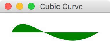
117 |
118 | ## Ellipse
119 |
120 | `Ellipse` represents an ellipse with parameters specifying size and location.
121 |
122 | ```kotlin
123 | ellipse {
124 | centerX = 50.0
125 | centerY = 50.0
126 | radiusX = 100.0
127 | radiusY = 50.0
128 | fill = Color.CORAL
129 | }
130 | ```
131 |
132 | 
133 |
134 | ## Line
135 |
136 | Line is fairly straight forward. Supply start and end coordinates to draw a line between the two points.
137 |
138 | ```kotlin
139 | line {
140 | startX = 50.0
141 | startY = 50.0
142 | endX = 150.0
143 | endY = 100.0
144 | }
145 | ```
146 |
147 | 
148 |
149 | ## Polyline
150 |
151 | A `Polyline` is defined by an array of segment points. `Polyline`is similar to `Polygon`, except it is not automatically closed.
152 |
153 | ```kotlin
154 | polyline(0.0, 0.0, 80.0, 40.0, 40.0, 80.0)
155 | ```
156 |
157 | 
158 |
159 | ## QuadCurve
160 |
161 | The `Quadcurve`represents a quadratic Bézier parametric curve segment in (x,y) coordinate space. Drawing a curve that intersects both the specified coordinates (`startX`, `startY`) and (`endX`, `endY`), using the specified point (`controlX`, `controlY`) as Bézier control point.
162 |
163 | ```kotlin
164 | quadcurve {
165 | startX = 0.0
166 | startY = 150.0
167 | endX = 150.0
168 | endY = 150.0
169 | controlX = 75.0
170 | controlY = 0.0
171 | fill = Color.BURLYWOOD
172 | }
173 | ```
174 |
175 | 
176 |
177 | ## SVGPath
178 |
179 | `SVGPath`represents a shape that is constructed by parsing SVG path data from a String.
180 |
181 | ```kotlin
182 | svgpath("M70,50 L90,50 L120,90 L150,50 L170,50 L210,90 L180,120 L170,110 L170,200 L70,200 L70,110 L60,120 L30,90 L70,50") {
183 | stroke = Color.DARKGREY
184 | strokeWidth = 2.0
185 | effect = DropShadow()
186 | }
187 | ```
188 |
189 | 
190 |
191 | ## Path
192 |
193 | `Path` represents a shape and provides facilities required for basic construction and management of a geometric path. In other words, it helps you create a custom shape. The following helper functions can be used to constuct the path:
194 |
195 | * `moveTo(x, y)`
196 | * `hlineTo(x)`
197 | * `vlineTo(y)`
198 | * `quadqurveTo(controlX, controlY, x, y)`
199 | * `lineTo(x, y)`
200 | * `arcTo(radiusX, radiusY, xAxisRotation, x, y, largeArcFlag, sweepFlag)`
201 | * `closepath()`
202 |
203 | ```kotlin
204 | path {
205 | moveTo(0.0, 0.0)
206 | hlineTo(70.0)
207 | quadqurveTo {
208 | x = 120.0
209 | y = 60.0
210 | controlX = 100.0
211 | controlY = 0.0
212 | }
213 | lineTo(175.0, 55.0)
214 | arcTo {
215 | x = 50.0
216 | y = 50.0
217 | radiusX = 50.0
218 | radiusY = 50.0
219 | }
220 | }
221 | ```
222 |
223 | 
224 |
225 | # Animation
226 |
227 | JavaFX has tools to animate any `Node` by gradually changing one or more of its properties. There are three components you work with to create animations in JavaFX.
228 |
229 | * `Timeline` - A sequence of `KeyFrame` items executed in a specified order
230 |
231 | * `KeyFrame` - A "snapshot" specifying value changes on one or more writable properties (via a `KeyValue`) on one or more Nodes
232 |
233 | * `KeyValue` - A pairing of a `Node` property to a value that will be "transitioned" to
234 |
235 |
236 | A `KeyValue` is the basic building block of JavaFX animation. It specifies a property and the "new value" it will gradually be transitioned to. So if you have a `Rectangle` with a `rotateProperty()` of `0.0`, and you specify a `KeyValue` that changes it to `90.0` degrees, it will incrementally move from `0.0` to `90.0` degrees. Put that `KeyValue` inside a `KeyFrame` which will specify how long the animation between those two values will last. In this case let's make it 5 seconds. Then finally put that `KeyFrame` in a `Timeline`. If you run the code below, you will see a rectange gradually rotate from \`0.0\` to \`90.0\` degrees in 5 seconds (Figure 9.1).
237 |
238 | ```
239 | val rectangle = rectangle(width = 60.0,height = 40.0) {
240 | padding = Insets(20.0)
241 | }
242 | timeline {
243 | keyframe(Duration.seconds(5.0)) {
244 | keyvalue(rectangle.rotateProperty(),90.0)
245 | }
246 | }
247 | ```
248 |
249 | **Figure 9.1**
250 |
251 | 
252 |
253 | In a given `KeyFrame`, you can simultaneously manipulate other properties in that 5-second window too. For instance we can transition the `arcWidthProperty()` and `arcHeightProperty()` while the `Rectangle` is rotating (Figure 9.2)
254 |
255 | ```
256 | timeline {
257 | keyframe(Duration.seconds(5.0)) {
258 | keyvalue(rectangle.rotateProperty(),90.0)
259 | keyvalue(rectangle.arcWidthProperty(),60.0)
260 | keyvalue(rectangle.arcHeightProperty(),60.0)
261 | }
262 | }
263 | ```
264 |
265 | **Figure 9.2**
266 |
267 | 
268 |
269 | #### Interpolators
270 |
271 | You can also specify an `Interpolator` which can add subtle effects to the animation. For instance, you can specify `Interpolator.EASE_BOTH` to accelerate and decelerate the value change at the beginning and end of the animation gracefully.
272 |
273 |
274 | ```
275 | val rectangle = rectangle(width = 60.0, height = 40.0) {
276 | padding = Insets(20.0)
277 | }
278 |
279 | timeline {
280 | keyframe(5.seconds) {
281 | keyvalue(rectangle.rotateProperty(), 180.0, interpolator = Interpolator.EASE_BOTH)
282 | }
283 | }
284 | ```
285 |
286 | #### Cycles and AutoReverse
287 |
288 |
289 | You can modify other attributes of the `timeline()` such as `cycleCount` and `autoReverse`. The `cycleCount` will repeat the animation a specified number of times, and setting the `isAutoReverse` to true will cause it to revert back with each cycle.
290 |
291 | ```kotlin
292 | timeline {
293 | keyframe(5.seconds) {
294 | keyvalue(rectangle.rotateProperty(), 180.0, interpolator = Interpolator.EASE_BOTH)
295 | }
296 | isAutoReverse = true
297 | cycleCount = 3
298 | }
299 | ```
300 |
301 |
302 | To repeat the animation indefinitely, set the `cycleCount` to `Timeline.INDEFINITE`.
303 |
304 | #### Shorthand Animation
305 |
306 | If you want to animate a single property, you can quickly animate it without declaring a `timeline()`, `keyframe()`, and `keyset()`. Call the `animate()` extension function on that propert and provide the `endValue`, the `duration`, and optionally the `interoplator`. This is much shorter and cleaner if you are animating just one property.
307 |
308 | ```kotlin
309 | rectangle.rotateProperty().animate(endValue = 180.0, duration = 5.seconds)
310 | ```
311 |
312 | ## Summary
313 |
314 | In this chapter we covered builders for shape and animation. We did not cover JavaFX's `Canvas` as this is beyond the scope of the `TornadoFX` framework. It could easily take up more than several chapters on its own. But the shapes and animation should allow you to do basic custom graphics for a majority of tasks.
315 |
316 | This concludes our coverage of TornadoFX builders for now. Next we will cover FXML for those of us that have need to use it.
317 |
--------------------------------------------------------------------------------
/part2/EventBus.md:
--------------------------------------------------------------------------------
1 | # EventBus
2 |
3 | An `EventBus` is a versatile tool with a multitude of use cases. Depending on your coding style and
4 | preferences, you might want to reduce coupling between controllers and views by passing messages
5 | instead of having hard references to each other. The TornadoFX event bus can make sure
6 | that the messages are received on the appropriate thread, without having to do that concurrency house-keeping manually.
7 |
8 | People use event buses for many different use cases. TornadoFX does not dictate when or how you should
9 | use them, but we want to show you some of the advantages it can provide to you.
10 |
11 | ## Structure of the EventBus
12 |
13 | As with any typical event bus implementation, you can fire events as well as subscribe and unsubscribe
14 | to events on the bus. You create an event by extending the `FXEvent` class. In some cases, an event
15 | can be just a signal to some other component to trigger something to happen. In other cases, the
16 | event can contain data which will be broadcast to the subscribers of this event. Let us look at a couple of
17 | event definitions and how to use them.
18 |
19 | Picture a UI where the user can click a `Button` to refresh a list of customers. The `View`
20 | knows nothing of where the data is coming from or how it is produced, but it subscribes
21 | to the data events and uses the data once it arrives. Let us create two event classes for this use case.
22 |
23 | First we define an event signal type to notify any listeners that we want some customer data:
24 |
25 | ```kotlin
26 | import tornadofx.EventBus.RunOn.*
27 |
28 | object CustomerListRequest : FXEvent(BackgroundThread)
29 | ```
30 |
31 | This event object is an application-wide `object`. Because it will never need to contain data, it will simply be
32 | broadcast to say that we want the customer list. The `RunOn` property is set to `BackgroundThread`, to signal
33 | that the receiver of this event should operate off of the JavaFX Application Thread. That means it will be
34 | given a background thread by default, so that it can do heavy work without blocking the UI. In the example above, we have added a static import for the `RunOn` enum, so that we
35 | just write `BackgroundThread` instead of `EventBus.RunOn.BackgroundThread`. Your IDE will help you to make this import so your
36 | code looks cleaner.
37 |
38 | A button in the UI can fire this event by using the `fire` function:
39 |
40 | ```kotlin
41 | button("Load customers").action {
42 | fire(CustomerListRequest)
43 | }
44 | ```
45 |
46 | A `CustomerController` might listen for this event, and load the customer list on demand before it fires an event
47 | with the actual customer data. First we need to define an event that can contain the customer list:
48 |
49 | ```kotlin
50 | class CustomerListEvent(val customers: List) : FXEvent()
51 | ```
52 |
53 | This event is a `class` rather than an `object`, as it will contain actual data and vary. Also, it did not specify another value for the
54 | `RunOn` property, so this event will be emitted on the JavaFX Application Thread.
55 |
56 | A controller can now subscribe to our request for data and emit that data once it has it:
57 |
58 | ```kotlin
59 | class CustomerController : Controller() {
60 | init {
61 | subscribe {
62 | val customers = loadCustomers()
63 | fire(CustomerListEvent(customers))
64 | }
65 | }
66 |
67 | fun loadCustomers(): List = db.selectAllCustomers()
68 | }
69 | ```
70 |
71 | Back in our UI, we can listen to this event inside the customer table definition:
72 |
73 | ```kotlin
74 | tableview {
75 | column("Name", Customer::nameProperty)
76 | column("Age", Customer::ageProperty)
77 |
78 | subscribe { event ->
79 | items.setAll(event.customers)
80 | }
81 | }
82 | ```
83 |
84 | We tell the event bus that we are interested in `CustomerListEvent`s, and once we have such an event we
85 | extract the customers from the event and set them into the `items` property of the `TableView`.
86 |
87 | ## Query Parameters In Events
88 |
89 | Above you saw a signal used to ask for data, and an event returned with that data. The signal could just as well
90 | contain query parameters. For example, it could be used to ask for a specific customer. Imagine these events:
91 |
92 | ```kotlin
93 | class CustomerQuery(val id: Int) : FXEvent(false)
94 | class CustomerEvent(val customer: Customer) : FXEvent()
95 | ```
96 |
97 | Using the same procedure as above, we can now signal our need for a specific `Customer`, but we now need to be
98 | more careful with the data we get back. If our UI allows for multiple customers to be edited at once, we need to
99 | make sure that we only apply data for the customer we asked for. This is quite easily accounted for though:
100 |
101 | ```kotlin
102 | class CustomerEditor(val customerId: Int) : View() {
103 | val model : CustomerModel
104 |
105 | override val root = form {
106 | fieldset("Customer data") {
107 | field("Name") {
108 | textfield(model.name)
109 | }
110 | // More fields and buttons here
111 | }
112 | }
113 |
114 | init {
115 | subscribe {
116 | if (it.customer.id == customerId)
117 | model.item = it.customer
118 | }
119 | fire(CustomerQuery(customerId))
120 | }
121 | }
122 | ```
123 |
124 | The UI is created before the interesting bit happens in the `init` function. First, we subscribe to `CustomerEvent`s,
125 | but we make sure to only act once we retrieve the customer we were asking for. If the `customerId` matches,
126 | we assign the customer to the `item` property of our `ItemViewModel`, and the UI is updated.
127 |
128 | A nice side effect of this is that our customer object will be updated whenever the system emits new data
129 | for this customer, no matter who asked for them.
130 |
131 | ## Events and Threading
132 |
133 | When you create a subclass of `FXEvent`, you dictate the value of the `runOn` property. It is `ApplicationThread`
134 | by default, meaning that the subscriber will receive the event on the JavaFX Application Thread. This is useful for events
135 | coming from and going to other UI components, as well as backend services sending data to the UI. If you want to
136 | signal something to a backend service, one which is likely to perform heavy, long-running work, you should set `runOn`
137 | to `BackgroundThread`, making sure the subscriber will operate off of the UI thread. The subscriber now no longer needs to
138 | make sure that it is off of the UI thread, so you remove a lot of thread-related house keeping calls. Used correctly
139 | this is convenient and powerful. Used incorrectly, you will have a non responsive UI. Make sure you understand
140 | this completely before playing with events, or always wrap long running tasks in `runAsync {}`.
141 |
142 | ## Scopes
143 |
144 | The event bus emits messages across all scopes by default. If you want to limit signals to a certain scope, you
145 | can supply the second parameter to the `FXEvent` constructor. This will make sure that only subscribers from the
146 | given scope will receive your event.
147 |
148 | ```kotlin
149 | class CustomerListRequest(scope: Scope) : FXEvent(BackgroundThread, scope)
150 | ```
151 |
152 | The `CustomerListRequest` is not an object anymore since it needs to contain the scope parameter. You would now fire
153 | this event from any UI Component like this:
154 |
155 | ```kotlin
156 | button("Load customers").action {
157 | fire(CustomerListRequest(scope))
158 | }
159 | ```
160 |
161 | The scope parameter from your `UIComponent` is passed into the `CustomerListRequest`. When customer data comes
162 | back, the framework takes care of discriminating on scope and only apply the results if they are meant for you. You
163 | do not need to mention the scope to the subscribe function call, as the framework will associate your subscription
164 | with the scope your are in at the time you create the subscription.
165 |
166 | ```kotlin
167 | subscribe { event ->
168 | items.setAll(event.customers)
169 | }
170 | ```
171 |
172 | ## Invalidation of Event Subscribers
173 |
174 | In many event bus implementations, you are left with the task of deregistering the subscribers when your UI components
175 | should no longer receive them. TornadoFX takes an opinionated approach to event cleanup so you do not have to think about it much.
176 |
177 | Subscriptions inside `UIComponents` like `View` and `Fragment` are only active when that component is docked. That means that even if you have a `View` that has been previously initialized and used, event subscriptions will not reach it unless the `View` is docked inside a window or some other component. Once the view is docked, the events will reach it. Once it is undocked, the events will no longer be delivered to your component. This takes care of the need for you to manually deregister subscribers when you discard of a view.
178 |
179 | For `Controllers` however, subscriptions are always active until you call `unsubscribe`. You need to keep
180 | in mind that controllers are lazily loaded, so if nothing references your controller, the subscriptions will
181 | never be registered in the first place. If you have such a controller with no other references, but you want
182 | it to subscribe to events right away, a good place to eagerly load it would be the `init` block of your `App` subclass:
183 |
184 | ```kotlin
185 | class MyApp : App(MainView::class) {
186 | init {
187 | // Eagerly load CustomerController so it can receive events
188 | find(CustomerController::class)
189 | }
190 | }
191 | ```
192 |
193 | ## Duplicate Subscriptions
194 |
195 | To avoid registering your subscriptions multiple times, make sure you do not register the event subscriptions in `onDock()` or any other callback function that might be invoked more than once for the duration of the component lifecycle. The safest place to create event subscriptions is in the `init` block of the component.
196 |
197 | ## Should I use events for UI logic everywhere?
198 |
199 | Using events for everything might seem like a noble idea, and some people might prefer it because of the loose coupling
200 | it facilitates. However, the `ItemViewModel` with injection is often a more streamlined solution to passing data and keeping UI state. This example was provided to explain how the event system works, not to convince you to write your UIs this way all the time.
201 |
202 | Many feel that events might be better suited for passing signals rather than actual data, so you might also consider subscribing to signals and then actively retrieving the data you need instead.
203 |
204 | ## Unsubscribe after event is processed
205 |
206 | In some situations you might want to only want to trigger your listener a certain amount of times. Admittedly, this is not very convenient. You can pass the `times = n` parameter to subscribe to control how many times the event is triggered before it is unsubscribed:
207 |
208 | ```kotlin
209 | object MyEvent : FXEvent()
210 |
211 | class MyView : View() {
212 | override val root = stackpane {
213 | paddingAll = 100
214 | button("Fire!").action {
215 | fire(MyEvent)
216 | }
217 | }
218 |
219 | init {
220 | subscribe(times = 2) {
221 | alert(INFORMATION, "Event received!", "This message should only appear twice.")
222 | }
223 | }
224 | }
225 | ```
226 |
227 | You can also manually unsubscribe based on an arbitrary condition, or simply after the first run:
228 |
229 | ```kotlin
230 | class MyView : View() {
231 | override val root = stackpane {
232 | paddingAll = 100
233 | button("Fire!").action {
234 | fire(MyEvent)
235 | }
236 | }
237 |
238 | init {
239 | subscribe {
240 | alert(INFORMATION, "Event received!", "This message should only appear once.")
241 | unsubscribe()
242 | }
243 | }
244 | }
245 | ```
246 |
--------------------------------------------------------------------------------
/part2/JSON_and_REST.md:
--------------------------------------------------------------------------------
1 | # JSON and REST
2 |
3 | JSON has become the new standard for data exchange over HTTP. Working with JSON with the data types defined in `javax.json` is not hard, but a bit cumbersome. The TornadoFX JSON support comes
4 | in two forms: Enhancements to the `javax.json` objects and functions and a specialized REST client that does HTTP as well as automatic conversion between JSON and your domain models.
5 |
6 | To facilitate conversion between these JSON objects and your model objects, you can choose to implement the interface JsonModel and one or both of the functions `updateModel` and `toJSON`.
7 |
8 | Later in this chapter we will introduce the REST client, but the JSON Support can also be used standalone. The REST client calls certain functions on JsonModel objects during the lifecycle of an HTTP request.
9 |
10 | `updateModel` is called to convert a JSON object to your domain model. It receives a JSON object from which you can update the properties of your model object.
11 |
12 | `toJSON` is called to convert your model object to a JSON payload. It receives a `JsonBuilder` where you can set the values of the model object.
13 |
14 | ```kotlin
15 | class Person : JsonModel {
16 | val idProperty = SimpleIntegerProperty()
17 | var id by idProperty
18 |
19 | val firstNameProperty = SimpleStringProperty()
20 | var firstName by firstNameProperty
21 |
22 | val lastNameProperty = SimpleStringProperty()
23 | var lastName by lastNameProperty
24 |
25 | val phones = FXCollections.observableArrayList()
26 |
27 | override fun updateModel(json: JsonObject) {
28 | with(json) {
29 | id = int("id")
30 | firstName = string("firstName")
31 | lastName = string("lastName")
32 | phones.setAll(getJsonArray("phones").toModel())
33 | }
34 | }
35 |
36 | override fun toJSON(json: JsonBuilder) {
37 | with(json) {
38 | add("id", id)
39 | add("firstName", firstName)
40 | add("lastName", lastName)
41 | add("phones", phones.toJSON())
42 | }
43 | }
44 | }
45 |
46 | class Phone : JsonModel {
47 | val idProperty = SimpleIntegerProperty()
48 | var id by idProperty
49 |
50 | val numberProperty = SimpleStringProperty()
51 | var number by numberProperty
52 |
53 | override fun updateModel(json: JsonObject) {
54 | with(json) {
55 | id = int("id")
56 | number = string("number")
57 | }
58 | }
59 |
60 | override fun toJSON(json: JsonBuilder) {
61 | with(json) {
62 | add("id", id)
63 | add("number", number)
64 | }
65 | }
66 | }
67 | ```
68 |
69 | > JsonModel with getters/setters and property\(\) accessor functions to be JavaFX Property compatible
70 |
71 | When you implement `JsonModel` you also get the `copy` function, which creates a copy of your model object.
72 |
73 | Tornado FX also comes with special support functions for reading and writing JSON properties. Please see the bottom of [Json.kt](https://github.com/edvin/tornadofx/blob/master/src/main/java/tornadofx/Json.kt) for an exhaustive list.
74 |
75 | All the JSON retrieval functions accepts a vararg argument for the key in the JSON document. The first key available in the document will be used to retrieve the value. This makes it easier to work with slightly inconsistent JSON schemes or can be used as a ternary to provide a fallback value for example.
76 |
77 | ## Configuring datetime
78 |
79 | The `datetime(key)` function used to retrieve a `LocalDateTime` object from JSON will by default expect a value of "Seconds since epoch". If your external webservice expects "Milliseconds since epoch" instead,
80 | you can either send `datetime(key, millis = true)` or configure it globally by setting `JsonConfig.DefaultDateTimeMillis = true`.
81 |
82 | ## Generating JSON objects
83 |
84 | The `JsonBuilder` is an abstraction over `javax.json.JsonObjectBuilder` that supports null values. Instead of blowing up, it silently dismisses the missing entry, which enables you to build your JSON object graph
85 | more fluently without checking for nulls.
86 |
87 | # REST Client
88 |
89 | The REST Client that makes it easy to perform JSON based REST calls. The underlying HTTP engine interface has two implementations. The default uses HttpURLConnection and there is also an implementation based on Apache HttpClient. It is easy to extend the `Rest.Engine` to support other http client libraries if needed.
90 |
91 | To use the Apache HttpClient implementation, simply call `Rest.useApacheHttpClient()` in the `init` method of your App class and include the `org.apache.httpcomponents:httpclient` dependency in your project descriptor.
92 |
93 | ## Configuration
94 |
95 | If you mostly access the same api on every call, you can set a base uri so subsequent calls only need to include relative urls. You can configure the base url anywhere you like, but the `init` function of your `App` class is a good place to do it.
96 |
97 | ```kotlin
98 | class MyApp : App() {
99 | val api: Rest by inject()
100 |
101 | init {
102 | api.baseURI = "https://contoso.com/api"
103 | }
104 | }
105 | ```
106 |
107 | ## Basic operations
108 |
109 | There are convenience functions to perform `GET`, `PUT`, `POST` and `DELETE` operations.
110 |
111 | ```kotlin
112 | class CustomerController : Controller() {
113 | val api: Rest by inject()
114 |
115 | fun loadCustomers(): ObservableList =
116 | api.get("customers").list().toModel()
117 | }
118 | ```
119 |
120 | > CustomerController with loadCustomers call
121 |
122 | So, what exactly is going on in the `loadCustomers` function? First we call `api.get("customers")` which will perform the call and return a `Response` object. We then call `Response.list()` which will consume the response and convert it to a `javax.json.JsonArray`. Lastly, we call the extension function `JsonArray.toModel()` which creates one `Customer` object per `JsonObject` in the array and calls `JsonModel.updateModel` on it. In this example, the type argument is taken from the function return type, but you could also write the above method like this if you prefer:
123 |
124 | ```kotlin
125 | fun loadCustomers() = api.get("customers").list().toModel()
126 | ```
127 |
128 | How you provide the type argument to the `toModel` function is a matter of taste, so choose the syntax you are most comfortable with.
129 |
130 | These functions take an optional parameter with either a `JsonObject` or a `JsonModel` that will be the payload of your request, converted to a JSON string.
131 |
132 | The following example updates a customer object.
133 |
134 | ```kotlin
135 | fun updateCustomer(customer: Customer) = api.put("customers/${customer.id}", customer)
136 | ```
137 |
138 | If the api endpoint returns the customer object to us after save, we would fetch a JsonObject by calling `one()` and then `toModel()` to convert it back into our model object.
139 |
140 | ```kotlin
141 | fun updateCustomer(customer: Customer) =
142 | api.put("customers/${customer.id}", customer).one().toModel()
143 | ```
144 |
145 | ## Query parameters
146 |
147 | Query parameters needs to be URL encoded. The `Map.queryString` extension value will turn any map into a properly URL encoded query string:
148 |
149 | ```kotlin
150 | val params = mapOf("id" to 1)
151 | api.put("customers${params.queryString}", customer).one().toModel()
152 | ```
153 |
154 | This will call the URI `customers?id=1`.
155 |
156 | ## Error handling
157 |
158 | If an I/O error occurs during the processing of the request, the default Error Handler will report the error to the user. You can of course catch any errors yourself instead. To handle HTTP return codes, you might want to inspect the `Response` before you convert the result to JSON. Make sure you always call `consume()` on the response if you don't extract data from it using any of the methods `list()`, `one()`, `text()` or `bytes()`.
159 |
160 | ```kotlin
161 | fun getCustomer(id: Int): Customer {
162 | val response = api.get("some/action")
163 |
164 | try {
165 | if (response.ok())
166 | return response.one().toModel()
167 | else if (response.statusCode == 404)
168 | throw CustomerNotFound()
169 | else
170 | throw MyException("getCustomer returned ${response.statusCode} ${response.reason}")
171 | } finally {
172 | response.consume()
173 | }
174 | }
175 | ```
176 |
177 | > Extract status code and reason from `HttpResponse`
178 |
179 | `response.ok()` is shorthand for `response.statusCode == 200`.
180 |
181 | ## Authentication
182 |
183 | Tornado FX makes it very easy to add basic authentication to your api requests:
184 |
185 | ```kotlin
186 | api.setBasicAuth("username", "password")
187 | ```
188 |
189 | To configure authentication manually, configure the `requestInterceptor` of the engine to add custom headers etc to the request. For example, this is how the basic authentication is implemented for the `HttpUrlEngine`:
190 |
191 | ```kotlin
192 | requestInterceptor = { request ->
193 | val b64 = Base64.getEncoder().encodeToString("$username:$password".toByteArray(UTF_8))
194 | request.addHeader("Authorization", "Basic $b64")
195 | }
196 | ```
197 |
198 | For a more advanced example of configuring the underlying client, take a look at how basic authentication is implemented in the `HttpClientEngine.setBasicAuth` function in [Rest.kt](https://github.com/edvin/tornadofx/blob/master/src/main/java/tornadofx/Rest.kt).
199 |
200 | ## Intercepting calls
201 |
202 | You can for example show a login screen if an HTTP call fails with statusCode 401:
203 |
204 | ```kotlin
205 | api.engine.responseInterceptor = { response ->
206 | if (response.statusCode == 401)
207 | showLoginScreen("Invalid credentials, please log in again.")
208 | }
209 | ```
210 |
211 | ## Setting timeouts
212 |
213 | You can configure the read timeout for the default provider by using a `requestInterceptor` and casting the request to `HttpURLRequest` before yo operate on it.
214 |
215 | ```kotlin
216 | api.engine.requestInterceptor = {
217 | (it as HttpURLRequest).connection.readTimeout = 5000
218 | }
219 | ```
220 |
221 | You can configure the `connectionTimeout` of the `HTTPUrlConnection` object above in the same way.
222 |
223 | ## Connect to multiple API's
224 |
225 | You can create multiple instances of the `Rest` class by subclassing it and configuring each subclass as you wish. Injection of subclasses work seamlessly. Override the `engine` property if you want to use another engine than the default.
226 |
227 | ## Default engine for new Rest instances
228 |
229 | The engine used by a new Rest client is configured with the `engineProvider` of the Rest class. This is what happens when you call `Rest.useApacheHttpClient`:
230 |
231 | ```kotlin
232 | Rest.engineProvider = { rest -> HttpClientEngine(rest) }
233 | ```
234 |
235 | > The `engineProvider` returns a concrete `engine` implementation that is given the current `Rest` instance as argument.
236 |
237 | You can override the configured `engine` in a `Rest` instance at any time.
238 |
239 | ## Proxy
240 |
241 | A proxy can be configured either by implementing an interceptor that augments each call, or, preferably once per Rest client instance:
242 |
243 | ```kotlin
244 | rest.proxy = Proxy(Proxy.Type.HTTP, InetSocketAddress("127.0.0.1", 8080))
245 | ```
246 |
247 | ## Sequence numbers
248 |
249 | If you do multiple http calls they will not be pooled and returned in the order you executed the calls. Any http request will return as soon as it is available. If you want to handle them in sequence, or even discard older results, you can use the `Response.seq` value which will contain a `Long` sequence number.
250 |
251 | ## Progress indicator
252 |
253 | Tornado FX comes with a HTTP ProgressIndicator View. This view can be embedded in your application and will show you information about ongoing REST calls. Embed the `RestProgressBar` into a _ToolBar_ or any other parent container:
254 |
255 | ```kotlin
256 | toolbar.add(RestProgressBar::class)
257 | ```
258 |
259 |
260 |
261 |
--------------------------------------------------------------------------------
/part1/10_FXML.md:
--------------------------------------------------------------------------------
1 | # FXML and Internationalization
2 |
3 | TornadoFX's type-safe builders provide a fast, easy, and declarative way to construct UI's. This DSL approach is encouraged because it is more flexible, reliable, and simpler. However, JavaFX also supports an XML-based structure called FXML that can also build a UI layout. TornadoFX has tools to streamline FXML usage for those that need it.
4 |
5 | If you are unfamiliar with FXML and are perfectly happy with type-safe builders, please feel free to skip this chapter. If you need to work with FXML or feel you should learn it, please read on. You can also take a look at the [official FXML documentation](https://docs.oracle.com/javase/8/javafx/fxml-tutorial/why_use_fxml.htm) to learn more.
6 |
7 | ## Reasons for Considering FXML
8 |
9 | While the developers of TornadoFX strongly encourage using type-safe builders, some situations and factors might cause you to consider using FXML.
10 |
11 | ### Separation of Concerns
12 |
13 | With FXML it is easy to separate your UI logic code from the UI layout code. This separation is just as achievable with type-safe builders by utilizing MVP or other separation patterns. But some programmers find FXML forces them to maintain this separation and prefer it for that reason.
14 |
15 | ### WYSIWYG Editor
16 |
17 | FXML files also can be edited and processed by [Scene Builder](http://www.oracle.com/technetwork/java/javase/downloads/javafxscenebuilder-info-2157684.html), a visual layout tool that allows building interfaces via drag-and-drop functionality. Edits in Scene Builder are immediately rendered in a WYSIWYG ("What You See is What You Get") pane next to the editor.
18 |
19 | If you prefer making interfaces via drag-and-drop or have trouble building UI's with pure code, you might consider using FXML simply to leverage Scene Builder.
20 |
21 | > The Scene Builder tool was created by Oracle/Sun but is now [maintained by Gluon](http://gluonhq.com/labs/scene-builder/), an innovative company that invests heavily in JavaFX technology, especially for the mobile market.
22 |
23 | ### Compatibility with Existing Codebases
24 |
25 | If you are converting an existing JavaFX application to TornadoFX, there is a strong chance your UI was constructed with FXML. If you hesitate to transition legacy FXML to TornadoFX builders or would like to put that off as long as possible, TornadoFX can at least streamline the processing of FXML.
26 |
27 | ## How FXML works
28 |
29 | The `root` property of a `View` represents the top-level `Node` containing a hierarchy of children Nodes, which makes up the user interface. When you work with FXML, you do not instantiate this root node directly, but instead, ask TornadoFX to load it from a corresponding FXML file. By default, TornadoFX will look for a file with the same name as your view with the `.fxml` file ending in the same package as your `View` class. You can also override the FXML location with a parameter if you want to put all your FXML files in a single folder or organize them some other way that does not directly correspond to your `View` location.
30 |
31 | ## A Simple Example
32 |
33 | Let's create a basic user interface that presents a `Label` and a `Button`. We will add functionality to this view so when the `Button` is clicked, the `Label` will update its `text` with the number of times the `Button` has been clicked.
34 |
35 | Create a file named `CounterView.fxml` with the following content:
36 |
37 | ```xml
38 |
39 |
40 |
41 |
42 |
43 |
44 |
45 |
46 |
48 |
49 |
50 |
51 |
52 |
53 |
55 |
56 |
58 |
59 |
60 | ```
61 |
62 | > You may notice above you have to `import` the types you use in FXML just like coding in Java or Kotlin. Intellij IDEA should have a plugin to support using ALT+ENTER to generate the `import` statements.
63 |
64 | If you load this file in Scene Builder you will see the following result (Figure 9.1).
65 |
66 | **Figure 9.1**
67 |
68 | 
69 |
70 | Next, let's load this FXML into TornadoFX.
71 |
72 | ### Loading FXML into TornadoFX
73 |
74 | We have created an FXML file containing our UI structure, but now we need to load it into a TornadoFX `View` for it to be usable. Logically, we can load this `Node` hierarchy into the `root` node of our `View`. Define the following `View` class:
75 |
76 | ```kotlin
77 | class CounterView : View() {
78 | override val root : BorderPane by fxml()
79 | }
80 | ```
81 |
82 | Note that the `root` property is defined by the `fxml()` delegate. The `fxml()` delegate takes care of loading the corresponding `CounterView.fxml` into the `root` property. If we placed `CounterView.fxml` in a different location (such as `/views/`) that is different than where the `CounterView` file resides, we would add a parameter.
83 |
84 | ```kotlin
85 | class CounterView : View() {
86 | override val root : BorderPane by fxml("/views/CounterView.fxml")
87 | }
88 | ```
89 |
90 | We have laid out the UI, but it has no functionality yet. We need to define a variable that holds the number of times the `Button` has been clicked. Add a variable called `counter` and define a function that will increment its value:
91 |
92 | ```kotlin
93 | class CounterView : View() {
94 | override val root : BorderPane by fxml()
95 | val counter = SimpleIntegerProperty()
96 |
97 | fun increment() {
98 | counter.value += 1
99 | }
100 | }
101 | ```
102 |
103 | We want the `increment()` function to be called whenever the `Button` is clicked. Back in the FXML file, add the `onAction` attribute to the button:
104 |
105 | ```xml
106 |
121 | ```
122 |
123 | Now we can inject this `Label` into our `View` class:
124 |
125 | ```kotlin
126 | val counterLabel : Label by fxid()
127 | ```
128 |
129 | This tells TornadoFX to look for a `Node` in our structure with the `fx:id` property with the same name as the property we defined (which is "counterLabel"). It is also possible to use another property name in the `View` and add a name parameter to the `fxid` delegate:
130 |
131 | ```kotlin
132 | val myLabel : Label by fxid("counterLabel")
133 | ```
134 |
135 | Now that we have a hold of the `Label`, we can use the binding shortcuts of TornadoFX to bind the `counter` value to the `text` property of the `counterLabel`. Our whole `View` should now look like this:
136 |
137 | ```kotlin
138 | class CounterView : View() {
139 | override val root : BorderPane by fxml()
140 | val counter = SimpleIntegerProperty()
141 | val counterLabel: Label by fxid()
142 |
143 | init {
144 | counterLabel.bind(counter)
145 | }
146 |
147 | fun increment() {
148 | counter.value += 1
149 | }
150 | }
151 | ```
152 |
153 | Our app is now complete. Every time the button is clicked, the `label` will increment its count.
154 |
155 | ## Internationalization
156 |
157 | JavaFX has strong support for multi-language UI's. To support internationalization in FXML, you normally have to register a resource bundle with the `FXMLLoader` and it will in return replace instances of resource names with their locale-specific value. A resource name is a key in the resource bundle prepended with `%`.
158 |
159 | TornadoFX makes this easier by supporting a convention for resource bundles: Create a resource bundle with the same base name as your `View`, and it will be automatically loaded, both for use programmatically within the `View` and from the FXML file.
160 |
161 | Let's internationalize the button text in our UI. Create a file called `CounterView.properties` and add the following content:
162 |
163 | ```
164 | clickToIncrement=Click to increment
165 | ```
166 |
167 | If you want to support multiple languages, create a file with the same base name followed by an underscore, and then the language code. For instance, to support French create the file `CounterView_fr.properties`. The closest geographical match to the current locale will be used.
168 |
169 | ```
170 | clickToIncrement=Cliquez sur incrément
171 | ```
172 |
173 | Now we swap the button text with the resource key in the FXML file.
174 |
175 | ```xml
176 | {
80 | openModal()
81 | }
82 | }
83 | ```
84 |
85 | ## Page navigation
86 |
87 | By default, the `Back` and `Next` buttons are available whenever there are more pages either previous or next in the wizard.
88 |
89 | For `Next` navigation however, whether the wizard actually navigates to the next page is dependent upon the `completed` state
90 | of the current page. Every `View` has a `completed` property and a corresponding `isCompleted` variable you can manipulate.
91 |
92 | When the `Next` or `Finish` button is clicked, the `onSave` function of the current page is called, and the navigation
93 | action is only performed if the current page's `completed` value is `true`. Every `View` is completed by default,
94 | that's why we can navigate to page number two without completing page one first. Let's change that.
95 |
96 | In the `BasicData` editor, we override the `onSave` function to perform a partial commit of the `name` and `type` fields,
97 | because that's the only two fields the user can change on that page.
98 |
99 | ```kotlin
100 | override fun onSave() {
101 | isComplete = customer.commit(customer.name, customer.type)
102 | }
103 | ```
104 |
105 | The commit function now controls the completed state of our wizard page, hence controller whether the user is allowed
106 | to navigate to the address page. If we try to navigate without filling in the name, we will be granted by the
107 | validation error message in Figure 21.2:
108 |
109 | 
110 |
111 | **Figure 21.2**
112 |
113 | We could go on to do the same for the address editor, taking care to only commit the editable fields:
114 |
115 | ```kotlin
116 | override fun onSave() {
117 | isComplete = customer.commit(customer.zip, customer.city)
118 | }
119 | ```
120 |
121 | If the user clicks the Finish button, the `onSave` function in the Wizard itself is activated. If
122 | the Wizard's `completed` state is true after the `onSave` call, the wizard dialog is closed, provided that
123 | the user calls `super.onSave()`. In such a scenario, the Wizard itself needs to handle whatever should
124 | happen in the `onSave` function. Another possibility is to configure a callback that will be executed
125 | whenever the wizard is completed. With that approach, we need access the completed customer object somehow,
126 | so we inject it into the wizard itself as well:
127 |
128 | ```kotlin
129 | class CustomerWizard : Wizard() {
130 | val customer: CustomerModel by inject()
131 | }
132 | ```
133 |
134 | Let's revisit the button action that activated the wizard and add an `onComplete` callback that extracts
135 | the customer and inserts it into a database before it opens the newly created Customer object in a CustomerEditor View:
136 |
137 | ```kotlin
138 | button("Add Customer").action {
139 | find {
140 | onComplete {
141 | runAsync {
142 | database.insert(customer.item)
143 | } ui {
144 | workspace.dockInNewScope(customer.item)
145 | }
146 | }
147 | openModal()
148 | }
149 | }
150 | ```
151 |
152 | ## Wizard scoping
153 |
154 | In our example, both of the Wizard pages share a common view model, namely the `CustomerModel`. This model
155 | is injected into both pages, so it should be the same instance. But what if other parts of the application
156 | is already using the `CustomerModel` in the same scope we created the Wizard from? It turns out that this is
157 | not even an issue, because the `Wizard` base class implements `InjectionScoped` which makes sure that whenever
158 | you inject a `Wizard` subclass, a new scope is automatically activated. This makes sure that whatever resources
159 | we require inside the Wizard will be unique and not shared with any other part of the application.
160 |
161 | It also means that if you need to inject existing data into a Wizard's scope, you must do so manually:
162 |
163 | ```kotlin
164 | val wizard = find()
165 | wizard.scope.set(someExistingObject)
166 | wizard.openModal()
167 | ```
168 |
169 | ## Improving the visual cues
170 |
171 | Un until now, the `Next` button was enabled whenever there was another page to navigate forward to. The `Finish`
172 | button was also always enabled. This might be fine, but you can improve the cues given to your users by only
173 | enabling those buttons when it would make sense to click them. By looking into the `Wizard` base class, we can see
174 | that the buttons are bound to the following boolean expressions:
175 |
176 | ```kotlin
177 | open val canFinish: BooleanExpression = SimpleBooleanProperty(true)
178 | open val canGoNext: BooleanExpression = hasNext
179 | ```
180 |
181 | The `canFinish` expression is bound to the `Finish` button and the `canGoNext` expression is bound to the `Next` button.
182 | The `Wizard` class also includes some boolean expressions that are unused by default. Two of those are `currentPageComplete`
183 | and `allPagesComplete`. These expressions are always up to date, and we can use them in our `CustomerWizard` to improve the user
184 | experience.
185 |
186 | ```kotlin
187 | class CustomerWizard : Wizard() {
188 | override val canFinish = allPagesComplete
189 | override val canGoNext = currentPageComplete
190 | }
191 | ```
192 |
193 | With this redefinition in place, the `Next` and `Finish` buttons will only be enabled whenever the new conditions
194 | are met. This is what we want, but we're not done yet. Remember how we only updated `isCompleted` whenever `onSave` was called?
195 | You might also remember that `onSave` was called whenever `Next` or `Finish` was clicked? It looks like we have ourselves
196 | a good old Catch22 situation here, folks!
197 |
198 | The solution is however quite simple: Instead of evaluating the completed state on save, we will do it whenever a change is made to
199 | any of our input fields. We need to make sure that we supply the `autocommit` parameter to each binding in our ViewModel:
200 |
201 | ```kotlin
202 | class CustomerModel : ItemViewModel() {
203 | val name = bind(Customer::nameProperty, autocommit = true)
204 | val zip = bind(Customer::zipProperty, autocommit = true)
205 | val city = bind(Customer::cityProperty, autocommit = true)
206 | val type = bind(Customer::typeProperty, autocommit = true)
207 | }
208 | ```
209 |
210 | The input fields in our wizard pages are bound to these properties, and whenever a change is made, the underlying Customer
211 | object will be updated. We no longer need to call `customer.commit()` in our `onSave` callback, but we do need to
212 | redefine the `complete` boolean expression in each wizard page.
213 |
214 | Here is the new definition in the `BasicData` View:
215 |
216 | ```kotlin
217 | override val complete = customer.valid(customer.name)
218 | ```
219 |
220 | And here is the definition in the `AddressInput` View:
221 |
222 | ```kotlin
223 | override val complete = customer.valid(customer.street, customer.zip, customer.city)
224 | ```
225 |
226 | We bind the completed state of our wizard pages to an ever updating boolean expression which indicates whether the
227 | editable properties for that page is valid or not.
228 |
229 | Remember to delete the `onSave` functions as we no longer need them. If you run the application with these changes you
230 | will see how much more expressive the Wizard becomes in terms of telling the user when he can proceed and when he
231 | can finish the process. Using this approach will also convey that any non-filled data is optional once the `Finish` button
232 | is enabled.
233 |
234 | Here is the completely rewritten wizard and pages:
235 |
236 | ```kotlin
237 | class CustomerWizard : Wizard() {
238 | val customer: CustomerModel by inject()
239 |
240 | override val canGoNext = currentPageComplete
241 | override val canFinish = allPagesComplete
242 |
243 | init {
244 | add(BasicData::class)
245 | add(AddressInput::class)
246 | }
247 | }
248 |
249 | class BasicData : View("Basic Data") {
250 | val customer: CustomerModel by inject()
251 |
252 | override val complete = customer.valid(customer.name)
253 |
254 | override val root = form {
255 | fieldset(title) {
256 | field("Type") {
257 | combobox(customer.type, Customer.Type.values().toList())
258 | }
259 | field("Name") {
260 | textfield(customer.name).required()
261 | }
262 | }
263 | }
264 | }
265 |
266 | class AddressInput : View("Address") {
267 | val customer: CustomerModel by inject()
268 |
269 | override val complete = customer.valid(customer.zip, customer.city)
270 |
271 | override val root = form {
272 | fieldset(title) {
273 | field("Zip/City") {
274 | textfield(customer.zip) {
275 | prefColumnCount = 5
276 | required()
277 | }
278 | textfield(customer.city).required()
279 | }
280 | }
281 | }
282 | }
283 | ```
284 |
285 | ## Styling and adapting the look and feel
286 |
287 | There are many built in options you can configure to change the look and feel of the wizard. Common for them all
288 | is that they have observable/writable properties which you can bind to over just set in your wizard subclass. For each
289 | accessor below there will be a corresponding `accessorProperty`.
290 |
291 | ### Modifying the steps indicator
292 |
293 | #### Steps
294 | The steps list is on the left of the wizard. It has the following configuration options:
295 |
296 | |Name|Description|
297 | |---|---|
298 | |showSteps|Set to `false` to remove the steps view completely|
299 | |stepsText|Change the header from "Steps" to any desired String|
300 | |showStepsHeader|Remove the header|
301 | |enableStepLinks|Set to `true` to turn each step description into a hyperlink|
302 | |stepLinksCommits|Set to `false` to no longer require that the current page is valid before navigating to the new page|
303 | |numberedSteps|Set to `true` to add the index number before each step description|
304 |
305 | #### Navigation
306 |
307 | You can change the text of the navigation buttons and control navigation flow with Enter:
308 |
309 | |Name|Description|
310 | |---|---|
311 | |backButtonText|Change the text of the `Back` button|
312 | |nextButtonText|Change the text of the `Next` button|
313 | |cancelButtonText|Change the text of the `Cancel` button|
314 | |finishButtonText|Change the text of the `Finish` button|
315 | |enterProgresses|Enter goes to next page when complete and finish on last page|
316 |
317 | #### Header area
318 |
319 | |Name|Description|
320 | |---|---|
321 | |showHeader|Set to `false` to remove the header|
322 | |graphic|A node that will show up on the far right of the header|
323 |
324 | #### Structural modifications
325 |
326 | The root of the `Wizard` class is a `BorderPane`. The header will be in the `top` slot,
327 | the steps are in the `left` slot, the pages are in the `center` slot and the buttons
328 | are in the `bottom` slot. You can change/hide/add styling and set properties to these nodes
329 | as you see fit to alter the design and layout of the Wizard. A good place to do this would be
330 | in the `onDock` callback of your wizard subclass. It is completely valid change the layout
331 | in any way you see fit, you can even remove the `BorderPane` and move the other parts
332 | into another layout container for example.
--------------------------------------------------------------------------------
/part2/Advanced_Data_Controls.md:
--------------------------------------------------------------------------------
1 | # Advanced Data Controls
2 |
3 | This section will primarily address more advanced features you can leverage with data controls, particulary with the `TableView` and `ListView`.
4 |
5 | ## TableView Advanced Column Resizing
6 |
7 | The SmartResize policy brings the ability to intuitively resize columns by providing sensible defaults combined with powerful and dynamic configuration options.
8 |
9 | To apply the resize policy to a `TableView` we configure the `columnResizePolicy`. For this exercise we will use a list of hotel rooms. This is our initial table with the `SmartResize` policy activated:
10 |
11 | ```kotlin
12 | tableview(rooms) {
13 | column("#", Room::id)
14 | column("Number", Room::number)
15 | column("Type", Room::type)
16 | column("Bed", Room::bed)
17 |
18 | smartResize()
19 | }
20 | ```
21 |
22 | Here is a picture of the table with the SmartResize policy activated \(Figure 13.1\):
23 |
24 | **Figure 13.1**
25 |
26 | 
27 |
28 | The default settings gave each column the space it needs based on its content, and gave the remaining width to the last column. When you resize a column by dragging the divider between column headers, only the column immediately to the right will be affected, which avoids pushing the columns to the right outside the viewport of the `TableView`.
29 |
30 | While this often presents a pleasant default, there is a lot more we can do to improve the user experience in this particular case. It is evident that our table did not need the full 800 pixels it was provided, but it gives us a nice chance to elaborate on the configuration options of the `SmartResize` policy.
31 |
32 | The bed column is way too big, and it seems more sensible to give the extra space to the **Type** column, since it might contain arbitrary long descriptions of the room. To give the extra space to the **Type** column, we change its column definition \(Figure 13.2\):
33 |
34 | ```kotlin
35 | column("Type", Room::type).remainingWidth()
36 | ```
37 |
38 | **Figure 13.2**
39 |
40 | 
41 |
42 | Now it is apparent the **Bed** column looks cramped, being pushed all the way to the left. We configure it to keep its desired width based on the content plus 50 pixels padding:
43 |
44 | ```kotlin
45 | column("Bed", Room:bed).contentWidth(padding = 50.0)
46 | ```
47 |
48 | The result is a much more pleasant visual impression \(Figure 13.3\) :
49 |
50 | **Figure 13.3**
51 |
52 | 
53 |
54 | This fine-tuning may not seem like a big deal, but it means a lot to people who are forced to stare at your software all day! It is the little things that make software pleasant to use.
55 |
56 | If the user increases the width of the **Number** column, the **Type** column will gradually decrease in width, until it reaches its default width of 10 pixels \(the JavaFX default\). After that, the **Bed** column must start giving away its space. We don't ever want the **Bed** column to be smaller that what we configured, so we tell it to use its content-based width plus the padding we added as its minimum width:
57 |
58 | ```kotlin
59 | column("Bed", Room:bed).contentWidth(padding = 50.0, useAsMin = true)
60 | ```
61 |
62 | Trying to decrease the **Bed** column either by explicitly expanding the **Type** column or implicitly by expanding the **Number** column will simply be denied by the resize policy. It is worth noting that there is also a `useAsMax` choice for the `contentWidth` resize type. This would effectively result in a hard-coded, unresizable column, based on the required content width plus any configured padding. This would be a good policy for the **\#** column:
63 |
64 | ```kotlin
65 | column("#", Room::id).contentWidth(useAsMin = true, useAsMax = true)
66 | ```
67 |
68 | The rest of the examples will probably not benefit the user, but there are still other options at your disposal. Try to make the **Number** column 25% of the total table width:
69 |
70 | ```kotlin
71 | column("Number", Room::number).pctWidth(25.0)
72 | ```
73 |
74 | When you resize the `TableView`, the **Number** column will gradually expand to keep up with our 25% width requirement, while the **Type** column gets the remaining extra space.
75 |
76 | **Figure 13.4**
77 |
78 | 
79 |
80 | An alternative approach to percentage width is to specify a weight. This time we add weights to both **Number** and **Type**:
81 |
82 | ```kotlin
83 | column("Number", Room::number).weigthedWidth(1.0)
84 | column("Type", Room::type).weigthedWidth(3.0)
85 | ```
86 |
87 | The two weighted columns share the remaining space after the other columns have received their fair share. Since the **Type** column has a weight that is three times bigger than the **Number** column, its size will be three times bigger as well. This will be reevaluated as the `TableView` itself is resized.
88 |
89 | **Figure 13.5**
90 |
91 | 
92 |
93 | This setting will make sure we keep the mentioned ratio between the two columns, but it might become problematic if the `TableView` is resized to be very small. The the **Number** column would not have space to show all of its content, so we guard against that by specifying that it should never grow below the space it needs to show its content, plus some padding, for good measure:
94 |
95 | ```kotlin
96 | column("Number", Room::number).weigthedWidth(1.0, minContentWidth = true, padding = 10.0)
97 | ```
98 |
99 | This makes sure our table behaves nicely also under constrained width conditions.
100 |
101 | #### Dynamic content resizing
102 |
103 | Since some of the resizing modes are based on the actual content of the columns, they might need to be reevaluated even when the table or it's columns aren't resized. For example, if you add or remove content items from the backing list, the required content measurements might need to be updated. For this you can call the `requestResize` function after you have manipulated the items:
104 |
105 | ```kotlin
106 | SmartResize.POLICY.requestResize(tableView)
107 | ```
108 |
109 | In fact, you can ask the TableView to ask the policy for you:
110 |
111 | ```kotlin
112 | tableView.requestResize()
113 | ```
114 |
115 | #### Statically setting the content width
116 |
117 | In most cases you probably want to configure your column widths based on either the total available space or the content of the columns. In some cases you might want to configure a specific width, that that can be done with the `prefWidth` function:
118 |
119 | ```kotlin
120 | column("Bed", Room::bed).prefWidth(200.0)
121 | ```
122 |
123 | A column with a preferred width can be resized, so to make it non-resizable, use the `fixedWidth` function instead:
124 |
125 | ```kotlin
126 | column("Bed", Room::bed).fixedWidth(200.0)
127 | ```
128 |
129 | When you hard-code the width of the columns you will most likely end up with some extra space. This space will be awarded to the right most resizable column, unless you specify `remainingWidth()` for one or more column. In that case, these columns will divide the extra space between them.
130 |
131 | In the case where not all columns can be afforded their preferred width, all resizable columns must give away some of their space, but the `SmartResize` Policy makes sure that the column with the biggest reduction potential will give away its space first. The reduction potential is the difference between the current width of the column and its defined minimum width.
132 |
133 | ## Custom Cell Formatting in ListView
134 |
135 | Even though the default look of a `ListView` is rather boring \(because it calls `toString()` and renders it as text\) you can modify it so that every cell is a custom `Node` of your choosing. By calling `cellCache()`, TornadoFX provides a convenient way to override what kind of `Node` is returned for each item in your list \(Figure 13.6\).
136 |
137 | ```kotlin
138 | class MyView: View() {
139 |
140 | val persons = listOf(
141 | Person("John Marlow", LocalDate.of(1982,11,2)),
142 | Person("Samantha James", LocalDate.of(1973,2,4))
143 | ).observable()
144 |
145 | override val root = listview(persons) {
146 | cellFormat {
147 | graphic = cache {
148 | form {
149 | fieldset {
150 | field("Name") {
151 | label(it.name)
152 | }
153 | field("Birthday") {
154 | label(it.birthday.toString())
155 | }
156 | label("${it.age} years old") {
157 | alignment = Pos.CENTER_RIGHT
158 | style {
159 | fontSize = 22.px
160 | fontWeight = FontWeight.BOLD
161 | }
162 | }
163 | }
164 | }
165 | }
166 | }
167 | }
168 | }
169 |
170 | class Person(val name: String, val birthday: LocalDate) {
171 | val age: Int get() = Period.between(birthday, LocalDate.now()).years
172 | }
173 | ```
174 |
175 | **Figure 13.6** - A custom cell rendering for `ListView`
176 |
177 | 
178 |
179 | The `cellFormat` function lets you configure the `text` and/or `graphic` property of the cell whenever it comes into view on the screen. The cells themselves are reused, but whenever the `ListView` asks the cell to update its content, the `cellFormat` function is called. In our example we only assign to `graphic`, but if you just want to change the string representation you should assign it to `text`. It is completely legitimate to assign it to both `text` and `graphic`. The values will automatically be cleared by the `cellFormat` function when a certain list cell is not showing an active item.
180 |
181 | Note that assigning new nodes to the `graphic` property every time the list cell is asked to update can be expensive. It might
182 | be fine for many use cases, but for heavy node graphs, or node graphs where you utilize binding towards the UI components inside the cell, you should cache the resulting node so the Node graph will only be created once per node. This is done using the `cache` wrapper in the above example.
183 |
184 | #### Assign If Null
185 |
186 | If you have a reason for wanting to recreate the graphic property for a list cell, you can use the `assignIfNull` helper,
187 | which will assign a value to any given property if the property doesn't already contain a value. This will make sure that
188 | you avoid creating new nodes if `updateItem` is called on a cell that already has a graphic property assigned.
189 |
190 | ```kotlin
191 | cellFormat {
192 | graphicProperty().assignIfNull {
193 | label("Hello")
194 | }
195 | }
196 | ```
197 |
198 | ### ListCellFragment
199 |
200 | The `ListCellFragment` is a special fragment which can help you manage `ListView` cells. It extends `Fragment`, and
201 | includes some extra `ListView` specific fields and helpers. You never instantiate these fragments manually, instead you
202 | instruct the `ListView` to create them as needed. There is a one-to-one correlation between `ListCell` and `ListCellFragment` instances. Only one `ListCellFragment` instance will over its lifecycle be used to represent different items.
203 |
204 | To understand how this works, let's consider a manually implemented `ListCell`, essentially the way you would do in vanilla JavaFX. The `updateItem` function will be called when the `ListCell` should represent a new item, no item, or just an update to the same item. When you use a `ListCellFragment`, you do not need to implement something akin to `updateItem`, but the `itemProperty` inside it will update to represent the new item automatically. You can listen to changes to the `itemProperty`, or better yet, bind it directly to a `ViewModel`. That way your UI can bind directly to the `ViewModel` and no longer need to care about changes to the underlying item.
205 |
206 | Let's recreate the form from the `cellFormat` example using a `ListCellFragment`. We need a `ViewModel` which we will
207 | call `PersonModel` \(Please see the `Editing Models and Validation` chapter for a full explanation of the `ViewModel`\) For now,
208 | just imagine that the `ViewModel` acts as a proxy for an underlying `Person`, and that the `Person` can be changed while the
209 | observable values in the `ViewModel` remain the same. When we have created our `PersonCellFragment`, we need to configure
210 | the `ListView` to use it:
211 |
212 | ```kotlin
213 | listview(personlist) {
214 | cellFragment()
215 | }
216 | ```
217 |
218 | Now comes the `ListCellFragment` itself.
219 |
220 | ```kotlin
221 | class PersonListFragment : ListCellFragment() {
222 | val person = PersonModel().bindTo(this)
223 |
224 | override val root = form {
225 | fieldset {
226 | field("Name") {
227 | label(person.name)
228 | }
229 | field("Birthday") {
230 | label(person.birthday)
231 | }
232 | label(stringBinding(person.age) { "$value years old" }) {
233 | alignment = Pos.CENTER_RIGHT
234 | style {
235 | fontSize = 22.px
236 | fontWeight = FontWeight.BOLD
237 | }
238 | }
239 | }
240 | }
241 | }
242 | ```
243 |
244 | Because this Fragment will be reused to represent different list items, the easiest approach is to bind the ui elements to the ViewModel's properties.
245 |
246 | The `name` and `birthday` properties are bound directly to the labels inside the fields. The age string in the last label needs to be constructed using a `stringBinding`to make sure it updates when the item changes.
247 |
248 | While this might seem like slightly more work than the `cellFormat` example, this approach makes it possible to leverage
249 | everything the Fragment class has to offer. It also forces you to define the cell node graph outside of the builder hierarchy,
250 | which improves refactoring possibilities and enables code reuse.
251 |
252 | #### Additional helpers and editing support
253 |
254 | The `ListCellFragment` also have some other helper properties. They include the `cellProperty` which will
255 | update whenever the underlying cell changes and the `editingProperty`, which will tell you if this the underlying list cell
256 | is in editing mode. There are also editing helper functions called `startEdit`, `commitEdit`, `cancelEdit` plus an `onEdit`
257 | callback. The `ListCellFragment` makes it trivial to utilize the existing editing capabilites of the `ListView`. A complete example
258 | can be seen in the [TodoMVC](https://github.com/edvin/todomvc) demo application.
259 |
260 |
--------------------------------------------------------------------------------
/part1/6_CSS.md:
--------------------------------------------------------------------------------
1 | # Type-Safe CSS
2 |
3 | While you can create plain text CSS style sheets in JavaFX, TornadoFX provides the option to bring type-safety and compiled CSS to JavaFX. You can conveniently choose to create styles in its own class, or do it inline within a control declaration.
4 |
5 | ### Inline CSS
6 |
7 | The quickest and easiest way to style a control on the fly is to call a given `Node`'s inline `style { }` function. All the CSS properties available on a given control are available in a type-safe manner, with compilation checks and auto-completion.
8 |
9 | For example, you can style the borders on a `Button` (using the `box()` function), bold its font, and rotate it (Figure 6.1).
10 |
11 | ```kotlin
12 | button("Press Me") {
13 | style {
14 | fontWeight = FontWeight.EXTRA_BOLD
15 | borderColor += box(
16 | top = Color.RED,
17 | right = Color.DARKGREEN,
18 | left = Color.ORANGE,
19 | bottom = Color.PURPLE
20 | )
21 | rotate = 45.deg
22 | }
23 |
24 | setOnAction { println("You pressed the button") }
25 | }
26 | ```
27 |
28 | **Figure 6.1**
29 |
30 | 
31 |
32 | This is especially helpful when you want to style a control without breaking the declaration flow of the `Button`. However, keep in mind the `style { }` will replace all styles applied to that control unless you pass `true` for its optional `append` argument.
33 |
34 | ```kotlin
35 | style(append = true) {
36 | ....
37 | }
38 | ```
39 |
40 | Some times you want to apply the same styles to many nodes in one go. The `style { }` function can also be applied to any Iterable that contains Nodes:
41 |
42 | ```kotlin
43 | vbox {
44 | label("First")
45 | label("Second")
46 | label("Third")
47 | children.style {
48 | fontWeight = FontWeight.BOLD
49 | }
50 | }
51 | ```
52 |
53 | The `fontWeight` style is applied to all children of the vbox, in essence all the labels we added.
54 |
55 | When your styling complexity passes a certain threshold, you may want to consider using Stylesheets which we will cover next.
56 |
57 | ### Applying Style Classes with Stylesheets
58 |
59 | If you want to organize, re-use, combine, and override styles you need to leverage a `Stylesheet`. Traditionally in JavaFX, a stylesheet is defined in a plain CSS text file included in the project. However, TornadoFX allows creating stylesheets with pure Kotlin code. This has the benefits of compilation checks, auto-completion, and other perks that come with statically typed code.
60 |
61 | To declare a `Stylesheet`, extend it onto your own class to hold your customized styles.
62 |
63 | ```kotlin
64 | import tornadofx.*
65 |
66 | class MyStyle: Stylesheet() {
67 | }
68 | ```
69 |
70 | Next, you will want to specify its `companion object` to hold class-level properties that can easily be retrieved. Declare a new `cssclass()`-delegated property called `tackyButton`, and define four colors we will use for its borders.
71 |
72 | ```kotlin
73 | import javafx.scene.paint.Color
74 | import tornadofx.*
75 |
76 | class MyStyle: Stylesheet() {
77 |
78 | companion object {
79 | val tackyButton by cssclass()
80 |
81 | private val topColor = Color.RED
82 | private val rightColor = Color.DARKGREEN
83 | private val leftColor = Color.ORANGE
84 | private val bottomColor = Color.PURPLE
85 | }
86 | }
87 | ```
88 |
89 | Note also you can use the `c()` function to build colors quickly using RGB values or color Strings.
90 |
91 | ```kotlin
92 | private val topColor = c("#FF0000")
93 | private val rightColor = c("#006400")
94 | private val leftColor = c("#FFA500")
95 | private val bottomColor = c("#800080")
96 | ```
97 |
98 | Finally, declare an `init()` block to apply styling to the classes. Define your selection and provide a block that manipulates its various properties. (For compound selections, call the `s()` function, which is an alias for the `select()` function). Set `rotate` to 10 degrees, define the `borderColor` using the four colors and the `box()` function, make the font family "Comic Sans MS", and increase the `fontSize` to 20 pixels. Note that there are extension properties for `Number` types to quickly yield the value in that unit, such as `10.deg` for 10 degrees and `20.px` for 20 pixels.
99 |
100 | ```kotlin
101 | import javafx.scene.paint.Color
102 | import tornadofx.*
103 |
104 | class MyStyle: Stylesheet() {
105 |
106 | companion object {
107 | val tackyButton by cssclass()
108 |
109 | private val topColor = Color.RED
110 | private val rightColor = Color.DARKGREEN
111 | private val leftColor = Color.ORANGE
112 | private val bottomColor = Color.PURPLE
113 | }
114 |
115 | init {
116 | tackyButton {
117 | rotate = 10.deg
118 | borderColor += box(topColor,rightColor,bottomColor,leftColor)
119 | fontFamily = "Comic Sans MS"
120 | fontSize = 20.px
121 | }
122 | }
123 | }
124 | ```
125 |
126 | Now you can apply the `tackyButton` style to buttons, labels, and other controls that support these properties. While this styling can work with other controls like labels, we are going to target buttons in this example.
127 |
128 | First, load the `MyStyle` stylesheet into your application by including it as contructor parameter.
129 |
130 | ```kotlin
131 | class MyApp: App(MyView::class, MyStyle::class) {
132 | init {
133 | reloadStylesheetsOnFocus()
134 | }
135 | }
136 | ```
137 |
138 | > The `reloadStylesheetsOnFocus()` function call will instruct TornadoFX to reload the Stylesheets every time the `Stage` gets focus. You can also pass the `--live-stylesheets` argument to the application to accomplish this.
139 |
140 | **Important:** For the reload to work, you must be running the JVM in debug mode and you must instruct your IDE to recompile before you switch back to your app. Without these steps, nothing will happen. This also applies to `reloadViewsOnFocus()` which is similar, but reloads the whole view instead of just the stylesheet. This way, you can evolve your UI very rapidly in a "code change, compile, refresh" manner.
141 |
142 | You can apply styles directly to a control by calling its `addClass()` function. Provide the `MyStyle.tackyButton` style to two buttons (Figure 6.2).
143 |
144 | ```kotlin
145 | class MyView: View() {
146 | override val root = vbox {
147 | button("Press Me") {
148 | addClass(MyStyle.tackyButton)
149 | }
150 | button("Press Me Too") {
151 | addClass(MyStyle.tackyButton)
152 | }
153 | }
154 | }
155 | ```
156 |
157 | **Figure 6.2**
158 |
159 | 
160 |
161 | > Intellij IDEA can perform a quickfix to import member variables, allowing `addClass(MyStyle.tackyButton)` to be shortened to `addClass(tackyButton)` if you prefer.
162 |
163 | You can use `removeClass()` to remove the specified style as well.
164 |
165 | #### Targeting Styles to a Type
166 |
167 | One of the benefits of using pure Kotlin is you can tightly manipulate UI control behavior and conditions using Kotlin code. For example, you can apply the style to any `Button` by iterating through a control's `children`, filtering for only children that are Buttons, and applying the `addClass()` to them.
168 |
169 | ```kotlin
170 | class MyView: View() {
171 | override val root = vbox {
172 | button("Press Me")
173 | button("Press Me Too")
174 |
175 | children.asSequence()
176 | .filter { it is Button }
177 | .forEach { it.addClass(MyStyle.tackyButton) }
178 | }
179 | }
180 | ```
181 |
182 | Infact, manipulating classes on several nodes at once is so common that TornadoFX provides a shortcut for it:
183 |
184 | ```kotlin
185 | children.filter { it is Button }.addClass(MyStyle.tackyButton) }
186 | ```
187 |
188 | You can also target all `Button` instances in your application by selecting and modifying the `button` in the `Stylesheet`. This will apply the style to all Buttons.
189 |
190 | ```kotlin
191 | import javafx.scene.paint.Color
192 | import tornadofx.*
193 |
194 | class MyStyle: Stylesheet() {
195 |
196 | companion object {
197 | val tackyButton by cssclass()
198 |
199 | private val topColor = Color.RED
200 | private val rightColor = Color.DARKGREEN
201 | private val leftColor = Color.ORANGE
202 | private val bottomColor = Color.PURPLE
203 | }
204 |
205 | init {
206 | button {
207 | rotate = 10.deg
208 | borderColor += box(topColor,rightColor,leftColor,bottomColor)
209 | fontFamily = "Comic Sans MS"
210 | fontSize = 20.px
211 | }
212 | }
213 | }
214 | ```
215 |
216 | ```kotlin
217 | import javafx.scene.layout.VBox
218 | import tornadofx.*
219 |
220 | class MyApp: App(MyView::class, MyStyle::class) {
221 | init {
222 | reloadStylesheetsOnFocus()
223 | }
224 | }
225 | ```
226 |
227 | ```kotlin
228 | class MyView: View() {
229 | override val root = vbox {
230 | button("Press Me")
231 | button("Press Me Too")
232 | }
233 | }
234 | ```
235 |
236 | **Figure 6.3**
237 |
238 | 
239 |
240 | Note also you can select multiple classes and control types to mix-and-match styles. For example, you can set the font size of labels and buttons to 20 pixels, and create tacky borders and fonts only for buttons (Figure 6.4).
241 |
242 | ```kotlin
243 | class MyStyle: Stylesheet() {
244 |
245 | companion object {
246 |
247 | private val topColor = Color.RED
248 | private val rightColor = Color.DARKGREEN
249 | private val leftColor = Color.ORANGE
250 | private val bottomColor = Color.PURPLE
251 | }
252 |
253 | init {
254 | s(button, label) {
255 | fontSize = 20.px
256 | }
257 | button {
258 | rotate = 10.deg
259 | borderColor += box(topColor,rightColor,leftColor,bottomColor)
260 | fontFamily = "Comic Sans MS"
261 | }
262 | }
263 | }
264 | ```
265 |
266 | ```
267 | class MyApp: App(MyView::class, MyStyle::class) {
268 | init {
269 | reloadStylesheetsOnFocus()
270 | }
271 | }
272 |
273 | class MyView: View() {
274 | override val root = vbox {
275 | label("Lorem Ipsum")
276 | button("Press Me")
277 | button("Press Me Too")
278 | }
279 | }
280 | ```
281 |
282 | **Figure 6.4**
283 |
284 | 
285 |
286 | #### Other types of selectors
287 |
288 | TornadoFX supports selecting nodes based on their element name, ID, and style-class, and also has support for pseudo-classes. The following example shows how each of them can be used:
289 |
290 | ```kotlin
291 | class MyStyle: Stylesheet() {
292 | companion object {
293 | val udp by csselement("UpsideDownPane")
294 | val phantomZone by cssid()
295 | val fancyPants by cssclass()
296 | val interactive by csspseudoclass()
297 | }
298 |
299 | init {
300 | udp {
301 | fontSize = 20.px
302 | }
303 | phantomZone {
304 | backgroundColor += c("black")
305 | }
306 | fancyPants {
307 | backgroundColor += c("orange")
308 | }
309 | label and interactive {
310 | textFill = c("green")
311 | }
312 | }
313 | }
314 | ```
315 |
316 | And would result in the following CSS:
317 |
318 | ```css
319 | UpsideDownPane {
320 | -fx-font-size: 20px;
321 | }
322 | #phantom-zone {
323 | -fx-background-color: #000000ff;
324 | }
325 | .fancy-pants {
326 | -fx-background-color: #ff8000ff;
327 | }
328 | label:interactive {
329 | -fx-test-fill: #008000ff;
330 | }
331 | ```
332 |
333 | ### Multi-Value CSS Properties
334 |
335 | Some CSS properties accept multiple values, and TornadoFX Stylesheets can streamline this with the `multi()` function. This allows you to specify multiple values via a `varargs` parameter and let TornadoFX take care of the rest. For instance, you can nest multiple background colors and insets into a control (Figure 6.5).
336 |
337 | ```kotlin
338 | label("Lore Ipsum") {
339 | style {
340 | fontSize = 30.px
341 | backgroundColor = multi(Color.RED, Color.BLUE, Color.YELLOW)
342 | backgroundInsets = multi(box(4.px), box(8.px), box(12.px))
343 | }
344 | }
345 | ```
346 |
347 | **Figure 6.5**
348 |
349 | 
350 |
351 | The `multi()` function should work wherever multiple values are accepted. If you want to only assign a single value to a property that accepts multiple values, you will need to use the `plusAssign()` operator to add it (Figure 6.6).
352 |
353 | ```kotlin
354 | label("Lore Ipsum") {
355 | style {
356 | fontSize = 30.px
357 | backgroundColor += Color.RED
358 | backgroundInsets += box(4.px)
359 | }
360 | }
361 | ```
362 |
363 | **Figure 6.6**
364 |
365 | 
366 |
367 | ### Nesting Styles
368 |
369 | Inside a selector block you can apply further styles targeting child controls.
370 |
371 | For instance, define a CSS class called `critical`. Make it put an orange border around any control it is applied to, and pad it by 5 pixels.
372 |
373 | ```kotlin
374 | class MyStyle: Stylesheet() {
375 |
376 | companion object {
377 | val critical by cssclass()
378 | }
379 |
380 | init {
381 | critical {
382 | borderColor += box(Color.ORANGE)
383 | padding = box(5.px)
384 | }
385 | }
386 | }
387 | ```
388 |
389 | But suppose when we applied `critical` to any control, such as an `HBox`, we want it to add additional stylings to buttons inside that control. Nesting another selection will do the trick.
390 |
391 | ```kotlin
392 | class MyStyle: Stylesheet() {
393 | companion object {
394 | val critical by cssclass()
395 | }
396 | init {
397 | critical {
398 | borderColor += box(Color.ORANGE)
399 | padding = box(5.px)
400 | button {
401 | backgroundColor += Color.RED
402 | textFill = Color.WHITE
403 | }
404 | }
405 | }
406 | }
407 | ```
408 |
409 | Now when you apply `critical` to say, an `HBox`, all buttons inside that `HBox` will get that defined style for `button` (Figure 6.7)
410 |
411 | ```kotlin
412 | class MyApp: App(MyView::class, MyStyle::class) {
413 | init {
414 | reloadStylesheetsOnFocus()
415 | }
416 | }
417 |
418 | class MyView: View() {
419 | override val root = hbox {
420 | addClass(MyStyle.critical)
421 | button("Warning!")
422 | button("Danger!")
423 | }
424 | }
425 | ```
426 |
427 | **Figure 6.7**
428 |
429 | 
430 |
431 | There is one critical thing to not confuse here. _The orange border is only applied to the HBox_ since the `critical` class was applied to it. The buttons do not get an orange border because they are children to the `HBox`. While their style is defined by `critical`, they do not inherit the styles of their parent, only those defined for `button`.
432 |
433 | If you want the buttons to get an orange border too, you need to apply the `critical` class directly to them. You will want to use the `and()` to apply specific styles to buttons that are also declared as `critical`.
434 |
435 | ```kotlin
436 | class MyStyle: Stylesheet() {
437 |
438 | companion object {
439 | val critical by cssclass()
440 | }
441 |
442 | init {
443 | critical {
444 |
445 | borderColor += box(Color.ORANGE)
446 | padding = box(5.px)
447 |
448 | and(button) {
449 | backgroundColor += Color.RED
450 | textFill = Color.WHITE
451 | }
452 | }
453 | }
454 | }
455 | ```
456 |
457 | ```kotlin
458 | class MyApp: App(MyView::class, MyStyle::class) {
459 | init {
460 | reloadStylesheetsOnFocus()
461 | }
462 | }
463 |
464 | class MyView: View() {
465 | override val root = hbox {
466 | addClass(MyStyle.critical)
467 |
468 | button("Warning!") {
469 | addClass(MyStyle.critical)
470 | }
471 |
472 | button("Danger!") {
473 | addClass(MyStyle.critical)
474 | }
475 | }
476 | }
477 | ```
478 |
479 | **Figure 6.8**
480 |
481 | 
482 |
483 | Now you have orange borders around the `HBox` as well as the buttons. When nesting styles, keep in mind that wrapping the selection with `and()` will cascade styles to children controls or classes.
484 |
485 | ## Mixins
486 |
487 | There are times you may want to reuse a set of stylings and apply them to several controls and selectors. This prevents you from having to redundantly define the same properties and values. For instance, if you want to create a set of styling called `redAllTheThings`, you could define it as a mixin as shown below. Then you can reuse it for a `redStyle` class, as well as a `textInput`, a `label`, and a `passwordField` with additional style modifications (Figure 6.9).
488 |
489 | **Stylesheet**
490 |
491 | ```kotlin
492 | import javafx.scene.paint.Color
493 | import javafx.scene.text.FontWeight
494 | import tornadofx.*
495 |
496 | class Styles : Stylesheet() {
497 |
498 | companion object {
499 | val redStyle by cssclass().
500 | }
501 |
502 | init {
503 | val redAllTheThings = mixin {
504 | backgroundInsets += box(5.px)
505 | borderColor += box(Color.RED)
506 | textFill = Color.RED
507 | }
508 |
509 | redStyle {
510 | +redAllTheThings
511 | }
512 |
513 | s(textInput, label) {
514 | +redAllTheThings
515 | fontWeight = FontWeight.BOLD
516 | }
517 |
518 | passwordField {
519 | +redAllTheThings
520 | backgroundColor += Color.YELLOW
521 | }
522 | }
523 | }
524 | ```
525 |
526 | **App and View**
527 |
528 | ```kotlin
529 | class MyApp: App(MyView::class, Styles::class)
530 |
531 | class MyView : View("My View") {
532 | override val root = vbox {
533 | label("Enter your login")
534 | form {
535 | fieldset{
536 | field("Username") {
537 | textfield()
538 | }
539 | field("Password") {
540 | passwordfield()
541 | }
542 | }
543 | }
544 | button("Go!") {
545 | addClass(Styles.redStyle)
546 | }
547 | }
548 | }
549 | ```
550 |
551 | **Figure 6.9**
552 |
553 | 
554 |
555 | The stylesheet is applied to the application by adding it as a constructor parameter to the App class. This is a vararg parameter, so you can send in a comma separated list of multiple stylesheets. If you want to load stylesheets dynamically based on some condition, you can call `importStylesheet(Styles::class)` from anywhere. Any UIComponent opened after the call to `importStylesheet` will get the stylesheet applied. You can also load normal text based css stylesheets with this function:
556 |
557 | ```kotlin
558 | importStylesheet("/mystyles.css")
559 | ```
560 |
561 | > Loading a text based css stylesheet
562 |
563 | If you find you are repeating yourself setting the same CSS properties to the same values, you might want to consider using mixins and reusing them wherever they are needed in a `Stylesheet`.
564 |
565 | ## Modifier Selections
566 |
567 | TornadoFX also supports modifier selections by leveraging `and()` functions within a selection. The most common case this is handy is styling for "selected" and cursor "hover" contexts for a control.
568 |
569 | If you wanted to create a UI that will make any `Button` red when it is hovered over, and any selected `Cell` in data controls such as `ListView` red, you can define a `Stylesheet` like this (Figure 6.10).
570 |
571 | **Stylesheet**
572 |
573 | ```kotlin
574 | import javafx.scene.paint.Color
575 | import tornadofx.Stylesheet
576 |
577 | class Styles : Stylesheet() {
578 |
579 | init {
580 | button {
581 | and(hover) {
582 | backgroundColor += Color.RED
583 | }
584 | }
585 | cell {
586 | and(selected) {
587 | backgroundColor += Color.RED
588 | }
589 | }
590 | }
591 | }
592 | ```
593 |
594 | **App and View**
595 |
596 | ```kotlin
597 | import tornadofx.*
598 |
599 | class MyApp: App(MyView::class, Styles::class)
600 |
601 | class MyView : View("My View") {
602 |
603 | val listItems = listOf("Alpha","Beta","Gamma").observable()
604 | and
605 | override val root = vbox {
606 | button("Hover over me")
607 | listview(listItems)
608 | }
609 | }
610 | ```
611 |
612 | **Figure 6.10** - A cell is selected and the `Button` is being hovered over. Both are now red.
613 |
614 | 
615 |
616 | Whenever you need modifiers, use the `select()` function to make those contextual style modifications.
617 |
618 | ## Control-Specific Stylesheets
619 |
620 | If you decide to create your own controls (often by extending an existing control, like `Button`), JavaFX allows you to pair a stylesheet with it. In this situation, it is advantageous to load this `Stylesheet` only when this control is loaded. For instance, if you have a `DangerButton` class that extends `Button`, you might consider creating a `Stylesheet` specifically for that `DangerButton`. To allow JavaFX to load it, you need to override the `getUserAgentStyleSheet()` function as shown below. This will convert your type-safe `Stylesheet` into plain text CSS that JavaFX natively understands.
621 |
622 | ```kotlin
623 | class DangerButton : Button("Danger!") {
624 | init {
625 | addClass(DangerButtonStyles.dangerButton)
626 | }
627 | override fun getUserAgentStylesheet() = DangerButtonStyles().base64URL.toExternalForm()
628 | }
629 |
630 | class DangerButtonStyles : Stylesheet() {
631 | companion object {
632 | val dangerButton by cssclass()
633 | }
634 |
635 | init {
636 | dangerButton {
637 | backgroundInsets += box(0.px)
638 | fontWeight = FontWeight.BOLD
639 | fontSize = 20.px
640 | padding = box(10.px)
641 | }
642 | }
643 | }
644 | ```
645 |
646 | The `DangerButtonStyles().base64URL.toExternalForm()` expression creates an instance of the `DangerButtonStyles`, and turns it into a URL containing the entire stylesheet that JavaFX can consume.
647 |
648 | ## Conclusion
649 |
650 | TornadoFX does a great job executing a brilliant concept to make CSS type-safe, and it further demonstrates the power of Kotlin DSL's. Configuration through static text files is slow to express with, but type-safe CSS makes it fluent and quick especially with IDE auto-completion. Even if you are pragmatic about UI's and feel styling is superfluous, there will be times you need to leverage conditional formatting and highlighting so rules "pop out" in a UI. At minimum, get comfortable using the inline `style { }` block so you can quickly access styling properties that cannot be accessed any other way (such as `TextWeight`).
651 |
652 |
--------------------------------------------------------------------------------
/part1/4_Basic_Controls.md:
--------------------------------------------------------------------------------
1 | # Basic Controls
2 |
3 | One of the most exciting features of TornadoFX are the Type-Safe Builders. Configuring and laying out controls for complex UI's can be verbose and difficult, and the code can quickly become messy to maintain. Fortunately, you can use a [powerful closure pattern](https://kotlinlang.org/docs/reference/type-safe-builders.html) pioneered by Groovy to create structured UI layouts with pure and simple Kotlin code.
4 |
5 | While we will learn how to apply FXML later in Chapter 10, you may find builders to be an expressive, robust way to create complex UI's in a fraction of the time. There are no configuration files or compiler magic tricks, and builders are done with pure Kotlin code. The next several chapters will divide the builders into separate categories of controls. Along the way, you will gradually build more complex UI's by integrating these builders together.
6 |
7 | But first, let's cover how builders actually work.
8 |
9 | ## How Builders Work
10 |
11 | Kotlin's standard library comes with a handful of helpful "block" functions to target items of any type `T`. There is the [with() function](https://kotlinlang.org/api/latest/jvm/stdlib/kotlin/with.html), which allows you to write code against a control as if you were right inside of its class.
12 |
13 | ```kotlin
14 | import javafx.scene.control.Button
15 | import javafx.scene.layout.VBox
16 | import tornadofx.*
17 |
18 | class MyView : View() {
19 |
20 | override val root = VBox()
21 |
22 | init {
23 | with(root) {
24 | this += Button("Press Me")
25 | }
26 | }
27 | }
28 | ```
29 |
30 | In the above example, the `with()` function accepts the `root` as an argument. The following closure argument manipulates `root` directly by referring to it as `this`, which is safely interpreted as a `VBox`. A `Button` was added to the `VBox` by calling its `plusAssign()` extended operator.
31 |
32 | Alternatively, every type in Kotlin has an [apply() function](https://kotlinlang.org/api/latest/jvm/stdlib/kotlin/apply.html). This is almost the same functionality as `with()` but it is presented as an extended higher-order function.
33 |
34 | ```kotlin
35 | import javafx.scene.control.Button
36 | import javafx.scene.layout.VBox
37 | import tornadofx.*
38 |
39 | class MyView : View() {
40 |
41 | override val root = VBox()
42 |
43 | init {
44 | root.apply {
45 | this += Button("Press Me")
46 | }
47 | }
48 | }
49 | ```
50 |
51 | Both `with()` and `apply()` accomplish a similar task. They safely interpret the type they are targeting and allow manipulations to be done to it. However, `apply()` returns the item it was targeting. Therefore, if you call `apply()` on a `Button` to manipulate, say, its font color and action, it is helpful the `Button` returns itself so as to not break the declaration and assignment flow.
52 |
53 | ```kotlin
54 | import javafx.scene.control.Button
55 | import javafx.scene.layout.VBox
56 | import javafx.scene.paint.Color
57 | import tornadofx.*
58 |
59 | class MyView : View() {
60 |
61 | override val root = VBox()
62 |
63 | init {
64 | with(root) {
65 | this += Button("Press Me").apply {
66 | textFill = Color.RED
67 | action { println("Button pressed!") }
68 | }
69 | }
70 | }
71 | }
72 | ```
73 |
74 | The basic concepts of how builders work are expressed above, and there are three tasks being done:
75 |
76 | 1. A `Button` is created
77 | 2. The `Button` is modified
78 | 3. The `Button` is added to its "parent", which is a `VBox`
79 |
80 | When declaring any `Node`, these three steps are so common that TornadoFX streamlines them for you using strategically placed extension functions, such as `button()` as shown below.
81 |
82 | ```kotlin
83 | import javafx.scene.layout.VBox
84 | import javafx.scene.paint.Color
85 | import tornadofx.*
86 |
87 | class MyView : View() {
88 |
89 | override val root = VBox()
90 |
91 | init {
92 | with(root) {
93 | button("Press Me") {
94 | textFill = Color.RED
95 | action { println("Button pressed!") }
96 | }
97 | }
98 | }
99 | }
100 | ```
101 |
102 | While this looks much cleaner, you might be wondering: "How did we just get rid of the `this +=` and `apply()` function call? And why are we using a function called `button()` instead of an actual `Button`?"
103 |
104 | We will not go too deep on how this is done, and you can always dig into the [source code](https://github.com/edvin/tornadofx/blob/master/src/main/java/tornadofx/Controls.kt#L309-L314) if you are curious. But essentially, the `VBox` (or any targetable component) has an extension function called `button()`. It accepts a text argument and an optional closure targeting a `Button` it will instantiate.
105 |
106 | When this function is called, it will create a `Button` with the specified text, apply the closure to it, add it to the `VBox` it was called on, and then return it.
107 |
108 | Taking this efficiency further, you can override the `root` in a `View`, but assign it a builder function and avoid needing any `init` or `with()` blocks.
109 |
110 | ```kotlin
111 | import javafx.scene.paint.Color
112 | import tornadofx.*
113 |
114 | class MyView : View() {
115 |
116 | override val root = vbox {
117 | button("Press Me") {
118 | textFill = Color.RED
119 | action { println("Button pressed!") }
120 | }
121 | }
122 | }
123 | ```
124 |
125 | The builder pattern becomes especially powerful when you start nesting controls into other controls. Using these builder extension functions, you can easily populate and nest multiple `HBox` instances into a `VBox`, and create UI code that is clearly structured (Figure 4.1).
126 |
127 | ```kotlin
128 | import tornadofx.*
129 |
130 | class MyView : View() {
131 |
132 | override val root = vbox {
133 | hbox {
134 | label("First Name")
135 | textfield()
136 | }
137 | hbox {
138 | label("Last Name")
139 | textfield()
140 | }
141 | button("LOGIN") {
142 | useMaxWidth = true
143 | }
144 | }
145 | }
146 | ```
147 |
148 | **Figure 4.1**
149 |
150 | 
151 |
152 | > Also note we will learn about TornadoFX's proprietary `Form` later, which will make simple input UI's like this even simpler to build.
153 |
154 | If you need to save references to controls such as the TextFields, you can save them to variables or properties since the functions return the produced controls. Until we learn more robust modeling techniques, it is recommended you use the `singleAssign()` delegates to ensure the properties are only assigned once.
155 |
156 | ```kotlin
157 | import javafx.scene.control.TextField
158 | import tornadofx.*
159 |
160 | class MyView : View() {
161 |
162 | var firstNameField: TextField by singleAssign()
163 | var lastNameField: TextField by singleAssign()
164 |
165 | override val root = vbox {
166 | hbox {
167 | label("First Name")
168 | firstNameField = textfield()
169 | }
170 | hbox {
171 | label("Last Name")
172 | lastNameField = textfield()
173 | }
174 | button("LOGIN") {
175 | useMaxWidth = true
176 | action {
177 | println("Logging in as ${firstNameField.text} ${lastNameField.text}")
178 | }
179 | }
180 | }
181 | }
182 | ```
183 |
184 | Note that non-builder extension functions and properties have been added to different controls as well. The `useMaxWidth` is an extended property for `Node`, and it sets the `Node` to occupy the maximum width allowed. We will see more of these helpful extensions throughout the next few chapters. We will also see each corresponding builder for each JavaFX control. With the concepts understood above, you can read about these next chapters start to finish or as a reference.
185 |
186 | ## Builders for Basic Controls
187 |
188 | The rest of this chapter will cover builders for common JavaFX controls like `Button`, `Label`, and `TextField`. The next chapter will cover builders for data-driven controls like `ListView`, `TableView`, and `TreeTableView`.
189 |
190 | ### Button
191 |
192 | For any `Pane`, you can call its `button()` extension function to add a `Button` to it. You can optionally pass a `text` argument and a `Button.() -> Unit` lambda to modify its properties.
193 |
194 | This will add a `Button` with red text and print "Button pressed!" every time it is clicked (Figure 4.2)
195 |
196 | ```kotlin
197 | button("Press Me") {
198 | textFill = Color.RED
199 | action {
200 | println("Button pressed!")
201 | }
202 | }
203 | ```
204 |
205 | **Figure 4.2**
206 |
207 | 
208 |
209 | ### Label
210 |
211 | You can call the `label()` extension function to add a `Label` to a given `Pane`.
212 | Optionally you can provide a text (of type `String` or `Property`), a graphic
213 | (of type`Node` or `ObjectProperty`) and a `Label.() -> Unit` lambda to modify its properties (Figure 4.3).
214 |
215 | ```kotlin
216 | label("Lorem ipsum") {
217 | textFill = Color.BLUE
218 | }
219 | ```
220 |
221 | **Figure 4.3**
222 |
223 | 
224 |
225 | ### TextField
226 |
227 | For any target, you can add a `TextField` by calling its `textfield()` extension function (Figure 4.4).
228 |
229 | ```kotlin
230 | textfield()
231 | ```
232 |
233 | **Figure 4.4**
234 |
235 | 
236 |
237 | You can optionally provide initial text as well as a closure to manipulate the `TextField`. For example, we can add a listener to its `textProperty()` and print its value every time it changes (Figure 4.5).
238 |
239 | ```kotlin
240 | textfield("Input something") {
241 | textProperty().addListener { obs, old, new ->
242 | println("You typed: " + new)
243 | }
244 | }
245 | ```
246 |
247 | **Figure 4.6**
248 |
249 | 
250 |
251 | ### PasswordField
252 |
253 | If you need a `TextField` to take sensitive information, you might want to consider a `PasswordField` instead. It will show anonymous characters to protect from prying eyes. You can also provide an initial password as an argument and a block to manipulate it (Figure 4.7).
254 |
255 | ```kotlin
256 | passwordfield("password123") {
257 | requestFocus()
258 | }
259 | ```
260 |
261 | **Figure 4.7**
262 |
263 | 
264 |
265 | ### CheckBox
266 |
267 | You can create a `CheckBox` to quickly create a true/false state control and optionally manipulate it with a block (Figure 4.8).
268 |
269 | ```kotlin
270 | checkbox("Admin Mode") {
271 | action { println(isSelected) }
272 | }
273 | ```
274 |
275 | **Figure 4.9**
276 |
277 | 
278 |
279 | Notice that the action block is wrapped inside the checkbox so you can access its `isSelected` property. If you do not need access to the properties of the `CheckBox`, you can just express it like this.
280 |
281 | ```kotlin
282 | checkbox("Admin Mode").action {
283 | println("Checkbox clicked")
284 | }
285 | ```
286 |
287 |
288 | You can also provide a `Property` that will bind to its selection state.
289 |
290 | ```kotlin
291 | val booleanProperty = SimpleBooleanProperty()
292 |
293 | checkbox("Admin Mode", booleanProperty) {
294 | action {
295 | println(isSelected)
296 | }
297 | }
298 | ```
299 |
300 | ### ComboBox
301 |
302 | A `ComboBox` is a drop-down control that allows a fixed set of values to be selected from (Figure 4.10).
303 |
304 | ```kotlin
305 | val texasCities = FXCollections.observableArrayList("Austin",
306 | "Dallas","Midland", "San Antonio","Fort Worth")
307 |
308 | combobox {
309 | items = texasCities
310 | }
311 | ```
312 |
313 | **Figure 4.10**
314 |
315 | 
316 |
317 | You do not need to specify the generic type if you declare the `values` as an argument.
318 |
319 | ```kotlin
320 | val texasCities = FXCollections.observableArrayList("Austin",
321 | "Dallas","Midland","San Antonio","Fort Worth")
322 |
323 | combobox(values = texasCities)
324 | ```
325 |
326 | You can also specify a `Property` to be bound to the selected value.
327 |
328 | ```kotlin
329 | val texasCities = FXCollections.observableArrayList("Austin",
330 | "Dallas","Midland","San Antonio","Fort Worth")
331 |
332 | val selectedCity = SimpleStringProperty()
333 |
334 | combobox(selectedCity, texasCities)
335 | ```
336 |
337 | ### ToggleButton
338 |
339 | A `ToggleButton` is a button that expresses a true/false state depending on its selection state (Figure 4.11).
340 |
341 | ```kotlin
342 | togglebutton("OFF") {
343 | action {
344 | text = if (isSelected) "ON" else "OFF"
345 | }
346 | }
347 | ```
348 |
349 | A more idiomatic way to control the button text would be to use a `StringBinding` bound to the `textProperty:`
350 |
351 | ```kotlin
352 | togglebutton {
353 | val stateText = selectedProperty().stringBinding {
354 | if (it == true) "ON" else "OFF"
355 | }
356 | textProperty().bind(stateText)
357 | }
358 | ```
359 |
360 | **Figure 4.11**
361 |
362 |  
363 |
364 | You can optionally pass a `ToggleGroup` to the `togglebutton()` function. This will ensure all `ToggleButton`s in that `ToggleGroup` can only have one in a selected state at a time (Figure 4.12).
365 |
366 | ```kotlin
367 | import javafx.scene.control.ToggleGroup
368 | import tornadofx.*
369 |
370 | class MyView : View() {
371 |
372 | private val toggleGroup = ToggleGroup()
373 |
374 | override val root = hbox {
375 | togglebutton("YES", toggleGroup)
376 | togglebutton("NO", toggleGroup)
377 | togglebutton("MAYBE", toggleGroup)
378 | }
379 | }
380 | ```
381 |
382 | **Figure 4.12**
383 |
384 | 
385 |
386 | ### RadioButton
387 |
388 | A `RadioButton` has the same functionality as a `ToggleButton` but with a different visual style. When it is selected, it "fills" in a circular control (Figure 4.13).
389 |
390 | ```kotlin
391 | radiobutton("Power User Mode") {
392 | action {
393 | println("Power User Mode: $isSelected")
394 | }
395 | }
396 | ```
397 |
398 | **Figure 4.13**
399 |
400 | 
401 |
402 | Also like the `ToggleButton`, you can set a `RadioButton` to be included in a `ToggleGroup` so that only one item in that group can be selected at a time (Figure 4.14).
403 |
404 | ```kotlin
405 | import javafx.scene.control.ToggleGroup
406 | import tornadofx.*
407 |
408 | class MyView : View() {
409 |
410 | private val toggleGroup = ToggleGroup()
411 |
412 | override val root = vbox {
413 | radiobutton("Employee", toggleGroup)
414 | radiobutton("Contractor", toggleGroup)
415 | radiobutton("Intern", toggleGroup)
416 | }
417 | }
418 | ```
419 |
420 | **Figure 4.14**
421 |
422 | 
423 |
424 | ### DatePicker
425 |
426 | The `DatePicker` allows you to choose a date from a popout calendar control. You can optionally provide a block to manipulate it (Figure 4.15).
427 |
428 | ```kotlin
429 | datepicker {
430 | value = LocalDate.now()
431 | }
432 | ```
433 |
434 | **Figure 4.15**
435 |
436 | 
437 |
438 | You can also provide a `Property` as an argument to bind to its value.
439 |
440 | ```kotlin
441 | val dateProperty = SimpleObjectProperty()
442 |
443 | datepicker(dateProperty) {
444 | value = LocalDate.now()
445 | }
446 | ```
447 |
448 | ### TextArea
449 |
450 | The `TextArea` allows you input multiline freeform text. You can optionally provide the initial text `value` as well as a block to manipulate it on declaration (Figure 4.16).
451 |
452 | ```kotlin
453 | textarea("Type memo here") {
454 | selectAll()
455 | }
456 | ```
457 |
458 | **Figure 4.16**
459 |
460 | 
461 |
462 | ### ProgressBar
463 |
464 | A `ProgressBar` visualizes progress towards completion of a process. You can optionally provide an initial `Double` value less than or equal to 1.0 indicating percentage of completion (Figure 4.17).
465 |
466 | ```kotlin
467 | progressbar(0.5)
468 | ```
469 |
470 | **Figure 4.17**
471 |
472 | 
473 |
474 | Here is a more dynamic example simulating progress over a short period of time.
475 |
476 | ```kotlin
477 | progressbar {
478 | thread {
479 | for (i in 1..100) {
480 | Platform.runLater { progress = i.toDouble() / 100.0 }
481 | Thread.sleep(100)
482 | }
483 | }
484 | }
485 | ```
486 |
487 | You can also pass a `Property` that will bind the `progress` to its value as well as a block to manipulate the `ProgressBar`.
488 |
489 | ```kotlin
490 | progressbar(completion) {
491 | progressProperty().addListener {
492 | obsVal, old, new -> print("VALUE: $new")
493 | }
494 | }
495 | ```
496 |
497 | ### ProgressIndicator
498 |
499 | A `ProgressIndicator` is functionally identical to a `ProgressBar` but uses a filling circle instead of a bar (Figure 4.18).
500 |
501 | ```kotlin
502 | progressindicator {
503 | thread {
504 | for (i in 1..100) {
505 | Platform.runLater { progress = i.toDouble() / 100.0 }
506 | Thread.sleep(100)
507 | }
508 | }
509 | }
510 | ```
511 |
512 | **Figure 4.18**
513 |
514 |  
515 |
516 | Just like the `ProgressBar` you can provide a `Property` and/or a block as optional arguments (Figure 4.19).
517 |
518 | ```kotlin
519 | val completion = SimpleObjectProperty(0.0)
520 | progressindicator(completion)
521 | ```
522 |
523 | ### ImageView
524 |
525 | You can embed an image using `imageview()`.
526 |
527 | ```kotlin
528 | imageview("tornado.jpg")
529 | ```
530 |
531 | **Figure 4.19**
532 |
533 | 
534 |
535 | Like most other controls, you can use a block to modify its attributes (Figure 4.20).
536 |
537 | ```kotlin
538 | imageview("tornado.jpg") {
539 | scaleX = .50
540 | scaleY = .50
541 | }
542 | ```
543 |
544 | **Figure 4.20**
545 |
546 | 
547 |
548 | ### ScrollPane
549 |
550 | You can embed a control inside a `ScrollPane` to make it scrollable. When the available area becomes smaller than the control, scrollbars will appear to navigate the control's area.
551 |
552 | For instance, you can wrap an `ImageView` inside a `ScrollPane` (Figure 4.21).
553 |
554 | ```kotlin
555 | scrollpane {
556 | imageview("tornado.jpg")
557 | }
558 | ```
559 |
560 | **Figure 4.21**
561 |
562 | 
563 |
564 | Keep in mind that many controls like `TableView` and `TreeTableView` already have scroll bars on them, so wrapping them in a `ScrollPane` is not necessary (Figure 4.22).
565 |
566 | ### Hyperlink
567 |
568 | You can create a `Hyperlink` control to mimic the behavior of a typical hyperlink to a file, a website, or simply perform an action.
569 |
570 | ```kotlin
571 | hyperlink("Open File").action { println("Opening file...") }
572 | ```
573 |
574 | **Figure 4.22**
575 |
576 | 
577 |
578 | ### Text
579 |
580 | You can add a simple piece of `Text` with formatted properties. This control is simpler and rawer than a `Label`, and paragraphs can be separated using `\n` characters (Figure 4.23).
581 |
582 | ```kotlin
583 | text("Veni\nVidi\nVici") {
584 | fill = Color.PURPLE
585 | font = Font(20.0)
586 | }
587 | ```
588 |
589 | **Figure 4.23**
590 |
591 | 
592 |
593 | ### TextFlow
594 |
595 | If you need to concatenate multiple pieces of text with different formats, the `TextFlow` control can be helpful (Figure 4.24).
596 |
597 | ```kotlin
598 | textflow {
599 | text("Tornado") {
600 | fill = Color.PURPLE
601 | font = Font(20.0)
602 | }
603 | text("FX") {
604 | fill = Color.ORANGE
605 | font = Font(28.0)
606 | }
607 | }
608 | ```
609 |
610 | **Figure 4.24**
611 |
612 | 
613 |
614 | You can add any `Node` to the `textflow`, including images, using the standard builder functions.
615 |
616 | ### Tooltips
617 |
618 | Inside any `Node` you can specify a `Tooltip` via the `tooltip()` function (Figure 4.25).
619 |
620 | ```kotlin
621 | button("Commit") {
622 | tooltip("Writes input to the database")
623 | }
624 | ```
625 |
626 | **Figure 4.25**
627 |
628 | 
629 |
630 | Like most other builders, you can provide a closure to customize the `Tooltip` itself.
631 |
632 | ```kotlin
633 | button("Commit") {
634 | tooltip("Writes input to the database") {
635 | font = Font.font("Verdana")
636 | }
637 | }
638 | ```
639 |
640 |
641 |
642 | ## Shortcuts and Key Combinations
643 |
644 | You can fire actions when certain key combinations are typed. This is done with the `shortcut` function:
645 |
646 | ```kotlin
647 | shortcut(KeyCombination.valueOf("Ctrl+Y")) {
648 | doSomething()
649 | }
650 | ```
651 |
652 | There is also a string version of the `shortcut` function that does the same but is less verbose:
653 |
654 | ```kotlin
655 | shortcut("Ctrl+Y") {
656 | doSomething()
657 | }
658 | ```
659 |
660 | You can also add shortcuts to button actions directly:
661 |
662 | ```kotlin
663 | button("Save") {
664 | action { doSave() }
665 | shortcut("Ctrl+S")
666 | }
667 | ```
668 |
669 | ## Touch Support
670 |
671 | JavaFX supports touch out of the box, and TornadoFX makes a few improvements especially for shortpress and longpress durations. It consists of two functions similar to `action`, which can be configured on any `Node`:
672 |
673 | ```kotlin
674 | shortpress { println("Activated on short press") }
675 | longpress { println("Activated on long press") }
676 | ```
677 |
678 | Both functions accepts a `consume` parameter which by default is `false`. Setting it to true will prevent event bubbling for the press event. The `longpress` function additionally supports a `threshold` parameter which is used to determine when a `longpress` has occurred. It is `700.millis` by default.
679 |
680 | **SUMMARY**
681 |
682 | In this chapter we learned about TornadoFX builders and how they work simply by using Kotlin extension functions. We also covered builders for basic controls like `Button`, `TextField` and `ImageView`. In the coming chapters we will learn about builders for tables, layouts, menus, charts, and other controls. As you will see, combining all these builders together creates a powerful way to express complex UI's with very structured and minimal code.
683 |
684 | There are many other builder controls, and the maintainers of TornadoFX have strived to create a builder for every JavaFX control. If you need something that is not covered here, use Google to see if its included in JavaFX. Chances are if a control is available in JavaFX, there is a builder with the same name in TornadoFX.
685 |
686 | These are not the only control builders in the TornadoFX API, and this guide does its best to keep up. Always check the [TornadoFX](https://github.com/edvin/tornadofx) GitHub to see the latest builders and functionalities available, and file an issue if you see any missing.
687 |
688 | We are not done covering builders yet though. In the next section, we will cover more complex controls in the next few sections.
689 |
--------------------------------------------------------------------------------