├── schedule.md
├── README.md
├── design-resources.md
├── extra-resources
├── nav-bar-activity
│ ├── nav-example
│ │ ├── style.css
│ │ └── index.html
│ └── nav-tutorial.md
├── responsive-design
│ ├── responsive-design.md
│ ├── responsive-example
│ │ ├── style.css
│ │ └── index.html
│ ├── media-queries-examples
│ │ ├── style.css
│ │ └── index.html
│ └── media-queries.md
└── example-css-test
│ ├── style.css
│ └── index.html
├── teacher-resources
├── html.md
├── 2day-schedule.md
├── 2017-revamp.md
└── schudule.md
├── css
├── chrome_inspector.md
├── box-model.md
├── design-resources.md
├── positioning.md
└── responsive-font-sizes.md
├── followup.md
├── keep-learning-coding.md
├── gh-pages
└── tutorial.md
└── html
└── html-cheatsheet.md
/schedule.md:
--------------------------------------------------------------------------------
1 |
2 | ## Morning
3 |
4 | 1. Intro to FAC
5 |
6 | 2. Talk : html basics
7 | 3. HTML task - build a basic page html layout.
8 |
9 | 4. Introduction to CSS
10 | 5. CSS Warm up task
11 |
12 | ## LUNCH
13 |
14 | 6. CSS Positioning
15 | 7. CSS Positioning Game
16 | 8. Build your own site
17 | 9. Host your site for free on gh-pages.
18 |
--------------------------------------------------------------------------------
/README.md:
--------------------------------------------------------------------------------
1 | # workshop-html-css
2 | An introductory weekend workshop to HTML & CSS
3 |
4 | Welcome to our workshop!
5 |
6 | [Slides can be found here](https://drive.google.com/file/d/0B73woEu0t2mqaUV6bEdJMy03VjQ/view?usp=sharing)
7 |
8 | Positioning [game](http://codepen.io/tormod17/pen/WRpBpR?editors=1100)
9 |
10 | [Leave us your feedback](https://founderscoders.typeform.com/to/TEY1m4)
11 |
--------------------------------------------------------------------------------
/design-resources.md:
--------------------------------------------------------------------------------
1 | # Design Resources
2 | - [Unsplash](https://unsplash.com/) Free high res photos.
3 | - [Adoble Color](https://color.adobe.com/) Colour schemes, and generate colour scheme from a photo.
4 | - [50 Beautiful Color Palettes for Your Next Web Project](http://www.dtelepathy.com/blog/inspiration/beautiful-color-palettes-for-your-next-web-project)
5 | - [Google Fonts Pairings](https://femmebot.github.io/google-type/)
6 |
--------------------------------------------------------------------------------
/extra-resources/nav-bar-activity/nav-example/style.css:
--------------------------------------------------------------------------------
1 | * {
2 | margin: 0;
3 | }
4 |
5 |
6 | nav {
7 | display: flex;
8 | align-items: center;
9 | justify-content: space-between;
10 |
11 | width: 100%;
12 | background-color: #FAEBDB;
13 | font-family:sans-serif;
14 |
15 | }
16 |
17 | ul {
18 | padding-right: 4em;
19 | }
20 |
21 |
22 | nav ul li {
23 | display: inline;
24 | padding: 5px;
25 | text-decoration: none;
26 | }
27 |
28 | nav ul li:hover {
29 | color: white;
30 | }
31 |
--------------------------------------------------------------------------------
/extra-resources/nav-bar-activity/nav-example/index.html:
--------------------------------------------------------------------------------
1 |
2 |
3 |
4 |
5 | Navbar
6 |
7 |
8 |
9 |
18 |
19 |
20 |
--------------------------------------------------------------------------------
/teacher-resources/html.md:
--------------------------------------------------------------------------------
1 |
2 | 1. create a new folder
3 | 2. create index.html
4 |
5 | 3. basic layout
6 | - html
7 | - doctype
8 |
9 | - head and body
10 | - title in head
11 |
12 | 4. h1 and titles
13 | - h1, h2, h3
14 | - Descendants parent child relationship
15 |
16 | 5. list items
17 | - ol, ul, li
18 |
19 | 6 images
20 | - ul and from folder
21 |
22 | 7 divs
23 | - create header, footer div
24 |
25 | 8 ids & classes
26 |
27 |
--------------------------------------------------------------------------------
/teacher-resources/2day-schedule.md:
--------------------------------------------------------------------------------
1 | # Introductary HTML & CSS Weekend Workshop
2 | Welcome to Founders and Coders
3 |
4 | ## Saturday Workshop
5 | #### Morning - HTML
6 | - Ice Breaker & Intro 60mins
7 | - HTML Talk
8 | - HTML Walk Through Activity
9 | - HTML 4 with HTML 5
10 | - extension Activies
11 |
12 | #### Lunch
13 |
14 | #### Afternoon - CSS
15 | - CSS Presentation
16 | - CSS Demo
17 | - Fixing CSS
18 |
19 | #### Build your own site
20 | - Building Your Wireframe with HTML and CSS
21 |
22 | ## Sunday Workshop
23 | Warm Up [CSS Diner] (http://flukeout.github.io/)
24 | #### Morning - Responsive Design
25 | - Warm activity CSS Dinner
26 | - Responsive Design Talk
27 | - Media Query Demo
28 | - Make your site responsive
29 |
30 | #### Lunch
31 |
32 | #### Afternoon - Github Pages Hosting
33 | - Github talk
34 | - Github hosting workshop
35 |
36 |
37 | [link to slides](https://docs.google.com/presentation/d/19hpTnLNG8hfwcV80mPMmBkUWYAmEnVDy4RYFTrgrnuU/edit)
38 |
--------------------------------------------------------------------------------
/extra-resources/responsive-design/responsive-design.md:
--------------------------------------------------------------------------------
1 | #Responsive Design
2 |
3 | ##View port meta tag
4 | ``
5 | [More information on what this does from the Mozilla Network](https://developer.mozilla.org/en/docs/Mozilla/Mobile/Viewport_meta_tag)
6 |
7 |
8 | ##Tools
9 | Both Chrome and firefox have dev tools designed to help you to preview what your site looks like on different sized devices:
10 | + [Chrome Dev Tools, Device viewer] (https://developers.google.com/web/tools/chrome-devtools/iterate/device-mode/?hl=en)
11 | + [Firefox Responsive Design View] (https://developer.mozilla.org/en/docs/Tools/Responsive_Design_View) your site would look like on different devices.
12 |
13 |
14 | Reading
15 | + [Smashing Magazines Guide to Responsive Design] (https://www.smashingmagazine.com/2011/01/guidelines-for-responsive-web-design/)
16 | + [Responsive Design in 2016] (http://thenextweb.com/dd/2015/12/22/the-web-in-2016-long-live-responsive-design/#gref)
17 |
--------------------------------------------------------------------------------
/css/chrome_inspector.md:
--------------------------------------------------------------------------------
1 | ##Chrome Inspector (Dev Tools)
2 |
3 | When writing CSS Chrome developer tools are your best friend (other browsers offer a similar services).
4 | They will allow you to:
5 | - look at the structure of your HTML (including classes and styles that have been applied)
6 | - See which CSS styles are being applied
7 | - Test out new styles
8 | - Preview you your site on different sized devices (more on sundays workshop)
9 |
10 | .... and much more
11 |
12 | For more information
13 | - [Offical Documentation](https://developers.google.com/web/tools/chrome-devtools/?hl=en)
14 | - [Six Tips for Chrome Dev Tools] (https://css-tricks.com/six-tips-for-chrome-devtools/)
15 |
16 | #Opening Chrome Dev Tools
17 | To open Chrome Dev Tools (also known as chrome inspector) you either:
18 | 
19 | or right click on the page
20 | 
21 |
22 |
--------------------------------------------------------------------------------
/followup.md:
--------------------------------------------------------------------------------
1 | #Follow-up Making a Personal Responsive Site 3-4th June
2 |
3 | ##Further Reading
4 |
5 | [Brief Intro to View Port META TAG](http://www.w3schools.com/css/css_rwd_viewport.asp) - [More in-depth](https://developer.mozilla.org/en/docs/Mozilla/Mobile/Viewport_meta_tag)
6 |
7 | [Flexbox](https://developer.mozilla.org/en-US/docs/Web/CSS/CSS_Flexible_Box_Layout/Using_CSS_flexible_boxes)
8 |
9 | [Boxsizing Intro](http://www.w3schools.com/cssref/css3_pr_box-sizing.asp) - [More in-depth](https://developer.mozilla.org/en/docs/Web/CSS/box-sizing)
10 |
11 | [Positioning Intro](http://www.w3schools.com/css/css_positioning.asp) - [More in-depth](https://developer.mozilla.org/en/docs/Web/CSS/position)
12 |
13 | [Float Clear and Overflow](http://www.w3schools.com/css/css_float.asp) - [More in-depth](https://css-tricks.com/all-about-floats/)
14 |
15 | [Font Awesome Icons](http://fontawesome.io/get-started/)
16 |
17 | [HTML 5 Tags](https://developer.mozilla.org/en/docs/Web/HTML/Element)
18 |
19 | ##Spruce it up!
20 |
21 | So you've made a basic responsive site but at the moment it could stil do with some sprucing up! Why not add a profile image.
22 | Split some of the sections into two columns, so you can have an image on one side and text on the other. What about the social media links shall we add some icons to these ( use font awesome maybe). How about the back ground colour maybe add a gradient.
23 | You could possibliy change the background colour of each section. Add a google map maybe showing where you're from.
24 |
--------------------------------------------------------------------------------
/css/box-model.md:
--------------------------------------------------------------------------------
1 | ###The CSS box model
2 |
3 | All HTML elements can be considered as boxes. In CSS, the term "box model" is used when talking about design and layout.
4 |
5 | The CSS box model is essentially a box that wraps around HTML elements, and it consists of: **margins, borders, padding, and the actual content**.
6 |
7 | The box model allows us to add a border around elements, and to define space between elements.
8 |
9 | The image below illustrates the box model:
10 |
11 | 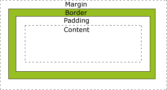
12 |
13 |
14 | #####Explanation of the different parts:
15 |
16 | * **Content** - The content of the box, where text and images appear
17 | * **Padding** - Clears an area around the content. The padding is transparent
18 | * **Border** - A border that goes around the padding and content
19 | * **Margin** - Clears an area outside the border. The margin is transparent
20 |
21 | >Example:
22 |
23 | >div {
24 | width: 300px;
25 | padding: 25px;
26 | border: 25px solid navy;
27 | margin: 25px;
28 | }
29 |
30 | In order to set the width and height of an element correctly in all browsers, you need to know how the box model works.
31 |
32 | When you set the width and height properties of an element with CSS, you just set the width and height of the content area. **To calculate the full size of an element, you must also add padding, borders and margins.**
33 |
34 |
35 | **Total element width** = width + left padding + right padding + left border + right border + left margin + right margin
36 |
37 | **Total element height** = height + top padding + bottom padding + top border + bottom border + top margin + bottom margin
38 |
--------------------------------------------------------------------------------
/css/design-resources.md:
--------------------------------------------------------------------------------
1 | #Design & Image Resources
2 |
3 |
4 | ##Photos
5 | * [Unsplash](https://unsplash.com/) Beautiful and free to use stock photos.
6 | * [Pixabay] (https://pixabay.com/) Free images and videos you can use anywhere.
7 |
8 | ##Fonts
9 | * [Google Fonts] (https://www.google.com/fonts) Free to use web fonts, [a tutorial to get started using them](https://developers.google.com/fonts/docs/getting_started?hl=en)
10 | * [Font Awesome] (https://fortawesome.github.io/Font-Awesome/)Open Source icons. Use in a similar way to Google fonts (checkout the documentation).
11 | * [Font Squirrel] (http://www.fontsquirrel.com/) More free fonts to use.
12 |
13 | ##Colour
14 | * [Adobe Kuler or Colour CC] (https://color.adobe.com/create/color-wheel/) A great resource for picking a colour scheme. [Browse their library] (https://color.adobe.com/explore/newest/) or create your own from scratch or from a photo.
15 | * [50 Beautiful Colour Palettes for your next web project] (http://www.dtelepathy.com/blog/inspiration/beautiful-color-palettes-for-your-next-web-project) inspiration!
16 |
17 |
18 | ##Editor Tips
19 | * Shortcuts to writing tags - e.g. by typing li/p/h1 then tab will automatically give you the opening and closing tabs.
20 |
21 |
22 | ##Inspiration
23 | * [Awwwards](http://www.awwwards.com/) The latests trends in professional sites. Some very high spec examples here.
24 | * [Creaive Blog](http://www.creativebloq.com/) A great resource for web design information.
25 | * [Smashing Magazine] (http://www.smashingmagazine.com/) Lot's of information on all things design and front end.
26 | *
27 | ##Templates
28 | * [Bootstrap Agency](http://startbootstrap.com/template-overviews/agency/) A beautiful and free to use template. Download the files and customise.
29 |
--------------------------------------------------------------------------------
/css/positioning.md:
--------------------------------------------------------------------------------
1 | #Fixed Absolute and Relative Positioning
2 |
3 | ###Static Position
4 | this is the default positioning.
5 |
6 | ###Relative positioning
7 |
8 | Essentially means "relative to itself". If you specify position:relative then you can use top or bottom, and left or right to move the element relative to where it would normally occur in the document. However, if you set position: relative; on an element but no other positioning attributes (top, left, bottom or right), it will have no effect on it's positioning.
9 |
10 | E.g. If you specify position:relative and give the element some other positioning attribute, such as, top: 10px; it will shift it's position 10 pixels down from where it would normally be.
11 |
12 | ![an example of relative positioning] (http://blog.teamtreehouse.com/wp-content/uploads/2012/11/position-relative.jpg)
13 |
14 |
15 | ###Absolute positioning
16 | Absolute positioning is a bit confusing. Basically the browser will look back up the elements DOM tree for the most recent parent that is positioned anything other than static (ie relative, fixed or absolute). If an absolutely-positioned element has no positioned ancestors, it uses the document body, and still moves along with page scrolling. **Absolute positioning, positions elements relative to its nearest non static parent**.
17 |
18 | Because absolute positioning is based on the positioning of parent elements, this can make it difficult to workout. You will have to investigate the positioning of an elements parent.
19 |
20 | Still confused? [This blog post does a really good job of explaining absolute and relative positioning ](https://css-tricks.com/absolute-positioning-inside-relative-positioning/).
21 |
22 | ###Fixed positioning
23 | Elements are fixed in a static position to the viewport (ie the window you can see on the browser).
24 |
25 |
26 |
27 |
28 | ### Useful links
29 | http://learnlayout.com/position.html
30 |
--------------------------------------------------------------------------------
/keep-learning-coding.md:
--------------------------------------------------------------------------------
1 | # Keep Learning Coding
2 |
3 | Thanks for attending the workshop. We hope you had a great time and have caught the coding bug.
4 |
5 | Here are some reasources you can use to teach yourself more coding skills
6 |
7 | ## General
8 | [Codecademy](https://www.codecademy.com/) A great free site with lots of tutorials covering html, css, javascript and more. Great paid sites include [Treehouse](teamtreehouse.com) and [Lynda] (lynda.com).
9 |
10 |
11 | ### Responsive Design with Bootstrap
12 | Responsive design is all about making sites look good on any sized device.
13 | A great tool for responsive design is [Twitter Bootstrap](http://getbootstrap.com/). Twitter bootstrap is a css and javascript library for building responsive sites. A good place to start learning this is the Codecademy [Make a website course](https://www.codecademy.com/skills/make-a-website) which has a section on [adding Bootstrap] (https://www.codecademy.com/courses/web-beginner-en-yjvdd/0/1)
14 |
15 | ### Javascript
16 | Javascript is used to add animation, and behaviour to sites, and much more. Checkout out the [Codecademy Course](https://www.codecademy.com/learn/javascript). Once you have completed this course you might fancy trying your hand at some of the [Codewars Kata Problems] (http://www.codewars.com), they are designed to be difficult you will learn loads.
17 |
18 | ### Founders & Coders Meetups
19 | Keep an eye out on our [Meetup page](http://www.meetup.com/founderscoders/) for more weekend workshops coming soon. Founders & Coders also run weekly Coding for Everyone workshops, and fortnightly Coding for Women workshops, which are free and provide a less structured learning environment. If you are really keen you might be interested in our 16 Week free coding workshop, checkout out [Fouders & Coders] (http://www.foundersandcoders.com/academy/#apply).
20 |
21 | You can also join the [Founders & Coders Coding for Everyone gitter channel](https://gitter.im/codingforeveryone).
22 |
--------------------------------------------------------------------------------
/gh-pages/tutorial.md:
--------------------------------------------------------------------------------
1 | # GH Pages Workshop
2 |
3 | #### Pre-Req Steps
4 | - Sign-up for **[Github](https://github.com)**
5 | - **[Link to Download latest desktop client](https://desktop.github.com/)**
6 | - Whilst it is downloading, we need to create a `Repo` in our profile.
7 | - Call this repo `fullname.github.io`. for e.g. mine will be `sohilpandya`
8 | - Setup Github Desktop & Follow the short Tutorial that is prompted when you open GiHub application. Feel free to answer any question you may have whilst you are following this short Tutorial
9 |
10 | ## Workshop
11 |
12 | ### Cloning the Repo
13 | - Go to Repo online and click the save to computer and open in GitHub desktop icon
14 | 
15 |
16 | - This will prompt your desktop application to open automatically and add the newly created `repo`
17 |
18 | 
19 |
20 | - Simply select Clone to copy the repo onto your computer
21 |
22 | ### Copying Existing Work to the new Repo
23 | - Lets Create a Branch before we make any changes
24 | - Why Create a branch? (explain workflow - e.g. why it would be important in a team environmet?)
25 | - In Finder/File Explorer copy all existing work to the newly created folder
26 | - Github Application has automaticall added the changes made in the new branch.
27 | 
28 |
29 |
30 | - Make a commit, always be descriptive in the commits
31 | - Create a pull Request
32 | - Review Pull Request in the url provided by GitHub
33 | 
34 |
35 |
36 | - Code Review and what are its Benefits?
37 | - Merge Pull Request
38 | - Visit site at username.github.io
39 |
40 | ### Congratulations on uploading your first website to the world!
41 |
--------------------------------------------------------------------------------
/css/responsive-font-sizes.md:
--------------------------------------------------------------------------------
1 | ## Responsive Font Size
2 |
3 | #### Three ways to create responsive font
4 | * Using viewport units you can set your font size as a percentage of the browser size. The following units are available:
5 | * `vw` - sets the font size to be a percentage of the browser width
6 | * `vh` - sets the font size to be a percentage of the browser height
7 | * `vmin` - the shortest of the above two dimensions
8 | * `vmax` - the longest of the above two dimensions
9 |
10 |
11 | * Using media queries you can set discrete font sizes for various viewport sizes
12 | * Use `@media (min-width:2000px) { your CSS }`. will apply the CSS only when the screen width is greater than `2000px`.
13 | * Use `@media (max-width:1000px) { your CSS }`. will apply the CSS only when the screen width is less than `1000px`.
14 |
15 |
16 | * Use `em` and `rem` units to access pixel sizes of preset fonts.
17 | * `font-size=2em` this means that the font size of the text will be set to twice that of the default. e.g. you may set the font size of a paragraph to be `3em`. if the default font size is `12px` then the paragraph font size in pixel will be `36px`
18 | * `rem` is similar to `em`, except it look for at the font size of the html element. This allows all responsive font to look at the same root font size.
19 |
20 | #####For more information on responsive font sizing visit: http://codeitdown.com/responsive-font-size-css/
21 |
22 | ## Responsive Div Size
23 |
24 | #### Three ways to create responsive Divs
25 | * Divs width can be set as a percentage of the parent width. e.g. `
` will set the width of the `div` to the width of its parent.
26 | * As above media queries can all be used to customise the size of `div` elements
27 | * As above the units `em` & `rem` can be used in setting the size of `div` elements
28 |
29 |
30 | ###Navbars
31 | [A tutorial to follow to add a responsive navbar with hamburger menu](http://inspirationalpixels.com/tutorials/creating-a-responsive-menu-with-html-css-jquery)
32 |
33 |
34 | ###Final Thoughts
35 |
36 | ##### Although all these techniques can be effective on their own, they work best when used in conjunction with each other
37 |
38 |
--------------------------------------------------------------------------------
/extra-resources/example-css-test/style.css:
--------------------------------------------------------------------------------
1 | /*ALL ITEMS*/
2 | * {
3 | font-family: sans-serif;
4 | }
5 |
6 | body {
7 | margin: 0;
8 | width: 100%;
9 | }
10 |
11 |
12 | /*NAVBAR STYLING*/
13 |
14 | .logo-div{
15 | width: 30%;
16 | float:left;
17 | }
18 | .logo-div img{
19 | width:8.5em;
20 | }
21 | .nav-tabs{
22 | width: 68%;
23 | float: right;
24 | text-align: right;
25 | }
26 |
27 | .nav-tabs li{
28 | text-decoration: none;
29 | display: inline-block;
30 | padding: 1em;
31 | /*margin and padding at space around the li elemenets*/
32 | background-color: #704C38;
33 | border-radius: 2em;
34 | margin: 1em;
35 | color: white;
36 | }
37 | .clear {
38 | clear: both;
39 | }
40 |
41 | /*HEADER STYLING*/
42 | header {
43 | text-align: center;
44 | background-image: url("https://images.unsplash.com/photo-1431975562098-bac8ded504c7?crop=entropy&fit=crop&fm=jpg&h=850&ixjsv=2.1.0&ixlib=rb-0.3.5&q=80&w=1700");
45 | padding: 2em;
46 | }
47 |
48 | header h1 {
49 | font-family: fantasy;
50 | font-size: 6em;
51 | margin: 0;
52 | }
53 |
54 | header h3 {
55 | font-size: 2.5em;
56 | margin: 0;
57 | font-weight: 100;
58 | color: white;
59 | }
60 |
61 | /*CONTENT STYLING*/
62 |
63 | .row{
64 | margin: 5em;
65 | }
66 |
67 | .left-div{
68 | width: 40%;
69 | float: left;
70 | }
71 |
72 | .right-div{
73 | width: 58%;
74 | float: right;
75 | text-align: center;
76 | }
77 | .right-div img{
78 | width:55em;
79 | }
80 |
81 | /*BOX STYLING*/
82 |
83 | .main {
84 | text-align: center;
85 | }
86 |
87 | .section-two{
88 | background-color: #704C38;
89 | width:23%;
90 | height:10em;
91 | display: inline-block;
92 | }
93 |
94 | .section-two h1 {
95 | font-family: fantasy;
96 | font-size: 4em;
97 | color: white;
98 | }
99 |
100 | .section-two:hover {
101 | background-color: #777572;
102 | }
103 |
104 | /*FOOTER*/
105 |
106 | footer {
107 | margin-top: 1em;
108 | text-align: center;
109 | padding: 1em;
110 | background-color: #777572;
111 | }
112 | footer a{
113 | color: #704C38;
114 | text-decoration: none;
115 | font-size: 1.3em;
116 | }
117 |
--------------------------------------------------------------------------------
/extra-resources/responsive-design/responsive-example/style.css:
--------------------------------------------------------------------------------
1 | * {
2 | margin: 0;
3 | }
4 | a{
5 | text-decoration: none;
6 | }
7 |
8 | body{
9 | width: 100%;
10 | }
11 |
12 | nav {
13 | display: flex;
14 | align-items: center;
15 | justify-content: space-between;
16 |
17 |
18 | background-color: #957D6F;
19 | font-family:sans-serif;
20 | }
21 |
22 | ul {
23 | padding-right: 4em;
24 | }
25 |
26 | nav ul li {
27 | display: inline;
28 | padding: 5px;
29 | text-decoration: none;
30 | }
31 |
32 | nav ul li:hover {
33 | color: white;
34 | }
35 |
36 |
37 | header {
38 | height: 70vh;
39 | background-image: url('https://images.unsplash.com/photo-1444044205806-38f3ed106c10?crop=entropy&dpr=0.75&fit=crop&fm=jpg&h=975&ixjsv=2.1.0&ixlib=rb-0.3.5&q=80&w=1925');
40 | }
41 |
42 | header h1 {
43 | padding-top: 30vh;
44 | text-align: center;
45 | font-family: 'Poiret One', sans-serif;
46 | color: white;
47 | font-size:70px;
48 | }
49 |
50 |
51 | h2 {
52 | font-family: 'Poiret One', sans-serif;
53 | color: #957D6F;
54 | font-size: 30px;
55 | text-align: center;
56 | }
57 |
58 | .about {
59 | width: 100%;
60 | text-align: center;
61 | }
62 | .about-image{
63 | width: 30%;
64 | display: inline-block;
65 | padding: 15px;
66 | }
67 | .about-image img {
68 | height: 200px;
69 | width: 200px;
70 | border-radius: 200%;
71 | }
72 | .about p {
73 | padding: 15px;
74 | }
75 |
76 |
77 | .press {
78 | background-color: #957D6F;
79 | height: 300px;
80 |
81 | }
82 |
83 | .press h2 {
84 | color: white;
85 | }
86 |
87 | .press h3 {
88 | margin:100px;
89 | font-style: italic;
90 | text-align: center;
91 | color: white;
92 | font-size: 40px;
93 | }
94 |
95 | .blog img{
96 | width: 300px;
97 | text-align: center;
98 | }
99 |
100 | .col-2 {
101 | width: 37%;
102 | display: inline-block;
103 | }
104 | .col-2 p {
105 | padding: 15px;
106 | }
107 | .center-img {
108 | background: url('https://images.unsplash.com/photo-1450849608880-6f787542c88a?ixlib=rb-0.3.5&q=80&fm=jpg&crop=entropy&w=1080&fit=max&s=b256aa5102c408322cdb99ce6a6a0f53') no-repeat center center;
109 | display: inline-block;
110 | height: 300px;
111 | width: 700px;
112 | }
113 |
114 |
115 |
--------------------------------------------------------------------------------
/teacher-resources/2017-revamp.md:
--------------------------------------------------------------------------------
1 |
2 | ## Morning
3 |
4 | I think html is an easier topic than CSS, so perhaps we should do html and a tiny bit of CSS in the morning - and leave the afternoon for the more meaty (and annoying) CSS topics like position etc.
5 |
6 |
7 | ### start
8 |
9 | 10-15 mins settling time with materials and GitHub repo on board.
10 | Students need to make sure they have:
11 | - Text editor (Atom or [Sublime](https://www.sublimetext.com/3)) down load if
12 | - https://github.com/foundersandcoders/workshop-html-css
13 |
14 |
15 | ## Intro to FAC
16 | 1. Task - Html sort card tasks
17 | * Tags: html, head, title, body, h1, h2, p, footer.
18 | 2. Talk
19 | - What HTML, CSS & JS are for (skeleton, clothes, movement)
20 | - Static sites - what they are, what they are used for
21 | - structure of the day, what we will achieve
22 |
23 | 3. Talk : html basics
24 | * What tags look like - open, closing and self closing.
25 | * html attributes, suchas class, id's, src, alt....
26 | * How tags contain other tags - touch on parent child relationship and indentation.
27 | * What head and body tags are, and what's contained in them.
28 |
29 | 4. Task : html basic
30 | * Display tags from html sort task
31 | * Students have to pair to create a page which uses all of them
32 | * Introduce W3 schools (show MDN at end of course - I think its more confusing than w3 to complete beginners)
33 | * Introduce googling as a skill
34 | * http://www.w3schools.com/html/html_basic.asp
35 |
36 | 5. Feedback - get a student to demo work
37 | 6. Explanation - images - walk students through how to create an image folder and save an image
38 | * Task - students use W3 schools to work out how to load an image from another server.
39 |
40 | ### Easy intro to CSS
41 | * Introduce CSS for style
42 | 1. Task : attach a CSS Style sheet and change text color using html selector. Walk through this quickly then get them to do in pairs.
43 | - Intro what css selectors are:- class, id, tag names.
44 | - extentions try hex, rgb and named colours - W3 reference
45 |
46 | ## LUNCH
47 |
48 | ### CSS Continued
49 | - CSS diner.
50 | - Display and Positioning slides.
51 | - Positioning [game](http://codepen.io/tormod17/pen/WRpBpR?editors=1100)
52 |
53 | ### Build your own website.
54 |
--------------------------------------------------------------------------------
/extra-resources/responsive-design/media-queries-examples/style.css:
--------------------------------------------------------------------------------
1 | * {
2 | margin: 0;
3 | }
4 | a{
5 | text-decoration: none;
6 | }
7 |
8 | body{
9 | width: 100%;
10 | }
11 |
12 | nav {
13 | display: flex;
14 | align-items: center;
15 | justify-content: space-between;
16 |
17 |
18 | background-color: #957D6F;
19 | font-family:sans-serif;
20 | }
21 |
22 | ul {
23 | padding-right: 4em;
24 | }
25 |
26 | nav ul li {
27 | display: inline;
28 | padding: 5px;
29 | text-decoration: none;
30 | }
31 |
32 | nav ul li:hover {
33 | color: white;
34 | }
35 |
36 |
37 | header {
38 | height: 70vh;
39 | background-image: url('https://images.unsplash.com/photo-1444044205806-38f3ed106c10?crop=entropy&dpr=0.75&fit=crop&fm=jpg&h=975&ixjsv=2.1.0&ixlib=rb-0.3.5&q=80&w=1925');
40 | }
41 |
42 | header h1 {
43 | padding-top: 30vh;
44 | text-align: center;
45 | font-family: 'Poiret One', sans-serif;
46 | color: white;
47 | font-size:70px;
48 | }
49 |
50 |
51 | h2 {
52 | font-family: 'Poiret One', sans-serif;
53 | color: #957D6F;
54 | font-size: 30px;
55 | text-align: center;
56 | }
57 |
58 | .about {
59 | width: 100%;
60 | text-align: center;
61 | }
62 | .about-image{
63 | width: 30%;
64 | display: inline-block;
65 | padding: 15px;
66 | }
67 | .about-image img {
68 | height: 200px;
69 | width: 200px;
70 | border-radius: 200%;
71 | }
72 | .about p {
73 | padding: 15px;
74 | }
75 |
76 |
77 | .press {
78 | background-color: #957D6F;
79 | height: 300px;
80 |
81 | }
82 |
83 | .press h2 {
84 | color: white;
85 | }
86 |
87 | .press h3 {
88 | margin:100px;
89 | font-style: italic;
90 | text-align: center;
91 | color: white;
92 | font-size: 40px;
93 | }
94 |
95 | .blog img{
96 | width: 300px;
97 | text-align: center;
98 | }
99 |
100 | .col-2 {
101 | width: 37%;
102 | display: inline-block;
103 | }
104 | .col-2 p {
105 | padding: 15px;
106 | }
107 | .center-img {
108 | background: url('https://images.unsplash.com/photo-1450849608880-6f787542c88a?ixlib=rb-0.3.5&q=80&fm=jpg&crop=entropy&w=1080&fit=max&s=b256aa5102c408322cdb99ce6a6a0f53') no-repeat center center;
109 | display: inline-block;
110 | height: 300px;
111 | width: 700px;
112 |
113 | /*add this line to stop the image size being greater than the layout*/
114 | max-width: 100%;
115 | }
116 |
117 | @media (max-width:600px ) {
118 | .about-image{
119 | display: inline;
120 | }
121 |
122 | .col-2 {
123 | width: 100%;
124 | display: inline;
125 | }
126 | .col-2 h3 {
127 | text-align: center;
128 | }
129 |
130 | ul {
131 | padding-right: 0px;
132 | }
133 |
134 |
135 | }
136 |
--------------------------------------------------------------------------------
/html/html-cheatsheet.md:
--------------------------------------------------------------------------------
1 | #HTML Cheatsheet
2 |
3 | A basic html outline looks something like this:
4 | ```HTML
5 |
6 |
7 |
8 |
9 | My first website
10 |
11 |
12 |
13 |
14 |
15 |
16 |
Hello World
17 |
Welcome to my fist page
18 |
Lorem ipsum dolor sit amet, consectetur adipisicing elit, sed do eiusmod tempor incididunt ut labore et dolore magna aliqua. Ut enim ad minim veniam, quis nostrud exercitation ullamco laboris nisi ut aliquip ex ea commodo consequat. Duis aute irure
19 | dolor in reprehenderit in voluptate velit esse cillum dolore eu fugiat nulla pariatur. Excepteur sint occaecat cupidatat non proident, sunt in culpa qui officia deserunt mollit anim id est laborum.
40 |
41 |
46 |
47 |
48 | ```
49 |
50 | ##ID and Class
51 | You can add a id or a class to a html tag. You can only use an id once (ie they are specific) but you use classes muliple times/
52 | `
'
53 | `
'
54 |
55 |
56 | ##HTML 5
57 | There are a number of html tags you can use to make your code more accessible. You don't need to remember them all but [here is a link with the full list of available tags](http://www.w3schools.com/html/html5_new_elements.asp)
58 | 
59 | 
60 |
61 | ##Links
62 | Some useful resources on html can be found at:
63 | * [Mozilla Network HTML] (https://developer.mozilla.org/en-US/docs/Web/HTML)
64 | * [W3 Schools HTML] (http://www.w3schools.com/html/)
65 |
66 |
67 |
--------------------------------------------------------------------------------
/extra-resources/example-css-test/index.html:
--------------------------------------------------------------------------------
1 |
2 |
3 |
4 |
5 |
6 |
7 |
8 |
9 |
10 |
11 |
12 |
13 |
14 |
15 |
16 |
17 |
18 |
About
19 |
Contact
20 |
21 |
22 |
23 |
24 |
25 |
26 |
Hello World
27 |
I love CSS
28 |
29 |
30 |
31 |
32 |
33 |
Hipster lorem Ipsum
34 |
Ugh messenger bag typewriter tousled chicharrones, forage ethical. Craft beer cliche pinterest gentrify franzen. Church-key asymmetrical hoodie pitchfork gochujang, lo-fi PBR&B celiac keffiyeh umami street art. Flexitarian ennui affogato waistcoat. Gluten-free 8-bit bitters pour-over roof party. Chia gluten-free beard, swag health goth letterpress etsy 3 wolf moon drinking vinegar intelligentsia pabst street art hashtag biodiesel. Direct trade slow-carb semiotics, fixie distillery chillwave tacos drinking vinegar ugh mixtape poutine.
35 |
Shabby chic PBR&B photo booth retro. Before they sold out single-origin coffee you probably haven't heard of them literally, echo park messenger bag hoodie farm-to-table trust fund deep v polaroid. Vinyl pickled deep v, celiac before they sold out cliche meditation art party chicharrones williamsburg selvage. Microdosing fanny pack swag, roof party godard messenger bag sartorial DIY typewriter direct trade PBR&B. Narwhal 8-bit quinoa, kombucha franzen retro pour-over try-hard austin ugh. YOLO 90's taxidermy DIY. DIY you probably haven't heard of them church-key twee, trust fund scenester PBR&B listicle fingerstache beard.
36 |
37 |
38 |
39 |
40 |
41 |
42 |
43 |
44 |
45 |
46 |
47 |
48 |
49 |
One
50 |
51 |
52 |
Two
53 |
54 |
55 |
Three
56 |
57 |
58 |
Four
59 |
60 |
61 |
62 |
65 |
66 |
67 |
68 |
69 |
70 |
--------------------------------------------------------------------------------
/extra-resources/responsive-design/media-queries.md:
--------------------------------------------------------------------------------
1 | # Media Queries
2 |
3 | Media queries are used to set different styling for different sized screens and devises. They are a key part of responsive design.
4 | Media queries are usually set at the bottom of a style sheet and start with `@media`. then specify a media type, ie `screen` and a size (in either px or ems) ie `300px`.
5 |
6 |
7 | ## Example
8 | Media queries use can use either `max-width` or `min-width`
9 | ```CSS
10 | @media screen and (max-width: 300px) {
11 | /* inside these CSS brackets we can set our styling for screen sizes up to 300px (above 300px this styling will not be applied */
12 | /* select the classes or id's you wish to style in the normal way */
13 | body {
14 | background-color:green ;
15 | }
16 | }
17 |
18 | }
19 | ```
20 |
21 | ```CSS
22 | @media screen and (min-width: 301px) {
23 | /* this media querie styles screens of of sizes 301px up*/
24 | body {
25 | background-color:red ;
26 | }
27 | }
28 |
29 | }
30 | ```
31 |
32 | ## Media Types
33 | As well as setting style rule for screens of different sizes, you can also target certain media types (see the `screen` part of the queries above.
34 | For example you might wat to target on `print` for printers, or `braille` for braille devices. A full list of media types can be found here: http://www.w3schools.com/cssref/css3_pr_mediaquery.asp
35 |
36 | ## Orientation
37 | Media queries can also be used to specifiy styles for either landscape or portait views (useful for ipads & phones).
38 | ``` CSS
39 | @media tv and (min-width: 700px) and (orientation: landscape) { ... }
40 | ```
41 | ## Resolution
42 | Media queries can be used to style screens of different resolutions
43 | ```CSS
44 | @media print and (min-resolution: 300dpi) { ... }
45 | ```
46 |
47 | To look at see the full list of media queries capabilities, check out the mozilla documentation: https://developer.mozilla.org/en-US/docs/Web/CSS/Media_Queries/Using_media_queries
48 |
49 | ## Choosing media queries breakpoints
50 | Devices change alot, and this topic is debated alot.
51 | Instead of targeting specific devices, many designers & front end devs, now advocate using a mobile-first & content first approach. For info about mobile first, see below. Content first means you consider your content when choosing your breakpoints, for more on this read: http://www.jordesign.com/responsive-breakpoints-from-the-content-out/
52 | And https://responsivedesign.is/articles/why-you-dont-need-device-specific-breakpoints
53 |
54 |
55 | ## Mobile first design
56 | In mobile first design, we think about how our screen will look on mobiles first (yep, it does what it says on the tin), and scale up from there. This helps us keep our code simplier.
57 | This means you code the mobile as default, then add media queries for larger screens, ie `@media screen mim-width 400px`
58 | For more on mobile first checkout: http://www.zell-weekeat.com/how-to-write-mobile-first-css
59 |
60 |
61 |
62 |
63 | ## Links
64 | http://learnlayout.com/media-queries.html
65 | https://developer.mozilla.org/en-US/docs/Web/CSS/Media_Queries/Using_media_queries
66 | http://bradfrost.com/blog/post/7-habits-of-highly-effective-media-queries/
67 |
68 |
69 |
70 |
71 |
--------------------------------------------------------------------------------
/extra-resources/nav-bar-activity/nav-tutorial.md:
--------------------------------------------------------------------------------
1 | # Navbar Tutorial
2 |
3 | Follow this tutorial to make a simple navbar. If you get stuck you can have a look at the example in [this directory](https://github.com/foundersandcoders/workshop-html-css/tree/master/nav-bar-activity/nav-example) (but try and work through the tutorial without it as much as you can).
4 |
5 | ### HTML
6 | First we are going to need to layout our HTML. We are going to make a simple navbar that looks like this:
7 | ![Example Wireframe] (https://files.gitter.im/RachBLondon/F70a/Screen-Shot-2016-01-18-at-09.36.23.png)
8 |
9 | - create a new folder, and inside that folder create a file called index.html
10 | - create a basic html outline (Atom will auto complete this for you if you type start to type html and press `enter` (you can use this trick for other html elements as well).
11 | - We are going to use HTML5, so create a `
 36 |
37 |
36 |
37 | 
 15 |
15 |  41 |
41 |