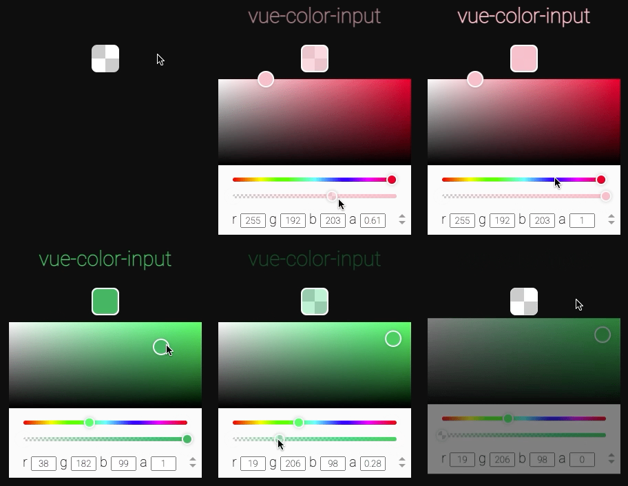
14 |
15 | ## Why
16 |
17 | ### Multi-format
18 | Forget about color conversions: vue-color-input does it for you. Unlike `` (which only understands hex) vue-color-input supports all commonly used color models, and by default __will output color in the same format that was passed as input__. It also has support for alpha channel, unless you specifically disable it.
19 |
20 | ### Customizable
21 | HTML's native color input is annoying to style. Most likely you'll have to get tricky hiding the original input & binding click event to a presentable-looking div. But it only gets you halfway there cause the color picker popup window is still out of reach and it might look way different in different browsers.
22 | With vue-color-input this poblem is solved. It looks pretty out of the box with the default styles, but it's also intuitive & straight-forward to customize from css.
23 |
24 | ### Uniform
25 | Not only that native color input looks different in different browsers, it also operates differently, and in some cases it's just not what you expect it to be. Yes, I'm looking at you, Safari. vue-color-input delivers a color picker that looks and performs the same regardless of browser.
26 |
27 | ### It just works
28 | vue-color-input combines minimalist approach with comprehensive functionality. You *can* customize and extend it to your liking, set it up with additional properties, but you _don't have to_. It works as expected out of the box just as well, with only `v-model` provided.
29 |
30 |
31 | ## Usage
32 |
33 | ### Install
34 | ```
35 | npm i vue-color-input
36 | ```
37 |
38 | ### Import
39 | ```javascript
40 | import ColorInput from 'vue-color-input'
41 | ```
42 |
43 | ### Use
44 | ```xml
45 |
46 | ```
47 |
48 |
49 | # Table of contents
50 |
51 | | [Props](#props) | [Styling](#styling) | [Events](#events) | [Exposed](#exposed-methods-and-properties) |
52 | |------------------------------------------------------|-------------------------------------------------|-----------------------------|----------------------------------------------------|
53 | | [v-model](#v-model) | [Class names](#class-names) | [Event names](#event-names) | [Methods](#exposed-methods) |
54 | | [format](#format-optional) | [Customization](#customizing-factory-styles) | | [Properties](#exposed-properties) |
55 | | [position](#position-optional) | [Transitions](#transitions) | | |
56 | | [disabled](#disabled-optional) | [Box active transition](#box-active-transition) | | |
57 | | [disable-alpha](#disable-alpha-optional) | [Example CSS](#example-css) | | |
58 | | [disable-text-inputs](#disable-text-inputs-optional) | [Styling guidelines](#styling-guidelines) | | |
59 | | [transition](#transition-optional) | | | |
60 | | [class](#class-optional) | | | |
61 |
62 |
63 | # Props
64 |
65 | ## v-model
66 |
67 | This is where you supply the variable holding the color to be adjusted by end user.
68 | Model value is allowed to be changed externally too, vue-color-input will adjust accordingly.
69 | When first initialized and every time v-model value updates _from outside the component_, incoming color format is stored to be matched by output.
70 |
71 | ### Input (initial value)
72 |
73 | Under the hood vue-color-input uses [`tinycolor2`](https://www.npmjs.com/package/tinycolor2) for color conversion. So everything tinycolor [accepts as input](https://github.com/bgrins/TinyColor#accepted-string-input), is valid here as well (both string and object).
74 |
75 | ### Output (return value)
76 |
77 | By default output will be a string or an object in the same color model as the initial value.
78 |
79 | For example:
80 | ```javascript
81 | // in parent component
82 |
83 | const color = ref('rgb(50, 150, 150)')
84 | ```
85 | ```xml
86 |
87 |
88 |
89 | ```
90 | User adjusts hue to `0`, now `color` becomes
91 | ```javascript
92 | "rgb(150, 50, 50)"
93 | ```
94 | Then user adjusts alpha to `0.5`, `color` becomes
95 | ```javascript
96 | "rgba(150, 50, 50, 0.5)"
97 | ```
98 |
99 | Let's say `color` property was initialy set to be an object:
100 | ```javascript
101 | // in parent component
102 |
103 | const color = ref({ "h": 350, "s": 1, "l": 0.8 })
104 | ```
105 | In the same scenario the resulting output would be
106 | ```javascript
107 | { "h": 0, "s": 1, "l": 0.8, "a": 0.5 }
108 | ```
109 |
110 | vue-color-input will always try to output color in the same color model as the initial value (unless target format is specified explicitly by `format` property.
111 | However in some cases that would not be possible. For those colors it will fall back to different formats.
112 |
113 | ### name || hex -> rgba fallback
114 |
115 | If initial color format was `name` (e.g. `"purple"`) or `hex` (e.g. `"#800080"`), and then alpha is changed to be less than `1`, output will be formatted as `rgba`:
116 | ```javascript
117 | "#cd5c5c" // hex input
118 |
119 | /* user changes alpha to 0.9 */
120 |
121 | "rgba(205, 92, 92, 0.9)" // rgba output
122 | ```
123 |
124 | _Note: this behavior does not apply if `format` property is explicitly set to be `hex` or `name`._
125 | _Note 2: if initial color format is `hex8` (e.g. `#800080ff`), output will be `hex8` also, unless specified differently by `format` property._
126 |
127 | ### name -> hex fallback
128 |
129 | If initial color format was `name`, but the resulting output color does not have a name equivalent, `hex` value will be output instead:
130 | ```javascript
131 | "indianred" // name input
132 |
133 | /* user changes hue to 180 */
134 |
135 | "#5ccdcc" // hex output
136 | ```
137 |
138 | ### invalid -> rgb fallback
139 |
140 | Invalid color initialy diasplays as black. Default output format will be set to `rgb`:
141 | ```javascript
142 | "ironmanred" // invalid string input
143 |
144 | /* user changes alpha to 0.1 */
145 |
146 | "rgba(0, 0, 0, 0.1)" // rgb(a) output
147 | ```
148 |
149 | ## format _`optional`_
150 |
151 | Here you can supply the color format you want the output to be in.
152 |
153 | The value consists of two arguments: format & type. The order of two is inconsequential, e.g. both `"hsl object"` & `"object hsl"` are valid values.
154 |
155 | __Format__ is the target color model that the return value is converted to. `[ "rgb", "hsv", "hsl", "hex", "hex8", "name" ]`
156 |
157 | __Type__ is data type of the return value. `[ "string", "object" ]`
158 |
159 | If you want to use v-model value for styling, `"string"` type should do the job. On the other hand, if you want to continue processing the data, `"object"` is probably more useful.
160 |
161 | Hsv & hsl color component values are presented differently in different output types:
162 | ```javascript
163 | "hsl(0, 53%, 58%)" // "hsl string"
164 |
165 | { "h": 0, "s": 0.531, "l": 0.582, "a": 1 } // "hsl object"
166 | ```
167 | Notice how strings contain percent-based values, and object 0-1 floats.
168 |
169 | >Note that name & hex formats don't support alpha channel. Specifying either of them as target format will prevent vue-color-input from falling back to rgba. Instead, it will disable alpha slider and always return full opacity color.
170 | >If this is not the behavior that you want, and you'd rather it fall back to rgba to support alpha, you should not specify the format.
171 |
172 | ### Type
173 | String
174 |
175 | ### Allowed values
176 | ```javascript
177 | [ "rgb", "rgb object", "rgb string",
178 | "hsv", "hsv object", "hsv string",
179 | "hsl", "hsl object", "hsl string",
180 | "name", "name string",
181 | "hex", "hex string",
182 | "hex8", "hex8 string" ]
183 | ```
184 | _Note: `"name object"`, `"hex object"` & `"hex8 object"`, make no sense and therefore are illegal._
185 | _Note 2: format without type is allowed, type without format is not._
186 |
187 | ### Default value
188 | Calculated to match the input.
189 |
190 | ### Example
191 | ```xml
192 |
193 | ```
194 |
195 | ## position _`optional`_
196 |
197 | This is where you specify the position of the popup color picker window relative to the clickable box.
198 |
199 | ### Type
200 | String
201 |
202 | ### Allowed values
203 | ```javascript
204 | [ "top", "top right", "top left", "top center",
205 | "right top", "right", "right bottom", "right center",
206 | "bottom right", "bottom", "bottom left", "bottom center",
207 | "left top", "left bottom", "left", "left center" ]
208 | ```
209 | Pretty intuitive: the first value is the direction from the box in which the popup will appear, the second is how it will align.
210 | _Note: Omitting the second parameter results in center alignment, making `"top"` a shortcut for `"top center"`_
211 |
212 | ### Default value
213 | `"bottom"`
214 |
215 | ### Example
216 | ```xml
217 |
218 | ```
219 |
220 | ## disabled _`optional`_
221 |
222 | Setting this to `true` will make the initial box nonresponsive to user clicks. The popup will not appear.
223 | However the box will still react to v-model changes, should they come from elsewhere.
224 |
225 | ### Type
226 | Boolean
227 |
228 | ### Allowed values
229 | ```javascript
230 | [ true, false ]
231 | ```
232 |
233 | ### Default value
234 | `false`
235 |
236 | ### Example
237 | ```xml
238 |
239 | ```
240 |
241 | ## disable-alpha _`optional`_
242 |
243 | If you set this to `true`, alpha slider will be removed from the color picker, and the returned color will always have full opacity.
244 |
245 | >Specifying name or hex as the target `format` will make this property default to `true` and ignore any passed value.
246 |
247 | ### Type
248 | Boolean
249 |
250 | ### Allowed values
251 | ```javascript
252 | [ true, false ]
253 | ```
254 |
255 | ### Default value
256 | `false`,
257 | `true` if target format is hex or name
258 |
259 | ### Example
260 | ```xml
261 |
262 | ```
263 |
264 | ## disable-text-inputs _`optional`_
265 |
266 | With this property you can hide the section of the color picker containing the text inputs.
267 |
268 | ### Type
269 | Boolean
270 |
271 | ### Allowed values
272 | ```javascript
273 | [ true, false ]
274 | ```
275 |
276 | ### Default value
277 | `false`
278 |
279 | ### Example
280 | ```xml
281 |
282 | ```
283 |
284 | ## transition _`optional`_
285 |
286 | Set this to a custom transition name to override factory enter and leave-to transitions of the popup.
287 |
288 | This is _not_ the only way to customize color picker transition.
289 | You can also override default transition classes from css. More details [below](#transitions).
290 |
291 | >More information about Vue enter/leave transitions [here](https://v3.vuejs.org/guide/transitions-enterleave.html).
292 |
293 | ### Type
294 | String
295 |
296 | ### Default value
297 | `"color-input__popup-"`
298 |
299 | ### Example
300 | ```xml
301 |
302 | ```
303 | ```css
304 | .my-cool-transition-enter-from,
305 | .my-cool-transition-leave-to {
306 | transform: rotate(240) scale(.5);
307 | opacity: 0;
308 | }
309 | .my-cool-transition-enter-active,
310 | .my-cool-transition-leave-active {
311 | transition: transform .3s, opacity .3s;
312 | }
313 | ```
314 |
315 | ## class _`optional`_
316 |
317 | With this you can provide a custom class that will get applied both to the root element and the popup elemnt. You can use this class later for styling.
318 |
319 | ### Type
320 | String
321 |
322 | ### Example
323 | ```xml
324 |
325 | ```
326 |
327 | # Styling
328 |
329 | As previously mentioned, applying styles to vue-color-input is a breeze.
330 |
331 | Default CSS is written with custumizability in mind, so anything you want to style will likely work as expected, and the whole component's layout will not get screwed up by that.
332 |
333 | Starting with v2, vue-color-input now uses bem class-naming approach instead of nested selectors and scoped styles to simplify customization while providing a namespaced classname isolation across the DOM.
334 |
335 | ## Class names
336 |
337 | | class | description |
338 | |--------------------------------------|---------------------------------------------------------|
339 | | `.color-input__box [class]` | Root clickable box |
340 | | `.color-input__popup [class]` | Popup color picker window (teleported to body) |
341 | | `.color-input__saturation-area` | Picking area where you select saturation and brightness |
342 | | `.color-input__slider` | Hue and opacity sliders (track) |
343 | | `.color-input__saturation-pointer` | Pointer in the saturation-brightness area |
344 | | `.color-input__slider-pointer` | Pointer on a slider |
345 |
346 | Feel free to scout the HTML for more class names.
347 |
348 | ## Customizing factory styles
349 |
350 | You don't have to use `!important` rules for everything you want to customize. Instead, here are several approaches you can take to override factory styles.
351 |
352 | ### Specificity
353 |
354 | The easiest way is to add a level of [specificity](https://developer.mozilla.org/en-US/docs/Web/CSS/Specificity) to your selectors as in `div.class`, and that will outweight the factory styles which are defined simply as `.class`.
355 |
356 | Example:
357 | ```css
358 | div.color-input__box {
359 | border-radius: 50%;
360 | }
361 | div.color-input__popup {
362 | background: pink;
363 | }
364 | ```
365 |
366 | ### Custom class
367 |
368 | You can also use a `class` prop to set a custom class name on _both_ the root element and the popup, to later use it in your selectors.
369 |
370 | Bear in mind though that the class is applied _only_ to the root elemnent and the popup root element, not to all nested elements. So it will be `.custom.color-input__box` and `.custom.color-input__popup` _but_ for all their nested elements it will be `.custom .color-input__box-inner` (note the space).
371 |
372 | Example:
373 | ```xml
374 |
375 | ```
376 | ```css
377 | .custom.color-input__box {
378 | border-radius: 50%;
379 | }
380 | .custom.color-input__popup {
381 | background: pink;
382 | }
383 | ```
384 |
385 | ## Transitions
386 |
387 | Instead of using `transition` property with a custom transition name, you can simply override default transition styles.
388 | This can be done in the same manner as with the other classes, e.g:
389 |
390 | ```css
391 | .color-input__popup--enter-from {
392 | transform: translateY(-100%) scale(.1);
393 | }
394 | .color-input__popup--leave-to {
395 | transform: scale(3);
396 | }
397 | /* and if you want to change the durations as well */
398 | .color-input__popup--enter-active,
399 | .color-input__popup--leave-active {
400 | transition: all .5s;
401 | }
402 | ```
403 |
404 | >More information about Vue enter/leave transitions [here](https://v3.vuejs.org/guide/transitions-enterleave.html).
405 |
406 | ## Box active transition
407 |
408 | When clicked on, the box gets what looks like an outline, but in reality its content is scaled down and background is revealed.
409 |
410 | Here's what the box element html looks like:
411 | ```xml
412 |
413 |
414 |
415 |
416 |
417 |
418 |
419 | ```
420 | To customize this transition, you can use `.color-input__box--active` in combination with `.color-input__box-inner--active`.
421 | For example:
422 | ```css
423 | div.color-input__box--active {
424 | /* "outline" color */
425 | background: #0f0f0f;
426 | }
427 | div.color-input__box-inner--active {
428 | /* different transition effect */
429 | transform: scale(.9) rotate(90deg);
430 | }
431 | ```
432 |
433 | ## Popup offset
434 |
435 | The popup gets a default offset from the box which is equal to `10px`. If you would like to use a different offset, you should set it with a `--popup-offset` css property defined on the popup.
436 |
437 | Example:
438 | ```css
439 | div.color-input__popup {
440 | --popup-offset: 20px;
441 | }
442 | ```
443 |
444 | ## Example CSS
445 |
446 | ```css
447 | div.color-input__box {
448 | /* make clickable box a 100x100 circle */
449 | width: 100px;
450 | height: 100px;
451 | border-radius: 50px;
452 | }
453 | div.color-input__popup {
454 | /* dark mode for popup window */
455 | background: #000;
456 | color: #fbfbfb;
457 | /* and make it wide */
458 | width: 400px;
459 | }
460 | div.color-input__slider {
461 | /* thin out the sliders and make them wider */
462 | height: 2px;
463 | width: 92%;
464 | }
465 | div.color-input__saturation-area {
466 | /* bigger picking area */
467 | height: 150px;
468 | }
469 | div.color-input__slider-pointer {
470 | /* make slider pointers square-ish and 10x10 */
471 | border-radius: 4px;
472 | width: 10px;
473 | height: 10px;
474 | }
475 | div.color-input__saturation-pointer {
476 | /* increase saturation pointer size */
477 | width: 40px;
478 | height: 40px;
479 | }
480 | ```
481 |
482 | ## Styling guidelines
483 |
484 | ### Use stylesheets, no need to set inline styles
485 |
486 | Inline styles will only let you style the root element, when typically you will want to style more than that.
487 |
488 | ### Use specificity or custom class to override default styles
489 |
490 | Read more about the both approaches [here](#customizing-factory-styles).
491 |
492 | ### Don't expect the popup to be nested within the root
493 |
494 | As the popup is teleported to the body, the following nested css selectors won't work:
495 | ```xml
496 |
497 | ```
498 | ```css
499 | /* ❌ example of selector that won't work */
500 | .my-custom-class .color-input__popup {}
501 | ```
502 | Instead, think of box and popup as two _separate roots_ that both get your custom class. And then both of those have some children that you can access with nested selectors:
503 | ```css
504 | .my-custom-class.color-input__popup {}
505 | .my-custom-class.color-input__box {}
506 | .my-custom-class .color-input__slider {}
507 | .my-custom-class .color-input__box-inner {}
508 | ```
509 | And likewise...
510 |
511 | ### Don't expect your custom class to point only to the box
512 |
513 | As described above, _both the box and the popup_ will get your custom class, so don't try to use your custom class without the specifying selector, that will apply the styles to both the box and the popup:
514 | ```css
515 | /* ❌ example of what not to do */
516 | .my-custom-class {
517 | width: 50px;
518 | height: 50px;
519 | }
520 | ```
521 | Instead, use a specifying classname:
522 | ```css
523 | .my-custom-class.color-input__box {}
524 | .my-custom-class.color-input__popup {}
525 | ```
526 |
527 | ### Use preprocesser nesting to reduce typing
528 |
529 | If you use a style preprocessor (like sass), you can use it's nesting to reduce the amount of typing and produce a cleaner and more readable code:
530 | ```scss
531 | div.color-input {
532 | &__box {
533 | &--disabled {}
534 | &--active {}
535 | }
536 | &__popup {}
537 | &__slider {}
538 | }
539 | ```
540 |
541 | ### Don't use scoped styles
542 |
543 | With scoped styles you won't be able to reach component's inner elements, so you should use global styles.
544 |
545 | If, for some reason, you need to use several vue-color-input instances that should be styled differently, you can set different class names on them to provide instance-based scope.
546 |
547 |
548 | # Events
549 |
550 | The instance provides hooks for custom event handling.
551 |
552 | Most events carry payload with current state of the corresponding color component.
553 |
554 | Note that event data is always passed in __hsv__ format.
555 |
556 | ## Event names
557 |
558 | Generally you don't need to rely on events to retrieve color data from this component. Instead, you should use [v-model](#v-model) two-way binding.
559 |
560 | But if you want to setup some additional hooks, the component emits following events:
561 |
562 | | event | description | payload |
563 | |---|---|---|
564 | | __pickStart__ | color picking process is initiated, popup is opening | |
565 | | __pickEnd__ | color picking process is finished, popup will close now | |
566 | | __mounted__ | lifecycle hook, emitted from root component's mounted() | |
567 | | __beforeUnmount__ | lifecycle hook, emitted from root component's beforeUnmount() | |
568 | | __saturationInputStart__ | saturation-brightness adjustment has begun. This is only emitted when pointerdown inside saturation-brightness area is registered. This will _not_ emit when text inputs are edited | current state of saturation & value (hsv) `{ s: 0.5, v: 0.5 }` |
569 | | __saturationInputEnd__ | saturation-brightness adjustment has ended. This is only emitted when pointerup of the saturation-brightness area is registered. This will _not_ emit when text inputs are edited | current state of saturation & value (hsv) `{ s: 0.5, v: 0.5 }` |
570 | | __saturationInput__ | saturation-brightness is being adjusted. This will emit every time saturation-brightness is changed, including text inputs | current state of saturation & value (hsv) `{ s: 0.5, v: 0.5 }` |
571 | | __hueInputStart__ | hue adjustment has begun. This is only emitted when pointerdown over the hue slider is registered. This will _not_ emit when hue is changed from text inputs | current state of hue `{ h: 180 }` |
572 | | __hueInputEnd__ | hue adjustment has ended. This is only emitted when pointerup of the hue slider is registered. This will _not_ emit when hue is changed from text inputs | current state of hue `{ h: 180 }` |
573 | | __hueInput__ | hue is being adjusted. This will emit every time hue is changed, including text inputs | current state of hue `{ h: 180 }` |
574 | | __alphaInputStart__ | alpha adjustment has begun. This is only emitted when pointerdown over the alpha slider is registered. This will _not_ emit when alpha is changed from text inputs | current state of alpha `{ a: 0.5 }` |
575 | | __alphaInputEnd__ | alpha adjustment has ended. This is only emitted when pointerup of the alpha slider is registered. This will _not_ emit when alpha is changed from text inputs | current state of alpha `{ a: 0.5 }` |
576 | | __alphaInput__ | alpha is being adjusted. This will emit every time alpha is changed, including text inputs | current state of alpha `{ a: 0.5 }` |
577 | | __change__ | the color has changed by user interaction. This will emit every time _any_ parameter is changed. This _will_ emit when color is changed from text inputs as well, on blur | current state of all color components `{ h: 180, s: 0.5, v: 0.5, a: 0.5 }` |
578 |
579 | ## Example
580 |
581 | ```xml
582 |
587 | ```
588 |
589 |
590 | # Exposed methods and properties
591 |
592 | You shouldn't _need_ to manually access instance methods and properties, but if you feel like it, you can.
593 | This can be done by specifying a `ref` property on the instance.
594 |
595 | The following section implies you have a vue-color-input instance with a `ref` variable named `colorInput` in a script setup context:
596 | ```xml
597 |
598 | ```
599 | ```javascript
600 | const colorInput = ref()
601 | ```
602 |
603 | ## Exposed methods
604 |
605 | ```javascript
606 | colorInput.value.pickStart() // begin color selection (show popup)
607 | colorInput.value.pickEnd() // end color selection (hide popup)
608 | ```
609 |
610 | ## Exposed properties
611 |
612 | ```javascript
613 | colorInput.value.color // tinycolor instance
614 | colorInput.value.active // boolean - is the picker currently active
615 | ```
616 |
617 |
618 | # License
619 |
620 | MIT
621 |
622 |
623 |
624 |
--------------------------------------------------------------------------------
/.gitignore:
--------------------------------------------------------------------------------
1 | .DS_Store
2 | node_modules/
3 | dist/
4 | demo/
5 |
6 | # local env files
7 | .env.local
8 | .env.*.local
9 |
10 | # Log files
11 | npm-debug.log*
12 | yarn-debug.log*
13 | yarn-error.log*
14 |
15 | # Editor directories and files
16 | .idea
17 | .vscode
18 | *.suo
19 | *.ntvs*
20 | *.njsproj
21 | *.sln
22 | *.sw*
23 |
--------------------------------------------------------------------------------
/LICENSE:
--------------------------------------------------------------------------------
1 | MIT License
2 |
3 | Copyright (c) 2021 Ivan Chepurin
4 |
5 | Permission is hereby granted, free of charge, to any person obtaining a copy
6 | of this software and associated documentation files (the "Software"), to deal
7 | in the Software without restriction, including without limitation the rights
8 | to use, copy, modify, merge, publish, distribute, sublicense, and/or sell
9 | copies of the Software, and to permit persons to whom the Software is
10 | furnished to do so, subject to the following conditions:
11 |
12 | The above copyright notice and this permission notice shall be included in all
13 | copies or substantial portions of the Software.
14 |
15 | THE SOFTWARE IS PROVIDED "AS IS", WITHOUT WARRANTY OF ANY KIND, EXPRESS OR
16 | IMPLIED, INCLUDING BUT NOT LIMITED TO THE WARRANTIES OF MERCHANTABILITY,
17 | FITNESS FOR A PARTICULAR PURPOSE AND NONINFRINGEMENT. IN NO EVENT SHALL THE
18 | AUTHORS OR COPYRIGHT HOLDERS BE LIABLE FOR ANY CLAIM, DAMAGES OR OTHER
19 | LIABILITY, WHETHER IN AN ACTION OF CONTRACT, TORT OR OTHERWISE, ARISING FROM,
20 | OUT OF OR IN CONNECTION WITH THE SOFTWARE OR THE USE OR OTHER DEALINGS IN THE
21 | SOFTWARE.
22 |
--------------------------------------------------------------------------------
/README.md:
--------------------------------------------------------------------------------
1 |
2 |
3 | # vue-color-input
4 | Slick and perfomant Vue 3 color picker component whose goal is to replace ``
5 |
6 |
12 |
13 | ## Why
14 |
15 | ### Multi-format
16 | Forget about color conversions: vue-color-input does it for you. Unlike `` (which only understands hex) vue-color-input supports all commonly used color models, and by default __will output color in the same format that was passed as input__. It also has support for alpha channel, unless you specifically disable it.
17 |
18 | ### Customizable
19 | HTML's native color input is annoying to style. Most likely you'll have to get tricky hiding the original input & binding click event to a presentable-looking div. But it only gets you halfway there cause the color picker popup window is still out of reach and it might look way different in different browsers.
20 | With vue-color-input this poblem is solved. It looks pretty out of the box with the default styles, but it's also intuitive & straight-forward to customize from css.
21 |
22 | ### Uniform
23 | Not only that native color input looks different in different browsers, it also operates differently, and in some cases it's just not what you expect it to be. Yes, I'm looking at you, Safari. vue-color-input delivers a color picker that looks and performs the same regardless of browser.
24 |
25 | ### It just works
26 | vue-color-input combines minimalist approach with comprehensive functionality. You *can* customize and extend it to your liking, set it up with additional properties, but you _don't have to_. It works as expected out of the box just as well, with only `v-model` provided.
27 |
28 | ## Usage
29 |
30 | ### Install
31 | ```
32 | npm i vue-color-input
33 | ```
34 |
35 | ### Import
36 | ```javascript
37 | import ColorInput from 'vue-color-input'
38 | ```
39 |
40 | ### Use
41 | ```xml
42 |
43 | ```
44 |
45 |
46 | # Docs
47 |
48 | See complete documentation [on github](https://github.com/gVguy/vue-color-input#table-of-contents)
49 |
50 |
51 | # License
52 |
53 | MIT
54 |
55 |
56 |
57 |
--------------------------------------------------------------------------------
/dev/demo-styles.css:
--------------------------------------------------------------------------------
1 | div.color-input__box {
2 | width: 100px;
3 | height: 100px;
4 | }
5 | div.color-input__box--active {
6 | background: #0f0f0f;
7 | }
8 | div.color-input__box-inner--active {
9 | transform: scale(.88);
10 | }
11 | div.color-input__box--disabled {}
12 |
13 | div.color-input__popup {}
14 | div.color-input__slider {}
15 | div.color-input__slider-pointer {}
16 | div.color-input__saturation-pointer {}
17 |
18 | div.color-input__popup--enter-from,
19 | div.color-input__popup--leave-to {}
20 | div.color-input__popup--enter-active,
21 | div.color-input__popup--leave-active {}
22 |
--------------------------------------------------------------------------------
/dev/serve-setup.vue:
--------------------------------------------------------------------------------
1 |
20 |
21 |
22 |
23 |
24 |
25 |
27 |
28 |
--------------------------------------------------------------------------------
/dev/serve.js:
--------------------------------------------------------------------------------
1 | import { createApp } from 'vue';
2 | import Dev from './serve.vue';
3 | import DevSetup from './serve-setup.vue';
4 |
5 | const app = createApp(Dev);
6 | app.config.unwrapInjectedRef = true;
7 | app.mount('#app');
8 |
9 | document.title = 'vue-color-input';
10 |
--------------------------------------------------------------------------------
/dev/serve.vue:
--------------------------------------------------------------------------------
1 |
2 |