├── .gitignore ├── .storybook ├── addons.js ├── config.js └── webpack.config.js ├── README.md ├── assets └── ecommerce-listing │ ├── ecl-single-variants.png │ ├── ecl-single-variants@2x.png │ ├── ecl-single.png │ ├── ecl-single@2x.png │ ├── ecl-single@3x.png │ ├── ecommerce-listing-design.png │ ├── ecommerce-listing-design@2x.png │ ├── ecommerce-listing-design@3x.png │ ├── thinsulate-hat-blue.jpg │ ├── thinsulate-hat-gray.jpg │ ├── thinsulate-hat-orange.jpg │ ├── thinsulate-hat-tan.jpg │ └── thinsulate-hat-yellow.jpg ├── demo.html ├── docs ├── favicon.ico ├── iframe.html ├── index.html └── static │ ├── manager.bf7e11718ca03d9ed7e1.bundle.js │ ├── manager.bf7e11718ca03d9ed7e1.bundle.js.map │ ├── preview.dd198ff1acb927d259a2.bundle.js │ └── preview.dd198ff1acb927d259a2.bundle.js.map ├── package.json ├── post.md ├── src ├── 01-ecommerce-listing │ ├── day-1 │ │ ├── index.jsx │ │ └── post.md │ ├── day-2 │ │ ├── index.jsx │ │ └── post.md │ ├── day-3 │ │ ├── index.jsx │ │ └── post.md │ ├── day-4 │ │ ├── index.jsx │ │ └── post.md │ ├── day-5 │ │ ├── index.jsx │ │ └── post.md │ ├── day-6 │ │ ├── index.jsx │ │ └── post.md │ ├── day-7 │ │ ├── index.jsx │ │ └── post.md │ ├── demo.jsx │ ├── index.jsx │ └── util.js ├── 02-search-bar │ ├── day-1 │ │ ├── index.jsx │ │ └── post.md │ ├── day-2 │ │ ├── index.jsx │ │ └── post.md │ ├── day-3 │ │ ├── index.jsx │ │ └── post.md │ ├── day-4 │ │ ├── index.jsx │ │ └── post.md │ ├── day-5 │ │ ├── index.jsx │ │ └── post.md │ ├── day-6 │ │ ├── index.jsx │ │ └── post.md │ ├── day-7 │ │ ├── index.jsx │ │ └── post.md │ ├── index.jsx │ └── util.js └── 03-results-page │ ├── day-1 │ └── post.md │ ├── day-2 │ ├── index.jsx │ └── post.md │ ├── day-3 │ ├── index.jsx │ └── post.md │ ├── day-4 │ ├── index.jsx │ └── post.md │ ├── day-5 │ ├── index.jsx │ └── post.md │ ├── index.jsx │ └── util.js ├── stories └── index.stories.js ├── storybook-static ├── favicon.ico ├── iframe.html ├── index.html └── static │ ├── manager.bdc98f5523150386c8c5.bundle.js │ ├── manager.bdc98f5523150386c8c5.bundle.js.map │ ├── preview.09b54a7e4dcd3a07a09f.bundle.js │ └── preview.09b54a7e4dcd3a07a09f.bundle.js.map ├── tag-index ├── about.md ├── description.md └── rules.md ├── webpack.config.js └── yarn.lock /.gitignore: -------------------------------------------------------------------------------- 1 | # weekly-ui ignores... 2 | node_modules 3 | .DS_STORE 4 | *log 5 | *.sketch 6 | dist 7 | -------------------------------------------------------------------------------- /.storybook/addons.js: -------------------------------------------------------------------------------- 1 | import '@storybook/addon-actions/register'; 2 | -------------------------------------------------------------------------------- /.storybook/config.js: -------------------------------------------------------------------------------- 1 | import { configure } from '@storybook/react'; 2 | 3 | // automatically import all files ending in *.stories.js 4 | const req = require.context('../stories', true, /.stories.js$/); 5 | function loadStories() { 6 | req.keys().forEach(filename => req(filename)); 7 | } 8 | 9 | configure(loadStories, module); 10 | -------------------------------------------------------------------------------- /.storybook/webpack.config.js: -------------------------------------------------------------------------------- 1 | // you can use this file to add your custom webpack plugins, loaders and anything you like. 2 | // This is just the basic way to add additional webpack configurations. 3 | // For more information refer the docs: https://storybook.js.org/configurations/custom-webpack-config 4 | 5 | // IMPORTANT 6 | // When you add this file, we won't add the default configurations which is similar 7 | // to "React Create App". This only has babel loader to load JavaScript. 8 | 9 | const path = require('path') 10 | 11 | module.exports = { 12 | resolve: { 13 | alias: { 14 | EcommerceListing: path.resolve(__dirname,'../src/01-ecommerce-listing/'), 15 | SearchBar: path.resolve(__dirname, '../src/02-search-bar/'), 16 | ResultsPage: path.resolve(__dirname,'../src/03-results-page') 17 | } 18 | }, 19 | plugins: [ 20 | // your custom plugins 21 | ], 22 | module: { 23 | rules: [ 24 | // add your custom rules. 25 | ], 26 | }, 27 | }; 28 | -------------------------------------------------------------------------------- /README.md: -------------------------------------------------------------------------------- 1 | # Weekly UI Challenge 2 | 3 | ## Current challenge 4 | 5 | ### Week 3: xxx 6 | 7 | ![xxx design](https://raw.githubusercontent.com/geoffdavis92/weekly-ui-assets/master/search-bar/design.png) 8 | 9 | 1. (Sunday 4/22) Design component 10 | 2. 11 | 3. 12 | 4. 13 | 5. 14 | 6. 100% a11y score 15 | 7. Tweaks, refactors, fixes 16 | 17 | ## Challenges archive 18 | 19 | ### Week 1: ecommerce listing 20 | 21 | ![3 ecommerce listing components, each with a different state for favorited, price, and availability](https://raw.githubusercontent.com/geoffdavis92/weekly-ui/master/assets/ecommerce-listing/ecommerce-listing-design@2x.png) 22 | 23 | 1. (Sunday 4/8) Design component 24 | 2. Display product name, price, and image 25 | 3. Add to cart button, favorite button 26 | 4. Sale price display, sold out states 27 | 5. Color variant thumbnail buttons 28 | 6. 100% a11y score 29 | 7. Tweaks, refactors, fixes 30 | 31 | ### Week 2: Search Bar 32 | 33 | ![Search Bar design](https://raw.githubusercontent.com/geoffdavis92/weekly-ui-assets/master/search-bar/design.png) 34 | 35 | 1. (Sunday 4/15) Design component 36 | 2. Input field 37 | 3. Submit button 38 | 4. [autocomplete] Downshift integration 39 | 5. Past search term indicators 40 | 6. 100% a11y score 41 | 7. Tweaks, refactors, fixes 42 | 43 | ## Getting started 44 | 45 | ## Resources 46 | 47 | 48 | 49 | 58 | 59 | -------------------------------------------------------------------------------- /assets/ecommerce-listing/ecl-single-variants.png: -------------------------------------------------------------------------------- https://raw.githubusercontent.com/geoffdavis92/weekly-ui/16af4c809adbabe77757e07db987f47ea9071e6d/assets/ecommerce-listing/ecl-single-variants.png -------------------------------------------------------------------------------- /assets/ecommerce-listing/ecl-single-variants@2x.png: -------------------------------------------------------------------------------- https://raw.githubusercontent.com/geoffdavis92/weekly-ui/16af4c809adbabe77757e07db987f47ea9071e6d/assets/ecommerce-listing/ecl-single-variants@2x.png -------------------------------------------------------------------------------- /assets/ecommerce-listing/ecl-single.png: -------------------------------------------------------------------------------- https://raw.githubusercontent.com/geoffdavis92/weekly-ui/16af4c809adbabe77757e07db987f47ea9071e6d/assets/ecommerce-listing/ecl-single.png -------------------------------------------------------------------------------- /assets/ecommerce-listing/ecl-single@2x.png: -------------------------------------------------------------------------------- https://raw.githubusercontent.com/geoffdavis92/weekly-ui/16af4c809adbabe77757e07db987f47ea9071e6d/assets/ecommerce-listing/ecl-single@2x.png -------------------------------------------------------------------------------- /assets/ecommerce-listing/ecl-single@3x.png: -------------------------------------------------------------------------------- https://raw.githubusercontent.com/geoffdavis92/weekly-ui/16af4c809adbabe77757e07db987f47ea9071e6d/assets/ecommerce-listing/ecl-single@3x.png -------------------------------------------------------------------------------- /assets/ecommerce-listing/ecommerce-listing-design.png: -------------------------------------------------------------------------------- https://raw.githubusercontent.com/geoffdavis92/weekly-ui/16af4c809adbabe77757e07db987f47ea9071e6d/assets/ecommerce-listing/ecommerce-listing-design.png -------------------------------------------------------------------------------- /assets/ecommerce-listing/ecommerce-listing-design@2x.png: -------------------------------------------------------------------------------- https://raw.githubusercontent.com/geoffdavis92/weekly-ui/16af4c809adbabe77757e07db987f47ea9071e6d/assets/ecommerce-listing/ecommerce-listing-design@2x.png -------------------------------------------------------------------------------- /assets/ecommerce-listing/ecommerce-listing-design@3x.png: -------------------------------------------------------------------------------- https://raw.githubusercontent.com/geoffdavis92/weekly-ui/16af4c809adbabe77757e07db987f47ea9071e6d/assets/ecommerce-listing/ecommerce-listing-design@3x.png -------------------------------------------------------------------------------- /assets/ecommerce-listing/thinsulate-hat-blue.jpg: -------------------------------------------------------------------------------- https://raw.githubusercontent.com/geoffdavis92/weekly-ui/16af4c809adbabe77757e07db987f47ea9071e6d/assets/ecommerce-listing/thinsulate-hat-blue.jpg -------------------------------------------------------------------------------- /assets/ecommerce-listing/thinsulate-hat-gray.jpg: -------------------------------------------------------------------------------- https://raw.githubusercontent.com/geoffdavis92/weekly-ui/16af4c809adbabe77757e07db987f47ea9071e6d/assets/ecommerce-listing/thinsulate-hat-gray.jpg -------------------------------------------------------------------------------- /assets/ecommerce-listing/thinsulate-hat-orange.jpg: -------------------------------------------------------------------------------- https://raw.githubusercontent.com/geoffdavis92/weekly-ui/16af4c809adbabe77757e07db987f47ea9071e6d/assets/ecommerce-listing/thinsulate-hat-orange.jpg -------------------------------------------------------------------------------- /assets/ecommerce-listing/thinsulate-hat-tan.jpg: -------------------------------------------------------------------------------- https://raw.githubusercontent.com/geoffdavis92/weekly-ui/16af4c809adbabe77757e07db987f47ea9071e6d/assets/ecommerce-listing/thinsulate-hat-tan.jpg -------------------------------------------------------------------------------- /assets/ecommerce-listing/thinsulate-hat-yellow.jpg: -------------------------------------------------------------------------------- https://raw.githubusercontent.com/geoffdavis92/weekly-ui/16af4c809adbabe77757e07db987f47ea9071e6d/assets/ecommerce-listing/thinsulate-hat-yellow.jpg -------------------------------------------------------------------------------- /demo.html: -------------------------------------------------------------------------------- 1 | 2 | 3 | 4 | 5 | 6 | 7 | 8 | Demos 9 | 10 | 11 | 12 |
13 | 14 | 15 | 16 | 17 | -------------------------------------------------------------------------------- /docs/favicon.ico: -------------------------------------------------------------------------------- https://raw.githubusercontent.com/geoffdavis92/weekly-ui/16af4c809adbabe77757e07db987f47ea9071e6d/docs/favicon.ico -------------------------------------------------------------------------------- /docs/iframe.html: -------------------------------------------------------------------------------- 1 | 2 | 3 | 4 | 5 | 6 | 7 | 8 | 13 | Storybook 14 | 15 | 16 | 17 |
18 |
19 | 20 | 21 | -------------------------------------------------------------------------------- /docs/index.html: -------------------------------------------------------------------------------- 1 | 2 | 3 | 4 | 5 | 6 | 7 | 8 | Storybook 9 | 38 | 39 | 40 | 41 | 42 |
43 | 44 | 45 | -------------------------------------------------------------------------------- /package.json: -------------------------------------------------------------------------------- 1 | { 2 | "name": "weekly-ui", 3 | "version": "0.0.0", 4 | "main": "index.js", 5 | "repository": "https://github.com/geoffdavis92/weekly-ui.git", 6 | "author": "Geoff Davis ", 7 | "license": "MIT", 8 | "private": false, 9 | "scripts": { 10 | "prettier": 11 | "npx prettier ./{*json,*js,stories/*,src/**/{*.{js,jsx},**/*.{js,jsx}}} --write", 12 | "storybook": "start-storybook -p 6006", 13 | "build-storybook": "build-storybook", 14 | "docs": "sudo yarn run build-storybook -o docs", 15 | "webpack": "webpack --mode=development --watch" 16 | }, 17 | "babel": { 18 | "presets": [ 19 | [ 20 | "env", 21 | { 22 | "target": { 23 | "browsers": "last 2 versions" 24 | } 25 | } 26 | ], 27 | "react" 28 | ], 29 | "plugins": ["transform-class-properties"] 30 | }, 31 | "prettier": { 32 | "useTabs": false, 33 | "tabWidth": 2 34 | }, 35 | "devDependencies": { 36 | "@fortawesome/fontawesome": "^1.1.5", 37 | "@fortawesome/fontawesome-free-regular": "^5.0.9", 38 | "@fortawesome/fontawesome-free-solid": "^5.0.9", 39 | "@fortawesome/react-fontawesome": "^0.0.18", 40 | "@kadira/storybook": "^2.21.0", 41 | "@storybook/addon-actions": "^4.0.0-alpha.1", 42 | "@storybook/addon-links": "^4.0.0-alpha.1", 43 | "@storybook/addons": "^4.0.0-alpha.1", 44 | "@storybook/react": "^4.0.0-alpha.1", 45 | "@types/react": "^16.1.0", 46 | "@types/react-dom": "^16.0.4", 47 | "babel-core": "^6.26.0", 48 | "babel-loader": "^7.1.4", 49 | "babel-plugin-transform-class-properties": "^6.24.1", 50 | "babel-plugin-transform-object-rest-spread": "^6.26.0", 51 | "babel-preset-env": "^1.6.1", 52 | "babel-preset-react": "^6.24.1", 53 | "babel-runtime": "^6.26.0", 54 | "downshift": "^1.31.7", 55 | "proptypes": "^1.1.0", 56 | "react": "^16.3.0", 57 | "react-dom": "^16.3.0", 58 | "react-floodgate": "^0.0.7", 59 | "styled-components": "^3.2.5", 60 | "ts-loader": "^4.1.0", 61 | "typescript": "^2.8.1", 62 | "webpack": "^4.4.1", 63 | "webpack-cli": "^2.0.14" 64 | }, 65 | "dependencies": {} 66 | } 67 | -------------------------------------------------------------------------------- /post.md: -------------------------------------------------------------------------------- 1 | <<<<<<< HEAD 2 | ======= 3 | --- 4 | title: Announcing Weekly UI Challenge 5 | published: false 6 | description: I'm starting a weekly UI challenge to better my design and development skills. Come join me! 7 | tags: ui,uiweekly,react,design 8 | cover_image: https://source.unsplash.com/REZp_5-2wzA 9 | --- 10 | 11 | 12 | 13 | Like many developers, I love to code in my free time for personal side projects; also like many developers, my side projects tend to fizzle out and collect dust in their Github repos. 14 | 15 | In the interest of engaging with the dev and design community and achieving attainable, meaningful progress in side projects, I decided to come up with a **Weekly UI Challenge**; while I designed this for my own benefit and conditions, it will be shared in a public repo, and I will be sharing my daily design and write-ups on that day's development. If this interests you, I encourage you to follow a long! 16 | 17 | ## Goals 18 | 19 | I have a few goals in mind for this challenge: 20 | 21 | 1. Continue working on my React skills 22 | 2. Bolster my design abilities, especially in regards to UI/UX 23 | 3. Work on a project that has incremental progression at a reasonable pace 24 | 25 | Even though I can get #1 and #2 in any design/UI challenge, like [Daily UI](http://www.dailyui.co/), I wanted to not only control my own pace, but also have the ability to work on one piece of a design per day. My thinking is this will allow my to really focus on building component features in the principle of [Atomic Design](http://bradfrost.com/blog/post/atomic-web-design/), and will (hopefully) prevent me from burning out or losing interest. 26 | 27 | ## How will it work? 28 | 29 | Here's my plan for how the challenge will work: 30 | 31 | - Designs will be made with Adobe XD or Sketch 32 | - Components will be developed in a React-based stack: [React](https://reactjs.org/), [styled components](https://styled-components.com), [Webpack](https://webpack.js.org/), [Storybook](https://storybook.js.org/), [Jest](https://facebook.github.io/jest/) 33 | - Each day will have a unique goal/set of goals; day 1 (Sunday) will usually be design, and the rest of the days have goals to implement individual or sets of pieces of the design 34 | 35 | If you want to join me in this challenge, know that you can design your own components and develop them using any stack/technology you wish! I will be posting the weekly challenge and my own write ups under the [#weeklyui](https://dev.to/t/weeklyui) tag here on dev.to, and posting on twitter using [#WeeklyUI](https://twitter.com/hashtag/WeeklyUI). 36 | 37 | ## Week 1 sneak peek 38 | 39 | ![ecommerce listing component with different states of pricing, availability, and product color](https://raw.githubusercontent.com/geoffdavis92/weekly-ui/master/assets/ecommerce-listing/ecommerce-listing-design@2x.png) 40 | 41 | The first week's component is: **ecommerce listing**! (I kind of cheated and already made the design, since I had the idea to make this a public challenge *after* I had already designed it 😁) 42 | 43 | The daily breakdown will look like this: 44 | 45 | >>>>>>> 142ff3b108e247bd83ea0569301a27f9d4496c26 46 | 1. (Sunday 4/8) Design component 47 | 2. Display product name, price, and image 48 | 3. Add to cart button, favorite button 49 | 4. Sale price display, sold out states 50 | 5. Color variant thumbnail buttons 51 | 6. 100% a11y score 52 | <<<<<<< HEAD 53 | 7. Tweaks, refactors, fixes 54 | ======= 55 | 7. Tweaks, refactors, fixes 56 | 57 | To follow along with my repo or to use the same stack I'm using, fork [the Weekly UI repo](https://github.com/geoffdavis92/weekly-ui) on Github. 58 | 59 | Happy designing! 🎉 60 | >>>>>>> 142ff3b108e247bd83ea0569301a27f9d4496c26 61 | -------------------------------------------------------------------------------- /src/01-ecommerce-listing/day-1/index.jsx: -------------------------------------------------------------------------------- 1 | import React from "react"; 2 | 3 | export default props =>

Day 1

; 4 | -------------------------------------------------------------------------------- /src/01-ecommerce-listing/day-1/post.md: -------------------------------------------------------------------------------- 1 | --- 2 | cover_image: https://thepracticaldev.s3.amazonaws.com/i/1u140omo4551k97bg0f3.jpg 3 | title: "Week 1 Day 1: Design an Ecommerce Listing" 4 | published: false 5 | description: "Week 1 Day 1 of my Weekly UI challenge: design the component!" 6 | tags: ui,weeklyui,react,design 7 | --- 8 | 9 | Welcome to Week 1, Day 1 of my Weekly UI challenge! As I stated in the 10 | [announcement post](), week 1 will focus on an **ecommerce listing** UI 11 | component; each day throughout this following week, I will pick one or two 12 | (usually related) subelements of the design to implement. For day one, our goal 13 | is to… 14 | 15 | ## Design the component 16 | 17 | I personally used Sketch to design this week's component, but you can use 18 | Sketch, a similar UX/UI design program like Adobe XD, or really any other 19 | program (or just paper and pen/pencil!) to design your component. 20 | 21 | If you decide you would rather not design your own component, you are more than 22 | welcome to follow along using my designs, but I think you'd really get the most 23 | of it if you designed your own. (plus I'd love to see what you all come up 24 | with!) 25 | 26 | Here is what the listing component will look like, including a number of the 27 | component's alternative states: 28 | 29 | ![An ecommerce listing component design, with color-coded states for various component states, like "sold out", "added to cart", "remove from cart", etc.](https://raw.githubusercontent.com/geoffdavis92/weekly-ui/master/assets/ecommerce-listing/ecl-single-variants%402x.png) 
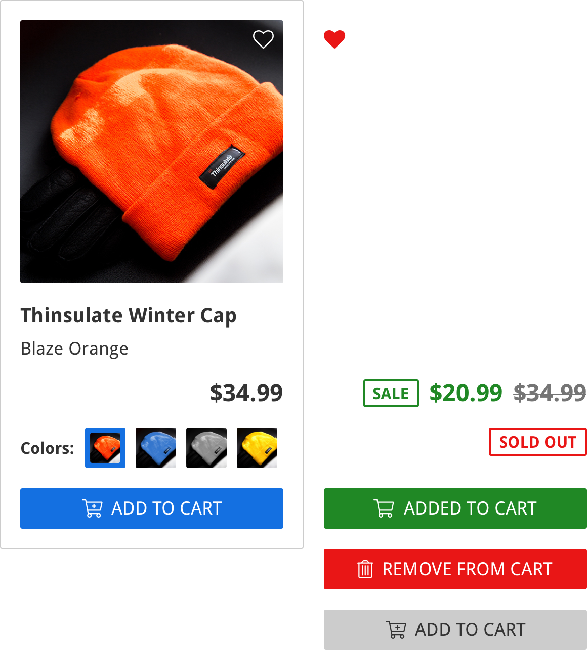
30 | 31 | This is what the various states of pieces of the component look like across a 32 | row of listings: 33 | 34 | ![A row of ecommerce listing components, with different states visible in respective listing components](https://raw.githubusercontent.com/geoffdavis92/weekly-ui/master/assets/ecommerce-listing/ecommerce-listing-design%402x.png) 
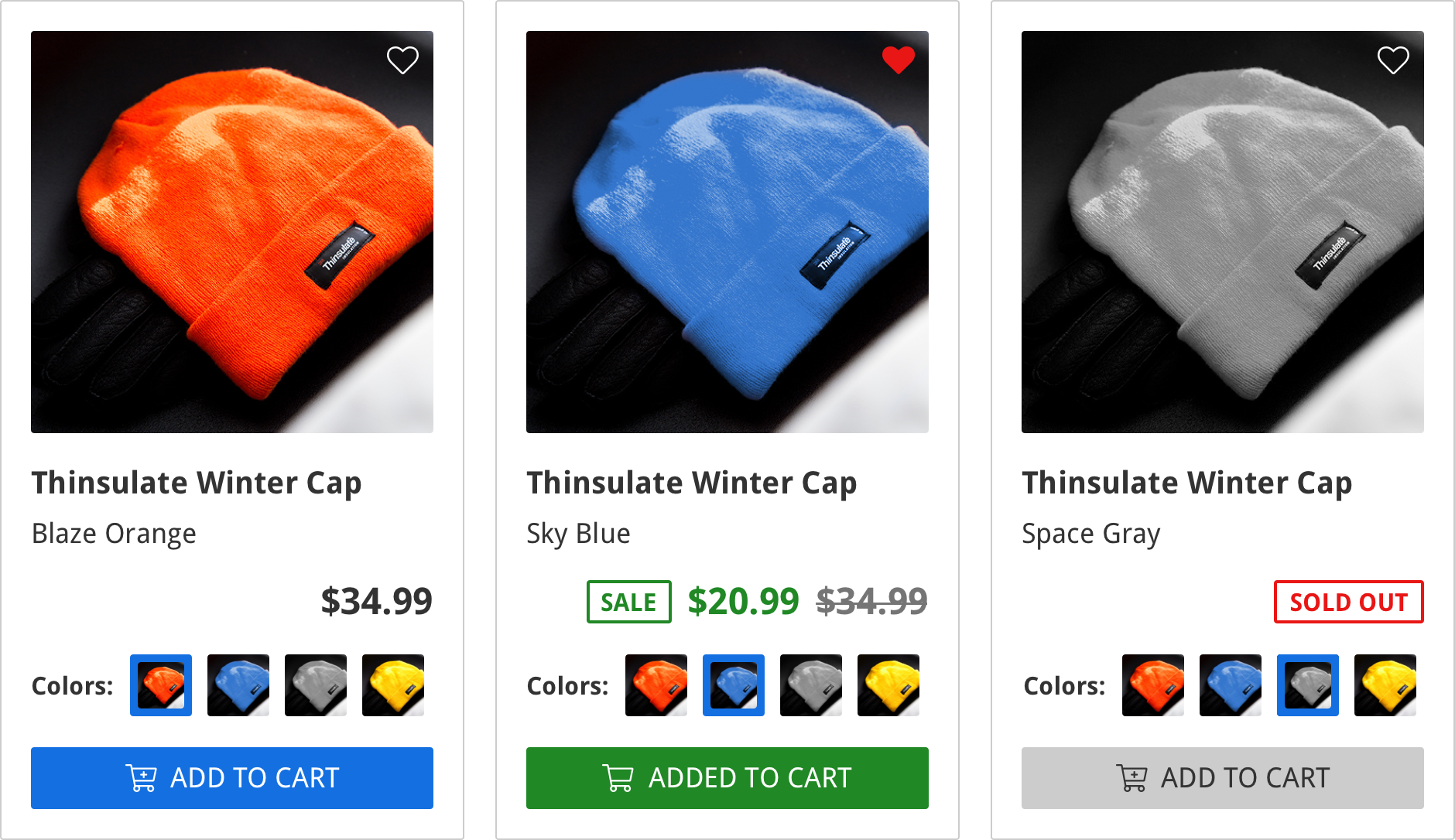
35 | 36 | ## Now it is your turn 37 | 38 | Hop on those design programs (or get out that pen and paper pad) and design your 39 | own **ecommerce listing**! Below is a calendar of what features I will be 40 | implementing on which day, as well as a few resources that may help you. 41 | 42 | Also, please add your repos and/or images of your designs in the comments for 43 | inspiration! I would love to see what designs you all create. 44 | 45 | Happy designing! 🎉 46 | 47 | ### Week 1 Calendar 48 | 49 | 1. Design component 🎯 50 | 2. Display product name, price, and image 51 | 3. Add to cart button, favorite button 52 | 4. Sale price display, sold out states 53 | 5. Color variant thumbnail buttons 54 | 6. 100% a11y score 55 | 7. Tweaks, refactors, fixes 56 | 57 | ### Resources 58 | 59 | * [Best Practices for Cards](https://uxplanet.org/best-practices-for-cards-fa45e3ad94dd) 60 | (since my design, and some ecommerce platforms, utilize the "card" type of 61 | design for listings) 62 | * [Best Practices for Buttons](https://uxplanet.org/button-ux-design-best-practices-types-and-states-647cf4ae0fc6) 63 | * [7 Rules for Creating Gorgeous UI](https://medium.com/@erikdkennedy/7-rules-for-creating-gorgeous-ui-part-1-559d4e805cda) 64 | * [a11y Project](https://a11yproject.com/) (_great_ resources for creating 65 | accessible web sites/apps) 66 | * [Writing CSS with Accessibility in Mind](https://medium.com/@matuzo/writing-css-with-accessibility-in-mind-8514a0007939) 67 | -------------------------------------------------------------------------------- /src/01-ecommerce-listing/day-2/index.jsx: -------------------------------------------------------------------------------- 1 | import React from "react"; 2 | import styled from "styled-components"; 3 | 4 | const EcommerceListing = styled.article` 5 | border: 1px solid #eee; 6 | border-radius: 2px; 7 | display: inline-block; 8 | font-family: "Droid Sans", "Roboto", sans-serif; 9 | font-size: 20px; 10 | padding: 1em; 11 | max-width: 300px; 12 | `; 13 | 14 | const ListingImage = styled.figure` 15 | margin: 0 auto 1em; 16 | img { 17 | border-radius: 2px; 18 | display: block; 19 | max-width: 100%; 20 | } 21 | `; 22 | 23 | const ListingTitle = styled.h3` 24 | font-size: 1.2em; 25 | margin: 0 auto 0.5em; 26 | `; 27 | 28 | const ListingSubtitle = styled.h4` 29 | font-weight: 400; 30 | margin: 0 auto 1em; 31 | `; 32 | 33 | const ListingPrice = styled.h5` 34 | font-size: 1.2em; 35 | margin: auto; 36 | text-align: right; 37 | `; 38 | 39 | export default props => ( 40 | 41 | 45 | 46 | 47 | Thinsulate knitted winter cap in blaze orange 51 | 52 |
53 | Thinsulate Winter Cap 54 | Blaze Orange 55 |
56 | $34.99 57 |
58 |
59 | ); 60 | -------------------------------------------------------------------------------- /src/01-ecommerce-listing/day-2/post.md: -------------------------------------------------------------------------------- 1 | --- 2 | cover_image: https://thepracticaldev.s3.amazonaws.com/i/80pa2qepn715k4qdf0gi.jpg 3 | title: "Week 1 Day 2: Display Product Name, Price, and Image" 4 | published: true 5 | description: "Week 1 Day 2 of my Weekly UI challenge: display the essentials!" 6 | tags: ui,weeklyui,react 7 | --- 8 | 9 | Welcome to Week 1, Day 2 of my Weekly UI challenge! As I stated in the 10 | [announcement post](https://dev.to/geoff/announcing-weekly-ui-challenge-h87), 11 | week 1 will focus on an **ecommerce listing** UI component; each day throughout 12 | this following week, I will pick one or two (usually related) subelements of the 13 | design to implement. For day two, our goal is to… 14 | 15 | ## Display product name, price, and image 16 | 17 | Now that we have our design ready to go, it is time to start implementing some 18 | features. A good starting point for any kind of ecommerce component is to 19 | display the bare essentials of what customers need to know to purchase a 20 | product: the name of the product, the price, and perhaps a photo or graphic 21 | relating to the product. 22 | 23 | I am basing _my_ component around a 24 | [photograph of a hat](https://unsplash.com/photos/GsKf0FXVj3Y) I found on 25 | Unsplash; it was a great shot, FREE, (and 26 | [permissively licensed](https://unsplash.com/license)) so I decided to use it 27 | for my product. The **Thinsulate Winter cap** is the perfect low-price 28 | beanie/toboggan/[insert regional winter knitted hat name here] for _you_, and 29 | now my job is to get it listed on an ecommerce platform so folks can actually 30 | buy the piece. 31 | 32 | Following the original design I created, this is what I've got for **Day 2**: 33 | 34 | ![ecommerce listing showing orange knitted winter hat, the name of item "Thinsulate Winter Cap", and the $34.99 price](https://raw.githubusercontent.com/geoffdavis92/weekly-ui-assets/master/ecommerce-listing/day2/w1d2-final.png) 35 | 36 | I went with a classic "card" style design for the container element, giving 37 | ample whitespace padding around the inner contents; it's got a subtle **2px** 38 | `border-radius` to soften the edges, but not enough to make it seem "kiddy" or 39 | malformed. If you look closely, you will see I added the same radius to the 40 | product image, so as to make the two elements look unified. 41 | 42 | I decided to use a base `font-size` of **20px**, which is a 43 | [recommended font size for body copy](https://blog.usejournal.com/your-body-text-is-too-small-5e02d36dc902) 44 | for readability and visual impact. (read that article, it's got some other great 45 | points) For my `font-family`, I am using **Droid Sans** for the preferred 46 | typeface, with **Roboto** and the system sans-serif typefaces as fallbacks. 47 | 48 | Both the product title and subtitle use semantic heading tags: `h4` and `h5` 49 | respectively; this is good for SEO and a11y ratings, but may not be necessary, 50 | as properly contrasted font sizes and weights could do the trick. The title and 51 | price elements are slightly bigger than the base size to convey importance, and 52 | they also leverage a higher `font-weight` for the same reason, and to aid in 53 | readability whilst scanning. 54 | 55 | You can check out my coded implementation 56 | [on my Github pages site for this project](https://geoffdavis92.github.io/weekly-ui/). 57 | 58 | ## Now it's your turn 59 | 60 | I used [React.js](https://reactjs.org) and [Storybook](http://storybook.js.org) 61 | to develop my implementation, but you can use whatever technology stack you 62 | would like! (hint: if you use [Vue.js](https://vuejs.org/) or 63 | [Angular.js](https://angularjs.org), you can still use 64 | [Storybook for those libraries](https://storybook.js.org/basics/slow-start-guide/)) 65 | 66 | You don't even have to use a view library if you don't want to; HTML and 67 | CSS-only (and non-view JavaScript library) components are more than possible, 68 | especially for this step. 69 | 70 | Also, please add your repos and/or images of your designs in the comments for 71 | inspiration! I would love to see what designs you all create. 72 | 73 | Happy coding! 🎉 74 | 75 | ### Week 1 Calendar 76 | 77 | 1. Design component ✅ 78 | 2. Display product name, price, and image 🎯 79 | 3. Add to cart button, favorite button 80 | 4. Sale price display, sold out states 81 | 5. Color variant thumbnail buttons 82 | 6. 100% a11y score 83 | 7. Tweaks, refactors, fixes 84 | 85 | ### Resources 86 | 87 | * [How To Use H1-H6 HTML Elements Properly](https://www.hobo-web.co.uk/headers/) 88 | * [Your Body Text is Too Small](https://blog.usejournal.com/your-body-text-is-too-small-5e02d36dc902) 89 | * [Storybook](https://storybook.js.org) - JavaScript view library development 90 | environment 91 | * [Unsplash](https://unsplash.com) - Free and unlicensed high-quality images 92 | -------------------------------------------------------------------------------- /src/01-ecommerce-listing/day-3/index.jsx: -------------------------------------------------------------------------------- 1 | import React from "react"; 2 | import styled from "styled-components"; 3 | import { faHeart } from "@fortawesome/fontawesome-free-regular"; 4 | import { 5 | faCartArrowDown, 6 | faCartPlus, 7 | faHeart as faHeartSolid, 8 | faTrashAlt 9 | } from "@fortawesome/fontawesome-free-solid"; 10 | import FA from "@fortawesome/react-fontawesome"; 11 | import { THEME } from "EcommerceListing/util"; 12 | 13 | const ListingContainer = styled.article` 14 | border: 1px solid #eee; 15 | border-radius: 2px; 16 | display: inline-block; 17 | font-family: ${THEME.fontFamily}; 18 | font-size: 20px; 19 | padding: 1em; 20 | max-width: 300px; 21 | `; 22 | 23 | const ListingImage = styled.figure` 24 | margin: 0 auto 1em; 25 | position: relative; 26 | img { 27 | border-radius: 2px; 28 | display: block; 29 | max-width: 100%; 30 | } 31 | `; 32 | 33 | const ListingTitle = styled.h3` 34 | font-size: 1.2em; 35 | margin: 0 auto 0.5em; 36 | `; 37 | 38 | const ListingSubtitle = styled.h4` 39 | font-weight: 400; 40 | margin: 0 auto 1em; 41 | `; 42 | 43 | const ListingPrice = styled.h5` 44 | font-size: 1.2em; 45 | margin: 0 auto 0.85em; 46 | text-align: right; 47 | `; 48 | 49 | const FavButton = styled.button` 50 | background: transparent; 51 | border: none; 52 | color: ${props => (props.isFavorite ? THEME.red : "#fff")}; 53 | cursor: pointer; 54 | font-size: 1.2em; 55 | line-height: 1; 56 | padding: 0; 57 | position: absolute; 58 | top: 0.5em; 59 | right: 0.5em; 60 | `; 61 | 62 | const CartButton = styled.button` 63 | background-color: ${props => 64 | !props.showAddedToCart && props.inCart && props.hover 65 | ? THEME.red 66 | : props.inCart 67 | ? THEME.green 68 | : THEME.blue}; 69 | border: none; 70 | border-radius: 2px; 71 | color: #fff; 72 | cursor: ${props => 73 | props.hover && props.showAddedToCart ? "default" : "pointer"}; 74 | display: block; 75 | font-family: ${THEME.fontFamily}; 76 | font-size: 0.9em; 77 | padding: 0.5em; 78 | width: 100%; 79 | `; 80 | 81 | class ListingCartButton extends React.Component { 82 | state = { hover: false }; 83 | _toggleHoverState = e => { 84 | this.setState(prevState => ({ 85 | hover: !prevState.hover, 86 | showAddedToCart: false 87 | })); 88 | }; 89 | render() { 90 | const { inCart, onClick } = this.props; 91 | const { hover, showAddedToCart } = this.state; 92 | const ButtonContent = 93 | inCart && showAddedToCart ? ( 94 | 95 | ADDED TO CART 96 | 97 | ) : inCart && hover ? ( 98 | 99 | REMOVE FROM CART 100 | 101 | ) : !inCart ? ( 102 | 103 | ADD TO CART 104 | 105 | ) : ( 106 | 107 | ADDED TO CART 108 | 109 | ); 110 | return ( 111 | { 114 | hover && 115 | !showAddedToCart && 116 | this.setState( 117 | prevState => ({ 118 | showAddedToCart: inCart ? false : true 119 | }), 120 | () => onClick() 121 | ); 122 | }} 123 | {...{ inCart, showAddedToCart }} 124 | onMouseEnter={this._toggleHoverState} 125 | onMouseLeave={this._toggleHoverState} 126 | > 127 | {ButtonContent} 128 | 129 | ); 130 | } 131 | } 132 | 133 | export default class EcommerceListing extends React.Component { 134 | state = { inCart: false, isFavorite: false }; 135 | _toggleFavorite = () => { 136 | this.setState(prevState => ({ 137 | isFavorite: !prevState.isFavorite 138 | })); 139 | }; 140 | _toggleInCart = () => { 141 | this.setState(prevState => ({ 142 | inCart: !prevState.inCart 143 | })); 144 | }; 145 | render() { 146 | return ( 147 | 148 | 152 | 153 | 154 | 158 | 159 | 160 | Thinsulate knitted winter cap in blaze orange 164 | 165 |
166 | Thinsulate Winter Cap 167 | Blaze Orange 168 |
169 | $34.99 170 |
171 | 175 |
176 |
177 |
178 | ); 179 | } 180 | } 181 | -------------------------------------------------------------------------------- /src/01-ecommerce-listing/day-3/post.md: -------------------------------------------------------------------------------- 1 | --- 2 | cover_image: https://thepracticaldev.s3.amazonaws.com/i/fcezbhi5pdhaw0iybyep.jpg 3 | title: "Week 1 Day 3: Add to Cart, Favorite Buttons" 4 | published: false 5 | description: "Week 1 Day 3 of my Weekly UI challenge: buttons!" 6 | tags: ui,weeklyui,react 7 | --- 8 | 9 | Welcome to Week 1, Day 3 of my Weekly UI challenge! As I stated in the [announcement post](https://dev.to/geoff/announcing-weekly-ui-challenge-h87), week 1 will focus on an **ecommerce listing** UI component; each day throughout this following week, I will pick one or two (usually related) subelements of the design to implement. For day three, our goal is to… 10 | 11 | ## Add to Cart, Favorite Buttons 12 | 13 | My listing has the all essentials: title, price, photo, that's it right? All finished? Nope… 14 | 15 | I forgot to make it available for purchase, a pretty imporant step unless you are operating a window shopping ecommerce platform! 16 | 17 | Following the original design I created, this is what I've got for **Day 3**: 18 | 19 | ![ecommerce listing showing orange knitted winter hat, the name of item "Thinsulate Winter Cap", and the $34.99 price, and a "add to cart" button in blue, on the bottom](https://raw.githubusercontent.com/geoffdavis92/weekly-ui-assets/master/ecommerce-listing/day3/w1d3-final.png) 20 | 21 | Like the title and price of the product, a way to purchase a product or add it to your basket/cart should be prominently displayed on an ecommerce listing. I chose to implement this using a block-level button, or a button that is 100% width, and/or utilizes `display: block`. This **Cart button** uses the "[Bootstrap](https://getbootstrap.com)" color scheme; this is essentially: **blue** for information or primary button state (e.g. a CTA), **green** for success state (e.g. "the thing was done"), and **red** for danger state (e.g. "be careful considering this option"). 22 | 23 | The **Favorite button** in the top-right of the product image would be helpful if your ecommerce app had some sort of wishlist or "save for later" feature. Both the Favorite and Cart buttons use [Fontawesome Icons](https://fontawesome.com/icons) and color to better convey the message of the button and/or its state, even if one may not understand the label. 24 | 25 | Here's a GIF with the different states of both the Cart button and the Favorite button: 26 | 27 | ![ecommerce listing animated GIF showing different states of the "Add to Cart" button and "favorite" button](https://media.giphy.com/media/1wXbgS8b4A4ObXbZ4P/giphy.gif) 28 | 29 | You can check out my coded implementation [on my Github pages site for this project](https://geoffdavis92.github.io/weekly-ui/). 30 | 31 | ## Now it's your turn 32 | 33 | I used [React.js](https://reactjs.org) and [Storybook](http://storybook.js.org) to develop my implementation, but you can use whatever technology stack you would like! (hint: if you use [Vue.js](https://vuejs.org/) or [Angular.js](https://angularjs.org), you can still use [Storybook for those libraries](https://storybook.js.org/basics/slow-start-guide/)) 34 | 35 | You don't even have to use a view library if you don't want to; HTML and CSS-only (and non-view JavaScript library) components are more than possible, especially for this step. 36 | 37 | Also, please add your repos and/or images of your designs in the comments for inspiration! I would love to see what designs you all create. 38 | 39 | Happy coding! 🎉 40 | 41 | ### Week 1 Calendar 42 | 43 | 1. Design component ✅ 44 | 2. Display product name, price, and image ✅ 45 | 3. Add to cart button, favorite button 🎯 46 | 4. Sale price display, sold out states 47 | 5. Color variant thumbnail buttons 48 | 6. 100% a11y score 49 | 7. Tweaks, refactors, fixes 50 | 51 | ### Resources 52 | 53 | * [Fontawesome Icons](https://fontawesome.com) - Free and Pro (paid) icons 54 | * [Learnstorybook.com](https://dev.to/chroma/introducing-learnstorybookcom-1k6d) - Learn Storybook using a FREE UI tutorial from the folks at [Chroma](http://chromaticqa.com) 55 | * [Button UX Design: Best Practices, Types and States](https://uxplanet.org/button-ux-design-best-practices-types-and-states-647cf4ae0fc6) 56 | -------------------------------------------------------------------------------- /src/01-ecommerce-listing/day-4/index.jsx: -------------------------------------------------------------------------------- 1 | import React from "react"; 2 | import styled from "styled-components"; 3 | import { faHeart } from "@fortawesome/fontawesome-free-regular"; 4 | import { 5 | faCartArrowDown, 6 | faCartPlus, 7 | faHeart as faHeartSolid, 8 | faTrashAlt 9 | } from "@fortawesome/fontawesome-free-solid"; 10 | import FA from "@fortawesome/react-fontawesome"; 11 | import { THEME } from "EcommerceListing/util"; 12 | 13 | const ListingContainer = styled.article` 14 | border: 1px solid #eee; 15 | border-radius: 2px; 16 | display: inline-block; 17 | font-family: ${THEME.fontFamily}; 18 | font-size: 20px; 19 | margin: 0.5em; 20 | padding: 1em; 21 | max-width: 300px; 22 | `; 23 | 24 | const ListingImage = styled.figure` 25 | margin: 0 auto 1em; 26 | position: relative; 27 | img { 28 | border-radius: 2px; 29 | display: block; 30 | max-width: 100%; 31 | } 32 | `; 33 | 34 | const ListingTitle = styled.h3` 35 | font-size: 1.2em; 36 | margin: 0 auto 0.5em; 37 | `; 38 | 39 | const ListingSubtitle = styled.h4` 40 | font-weight: 400; 41 | margin: 0 auto 1em; 42 | `; 43 | 44 | const PriceDisplay = styled.h5` 45 | font-size: 1.2em; 46 | line-height: 1; 47 | margin: 0 auto 0.85em; 48 | text-align: right; 49 | vertical-align: middle; 50 | `; 51 | 52 | const FavButton = styled.button` 53 | background: transparent; 54 | border: none; 55 | color: ${props => (props.isFavorite ? THEME.red : "#fff")}; 56 | cursor: pointer; 57 | font-size: 1.2em; 58 | line-height: 1; 59 | padding: 0; 60 | position: absolute; 61 | top: 0.5em; 62 | right: 0.5em; 63 | `; 64 | 65 | const CartButton = styled.button` 66 | background-color: ${props => 67 | props.disabled 68 | ? THEME.gray 69 | : !props.showAddedToCart && props.inCart && props.hover 70 | ? THEME.red 71 | : props.inCart 72 | ? THEME.green 73 | : THEME.blue}; 74 | border: none; 75 | border-radius: 2px; 76 | color: ${props => (props.disabled ? THEME.grayDark : "#fff")}; 77 | cursor: ${props => 78 | props.disabled 79 | ? "not-allowed" 80 | : props.hover && props.showAddedToCart 81 | ? "default" 82 | : "pointer"}; 83 | display: block; 84 | font-family: ${THEME.fontFamily}; 85 | font-size: 0.9em; 86 | padding: 0.5em; 87 | width: 100%; 88 | `; 89 | 90 | const Badge = styled.span` 91 | border: 2px solid 92 | ${props => (props.soldOut ? THEME.red : props.sale ? THEME.green : "none")}; 93 | border-radius: 2px; 94 | color: ${props => 95 | props.soldOut ? THEME.red : props.sale ? THEME.green : "inherit"}; 96 | display: inline-block; 97 | font-size: 0.75em; 98 | line-height: 1; 99 | padding: 0.33em 0.5em; 100 | vertical-align: top; 101 | `; 102 | 103 | const Sale = styled.span` 104 | color: ${THEME.green}; 105 | display: inline-block; 106 | margin: 0 0.5em; 107 | vertical-align: sub; 108 | `; 109 | 110 | const Strikethrough = styled.span` 111 | color: ${THEME.grayDark}; 112 | text-decoration: line-through; 113 | vertical-align: sub; 114 | `; 115 | 116 | const ListingPrice = ({ children, sale, soldOut }) => { 117 | const Price = soldOut ? ( 118 | SOLD OUT 119 | ) : sale ? ( 120 | 121 | SALE 122 | {sale} 123 | {children} 124 | 125 | ) : ( 126 | children 127 | ); 128 | return {Price}; 129 | }; 130 | 131 | class ListingCartButton extends React.Component { 132 | state = { hover: false }; 133 | _toggleHoverState = e => { 134 | this.setState(prevState => ({ 135 | hover: !prevState.hover, 136 | showAddedToCart: false 137 | })); 138 | }; 139 | render() { 140 | const { disabled, inCart, onClick } = this.props; 141 | const { hover, showAddedToCart } = this.state; 142 | const ButtonContent = 143 | inCart && showAddedToCart ? ( 144 | 145 | ADDED TO CART 146 | 147 | ) : inCart && hover ? ( 148 | 149 | REMOVE FROM CART 150 | 151 | ) : !inCart ? ( 152 | 153 | ADD TO CART 154 | 155 | ) : ( 156 | 157 | ADDED TO CART 158 | 159 | ); 160 | return ( 161 | { 164 | hover && 165 | !showAddedToCart && 166 | this.setState( 167 | prevState => ({ 168 | showAddedToCart: inCart ? false : true 169 | }), 170 | () => onClick() 171 | ); 172 | }} 173 | {...{ disabled, inCart, showAddedToCart }} 174 | onMouseEnter={() => (!disabled ? this._toggleHoverState() : null)} 175 | onMouseLeave={() => (!disabled ? this._toggleHoverState() : null)} 176 | > 177 | {ButtonContent} 178 | 179 | ); 180 | } 181 | } 182 | 183 | export default class EcommerceListing extends React.Component { 184 | state = { inCart: false, isFavorite: false }; 185 | _toggleFavorite = () => { 186 | this.setState(prevState => ({ 187 | isFavorite: !prevState.isFavorite 188 | })); 189 | }; 190 | _toggleInCart = () => { 191 | this.setState(prevState => ({ 192 | inCart: !prevState.inCart 193 | })); 194 | }; 195 | render() { 196 | const { sale, soldOut } = this.props; 197 | return ( 198 | 199 | 203 | 204 | 205 | 209 | 210 | 211 | Thinsulate knitted winter cap in blaze orange 215 | 216 |
217 | Thinsulate Winter Cap 218 | Blaze Orange 219 |
220 | $34.99 221 |
222 | 227 |
228 |
229 |
230 | ); 231 | } 232 | } 233 | -------------------------------------------------------------------------------- /src/01-ecommerce-listing/day-4/post.md: -------------------------------------------------------------------------------- 1 | --- 2 | cover_image: https://thepracticaldev.s3.amazonaws.com/i/4emvycmpar0yg27cpau3.jpg 3 | title: "Week 1 Day 4: Sale price display, sold out states" 4 | published: false 5 | description: "Week 1 Day 4 of my Weekly UI challenge: Sales and sell-outs!" 6 | tags: ui,weeklyui,react 7 | --- 8 | 9 | Welcome to Week 1, Day 4 of my Weekly UI challenge! As I stated in the [announcement post](https://dev.to/geoff/announcing-weekly-ui-challenge-h87), week 1 will focus on an **ecommerce listing** UI component; each day throughout this following week, I will pick one or two (usually related) subelements of the design to implement. For day four, our goal is to… 10 | 11 | ## Sale Price Display, Sold Out States 12 | 13 | Sometimes when you are a business owner, you have to generate interest for your items or incentivize customers to purchase a product. With a brick-and-mortar store, perhaps that's a flashy sign or a kitschy local TV ad; with an online store, that could be a banner across the top of the listing, a ribbon decorating an upper corner of a product card, or a **SALE** callout on the listing, which is what I have configured. 14 | 15 | Conversely, it's nice to tell your customers– before they click through to the product page– whether an item is still in stock or not. To aid my users in their search for products they can actually buy, I've added a **SOLD OUT** callout in place of a price. 16 | 17 | Following the original design I created, this is what I've got for **Day 4**: 18 | 19 | 20 | ![ecommerce listing showing orange knitted winter hat, the name of item "Thinsulate Winter Cap", and the $20.99 sale price with a crossed out $34.99 price, and an "add to cart" button in blue, on the bottom](https://raw.githubusercontent.com/geoffdavis92/weekly-ui-assets/master/ecommerce-listing/day4/w1d4-final-group.png) 21 | 22 | For the sale price display, I added a green callout, or "badge" as [it's referred to sometimes](https://getbootstrap.com/docs/4.1/components/badge/). I then render the sale price next to it, naturally; to cap off the sale update, I strike-through the original price, so users can *see* their savings! (we're talking about *literally* slashing prices here) 23 | 24 | For the sold out display, I actually use the same badge component with different props to make the border/text color red. No need to display the price for this product, since it is not available for sale; if this was hooked up to a larger ecommerce platform, you could/should still link the component through to the product page, and display the price there, for inquisitive minds and long-term planners. 25 | 26 | Finally, in order to make sure the ecommerce database team doesn't need to go in and scrub some orders and issue apology emails, I need to disable the button and its function. Since this is a semantic `button` element, I can add the `disabled` attribute (or since I'm using React, a "prop") to render the button unclickable; to be safe, I also remove the `onClick` handler as well, and make the button grayscale for visual shoppers. 27 | 28 | You can check out my coded implementation [on my Github pages site for this project](https://geoffdavis92.github.io/weekly-ui/). 29 | 30 | ## Now it's your turn 31 | 32 | I used [React.js](https://reactjs.org) and [Storybook](http://storybook.js.org) to develop my implementation, but you can use whatever technology stack you would like! (hint: if you use [Vue.js](https://vuejs.org/) or [Angular.js](https://angularjs.org), you can still use [Storybook for those libraries](https://storybook.js.org/basics/slow-start-guide/)) 33 | 34 | You don't even have to use a view library if you don't want to; HTML and CSS-only (and non-view JavaScript library) components are more than possible, especially for this step. 35 | 36 | Also, please add your repos and/or images of your designs in the comments for inspiration! I would love to see what designs you all create. 37 | 38 | Happy coding! 🎉 39 | 40 | ### Week 1 Calendar 41 | 42 | 1. Design component ✅ 43 | 2. Display product name, price, and image ✅ 44 | 3. Add to cart button, favorite button ✅ 45 | 4. Sale price display, sold out states 🎯 46 | 5. Color variant thumbnail buttons 47 | 6. 100% a11y score 48 | 7. Tweaks, refactors, fixes 49 | -------------------------------------------------------------------------------- /src/01-ecommerce-listing/day-5/index.jsx: -------------------------------------------------------------------------------- 1 | import React from "react"; 2 | import styled from "styled-components"; 3 | import { faHeart } from "@fortawesome/fontawesome-free-regular"; 4 | import { 5 | faCartArrowDown, 6 | faCartPlus, 7 | faHeart as faHeartSolid, 8 | faTrashAlt 9 | } from "@fortawesome/fontawesome-free-solid"; 10 | import FA from "@fortawesome/react-fontawesome"; 11 | import { THEME } from "EcommerceListing/util"; 12 | 13 | const ListingContainer = styled.article` 14 | border: 1px solid #eee; 15 | border-radius: 2px; 16 | display: inline-block; 17 | font-family: ${THEME.fontFamily}; 18 | font-size: 20px; 19 | margin: 0.5em; 20 | padding: 1em; 21 | max-width: 300px; 22 | `; 23 | 24 | const ListingImage = styled.figure` 25 | margin: 0 auto 1em; 26 | position: relative; 27 | img { 28 | border-radius: 2px; 29 | display: block; 30 | max-width: 100%; 31 | } 32 | `; 33 | 34 | const ListingTitle = styled.h3` 35 | font-size: 1.2em; 36 | margin: 0 auto 0.5em; 37 | `; 38 | 39 | const ListingSubtitle = styled.h4` 40 | font-weight: 400; 41 | margin: 0 auto 1em; 42 | text-transform: capitalize; 43 | `; 44 | 45 | const PriceDisplay = styled.h5` 46 | font-size: 1.2em; 47 | line-height: 1; 48 | margin: 0 auto 0.85em; 49 | text-align: right; 50 | vertical-align: middle; 51 | `; 52 | 53 | const FavButton = styled.button` 54 | background: transparent; 55 | border: none; 56 | color: ${props => (props.isFavorite ? THEME.red : "#fff")}; 57 | cursor: pointer; 58 | font-size: 1.2em; 59 | line-height: 1; 60 | padding: 0; 61 | position: absolute; 62 | top: 0.5em; 63 | right: 0.5em; 64 | `; 65 | 66 | const CartButton = styled.button` 67 | background-color: ${props => 68 | props.disabled 69 | ? THEME.gray 70 | : !props.showAddedToCart && props.inCart && props.hover 71 | ? THEME.red 72 | : props.inCart 73 | ? THEME.green 74 | : THEME.blue}; 75 | border: none; 76 | border-radius: 2px; 77 | color: ${props => (props.disabled ? THEME.grayDark : "#fff")}; 78 | cursor: ${props => 79 | props.disabled 80 | ? "not-allowed" 81 | : props.hover && props.showAddedToCart 82 | ? "default" 83 | : "pointer"}; 84 | display: block; 85 | font-family: ${THEME.fontFamily}; 86 | font-size: 0.9em; 87 | padding: 0.5em; 88 | width: 100%; 89 | `; 90 | 91 | const Badge = styled.span` 92 | border: 2px solid 93 | ${props => (props.soldOut ? THEME.red : props.sale ? THEME.green : "none")}; 94 | border-radius: 2px; 95 | color: ${props => 96 | props.soldOut ? THEME.red : props.sale ? THEME.green : "inherit"}; 97 | display: inline-block; 98 | font-size: 0.75em; 99 | line-height: 1; 100 | padding: 0.33em 0.5em; 101 | vertical-align: top; 102 | `; 103 | 104 | const Sale = styled.span` 105 | color: ${THEME.green}; 106 | display: inline-block; 107 | margin: 0 0.5em; 108 | vertical-align: sub; 109 | `; 110 | 111 | const Strikethrough = styled.span` 112 | color: ${THEME.grayDark}; 113 | text-decoration: line-through; 114 | vertical-align: sub; 115 | `; 116 | 117 | const ListingPrice = ({ children, sale, soldOut }) => { 118 | const Price = soldOut ? ( 119 | SOLD OUT 120 | ) : sale ? ( 121 | 122 | SALE 123 | {sale} 124 | {children} 125 | 126 | ) : ( 127 | children 128 | ); 129 | return {Price}; 130 | }; 131 | 132 | const VariantWrapper = styled.span` 133 | display: block; 134 | margin: 1em 0; 135 | `; 136 | 137 | const VariantInlineBlock = styled.span` 138 | display: inline-block; 139 | vertical-align: middle; 140 | `; 141 | 142 | const VariantGrid = styled.span` 143 | display: flex; 144 | @supports (display: grid) { 145 | display: grid; 146 | grid-template-columns: repeat(4, 40px); 147 | grid-column-gap: 0.5em; 148 | grid-row-gap: 0.5em; 149 | } 150 | `; 151 | 152 | const VariantImage = styled.span` 153 | cursor: ${props => (props.disableSelection ? "not-allowed" : "default")}; 154 | display: inline-block; 155 | width: 2em; 156 | img { 157 | border: ${props => (props.selected ? `.25em solid ${THEME.blue}` : "none")}; 158 | border-radius: 2px; 159 | display: block; 160 | opacity: ${props => (props.selected ? 1 : 0.5)}; 161 | max-width: ${props => (props.selected ? `calc(100% - .5em)` : "100%")}; 162 | } 163 | `; 164 | 165 | const ListingVariants = ({ 166 | children, 167 | onClick, 168 | disableSelection, 169 | selectedVariant 170 | }) => { 171 | return ( 172 | 173 | Colors:  174 | 175 | 176 | {React.Children.map(children, (child, index) => ( 177 | 181 | !disableSelection ? onClick({ index, imgsrc: child }) : null 182 | } 183 | {...{ disableSelection }} 184 | > 185 | 186 | 187 | ))} 188 | 189 | 190 | 191 | ); 192 | }; 193 | 194 | class ListingCartButton extends React.Component { 195 | state = { hover: false }; 196 | _toggleHoverState = e => { 197 | this.setState(prevState => ({ 198 | hover: !prevState.hover, 199 | showAddedToCart: false 200 | })); 201 | }; 202 | render() { 203 | const { disabled, inCart, onClick } = this.props; 204 | const { hover, showAddedToCart } = this.state; 205 | const ButtonContent = 206 | inCart && showAddedToCart ? ( 207 | 208 | ADDED TO CART 209 | 210 | ) : inCart && hover ? ( 211 | 212 | REMOVE FROM CART 213 | 214 | ) : !inCart ? ( 215 | 216 | ADD TO CART 217 | 218 | ) : ( 219 | 220 | ADDED TO CART 221 | 222 | ); 223 | return ( 224 | { 227 | hover && 228 | !showAddedToCart && 229 | this.setState( 230 | prevState => ({ 231 | showAddedToCart: inCart ? false : true 232 | }), 233 | () => onClick() 234 | ); 235 | }} 236 | {...{ disabled, inCart, showAddedToCart }} 237 | onMouseEnter={() => (!disabled ? this._toggleHoverState() : null)} 238 | onMouseLeave={() => (!disabled ? this._toggleHoverState() : null)} 239 | > 240 | {ButtonContent} 241 | 242 | ); 243 | } 244 | } 245 | 246 | export default class EcommerceListing extends React.Component { 247 | state = { 248 | listingImageSrc: 249 | "https://raw.githubusercontent.com/geoffdavis92/weekly-ui/master/assets/ecommerce-listing/thinsulate-hat-orange.jpg", 250 | inCart: false, 251 | isFavorite: false, 252 | selectedVariant: 0 253 | }; 254 | _selectVariant = ({ index, imgsrc }) => { 255 | this.setState(prevState => ({ 256 | listingImageSrc: imgsrc, 257 | selectedVariant: index 258 | })); 259 | }; 260 | _toggleFavorite = () => { 261 | this.setState(prevState => ({ 262 | isFavorite: !prevState.isFavorite 263 | })); 264 | }; 265 | _toggleInCart = () => { 266 | this.setState(prevState => ({ 267 | inCart: !prevState.inCart 268 | })); 269 | }; 270 | render() { 271 | const { sale, soldOut } = this.props; 272 | const pattern = /.+\-([a-z]+)+.[a-z]+$/; 273 | const [_, productColor] = pattern.exec(this.state.listingImageSrc); 274 | return ( 275 | 276 | 280 | 281 | 282 | 286 | 287 | 288 | {`Thinsulate 292 | 293 |
294 | Thinsulate Winter Cap 295 | {productColor} 296 |
297 | $34.99 298 | 303 | {[ 304 | "https://raw.githubusercontent.com/geoffdavis92/weekly-ui/master/assets/ecommerce-listing/thinsulate-hat-orange.jpg", 305 | "https://raw.githubusercontent.com/geoffdavis92/weekly-ui/master/assets/ecommerce-listing/thinsulate-hat-blue.jpg", 306 | "https://raw.githubusercontent.com/geoffdavis92/weekly-ui/master/assets/ecommerce-listing/thinsulate-hat-gray.jpg", 307 | "https://raw.githubusercontent.com/geoffdavis92/weekly-ui/master/assets/ecommerce-listing/thinsulate-hat-yellow.jpg" 308 | ]} 309 | 310 |
311 | 316 |
317 |
318 |
319 | ); 320 | } 321 | } 322 | -------------------------------------------------------------------------------- /src/01-ecommerce-listing/day-5/post.md: -------------------------------------------------------------------------------- 1 | --- 2 | cover_image: https://thepracticaldev.s3.amazonaws.com/i/dyf1j6lzemg3aa4fwwp6.jpg 3 | title: "Week 1 Day 5: Color Variant Thumbnail Buttons" 4 | published: true 5 | description: "Week 1 Day 5 of my Weekly UI challenge: Variety is the spice of life" 6 | tags: ui,weeklyui,react 7 | --- 8 | 9 | Welcome to Week 1, Day 5 of my Weekly UI challenge! As I stated in the [announcement post](https://dev.to/geoff/announcing-weekly-ui-challenge-h87), week 1 will focus on an **ecommerce listing** UI component; each day throughout this following week, I will pick one or two (usually related) subelements of the design to implement. For day five, our goal is to… 10 | 11 | ## Color Variant Thumbnail Buttons 12 | 13 | They say that "the world is not black and white", which is definitely true; so why should our ecommerce products be restricted to just one color? Today we're going to add a small list of variants of the original product; such a component can be seen on such online shops as [J.Crew](https://www.jcrew.com/c/mens_category/teesfleece) (hover over a product) and [Madewell](https://www.madewell.com/madewell_category/SHOESANDBOOTS.jsp). This is yet another element that is not only nice to have for your users, but also can be crucial in showing all product options and availability to increase conversions. 14 | 15 | Following the original design I created, this is what I've got for **Day 5**: 16 | 17 | 18 | ![ecommerce listing showing orange knitted winter hat, the name of item "Thinsulate Winter Cap", and the $20.99 sale price with a crossed out $34.99 price, and an "add to cart" button in blue, on the bottom](https://raw.githubusercontent.com/geoffdavis92/weekly-ui-assets/master/ecommerce-listing/day5/w1d5-final.png) 19 | 20 | I positioned this list of variants below the product name and price– but above the cart button– because it's more of a secondary feature to those text elements and should come before the actionable UI item that would presumably take a user off the page (the cart button). 21 | 22 | To highlight the currently selected variant, I place a border around the thumbnail image and fade out the unselected options. Lastly, once an item is in the cart, the variant is locked in, with an appropriate cursor around the variant selector to indicate as such. 23 | 24 | Here's a GIF of the variant selector in action: 25 | 26 | ![Ecommerce listing GIF animation showing the different states of the variant selector, as it loops through various colors of the hat product](https://raw.githubusercontent.com/geoffdavis92/weekly-ui-assets/master/ecommerce-listing/day5/w1d5-variant-demo-ld.gif) 27 | 28 | You can check out my coded implementation [on my Github pages site for this project](https://geoffdavis92.github.io/weekly-ui/). 29 | 30 | ## Now it's your turn 31 | 32 | I used [React.js](https://reactjs.org) and [Storybook](http://storybook.js.org) to develop my implementation, but you can use whatever technology stack you would like! (hint: if you use [Vue.js](https://vuejs.org/) or [Angular.js](https://angularjs.org), you can still use [Storybook for those libraries](https://storybook.js.org/basics/slow-start-guide/)) 33 | 34 | You don't even have to use a view library if you don't want to; HTML and CSS-only (and non-view JavaScript library) components are more than possible, especially for this step. 35 | 36 | Also, please add your repos and/or images of your designs in the comments for inspiration! I would love to see what designs you all create. 37 | 38 | Happy coding! 🎉 39 | 40 | ### Week 1 Calendar 41 | 42 | 1. Design component ✅ 43 | 2. Display product name, price, and image ✅ 44 | 3. Add to cart button, favorite button ✅ 45 | 4. Sale price display, sold out states ✅ 46 | 5. Color variant thumbnail buttons 🎯 47 | 6. 100% a11y score 48 | 7. Tweaks, refactors, fixes 49 | -------------------------------------------------------------------------------- /src/01-ecommerce-listing/day-6/index.jsx: -------------------------------------------------------------------------------- 1 | import React from "react"; 2 | import styled from "styled-components"; 3 | import { faHeart } from "@fortawesome/fontawesome-free-regular"; 4 | import { 5 | faCartArrowDown, 6 | faCartPlus, 7 | faHeart as faHeartSolid, 8 | faTrashAlt 9 | } from "@fortawesome/fontawesome-free-solid"; 10 | import FA from "@fortawesome/react-fontawesome"; 11 | import { THEME } from "EcommerceListing/util"; 12 | 13 | const ListingContainer = styled.article` 14 | border: 1px solid #eee; 15 | border-radius: 2px; 16 | display: inline-block; 17 | font-family: ${THEME.fontFamily}; 18 | font-size: 20px; 19 | margin: 0.5em; 20 | padding: 1em; 21 | max-width: 300px; 22 | `; 23 | 24 | const ListingImage = styled.figure.attrs({ role: "group" })` 25 | margin: 0 auto 1em; 26 | position: relative; 27 | img { 28 | border-radius: 2px; 29 | display: block; 30 | max-width: 100%; 31 | } 32 | `; 33 | 34 | const ListingTitle = styled.h3` 35 | font-size: 1.2em; 36 | margin: 0 auto 0.5em; 37 | `; 38 | 39 | const ListingSubtitle = styled.h4` 40 | font-weight: 400; 41 | margin: 0 auto 1em; 42 | text-transform: capitalize; 43 | `; 44 | 45 | const PriceDisplay = styled.h5` 46 | font-size: 1.2em; 47 | height: 1.4em; 48 | line-height: 1; 49 | margin: 0 auto 0.85em; 50 | text-align: right; 51 | vertical-align: middle; 52 | `; 53 | 54 | const FavButton = styled.button` 55 | background: transparent; 56 | border: none; 57 | color: ${props => (props.isFavorite ? THEME.red : "#fff")}; 58 | cursor: pointer; 59 | font-size: 1.2em; 60 | line-height: 1; 61 | padding: 0; 62 | position: absolute; 63 | top: 0.5em; 64 | right: 0.5em; 65 | `; 66 | 67 | const CartButton = styled.button` 68 | background-color: ${props => 69 | props.disabled 70 | ? THEME.gray 71 | : !props.showAddedToCart && props.inCart && props.hover 72 | ? THEME.red 73 | : props.inCart 74 | ? THEME.green 75 | : THEME.blue}; 76 | border: none; 77 | border-radius: 2px; 78 | color: ${props => (props.disabled ? THEME.grayDark : "#fff")}; 79 | cursor: ${props => 80 | props.disabled 81 | ? "not-allowed" 82 | : props.hover && props.showAddedToCart 83 | ? "default" 84 | : "pointer"}; 85 | display: block; 86 | font-family: ${THEME.fontFamily}; 87 | font-size: 0.9em; 88 | padding: 0.5em; 89 | width: 100%; 90 | `; 91 | 92 | const Badge = styled.span` 93 | border: 2px solid 94 | ${props => (props.soldOut ? THEME.red : props.sale ? THEME.green : "none")}; 95 | border-radius: 2px; 96 | color: ${props => 97 | props.soldOut ? THEME.red : props.sale ? THEME.green : "inherit"}; 98 | display: inline-block; 99 | font-size: 0.75em; 100 | line-height: 1; 101 | padding: 0.33em 0.5em; 102 | vertical-align: top; 103 | `; 104 | 105 | const Sale = styled.span` 106 | color: ${THEME.green}; 107 | display: inline-block; 108 | margin: 0 0.5em; 109 | vertical-align: sub; 110 | `; 111 | 112 | const Strikethrough = styled.span` 113 | color: ${THEME.grayDark}; 114 | text-decoration: line-through; 115 | vertical-align: sub; 116 | `; 117 | 118 | const ListingPrice = ({ children, sale, soldOut }) => { 119 | const Price = soldOut ? ( 120 | SOLD OUT 121 | ) : sale ? ( 122 | 123 | SALE 124 | {sale} 125 | {children} 126 | 127 | ) : ( 128 | children 129 | ); 130 | return {Price}; 131 | }; 132 | 133 | const VariantWrapper = styled.span` 134 | display: block; 135 | margin: 1em 0; 136 | `; 137 | 138 | const VariantInlineBlock = styled.span` 139 | display: inline-block; 140 | vertical-align: middle; 141 | `; 142 | 143 | const VariantGrid = styled.span` 144 | display: flex; 145 | @supports (display: grid) { 146 | display: grid; 147 | grid-template-columns: repeat(4, 40px); 148 | grid-column-gap: 0.5em; 149 | grid-row-gap: 0.5em; 150 | } 151 | `; 152 | 153 | const VariantImage = styled.span` 154 | cursor: ${props => (props.disableSelection ? "not-allowed" : "default")}; 155 | display: inline-block; 156 | width: 2em; 157 | img { 158 | border: ${props => (props.selected ? `.25em solid ${THEME.blue}` : "none")}; 159 | border-radius: 2px; 160 | display: block; 161 | opacity: ${props => (props.selected ? 1 : 0.5)}; 162 | max-width: ${props => (props.selected ? `calc(100% - .5em)` : "100%")}; 163 | } 164 | `; 165 | 166 | const getAltTextFromSrc = src => { 167 | const pattern = /.+\-([a-z]+)+.[a-z]+$/; 168 | const [_, productColor] = pattern.exec(src); 169 | return productColor; 170 | }; 171 | 172 | const ListingVariants = ({ 173 | children, 174 | onClick, 175 | disableSelection, 176 | selectedVariant 177 | }) => { 178 | return ( 179 | 180 | Colors:  181 | 182 | 183 | {React.Children.map(children, (child, index) => ( 184 | 188 | !disableSelection ? onClick({ index, imgsrc: child }) : null 189 | } 190 | {...{ disableSelection }} 191 | > 192 | {getAltTextFromSrc(child)} 193 | 194 | ))} 195 | 196 | 197 | 198 | ); 199 | }; 200 | 201 | class ListingCartButton extends React.Component { 202 | state = { hover: false }; 203 | _toggleHoverState = e => { 204 | this.setState(prevState => ({ 205 | hover: !prevState.hover, 206 | showAddedToCart: false 207 | })); 208 | }; 209 | render() { 210 | const { disabled, inCart, onClick } = this.props; 211 | const { hover, showAddedToCart } = this.state; 212 | const ButtonContent = 213 | inCart && showAddedToCart ? ( 214 | 215 | ADDED TO CART 216 | 217 | ) : inCart && hover ? ( 218 | 219 | REMOVE 220 | FROM CART 221 | 222 | ) : !inCart ? ( 223 | 224 | ADD TO CART 225 | 226 | ) : ( 227 | 228 | ADDED TO CART 229 | 230 | ); 231 | return ( 232 | { 236 | hover && 237 | !showAddedToCart && 238 | this.setState( 239 | prevState => ({ 240 | showAddedToCart: inCart ? false : true 241 | }), 242 | () => onClick() 243 | ); 244 | }} 245 | {...{ disabled, inCart, showAddedToCart }} 246 | onMouseEnter={() => (!disabled ? this._toggleHoverState() : null)} 247 | onMouseLeave={() => (!disabled ? this._toggleHoverState() : null)} 248 | > 249 | {ButtonContent} 250 | 251 | ); 252 | } 253 | } 254 | 255 | export default class EcommerceListing extends React.Component { 256 | state = { 257 | listingImageSrc: 258 | "https://raw.githubusercontent.com/geoffdavis92/weekly-ui/master/assets/ecommerce-listing/thinsulate-hat-orange.jpg", 259 | inCart: false, 260 | isFavorite: false, 261 | selectedVariant: 0 262 | }; 263 | _selectVariant = ({ index, imgsrc }) => { 264 | this.setState(prevState => ({ 265 | listingImageSrc: imgsrc, 266 | selectedVariant: index 267 | })); 268 | }; 269 | _toggleFavorite = () => { 270 | this.setState(prevState => ({ 271 | isFavorite: !prevState.isFavorite 272 | })); 273 | }; 274 | _toggleInCart = () => { 275 | this.setState(prevState => ({ 276 | inCart: !prevState.inCart 277 | })); 278 | }; 279 | render() { 280 | const { sale, soldOut } = this.props; 281 | // const pattern = /.+\-([a-z]+)+.[a-z]+$/; 282 | // const [_, productColor] = pattern.exec(this.state.listingImageSrc); 283 | const productColor = getAltTextFromSrc(this.state.listingImageSrc); 284 | return ( 285 | 286 | 290 | 291 | 292 | 298 | 304 | 305 | {`Thinsulate 309 | 310 |
311 | Thinsulate Winter Cap 312 | {productColor} 313 |
314 | $34.99 315 | 320 | {[ 321 | "https://raw.githubusercontent.com/geoffdavis92/weekly-ui/master/assets/ecommerce-listing/thinsulate-hat-orange.jpg", 322 | "https://raw.githubusercontent.com/geoffdavis92/weekly-ui/master/assets/ecommerce-listing/thinsulate-hat-blue.jpg", 323 | "https://raw.githubusercontent.com/geoffdavis92/weekly-ui/master/assets/ecommerce-listing/thinsulate-hat-gray.jpg", 324 | "https://raw.githubusercontent.com/geoffdavis92/weekly-ui/master/assets/ecommerce-listing/thinsulate-hat-yellow.jpg" 325 | ]} 326 | 327 |
328 | 333 |
334 |
335 |
336 | ); 337 | } 338 | } 339 | -------------------------------------------------------------------------------- /src/01-ecommerce-listing/day-6/post.md: -------------------------------------------------------------------------------- 1 | --- 2 | cover_image: https://thepracticaldev.s3.amazonaws.com/i/dyf1j6lzemg3aa4fwwp6.jpg 3 | title: "Week 1 Day 6: Score 100% in an a11y audit" 4 | published: false 5 | description: "Week 1 Day 6 of my Weekly UI challenge: make it accessible" 6 | tags: ui,weeklyui,react,a11y 7 | --- 8 | 9 | Welcome to Week 1, Day 6 of my Weekly UI challenge! As I stated in the [announcement post](https://dev.to/geoff/announcing-weekly-ui-challenge-h87), week 1 will focus on an **ecommerce listing** UI component; each day throughout this following week, I will pick one or two (usually related) subelements of the design to implement. For day six, our goal is to… 10 | 11 | ## Score 100% in an a11y audit 12 | 13 | Accessibility– or a11y, pronounced "ally"– is a very important concept in modern web development. No matter whether you are building web applications or simple static landing pages, making a web page accessible should be on the forefront of every developer and designer's mind. For many, this is an afterthought, but a11y is quickly becoming a [metric in SEO ranking](https://webaim.org/blog/web-accessibility-and-seo/) and vital to the [legal integrity of your web page/app](https://www.adatitleiii.com/2018/01/2017-website-accessibility-lawsuit-recap-a-tough-year-for-businesses/); it is also a good idea and strategy to make it easier for users to actually use your site/app/widget. 14 | 15 | A11y techniques span quite a few domains and disciplines, from HTML attributes and CSS states, to colors used in the design (you may notice that most colors I used in my design have WCAG contrast ratings of at least AA for their relevant domains) and text that no one will interact with unless they use a screen reader. In order to test for a web page's accessibility, there are several tools floating around the web. One such tool is **[a11y.css](https://ffoodd.github.io/a11y.css/)**. 16 | 17 | My design/features have not changed since Day 5, so for **Day 6**, my first image is what my component looks like with a11y.css enabled: 18 | 19 | 20 | ![ecommerce listing showing orange knitted winter hat, the name of item "Thinsulate Winter Cap", and the $20.99 sale price with a crossed out $34.99 price, and an "add to cart" button in blue, on the bottom, with outlines around components showing accessibility ratings](https://raw.githubusercontent.com/geoffdavis92/weekly-ui-assets/master/ecommerce-listing/day6/w1d6-a11ycss.png) 21 | 22 | The above screenshot shows what an erroneous web page looks like when using the a11y.css bookmarklet. a11y.css is an awesome tool that uses CSS targeting to find a11y errors, warnings, and advisable tips in your code, and show you the messages inline. You can even configure the tool to target only certain levels of warnings too. When I start working on improving accessibility, this tool is the first one I use. 23 | 24 | Another tool I use is the [Google Lighthouse accessibility audit](https://developers.google.com/web/tools/lighthouse/), here is what it looks like after successfully adjusting any changes the tool suggests: 25 | 26 | ![Screenshot of ecommerce listings and a developer tools panel showing a 100% accessiblity audit score (you'll just have to take my word for it)](https://raw.githubusercontent.com/geoffdavis92/weekly-ui-assets/master/ecommerce-listing/day6/w1d6-a11y-audit.png) 27 | 28 | This tool will check all the types of things a11y.css does, and then some. It allows a little more control over debugging, as it will list offending elements, and scolling over that list will highlight those elements in the DOM, much like normal devtools do. I also find Lighthouse a *lot* easier to figure out what to fix, since it will also link to explainer pages for each error. 29 | 30 | I've linked several tools and resources for a11y techniques and testing in the footnotes of this post, and I hope you use them and explore ways to help make the web usable for *everyone*! 31 | 32 | You can check out my coded implementation [on my Github pages site for this project](https://geoffdavis92.github.io/weekly-ui/). 33 | 34 | ## Now it's your turn 35 | 36 | I used [React.js](https://reactjs.org) and [Storybook](http://storybook.js.org) to develop my implementation, but you can use whatever technology stack you would like! (hint: if you use [Vue.js](https://vuejs.org/) or [Angular.js](https://angularjs.org), you can still use [Storybook for those libraries](https://storybook.js.org/basics/slow-start-guide/)) 37 | 38 | You don't even have to use a view library if you don't want to; HTML and CSS-only (and non-view JavaScript library) components are more than possible, especially for this step. 39 | 40 | Also, please add your repos and/or images of your designs in the comments for inspiration! I would love to see what designs you all create. 41 | 42 | Happy coding! 🎉 43 | 44 | ### Week 1 Calendar 45 | 46 | 1. Design component ✅ 47 | 2. Display product name, price, and image ✅ 48 | 3. Add to cart button, favorite button ✅ 49 | 4. Sale price display, sold out states ✅ 50 | 5. Color variant thumbnail buttons ✅ 51 | 6. 100% a11y score 🎯 52 | 7. Tweaks, refactors, fixes 53 | 54 | ### Resources 55 | 56 | * [a11y.css](https://ffoodd.github.io/a11y.css/) 57 | * [a11y Project](https://a11yproject.com) 58 | * [`aria` techniques on MDN](https://developer.mozilla.org/en-US/docs/Web/Accessibility/ARIA/ARIA_Techniques) 59 | * [Google Lighthouse](https://developers.google.com/web/tools/lighthouse/) 60 | * [WCAG Color Contrast Checker](https://webaim.org/resources/contrastchecker/) -------------------------------------------------------------------------------- /src/01-ecommerce-listing/day-7/index.jsx: -------------------------------------------------------------------------------- 1 | import React from "react"; 2 | import styled from "styled-components"; 3 | import { faHeart } from "@fortawesome/fontawesome-free-regular"; 4 | import { 5 | faCartArrowDown, 6 | faCartPlus, 7 | faHeart as faHeartSolid, 8 | faTrashAlt 9 | } from "@fortawesome/fontawesome-free-solid"; 10 | import FA from "@fortawesome/react-fontawesome"; 11 | import { THEME } from "EcommerceListing/util"; 12 | 13 | const ListingContainer = styled.article` 14 | border: 1px solid #eee; 15 | border-radius: 2px; 16 | display: inline-block; 17 | font-family: ${THEME.fontFamily}; 18 | font-size: 20px; 19 | margin: 0.5em; 20 | padding: 1em; 21 | max-width: 300px; 22 | `; 23 | 24 | const ListingImage = styled.figure.attrs({ role: "group" })` 25 | margin: 0 auto 1em; 26 | position: relative; 27 | img { 28 | border-radius: 2px; 29 | display: block; 30 | max-width: 100%; 31 | } 32 | `; 33 | 34 | const ListingTitle = styled.h3` 35 | font-size: 1.2em; 36 | margin: 0 auto 0.5em; 37 | `; 38 | 39 | const ListingSubtitle = styled.h4` 40 | font-weight: 400; 41 | margin: 0 auto 1em; 42 | text-transform: capitalize; 43 | `; 44 | 45 | const PriceDisplay = styled.h5` 46 | font-size: 1.2em; 47 | height: 1.4em; 48 | line-height: 1; 49 | margin: 0 auto 0.85em; 50 | text-align: right; 51 | vertical-align: middle; 52 | `; 53 | 54 | const FavButton = styled.button` 55 | background: transparent; 56 | border: none; 57 | border-radius: 2px; 58 | box-shadow: 0 0 0 2px transparent, 59 | 0 0 0 0 ${props => (props.isFavorite ? THEME.red : "#fff")}; 60 | color: ${props => (props.isFavorite ? THEME.red : "#fff")}; 61 | cursor: pointer; 62 | font-size: 1.2em; 63 | line-height: 1; 64 | padding: 0; 65 | position: absolute; 66 | top: 0.5em; 67 | right: 0.5em; 68 | &:focus { 69 | box-shadow: 0 0 0 2px transparent, 70 | 0 0 0 2px ${props => (props.isFavorite ? THEME.red : "#fff")}; 71 | outline: none; 72 | transition: 0.2s box-shadow; 73 | } 74 | `; 75 | 76 | const CartButton = styled.button` 77 | background-color: ${props => 78 | props.disabled 79 | ? THEME.gray 80 | : !props.showAddedToCart && props.inCart && props.hover 81 | ? THEME.red 82 | : props.inCart 83 | ? THEME.green 84 | : THEME.blue}; 85 | border: none; 86 | border-radius: 2px; 87 | box-shadow: 0 0 0 2px #fff, 88 | 0 0 0 89 | ${props => 90 | !props.showAddedToCart && props.inCart && props.hover 91 | ? THEME.red 92 | : props.inCart 93 | ? THEME.green 94 | : THEME.blue}; 95 | color: ${props => (props.disabled ? THEME.grayDark : "#fff")}; 96 | cursor: ${props => 97 | props.disabled 98 | ? "not-allowed" 99 | : props.hover && props.showAddedToCart 100 | ? "default" 101 | : "pointer"}; 102 | display: block; 103 | font-family: ${THEME.fontFamily}; 104 | font-size: 0.9em; 105 | padding: 0.5em; 106 | width: 100%; 107 | &:focus { 108 | box-shadow: 0 0 0 2px #fff, 109 | 0 0 0 4px 110 | ${props => 111 | !props.showAddedToCart && props.inCart && props.hover 112 | ? THEME.red 113 | : props.inCart 114 | ? THEME.green 115 | : THEME.blue}; 116 | outline: none; 117 | transition: 0.2s box-shadow; 118 | } 119 | `; 120 | 121 | const Badge = styled.span` 122 | border: 2px solid 123 | ${props => (props.soldOut ? THEME.red : props.sale ? THEME.green : "none")}; 124 | border-radius: 2px; 125 | color: ${props => 126 | props.soldOut ? THEME.red : props.sale ? THEME.green : "inherit"}; 127 | display: inline-block; 128 | font-size: 0.75em; 129 | line-height: 1; 130 | padding: 0.33em 0.5em; 131 | vertical-align: top; 132 | `; 133 | 134 | const Sale = styled.span` 135 | color: ${THEME.green}; 136 | display: inline-block; 137 | margin: 0 0.5em; 138 | vertical-align: sub; 139 | `; 140 | 141 | const Strikethrough = styled.span` 142 | color: ${THEME.grayDark}; 143 | text-decoration: line-through; 144 | vertical-align: sub; 145 | `; 146 | 147 | const ListingPrice = ({ children, sale, soldOut }) => { 148 | const Price = soldOut ? ( 149 | SOLD OUT 150 | ) : sale ? ( 151 | 152 | SALE 153 | {sale} 154 | {children} 155 | 156 | ) : ( 157 | children 158 | ); 159 | return {Price}; 160 | }; 161 | 162 | const VariantWrapper = styled.span` 163 | display: block; 164 | margin: 1em 0; 165 | `; 166 | 167 | const VariantInlineBlock = styled.span` 168 | display: inline-block; 169 | vertical-align: middle; 170 | `; 171 | 172 | const VariantGrid = styled.span` 173 | display: flex; 174 | @supports (display: grid) { 175 | display: grid; 176 | grid-template-columns: repeat(4, 40px); 177 | grid-column-gap: 0.5em; 178 | grid-row-gap: 0.5em; 179 | } 180 | `; 181 | 182 | const VariantImage = styled.button` 183 | border: none; 184 | border-radius: 2px; 185 | box-shadow: 0 0 0 2px #fff, 0 0 0 0 ${THEME.blue}; 186 | cursor: ${props => (props.disableSelection ? "not-allowed" : "default")}; 187 | display: inline-block; 188 | font-size: 1em; 189 | outline: none; 190 | padding: 0; 191 | width: 2em; 192 | img { 193 | border: ${props => (props.selected ? `.25em solid ${THEME.blue}` : "none")}; 194 | border-radius: 2px; 195 | display: block; 196 | opacity: ${props => (props.selected ? 1 : 0.5)}; 197 | max-width: ${props => (props.selected ? `calc(100% - .5em)` : "100%")}; 198 | } 199 | ${props => 200 | props.disableSelection 201 | ? "" 202 | : `&:focus { 203 | box-shadow: 0 0 0 2px #fff, 0 0 0 4px ${THEME.blue}; 204 | transition: .2s box-shadow; 205 | }`}; 206 | `; 207 | 208 | const getAltTextFromSrc = src => { 209 | const pattern = /.+\-([a-z]+)+.[a-z]+$/; 210 | const [_, productColor] = pattern.exec(src); 211 | return productColor; 212 | }; 213 | 214 | const ListingVariants = ({ 215 | children, 216 | onClick, 217 | disableSelection, 218 | selectedVariant 219 | }) => { 220 | return ( 221 | 222 | Colors:  223 | 224 | 225 | {React.Children.map(children, (child, index) => ( 226 | 230 | !disableSelection ? onClick({ index, imgsrc: child }) : null 231 | } 232 | {...{ disableSelection }} 233 | > 234 | {getAltTextFromSrc(child)} 235 | 236 | ))} 237 | 238 | 239 | 240 | ); 241 | }; 242 | 243 | class ListingCartButton extends React.Component { 244 | state = { hover: false }; 245 | _toggleHoverState = e => { 246 | this.setState(prevState => ({ 247 | hover: !prevState.hover, 248 | showAddedToCart: false 249 | })); 250 | }; 251 | render() { 252 | const { disabled, inCart, onClick } = this.props; 253 | const { hover, showAddedToCart } = this.state; 254 | const ButtonContent = 255 | inCart && showAddedToCart ? ( 256 | 257 | ADDED TO CART 258 | 259 | ) : inCart && hover ? ( 260 | 261 | REMOVE 262 | FROM CART 263 | 264 | ) : !inCart ? ( 265 | 266 | ADD TO CART 267 | 268 | ) : ( 269 | 270 | ADDED TO CART 271 | 272 | ); 273 | return ( 274 | { 278 | hover && 279 | !showAddedToCart && 280 | this.setState( 281 | prevState => ({ 282 | showAddedToCart: inCart ? false : true 283 | }), 284 | () => onClick() 285 | ); 286 | }} 287 | {...{ disabled, inCart, showAddedToCart }} 288 | onMouseEnter={() => (!disabled ? this._toggleHoverState() : null)} 289 | onMouseLeave={() => (!disabled ? this._toggleHoverState() : null)} 290 | > 291 | {ButtonContent} 292 | 293 | ); 294 | } 295 | } 296 | 297 | export default class EcommerceListing extends React.Component { 298 | state = { 299 | listingImageSrc: 300 | "https://raw.githubusercontent.com/geoffdavis92/weekly-ui/master/assets/ecommerce-listing/thinsulate-hat-orange.jpg", 301 | inCart: false, 302 | isFavorite: false, 303 | selectedVariant: 0 304 | }; 305 | _selectVariant = ({ index, imgsrc }) => { 306 | this.setState(prevState => ({ 307 | listingImageSrc: imgsrc, 308 | selectedVariant: index 309 | })); 310 | }; 311 | _toggleFavorite = () => { 312 | this.setState(prevState => ({ 313 | isFavorite: !prevState.isFavorite 314 | })); 315 | }; 316 | _toggleInCart = () => { 317 | this.setState(prevState => ({ 318 | inCart: !prevState.inCart 319 | })); 320 | }; 321 | render() { 322 | const { sale, soldOut } = this.props; 323 | // const pattern = /.+\-([a-z]+)+.[a-z]+$/; 324 | // const [_, productColor] = pattern.exec(this.state.listingImageSrc); 325 | const productColor = getAltTextFromSrc(this.state.listingImageSrc); 326 | return ( 327 | 328 | 332 | 333 | 334 | 340 | 346 | 347 | {`Thinsulate 351 | 352 |
353 | Thinsulate Winter Cap 354 | {productColor} 355 |
356 | $34.99 357 | 362 | {[ 363 | "https://raw.githubusercontent.com/geoffdavis92/weekly-ui/master/assets/ecommerce-listing/thinsulate-hat-orange.jpg", 364 | "https://raw.githubusercontent.com/geoffdavis92/weekly-ui/master/assets/ecommerce-listing/thinsulate-hat-blue.jpg", 365 | "https://raw.githubusercontent.com/geoffdavis92/weekly-ui/master/assets/ecommerce-listing/thinsulate-hat-gray.jpg", 366 | "https://raw.githubusercontent.com/geoffdavis92/weekly-ui/master/assets/ecommerce-listing/thinsulate-hat-yellow.jpg" 367 | ]} 368 | 369 |
370 | 375 |
376 |
377 |
378 | ); 379 | } 380 | } 381 | -------------------------------------------------------------------------------- /src/01-ecommerce-listing/day-7/post.md: -------------------------------------------------------------------------------- 1 | --- 2 | cover_image: https://thepracticaldev.s3.amazonaws.com/i/njqzjs9z01djgckfv8de.jpg 3 | title: "Weekly UI Challenge Week 1 Day 7: Tweaks, refactors, fixes" 4 | published: false 5 | description: "Week 1 Day 7 of my Weekly UI Challenge: All the fixings" 6 | tags: ui,weeklyui,challenge,react 7 | --- 8 | 9 | ## A quick recap 10 | 11 | As we wind down this week's challenge, I want to thank **[Ben](https://dev.to/ben)** and his fellow **dev.to admins** for getting behind this Weekly UI Challenge and setting up some great new tools for moderating the [#weeklyui](https://dev.to/t/weeklyui) tag page. (seriously, check it out, it looks awesome) 12 | 13 | Thank you to everyone who has participated, retweeted, and liked/unicorn'd these posts; I really hope we can get more of the community involved for Week 2 and beyond. Speaking of participants, **[Ali Spittel](https://dev.to/aspittel)** gets the Week 1 Gold Star🌟 for tweeting and displaying her daily results! 14 | 15 | --- 16 | 17 | Welcome to Week 1, Day 7 of my Weekly UI challenge! As I stated in the [announcement post](https://dev.to/geoff/announcing-weekly-ui-challenge-h87), week 1 will focus on an **ecommerce listing** UI component; each day throughout this following week, I will pick one or two (usually related) subelements of the design to implement. For day seven, our goal is to… 18 | 19 | ## Tweak, refactor, and/or fix your code 20 | 21 | Today is all about you and your design/code perfectionism. Did you want to change your component API to be more flexible? Did you mean to tweak spacing on Day 5 but didn't have time? Perhaps you needed more time to research how to fix a few more a11y issues before you get that perfect score on Day 6. We all have to get sleep, spend time with friends and family, and have other things pop up that may affect your workflow; today is your day to finish strong and get everything up to spec as *you* see fit. 22 | 23 | I will be updating my variant thumbnails to be tab-able, adjusting focus states on my buttons, and updating the API to be more programmatic. As always, you can check out my coded implementation [on my Github pages site for this project](https://geoffdavis92.github.io/weekly-ui/). 24 | 25 | Please add your repos and/or images of your designs in the comments for inspiration! I would love to see what you all created throughout the week. 26 | 27 | Happy fixing! 🎉 28 | 29 | ### Week 1 Calendar 30 | 31 | 1. Design component ✅ 32 | 2. Display product name, price, and image ✅ 33 | 3. Add to cart button, favorite button ✅ 34 | 4. Sale price display, sold out states ✅ 35 | 5. Color variant thumbnail buttons ✅ 36 | 6. 100% a11y score ✅ 37 | 7. Tweaks, refactors, fixes 🎯 38 | -------------------------------------------------------------------------------- /src/01-ecommerce-listing/demo.jsx: -------------------------------------------------------------------------------- 1 | import React from "react"; 2 | import ReactDOM from "react-dom"; 3 | import styled from "styled-components"; 4 | import EcommerceListingCollection from "./"; 5 | 6 | const { Day6: EcommerceListing } = EcommerceListingCollection; 7 | 8 | const Center = styled.div` 9 | display: grid; 10 | grid-template-columns: repeat(2, auto); 11 | grid-column-gap: 1em; 12 | grid-row-gap: 1em; 13 | justify-content: center; 14 | `; 15 | 16 | ReactDOM.render( 17 |
18 | 19 | 20 | 21 |
, 22 | document.getElementById("app") 23 | ); 24 | -------------------------------------------------------------------------------- /src/01-ecommerce-listing/index.jsx: -------------------------------------------------------------------------------- 1 | import Day1 from "./day-1/"; 2 | import Day2 from "./day-2/"; 3 | import Day3 from "./day-3/"; 4 | import Day4 from "./day-4/"; 5 | import Day5 from "./day-5/"; 6 | import Day6 from "./day-6/"; 7 | import Day7 from "./day-7/"; 8 | 9 | export default { 10 | Day1, 11 | Day2, 12 | Day3, 13 | Day4, 14 | Day5, 15 | Day6, 16 | Day7 17 | }; 18 | -------------------------------------------------------------------------------- /src/01-ecommerce-listing/util.js: -------------------------------------------------------------------------------- 1 | import React from "react"; 2 | import styled from "styled-components"; 3 | 4 | const THEME = { 5 | fontFamily: "'Droid Sans','Roboto', sans-serif", 6 | red: "#E91616", 7 | green: "#208825", 8 | blue: "#1470E1", 9 | gray: "#CCCCCC", 10 | grayDark: "#757575", 11 | text: "#333333" 12 | }; 13 | 14 | export { THEME }; 15 | -------------------------------------------------------------------------------- /src/02-search-bar/day-1/index.jsx: -------------------------------------------------------------------------------- https://raw.githubusercontent.com/geoffdavis92/weekly-ui/16af4c809adbabe77757e07db987f47ea9071e6d/src/02-search-bar/day-1/index.jsx -------------------------------------------------------------------------------- /src/02-search-bar/day-1/post.md: -------------------------------------------------------------------------------- 1 | --- 2 | cover_image: https://thepracticaldev.s3.amazonaws.com/i/y6tzg02rcyp6snyvjbm1.jpg 3 | title: "Weekly UI Challenge Week 2 Day 1: Design a Search Bar" 4 | published: false 5 | description: "Week 1 Day 2 of my Weekly UI challenge: Design the component!" 6 | tags: ui,weeklyui,challenge,design 7 | --- 8 | 9 | Welcome to Week 2, Day 1 of my Weekly UI challenge! Week 2 will focus on a **search bar** UI component; each day throughout this following week, I will pick one subelement of the design to implement. For day one, our goal is to… 10 | 11 | ## Design the component 12 | 13 | I personally used Sketch to design this week's component, but you can use Sketch, a similar UX/UI design program like Adobe XD, or really any other program (or just paper and pen/pencil!) to design your component. 14 | 15 | If you decide you would rather not design your own component, you are more than welcome to follow along using my designs, but I think you'd really get the most of it if you designed your own. (plus I'd love to see what you all come up with!) 16 | 17 | Here is what my search component will look like, including a number of the component's states: 18 | 19 | ![A search bar component, with input text and a results dropdown with a possible search term highlighted](https://raw.githubusercontent.com/geoffdavis92/weekly-ui-assets/master/search-bar/design.png) 20 | 21 | This is what the various states of pieces of the component look like: 22 | 23 | ![A column of search bar components, with different states visible in respective search components](https://raw.githubusercontent.com/geoffdavis92/weekly-ui-assets/master/search-bar/design-allstates.png) 24 | 25 | ## Now it's your turn 26 | 27 | Hop on those design programs (or get out that pen and paper pad) and design your own **search bar**! Below is a calendar of what features I will be implementing on which day, as well as a few resources that may help you. 28 | 29 | Also, please add your repos and/or images of your designs in the comments for inspiration! I would love to see what designs you all create. 30 | 31 | Happy designing! 🎉 32 | 33 | ### Week 2 Calendar 34 | 35 | 1. (Sunday 4/15) Design component 🎯 36 | 2. Input field 37 | 3. Submit button 38 | 4. Integrate autocomplete functionality 39 | 5. Past search term indicators 40 | 6. 100% a11y score 41 | 7. Tweaks, refactors, fixes 42 | 43 | ### Resources 44 | 45 | * [Design a Perfect Search Box](https://uxplanet.org/design-a-perfect-search-box-b6baaf9599c) 46 | * [Button UX Design: Best Practices, Types and States](https://uxplanet.org/button-ux-design-best-practices-types-and-states-647cf4ae0fc6) 47 | * [7 Rules for Creating Gorgeous UI](https://medium.com/@erikdkennedy/7-rules-for-creating-gorgeous-ui-part-1-559d4e805cda) 48 | * [a11y Project](https://a11yproject.com/) (_great_ resources for creating 49 | accessible web sites/apps) 50 | * [Writing CSS with Accessibility in Mind](https://medium.com/@matuzo/writing-css-with-accessibility-in-mind-8514a0007939) 51 | -------------------------------------------------------------------------------- /src/02-search-bar/day-2/index.jsx: -------------------------------------------------------------------------------- 1 | import React from "react"; 2 | import styled from "styled-components"; 3 | import { focusShadow, THEME } from "../util"; 4 | 5 | const SearchForm = styled.form` 6 | font-size: 20px; 7 | font-family: "Noto Sans", sans-serif; 8 | line-height: 1; 9 | 10 | &:focus-within { 11 | section, 12 | input[type="submit"] { 13 | border-color: #333; 14 | color: #333; 15 | } 16 | section { 17 | &:focus-within { 18 | ${focusShadow(THEME.blue)}; 19 | } 20 | } 21 | } 22 | `; 23 | 24 | const SearchInputWrapper = styled.section` 25 | background-color: #fff; 26 | border: 1px solid #999; 27 | border-radius: 2px; 28 | display: inline-block; 29 | padding: 0.5em; 30 | max-width: calc(100% - 1em); 31 | `; 32 | 33 | const SearchInput = styled.input.attrs({ 34 | type: "search" 35 | })` 36 | background: transparent; 37 | border: none; 38 | display: inline-block; 39 | font-size: 1em; 40 | outline: none; 41 | width: 33ch; 42 | max-width: 100%; 43 | `; 44 | 45 | export default class SearchBar extends React.Component { 46 | render() { 47 | return ( 48 | { 50 | e.preventDefault(); 51 | this.props.handleSubmit(this.Input.value); 52 | this.Form.reset(); 53 | }} 54 | innerRef={node => (this.Form = node)} 55 | > 56 | 57 | (this.Input = node)} 60 | /> 61 | 62 | 63 | ); 64 | } 65 | } 66 | -------------------------------------------------------------------------------- /src/02-search-bar/day-2/post.md: -------------------------------------------------------------------------------- 1 | --- 2 | cover_image: https://thepracticaldev.s3.amazonaws.com/i/f1aw40p6ebsbvz8sjrto.jpg 3 | title: "Weekly UI Challenge Week 2 Day 2: Add an input field" 4 | published: false 5 | description: "Week 2 Day 2 of my Weekly UI challenge: Time for a search party" 6 | tags: ui,weeklyui,challenge,react 7 | --- 8 | 9 | Welcome to Week 2, Day 2 of my Weekly UI challenge! Week 2 will focus on a **search bar** UI component; each day throughout this following week, I will pick one subelement of the design to implement. For day two, our goal is to… 10 | 11 | ## Add an input field 12 | 13 | Before we get into any kind of exciting territory, we need to create the bare minimum for a search bar: an input field! After all, if a user cannot type their search query how can they possibly make a request to the search platform and/or server for what they want to look for? Go ahead and create the (in)famous white rectangle made famous by internet greats such as everyone's favorite search butler **Ask Jeeves**, that toolbar from **Yahoo** your Grandma still has stickied to her copy of Internet Explorer 8, and a little company called **Google** (ever heard of them?). 14 | 15 | Following the original design I created, this is what I've got for **Day 2**: 16 | 17 | ![A search bar component, with input text element](https://raw.githubusercontent.com/geoffdavis92/weekly-ui-assets/master/search-bar/day2/w2d2-final-sized.png) 18 | 19 | Again, I am not straying from the tried-and-true tradition of the "white rectangle" search input; for this, I used an `input` element with the `type="search"` attribute; you could use `type="text"` or some other type of element to source user input, but using the proper HTML element and `type` attribute will help the user experience (or UX) of the component, since browsers and devices will add extra functionality based on the search type. 20 | 21 | In order to actually have this component work as-is, I wrapped the `input` in a `form` element; this allows the searched text to be submitted to whatever server/service/platform you would use for searching, just by pressing "enter/return". 22 | 23 | I kept the 2px `border-radius` style from Week 1, as well as the same color pallete; I found it was nice a minimalistic and still fit this design pretty well. If you check out the live demo, you'll notice I added the focus state from Day 7 for a little extra flair. 24 | 25 | Here is an animation of the first piece in action: 26 | 27 | ![An animation showing the search bar component in use, with text input to the input element and a logger display showing the output below](https://raw.githubusercontent.com/geoffdavis92/weekly-ui-assets/master/search-bar/day2/w2d2-searchinput-animation.gif) 28 | 29 | ## Now it's your turn 30 | 31 | I used [React.js](https://reactjs.org) and [Storybook](http://storybook.js.org) to develop my implementation, but you can use whatever technology stack you would like! (hint: if you use [Vue.js](https://vuejs.org/) or [Angular.js](https://angularjs.org), you can still use [Storybook for those libraries](https://storybook.js.org/basics/slow-start-guide/)) 32 | 33 | You don't even have to use a view library if you don't want to; HTML and CSS-only (and non-view JavaScript library) components are more than possible, especially for this step. 34 | 35 | Also, please add your repos and/or images of your designs in the comments for inspiration! I would love to see what designs you all create. 36 | 37 | Happy coding! 🎉 38 | 39 | ### Week 2 Calendar 40 | 41 | 1. (Sunday 4/15) Design component ✅ 42 | 2. Input field 🎯 43 | 3. Submit button 44 | 4. Integrate autocomplete functionality 45 | 5. Past search term indicators 46 | 6. 100% a11y score 47 | 7. Tweaks, refactors, fixes 48 | 49 | ### Resources 50 | 51 | * [Search input type on MDN](https://developer.mozilla.org/en-US/docs/Web/HTML/Element/input/search) 52 | * [outline: none (dot com)](http://www.outlinenone.com/) (a good primer for working with/around the `outline` CSS property) 53 | * [Accessible search elements](http://www.a11ymatters.com/pattern/accessible-search/) 54 | -------------------------------------------------------------------------------- /src/02-search-bar/day-3/index.jsx: -------------------------------------------------------------------------------- 1 | import React from "react"; 2 | import styled from "styled-components"; 3 | import { focusShadow, THEME } from "../util"; 4 | 5 | const SearchForm = styled.form.attrs({ id: "search-form" })` 6 | font-size: 20px; 7 | font-family: "Noto Sans", sans-serif; 8 | line-height: 1; 9 | 10 | &:focus-within { 11 | section, 12 | input[type="submit"] { 13 | border-color: #333; 14 | color: #333; 15 | } 16 | section { 17 | &:focus-within { 18 | ${focusShadow(THEME.blue)}; 19 | } 20 | } 21 | } 22 | `; 23 | 24 | const SearchInputWrapper = styled.section` 25 | background-color: #fff; 26 | border: 1px solid #999; 27 | border-radius: 2px; 28 | cursor: text; 29 | display: inline-block; 30 | padding: 0.5em; 31 | `; 32 | 33 | const SearchInput = styled.input.attrs({ 34 | name: "search-query", 35 | type: "search" 36 | })` 37 | background: transparent; 38 | border: none; 39 | display: inline-block; 40 | font-size: 1em; 41 | outline: none; 42 | width: 33ch; 43 | `; 44 | 45 | const SearchButton = styled.input.attrs({ 46 | type: "submit", 47 | value: "Search" 48 | })` 49 | background: #fff; 50 | border: 1px solid #999; 51 | border-radius: 2px; 52 | color: #999; 53 | font-size: 1em; 54 | margin: 0 auto 0 0.5em; 55 | outline: none; 56 | padding: calc(0.5em + 1px) 0.5em; 57 | 58 | &:active { 59 | background: ${THEME.blue}; 60 | border-color: #fff !important; 61 | color: #fff !important; 62 | } 63 | &:focus { 64 | ${focusShadow(THEME.blue)}; 65 | } 66 | `; 67 | 68 | export default class SearchBar extends React.Component { 69 | state = { query: "" }; 70 | _handleSubmit = e => { 71 | e.preventDefault(); 72 | console.log(this.Input.value); 73 | this.setState(prevState => ({ query: this.Input.value })); 74 | }; 75 | render() { 76 | return ( 77 | 78 | { 80 | this.props.handleSubmit({ event: e, query: this.Input.value }); 81 | this.Form.reset(); 82 | }} 83 | innerRef={node => (this.Form = node)} 84 | > 85 | this.Input.focus()}> 86 | (this.Input = node)} 89 | /> 90 | 91 | 92 | 93 |

94 | {this.state.query} 95 |

96 |
97 | ); 98 | } 99 | } 100 | -------------------------------------------------------------------------------- /src/02-search-bar/day-3/post.md: -------------------------------------------------------------------------------- 1 | --- 2 | cover_image: https://thepracticaldev.s3.amazonaws.com/i/esxpbj7v1zc27o49ymzm.jpg 3 | title: "Weekly UI Challenge Week 2 Day 3: Add a submit button" 4 | published: false 5 | description: "Week 2 Day 3 of my Weekly UI challenge: Pressing buttons" 6 | tags: ui,weeklyui,challenge,react 7 | --- 8 | 9 | Welcome to Week 2, Day 3 of my Weekly UI challenge! Week 2 will focus on a **search bar** UI component; each day throughout this following week, I will pick one subelement of the design to implement. For day three, our goal is to… 10 | 11 | ## Add a submit button 12 | 13 | Despite the fact that many (most?) search bar UI components allow a user to submit the search query by pressing `enter`/`return`, it is also [best practice to include a click-able button](https://uxplanet.org/design-a-perfect-search-box-b6baaf9599c#c63f). 14 | 15 | If users are so inclined, they can click that to search. Otherwise, such users– and perhaps users that are less tech-literate– may be confused as to how to submit the search query. Besides, pixels are cheap and who doesn't like *more* options? 16 | 17 | Following the original design I created, this is what I've got for **Day 3**: 18 | 19 | ![A search bar component, with input text element and submit button](https://thepracticaldev.s3.amazonaws.com/i/bha1bm0cqf0jn0exrskr.jpg) 20 | 21 | The submit/search button uses much of the same styles of the search `input` element, for uniformity and because it's a great size for clicking and tapping, making it easy for users to get their searching done. 22 | 23 | Instead of using a `button` element– which would still work to submit the `form` element, I use an `input` element with the type of `submit`; this is more semantic and clearly defines the purpose of the element. To further cement semantic utility of this element, I updated the `value` attribute to read "Search", since the native "submit" is not very clear in what exactly the user is "submitting" or to what form. Note that you do not need to add a name to this element, since rarely– if ever– do search queries need the value of the `submit` input sent with a query, and [input elements with no `name` attribute are never submitted to the server](https://stackoverflow.com/questions/24472017/are-input-fields-without-a-name-attribute-submitted-to-the-server). 24 | 25 | Here is an animation of the search input and submit button working together: 26 | 27 | ![An animation showing the search bar component in use, with text input to the input element, a button to trigger a search form submission, and a logger display showing the output below](https://raw.githubusercontent.com/geoffdavis92/weekly-ui-assets/master/search-bar/day3/w2d3-animation-xld.gif) 28 | 29 | ## Now it's your turn 30 | 31 | I used [React.js](https://reactjs.org) and [Storybook](http://storybook.js.org) to develop my implementation, but you can use whatever technology stack you would like! (hint: if you use [Vue.js](https://vuejs.org/) or [Angular.js](https://angularjs.org), you can still use [Storybook for those libraries](https://storybook.js.org/basics/slow-start-guide/)) 32 | 33 | You don't even have to use a view library if you don't want to; HTML and CSS-only (and non-view JavaScript library) components are more than possible, especially for this step. 34 | 35 | Also, please add your repos and/or images of your designs in the comments for inspiration! I would love to see what designs you all create. 36 | 37 | Happy coding! 🎉 38 | 39 | ### Week 2 Calendar 40 | 41 | 1. (Sunday 4/15) Design component ✅ 42 | 2. Input field ✅ 43 | 3. Submit button 🎯 44 | 4. Integrate autocomplete functionality 45 | 5. Past search term indicators 46 | 6. 100% a11y score 47 | 7. Tweaks, refactors, fixes 48 | 49 | ### Resources 50 | 51 | * [Input type "submit" on MDN](https://developer.mozilla.org/en-US/docs/Web/HTML/Element/input/submit) 52 | * [Button UX Design: Best Practices, Types and States](https://uxplanet.org/button-ux-design-best-practices-types-and-states-647cf4ae0fc6) 53 | * [Design a Perfect Search Box](https://uxplanet.org/design-a-perfect-search-box-b6baaf9599c) 54 | -------------------------------------------------------------------------------- /src/02-search-bar/day-4/index.jsx: -------------------------------------------------------------------------------- 1 | import React from "react"; 2 | import styled from "styled-components"; 3 | import Downshift from "downshift"; 4 | import { focusShadow, THEME } from "../util"; 5 | 6 | const SearchForm = styled.form.attrs({ id: "search-form" })` 7 | display: inline-block; 8 | font-size: 20px; 9 | font-family: "Noto Sans", sans-serif; 10 | line-height: 1; 11 | position: relative; 12 | 13 | &:focus-within { 14 | section, 15 | input[type="submit"] { 16 | border-color: #333; 17 | color: #333; 18 | } 19 | section { 20 | &:focus-within { 21 | ${focusShadow(THEME.blue)}; 22 | } 23 | } 24 | } 25 | `; 26 | 27 | const SearchInputWrapper = styled.section` 28 | background-color: #fff; 29 | border: 1px solid #999; 30 | border-radius: 2px; 31 | cursor: text; 32 | display: inline-block; 33 | padding: 0.5em; 34 | `; 35 | 36 | const SearchInput = styled.input.attrs({ 37 | name: "search-query", 38 | type: "search" 39 | })` 40 | background: transparent; 41 | border: none; 42 | display: inline-block; 43 | font-size: 1em; 44 | outline: none; 45 | width: 33ch; 46 | `; 47 | 48 | const SearchButton = styled.input.attrs({ 49 | type: "submit", 50 | value: "Search" 51 | })` 52 | background: #fff; 53 | border: 1px solid #999; 54 | border-radius: 2px; 55 | color: #999; 56 | font-size: 1em; 57 | margin: 0 auto 0 0.5em; 58 | outline: none; 59 | padding: calc(0.5em + 1px) 0.5em; 60 | 61 | &:active { 62 | background: ${THEME.blue}; 63 | border-color: #fff !important; 64 | color: #fff !important; 65 | } 66 | &:focus { 67 | ${focusShadow(THEME.blue)}; 68 | } 69 | `; 70 | 71 | const SearchContainer = styled.section` 72 | border-radius: 2px; 73 | display: inline-block; 74 | position: relative; 75 | `; 76 | 77 | const AutocompleteWrapper = styled.dialog` 78 | border: 1px solid #333; 79 | border-radius: 2px; 80 | padding: 0; 81 | position: absolute; 82 | top: calc(100% + 0.33em); 83 | right: auto; 84 | left: 0; 85 | 86 | width: calc(100% - 2px); 87 | `; 88 | const AutocompleteList = styled.ol` 89 | list-style-type: none; 90 | margin: 0; 91 | padding: 0; 92 | `; 93 | const AutocompleteItem = styled.li` 94 | background: ${props => (props.highlighted ? THEME.blue : "transparent")}; 95 | color: ${props => (props.highlighted ? "#fff" : "#333")}; 96 | cursor: default; 97 | padding: 0.33em 1em; 98 | &:first-of-type { 99 | margin-top: 0.75em; 100 | } 101 | &:last-of-type { 102 | margin-bottom: 0.75em; 103 | } 104 | `; 105 | 106 | const AutocompleteResults = ({ 107 | filterItems, 108 | items, 109 | isOpen, 110 | getItemProps, 111 | highlightedIndex, 112 | selectItem 113 | }) => { 114 | const filteredItems = items.filter(filterItems); 115 | const mappedItems = filteredItems.map((item, i) => { 116 | return ( 117 | { 126 | selectItem({ item }); 127 | }} 128 | > 129 | {item} 130 | 131 | ); 132 | }); 133 | return ( 134 | isOpen && ( 135 | 136 | {mappedItems} 137 | 138 | ) 139 | ); 140 | }; 141 | 142 | export default class SearchBar extends React.Component { 143 | state = { query: "" }; 144 | Input = false; 145 | componentDidMount() { 146 | // console.log(this.DS); 147 | } 148 | _filterItems = ({ inputValue }) => i => 149 | !inputValue || i.toLowerCase().includes(inputValue.toLowerCase()); 150 | _handleItemClick = ({ item }) => { 151 | alert(item); 152 | this.setState(prevState => ({ 153 | selectedItemValue: item 154 | })); 155 | }; 156 | _handleSubmit = e => { 157 | e.preventDefault(); 158 | this.props.handleSubmit({ event: e, query: this.Input.value }); 159 | this.Form.reset(); 160 | this.DS.clearSelection(); 161 | }; 162 | render() { 163 | const { items } = this.props; 164 | return ( 165 | (this.Form = node)} 168 | > 169 | 170 | (this.DS = n)}> 171 | {({ 172 | getRootProps, 173 | getItemProps, 174 | getInputProps, 175 | inputValue, 176 | isOpen, 177 | highlightedIndex, 178 | selectItem, 179 | selectedItem 180 | }) => { 181 | return ( 182 | 185 | (this.Input = n)} 188 | {...getInputProps({ 189 | value: selectedItem ? selectedItem.item : undefined 190 | })} 191 | /> 192 | 204 | 205 | ); 206 | }} 207 | 208 | 209 | 210 | 211 | ); 212 | } 213 | } 214 | -------------------------------------------------------------------------------- /src/02-search-bar/day-4/post.md: -------------------------------------------------------------------------------- 1 | --- 2 | cover_image: https://thepracticaldev.s3.amazonaws.com/i/z70s1n0tm3vvq0cars6m.jpg 3 | title: "Weekly UI Challenge Week 2 Day 4: Integrate autocomplete functionality" 4 | published: false 5 | description: "Week 2 Day 4 of my Weekly UI challenge: Finishing each others'…" 6 | tags: ui,weeklyui,challenge,react 7 | --- 8 | 9 | Welcome to Week 2, Day 4 of my Weekly UI challenge! Week 2 will focus on a **search bar** UI component; each day throughout this following week, I will pick one subelement of the design to implement. For day four, our goal is to… 10 | 11 | ## Integrate autocomplete functionality 12 | 13 | Most search bars nowadays have some sort of autocomplete functionality to users find the most accurate web page/result from your site/app. For such search components like Facebook's and Google's, there's a bit of machine learning involved, but we won't get into any of that tonight. 14 | 15 | This component just needs to list a few options that may be the most searched or prominent articles/results that the app/site wants to have appear. It would be best practice to also let users search without having to select an autocompleted option, but sometimes that makes sense for certain types of search implementations. 16 | 17 | Following the original design I created, this is what I've got for **Day 4**: 18 | 19 | ![A search bar component, with input text element, autocomplete dropdown, and submit button](https://thepracticaldev.s3.amazonaws.com/i/zwy2kqa1jm8oe2z0xrnl.jpg) 20 | 21 | My implementation offers up some music genres, as if it was added to a music blog or research site; I used PayPal's [Downshift](https://github.com/paypal/downshift) library, created and written by [Kent Dodds](https://twitter.com/kentcdodds), for the autocomplete functionality. I had a bit of trouble getting it fully working, so my coded version is not 100% beautiful, but it will get the job done! 22 | 23 | Here is an animation of the autocomplete functionality in action: 24 | 25 | ![An animation showing the search bar component in use, with text input to the input element, a button to trigger a search form submission, an autocomplete dropdown, and a logger display showing the output below](https://raw.githubusercontent.com/geoffdavis92/weekly-ui-assets/master/search-bar/day4/w2d4-animation.gif) 26 | 27 | ## Now it's your turn 28 | 29 | I used [React.js](https://reactjs.org) and [Storybook](http://storybook.js.org) to develop my implementation, but you can use whatever technology stack you would like! (hint: if you use [Vue.js](https://vuejs.org/) or [Angular.js](https://angularjs.org), you can still use [Storybook for those libraries](https://storybook.js.org/basics/slow-start-guide/)) 30 | 31 | You don't even have to use a view library if you don't want to; HTML and CSS-only (and non-view JavaScript library) components are more than possible, especially for this step. 32 | 33 | Also, please add your repos and/or images of your designs in the comments for inspiration! I would love to see what designs you all create. 34 | 35 | Happy coding! 🎉 36 | 37 | ### Week 2 Calendar 38 | 39 | 1. (Sunday 4/15) Design component ✅ 40 | 2. Input field ✅ 41 | 3. Submit button ✅ 42 | 4. Integrate autocomplete functionality 🎯 43 | 5. Past search term indicators 44 | 6. 100% a11y score 45 | 7. Tweaks, refactors, fixes 46 | -------------------------------------------------------------------------------- /src/02-search-bar/day-5/index.jsx: -------------------------------------------------------------------------------- 1 | import React from "react"; 2 | import styled from "styled-components"; 3 | import Downshift from "downshift"; 4 | import { focusShadow, THEME } from "../util"; 5 | 6 | const SearchForm = styled.form.attrs({ id: "search-form" })` 7 | display: inline-block; 8 | font-size: 20px; 9 | font-family: "Noto Sans", sans-serif; 10 | line-height: 1; 11 | position: relative; 12 | 13 | &:focus-within { 14 | section, 15 | input[type="submit"] { 16 | border-color: #333; 17 | color: #333; 18 | } 19 | section { 20 | &:focus-within { 21 | ${focusShadow(THEME.blue)}; 22 | } 23 | } 24 | } 25 | `; 26 | 27 | const SearchInputWrapper = styled.section` 28 | background-color: #fff; 29 | border: 1px solid #999; 30 | border-radius: 2px; 31 | cursor: text; 32 | display: inline-block; 33 | padding: 0.5em; 34 | `; 35 | 36 | const SearchInput = styled.input.attrs({ 37 | name: "search-query", 38 | type: "search" 39 | })` 40 | background: transparent; 41 | border: none; 42 | display: inline-block; 43 | font-size: 1em; 44 | outline: none; 45 | width: 33ch; 46 | `; 47 | 48 | const SearchButton = styled.input.attrs({ 49 | type: "submit", 50 | value: "Search" 51 | })` 52 | background: #fff; 53 | border: 1px solid #999; 54 | border-radius: 2px; 55 | color: #999; 56 | font-size: 1em; 57 | margin: 0 auto 0 0.5em; 58 | outline: none; 59 | padding: calc(0.5em + 1px) 0.5em; 60 | 61 | &:active { 62 | background: ${THEME.blue}; 63 | border-color: #fff !important; 64 | color: #fff !important; 65 | } 66 | &:focus { 67 | ${focusShadow(THEME.blue)}; 68 | } 69 | `; 70 | 71 | const SearchContainer = styled.section` 72 | border-radius: 2px; 73 | display: inline-block; 74 | position: relative; 75 | `; 76 | 77 | const AutocompleteWrapper = styled.dialog` 78 | border: 1px solid #333; 79 | border-radius: 2px; 80 | padding: 0; 81 | position: absolute; 82 | top: calc(100% + 0.33em); 83 | right: auto; 84 | left: 0; 85 | 86 | width: calc(100% - 2px); 87 | `; 88 | const AutocompleteList = styled.ol` 89 | list-style-type: none; 90 | margin: 0; 91 | padding: 0; 92 | `; 93 | const AutocompleteItem = styled.li` 94 | background: transparent; 95 | color: #333; 96 | cursor: default; 97 | padding: 0.33em 1em; 98 | &:hover { 99 | background: ${THEME.blue}; 100 | color: #fff; 101 | } 102 | &:first-of-type { 103 | margin-top: 0.75em; 104 | } 105 | &:last-of-type { 106 | margin-bottom: 0.75em; 107 | } 108 | `; 109 | 110 | const PastSearchLabel = styled.label` 111 | color: #999; 112 | display: inline-block; 113 | padding: 0 0 0 1em; 114 | position: relative; 115 | &:after { 116 | content: ""; 117 | display: inline-block; 118 | height: 0.5em; 119 | width: calc(100%); 120 | position: absolute; 121 | top: 5%; 122 | right: calc(-100% - 0.5em); 123 | border-bottom: 2px solid #aaa; 124 | } 125 | `; 126 | const PastSearchBreak = styled.hr` 127 | display: inline-block; 128 | `; 129 | 130 | const AutocompleteResults = ({ 131 | filterItems, 132 | items, 133 | pastItems, 134 | isOpen, 135 | getItemProps, 136 | highlightedIndex, 137 | selectItem 138 | }) => { 139 | const filteredPastItems = pastItems.filter(filterItems); 140 | const filteredItems = items.filter(filterItems); 141 | const mappedItems = filteredItems.map((item, i) => { 142 | return ( 143 | { 152 | selectItem({ item }); 153 | }} 154 | > 155 | {item} 156 | 157 | ); 158 | }); 159 | const mappedPastItems = filteredPastItems.map((item, i) => { 160 | return ( 161 | { 170 | selectItem({ item }); 171 | }} 172 | > 173 | {item} 174 | 175 | ); 176 | }); 177 | return ( 178 | isOpen && ( 179 | 182 | {mappedItems.length ? ( 183 | {mappedItems} 184 | ) : null} 185 | {!mappedItems.length && mappedPastItems.length ?
: null} 186 | {mappedPastItems.length ? ( 187 | Past search terms 188 | ) : null} 189 | {mappedPastItems.length ? ( 190 | {mappedPastItems} 191 | ) : null} 192 |
193 | ) 194 | ); 195 | }; 196 | 197 | export default class SearchBar extends React.Component { 198 | state = { query: "" }; 199 | Input = false; 200 | componentDidMount() { 201 | // console.log(this.DS); 202 | } 203 | _filterItems = ({ inputValue }) => i => 204 | !inputValue || i.toLowerCase().includes(inputValue.toLowerCase()); 205 | _handleItemClick = ({ item }) => { 206 | alert(item); 207 | this.setState(prevState => ({ 208 | selectedItemValue: item 209 | })); 210 | }; 211 | _handleSubmit = e => { 212 | e.preventDefault(); 213 | this.props.handleSubmit({ event: e, query: this.Input.value }); 214 | this.Form.reset(); 215 | this.DS.clearSelection(); 216 | }; 217 | render() { 218 | const { items, pastItems } = this.props; 219 | return ( 220 | (this.Form = node)} 223 | > 224 | 225 | (this.DS = n)}> 226 | {({ 227 | getRootProps, 228 | getItemProps, 229 | getInputProps, 230 | inputValue, 231 | isOpen, 232 | highlightedIndex, 233 | selectItem, 234 | selectedItem 235 | }) => { 236 | return ( 237 | 240 | (this.Input = n)} 243 | {...getInputProps({ 244 | value: selectedItem ? selectedItem.item : undefined 245 | })} 246 | /> 247 | 260 | 261 | ); 262 | }} 263 | 264 | 265 | 266 | 267 | ); 268 | } 269 | } 270 | -------------------------------------------------------------------------------- /src/02-search-bar/day-5/post.md: -------------------------------------------------------------------------------- 1 | --- 2 | cover_image: https://thepracticaldev.s3.amazonaws.com/i/crr8zwevjxq2sapa81ps.jpg 3 | title: "Weekly UI Challenge Week 2 Day 5: Past search term indicators" 4 | published: false 5 | description: "Week 2 Day 5 of my Weekly UI challenge: Looking up the past" 6 | tags: ui,weeklyui,challenge,react 7 | --- 8 | 9 | Welcome to Week 2, Day 5 of my Weekly UI challenge! Week 2 will focus on a **search bar** UI component; each day throughout this following week, I will pick one subelement of the design to implement. For day five, our goal is to… 10 | 11 | ## Past search term indicators 12 | 13 | 14 | 15 | Following the original design I created, this is what I've got for **Day 5**: 16 | 17 | ![A search bar component, with input text element, autocomplete dropdown, and submit button](https://thepracticaldev.s3.amazonaws.com/i/ia6xagqgpwoeso45gilq.png) 18 | 19 | This is it. 20 | 21 | Here is an animation displaying the past search terms: 22 | 23 | ![An animation showing the search bar component in use, with text input to the input element, a button to trigger a search form submission, an autocomplete dropdown, and a logger display showing the output below](https://raw.githubusercontent.com/geoffdavis92/weekly-ui-assets/master/search-bar/day5/w2d5-animation.gif) 24 | 25 | ## Now it's your turn 26 | 27 | I used [React.js](https://reactjs.org) and [Storybook](http://storybook.js.org) to develop my implementation, but you can use whatever technology stack you would like! (hint: if you use [Vue.js](https://vuejs.org/) or [Angular.js](https://angularjs.org), you can still use [Storybook for those libraries](https://storybook.js.org/basics/slow-start-guide/)) 28 | 29 | You don't even have to use a view library if you don't want to; HTML and CSS-only (and non-view JavaScript library) components are more than possible, especially for this step. 30 | 31 | Also, please add your repos and/or images of your designs in the comments for inspiration! I would love to see what designs you all create. 32 | 33 | Happy coding! 🎉 34 | 35 | ### Week 2 Calendar 36 | 37 | 1. (Sunday 4/15) Design component ✅ 38 | 2. Input field ✅ 39 | 3. Submit button ✅ 40 | 4. Integrate autocomplete functionality ✅ 41 | 5. Past search term indicators 🎯 42 | 6. 100% a11y score 43 | 7. Tweaks, refactors, fixes 44 | -------------------------------------------------------------------------------- /src/02-search-bar/day-6/index.jsx: -------------------------------------------------------------------------------- 1 | import React from "react"; 2 | import styled from "styled-components"; 3 | import Downshift from "downshift"; 4 | import { focusShadow, THEME } from "../util"; 5 | 6 | const SearchForm = styled.form.attrs({ id: "search-form" })` 7 | display: inline-block; 8 | font-size: 20px; 9 | font-family: "Noto Sans", sans-serif; 10 | line-height: 1; 11 | position: relative; 12 | 13 | &:focus-within { 14 | section, 15 | input[type="submit"] { 16 | border-color: #333; 17 | color: #333; 18 | } 19 | section { 20 | &:focus-within { 21 | ${focusShadow(THEME.blue)}; 22 | } 23 | } 24 | } 25 | `; 26 | 27 | const SearchInputWrapper = styled.section` 28 | background-color: #fff; 29 | border: 1px solid #999; 30 | border-radius: 2px; 31 | cursor: text; 32 | display: inline-block; 33 | padding: 0.5em; 34 | `; 35 | 36 | const SearchInput = styled.input.attrs({ 37 | name: "search-query", 38 | type: "search" 39 | })` 40 | background: transparent; 41 | border: none; 42 | display: inline-block; 43 | font-size: 1em; 44 | outline: none; 45 | width: 33ch; 46 | `; 47 | 48 | const SearchButton = styled.input.attrs({ 49 | type: "submit", 50 | value: "Search" 51 | })` 52 | background: #fff; 53 | border: 1px solid #999; 54 | border-radius: 2px; 55 | color: #999; 56 | font-size: 1em; 57 | margin: 0 auto 0 0.5em; 58 | outline: none; 59 | padding: calc(0.5em + 1px) 0.5em; 60 | 61 | &:active { 62 | background: ${THEME.blue}; 63 | border-color: #fff !important; 64 | color: #fff !important; 65 | } 66 | &:focus { 67 | ${focusShadow(THEME.blue)}; 68 | } 69 | `; 70 | 71 | const SearchContainer = styled.section` 72 | border-radius: 2px; 73 | display: inline-block; 74 | position: relative; 75 | `; 76 | 77 | const AutocompleteWrapper = styled.dialog` 78 | border: 1px solid #333; 79 | border-radius: 2px; 80 | padding: 0; 81 | position: absolute; 82 | top: calc(100% + 0.33em); 83 | right: auto; 84 | left: 0; 85 | 86 | width: calc(100% - 2px); 87 | `; 88 | const AutocompleteList = styled.ol` 89 | list-style-type: none; 90 | margin: 0; 91 | padding: 0; 92 | `; 93 | const AutocompleteItem = styled.li` 94 | background: transparent; 95 | color: #333; 96 | cursor: default; 97 | padding: 0.33em 1em; 98 | &:hover { 99 | background: ${THEME.blue}; 100 | color: #fff; 101 | } 102 | &:first-of-type { 103 | margin-top: 0.75em; 104 | } 105 | &:last-of-type { 106 | margin-bottom: 0.75em; 107 | } 108 | `; 109 | 110 | const PastSearchLabel = styled.label` 111 | color: #999; 112 | display: inline-block; 113 | padding: 0 0 0 1em; 114 | position: relative; 115 | &:after { 116 | content: ""; 117 | display: inline-block; 118 | height: 0.5em; 119 | width: calc(100%); 120 | position: absolute; 121 | top: 5%; 122 | right: calc(-100% - 0.5em); 123 | border-bottom: 2px solid #aaa; 124 | } 125 | `; 126 | const PastSearchBreak = styled.hr` 127 | display: inline-block; 128 | `; 129 | 130 | const AutocompleteResults = ({ 131 | filterItems, 132 | items, 133 | pastItems, 134 | isOpen, 135 | getItemProps, 136 | highlightedIndex, 137 | selectItem 138 | }) => { 139 | const filteredPastItems = pastItems.filter(filterItems); 140 | const filteredItems = items.filter(filterItems); 141 | const mappedItems = filteredItems.map((item, i) => { 142 | return ( 143 | { 152 | selectItem({ item }); 153 | }} 154 | > 155 | {item} 156 | 157 | ); 158 | }); 159 | const mappedPastItems = filteredPastItems.map((item, i) => { 160 | return ( 161 | { 170 | selectItem({ item }); 171 | }} 172 | > 173 | {item} 174 | 175 | ); 176 | }); 177 | return ( 178 | isOpen && ( 179 | 182 | {mappedItems.length ? ( 183 | {mappedItems} 184 | ) : null} 185 | {!mappedItems.length && mappedPastItems.length ?
: null} 186 | {mappedPastItems.length ? ( 187 | Past search terms 188 | ) : null} 189 | {mappedPastItems.length ? ( 190 | {mappedPastItems} 191 | ) : null} 192 |
193 | ) 194 | ); 195 | }; 196 | 197 | export default class SearchBar extends React.Component { 198 | state = { query: "" }; 199 | Input = false; 200 | componentDidMount() { 201 | // console.log(this.DS); 202 | } 203 | _filterItems = ({ inputValue }) => i => 204 | !inputValue || i.toLowerCase().includes(inputValue.toLowerCase()); 205 | _handleItemClick = ({ item }) => { 206 | alert(item); 207 | this.setState(prevState => ({ 208 | selectedItemValue: item 209 | })); 210 | }; 211 | _handleSubmit = e => { 212 | e.preventDefault(); 213 | this.props.handleSubmit({ event: e, query: this.Input.value }); 214 | this.Form.reset(); 215 | this.DS.clearSelection(); 216 | }; 217 | render() { 218 | const { items, pastItems } = this.props; 219 | return ( 220 | (this.Form = node)} 223 | > 224 | 225 | (this.DS = n)}> 226 | {({ 227 | getRootProps, 228 | getItemProps, 229 | getInputProps, 230 | inputValue, 231 | isOpen, 232 | highlightedIndex, 233 | selectItem, 234 | selectedItem 235 | }) => { 236 | return ( 237 | 240 | (this.Input = n)} 243 | {...getInputProps({ 244 | value: selectedItem ? selectedItem.item : undefined 245 | })} 246 | /> 247 | 260 | 261 | ); 262 | }} 263 | 264 | 265 | 266 | 267 | ); 268 | } 269 | } 270 | -------------------------------------------------------------------------------- /src/02-search-bar/day-6/post.md: -------------------------------------------------------------------------------- 1 | --- 2 | cover_image: https://thepracticaldev.s3.amazonaws.com/i/crr8zwevjxq2sapa81ps.jpg 3 | title: "Weekly UI Challenge Week 2 Day 6: Score 100% in an a11y audit" 4 | published: false 5 | description: "Week 2 Day 6 of my Weekly UI challenge: Make it accessible" 6 | tags: ui,weeklyui,challenge,react,a11y 7 | --- 8 | 9 | Welcome to Week 2, Day 6 of my Weekly UI challenge! Week 2 will focus on a **search bar** UI component; each day throughout this following week, I will pick one subelement of the design to implement. For day six, our goal is to… 10 | 11 | ## Score 100% in an a11y audit 12 | 13 | Accessibility– or a11y, pronounced "ally"– is a very important concept in modern web development. No matter whether you are building web applications or simple static landing pages, making a web page accessible should be on the forefront of every developer and designer's mind. For many, this is an afterthought, but a11y is quickly becoming a [metric in SEO ranking](https://webaim.org/blog/web-accessibility-and-seo/) and vital to the [legal integrity of your web page/app](https://www.adatitleiii.com/2018/01/2017-website-accessibility-lawsuit-recap-a-tough-year-for-businesses/); it is also a good idea and strategy to make it easier for users to actually use your site/app/widget. 14 | 15 | A11y techniques span quite a few domains and disciplines, from HTML attributes and CSS states, to colors used in the design (you may notice that most colors I used in my design have WCAG contrast ratings of at least AA for their relevant domains) and text that no one will interact with unless they use a screen reader. In order to test for a web page's accessibility, there are several tools floating around the web. One such tool is **[a11y.css](https://ffoodd.github.io/a11y.css/)**. 16 | 17 | a11y.css is an awesome tool that uses CSS targeting to find a11y errors, warnings, and advisable tips in your code, and show you the messages inline. You can even configure the tool to target only certain levels of warnings too. When I start working on improving accessibility, this tool is the first one I use. 18 | 19 | Another tool I use is the [Google Lighthouse accessibility audit](https://developers.google.com/web/tools/lighthouse/) This tool will check all the types of things a11y.css does, and then some. It allows a little more control over debugging, as it will list offending elements, and scolling over that list will highlight those elements in the DOM, much like normal devtools do. I also find Lighthouse a *lot* easier to figure out what to fix, since it will also link to explainer pages for each error. 20 | 21 | I've linked several tools and resources for a11y techniques and testing in the footnotes of this post, and I hope you use them and explore ways to help make the web usable for *everyone*! 22 | 23 | ## Now it's your turn 24 | 25 | I used [React.js](https://reactjs.org) and [Storybook](http://storybook.js.org) to develop my implementation, but you can use whatever technology stack you would like! (hint: if you use [Vue.js](https://vuejs.org/) or [Angular.js](https://angularjs.org), you can still use [Storybook for those libraries](https://storybook.js.org/basics/slow-start-guide/)) 26 | 27 | You don't even have to use a view library if you don't want to; HTML and CSS-only (and non-view JavaScript library) components are more than possible, especially for this step. 28 | 29 | Also, please add your repos and/or images of your designs in the comments for inspiration! I would love to see what designs you all create. 30 | 31 | Happy coding! 🎉 32 | 33 | ### Week 2 Calendar 34 | 35 | 1. (Sunday 4/15) Design component ✅ 36 | 2. Input field ✅ 37 | 3. Submit button ✅ 38 | 4. Integrate autocomplete functionality ✅ 39 | 5. Past search term indicators ✅ 40 | 6. 100% a11y score 🎯 41 | 7. Tweaks, refactors, fixes 42 | 43 | ### Resources 44 | 45 | * [a11y.css](https://ffoodd.github.io/a11y.css/) 46 | * [a11y Project](https://a11yproject.com) 47 | * [`aria` techniques on MDN](https://developer.mozilla.org/en-US/docs/Web/Accessibility/ARIA/ARIA_Techniques) 48 | * [Google Lighthouse](https://developers.google.com/web/tools/lighthouse/) 49 | * [WCAG Color Contrast Checker](https://webaim.org/resources/contrastchecker/) -------------------------------------------------------------------------------- /src/02-search-bar/day-7/index.jsx: -------------------------------------------------------------------------------- 1 | import React from "react"; 2 | import styled from "styled-components"; 3 | import Downshift from "downshift"; 4 | import { focusShadow, THEME } from "../util"; 5 | 6 | const SearchForm = styled.form.attrs({ id: "search-form" })` 7 | display: inline-block; 8 | font-size: 20px; 9 | font-family: "Noto Sans", sans-serif; 10 | line-height: 1; 11 | position: relative; 12 | 13 | &:focus-within { 14 | section, 15 | input[type="submit"] { 16 | border-color: #333; 17 | color: #333; 18 | } 19 | section { 20 | &:focus-within { 21 | ${focusShadow(THEME.blue)}; 22 | } 23 | } 24 | } 25 | `; 26 | 27 | const SearchInputWrapper = styled.section` 28 | background-color: #fff; 29 | border: 1px solid #999; 30 | border-radius: 2px; 31 | cursor: text; 32 | display: inline-block; 33 | padding: 0.5em; 34 | `; 35 | 36 | const SearchInput = styled.input.attrs({ 37 | name: "search-query", 38 | type: "search" 39 | })` 40 | background: transparent; 41 | border: none; 42 | display: inline-block; 43 | font-size: 1em; 44 | outline: none; 45 | width: 33ch; 46 | `; 47 | 48 | const SearchButton = styled.input.attrs({ 49 | type: "submit", 50 | value: "Search" 51 | })` 52 | background: #fff; 53 | border: 1px solid #999; 54 | border-radius: 2px; 55 | color: #999; 56 | font-size: 1em; 57 | margin: 0 auto 0 0.5em; 58 | outline: none; 59 | padding: calc(0.5em + 1px) 0.5em; 60 | 61 | &:active { 62 | background: ${THEME.blue}; 63 | border-color: #fff !important; 64 | color: #fff !important; 65 | } 66 | &:focus { 67 | ${focusShadow(THEME.blue)}; 68 | } 69 | `; 70 | 71 | const SearchContainer = styled.section` 72 | border-radius: 2px; 73 | display: inline-block; 74 | position: relative; 75 | `; 76 | 77 | const AutocompleteWrapper = styled.dialog` 78 | border: 1px solid #333; 79 | border-radius: 2px; 80 | padding: 0; 81 | position: absolute; 82 | top: calc(100% + 0.33em); 83 | right: auto; 84 | left: 0; 85 | 86 | width: calc(100% - 2px); 87 | `; 88 | const AutocompleteList = styled.ol` 89 | list-style-type: none; 90 | margin: 0; 91 | padding: 0; 92 | `; 93 | const AutocompleteItem = styled.li` 94 | background: transparent; 95 | color: #333; 96 | cursor: default; 97 | padding: 0.33em 1em; 98 | &:hover { 99 | background: ${THEME.blue}; 100 | color: #fff; 101 | } 102 | &:first-of-type { 103 | margin-top: 0.75em; 104 | } 105 | &:last-of-type { 106 | margin-bottom: 0.75em; 107 | } 108 | `; 109 | 110 | const PastSearchLabel = styled.label` 111 | color: #999; 112 | display: inline-block; 113 | padding: 0 0 0 1em; 114 | position: relative; 115 | &:after { 116 | content: ""; 117 | display: inline-block; 118 | height: 0.5em; 119 | width: calc(100%); 120 | position: absolute; 121 | top: 5%; 122 | right: calc(-100% - 0.5em); 123 | border-bottom: 2px solid #aaa; 124 | } 125 | `; 126 | const PastSearchBreak = styled.hr` 127 | display: inline-block; 128 | `; 129 | 130 | const AutocompleteResults = ({ 131 | filterItems, 132 | items, 133 | pastItems, 134 | isOpen, 135 | getItemProps, 136 | highlightedIndex, 137 | selectItem 138 | }) => { 139 | const filteredPastItems = pastItems.filter(filterItems); 140 | const filteredItems = items.filter(filterItems); 141 | const mappedItems = filteredItems.map((item, i) => { 142 | return ( 143 | { 152 | selectItem({ item }); 153 | }} 154 | > 155 | {item} 156 | 157 | ); 158 | }); 159 | const mappedPastItems = filteredPastItems.map((item, i) => { 160 | return ( 161 | { 170 | selectItem({ item }); 171 | }} 172 | > 173 | {item} 174 | 175 | ); 176 | }); 177 | return ( 178 | isOpen && ( 179 | 182 | {mappedItems.length ? ( 183 | {mappedItems} 184 | ) : null} 185 | {!mappedItems.length && mappedPastItems.length ?
: null} 186 | {mappedPastItems.length ? ( 187 | Past search terms 188 | ) : null} 189 | {mappedPastItems.length ? ( 190 | {mappedPastItems} 191 | ) : null} 192 |
193 | ) 194 | ); 195 | }; 196 | 197 | export default class SearchBar extends React.Component { 198 | state = { query: "" }; 199 | Input = false; 200 | componentDidMount() { 201 | // console.log(this.DS); 202 | } 203 | _filterItems = ({ inputValue }) => i => 204 | !inputValue || i.toLowerCase().includes(inputValue.toLowerCase()); 205 | _handleItemClick = ({ item }) => { 206 | alert(item); 207 | this.setState(prevState => ({ 208 | selectedItemValue: item 209 | })); 210 | }; 211 | _handleSubmit = e => { 212 | e.preventDefault(); 213 | this.props.handleSubmit({ event: e, query: this.Input.value }); 214 | this.Form.reset(); 215 | this.DS.clearSelection(); 216 | }; 217 | render() { 218 | const { items, pastItems } = this.props; 219 | return ( 220 | (this.Form = node)} 223 | > 224 | 225 | (this.DS = n)}> 226 | {({ 227 | getRootProps, 228 | getItemProps, 229 | getInputProps, 230 | inputValue, 231 | isOpen, 232 | highlightedIndex, 233 | selectItem, 234 | selectedItem 235 | }) => { 236 | return ( 237 | 240 | (this.Input = n)} 243 | {...getInputProps({ 244 | value: selectedItem ? selectedItem.item : undefined 245 | })} 246 | /> 247 | 260 | 261 | ); 262 | }} 263 | 264 | 265 | 266 | 267 | ); 268 | } 269 | } 270 | -------------------------------------------------------------------------------- /src/02-search-bar/day-7/post.md: -------------------------------------------------------------------------------- 1 | --- 2 | cover_image: https://thepracticaldev.s3.amazonaws.com/i/qpqdtm9qxhbrqyrbmsx7.jpg 3 | title: "Weekly UI Challenge Week 2 Day 7: Tweaks, refactors, fixes" 4 | published: false 5 | description: "Week 2 Day 7 of my Weekly UI challenge: All the fixings" 6 | tags: ui,weeklyui,challenge 7 | --- 8 | 9 | ## A short announcement 10 | 11 | One note on future **Weekly UI** posts: often times outside life gets in the way of scheduled series, especially when they have daily elements, like this one. As the summer kicks off, there will be some weeks where I will be busy and/or out of town, and unable to dedicate my full attention to Weekly UI posts as I want to; I will try to recognize those weeks ahead of time and plan on not posting a challenge for such a week. 12 | 13 | Do not fret! That doesn't mean that this series is going anywhere, but just that I want weekly challenges to be consistent with what you all have come to expect. If you want to stay as informed as possible, [**follow the WeeklyUI tag** on its tag page](https://dev.to/t/weeklyui) and [give me a follow](https://dev.to/geoff); this way, you will get notifications when I post challenges. 14 | 15 | [![follow the WeeklyUI tag on https://dev.to/t/weeklyui](https://image.prntscr.com/image/rwKJB4RXQeOggb8XdYMbcA.png)](https://dev.to/t/weeklyui) 16 | 17 | --- 18 | 19 | Welcome to Week 2, Day 7 of my Weekly UI challenge! Week 2 will focus on a **search bar** UI component; each day throughout this following week, I will pick one subelement of the design to implement. For day seven, our goal is to… 20 | 21 | ## Tweak, refactor, and/or fix your code 22 | 23 | Today is all about you and your design/code perfectionism. Did you want to change your component API to be more flexible? Did you mean to tweak spacing on Day 5 but didn't have time? Perhaps you needed more time to research how to fix a few more a11y issues before you get that perfect score on Day 6. We all have to get sleep, spend time with friends and family, and have other things pop up that may affect your workflow; today is your day to finish strong and get everything up to spec as *you* see fit. 24 | 25 | I will be updating my dropdown list items to be focusable via the arrow keys and improving form submission behavior. As always, you can check out my coded implementation [on my Github pages site for this project](https://geoffdavis92.github.io/weekly-ui/). 26 | 27 | Please add your repos and/or images of your designs in the comments for inspiration! I would love to see what you all created throughout the week. 28 | 29 | Happy fixing! 🎉 30 | 31 | ### Week 2 Calendar 32 | 33 | 1. (Sunday 4/15) Design component ✅ 34 | 2. Input field ✅ 35 | 3. Submit button ✅ 36 | 4. Integrate autocomplete functionality ✅ 37 | 5. Past search term indicators ✅ 38 | 6. 100% a11y score ✅ 39 | 7. Tweaks, refactors, fixes 🎯 -------------------------------------------------------------------------------- /src/02-search-bar/index.jsx: -------------------------------------------------------------------------------- 1 | import Day2 from "./day-2"; 2 | import Day3 from "./day-3"; 3 | import Day4 from "./day-4"; 4 | import Day5 from "./day-5"; 5 | 6 | export default { 7 | Day2, 8 | Day3, 9 | Day4, 10 | Day5 11 | }; 12 | -------------------------------------------------------------------------------- /src/02-search-bar/util.js: -------------------------------------------------------------------------------- 1 | const THEME = { 2 | red: "#E91616", 3 | green: "#208825", 4 | blue: "#1470E1", 5 | gray: "#CCCCCC", 6 | grayDark: "#757575", 7 | text: "#333333" 8 | }; 9 | 10 | const focusShadow = color => props => ` 11 | box-shadow: 0 0 0 2px #fff, 0 0 0 4px ${color}; 12 | transition: .2s box-shadow; 13 | `; 14 | 15 | export { focusShadow, THEME }; 16 | -------------------------------------------------------------------------------- /src/03-results-page/day-1/post.md: -------------------------------------------------------------------------------- 1 | --- 2 | cover_image: https://thepracticaldev.s3.amazonaws.com/i/qtg310r1mrgjup6ql7da.png 3 | title: "Weekly UI Challenge Week 3 Day 1: Design a Results Page" 4 | published: false 5 | description: "Week 3 Day 1 of my Weekly UI challenge: Design the component!" 6 | tags: ui,weeklyui,challenge,design 7 | --- 8 | 9 | Welcome to Week 3, Day 1 of my Weekly UI challenge! Week 3 will focus on a **results page** UI component; each day throughout this following week, I will pick one or two (usually related) subelements of the design to implement. For day one, our goal is to… 10 | 11 | ## Design the component 12 | 13 | I personally used Sketch to design this week's component, but you can use Sketch, a similar UX/UI design program like Adobe XD, or really any other program (or just paper and pen/pencil!) to design your component. 14 | 15 | If you decide you would rather not design your own component, you are more than welcome to follow along using my designs, but I think you'd really get the most of it if you designed your own. (plus I'd love to see what you all come up with!) 16 | 17 | Here is what my search component will look like, including a number of the component's states: 18 | 19 | ![A result page component, with a list view and ancillary buttons present](https://thepracticaldev.s3.amazonaws.com/i/3d8rfrn8i29o8lomq7kv.jpg) 20 | 21 | This is what the grid view of the component looks like: 22 | 23 | ![A result page component, with a grid view and ancillary buttons present](https://thepracticaldev.s3.amazonaws.com/i/jkzu0miy8adkolreczzn.jpg) 24 | 25 | ## Now it's your turn 26 | 27 | Hop on those design programs (or get out that pen and paper pad) and design your own **results page**! Below is a calendar of what features I will be implementing on which day, as well as a few resources that may help you. 28 | 29 | Also, please add your repos and/or images of your designs in the comments for inspiration! I would love to see what designs you all create. 30 | 31 | Happy designing! 🎉 32 | 33 | ### Week 3 Calendar 34 | 35 | 1. (Sunday 4/22) Design component 🎯 36 | 2. Result entry, sponsored/best seller indicators 37 | 3. Grid/list view toggles 38 | 4. Sorting 39 | 5. Pagination/load more 40 | 6. 100% a11y score 41 | 7. Tweaks, refactors, fixes 42 | 43 | ### Resources 44 | 45 | * [Best Practices for Search Results](https://uxplanet.org/best-practices-for-search-results-1bbed9d7a311) 46 | * [The basic principles for designing search & results](https://www.deeson.co.uk/blog/ux-series-basic-principles-designing-search-results) 47 | * [7 Rules for Creating Gorgeous UI](https://medium.com/@erikdkennedy/7-rules-for-creating-gorgeous-ui-part-1-559d4e805cda) 48 | * [a11y Project](https://a11yproject.com/) (_great_ resources for creating 49 | accessible web sites/apps) 50 | -------------------------------------------------------------------------------- /src/03-results-page/day-2/index.jsx: -------------------------------------------------------------------------------- 1 | import React from "react"; 2 | import styled from "styled-components"; 3 | import { THEME } from "../util"; 4 | 5 | const ResultsPage = styled.main` 6 | color: ${THEME.black}; 7 | font-family: "Open Sans", "Arial", sans-serif; 8 | font-size: 20px; 9 | padding: 1em; 10 | `; 11 | 12 | const Header = styled.header` 13 | margin: 0 0 1em 0; 14 | `; 15 | 16 | const QueryHeading = styled.h2` 17 | font-family: ${THEME.font.serif}; 18 | font-weight: 400; 19 | margin: 0; 20 | 21 | strong { 22 | font-family: ${THEME.font.sansSerif}; 23 | } 24 | `; 25 | 26 | const EntriesContainer = styled.ul` 27 | list-style-type: none; 28 | margin: 0; 29 | padding: 0; 30 | `; 31 | 32 | const ResultEntry = styled.li` 33 | ${props => (props.sponsored ? `background-color: ${THEME.green}` : "")}; 34 | border-radius: 2px; 35 | display: inline-block; 36 | margin: 0 0 1em; 37 | max-width: 760px; 38 | &:hover { 39 | background: ${props => 40 | props.sponsored ? THEME.greenLight : THEME.grayLight}; 41 | } 42 | `; 43 | 44 | const EntryWrapper = styled.a.attrs({ href: "#!" })` 45 | color: ${THEME.black}; 46 | display: block; 47 | text-decoration: none; 48 | &:focus { 49 | outline: 1px dotted ${THEME.grayDark}; 50 | } 51 | &:active { 52 | outline: 1px dotted ${THEME.black}; 53 | } 54 | `; 55 | 56 | const EntryImage = styled.div` 57 | background-color: ${THEME.grayDark}; 58 | background-image: url(${props => props.imageSource}); 59 | background-position: center; 60 | background-size: cover; 61 | border-radius: 2px; 62 | display: block; 63 | height: 33vw; 64 | vertical-align: middle; 65 | 66 | @media only screen and (min-width: 768px) { 67 | display: inline-block; 68 | height: 20vw; 69 | width: 20vw; 70 | max-height: 150px; 71 | max-width: 150px; 72 | } 73 | `; 74 | 75 | const EntryContent = styled.article` 76 | display: inline-block; 77 | padding: 0.5em 1em; 78 | vertical-align: top; 79 | // max-height: 150px; 80 | `; 81 | 82 | const EntryHeading = styled.h3` 83 | font-family: ${THEME.font.serif}; 84 | font-size: 1em; 85 | margin: 0 auto 1em; 86 | `; 87 | 88 | const SponsoredTag = styled.span` 89 | color: ${THEME.greenDark}; 90 | `; 91 | 92 | const EntryPreview = styled.p` 93 | font-family: ${THEME.font.serif}; 94 | font-size: 1em; 95 | margin: auto; 96 | overflow: hidden; 97 | text-overflow: ellipsis; 98 | max-width: 415px; //470px; 99 | `; 100 | 101 | const EntryDate = styled.aside` 102 | font-family: ${THEME.font.serif}; 103 | font-size: 16px; 104 | margin: 0; 105 | padding: 10px; 106 | text-align: right; 107 | vertical-align: top; 108 | @media only screen and (min-width: 768px) { 109 | display: inline-block; 110 | padding: 10px 10px 0 0; 111 | text-align: left; 112 | } 113 | `; 114 | 115 | export default props => ( 116 | 117 |
118 | 119 | Search results for: {props.query} 120 | 121 |
122 | 123 | 124 | 125 | 126 | 127 | 128 | Best MLS Fan Experiences  129 | - sponsored 130 | 131 | 132 | 133 | Sit pariatur mollit eu non magna nulla ullamco esse adipisicing 134 | non amet cupidatat esse do nulla est consequat… 135 | 136 | 137 | 4/22/2018 138 | 139 | 140 | 141 | 142 | 143 | 144 | Best MLS Fan Experiences 145 | 146 | Laboris officia exercitation commodo et sunt minim cillum labore 147 | culpa adipisicing aliquip. 148 | 149 | 150 | 4/22/2018 151 | 152 | 153 | 154 | 155 | 156 | 157 | Best MLS Fan Experiences 158 | 159 | Elit aliqua dolore dolor nisi elit excepteur tempor sunt id 160 | aliquip enim enim officia esse cupidatat nostrud dolor labore… 161 | 162 | 163 | 4/22/2018 164 | 165 | 166 | 167 | 168 | 169 | 170 | Best MLS Fan Experiences 171 | 172 | Commodo labore culpa duis eiusmod ipsum minim non excepteur aute 173 | sint quis do nulla irure voluptate… 174 | 175 | 176 | 4/22/2018 177 | 178 | 179 | 180 |
181 | ); 182 | -------------------------------------------------------------------------------- /src/03-results-page/day-2/post.md: -------------------------------------------------------------------------------- 1 | --- 2 | cover_image: https://thepracticaldev.s3.amazonaws.com/i/yc5kcdxza0knj63nuda8.png 3 | title: "Weekly UI Challenge Week 3 Day 2: Add result entry, sponsored/best seller indicators" 4 | published: true 5 | description: "Week 3 Day 2 of my Weekly UI challenge: Time for a search party" 6 | tags: ui,weeklyui,challenge,react 7 | --- 8 | 9 | Welcome to Week 3, Day 2 of my Weekly UI challenge! Week 3 will focus on a **results page** UI component; each day throughout this following week, I will pick one or two (usually related) subelements of the design to implement. For day two, our goal is to… 10 | 11 | ## Add result entry, sponsored/best seller indicators 12 | 13 | Back to basics again! The first thing any results page needs is an entry/entries to populate the page, because without them this would just be a bunch of whitespace. Like the rest of the UI projects we have worked on, these results should be easily traversable, have good color contrast, and have relevant content displaying, in order to be of most use to the searcher. 14 | 15 | Additionally, the original search query is display atop the page, so users are able to see what they searched; this could easily be replaced by a secondary search bar, similar to how Google's main search functions. 16 | 17 | Also like Google's search, our results should have some sort of indicator if there is paid content and/or a well-regarded result displaying. In my case, I am basing my design off of a would-be sports blog, so I have a special background color indicating the link goes to content that is sponsored by someone to appear first. 18 | 19 | Following the original design I created, this is what I've got for **Day 2**: 20 | 21 | ![A results page component, with one result entry highlighted to indicate it is sponsored](https://thepracticaldev.s3.amazonaws.com/i/ha402qn8gf6tyl5z8soq.png) 22 | 23 | My implementation is fairly simple, and uses a list view (for now); if you wanted to, and for *EXTRA* points, you could use the ecommerce listing you made from Week 1, if that fits your design. 24 | 25 | I chose a faded green color to act as the sponsored content indicator, alongside a complementing, darker shade for the label. Lastly, a simple custom focus state gives a bit of character to the otherwise straightforward page. 26 | 27 | ## Now it's your turn 28 | 29 | I used [React.js](https://reactjs.org) and [Storybook](http://storybook.js.org) to develop my implementation, but you can use whatever technology stack you would like! (hint: if you use [Vue.js](https://vuejs.org/) or [Angular.js](https://angularjs.org), you can still use [Storybook for those libraries](https://storybook.js.org/basics/slow-start-guide/)) 30 | 31 | You don't even have to use a view library if you don't want to; HTML and CSS-only (and non-view JavaScript library) components are more than possible, especially for this step. 32 | 33 | Also, please add your repos and/or images of your designs in the comments for inspiration! I would love to see what designs you all create. 34 | 35 | Happy coding! 🎉 36 | 37 | ### Week 3 Calendar 38 | 39 | 1. (Sunday 4/22) Design component ✅ 40 | 2. Result entry, sponsored/best seller indicators 🎯 41 | 3. Grid/list view toggles 42 | 4. Sorting 43 | 5. Pagination/load more 44 | 6. 100% a11y score 45 | 7. Tweaks, refactors, fixes 46 | -------------------------------------------------------------------------------- /src/03-results-page/day-3/index.jsx: -------------------------------------------------------------------------------- 1 | import React from "react"; 2 | import styled from "styled-components"; 3 | import FA from "@fortawesome/react-fontawesome"; 4 | import { faListUl, faTh } from "@fortawesome/fontawesome-free-solid"; 5 | import { THEME } from "../util"; 6 | 7 | const Page = styled.main` 8 | color: ${THEME.black}; 9 | font-family: "Open Sans", "Arial", sans-serif; 10 | font-size: 20px; 11 | padding: 1em; 12 | `; 13 | 14 | const Header = styled.header` 15 | margin: 0 0 1em 0; 16 | `; 17 | 18 | const QueryHeading = styled.h2` 19 | font-family: ${THEME.font.serif}; 20 | font-weight: 400; 21 | margin: 0; 22 | 23 | strong { 24 | font-family: ${THEME.font.sansSerif}; 25 | } 26 | `; 27 | 28 | const EntriesContainer = styled.ul` 29 | list-style-type: none; 30 | margin: 0; 31 | padding: 0; 32 | `; 33 | 34 | const ResultEntry = styled.li` 35 | ${props => (props.sponsored ? `background-color: ${THEME.green}` : "")}; 36 | ${props => 37 | props.entryStyle === "grid" 38 | ? `background-image: url(${props.imageSource}); background-size: cover;` 39 | : ""} border-radius: 2px; 40 | display: inline-block; 41 | ${props => 42 | props.entryStyle === "list" 43 | ? `margin: 0 0 1em; max-width: 760px;` 44 | : `height: calc(20vw - 1em); margin: 0 1em 1em 0; width: calc(20vw - 1em)`}; 45 | ${props => 46 | props.entryStyle !== "grid" 47 | ? `&:hover { 48 | background: ${props => 49 | props.sponsored ? THEME.greenLight : THEME.grayLight}; 50 | }` 51 | : ` 52 | position: relative; 53 | 54 | article { 55 | background: linear-gradient(to top, ${THEME.black}, transparent ); 56 | position: absolute; 57 | bottom: 0; 58 | width: calc(100% - 2em); 59 | 60 | h3 { 61 | color: #fff; 62 | margin: 0; 63 | text-shadow: 2px 2px 2px ${THEME.black}; 64 | span { 65 | color: #fff; 66 | display: block; 67 | } 68 | } 69 | } 70 | `}; 71 | `; 72 | 73 | const EntryWrapper = styled.a.attrs({ href: "#!" })` 74 | color: ${THEME.black}; 75 | display: block; 76 | text-decoration: none; 77 | &:focus { 78 | outline: 1px dotted ${THEME.grayDark}; 79 | } 80 | &:active { 81 | outline: 1px dotted ${THEME.black}; 82 | } 83 | `; 84 | 85 | const EntryImage = styled.div` 86 | background-color: ${THEME.grayDark}; 87 | background-image: url(${props => props.imageSource}); 88 | background-position: center; 89 | background-size: cover; 90 | border-radius: 2px; 91 | display: block; 92 | height: 33vw; 93 | vertical-align: middle; 94 | 95 | @media only screen and (min-width: 768px) { 96 | display: inline-block; 97 | height: 20vw; 98 | width: 20vw; 99 | max-height: 150px; 100 | max-width: 150px; 101 | } 102 | `; 103 | 104 | const EntryContent = styled.article` 105 | display: inline-block; 106 | padding: 0.5em 1em; 107 | vertical-align: top; 108 | // max-height: 150px; 109 | `; 110 | 111 | const EntryHeading = styled.h3` 112 | font-family: ${THEME.font.serif}; 113 | font-size: 1em; 114 | margin: 0 auto 1em; 115 | `; 116 | 117 | const SponsoredTag = styled.span` 118 | color: ${THEME.greenDark}; 119 | `; 120 | 121 | const EntryPreview = styled.p` 122 | font-family: ${THEME.font.serif}; 123 | font-size: 1em; 124 | margin: auto; 125 | overflow: hidden; 126 | text-overflow: ellipsis; 127 | max-width: 415px; //470px; 128 | `; 129 | 130 | const EntryDate = styled.aside` 131 | font-family: ${THEME.font.serif}; 132 | font-size: 16px; 133 | margin: 0; 134 | padding: 10px; 135 | text-align: right; 136 | vertical-align: top; 137 | @media only screen and (min-width: 768px) { 138 | display: inline-block; 139 | padding: 10px 10px 0 0; 140 | text-align: left; 141 | } 142 | `; 143 | 144 | const ToggleWrapper = styled.section` 145 | margin: 0 0 0.5em; 146 | `; 147 | 148 | const ToggleButton = styled.button` 149 | background: ${props => (!props.active ? THEME.grayDark : "#fff")}; 150 | border: 1px solid ${THEME.black}; 151 | ${props => 152 | props.right 153 | ? ` 154 | border-top-right-radius: 2px; 155 | border-bottom-right-radius: 2px; 156 | ` 157 | : ` 158 | border-top-left-radius: 2px; 159 | border-bottom-left-radius: 2px; 160 | `} 161 | color: ${props => (props.active ? THEME.black : THEME.grayLight)}; 162 | font-size: 16px; 163 | padding: 0.5em; 164 | ${props => 165 | props.right 166 | ? ` 167 | border-left: none; 168 | ` 169 | : ""}; 170 | &:focus { 171 | outline: 1px dotted ${THEME.grayDark}; 172 | } 173 | &:active { 174 | outline: 1px dotted ${THEME.black}; 175 | } 176 | `; 177 | 178 | const ViewToggle = props => { 179 | return ( 180 | 181 | props.toggleView({ view: "left" })} 184 | > 185 | List 186 | 187 | props.toggleView({ view: "right" })} 190 | right 191 | > 192 | Grid 193 | 194 | 195 | ); 196 | }; 197 | 198 | export default class ResultsPage extends React.Component { 199 | state = { listToggled: true, gridToggled: false }; 200 | _handleToggleView = ({ view }) => { 201 | this.setState(prevState => ({ 202 | listToggled: view === "left" ? true : false, 203 | gridToggled: view === "right" ? true : false 204 | })); 205 | }; 206 | render() { 207 | return ( 208 | 209 |
210 | 211 | Search results for: {this.props.query} 212 | 213 |
214 | 219 | 220 | 225 | 226 | {this.state.listToggled && ( 227 | 228 | )} 229 | 230 | 231 | Best MLS Fan Experiences  232 | - sponsored 233 | 234 | 235 | {this.state.listToggled && ( 236 | 237 | Sit pariatur mollit eu non magna nulla ullamco esse 238 | adipisicing non amet cupidatat esse do nulla est consequat… 239 | 240 | )} 241 | 242 | {this.state.listToggled && 4/22/2018} 243 | 244 | 245 | 249 | 250 | {this.state.listToggled && ( 251 | 252 | )} 253 | 254 | Week 7 Crowd Attendance 255 | {this.state.listToggled && ( 256 | 257 | Laboris officia exercitation commodo et sunt minim cillum 258 | labore culpa adipisicing aliquip. 259 | 260 | )} 261 | 262 | {this.state.listToggled && 4/22/2018} 263 | 264 | 265 | 269 | 270 | {this.state.listToggled && ( 271 | 272 | )} 273 | 274 | 275 | Report: Homegrown GK training lacking 276 | 277 | {this.state.listToggled && ( 278 | 279 | Elit aliqua dolore dolor nisi elit excepteur tempor sunt id 280 | aliquip enim enim officia esse cupidatat nostrud dolor 281 | labore… 282 | 283 | )} 284 | 285 | {this.state.listToggled && 4/22/2018} 286 | 287 | 288 | 292 | 293 | {this.state.listToggled && ( 294 | 295 | )} 296 | 297 | Report: Miami to sign Rooney 298 | {this.state.listToggled && ( 299 | 300 | Commodo labore culpa duis eiusmod ipsum minim non excepteur 301 | aute sint quis do nulla irure voluptate… 302 | 303 | )} 304 | 305 | {this.state.listToggled && 4/22/2018} 306 | 307 | 308 | 309 |
310 | ); 311 | } 312 | } 313 | -------------------------------------------------------------------------------- /src/03-results-page/day-3/post.md: -------------------------------------------------------------------------------- 1 | --- 2 | cover_image: 3 | title: "Weekly UI Challenge Week 3 Day 3: Add grid/list view toggles" 4 | published: false 5 | description: "Week 3 Day 3 of my Weekly UI challenge: " 6 | tags: ui,weeklyui,challenge,react 7 | --- 8 | 9 | Welcome to Week 3, Day 3 of my Weekly UI challenge! Week 3 will focus on a **results page** UI component; each day throughout this following week, I will pick one or two (usually related) subelements of the design to implement. For day three, our goal is to… 10 | 11 | ## Add grid/list view toggles 12 | 13 | The ability to control the display of UI is not a very oft-included feature, but one that can enhance the experience and/or utility of an app/web site. Such a feature is included in such user interfaces as Instagram (user profile views) and Google Drive; they can certainly aid in the scannability of a design, by removing excess– yet perhaps at times useful– information. 14 | 15 | While design is an all-important decision in implementing the vision of one's app or site, handing over some control of the display can show your users that you care for their needs. 16 | 17 | Following the original design I created, this is what I've got for **Day 3**: 18 | 19 | ![A results page component in list view, with one result entry highlighted to indicate it is sponsored](https://thepracticaldev.s3.amazonaws.com/i/cmm27su78o4j8defusbt.png) 20 | 21 | ![A results page component in grid view, with one result entry highlighted to indicate it is sponsored](https://thepracticaldev.s3.amazonaws.com/i/egr6t09jvbs2qo07ej2w.png) 22 | 23 | Like some of the features we've created on this challenge, this view toggle may work best when preferences are saved using cookies or some other mechanism to save user state. But, I've skipped this step so far. This feature is a simple toggle that utilizes React's internal component state and dynamic styling via [Styled Components](https://styled-components.com). 24 | 25 | One thing I would suggest is trying out the new(ish) [`grid` CSS API](https://developer.mozilla.org/en-US/docs/Web/CSS/grid) to style the grid view; it's not as scary as you may imagine, and it's incredibly powerful. 26 | 27 | Here's an animation of the feature in action: 28 | 29 | ![A results page component switching between list and grid views](https://thepracticaldev.s3.amazonaws.com/i/f1kxwc5o0mjktd0fsb73.gif) 30 | 31 | You can check out my coded implementation [on my Github pages site for this project](https://geoffdavis92.github.io/weekly-ui/). 32 | 33 | ## Now it's your turn 34 | 35 | I used [React.js](https://reactjs.org) and [Storybook](http://storybook.js.org) to develop my implementation, but you can use whatever technology stack you would like! (hint: if you use [Vue.js](https://vuejs.org/) or [Angular.js](https://angularjs.org), you can still use [Storybook for those libraries](https://storybook.js.org/basics/slow-start-guide/)) 36 | 37 | You don't even have to use a view library if you don't want to; HTML and CSS-only (and non-view JavaScript library) components are more than possible, especially for this step. 38 | 39 | Also, please add your repos and/or images of your designs in the comments for inspiration! I would love to see what designs you all create. 40 | 41 | Happy coding! 🎉 42 | 43 | ### Week 3 Calendar 44 | 45 | 1. (Sunday 4/22) Design component ✅ 46 | 2. Result entry, sponsored/best seller indicators ✅ 47 | 3. Grid/list view toggles 🎯 48 | 4. Sorting 49 | 5. Pagination/load more 50 | 6. 100% a11y score 51 | 7. Tweaks, refactors, fixes 52 | -------------------------------------------------------------------------------- /src/03-results-page/day-4/index.jsx: -------------------------------------------------------------------------------- 1 | import React from "react"; 2 | import styled from "styled-components"; 3 | import FA from "@fortawesome/react-fontawesome"; 4 | import { faListUl, faTh } from "@fortawesome/fontawesome-free-solid"; 5 | import { THEME } from "../util"; 6 | 7 | const Page = styled.main` 8 | color: ${THEME.black}; 9 | font-family: "Open Sans", "Arial", sans-serif; 10 | font-size: 20px; 11 | margin: auto; 12 | padding: 1em; 13 | max-width: 1200px; 14 | `; 15 | 16 | const Header = styled.header` 17 | margin: 0 0 1em 0; 18 | `; 19 | 20 | const QueryHeading = styled.h2` 21 | font-family: ${THEME.font.serif}; 22 | font-weight: 400; 23 | margin: 0; 24 | 25 | strong { 26 | font-family: ${THEME.font.sansSerif}; 27 | } 28 | `; 29 | 30 | const EntriesContainer = styled.ul` 31 | list-style-type: none; 32 | margin: 0; 33 | padding: 0; 34 | ${props => 35 | props.gridToggled 36 | ? `@supports ( display: grid ) { 37 | display: grid; 38 | grid-template-columns: repeat(1,calc(100%)); 39 | grid-row-gap: 1em; 40 | 41 | @media only screen and (min-width: 768px) { 42 | grid-template-columns: repeat(2,calc(50% - .5em)); 43 | grid-column-gap: .5em; 44 | } 45 | 46 | @media only screen and (min-width: 950px) { 47 | grid-template-columns: repeat(4,calc(25% - .5em)); 48 | grid-column-gap: .5em; 49 | } 50 | }` 51 | : ""}; 52 | `; 53 | 54 | const ResultEntry = styled.li` 55 | ${props => (props.sponsored ? `background-color: ${THEME.green}` : "")}; 56 | ${props => 57 | props.entryStyle === "grid" 58 | ? ` 59 | background-image: url(${props.imageSource}); 60 | background-position: center bottom; 61 | background-size: cover; 62 | ` 63 | : ""} border-radius: 2px; 64 | display: inline-block; 65 | ${props => 66 | props.entryStyle === "list" 67 | ? `margin: 0 0 1em; max-width: 760px;` 68 | : `height: calc(20vw - 1em); 69 | margin: 0 1em 1em 0; 70 | width: calc(25% - 1em); 71 | min-height: 33vh; 72 | 73 | @supports ( display: grid ) { 74 | margin: auto; 75 | width: 100%; 76 | }`}; 77 | ${props => 78 | props.entryStyle !== "grid" 79 | ? `&:hover { 80 | background: ${props => 81 | props.sponsored ? THEME.greenLight : THEME.grayLight}; 82 | }` 83 | : ` 84 | position: relative; 85 | 86 | article { 87 | background: linear-gradient(to top, ${THEME.black}, transparent ); 88 | position: absolute; 89 | bottom: 0; 90 | width: calc(100% - 2em); 91 | 92 | h3 { 93 | color: #fff; 94 | margin: 0; 95 | text-shadow: 2px 2px 2px ${THEME.black}; 96 | span { 97 | color: #fff; 98 | display: block; 99 | } 100 | } 101 | } 102 | `}; 103 | `; 104 | 105 | const EntryWrapper = styled.a.attrs({ href: "#!" })` 106 | color: ${THEME.black}; 107 | display: block; 108 | text-decoration: none; 109 | &:focus { 110 | outline: 1px dotted ${THEME.grayDark}; 111 | } 112 | &:active { 113 | outline: 1px dotted ${THEME.black}; 114 | } 115 | `; 116 | 117 | const EntryImage = styled.div` 118 | background-color: ${THEME.grayDark}; 119 | background-image: url(${props => props.imageSource}); 120 | background-position: center; 121 | background-size: cover; 122 | border-radius: 2px; 123 | display: block; 124 | height: 33vw; 125 | vertical-align: middle; 126 | 127 | @media only screen and (min-width: 768px) { 128 | display: inline-block; 129 | height: 20vw; 130 | width: 20vw; 131 | max-height: 150px; 132 | max-width: 150px; 133 | } 134 | `; 135 | 136 | const EntryContent = styled.article` 137 | display: inline-block; 138 | padding: 0.5em 1em; 139 | vertical-align: top; 140 | // max-height: 150px; 141 | `; 142 | 143 | const EntryHeading = styled.h3` 144 | font-family: ${THEME.font.serif}; 145 | font-size: 1em; 146 | margin: 0 auto 1em; 147 | `; 148 | 149 | const SponsoredTag = styled.span` 150 | color: ${THEME.greenDark}; 151 | `; 152 | 153 | const EntryPreview = styled.p` 154 | font-family: ${THEME.font.serif}; 155 | font-size: 1em; 156 | margin: auto; 157 | overflow: hidden; 158 | text-overflow: ellipsis; 159 | max-width: 415px; //470px; 160 | `; 161 | 162 | const EntryDate = styled.aside` 163 | font-family: ${THEME.font.serif}; 164 | font-size: 16px; 165 | margin: 0; 166 | padding: 10px; 167 | text-align: right; 168 | vertical-align: top; 169 | @media only screen and (min-width: 768px) { 170 | display: inline-block; 171 | padding: 10px 10px 0 0; 172 | text-align: left; 173 | } 174 | `; 175 | 176 | const ToggleWrapper = styled.section` 177 | margin: 0 0 0.5em; 178 | `; 179 | 180 | const ToggleButton = styled.button` 181 | background: ${props => (!props.active ? THEME.grayDark : "#fff")}; 182 | border: 1px solid ${THEME.black}; 183 | ${props => 184 | props.right 185 | ? ` 186 | border-top-right-radius: 2px; 187 | border-bottom-right-radius: 2px; 188 | ` 189 | : ` 190 | border-top-left-radius: 2px; 191 | border-bottom-left-radius: 2px; 192 | `} 193 | color: ${props => (props.active ? THEME.black : THEME.grayLight)}; 194 | font-size: 16px; 195 | padding: 0.5em; 196 | ${props => 197 | props.right 198 | ? ` 199 | border-left: none; 200 | ` 201 | : ""}; 202 | &:focus { 203 | outline: 1px dotted ${THEME.grayDark}; 204 | } 205 | &:active { 206 | outline: 1px dotted ${THEME.black}; 207 | } 208 | `; 209 | 210 | const ControlsWrapper = props => { 211 | return ( 212 | 213 | props.toggleView({ view: "left" })} 216 | > 217 | List 218 | 219 | props.toggleView({ view: "right" })} 222 | right 223 | > 224 | Grid 225 | 226 | 227 | 230 | 231 | 232 | 233 | 234 | ); 235 | }; 236 | 237 | const SortSelect = styled.select` 238 | background: #fff; 239 | border: 1px solid ${THEME.black}; 240 | color: ${THEME.black}; 241 | font-size: 16px; 242 | margin: 0 0 0 1em; 243 | padding: 0.5em; 244 | &:focus { 245 | outline: 1px dotted ${THEME.grayDark}; 246 | } 247 | &:active { 248 | outline: 1px dotted ${THEME.black}; 249 | } 250 | `; 251 | 252 | export default class ResultsPage extends React.Component { 253 | state = { listToggled: true, gridToggled: false, sortMethod: "newest" }; 254 | _handleToggleView = ({ view }) => { 255 | this.setState(prevState => ({ 256 | listToggled: view === "left" ? true : false, 257 | gridToggled: view === "right" ? true : false 258 | })); 259 | }; 260 | _handleSortSelect = e => { 261 | const sortMethod = e.target.value; 262 | this.setState(prevState => ({ 263 | sortMethod 264 | })); 265 | }; 266 | render() { 267 | const Entries = [ 268 | { 269 | date: new Date("4/22/2018"), 270 | sponsored: true, 271 | component: ( 272 | 277 | 278 | {this.state.listToggled && ( 279 | 280 | )} 281 | 282 | 283 | Best MLS Fan Experiences  284 | - sponsored 285 | 286 | 287 | {this.state.listToggled && ( 288 | 289 | Sit pariatur mollit eu non magna nulla ullamco esse 290 | adipisicing non amet cupidatat esse do nulla est consequat… 291 | 292 | )} 293 | 294 | {this.state.listToggled && 4/22/2018} 295 | 296 | 297 | ) 298 | }, 299 | { 300 | date: new Date("4/23/2018"), 301 | sponsored: false, 302 | component: ( 303 | 307 | 308 | {this.state.listToggled && ( 309 | 310 | )} 311 | 312 | Week 7 Crowd Attendance 313 | {this.state.listToggled && ( 314 | 315 | Laboris officia exercitation commodo et sunt minim cillum 316 | labore culpa adipisicing aliquip. 317 | 318 | )} 319 | 320 | {this.state.listToggled && 4/23/2018} 321 | 322 | 323 | ) 324 | }, 325 | { 326 | date: new Date("4/24/2018"), 327 | sponsored: false, 328 | component: ( 329 | 333 | 334 | {this.state.listToggled && ( 335 | 336 | )} 337 | 338 | 339 | Report: Homegrown GK training lacking 340 | 341 | {this.state.listToggled && ( 342 | 343 | Elit aliqua dolore dolor nisi elit excepteur tempor sunt id 344 | aliquip enim enim officia esse cupidatat nostrud dolor 345 | labore… 346 | 347 | )} 348 | 349 | {this.state.listToggled && 4/24/2018} 350 | 351 | 352 | ) 353 | }, 354 | { 355 | date: new Date("4/25/2018"), 356 | sponsored: false, 357 | component: ( 358 | 362 | 363 | {this.state.listToggled && ( 364 | 365 | )} 366 | 367 | Report: Miami to sign Rooney 368 | {this.state.listToggled && ( 369 | 370 | Commodo labore culpa duis eiusmod ipsum minim non excepteur 371 | aute sint quis do nulla irure voluptate… 372 | 373 | )} 374 | 375 | {this.state.listToggled && 4/25/2018} 376 | 377 | 378 | ) 379 | } 380 | ]; 381 | 382 | return ( 383 | 384 |
385 | 386 | Search results for: {this.props.query} 387 | 388 |
389 | 395 | 396 | {Entries.sort( 397 | ( 398 | { date: aDate, sponsored: aSponsored }, 399 | { date: bDate, sponsored: bSponsored } 400 | ) => { 401 | if (aSponsored) { 402 | return aSponsored < bSponsored; 403 | } 404 | switch (this.state.sortMethod) { 405 | case "oldest": { 406 | return aDate > bDate; 407 | break; 408 | } 409 | case "newest": 410 | default: { 411 | return aDate < bDate; 412 | } 413 | } 414 | } 415 | ).map(({ component }) => { 416 | return component; 417 | })} 418 | 419 |
420 | ); 421 | } 422 | } 423 | -------------------------------------------------------------------------------- /src/03-results-page/day-4/post.md: -------------------------------------------------------------------------------- 1 | --- 2 | cover_image: https://thepracticaldev.s3.amazonaws.com/i/cyolczubwx9dg2plzcuj.png 3 | title: "Weekly UI Challenge Week 3 Day 4: Add sorting" 4 | published: false 5 | description: "Week 3 Day 4 of my Weekly UI challenge: Shuffling the deck " 6 | tags: ui,weeklyui,challenge,react 7 | --- 8 | 9 | Welcome to Week 3, Day 4 of my Weekly UI challenge! Week 3 will focus on a **results page** UI component; each day throughout this following week, I will pick one or two (usually related) subelements of the design to implement. For day four, our goal is to… 10 | 11 | ## Add sorting 12 | 13 | The sorting of search results are an important part of a useful results page. Whether it is for an ecommerce platform– sorting by price or customer review, or a search engine– sorting by date or relevance, or some other type of app/site, proper sorting methods help users get the best of your search implementation. 14 | 15 | Following the original design I created, this is what I've got for **Day 4**: 16 | 17 | ![A results page component in list view, with one result entry highlighted to indicate it is sponsored](https://thepracticaldev.s3.amazonaws.com/i/j8cjtbklxomue6imuy5i.png) 18 | 19 | The design is a little different due to the fact that I am using the native HTML `select` element, but the functionality is all there. The design continues to emulate the results of a mock soccer blog, so the sorting methods reflect that of a blog, i.e. sorting by date. If you were using a more robust search platform and flexible API, you could also sort by relevance (like Google and Amazon do, for example) or by price or customer rating, as previously mentioned. 20 | 21 | Here's an animation of the feature in action: 22 | 23 | ![A results page component switching between list and grid views, with certain sorting parameters in place](https://thepracticaldev.s3.amazonaws.com/i/aw87o75t8vbp4rnqdb71.gif) 24 | 25 | You can check out my coded implementation [on my Github pages site for this project](https://geoffdavis92.github.io/weekly-ui/). 26 | 27 | ## Now it's your turn 28 | 29 | I used [React.js](https://reactjs.org) and [Storybook](http://storybook.js.org) to develop my implementation, but you can use whatever technology stack you would like! (hint: if you use [Vue.js](https://vuejs.org/) or [Angular.js](https://angularjs.org), you can still use [Storybook for those libraries](https://storybook.js.org/basics/slow-start-guide/)) 30 | 31 | You don't even have to use a view library if you don't want to; HTML and CSS-only (and non-view JavaScript library) components are more than possible, especially for this step. 32 | 33 | Also, please add your repos and/or images of your designs in the comments for inspiration! I would love to see what designs you all create. 34 | 35 | Happy coding! 🎉 36 | 37 | ### Week 3 Calendar 38 | 39 | 1. (Sunday 4/22) Design component ✅ 40 | 2. Result entry, sponsored/best seller indicators ✅ 41 | 3. Grid/list view toggles ✅ 42 | 4. Sorting 🎯 43 | 5. Pagination/load more 44 | 6. 100% a11y score 45 | 7. Tweaks, refactors, fixes 46 | -------------------------------------------------------------------------------- /src/03-results-page/day-5/index.jsx: -------------------------------------------------------------------------------- 1 | import React from "react"; 2 | import styled from "styled-components"; 3 | import FA from "@fortawesome/react-fontawesome"; 4 | import { faListUl, faTh } from "@fortawesome/fontawesome-free-solid"; 5 | import Floodgate from "react-floodgate"; 6 | import { THEME } from "../util"; 7 | 8 | const Page = styled.main` 9 | color: ${THEME.black}; 10 | font-family: "Open Sans", "Arial", sans-serif; 11 | font-size: 20px; 12 | margin: auto; 13 | padding: 1em; 14 | max-width: 1200px; 15 | `; 16 | 17 | const Header = styled.header` 18 | margin: 0 0 1em 0; 19 | `; 20 | 21 | const QueryHeading = styled.h2` 22 | font-family: ${THEME.font.serif}; 23 | font-weight: 400; 24 | margin: 0; 25 | 26 | strong { 27 | font-family: ${THEME.font.sansSerif}; 28 | } 29 | `; 30 | 31 | const EntriesContainer = styled.ul` 32 | list-style-type: none; 33 | margin: 0; 34 | padding: 0; 35 | ${props => 36 | props.gridToggled 37 | ? `@supports ( display: grid ) { 38 | display: grid; 39 | grid-template-columns: repeat(1,calc(100%)); 40 | grid-row-gap: 1em; 41 | 42 | @media only screen and (min-width: 768px) { 43 | grid-template-columns: repeat(2,calc(50% - .5em)); 44 | grid-column-gap: .5em; 45 | } 46 | 47 | @media only screen and (min-width: 950px) { 48 | grid-template-columns: repeat(4,calc(25% - .5em)); 49 | grid-column-gap: .5em; 50 | } 51 | }` 52 | : ""}; 53 | `; 54 | 55 | const ResultEntry = styled.li` 56 | ${props => (props.sponsored ? `background-color: ${THEME.green}` : "")}; 57 | ${props => 58 | props.entryStyle === "grid" 59 | ? ` 60 | background-image: url(${props.imageSource}); 61 | background-position: center bottom; 62 | background-size: cover; 63 | ` 64 | : ""} border-radius: 2px; 65 | display: inline-block; 66 | ${props => 67 | props.entryStyle === "list" 68 | ? `margin: 0 0 1em; max-width: 760px;` 69 | : `height: calc(20vw - 1em); 70 | margin: 0 1em 1em 0; 71 | width: calc(25% - 1em); 72 | min-height: 33vh; 73 | 74 | @supports ( display: grid ) { 75 | margin: auto; 76 | width: 100%; 77 | }`}; 78 | ${props => 79 | props.entryStyle !== "grid" 80 | ? `&:hover { 81 | background: ${props => 82 | props.sponsored ? THEME.greenLight : THEME.grayLight}; 83 | }` 84 | : ` 85 | position: relative; 86 | 87 | article { 88 | background: linear-gradient(to top, ${THEME.black}, transparent ); 89 | position: absolute; 90 | bottom: 0; 91 | width: calc(100% - 2em); 92 | 93 | h3 { 94 | color: #fff; 95 | margin: 0; 96 | text-shadow: 2px 2px 2px ${THEME.black}; 97 | span { 98 | color: #fff; 99 | display: block; 100 | } 101 | } 102 | } 103 | `}; 104 | `; 105 | 106 | const EntryWrapper = styled.a.attrs({ href: "#!" })` 107 | color: ${THEME.black}; 108 | display: block; 109 | text-decoration: none; 110 | &:focus { 111 | outline: 1px dotted ${THEME.grayDark}; 112 | } 113 | &:active { 114 | outline: 1px dotted ${THEME.black}; 115 | } 116 | `; 117 | 118 | const EntryImage = styled.div` 119 | background-color: ${THEME.grayDark}; 120 | background-image: url(${props => props.imageSource}); 121 | background-position: center; 122 | background-size: cover; 123 | border-radius: 2px; 124 | display: block; 125 | height: 33vw; 126 | vertical-align: middle; 127 | 128 | @media only screen and (min-width: 768px) { 129 | display: inline-block; 130 | height: 20vw; 131 | width: 20vw; 132 | max-height: 150px; 133 | max-width: 150px; 134 | } 135 | `; 136 | 137 | const EntryContent = styled.article` 138 | display: inline-block; 139 | padding: 0.5em 1em; 140 | vertical-align: top; 141 | // max-height: 150px; 142 | `; 143 | 144 | const EntryHeading = styled.h3` 145 | font-family: ${THEME.font.serif}; 146 | font-size: 1em; 147 | margin: 0 auto 1em; 148 | `; 149 | 150 | const SponsoredTag = styled.span` 151 | color: ${THEME.greenDark}; 152 | `; 153 | 154 | const EntryPreview = styled.p` 155 | font-family: ${THEME.font.serif}; 156 | font-size: 1em; 157 | margin: auto; 158 | overflow: hidden; 159 | text-overflow: ellipsis; 160 | max-width: 415px; //470px; 161 | `; 162 | 163 | const EntryDate = styled.aside` 164 | font-family: ${THEME.font.serif}; 165 | font-size: 16px; 166 | margin: 0; 167 | padding: 10px; 168 | text-align: right; 169 | vertical-align: top; 170 | @media only screen and (min-width: 768px) { 171 | display: inline-block; 172 | padding: 10px 10px 0 0; 173 | text-align: left; 174 | } 175 | `; 176 | 177 | const ToggleWrapper = styled.section` 178 | margin: 0 0 0.5em; 179 | `; 180 | 181 | const ToggleButton = styled.button` 182 | background: ${props => (!props.active ? THEME.grayDark : "#fff")}; 183 | border: 1px solid ${THEME.black}; 184 | ${props => 185 | props.right 186 | ? ` 187 | border-top-right-radius: 2px; 188 | border-bottom-right-radius: 2px; 189 | ` 190 | : ` 191 | border-top-left-radius: 2px; 192 | border-bottom-left-radius: 2px; 193 | `} 194 | color: ${props => (props.active ? THEME.black : THEME.grayLight)}; 195 | font-size: 16px; 196 | padding: 0.5em; 197 | ${props => 198 | props.right 199 | ? ` 200 | border-left: none; 201 | ` 202 | : ""}; 203 | &:focus { 204 | outline: 1px dotted ${THEME.grayDark}; 205 | } 206 | &:active { 207 | outline: 1px dotted ${THEME.black}; 208 | } 209 | `; 210 | 211 | const ControlsWrapper = props => { 212 | return ( 213 | 214 | props.toggleView({ view: "left" })} 217 | > 218 | List 219 | 220 | props.toggleView({ view: "right" })} 223 | right 224 | > 225 | Grid 226 | 227 | 228 | 231 | 232 | 233 | 234 | 235 | ); 236 | }; 237 | 238 | const SortSelect = styled.select` 239 | background: #fff; 240 | border: 1px solid ${THEME.black}; 241 | color: ${THEME.black}; 242 | font-size: 16px; 243 | margin: 0 0 0 1em; 244 | padding: 0.5em; 245 | &:focus { 246 | outline: 1px dotted ${THEME.grayDark}; 247 | } 248 | &:active { 249 | outline: 1px dotted ${THEME.black}; 250 | } 251 | `; 252 | 253 | const LoadMoreButton = styled.button` 254 | background: ${props => props.disabled ? THEME.grayLight : "#fff"}; 255 | border: 1px solid ${props => props.disabled ? THEME.grayDark : THEME.black}; 256 | border-radius: 2px; 257 | color: ${props => props.disabled ? THEME.grayDark : THEME.black}; 258 | display: block; 259 | font-size: 20px; 260 | margin: 0; 261 | padding: 0.5em; 262 | width: 100%; 263 | 264 | &[disabled] { 265 | cursor: not-allowed; 266 | } 267 | 268 | &:focus { 269 | outline: 1px dotted ${THEME.grayDark}; 270 | } 271 | &:active { 272 | background: ${THEME.black}; 273 | color: #fff; 274 | outline: 1px dotted ${THEME.black}; 275 | } 276 | `; 277 | 278 | export default class ResultsPage extends React.Component { 279 | state = { listToggled: true, gridToggled: false, sortMethod: "oldest" }; 280 | _handleToggleView = ({ view }) => { 281 | this.setState(prevState => ({ 282 | listToggled: view === "left" ? true : false, 283 | gridToggled: view === "right" ? true : false 284 | })); 285 | }; 286 | _handleSortSelect = e => { 287 | const sortMethod = e.target.value; 288 | this.setState(prevState => ({ 289 | sortMethod 290 | })); 291 | }; 292 | render() { 293 | const Entries = [ 294 | { 295 | date: new Date("4/22/2018"), 296 | sponsored: true, 297 | Component: props => ( 298 | 303 | 304 | {this.state.listToggled && ( 305 | 306 | )} 307 | 308 | 309 | Best MLS Fan Experiences  310 | - sponsored 311 | 312 | 313 | {this.state.listToggled && ( 314 | 315 | Sit pariatur mollit eu non magna nulla ullamco esse 316 | adipisicing non amet cupidatat esse do nulla est consequat… 317 | 318 | )} 319 | 320 | {this.state.listToggled && 4/22/2018} 321 | 322 | 323 | ) 324 | }, 325 | { 326 | date: new Date("4/23/2018"), 327 | sponsored: false, 328 | Component: props => ( 329 | 333 | 334 | {this.state.listToggled && ( 335 | 336 | )} 337 | 338 | Week 7 Crowd Attendance 339 | {this.state.listToggled && ( 340 | 341 | Laboris officia exercitation commodo et sunt minim cillum 342 | labore culpa adipisicing aliquip. 343 | 344 | )} 345 | 346 | {this.state.listToggled && 4/23/2018} 347 | 348 | 349 | ) 350 | }, 351 | { 352 | date: new Date("4/24/2018"), 353 | sponsored: false, 354 | Component: props => ( 355 | 359 | 360 | {this.state.listToggled && ( 361 | 362 | )} 363 | 364 | 365 | Report: Homegrown GK training lacking 366 | 367 | {this.state.listToggled && ( 368 | 369 | Elit aliqua dolore dolor nisi elit excepteur tempor sunt id 370 | aliquip enim enim officia esse cupidatat nostrud dolor 371 | labore… 372 | 373 | )} 374 | 375 | {this.state.listToggled && 4/24/2018} 376 | 377 | 378 | ) 379 | }, 380 | { 381 | date: new Date("4/25/2018"), 382 | sponsored: false, 383 | Component: props => ( 384 | 388 | 389 | {this.state.listToggled && ( 390 | 391 | )} 392 | 393 | Report: Miami to sign Rooney 394 | {this.state.listToggled && ( 395 | 396 | Commodo labore culpa duis eiusmod ipsum minim non excepteur 397 | aute sint quis do nulla irure voluptate… 398 | 399 | )} 400 | 401 | {this.state.listToggled && 4/25/2018} 402 | 403 | 404 | ) 405 | }, 406 | { 407 | date: new Date("4/26/2018"), 408 | sponsored: false, 409 | Component: props => ( 410 | 414 | 415 | {this.state.listToggled && ( 416 | 417 | )} 418 | 419 | MLS Week 9 Preview 420 | {this.state.listToggled && ( 421 | 422 | Ad consequat et tempor do sit ut sunt sit tempor do. 423 | 424 | )} 425 | 426 | {this.state.listToggled && 4/26/2018} 427 | 428 | 429 | ) 430 | }, 431 | { 432 | date: new Date("4/27/2018"), 433 | sponsored: false, 434 | Component: props => ( 435 | 439 | 440 | {this.state.listToggled && ( 441 | 442 | )} 443 | 444 | The future of CONCACAF 445 | {this.state.listToggled && ( 446 | 447 | Excepteur adipisicing dolore dolor officia proident elit do 448 | aliquip sunt culpa tempor… 449 | 450 | )} 451 | 452 | {this.state.listToggled && 4/27/2018} 453 | 454 | 455 | ) 456 | } 457 | ]; 458 | 459 | return ( 460 | 461 |
462 | 463 | Search results for: {this.props.query} 464 | 465 |
466 | 472 | 473 | {({ items, loadComplete, loadNext, reset }) => { 474 | return ( 475 | 476 | 477 | {items 478 | .sort( 479 | ( 480 | { date: aDate, sponsored: aSponsored }, 481 | { date: bDate, sponsored: bSponsored } 482 | ) => { 483 | if (aSponsored) { 484 | return aSponsored < bSponsored; 485 | } 486 | switch (this.state.sortMethod) { 487 | case "oldest": { 488 | return aDate > bDate; 489 | break; 490 | } 491 | case "newest": 492 | default: { 493 | return aDate < bDate; 494 | } 495 | } 496 | } 497 | ) 498 | .map(({ Component }) => { 499 | return ; 500 | })} 501 | 502 |
503 | 507 | {!loadComplete ? "Load More" : "All articles loaded"} 508 | 509 |
510 | {loadComplete && Reset} 511 |
512 | ); 513 | }} 514 |
515 |
516 | ); 517 | } 518 | } 519 | -------------------------------------------------------------------------------- /src/03-results-page/day-5/post.md: -------------------------------------------------------------------------------- 1 | --- 2 | cover_image: https://thepracticaldev.s3.amazonaws.com/i/c08dxg74uyqfo7gzdfll.png 3 | title: "Weekly UI Challenge Week 3 Day 5: Add a pagination/load more feature" 4 | published: false 5 | description: "Week 3 Day 5 of my Weekly UI challenge: Loading…" 6 | tags: ui,weeklyui,challenge,react 7 | --- 8 | 9 | Welcome to Week 3, Day 5 of my Weekly UI challenge! Week 3 will focus on a **results page** UI component; each day throughout this following week, I will pick one or two (usually related) subelements of the design to implement. For day five, our goal is to… 10 | 11 | ## Add a pagination/load more feature 12 | 13 | Have you ever submitted a search query and found yourself with over a million results from Google or Amazon? And in that situation, how many times have you had to scroll for a few hours to get to the end? None? Of course, because most robust search engines like those offer pagination or lazy loadin of search results! 14 | 15 | Pagination (the dynamic creation of pages to display content) and lazy loading content like search results or article listings are more features that really aid in providing a robust user experience on your site/app. This not only prevents users from being overwhelmed with results, but improves overall performance and accessibility by not loading dozens/hundreds/maybe thousands of results in one render and decreases the data load on a device, respectively. 16 | 17 | Following the original design I created, this is what I've got for **Day 5**: 18 | 19 | ![A results page component in list view, with one result entry highlighted to indicate it is sponsored](https://thepracticaldev.s3.amazonaws.com/i/nf6dvzp90w720cr0cl0g.png) 20 | 21 | I chose to use a "load more" for today's feature implementation; luckily for me, I wrote a small React component to do just this called [Floodgate](https://github.com/geoffdavis92/react-floodgate). 22 | 23 | Floodgate is a component that utilizes [render props](https://reactjs.org/docs/render-props.html) and generators to incrementally render a subset of items passed to the component. Such items can be anything array-bound, and in this case the items are an array of objects that hold the `` component and its dates, for sorting. Floodgate also passes in functions as arguments to load the next batch of items, load in all items, and to reset the component state. (I use the reset function after all items have rendered for easy demoing of the feature, as a normal results page may not utilize this necessarily) 24 | 25 | In order to give a good UX to the perusers of my search results, I also need to disable the load more button and perhaps display a label to inform them that all results have been displayed. Floodgate has you covered! A `loadComplete` boolean is passed in as a render function argument as well, which yields a value of `true` if all the items have been rendered. 26 | 27 | If you're using React to build your search results UI, give Floodgate a look and see if it can help you! 28 | 29 | Here's an animation of my load more feature in action: 30 | 31 | ![A results page component switching between list and grid views, with certain sorting parameters in place, and a load more button](https://thepracticaldev.s3.amazonaws.com/i/18jx0388xfzw7styclpi.gif) 32 | 33 | You can check out my coded implementation [on my Github pages site for this project](https://geoffdavis92.github.io/weekly-ui/). 34 | 35 | ## Now it's your turn 36 | 37 | I used [React.js](https://reactjs.org) and [Storybook](http://storybook.js.org) to develop my implementation, but you can use whatever technology stack you would like! (hint: if you use [Vue.js](https://vuejs.org/) or [Angular.js](https://angularjs.org), you can still use [Storybook for those libraries](https://storybook.js.org/basics/slow-start-guide/)) 38 | 39 | You don't even have to use a view library if you don't want to; HTML and CSS-only (and non-view JavaScript library) components are more than possible, especially for this step. 40 | 41 | Also, please add your repos and/or images of your designs in the comments for inspiration! I would love to see what designs you all create. 42 | 43 | Happy coding! 🎉 44 | 45 | ### Week 3 Calendar 46 | 47 | 1. (Sunday 4/22) Design component ✅ 48 | 2. Result entry, sponsored/best seller indicators ✅ 49 | 3. Grid/list view toggles ✅ 50 | 4. Sorting ✅ 51 | 5. Pagination/load more 🎯 52 | 6. 100% a11y score 53 | 7. Tweaks, refactors, fixes 54 | 55 | ### Resources 56 | 57 | * [`react-floodgate`](https://github.com/geoffdavis92/react-floodgate) - a React "load more" React component for incrementally displaying data 58 | * [Pagination – Examples And Good Practices](https://www.smashingmagazine.com/2007/11/pagination-gallery-examples-and-good-practices/) 59 | * [Infinite Scrolling Best Practices](https://uxplanet.org/infinite-scrolling-best-practices-c7f24c9af1d) 60 | * [Infinite Scrolling, Pagination Or “Load More” Buttons? Usability Findings In eCommerce](https://www.smashingmagazine.com/2016/03/pagination-infinite-scrolling-load-more-buttons/) -------------------------------------------------------------------------------- /src/03-results-page/index.jsx: -------------------------------------------------------------------------------- 1 | import Day2 from "./day-2"; 2 | import Day3 from "./day-3"; 3 | import Day4 from "./day-4"; 4 | import Day5 from "./day-5"; 5 | 6 | export default { 7 | Day2, 8 | Day3, 9 | Day4, 10 | Day5 11 | }; 12 | -------------------------------------------------------------------------------- /src/03-results-page/util.js: -------------------------------------------------------------------------------- 1 | const THEME = { 2 | black: "#333", 3 | grayDark: "#999", 4 | grayLight: "#f3f3f3", 5 | greenDark: "#647F64", 6 | green: "#AFDFAF", 7 | greenLight: "#BFEFBF", 8 | font: { 9 | sansSerif: `"Open Sans", "Arial", sans-serif`, 10 | serif: `"Merriweather", "Georgia", serif` 11 | } 12 | }; 13 | export { THEME }; 14 | -------------------------------------------------------------------------------- /stories/index.stories.js: -------------------------------------------------------------------------------- 1 | import React from "react"; 2 | 3 | import { storiesOf } from "@storybook/react"; 4 | import { action } from "@storybook/addon-actions"; 5 | import { linkTo } from "@storybook/addon-links"; 6 | 7 | import { Button, Welcome } from "@storybook/react/demo"; 8 | import EcommerceListing from "EcommerceListing"; 9 | import SearchBar from "SearchBar"; 10 | import ResultsPage from "ResultsPage"; 11 | 12 | storiesOf("Week 1: Ecommerce Listing", module) 13 | .add("Day 2", () => ) 14 | .add("Day 3", () => ) 15 | .add("Day 4", () => ( 16 | 17 | 18 | 19 | )) 20 | .add("Day 5", () => ) 21 | .add("Day 6", () => ) 22 | .add("Day 7", () => ); 23 | 24 | storiesOf("Week 2: Search Bar", module) 25 | .add("Day 2", () => ( 26 | { 28 | action("Searched term")(query); 29 | }} 30 | /> 31 | )) 32 | .add("Day 3", () => ( 33 | { 35 | event.preventDefault(); 36 | action("Searched term")(query); 37 | }} 38 | /> 39 | )) 40 | .add("Day 4", () => ( 41 | { 44 | event.preventDefault(); 45 | if (query.length) action("Searched term")(query); 46 | }} 47 | /> 48 | )) 49 | .add("Day 5", () => ( 50 | { 65 | event.preventDefault(); 66 | if (query.length) action("Searched term")(query); 67 | }} 68 | /> 69 | )); 70 | 71 | storiesOf("Week 3: Results Page", module) 72 | .add("Day 2", () => ( 73 | 74 | 78 | 79 | 80 | )) 81 | .add("Day 3", () => ( 82 | 83 | 87 | 88 | 89 | )) 90 | .add("Day 4", () => ( 91 | 92 | 96 | 97 | 98 | )) 99 | .add("Day 5", () => ( 100 | 101 | 105 | 106 | 107 | )); 108 | -------------------------------------------------------------------------------- /storybook-static/favicon.ico: -------------------------------------------------------------------------------- https://raw.githubusercontent.com/geoffdavis92/weekly-ui/16af4c809adbabe77757e07db987f47ea9071e6d/storybook-static/favicon.ico -------------------------------------------------------------------------------- /storybook-static/iframe.html: -------------------------------------------------------------------------------- 1 | 2 | 3 | 4 | 5 | 6 | 7 | 8 | 13 | Storybook 14 | 15 | 16 | 17 |
18 |
19 | 20 | 21 | -------------------------------------------------------------------------------- /storybook-static/index.html: -------------------------------------------------------------------------------- 1 | 2 | 3 | 4 | 5 | 6 | 7 | 8 | Storybook 9 | 38 | 39 | 40 | 41 | 42 |
43 | 44 | 45 | -------------------------------------------------------------------------------- /tag-index/about.md: -------------------------------------------------------------------------------- 1 | \#weeklyui is a weekly exercise to help expand one's design and development skills, adding features in incrementally, and showing your results to the community! 2 | 3 | Any questions? Contact [@geoff](https://dev.to/geoff) via twitter or by replying to a post with your question(s). 4 | 5 | ## Current Challenge 6 | 7 | Check out the schedule and steps for the current challenge: 8 | 9 | ### Results Page 10 | 11 | [![A result page component, with a list view and ancillary buttons present](https://thepracticaldev.s3.amazonaws.com/i/3d8rfrn8i29o8lomq7kv.jpg)](https://dev.to/geoff/weekly-ui-challenge-week-3-day-1-design-a-results-page-1bok) 12 | 13 | 1. (Sunday 4/22) Design component 14 | 2. Result entry, sponsored/best seller indicators 15 | 3. Grid/list view toggles 16 | 4. Sorting 17 | 5. Pagination/load more 18 | 6. 100% a11y score 19 | 7. Tweaks, refactors, fixes 20 | 21 | ## Past Challenges 22 | 23 | ### Ecommerce Listing (Wk1) 24 | 25 | [![3 ecommerce listing components, each with a different state for favorited, price, and availability](https://raw.githubusercontent.com/geoffdavis92/weekly-ui/master/assets/ecommerce-listing/ecommerce-listing-design@2x.png)](https://dev.to/geoff/week-1-day-1-design-an-ecommerce-listing-28fn) 26 | 27 | ### Search Bar (Wk2) 28 | 29 | [![A search bar component, with input text and a results dropdown with a possible search term highlighted](https://raw.githubusercontent.com/geoffdavis92/weekly-ui-assets/master/search-bar/design.png)](https://dev.to/geoff/week-2-day-1-design-a-search-bar-mo6) -------------------------------------------------------------------------------- /tag-index/description.md: -------------------------------------------------------------------------------- 1 | Design one UI component per week, and implement one feature per day. -------------------------------------------------------------------------------- /tag-index/rules.md: -------------------------------------------------------------------------------- https://raw.githubusercontent.com/geoffdavis92/weekly-ui/16af4c809adbabe77757e07db987f47ea9071e6d/tag-index/rules.md -------------------------------------------------------------------------------- /webpack.config.js: -------------------------------------------------------------------------------- 1 | const webpack = require("webpack"); 2 | const path = require("path"); 3 | 4 | module.exports = { 5 | entry: { 6 | ecommerceListing: path.resolve( 7 | __dirname, 8 | "src/01-ecommerce-listing/demo.jsx" 9 | ), 10 | searchBar: path.resolve(__dirname, "src/02-search-bar/demo.jsx") 11 | }, 12 | output: { 13 | filename: "bundle.js", 14 | path: path.resolve(__dirname, "dist/") 15 | }, 16 | resolve: { 17 | extensions: [".js", ".jsx"], 18 | alias: { 19 | EcommerceListing: path.resolve(__dirname, "src/01-ecommerce-listing/"), 20 | SearchBar: path.resolve(__dirname, "src/02-search-bar/"), 21 | types: path.resolve(__dirname, "src/types"), 22 | utils: path.resolve(__dirname, "src/utils") 23 | } 24 | }, 25 | module: { 26 | rules: [ 27 | { 28 | test: /\.jsx?/, 29 | exclude: /node_modules/, 30 | loader: "babel-loader" 31 | } 32 | ] 33 | } 34 | }; 35 | --------------------------------------------------------------------------------