18 |
25 |
22 |
24 |  5 |
5 | Value: {{ value }}
12 |
13 |
--------------------------------------------------------------------------------
/layers/ui/components/Card/CardBody.vue:
--------------------------------------------------------------------------------
1 |
11 |
12 |
13 | 14 | {{ subtitle }} 15 |
16 |16 | {{ subtitle }} 17 |
18 |16 | {{ description }} 17 |
18 |17 | Document or page not found 18 |
19 |Values: {{ form }}
50 |
51 |
--------------------------------------------------------------------------------
/layers/landing/components/landing/About.vue:
--------------------------------------------------------------------------------
1 |
11 |
12 |
13 | 20 | {{ description }} 21 |
22 | 23 |14 | We announced a new product! 15 | Big news! We're excited to announce a brand new product. 16 |
17 |13 | {{ appConfig.feature.subtitle }} 14 |
15 |16 | {{ appConfig.feature.description }} 17 |
18 |15 | {{ appConfig.feature.subtitle }} 16 |
17 |18 | {{ appConfig.feature.description }} 19 |
20 |38 | {{ link.title }} 39 |
40 |61 | {{ callout.description }} 62 |
63 |20 | The walnut wood card tray is precision milled to perfectly fit a stack of Focus cards. The powder coated steel divider separates active cards from new ones, or can be used to archive important task lists. 21 |
22 | 23 |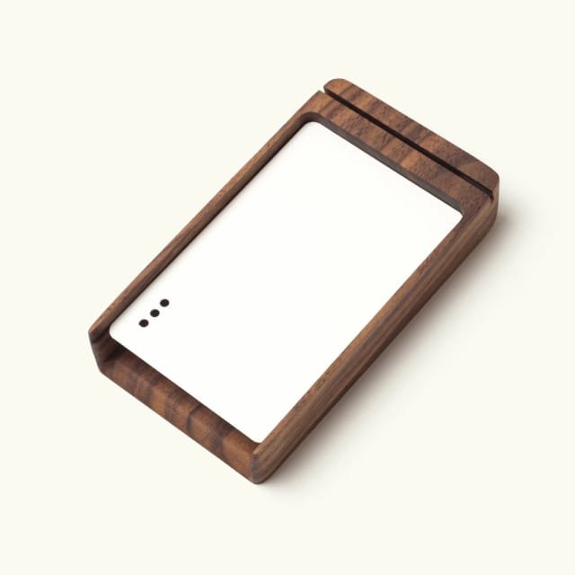 36 |
36 | 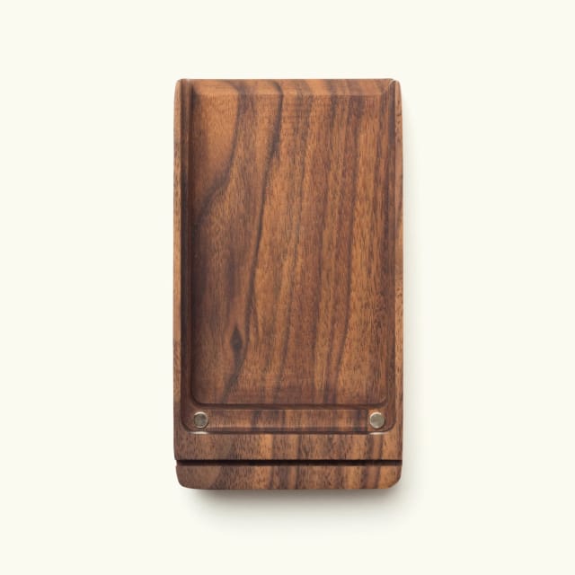 37 |
37 | 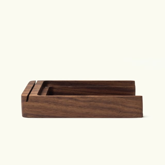 38 |
38 | 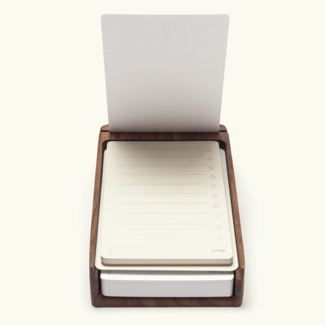 39 |
39 | 26 | {{ appConfig.cta.description }} 27 |
28 |20 | {{ appConfig.description }} 21 |
22 |38 | {{ feature.description }} 39 |
40 |72 | {{ item.description }} 73 |
74 |10 | This year, our new summer collection will shelter you from the harsh elements of a world that doesn't care if you live or die. 11 |
12 | 22 |
22 |  25 |
25 |  30 |
30 |  33 |
33 |  36 |
36 |  41 |
41 |  44 |
44 |