├── .gitignore
├── LICENSE
├── README.md
├── images
└── demo.gif
├── index.js
├── lib
├── .DS_Store
├── indicator.js
├── option.js
├── optionlist.js
└── select.js
└── package.json
/.gitignore:
--------------------------------------------------------------------------------
1 | # Logs
2 | logs
3 | *.log
4 | npm-debug.log*
5 |
6 | # Runtime data
7 | pids
8 | *.pid
9 | *.seed
10 |
11 | # Directory for instrumented libs generated by jscoverage/JSCover
12 | lib-cov
13 |
14 | # Coverage directory used by tools like istanbul
15 | coverage
16 |
17 | # nyc test coverage
18 | .nyc_output
19 |
20 | # Grunt intermediate storage (http://gruntjs.com/creating-plugins#storing-task-files)
21 | .grunt
22 |
23 | # node-waf configuration
24 | .lock-wscript
25 |
26 | # Compiled binary addons (http://nodejs.org/api/addons.html)
27 | build/Release
28 |
29 | # Dependency directories
30 | node_modules
31 | jspm_packages
32 |
33 | # Optional npm cache directory
34 | .npm
35 |
36 | # Optional REPL history
37 | .node_repl_history
38 |
--------------------------------------------------------------------------------
/LICENSE:
--------------------------------------------------------------------------------
1 | MIT License
2 |
3 | Copyright (c) 2016 Azharuddin
4 |
5 | Permission is hereby granted, free of charge, to any person obtaining a copy
6 | of this software and associated documentation files (the "Software"), to deal
7 | in the Software without restriction, including without limitation the rights
8 | to use, copy, modify, merge, publish, distribute, sublicense, and/or sell
9 | copies of the Software, and to permit persons to whom the Software is
10 | furnished to do so, subject to the following conditions:
11 |
12 | The above copyright notice and this permission notice shall be included in all
13 | copies or substantial portions of the Software.
14 |
15 | THE SOFTWARE IS PROVIDED "AS IS", WITHOUT WARRANTY OF ANY KIND, EXPRESS OR
16 | IMPLIED, INCLUDING BUT NOT LIMITED TO THE WARRANTIES OF MERCHANTABILITY,
17 | FITNESS FOR A PARTICULAR PURPOSE AND NONINFRINGEMENT. IN NO EVENT SHALL THE
18 | AUTHORS OR COPYRIGHT HOLDERS BE LIABLE FOR ANY CLAIM, DAMAGES OR OTHER
19 | LIABILITY, WHETHER IN AN ACTION OF CONTRACT, TORT OR OTHERWISE, ARISING FROM,
20 | OUT OF OR IN CONNECTION WITH THE SOFTWARE OR THE USE OR OTHER DEALINGS IN THE
21 | SOFTWARE.
22 |
--------------------------------------------------------------------------------
/README.md:
--------------------------------------------------------------------------------
1 | # React Native Chooser
2 | Simple DropDown menu for React Native App! Your Select Tag for React Native. Fully Customizable too.
3 |
4 | ## Introduction
5 |
6 | React Native Chooser is simple, customizable and easy to use dropdown in React Native. It has been tested on both Android and IOS and works like a charm.
7 |
8 |
9 | ## Installation
10 | ```
11 | npm i react-native-chooser --save
12 | ```
13 |
14 | ## Usage
15 |
16 | ```js
17 | import React, { Component } from 'react';
18 | import {Select, Option} from "react-native-chooser";
19 |
20 | import {
21 | AppRegistry,
22 | StyleSheet,
23 | Text,
24 | View
25 | } from 'react-native';
26 |
27 | export default class AwesomeProject extends Component {
28 |
29 | constructor(props) {
30 | super(props);
31 | this.state = {value : "Select Me Please"}
32 | }
33 | onSelect(value, label) {
34 | this.setState({value : value});
35 | }
36 |
37 | render() {
38 | return (
39 |
40 |
59 |
60 | );
61 | }
62 | }
63 | ```
64 |
65 | ### Props
66 |
67 | #### Props for Select
68 |
69 | | Prop Name | Data Type | Default Values | Description |
70 | |-----------------|-----------|-----------------|--------------------------------------------------|
71 | | onSelect | function | null | function that executes on selection of an option |
72 | | defaultText | string | Click To Select | Text to show as default text |
73 | | style | object | null | To style the select box. |
74 | | backdropStyle | object | null | To style the overlay |
75 | | textStyle | object | null | To style the text shown in the box |
76 | | optionListStyle | object | null | To style the selection box |
77 | | transparent | boolean | false | To set the transparent prop on Modal |
78 | | animationType | string | "none" | To set the animationType prop on Modal |
79 | | indicator | string | "none", "up" or "down" | "none" | To enable an indicator arrow |
80 | | indicatorColor | string | "black" | The color of the indicator arrow |
81 | | indicatorSize | number | 10 | The size of the indicator arrow |
82 | | indicatorStyle | object | null | To style the indicator arrow |
83 | | indicatorIcon | react element | null | Show the indicator icon |
84 | | selected | string | null | Give it same value as you give to Option |
85 | | selectedStyle | object | null | Apply styles to the selected Option |
86 |
87 | #### Functions for Select
88 |
89 | | Function Name | Description |
90 | |-----------|-----------|
91 | | setSelectedText(text) | Set default text in the select option, often used to reset text.|
92 |
93 | #### Props for Option
94 |
95 | | Prop Name | Data Type | Default Values | Description |
96 | |-----------|-----------|----------------|---------------------------------------|
97 | | style | object | null | To style each option |
98 | | styleText | object | null | To style the text shown in the option |
99 |
100 | ## Demo
101 | ### IOS and Android:
102 |
103 | 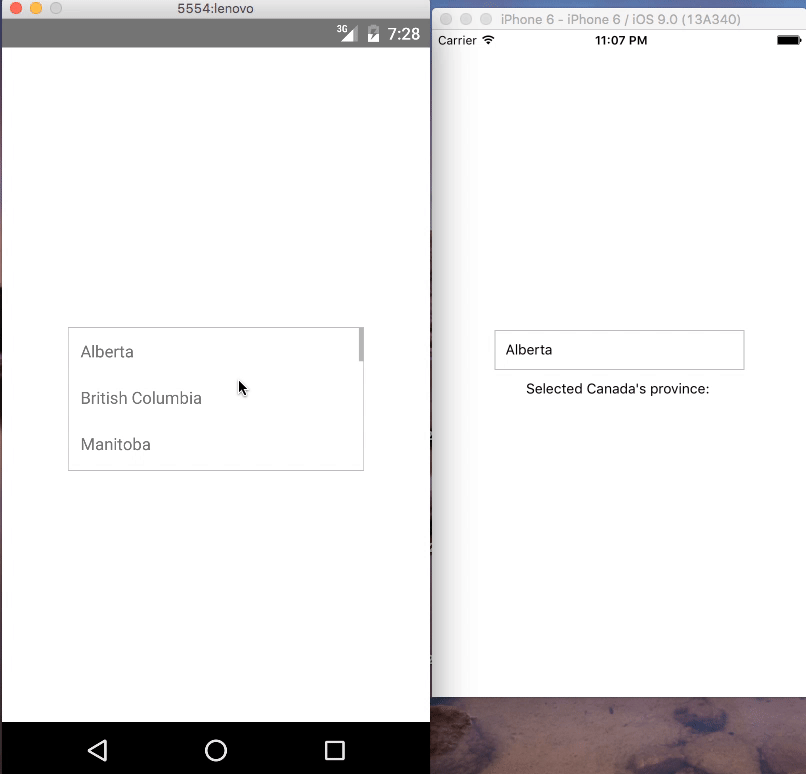 104 |
104 |
105 |
106 | ## Contributions
107 | Your contributions and suggestions are heartily♡ welcome. (✿◠‿◠)
108 |
--------------------------------------------------------------------------------
/images/demo.gif:
--------------------------------------------------------------------------------
https://raw.githubusercontent.com/gs-akhan/react-native-chooser/9019b7299cfe5eab75aa6ef4876b382162421d14/images/demo.gif
--------------------------------------------------------------------------------
/index.js:
--------------------------------------------------------------------------------
1 | export { default as Select } from "./lib/select";
2 | export { default as Option } from "./lib/option";
3 |
--------------------------------------------------------------------------------
/lib/.DS_Store:
--------------------------------------------------------------------------------
https://raw.githubusercontent.com/gs-akhan/react-native-chooser/9019b7299cfe5eab75aa6ef4876b382162421d14/lib/.DS_Store
--------------------------------------------------------------------------------
/lib/indicator.js:
--------------------------------------------------------------------------------
1 | import PropTypes from "prop-types";
2 | import React from "react";
3 | import {
4 | View,
5 | Text,
6 | StyleSheet,
7 | TouchableWithoutFeedback,
8 | Modal,
9 | Dimensions,
10 | ViewPropTypes
11 | } from "react-native";
12 |
13 | export default (Indicator = function({ direction, size, color, style }) {
14 | const styles = getStyles(size, color);
15 |
16 | if (direction === "up") return ;
17 | else if (direction === "down")
18 | return ;
19 |
20 | return null;
21 | });
22 |
23 | const getStyles = function(size, color) {
24 | return StyleSheet.create({
25 | triangle: {
26 | width: 0,
27 | height: 0,
28 | backgroundColor: "transparent",
29 | borderStyle: "solid",
30 | borderLeftWidth: size / 2,
31 | borderRightWidth: size / 2,
32 | borderBottomWidth: size,
33 | borderLeftColor: "transparent",
34 | borderRightColor: "transparent",
35 | borderBottomColor: color
36 | },
37 | triangleDown: {
38 | transform: [{ rotate: "180deg" }]
39 | }
40 | });
41 | };
42 |
43 | Indicator.propTypes = {
44 | direction: PropTypes.string,
45 | size: PropTypes.number.isRequired,
46 | color: PropTypes.string.isRequired,
47 | style: ViewPropTypes.style
48 | };
49 |
--------------------------------------------------------------------------------
/lib/option.js:
--------------------------------------------------------------------------------
1 | import PropTypes from "prop-types";
2 | import React, { Component } from "react";
3 | import {
4 | View,
5 | Text,
6 | StyleSheet,
7 | ScrollView,
8 | TouchableWithoutFeedback,
9 | ViewPropTypes
10 | } from "react-native";
11 |
12 | export default class Option extends Component {
13 | static propTypes = {
14 | style: ViewPropTypes.style,
15 | styleText: Text.propTypes.style,
16 | children: PropTypes.string.isRequired
17 | };
18 |
19 | render() {
20 | const { style, styleText } = this.props;
21 | return (
22 |
23 |
24 | {" "}{this.props.children}{" "}
25 |
26 |
27 | );
28 | }
29 | }
30 |
31 | var styles = StyleSheet.create({
32 | item: {
33 | padding: 10
34 | },
35 | optionText: {
36 | fontSize: 14
37 | }
38 | });
39 |
--------------------------------------------------------------------------------
/lib/optionlist.js:
--------------------------------------------------------------------------------
1 | import PropTypes from "prop-types";
2 | import React, { Component } from "react";
3 | import {
4 | StyleSheet,
5 | ScrollView,
6 | View,
7 | TouchableWithoutFeedback,
8 | ViewPropTypes
9 | } from "react-native";
10 |
11 | export default class OptionList extends Component {
12 | static defaultProps = {
13 | onSelect: () => {}
14 | };
15 | static propTypes = {
16 | style: ViewPropTypes.style,
17 | onSelect: PropTypes.func
18 | };
19 |
20 | render() {
21 | const { style, children, onSelect, selectedStyle, selected } = this.props;
22 | const renderedItems = React.Children.map(children, (item, key) => {
23 | if (!item) return null
24 | return onSelect(item.props.children, item.props.value)}
28 | >
29 |
35 | {item}
36 |
37 |
38 | });
39 |
40 | return (
41 |
42 |
43 | {renderedItems}
44 |
45 |
46 | );
47 | }
48 | }
49 |
50 | var styles = StyleSheet.create({
51 | scrollView: {
52 | height: 120,
53 | width: 300,
54 | borderWidth: 1
55 | }
56 | });
57 |
--------------------------------------------------------------------------------
/lib/select.js:
--------------------------------------------------------------------------------
1 | import PropTypes from "prop-types";
2 | import React, { Component } from "react";
3 | import {
4 | View,
5 | Text,
6 | StyleSheet,
7 | TouchableWithoutFeedback,
8 | Modal,
9 | Dimensions,
10 | ViewPropTypes
11 | } from "react-native";
12 |
13 | import OptionList from "./optionlist";
14 | import Indicator from "./indicator";
15 |
16 | const window = Dimensions.get("window");
17 |
18 | export default class Select extends Component {
19 | static defaultProps = {
20 | defaultText: "Click To Select",
21 | onSelect: () => {},
22 | transparent: false,
23 | animationType: "none",
24 | indicator: "none",
25 | indicatorColor: "black",
26 | indicatorSize: 10,
27 | indicatorIcon: null
28 | };
29 | static propTypes = {
30 | style: ViewPropTypes.style,
31 | defaultText: PropTypes.string,
32 | onSelect: PropTypes.func,
33 | textStyle: Text.propTypes.style,
34 | backdropStyle: ViewPropTypes.style,
35 | optionListStyle: ViewPropTypes.style,
36 | indicator: PropTypes.string,
37 | indicatorColor: PropTypes.string,
38 | indicatorSize: PropTypes.number,
39 | indicatorStyle: ViewPropTypes.style,
40 | indicatorIcon: PropTypes.element
41 | };
42 |
43 | constructor(props) {
44 | super(props);
45 | this.selected = this.props.selected;
46 | this.state = {
47 | modalVisible: false,
48 | defaultText: this.props.defaultText,
49 | selected: this.props.selected
50 | };
51 | }
52 |
53 | componentWillReceiveProps(nextProps) {
54 | if (nextProps.selected == null)
55 | this.setState({
56 | defaultText: nextProps.defaultText
57 | });
58 | }
59 |
60 | onSelect(label, value) {
61 | this.props.onSelect(value, label);
62 | this.setState({
63 | modalVisible: false,
64 | defaultText: label
65 | });
66 | }
67 |
68 | onClose() {
69 | this.setState({
70 | modalVisible: false
71 | });
72 | }
73 |
74 | render() {
75 | let {
76 | style,
77 | defaultText,
78 | textStyle,
79 | backdropStyle,
80 | optionListStyle,
81 | transparent,
82 | animationType,
83 | indicator,
84 | indicatorColor,
85 | indicatorSize,
86 | indicatorStyle,
87 | indicatorIcon,
88 | selectedStyle,
89 | selected
90 | } = this.props;
91 |
92 | return (
93 |
94 |
95 |
96 |
97 | {this.state.defaultText}
98 | {indicatorIcon ?
99 | indicatorIcon
100 | :
101 |
107 | }
108 |
109 |
110 |
111 |
112 |
119 |
120 |
121 |
127 | {this.props.children}
128 |
129 |
130 |
131 |
132 |
133 |
134 | );
135 | }
136 | /*
137 | Fired when user clicks the button
138 | */
139 | onPress() {
140 | this.setState({
141 | modalVisible: !this.state.modalVisible
142 | });
143 | }
144 |
145 | /*
146 | Fires when user clicks on modal. primarily used to close
147 | the select box
148 | */
149 |
150 | onModalPress() {
151 | this.setState({
152 | modalVisible: false
153 | });
154 | }
155 |
156 | setSelectedText(text) {
157 | this.setState({
158 | defaultText: text
159 | });
160 | }
161 | }
162 |
163 | var styles = StyleSheet.create({
164 | selectBox: {
165 | borderWidth: 1,
166 | width: 200,
167 | padding: 10,
168 | borderColor: "black"
169 | },
170 | selectBoxContent: {
171 | flexDirection: "row",
172 | justifyContent: "space-between",
173 | alignItems: "center"
174 | },
175 | modalOverlay: {
176 | flex: 1,
177 | justifyContent: "center",
178 | alignItems: "center"
179 | }
180 | });
181 |
--------------------------------------------------------------------------------
/package.json:
--------------------------------------------------------------------------------
1 |
2 | {
3 | "name": "react-native-chooser",
4 | "version": "1.7.0",
5 | "description": "Simple Cross platform SELECT tag for React-Native",
6 | "main": "index.js",
7 | "scripts": {
8 | "test": "echo \"Error: no test specified\" && exit 1"
9 | },
10 | "repository": {
11 | "type": "git",
12 | "url": "git+https://github.com/gs-akhan/react-native-chooser.git"
13 | },
14 | "keywords": [
15 | "react-native",
16 | "chooser",
17 | "select",
18 | "picker"
19 | ],
20 | "author": "Azhar",
21 | "license": "MIT",
22 | "bugs": {
23 | "url": "https://github.com/gs-akhan/react-native-chooser/issues"
24 | },
25 | "homepage": "https://github.com/gs-akhan/react-native-chooser#readme",
26 | "peerDependencies": {
27 | "prop-types": "^15.5.10"
28 | },
29 | "devDependencies": {
30 | "react": "16.0.0-alpha.12",
31 | "prop-types": "^15.5.10"
32 | }
33 | }
--------------------------------------------------------------------------------