29 |
30 | ### Need easy way to refelect all the button states?
31 | Progress Button is an android library for handling different types states like active, finished, enabled, disabled, and reset with a single line of code.
32 |
33 | ## 🚀 Demo
34 |
35 |
36 |
37 |
38 |
39 | ## 🧐 Features
40 |
41 | - One line of code to change state
42 | - Easy configurable
43 | - Customizable
44 | - Set vibration on click
45 | - Disable views in active state
46 |
47 | ## 🛠️ Installation Steps
48 |
49 | ```gradle
50 | repositories {
51 | maven { url 'https://jitpack.io' }
52 | }
53 |
54 | dependencies {
55 | implementation 'com.github.hellosagar:ProgressButton:latest_version'
56 | }
57 | ```
58 |
59 | ## 💻 Usage
60 |
61 | In XMl you need to define the button with your parameters to achieve the desired the design
62 |
63 | #### Notes -
64 | * To use vibration on click please add the following permission in android manifest
65 | ```xml
66 |
67 | ```
68 |
69 | Here is the sample code
70 |
71 | ```xml
72 |
86 | ```
87 |
88 | ## Color Parameters
89 |
90 | | Explanation | Parameter Name | Type | Default Value |
91 | | ---------------------------- | ----------------------- | ---------- | -------------- |
92 | | Set Default Color | **default_color** | color | #0052FE |
93 | | Set Disabled Color | **disabled_color** | color | #537CD3 |
94 | | Set Pressed Color | **pressed_color** | color | #0845D1 |
95 | | Set Finished Color | **finished_color** | color | #27AE60 |
96 | | Set Ripple Color | **ripple_color** | color | @android:color/transparent |
97 | | Set Text Color | **btn_text_color** | color | #FFFFFF |
98 | | Set Stroke Color | **stroke_color** | color | @android:color/transparent |
99 |
100 | ## Text Parameters
101 |
102 | | Explanation | Parameter Name | Type | Default Value |
103 | | ---------------------------- | ------------------ | ---------- | ---------------- |
104 | | Set Default Text | **default_color** | text | Button |
105 | | Set Finished Text | **finish_text** | text | Finish |
106 | | Set Text Size | **btn_text_size** | dimension | 14sp |
107 |
108 |
109 | ## Vibration Parameters
110 |
111 | | Explanation | Parameter Name | Type | Default Value |
112 | | ---------------------------- | ------------------ | ---------- | ---------------- |
113 | | Is Vibration enabled | **is_vibrate** | boolean | false |
114 | | Set Vibration time in (ms) | **finish_text** | integer | 30 |
115 |
116 |
117 | ## Misc Button Parameters
118 |
119 | | Explanation | Parameter Name | Type | Default Value |
120 | | ---------------------------- | ------------------ | ---------- | ---------------- |
121 | | Set Stroke Width | **stroke_width** | dimension | 0dp |
122 | | Set Corner Radius | **corner_radius** | dimension | 10dp |
123 | | Set Button Elevation | **btn_elevation** | dimension | 0dp |
124 |
125 |
126 | Here is the code sample to understand on how to change the button state
127 |
128 | ```kotlin
129 | class MainActivity : AppCompatActivity() {
130 | private lateinit var binding: ActivityMainBinding
131 |
132 | override fun onCreate(savedInstanceState: Bundle?) {
133 | super.onCreate(savedInstanceState)
134 | binding = ActivityMainBinding.inflate(layoutInflater)
135 | setContentView(binding.root)
136 |
137 | initViews()
138 | initClickListeners()
139 | }
140 |
141 | private fun initViews() = binding.apply {
142 | // Passing list of view that we want them to be disabled during the active state
143 | progressButton.setDisableViews(listOf(
144 | editTextTextPersonName,
145 | editTextTextPersonName2,
146 | ))
147 |
148 | }
149 |
150 | private fun initClickListeners() = binding.apply {
151 |
152 | progressButton.setOnClickListener {
153 | Toast.makeText(this@MainActivity, "On click!", Toast.LENGTH_SHORT).show()
154 | }
155 |
156 | btnLoading.setOnClickListener {
157 | // Loading state
158 | progressButton.loading()
159 | }
160 |
161 | btnFinish.setOnClickListener {
162 | // Finish state
163 | progressButton.finished()
164 | }
165 |
166 | btnEnable.setOnClickListener {
167 | // Enable state
168 | progressButton.enable()
169 | }
170 |
171 | btnDisable.setOnClickListener {
172 | // Enable state
173 | progressButton.disable()
174 | }
175 |
176 | btnReset.setOnClickListener {
177 | // Reset state
178 | progressButton.reset()
179 | }
180 |
181 | }
182 |
183 | }
184 | ```
185 |
186 | You can also directly integrate livedata to your button. This will automatically change the state of
187 | button according to the livedata.
188 |
189 | ```kotlin
190 |
191 | //This is an enum that contains all button states, use this for livedata
192 | enum class ButtonStates {
193 | LOADING, ENABLED, DISABLED, FINISHED
194 | }
195 |
196 | //liveData variable
197 | val buttonState = MutableLiveData()
198 |
199 | //In Fragment or Activity
200 | binding.progressButton.attachToLiveData(buttonState)
201 |
202 | ```
203 |
204 | Just post the button state to the livedata like
205 | `livedata.postValue(ButtonStates.LOADING)` and button will change to loading state automatically
206 |
207 | ## Jetpack Compose
208 |
209 | If you are using Jetpack Compose, all you have to do it to call the ProgressButton composable
210 |
211 | ### Composable function
212 |
213 | ```kotlin
214 | @Composable
215 | fun ProgressButton(
216 | buttonState: ButtonState,
217 | text: String,
218 | completedText: String,
219 | modifier: Modifier = Modifier,
220 | shape: Shape = RoundedCornerShape(4.dp),
221 | progressBarStrokeWidth: Dp = 3.dp,
222 | progressButtonColors: ProgressButtonColors = ProgressButtonColors(),
223 | progressButtonElevation: ProgressButtonElevation = ProgressButtonElevation(),
224 | textStyle: TextStyle = defaultTextStyle,
225 | onClick: () -> Unit
226 | )
227 | ```
228 |
229 | ### Parameters
230 |
231 | | Explanation | Paramter name | Type | Default value |
232 | |------|------|------|------|
233 | | Current state of button | buttonState | ButtonState | none |
234 | | Text shown in button | text | String | none |
235 | | Text shown in completed State | text | String | none |
236 | | Modifier for button | modifier | Modifier | Modifier |
237 | | Shape of button | shape | Shape | RoundedCornerShape with 4dp radius |
238 | | Stroke width of the progress bar inside button | progressBarStrokeWidth | Dp | 3.dp |
239 | | Colors used in button | progressButtonColors | ProgressButtonColors | ProgressButtonColors() |
240 | | Elevation used in button states | progressButtonElevation | ProgressButtonElevation | ProgressButtonElevation() |
241 | | Text Style of text inside button | textStyle | TextStyle | TextStyle(color = Color.White, fontSize = 16.sp, fontWeight = FontWeight.Bold) |
242 | | Lambda function to be called on button press | onClick | () -> Unit | none |
243 |
244 | ### Helper Classes
245 |
246 | ```kotlin
247 | //This class holds data of the colors used in button
248 | data class ProgressButtonColors(
249 | val backgroundColor: Color = DEFAULT_COLOR, //#0052FE
250 | val disabledColor: Color = DISABLED_COLOR, //#537CD3
251 | val finishedColor: Color = FINISHED_COLOR, //#27AE60
252 | val contentColor: Color = CONTENT_COLOR //#FFFFFF
253 | )
254 |
255 | //This class holds data for the elevation used in button
256 | data class ProgressButtonElevation(
257 | val defaultElevation: Dp = DEFAULT_ELEVATION, //8dp
258 | val elevationOnPress: Dp = DEFAULT_ELEVATION_ON_PRESS //12dp
259 | )
260 | ```
261 |
262 | ### Sample code
263 |
264 | ```kotlin
265 | fun MainScreenContent() {
266 | //mutable State to holf button state
267 | var buttonState by remember {
268 | mutableStateOf(ButtonState.DISABLED)
269 | }
270 | ProgressButton(
271 | buttonState = buttonState,
272 | text = "Button",
273 | completedText = "Finished",
274 | shape = RoundedCornerShape(12.dp),
275 | modifier = Modifier.fillMaxWidth()
276 | ) {
277 | }
278 |
279 | }
280 | ```
281 |
282 | 🌟 You are all set!
283 |
284 | ## 🍰 Contribute
285 |
286 | Feel free to fork this project, to optimise the code or to add new features.
287 |
288 | ## 📝 TODO
289 |
290 | * Lottie support
291 |
292 | ## 🛡️ License
293 |
294 | This project is licensed under the MIT License - see the [`LICENSE`](LICENSE) file for details.
295 |
296 | ## 🙌 Support
297 |
298 | This project needs a 🌟 from you
299 |
300 |
301 | Developed with ❤️ in India 🇮🇳
302 |
303 |
304 |
--------------------------------------------------------------------------------
/app/.gitignore:
--------------------------------------------------------------------------------
1 | /build
--------------------------------------------------------------------------------
/app/build.gradle:
--------------------------------------------------------------------------------
1 | plugins {
2 | id 'com.android.application'
3 | id 'kotlin-android'
4 | }
5 |
6 | android {
7 | compileSdkVersion 30
8 | buildToolsVersion "30.0.3"
9 |
10 | defaultConfig {
11 | applicationId "dev.sagar.progressbutton"
12 | minSdkVersion 26
13 | targetSdkVersion 30
14 | versionCode 1
15 | versionName "1.0"
16 |
17 | testInstrumentationRunner "androidx.test.runner.AndroidJUnitRunner"
18 |
19 | vectorDrawables {
20 | useSupportLibrary true
21 | }
22 | }
23 |
24 | buildTypes {
25 | release {
26 | minifyEnabled false
27 | proguardFiles getDefaultProguardFile('proguard-android-optimize.txt'), 'proguard-rules.pro'
28 | }
29 | }
30 | compileOptions {
31 | sourceCompatibility JavaVersion.VERSION_1_8
32 | targetCompatibility JavaVersion.VERSION_1_8
33 | }
34 | kotlinOptions {
35 | jvmTarget = '1.8'
36 | useIR = true
37 | }
38 | buildFeatures {
39 | viewBinding true
40 | compose true
41 | }
42 | composeOptions {
43 | kotlinCompilerExtensionVersion compose_version
44 | }
45 |
46 | }
47 |
48 | dependencies {
49 |
50 | implementation "org.jetbrains.kotlin:kotlin-stdlib:$kotlin_version"
51 | implementation 'androidx.core:core-ktx:1.5.0'
52 | implementation 'androidx.appcompat:appcompat:1.3.0'
53 | implementation 'androidx.constraintlayout:constraintlayout:2.0.4'
54 | implementation project(path: ':progress-button')
55 | implementation project(path: ':progress-button-compose')
56 | testImplementation 'junit:junit:4.+'
57 | androidTestImplementation 'androidx.test.ext:junit:1.1.3'
58 | androidTestImplementation 'androidx.test.espresso:espresso-core:3.4.0'
59 |
60 | // Material Design
61 | implementation 'com.google.android.material:material:1.4.0'
62 |
63 | // Lifecycle
64 | implementation "androidx.lifecycle:lifecycle-extensions:2.2.0"
65 | implementation "androidx.lifecycle:lifecycle-livedata-ktx:2.3.1"
66 | implementation "androidx.lifecycle:lifecycle-runtime-ktx:2.3.1"
67 |
68 |
69 |
70 | implementation "androidx.compose.ui:ui:$compose_version"
71 | implementation "androidx.compose.material:material:$compose_version"
72 | implementation "androidx.compose.ui:ui-tooling:$compose_version"
73 | implementation 'androidx.activity:activity-compose:1.3.0-beta02'
74 |
75 | }
--------------------------------------------------------------------------------
/app/proguard-rules.pro:
--------------------------------------------------------------------------------
1 | # Add project specific ProGuard rules here.
2 | # You can control the set of applied configuration files using the
3 | # proguardFiles setting in build.gradle.
4 | #
5 | # For more details, see
6 | # http://developer.android.com/guide/developing/tools/proguard.html
7 |
8 | # If your project uses WebView with JS, uncomment the following
9 | # and specify the fully qualified class name to the JavaScript interface
10 | # class:
11 | #-keepclassmembers class fqcn.of.javascript.interface.for.webview {
12 | # public *;
13 | #}
14 |
15 | # Uncomment this to preserve the line number information for
16 | # debugging stack traces.
17 | #-keepattributes SourceFile,LineNumberTable
18 |
19 | # If you keep the line number information, uncomment this to
20 | # hide the original source file name.
21 | #-renamesourcefileattribute SourceFile
--------------------------------------------------------------------------------
/app/src/main/AndroidManifest.xml:
--------------------------------------------------------------------------------
1 |
2 |
4 |
5 |
6 |
7 |
14 |
15 |
16 |
17 |
18 |
19 |
20 |
21 |
22 |
23 |
28 |
29 |
30 |
--------------------------------------------------------------------------------
/app/src/main/java/dev/sagar/progressbutton/ComposeActivity.kt:
--------------------------------------------------------------------------------
1 | package dev.sagar.progressbutton
2 |
3 | import android.os.Bundle
4 | import androidx.activity.ComponentActivity
5 | import androidx.activity.compose.setContent
6 | import androidx.compose.foundation.ExperimentalFoundationApi
7 | import androidx.compose.foundation.layout.* // ktlint-disable no-wildcard-imports
8 | import androidx.compose.foundation.shape.RoundedCornerShape
9 | import androidx.compose.material.Button
10 | import androidx.compose.material.Surface
11 | import androidx.compose.material.Text
12 | import androidx.compose.runtime.* // ktlint-disable no-wildcard-imports
13 | import androidx.compose.ui.Alignment
14 | import androidx.compose.ui.Modifier
15 | import androidx.compose.ui.graphics.Color
16 | import androidx.compose.ui.res.stringResource
17 | import androidx.compose.ui.tooling.preview.Preview
18 | import androidx.compose.ui.unit.dp
19 | import dev.sagar.progress_button_compose.ButtonState
20 | import dev.sagar.progress_button_compose.ProgressButton
21 | import dev.sagar.progress_button_compose.ProgressButtonColors
22 |
23 | class ComposeActivity : ComponentActivity() {
24 | @ExperimentalFoundationApi
25 | override fun onCreate(savedInstanceState: Bundle?) {
26 | super.onCreate(savedInstanceState)
27 | setContent {
28 | Surface(color = Color.White) {
29 | MainScreenContent()
30 | }
31 | }
32 | }
33 | }
34 |
35 | @ExperimentalFoundationApi
36 | @Composable
37 | @Preview
38 | fun MainScreenContent() {
39 |
40 | var buttonState by remember {
41 | mutableStateOf(ButtonState.DISABLED)
42 | }
43 |
44 | Column(
45 | modifier = Modifier
46 | .fillMaxSize()
47 | .padding(32.dp),
48 | verticalArrangement = Arrangement.Center,
49 | horizontalAlignment = Alignment.CenterHorizontally
50 | ) {
51 | ProgressButton(
52 | buttonState = buttonState,
53 | text = stringResource(R.string.button),
54 | completedText = stringResource(R.string.finished),
55 | shape = RoundedCornerShape(12.dp),
56 | modifier = Modifier
57 | .fillMaxWidth(),
58 | progressButtonColors = ProgressButtonColors()
59 | ) { }
60 |
61 | Spacer(modifier = Modifier.height(100.dp))
62 |
63 | ControlButton(text = stringResource(R.string.enable)) {
64 | buttonState = ButtonState.ENABLED
65 | }
66 | Spacer(modifier = Modifier.height(16.dp))
67 | ControlButton(text = stringResource(R.string.disable)) {
68 | buttonState = ButtonState.DISABLED
69 | }
70 | Spacer(modifier = Modifier.height(16.dp))
71 | ControlButton(text = stringResource(R.string.loading)) {
72 | buttonState = ButtonState.LOADING
73 | }
74 | Spacer(modifier = Modifier.height(16.dp))
75 | ControlButton(text = stringResource(R.string.finished)) {
76 | buttonState = ButtonState.FINISHED
77 | }
78 | }
79 | }
80 |
81 | @Composable
82 | fun ControlButton(text: String, onClick: () -> Unit) {
83 | Button(onClick = onClick, contentPadding = PaddingValues(horizontal = 16.dp)) {
84 | Text(text = text, color = Color.White)
85 | }
86 | }
87 |
--------------------------------------------------------------------------------
/app/src/main/java/dev/sagar/progressbutton/MainActivity.kt:
--------------------------------------------------------------------------------
1 | package dev.sagar.progressbutton
2 |
3 | import android.content.Intent
4 | import android.os.Bundle
5 | import android.widget.Toast
6 | import androidx.appcompat.app.AppCompatActivity
7 | import androidx.lifecycle.LiveData
8 | import androidx.lifecycle.liveData
9 | import dev.sagar.progress_button.ButtonStates
10 | import dev.sagar.progressbutton.databinding.ActivityMainBinding
11 | import kotlinx.coroutines.Dispatchers
12 | import kotlinx.coroutines.delay
13 |
14 | class MainActivity : AppCompatActivity() {
15 | private lateinit var binding: ActivityMainBinding
16 |
17 | private val sampleLiveData: LiveData = liveData(Dispatchers.IO) {
18 | emit(ButtonStates.DISABLED)
19 | delay(DELAY_TIME)
20 | emit(ButtonStates.ENABLED)
21 | delay(DELAY_TIME)
22 | emit(ButtonStates.LOADING)
23 | delay(DELAY_TIME)
24 | emit(ButtonStates.FINISHED)
25 | delay(DELAY_TIME)
26 | emit(ButtonStates.ENABLED)
27 | }
28 |
29 | override fun onCreate(savedInstanceState: Bundle?) {
30 | super.onCreate(savedInstanceState)
31 | binding = ActivityMainBinding.inflate(layoutInflater)
32 | setContentView(binding.root)
33 |
34 | initViews()
35 | initClickListeners()
36 | }
37 |
38 | private fun initViews() = binding.apply {
39 | // Passing list of view that we want them to be disabled during the active state
40 | progressButton.setDisableViews(
41 | listOf(
42 | editTextTextPersonName,
43 | editTextTextPersonName2,
44 | )
45 | )
46 | }
47 |
48 | private fun initClickListeners() = binding.apply {
49 |
50 | progressButton.setOnClickListener {
51 | Toast.makeText(this@MainActivity, "On click!", Toast.LENGTH_SHORT).show()
52 | }
53 |
54 | btnLoading.setOnClickListener {
55 | // Loading state
56 | progressButton.loading()
57 | }
58 |
59 | btnFinish.setOnClickListener {
60 | // Finish state
61 | progressButton.finished()
62 | }
63 |
64 | btnEnable.setOnClickListener {
65 | // Enable state
66 | progressButton.enable()
67 | }
68 |
69 | btnDisable.setOnClickListener {
70 | // Enable state
71 | progressButton.disable()
72 | }
73 |
74 | btnReset.setOnClickListener {
75 | // Reset state
76 | progressButton.reset()
77 | }
78 |
79 | switchToCompose.setOnClickListener {
80 | Intent(this@MainActivity, ComposeActivity::class.java).also {
81 | startActivity(it)
82 | }
83 | }
84 |
85 | progressButton.attachToLiveData(sampleLiveData, this@MainActivity)
86 | }
87 |
88 | companion object {
89 | const val DELAY_TIME = 5000L
90 | }
91 | }
92 |
--------------------------------------------------------------------------------
/app/src/main/res/drawable-v24/ic_launcher_foreground.xml:
--------------------------------------------------------------------------------
1 |
7 |
8 |
9 |
15 |
18 |
21 |
22 |
23 |
24 |
30 |
--------------------------------------------------------------------------------
/app/src/main/res/drawable/ic_launcher_background.xml:
--------------------------------------------------------------------------------
1 |
2 |
7 |
10 |
15 |
20 |
25 |
30 |
35 |
40 |
45 |
50 |
55 |
60 |
65 |
70 |
75 |
80 |
85 |
90 |
95 |
100 |
105 |
110 |
115 |
120 |
125 |
130 |
135 |
140 |
145 |
150 |
155 |
160 |
165 |
170 |
171 |
--------------------------------------------------------------------------------
/app/src/main/res/layout/activity_main.xml:
--------------------------------------------------------------------------------
1 |
2 |
8 |
9 |
19 |
20 |
29 |
30 |
37 |
38 |
48 |
49 |
57 |
58 |
67 |
68 |
82 |
83 |
94 |
95 |
107 |
108 |
--------------------------------------------------------------------------------
/app/src/main/res/mipmap-anydpi-v26/ic_launcher.xml:
--------------------------------------------------------------------------------
1 |
2 |
3 |
4 |
5 |
--------------------------------------------------------------------------------
/app/src/main/res/mipmap-anydpi-v26/ic_launcher_round.xml:
--------------------------------------------------------------------------------
1 |
2 |
3 |
4 |
5 |
--------------------------------------------------------------------------------
/app/src/main/res/mipmap-hdpi/ic_launcher.png:
--------------------------------------------------------------------------------
https://raw.githubusercontent.com/hellosagar/ProgressButton/fe7a3f4c28ac45dff79293ea93e7f505f0ddd4fe/app/src/main/res/mipmap-hdpi/ic_launcher.png
--------------------------------------------------------------------------------
/app/src/main/res/mipmap-hdpi/ic_launcher_round.png:
--------------------------------------------------------------------------------
https://raw.githubusercontent.com/hellosagar/ProgressButton/fe7a3f4c28ac45dff79293ea93e7f505f0ddd4fe/app/src/main/res/mipmap-hdpi/ic_launcher_round.png
--------------------------------------------------------------------------------
/app/src/main/res/mipmap-mdpi/ic_launcher.png:
--------------------------------------------------------------------------------
https://raw.githubusercontent.com/hellosagar/ProgressButton/fe7a3f4c28ac45dff79293ea93e7f505f0ddd4fe/app/src/main/res/mipmap-mdpi/ic_launcher.png
--------------------------------------------------------------------------------
/app/src/main/res/mipmap-mdpi/ic_launcher_round.png:
--------------------------------------------------------------------------------
https://raw.githubusercontent.com/hellosagar/ProgressButton/fe7a3f4c28ac45dff79293ea93e7f505f0ddd4fe/app/src/main/res/mipmap-mdpi/ic_launcher_round.png
--------------------------------------------------------------------------------
/app/src/main/res/mipmap-xhdpi/ic_launcher.png:
--------------------------------------------------------------------------------
https://raw.githubusercontent.com/hellosagar/ProgressButton/fe7a3f4c28ac45dff79293ea93e7f505f0ddd4fe/app/src/main/res/mipmap-xhdpi/ic_launcher.png
--------------------------------------------------------------------------------
/app/src/main/res/mipmap-xhdpi/ic_launcher_round.png:
--------------------------------------------------------------------------------
https://raw.githubusercontent.com/hellosagar/ProgressButton/fe7a3f4c28ac45dff79293ea93e7f505f0ddd4fe/app/src/main/res/mipmap-xhdpi/ic_launcher_round.png
--------------------------------------------------------------------------------
/app/src/main/res/mipmap-xxhdpi/ic_launcher.png:
--------------------------------------------------------------------------------
https://raw.githubusercontent.com/hellosagar/ProgressButton/fe7a3f4c28ac45dff79293ea93e7f505f0ddd4fe/app/src/main/res/mipmap-xxhdpi/ic_launcher.png
--------------------------------------------------------------------------------
/app/src/main/res/mipmap-xxhdpi/ic_launcher_round.png:
--------------------------------------------------------------------------------
https://raw.githubusercontent.com/hellosagar/ProgressButton/fe7a3f4c28ac45dff79293ea93e7f505f0ddd4fe/app/src/main/res/mipmap-xxhdpi/ic_launcher_round.png
--------------------------------------------------------------------------------
/app/src/main/res/mipmap-xxxhdpi/ic_launcher.png:
--------------------------------------------------------------------------------
https://raw.githubusercontent.com/hellosagar/ProgressButton/fe7a3f4c28ac45dff79293ea93e7f505f0ddd4fe/app/src/main/res/mipmap-xxxhdpi/ic_launcher.png
--------------------------------------------------------------------------------
/app/src/main/res/mipmap-xxxhdpi/ic_launcher_round.png:
--------------------------------------------------------------------------------
https://raw.githubusercontent.com/hellosagar/ProgressButton/fe7a3f4c28ac45dff79293ea93e7f505f0ddd4fe/app/src/main/res/mipmap-xxxhdpi/ic_launcher_round.png
--------------------------------------------------------------------------------
/app/src/main/res/values/colors.xml:
--------------------------------------------------------------------------------
1 |
2 |
3 | #FFBB86FC
4 | #FF6200EE
5 | #FF3700B3
6 | #FF03DAC5
7 | #FF018786
8 | #FF000000
9 | #FFFFFFFF
10 |
--------------------------------------------------------------------------------
/app/src/main/res/values/dimens.xml:
--------------------------------------------------------------------------------
1 |
2 |
3 | 110dp
4 |
--------------------------------------------------------------------------------
/app/src/main/res/values/strings.xml:
--------------------------------------------------------------------------------
1 |
2 | ProgressButton
3 | ComposeActivity
4 |
5 | Button
6 | Finished
7 | Enable
8 | Disable
9 | Loading
10 |
--------------------------------------------------------------------------------
/app/src/main/res/values/themes.xml:
--------------------------------------------------------------------------------
1 |
2 |
3 |
12 |
13 |
14 |
18 |
19 |
20 |
21 |
22 |
--------------------------------------------------------------------------------
/build.gradle:
--------------------------------------------------------------------------------
1 | // Top-level build file where you can add configuration options common to all sub-projects/modules.
2 | buildscript {
3 | ext.kotlin_version = "1.5.10"
4 | ext.compose_version = '1.0.0-beta09'
5 | repositories {
6 | google()
7 | mavenCentral()
8 | }
9 | dependencies {
10 | classpath 'com.android.tools.build:gradle:7.0.0'
11 | classpath "org.jetbrains.kotlin:kotlin-gradle-plugin:1.5.10"
12 |
13 | // NOTE: Do not place your application dependencies here; they belong
14 | // in the individual module build.gradle files
15 | }
16 | }
17 |
18 | allprojects {
19 | repositories {
20 | google()
21 | mavenCentral()
22 | jcenter() // Warning: this repository is going to shut down soon
23 | }
24 | }
25 |
26 | task clean(type: Delete) {
27 | delete rootProject.buildDir
28 | }
--------------------------------------------------------------------------------
/gif/demo.gif:
--------------------------------------------------------------------------------
https://raw.githubusercontent.com/hellosagar/ProgressButton/fe7a3f4c28ac45dff79293ea93e7f505f0ddd4fe/gif/demo.gif
--------------------------------------------------------------------------------
/gradle.properties:
--------------------------------------------------------------------------------
1 | # Project-wide Gradle settings.
2 | # IDE (e.g. Android Studio) users:
3 | # Gradle settings configured through the IDE *will override*
4 | # any settings specified in this file.
5 | # For more details on how to configure your build environment visit
6 | # http://www.gradle.org/docs/current/userguide/build_environment.html
7 | # Specifies the JVM arguments used for the daemon process.
8 | # The setting is particularly useful for tweaking memory settings.
9 | org.gradle.jvmargs=-Xmx2048m -Dfile.encoding=UTF-8
10 | # When configured, Gradle will run in incubating parallel mode.
11 | # This option should only be used with decoupled projects. More details, visit
12 | # http://www.gradle.org/docs/current/userguide/multi_project_builds.html#sec:decoupled_projects
13 | # org.gradle.parallel=true
14 | # AndroidX package structure to make it clearer which packages are bundled with the
15 | # Android operating system, and which are packaged with your app"s APK
16 | # https://developer.android.com/topic/libraries/support-library/androidx-rn
17 | android.useAndroidX=true
18 | # Kotlin code style for this project: "official" or "obsolete":
19 | kotlin.code.style=official
--------------------------------------------------------------------------------
/gradle/wrapper/gradle-wrapper.jar:
--------------------------------------------------------------------------------
https://raw.githubusercontent.com/hellosagar/ProgressButton/fe7a3f4c28ac45dff79293ea93e7f505f0ddd4fe/gradle/wrapper/gradle-wrapper.jar
--------------------------------------------------------------------------------
/gradle/wrapper/gradle-wrapper.properties:
--------------------------------------------------------------------------------
1 | #Wed Sep 22 20:53:13 IST 2021
2 | distributionBase=GRADLE_USER_HOME
3 | distributionUrl=https\://services.gradle.org/distributions/gradle-7.0.2-bin.zip
4 | distributionPath=wrapper/dists
5 | zipStorePath=wrapper/dists
6 | zipStoreBase=GRADLE_USER_HOME
7 |
--------------------------------------------------------------------------------
/gradlew:
--------------------------------------------------------------------------------
1 | #!/usr/bin/env sh
2 |
3 | ##############################################################################
4 | ##
5 | ## Gradle start up script for UN*X
6 | ##
7 | ##############################################################################
8 |
9 | # Attempt to set APP_HOME
10 | # Resolve links: $0 may be a link
11 | PRG="$0"
12 | # Need this for relative symlinks.
13 | while [ -h "$PRG" ] ; do
14 | ls=`ls -ld "$PRG"`
15 | link=`expr "$ls" : '.*-> \(.*\)$'`
16 | if expr "$link" : '/.*' > /dev/null; then
17 | PRG="$link"
18 | else
19 | PRG=`dirname "$PRG"`"/$link"
20 | fi
21 | done
22 | SAVED="`pwd`"
23 | cd "`dirname \"$PRG\"`/" >/dev/null
24 | APP_HOME="`pwd -P`"
25 | cd "$SAVED" >/dev/null
26 |
27 | APP_NAME="Gradle"
28 | APP_BASE_NAME=`basename "$0"`
29 |
30 | # Add default JVM options here. You can also use JAVA_OPTS and GRADLE_OPTS to pass JVM options to this script.
31 | DEFAULT_JVM_OPTS=""
32 |
33 | # Use the maximum available, or set MAX_FD != -1 to use that value.
34 | MAX_FD="maximum"
35 |
36 | warn () {
37 | echo "$*"
38 | }
39 |
40 | die () {
41 | echo
42 | echo "$*"
43 | echo
44 | exit 1
45 | }
46 |
47 | # OS specific support (must be 'true' or 'false').
48 | cygwin=false
49 | msys=false
50 | darwin=false
51 | nonstop=false
52 | case "`uname`" in
53 | CYGWIN* )
54 | cygwin=true
55 | ;;
56 | Darwin* )
57 | darwin=true
58 | ;;
59 | MINGW* )
60 | msys=true
61 | ;;
62 | NONSTOP* )
63 | nonstop=true
64 | ;;
65 | esac
66 |
67 | CLASSPATH=$APP_HOME/gradle/wrapper/gradle-wrapper.jar
68 |
69 | # Determine the Java command to use to start the JVM.
70 | if [ -n "$JAVA_HOME" ] ; then
71 | if [ -x "$JAVA_HOME/jre/sh/java" ] ; then
72 | # IBM's JDK on AIX uses strange locations for the executables
73 | JAVACMD="$JAVA_HOME/jre/sh/java"
74 | else
75 | JAVACMD="$JAVA_HOME/bin/java"
76 | fi
77 | if [ ! -x "$JAVACMD" ] ; then
78 | die "ERROR: JAVA_HOME is set to an invalid directory: $JAVA_HOME
79 |
80 | Please set the JAVA_HOME variable in your environment to match the
81 | location of your Java installation."
82 | fi
83 | else
84 | JAVACMD="java"
85 | which java >/dev/null 2>&1 || die "ERROR: JAVA_HOME is not set and no 'java' command could be found in your PATH.
86 |
87 | Please set the JAVA_HOME variable in your environment to match the
88 | location of your Java installation."
89 | fi
90 |
91 | # Increase the maximum file descriptors if we can.
92 | if [ "$cygwin" = "false" -a "$darwin" = "false" -a "$nonstop" = "false" ] ; then
93 | MAX_FD_LIMIT=`ulimit -H -n`
94 | if [ $? -eq 0 ] ; then
95 | if [ "$MAX_FD" = "maximum" -o "$MAX_FD" = "max" ] ; then
96 | MAX_FD="$MAX_FD_LIMIT"
97 | fi
98 | ulimit -n $MAX_FD
99 | if [ $? -ne 0 ] ; then
100 | warn "Could not set maximum file descriptor limit: $MAX_FD"
101 | fi
102 | else
103 | warn "Could not query maximum file descriptor limit: $MAX_FD_LIMIT"
104 | fi
105 | fi
106 |
107 | # For Darwin, add options to specify how the application appears in the dock
108 | if $darwin; then
109 | GRADLE_OPTS="$GRADLE_OPTS \"-Xdock:name=$APP_NAME\" \"-Xdock:icon=$APP_HOME/media/gradle.icns\""
110 | fi
111 |
112 | # For Cygwin, switch paths to Windows format before running java
113 | if $cygwin ; then
114 | APP_HOME=`cygpath --path --mixed "$APP_HOME"`
115 | CLASSPATH=`cygpath --path --mixed "$CLASSPATH"`
116 | JAVACMD=`cygpath --unix "$JAVACMD"`
117 |
118 | # We build the pattern for arguments to be converted via cygpath
119 | ROOTDIRSRAW=`find -L / -maxdepth 1 -mindepth 1 -type d 2>/dev/null`
120 | SEP=""
121 | for dir in $ROOTDIRSRAW ; do
122 | ROOTDIRS="$ROOTDIRS$SEP$dir"
123 | SEP="|"
124 | done
125 | OURCYGPATTERN="(^($ROOTDIRS))"
126 | # Add a user-defined pattern to the cygpath arguments
127 | if [ "$GRADLE_CYGPATTERN" != "" ] ; then
128 | OURCYGPATTERN="$OURCYGPATTERN|($GRADLE_CYGPATTERN)"
129 | fi
130 | # Now convert the arguments - kludge to limit ourselves to /bin/sh
131 | i=0
132 | for arg in "$@" ; do
133 | CHECK=`echo "$arg"|egrep -c "$OURCYGPATTERN" -`
134 | CHECK2=`echo "$arg"|egrep -c "^-"` ### Determine if an option
135 |
136 | if [ $CHECK -ne 0 ] && [ $CHECK2 -eq 0 ] ; then ### Added a condition
137 | eval `echo args$i`=`cygpath --path --ignore --mixed "$arg"`
138 | else
139 | eval `echo args$i`="\"$arg\""
140 | fi
141 | i=$((i+1))
142 | done
143 | case $i in
144 | (0) set -- ;;
145 | (1) set -- "$args0" ;;
146 | (2) set -- "$args0" "$args1" ;;
147 | (3) set -- "$args0" "$args1" "$args2" ;;
148 | (4) set -- "$args0" "$args1" "$args2" "$args3" ;;
149 | (5) set -- "$args0" "$args1" "$args2" "$args3" "$args4" ;;
150 | (6) set -- "$args0" "$args1" "$args2" "$args3" "$args4" "$args5" ;;
151 | (7) set -- "$args0" "$args1" "$args2" "$args3" "$args4" "$args5" "$args6" ;;
152 | (8) set -- "$args0" "$args1" "$args2" "$args3" "$args4" "$args5" "$args6" "$args7" ;;
153 | (9) set -- "$args0" "$args1" "$args2" "$args3" "$args4" "$args5" "$args6" "$args7" "$args8" ;;
154 | esac
155 | fi
156 |
157 | # Escape application args
158 | save () {
159 | for i do printf %s\\n "$i" | sed "s/'/'\\\\''/g;1s/^/'/;\$s/\$/' \\\\/" ; done
160 | echo " "
161 | }
162 | APP_ARGS=$(save "$@")
163 |
164 | # Collect all arguments for the java command, following the shell quoting and substitution rules
165 | eval set -- $DEFAULT_JVM_OPTS $JAVA_OPTS $GRADLE_OPTS "\"-Dorg.gradle.appname=$APP_BASE_NAME\"" -classpath "\"$CLASSPATH\"" org.gradle.wrapper.GradleWrapperMain "$APP_ARGS"
166 |
167 | # by default we should be in the correct project dir, but when run from Finder on Mac, the cwd is wrong
168 | if [ "$(uname)" = "Darwin" ] && [ "$HOME" = "$PWD" ]; then
169 | cd "$(dirname "$0")"
170 | fi
171 |
172 | exec "$JAVACMD" "$@"
173 |
--------------------------------------------------------------------------------
/gradlew.bat:
--------------------------------------------------------------------------------
1 | @if "%DEBUG%" == "" @echo off
2 | @rem ##########################################################################
3 | @rem
4 | @rem Gradle startup script for Windows
5 | @rem
6 | @rem ##########################################################################
7 |
8 | @rem Set local scope for the variables with windows NT shell
9 | if "%OS%"=="Windows_NT" setlocal
10 |
11 | set DIRNAME=%~dp0
12 | if "%DIRNAME%" == "" set DIRNAME=.
13 | set APP_BASE_NAME=%~n0
14 | set APP_HOME=%DIRNAME%
15 |
16 | @rem Add default JVM options here. You can also use JAVA_OPTS and GRADLE_OPTS to pass JVM options to this script.
17 | set DEFAULT_JVM_OPTS=
18 |
19 | @rem Find java.exe
20 | if defined JAVA_HOME goto findJavaFromJavaHome
21 |
22 | set JAVA_EXE=java.exe
23 | %JAVA_EXE% -version >NUL 2>&1
24 | if "%ERRORLEVEL%" == "0" goto init
25 |
26 | echo.
27 | echo ERROR: JAVA_HOME is not set and no 'java' command could be found in your PATH.
28 | echo.
29 | echo Please set the JAVA_HOME variable in your environment to match the
30 | echo location of your Java installation.
31 |
32 | goto fail
33 |
34 | :findJavaFromJavaHome
35 | set JAVA_HOME=%JAVA_HOME:"=%
36 | set JAVA_EXE=%JAVA_HOME%/bin/java.exe
37 |
38 | if exist "%JAVA_EXE%" goto init
39 |
40 | echo.
41 | echo ERROR: JAVA_HOME is set to an invalid directory: %JAVA_HOME%
42 | echo.
43 | echo Please set the JAVA_HOME variable in your environment to match the
44 | echo location of your Java installation.
45 |
46 | goto fail
47 |
48 | :init
49 | @rem Get command-line arguments, handling Windows variants
50 |
51 | if not "%OS%" == "Windows_NT" goto win9xME_args
52 |
53 | :win9xME_args
54 | @rem Slurp the command line arguments.
55 | set CMD_LINE_ARGS=
56 | set _SKIP=2
57 |
58 | :win9xME_args_slurp
59 | if "x%~1" == "x" goto execute
60 |
61 | set CMD_LINE_ARGS=%*
62 |
63 | :execute
64 | @rem Setup the command line
65 |
66 | set CLASSPATH=%APP_HOME%\gradle\wrapper\gradle-wrapper.jar
67 |
68 | @rem Execute Gradle
69 | "%JAVA_EXE%" %DEFAULT_JVM_OPTS% %JAVA_OPTS% %GRADLE_OPTS% "-Dorg.gradle.appname=%APP_BASE_NAME%" -classpath "%CLASSPATH%" org.gradle.wrapper.GradleWrapperMain %CMD_LINE_ARGS%
70 |
71 | :end
72 | @rem End local scope for the variables with windows NT shell
73 | if "%ERRORLEVEL%"=="0" goto mainEnd
74 |
75 | :fail
76 | rem Set variable GRADLE_EXIT_CONSOLE if you need the _script_ return code instead of
77 | rem the _cmd.exe /c_ return code!
78 | if not "" == "%GRADLE_EXIT_CONSOLE%" exit 1
79 | exit /b 1
80 |
81 | :mainEnd
82 | if "%OS%"=="Windows_NT" endlocal
83 |
84 | :omega
85 |
--------------------------------------------------------------------------------
/jitpack.yml:
--------------------------------------------------------------------------------
1 | jdk:
2 | - openjdk11
3 | install:
4 | - ./gradlew build :progress-button:publishToMavenLocal
--------------------------------------------------------------------------------
/progress-button-compose/.gitignore:
--------------------------------------------------------------------------------
1 | /build
--------------------------------------------------------------------------------
/progress-button-compose/build.gradle:
--------------------------------------------------------------------------------
1 | plugins {
2 | id 'com.android.library'
3 | id 'kotlin-android'
4 | id 'maven-publish'
5 | }
6 |
7 | project.afterEvaluate {
8 | publishing {
9 | publications {
10 | release(MavenPublication) {
11 | from components.release
12 | }
13 | }
14 | }
15 | }
16 |
17 | android {
18 | compileSdkVersion 30
19 | buildToolsVersion "30.0.3"
20 |
21 | defaultConfig {
22 | minSdkVersion 26
23 | targetSdkVersion 30
24 |
25 | testInstrumentationRunner "androidx.test.runner.AndroidJUnitRunner"
26 | consumerProguardFiles "consumer-rules.pro"
27 |
28 | vectorDrawables {
29 | useSupportLibrary true
30 | }
31 | }
32 |
33 | buildTypes {
34 | release {
35 | minifyEnabled false
36 | proguardFiles getDefaultProguardFile('proguard-android-optimize.txt'), 'proguard-rules.pro'
37 | }
38 | }
39 | compileOptions {
40 | sourceCompatibility JavaVersion.VERSION_1_8
41 | targetCompatibility JavaVersion.VERSION_1_8
42 | }
43 | kotlinOptions {
44 | jvmTarget = '1.8'
45 | useIR = true
46 | }
47 | buildFeatures {
48 | compose true
49 | }
50 | composeOptions {
51 | kotlinCompilerExtensionVersion compose_version
52 | }
53 | }
54 |
55 | dependencies {
56 |
57 | implementation 'androidx.core:core-ktx:1.6.0'
58 | implementation 'androidx.appcompat:appcompat:1.3.0'
59 | implementation 'com.google.android.material:material:1.3.0'
60 | testImplementation 'junit:junit:4.+'
61 | androidTestImplementation 'androidx.test.ext:junit:1.1.3'
62 | androidTestImplementation 'androidx.test.espresso:espresso-core:3.4.0'
63 |
64 |
65 |
66 | implementation "androidx.compose.ui:ui:$compose_version"
67 | implementation "androidx.compose.material:material:$compose_version"
68 | implementation "androidx.compose.ui:ui-tooling:$compose_version"
69 | implementation 'androidx.activity:activity-compose:1.3.0-beta02'
70 | }
--------------------------------------------------------------------------------
/progress-button-compose/consumer-rules.pro:
--------------------------------------------------------------------------------
https://raw.githubusercontent.com/hellosagar/ProgressButton/fe7a3f4c28ac45dff79293ea93e7f505f0ddd4fe/progress-button-compose/consumer-rules.pro
--------------------------------------------------------------------------------
/progress-button-compose/proguard-rules.pro:
--------------------------------------------------------------------------------
1 | # Add project specific ProGuard rules here.
2 | # You can control the set of applied configuration files using the
3 | # proguardFiles setting in build.gradle.
4 | #
5 | # For more details, see
6 | # http://developer.android.com/guide/developing/tools/proguard.html
7 |
8 | # If your project uses WebView with JS, uncomment the following
9 | # and specify the fully qualified class name to the JavaScript interface
10 | # class:
11 | #-keepclassmembers class fqcn.of.javascript.interface.for.webview {
12 | # public *;
13 | #}
14 |
15 | # Uncomment this to preserve the line number information for
16 | # debugging stack traces.
17 | #-keepattributes SourceFile,LineNumberTable
18 |
19 | # If you keep the line number information, uncomment this to
20 | # hide the original source file name.
21 | #-renamesourcefileattribute SourceFile
--------------------------------------------------------------------------------
/progress-button-compose/src/main/AndroidManifest.xml:
--------------------------------------------------------------------------------
1 |
2 |
4 |
5 |
6 |
--------------------------------------------------------------------------------
/progress-button-compose/src/main/java/dev/sagar/progress_button_compose/ButtonState.kt:
--------------------------------------------------------------------------------
1 | package dev.sagar.progress_button_compose
2 |
3 | enum class ButtonState {
4 | LOADING, ENABLED, DISABLED, FINISHED
5 | }
6 |
--------------------------------------------------------------------------------
/progress-button-compose/src/main/java/dev/sagar/progress_button_compose/DefaultValues.kt:
--------------------------------------------------------------------------------
1 | package dev.sagar.progress_button_compose
2 |
3 | import androidx.compose.ui.graphics.Color
4 | import androidx.compose.ui.text.TextStyle
5 | import androidx.compose.ui.text.font.FontWeight
6 | import androidx.compose.ui.unit.dp
7 | import androidx.compose.ui.unit.sp
8 |
9 | val DEFAULT_COLOR = Color(0xFF0052FE)
10 | val PRESSED_COLOR = Color(0xFF0845D1)
11 | val DISABLED_COLOR = Color(0xFF537CD3)
12 | val FINISHED_COLOR = Color(0xFF27AE60)
13 | val CONTENT_COLOR = Color.White
14 |
15 | const val TITLE_TEXT = "Button"
16 | const val FINISHED_TEXT = "Finish"
17 |
18 | val DEFAULT_ELEVATION = 8.dp
19 | val DEFAULT_ELEVATION_ON_PRESS = 12.dp
20 |
21 | val defaultTextStyle =
22 | TextStyle(color = Color.White, fontSize = 16.sp, fontWeight = FontWeight.Bold)
23 |
--------------------------------------------------------------------------------
/progress-button-compose/src/main/java/dev/sagar/progress_button_compose/ProgressButtonColors.kt:
--------------------------------------------------------------------------------
1 | package dev.sagar.progress_button_compose
2 |
3 | import androidx.compose.ui.graphics.Color
4 |
5 | /**
6 | * @param backgroundColor BackgroundColor of button
7 | * @param disabledColor button color when button is disabled
8 | * @param finishedColor button color when button is in finished state
9 | * @param contentColor color of the content inside button
10 |
11 | */
12 | data class ProgressButtonColors(
13 | val backgroundColor: Color = DEFAULT_COLOR,
14 | val disabledColor: Color = DISABLED_COLOR,
15 | val finishedColor: Color = FINISHED_COLOR,
16 | val contentColor: Color = CONTENT_COLOR
17 | )
18 |
--------------------------------------------------------------------------------
/progress-button-compose/src/main/java/dev/sagar/progress_button_compose/ProgressButtonCompose.kt:
--------------------------------------------------------------------------------
1 | package dev.sagar.progress_button_compose
2 |
3 | import android.content.Context.VIBRATOR_SERVICE
4 | import android.os.VibrationEffect
5 | import android.os.Vibrator
6 | import androidx.compose.foundation.layout.PaddingValues
7 | import androidx.compose.foundation.layout.size
8 | import androidx.compose.foundation.shape.RoundedCornerShape
9 | import androidx.compose.material.Button
10 | import androidx.compose.material.ButtonDefaults
11 | import androidx.compose.material.CircularProgressIndicator
12 | import androidx.compose.material.Text
13 | import androidx.compose.runtime.Composable
14 | import androidx.compose.ui.Modifier
15 | import androidx.compose.ui.graphics.Shape
16 | import androidx.compose.ui.platform.LocalContext
17 | import androidx.compose.ui.text.TextStyle
18 | import androidx.compose.ui.unit.Dp
19 | import androidx.compose.ui.unit.dp
20 |
21 | /**
22 | * @param buttonState Current State of Button. eg.LOADING, FINISHED
23 | * @param text Text shown on Button
24 | * @param completedText Text shown when button state is FINISHED
25 | * @param modifier Modifier to modify the button
26 | * @param shape Button Shape
27 | * @param progressBarStrokeWidth Stroke Width of the progress bar shown in the button
28 | * @param progressButtonColors A data class which contains the colors of the button
29 | * @param progressButtonElevation A data class which contains the elevation values of button
30 | * @param textStyle TextStyle to style the text shown in button
31 | * @param onClick lambda functions which defines the action to be done on button press
32 | */
33 | @Composable
34 | fun ProgressButton(
35 | buttonState: ButtonState,
36 | text: String,
37 | completedText: String,
38 | modifier: Modifier = Modifier,
39 | shape: Shape = RoundedCornerShape(4.dp),
40 | progressBarStrokeWidth: Dp = 3.dp,
41 | progressButtonColors: ProgressButtonColors = ProgressButtonColors(),
42 | progressButtonElevation: ProgressButtonElevation = ProgressButtonElevation(),
43 | textStyle: TextStyle = defaultTextStyle,
44 | onClick: () -> Unit
45 | ) {
46 |
47 | val btnBackgroundColor = when (buttonState) {
48 | ButtonState.LOADING -> progressButtonColors.disabledColor
49 | ButtonState.ENABLED -> progressButtonColors.backgroundColor
50 | ButtonState.DISABLED -> progressButtonColors.disabledColor
51 | ButtonState.FINISHED -> progressButtonColors.finishedColor
52 | }
53 | val vibrator = LocalContext.current.getSystemService(VIBRATOR_SERVICE) as Vibrator
54 | val isEnabled = buttonState == ButtonState.ENABLED
55 | val btnColorDisabled =
56 | if (buttonState == ButtonState.FINISHED) progressButtonColors.finishedColor
57 | else progressButtonColors.disabledColor
58 | Button(
59 | onClick = {
60 | onClick()
61 | vibrator.vibrate(VibrationEffect.createOneShot(70L, VibrationEffect.DEFAULT_AMPLITUDE))
62 | },
63 | modifier = modifier,
64 | enabled = isEnabled,
65 | shape = shape,
66 | elevation = ButtonDefaults.elevation(
67 | defaultElevation = progressButtonElevation.defaultElevation,
68 | pressedElevation = progressButtonElevation.elevationOnPress
69 | ),
70 | contentPadding = PaddingValues(16.dp),
71 | colors = ButtonDefaults.buttonColors(
72 | backgroundColor = btnBackgroundColor,
73 | contentColor = progressButtonColors.contentColor,
74 | disabledBackgroundColor = btnColorDisabled
75 | )
76 | ) {
77 | when (buttonState) {
78 | ButtonState.LOADING -> CircularProgressIndicator(
79 | color = progressButtonColors.contentColor,
80 | modifier = Modifier.size(24.dp),
81 | strokeWidth = progressBarStrokeWidth
82 | )
83 | ButtonState.FINISHED -> Text(text = completedText, style = textStyle)
84 | else -> Text(text = text, style = textStyle)
85 | }
86 | }
87 | }
88 |
--------------------------------------------------------------------------------
/progress-button-compose/src/main/java/dev/sagar/progress_button_compose/ProgressButtonElevation.kt:
--------------------------------------------------------------------------------
1 | package dev.sagar.progress_button_compose
2 |
3 | import androidx.compose.ui.unit.Dp
4 |
5 | /**
6 | * @param defaultElevation Default elevation of button
7 | * @param elevationOnPress elevation of button when it is being pressed
8 | */
9 | data class ProgressButtonElevation(
10 | val defaultElevation: Dp = DEFAULT_ELEVATION,
11 | val elevationOnPress: Dp = DEFAULT_ELEVATION_ON_PRESS
12 | )
13 |
--------------------------------------------------------------------------------
/progress-button/.gitignore:
--------------------------------------------------------------------------------
1 | /build
--------------------------------------------------------------------------------
/progress-button/build.gradle:
--------------------------------------------------------------------------------
1 | plugins {
2 | id 'com.android.library'
3 | id 'kotlin-android'
4 | id 'maven-publish'
5 | }
6 |
7 | project.afterEvaluate {
8 | publishing {
9 | publications {
10 | release(MavenPublication) {
11 | from components.release
12 | }
13 | }
14 | }
15 | }
16 |
17 | android {
18 | compileSdkVersion 30
19 | buildToolsVersion "30.0.3"
20 |
21 | defaultConfig {
22 | minSdkVersion 21
23 | targetSdkVersion 30
24 |
25 | testInstrumentationRunner "androidx.test.runner.AndroidJUnitRunner"
26 | consumerProguardFiles "consumer-rules.pro"
27 | }
28 |
29 | buildTypes {
30 | release {
31 | minifyEnabled false
32 | proguardFiles getDefaultProguardFile('proguard-android-optimize.txt'), 'proguard-rules.pro'
33 | }
34 | }
35 | compileOptions {
36 | sourceCompatibility JavaVersion.VERSION_1_8
37 | targetCompatibility JavaVersion.VERSION_1_8
38 | }
39 | kotlinOptions {
40 | jvmTarget = '1.8'
41 | }
42 | }
43 |
44 | dependencies {
45 |
46 | implementation "org.jetbrains.kotlin:kotlin-stdlib:$kotlin_version"
47 | implementation 'androidx.core:core-ktx:1.5.0'
48 | implementation 'androidx.appcompat:appcompat:1.3.0'
49 | implementation 'com.google.android.material:material:1.4.0'
50 | testImplementation 'junit:junit:4.+'
51 | androidTestImplementation 'androidx.test.ext:junit:1.1.3'
52 | androidTestImplementation 'androidx.test.espresso:espresso-core:3.4.0'
53 | }
--------------------------------------------------------------------------------
/progress-button/consumer-rules.pro:
--------------------------------------------------------------------------------
https://raw.githubusercontent.com/hellosagar/ProgressButton/fe7a3f4c28ac45dff79293ea93e7f505f0ddd4fe/progress-button/consumer-rules.pro
--------------------------------------------------------------------------------
/progress-button/proguard-rules.pro:
--------------------------------------------------------------------------------
1 | # Add project specific ProGuard rules here.
2 | # You can control the set of applied configuration files using the
3 | # proguardFiles setting in build.gradle.
4 | #
5 | # For more details, see
6 | # http://developer.android.com/guide/developing/tools/proguard.html
7 |
8 | # If your project uses WebView with JS, uncomment the following
9 | # and specify the fully qualified class name to the JavaScript interface
10 | # class:
11 | #-keepclassmembers class fqcn.of.javascript.interface.for.webview {
12 | # public *;
13 | #}
14 |
15 | # Uncomment this to preserve the line number information for
16 | # debugging stack traces.
17 | #-keepattributes SourceFile,LineNumberTable
18 |
19 | # If you keep the line number information, uncomment this to
20 | # hide the original source file name.
21 | #-renamesourcefileattribute SourceFile
--------------------------------------------------------------------------------
/progress-button/src/main/AndroidManifest.xml:
--------------------------------------------------------------------------------
1 |
2 |
--------------------------------------------------------------------------------
/progress-button/src/main/java/dev/sagar/progress_button/ButtonStates.kt:
--------------------------------------------------------------------------------
1 | package dev.sagar.progress_button
2 |
3 | enum class ButtonStates {
4 | LOADING, ENABLED, DISABLED, FINISHED
5 | }
6 |
--------------------------------------------------------------------------------
/progress-button/src/main/java/dev/sagar/progress_button/DefaultParams.kt:
--------------------------------------------------------------------------------
1 | package dev.sagar.progress_button
2 |
3 | import android.graphics.Color
4 |
5 | object DefaultParams {
6 |
7 | const val TITLE_TEXT = "Button"
8 | const val FINISHED_TEXT = "Finish"
9 |
10 | const val CORNER_RADIUS = 10.0F
11 | const val ELEVATION = 0.0F
12 |
13 | const val STROKE_COLOR = Color.TRANSPARENT
14 | const val STROKE_WIDTH = 0F
15 |
16 | const val TEXT_SIZE = 16F
17 | const val TEXT_COLOR = Color.WHITE
18 |
19 | const val IS_VIBRATION_ENABLED = false
20 | const val VIBRATION_TIME = 30
21 |
22 | const val RIPPLE_COLOR = Color.TRANSPARENT
23 | }
24 |
--------------------------------------------------------------------------------
/progress-button/src/main/java/dev/sagar/progress_button/ProgressButton.kt:
--------------------------------------------------------------------------------
1 | package dev.sagar.progress_button
2 |
3 | import android.Manifest
4 | import android.annotation.SuppressLint
5 | import android.content.Context
6 | import android.content.pm.PackageManager
7 | import android.content.res.ColorStateList
8 | import android.os.Build
9 | import android.os.VibrationEffect
10 | import android.os.Vibrator
11 | import android.util.AttributeSet
12 | import android.util.Log
13 | import android.util.TypedValue
14 | import android.view.MotionEvent
15 | import android.view.View
16 | import android.view.animation.Animation
17 | import android.view.animation.AnimationUtils
18 | import android.widget.ProgressBar
19 | import android.widget.TextView
20 | import androidx.core.content.ContextCompat
21 | import androidx.lifecycle.LifecycleOwner
22 | import androidx.lifecycle.LiveData
23 | import com.google.android.material.card.MaterialCardView
24 | import dev.sagar.progress_button.DefaultParams.CORNER_RADIUS
25 | import dev.sagar.progress_button.DefaultParams.ELEVATION
26 | import dev.sagar.progress_button.DefaultParams.FINISHED_TEXT
27 | import dev.sagar.progress_button.DefaultParams.IS_VIBRATION_ENABLED
28 | import dev.sagar.progress_button.DefaultParams.RIPPLE_COLOR
29 | import dev.sagar.progress_button.DefaultParams.STROKE_COLOR
30 | import dev.sagar.progress_button.DefaultParams.STROKE_WIDTH
31 | import dev.sagar.progress_button.DefaultParams.TEXT_COLOR
32 | import dev.sagar.progress_button.DefaultParams.TEXT_SIZE
33 | import dev.sagar.progress_button.DefaultParams.TITLE_TEXT
34 | import dev.sagar.progress_button.DefaultParams.VIBRATION_TIME
35 |
36 | @SuppressLint("ClickableViewAccessibility")
37 | class ProgressButton @JvmOverloads constructor(
38 | context: Context,
39 | attributeSet: AttributeSet? = null,
40 | defStyle: Int = 0,
41 | ) : MaterialCardView(context, attributeSet, defStyle) {
42 |
43 | private val TAG = "ProgressButton"
44 |
45 | /** Core Components */
46 | private var cardView: MaterialCardView = this
47 | private var progressBar: ProgressBar
48 | private var textView: TextView
49 | private var scaleUp: Animation
50 | private var scaleDown: Animation
51 | private var vibrator: Vibrator? = null
52 | private var disableViews: List = mutableListOf()
53 |
54 | /** Attributes */
55 | private var defaultText: String
56 | private var finishText: String
57 | private var defaultColor: Int
58 | private var pressedColor: Int
59 | private var disabledColor: Int
60 | private var finishedColor: Int
61 | private var btnStrokeColor: Int
62 | private var btnStrokeWidth: Int
63 | private var btnCornerRadius: Float
64 | private var btnElevation: Float
65 | private var btnTextSize: Float
66 | private var btnTextColor: Int
67 | private var isVibrationEnabled: Boolean
68 | private var vibrationMillisecond: Long
69 | private var rippleColor: Int
70 |
71 | // liveData for button states
72 | private var buttonStatesLiveData: LiveData? = null
73 |
74 | private var currentState = ButtonStates.ENABLED
75 |
76 | init {
77 | inflate(context, R.layout.progress_button_view, this)
78 | val customAttributes = context.obtainStyledAttributes(
79 | attributeSet, R.styleable.ProgressButton,
80 | defStyle, 0
81 | )
82 | textView = findViewById(R.id.tvProgressTitle)
83 | progressBar = findViewById(R.id.progressBar)
84 | scaleDown = AnimationUtils.loadAnimation(context, R.anim.scale_down)
85 | scaleUp = AnimationUtils.loadAnimation(context, R.anim.scale_up)
86 |
87 | customAttributes.apply {
88 | defaultText = getString(R.styleable.ProgressButton_default_text) ?: TITLE_TEXT
89 | finishText = getString(R.styleable.ProgressButton_finish_text) ?: FINISHED_TEXT
90 | btnCornerRadius = getDimension(R.styleable.ProgressButton_corner_radius, CORNER_RADIUS)
91 | btnElevation = getDimension(R.styleable.ProgressButton_btn_elevation, ELEVATION)
92 | defaultColor = getColor(
93 | R.styleable.ProgressButton_default_color,
94 | ContextCompat.getColor(
95 | context,
96 | R.color.blue_500
97 | )
98 | )
99 | pressedColor = getColor(
100 | R.styleable.ProgressButton_pressed_color,
101 | ContextCompat.getColor(
102 | context,
103 | R.color.blue_700
104 | )
105 | )
106 | disabledColor = getColor(
107 | R.styleable.ProgressButton_disabled_color,
108 | ContextCompat.getColor(
109 | context,
110 | R.color.blue_200
111 | )
112 | )
113 | finishedColor = getColor(
114 | R.styleable.ProgressButton_finished_color,
115 | ContextCompat.getColor(
116 | context,
117 | R.color.green_500
118 | )
119 | )
120 | btnStrokeColor = getColor(
121 | R.styleable.ProgressButton_stroke_color, STROKE_COLOR
122 | )
123 | btnStrokeWidth = getDimension(
124 | R.styleable.ProgressButton_stroke_width, STROKE_WIDTH
125 | ).toInt()
126 |
127 | btnTextSize = getDimension(
128 | R.styleable.ProgressButton_btn_text_size, TEXT_SIZE
129 | )
130 |
131 | btnTextColor = getColor(
132 | R.styleable.ProgressButton_btn_text_color, TEXT_COLOR
133 | )
134 |
135 | isVibrationEnabled = getBoolean(
136 | R.styleable.ProgressButton_is_vibrate, IS_VIBRATION_ENABLED
137 | )
138 |
139 | vibrationMillisecond = getInt(
140 | R.styleable.ProgressButton_vibration_millisecond, VIBRATION_TIME
141 | ).toLong()
142 |
143 | rippleColor = getColor(
144 | R.styleable.ProgressButton_ripple_color, RIPPLE_COLOR
145 | )
146 | }
147 |
148 | // Set Text attributes
149 | setFinishedText(finishText)
150 | setDefaultText(defaultText)
151 | setBtnTextSize(btnTextSize)
152 | setBtnTextColor(btnTextColor)
153 | setBtnText(defaultText)
154 |
155 | // set cardview color states
156 | cardView.setCardBackgroundColor(defaultColor)
157 | setDefaultColor(defaultColor)
158 | setPressedColor(pressedColor)
159 | setDisabledColor(disabledColor)
160 | setFinishedColor(finishedColor)
161 |
162 | // set stroke attributes
163 | setBtnStrokeColor(btnStrokeColor)
164 | setBtnStrokeWidth(btnStrokeWidth)
165 |
166 | // set card attributes
167 | setCornerRadius(btnCornerRadius)
168 | setButtonElevation(btnElevation)
169 | setRippleColor(rippleColor)
170 |
171 | // change color with gesture i.e action up and down
172 | setOnTouchListener { _, event ->
173 | when (event.action) {
174 | MotionEvent.ACTION_DOWN -> {
175 | cardView.startAnimation(scaleDown)
176 | changeColorOnActionDown()
177 | }
178 | MotionEvent.ACTION_UP -> {
179 | cardView.startAnimation(scaleUp)
180 | changeColorOnActionUp()
181 | }
182 | }
183 | false
184 | }
185 |
186 | customAttributes.recycle()
187 | }
188 |
189 | /**
190 | * Function invoked on click of cardview/button
191 | */
192 | fun setOnClickListener(listener: () -> Unit) {
193 | cardView.setOnClickListener {
194 | if (isVibrationEnabled) {
195 | if ((
196 | ContextCompat.checkSelfPermission(
197 | context,
198 | Manifest.permission.VIBRATE
199 | ) == PackageManager.PERMISSION_GRANTED
200 | )
201 | ) {
202 | vibrateOnClick()
203 | } else {
204 | Log.w(
205 | TAG,
206 | "Please add vibration permission in your manifest, if you want to use vibration and don't tell us that we didn't remind you ^_^"
207 | )
208 | }
209 | }
210 | listener.invoke()
211 | }
212 | }
213 |
214 | /**
215 | * Set ripple color
216 | */
217 | fun setRippleColor(color: Int) {
218 | cardView.rippleColor = ColorStateList.valueOf(color)
219 | }
220 |
221 | /**
222 | * Enable Vibration
223 | */
224 | fun enableVibration() {
225 | isVibrationEnabled = true
226 | }
227 |
228 | /**
229 | * Disable Vibration
230 | */
231 | fun disableVibration() {
232 | isVibrationEnabled = false
233 | }
234 |
235 | /**
236 | * Set vibration time in millisecond
237 | */
238 | fun setVibrationTimeInMillisecond(time: Long) {
239 | vibrationMillisecond = time
240 | }
241 |
242 | /**
243 | * Set text color
244 | */
245 | fun setBtnTextColor(color: Int) {
246 | textView.setTextColor(color)
247 | }
248 |
249 | /**
250 | * Set text size
251 | */
252 | fun setBtnTextSize(textSize: Float) {
253 | textView.setTextSize(TypedValue.COMPLEX_UNIT_SP, textSize)
254 | }
255 |
256 | /**
257 | * Set finished text to button
258 | */
259 | fun setFinishedText(text: String) {
260 | finishText = text
261 | setTextWithRespectToState()
262 | }
263 |
264 | /**
265 | * Set default button color
266 | */
267 | fun setDefaultColor(color: Int) {
268 | defaultColor = color
269 | }
270 |
271 | /**
272 | * Set default button color
273 | */
274 | fun setDisabledColor(color: Int) {
275 | disabledColor = color
276 | }
277 |
278 | /**
279 | * Set pressed button color
280 | */
281 | fun setPressedColor(color: Int) {
282 | pressedColor = color
283 | }
284 |
285 | /**
286 | * Set finished button color
287 | */
288 | fun setFinishedColor(color: Int) {
289 | finishedColor = color
290 | }
291 |
292 | /**
293 | * Set stroke color
294 | */
295 | fun setBtnStrokeColor(color: Int) {
296 | btnStrokeColor = color
297 | cardView.strokeColor = btnStrokeColor
298 | }
299 |
300 | /**
301 | * Set stroke width
302 | */
303 | fun setBtnStrokeWidth(width: Int) {
304 | btnStrokeWidth = width
305 | cardView.strokeWidth = btnStrokeWidth
306 | }
307 |
308 | /**
309 | * Set Corner radius of button
310 | */
311 | fun setCornerRadius(radius: Float) {
312 | btnCornerRadius = radius
313 | cardView.radius = radius
314 | }
315 |
316 | /**
317 | * Set button elevation
318 | */
319 | fun setButtonElevation(elevation: Float) {
320 | btnElevation = elevation
321 | cardView.elevation = btnElevation
322 | }
323 |
324 | /**
325 | * Set default text
326 | */
327 | fun setDefaultText(text: String) {
328 | defaultText = text
329 | setTextWithRespectToState()
330 | }
331 |
332 | private fun setTextWithRespectToState() {
333 | if (currentState == ButtonStates.ENABLED || currentState == ButtonStates.DISABLED) {
334 | setBtnText(defaultText)
335 | } else if (currentState == ButtonStates.LOADING) {
336 | setBtnText(finishText)
337 | }
338 | }
339 |
340 | /**
341 | * Set text to button
342 | */
343 | private fun setBtnText(title: String) {
344 | textView.text = title
345 | }
346 |
347 | /**
348 | * Vibrate the device with the following vibrate time in millisecond
349 | */
350 | @SuppressLint("MissingPermission")
351 | private fun vibrateOnClick() {
352 |
353 | if (vibrator == null)
354 | vibrator = context.getSystemService(Context.VIBRATOR_SERVICE) as Vibrator
355 |
356 | if (Build.VERSION.SDK_INT >= Build.VERSION_CODES.O) {
357 | vibrator?.vibrate(
358 | VibrationEffect.createOneShot(
359 | vibrationMillisecond,
360 | VibrationEffect.DEFAULT_AMPLITUDE
361 | )
362 | )
363 | } else {
364 | @Suppress("DEPRECATION")
365 | vibrator?.vibrate(30)
366 | }
367 | }
368 |
369 | /**
370 | * Enable button
371 | */
372 | fun enable() {
373 | currentState = ButtonStates.ENABLED
374 | for (editText in disableViews) {
375 | editText.isEnabled = true
376 | }
377 | cardView.setCardBackgroundColor(
378 | defaultColor
379 | )
380 | setBtnText(defaultText)
381 | cardView.isEnabled = true
382 | progressBar.gone()
383 | textView.visible()
384 | }
385 |
386 | /**
387 | * Disable button
388 | */
389 | fun disable() {
390 | currentState = ButtonStates.DISABLED
391 | cardView.setCardBackgroundColor(
392 | disabledColor
393 | )
394 | setBtnText(defaultText)
395 | cardView.isEnabled = false
396 | progressBar.gone()
397 | textView.visible()
398 | }
399 |
400 | /**
401 | * Setting list of view that will disable in active state of button
402 | */
403 | fun setDisableViews(views: List) {
404 | disableViews = views
405 | }
406 |
407 | /**
408 | * Set the button state to loading for loading purpose
409 | */
410 | fun loading() {
411 | currentState = ButtonStates.LOADING
412 | for (editText in disableViews) {
413 | editText.isEnabled = false
414 | }
415 |
416 | cardView.setCardBackgroundColor(
417 | disabledColor
418 | )
419 | textView.invisible()
420 | progressBar.visible()
421 |
422 | cardView.isEnabled = false
423 | }
424 |
425 | /**
426 | * Set the button state to finished - when task is completed
427 | */
428 | fun finished() {
429 | currentState = ButtonStates.FINISHED
430 | for (editText in disableViews) {
431 | editText.isEnabled = true
432 | }
433 |
434 | cardView.isEnabled = true
435 | cardView.setCardBackgroundColor(
436 | finishedColor
437 | )
438 | setBtnText(finishText)
439 | textView.visible()
440 | progressBar.gone()
441 | }
442 |
443 | /**
444 | * Reset the button state
445 | */
446 | fun reset() {
447 | currentState = ButtonStates.ENABLED
448 | for (editText in disableViews) {
449 | editText.isEnabled = true
450 | }
451 | cardView.isEnabled = true
452 | cardView.setCardBackgroundColor(
453 | defaultColor
454 | )
455 | setBtnText(defaultText)
456 | textView.visible()
457 | progressBar.gone()
458 | }
459 |
460 | /**
461 | * Set pressed color on card background color on action down
462 | */
463 | private fun changeColorOnActionDown() {
464 | cardView.setCardBackgroundColor(
465 | pressedColor
466 | )
467 | }
468 |
469 | /**
470 | * Set default color on card background color on action up
471 | */
472 | private fun changeColorOnActionUp() {
473 | cardView.setCardBackgroundColor(
474 | defaultColor
475 | )
476 | }
477 |
478 | /**
479 | * Attach livedata to the button to directly observe changes in button states .
480 | * Helps when u have a livedata in your viewModel and you want to update button state
481 | * according to the livedata
482 | */
483 | fun attachToLiveData(state: LiveData, lifecycleOwner: LifecycleOwner) {
484 | buttonStatesLiveData = state
485 | buttonStatesLiveData?.observe(lifecycleOwner) {
486 | when (it) {
487 | ButtonStates.LOADING -> loading()
488 | ButtonStates.ENABLED -> enable()
489 | ButtonStates.DISABLED -> disable()
490 | ButtonStates.FINISHED -> finished()
491 | else -> reset()
492 | }
493 | }
494 | }
495 |
496 | /**
497 | * Added the enum support to change the Button state using [ButtonStates] enum
498 | */
499 | fun setState(state: ButtonStates) {
500 | when (state) {
501 | ButtonStates.LOADING -> loading()
502 | ButtonStates.ENABLED -> enable()
503 | ButtonStates.DISABLED -> disable()
504 | ButtonStates.FINISHED -> finished()
505 | else -> reset()
506 | }
507 | }
508 | }
509 |
--------------------------------------------------------------------------------
/progress-button/src/main/java/dev/sagar/progress_button/ViewEx.kt:
--------------------------------------------------------------------------------
1 | package dev.sagar.progress_button
2 |
3 | import android.view.View
4 |
5 | fun View.visible() {
6 | this.visibility = View.VISIBLE
7 | }
8 |
9 | fun View.invisible() {
10 | this.visibility = View.INVISIBLE
11 | }
12 |
13 | fun View.gone() {
14 | this.visibility = View.GONE
15 | }
16 |
--------------------------------------------------------------------------------
/progress-button/src/main/res/anim/fade_in.xml:
--------------------------------------------------------------------------------
1 |
2 |
3 |
7 |
--------------------------------------------------------------------------------
/progress-button/src/main/res/anim/scale_down.xml:
--------------------------------------------------------------------------------
1 |
2 |
--------------------------------------------------------------------------------
/progress-button/src/main/res/anim/scale_up.xml:
--------------------------------------------------------------------------------
1 |
2 |
--------------------------------------------------------------------------------
/progress-button/src/main/res/layout/progress_button_view.xml:
--------------------------------------------------------------------------------
1 |
2 |
8 |
9 |
23 |
24 |
38 |
39 |
--------------------------------------------------------------------------------
/progress-button/src/main/res/values/attrs.xml:
--------------------------------------------------------------------------------
1 |
2 |
3 |
4 |
5 |
6 |
7 |
8 |
9 |
10 |
11 |
12 |
13 |
14 |
15 |
16 |
17 |
18 |
19 |
20 |
21 |
22 |
23 |
--------------------------------------------------------------------------------
/progress-button/src/main/res/values/colors.xml:
--------------------------------------------------------------------------------
1 |
2 |
3 | #E8EBE8
4 | #989898
5 | #6E7375
6 | #12212A
7 | #0052FE
8 | #0845D1
9 | #537CD3
10 | #FFFFFFFF
11 |
12 | #BD2B35
13 | #27AE60
14 |
15 | #DCE0DE
16 |
17 |
--------------------------------------------------------------------------------
/settings.gradle:
--------------------------------------------------------------------------------
1 | rootProject.name = "ProgressButton"
2 | include ':app'
3 | include ':progress-button'
4 | include ':progress-button-compose'
5 |
--------------------------------------------------------------------------------
 6 |
7 |
8 |
6 |
7 |
8 |  9 |
10 |
11 |
9 |
10 |
11 |  12 |
13 |
14 |
12 |
13 |
14 |  15 |
16 |
17 |
15 |
16 |
17 |  18 |
19 |
20 |
18 |
19 |
20 |  21 |
22 |
21 |
22 | 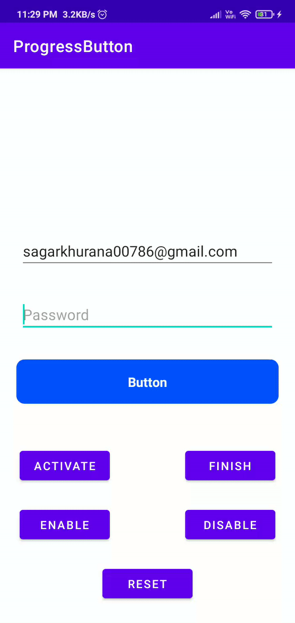 37 |
37 |