 25 |
26 | ##
27 |
28 |
25 |
26 | ##
27 |
28 |  29 |
30 | ##
31 |
32 |
29 |
30 | ##
31 |
32 |  33 |
34 | ##
35 |
36 |
33 |
34 | ##
35 |
36 |  37 |
38 | ##
39 |
40 |
37 |
38 | ##
39 |
40 |  41 |
42 | ## Back-end
43 |
44 | Using [Firebase](https://firebase.google.com/) as simple backend.
45 |
46 | ## Browser support
47 |
48 | Compatible with every evergreen browser.
49 |
50 | ## Web design
51 |
52 | Iconspace. [Stylish Dashboard UI Kit for Various Need](https://iconspace.co/product/square-dashboard-ui-kit/). Made with a unique style using rounded corner shape & modern color scheme. Make it looks dynamic and matches with the current and future design styles.
53 |
54 | ## License
55 |
56 | Licensed under [MIT](https://github.com/heysafronov/square-react-dashboard/blob/master/LICENSE).
57 |
--------------------------------------------------------------------------------
/babel.config.js:
--------------------------------------------------------------------------------
1 | module.exports = function(api) {
2 | api.cache(true)
3 |
4 | const presets = [
5 | '@babel/preset-env',
6 | '@babel/preset-typescript',
7 | '@babel/preset-react'
8 | ]
9 | const plugins = [
10 | [
11 | 'babel-plugin-styled-components',
12 | {
13 | displayName: true,
14 | fileName: true
15 | }
16 | ],
17 | '@babel/proposal-class-properties',
18 | '@babel/proposal-object-rest-spread'
19 | ]
20 |
21 | return {
22 | presets,
23 | plugins
24 | }
25 | }
26 |
--------------------------------------------------------------------------------
/dist/0d0de35b6447df412926c60e216ccfa8.png:
--------------------------------------------------------------------------------
https://raw.githubusercontent.com/heysafronov/square-react-dashboard/f12759a0980299583134e6e7b9ba5d34521d47d5/dist/0d0de35b6447df412926c60e216ccfa8.png
--------------------------------------------------------------------------------
/dist/1.9c0f81488d5788f4d661.js.LICENSE.txt:
--------------------------------------------------------------------------------
1 | /*!
2 | * Determine if an object is a Buffer
3 | *
4 | * @author Feross Aboukhadijeh
41 |
42 | ## Back-end
43 |
44 | Using [Firebase](https://firebase.google.com/) as simple backend.
45 |
46 | ## Browser support
47 |
48 | Compatible with every evergreen browser.
49 |
50 | ## Web design
51 |
52 | Iconspace. [Stylish Dashboard UI Kit for Various Need](https://iconspace.co/product/square-dashboard-ui-kit/). Made with a unique style using rounded corner shape & modern color scheme. Make it looks dynamic and matches with the current and future design styles.
53 |
54 | ## License
55 |
56 | Licensed under [MIT](https://github.com/heysafronov/square-react-dashboard/blob/master/LICENSE).
57 |
--------------------------------------------------------------------------------
/babel.config.js:
--------------------------------------------------------------------------------
1 | module.exports = function(api) {
2 | api.cache(true)
3 |
4 | const presets = [
5 | '@babel/preset-env',
6 | '@babel/preset-typescript',
7 | '@babel/preset-react'
8 | ]
9 | const plugins = [
10 | [
11 | 'babel-plugin-styled-components',
12 | {
13 | displayName: true,
14 | fileName: true
15 | }
16 | ],
17 | '@babel/proposal-class-properties',
18 | '@babel/proposal-object-rest-spread'
19 | ]
20 |
21 | return {
22 | presets,
23 | plugins
24 | }
25 | }
26 |
--------------------------------------------------------------------------------
/dist/0d0de35b6447df412926c60e216ccfa8.png:
--------------------------------------------------------------------------------
https://raw.githubusercontent.com/heysafronov/square-react-dashboard/f12759a0980299583134e6e7b9ba5d34521d47d5/dist/0d0de35b6447df412926c60e216ccfa8.png
--------------------------------------------------------------------------------
/dist/1.9c0f81488d5788f4d661.js.LICENSE.txt:
--------------------------------------------------------------------------------
1 | /*!
2 | * Determine if an object is a Buffer
3 | *
4 | * @author Feross Aboukhadijeh
53 | Hi James,
54 | here’s your currently activity
55 |
56 |
41 | {this.state.error && this.state.error.toString()}
42 |
43 | {this.state.errorInfo.componentStack} 44 |
45 | 43 | {this.state.errorInfo.componentStack} 44 |
66 |
68 | New
69 | {opened ?
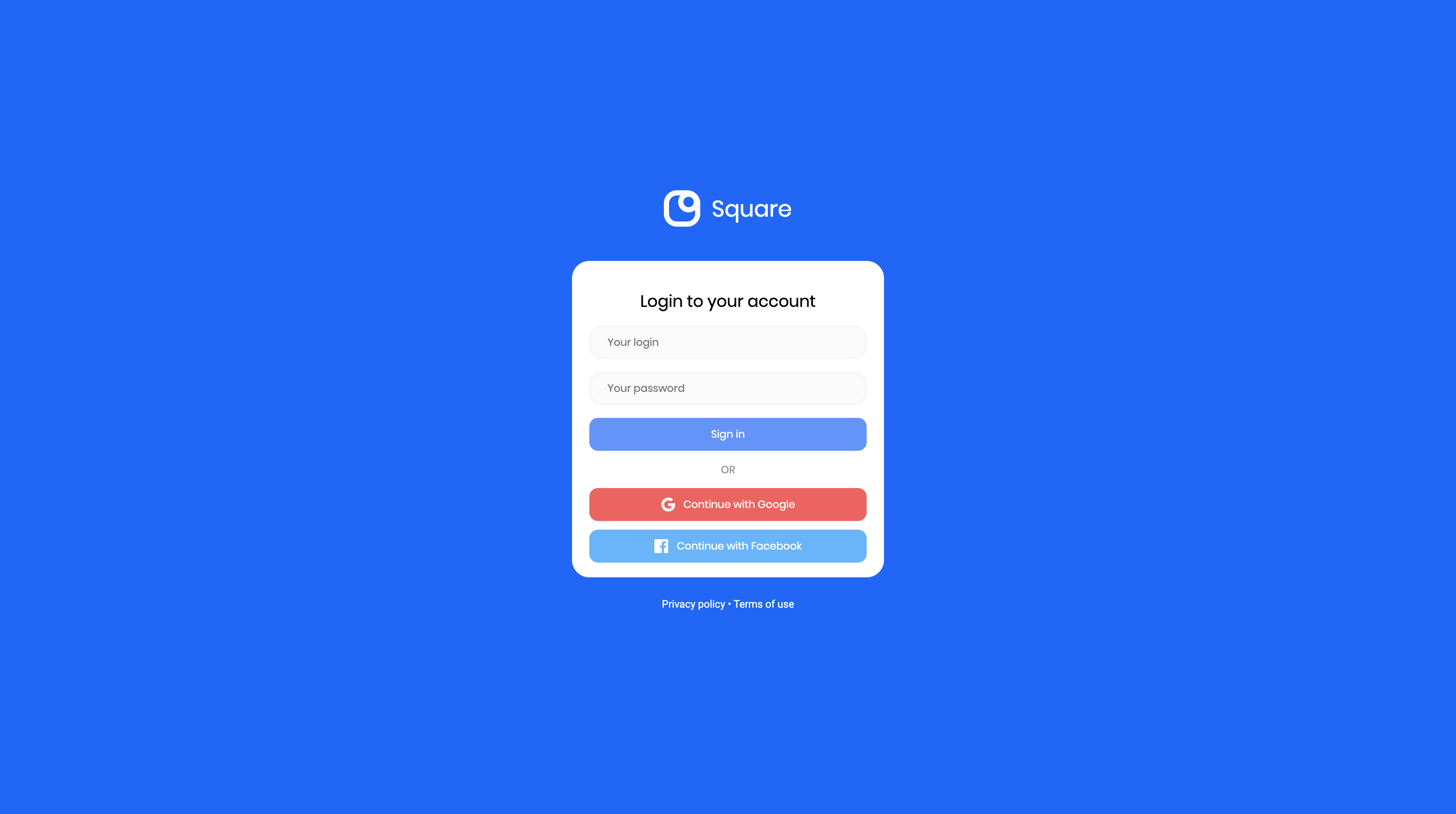
50 | Login to your account
23 |
30 | Hi James,
31 | here’s your currently projects
32 |
33 |
53 | Hi James,
54 | here’s your currently messages
55 |
56 |
53 | Hi James,
54 | here’s your currently schedule
55 |
56 |
53 | Hi James,
54 | here’s your currently settings
55 |
56 |