├── .github
└── ISSUE_TEMPLATE.md
├── .gitignore
├── .npmignore
├── CHANGELOG.md
├── CONTRIBUTING.md
├── DesignPrinciples.md
├── EvenMoreExamples.md
├── LICENSE.md
├── README.md
├── UniversalPinterestLayout.md
├── UniversalTiles.md
├── package.json
└── src
├── components
├── Column.js
├── Grid.js
└── Row.js
├── index.js
└── lib
├── ScreenInfo.js
└── helpers.js
/.github/ISSUE_TEMPLATE.md:
--------------------------------------------------------------------------------
1 |
--------------------------------------------------------------------------------
/.gitignore:
--------------------------------------------------------------------------------
1 | npm-debug.log
2 | node_modules/
3 | .vscode
4 | .DS_Store
5 | **/.DS_Store
6 | yarn.lock
7 |
--------------------------------------------------------------------------------
/.npmignore:
--------------------------------------------------------------------------------
1 | tests/
2 | node_modules/
3 | CHANGELOG.md
4 |
--------------------------------------------------------------------------------
/CHANGELOG.md:
--------------------------------------------------------------------------------
1 | # Changelog
2 | All notable changes to this project will be documented in this file.
3 |
4 | The format is based on [Keep a Changelog](http://keepachangelog.com/en/1.0.0/) with the minor addition of Breaking vs Non-Breaking sections under 'Changed.'
5 |
6 | This project adheres to [Semantic Versioning](http://semver.org/spec/v2.0.0.html).
7 |
8 | ## [Released]
9 |
10 | ## [0.41.0]
11 |
12 | ### Changed (breaking)
13 |
14 | - fixed break points (see Readme)
15 |
16 | ### Added (non-breaking)
17 |
18 | - setBreakPoints
19 |
20 | ## [0.40.0]
21 |
22 | ### Changed (breaking)
23 |
24 | - alignLines on Row now has 'stretch' as default value (consistent with CSS spec)
25 |
26 | ## [0.39.0]
27 |
28 | ### Changed (breaking)
29 |
30 | - Screen-size-specific _size_ and _hidden_ props now reference both the current screen width in case of Columns and the current screen height in case of Rows, both of which change with orientation. The _offset_ props only apply to Columns so they still refer to the current screen width.
31 |
32 | The following are the thresholds for these props:
33 |
34 | - SMALL_Width = 375
35 | - MEDIUM_Width = 414
36 | - LARGE_Width = 768
37 | - XLARGE_Width = 1024
38 |
39 | - SMALL_Height = 667
40 | - MEDIUM_Height = 736
41 | - LARGE_Height = 1024
42 | - XLARGE_Height = 1366
43 |
44 | ### Changed (non-breaking)
45 |
46 | - Rows and Cols can have position absolute (use for creating overlays, see Eample 2 for 2D positioning technique)
47 |
48 | ## [0.38.0]
49 |
50 | - Do not use this release (design regression fixed in 0.39.0)
51 |
52 | ## [0.37.0]
53 |
54 | ### Changed (breaking)
55 |
56 | - default value for vAlign on Row is now `stretch`
57 | - default value for hAlign on Col is now `stretch`
58 | - Grid is {flex: 1} by default and Grid's style can be fully overriden with user styles
59 |
60 | ## [0.35.0] 2017-11-28
61 |
62 | ### Changed (breaking)
63 |
64 | - Removed Row's reaction to its own layout changes. Screens must contain Grid at top of view hierarchy in order to respond to orientation changes. Non-orientation layout changes should be handled with Flexbox contsraints, no longer from JS. Simplifies code, usage and improves performance.
65 |
66 | ## [0.34.0] - 2017-11-22
67 |
68 | ### Changed (non-breaking)
69 |
70 | - exposed .shown and .hidden as instance variables on Row and Col components
71 |
72 | ### Changed (breaking)
73 |
74 | - replaced layoutEvent prop and having to build stateful components (and the ambiguity around where in the component tree to place layoutEvent) with a Grid component that sits at the very top of the UI component tree, above ScrollView, ListView and FlatList et al as an optional component for when managing state is necessary (e.g. adaptive layouts)
75 |
76 | ## [Released]
77 |
78 | ## [0.33.0] - 2017-06-27
79 |
80 | ### Changed (non-breaking)
81 |
82 | - fixed hide() and show() for columns in wrapped rows
83 | - made 'center' synonomous with 'middle' throughout
84 |
85 | ### Changed (breaking)
86 |
87 | - columns and rows have overflow: 'hidden' by design
88 |
89 | ## [Released]
90 |
91 | ## [0.32.01] - 2017-06-27
92 |
93 | ### Changed (non-breaking)
94 |
95 | - fixed regression with Row update when no layoutEvent is specified
96 |
97 | ## [0.32.0] - 2017-06-27
98 |
99 | ### Added
100 |
101 | - `alignSelf` for Row and Column. See Readme.
102 |
103 | ### Changed (non-breaking)
104 |
105 | - updated the Universal Tiles demo show the number of each tile at the center so it's clear what is happening when tiles are removed and re-inserted and when orientation changes.
106 |
107 | [*Updated* Universal Tiles demo https://www.youtube.com/watch?v=OPUKz9wQ1Ks](https://www.youtube.com/watch?v=OPUKz9wQ1Ks)
108 |
109 | ## [0.31.0] - 2017-06-26
110 |
111 | [Universal Tiles demo https://www.youtube.com/watch?v=x785Qib0ySg](https://www.youtube.com/watch?v=x785Qib0ySg)
112 |
113 | ### Removed (Breaking)
114 |
115 | - `fullHeight` may be supplied as prop to Row ONLY as a convenience to enable vAlign to work on child Column(s) -- fullWidth on Row has been removed since it can interfere with Column's offset prop.
116 |
117 | - `fullWidth` may be supplied as prop to Column ONLY as a convenience to enable hAlign to work on child Row(s) -- fullHeight on Column has been removed since it can interfere with Row's size prop.
118 |
119 | ### Added
120 |
121 | - Rows can have size props to set high, both in percent and absolute points. See updated Readme.
122 |
123 | - Example of Universal Tiles: responsive tiles with hide/show for Universal Apps. See updated Readme.
124 |
125 | - Column and Row now have show() and hide() methods. See Example #1 in updated Readme for usage.
126 |
127 | ### Changed (Breaking)
128 |
129 | - Simplified interaction of props and styles: except for position, styles take precedence over props.
130 |
131 | - 'wrap` is now the default behavior for Row. You must specify 'noWrap' to disable wrapping.
132 |
133 | ### Changed (non-breaking)
134 |
135 | - Updated Readme
136 |
137 | - Fixed regression with non-grid props propagation
138 |
139 | ## [0.30.0] - 2017-06-21
140 |
141 | ### Removed (Breaking)
142 |
143 | - breakPoints prop was introduced as a screen-size-specific, point-valued _override_ for screen-size-specific percent-valued `size` props. Given that we have just added point-valued, screen-size-specific `size` and `offset` props in 0.29.88, we no longer need breakPoints. Mixing percent-valued and point-valued sizing info is an anti-pattern and it has been removed. Use of minWidth and minHeight is still supported as explicit override, but it's no longer exposed as a high level interface, since it's noth confusing and not necessary given the aforementioned additions.
144 |
145 | ## [0.29.88 & 0.29.89] - 2017-06-20
146 |
147 | ### Added
148 | - Points-based `size` and `offset` props since absolute positioning is sometimes needed in a responsive layout, e.g. position of back arrow and hamburger menu on navigation bar.
149 | - `baseline` value for `vAlign` when supplied to Row
150 | - This CHANGELOG.md
151 |
152 | ### Changed (Non-breaking)
153 | - Fixed device-size-based offsets
154 | - Fixed regression in item alignment for RTL mode
155 | - Fixed handling of left/right margins (when set in style) relative to offset value and RTL/LTR modes
156 | - Refactored code for clarity and correctness
157 | - Updated Readme to explain use of newly added features
158 |
159 | ### Changed (Breaking)
160 |
161 | None.
--------------------------------------------------------------------------------
/CONTRIBUTING.md:
--------------------------------------------------------------------------------
1 | # Contribute
2 |
3 | ## Introduction
4 |
5 | First, thank you for considering contributing to react-native-responsive-grid! It's people like you that make the open source community such a great community! 😊
6 |
7 | We welcome any type of contribution, not only code. You can help with
8 | - **QA**: file bug reports, the more details you can give the better (e.g. screenshots with the console open)
9 | - **Marketing**: writing blog posts, howto's, printing stickers, ...
10 | - **Community**: presenting the project at meetups, organizing a dedicated meetup for the local community, ...
11 | - **Code**: take a look at the [open issues](issues). Even if you can't write code, commenting on them, showing that you care about a given issue matters. It helps us triage them.
12 | - **Money**: we welcome financial contributions in full transparency on our [open collective](https://opencollective.com/react-native-responsive-grid).
13 |
14 | ## Your First Contribution
15 |
16 | Working on your first Pull Request? You can learn how from this *free* series, [How to Contribute to an Open Source Project on GitHub](https://egghead.io/series/how-to-contribute-to-an-open-source-project-on-github).
17 |
18 | ## Submitting code
19 |
20 | Any code change should be submitted as a pull request. The description should explain what the code does and give steps to execute it. The pull request should also contain tests.
21 |
22 | ## Code review process
23 |
24 | The bigger the pull request, the longer it will take to review and merge. Try to break down large pull requests in smaller chunks that are easier to review and merge.
25 |
26 | It is also always helpful to have some context for your pull request. What was the purpose? Why does it matter to you?
27 |
28 | ## Financial contributions
29 |
30 | We also welcome financial contributions in full transparency on our [open collective](https://opencollective.com/react-native-responsive-grid).
31 | Anyone can file an expense. If the expense makes sense for the development of the community, it will be "merged" in the ledger of our open collective by the core contributors and the person who filed the expense will be reimbursed.
32 |
33 | ## Questions
34 |
35 | If you have any questions, create an [issue](issue) (protip: do a quick search first to see if someone else didn't ask the same question before!).
36 | You can also reach us at hello@react-native-responsive-grid.opencollective.com.
37 |
38 | ## Credits
39 |
40 | ### Contributors
41 |
42 | Thank you to all the people who have already contributed to react-native-responsive-grid!
43 |  44 |
45 |
46 | ### Backers
47 |
48 | Thank you to all our backers! [[Become a backer](https://opencollective.com/react-native-responsive-grid#backer)]
49 |
50 |
44 |
45 |
46 | ### Backers
47 |
48 | Thank you to all our backers! [[Become a backer](https://opencollective.com/react-native-responsive-grid#backer)]
49 |
50 |  51 |
52 |
53 | ### Sponsors
54 |
55 | Thank you to all our sponsors! (please ask your company to also support this open source project by [becoming a sponsor](https://opencollective.com/react-native-responsive-grid#sponsor))
56 |
57 |
51 |
52 |
53 | ### Sponsors
54 |
55 | Thank you to all our sponsors! (please ask your company to also support this open source project by [becoming a sponsor](https://opencollective.com/react-native-responsive-grid#sponsor))
56 |
57 |  58 |
58 |  59 |
59 |  60 |
60 |  61 |
61 |  62 |
62 |  63 |
63 |  64 |
64 |  65 |
65 |  66 |
66 |  67 |
68 |
--------------------------------------------------------------------------------
/DesignPrinciples.md:
--------------------------------------------------------------------------------
1 | ## Design Principles
2 |
3 | ### _Simple Calculations_
4 |
5 | This grid simplifies the mental model for grid based layouts by abandoning the format-based, columns-per-view approach (e.g. "12 column grid") and instead allowing the developer to specify the width of each grid column as a percentage of parent Row's width, so 10% meams 10 columns will fit inside the row, and 8.333% means 12 columns.
6 |
7 | ### _Simple Layout_
8 |
9 | While most React Native developers use `flex: n` (which is based on Facebook's Yoga layout algorithm) in place of the confusing mix of `flexGrow`, `flexShrink` and `flexBasis` (lots has been written about the Flexbox spec and its steep learning curve, e.g. [flex-grow is weird. Or is it?](https://css-tricks.com/flex-grow-is-weird/)) we still find it difficult to use `flex: n` since n is not a percentage of the parent view's computed or explicit width or height but a more complex constraint. We lose perspective on the item size relative to the size of its parent as we constrain the item sizes relative to each other rather that the size of each item relative to a single parent. It's like O(n) vs O(n^2) complexity for these two different sizing models in that instead of relating the size of each item to the size of its parent as a percentage (n steps), with `flex: n` we relate the size of each item to the size of each other (sibling) item (n^2 steps.) That's because we don't have a single scale (parent's width or height) to measure against. More importantly, we give up direct knowledge of each item's width as a percentage of the parent's width in favor of having comparative size factors for the sibling items. However, there are times when we'd like to have that, so this grid does not take that ability away from us. In fact, this grid relies heavily (under the hood) on Flexbox features like flexDirection, justifyContent, alignItems, and alignContent, but it uses them under the hood and combines them with a simple percentage-based layout model. This results in a layout system that is simple and predictable, yet powerful.
10 |
11 | Having said that, there is an escape hatch in that we can still specify a numerical `flex: n` constraint in styles of Row and Column and even use bare Views mixed in with Row and Column components.
12 |
13 | _When To Use Flexbox Sizing:_
14 |
15 | _In some cases when having an absolutely sized view followed (vertically or horizontally) by a view that must take up the remaining space, we'll need to use a wrapping grid element -- Column (to wrap vertical layout) or Row (to wrap horizontal layout) -- with style={{flex: 1}} and same on the Flex sized element that it wraps along with the absolutely sized element. However, such mixing of absolute and Flex sizing is not recommended as it won't lead to a fully responsive UI layout._
16 |
17 | Other than that, the only other reason to use Flexbox grow/shrink sizing is for non-scrollable "squishy" UIs that shrink/grow elements instead of performing dynamic layout change and/or keeping things in proportion to screen width (rather tham to each other as is the case with Flexbox grow/shrink siing) via percentage based layout. You can still do that with this grid but you wouldn't want to use it if that was your only use case.
18 |
19 | ### _Works in Both Directions_
20 |
21 | Sometimes, we lay things out from left to right (LTR.) Other times, we might find it easier to lay things out from right to left (RTL.) I've found that RTL support to be generally lacking in both React and React Native grids, so I've added support for it. React makes it really simple. This can be very useful for apps with right-to-left text, i.e. Arabic, Aramaic, Azeri, Dhivehi/Maldivian, Hebrew, Kurdish (Sorani), Persian/Farsi, and Urdu.
22 |
--------------------------------------------------------------------------------
/EvenMoreExamples.md:
--------------------------------------------------------------------------------
1 | # Even More Examples
2 |
3 | ## Responsive Layout
4 |
5 |
67 |
68 |
--------------------------------------------------------------------------------
/DesignPrinciples.md:
--------------------------------------------------------------------------------
1 | ## Design Principles
2 |
3 | ### _Simple Calculations_
4 |
5 | This grid simplifies the mental model for grid based layouts by abandoning the format-based, columns-per-view approach (e.g. "12 column grid") and instead allowing the developer to specify the width of each grid column as a percentage of parent Row's width, so 10% meams 10 columns will fit inside the row, and 8.333% means 12 columns.
6 |
7 | ### _Simple Layout_
8 |
9 | While most React Native developers use `flex: n` (which is based on Facebook's Yoga layout algorithm) in place of the confusing mix of `flexGrow`, `flexShrink` and `flexBasis` (lots has been written about the Flexbox spec and its steep learning curve, e.g. [flex-grow is weird. Or is it?](https://css-tricks.com/flex-grow-is-weird/)) we still find it difficult to use `flex: n` since n is not a percentage of the parent view's computed or explicit width or height but a more complex constraint. We lose perspective on the item size relative to the size of its parent as we constrain the item sizes relative to each other rather that the size of each item relative to a single parent. It's like O(n) vs O(n^2) complexity for these two different sizing models in that instead of relating the size of each item to the size of its parent as a percentage (n steps), with `flex: n` we relate the size of each item to the size of each other (sibling) item (n^2 steps.) That's because we don't have a single scale (parent's width or height) to measure against. More importantly, we give up direct knowledge of each item's width as a percentage of the parent's width in favor of having comparative size factors for the sibling items. However, there are times when we'd like to have that, so this grid does not take that ability away from us. In fact, this grid relies heavily (under the hood) on Flexbox features like flexDirection, justifyContent, alignItems, and alignContent, but it uses them under the hood and combines them with a simple percentage-based layout model. This results in a layout system that is simple and predictable, yet powerful.
10 |
11 | Having said that, there is an escape hatch in that we can still specify a numerical `flex: n` constraint in styles of Row and Column and even use bare Views mixed in with Row and Column components.
12 |
13 | _When To Use Flexbox Sizing:_
14 |
15 | _In some cases when having an absolutely sized view followed (vertically or horizontally) by a view that must take up the remaining space, we'll need to use a wrapping grid element -- Column (to wrap vertical layout) or Row (to wrap horizontal layout) -- with style={{flex: 1}} and same on the Flex sized element that it wraps along with the absolutely sized element. However, such mixing of absolute and Flex sizing is not recommended as it won't lead to a fully responsive UI layout._
16 |
17 | Other than that, the only other reason to use Flexbox grow/shrink sizing is for non-scrollable "squishy" UIs that shrink/grow elements instead of performing dynamic layout change and/or keeping things in proportion to screen width (rather tham to each other as is the case with Flexbox grow/shrink siing) via percentage based layout. You can still do that with this grid but you wouldn't want to use it if that was your only use case.
18 |
19 | ### _Works in Both Directions_
20 |
21 | Sometimes, we lay things out from left to right (LTR.) Other times, we might find it easier to lay things out from right to left (RTL.) I've found that RTL support to be generally lacking in both React and React Native grids, so I've added support for it. React makes it really simple. This can be very useful for apps with right-to-left text, i.e. Arabic, Aramaic, Azeri, Dhivehi/Maldivian, Hebrew, Kurdish (Sorani), Persian/Farsi, and Urdu.
22 |
--------------------------------------------------------------------------------
/EvenMoreExamples.md:
--------------------------------------------------------------------------------
1 | # Even More Examples
2 |
3 | ## Responsive Layout
4 |
5 |  6 |
7 |
8 | ### Navbar (ExNavigation - Todo: switch exampe to React Navigation)
9 |
10 | ```jsx
11 |
12 | static route = {
13 | navigationBar: {
14 | title: 'Home',
15 | renderTitle: (route, props) => {
16 | return (
17 |
6 |
7 |
8 | ### Navbar (ExNavigation - Todo: switch exampe to React Navigation)
9 |
10 | ```jsx
11 |
12 | static route = {
13 | navigationBar: {
14 | title: 'Home',
15 | renderTitle: (route, props) => {
16 | return (
17 |
18 |
19 |
20 |
21 |
)
22 | },
23 | renderRight: (route, props) => {
24 | const { config: { eventEmitter } } = route;
25 | return (
26 |
27 |
28 |
29 |
37 |
38 |
39 | )
40 | },
41 | backgroundColor: "#fff"
42 | }
43 | }
44 |
45 | ...
46 |
47 | // in styles:
48 |
49 | titleImage: {
50 | width: 120,
51 | height: 24,
52 | resizeMode: 'stretch'
53 | }
54 | ```
55 |
56 | ### Main Screen
57 |
58 | Note:
59 |
60 | Remember that paddingTop and marginTop when given as percentages are percentages of the parent view's width, not of its height. This is per the CSS spec.
61 |
62 | ```jsx
63 |
64 |
65 |
66 |
67 | PREVIOUS ORDERS
68 |
69 |
70 |
71 |
72 | SEE ALL
73 |
74 |
75 |
76 |
77 |
78 |
79 |
80 |
81 |
82 | February 28, 2017
83 |
84 |
85 |
86 |
87 |
88 | TAKEOUT ORDER
89 |
90 |
91 |
92 |
93 | Grilld Cheese Sandwich
94 | Key Lime Pie
95 |
96 |
97 |
98 |
99 |
100 |
101 |
102 |
103 |
104 |
105 |
106 |
107 |
108 |
109 | March 8, 2017
110 |
111 |
112 |
113 |
114 |
115 | DINE-IN ORDER
116 |
117 |
118 |
119 |
120 | Linguini Alfredo
121 |
122 |
123 |
124 |
125 |
126 |
127 |
128 |
129 |
130 |
131 |
132 |
133 | March 9, 2017
134 |
135 |
136 |
137 |
138 |
139 | TAKEOUT ORDER
140 |
141 |
142 |
143 |
144 | Double Cheese Burger
145 |
146 |
147 |
148 |
149 |
150 |
151 |
152 |
153 |
154 |
155 |
156 | FAVORITE ITEMS
157 |
158 |
159 |
160 |
161 | ADD MORE
162 |
163 |
164 |
165 |
166 |
167 |
168 |
169 | Linguini Alfredo
170 |
171 |
172 |
173 |
174 |
175 |
176 |
177 |
178 |
179 |
180 | Double Cheese Burger
181 |
182 |
183 |
184 |
185 |
186 |
187 |
188 | ```
189 |
190 | ## Custom Components
191 |
192 |  193 |
194 | ```jsx
195 | this.close()}
200 | >
201 |
193 |
194 | ```jsx
195 | this.close()}
200 | >
201 |
202 |
203 |
204 |
205 |
206 |
207 |
208 |
209 |
210 |
211 | this.close()}>
212 |
217 |
218 |
219 |
220 |
221 |
222 | LOG IN TO YOUR ACCOUNT
223 |
224 |
225 |
226 |
227 |
228 |
229 |
230 |
231 |
232 |
233 |
234 |
235 |
236 |
237 |
238 |
239 |
240 |
241 |
242 |
243 |
244 |
245 |
246 |
247 |
248 |
249 |
250 |
251 |
252 |
253 | Forgot password?
254 |
255 |
256 |
257 | |
258 |
259 |
260 |
261 | this.login()}>
262 |
263 | LOG IN
264 |
265 |
266 |
267 |
268 |
269 |
270 |
271 |
272 |
273 |
274 |
275 |
276 |
277 |
278 |
279 |
280 |
281 |
282 | LOG IN WITH FACEBOOK
283 |
284 |
285 |
286 |
287 |
288 |
289 |
290 |
291 | ```
292 |
293 | ## Wrapped Alignment
294 |
295 | By default, content (plural) in Rows will wrap if the sum of the width values of the content is larger than 100% of the row's width. To prevent wrapping of content (plural) the Row must have the 'noWrap' prop supplied. When rows are allowed to wrap the row will contain two or more horizontal "lines" that hold the items within it. The lines themselves (as opposed to the items within them) may be aligned in the vertical direction using alignLines prop (see Props section above for details)
296 |
297 | Here are two screens illustrating the effect of wrap, vAlign and alignLines. The first tells the row that it can turn into a multi-line row that wraps the items. The second tells it how to vertically align the items. The third tells it how to vertically align the wrapped lines that contain the items.
298 |
299 | Markup #1:
300 | ```jsx
301 |
302 |
303 |
304 | PREVIOUS ORDERS
305 |
306 |
307 |
308 |
309 | SEE ALL
310 |
311 |
312 |
313 | ```
314 |
315 |  316 |
317 | Markup #2:
318 | ```jsx
319 |
316 |
317 | Markup #2:
318 | ```jsx
319 |
320 |
321 |
322 | PREVIOUS ORDERS
323 |
324 |
325 |
326 |
327 | SEE ALL
328 |
329 |
330 |
331 | ```
332 |
333 |  334 |
--------------------------------------------------------------------------------
/LICENSE.md:
--------------------------------------------------------------------------------
1 | The MIT License (MIT)
2 |
3 | Copyright (c) 2016 Marc Fawzi (for modified version)
4 |
5 | The MIT License (MIT)
6 |
7 | Copyright (c) 2016 Derek Tor (for original)
8 |
9 | Permission is hereby granted, free of charge, to any person obtaining a copy of
10 | this software and associated documentation files (the "Software"), to deal in
11 | the Software without restriction, including without limitation the rights to
12 | use, copy, modify, merge, publish, distribute, sublicense, and/or sell copies of
13 | the Software, and to permit persons to whom the Software is furnished to do so,
14 | subject to the following conditions:
15 |
16 | The above copyright notice and this permission notice shall be included in all
17 | copies or substantial portions of the Software.
18 |
19 | THE SOFTWARE IS PROVIDED "AS IS", WITHOUT WARRANTY OF ANY KIND, EXPRESS OR
20 | IMPLIED, INCLUDING BUT NOT LIMITED TO THE WARRANTIES OF MERCHANTABILITY, FITNESS
21 | FOR A PARTICULAR PURPOSE AND NONINFRINGEMENT. IN NO EVENT SHALL THE AUTHORS OR
22 | COPYRIGHT HOLDERS BE LIABLE FOR ANY CLAIM, DAMAGES OR OTHER LIABILITY, WHETHER
23 | IN AN ACTION OF CONTRACT, TORT OR OTHERWISE, ARISING FROM, OUT OF OR IN
24 | CONNECTION WITH THE SOFTWARE OR THE USE OR OTHER DEALINGS IN THE SOFTWARE.
25 |
--------------------------------------------------------------------------------
/README.md:
--------------------------------------------------------------------------------
1 |
2 |
3 | [](https://npmjs.org/package/react-native-responsive-grid)
4 |
5 | [](#backers) [](#sponsors)
6 |
7 | # React Native Library for Responsive and Universal Apps
8 |
9 | ### Pending Proposals
10 |
11 | All issues that are not bugs are appropriately labeled and closed.
12 |
13 | For now we have three kinds of non-bug issues that are open:
14 |
15 | - [Pending Proposals](https://github.com/idibidiart/react-native-responsive-grid/issues?utf8=%E2%9C%93&q=is%3Aissue+label%3Aproposal+label%3Apending)
16 |
17 | - [Pending Questions](https://github.com/idibidiart/react-native-responsive-grid/issues?utf8=%E2%9C%93&q=is%3Aissue+label%3Aquestion+label%3Apending)
18 |
19 |
20 | ### Install
21 |
22 | In your project folder, `yarn add react-native-responsive-grid`
23 |
24 | *For best results, use React Native 0.50 or later
25 |
26 | ## Predictable Responsive Layout
27 |
28 | This grid is based on row and column components that can be nested in an alternating pattern to build a responsive and adaptive 'tree of Views' of any shape and depth. It eschews complicated Flexbox-based size constraints in favor of simple percentage-based size constraints. And it does so while using Flexbox-based vertical and horizontal alignment constraints.
29 |
30 | A Column may contain one or more Rows, each of which may contain one or more Columns, each of which may contain one or more Rows, and so on. Both Rows and Columns can be styled using predictable, percentage-based dimensions and, in case of Columns, percentage-based horizontal `offset`.
31 |
32 | Rows can be aligned inside Columns, vertically (along main axis,) and aligned and stretched horizontally (along cross axis.) Columns can be aligned inside Rows, horizontally (along main axis), and and aligned and stretched vertically (along cross axis.) Additionally, the lines created within a Row that wraps may be aligned and stretched vertically relative to a parent Column.
33 |
34 | With these basic features, we can build the entire UI component tree (or an individual component's subtree) as a consistent, repeatable and recursive pattern, one that has predictable and dynamic --not only static-- responsiveness and the ability to trigger specific adaptive behavior.
35 |
36 | _When To Use Flexbox Sizing:_
37 |
38 | _In some cases when having an absolutely sized view followed (vertically or horizontally) by a view that must take up the remaining space, we'll need to use a wrapping grid element -- Column (to wrap vertical layout) or Row (to wrap horizontal layout) -- with style={{flex: 1}} and same on the Flex sized element that it wraps along with the absolutely sized element. However, such mixing of absolute and Flex sizing is not recommended as it won't lead to a fully responsive UI layout._
39 |
40 | _The only other reason to use Flexbox grow/shrink sizing with this Grid is for grow-and-shrink-in-place UI (aka "squishy" UI) where elements shrink and grow in elastic fashion and relative to each other instead of undergoing dynamic layout change and/or staying in proportion to screen width._
41 |
42 | ## Examples
43 |
44 | You may use this grid to build responsive 2D layouts that maintain their relative proportions, change their basic structure in a predictable way and dynamically decide what content to display, based on screen size, aspect ratio, and orientation.
45 |
46 | ## [Example 1: Universal, Responsive Pinterest Layout](https://www.youtube.com/watch?v=QyIRoKinyLU)
47 | [](https://www.youtube.com/watch?v=QyIRoKinyLU)
48 |
49 | ## [Example 2: Reponsive Tiles for Universal Apps](https://www.youtube.com/watch?v=OPUKz9wQ1Ks)
50 | [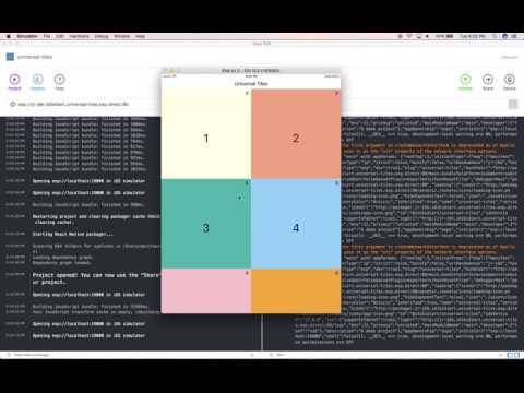](https://www.youtube.com/watch?v=OPUKz9wQ1Ks)
51 |
52 | ## [Example 3: Selecting an image with the right aspect ratio](https://www.youtube.com/watch?v=Nghqc5QFln8)
53 | [](https://www.youtube.com/watch?v=Nghqc5QFln8)
54 |
55 | ## [Example 4: Responsive Break Points (Row Wrapping)](https://www.youtube.com/watch?v=GZ1uxWEVAuQ)
56 | [](https://www.youtube.com/watch?v=GZ1uxWEVAuQ)
57 |
58 | ## [Example 5: FlatList + Row & Column Wrapping](https://www.youtube.com/watch?v=qLqxat3wX_8)
59 | [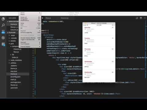](https://www.youtube.com/watch?v=qLqxat3wX_8)
60 |
61 | The demos in the videos above show some of the possibilities, but this grid is capable of more complex responsive and adaptive behavior.
62 |
63 | ### Example 1: Universal, Responsive Pinterest Layout
64 |
65 | This examples showcases 2-dimensional Constraint-Based Layout using a custom layout in a few lines of code. Flexbox fails us here in that it does not support a 2-dimensional constraint layout. This is precisely why React Native needs native support for display:'grid' Until then you may use this grid with your own constraint-based layout. This example shows a simplified Pinterest-like layout. You may extend it to build a masonry effect using a box packing algorithm and Flexbox's 1-dimensional constraint-based elastic layout. One thing this grid is not designed to do is to implement transitions but it can be forked and extended to do that (would happy take a PR.)
66 |
67 | [Source Code for Example 1](https://github.com/idibidiart/react-native-responsive-grid/blob/master/UniversalPinterestLayout.md)
68 |
69 | ### Example 2: Reponsive Tiles for Universal Apps
70 |
71 | This examples showcases the grid's 1-dimensional Constraint-Based Layout using Flexbox wrapping behavior.
72 |
73 | The problem it solves is how to make a tiled screen layout that looks consistent across all screen sizes and aspect ratios, It involves the following:
74 |
75 | 1. How to size tiles such that they change size relative to the size of the screen *as well as* retain their shape (width/height aspect ratio)
76 |
77 | 2. How do we hide/show tiles on demand and fill the void left by hidden tiles.
78 |
79 | The goal is how to do the above in an elegant and declarative way that allows the average user to work without all the tedious implementation details of doing it in row Flexbox and JS.
80 |
81 | _This example also showes how to use alignLines='stretch' for wrapped row content to have the wrapped lines fill the whole screen. It's the right way to partition a Row vertically in 1/n tall lines where n is the number of wrapping-stacked fullWidth columns._
82 |
83 | [Source Code for Example 2](https://github.com/idibidiart/react-native-responsive-grid/blob/master/UniversalTiles.md)
84 |
85 | ### Example 3: Selecting an image with the right aspect ratio
86 |
87 | In this demo, the grid picks the image with the **closest aspect ratio** to the device aspect ratio, dynamically, taking into account the current device orientation. The images themselves must be sized and cropped by the designer so that they match the common device aspect ratios (see below) while also showing the part of the image that the designer intends to show for each aspect ratio. Since there could be many aspect ratios that correspond to different devices we should have multiple such images (and, optionally, their rotated versions.)
88 |
89 | The following table maps some common device aspect ratios to the ratio of width/height of devices known to this developer, for both landscape and portrait device orientations. The physical device aspect ratio does not change with device rotation (i.e. a device with 16:9 aspect ratio does not become one with a 9:16 aspect ratio when it's rotated, although it does mathematically), but since the width and height get flipped when changing orientation from portrait to lanscape and vice versa, we need to have two images per each physical device aspect ratio, one for portrait mode and the other for landscape. However, if our app only supports portrait or landscape mode then we only need to have the one corresponding to that orientation.
90 |
91 | | Aspect Ratio | Width | Height | Width/Height Ratio (landscape) | Devices
92 | | :---: | :---: | :---: | :---: | :---: |
93 | | '16:9' | 568 | 320 | 1.77 | iPhone 5
94 | | '16:9' | 667 | 375 | 1.77 | iPhone 6 & 7
95 | | '16:9' | 736 | 414 | 1.77 | iPhone 6 Plus & 7 Plus
96 | | '16:10' | ? | ? | 1.6 | ?
97 | | '3:2' | 480 | 320 | 1.5 | iPhone 4
98 | | '4:3' | 1024 | 768 | 1.33 | iPad Mini, iPad Air and small iPad Pro
99 | | '4:3' | 1366 | 1024 | 1.33 | Large iPad Pro
100 | | '1:1' | 1 | ? | ? | ?
101 |
102 | | Aspect Ratio | Width | Height | Width/Height Ratio (portrait) | Devices
103 | | :---: | :---: | :---: | :---: | :---: |
104 | | '16:9' | 320 | 568 | 0.56 | iPhone 5
105 | | '16:9' | 375 | 667 | 0.56 | iPhone 6 & 7
106 | | '16:9' | 414 | 736 | 0.56 | iPhone 6 Plus & 7 Plus
107 | | '16:10' | ? | ? | 0.625| ?
108 | | '3:2' | 320 | 480 | 0.66 | iPhone 4
109 | | '4:3' | 768 | 1024 | 0.75 | iPad Mini, iPad Air and small iPad Pro
110 | | '4:3' | 1024 | 1366 | 0.75 | Large iPad Pro
111 | | '1:1' | 1 | ? | ? | ?
112 |
113 | ```jsx
114 | {(state, setState) => (
115 |
334 |
--------------------------------------------------------------------------------
/LICENSE.md:
--------------------------------------------------------------------------------
1 | The MIT License (MIT)
2 |
3 | Copyright (c) 2016 Marc Fawzi (for modified version)
4 |
5 | The MIT License (MIT)
6 |
7 | Copyright (c) 2016 Derek Tor (for original)
8 |
9 | Permission is hereby granted, free of charge, to any person obtaining a copy of
10 | this software and associated documentation files (the "Software"), to deal in
11 | the Software without restriction, including without limitation the rights to
12 | use, copy, modify, merge, publish, distribute, sublicense, and/or sell copies of
13 | the Software, and to permit persons to whom the Software is furnished to do so,
14 | subject to the following conditions:
15 |
16 | The above copyright notice and this permission notice shall be included in all
17 | copies or substantial portions of the Software.
18 |
19 | THE SOFTWARE IS PROVIDED "AS IS", WITHOUT WARRANTY OF ANY KIND, EXPRESS OR
20 | IMPLIED, INCLUDING BUT NOT LIMITED TO THE WARRANTIES OF MERCHANTABILITY, FITNESS
21 | FOR A PARTICULAR PURPOSE AND NONINFRINGEMENT. IN NO EVENT SHALL THE AUTHORS OR
22 | COPYRIGHT HOLDERS BE LIABLE FOR ANY CLAIM, DAMAGES OR OTHER LIABILITY, WHETHER
23 | IN AN ACTION OF CONTRACT, TORT OR OTHERWISE, ARISING FROM, OUT OF OR IN
24 | CONNECTION WITH THE SOFTWARE OR THE USE OR OTHER DEALINGS IN THE SOFTWARE.
25 |
--------------------------------------------------------------------------------
/README.md:
--------------------------------------------------------------------------------
1 |
2 |
3 | [](https://npmjs.org/package/react-native-responsive-grid)
4 |
5 | [](#backers) [](#sponsors)
6 |
7 | # React Native Library for Responsive and Universal Apps
8 |
9 | ### Pending Proposals
10 |
11 | All issues that are not bugs are appropriately labeled and closed.
12 |
13 | For now we have three kinds of non-bug issues that are open:
14 |
15 | - [Pending Proposals](https://github.com/idibidiart/react-native-responsive-grid/issues?utf8=%E2%9C%93&q=is%3Aissue+label%3Aproposal+label%3Apending)
16 |
17 | - [Pending Questions](https://github.com/idibidiart/react-native-responsive-grid/issues?utf8=%E2%9C%93&q=is%3Aissue+label%3Aquestion+label%3Apending)
18 |
19 |
20 | ### Install
21 |
22 | In your project folder, `yarn add react-native-responsive-grid`
23 |
24 | *For best results, use React Native 0.50 or later
25 |
26 | ## Predictable Responsive Layout
27 |
28 | This grid is based on row and column components that can be nested in an alternating pattern to build a responsive and adaptive 'tree of Views' of any shape and depth. It eschews complicated Flexbox-based size constraints in favor of simple percentage-based size constraints. And it does so while using Flexbox-based vertical and horizontal alignment constraints.
29 |
30 | A Column may contain one or more Rows, each of which may contain one or more Columns, each of which may contain one or more Rows, and so on. Both Rows and Columns can be styled using predictable, percentage-based dimensions and, in case of Columns, percentage-based horizontal `offset`.
31 |
32 | Rows can be aligned inside Columns, vertically (along main axis,) and aligned and stretched horizontally (along cross axis.) Columns can be aligned inside Rows, horizontally (along main axis), and and aligned and stretched vertically (along cross axis.) Additionally, the lines created within a Row that wraps may be aligned and stretched vertically relative to a parent Column.
33 |
34 | With these basic features, we can build the entire UI component tree (or an individual component's subtree) as a consistent, repeatable and recursive pattern, one that has predictable and dynamic --not only static-- responsiveness and the ability to trigger specific adaptive behavior.
35 |
36 | _When To Use Flexbox Sizing:_
37 |
38 | _In some cases when having an absolutely sized view followed (vertically or horizontally) by a view that must take up the remaining space, we'll need to use a wrapping grid element -- Column (to wrap vertical layout) or Row (to wrap horizontal layout) -- with style={{flex: 1}} and same on the Flex sized element that it wraps along with the absolutely sized element. However, such mixing of absolute and Flex sizing is not recommended as it won't lead to a fully responsive UI layout._
39 |
40 | _The only other reason to use Flexbox grow/shrink sizing with this Grid is for grow-and-shrink-in-place UI (aka "squishy" UI) where elements shrink and grow in elastic fashion and relative to each other instead of undergoing dynamic layout change and/or staying in proportion to screen width._
41 |
42 | ## Examples
43 |
44 | You may use this grid to build responsive 2D layouts that maintain their relative proportions, change their basic structure in a predictable way and dynamically decide what content to display, based on screen size, aspect ratio, and orientation.
45 |
46 | ## [Example 1: Universal, Responsive Pinterest Layout](https://www.youtube.com/watch?v=QyIRoKinyLU)
47 | [](https://www.youtube.com/watch?v=QyIRoKinyLU)
48 |
49 | ## [Example 2: Reponsive Tiles for Universal Apps](https://www.youtube.com/watch?v=OPUKz9wQ1Ks)
50 | [](https://www.youtube.com/watch?v=OPUKz9wQ1Ks)
51 |
52 | ## [Example 3: Selecting an image with the right aspect ratio](https://www.youtube.com/watch?v=Nghqc5QFln8)
53 | [](https://www.youtube.com/watch?v=Nghqc5QFln8)
54 |
55 | ## [Example 4: Responsive Break Points (Row Wrapping)](https://www.youtube.com/watch?v=GZ1uxWEVAuQ)
56 | [](https://www.youtube.com/watch?v=GZ1uxWEVAuQ)
57 |
58 | ## [Example 5: FlatList + Row & Column Wrapping](https://www.youtube.com/watch?v=qLqxat3wX_8)
59 | [](https://www.youtube.com/watch?v=qLqxat3wX_8)
60 |
61 | The demos in the videos above show some of the possibilities, but this grid is capable of more complex responsive and adaptive behavior.
62 |
63 | ### Example 1: Universal, Responsive Pinterest Layout
64 |
65 | This examples showcases 2-dimensional Constraint-Based Layout using a custom layout in a few lines of code. Flexbox fails us here in that it does not support a 2-dimensional constraint layout. This is precisely why React Native needs native support for display:'grid' Until then you may use this grid with your own constraint-based layout. This example shows a simplified Pinterest-like layout. You may extend it to build a masonry effect using a box packing algorithm and Flexbox's 1-dimensional constraint-based elastic layout. One thing this grid is not designed to do is to implement transitions but it can be forked and extended to do that (would happy take a PR.)
66 |
67 | [Source Code for Example 1](https://github.com/idibidiart/react-native-responsive-grid/blob/master/UniversalPinterestLayout.md)
68 |
69 | ### Example 2: Reponsive Tiles for Universal Apps
70 |
71 | This examples showcases the grid's 1-dimensional Constraint-Based Layout using Flexbox wrapping behavior.
72 |
73 | The problem it solves is how to make a tiled screen layout that looks consistent across all screen sizes and aspect ratios, It involves the following:
74 |
75 | 1. How to size tiles such that they change size relative to the size of the screen *as well as* retain their shape (width/height aspect ratio)
76 |
77 | 2. How do we hide/show tiles on demand and fill the void left by hidden tiles.
78 |
79 | The goal is how to do the above in an elegant and declarative way that allows the average user to work without all the tedious implementation details of doing it in row Flexbox and JS.
80 |
81 | _This example also showes how to use alignLines='stretch' for wrapped row content to have the wrapped lines fill the whole screen. It's the right way to partition a Row vertically in 1/n tall lines where n is the number of wrapping-stacked fullWidth columns._
82 |
83 | [Source Code for Example 2](https://github.com/idibidiart/react-native-responsive-grid/blob/master/UniversalTiles.md)
84 |
85 | ### Example 3: Selecting an image with the right aspect ratio
86 |
87 | In this demo, the grid picks the image with the **closest aspect ratio** to the device aspect ratio, dynamically, taking into account the current device orientation. The images themselves must be sized and cropped by the designer so that they match the common device aspect ratios (see below) while also showing the part of the image that the designer intends to show for each aspect ratio. Since there could be many aspect ratios that correspond to different devices we should have multiple such images (and, optionally, their rotated versions.)
88 |
89 | The following table maps some common device aspect ratios to the ratio of width/height of devices known to this developer, for both landscape and portrait device orientations. The physical device aspect ratio does not change with device rotation (i.e. a device with 16:9 aspect ratio does not become one with a 9:16 aspect ratio when it's rotated, although it does mathematically), but since the width and height get flipped when changing orientation from portrait to lanscape and vice versa, we need to have two images per each physical device aspect ratio, one for portrait mode and the other for landscape. However, if our app only supports portrait or landscape mode then we only need to have the one corresponding to that orientation.
90 |
91 | | Aspect Ratio | Width | Height | Width/Height Ratio (landscape) | Devices
92 | | :---: | :---: | :---: | :---: | :---: |
93 | | '16:9' | 568 | 320 | 1.77 | iPhone 5
94 | | '16:9' | 667 | 375 | 1.77 | iPhone 6 & 7
95 | | '16:9' | 736 | 414 | 1.77 | iPhone 6 Plus & 7 Plus
96 | | '16:10' | ? | ? | 1.6 | ?
97 | | '3:2' | 480 | 320 | 1.5 | iPhone 4
98 | | '4:3' | 1024 | 768 | 1.33 | iPad Mini, iPad Air and small iPad Pro
99 | | '4:3' | 1366 | 1024 | 1.33 | Large iPad Pro
100 | | '1:1' | 1 | ? | ? | ?
101 |
102 | | Aspect Ratio | Width | Height | Width/Height Ratio (portrait) | Devices
103 | | :---: | :---: | :---: | :---: | :---: |
104 | | '16:9' | 320 | 568 | 0.56 | iPhone 5
105 | | '16:9' | 375 | 667 | 0.56 | iPhone 6 & 7
106 | | '16:9' | 414 | 736 | 0.56 | iPhone 6 Plus & 7 Plus
107 | | '16:10' | ? | ? | 0.625| ?
108 | | '3:2' | 320 | 480 | 0.66 | iPhone 4
109 | | '4:3' | 768 | 1024 | 0.75 | iPad Mini, iPad Air and small iPad Pro
110 | | '4:3' | 1024 | 1366 | 0.75 | Large iPad Pro
111 | | '1:1' | 1 | ? | ? | ?
112 |
113 | ```jsx
114 | {(state, setState) => (
115 |
116 |
117 |
118 |
119 |
120 |
121 |
122 |
123 |
124 |
125 |
126 |
127 |
128 |
129 |
130 | )}
131 |
132 | ```
133 |
134 | ### Example 4: Responsive Break Points (Row Wrapping)
135 |
136 | A more basic example of he grid's 1-Dimensional Constraint-Based Layout using Flexbox.
137 |
138 | In the second demo, the grid folds columns in rows based on the screen-device-depebdent `xxSize` prop provided on the column (which can be percentage based, e.g. smSize, or point based, e.g. smSizePoints. This means that different break points can be supplied for the different screen sizes in both absolute and relative terms. This example demonstrates how to get Row content (e.g. child Columns) to wrap at certain break points (which can be supplied per screen width)
139 |
140 | The following are the preset screen widths (in points) at which breaks maybe specified (where row wraps columns within it into new horozintal lines):
141 |
142 | - SMALL_Width: 375 (0-375)
143 | - MEDIUM_Width: 767 (376-767)
144 | - LARGE_Width: 1023 (768-1023)
145 | - XLARGE_Width: 1024+
146 |
147 | - SMALL_Height: 667 (0-667)
148 | - MEDIUM_Height: 1023 (668-1023)
149 | - LARGE_Height: 1365 (1024-1365)
150 | - XLARGE_Height: 1366+
151 |
152 | The preset values may be overridden with `setBreakPoints` which merges the parameter object with the defaults. Each cutoff specifies the upper end for that range. `XLARGE_Width` is inferred from anything above `LARGE_Width`. BreakPoints should be set early in the app such as in `index.js`. An example overriding the `SMALL_Width`, `MEDIUM_Width`, and `LARGE_Width` break points:
153 | ```
154 | import { setBreakPoints } from 'react-native-responsive-grid';
155 |
156 | setBreakPoints({
157 | SMALL_Width: 414,
158 | MEDIUM_Width: 600,
159 | LARGE_Width: 1024
160 | })
161 | ```
162 |
163 | ```jsx
164 |
165 |
166 |
167 |
168 | March 9, 2017
169 |
170 |
171 |
172 |
173 |
174 | TAKEOUT ORDER
175 |
176 |
177 |
178 |
179 | Double Cheese Burger
180 |
181 |
182 |
183 |
184 |
185 |
186 |
187 | ```
188 |
189 | ### Example 5: FlatList + Row & Column Wrapping
190 |
191 | FlatList is a virtualized replacement for React Native's old ListView component. Using FlatList as a container is supported by this grid. This example also demonstrate wrapping Column content based on screen size. See ('size' prop under the [Props](https://github.com/idibidiart/react-native-responsive-grid#props) section.) It also demonstrates who to wrap Row content (e.g. child columns) based on screen size (also see [Example 4](https://github.com/idibidiart/react-native-responsive-grid#example-4))
192 |
193 | ```jsx
194 | import React, { Component } from 'react';
195 | import {
196 | FlatList,
197 | Text,
198 | ScrollView
199 | } from 'react-native';
200 |
201 | import { Row, Column as Col, Grid} from 'react-native-responsive-grid'
202 | import { MaterialIcons } from '@expo/vector-icons';
203 | import faker from 'faker';
204 |
205 | let j = 0
206 | const randomUsers = (count = 10) => {
207 | const arr = [];
208 | for (let i = 0; i < count; i++) {
209 | arr.push({
210 | key: faker.random.uuid(),
211 | date: faker.date.weekday(),
212 | name: faker.name.firstName(),
213 | job: faker.name.jobTitle(),
214 | index: j++
215 | })
216 | }
217 | return arr
218 | }
219 |
220 | export default class Home extends Component {
221 | state = {
222 | refreshing: false,
223 | data: randomUsers(10),
224 | };
225 |
226 | onEndReached = () => {
227 | const data = [
228 | ...this.state.data,
229 | ...randomUsers(10),
230 | ]
231 |
232 | this.setState(state => ({
233 | data
234 | }));
235 | };
236 |
237 | onRefresh = () => {
238 | this.setState({
239 | data: randomUsers(10),
240 | });
241 | }
242 |
243 | render() {
244 | return (
245 | {
254 | return (
255 |
256 |
257 |
258 |
259 | {String(item.date)}
260 |
261 |
262 |
263 |
264 |
265 | {item.job}
266 |
267 |
268 |
269 |
270 | {item.name}
271 |
272 |
273 |
274 |
275 | {item.index}
276 |
277 |
278 | )
279 | }}
280 | />
281 | )
282 | }
283 | }
284 | ```
285 |
286 | ## Components
287 |
288 | - Row: Flexbox View with flexDirection set to 'row' with convenient props and dynamic behavior.
289 |
290 | - Col: Flexbox View with flexDirection set to 'column' with convenient props and dynamic behavior.
291 |
292 | - Grid: an optional, stateful, component with style={{flex: 1}}. The Grid uses the children-as-funnction pattern and passes its state to its children, and allows state to be declared in its props, which will have the latest screen and grid info after orientation changes. It also passes it's render-triggering async setState method to its children.
293 |
294 | **Important:**
295 |
296 | **Grid component is required if you need to re-run the render() function in response to orientation change (many examples here)**
297 |
298 | **Grid component is also required if you use aspectRatio prop on Rows or Columns since the selection of content of the closest aspect ratio requires re-running the render function after orientation change.**
299 |
300 | Below is an example:
301 |
302 | ```jsx
303 | export const Home = () => (
304 |
309 | {({state, setState}) => (
310 | {/* possibly other JSX here */}
311 |
312 |
313 |
314 | {layout(state)}
315 |
316 |
317 |
318 | )}
319 | )
320 | ```
321 |
322 | ## Utils
323 |
324 | import { Row, Column as Col, ScreenInfo, Grid} from './grid'
325 |
326 | `ScreenInfo()` This will return the following data:
327 |
328 | ```js
329 | {
330 | mediaSize: mediaSizeWidth,
331 | mediaSizeWidth,
332 | mediaSizeHeight,
333 | width: SCREEN_WIDTH,
334 | height: SCREEN_HEIGHT,
335 | aspectRatio: {currentNearestRatio, currentOrientation}
336 | }
337 | ```
338 |
339 | - mediaSize is one of `sm`, `md`, `lg`, `xl` screen width categories and is aliased to mediaSizeWidth
340 | - mediaSizeHeight is the same but for screen height. It's used for hiding/showing Rows wit `hidden` prop based on screen height category and for Row `size` props.
341 |
342 | if `sizeOnly` is true it will drop aspectRatio and its 'nearest match' calculation (shaves a few ms)
343 |
344 | ## Methods
345 |
346 | Row and Column both have `.hide()` and `.show()` instance methods. The instance reference you get from a ref callback will have these methods. See Example #1 for usage.
347 |
348 | ## Instance Variables
349 |
350 | These are provided mainly for unit tests, except for componentInstance`.hidden` and componentInstance`.shown` which can be used to tell the state of the component.
351 |
352 | ## Props
353 |
354 | All props are case sensitive.
355 |
356 | `aspectRatio` (see [Example 3](https://github.com/idibidiart/react-native-responsive-grid#example-3))
357 |
358 | `size` may be supplied as prop to Column (width) or Row (height). This number defines the width of the column or height of a row as a percentage of its parent view's computed or explicit width or height, respectively.
359 |
360 | `smSize`, `mdSize`, `lgSize` and `xlSize` are device-dependent size values that are applied to Columns (which map to width percent) and Rows (which map to height percent.) In addition to their utility in deciding the size of content based on screen size (width in case of Columns and height in case of Rows), they may are also used for defining column wrapping behavior based on screen size. For example, Columns in as Row will wrap if Row width becomes smaller at smaller screen sizes.
361 |
362 | `sizePoints` may be supplied as prop to Column (which map to width points) or Row (which map to height points). This number defines the width of the column or height of a row as an asolute value in points.
363 |
364 | `smSizePoints`, `mdSizePoints`, `lgSizePoints`, and `xlSizePoints` are like their percentage-based equivalents but use point values.
365 |
366 | `offset` may be applied to Column. This number defines the marginLeft (or marginRight in csase of RTL mode) for the column as a percentage of its parent view's computed or explicitly set width. Offset values can also be negative. Default is 0.
367 |
368 | `smOffset`, `mdOffset`, `lgOffset` and `xlOffset` are device-dependent offset values that are applied to columns.
369 |
370 | `offsetPoints`, `mdOffsetPoints`, `lgOffsetPoints`, and `xlOffsetPoints` are like their percentage-based equivalents (i.e. applied to Column to produce offset) but use value in points instead of value in percent.
371 |
372 | _Using offset values in RTL mode moves things from right to left. Using them in normal LTR mode moves things from left to right. It's pretty normal to expect that. If you're working in both directions, this makes offsets more useful than using marginLeft or marginRight directly._
373 |
374 | _Specifying an offset value in normal LTR mode means marginLeft (if specified in style prop) will be overwritten by offset value. However, marginRight (if specified in style prop) will not be overwritten by the offset value. Specifying offset value in RTL mode means marginRight (if specified in style prop) will be overwritten by offset value. However, marginLeft (if specified in style prop) will not be overwritten by offset value._
375 |
376 | `smHidden`, `mdHidden`, `lgHidden` and `xlHidden` - may be applied to Column or Row which tells the parent Row or Column, respectively, to hide the affected child Column or child Row based on the current width (for child Columns) or height (for child Rows) of the screen.
377 |
378 | The screen-size-specific _size_ and _hidden_ props refer to the current screen width in case of Columns and current screen height in case of Rows, which changes with orientation. The _offset_ props only apply to Columns so they refer to the current screen width.
379 |
380 | The following are the device width (for Columns) and height (for Rows) thresholds for these props:
381 |
382 | The preset values may be overridden with `setBreakPoints` which merges the parameter object with the defaults. Each cutoff specifies the upper end for that range. `XLARGE_Width` is inferred from anything above `LARGE_Width`. BreakPoints should be set early in the app such as in `index.js`. An example overriding the `SMALL_Width`, `MEDIUM_Width`, and `LARGE_Width` break points:
383 | ```
384 | import { setBreakPoints } from 'react-native-responsive-grid';
385 |
386 | setBreakPoints({
387 | SMALL_Width: 414,
388 | MEDIUM_Width: 600,
389 | LARGE_Width: 1024
390 | })
391 | ```
392 |
393 | `vAlign` may be supplied as prop to Column to vertically align the elements and/or rows within it. Possible values are: `middle` | `center`, `top`, `bottom`, `space` and `distribute`. Default is top.
394 |
395 | `vAlign` may also be supplied as prop to Row to align the columns within it in the vertical direction. Possible values are: `top`, `middle` | `center`, `bottom`, `baseline` and `stretch`. Default is `stretch`.
396 |
397 | `hAlign` may be supplied as prop to Row to align its child Columns and/or elements within it in the horizontal direction. Possible values are: `center` | `middle`, `left`, `right`, `space` and `distribute`. Default is left.
398 |
399 | `hAlign` may also be supplied as prop to Column to align its child Rows and/or elements within it in the horizontal direction. Possible values are: `center` | `middle`, `left`, `right`, and `stretch`. Default is `stretch`.
400 |
401 | `rtl` may be supplied as prop to Row to both reverse the order of columns (or elements) inside a row as well as to set hAlign to 'right.' This is useful for right-to-left layouts.
402 |
403 | `fullHeight` may be supplied as prop to Row in place of size={100} or style={{height: '100%'}} -- note that Rows have 0 height and width by default, but a fullHeight Row inside of a fullWidth Column will have height and width of 100%
404 |
405 | `fullWidth` may be supplied as prop to Column in place of size={100} or style={{width: '100%'}} -- note that Columns have 0 height and width by default, but a fullWidth Column inside of a fullHeight Row will have height and width of 100%
406 |
407 | `alignLines` may be supplied as prop to Row to vertically align the wrapped lines within the Row (not to be confused with the items that are inside each line.) Possible values are: top, middle, bottom, space, distribute, stretch. (See section on Aligning Wrapped Lines within Rows)
408 |
409 | `alignSelf` maybe supplied as prop to Row to override the hAlign prop of the parent Column for that Row.
410 | Possible values are: `auto`, `left`, `right`, `center` | `middle`, `stretch`
411 |
412 | `alignSelf` maybe supplied as prop to Column to override the vAlign prop of the parent Row for that Column.
413 | Possible values are: `auto`, `top`, `bottom`, `middle` | `center`, `stretch`, `baseline`
414 |
415 | `noWrap` may be supplied as prop to Row prevent child elements from wrapping.
416 |
417 | ### Nesting
418 |
419 | If you're nesting a column inside a row which is inside another column that is inside another row as below:
420 |
421 | ```jsx
422 |
423 |
424 |
425 |
426 |
427 | This column is 25% of the outer view's width (or 25% of the screen width if
428 | the top level Row has no parent)
429 |
430 |
431 |
432 |
433 |
434 | ```
435 |
436 | The nested column's size will be the column size value (size, sm, md, lg, xl) as a percentage of the width of the preceding column in the hierarchy .
437 |
438 | This nested percentages model applies to offsets, too.
439 |
440 | ### RTL Support
441 |
442 | This is intended for right-to-left (RTL) layouts and apps that have their text in any of the following languages:
443 |
444 | - Arabic
445 | - Aramaic
446 | - Azeri
447 | - Dhivehi/Maldivian
448 | - Hebrew
449 | - Kurdish (Sorani)
450 | - Persian/Farsi
451 | - Urdu
452 |
453 | Notice the reversed order of the Text relative to the physical order in the markup. Also notice that columns are justified as flex-end within the row and their content is rightAligned (except for the second column which is explicitly leftAligned to mimic the rightAligned behavior in normal ltr layout)
454 |
455 |  456 |
457 | ### Normal LTR Markup
458 |
459 | ```jsx
460 |
456 |
457 | ### Normal LTR Markup
458 |
459 | ```jsx
460 |
461 |
462 |
463 | PREVIOUS ORDERS
464 |
465 |
466 |
467 |
468 | SEE ALL
469 |
470 |
471 |
472 | ```
473 |
474 | ### RTL Markup
475 |
476 | Notice the offset values work in RTL direction now. The addition of .7 offset is to mimic the fact that the left margin in the LTR layout is smaller than the right margin in that layout, whereas it's the opposite in the RTL direction. So the .7 offset is used in RTL layout instead of the 1 offset, so alignment is identical.
477 |
478 | ```jsx
479 |
480 |
481 |
482 | PREVIOUS ORDERS
483 |
484 |
485 |
486 |
487 | SEE ALL
488 |
489 |
490 |
491 | ```
492 |
493 | ### Utils
494 |
495 | You may import ScreenInfo from grid and invoke inside of render() of your component to get current screen diemsnions and orientation.
496 |
497 | ### Predictable, Dynamic Layout Behavior
498 |
499 | Being able to readt to layout changes, including changes due to device rotation (for apps that allow it), is a key aspect of responsive design. This grid is designed to enable dynamic response to layout changes (see the demos at the start of this Readme)
500 |
501 | Columns and Rows have `position: 'relative'` by default to keep them within the layout flow, but they can have `position: 'absolute'` specified in style prop, for overlays and such.
502 |
503 | The Grid component is a stateful top-level component (at root, above ScrollView, ListView, FlatList et al but below a Modal and Drawer) Grid should not be inside another Grid and it is only needed if you wish to respond to orientation and layout changes by re-running the render() function. It uses the children-as-funnction pattern to pass its state, including its dimensions and any user-defined state, along with screen dimensions, to its children. The user may define Grid state in its props. The Grid also passes it's async render-causing setState method to its children.
504 |
505 | ## More Examples
506 |
507 | ```jsx
508 | import {Column as Col, Row} from 'react-native-responsive-grid';
509 |
510 |
511 |
512 | First Column
513 |
514 |
515 | ```
516 |
517 | In the example above, on a phone in portrait mode, the Column would take up 50% of the row's computed width. On a phone in landscape nmode or a normal tablet the Column would take up 33.333% of the row's width. On a big tablet the Column would take up 25% of the row's width.
518 |
519 | ```jsx
520 | import {Column as Col, Row} from 'react-native-responsive-grid';
521 |
522 |
523 |
524 | test
525 |
526 |
527 | ```
528 |
529 | In the example above, the text "test" will move further to the right with larger screen sizes.
530 |
531 | ```jsx
532 | import {Column as Col, Row} from 'react-native-responsive-grid';
533 |
534 |
535 |
536 | Column displayed when width is <= 480
537 |
538 |
539 | Column displayed when width is > 480
540 |
541 |
542 | ```
543 |
544 | In the example above, the column and all of it's children will be hidden on small screens like phones, but it will appear on bigger screens like tablets. The size-prefixed 'hidden' props may be applied to columns. Hidden props are all booleans. They default to false.
545 |
546 | ## More Examples
547 |
548 | - [Responsive Layout](https://github.com/idibidiart/react-native-responsive-grid/blob/master/EvenMoreExamples.md#responsive-layout)
549 | - [Custom Components](https://github.com/idibidiart/react-native-responsive-grid/blob/master/EvenMoreExamples.md#custom-components)
550 | - [Wrapped Alignment](https://github.com/idibidiart/react-native-responsive-grid/blob/master/EvenMoreExamples.md#wrapped-alignment)
551 |
552 | ## History
553 |
554 | Before React Native v0.42 we didn't have a performant, declarative way of specifying percentage-based dimensions. Then came React Native v0.42 which gave us that ability. Since then several open source contributors have made responsive grids that take advantage of this new capability. This "grid" takes one of the simplest and most well-thought-out ones, namely, `react-native-flexbox-grid` (by @rundmt), and modifies it heavily to produce a simple yet powerful layout model that we can use to implement responsive and adaptive behavior.
555 |
556 | # Gridism
557 |
558 | ## _When I first made a grid I happened to be thinking of the innocence of trees and then this grid came into my mind and I thought it represented innocence, and I still do, and so I painted it and then I was satisfied. I thought, this is my vision._ --[Agnes Martin](https://www.guggenheim.org/arts-curriculum/topic/grids)
559 |
560 |
561 | ## Contributors
562 |
563 | This project exists thanks to all the people who contribute. [[Contribute]](CONTRIBUTING.md).
564 |
565 |
566 |
567 | ## Backers
568 |
569 | Thank you to all our backers! 🙏 [[Become a backer](https://opencollective.com/react-native-responsive-grid#backer)]
570 |
571 |
572 |
573 |
574 | ## Sponsors
575 |
576 | Support this project by becoming a sponsor. Your logo will show up here with a link to your website. [[Become a sponsor](https://opencollective.com/react-native-responsive-grid#sponsor)]
577 |
578 |
579 |
580 |
581 |
582 |
583 |
584 |
585 |
586 |
587 |
588 |
589 |
590 |
--------------------------------------------------------------------------------
/UniversalPinterestLayout.md:
--------------------------------------------------------------------------------
1 | ## Universal, Responsive Pinterest Layout
2 |
3 | ```jsx
4 | import React, { Component} from 'react'
5 |
6 | import {
7 | View,
8 | Text,
9 | Image,
10 | StyleSheet,
11 | ScrollView,
12 | ImageBackground
13 | } from 'react-native'
14 |
15 | import { Row, Column as Col, ScreenInfo, Grid} from './grid'
16 |
17 | // column width (relative to screen size)
18 | const sizes = {sm: 100, md: 50, lg: 25, xl: 20}
19 |
20 | const layout = (state) => {
21 |
22 | const numCols = Math.floor(100/sizes[ScreenInfo().mediaSize])
23 | const numRows = Math.ceil(data.length / numCols)
24 | const colWidth = state.layout.grid ? state.layout.grid.width / numCols : 0
25 |
26 | let layoutMatrix = [], layoutCols = []
27 |
28 | for (let col = 0; col < numCols; col++) {
29 | layoutMatrix.push([])
30 | for (let row = 0, i = col; row < numRows; row++, i += numCols) {
31 | if (data[i])
32 | layoutMatrix[col].push(
33 |
72 |
73 |
83 |
84 | {props.id}
85 |
86 |
87 |
88 |
89 | )}
90 |
91 | export const Home = () => (
92 | {({state, setState}) => (
93 |
94 |
95 |
96 | {layout(state)}
97 |
98 |
99 |
100 | )}
101 | )
102 |
103 | const data = [
104 | {
105 | url: 'https://i.pinimg.com/236x/d8/3a/9b/d83a9b6faf2e58ff895342242bd62214.jpg',
106 | pixelHeight: 354,
107 | pixelWidth: 236
108 | },
109 | {
110 | url: 'https://i.pinimg.com/236x/61/35/93/613593ea3d5537c7f85f7365f0d72f45.jpg',
111 | pixelHeight: 157,
112 | pixelWidth: 236
113 | },
114 | {
115 | url: 'https://i.pinimg.com/236x/52/7c/66/527c66879c1bbbeaf53938e467ee8927.jpg',
116 | pixelHeight: 289,
117 | pixelWidth: 236
118 | },
119 | {
120 | url: 'https://i.pinimg.com/236x/16/8e/1e/168e1e2ba9e74baf37e1c64df576b79c.jpg',
121 | pixelHeight: 326,
122 | pixelWidth: 236
123 | },
124 | {
125 | url: 'https://i.pinimg.com/236x/22/0f/01/220f016c154044a51abca097f7ecc4ea.jpg',
126 | pixelHeight: 354,
127 | pixelWidth: 236
128 | },
129 | {
130 | url: 'https://i.pinimg.com/236x/14/3a/8c/143a8c283ecaecbf90058ac0f914a1ed.jpg',
131 | pixelHeight: 176,
132 | pixelWidth: 236
133 | },
134 | {
135 | url: 'https://i.pinimg.com/236x/3d/65/6f/3d656f63189290a84d906b92d0d1565d.jpg',
136 | pixelHeight: 571,
137 | pixelWidth: 236
138 | },
139 | {
140 | url: 'https://i.pinimg.com/236x/7a/2c/f2/7a2cf28357e37a95dfac3d273ef9cb0a.jpg',
141 | pixelHeight: 265,
142 | pixelWidth: 190
143 | },
144 | {
145 | url: 'https://i.pinimg.com/236x/57/f2/c5/57f2c55991b7173ffa9056c413cae260.jpg',
146 | pixelHeight: 744,
147 | pixelWidth: 236
148 | },
149 | {
150 | url: 'https://i.pinimg.com/236x/e0/d3/85/e0d385c22794dc2140639ffc73257047.jpg',
151 | pixelHeight: 354,
152 | pixelWidth: 236
153 | },
154 | {
155 | url: 'https://i.pinimg.com/236x/b2/bf/d8/b2bfd8cb9ecb96982de45d96ef5f5801.jpg',
156 | pixelHeight: 249,
157 | pixelWidth: 236
158 | },
159 | {
160 | url: 'https://i.pinimg.com/236x/c3/73/2a/c3732abb95e790432a0208097c4e662e.jpg',
161 | pixelHeight: 314,
162 | pixelWidth: 236
163 | },
164 | {
165 | url: 'https://i.pinimg.com/236x/24/1b/5e/241b5eb929d7353e7a85c37cffad4027.jpg',
166 | pixelHeight: 188,
167 | pixelWidth: 236
168 | },
169 | {
170 | url: 'https://i.pinimg.com/236x/8b/73/b9/8b73b932a9d73ae7e17f3ccc8fc4029c.jpg',
171 | pixelHeight: 156,
172 | pixelWidth: 236
173 | },
174 | {
175 | url: 'https://i.pinimg.com/236x/88/a8/4d/88a84d09003aae699bde89d888428642.jpg',
176 | pixelHeight: 361,
177 | pixelWidth: 236
178 | },
179 | {
180 | url: 'https://i.pinimg.com/236x/3c/ca/4f/3cca4f233f253b4ca72010f5200cb372.jpg',
181 | pixelHeight: 249,
182 | pixelWidth: 202
183 | },
184 | {
185 | url: 'https://i.pinimg.com/236x/35/50/b5/3550b5659e25022e8af69fb8f6417e13.jpg',
186 | pixelHeight: 1137,
187 | pixelWidth: 236
188 | },
189 | {
190 | url: 'https://i.pinimg.com/236x/ba/2d/f9/ba2df9aa774329560f3ee48fc947a299.jpg',
191 | pixelHeight: 785,
192 | pixelWidth: 236
193 | },
194 | {
195 | url: 'https://i.pinimg.com/236x/f0/45/4d/f0454d0a5047ba3c73a50cc8c9d80bba.jpg',
196 | pixelHeight: 353,
197 | pixelWidth: 236
198 | },
199 | {
200 | url: 'https://i.pinimg.com/236x/d8/64/ca/d864cad4ec4d9cfb1a08202a887bb175.jpg',
201 | pixelHeight: 353,
202 | pixelWidth: 236
203 | },
204 | {
205 | url: 'https://i.pinimg.com/236x/2d/f4/91/2df491590161974dc461767bd405de8e.jpg',
206 | pixelHeight: 405,
207 | pixelWidth: 236
208 | },
209 | {
210 | url: 'https://i.pinimg.com/236x/c6/6d/02/c66d0236627dbb979f8b1c1b5cc3e8fb.jpg',
211 | pixelHeight: 354,
212 | pixelWidth: 236
213 | },
214 | {
215 | url: 'https://i.pinimg.com/236x/bd/3c/35/bd3c35762f8174decf01096f980c10e0.jpg',
216 | pixelHeight: 236,
217 | pixelWidth: 236
218 | },
219 | {
220 | url: 'https://i.pinimg.com/236x/90/0a/49/900a49c038c9759f79ddccbf6a82c499.jpg',
221 | pixelHeight: 480,
222 | pixelWidth: 230
223 | },
224 | {
225 | url: 'https://i.pinimg.com/236x/13/24/2f/13242f1e28dfe2e590859107d31758a1.jpg',
226 | pixelHeight: 300,
227 | pixelWidth: 225
228 | },
229 | {
230 | url: 'https://i.pinimg.com/236x/cc/da/2a/ccda2a351bb00a0267bb98e6bc8067eb.jpg',
231 | pixelHeight: 577,
232 | pixelWidth: 236
233 | },
234 | {
235 | url: 'https://i.pinimg.com/236x/a7/1e/97/a71e9712083d908d31d55ada64598125.jpg',
236 | pixelHeight: 394,
237 | pixelWidth: 236
238 | },
239 | {
240 | url: 'https://i.pinimg.com/236x/2d/cf/1e/2dcf1eca1f7329f45b4ecc572841b0f7.jpg',
241 | pixelHeight: 187,
242 | pixelWidth: 236
243 | },
244 | {
245 | url: 'https://i.pinimg.com/236x/d5/32/b3/d532b398c2c824bace748d5c876e0d1f.jpg',
246 | pixelHeight: 975,
247 | pixelWidth: 236
248 | },
249 | {
250 | url: 'https://i.pinimg.com/236x/4f/a3/44/4fa3442fd9a7e2da25ddaddb968b6d0a.jpg',
251 | pixelHeight: 328,
252 | pixelWidth: 236
253 | }
254 | ]
255 | ```
--------------------------------------------------------------------------------
/UniversalTiles.md:
--------------------------------------------------------------------------------
1 | ## Universal Tiles
2 |
3 | ```jsx
4 | import React, { Component} from 'react'
5 |
6 | import {
7 | View,
8 | Text,
9 | Image,
10 | StyleSheet,
11 | ScrollView,
12 | TouchableOpacity
13 | } from 'react-native'
14 |
15 | import { Row, Column as Col, Grid} from './grid'
16 |
17 | const data = [...new Array(12).keys()]
18 |
19 | // column width (relative to screen size)
20 | const sizes = {sm: 100, md: 50, lg: 33.333, xl: 25}
21 |
22 | let els = {}
23 |
24 | const hide = (id) => {
25 | els[id].hide()
26 | }
27 |
28 | const showAll = (e) => {
29 | Object.keys(els).forEach((id) => {
30 | els[id].show()
31 | })
32 | }
33 |
34 | const Item = (props) => {
35 | return (
36 | props.els[props.id] = col} smSize={sizes.sm} mdSize={sizes.md} lgSize={sizes.lg} xlSize={sizes.xl}
37 | style={{backgroundColor: colors[props.id]}}>
38 |
44 |
45 |
46 |
47 | { props.hide(props.id)}}>
48 |
49 | X
50 |
51 |
52 |
53 |
54 |
55 |
56 |
57 | {props.id}
58 |
59 |
60 |
61 | )}
62 |
63 | const layout = (state) => {
64 | return data.map((i) => {
65 | return ([
83 | {
84 | layout(state)
85 | }
86 |
87 |
88 |
89 | )}
90 | }
91 |
92 | )
93 |
94 | const colors = ['lightyellow', 'lightsalmon', 'lightseagreen', 'lightskyblue', 'pink',
95 | 'orange', 'yellow', 'lime', 'lightgreen', 'purple', 'magenta', 'gold']
96 | ```
--------------------------------------------------------------------------------
/package.json:
--------------------------------------------------------------------------------
1 | {
2 | "name": "react-native-responsive-grid",
3 | "version": "0.41.992",
4 | "description": "Responsive grid for React Native based on react-native-flexbox-grid",
5 | "main": "src/index.js",
6 | "repository": {
7 | "type": "git",
8 | "url": "git+https://github.com/idibidiart/react-native-responsive-grid.git"
9 | },
10 | "keywords": [
11 | "react-native",
12 | "react",
13 | "native",
14 | "flexbox",
15 | "grid"
16 | ],
17 | "author": "Multiple, see License",
18 | "license": "MIT",
19 | "bugs": {
20 | "url": "https://github.com/idibidiart/react-native-responsive-grid/issues"
21 | },
22 | "homepage": "https://github.com/idibidiart/react-native-responsive-grid#readme",
23 | "dependencies": {
24 | "opencollective": "^1.0.3"
25 | },
26 | "collective": {
27 | "type": "opencollective",
28 | "url": "https://opencollective.com/react-native-responsive-grid",
29 | "logo": "https://opencollective.com/opencollective/logo.txt"
30 | },
31 | "scripts": {
32 | "postinstall": "opencollective postinstall"
33 | }
34 | }
--------------------------------------------------------------------------------
/src/components/Column.js:
--------------------------------------------------------------------------------
1 |
2 | import React from 'react';
3 | import PropTypes from 'prop-types'
4 | import {ScreenInfo} from '../lib/ScreenInfo';
5 | import {isHidden, isExcludedByAspectRatio, getSize, getOffset} from '../lib/helpers';
6 | import {View} from 'react-native';
7 |
8 | export default class Column extends React.Component {
9 | constructor (props) {
10 | super(props)
11 | this.state = {}
12 | }
13 |
14 | setNativeProps = (nativeProps) => {
15 | this._root.setNativeProps(nativeProps);
16 | }
17 |
18 | hide = () => {
19 | this.setState((state) => {
20 | this.hidden = true
21 | return {...state, display: 'none'}
22 | })
23 | }
24 |
25 | show = () => {
26 | this.setState((state) => {
27 | this.shown = true
28 | return {...state, display: 'flex'}
29 | })
30 | }
31 |
32 | cloneElements = () => {
33 | if (isHidden(this.screenInfo.mediaSizeWidth, this.props) ||
34 | isExcludedByAspectRatio(this.props, this.screenInfo.aspectRatio)) {
35 | return null;
36 | }
37 |
38 | return React.Children.map(this.props.children, (element) => {
39 | if (!element) return null
40 | if (element.type && element.type.name === 'Column') {
41 | if (__DEV__)
42 | console.error("Column may not contain other Columns as children. Child columns must be wrapped in a Row.")
43 | return null
44 | }
45 | return element
46 | })
47 | }
48 |
49 | static propTypes = {
50 | size: PropTypes.number,
51 | sizePoints: PropTypes.number,
52 | offset: PropTypes.number,
53 | offsetPoints: PropTypes.number,
54 | smSize: PropTypes.number,
55 | smSizePoints: PropTypes.number,
56 | smOffset: PropTypes.number,
57 | smOffsetPoints: PropTypes.number,
58 | smHidden: PropTypes.bool,
59 | mdSize: PropTypes.number,
60 | mdSizePoints: PropTypes.number,
61 | mdOffset: PropTypes.number,
62 | mdOffsetPoints: PropTypes.number,
63 | mdHidden: PropTypes.bool,
64 | lgSize: PropTypes.number,
65 | lgSizePoints: PropTypes.number,
66 | lgOffset: PropTypes.number,
67 | lgOffsetPoints: PropTypes.number,
68 | lgHidden: PropTypes.bool,
69 | xlSize: PropTypes.number,
70 | xlSizePoints: PropTypes.number,
71 | xlOffset: PropTypes.number,
72 | xlOffsetPoints: PropTypes.number,
73 | xlHidden: PropTypes.bool,
74 | vAlign: PropTypes.oneOf(['space', 'distribute', 'middle', 'center', 'bottom', 'top']),
75 | hAlign: PropTypes.oneOf(['stretch', 'center', 'middle', 'right', 'left']),
76 | alignSelf: PropTypes.oneOf(['auto', 'top', 'bottom', 'middle', 'center', 'stretch', 'baseline']),
77 | fullWidth: PropTypes.bool,
78 | aspectRatio: PropTypes.object
79 | }
80 |
81 | render() {
82 |
83 | const {
84 | size,
85 | sizePoints,
86 | offset,
87 | offsetPoints,
88 | smSize,
89 | smSizePoints,
90 | smOffset,
91 | smOffsetPoints,
92 | smHidden,
93 | mdSize,
94 | mdSizePoints,
95 | mdOffset,
96 | mdOffsetPoints,
97 | mdHidden,
98 | lgSize,
99 | lgSizePoints,
100 | lgOffset,
101 | lgOffsetPoints,
102 | lgHidden,
103 | xlSize,
104 | xlSizePoints,
105 | xlOffset,
106 | xlOffsetPoints,
107 | xlHidden,
108 | vAlign,
109 | hAlign,
110 | alignSelf,
111 | rtl,
112 | fullWidth,
113 | aspectRatio,
114 | ...rest
115 | } = this.props;
116 |
117 | this.screenInfo = ScreenInfo()
118 |
119 | this.flex = this.props.style && this.props.style.flex !== undefined ? this.props.style.flex : 0
120 |
121 | switch (vAlign) {
122 | case 'space':
123 | this.vAlign = 'space-between'
124 | break;
125 | case 'distribute':
126 | this.vAlign = 'space-around'
127 | break;
128 | case 'middle':
129 | case 'center':
130 | this.vAlign = 'center'
131 | break;
132 | case 'bottom':
133 | this.vAlign = 'flex-end'
134 | break;
135 | default:
136 | this.vAlign = 'flex-start'
137 | }
138 |
139 | if (rtl && !hAlign) {
140 | this.hAlign = 'flex-end'
141 | } else {
142 | switch (hAlign) {
143 | case 'stretch':
144 | this.hAlign = 'stretch'
145 | break;
146 | case 'center':
147 | case 'middle':
148 | this.hAlign = 'center'
149 | break;
150 | case 'left':
151 | this.hAlign = 'flex-start'
152 | break;
153 | case 'right':
154 | this.hAlign = 'flex-end'
155 | break;
156 | default:
157 | this.hAlign = 'stretch'
158 | }
159 | }
160 |
161 | switch (alignSelf) {
162 | case 'stretch':
163 | this.alignSelf = 'stretch'
164 | break;
165 | case 'middle':
166 | case 'center':
167 | this.alignSelf = 'center'
168 | break;
169 | case 'top':
170 | this.alignSelf = 'flex-start'
171 | break;
172 | case 'bottom':
173 | this.alignSelf = 'flex-end'
174 | break;
175 | case 'baseline':
176 | this.alignSelf = 'baseline'
177 | break;
178 | default:
179 | this.alignSelf = 'auto'
180 | }
181 |
182 | this.style = {
183 | display: this.state.display || 'flex',
184 | flex: this.flex,
185 | width: this.props.fullWidth ? '100%' : this.props.style && this.props.style.width !== undefined ? this.props.style.width :
186 | (this.props.size !== undefined ||
187 | this.props.sizePoints !== undefined ||
188 | this.props[this.screenInfo.mediaSizeWidth + 'Size'] !== undefined ||
189 | this.props[this.screenInfo.mediaSizeWidth + 'SizePoints'] !== undefined) ?
190 | getSize(this.screenInfo.mediaSizeWidth, this.props) : undefined,
191 | flexDirection: 'column',
192 | marginLeft: this.props.style && this.props.style.marginLeft !== undefined ? this.props.style.marginLeft :
193 | !this.props.rtl && (
194 | this.props.offset !== undefined ||
195 | this.props.offsetPoints !== undefined ||
196 | this.props[this.screenInfo.mediaSizeWidth + 'Offset'] !== undefined ||
197 | this.props[this.screenInfo.mediaSizeWidth + 'OffsetPoints'] !== undefined) ?
198 | getOffset(this.screenInfo.mediaSizeWidth, this.props) : undefined,
199 | marginRight: this.props.style && this.props.style.marginRight !== undefined ? this.props.style.marginRight :
200 | this.props.rtl && (
201 | this.props.offset !== undefined ||
202 | this.props.offsetPoints !== undefined ||
203 | this.props[this.screenInfo.mediaSizeWidth + 'Offset'] !== undefined ||
204 | this.props[this.screenInfo.mediaSizeWidth + 'OffsetPoints'] !== undefined) ?
205 | getOffset(this.screenInfo.mediaSizeWidth, this.props) : undefined,
206 | alignItems: this.hAlign,
207 | justifyContent: this.vAlign,
208 | alignSelf: this.alignSelf,
209 | position: this.props.style && this.props.style.position ? this.props.style.position : 'relative',
210 | overflow: 'hidden'
211 | }
212 |
213 | try {
214 | return (
215 | this._root = component}
217 | style={[this.props.style, this.style]}>
218 | {this.cloneElements()}
219 |
220 | )
221 | } catch (e) {
222 | if (__DEV__) {
223 | console.error(e)
224 | }
225 | return null
226 | }
227 |
228 | }
229 | }
230 |
--------------------------------------------------------------------------------
/src/components/Grid.js:
--------------------------------------------------------------------------------
1 | import React from 'react';
2 | import PropTypes from 'prop-types';
3 | import {View, InteractionManager} from 'react-native';
4 | import {ScreenInfo} from '../lib/ScreenInfo';
5 |
6 | export default class Grid extends React.Component {
7 | constructor(props) {
8 | super(props)
9 | this.state = {...props.state, layout: {}}
10 | this.animFrame
11 | this.unmounting = false
12 | }
13 |
14 | componentWillUnmount = () => {
15 | this.unmounting = true
16 | cancelAnimationFrame(this.animFrame)
17 | }
18 |
19 | callback = (e) => {
20 |
21 | // callback to runAfterInteractions is async
22 | // so onLayout might be triggered before component is unmounted
23 | // and it mifht schedule rAF after component is unmounted
24 | // so cAF in componentWillUnmount would then miss that rFA
25 | if (this.unmounting) return
26 |
27 | const layout = {
28 | screen: ScreenInfo(),
29 | grid: e.nativeEvent.layout
30 | }
31 | this.setState((state) => {
32 | return {...state, layout}
33 | })
34 | }
35 |
36 | render() {
37 | return (
38 | {
47 | e.persist()
48 | InteractionManager.runAfterInteractions(() => {
49 | // avoid queuing up rAF tasks
50 | cancelAnimationFrame(this.animFrame)
51 | this.animFrame = requestAnimationFrame(() => {
52 | this.callback(e)
53 | })
54 | })
55 | }}
56 | >
57 | {this.props.children({
58 | state: this.state,
59 | setState: (...args) => this.setState(...args),
60 | })}
61 | )
62 | }
63 | }
--------------------------------------------------------------------------------
/src/components/Row.js:
--------------------------------------------------------------------------------
1 | import React from 'react';
2 | import PropTypes from 'prop-types';
3 | import {ScreenInfo} from '../lib/ScreenInfo';
4 | import {View, InteractionManager} from 'react-native';
5 | import {isHidden, isExcludedByAspectRatio, getSize, getOffset} from '../lib/helpers';
6 |
7 | export default class Row extends React.Component {
8 | constructor(props) {
9 | super (props)
10 | this.state = {}
11 | this.hidden = false
12 | this.shown = true
13 | }
14 |
15 | hide = () => {
16 | this.setState((state) => {
17 | this.hidden = true
18 | this.shown = false
19 | return {...state, display: 'none'}
20 | })
21 | }
22 |
23 | show = () => {
24 | this.setState((state) => {
25 | this.shown = true
26 | this.hidden = false
27 | return {...state, display: 'flex'}
28 | })
29 | }
30 |
31 | cloneElements = () => {
32 | if (isHidden(this.screenInfo.mediaSizeHeight, this.props) ||
33 | isExcludedByAspectRatio(this.props, this.screenInfo.aspectRatio)) {
34 | return null;
35 | }
36 |
37 | const rtl = this.props.rtl
38 | return React.Children.map((rtl ? React.Children.toArray(this.props.children).reverse() : this.props.children), (element) => {
39 | if (!element) return null
40 | if (element.type && (element.type.name === 'Row')) {
41 | if (__DEV__)
42 | console.error("Row may not contain other Rows as children. Child rows must be wrapped in a Column.")
43 | return null
44 | } else if (element.type && element.type.name === 'Column') {
45 | return React.cloneElement(element, [{rtl}])
46 | } else {
47 | return element
48 | }
49 | })
50 | }
51 |
52 | setNativeProps = (nativeProps) => {
53 | this._root.setNativeProps(nativeProps);
54 | }
55 |
56 | static propTypes = {
57 | rtl: PropTypes.bool,
58 | noWrap: PropTypes.bool,
59 | hAlign: PropTypes.oneOf(['space', 'distribute', 'center', 'middle', 'left', 'right']),
60 | vAlign: PropTypes.oneOf(['stretch', 'middle', 'center', 'top', 'bottom', 'baseline']),
61 | alignSelf: PropTypes.oneOf(['auto', 'left', 'right', 'center', 'middle', 'stretch']),
62 | fullHeight: PropTypes.bool,
63 | alignLines: PropTypes.string,
64 | size: PropTypes.number,
65 | smSize: PropTypes.number,
66 | mdSize: PropTypes.number,
67 | lgSize: PropTypes.number,
68 | xlSize: PropTypes.number,
69 | sizePoints: PropTypes.number,
70 | smSizePoints: PropTypes.number,
71 | mdSizePoints: PropTypes.number,
72 | lgSizePoints: PropTypes.number,
73 | xlSizePoints: PropTypes.number,
74 | aspectRatio: PropTypes.object
75 | }
76 |
77 | render() {
78 |
79 | const {
80 | rtl,
81 | fullHeight,
82 | noWrap,
83 | hAlign,
84 | vAlign,
85 | alignLines,
86 | alignSelf,
87 | size,
88 | smSize,
89 | mdSize,
90 | lgSize,
91 | xlSize,
92 | sizePoints,
93 | smSizePoints,
94 | mdSizePoints,
95 | lgSizePoints,
96 | xlSizePoints,
97 | aspectRatio,
98 | ...rest
99 | } = this.props
100 |
101 | this.screenInfo = ScreenInfo()
102 |
103 | this.wrapState = noWrap ? 'nowrap' : 'wrap'
104 | this.flex = this.props.style && this.props.style.flex !== undefined ? this.props.style.flex : 0
105 |
106 | if (rtl && !hAlign) {
107 | this.hAlign = 'flex-end'
108 | } else {
109 | switch (hAlign) {
110 | case 'space':
111 | this.hAlign = 'space-between'
112 | break;
113 | case 'distribute':
114 | this.hAlign = 'space-around'
115 | break;
116 | case 'center':
117 | case 'middle':
118 | this.hAlign = 'center'
119 | break;
120 | case 'right':
121 | this.hAlign = 'flex-end'
122 | break;
123 | case 'left':
124 | this.hAlign = 'flex-start'
125 | break;
126 | default:
127 | this.hAlign = 'flex-start'
128 | }
129 | }
130 |
131 | switch (vAlign) {
132 | case 'stretch':
133 | this.vAlign = 'stretch'
134 | break;
135 | case 'middle':
136 | case 'center':
137 | this.vAlign = 'center'
138 | break;
139 | case 'bottom':
140 | this.vAlign = 'flex-end'
141 | break;
142 | case 'baseline':
143 | this.vAlign = 'baseline'
144 | break;
145 | case 'top':
146 | this.vAlign = 'flex-start'
147 | default:
148 | this.vAlign = 'stretch'
149 | }
150 |
151 | switch (alignLines) {
152 | case 'top':
153 | this.alignLines = 'flex-start'
154 | break;
155 | case 'bottom':
156 | this.alignLines = 'flex-end'
157 | break;
158 | case 'middle':
159 | case 'center':
160 | this.alignLines = 'center'
161 | break;
162 | case 'space':
163 | this.alignLines = 'space-between'
164 | break;
165 | case 'distribute':
166 | this.alignLines = 'space-around'
167 | break;
168 | case 'stretch':
169 | this.alignLines = 'stretch'
170 | break;
171 | default:
172 | this.alignLines = 'stretch'
173 | }
174 |
175 | switch (alignSelf) {
176 | case 'left':
177 | this.alignSelf = 'flex-start'
178 | break;
179 | case 'right':
180 | this.alignSelf = 'flex-end'
181 | break;
182 | case 'center':
183 | case 'middle':
184 | this.alignSelf = 'center'
185 | break;
186 | case 'stretch':
187 | this.alignLines = 'stretch'
188 | break;
189 | default:
190 | this.alignSelf = 'auto'
191 | }
192 |
193 | return (
194 | this._root = component}
196 | style={[this.props.style,
197 | {
198 | display: this.state.display || 'flex',
199 | flex: this.flex,
200 | flexDirection: 'row',
201 | height: this.props.fullHeight ? '100%' : this.props.style && this.props.style.height !== undefined ? this.props.style.height :
202 | (this.props.size !== undefined ||
203 | this.props.sizePoints !== undefined ||
204 | this.props[this.screenInfo.mediaSizeHeight + 'Size'] !== undefined ||
205 | this.props[this.screenInfo.mediaSizeHeight + 'SizePoints'] !== undefined) ?
206 | getSize(this.screenInfo.mediaSizeHeight, this.props) : undefined,
207 | alignContent: this.alignLines,
208 | flexWrap: this.wrapState,
209 | alignItems: this.vAlign,
210 | justifyContent: this.hAlign,
211 | alignSelf: this.alignSelf,
212 | position: this.props.style && this.props.style.position ? this.props.style.position : 'relative',
213 | overflow: 'hidden'
214 | }]}
215 | >
216 | {this.cloneElements()}
217 |
218 | )
219 |
220 | }
221 | }
--------------------------------------------------------------------------------
/src/index.js:
--------------------------------------------------------------------------------
1 | export { default as Row } from './components/Row';
2 | export { default as Column } from './components/Column';
3 | export { default as Grid } from './components/Grid';
4 | export { ScreenInfo, setBreakPoints } from './lib/ScreenInfo';
5 |
--------------------------------------------------------------------------------
/src/lib/ScreenInfo.js:
--------------------------------------------------------------------------------
1 |
2 | 'use strict';
3 |
4 | import React from 'react';
5 | import { Dimensions } from 'react-native';
6 |
7 | const diff = (value, list, index) => Math.abs(value - list[index])
8 |
9 | // binary search in case we wish to let user specify a wide range of aspect ratios for
10 | // the web/desktop version
11 | const closest = (value, list) => {
12 | let start = 0;
13 | let end = list.length - 1
14 | let mid = (end + start) >> 1
15 | while (start < end && list[mid] !== value) {
16 | if (value < list[mid]) {
17 | end = mid - 1
18 | } else if (value > list[mid]) {
19 | start = mid + 1
20 | }
21 | mid = (end + start) >> 1
22 | }
23 |
24 | let resultIndex
25 |
26 | if (list[mid] === value) {
27 | resultIndex = mid;
28 | } else {
29 | const prev = mid - 1;
30 | const next = mid + 1;
31 |
32 | if (prev < 0) {
33 | resultIndex = diff(value, list, mid) < diff(value, list, next) ? mid : next
34 | } else if (next >= list.length) {
35 | resultIndex = diff(value, list, prev) < diff(value, list, mid) ? prev : mid
36 | } else {
37 | if (diff(value, list, prev) < diff(value, list, mid)) {
38 | resultIndex = diff(value, list, prev) < diff(value, list, next) ? prev : next
39 | } else {
40 | resultIndex = diff(value, list, mid) < diff(value, list, next) ? mid : next
41 | }
42 | }
43 | }
44 |
45 | return {index: resultIndex, value: list[resultIndex]}
46 | }
47 |
48 | let mediaSizeWidth, mediaSizeHeight;
49 |
50 | let breakPoints = {
51 | SMALL_Width: 375,
52 | MEDIUM_Width: 767,
53 | LARGE_Width: 1023,
54 | // XLARGE_Width: 1024+
55 | SMALL_Height: 667,
56 | MEDIUM_Height: 1023,
57 | LARGE_Height: 1365,
58 | // XLARGE_Height: 1366+
59 | };
60 |
61 | const setBreakPoints = newBreakPoints => {
62 | breakPoints = {...breakPoints, ...newBreakPoints};
63 | }
64 |
65 | let _screenInfo = null, _screenWidth = null, _screenHeight = null
66 |
67 | const setScreenInfo = () => {
68 | const SCREEN_WIDTH = Dimensions.get('window').width
69 | const SCREEN_HEIGHT = Dimensions.get('window').height
70 |
71 | // no need to recompute everything if width/height haven't changed
72 | if ((_screenWidth === SCREEN_WIDTH) && (_screenHeight === SCREEN_HEIGHT)) {
73 | return _screenInfo;
74 | }
75 | _screenWidth = SCREEN_WIDTH;
76 | _screenHeight = SCREEN_HEIGHT;
77 |
78 | if (SCREEN_WIDTH <= breakPoints.SMALL_Width) { // 0 to SMALL_Width
79 | mediaSizeWidth = 'sm';
80 | }
81 | else if (SCREEN_WIDTH <= breakPoints.MEDIUM_Width) { // SMALL_Width + 1 to MEDIUM_Width
82 | mediaSizeWidth = 'md';
83 | }
84 | else if (SCREEN_WIDTH <= breakPoints.LARGE_Width) { // MEDIUM_Width + 1 to LARGE_Width
85 | mediaSizeWidth = 'lg';
86 | }
87 | else { // > LARGE_Width (aka XLARGE_Width)
88 | mediaSizeWidth = 'xl';
89 | }
90 |
91 | if (SCREEN_HEIGHT <= breakPoints.SMALL_Height) { // 0 to SMALL_Height
92 | mediaSizeHeight = 'sm';
93 | }
94 | else if (SCREEN_HEIGHT <= breakPoints.MEDIUM_Height) { // SMALL_Height + 1 to LARGE_Height
95 | mediaSizeHeight = 'md';
96 | }
97 | else if (SCREEN_HEIGHT <= breakPoints.LARGE_Height) { // LARGE_Height + 1 to XLARGE_Height
98 | mediaSizeHeight = 'lg';
99 | }
100 | else { // > LARGE_Height (aka XLARGE_Height)
101 | mediaSizeHeight = 'xl';
102 | }
103 |
104 | // sorted ascending order
105 | const decimalRatios = [0.56, 0.625, 0.66, 0.75, 1, 1.33, 1.5, 1.6, 1.77];
106 | // values in aspetcRatios array must map 1:1 order-wise to values in decimalRatios array
107 | const aspectRatios = ['16:9', '16:10', '3:2', '4:3', '1:1','4:3', '3:2', '16:10', '16:9'];
108 | const currentFloatRatio= SCREEN_WIDTH/SCREEN_HEIGHT;
109 | const currentDecimalRatio = closest(currentFloatRatio, decimalRatios)
110 | const currentNearestRatio = aspectRatios[currentDecimalRatio.index];
111 |
112 | let currentOrientation;
113 |
114 | if (currentDecimalRatio.value == 1) {
115 | currentOrientation = "square"
116 | } else if (currentDecimalRatio.value > 1) {
117 | currentOrientation = "landscape"
118 | } else {
119 | currentOrientation = "portrait"
120 | }
121 |
122 | _screenInfo = {
123 | mediaSize: mediaSizeWidth,
124 | mediaSizeWidth,
125 | mediaSizeHeight,
126 | width: SCREEN_WIDTH,
127 | height: SCREEN_HEIGHT,
128 | aspectRatio: {currentNearestRatio, currentOrientation}
129 | }
130 | return _screenInfo
131 | }
132 |
133 | export {
134 | setScreenInfo as ScreenInfo,
135 | setBreakPoints
136 | }
137 |
--------------------------------------------------------------------------------
/src/lib/helpers.js:
--------------------------------------------------------------------------------
1 | 'use strict';
2 |
3 | import { Dimensions } from 'react-native';
4 |
5 | export const isHidden = (screenSize, props) => {
6 | switch(screenSize) {
7 | case 'sm':
8 | return props.smHidden ? true : false;
9 | case 'md':
10 | return props.mdHidden ? true : false;
11 | case 'lg':
12 | return props.lgHidden ? true : false;
13 | case 'xl':
14 | return props.xlHidden ? true : false;
15 | default:
16 | return false;
17 | }
18 | }
19 |
20 | export const isExcludedByAspectRatio = ({aspectRatio}, {currentNearestRatio, currentOrientation}) => {
21 | if (aspectRatio !== undefined) {
22 | if (aspectRatio.ratio !== currentNearestRatio || aspectRatio.orientation.toLowerCase() !== currentOrientation) {
23 | return true
24 | }
25 | }
26 | return false
27 | }
28 |
29 | const toPercent = (num) => num + '%';
30 |
31 | export const getSize = (screenSize, props) => {
32 |
33 | switch(screenSize) {
34 | case 'sm':
35 | if (props.smSize !== undefined || props.smSizePoints !== undefined) {
36 | if (props.smSize !== undefined)
37 | return toPercent(Math.max(props.smSize, 0));
38 | return props.smSizePoints
39 | } else if (props.size !== undefined || props.sizePoints !== undefined) {
40 | if (props.size !== undefined)
41 | return toPercent(Math.max(props.size, 0));
42 | return props.sizePoints
43 | } else {
44 | return undefined
45 | }
46 |
47 | case 'md':
48 | if (props.mdSize !== undefined || props.mdSizePoints) {
49 | if (props.mdSize !== undefined)
50 | return toPercent(Math.max(props.mdSize, 0));
51 | return props.mdSizePoints
52 | } else if (props.size !== undefined || props.sizePoints !== undefined) {
53 | if (props.size !== undefined)
54 | return toPercent(Math.max(props.size, 0));
55 | return props.sizePoints
56 | } else {
57 | return undefined
58 | }
59 |
60 | case 'lg':
61 | if (props.lgSize !== undefined || props.lgSizePoints !== undefined) {
62 | if (props.lgSize !== undefined)
63 | return toPercent(Math.max(props.lgSize, 0));
64 | return props.lgSizePoints
65 | } else if (props.size !== undefined || props.sizePoints !== undefined) {
66 | if (props.size !== undefined)
67 | return toPercent(Math.max(props.size, 0));
68 | return props.sizePoints
69 | } else {
70 | return undefined
71 | }
72 |
73 | case 'xl':
74 | if (props.xlSize !== undefined || props.xlSizePoints !== undefined) {
75 | if (props.xlSize !== undefined)
76 | return toPercent(Math.max(props.xlSize, 0));
77 | return props.xlSizePoints
78 | } else if (props.size !== undefined || props.sizePoints !== undefined) {
79 | if (props.size !== undefined)
80 | return toPercent(Math.max(props.size, 0));
81 | return props.sizePoints
82 | } else {
83 | return undefined
84 | }
85 | }
86 | }
87 |
88 | export const getOffset = (screenSize, props) => {
89 |
90 | switch(screenSize) {
91 | case 'sm':
92 | if (props.smOffset !== undefined || props.smOffsetPoints) {
93 | if (props.smOffset !== undefined)
94 | return toPercent(props.smOffset)
95 | return props.smOffsetPoints
96 | } else if (props.offset !== undefined || props.offsetPoints !== undefined) {
97 | if (props.offset !== undefined)
98 | return toPercent(props.offset)
99 | return props.offsetPoints
100 | } else {
101 | return undefined;
102 | }
103 |
104 | case 'md':
105 | if (props.mdOffset !== undefined || props.mdOffsetPoints !== undefined) {
106 | if (props.mdOffset !== undefined)
107 | return toPercent(props.mdOffset)
108 | return props.mdOffsetPoints
109 | } else if (props.offset !== undefined || props.offsetPoints !== undefined) {
110 | if (props.offset !== undefined)
111 | return toPercent(props.offset)
112 | return props.offsetPoints
113 | } else {
114 | return undefined;
115 | }
116 |
117 | case 'lg':
118 | if (props.lgOffset !== undefined || props.lgOffsetPoints !== undefined) {
119 | if (props.lgOffset !== undefined)
120 | return toPercent(props.lgOffset);
121 | return props.lgOffsetPoints
122 | } else if (props.offset !== undefined || props.offsetPoints !== undefined) {
123 | if (props.offset !== undefined)
124 | return toPercent(props.offset)
125 | return props.offsetPoints
126 | } else {
127 | return undefined;
128 | }
129 |
130 | case 'xl':
131 | if (props.xlOffset !== undefined || props.xlOffsetPoints !== undefined) {
132 | if (props.xlOffset !== undefined)
133 | return toPercent(props.xlOffset);
134 | return props.xlOffsetPoints
135 | } else if (props.offset !== undefined || props.offsetPoints !== undefined) {
136 | if (props.offset !== undefined)
137 | return toPercent(props.offset)
138 | return props.offsetPoints
139 | } else {
140 | return undefined;
141 | }
142 | }
143 | };
144 |
--------------------------------------------------------------------------------