├── styleguide
├── .gitignore
├── src
│ ├── manifest.json
│ ├── main.js
│ ├── components
│ │ ├── Label.js
│ │ ├── TypeSpecimen.js
│ │ ├── Badge.js
│ │ ├── Palette_new.js
│ │ └── Swatch_new.js
│ ├── processColor.js
│ ├── designSystem.js
│ └── pages
│ │ └── styleguide.js
├── styleguide.sketchplugin
│ └── Contents
│ │ └── Sketch
│ │ └── manifest.json
├── package.json
└── README.md
└── .idea
├── vcs.xml
├── misc.xml
├── modules.xml
├── code_sketch_resource.iml
└── workspace.xml
/styleguide/.gitignore:
--------------------------------------------------------------------------------
1 | dist
2 | node_modules
3 | .DS_Store
--------------------------------------------------------------------------------
/.idea/vcs.xml:
--------------------------------------------------------------------------------
1 |
2 |
3 |
4 |
5 |
6 |
--------------------------------------------------------------------------------
/.idea/misc.xml:
--------------------------------------------------------------------------------
1 |
2 |
3 |
4 |
5 |
6 |
--------------------------------------------------------------------------------
/.idea/modules.xml:
--------------------------------------------------------------------------------
1 |
2 |
3 |
4 |
5 |
6 |
7 |
8 |
--------------------------------------------------------------------------------
/styleguide/src/manifest.json:
--------------------------------------------------------------------------------
1 | {
2 | "compatibleVersion": 1,
3 | "bundleVersion": 1,
4 | "commands": [
5 | {
6 | "name": "react-sketchapp: Styleguide",
7 | "identifier": "main",
8 | "script": "./main.js"
9 | }
10 | ],
11 | "menu": {
12 | "isRoot": true,
13 | "items": [
14 | "main"
15 | ]
16 | }
17 | }
18 |
--------------------------------------------------------------------------------
/.idea/code_sketch_resource.iml:
--------------------------------------------------------------------------------
1 |
2 |
3 |
4 |
5 |
6 |
7 |
8 |
9 |
--------------------------------------------------------------------------------
/styleguide/src/main.js:
--------------------------------------------------------------------------------
1 | // @flow
2 | /* eslint-disable react/jsx-filename-extension, import/no-named-as-default-member */
3 |
4 | import * as React from 'react';
5 | import { render } from 'react-sketchapp';
6 | import Styleguide from './pages/styleguide';
7 |
8 |
9 | export default (context: any) => {
10 |
11 | render(, context.document.currentPage());
12 |
13 | }
14 |
--------------------------------------------------------------------------------
/styleguide/src/components/Label.js:
--------------------------------------------------------------------------------
1 | // @flow
2 | import * as React from 'react';
3 | import { Text } from 'react-sketchapp';
4 |
5 | type P = {
6 | bold?: boolean,
7 | children?: any,
8 | };
9 | const Label = ({ bold, children }: P) => (
10 |
18 | {children}
19 |
20 | );
21 |
22 | export default Label;
23 |
--------------------------------------------------------------------------------
/styleguide/styleguide.sketchplugin/Contents/Sketch/manifest.json:
--------------------------------------------------------------------------------
1 | {
2 | "compatibleVersion": 1,
3 | "bundleVersion": 1,
4 | "commands": [
5 | {
6 | "name": "react-sketchapp: Styleguide",
7 | "identifier": "main",
8 | "script": "main.js"
9 | }
10 | ],
11 | "menu": {
12 | "isRoot": true,
13 | "items": [
14 | "main"
15 | ]
16 | },
17 | "name": "styleguide",
18 | "disableCocoaScriptPreprocessor": true,
19 | "appcast": "https://raw.githubusercontent.com//master/.appcast.xml",
20 | "author": "Jon Gold",
21 | "authorEmail": "jon.gold@airbnb.com"
22 | }
--------------------------------------------------------------------------------
/styleguide/src/components/TypeSpecimen.js:
--------------------------------------------------------------------------------
1 | // @flow
2 | import * as React from 'react';
3 | import { View, Text } from 'react-sketchapp';
4 | import Label from './Label';
5 |
6 | type P = {
7 | name: string,
8 | style: any,
9 | };
10 | const TypeSpecimen = ({ name, style }: P) => (
11 |
12 |
13 |
14 |
15 |
20 | {name}
21 |
22 |
23 | );
24 |
25 | export default TypeSpecimen;
26 |
--------------------------------------------------------------------------------
/styleguide/src/components/Badge.js:
--------------------------------------------------------------------------------
1 | // @flow
2 | import * as React from 'react';
3 | import { View, Text } from 'react-sketchapp';
4 |
5 | type P = {
6 | filled?: boolean,
7 | children?: React$Element,
8 | };
9 | const Badge = ({ children, filled }: P) => (
10 |
20 |
25 | {children}
26 |
27 |
28 | );
29 |
30 | export default Badge;
31 |
--------------------------------------------------------------------------------
/styleguide/src/components/Palette_new.js:
--------------------------------------------------------------------------------
1 | // @flow
2 | import * as React from 'react';
3 | import { View,Text} from 'react-sketchapp';
4 | import SwatchN from './Swatch_new';
5 |
6 | const SWATCH_WIDTH = 285;
7 |
8 | type P = {
9 | colors: any,
10 | };
11 | const PaletteN = ({ name,colors}: P) => (
12 |
13 |
22 | {name}
23 | {Object.keys(colors).map(index => (
24 |
25 | ))}
26 |
27 | );
28 |
29 | export default PaletteN;
30 |
--------------------------------------------------------------------------------
/styleguide/package.json:
--------------------------------------------------------------------------------
1 | {
2 | "name": "styleguide",
3 | "private": true,
4 | "skpm": {
5 | "main": "styleguide.sketchplugin",
6 | "manifest": "src/manifest.json"
7 | },
8 | "scripts": {
9 | "build": "skpm-build",
10 | "watch": "skpm-build --watch",
11 | "render": "skpm-build --watch --run",
12 | "render:once": "skpm-build --run",
13 | "postinstall": "npm run build && skpm-link"
14 | },
15 | "author": "Jingwhale ",
16 | "license": "MIT",
17 | "dependencies": {
18 | "@ant-design/colors": "^2.0.4",
19 | "antd": "^3.14.1",
20 | "chroma-js": "^1.2.2",
21 | "react": "^16.3.2",
22 | "react-sketchapp": "^2.0.0",
23 | "react-test-renderer": "^16.3.2"
24 | },
25 | "devDependencies": {
26 | "@skpm/builder": "^0.4.0"
27 | }
28 | }
29 |
--------------------------------------------------------------------------------
/styleguide/src/processColor.js:
--------------------------------------------------------------------------------
1 | // @flow
2 | /* eslint-disable import/no-extraneous-dependencies */
3 | import chroma from 'chroma-js';
4 |
5 | export type Color = {
6 | hex: string,
7 | contrast: number,
8 | accessibility: {
9 | aa?: boolean,
10 | aaLarge?: boolean,
11 | aaa?: boolean,
12 | aaaLarge?: boolean,
13 | },
14 | };
15 |
16 | const minimums = {
17 | aa: 4.5,
18 | aaLarge: 3,
19 | aaa: 7,
20 | aaaLarge: 4.5,
21 | };
22 |
23 | export default (hex: string): Color => {
24 | const contrast = chroma.contrast(hex, 'white');
25 | return {
26 | hex,
27 | contrast,
28 | accessibility: {
29 | aa: contrast >= minimums.aa,
30 | aaLarge: contrast >= minimums.aaLarge,
31 | aaa: contrast >= minimums.aaa,
32 | aaaLarge: contrast >= minimums.aaaLarge,
33 | },
34 | };
35 | };
36 |
--------------------------------------------------------------------------------
/styleguide/src/components/Swatch_new.js:
--------------------------------------------------------------------------------
1 | // @flow
2 | import * as React from 'react';
3 | import { View,Text} from 'react-sketchapp';
4 | import type { Color } from '../processColor';
5 |
6 | const SWATCH_WIDTH = 285;
7 | const SWATCH_HEIGHT = 56;
8 |
9 | type P = {
10 | name: string,
11 | color: Color,
12 | };
13 | const SwatchN = ({ color ,index,name}: P) => (
14 |
24 | {name+"-"+index}
25 | {color}
26 |
27 | );
28 |
29 | export default SwatchN;
30 |
--------------------------------------------------------------------------------
/styleguide/README.md:
--------------------------------------------------------------------------------
1 | # Styleguide
2 | For a detailed explanation on how things work, checkout the [code-sketch-resource Readme](https://www.yuque.com/jingwhale/tool/vgwxdb).
3 |
4 | ## How to use
5 |
6 | Download the project:
7 |
8 | ```bash
9 | https://github.com/jingwhale/code_sketch_resource/tar.gz/master
10 | cd styleguide
11 | ```
12 |
13 | or [clone the repo](https://github.com/jingwhale/code_sketch_resource):
14 | ```bash
15 | git clone https://github.com/jingwhale/code_sketch_resource
16 | cd styleguide
17 | ```
18 |
19 | Install the dependencies
20 |
21 | ```bash
22 | npm install
23 | ```
24 |
25 | Run with live reloading in Sketch, in terminal:
26 |
27 | ```bash
28 | npm run render
29 | ```
30 |
31 | or, open Sketch and navigate to `Plugins → react-sketchapp: Styleguide`
32 |
33 | ## [The idea behind the project](https://www.yuque.com/jingwhale/component/artboards/59671)
34 |
35 | The reason we started `react-sketchapp` was to build dynamic styleguides! This is an example showing how to quickly render rich styleguides from JavaScript design system definition. It uses `flow` to enforce correctness, and `chroma-js` to dynamically generate color contrast labels.
36 |
37 | 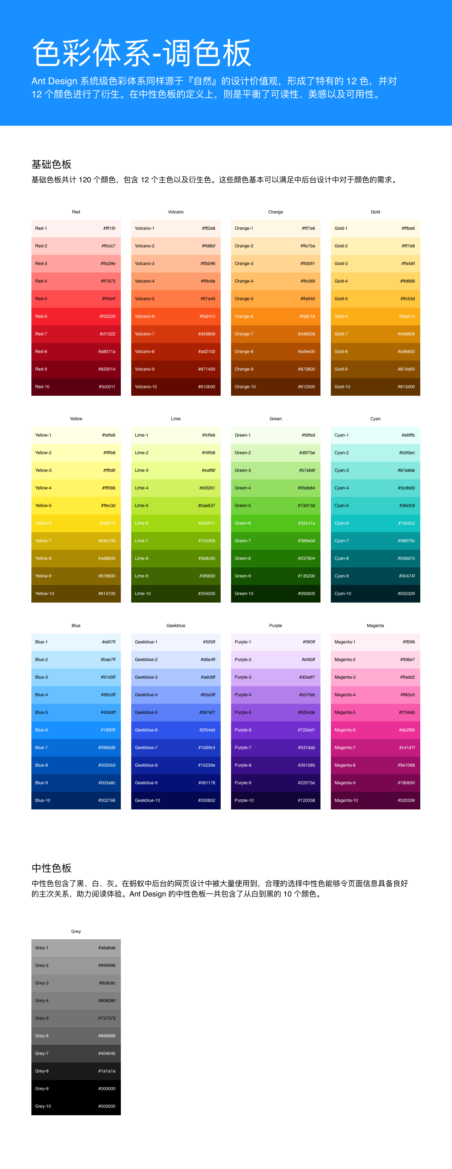
38 |
39 | 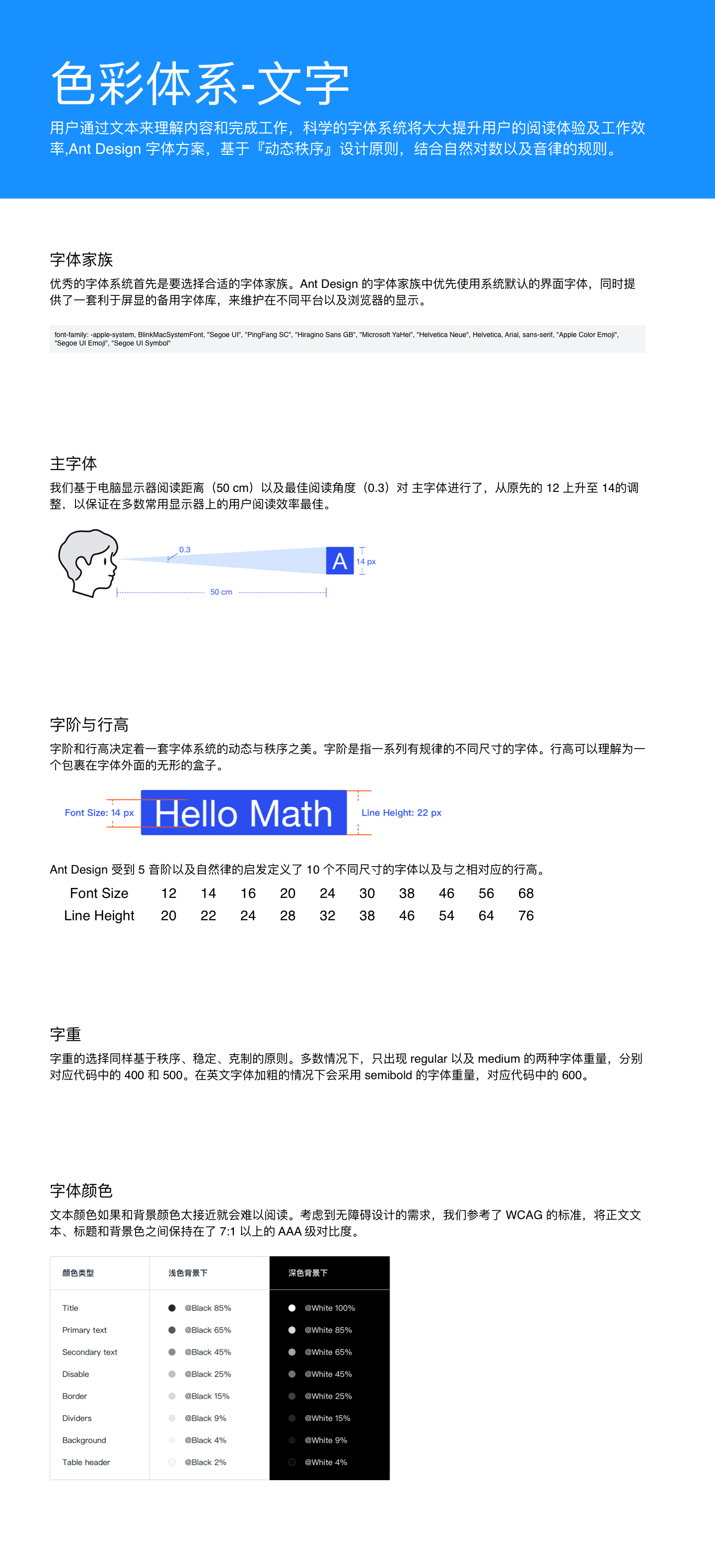
40 |
--------------------------------------------------------------------------------
/styleguide/src/designSystem.js:
--------------------------------------------------------------------------------
1 | import processColor from './processColor';
2 | import type { Color } from './processColor';
3 | import { generate, presetPalettes } from '@ant-design/colors';
4 |
5 |
6 | export const colors = generate('#1890ff');
7 |
8 | export const presetPalettesGrey = {};
9 |
10 |
11 | presetPalettesGrey.grey = presetPalettes.grey;
12 |
13 | delete presetPalettes["grey"];
14 |
15 | //字体与行高
16 | export const presetFont = {
17 | size: ["Font Size",12,14,16,20,24,30,38,46,56,68],
18 | height: ["Line Height",20,22,24,28,32,38,46,54,64,76]
19 | };
20 |
21 |
22 | const typeSizes = [80, 48, 36, 24, 20, 16];
23 |
24 | export const spacing = 16;
25 |
26 | const fontFamilies = {
27 | display: 'Helvetica',
28 | body: 'Georgia',
29 | };
30 |
31 | const fontWeights = {
32 | regular: 'regular',
33 | bold: 'bold',
34 | };
35 |
36 | export const fonts = {
37 | Headline: {
38 | color: colors.Night,
39 | fontSize: typeSizes[0],
40 | fontFamily: fontFamilies.display,
41 | fontWeight: fontWeights.bold,
42 | lineHeight: 80,
43 | },
44 | 'Title 1': {
45 | color: colors.Night,
46 | fontSize: typeSizes[2],
47 | fontFamily: fontFamilies.display,
48 | fontWeight: fontWeights.bold,
49 | lineHeight: 48,
50 | },
51 | 'Title 2': {
52 | color: colors.Night,
53 | fontSize: typeSizes[3],
54 | fontFamily: fontFamilies.display,
55 | fontWeight: fontWeights.bold,
56 | lineHeight: 36,
57 | },
58 | 'Title 3': {
59 | color: colors.Night,
60 | fontSize: typeSizes[4],
61 | fontFamily: fontFamilies.body,
62 | fontWeight: fontWeights.regular,
63 | lineHeight: 24,
64 | },
65 | Body: {
66 | color: colors.Night,
67 | fontSize: typeSizes[5],
68 | fontFamily: fontFamilies.body,
69 | fontWeight: fontWeights.regular,
70 | lineHeight: 24,
71 | marginBottom: 24,
72 | },
73 | };
74 |
75 | export default {
76 | colors,
77 | fonts,
78 | spacing,
79 | presetPalettes,
80 | presetPalettesGrey,
81 | presetFont
82 | };
83 |
84 | export type DesignSystem = {
85 | fonts: any,
86 | colors: { [key: string]: Color },
87 | };
88 |
--------------------------------------------------------------------------------
/styleguide/src/pages/styleguide.js:
--------------------------------------------------------------------------------
1 | // @flow
2 | /* eslint-disable react/jsx-filename-extension, import/no-named-as-default-member */
3 |
4 | import * as React from 'react';
5 |
6 | import { render, TextStyles, View ,Page,Artboard,Text,Image} from 'react-sketchapp';
7 | import designSystem, {generatec, presetFont, presetPalettes} from '../designSystem';
8 | import type { DesignSystem } from '../designSystem';
9 |
10 | import PaletteN from '../components/Palette_new';
11 | import TypeSpecimen from '../components/TypeSpecimen';
12 |
13 |
14 | const ARTBORD_WIDTH = 1440;
15 |
16 | const Styleguide = () => {
17 | return (
18 |
19 |
20 |
21 | 色彩体系-调色板
22 |
23 | Ant Design 系统级色彩体系同样源于『自然』的设计价值观,形成了特有的 12 色,并对 12 个颜色进行了衍生。在中性色板的定义上,则是平衡了可读性、美感以及可用性。
24 |
25 |
26 |
27 |
28 |
29 |
30 | 基础色板
31 | 基础色板共计 120 个颜色,包含 12 个主色以及衍生色。这些颜色基本可以满足中后台设计中对于颜色的需求。
32 |
33 |
34 | {Object.keys(designSystem.presetPalettes).map(name => (
35 |
36 | ))}
37 |
38 |
39 |
40 |
41 | 中性色板
42 |
43 | 中性色包含了黑、白、灰。在蚂蚁中后台的网页设计中被大量使用到,合理的选择中性色能够令页面信息具备良好的主次关系,助力阅读体验。Ant Design 的中性色板一共包含了从白到黑的 10 个颜色。
44 |
45 |
46 | {Object.keys(designSystem.presetPalettesGrey).map(name => (
47 |
48 | ))}
49 |
50 |
51 |
52 |
53 |
54 |
55 |
56 | 色彩体系-文字
57 |
58 | 用户通过文本来理解内容和完成工作,科学的字体系统将大大提升用户的阅读体验及工作效率,Ant Design 字体方案,基于『动态秩序』设计原则,结合自然对数以及音律的规则。
59 |
60 |
61 |
62 |
63 |
64 | 字体家族
65 |
66 | 优秀的字体系统首先是要选择合适的字体家族。Ant Design 的字体家族中优先使用系统默认的界面字体,同时提供了一套利于屏显的备用字体库,来维护在不同平台以及浏览器的显示。
67 |
68 |
69 |
70 | font-family: -apple-system, BlinkMacSystemFont, "Segoe UI", "PingFang SC", "Hiragino Sans GB", "Microsoft YaHei", "Helvetica Neue", Helvetica, Arial, sans-serif,
71 | "Apple Color Emoji", "Segoe UI Emoji", "Segoe UI Symbol"
72 |
73 |
74 |
75 |
76 |
77 |
78 | 主字体
79 |
80 | 我们基于电脑显示器阅读距离(50 cm)以及最佳阅读角度(0.3)对 主字体进行了,从原先的 12 上升至 14的调整,以保证在多数常用显示器上的用户阅读效率最佳。
81 |
82 |
88 |
89 |
90 |
91 |
92 |
93 | 字阶与行高
94 |
95 | 字阶和行高决定着一套字体系统的动态与秩序之美。字阶是指一系列有规律的不同尺寸的字体。行高可以理解为一个包裹在字体外面的无形的盒子。
96 |
97 |
103 |
104 | Ant Design 受到 5 音阶以及自然律的启发定义了 10 个不同尺寸的字体以及与之相对应的行高。
105 |
106 |
107 | {Object.keys(designSystem.presetFont.size).map(index => (
108 | 0?80:200,textAlign:"center",fontSize:28}}>{designSystem.presetFont.size[index]}
109 | ))}
110 |
111 |
112 | {Object.keys(designSystem.presetFont.height).map(index => (
113 | 0?80:200,textAlign:"center",fontSize:28}}>{designSystem.presetFont.height[index]}
114 | ))}
115 |
116 |
117 |
118 |
119 |
120 | 字重
121 |
122 | 字重的选择同样基于秩序、稳定、克制的原则。多数情况下,只出现 regular 以及 medium 的两种字体重量,分别对应代码中的 400 和 500。在英文字体加粗的情况下会采用 semibold 的字体重量,对应代码中的 600。
123 |
124 |
125 |
126 |
127 |
128 | 字体颜色
129 |
130 | 文本颜色如果和背景颜色太接近就会难以阅读。考虑到无障碍设计的需求,我们参考了 WCAG 的标准,将正文文本、标题和背景色之间保持在了 7:1 以上的 AAA 级对比度。
131 |
132 |
138 |
139 |
140 |
141 |
142 |
143 | );
144 | }
145 |
146 | export default Styleguide;
147 |
--------------------------------------------------------------------------------
/.idea/workspace.xml:
--------------------------------------------------------------------------------
1 |
2 |
3 |
4 |
5 |
6 |
7 |
8 |
9 |
10 |
11 |
12 |
13 |
14 |
15 |
16 |
17 |
18 |
19 |
20 |
21 |
22 |
23 |
24 |
25 |
26 |
27 |
28 |
29 |
30 |
31 |
32 |
33 |
34 |
35 |
36 |
37 |
38 |
39 |
40 |
41 |
42 |
43 |
44 |
45 |
46 |
47 |
48 |
49 |
50 |
51 |
52 |
53 |
54 |
55 |
56 |
57 |
58 |
59 |
60 |
61 |
62 |
63 |
64 |
65 |
66 |
67 |
68 |
69 |
70 |
71 |
72 |
73 |
74 |
75 |
76 |
77 |
78 |
79 |
80 |
81 |
82 |
83 |
84 |
85 |
86 |
87 |
88 |
89 |
90 |
91 |
92 |
93 |
94 |
95 |
96 |
97 |
98 |
99 |
100 |
101 |
102 |
103 |
104 |
105 | TypeSpecimen
106 |
107 |
108 |
109 |
110 |
111 |
112 |
121 |
122 |
123 |
124 |
125 | true
126 | DEFINITION_ORDER
127 |
128 |
129 |
130 |
131 |
132 |
133 |
134 |
135 |
136 |
137 |
138 |
139 |
140 |
141 |
142 |
143 |
144 |
145 |
146 |
147 |
148 |
149 |