├── package.json
├── LICENSE
├── example
└── App.js
├── README.md
└── index.js
/package.json:
--------------------------------------------------------------------------------
1 | {
2 | "name": "react-native-dialog-input",
3 | "version": "1.0.8",
4 | "description": "Dialog with input for React Native on iOS and Android.",
5 | "main": "index.js",
6 | "scripts": {
7 | "test": "echo \"Error: no test specified\" && exit 1"
8 | },
9 | "repository": {
10 | "type": "git",
11 | "url": "https://github.com/joseestrella89/react-native-dialog-input"
12 | },
13 | "keywords": [
14 | "react",
15 | "native",
16 | "dialog",
17 | "text input",
18 | "android",
19 | "ios"
20 | ],
21 | "author": "Jose Estrella",
22 | "bugs": {
23 | "url": "https://github.com/joseestrella89/react-native-dialog-input/issues"
24 | }
25 | }
26 |
--------------------------------------------------------------------------------
/LICENSE:
--------------------------------------------------------------------------------
1 | Copyright 2018 Jose Estrella
2 |
3 | Permission is hereby granted, free of charge, to any person obtaining a copy of this software and associated documentation files (the "Software"), to deal in the Software without restriction, including without limitation the rights to use, copy, modify, merge, publish, distribute, sublicense, and/or sell copies of the Software, and to permit persons to whom the Software is furnished to do so, subject to the following conditions:
4 |
5 | The above copyright notice and this permission notice shall be included in all copies or substantial portions of the Software.
6 |
7 | THE SOFTWARE IS PROVIDED "AS IS", WITHOUT WARRANTY OF ANY KIND, EXPRESS OR IMPLIED, INCLUDING BUT NOT LIMITED TO THE WARRANTIES OF MERCHANTABILITY, FITNESS FOR A PARTICULAR PURPOSE AND NONINFRINGEMENT. IN NO EVENT SHALL THE AUTHORS OR COPYRIGHT HOLDERS BE LIABLE FOR ANY CLAIM, DAMAGES OR OTHER LIABILITY, WHETHER IN AN ACTION OF CONTRACT, TORT OR OTHERWISE, ARISING FROM, OUT OF OR IN CONNECTION WITH THE SOFTWARE OR THE USE OR OTHER DEALINGS IN THE SOFTWARE.
8 |
--------------------------------------------------------------------------------
/example/App.js:
--------------------------------------------------------------------------------
1 | import React from 'react';
2 | import { StyleSheet, Text, View, TouchableOpacity } from 'react-native';
3 | import DialogInput from 'react-native-dialog-input';
4 |
5 | export default class App extends React.Component {
6 | constructor(props){
7 | super(props);
8 | this.state = {
9 | isDialogVisible: false,
10 | }
11 | }
12 | showDialog(isShow){
13 | this.setState({isDialogVisible: isShow});
14 | }
15 | sendInput(inputText){
16 | console.log("sendInput (DialogInput#1): "+inputText);
17 | }
18 | render() {
19 | return (
20 |
21 | {this.sendInput(inputText)} }
26 | closeDialog={ () => {this.showDialog(false)}}>
27 |
28 | {this.showDialog(true)}} style={{padding:10}}>
29 | Show DialogInput #1
30 |
31 |
32 | );
33 | }
34 | }
35 |
36 | const styles = StyleSheet.create({
37 | container: {
38 | flex: 1,
39 | backgroundColor: 'beige',
40 | alignItems: 'center',
41 | justifyContent: 'center',
42 | },
43 | });
44 |
45 |
--------------------------------------------------------------------------------
/README.md:
--------------------------------------------------------------------------------
1 | # react-native-dialog-input
2 | Dialog with input for React Native on iOS and Android.
3 |
4 | ## Examples
5 |
6 | 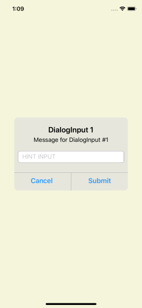
7 | 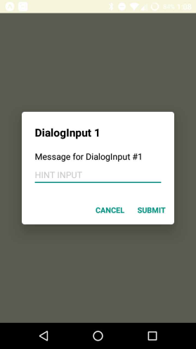
8 |
9 | ## Setup
10 |
11 | ```bash
12 | npm install --save react-native-dialog-input
13 | ```
14 |
15 | ## Usage
16 |
17 | ```javascript
18 | import DialogInput from 'react-native-dialog-input';
19 | ...
20 | {this.sendInput(inputText)} }
25 | closeDialog={ () => {this.showDialog(false)}}>
26 |
27 | ...
28 | ```
29 | ## Properties
30 |
31 | name | description | type
32 | :--------------------- |:------------------------------------------- | --------
33 | isDialogVisible | Condition to show or hide the DialogInput | Boolean
34 | title | Title to show in the DialogInput | String (OPTIONAL)
35 | message | Message to show in the DialogInput | String (OPTIONAL)
36 | hintInput | Text hint to show in the TextInput | String (OPTIONAL)
37 | hintTextColor | Color of the text hint | String (OPTIONAL)
38 | initValueTextInput | Default value for the TextInput | String (OPTIONAL)
39 | textInputProps | Additional properties to add to the TextInput in the form:
`textInputProps={{autoCorrect:false}}` Currently supports:
autoCorrect
autoCapitalize
clearButtonMode
clearTextOnFocus
keyboardType
secureTextEntry
maxLength | Object (OPTIONAL)
40 | modalStyle | Styles for the blocking view behind the DialogInput | Object (OPTIONAL)
41 | dialogStyle | Styles for the DialogInput main view | Object (OPTIONAL)
42 | cancelText | Replacement text for the Cancel button | String (OPTIONAL)
43 | submitText | Replacement text for the Submit button | String (OPTIONAL)
44 |
45 | ## Methods
46 |
47 | name | description | returns
48 | :-------------- |:-------------------------------------------------- | -------:
49 | submitInput() | Event fired when the user press the SUBMIT button | String
50 | closeDialog() | Event fired when the user press the CLOSE button | -
51 |
--------------------------------------------------------------------------------
/index.js:
--------------------------------------------------------------------------------
1 | import React, { PureComponent } from 'react';
2 | import {
3 | Modal,
4 | Platform,
5 | StyleSheet,
6 | Text,
7 | TextInput,
8 | TouchableOpacity,
9 | View,
10 | } from 'react-native';
11 |
12 | class DialogInput extends PureComponent{
13 | constructor(props){
14 | super(props);
15 | this.state = { inputModal: props.initValueTextInput, openning: true };
16 | }
17 |
18 | handleOnRequestClose = () => {
19 | this.props.closeDialog();
20 | this.setState({ inputModal: '' });
21 | };
22 |
23 | handleOnKeyPress = () => {
24 | this.setState({ openning: false });
25 | };
26 |
27 | handleOnChangeText = (inputModal) => {
28 | this.setState({ inputModal, openning: false });
29 | };
30 |
31 | handleOnCloseDialog = () => {
32 | this.props.closeDialog();
33 | this.setState({ inputModal: '',openning: true });
34 | };
35 |
36 | handleSubmit = () => {
37 | this.props.submitInput(this.state.inputModal);
38 | this.setState({ inputModal: '',openning: true });
39 | };
40 |
41 | render(){
42 | const title = this.props.title || '';
43 | const hintInput = this.props.hintInput || '';
44 | let value = '';
45 | if (!this.state.openning) {
46 | value = this.state.inputModal;
47 | }else{
48 | value = this.props.initValueTextInput ? this.props.initValueTextInput : '';
49 | }
50 |
51 | const textProps = this.props.textInputProps || null;
52 | const modalStyleProps = this.props.modalStyle || {};
53 | const dialogStyleProps = this.props.dialogStyle || {};
54 | const placeholderTextColor = this.props.placeholderTextColor
55 | const animationType = this.props.animationType || 'fade';
56 | let cancelText = this.props.cancelText || 'Cancel';
57 | let submitText = this.props.submitText || 'Submit';
58 | cancelText = (Platform.OS === 'ios')? cancelText:cancelText.toUpperCase();
59 | submitText = (Platform.OS === 'ios')? submitText:submitText.toUpperCase();
60 |
61 | return(
62 |
67 |
68 |
69 |
70 |
71 | {title}
72 | {this.props.message}
73 | 0)?textProps.maxLength:null}
81 | autoFocus={true}
82 | onKeyPress={this.handleOnKeyPress}
83 | underlineColorAndroid='transparent'
84 | placeholder={hintInput}
85 | placeholderTextColor={placeholderTextColor}
86 | onChangeText={this.handleOnChangeText}
87 | value={value}
88 | />
89 |
90 |
91 |
93 | {cancelText}
94 |
95 |
96 |
98 | {submitText}
99 |
100 |
101 |
102 |
103 |
104 |
105 | );
106 | }
107 | }
108 | const styles = StyleSheet.create({
109 | container:{
110 | flex:1,
111 | width: '100%',
112 | height: '100%',
113 | flexDirection: 'column',
114 | justifyContent: 'center',
115 | alignItems: 'center',
116 | ...Platform.select({
117 | android:{
118 | backgroundColor: 'rgba(0,0,0,0.62)'
119 | }
120 | }),
121 | },
122 | modal_container:{
123 | marginLeft: 30,
124 | marginRight: 30,
125 | ...Platform.select({
126 | ios: {
127 | backgroundColor:'#E3E6E7',
128 | borderRadius: 10,
129 | minWidth: 300,
130 | },
131 | android: {
132 | backgroundColor:'#fff',
133 | elevation: 24,
134 | minWidth: 280,
135 | borderRadius: 5,
136 | },
137 | }),
138 | },
139 | modal_body:{
140 | ...Platform.select({
141 | ios: {
142 | padding: 10,
143 | },
144 | android: {
145 | padding: 24,
146 | },
147 | }),
148 | },
149 | title_modal:{
150 | fontWeight: 'bold',
151 | fontSize: 20,
152 | ...Platform.select({
153 | ios: {
154 | marginTop: 10,
155 | textAlign:'center',
156 | marginBottom: 5,
157 | },
158 | android: {
159 | textAlign:'left',
160 | },
161 | }),
162 | },
163 | message_modal:{
164 | fontSize: 16,
165 | ...Platform.select({
166 | ios: {
167 | textAlign:'center',
168 | marginBottom: 10,
169 | },
170 | android: {
171 | textAlign:'left',
172 | marginTop: 20
173 | },
174 | }),
175 | },
176 | input_container:{
177 | textAlign:'left',
178 | fontSize: 16,
179 | color: 'rgba(0,0,0,0.54)',
180 | ...Platform.select({
181 | ios: {
182 | backgroundColor: 'white',
183 | borderRadius: 5,
184 | paddingTop: 5,
185 | borderWidth: 1,
186 | borderColor: '#B0B0B0',
187 | paddingBottom: 5,
188 | paddingLeft: 10,
189 | marginBottom: 15,
190 | marginTop: 10,
191 | },
192 | android: {
193 | marginTop: 8,
194 | borderBottomWidth: 2,
195 | borderColor: '#009688',
196 | },
197 | }),
198 | },
199 | btn_container:{
200 | flex: 1,
201 | flexDirection: 'row',
202 | ...Platform.select({
203 | ios: {
204 | justifyContent: 'center',
205 | borderTopWidth: 1,
206 | borderColor: '#B0B0B0',
207 | maxHeight: 48,
208 | },
209 | android:{
210 | alignSelf: 'flex-end',
211 | maxHeight: 52,
212 | paddingTop: 8,
213 | paddingBottom: 8,
214 | }
215 | }),
216 | },
217 | divider_btn:{
218 | ...Platform.select({
219 | ios:{
220 | width: 1,
221 | backgroundColor: '#B0B0B0',
222 | },
223 | android:{
224 | width: 0
225 | },
226 | }),
227 | },
228 | touch_modal:{
229 | ...Platform.select({
230 | ios: {
231 | flex: 1,
232 | },
233 | android:{
234 | paddingRight: 8,
235 | minWidth: 64,
236 | height: 36,
237 | }
238 | }),
239 | },
240 | btn_modal_left:{
241 | ...Platform.select({
242 | fontWeight: 'bold',
243 | ios: {
244 | fontSize:18,
245 | color:'#408AE2',
246 | textAlign:'center',
247 | borderRightWidth: 5,
248 | borderColor: '#B0B0B0',
249 | padding: 10,
250 | height: 48,
251 | maxHeight: 48,
252 | },
253 | android: {
254 | textAlign:'right',
255 | color:'#009688',
256 | padding: 8
257 | },
258 | }),
259 | },
260 | btn_modal_right:{
261 | ...Platform.select({
262 | fontWeight: 'bold',
263 | ios: {
264 | fontSize:18,
265 | color:'#408AE2',
266 | textAlign:'center',
267 | padding: 10,
268 | },
269 | android: {
270 | textAlign:'right',
271 | color:'#009688',
272 | padding: 8
273 | },
274 | }),
275 | },
276 | });
277 | export default DialogInput;
278 |
--------------------------------------------------------------------------------