{children}
;
11 | }
12 |
--------------------------------------------------------------------------------
/app/_components/Divider.tsx:
--------------------------------------------------------------------------------
1 | import React from "react";
2 |
3 | type Props = {
4 | navBar?: boolean;
5 | };
6 |
7 | export default function Divider({ navBar = false }: Props) {
8 | const classAddon = navBar
9 | ? "hidden lg:block lg:my-0.5 dark:border-slate-700"
10 | : "my-6 -mx-6 dark:border-slate-800";
11 |
12 | return ; 13 | } 14 | -------------------------------------------------------------------------------- /app/_components/Section/Banner/index.tsx: -------------------------------------------------------------------------------- 1 | import React, { ReactNode } from "react"; 2 | 3 | type Props = { 4 | className?: string; 5 | children: ReactNode; 6 | }; 7 | 8 | const SectionBanner = ({ className = "", children }: Props) => { 9 | return ( 10 |
{children}
11 | );
12 | };
13 |
14 | export default SectionBanner;
15 |
--------------------------------------------------------------------------------
/css/_progress.css:
--------------------------------------------------------------------------------
1 | @layer base {
2 | progress {
3 | @apply h-3 overflow-hidden rounded-full;
4 | }
5 |
6 | progress::-webkit-progress-bar {
7 | @apply bg-blue-200;
8 | }
9 |
10 | progress::-webkit-progress-value {
11 | @apply bg-blue-500;
12 | }
13 |
14 | progress::-moz-progress-bar {
15 | @apply bg-blue-500;
16 | }
17 |
18 | progress::-ms-fill {
19 | @apply border-0 bg-blue-500;
20 | }
21 | }
22 |
--------------------------------------------------------------------------------
/app/_components/FormField/CheckRadioGroup.tsx:
--------------------------------------------------------------------------------
1 | import { ReactNode } from "react";
2 |
3 | type Props = {
4 | isColumn?: boolean;
5 | children: ReactNode;
6 | };
7 |
8 | const FormCheckRadioGroup = (props: Props) => {
9 | return (
10 |
11 | {props.children}
12 |
13 | );
14 | };
15 |
16 | export default FormCheckRadioGroup;
17 |
--------------------------------------------------------------------------------
/.gitignore:
--------------------------------------------------------------------------------
1 | # dependencies
2 | /node_modules
3 | /.pnp
4 | .pnp.js
5 |
6 | # testing
7 | /coverage
8 |
9 | # next.js
10 | /.next/
11 | /out/
12 |
13 | # production
14 | /build
15 |
16 | # misc
17 | .DS_Store
18 | *.pem
19 |
20 | # debug
21 | npm-debug.log*
22 | yarn-debug.log*
23 | yarn-error.log*
24 |
25 | # local env files
26 | .env.local
27 | .env.development.local
28 | .env.test.local
29 | .env.production.local
30 |
31 | # vercel
32 | .vercel
--------------------------------------------------------------------------------
/app/_components/CardBox/Component/Title.tsx:
--------------------------------------------------------------------------------
1 | import React, { ReactNode } from "react";
2 |
3 | type Props = {
4 | title: string;
5 | children?: ReactNode;
6 | };
7 |
8 | const CardBoxComponentTitle = ({ title, children }: Props) => {
9 | return (
10 |
11 |
14 | );
15 | };
16 |
17 | export default CardBoxComponentTitle;
18 |
--------------------------------------------------------------------------------
/eslint.config.mjs:
--------------------------------------------------------------------------------
1 | import { dirname } from "path";
2 | import { fileURLToPath } from "url";
3 | import { FlatCompat } from "@eslint/eslintrc";
4 |
5 | const __filename = fileURLToPath(import.meta.url);
6 | const __dirname = dirname(__filename);
7 |
8 | const compat = new FlatCompat({
9 | baseDirectory: __dirname,
10 | });
11 |
12 | const eslintConfig = [
13 | ...compat.extends("next/core-web-vitals", "next/typescript"),
14 | ];
15 |
16 | export default eslintConfig;
17 |
--------------------------------------------------------------------------------
/app/_components/JustboilLogo/index.tsx:
--------------------------------------------------------------------------------
1 | import React from "react";
2 | import justboilLogoPath from "./logoPath";
3 |
4 | type Props = {
5 | className?: string;
6 | };
7 |
8 | export default function JustboilLogo({ className = "" }: Props) {
9 | return (
10 |
19 | );
20 | }
21 |
--------------------------------------------------------------------------------
/app/_components/StyleSelect/OnVisit.ts:
--------------------------------------------------------------------------------
1 | "use client";
2 |
3 | import { useEffect } from "react";
4 | import { useAppDispatch, useAppSelector } from "../../_stores/hooks";
5 | import { setDarkMode } from "../../_stores/darkModeSlice";
6 |
7 | export function OnVisit() {
8 | const darkMode = useAppSelector((state) => state.darkMode.isEnabled);
9 | const dispatch = useAppDispatch();
10 |
11 | useEffect(() => {
12 | if (darkMode) {
13 | dispatch(setDarkMode(false));
14 | }
15 | });
16 |
17 | return "...";
18 | }
19 |
--------------------------------------------------------------------------------
/app/dashboard/_components/NavBar/MenuList.tsx:
--------------------------------------------------------------------------------
1 | import React from "react";
2 | import { MenuNavBarItem } from "../../../_interfaces";
3 | import NavBarItem from "./Item";
4 |
5 | type Props = {
6 | menu: MenuNavBarItem[];
7 | onRouteChange: () => void;
8 | };
9 |
10 | export default function NavBarMenuList({ menu, ...props }: Props) {
11 | return (
12 | <>
13 | {menu.map((item, index) => (
14 | {title}
12 | {children} 13 |
25 | {children}
26 |
27 | );
28 | };
29 |
30 | export default Buttons;
31 |
--------------------------------------------------------------------------------
/next.config.ts:
--------------------------------------------------------------------------------
1 | import type { NextConfig } from "next";
2 |
3 | const nextConfig: NextConfig = {
4 | output: process.env.IS_OUTPUT_EXPORT ? "export" : "standalone",
5 | basePath: "/admin-one-react-tailwind",
6 | async redirects() {
7 | return [
8 | {
9 | source: "/",
10 | destination: "/admin-one-react-tailwind",
11 | basePath: false,
12 | permanent: false,
13 | },
14 | ];
15 | },
16 | images: {
17 | unoptimized: true,
18 | remotePatterns: [
19 | {
20 | protocol: "https",
21 | hostname: "static.justboil.me",
22 | },
23 | ],
24 | },
25 | };
26 |
27 | export default nextConfig;
28 |
--------------------------------------------------------------------------------
/app/login/page.tsx:
--------------------------------------------------------------------------------
1 | import React from "react";
2 | import CardBox from "../_components/CardBox";
3 | import SectionFullScreen from "../_components/Section/FullScreen";
4 | import { getPageTitle } from "../_lib/config";
5 | import { Metadata } from "next";
6 | import LoginForm from "./_components/LoginForm";
7 |
8 | export const metadata: Metadata = {
9 | title: getPageTitle("Login"),
10 | };
11 |
12 | const LoginPage = () => {
13 | return (
14 |
21 | {children}
22 |
23 | );
24 | }
25 |
--------------------------------------------------------------------------------
/app/_components/Icon/index.tsx:
--------------------------------------------------------------------------------
1 | import React, { ReactNode } from "react";
2 |
3 | type Props = {
4 | path: string;
5 | w?: string;
6 | h?: string;
7 | size?: string | number | null;
8 | className?: string;
9 | children?: ReactNode;
10 | };
11 |
12 | export default function Icon({
13 | path,
14 | w = "w-6",
15 | h = "h-6",
16 | size = null,
17 | className = "",
18 | children,
19 | }: Props) {
20 | const iconSize = size ?? 16;
21 |
22 | return (
23 |
24 |
27 | {children}
28 |
29 | );
30 | }
31 |
--------------------------------------------------------------------------------
/app/_components/Section/Title.tsx:
--------------------------------------------------------------------------------
1 | import React, { ReactNode } from "react";
2 |
3 | type Props = {
4 | custom?: boolean;
5 | first?: boolean;
6 | last?: boolean;
7 | children: ReactNode;
8 | };
9 |
10 | const SectionTitle = ({ custom = false, first = false, last = false, children }: Props) => {
11 | let classAddon = "-my-6";
12 |
13 | if (first) {
14 | classAddon = "-mb-6";
15 | } else if (last) {
16 | classAddon = "-mt-6";
17 | }
18 |
19 | return (
20 | {children}
} 23 |-
20 | {menu.map((item, index) => (
21 |
11 | Like the project? Please star on GitHub ;-) 12 |
13 |
14 |
21 |
22 |
16 |
18 |
18 | {props.icon && (
19 |
29 | );
30 | };
31 |
32 | export default PillTagPlain;
33 |
--------------------------------------------------------------------------------
/app/dashboard/_components/ChartLineSample/index.tsx:
--------------------------------------------------------------------------------
1 | import React from "react";
2 | import {
3 | Chart,
4 | LineElement,
5 | PointElement,
6 | LineController,
7 | LinearScale,
8 | CategoryScale,
9 | Tooltip,
10 | } from "chart.js";
11 | import { Line } from "react-chartjs-2";
12 |
13 | Chart.register(LineElement, PointElement, LineController, LinearScale, CategoryScale, Tooltip);
14 |
15 | const options = {
16 | responsive: true,
17 | maintainAspectRatio: false,
18 | scales: {
19 | y: {
20 | display: false,
21 | },
22 | x: {
23 | display: true,
24 | },
25 | },
26 | plugins: {
27 | legend: {
28 | display: false,
29 | },
30 | },
31 | };
32 |
33 | const ChartLineSample = ({ data }) => {
34 | return
20 |
24 |
25 | Unhandled exception
21 | 22 |An Error Occurred
23 |{children}
;
27 | }
28 |
--------------------------------------------------------------------------------
/css/styles/_white.css:
--------------------------------------------------------------------------------
1 | @theme {
2 | --scrollbar-track-light: var(--color-gray-100);
3 | --scrollbar-thumb-light: var(--color-gray-300);
4 | --scrollbar-light: var(--scrollbar-thumb-light) var(--scrollbar-track-light);
5 | }
6 |
7 | @utility style-white {
8 | &:not(.dark) {
9 | .aside {
10 | @apply bg-white;
11 | }
12 | .aside-scrollbar {
13 | @apply scrollbar-styled-light;
14 | }
15 | .aside-menu-item {
16 | @apply text-blue-600 hover:text-black;
17 | }
18 | .aside-menu-item-active {
19 | @apply text-black;
20 | }
21 | .aside-menu-dropdown {
22 | @apply bg-gray-100/75;
23 | }
24 | .navbar-item-label {
25 | @apply text-blue-600;
26 | }
27 | .navbar-item-label-hover {
28 | @apply hover:text-black;
29 | }
30 | .navbar-item-label-active {
31 | @apply text-black;
32 | }
33 | .overlay {
34 | @apply from-white via-gray-100 to-white;
35 | }
36 | }
37 | }
38 |
--------------------------------------------------------------------------------
/app/_stores/mainSlice.ts:
--------------------------------------------------------------------------------
1 | import { createSlice, PayloadAction } from "@reduxjs/toolkit";
2 | import { UserPayloadObject } from "../_interfaces";
3 |
4 | interface MainState {
5 | userName: string;
6 | userEmail: null | string;
7 | isFieldFocusRegistered: boolean;
8 | }
9 |
10 | const initialState: MainState = {
11 | /* User */
12 | userName: "John Doe",
13 | userEmail: "doe.doe.doe@example.com",
14 |
15 | /* Field focus with ctrl+k (to register only once) */
16 | isFieldFocusRegistered: false,
17 | };
18 |
19 | export const mainSlice = createSlice({
20 | name: "main",
21 | initialState,
22 | reducers: {
23 | setUser: (state, action: PayloadAction
28 |  33 | {children}
34 |
33 | {children}
34 |
35 | );
36 | }
37 |
--------------------------------------------------------------------------------
/css/styles/_basic.css:
--------------------------------------------------------------------------------
1 | @theme {
2 | --scrollbar-track-basic: var(--color-gray-900);
3 | --scrollbar-thumb-basic: var(--color-gray-600);
4 | --scrollbar-basic: var(--scrollbar-thumb-basic) var(--scrollbar-track-basic);
5 | }
6 |
7 | @utility style-basic {
8 | &:not(.dark) {
9 | .aside {
10 | @apply bg-gray-800;
11 | }
12 | .aside-scrollbar {
13 | @apply scrollbar-styled-basic;
14 | }
15 | .aside-brand {
16 | @apply bg-gray-900 text-white;
17 | }
18 | .aside-menu-item {
19 | @apply text-gray-300 hover:text-white;
20 | }
21 | .aside-menu-item-active {
22 | @apply text-white;
23 | }
24 | .aside-menu-dropdown {
25 | @apply bg-gray-700/50;
26 | }
27 | .navbar-item-label {
28 | @apply text-black hover:text-blue-500;
29 | }
30 | .navbar-item-label-active {
31 | @apply text-blue-600;
32 | }
33 | .overlay {
34 | @apply from-gray-700 via-gray-900 to-gray-700;
35 | }
36 | }
37 | }
38 |
--------------------------------------------------------------------------------
/app/_components/OverlayLayer.tsx:
--------------------------------------------------------------------------------
1 | import React, { ReactNode } from "react";
2 |
3 | type Props = {
4 | zIndex?: string;
5 | type?: string;
6 | children?: ReactNode;
7 | className?: string;
8 | onClick?: (e: React.MouseEvent) => void;
9 | };
10 |
11 | export default function OverlayLayer({
12 | zIndex = "z-50",
13 | type = "flex",
14 | children,
15 | className,
16 | ...props
17 | }: Props) {
18 | const handleClick = (e: React.MouseEvent) => {
19 | e.preventDefault();
20 |
21 | if (props.onClick) {
22 | props.onClick(e);
23 | }
24 | };
25 |
26 | return (
27 |
30 |
34 |
35 | {children}
36 |
37 | );
38 | }
39 |
--------------------------------------------------------------------------------
/app/dashboard/_components/AsideMenu/index.tsx:
--------------------------------------------------------------------------------
1 | import React from "react";
2 | import { MenuAsideItem } from "../../../_interfaces";
3 | import AsideMenuLayer from "./Layer";
4 | import OverlayLayer from "../../../_components/OverlayLayer";
5 |
6 | type Props = {
7 | menu: MenuAsideItem[];
8 | isAsideMobileExpanded: boolean;
9 | isAsideLgActive: boolean;
10 | onAsideLgClose: () => void;
11 | onRouteChange: () => void;
12 | };
13 |
14 | export default function AsideMenu({
15 | isAsideMobileExpanded = false,
16 | isAsideLgActive = false,
17 | ...props
18 | }: Props) {
19 | return (
20 | <>
21 |
20 | {icon && main &&
24 | {children}
25 | {!hasChildren && }
26 | {title}
23 |
33 |
40 | {style}
41 |& Dark mode
42 |
33 |
36 |
51 | {prefix}
52 | {newValueFormatted}
53 | {suffix}
54 |
55 | );
56 | };
57 |
58 | export default NumberDynamic;
59 |
--------------------------------------------------------------------------------
/.github/workflows/build.yml:
--------------------------------------------------------------------------------
1 | # This is a basic workflow to help you get started with Actions
2 | name: Build
3 |
4 | # Controls when the workflow will run
5 | on:
6 | # Triggers the workflow on push or pull request events but only for the master branch
7 | push:
8 | branches: [ master ]
9 |
10 | # Allows you to run this workflow manually from the Actions tab
11 | workflow_dispatch:
12 |
13 | env:
14 | IS_OUTPUT_EXPORT: true
15 |
16 | # A workflow run is made up of one or more jobs that can run sequentially or in parallel
17 | jobs:
18 | # This workflow contains a single job called "build"
19 | build:
20 | # The type of runner that the job will run on
21 | runs-on: ubuntu-latest
22 |
23 | # Steps represent a sequence of tasks that will be executed as part of the job
24 | steps:
25 | # Checks-out your repository under $GITHUB_WORKSPACE, so your job can access it
26 | - name: Checkout
27 | uses: actions/checkout@v2
28 | - name: Install and Build 🔧 # This example project is built using npm and outputs the result to the 'dist' folder
29 | run: |
30 | npm install
31 | npm run build
32 | touch out/.nojekyll
33 | - name: Deploy 🚀
34 | uses: JamesIves/github-pages-deploy-action@v4
35 | with:
36 | branch: gh-pages # The branch the action should deploy to.
37 | folder: out # The folder the action should deploy.
38 |
--------------------------------------------------------------------------------
/app/page.tsx:
--------------------------------------------------------------------------------
1 | import SectionMain from "./_components/Section/Main";
2 | import { gradientBgPurplePink } from "./_lib/colors";
3 | import { appTitle } from "./_lib/config";
4 | import { Metadata } from "next";
5 | import StylePickBox from "./_components/StyleSelect/StylePickBox";
6 | import { Suspense } from "react";
7 | import { OnVisit } from "./_components/StyleSelect/OnVisit";
8 |
9 | export const metadata: Metadata = {
10 | title: appTitle,
11 | };
12 |
13 | export default function StyleSelectPage() {
14 | const styles = ["white", "basic"];
15 |
16 | return (
17 |
18 |
19 |
21 |
22 |
26 | Style switching with a single{" "}
27 |
29 |
35 |
36 | );
37 | }
38 |
--------------------------------------------------------------------------------
/app/dashboard/_components/ChartLineSample/config.ts:
--------------------------------------------------------------------------------
1 | export const chartColors = {
2 | default: {
3 | primary: "#00D1B2",
4 | info: "#209CEE",
5 | danger: "#FF3860",
6 | },
7 | };
8 |
9 | const randomChartData = (n: number) => {
10 | const data: number[] = [];
11 |
12 | for (let i = 0; i < n; i++) {
13 | data.push(Math.round(Math.random() * 200));
14 | }
15 |
16 | return data;
17 | };
18 |
19 | const datasetObject = (color: string, points: number) => {
20 | return {
21 | fill: false,
22 | borderColor: chartColors.default[color],
23 | borderWidth: 2,
24 | borderDash: [],
25 | borderDashOffset: 0.0,
26 | pointBackgroundColor: chartColors.default[color],
27 | pointBorderColor: "rgba(255,255,255,0)",
28 | pointHoverBackgroundColor: chartColors.default[color],
29 | pointBorderWidth: 20,
30 | pointHoverRadius: 4,
31 | pointHoverBorderWidth: 15,
32 | pointRadius: 4,
33 | data: randomChartData(points),
34 | tension: 0.5,
35 | cubicInterpolationMode: "default",
36 | };
37 | };
38 |
39 | export const sampleChartData = (points = 9) => {
40 | const labels: string[] = [];
41 |
42 | for (let i = 1; i <= points; i++) {
43 | labels.push(`0${i}`);
44 | }
45 |
46 | return {
47 | labels,
48 | datasets: [
49 | datasetObject("primary", points),
50 | datasetObject("info", points),
51 | datasetObject("danger", points),
52 | ],
53 | };
54 | };
55 |
--------------------------------------------------------------------------------
/app/_components/CardBox/index.tsx:
--------------------------------------------------------------------------------
1 | import React, { ReactNode } from "react";
2 | import CardBoxComponentBody from "./Component/Body";
3 | import CardBoxComponentFooter from "./Component/Footer";
4 |
5 | type Props = {
6 | rounded?: string;
7 | flex?: string;
8 | className?: string;
9 | hasComponentLayout?: boolean;
10 | hasTable?: boolean;
11 | isHoverable?: boolean;
12 | isModal?: boolean;
13 | children: ReactNode;
14 | footer?: ReactNode;
15 | onClick?: (e: React.MouseEvent) => void;
16 | };
17 |
18 | export default function CardBox({
19 | rounded = "rounded-2xl",
20 | flex = "flex-col",
21 | className = "",
22 | hasComponentLayout = false,
23 | hasTable = false,
24 | isHoverable = false,
25 | isModal = false,
26 | children,
27 | footer,
28 | onClick,
29 | }: Props) {
30 | const componentClass = [
31 | "bg-white flex",
32 | className,
33 | rounded,
34 | flex,
35 | isModal ? "dark:bg-slate-900" : "dark:bg-slate-900/70",
36 | ];
37 |
38 | if (isHoverable) {
39 | componentClass.push("hover:shadow-lg transition-shadow duration-500");
40 | }
41 |
42 | return React.createElement(
43 | "div",
44 | { className: componentClass.join(" "), onClick },
45 | hasComponentLayout ? (
46 | children
47 | ) : (
48 | <>
49 | 23 | Pick a style… 24 |
25 |
26 | Style switching with a single{" "}
27 | action()
28 |
29 |
30 | {styles.map((style) => (
31 |
34 |
33 |
45 |
34 |
42 |
43 |
36 |
41 | {props.client.name}
37 |38 | {props.client.created} @ {props.client.login} 39 |
40 |
37 |
50 | );
51 | };
52 |
53 | export default NotificationBar;
54 |
--------------------------------------------------------------------------------
/app/_components/FormField/FilePicker.tsx:
--------------------------------------------------------------------------------
1 | "use client";
2 |
3 | import { useState } from "react";
4 | import { ColorButtonKey } from "../../_interfaces";
5 | import Button from "../Button";
6 |
7 | type Props = {
8 | label?: string;
9 | icon?: string;
10 | accept?: string;
11 | color: ColorButtonKey;
12 | isRoundIcon?: boolean;
13 | };
14 |
15 | const FormFilePicker = ({ label, icon, accept, color, isRoundIcon }: Props) => {
16 | const [file, setFile] = useState
38 |
49 |
39 | {props.icon && (
40 |
44 | {props.button}
45 | {!props.button && (
46 |
47 | )}
48 |
26 |
43 | {showFilename && (
44 |
49 | );
50 | };
51 |
52 | export default FormFilePicker;
53 |
--------------------------------------------------------------------------------
/app/_components/FormField/index.tsx:
--------------------------------------------------------------------------------
1 | import { ReactNode } from "react";
2 | import Icon from "../Icon";
3 | import { FormFieldData } from "./interface";
4 | import FieldLabel from "./FieldLabel";
5 |
6 | type Props = {
7 | label?: string;
8 | labelFor?: string;
9 | help?: string;
10 | icon?: string;
11 | isBorderless?: boolean;
12 | isTransparent?: boolean;
13 | hasTextareaHeight?: boolean;
14 | children: (fieldData: FormFieldData) => ReactNode;
15 | };
16 |
17 | const FormField = ({ children, ...props }: Props) => {
18 | const fieldData: FormFieldData = {
19 | className: [
20 | "px-3 py-2 max-w-full border-gray-700 rounded-sm w-full dark:placeholder-gray-400",
21 | "focus:ring-3 focus:ring-blue-600 focus:border-blue-600 focus:outline-hidden",
22 | props.hasTextareaHeight ? "h-24" : "h-12",
23 | props.isBorderless ? "border-0" : "border",
24 | props.isTransparent ? "bg-transparent" : "bg-white dark:bg-slate-800",
25 | props.icon ? "pl-10" : "",
26 | ].join(" "),
27 | };
28 |
29 | return (
30 |
45 | {file.name}
46 |
47 | )}
48 |
31 | {props.label && {props.label} }
32 |
47 | );
48 | };
49 |
50 | export default FormField;
51 |
--------------------------------------------------------------------------------
/app/login/_components/LoginForm.tsx:
--------------------------------------------------------------------------------
1 | "use client";
2 |
3 | import { Formik, Form, Field } from "formik";
4 | import { useRouter } from "next/navigation";
5 | import Button from "../../_components/Button";
6 | import Buttons from "../../_components/Buttons";
7 | import Divider from "../../_components/Divider";
8 | import FormField from "../../_components/FormField";
9 | import FormCheckRadio from "../../_components/FormField/CheckRadio";
10 |
11 | type LoginForm = {
12 | login: string;
13 | password: string;
14 | remember: boolean;
15 | };
16 |
17 | export default function LoginForm() {
18 | const router = useRouter();
19 |
20 | const handleSubmit = (formValues: LoginForm) => {
21 | router.push("/dashboard");
22 | console.log("Form values", formValues);
23 | };
24 |
25 | const initialValues: LoginForm = {
26 | login: "john.doe",
27 | password: "bG1sL9eQ1uD2sK3b",
28 | remember: true,
29 | };
30 | return (
31 |
33 | {children(fieldData)}
34 | {props.icon && (
35 |
43 | {props.help && (
44 | {props.help}
45 | )}
46 | {children}
56 |
28 |
36 | )}
37 |
38 |
52 |
39 |
41 |
47 |
48 | {props.icon && (
49 | {props.label}
40 |
41 |
47 |
21 |
48 |
23 |
47 |
24 | alert(JSON.stringify(values, null, 2))}
29 | >
30 |
35 |
36 |
37 | 38 | Howdy, {userName}! 39 |
40 |41 | Last login 12 mins ago from 127.0.0.1 42 |
43 |
44 |
46 |
36 |
52 |
37 |
45 |
39 |
44 | ${props.transaction.amount}
40 |41 | {props.transaction.date} via {props.transaction.business} 42 |
43 |
46 |
51 | {props.transaction.name}
47 |
48 |
50 |
18 |
26 |
32 |
40 |
44 |
52 |
58 |
66 |
54 |
55 |
56 |
57 |
58 |
62 |
63 | Just body & footer
64 |
65 |
66 |
59 |
61 | Card with title, icon & footer
60 |
26 |
27 |
28 | {() =>
30 |
31 |
32 |
33 | alert(JSON.stringify(values, null, 2))}
36 | >
37 |
62 |
63 |
64 |
65 | );
66 | }
67 |
--------------------------------------------------------------------------------
/app/_components/Button.tsx:
--------------------------------------------------------------------------------
1 | import React from "react";
2 | import Link from "next/link";
3 | import { getButtonColor } from "../_lib/colors";
4 | import Icon from "./Icon";
5 | import type { ColorButtonKey } from "../_interfaces";
6 |
7 | type Props = {
8 | label?: string | null;
9 | icon?: string;
10 | iconSize?: string | number;
11 | href?: string;
12 | target?: string;
13 | type?: string;
14 | color?: ColorButtonKey;
15 | className?: string;
16 | asAnchor?: boolean;
17 | small?: boolean;
18 | outline?: boolean;
19 | active?: boolean;
20 | disabled?: boolean;
21 | roundedFull?: boolean;
22 | isGrouped?: boolean;
23 | onClick?: (e: React.MouseEvent) => void;
24 | };
25 |
26 | export default function Button({
27 | label,
28 | icon,
29 | iconSize,
30 | href,
31 | target,
32 | type,
33 | color = "white",
34 | className = "",
35 | asAnchor = false,
36 | small = false,
37 | outline = false,
38 | active = false,
39 | disabled = false,
40 | roundedFull = false,
41 | onClick,
42 | ...props
43 | }: Props) {
44 | const componentClass = [
45 | "inline-flex",
46 | "justify-center",
47 | "items-center",
48 | "whitespace-nowrap",
49 | "focus:outline-hidden",
50 | "transition-colors",
51 | "focus:ring-3",
52 | "duration-150",
53 | "border",
54 | disabled ? "cursor-not-allowed" : "cursor-pointer",
55 | roundedFull ? "rounded-full" : "rounded-sm",
56 | getButtonColor(color, outline, !disabled, active),
57 | className,
58 | ];
59 |
60 | if (props.isGrouped) {
61 | componentClass.push("mr-3 last:mr-0 mb-3");
62 | }
63 |
64 | if (!label && icon) {
65 | componentClass.push("p-1");
66 | } else if (small) {
67 | componentClass.push("text-sm", roundedFull ? "px-3 py-1" : "p-1");
68 | } else {
69 | componentClass.push("py-2", roundedFull ? "px-6" : "px-3");
70 | }
71 |
72 | if (disabled) {
73 | componentClass.push(outline ? "opacity-50" : "opacity-70");
74 | }
75 |
76 | const componentClassString = componentClass.join(" ");
77 |
78 | const componentChildren = (
79 | <>
80 | {icon && setIsDropdownActive(!isDropdownActive)}>
74 | {asideMenuItemInnerContents}
75 |
76 | )}
77 | {item.menu && (
78 |
33 |
92 | );
93 | }
94 |
--------------------------------------------------------------------------------
/app/dashboard/_components/NavBar/Item/index.tsx:
--------------------------------------------------------------------------------
1 | "use client";
2 |
3 | import React from "react";
4 | import Link from "next/link";
5 | import { useState } from "react";
6 | import { mdiChevronUp, mdiChevronDown } from "@mdi/js";
7 | import Divider from "../../../../_components/Divider";
8 | import Icon from "../../../../_components/Icon";
9 | import UserAvatarCurrentUser from "../../UserAvatar/CurrentUser";
10 | import NavBarMenuList from "../MenuList";
11 | import { useAppDispatch, useAppSelector } from "../../../../_stores/hooks";
12 | import { MenuNavBarItem } from "../../../../_interfaces";
13 | import { setDarkMode } from "../../../../_stores/darkModeSlice";
14 |
15 | type Props = {
16 | item: MenuNavBarItem;
17 | onRouteChange: () => void;
18 | };
19 |
20 | export default function NavBarItem({ item, ...props }: Props) {
21 | const dispatch = useAppDispatch();
22 |
23 | const userName = useAppSelector((state) => state.main.userName);
24 |
25 | const [isDropdownActive, setIsDropdownActive] = useState(false);
26 |
27 | const componentClass = [
28 | "block lg:flex items-center relative cursor-pointer",
29 | isDropdownActive
30 | ? `navbar-item-label-active dark:text-slate-400`
31 | : `navbar-item-label dark:text-white dark:hover:text-slate-400`,
32 | item.menu ? "lg:py-2 lg:px-3" : "py-2 px-3",
33 | item.isDesktopNoLabel ? "lg:w-16 lg:justify-center" : "",
34 | ].join(" ");
35 |
36 | const itemLabel = item.isCurrentUser ? userName : item.label;
37 |
38 | const handleMenuClick = () => {
39 | if (item.menu) {
40 | setIsDropdownActive(!isDropdownActive);
41 | }
42 |
43 | if (item.isToggleLightDark) {
44 | dispatch(setDarkMode(null));
45 | }
46 | };
47 |
48 | const NavBarItemComponentContents = (
49 | <>
50 |
38 |
42 | setIsAsideMobileExpanded(!isAsideMobileExpanded)}
45 | >
46 |
48 | setIsAsideLgActive(true)}
51 | >
52 |
54 |
55 | alert(JSON.stringify(values, null, 2))}
60 | >
61 |
68 |
69 |
70 |
71 | setIsAsideLgActive(false)}
76 | onRouteChange={handleRouteChange}
77 | />
78 | {children}
79 |
80 | Get more with{` `}
81 |
87 | Premium version
88 |
89 |
90 |
91 |
58 | {item.isCurrentUser &&
74 | {item.menu && (
75 |
80 |
82 | )}
83 |
84 | );
85 |
86 | if (item.isDivider) {
87 | return {NavBarItemComponentContents}
;
104 | }
105 |
--------------------------------------------------------------------------------
/app/dashboard/ui/_components/NotificationsExample.tsx:
--------------------------------------------------------------------------------
1 | "use client";
2 |
3 | import {
4 | mdiInformation,
5 | mdiCheckCircle,
6 | mdiAlert,
7 | mdiAlertCircle,
8 | mdiContrastCircle,
9 | } from "@mdi/js";
10 | import { Formik, Field } from "formik";
11 | import Button from "../../../_components/Button";
12 | import FormCheckRadio from "../../../_components/FormField/CheckRadio";
13 | import NotificationBar from "../../../_components/NotificationBar";
14 | import SectionMain from "../../../_components/Section/Main";
15 | import SectionTitle from "../../../_components/Section/Title";
16 |
17 | export default function NotificationsExample() {
18 | return (
19 | Notifications
24 |
25 |
26 |
28 |
29 |
46 |
76 |
77 |
78 |
89 |
90 |
79 | {transactions.map((transaction: Transaction) => (
80 |
83 |
84 | {clientsListed.map((client: Client) => (
85 |
88 |
91 |
93 |
94 | 18 | Lorem ipsum dolor sit amet adipiscing elit 19 |
20 |This is sample modal
21 | 22 | ); 23 | 24 | const modalFooterInfo = ( 25 |
88 | setIsModalInfoActive(true)}
92 | isHoverable
93 | >
94 |
95 |
96 |
97 |
101 |
102 | setIsModalDangerActive(true)}
106 | isHoverable
107 | >
108 |
114 |
115 | setIsModalSuccessActive(true)}
119 | isHoverable
120 | >
121 |
127 |
128 |
98 |
100 | Click to see in action
99 |
111 |
113 | Click to see in action
112 |
124 |
126 | Click to see in action
125 |48 | Lorem ipsum dolor sit amet adipiscing elit 49 |
50 |This is sample modal
51 |62 | Lorem ipsum dolor sit amet adipiscing elit 63 |
64 |This is sample modal
65 || 71 | | Name | 72 |Company | 73 |City | 74 |Progress | 75 |Created | 76 |77 | |
|---|---|---|---|---|---|---|
|
83 | |
85 | {client.name} | 86 |{client.company} | 87 |{client.city} | 88 |89 | 96 | | 97 |98 | {client.created} 99 | | 100 |
101 | |
118 |
123 |
142 |
143 | );
144 | };
145 |
146 | export default TableSampleClients;
147 |
--------------------------------------------------------------------------------
/app/_lib/colors.ts:
--------------------------------------------------------------------------------
1 | import type { ColorButtonKey } from "../_interfaces";
2 |
3 | export const gradientBgBase = "bg-linear-to-tr";
4 | export const gradientBgPurplePink = `${gradientBgBase} from-purple-400 via-pink-500 to-red-500`;
5 | export const gradientBgDark = `${gradientBgBase} from-slate-700 via-slate-900 to-slate-800`;
6 | export const gradientBgPinkRed = `${gradientBgBase} from-pink-400 via-red-500 to-yellow-500`;
7 |
8 | export const colorsBgLight = {
9 | white: "bg-white text-black",
10 | light: "bg-white text-black dark:bg-slate-900/70 dark:text-white",
11 | contrast: "bg-gray-800 text-white dark:bg-white dark:text-black",
12 | success: "bg-emerald-500 border-emerald-500 text-white",
13 | danger: "bg-red-500 border-red-500 text-white",
14 | warning: "bg-yellow-500 border-yellow-500 text-white",
15 | info: "bg-blue-500 border-blue-500 text-white",
16 | };
17 |
18 | export const colorsText = {
19 | white: "text-black dark:text-slate-100",
20 | light: "text-gray-700 dark:text-slate-400",
21 | contrast: "dark:text-white",
22 | success: "text-emerald-500",
23 | danger: "text-red-500",
24 | warning: "text-yellow-500",
25 | info: "text-blue-500",
26 | };
27 |
28 | export const colorsOutline = {
29 | white: [colorsText.white, "border-gray-100"].join(" "),
30 | light: [colorsText.light, "border-gray-100"].join(" "),
31 | contrast: [colorsText.contrast, "border-gray-900 dark:border-slate-100"].join(" "),
32 | success: [colorsText.success, "border-emerald-500"].join(" "),
33 | danger: [colorsText.danger, "border-red-500"].join(" "),
34 | warning: [colorsText.warning, "border-yellow-500"].join(" "),
35 | info: [colorsText.info, "border-blue-500"].join(" "),
36 | };
37 |
38 | export const getButtonColor = (
39 | color: ColorButtonKey,
40 | isOutlined: boolean,
41 | hasHover: boolean,
42 | isActive = false,
43 | ) => {
44 | if (color === "void") {
45 | return "";
46 | }
47 |
48 | const colors = {
49 | ring: {
50 | white: "ring-gray-200 dark:ring-gray-500",
51 | whiteDark: "ring-gray-200 dark:ring-gray-500",
52 | lightDark: "ring-gray-200 dark:ring-gray-500",
53 | contrast: "ring-gray-300 dark:ring-gray-400",
54 | success: "ring-emerald-300 dark:ring-emerald-700",
55 | danger: "ring-red-300 dark:ring-red-700",
56 | warning: "ring-yellow-300 dark:ring-yellow-700",
57 | info: "ring-blue-300 dark:ring-blue-700",
58 | },
59 | active: {
60 | white: "bg-gray-100",
61 | whiteDark: "bg-gray-100 dark:bg-slate-800",
62 | lightDark: "bg-gray-200 dark:bg-slate-700",
63 | contrast: "bg-gray-700 dark:bg-slate-100",
64 | success: "bg-emerald-700 dark:bg-emerald-600",
65 | danger: "bg-red-700 dark:bg-red-600",
66 | warning: "bg-yellow-700 dark:bg-yellow-600",
67 | info: "bg-blue-700 dark:bg-blue-600",
68 | },
69 | bg: {
70 | white: "bg-white text-black",
71 | whiteDark: "bg-white text-black dark:bg-slate-900 dark:text-white",
72 | lightDark: "bg-gray-100 text-black dark:bg-slate-800 dark:text-white",
73 | contrast: "bg-gray-800 text-white dark:bg-white dark:text-black",
74 | success: "bg-emerald-600 dark:bg-emerald-500 text-white",
75 | danger: "bg-red-600 dark:bg-red-500 text-white",
76 | warning: "bg-yellow-600 dark:bg-yellow-500 text-white",
77 | info: "bg-blue-600 dark:bg-blue-500 text-white",
78 | },
79 | bgHover: {
80 | white: "hover:bg-gray-100",
81 | whiteDark: "hover:bg-gray-100 dark:hover:bg-slate-800",
82 | lightDark: "hover:bg-gray-200 dark:hover:bg-slate-700",
83 | contrast: "hover:bg-gray-700 dark:hover:bg-slate-100",
84 | success:
85 | "hover:bg-emerald-700 hover:border-emerald-700 dark:hover:bg-emerald-600 dark:hover:border-emerald-600",
86 | danger:
87 | "hover:bg-red-700 hover:border-red-700 dark:hover:bg-red-600 dark:hover:border-red-600",
88 | warning:
89 | "hover:bg-yellow-700 hover:border-yellow-700 dark:hover:bg-yellow-600 dark:hover:border-yellow-600",
90 | info: "hover:bg-blue-700 hover:border-blue-700 dark:hover:bg-blue-600 dark:hover:border-blue-600",
91 | },
92 | borders: {
93 | white: "border-white",
94 | whiteDark: "border-white dark:border-slate-900",
95 | lightDark: "border-gray-100 dark:border-slate-800",
96 | contrast: "border-gray-800 dark:border-white",
97 | success: "border-emerald-600 dark:border-emerald-500",
98 | danger: "border-red-600 dark:border-red-500",
99 | warning: "border-yellow-600 dark:border-yellow-500",
100 | info: "border-blue-600 dark:border-blue-500",
101 | },
102 | text: {
103 | contrast: "dark:text-slate-100",
104 | success: "text-emerald-600 dark:text-emerald-500",
105 | danger: "text-red-600 dark:text-red-500",
106 | warning: "text-yellow-600 dark:text-yellow-500",
107 | info: "text-blue-600 dark:text-blue-500",
108 | },
109 | outlineHover: {
110 | contrast:
111 | "hover:bg-gray-800 hover:text-gray-100 dark:hover:bg-slate-100 dark:hover:text-black",
112 | success:
113 | "hover:bg-emerald-600 hover:text-white hover:text-white dark:hover:text-white dark:hover:border-emerald-600",
114 | danger:
115 | "hover:bg-red-600 hover:text-white hover:text-white dark:hover:text-white dark:hover:border-red-600",
116 | warning:
117 | "hover:bg-yellow-600 hover:text-white hover:text-white dark:hover:text-white dark:hover:border-yellow-600",
118 | info: "hover:bg-blue-600 hover:text-white dark:hover:text-white dark:hover:border-blue-600",
119 | },
120 | };
121 |
122 | const isOutlinedProcessed = isOutlined && ["white", "whiteDark", "lightDark"].indexOf(color) < 0;
123 |
124 | const base = [colors.borders[color], colors.ring[color]];
125 |
126 | if (isActive) {
127 | base.push(colors.active[color]);
128 | } else {
129 | base.push(isOutlinedProcessed ? colors.text[color] : colors.bg[color]);
130 | }
131 |
132 | if (hasHover) {
133 | base.push(isOutlinedProcessed ? colors.outlineHover[color] : colors.bgHover[color]);
134 | }
135 |
136 | return base.join(" ");
137 | };
138 |
--------------------------------------------------------------------------------
/app/dashboard/_lib/sampleData.ts:
--------------------------------------------------------------------------------
1 | import { Client, Transaction } from "../../_interfaces";
2 |
3 | export const transactions: Transaction[] = [
4 | {
5 | id: 1,
6 | amount: 375.53,
7 | account: "45721474",
8 | name: "Home Loan Account",
9 | date: "3 days ago",
10 | type: "deposit",
11 | business: "Turcotte",
12 | },
13 | {
14 | id: 2,
15 | amount: 470.26,
16 | account: "94486537",
17 | name: "Savings Account",
18 | date: "3 days ago",
19 | type: "payment",
20 | business: "Murazik - Graham",
21 | },
22 | {
23 | id: 3,
24 | amount: 971.34,
25 | account: "63189893",
26 | name: "Checking Account",
27 | date: "5 days ago",
28 | type: "invoice",
29 | business: "Fahey - Keebler",
30 | },
31 | {
32 | id: 4,
33 | amount: 374.63,
34 | account: "74828780",
35 | name: "Auto Loan Account",
36 | date: "7 days ago",
37 | type: "withdraw",
38 | business: "Collier - Hintz",
39 | },
40 | ];
41 |
42 | export const clients: Client[] = [
43 | {
44 | id: 19,
45 | login: "percy64",
46 | name: "Howell Hand",
47 | company: "Kiehn-Green",
48 | city: "Emelyside",
49 | progress: 70,
50 | created: "Mar 3, 2025",
51 | created_mm_dd_yyyy: "03-03-2025",
52 | },
53 | {
54 | id: 11,
55 | login: "dare.concepcion",
56 | name: "Hope Howe",
57 | company: "Nolan Inc",
58 | city: "Paristown",
59 | progress: 68,
60 | created: "Dec 1, 2025",
61 | created_mm_dd_yyyy: "12-01-2025",
62 | },
63 | {
64 | id: 32,
65 | login: "geovanni.kessler",
66 | name: "Nelson Jerde",
67 | company: "Nitzsche LLC",
68 | city: "Jailynbury",
69 | progress: 49,
70 | created: "May 18, 2025",
71 | created_mm_dd_yyyy: "05-18-2025",
72 | },
73 | {
74 | id: 22,
75 | login: "macejkovic.dashawn",
76 | name: "Kim Weimann",
77 | company: "Brown-Lueilwitz",
78 | city: "New Emie",
79 | progress: 38,
80 | created: "May 4, 2025",
81 | created_mm_dd_yyyy: "05-04-2025",
82 | },
83 | {
84 | id: 34,
85 | login: "hilpert.leora",
86 | name: "Justice O'Reilly",
87 | company: "Lakin-Muller",
88 | city: "New Kacie",
89 | progress: 38,
90 | created: "Mar 27, 2025",
91 | created_mm_dd_yyyy: "03-27-2025",
92 | },
93 | {
94 | id: 48,
95 | login: "ferry.sophia",
96 | name: "Adrienne Mayer III",
97 | company: "Kozey, McLaughlin and Kuhn",
98 | city: "Howardbury",
99 | progress: 39,
100 | created: "Mar 29, 2025",
101 | created_mm_dd_yyyy: "03-29-2025",
102 | },
103 | {
104 | id: 20,
105 | login: "gokuneva",
106 | name: "Mr. Julien Ebert",
107 | company: "Cormier LLC",
108 | city: "South Serenaburgh",
109 | progress: 29,
110 | created: "Jun 25, 2025",
111 | created_mm_dd_yyyy: "06-25-2025",
112 | },
113 | {
114 | id: 47,
115 | login: "paolo.walter",
116 | name: "Lenna Smitham",
117 | company: "King Inc",
118 | city: "McCulloughfort",
119 | progress: 59,
120 | created: "Oct 8, 2025",
121 | created_mm_dd_yyyy: "10-08-2025",
122 | },
123 | {
124 | id: 24,
125 | login: "lkessler",
126 | name: "Travis Davis",
127 | company: "Leannon and Sons",
128 | city: "West Frankton",
129 | progress: 52,
130 | created: "Oct 20, 2025",
131 | created_mm_dd_yyyy: "10-20-2025",
132 | },
133 | {
134 | id: 49,
135 | login: "shana.lang",
136 | name: "Prof. Esteban Steuber",
137 | company: "Langosh-Ernser",
138 | city: "East Sedrick",
139 | progress: 34,
140 | created: "May 16, 2025",
141 | created_mm_dd_yyyy: "05-16-2025",
142 | },
143 | {
144 | id: 36,
145 | login: "jewel07",
146 | name: "Russell Goodwin V",
147 | company: "Nolan-Stracke",
148 | city: "Williamsonmouth",
149 | progress: 55,
150 | created: "Apr 22, 2025",
151 | created_mm_dd_yyyy: "04-22-2025",
152 | },
153 | {
154 | id: 33,
155 | login: "burnice.okuneva",
156 | name: "Ms. Cassidy Wiegand DVM",
157 | company: "Kuhlman-Hahn",
158 | city: "New Ruthiehaven",
159 | progress: 76,
160 | created: "Sep 16, 2025",
161 | created_mm_dd_yyyy: "09-16-2025",
162 | },
163 | {
164 | id: 44,
165 | login: "oconnell.juanita",
166 | name: "Mr. Watson Brakus PhD",
167 | company: "Osinski, Bins and Kuhn",
168 | city: "Lake Gloria",
169 | progress: 58,
170 | created: "Jun 22, 2025",
171 | created_mm_dd_yyyy: "06-22-2025",
172 | },
173 | {
174 | id: 46,
175 | login: "vgutmann",
176 | name: "Mr. Garrison Friesen V",
177 | company: "VonRueden, Rippin and Pfeffer",
178 | city: "Port Cieloport",
179 | progress: 39,
180 | created: "Oct 19, 2025",
181 | created_mm_dd_yyyy: "10-19-2025",
182 | },
183 | {
184 | id: 14,
185 | login: "veum.lucio",
186 | name: "Ms. Sister Morar",
187 | company: "Gusikowski, Altenwerth and Abbott",
188 | city: "Lake Macville",
189 | progress: 34,
190 | created: "Jun 11, 2025",
191 | created_mm_dd_yyyy: "06-11-2025",
192 | },
193 | {
194 | id: 40,
195 | login: "edietrich",
196 | name: "Ms. Laisha Reinger",
197 | company: "Boehm PLC",
198 | city: "West Alexiemouth",
199 | progress: 73,
200 | created: "Nov 2, 2025",
201 | created_mm_dd_yyyy: "11-02-2025",
202 | },
203 | {
204 | id: 5,
205 | login: "mose44",
206 | name: "Cameron Lind",
207 | company: "Tremblay, Padberg and Pouros",
208 | city: "Naderview",
209 | progress: 59,
210 | created: "Sep 14, 2025",
211 | created_mm_dd_yyyy: "09-14-2025",
212 | },
213 | {
214 | id: 43,
215 | login: "rau.abelardo",
216 | name: "Sarai Little",
217 | company: "Deckow LLC",
218 | city: "Jeanieborough",
219 | progress: 49,
220 | created: "Jun 13, 2025",
221 | created_mm_dd_yyyy: "06-13-2025",
222 | },
223 | {
224 | id: 2,
225 | login: "imurazik",
226 | name: "Shyann Kautzer",
227 | company: "Osinski, Boehm and Kihn",
228 | city: "New Alvera",
229 | progress: 41,
230 | created: "Feb 15, 2025",
231 | created_mm_dd_yyyy: "02-15-2025",
232 | },
233 | {
234 | id: 15,
235 | login: "annalise97",
236 | name: "Lorna Christiansen",
237 | company: "Altenwerth-Friesen",
238 | city: "Port Elbertland",
239 | progress: 36,
240 | created: "Mar 9, 2025",
241 | created_mm_dd_yyyy: "03-09-2025",
242 | },
243 | ];
244 |
--------------------------------------------------------------------------------
/README.md:
--------------------------------------------------------------------------------
1 | # [Admin One — Free React Tailwind 4.x Admin Dashboard with dark mode](https://justboil.me/tailwind-admin-templates/free-react-dashboard/)
2 |
3 | [](https://justboil.me/tailwind-admin-templates/free-react-dashboard/) [](https://justboil.me/tailwind-admin-templates/free-react-dashboard/)
4 |
5 | ### Tailwind 4.x React with Next.js and TypeScript
6 |
7 | [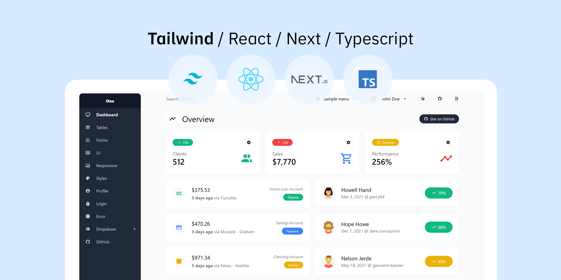](https://justboil.github.io/admin-one-react-tailwind/)
8 |
9 | [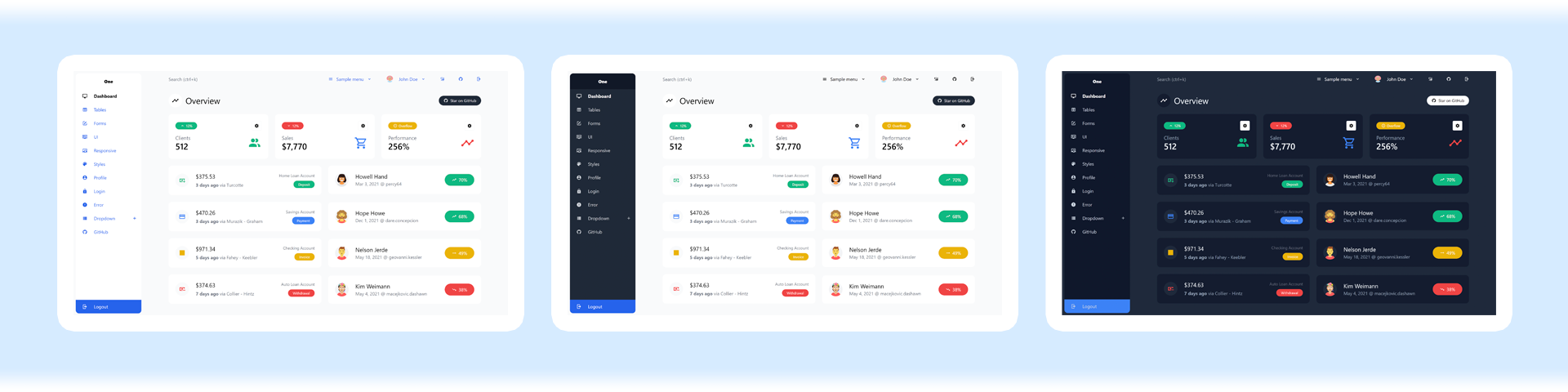](https://justboil.github.io/admin-one-react-tailwind/)
10 |
11 | ### Tailwind 4.x React with Next.js and TypeScript
12 |
13 | **Admin One** is fast, beautiful and free React Next Tailwind CSS 4.x admin dashboard with TypeScript.
14 |
15 | * Built with **TypeScript**, **React**, **Tailwind CSS 4** framework & **Next.js** with **app router**
16 | * **React Redux** state library — [Info](https://react-redux.js.org/)
17 | * **Dark mode**
18 | * **Production CSS** is only **≈38kb**
19 | * Reusable components
20 | * Free under MIT License
21 | * [Premium version](https://justboil.me/tailwind-admin-templates/react-dashboard/) available
22 |
23 | ## Table of Contents
24 |
25 | * [Vue version](#looking-for-vue-version)
26 | * [Responsive layout](#responsive-layout)
27 | * [Mobile & tablet](#mobile--tablet)
28 | * [Small laptops](#small-laptops-1024px)
29 | * [Laptops & desktops](#laptops--desktops)
30 | * [Demo](#demo)
31 | * [Free dashboard demo](#free-dashboard-demo)
32 | * [Premium dashboard demo](#premium-dashboard-demo)
33 | * [Quick Start](#quick-start)
34 | * [Get code & install](#get-code--install)
35 | * [Builds](#builds)
36 | * [Linting and formatting](#linting-and-formatting)
37 | * [Docs](#docs)
38 | * [Browser Support](#browser-support)
39 | * [Reporting Issues](#reporting-issues)
40 | * [Licensing](#licensing)
41 | * [Useful Links](#useful-links)
42 |
43 | ## Looking for Vue version?
44 |
45 | This is **Tailwind React TypeScript** version
46 |
47 | Looking for **Tailwind Vue**? Check [Admin One - Vue Tailwind dashboard](https://github.com/justboil/admin-one-vue-tailwind) version
48 |
49 | ## Responsive layout
50 |
51 | ### Mobile & tablet
52 |
53 | Mobile layout with hidden aside menu and collapsable cards & tables
54 |
55 | [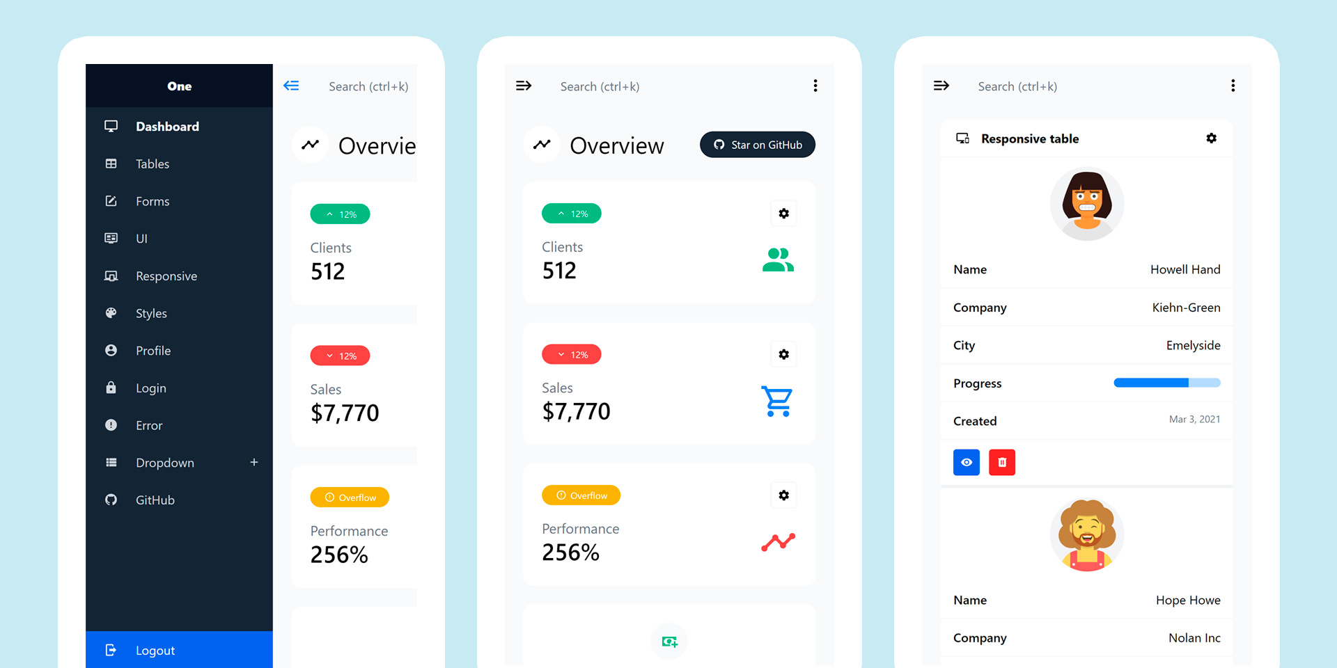](https://justboil.github.io/admin-one-react-tailwind/)
56 |
57 | ### Small laptops 1024px
58 |
59 | Small laptop layout with show/hide aside menu option
60 |
61 | [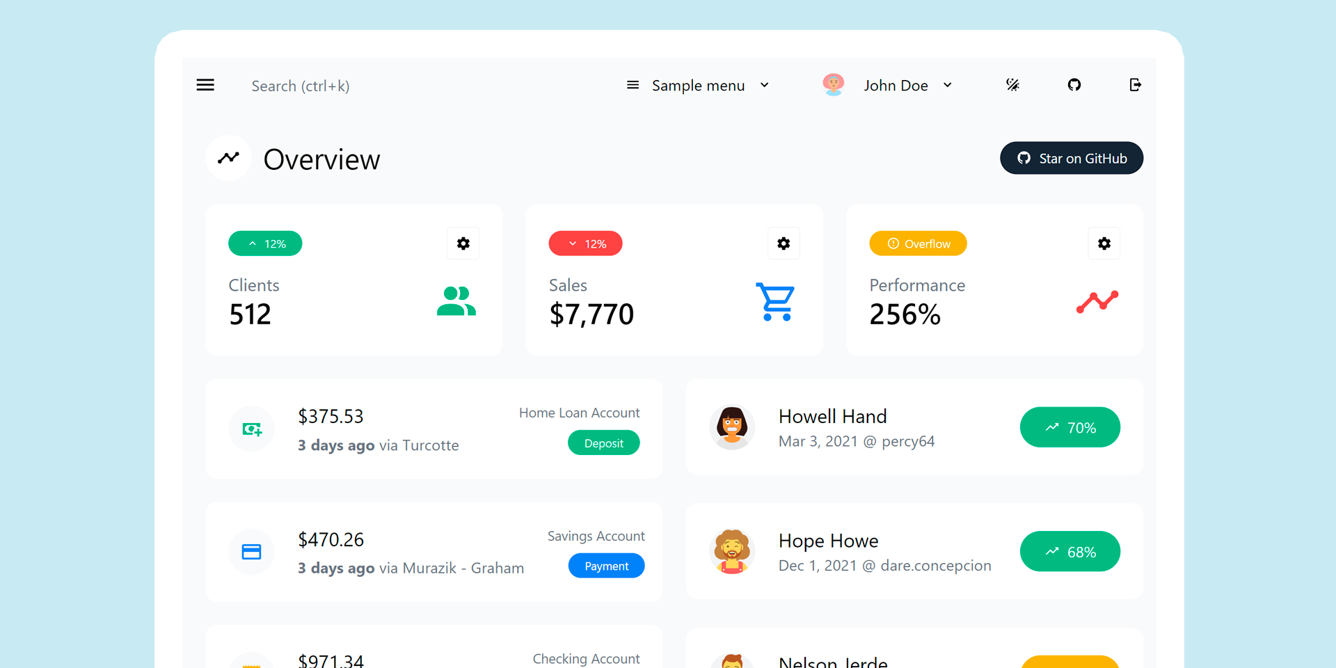](https://justboil.github.io/admin-one-react-tailwind/)
62 |
63 | [](https://justboil.github.io/admin-one-react-tailwind/)
64 |
65 | ### Laptops & desktops
66 |
67 | Classic layout with aside menus on the left
68 |
69 | [](https://justboil.github.io/admin-one-react-tailwind/)
70 |
71 | ## Demo
72 |
73 | ### Free Dashboard Demo
74 |
75 | https://justboil.github.io/admin-one-react-tailwind/
76 |
77 | ### Premium Dashboard Demo
78 |
79 | Premium version is coming soon
80 |
81 | ## Quick Start
82 |
83 | Get code & install. Then `dev` or `build`
84 |
85 | * [Get code & install](#get-code--install)
86 | * [Builds](#builds)
87 | * [Linting and formatting](#linting-and-formatting)
88 |
89 | ### Get code & install
90 |
91 | #### Get the repo
92 |
93 | * [Create new repo](https://github.com/justboil/admin-one-react-tailwind/generate) with this template
94 | * … or clone this repo on GitHub
95 | * … or [download .zip](https://github.com/justboil/admin-one-react-tailwind/archive/master.zip) from GitHub
96 |
97 | #### Install
98 |
99 | `cd` to project's dir and run `npm install`
100 |
101 | ### Builds
102 |
103 | Build are handled by Next.js CLI — [Info](https://nextjs.org/docs/app/api-reference/cli/next)
104 |
105 | #### Hot-reloads for development
106 |
107 | ```
108 | npm run dev
109 | ```
110 |
111 | #### Builds and minifies for production
112 |
113 | ```
114 | npm run build
115 | ```
116 |
117 | #### Exports build for static hosts
118 |
119 | Set `IS_OUTPUT_EXPORT` environment variable to `true` (or set `output` in next.config.ts)
120 |
121 | ### Linting & Formatting
122 |
123 | #### Lint
124 |
125 | ```
126 | npm run lint
127 | ```
128 |
129 | #### Format with prettier
130 |
131 | ```
132 | npm run format
133 | ```
134 |
135 | ## Docs
136 |
137 | Docs are coming soon
138 |
139 | ## Browser Support
140 |
141 | We try to make sure Dashboard works well in the latest versions of all major browsers
142 |
143 |
124 |
125 | {pagesList.map((page) => (
126 |
137 |
138 | Page {currentPage + 1} of {numPages}
139 |
140 |
141 | 


 144 |
145 | ## Reporting Issues
146 |
147 | JustBoil's free items are limited to community support on GitHub.
148 |
149 | The issue list is reserved exclusively for bug reports and feature requests. That means we do not accept usage questions. If you open an issue that does not conform to the requirements, it will be closed.
150 |
151 | 1. Make sure that you are using the latest version of the Dashboard. Issues for outdated versions are irrelevant
152 | 2. Provide steps to reproduce
153 | 3. Provide an expected behavior
154 | 4. Describe what is actually happening
155 | 5. Platform, Browser & version as some issues may be browser specific
156 |
157 | ## Licensing
158 |
159 | - Copyright © 2019-2025 JustBoil.me (https://justboil.me)
160 | - Licensed under MIT
161 |
162 | ## Useful Links
163 |
164 | - [JustBoil.me](https://justboil.me/)
165 | - [Tailwind CSS](https://tailwindcss.com/)
166 | - [Next.js Docs](https://nextjs.org/docs/app/getting-started)
167 | - [React.js Docs](https://react.dev/learn)
168 | - [Redux Docs](https://redux.js.org/introduction/getting-started) & [React-Redux Docs](https://react-redux.js.org/introduction/getting-started)
169 | - [TypeScript Docs](https://www.typescriptlang.org/docs/)
170 | - [TypeScript ESLint Docs](https://typescript-eslint.io/docs/)
171 |
--------------------------------------------------------------------------------
/app/dashboard/forms/page.tsx:
--------------------------------------------------------------------------------
1 | "use client";
2 |
3 | import { mdiAccount, mdiBallotOutline, mdiGithub, mdiMail, mdiUpload } from "@mdi/js";
4 | import { Field, Form, Formik } from "formik";
5 | import Head from "next/head";
6 | import Button from "../../_components/Button";
7 | import Buttons from "../../_components/Buttons";
8 | import Divider from "../../_components/Divider";
9 | import CardBox from "../../_components/CardBox";
10 | import FormCheckRadio from "../../_components/FormField/CheckRadio";
11 | import FormCheckRadioGroup from "../../_components/FormField/CheckRadioGroup";
12 | import FormField from "../../_components/FormField";
13 | import FormFilePicker from "../../_components/FormField/FilePicker";
14 | import SectionMain from "../../_components/Section/Main";
15 | import SectionTitle from "../../_components/Section/Title";
16 | import SectionTitleLineWithButton from "../../_components/Section/TitleLineWithButton";
17 | import { getPageTitle } from "../../_lib/config";
18 | import FieldLabel from "../../_components/FormField/FieldLabel";
19 |
20 | export default function FormsPage() {
21 | return (
22 | <>
23 |
24 |
144 |
145 | ## Reporting Issues
146 |
147 | JustBoil's free items are limited to community support on GitHub.
148 |
149 | The issue list is reserved exclusively for bug reports and feature requests. That means we do not accept usage questions. If you open an issue that does not conform to the requirements, it will be closed.
150 |
151 | 1. Make sure that you are using the latest version of the Dashboard. Issues for outdated versions are irrelevant
152 | 2. Provide steps to reproduce
153 | 3. Provide an expected behavior
154 | 4. Describe what is actually happening
155 | 5. Platform, Browser & version as some issues may be browser specific
156 |
157 | ## Licensing
158 |
159 | - Copyright © 2019-2025 JustBoil.me (https://justboil.me)
160 | - Licensed under MIT
161 |
162 | ## Useful Links
163 |
164 | - [JustBoil.me](https://justboil.me/)
165 | - [Tailwind CSS](https://tailwindcss.com/)
166 | - [Next.js Docs](https://nextjs.org/docs/app/getting-started)
167 | - [React.js Docs](https://react.dev/learn)
168 | - [Redux Docs](https://redux.js.org/introduction/getting-started) & [React-Redux Docs](https://react-redux.js.org/introduction/getting-started)
169 | - [TypeScript Docs](https://www.typescriptlang.org/docs/)
170 | - [TypeScript ESLint Docs](https://typescript-eslint.io/docs/)
171 |
--------------------------------------------------------------------------------
/app/dashboard/forms/page.tsx:
--------------------------------------------------------------------------------
1 | "use client";
2 |
3 | import { mdiAccount, mdiBallotOutline, mdiGithub, mdiMail, mdiUpload } from "@mdi/js";
4 | import { Field, Form, Formik } from "formik";
5 | import Head from "next/head";
6 | import Button from "../../_components/Button";
7 | import Buttons from "../../_components/Buttons";
8 | import Divider from "../../_components/Divider";
9 | import CardBox from "../../_components/CardBox";
10 | import FormCheckRadio from "../../_components/FormField/CheckRadio";
11 | import FormCheckRadioGroup from "../../_components/FormField/CheckRadioGroup";
12 | import FormField from "../../_components/FormField";
13 | import FormFilePicker from "../../_components/FormField/FilePicker";
14 | import SectionMain from "../../_components/Section/Main";
15 | import SectionTitle from "../../_components/Section/Title";
16 | import SectionTitleLineWithButton from "../../_components/Section/TitleLineWithButton";
17 | import { getPageTitle } from "../../_lib/config";
18 | import FieldLabel from "../../_components/FormField/FieldLabel";
19 |
20 | export default function FormsPage() {
21 | return (
22 | <>
23 |
24 |