--------------------------------------------------------------------------------
/CNAME:
--------------------------------------------------------------------------------
1 | blog.jxnblk.com
--------------------------------------------------------------------------------
/README.md:
--------------------------------------------------------------------------------
1 |
2 | # https://jxnblk.com
3 |
4 | Personal site and blog with thoughts on design, development, and other things
5 |
6 |
7 |
--------------------------------------------------------------------------------
/about.md:
--------------------------------------------------------------------------------
1 |
2 | Since 2020, I've been teaching myself game development with Unity and have been working on [Novantica][],
3 | a sci-fi adventure game, set in a futuristic urban open world where time travel is common,
4 | god-like AI govern the world, and a mysterious event has disrupted the city.
5 | You can [wishlist Novantica on Steam][novantica-steam].
6 |
7 | Over the years, I've worked on several open source projects that helped defined modern approaches to styling front end applications.
8 | Starting in 2013, I worked with Adam Morse and John Otander on [CSS Stats][], a web application to statically analyze a site's CSS.
9 | In 2015, I created [Basscss][], the first atomic/utility-based CSS framework that helped popularize using multiple classnames
10 | on a single element to style HTML.
11 | Basscss used a small set of theme values for font-size, color palettes, margin and padding scales, and more,
12 | which is now common practice in front end design systems.
13 | If you've seen (or cursed at) code that looks like \`class="block mb2 blue"\`, then you've seen my work.
14 | In 2017, I released v1 of [Rebass][] (also my first time on [Hacker News][rebass-hn]),
15 | a library of stateless functional React components with styling,
16 | which helped introduce the concept of styled UI components in React.
17 | Extracting the utility style props from Rebass, I created [Styled System][] in 2017.
18 | In 2019, I released [Theme UI][], an extension of these ideas that provided utilities for dark mode, styling content in MDX,
19 | and a universal \`sx\` prop to style elements inline with theme-based values.
20 |
21 | I've also worked on various other open source projects.
22 | I created [MDX Deck][] as a simple way to make slide presentations with MDX.
23 | Helped John Otander with the conceptual design and syntax of [MDX][], a combination of markdown and JSX.
24 | Created several color tools, including [Colorable][] for testing color contrast, Palx, [Spectral][], and [Hello Color][].
25 | SVG-related tools, including [Loading][], [Geomicons][], Microicon, [Paths][], and [Reline][].
26 |
27 | As a retired DJ, I also produce electronic music, previously running a project called [Microbeats][],
28 | in which each track was created in one hour or less.
29 | I am one-half of [MrsJxn][], a collaboration with Adam Morse.
30 | I also dabble with interactive music apps like [Skullcat][].
31 | Checkout my [SoundCloud][].
32 |
33 | I am currently working as a design engineer at [Val Town][].
34 | Previously, I worked at Gatsby JS, Priceline, The Grid, Etsy, Kickstarter, Stitch Fix, Living Social, and Opower.
35 | I studied sociology, Japanese language, and graphic design at Marshall University.
36 |
37 | [val town]: https://val.town
38 | [css stats]: https://cssstats.com
39 | [basscss]: https://basscss.com
40 | [rebass]: https://github.com/rebassjs/rebass
41 | [styled system]: https://github.com/styled-system/styled-system
42 | [theme ui]: https://github.com/system-ui/theme-ui
43 |
44 | [mdx deck]: https://github.com/jxnblk/mdx-deck
45 | [mdx]: https://mdxjs.com/community/about/
46 | [colorable]: https://colorable.jxnblk.com/
47 | [palx]: https://github.com/jxnblk/palx
48 | [spectral]: https://jxnblk.io/Spectral/
49 | [hello color]: https://jxnblk.io/hello-color
50 |
51 | [geomicons]: https://github.com/jxnblk/geomicons-wired
52 | [loading]: https://jxnblk.io/loading/
53 | [paths]: https://jxnblk.io/paths/
54 | [reline]: https://jxnblk.io/reline/
55 |
56 | [rebass-hn]: https://news.ycombinator.com/item?id=14704552
57 |
58 | [microbeats]: https://microbeats.cc/
59 | [mrsjxn]: https://soundcloud.com/mrsjxn
60 | [soundcloud]: https://soundcloud.com/jxnblk
61 | [skullcat]: https://jxnblk.io/skullcat/
62 | [novantica]: https://novanticagame.com
63 | [novantica-steam]: https://store.steampowered.com/app/2437530/Novantica/
64 |
65 |
--------------------------------------------------------------------------------
/about/index.mdx:
--------------------------------------------------------------------------------
1 | import { Container } from '../blocks'
2 |
3 | export default Container
4 |
5 | # About
6 |
7 | 
8 |
9 | Brent Jackson lives in Brooklyn, NY with his partner and calico roommate.
10 | Originally from Huntington, West Virginia,
11 | he studied Sociology, Graphic Design, and Japanese Language at Marshall University.
12 |
13 | His career in tech has led him from Web and interaction design to user experience design to front-end development.
14 | Jackson currently works at [Gatsby][],
15 | previously at Kickstarter, Etsy, LivingSocial, Stitch Fix, and Priceline.
16 | He has worked on several open source projects, including [Basscss][], [CSS Stats][], [Colorable][], [Rebass][], [Styled System][], [Theme UI][], and [MDX Deck][].
17 |
18 | [Gatsby]: https://gatsbyjs.org
19 | [Theme UI]: https://theme-ui.com
20 | [basscss]: https://basscss.com
21 | [css stats]: https://cssstats.com
22 | [colorable]: https://colorable.jxnblk.com
23 | [rebass]: https://rebassjs.org
24 | [styled system]: https://styled-system.com
25 | [theme ui]: https://theme-ui.com
26 | [mdx deck]: https://github.com/jxnblk/mdx-deck
27 |
--------------------------------------------------------------------------------
/api/blog/5-ways-to-not-shoot-yourself-in-the-foot-with-css/index.json:
--------------------------------------------------------------------------------
1 | {"path":"blog/5-ways-to-not-shoot-yourself-in-the-foot-with-css","slug":"5-ways-to-not-shoot-yourself-in-the-foot-with-css","title":"5 ways to not shoot yourself in the foot with CSS","description":null,"date":"2014-12-30T00:00:00.000Z","excerpt":"\n
Don’t make assumptions
\n
Don’t be specific
\n
Don’t override anything
\n
Don’t entangle it with markup
\n
Don’t repeat yourself
\n\n","html":"\n
Don’t make assumptions
\n
Don’t be specific
\n
Don’t override anything
\n
Don’t entangle it with markup
\n
Don’t repeat yourself
\n\n"}
--------------------------------------------------------------------------------
/api/blog/an-update-on-the-hamburger-menu/index.json:
--------------------------------------------------------------------------------
1 | {"path":"blog/an-update-on-the-hamburger-menu","slug":"an-update-on-the-hamburger-menu","title":"An Update on the Hamburger Menu","description":null,"date":"2014-04-12T00:00:00.000Z","excerpt":"
Facebook has discontinued using the hamburger menu in their iOS app.
\n
A few desktop websites have replaced their persistent navigation with the hamburger menu – who knows if they're actually testing it or how they're interpreting the results.
\n
Time Magazine decided to use it:
\n\n
\n
\"No one understands the icon, let's add the word menu. The word is too small, let's add a pop-up calling it out.\" pic.twitter.com/Jargi7gavX
Despite all of this, I still haven't seen any evidence suggesting that the hamburger menu is an improvement.
\n
Patterns
\n
Basically it comes down to interface design patterns. Patterns rely on familiarity and emerge slowly over time. Most of the ones we use on the web today have been around for many years.
\n
Users have plenty of new things to learn without adding contrived navigation patterns into the mix. Let's stop trying to innovate device-specific interactions and leave it to the device manufacturers.
\n
Let's focus on the real problems
\n
Product design requires solving many more difficult problems.\nFor example:
\n
\n
How does your product align with a user's mental model?
\n
How do you scale your information architecture?
\n
How do you make your product meaningful to your users?
\n
How do you reach a wider audience with your product?
\n
\n
Personally, I'd much rather be designing and testing solutions for problems like these.
\n"}
--------------------------------------------------------------------------------
/api/blog/buckets-and-jumpoffs-using-content-centric-contextual-navigation/index.json:
--------------------------------------------------------------------------------
1 | {"path":"blog/buckets-and-jumpoffs-using-content-centric-contextual-navigation","slug":"buckets-and-jumpoffs-using-content-centric-contextual-navigation","title":"Buckets and Jumpoffs: Using Content-Centric Contextual Navigation","description":null,"date":"2012-12-07T00:00:00.000Z","excerpt":"
While table views provide a clear and simple way to navigate certain types of content, mobile should be about putting content and user goals first and navigation second. Don't overload the user with navigation choices, show meaningful content instead. Even though tab bars are great – sitting below the content, out of the way until the user needs them – there are new opportunities to explore content-centric contextual navigation when designing for mobile.
\n","html":"
While table views provide a clear and simple way to navigate certain types of content, mobile should be about putting content and user goals first and navigation second. Don't overload the user with navigation choices, show meaningful content instead. Even though tab bars are great – sitting below the content, out of the way until the user needs them – there are new opportunities to explore content-centric contextual navigation when designing for mobile.
\n\n
Create Better Table Views with Teasers
\n
\n
A quick and dirty way to give table views more meaning is by using teasers. Apple's Mail App shows a numerical indicator of unread emails at the top level, then shows truncated previews of actual messages at the inbox level. Similarly, Messages shows previews of the last message sent before the user drills into the conversation.
\n
Flipping the Teaser Approach on Its Head
\n
While teasers can make basic table views more meaningful, they prioritize navigation over content. Taking the teaser approach and flipping it on its head can result in a content-centric design that provides meaningful contextual navigation to the user. Many apps and e-commerce sites already do this, and it can help create focus on content discovery rather than search.
\n
What are Buckets & Jumpoffs?
\n
You've probably seen this pattern before: take a collection of items, group them into categories, present a limited number of those items in buckets or lists, and provide a link to jump off and view more. There doesn't seem to be a great name for this pattern, some have suggested calling it the egg carton or the showcase, but neither of those terms seem to capture the essence of the jumpoff link's contextual navigation – thus, buckets & jumpoffs.
\n
\n
Twitter uses this approach in its profile view, along with a mix of standard table views. Instead of seeing all of the user's tweets in the profile view, there is a small bucket showing the latest three tweets and a link to view more.
\n
\n
Rdio does this to great effect in its search results view, showing results bucketed by artists, albums, songs, playlists, and people. This view provides direct links to the top results and a link to view more results in each bucket as well.
\n
\n
Using a mixture of swipeable carousel buckets and tiles, Apple creates a lot of visual interest in its App Store and iTunes apps. These Featured views are frequently updated and serve as a great way to promote content discovery in an otherwise extremely complex IA. Apple also uses buckets on its desktop version of iTunes, showing that this pattern can be effectively scaled up to larger displays.
\n
\n
Similarly, Foursquare places contextual navigation – which is often delegated to detail views – in-line with its content-rich list view. Unfortunately, Foursquare's desktop site lacks the same level of content discovery afforded in its mobile app and, instead, relies heavily on traditional search.
\n
Focus on Content but Don't Neglect Navigation
\n
Mobile is a new medium, and its constraints and advantages should be taken into account when designing navigation systems. The limited screen real estate makes traditional faceted filtering and search patterns more difficult. Instead of replicating desktop navigation-heavy approaches, try content-centric contextual navigation. To create a cohesive cross-platform experience, you can translate mobile navigation patterns to desktop. This often leads to simple, focused interfaces that will delight your users.
\n
When designing for mobile, focus on content, but don't neglect navigation in the process.
\n","draft":true}
--------------------------------------------------------------------------------
/api/blog/code-literacy/index.json:
--------------------------------------------------------------------------------
1 | {"path":"blog/code-literacy","slug":"code-literacy","title":"Code Literacy","description":"Asking should designers code is asking the wrong question.","date":"2019-07-25T00:00:00.000Z","excerpt":"Asking should designers code is asking the wrong question.","html":"
Ah yes, everyone's favorite question: should designers code?\nAs much as I'd love to pontificate on the matter,\nI think the framing of this question is fundamentally wrong.\nAt the heart of this conversation is the idea of code literacy,\nthat is, the level at which one can read, write, and understand software code in the form of programming languages.
\n
We don't question whether or not we should teach children to read and write,\nor whether we should math in school.\nIn a modern public education systems, these are a given.\nWhile these institutions might have other problems,\nI think code literacy should be a fundamental part of any school curriculum.
\n
What is code? Paul Ford has already written more than enough to cover that topic,\nbut I'd like to step back and consider how code is not dissimilar to written language and mathematics.
\n
While spoken languages are innate, we humans invented written language somewhat recently in our own history.\nSpeaking comes naturally, but written language is not hard-wired into our brains.\nWe naturally think in symbols, and most of us are able to handle reading and writing,\nbut it's still something that we invented.\nIt's a powerful tool that allows us to transfer knowledge over space and time in ways we couldn't do without it.
\n
Math, too, is symbolic in nature.\nIt's not entirely dependent on written language,\nbut math certainly benefits from our ability to scribble lines on paper.
\n
Code is the languages we humans use to communicate with computers.
\n
Think about this for a second:
\n\n
The computer is the first tool that we've created that requires written language to even work.
\n
Without software, computers are useless.\nPerhaps, one day, computers might fluently speak natural human languages,\nbut there will always be code underlying the abstractions that enable this.
\n
Some people are interested in abstracting away the code required to program computers,\nwhich can make computers accessible in ways they weren't before.\nBut saying that code will become less and less fundamental to the progress of technology\nis akin to saying that no one needs to learn mathematics because we have calculators now.\nIf anything, the opposite is true.
\n
I suspect that the invention of software might be on par with the invention of mathematics,\nbut we're too close to the event to see its historical significance.\nMathematics is broad and broadly applicable and works at a much lower level than code -\nsoftware isn't really possible without mathematics, afterall.\nBut this is the first time in human history where we've created a technology that requires written language (i.e. software) to operate.
\n
Not everyone in a modern society needs to be a poet, or a bestselling author, or have a PhD in mathematics,\nbut I think having basic reading, writing, and arithmetic skills will benefit anyone.\nI think the same is true for code literacy.\nNot everyone needs to be a software developer,\nbut the more you know about how humans communicate with machines,\nthe more benefits you'll see professionally.
\n
Imagine you work in the finance industry and have figured out a way to mitigate all the billions of dollars lost on spreadsheet errors.\nOr imagine you're a farmer who leverages machine learning to predict crop yields.\nYou could wait for software developers to create this for you,\nbut diverse experiences applied to different technologies can result in incredible innovation.
\n
I don't think we should expect someone in a non-developer role to read and write code professionally.\nBut I also think the people who are curious and who learn a little more than their peers\nwill always have the advantage.
Everything in a UI is a component.\nThis includes buttons, inputs, forms, promotional modules, pages, user flows, etc.\nI use the word component not only because this is how the underlying code is written in libraries like React and Ember,\nbut also because pieces of a well-designed UI system should be composable.
\n","html":"
Everything in a UI is a component.\nThis includes buttons, inputs, forms, promotional modules, pages, user flows, etc.\nI use the word component not only because this is how the underlying code is written in libraries like React and Ember,\nbut also because pieces of a well-designed UI system should be composable.
A highly composable system provides recombinant components that can be selected and assembled in various combinations to satisfy specific user requirements. In information systems, the essential features that make a component composable are that it be:
\n
\n
self-contained (modular): it can be deployed independently – note that it may cooperate with other components, but dependent components are replaceable
\n
stateless: it treats each request as an independent transaction, unrelated to any previous request. Stateless is just one technique; managed state and transactional systems can also be composable, but with greater difficulty.
\n
\n
\n
Modular & Stateless Components
\n
state => ui\n
\n
A UI system that is made up of independent stateless components is extremely flexible.\nWhen individual pieces need to be swapped out or updated,\nthose changes are isolated and don’t cause other parts of a system to break.\nThinking about these components as being pure functions –\nthat is, the same state always produces the same output –\ncan help ensure composability.
\n
\n
A pure function is one that exhibits the property of substitution: replacing a call with its returned value should make the program equivalent. As an example, concat('hello', 'world') can be substituted with 'hello world' without changing the behavior of your program.
\n
How can we apply this to a graphical user interface? By having the function return an abstract representation of widgets (or markup) to be rendered on the screen...
Naming things is hard, there’s no debate there, but when you start to categorize different parts of a UI into pages, views, flows, atoms, molecules, materials, or kittens, you’ve already started to undermine the concept of composability, and it probably takes more time and effort to get an entire team of people to “agree upon” your proposed naming conventions than it’s worth.
\n
The point of this is to think about everything as an interoperable system.\nYou can slice and dice components in any way you see fit, and these components are likely to change and be fine tuned as a system is developed.\nPremature optimization is a trap that’s easy to fall into.\nEmbrace the chaos as you build.\nPatterns will emerge from the primordial goop of UI that is your product,\nand by consistently thinking about a composable system you’ll probably come up with something more flexible\nand more robust than if one person dictates a dogmatic framework to work within.
\n"}
--------------------------------------------------------------------------------
/api/blog/designing-in-the-browser-faster/index.json:
--------------------------------------------------------------------------------
1 | {"path":"blog/designing-in-the-browser-faster","slug":"designing-in-the-browser-faster","title":"Designing in the Browser Faster","description":null,"date":"2014-04-14T00:00:00.000Z","excerpt":"
I’ve been dabbling with HTML and CSS for years—building small websites for myself and friends and building prototypes to test designs. And, while I’ve been fascinated with the idea of designing in the browser for a long time, it wasn’t until recently that it’s become much, much faster for me than using traditional design software.
\n","html":"
I’ve been dabbling with HTML and CSS for years—building small websites for myself and friends and building prototypes to test designs. And, while I’ve been fascinated with the idea of designing in the browser for a long time, it wasn’t until recently that it’s become much, much faster for me than using traditional design software.
\n\n
Getting faster
\n
Practice has certainly helped, but what really sped up my ability to design and iterate in code was an approach called Object Oriented CSS, or OOCSS. My friend and colleague sent me down this scary-sounding path over a year ago, and I haven’t looked back since. He gave me a ton of reading material, coached me with code reviews, and constantly challenged me. Most of the articles on OOCSS focus on front-end performance, code maintenance benefits, and things like naming conventions. What most people don’t tell you is how much faster it can make designing in code.
\n
Do one thing well
\n
At its core, OOCSS focuses on highly reusable styles that follow the open/closed principle—that is, they’re open for extension, but closed for modification. They do one thing and do it well. You can think of them as something like layer effects or color swatches. When I’m fleshing out a design, I spend a lot of time adjusting spacing, font sizes, colors, and other small details. I often don’t know what combination of styles each element should have before I see it in context.
\n
Don’t make assumptions
\n
For new web projects, I usually start with a base type scale, spacing scale, and a rough color palette. Having these separated into single-purpose utilities gives me the flexibility to jump straight into HTML and experiment, without having to constantly write and rewrite CSS. I try not to make assumptions about what any one element or module will end up looking like. Instead, I make sure each element feels right in context, then create more defined patterns when needed.
\n
Content-centric design
\n
Using single-purpose styles aligns well with the concept of content-centric design. Defining heading styles without knowing what they say or where they’re located can be difficult. Having the ability to quickly adjust type hierarchy, color, and other styles to get the rhythm, balance, and gestalt right is key to successfully designing in the browser.
\n
From paper to prototype
\n
Using this approach, I typically go directly from notes and paper sketches to building prototypes in code. The only time I open graphic applications like Illustrator or Photoshop are when I need to create image assets to use in code. And with tools like Github, I can try out a number of iterations on different branches in a non-destructive way.
\n
Choose the right tools
\n
Personally, this has sped up my workflow tremendously, and every designer I’ve introduced to this approach has picked it up quickly and enthusiastically. You might find OOCSS to be a useful addition to your design toolkit as well.
A domain-specific language (DSL) is a computer language specialized to a particular application domain. This is in contrast to a general-purpose language (GPL), which is broadly applicable across domains.\nhttps://en.wikipedia.org/wiki/Domain-specific_language\nA domain-specific language is created specifically to solve problems in a particular domain and is not intended to be able to solve problems outside it (although that may be technically possible). In contrast, general-purpose languages are created to solve problems in many domains.
\n
\n
\n
\n
consider designing in iOS, it requires domain-specific (i.e. platform-specific) design conventions and patterns, predominantly outlined in Apple's HIG
\n
\n
\n
Deviating from the HIG means you are creating a new design language specific to your application,\nwhich may have its benefits, but also requires more learning on the part of the user.
\n
Similarly, deviating from a web application's style guide, UI component library, or interaction pattern library\nis equivalent to creating a new design language that users need to learn.
\n
The web itself has it's own design language.\nUsers have acclimated to using blue underlined links, scrolling through pages, using standard form elements,\nas well as a plethora of other interaction design patterns.
\n
Though sometimes DSLs are appropriate,\nthe main disadvantage to using a DSL is that it requires domain-specifig knowledge of certain APIs rather than relying on more standard conventions. An example of this would be using coffeescript or JSX, rather than the standardized JavaScript (EMCAScript) syntax
\n","html":"
\n
\n
definition of DSL
\n
\n
A domain-specific language (DSL) is a computer language specialized to a particular application domain. This is in contrast to a general-purpose language (GPL), which is broadly applicable across domains.\nhttps://en.wikipedia.org/wiki/Domain-specific_language\nA domain-specific language is created specifically to solve problems in a particular domain and is not intended to be able to solve problems outside it (although that may be technically possible). In contrast, general-purpose languages are created to solve problems in many domains.
\n
\n
\n
\n
consider designing in iOS, it requires domain-specific (i.e. platform-specific) design conventions and patterns, predominantly outlined in Apple's HIG
\n
\n
\n
Deviating from the HIG means you are creating a new design language specific to your application,\nwhich may have its benefits, but also requires more learning on the part of the user.
\n
Similarly, deviating from a web application's style guide, UI component library, or interaction pattern library\nis equivalent to creating a new design language that users need to learn.
\n
The web itself has it's own design language.\nUsers have acclimated to using blue underlined links, scrolling through pages, using standard form elements,\nas well as a plethora of other interaction design patterns.
\n
Though sometimes DSLs are appropriate,\nthe main disadvantage to using a DSL is that it requires domain-specifig knowledge of certain APIs rather than relying on more standard conventions. An example of this would be using coffeescript or JSX, rather than the standardized JavaScript (EMCAScript) syntax
\n","draft":true}
--------------------------------------------------------------------------------
/api/blog/dont-boil-the-ocean/index.json:
--------------------------------------------------------------------------------
1 | {"path":"blog/dont-boil-the-ocean","slug":"dont-boil-the-ocean","title":"Don't Boil the Ocean","description":null,"date":"2019-03-18T00:00:00.000Z","excerpt":"
Geomicons Open is an SVG icon set completely hand-coded using the Path element.\nThe first version’s source was built in complete SVG, but I soon realized that the wrapping SVG and Path elements were the exact same for each icon.\nIn an effort to DRY things up, I set up a rudimentary build process that would take source code containing only the Path elements’ d attribute value and create valid SVG code.
\n
I also built a rough icon injection script...
\n
\n
geomicons-open as npm module
\n
paths object
\n
react-geomicons dependency
\n
wrapping dumb component
\n
\n","html":"
Geomicons Open is an SVG icon set completely hand-coded using the Path element.\nThe first version’s source was built in complete SVG, but I soon realized that the wrapping SVG and Path elements were the exact same for each icon.\nIn an effort to DRY things up, I set up a rudimentary build process that would take source code containing only the Path elements’ d attribute value and create valid SVG code.
\n
I also built a rough icon injection script...
\n
\n
geomicons-open as npm module
\n
paths object
\n
react-geomicons dependency
\n
wrapping dumb component
\n
\n","draft":true,"tags":["react","svg","icons","geomicons"]}
--------------------------------------------------------------------------------
/api/blog/i-dont-know-how-to-design/index.json:
--------------------------------------------------------------------------------
1 | {"path":"blog/i-dont-know-how-to-design","slug":"i-dont-know-how-to-design","title":"I don’t know how to design","description":null,"date":"2014-04-16T00:00:00.000Z","excerpt":"
I’ll admit it.
\n","html":"
I’ll admit it.
\n\n
I don’t know how to design without research.
\n
Without upfront research, you’re not designing things, you’re just building things that might or might not meet your users’ needs or fit their mental models. Chances are, they won’t. User acceptance testing and A/B testing are important, but won’t give you the insights you’ll need to start off on the right foot.
\n
I don’t know how to design without metrics.
\n
Whether it’s business goals, KPIs, or conversion rates, without metrics you’ll have no idea what problems you’re solving or if the solutions you’re building will fit the bill.
\n
I don’t know how to design without iterating.
\n
Your first attempt at anything will not be your best. Put something out there and continually work on making it better and better.
\n
I don’t know how to design without context.
\n
Good design simplifies complexity to align with users’ mental models. Without understanding context and creating systems to design within, you’re just adding noise that contributes to cognitive overload for both users and the people building the product.
\n
I don’t know how to design without collaboration.
\n
Design doesn’t happen in a vacuum. Whether it’s through participatory design with users, sketching sessions with other designers, developers, product managers, and stakeholders, or just an old fashioned critique, the best design work comes from working with others.
\n"}
--------------------------------------------------------------------------------
/api/blog/im-sick-of-your-tiny-tiny-type/index.json:
--------------------------------------------------------------------------------
1 | {"path":"blog/im-sick-of-your-tiny-tiny-type","slug":"im-sick-of-your-tiny-tiny-type","title":"I’m Sick of Your Tiny, Tiny Type","description":null,"date":"2013-01-29T00:00:00.000Z","excerpt":"
Your tiny type is hard to read – no, not hard to read, impossible to read. I carry my phone with me everywhere, but I always seem to forget my magnifying glass. I tap the Safari Reader button, but that’s not a solution to the problem. That’s a band-aid for your bad typesetting.
\n","html":"
Your tiny type is hard to read – no, not hard to read, impossible to read. I carry my phone with me everywhere, but I always seem to forget my magnifying glass. I tap the Safari Reader button, but that’s not a solution to the problem. That’s a band-aid for your bad typesetting.
\n\n
Sometimes I’m on my computer, and Reader doesn’t work on your web app. I hit CMD + two or three times so that my dyslexic brain can make sense of the musty 14px Helvetica your servers regurgitated all over my screen. Then the layout falls apart. Words start smashing together. Ads bleed into my emails. And I find myself scrolling up, down, left, right, left, right – what in the hell is this? The Konami code? I don’t need 30 extra lives. I want to read your content.
\n
And I know I’m not the only one who hates your tiny type. How many times have I heard users complain about fonts being too small? More times than I’ve heard them complain about fonts being too large – wait, I’ve never heard a user complain about that. Your users aren’t asking for a faster horse – they’re struggling to read your content. Surely that isn’t what you’re going for, and surely that isn’t a good experience.
\n"}
--------------------------------------------------------------------------------
/api/blog/its-okay-to-look-the-same/index.json:
--------------------------------------------------------------------------------
1 | {"path":"blog/its-okay-to-look-the-same","slug":"its-okay-to-look-the-same","title":"It’s Okay to Look the Same","description":null,"date":"2014-04-25T00:00:00.000Z","excerpt":"
Every once in a while I hear someone complain about the visual homogenization of the web, and front-end frameworks often get the brunt of the attack. This visual sameness isn’t necessarily a bad thing.
\n","html":"
Every once in a while I hear someone complain about the visual homogenization of the web, and front-end frameworks often get the brunt of the attack. This visual sameness isn’t necessarily a bad thing.
\n\n
Visual design is easy
\n
Visual design is one of the easiest parts of web design to get right. Beautiful looking sites are often perceived as being easier to use, but that’s a low hurdle to clear. Using clean typography, a good color palette, solid visual hierarchy, and consistency will get you most of the way there.
\n
It’s also hard
\n
The hardest part of visual design is stakeholder buy-in. It’s easily the most noticeable part of a design, and it’s one that people will certainly have opinions about — whether or not they understand typography, gestalt, or color psychology. If you’re the one calling the shots, then you’ve got it easy.
\n
\n
Visual design is a bike shed. User experience is a nuclear reactor.
\n
\n
It’s called Bootstrap for a reason
\n
When building something new, frameworks can help settle arguments over visual details. And, if you don’t have a background in design, using a framework can help you achieve a certain baseline of visual polish. Frameworks get you started and create well-defined systems to customize and build upon while you validate your ideas.
\n
Don’t not do it
\n
The visual aspects of web design are extremely important. If you’ve got the time and resources, by all means, sweat the details. But before you do, make sure your site works. Time spent deliberating visual design could be better spent conducting research with your users. A beautiful site that doesn’t align with mental models isn’t worth much to your business.
\n"}
--------------------------------------------------------------------------------
/api/blog/microbeats-is-the-best-journal-ive-ever-kept/index.json:
--------------------------------------------------------------------------------
1 | {"path":"blog/microbeats-is-the-best-journal-ive-ever-kept","slug":"microbeats-is-the-best-journal-ive-ever-kept","title":"Microbeats is the Best Journal I’ve Ever Kept","description":null,"date":"2012-11-07T00:00:00.000Z","excerpt":"
I’ve been producing electronic music on my computer for about a decade now, and I don’t have a whole lot to show for it. After moving to DC from Shanghai, where I played a lot of live sets and DJ gigs, I realized there wasn’t much of a music scene in DC, and I stopped playing out. After a few years, I noticed that I generally wasn’t being inspired, and I wasn’t growing much as an artist. I also noticed that I had a tendency to never finish the tracks that I’d started. I was pretty good at creating catchy little loops, but they never evolved into anything beyond that.
\n","html":"
I’ve been producing electronic music on my computer for about a decade now, and I don’t have a whole lot to show for it. After moving to DC from Shanghai, where I played a lot of live sets and DJ gigs, I realized there wasn’t much of a music scene in DC, and I stopped playing out. After a few years, I noticed that I generally wasn’t being inspired, and I wasn’t growing much as an artist. I also noticed that I had a tendency to never finish the tracks that I’d started. I was pretty good at creating catchy little loops, but they never evolved into anything beyond that.
\n\n
To try to pull myself out of this rut, I started a Tumblr called Loop A Day in early 2011. The idea was that I would spend no more than an hour each day creating a loop and posting it to this blog. I kept up with it for about a month, then I realized that the daily routine was wrecking my social life – I remember leaving parties more than once just to go home and work on music. I did like the hour limitation, but doing it every day had to stop. So, I got rid of my self-imposed quota and renamed the project Microbeats.
\n
A lot of the earlier beats I created were technical experimentations, and I drew a lot of inspiration from the music I was listening to. Then I started noticing something happening. I started subconsciously pulling inspiration from my actual life and putting more emotion into the beats I was creating. By the end of 2011, I started consciously pulling inspiration from the things I was doing, the places I was going, the people I was meeting and the conversations I was having and using that as mental fodder when I sat down to work on a beat.
\n
It may not be obvious to the outside observer, but for me, Microbeats became a record of all the things happening in my life – though some beats are admittedly (and intentionally) vulnerable. Conversations from friends’ parties, meeting new people, getting dumped, rebounding, breaking my hand, traveling for work, vacationing with family, moving to a new city, and everything in between – my life started to manifest itself in the music.
\n
Though I don’t do it very often, when I go back through the archives and listen to the beats, I start remembering things that I don’t think I would have otherwise – strange, nuanced emotions and small moments that my brain didn’t deem important enough to take good record of. Microbeats started off as a simple little experiment, but it’s grown into something so much bigger, personally, than I ever would’ve imagined.
\n"}
--------------------------------------------------------------------------------
/api/blog/mini-macbook-review/index.json:
--------------------------------------------------------------------------------
1 | {"path":"blog/mini-macbook-review","slug":"mini-macbook-review","title":"Mini MacBook Review","description":"Why the new MacBook might just be my favorite computer ever","date":"2015-06-17T00:00:00.000Z","excerpt":"Why the new MacBook might just be my favorite computer ever","html":"
Size
\n
Fits in my pocket.
\n
Screen
\n
Super sharp.
\n
Keyboard
\n
Sounds great. pok pok pok pok pok
\n
Trackpad
\n
Clicks and clicks again, but doesn’t really click.
\n
Ports
\n
Power: check. Beats: check.
\n
Performance
\n
Runs Vim like a champ.
\n","tags":["apple","macbook","review","laptop","tech"]}
--------------------------------------------------------------------------------
/api/blog/modular-characters-part-two/index.json:
--------------------------------------------------------------------------------
1 | {"path":"blog/modular-characters-part-two","slug":"modular-characters-part-two","title":"Modular Characters Part II","description":null,"date":"2023-10-17T00:00:00.000Z","excerpt":"
After redesigning the NPC characters in Novantica to use modular parts and color schemes, I realized that the approach I had set up wouldn't for the game due to poor performance.
\n","html":"
After redesigning the NPC characters in Novantica to use modular parts and color schemes, I realized that the approach I had set up wouldn't for the game due to poor performance.
\n\n","draft":true,"tags":["devlog","unity","blender","character design","mixamo"]}
--------------------------------------------------------------------------------
/api/blog/organizing-mobile-navigation-based-on-information-seeking-behavior/index.json:
--------------------------------------------------------------------------------
1 | {"path":"blog/organizing-mobile-navigation-based-on-information-seeking-behavior","slug":"organizing-mobile-navigation-based-on-information-seeking-behavior","title":"Organizing Mobile Navigation Based on Information-Seeking Behavior","description":null,"date":"2013-01-16T00:00:00.000Z","excerpt":"
When opening an application, a user should be able to understand its functionality, see relevant content, and get to where they want to go. Applications that obscure navigation with the intent of focusing on content can make finding specific information difficult. On the other hand, skewing towards too much navigation can overwhelm the user. Mobile apps should balance navigation for users with different information needs.
\n","html":"
When opening an application, a user should be able to understand its functionality, see relevant content, and get to where they want to go. Applications that obscure navigation with the intent of focusing on content can make finding specific information difficult. On the other hand, skewing towards too much navigation can overwhelm the user. Mobile apps should balance navigation for users with different information needs.
\n\n
An application's IA should be based on solid user research and mental models, but navigation should take the user context and design constraints of the platform into consideration. With desktop apps, the ample screen real estate allows for high information density and complex top-level navigation. Mobile apps require different approaches to map navigation to the product's IA. One approach is to organize navigation based on three common information seeking behaviors: known-item seeking, exploratory seeking, and discovery.
\n
What is Known-item Seeking?
\n
Known-item seeking is exactly what it sounds like: a user knows what they're looking for and seeks it out. For example, a person going to the market to pick up eggs is engaged in known-item seeking. Search can be a great way to accommodate this behavior. But with mobile apps, avoiding touchscreen keyboards is generally good practice since there's more room for error. Recognition is easier than recollection, and scanning a list of well-labeled categories can be a much quicker way to find information. Just be sure the labels make sense to users and are backed by research, using methods such as card sorting and tree testing.
\n
Exploratory Seeking
\n
Exploratory seeking is when the user has a vague idea of what they're looking for but may not know the proper words to describe it. An example of this behavior is when a person goes to the market looking for ingredients for an omelet, but isn't sure which vegetables are in season. Lists of well-labeled categories can accommodate this behavior as well.
\n
Discovery
\n
Discovery is when the user isn't looking for anything in particular – for instance, when a hungry person goes to the market with no idea what they'd like to eat. Discovery in mobile apps is often supported by displaying relevant content – as opposed to navigation – and is usually organized by time or social cues, such as popularity.
\n
Examples
\n
\n
While the navigation in Fab.com's mobile app is poorly organized and not very obvious, the app still supports known-item and exploratory seeking. Its Search view has both a text field for traditional search, and a table view navigation of categories, colors, and prices.
\n
\n
The Apple Store app's navigation includes a Featured tab, which encourages discovery, and a Products tab for seeking. A table view of well-labeled product categories provides quick known-item seeking, and both tabs include a search field at the top.
\n
\n
Similarly, the Etsy app supports discovery with its Explore tab and facilitates known-item and exploratory seeking with the categories listed in the Search tab. Like the desktop website, the mobile app's navigation provides obvious paths to specific items within their large inventory, but is significantly simpler at the top-level.
\n
Rethinking Mobile Navigation
\n
Designing mobile navigation requires different approaches than desktop apps. Don't try to cram a desktop-based navigation into a mobile app, and don't neglect navigation in the pursuit of making an app content-centric. Take a step back, look at your product's IA, and consider other organizing principles for designing mobile navigation.
\n"}
--------------------------------------------------------------------------------
/api/blog/portability/index.json:
--------------------------------------------------------------------------------
1 | {"path":"blog/portability","slug":"portability","title":"Portability","description":"Defining a portable file format for high level style information.","date":"2019-07-23T00:00:00.000Z","excerpt":"Defining a portable file format for high level style information.","html":"
In software development, formats help ensure that content and data are portable and can be used in many different applications.\nBy adhering to HTML standards set by the WHATWG and W3C, browsers created by different organizations\ncan render HTML documents created by many different people and generated in many different ways.\nThat is, HTML is a portable format that can be rendered by many different clients.\nWhile HTML is certainly one of the most successful examples of standardization ever,\nless widely used formats can still benefit from the same idea.
\n
Take Markdown as an example.\nIt was created in 2004 by John Gruber and Aaron Swartz, and today is the de facto format for writing software documentation.\nIt isn't widely used outside the field of software development,\nbut there are many different engines that can render this format into HTML.\nMarkdown has become a somewhat portable format.\nBy writing documentation, blog posts, or wiki pages in this format,\nyou can use many different tools to render the content in different places,\nand you can be fairly certain that there will always be tools that can render this format in the future.
\n
Markdown was intended to be easy-to-read and easy-to-write, and can be viewed as a simple abstraction on top of HTML.\nA complete HTML page cannot be replaced by Markdown, but all Markdown files can be written as HTML.\nMost people find markdown simpler to read and write than raw HTML, and prefer using it for things like blog posts and documentation.
\n
In the same way that Markdown has found a niche in certain contexts for authoring HTML,\nI'm very interested in taking this idea and applying it to CSS.\n\"But, CSS is already easy to read and write,\" you might say.\nSure, but when I'm considering which styles differ the most across different interfaces and which styles make the biggest impact,\nI'm mostly concerned with three things: color, typography, and layout.\nAuthoring an entire stylesheet to apply styles like this can require some effort,\nand the end result isn't as portable as you might think.\nSimply copying a stylesheet from one website to another does not guarantee that the styles will be applied the way you intend them to be.\nA lightweight abstraction for this sort of thing, however, could make these sorts of styles more portable.
\n
Unlike Markdown, I do not think this requires inventing new syntax.\nWith the existing syntaxes for CSS, JavaScript, JSON, YAML, and others, there are already plenty of tools that can handle parsing.\nThis does, however, require a specific shape or schema to be successful,\nand the Theme Specification is meant to be a simpler way to write styles for an application.\nWhile Theme UI (which is built with the Theme Specification) can output stylesheets in the form of Tachyons and other similar CSS libraries, it cannot fully replace CSS on its own.\nIt does provide a level of portability for sets of colors, typographic styles,\nand other design constraints that can be applied in many different places.\nAs the number of libraries that follow this Theme Specification increases,\nyou will be able to reuse these styles in more and more places,\nmaking it a more portable format for sharing styles.
\n"}
--------------------------------------------------------------------------------
/api/blog/progressive-documentation/index.json:
--------------------------------------------------------------------------------
1 | {"path":"blog/progressive-documentation","slug":"progressive-documentation","title":"Progressive Documentation","description":"Attempting to make writing documentation easier and faster","date":"2018-09-01T00:00:00.000Z","excerpt":"Attempting to make writing documentation easier and faster","html":"
When building out JS libraries and components, everyone knows the importance of good documentation.\nWithout it, good code can end up going unused, which leads to duplication.
\n
For many libraries, markdown is an excellent format for writing docs since it's based on HTML and renders nicely in a variety of tools like GitHub.com.\nBut markdown can fall a little short when documenting front-end UI components,\nwhere demos and the ability to interact with a component in the browser is immensely helpful.
\n
MDX
\n
MDX was built with some of this in mind.\nIt gives you the simplicity of writing markdown combined with the ability to import and use React components with JSX.\nMore and more tools are adding support for MDX,\nmaking using it as a documentation format a no-brainer.
\n
Documentation Tools
\n
While there are several great tools out there for creating high-quality documentation sites,\nsuch as Next.js, Gatsby, Docusaurus, and Docz,\nmany of these tools require custom setup and configuration outside of your source code\nand can be a distraction if you're trying to quickly create documentation for something new.
\n
Additionally, these tools don't always make it easy to set up documentation to serve as a development tool while working on the source code.\nThere are other tools out there for quickly developing components in isolation,\nbut they tend to use proprietary APIs and don't scale well, still requiring separate documentation as a project grows.
\n
Introducing mdx-go
\n
\n
mdx-go is a development tool for progressive documentation\nand is meant to be used alongside your tools of choice for building documentation sites.\nIt allows you to quickly prototype, draft docs, or build simple demos outside of a larger application.
\n
mdx-go is built with the following goals in mind:
\n
\n
Make it easy to focus on writing docs, not setting up an application
\n
View and interact with components with zero setup or configuration
\n
Always have a dev server ready to go, even alongside your source code
\n
Reduce lock-in and embrace the portability of the MDX file format
\n
\n
Don't boil the ocean
\n
By starting docs for a new project with mdx-go,\nyou can focus on writing docs immediately,\nand you won't be locked into custom APIs or build setups,\nmeaning that upgrading to other documentation solutions later on is easy when you're ready to.\nThe related mdx-docs project is one way to migrate a directory of MDX files over to using Next.js.
\n
mdx-go also works well as a local sandbox development environment, and you can continue to use it alongside other documentation tools.\nIt offers static site exporting for sharing work-in-progress demos or drafts with others.
\n
Choose the right tool for the job
\n
Tools like mdx-go make it easy to try things out without a lot of setup or getting locked into proprietary APIs.\nEvery team is different and has different needs, but I hope mdx-go is a helpful addition to your development toolkit.
\n"}
--------------------------------------------------------------------------------
/api/blog/rethinking-variables-in-css/index.json:
--------------------------------------------------------------------------------
1 | {"path":"blog/rethinking-variables-in-css","slug":"rethinking-variables-in-css","title":"Rethinking Variables in CSS","description":null,"date":"2015-05-08T00:00:00.000Z","excerpt":"
CSS was first introduced as a way to reduce the complexity of using inline styles and to help separate concerns. After years of ballooning stylesheets with the same values being used over and over and losing sync, CSS preprocessors introduced variables to help keep values defined in a single place. Soon custom properties will be part of the CSS specification, which promises a native, more robust approach than what preprocessors can do.
\n
While variables and custom properties make updating multiple instances of the same value trivial, we often still end up with multiple instances of the same property-value definitions spread throughout a global stylesheet.
\n","html":"
CSS was first introduced as a way to reduce the complexity of using inline styles and to help separate concerns. After years of ballooning stylesheets with the same values being used over and over and losing sync, CSS preprocessors introduced variables to help keep values defined in a single place. Soon custom properties will be part of the CSS specification, which promises a native, more robust approach than what preprocessors can do.
\n
While variables and custom properties make updating multiple instances of the same value trivial, we often still end up with multiple instances of the same property-value definitions spread throughout a global stylesheet.
\n\n
Bear with me for a second and consider this a thought experiment…
\n
What if instead of repeating these definitions in our stylesheets, we treated CSS rulesets as variables? That is, instead of defining something like a color across many styles, it’s only defined once, and is used by applying classes to HTML elements —i.e. .green instead of $green. We could vastly DRY up our stylesheets while making only a minimal impact on HTML size. If you apply this idea widely enough, the entire stylesheet can become so-called critical CSS.
\n
Effectively, this means removing complexity from stylesheets, which are global and leaky, and moving that complexity to the templating system, which is much more isolated and easier to manage.
\n
I know that this approach has sped up the development process in my professional work and for small open source projects, and I’ve never seen any evidence that this would break down when working at scale. Though I suspect that very few have ever really attempted this, and it hasn’t been long enough to know what sort of problems this might cause over the long term.
\n
Is this semantic?
\n
Yes, read this article from Nicolas Gallagher — it is the best answer to this question on the Internet: About HTML Semantics and Front-End Architecture. Classes do not affect HTML semantics, and you absolutely should use well structured, accessible, semantic HTML. Period.
\n
What about mixing concerns?
\n
Web components and things like React already do this and for good reason. The CSS Zen Garden is a pipe dream. If you could actually redesign something by only editing the stylesheet, we would all be using the same template and no one would be writing any new HTML.
\n
Won’t this lead to a lot of classes in HTML?
\n
If you’re concerned about this, I’m concerned about how much repetition you have in your templates. Most web projects will be utilizing some sort of templating system. Just as with any code, templates should be kept DRY. If the markup for something like a modal overlay is defined multiple times across templates, it should be consolidated to a single place. Living style guides and using a component-based system like React can help enforce this approach across a team.
\n
Wouldn’t there be a huge maintenance cost?
\n
Potentially. Though, I’ve only seen a handful of similar techniques at scale, and I suspect that, if it were implemented in a sensible way, it would be far better than the technical debt we incur with current CSS practices.
\n
What about web components?
\n
Web components add a whole new dimension to this dynamic by introducing style encapsulation and composability — essentially reducing utility styles to an implementation detail. I’ll try to address what that could look like in a follow-up post.
\n
To be continued…
\n","tags":["css","variables","preprocessors","postprocessors","postcss"]}
--------------------------------------------------------------------------------
/api/blog/the-advantages-of-table-views-over-left-nav-flyouts/index.json:
--------------------------------------------------------------------------------
1 | {"path":"blog/the-advantages-of-table-views-over-left-nav-flyouts","slug":"the-advantages-of-table-views-over-left-nav-flyouts","title":"The Advantages of Table Views Over Left Nav Flyouts","description":"At first glance, these two navigation patterns seem very similar, but there are a few points that give table views a huge leg up. When dealing with a multi-tiered hierarchy or a variable amount of navigation items – such as text messages, emails, folksonomic categories, folders, files, etc. – table views can be a great solution. Lists are generally easier to scan than tiles, and vertical scrolling is an easy interaction for touchscreen mobile devices.","date":"2012-12-01T00:00:00.000Z","excerpt":"At first glance, these two navigation patterns seem very similar, but there are a few points that give table views a huge leg up. When dealing with a multi-tiered hierarchy or a variable amount of navigation items – such as text messages, emails, folksonomic categories, folders, files, etc. – table views can be a great solution. Lists are generally easier to scan than tiles, and vertical scrolling is an easy interaction for touchscreen mobile devices.","html":"
\n
At first glance, these two navigation patterns seem very similar, but there are a few points that give table views* a huge leg up. When dealing with a multi-tiered hierarchy or a variable amount of navigation items – such as text messages, emails, folksonomic categories, folders, files, etc. – table views can be a great solution. Lists are generally easier to scan than tiles, and vertical scrolling is an easy interaction for touchscreen mobile devices.
\n
Some advantages of table views:
\n
\n
\n
Users are likely familiar with this pattern, since it's widely used across iOS.
\n
With table views, the user sees the top level, bird's-eye view of the hierarchy without requiring any interaction.
\n
As the user drills farther down the hierarchy, the navigation bar continues to look and work the same way, creating continuity in the UI.
\n
The navigation bar, along with properly labeled back buttons, works as a myopic breadcrumb, showing the user's current location and giving context to what the next level up in the hierarchy is. A hamburger button gives no context.
\n
\n
\n
\n
This pattern can work seamlessly with contextual navigation. Twitter's profile view is a perfect example of this.
\n
Table views can be effectively combined with tab bars, bringing the advantages of persistent navigation to a complex IA.
\n
The back button is in a hard-to-reach location, but when combined with a tab bar, the tab bar button can act as an easy-to-reach shortcut to the top-level.
\n
\n
What can be learned from left nav flyouts
\n
One advantage that the left nav flyout pattern generally has over table views is the swipe-to-reveal gesture shortcut. For table views, this gesture could be used as a shortcut for the back button – much like Loren Brichter's original Twitter for iPad – and navigation is probably a more common action than deleting items with the swipe-to-delete gesture.
\n
\n
Some may argue that the modal nature of left nav flyouts is well-suited for use as filtering controls for large collections. But, to use the Apple Store app as an example again, table views can be a very efficient way to filter through large collections of information.
\n
Forget the flyout – use table views
\n
If your product has a complex IA that can't neatly fit into a tab bar, consider the advantages that table views can provide before jumping on the left nav flyout bandwagon.
\n
*Note: For lack of a better term, table views refers to the one-window drilldown pattern that combines lists and navigation bars and is widely used in iOS.
\n"}
--------------------------------------------------------------------------------
/api/blog/the-cascade-is-not-inheritance/index.json:
--------------------------------------------------------------------------------
1 | {"path":"blog/the-cascade-is-not-inheritance","slug":"the-cascade-is-not-inheritance","title":"The Cascade is Not Inheritance","description":"On more than one occasion, I've heard people conflate the cascade feature of CSS with inheritance.","date":"2019-07-20T00:00:00.000Z","excerpt":"On more than one occasion, I've heard people conflate the cascade feature of CSS with inheritance.","html":"
On more than one occasion, I've heard people conflate the cascade feature of CSS with inheritance.\nWhile it's an understandable thing to mix up because they are, in fact, related,\nI think it's important to use the correct terms when talking about technology like this.
\n
Inheritance
\n
Inheritance is when a child element inherits styles from one of its parent elements.\nSome (not all) CSS properties will automatically apply as a default value for child elements.\nThis allows you to set a font family and color at the top level of a page\nand have all elements within that page use the same styles.\nVery cool.
\n
The Cascade
\n
The Cascade is the set of rules that a browser uses to determine which particular styles should apply to a given element,\nwhen there are conflicting rules.\nThis is, in my mind, the trickiest part of the CSS language and it trips people up all the time.
\n
The algorithm specified in CSS takes the following into consideration when applying styles:
If you didn't fully understand the cascade, specificity, and inheritance, then don't worry! This is definitely the most complicated thing we've covered so far in the course, and is something that even professional web developers sometimes find tricky.
\n
\n"}
--------------------------------------------------------------------------------
/api/blog/the-good-the-bad-and-the-cascade/index.json:
--------------------------------------------------------------------------------
1 | {"path":"blog/the-good-the-bad-and-the-cascade","slug":"the-good-the-bad-and-the-cascade","title":"The Good, The Bad, and The Cascade","description":null,"date":"2019-03-17T00:00:00.000Z","excerpt":"
\n
style properties
\n
Inheritance (not the cascade)
\n
User style sheets (the cascade)
\n
In-line block
\n
Flexbox
\n
Grid
\n
\n
Abstractions
\n
\n
Sass
\n
Variables
\n
Imports
\n
Mixins (bad)
\n
Functions (bad)
\n
\n
Standards
\n
\n
Custom properties
\n
\n
More bad stuff
\n
\n
Specificity
\n
Selectors
\n
\n
New Abstractions
\n
\n
\n
Hashed className s
\n
\n
\n
JS module scope
\n
\n
\n
Single build tool
\n
\n
\n
Portable code
\n
\n
\n
Runtime evaluation?
\n
\n
\n
CSS as assembly language
\n
\n
\n","html":"
\n
style properties
\n
Inheritance (not the cascade)
\n
User style sheets (the cascade)
\n
In-line block
\n
Flexbox
\n
Grid
\n
\n
Abstractions
\n
\n
Sass
\n
Variables
\n
Imports
\n
Mixins (bad)
\n
Functions (bad)
\n
\n
Standards
\n
\n
Custom properties
\n
\n
More bad stuff
\n
\n
Specificity
\n
Selectors
\n
\n
New Abstractions
\n
\n
\n
Hashed className s
\n
\n
\n
JS module scope
\n
\n
\n
Single build tool
\n
\n
\n
Portable code
\n
\n
\n
Runtime evaluation?
\n
\n
\n
CSS as assembly language
\n
\n
\n","draft":true}
--------------------------------------------------------------------------------
/api/blog/the-mystery-of-the-mustard-people/index.json:
--------------------------------------------------------------------------------
1 | {"path":"blog/the-mystery-of-the-mustard-people","slug":"the-mystery-of-the-mustard-people","title":"The Mystery of the Mustard People","description":null,"date":"2023-08-21T00:00:00.000Z","excerpt":"
One of the more perplexing bugs I encountered working on Novantica so far was when all the NPC extras in the game suddenly turned a greenish-yellow color.\nI had just swapped out URP materials for ones using a new shader, so I suspected that change made this happen,\nbut I didn't want to revert back to the old materials.\nTo add icing to the cake, this issue was only happening in builds, not in the editor.\nI started to dig in, but didn't realize it would take so long to track down.
\n","html":"
One of the more perplexing bugs I encountered working on Novantica so far was when all the NPC extras in the game suddenly turned a greenish-yellow color.\nI had just swapped out URP materials for ones using a new shader, so I suspected that change made this happen,\nbut I didn't want to revert back to the old materials.\nTo add icing to the cake, this issue was only happening in builds, not in the editor.\nI started to dig in, but didn't realize it would take so long to track down.
\n\n
\n
At first, since I didn't know how to reproduce the issue in the editor,\nI tried swapping different materials and shaders on one of the character models to see if it was related to any prefabs used to spawn the extras.\nNo luck, the character was still yellow.\nAfter a bit of fruitless searching on the Unity forums,\nI tried moving the model to different scenes and sometimes the material worked and other times not.\nI also noticed that the NPCs that were loaded from additive scenes didn't suffer the same ailment, as seen in the screenshot above.\nThose scenes were Addressables, so I started to suspect it was something related to how I'd set up shared materials across scenes with the Addressables system.
\n\n \n \n Changing this option to Use Existing Build made the issue reproducible in the editor\n \n\n
I switched the Unity Addressables Play Mode Script option to Use Existing Build and was able to start reproducing the issue in the editor.\nIt felt like I was onto something.
\n
\n
The next thing I tried was adding all the game's materials and textures to a new Addressables group.\nThis seemed to fix the yellow people problem, but now the materials were missing from some of the additively loaded Addressable scenes.\nIf you're familiar with Unity, the magenta colored objects in the screenshot above mean that the materials are missing.\nI tried a few different ways of grouping the materials in Addressables, but still wasn't able to get everything working as expected.
\n
At this point, I went outside to take a walk and clear my head.\nWhy were the characters turning yellow?\nThey should be rendering in magenta if the material was missing.\nThe shader looked like it was supposed to but only the color was off...
\n
Then it dawned on me.\nWhen I got back to the computer, I swapped the texture on the character material to confirm my suspicion.\nThe material was, in fact, working, but the UV maps were wrong.\nBut why?
\n\n \n \n The texture used to color the low poly character models.\n \n\n
This time, I found some useful hints from the forums.\nIt turns out the default Optimize Mesh Data setting on the imported character models was causing the UV map to get lost somewhere along the way.\nAs you can see in the texture above, the UV map controls how the low poly models are colored.\nFor some reason, the UV map was only set for one of these colors.
\n\n \n \n The default setting for Optimize Mesh was the culprit all along\n \n\n
After disabling this on all the imported FBX models, everything was rendering as expected again.\nCase closed.
\n
If you've run into similar issues with Unity, I hope this post was helpful,\nbut if you know of another or better way to avoid this issue, please let me know.
I recently read\nthis excellent article,\nwhere the design team at Vox has devised a testing framework for new UI components introduced into their pattern library.\nWhile the methods they suggest are excellent, and what I’d consider something that should be industry-standard in our field,\nit got me thinking that this concept could be taken a step further.\nWhat if designers wrote actual unit tests for UI components?\nWhat if those tests were actually applied in user acceptance testing, A/B tests, and tested against performance metrics?
\n","html":"
I recently read\nthis excellent article,\nwhere the design team at Vox has devised a testing framework for new UI components introduced into their pattern library.\nWhile the methods they suggest are excellent, and what I’d consider something that should be industry-standard in our field,\nit got me thinking that this concept could be taken a step further.\nWhat if designers wrote actual unit tests for UI components?\nWhat if those tests were actually applied in user acceptance testing, A/B tests, and tested against performance metrics?
\n\n
What would a unit test look like?
\n
This is a really contrived example of what a UI unit test could look like:
\n
describe: CTA button\n context: when a user sees the button\n expect: Users should know that the button is clickable\n expect: User should be able to click the button\n expect: Conversions should be above 4%\n
\n
Taking a cue from test driven development, these tests should be written before any design work is started, and they should \"fail\" – because there’s no design yet.
\n
Any work that follows should be towards making those tests pass.
\n
You might notice that this looks suspiciously like a user story,\nbut I think this approach differs in a few ways.\nFirst, user stories attempt to capture the how and why in addition to the what.\nThese unit tests only concern themselves with what.\nSecondly, user stories are very much a part of Agile software development,\nwhereas these are simply meant to measure the design of UI components.
\n
“Running” tests
\n
Once you have a potential component, or even better, several potential components,\nyou’d be ready to start testing it against the unit tests previously written.\nThese tests shouldn’t overshadow the typical formats and methodologies of user testing, A/B testing, etc.\nInstead, they should be used as an analytical tool to gauge the results.
\n
If, when user testing a feature, the user doesn’t notice the button, there’s still more design work to do.
\n
If, after ramping up a new button component, A/B testing shows that conversion is lower than expected, there’s still more work to do.
\n
If users are bouncing at higher-than-anticipated rates because of slow page load, there’s still more work to be done.
\n
Now, I will admit that design work is a lot less black and white than software development can be, and that it might be easy to shoot yourself in the foot with an approach like this. If, for example, conversion never gets above 3.9%, and you spend 2 weeks designing and redesigning a button, there are probably some other variables affecting things, and there are better ways to prioritize your time.
\n
But taking this idea as an approach to problem solving, gauging the efficacy of a design solution, and setting up goals for a product, I think it’s a concept worth exploring.
When I first started working on Novantica, I was considering releasing on iOS in addition to Steam and used TestFlight to manage development builds on my phone.\nI've always intended for the game to work well with gamepads/controllers, but I also wanted a way to play test the game using an on-screen virtual controller.
\n
I decided to use the InputSystem package so that the game would support most gamepads and it includes a very easy way to build a custom on-screen controller with the OnScreenControl component.\nFor the iOS build of the game, a custom on-screen controller shows, and automatically hides when a controller is connected.\nIt took a bit of fiddling with the InputSystem to get this to work, and I'd like to share how I set this up.
\n
First, make sure you have the InputSystem installed and enabled in your project.\nFind or create some images assets to use for any joysticks or buttons you want to use for the on-screen controller, then create a UI canvas for the controller, adding and positioning the joystick and buttons to suit your needs.
\n
The controller I had in the iOS builds looked like this:
\n
[IMAGE]
\n
Next, create a new script for hiding and showing the on-screen virtual controller.
\n
[GIST]
\n
Add this script to a parent component and hook up the UI canvas in the inspector.\nTo test this out in the editor, enter play mode, and you should see the on-screen virtual controller.\nNow connect a gamepad to your computer; the virtual controller should disappear.\nDisconnecting the physical controller should make the on-screen virtual controller reappear.
\n","html":"
When I first started working on Novantica, I was considering releasing on iOS in addition to Steam and used TestFlight to manage development builds on my phone.\nI've always intended for the game to work well with gamepads/controllers, but I also wanted a way to play test the game using an on-screen virtual controller.
\n
I decided to use the InputSystem package so that the game would support most gamepads and it includes a very easy way to build a custom on-screen controller with the OnScreenControl component.\nFor the iOS build of the game, a custom on-screen controller shows, and automatically hides when a controller is connected.\nIt took a bit of fiddling with the InputSystem to get this to work, and I'd like to share how I set this up.
\n
First, make sure you have the InputSystem installed and enabled in your project.\nFind or create some images assets to use for any joysticks or buttons you want to use for the on-screen controller, then create a UI canvas for the controller, adding and positioning the joystick and buttons to suit your needs.
\n
The controller I had in the iOS builds looked like this:
\n
[IMAGE]
\n
Next, create a new script for hiding and showing the on-screen virtual controller.
\n
[GIST]
\n
Add this script to a parent component and hook up the UI canvas in the inspector.\nTo test this out in the editor, enter play mode, and you should see the on-screen virtual controller.\nNow connect a gamepad to your computer; the virtual controller should disappear.\nDisconnecting the physical controller should make the on-screen virtual controller reappear.
React is a great way to generate static HTML with a component-based UI.\nOne of the biggest hurdles to working with React is the amount of boilerplate and build configuration it takes to get going.\nI wanted to make it dead-simple to start building static pages with React\nand without the need to install tons of npm modules and configure webpack.
\n","html":"
React is a great way to generate static HTML with a component-based UI.\nOne of the biggest hurdles to working with React is the amount of boilerplate and build configuration it takes to get going.\nI wanted to make it dead-simple to start building static pages with React\nand without the need to install tons of npm modules and configure webpack.
\n\n
That’s where static-react comes in. Here’s out to get started.
\n
Update: As of version 3.2.0, static-react includes Babel presets and they do not need to be installed separately. This post has been updated to reflect those changes.
\n
1. Install Dependencies
\n
npm i -D react static-react\n
\n
The Babel presets are optional, but make working with React much nicer, in my opinion.
78 | );
79 | };
80 |
--------------------------------------------------------------------------------
/src/devlog/the-mystery-of-the-mustard-people.md:
--------------------------------------------------------------------------------
1 | ---
2 | title: The Mystery of the Mustard People
3 | date: 2023-08-21
4 | devlog: 2
5 | tags:
6 | - devlog
7 | - unity
8 | - materials
9 | - shaders
10 | ---
11 |
12 | One of the more perplexing bugs I encountered working on [Novantica][] so far was when all the NPC extras in the game suddenly turned a greenish-yellow color.
13 | I had just swapped out URP materials for ones using a new shader, so I suspected that change made this happen,
14 | but I didn't want to revert back to the old materials.
15 | To add icing to the cake, this issue was only happening in builds, not in the editor.
16 | I started to dig in, but didn't realize it would take so long to track down.
17 |
18 | [novantica]: https://novanticagame.com
19 |
20 |
21 |
22 | 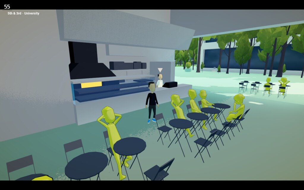
23 |
24 | At first, since I didn't know how to reproduce the issue in the editor,
25 | I tried swapping different materials and shaders on one of the character models to see if it was related to any prefabs used to spawn the extras.
26 | No luck, the character was still yellow.
27 | After a bit of fruitless searching on the Unity forums,
28 | I tried moving the model to different scenes and sometimes the material worked and other times not.
29 | I also noticed that the NPCs that were loaded from additive scenes didn't suffer the same ailment, as seen in the screenshot above.
30 | Those scenes were [Addressables][], so I started to suspect it was something related to how I'd set up shared materials across scenes with the Addressables system.
31 |
32 | [addressables]: https://docs.unity3d.com/2021.3/Documentation/Manual/com.unity.addressables.html
33 |
34 |
35 |
36 |
37 | Changing this option to Use Existing Build made the issue reproducible in the editor
38 |
39 |
40 |
41 | I switched the Unity Addressables _Play Mode Script_ option to _Use Existing Build_ and was able to start reproducing the issue in the editor.
42 | It felt like I was onto something.
43 |
44 | 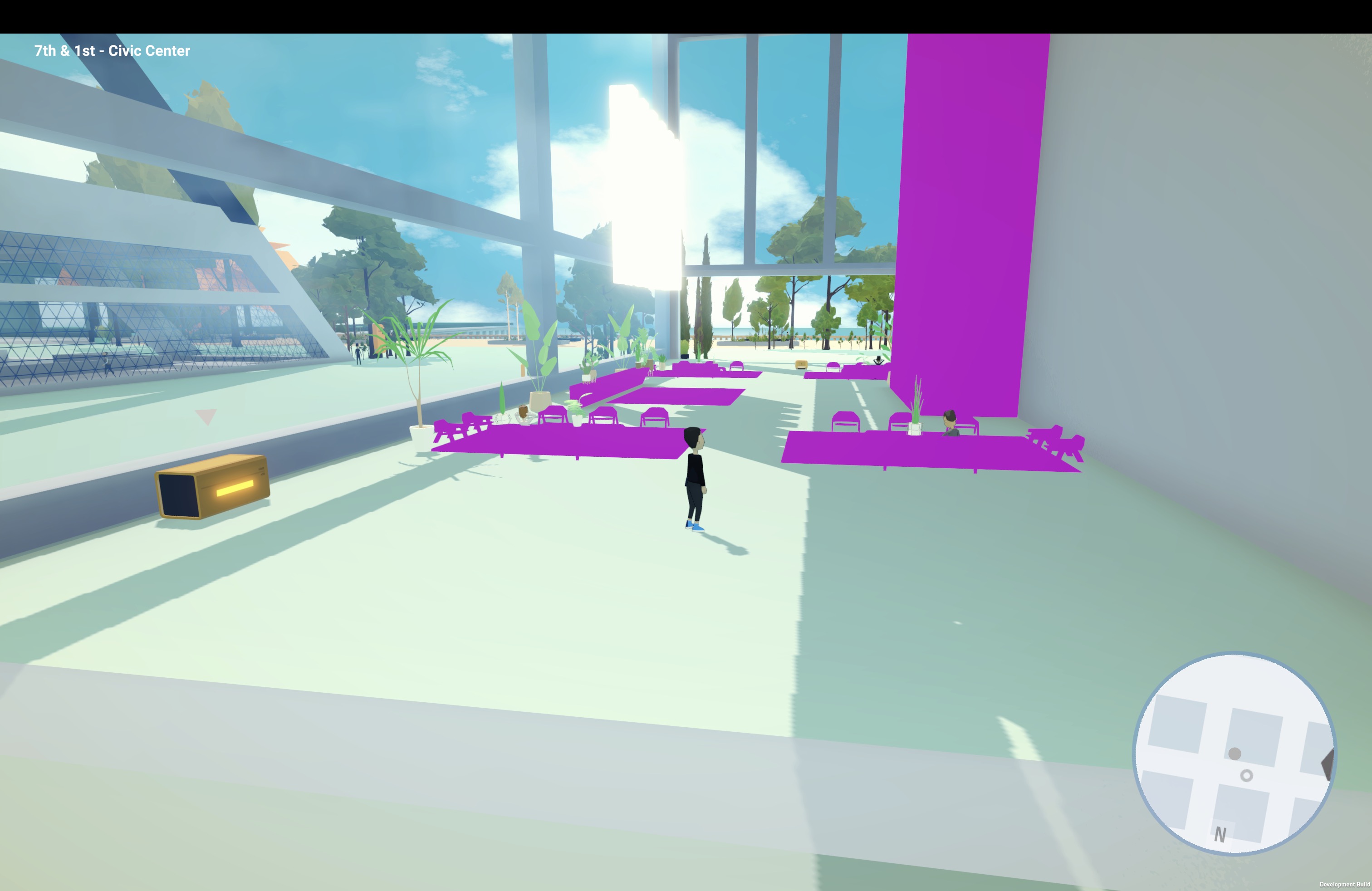
45 |
46 | The next thing I tried was adding all the game's materials and textures to a new Addressables group.
47 | This seemed to fix the yellow people problem, but now the materials were missing from some of the additively loaded Addressable scenes.
48 | If you're familiar with Unity, the magenta colored objects in the screenshot above mean that the materials are missing.
49 | I tried a few different ways of grouping the materials in Addressables, but still wasn't able to get everything working as expected.
50 |
51 | At this point, I went outside to take a walk and clear my head.
52 | _Why were the characters turning yellow?_
53 | _They should be rendering in magenta if the material was missing._
54 | _The shader looked like it was supposed to but only the color was off..._
55 |
56 | Then it dawned on me.
57 | When I got back to the computer, I swapped the texture on the character material to confirm my suspicion.
58 | The material _was_, in fact, working, but the UV maps were wrong.
59 | But why?
60 |
61 |
62 |
63 |
64 | The texture used to color the low poly character models.
65 |
66 |
67 |
68 | This time, I found some [useful hints](https://forum.unity.com/threads/warning-to-all-my-friends-beware-optimise-mesh-data.544735/) from the forums.
69 | It turns out the default _Optimize Mesh Data_ setting on the imported character models was causing the UV map to get lost somewhere along the way.
70 | As you can see in the texture above, the UV map controls how the low poly models are colored.
71 | For some reason, the UV map was only set for one of these colors.
72 |
73 |
74 |
78 |
79 | The default setting for Optimize Mesh was the culprit all along
80 |
81 |
82 |
83 | After disabling this on all the imported FBX models, everything was rendering as expected again.
84 | Case closed.
85 |
86 | If you've run into similar issues with Unity, I hope this post was helpful,
87 | but if you know of another or better way to avoid this issue, please let me know.
88 |
89 | _Alternative titles considered for this post:_
90 |
91 | - What is up with all these wasabi people?
92 | - Perplexed by the pea soup people
93 | - The curious case of caper colored characters
94 |
--------------------------------------------------------------------------------
/src/posts/5-ways-to-not-shoot-yourself-in-the-foot-with-css.md:
--------------------------------------------------------------------------------
1 | ---
2 | title: '5 ways to not shoot yourself in the foot with CSS'
3 | date: 2014-12-30
4 | crossposted:
5 | - https://medium.com/@jxnblk/5-ways-to-not-shoot-yourself-in-the-foot-with-css-8d3c84c94364
6 | ---
7 |
8 | 1. Don’t make assumptions
9 | 2. Don’t be specific
10 | 3. Don’t override anything
11 | 4. Don’t entangle it with markup
12 | 5. Don’t repeat yourself
13 |
14 |
--------------------------------------------------------------------------------
/src/posts/an-update-on-the-hamburger-menu.md:
--------------------------------------------------------------------------------
1 | ---
2 | title: 'An Update on the Hamburger Menu'
3 | date: 2014-04-12
4 | crossposted:
5 | - http://jxnblk.tumblr.com/post/82486816704/an-update-on-the-hamburger-menu
6 | ---
7 |
8 | About a year ago, I wrote [Hamburgers & Basements: Why Not to Use Left Nav Flyouts](http://jxnblk.tumblr.com/post/36218805036/hamburgers-basements-why-not-to-use-left-nav-flyouts).
9 |
10 | Since then, a few things have happened.
11 |
12 |
13 |
14 | 1. Facebook has discontinued using the hamburger menu in their iOS app.
15 | 2. A few desktop websites have replaced their persistent navigation with the hamburger menu – who knows if they're actually testing it or how they're interpreting the results.
16 | 3. Time Magazine decided to use it:
17 |
18 | > "No one understands the icon, let's add the word menu. The word is too small, let's add a pop-up calling it out." [pic.twitter.com/Jargi7gavX](http://t.co/Jargi7gavX)
19 | >
20 | > — Luke Wroblewski (@lukew) [March 11, 2014](https://twitter.com/lukew/statuses/443425041795928064)
21 |
22 | 4. Personally, I think user testing the hamburger menu is good enough, but these guys A/B tested it: [UX designers: Side drawer navigation could be costing you half your user engagement](http://thenextweb.com/dd/2014/04/08/ux-designers-side-drawer-navigation-costing-half-user-engagement/)
23 | 5. This guy tested it twice: [Mobile Menu AB Tested: Hamburger Not the Best Choice?](http://exisweb.net/mobile-menu-abtest) and [Hamburger vs Menu: The Final AB Test](http://exisweb.net/menu-eats-hamburger)
24 | 6. This guy also wrote about it: [The Hamburger is Bad for You](http://mor10.com/hamburger-bad/)
25 |
26 | Despite all of this, I still haven't seen any evidence suggesting that the hamburger menu is an improvement.
27 |
28 | ## Patterns
29 |
30 | Basically it comes down to interface design patterns. Patterns rely on familiarity and emerge slowly over time. Most of the ones we use on the web today have been around for many years.
31 |
32 | Users have plenty of new things to learn without adding contrived navigation patterns into the mix. Let's stop trying to innovate device-specific interactions and leave it to the device manufacturers.
33 |
34 | ## Let's focus on the real problems
35 |
36 | Product design requires solving many more difficult problems.
37 | For example:
38 |
39 | - How does your product align with a user's mental model?
40 | - How do you scale your information architecture?
41 | - How do you make your product meaningful to your users?
42 | - How do you reach a wider audience with your product?
43 |
44 | Personally, I'd much rather be designing and testing solutions for problems like these.
45 |
46 |
--------------------------------------------------------------------------------
/src/posts/buckets-and-jumpoffs-using-content-centric-contextual-navigation.md:
--------------------------------------------------------------------------------
1 | ---
2 | title: 'Buckets and Jumpoffs: Using Content-Centric Contextual Navigation'
3 | date: 2012-12-07
4 | crossposted:
5 | - http://jxnblk.tumblr.com/post/37416765650/buckets-jumpoffs-using-content-centric
6 | ---
7 |
8 | While table views provide a clear and simple way to navigate certain types of content, mobile should be about putting content and user goals first and navigation second. Don't overload the user with navigation choices, show meaningful content instead. Even though tab bars are great – sitting below the content, out of the way until the user needs them – there are new opportunities to explore content-centric contextual navigation when designing for mobile.
9 |
10 |
11 |
12 |
13 | ## Create Better Table Views with Teasers
14 |
15 | 
16 |
17 | A quick and dirty way to give table views more meaning is by using teasers. Apple's Mail App shows a numerical indicator of unread emails at the top level, then shows truncated previews of actual messages at the inbox level. Similarly, Messages shows previews of the last message sent before the user drills into the conversation.
18 |
19 | ## Flipping the Teaser Approach on Its Head
20 |
21 | While teasers can make basic table views more meaningful, they prioritize navigation over content. Taking the teaser approach and flipping it on its head can result in a content-centric design that provides meaningful contextual navigation to the user. Many apps and e-commerce sites already do this, and it can help create focus on content discovery rather than search.
22 |
23 | ## What are Buckets & Jumpoffs?
24 |
25 | You've probably seen this pattern before: take a collection of items, group them into categories, present a limited number of those items in buckets or lists, and provide a link to jump off and view more. There doesn't seem to be a great name for this pattern, some have suggested calling it the _egg carton_ or the _showcase_, but neither of those terms seem to capture the essence of the jumpoff link's contextual navigation – thus, _buckets & jumpoffs_.
26 |
27 | 
28 |
29 | Twitter uses this approach in its profile view, along with a mix of standard table views. Instead of seeing all of the user's tweets in the profile view, there is a small bucket showing the latest three tweets and a link to view more.
30 |
31 | 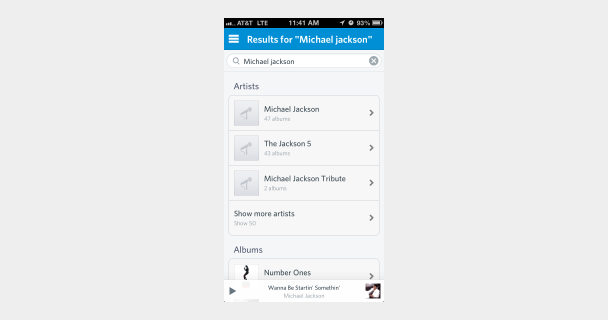
32 |
33 | Rdio does this to great effect in its search results view, showing results bucketed by artists, albums, songs, playlists, and people. This view provides direct links to the top results and a link to view more results in each bucket as well.
34 |
35 | 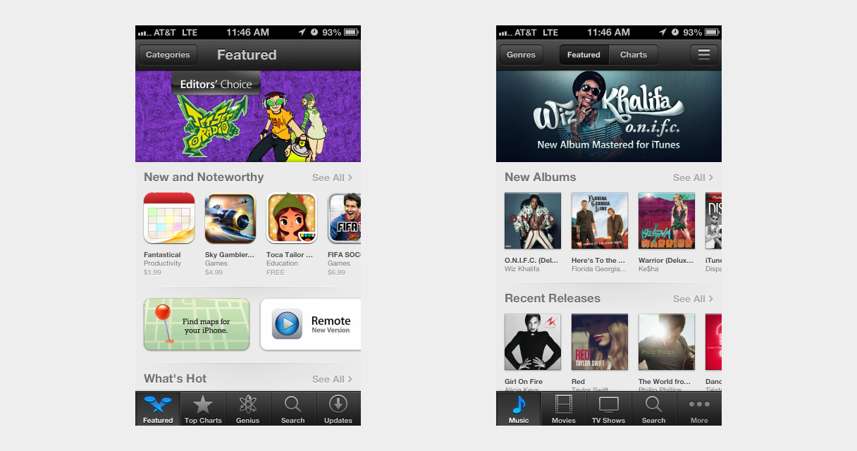
36 |
37 | Using a mixture of swipeable carousel buckets and tiles, Apple creates a lot of visual interest in its App Store and iTunes apps. These _Featured_ views are frequently updated and serve as a great way to promote content discovery in an otherwise extremely complex IA. Apple also uses buckets on its desktop version of iTunes, showing that this pattern can be effectively scaled up to larger displays.
38 |
39 | 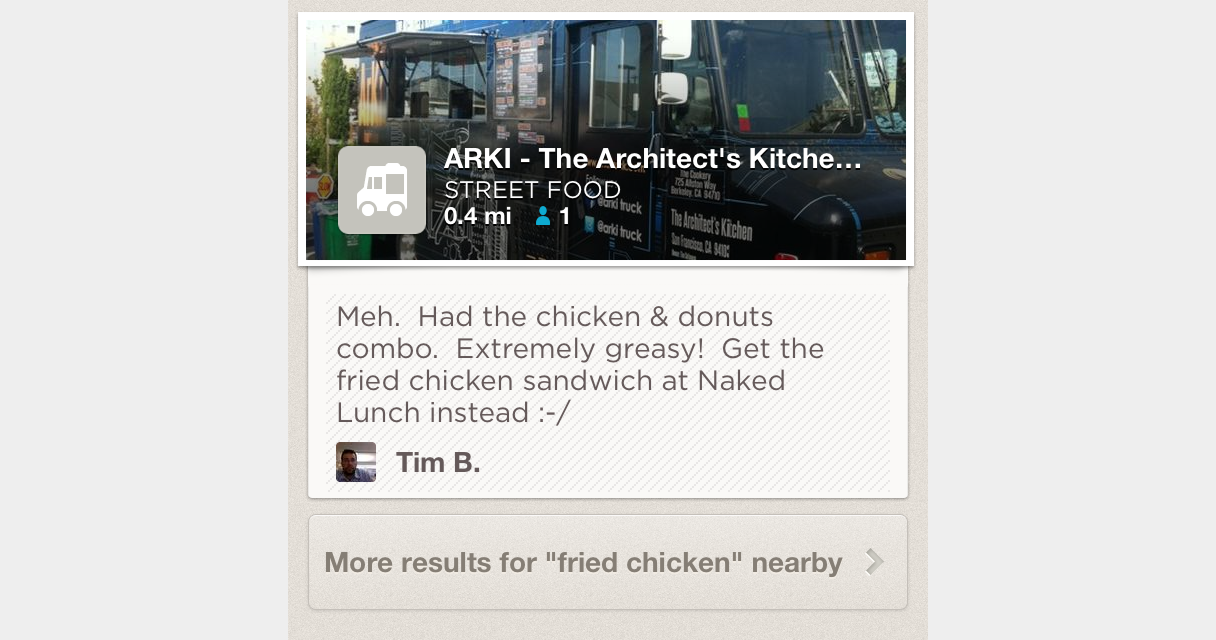
40 |
41 | Similarly, Foursquare places contextual navigation – which is often delegated to detail views – in-line with its content-rich list view. Unfortunately, Foursquare's desktop site lacks the same level of content discovery afforded in its mobile app and, instead, relies heavily on traditional search.
42 |
43 | ## Focus on Content but Don't Neglect Navigation
44 |
45 | Mobile is a new medium, and its constraints and advantages should be taken into account when designing navigation systems. The limited screen real estate makes traditional faceted filtering and search patterns more difficult. Instead of replicating desktop navigation-heavy approaches, try content-centric contextual navigation. To create a cohesive cross-platform experience, you can translate mobile navigation patterns to desktop. This often leads to simple, focused interfaces that will delight your users.
46 |
47 | When designing for mobile, focus on content, but don't neglect navigation in the process.
48 |
49 |
50 |
--------------------------------------------------------------------------------
/src/posts/building-blocks.md:
--------------------------------------------------------------------------------
1 | ---
2 | title: Building Blocks
3 | date: 2019-03-17
4 | draft: true
5 | ---
6 |
7 | People like building blocks.
8 |
9 | IKEA effect
10 |
11 | - basscss
12 | - rebass
13 | - axs
14 | - styled-components & emotion
15 | - styled system
16 |
17 |
--------------------------------------------------------------------------------
/src/posts/code-literacy.md:
--------------------------------------------------------------------------------
1 | ---
2 | title: Code Literacy
3 | date: 2019-07-25
4 | excerpt: Asking should designers code is asking the wrong question.
5 | ---
6 |
7 | Ah yes, everyone's favorite question: *should designers code?*
8 | As much as I'd love to pontificate on the matter,
9 | I think the framing of this question is fundamentally wrong.
10 | At the heart of this conversation is the idea of *code literacy*,
11 | that is, the level at which one can read, write, and understand software code in the form of programming languages.
12 |
13 | We don't question whether or not we should teach children to read and write,
14 | or whether we should math in school.
15 | In a modern public education systems, these are a given.
16 | While these institutions might have other problems,
17 | I think code literacy should be a fundamental part of any school curriculum.
18 |
19 | What *is* code? Paul Ford has [already written][what is code] more than enough to cover that topic,
20 | but I'd like to step back and consider how code is not dissimilar to written language and mathematics.
21 |
22 | While spoken languages are innate, we humans invented written language somewhat recently in our own history.
23 | Speaking comes naturally, but written language is not hard-wired into our brains.
24 | We naturally think in symbols, and most of us are able to handle reading and writing,
25 | but it's still something that we invented.
26 | It's a powerful tool that allows us to transfer knowledge over space and time in ways we couldn't do without it.
27 |
28 | Math, too, is symbolic in nature.
29 | It's not entirely dependent on written language,
30 | but math certainly benefits from our ability to scribble lines on paper.
31 |
32 | Code is the languages we humans use to communicate with computers.
33 |
34 | Think about this for a second:
35 |
36 |
39 |
40 | *The computer is the first tool that we've created that **requires** written language to even work.*
41 |
42 | Without software, computers are useless.
43 | Perhaps, one day, computers might fluently speak natural human languages,
44 | but there will always be code underlying the abstractions that enable this.
45 |
46 | Some people are interested in abstracting away the code required to program computers,
47 | which can make computers accessible in ways they weren't before.
48 | But saying that code will become less and less fundamental to the progress of technology
49 | is akin to saying that no one needs to learn mathematics because we have calculators now.
50 | If anything, the opposite is true.
51 |
52 | I suspect that the invention of software might be on par with the invention of mathematics,
53 | but we're too close to the event to see its historical significance.
54 | Mathematics is broad and broadly applicable and works at a much lower level than code -
55 | software isn't really possible without mathematics, afterall.
56 | But this is the first time in human history where we've created a technology that requires written language (i.e. software) to operate.
57 |
58 | Not everyone in a modern society needs to be a poet, or a bestselling author, or have a PhD in mathematics,
59 | but I think having basic reading, writing, and arithmetic skills will benefit anyone.
60 | I think the same is true for code literacy.
61 | Not everyone needs to be a software developer,
62 | but the more you know about how humans communicate with machines,
63 | the more benefits you'll see professionally.
64 |
65 | Imagine you work in the finance industry and have figured out a way to mitigate all the billions of dollars lost on spreadsheet errors.
66 | Or imagine you're a farmer who leverages machine learning to predict crop yields.
67 | You *could* wait for software developers to create this for you,
68 | but diverse experiences applied to different technologies can result in incredible innovation.
69 |
70 | I don't think we should expect someone in a non-developer role to read and write code professionally.
71 | But I also think the people who are curious and who learn a little more than their peers
72 | will always have the advantage.
73 |
74 | [what is code]: https://www.bloomberg.com/graphics/2015-paul-ford-what-is-code/
75 |
76 |
--------------------------------------------------------------------------------
/src/posts/components.md:
--------------------------------------------------------------------------------
1 | ---
2 | title: Components
3 | date: 2016-06-17
4 | ---
5 |
6 | Everything in a UI is a component.
7 | This includes buttons, inputs, forms, promotional modules, pages, user flows, etc.
8 | I use the word *component* not only because this is how the underlying code is written in libraries like React and Ember,
9 | but also because pieces of a well-designed UI system should be [composable](https://en.wikipedia.org/wiki/Composability).
10 |
11 |
12 |
13 |
14 | From the [Wikipedia page on Composability](https://en.wikipedia.org/wiki/Composability):
15 |
16 | > A highly composable system provides recombinant components that can be selected and assembled in various combinations to satisfy specific user requirements. In information systems, the essential features that make a component composable are that it be:
17 | >
18 | > - self-contained (modular): it can be deployed independently – note that it may cooperate with other components, but dependent components are replaceable
19 | > - stateless: it treats each request as an independent transaction, unrelated to any previous request. Stateless is just one technique; managed state and transactional systems can also be composable, but with greater difficulty.
20 |
21 |
22 | ## Modular & Stateless Components
23 |
24 | ```
25 | state => ui
26 | ```
27 |
28 | A UI system that is made up of independent stateless components is extremely flexible.
29 | When individual pieces need to be swapped out or updated,
30 | those changes are isolated and don’t cause other parts of a system to break.
31 | Thinking about these components as being pure functions –
32 | that is, the same state always produces the same output –
33 | can help ensure composability.
34 |
35 | > A pure function is one that exhibits the property of substitution: replacing a call with its returned value should make the program equivalent. As an example, `concat('hello', 'world')` can be substituted with `'hello world'` without changing the behavior of your program.
36 | >
37 | > How can we apply this to a graphical user interface? By having the function return an abstract representation of widgets (or markup) to be rendered on the screen...
38 | >
39 | > – [Pure UI by Guillermo Rauch](http://rauchg.com/2015/pure-ui/)
40 |
41 | ## Why is everything a “component?”
42 |
43 | Naming things is hard, there’s no debate there, but when you start to categorize different parts of a UI into pages, views, flows, atoms, molecules, materials, or kittens, you’ve already started to undermine the concept of composability, and it probably takes more time and effort to get an entire team of people to “agree upon” your proposed naming conventions than it’s worth.
44 |
45 | The point of this is to think about everything as an interoperable system.
46 | You can slice and dice components in any way you see fit, and these components are likely to change and be fine tuned as a system is developed.
47 | Premature optimization is a trap that’s easy to fall into.
48 | Embrace the chaos as you build.
49 | Patterns will emerge from the primordial goop of UI that is your product,
50 | and by consistently thinking about a composable system you’ll probably come up with something more flexible
51 | and more robust than if one person dictates a dogmatic framework to work within.
52 |
53 |
--------------------------------------------------------------------------------
/src/posts/designing-in-the-browser-faster.md:
--------------------------------------------------------------------------------
1 | ---
2 | title: 'Designing in the Browser Faster'
3 | date: 2014-04-14
4 | crossposted:
5 | - https://medium.com/@jxnblk/designing-in-the-browser-faster-bd413d2bc4f3
6 | ---
7 |
8 | I’ve been dabbling with HTML and CSS for years—building small websites for myself and friends and building prototypes to test designs. And, while I’ve been fascinated with the idea of designing in the browser for a long time, it wasn’t until recently that it’s become much, much faster for me than using traditional design software.
9 |
10 |
11 |
12 | ## Getting faster
13 | Practice has certainly helped, but what really sped up my ability to design and iterate in code was an approach called Object Oriented CSS, or OOCSS. My friend and colleague sent me down this scary-sounding path over a year ago, and I haven’t looked back since. He gave me a ton of reading material, coached me with code reviews, and constantly challenged me. Most of the articles on OOCSS focus on front-end performance, code maintenance benefits, and things like naming conventions. What most people don’t tell you is how much faster it can make designing in code.
14 |
15 | ## Do one thing well
16 | At its core, OOCSS focuses on highly reusable styles that follow the open/closed principle—that is, they’re open for extension, but closed for modification. They do one thing and do it well. You can think of them as something like layer effects or color swatches. When I’m fleshing out a design, I spend a lot of time adjusting spacing, font sizes, colors, and other small details. I often don’t know what combination of styles each element should have before I see it in context.
17 |
18 | ## Don’t make assumptions
19 | For new web projects, I usually start with a base type scale, spacing scale, and a rough color palette. Having these separated into single-purpose utilities gives me the flexibility to jump straight into HTML and experiment, without having to constantly write and rewrite CSS. I try not to make assumptions about what any one element or module will end up looking like. Instead, I make sure each element feels right in context, then create more defined patterns when needed.
20 |
21 | ## Content-centric design
22 | Using single-purpose styles aligns well with the concept of content-centric design. Defining heading styles without knowing what they say or where they’re located can be difficult. Having the ability to quickly adjust type hierarchy, color, and other styles to get the rhythm, balance, and gestalt right is key to successfully designing in the browser.
23 |
24 | ## From paper to prototype
25 | Using this approach, I typically go directly from notes and paper sketches to building prototypes in code. The only time I open graphic applications like Illustrator or Photoshop are when I need to create image assets to use in code. And with tools like Github, I can try out a number of iterations on different branches in a non-destructive way.
26 |
27 | ## Choose the right tools
28 | Personally, this has sped up my workflow tremendously, and every designer I’ve introduced to this approach has picked it up quickly and enthusiastically. You might find OOCSS to be a useful addition to your design toolkit as well.
29 |
30 |
--------------------------------------------------------------------------------
/src/posts/domain-specific-design-languages.md:
--------------------------------------------------------------------------------
1 | ---
2 | title: Domain-Specific Design Languages
3 | date: 2016-06-30
4 | draft: true
5 | ---
6 |
7 | - definition of DSL
8 | > A domain-specific language (DSL) is a computer language specialized to a particular application domain. This is in contrast to a general-purpose language (GPL), which is broadly applicable across domains.
9 | https://en.wikipedia.org/wiki/Domain-specific_language
10 | > A domain-specific language is created specifically to solve problems in a particular domain and is not intended to be able to solve problems outside it (although that may be technically possible). In contrast, general-purpose languages are created to solve problems in many domains.
11 |
12 | - consider designing in iOS, it requires domain-specific (i.e. platform-specific) design conventions and patterns, predominantly outlined in Apple's HIG
13 |
14 | Deviating from the HIG means you are creating a new design language specific to your application,
15 | which may have its benefits, but also requires more learning on the part of the user.
16 |
17 | Similarly, deviating from a web application's style guide, UI component library, or interaction pattern library
18 | is equivalent to creating a new design language that users need to learn.
19 |
20 | The web itself has it's own design language.
21 | Users have acclimated to using blue underlined links, scrolling through pages, using standard form elements,
22 | as well as a plethora of other interaction design patterns.
23 |
24 | Though sometimes DSLs are appropriate,
25 | the main disadvantage to using a DSL is that it requires domain-specifig knowledge of certain APIs rather than relying on more standard conventions. An example of this would be using coffeescript or JSX, rather than the standardized JavaScript (EMCAScript) syntax
26 |
--------------------------------------------------------------------------------
/src/posts/dont-boil-the-ocean.md:
--------------------------------------------------------------------------------
1 | ---
2 | title: Don't Boil the Ocean
3 | date: 2019-03-18
4 | draft: true
5 | ---
6 |
7 | - make it work, make it good, make it fast
8 | - Readme deiven development
9 | - Make it so good people want to use it
10 | - Solve your own problems
11 | - Build what you need
12 | - Anticipate changing requirements
13 | - Balance consistency with flexibility
14 | - Robustness
15 | - Quick to respond to changing requirements
16 | - Avoid premature abstractions
17 |
--------------------------------------------------------------------------------
/src/posts/hamburgers-and-basements-why-not-to-use-left-nav-flyouts.md:
--------------------------------------------------------------------------------
1 | ---
2 | title: 'Hamburgers & Basements: Why Not to Use Left Nav Flyouts'
3 | date: 2012-11-21
4 | crossposted:
5 | - http://jxnblk.tumblr.com/post/36218805036/hamburgers-basements-why-not-to-use-left-nav
6 | ---
7 |
8 | > **_"Good design makes a product understandable"_** – Dieter Rams
9 |
10 | Good navigation should do at least three things well: (1) it should allow the user to navigate; (2) it should serve as wayfinding, letting the user know where they are; and (3) it should help the user understand what the product is capable of. If your navigation is not doing these three things, something's wrong.
11 |
12 |
13 |
14 | For the iPhone, Apple conjured up three fairly solid navigation patterns: the tab bar, the table view (e.g. Messages & Mail), and the card stack (e.g. Weather). All three work fairly well if used as intended, but there's always room for experimentation and evolution in UI design – and always room for designers and developers to screw it up.
15 |
16 | Path and Facebook's mobile left nav flyout pattern is one such experimentation that should be avoided. [Mark Kawano](https://twitter.com/markkawano/status/256848377260679168) calls it the "hamburger icon that slides open the basement." Why call it the basement? Because it's hidden, dark, there's a ton of crap in it, and, frankly, it's scary and no one wants to go down there. Hiding the navigation allows Path to present itself in a more immersive, content-centric way but also tells the user that there's nothing much else to the app beyond its stream view.
17 |
18 | In Facebook's case, the basement just obscures a lot of the functionality available on the desktop version. The News Feed is important & Facebook provides a lot of contextual navigation, but Facebook's got a lot of other hidden cracks and crevices that aren't readily apparent from its iPhone app. But who knows? Maybe Facebook doesn't care about Messages, Places, or Events.
19 |
20 | Another, more obvious downside to the left nav flyout is its inefficiency: tap a [hard-to-reach button](http://www.lukew.com/ff/entry.asp?1649), wait for an animation, scroll a list while scanning for the item you want, tap again, and wait for another animation. Your user doesn't have time for that – don't subject them to such nonsense.
21 |
22 | Having a lot of functionality and complexity in your product is no excuse. If your navigation has more than five items at the top-level, that's just lazy information architecture. Too many choices is bad anywhere, especially on a 4-inch display.
23 |
24 | 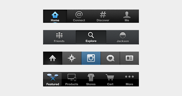
25 |
26 | Contrast this with Twitter's iPhone app. Holding the app in hand, the user knows exactly what it is. It's small enough to wrap their brain around, and it feels easy to use. The persistent tab bar quickly describes what the user can do, where they can go, and what type of content they'll see. It also – like any persistent navigation pattern – provides context about where the user has navigated and provides an easy one-tap path to the main parts of the app.
27 |
28 | Foursquare is another example of great mobile navigation, no doubt benefiting from its mobile-first approach. Foursquare is a much more complex product now than when it first launched, but they've maintained a simple IA that organizes functionality and content in a way that makes this complexity manageable for the user.
29 |
30 | Instagram, arguably, could have employed a left nav flyout for a more immersive feel, but instead employs a tab bar that emphasizes content consumption, exploration, content-creation, notifications, and user profiles. This not only makes navigating the app quicker, it also tells the user what they should do with the app.
31 |
32 | Or take the Apple Store app as an example. The desktop counterpart has a fair amount of navigation items, following patterns set by other e-commerce products, but Apple restructured the top-level navigation of their mobile app around discovery, search, and transactions.
33 |
34 | If you have a complex product and a large number of top-level navigation items, consider taking a mobile-first approach and restructuring your IA differently from its desktop version. Maybe a goal-based architecture makes sense – for example, search vs. discovery – or maybe there are broader categories that your functionality and content can more neatly fit into. Just like [truncating text is not a content strategy](http://karenmcgrane.com/2012/09/04/adapting-ourselves-to-adaptive-content-video-slides-and-transcript-oh-my/), throwing an entire desktop IA into the basement of a mobile app is not good information architecture.
35 |
36 | Is the left nav flyout always a bad navigation pattern? It depends, but I haven't seen an example yet where it works well. Feel free to discuss this with me on Twitter [@jxnblk](https://twitter.com/jxnblk).
37 |
38 |
39 |
--------------------------------------------------------------------------------
/src/posts/how-react-geomicons-works.md:
--------------------------------------------------------------------------------
1 | ---
2 | title: How react-geomicons Works
3 | date: 2015-06-10
4 | tags:
5 | - react
6 | - svg
7 | - icons
8 | - geomicons
9 | related:
10 | - name: react-geomicons
11 | href: http://jxnblk.com/react-geomicons
12 | - name: Geomicons
13 | href: http://geomicons.com
14 | draft: true
15 | ---
16 |
17 | [Geomicons Open](http://geomicons.com) is an SVG icon set completely hand-coded using the Path element.
18 | The first version’s source was built in complete SVG, but I soon realized that the wrapping SVG and Path elements were the exact same for each icon.
19 | In an effort to DRY things up, I set up a rudimentary build process that would take source code containing only the Path elements’ `d` attribute value and create valid SVG code.
20 |
21 | I also built a rough icon injection script...
22 |
23 | - geomicons-open as npm module
24 | - paths object
25 | - react-geomicons dependency
26 | - wrapping dumb component
27 |
28 |
29 |
--------------------------------------------------------------------------------
/src/posts/i-dont-know-how-to-design.md:
--------------------------------------------------------------------------------
1 | ---
2 | title: 'I don’t know how to design'
3 | date: 2014-04-16
4 | crossposted:
5 | - https://medium.com/@jxnblk/i-dont-know-how-to-design-ff8d85e2e862
6 | ---
7 |
8 | I’ll admit it.
9 |
10 |
11 |
12 | ## I don’t know how to design without research.
13 | Without upfront research, you’re not designing things, you’re just building things that might or might not meet your users’ needs or fit their mental models. Chances are, they won’t. User acceptance testing and A/B testing are important, but won’t give you the insights you’ll need to start off on the right foot.
14 |
15 | ## I don’t know how to design without metrics.
16 | Whether it’s business goals, KPIs, or conversion rates, without metrics you’ll have no idea what problems you’re solving or if the solutions you’re building will fit the bill.
17 |
18 | ## I don’t know how to design without iterating.
19 | Your first attempt at anything will not be your best. Put something out there and continually work on making it better and better.
20 |
21 | ## I don’t know how to design without context.
22 | Good design simplifies complexity to align with users’ mental models. Without understanding context and creating systems to design within, you’re just adding noise that contributes to cognitive overload for both users and the people building the product.
23 |
24 | ## I don’t know how to design without collaboration.
25 | Design doesn’t happen in a vacuum. Whether it’s through participatory design with users, sketching sessions with other designers, developers, product managers, and stakeholders, or just an old fashioned critique, the best design work comes from working with others.
26 |
--------------------------------------------------------------------------------
/src/posts/im-sick-of-your-tiny-tiny-type.md:
--------------------------------------------------------------------------------
1 | ---
2 | title: 'I’m Sick of Your Tiny, Tiny Type'
3 | date: 2013-01-29
4 | crossposted:
5 | - http://jxnblk.tumblr.com/post/41796724549/im-sick-of-your-tiny-tiny-type
6 | ---
7 |
8 | Your tiny type is hard to read – no, not hard to read, impossible to read. I carry my phone with me everywhere, but I always seem to forget my magnifying glass. I tap the Safari Reader button, but that’s not a solution to the problem. That’s a band-aid for your bad typesetting.
9 |
10 |
11 |
12 | Sometimes I’m on my computer, and Reader doesn’t work on your web app. I hit CMD + two or three times so that my dyslexic brain can make sense of the musty 14px Helvetica your servers regurgitated all over my screen. Then the layout falls apart. Words start smashing together. Ads bleed into my emails. And I find myself scrolling up, down, left, right, left, right – what in the hell is this? The Konami code? I don’t need 30 extra lives. I want to read your content.
13 |
14 | And I know I’m not the only one who hates your tiny type. How many times have I heard users complain about fonts being too small? More times than I’ve heard them complain about fonts being too large – wait, I’ve never heard a user complain about that. Your users aren’t asking for a faster horse – they’re struggling to read your content. Surely that isn’t what you’re going for, and surely that isn’t a good experience.
15 |
16 | ### Further reading:
17 |
18 | [Relative Readability](http://wm4.wilsonminer.com/posts/2008/oct/20/relative-readability/)
19 |
20 | [The 100% Easy-2-Read Standard](http://informationarchitects.net/blog/100e2r/)
21 |
22 | [The Typography and Layout behind the new Signal vs. Noise redesign](http://37signals.com/svn/posts/3285-the-typography-and-layout-behind-the-new-signal-vs-noise-redesign)
23 |
24 |
--------------------------------------------------------------------------------
/src/posts/its-okay-to-look-the-same.md:
--------------------------------------------------------------------------------
1 | ---
2 | title: 'It’s Okay to Look the Same'
3 | subhead: 'Why frameworks are actually pretty great'
4 | date: 2014-04-25
5 | crossposted:
6 | - https://medium.com/@jxnblk/its-okay-to-look-the-same-e95e79f409b7
7 | ---
8 |
9 | Every once in a while I hear someone complain about the visual homogenization of the web, and front-end frameworks often get the brunt of the attack. This visual sameness isn’t necessarily a bad thing.
10 |
11 |
12 |
13 | ## Visual design is easy
14 | Visual design is one of the easiest parts of web design to get right. Beautiful looking sites are often perceived as being easier to use, but that’s a low hurdle to clear. Using clean typography, a good color palette, solid visual hierarchy, and consistency will get you most of the way there.
15 |
16 | ## It’s also hard
17 | The hardest part of visual design is stakeholder buy-in. It’s easily the most noticeable part of a design, and it’s one that people will certainly have opinions about — whether or not they understand typography, gestalt, or color psychology. If you’re the one calling the shots, then you’ve got it easy.
18 |
19 | > Visual design is a bike shed. User experience is a nuclear reactor.
20 |
21 | ## It’s called Bootstrap for a reason
22 | When building something new, frameworks can help settle arguments over visual details. And, if you don’t have a background in design, using a framework can help you achieve a certain baseline of visual polish. Frameworks get you started and create well-defined systems to customize and build upon while you validate your ideas.
23 |
24 | ## Don’t not do it
25 | The visual aspects of web design are extremely important. If you’ve got the time and resources, by all means, sweat the details. But before you do, make sure your site works. Time spent deliberating visual design could be better spent conducting research with your users. A beautiful site that doesn’t align with mental models isn’t worth much to your business.
26 |
27 |
--------------------------------------------------------------------------------
/src/posts/microbeats-is-the-best-journal-ive-ever-kept.md:
--------------------------------------------------------------------------------
1 | ---
2 | title: Microbeats is the Best Journal I’ve Ever Kept
3 | date: 2012-11-07
4 | crossposted:
5 | - http://jxnblk.tumblr.com/post/35244863166/microbeats-is-the-best-journal-ive-ever-kept
6 | ---
7 |
8 | I’ve been producing electronic music on my computer for about a decade now, and I don’t have a whole lot to show for it. After moving to DC from Shanghai, where I played a lot of live sets and DJ gigs, I realized there wasn’t much of a music scene in DC, and I stopped playing out. After a few years, I noticed that I generally wasn’t being inspired, and I wasn’t growing much as an artist. I also noticed that I had a tendency to never finish the tracks that I’d started. I was pretty good at creating catchy little loops, but they never evolved into anything beyond that.
9 |
10 |
11 |
12 | To try to pull myself out of this rut, I started a Tumblr called Loop A Day in early 2011. The idea was that I would spend no more than an hour each day creating a loop and posting it to this blog. I kept up with it for about a month, then I realized that the daily routine was wrecking my social life – I remember leaving parties more than once just to go home and work on music. I did like the hour limitation, but doing it every day had to stop. So, I got rid of my self-imposed quota and renamed the project Microbeats.
13 |
14 | A lot of the earlier beats I created were technical experimentations, and I drew a lot of inspiration from the music I was listening to. Then I started noticing something happening. I started subconsciously pulling inspiration from my actual life and putting more emotion into the beats I was creating. By the end of 2011, I started consciously pulling inspiration from the things I was doing, the places I was going, the people I was meeting and the conversations I was having and using that as mental fodder when I sat down to work on a beat.
15 |
16 | It may not be obvious to the outside observer, but for me, Microbeats became a record of all the things happening in my life – though some beats are admittedly (and intentionally) vulnerable. Conversations from friends’ parties, meeting new people, getting dumped, rebounding, breaking my hand, traveling for work, vacationing with family, moving to a new city, and everything in between – my life started to manifest itself in the music.
17 |
18 | Though I don’t do it very often, when I go back through the archives and listen to the beats, I start remembering things that I don’t think I would have otherwise – strange, nuanced emotions and small moments that my brain didn’t deem important enough to take good record of. Microbeats started off as a simple little experiment, but it’s grown into something so much bigger, personally, than I ever would’ve imagined.
19 |
20 | [microbeats.cc](http://microbeats.cc)
21 |
22 |
--------------------------------------------------------------------------------
/src/posts/mini-macbook-review.md:
--------------------------------------------------------------------------------
1 | ---
2 | title: Mini MacBook Review
3 | date: 2015-06-17
4 | tags:
5 | - apple
6 | - macbook
7 | - review
8 | - laptop
9 | - tech
10 | excerpt: Why the new MacBook might just be my favorite computer ever
11 | ---
12 |
13 | ## Size
14 |
15 | Fits in my pocket.
16 |
17 | ## Screen
18 |
19 | Super sharp.
20 |
21 | ## Keyboard
22 |
23 | Sounds great. _pok pok pok pok pok_
24 |
25 | ## Trackpad
26 |
27 | Clicks and clicks again, but doesn’t really click.
28 |
29 | ## Ports
30 |
31 | Power: check. Beats: check.
32 |
33 | ## Performance
34 |
35 | Runs Vim like a champ.
36 |
37 |
--------------------------------------------------------------------------------
/src/posts/modular-characters-part-two.md:
--------------------------------------------------------------------------------
1 | ---
2 | title: Modular Characters Part II
3 | date: 2023-10-17
4 | devlog: 4
5 | draft: true
6 | tags:
7 | - devlog
8 | - unity
9 | - blender
10 | - character design
11 | - mixamo
12 | ---
13 |
14 | After redesigning the NPC characters in Novantica to use modular parts and color schemes, I realized that the approach I had set up wouldn't for the game due to poor performance.
15 |
16 |
17 |
18 | _This is a two-part series. Read [Modular Characters Part I](/posts/modular-characters-part-one) here._
19 |
20 |
21 |
54 |
--------------------------------------------------------------------------------
/src/posts/negative-space-in-react.md:
--------------------------------------------------------------------------------
1 | ---
2 | title: Negative space in react
3 | date: 2016-08-23
4 | draft: true
5 | tags:
6 | - react
7 | - design
8 | - style
9 | - css
10 | - margin
11 | ---
12 |
13 | > White space is to be regarded as an active element, not a passive background.
14 | >
15 | > – Jan Tschichold
16 |
17 | Negative space is arguably the most important part of a visual composition.
18 |
19 | Just as in music, the rests, breathing room, and headspace are the key players in rhythm.
20 | Without them, you just have noise.
21 | Similarly, negative space in design helps create the rhythm, contrast, and motion in a visual composition.
22 |
23 | When creating visual rhythm on the web, margin and padding is the abstraction we use most commonly for negative space.
24 | Despite its importance in the overall composition, margin isn't usually treated as a declarative equal in component based architectures.
25 | And, because of this, it's difficult to determine whether white space belongs to the child component or the parent.
26 |
27 | ## Personal bubbles
28 |
29 | I sometimes like to think of an element’s whitespace as it's *personal bubble*.
30 | That is, different societies of humans have different distances at which they consider normal to keep when having a conversation.
31 | Some cultures have much smaller personal bubbles than Americans,
32 | and when people from these cultures visit or immigrate to the US,
33 | americans may feel uncomfortable with how close the other person is standing to them and unconsciously back away.
34 | Similarly, when Americans visit cultures with larger personal bubbles, the American is the one forcing others to back away.
35 |
36 | Components obviously aren't people but they too can differ in the amount of whitespace they need,
37 | and create interesting dynamics among the different parts of a UI.
38 |
39 | ## Approaches
40 |
41 | There are two predominant ways of handling whitespace in component based systems.
42 | The first involves components defining their own margins, which is how
43 | [Rebass](http://jxnblk.com/rebass) and [Reflexbox](http://jxnblk.com/reflexbox) provide margin props.
44 | The second involves a parent component wrapping child components with padded containers, similar to
45 | Hugo Bessa’s [Spacing component](http://hugobessa.com.br/2016/07/20/composable-components/#layout-components).
46 | A third, but less common approach is [Rebass‘s](http://jxnblk.com/rebass) Space component,
47 | which declaratively creates space between other elements.
48 |
49 | ### Margin Props
50 | Let's explore the first method where a component defines its own margins.
51 |
52 | ### Parent Layout Component
53 |
54 | Now let's take a look at the second method, where the parent defines margins of its children.
55 |
56 | ### Space Component
57 | Lastly, let's explore a space component that declaratively adds space between components.
58 |
59 | ### Combined Approach
60 |
61 | We can actually devise a system that allows for all of the approaches listed above.
62 | To start, we need a component that manages its own margin.
63 |
64 | ---
65 |
66 | - HOC for other components
67 | - It accepts m props
68 | - Next, let's create a convenience parent wrapper
69 | - It could work with the m prop or go lower level and apply styles
70 | - Box component is somewhere in between
71 | - Parent spacer component in rebass
72 | - Row, Arrange, Align,
73 |
74 | Each has its trade offs
75 |
76 | Declarative spacer is verbose and can be cumbersome to manage efficiently. It also destroys a convenient aspect of CSS: margin collapsing
77 | - two elements before and after an item
78 | - Changes based on context: inline vs block
79 | - Desire lines from other devs, nbsp & br
80 |
81 | Parent spacer has its own limitations
82 | Similar to traditional CSS grid sys it doesn't allow for much flexibility
83 |
--------------------------------------------------------------------------------
/src/posts/notes.md:
--------------------------------------------------------------------------------
1 | ---
2 | draft: true
3 | ---
4 |
5 | # Notes
6 |
7 | ## Devlog
8 |
9 | - [ ] Modular NPC Character models
10 | - [ ] Low poly procedural ivy generation
11 |
12 | ---
13 |
14 | - Building Blocks
15 | - Iterations on a Theme
16 | - The Good, The Bad, and The Cascade
17 |
18 | - birth of styled-system: https://github.com/jxnblk/axs/commit/1c1c25ad5c767f5859e50f6134ba188dc6cbf95b
19 | - https://github.com/jxnblk/axs/commit/5996eecedf7b4b2821cd1b4f5f8fe09efa684ac9
20 | - css prop: https://github.com/jxnblk/axs/commit/b54d8527e6e19ec1177cb8894af9870a84a16962
21 |
--------------------------------------------------------------------------------
/src/posts/organizing-mobile-navigation-based-on-information-seeking-behavior.md:
--------------------------------------------------------------------------------
1 | ---
2 | title: 'Organizing Mobile Navigation Based on Information-Seeking Behavior'
3 | date: 2013-01-16
4 | crossposted:
5 | - http://jxnblk.tumblr.com/post/40693165132/organizing-mobile-navigation-based-on
6 | ---
7 |
8 | When opening an application, a user should be able to understand its functionality, see relevant content, and get to where they want to go. Applications that obscure navigation with the intent of focusing on content can make finding specific information difficult. On the other hand, skewing towards too much navigation can overwhelm the user. Mobile apps should balance navigation for users with different information needs.
9 |
10 |
11 |
12 | An application's IA should be based on solid user research and mental models, but navigation should take the user context and design constraints of the platform into consideration. With desktop apps, the ample screen real estate allows for high information density and complex top-level navigation. Mobile apps require different approaches to map navigation to the product's IA. One approach is to organize navigation based on three common [information seeking behaviors](http://boxesandarrows.com/four-modes-of-seeking-information-and-how-to-design-for-them/): _known-item seeking_, _exploratory seeking_, and _discovery_.
13 |
14 | ## What is Known-item Seeking?
15 |
16 | Known-item seeking is exactly what it sounds like: a user knows what they're looking for and seeks it out. For example, a person going to the market to pick up eggs is engaged in known-item seeking. Search can be a great way to accommodate this behavior. But with mobile apps, avoiding touchscreen keyboards is generally good practice since there's more room for error. Recognition is easier than recollection, and scanning a list of well-labeled categories can be a much quicker way to find information. Just be sure the labels make sense to users and are backed by research, using methods such as [card sorting and tree testing](http://www.measuringusability.com/blog/cardsort-tree-test.php).
17 |
18 | ## Exploratory Seeking
19 |
20 | Exploratory seeking is when the user has a vague idea of what they're looking for but may not know the proper words to describe it. An example of this behavior is when a person goes to the market looking for ingredients for an omelet, but isn't sure which vegetables are in season. Lists of well-labeled categories can accommodate this behavior as well.
21 |
22 | ## Discovery
23 |
24 | Discovery is when the user isn't looking for anything in particular – for instance, when a hungry person goes to the market with no idea what they'd like to eat. Discovery in mobile apps is often supported by displaying relevant content – as opposed to navigation – and is usually organized by time or social cues, such as popularity.
25 |
26 | ## Examples
27 |
28 | 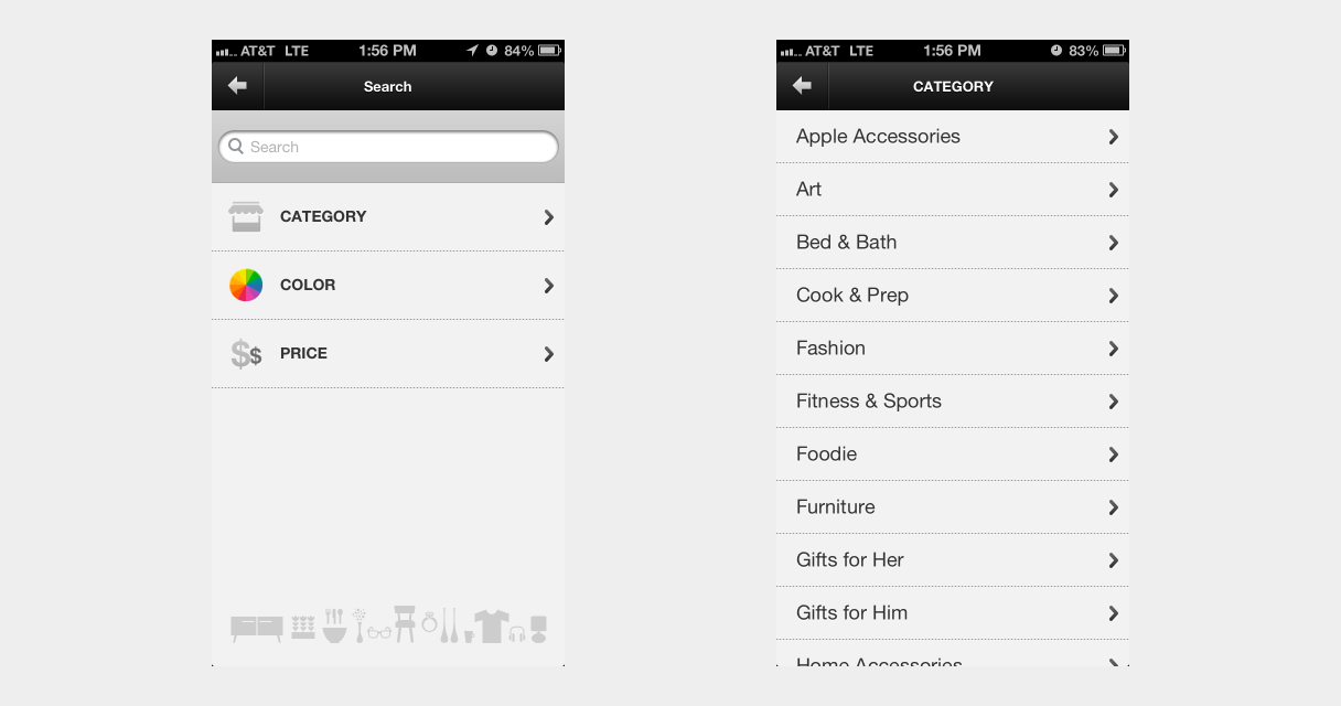
29 |
30 | While the navigation in Fab.com's mobile app is poorly organized and not very obvious, the app still supports known-item and exploratory seeking. Its Search view has both a text field for traditional search, and a table view navigation of categories, colors, and prices.
31 |
32 | 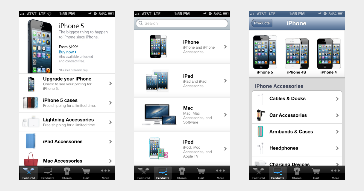
33 |
34 | The Apple Store app's navigation includes a Featured tab, which encourages discovery, and a Products tab for seeking. A table view of well-labeled product categories provides quick known-item seeking, and both tabs include a search field at the top.
35 |
36 | 
37 |
38 | Similarly, the Etsy app supports discovery with its Explore tab and facilitates known-item and exploratory seeking with the categories listed in the Search tab. Like the desktop website, the mobile app's navigation provides obvious paths to specific items within their large inventory, but is significantly simpler at the top-level.
39 |
40 | ## Rethinking Mobile Navigation
41 |
42 | Designing mobile navigation requires different approaches than desktop apps. Don't try to cram a desktop-based navigation into a mobile app, and don't neglect navigation in the pursuit of making an app content-centric. Take a step back, look at your product's IA, and consider other organizing principles for designing mobile navigation.
43 |
44 |
--------------------------------------------------------------------------------
/src/posts/portability.md:
--------------------------------------------------------------------------------
1 | ---
2 | title: Portability
3 | date: 2019-07-23
4 | excerpt: Defining a portable file format for high level style information.
5 | ---
6 |
7 | In software development, formats help ensure that content and data are portable and can be used in many different applications.
8 | By adhering to HTML standards set by the WHATWG and W3C, browsers created by different organizations
9 | can render HTML documents created by many different people and generated in many different ways.
10 | That is, HTML is a portable format that can be rendered by many different clients.
11 | While HTML is certainly one of the most successful examples of standardization ever,
12 | less widely used formats can still benefit from the same idea.
13 |
14 | Take Markdown as an example.
15 | It was created in 2004 by John Gruber and Aaron Swartz, and today is the de facto format for writing software documentation.
16 | It isn't widely used outside the field of software development,
17 | but there are many different engines that can render this format into HTML.
18 | Markdown has become a somewhat portable format.
19 | By writing documentation, blog posts, or wiki pages in this format,
20 | you can use many different tools to render the content in different places,
21 | and you can be fairly certain that there will always be tools that can render this format in the future.
22 |
23 | Markdown was intended to be *easy-to-read and easy-to-write*, and can be viewed as a simple abstraction on top of HTML.
24 | A complete HTML page cannot be replaced by Markdown, but all Markdown files can be written as HTML.
25 | Most people find markdown simpler to read and write than raw HTML, and prefer using it for things like blog posts and documentation.
26 |
27 | In the same way that Markdown has found a niche in certain contexts for authoring HTML,
28 | I'm very interested in taking this idea and applying it to CSS.
29 | *"But, CSS is already easy to read and write,"* you might say.
30 | Sure, but when I'm considering which styles differ the most across different interfaces and which styles make the biggest impact,
31 | I'm mostly concerned with three things: *color*, *typography*, and *layout*.
32 | Authoring an entire stylesheet to apply styles like this can require some effort,
33 | and the end result isn't as portable as you might think.
34 | Simply copying a stylesheet from one website to another does not guarantee that the styles will be applied the way you intend them to be.
35 | A lightweight abstraction for this sort of thing, however, could make these sorts of styles more portable.
36 |
37 | Unlike Markdown, I do not think this requires inventing new syntax.
38 | With the existing syntaxes for CSS, JavaScript, JSON, YAML, and others, there are already plenty of tools that can handle parsing.
39 | This *does*, however, require a specific shape or schema to be successful,
40 | and the [Theme Specification][] is meant to be a simpler way to write styles for an application.
41 | While [Theme UI][] (which is built with the Theme Specification) *can* output stylesheets in the form of [Tachyons](https://theme-ui.com/css/tachyons) and other similar CSS libraries, it cannot fully replace CSS on its own.
42 | It does provide a level of portability for sets of colors, typographic styles,
43 | and other design constraints that can be applied in many different places.
44 | As the number of libraries that follow this Theme Specification increases,
45 | you will be able to reuse these styles in more and more places,
46 | making it a more portable format for sharing styles.
47 |
48 |
49 | [theme specification]: https://system-ui.com/theme
50 | [theme ui]: https://theme-ui.com
51 |
52 |
--------------------------------------------------------------------------------
/src/posts/progressive-documentation.md:
--------------------------------------------------------------------------------
1 | ---
2 | title: Progressive Documentation
3 | date: 2018-09-01
4 | excerpt: Attempting to make writing documentation easier and faster
5 | ---
6 |
7 | When building out JS libraries and components, everyone knows the importance of good documentation.
8 | Without it, good code can end up going unused, which leads to duplication.
9 |
10 | For many libraries, markdown is an excellent format for writing docs since it's based on HTML and renders nicely in a variety of tools like [GitHub.com](https://github.com).
11 | But markdown can fall a little short when documenting front-end UI components,
12 | where demos and the ability to interact with a component in the browser is immensely helpful.
13 |
14 | ## MDX
15 |
16 | [MDX][] was built with some of this in mind.
17 | It gives you the simplicity of writing markdown combined with the ability to import and use React components with JSX.
18 | More and more tools are adding support for MDX,
19 | making using it as a documentation format a no-brainer.
20 |
21 | ## Documentation Tools
22 |
23 | While there are several great tools out there for creating high-quality documentation sites,
24 | such as [Next.js][], [Gatsby][], [Docusaurus][], and [Docz][],
25 | many of these tools require custom setup and configuration outside of your source code
26 | and can be a distraction if you're trying to quickly create documentation for something new.
27 |
28 | Additionally, these tools don't always make it easy to set up documentation to serve as a development tool while working on the source code.
29 | There are other tools out there for quickly developing components in isolation,
30 | but they tend to use proprietary APIs and don't scale well, still requiring separate documentation as a project grows.
31 |
32 | ## Introducing mdx-go
33 |
34 |
42 |
43 | [mdx-go][] is a development tool for **progressive documentation**
44 | and is meant to be used alongside your tools of choice for building documentation sites.
45 | It allows you to quickly prototype, draft docs, or build simple demos outside of a larger application.
46 |
47 | mdx-go is built with the following goals in mind:
48 |
49 | - Make it easy to focus on writing docs, not setting up an application
50 | - View and interact with components with zero setup or configuration
51 | - Always have a dev server ready to go, even alongside your source code
52 | - Reduce lock-in and embrace the portability of the MDX file format
53 |
54 | ## Don't boil the ocean
55 |
56 | By starting docs for a new project with mdx-go,
57 | you can focus on writing docs immediately,
58 | and you won't be locked into custom APIs or build setups,
59 | meaning that upgrading to other documentation solutions later on is easy when you're ready to.
60 | The related [mdx-docs][] project is one way to migrate a directory of MDX files over to using Next.js.
61 |
62 | mdx-go also works well as a local sandbox development environment, and you can continue to use it alongside other documentation tools.
63 | It offers static site exporting for sharing work-in-progress demos or drafts with others.
64 |
65 |
66 | ## Choose the right tool for the job
67 |
68 | Tools like mdx-go make it easy to try things out without a lot of setup or getting locked into proprietary APIs.
69 | Every team is different and has different needs, but I hope mdx-go is a helpful addition to your development toolkit.
70 |
71 | To learn more [see the mdx-go docs][mdx-go].
72 |
73 | ---
74 |
75 | ## Further Reading
76 |
77 | - [Initial MDX Proposal on Spectrum.chat][mdx-spectrum]
78 | - [mdxjs.com][MDX]
79 | - [What is MDX](http://youtu.be/d2sQiI5NFAM?a) by Kent C. Dodds
80 | - [x0: Making React Component Development Stupid Simple](https://compositor.io/blog/x0-making-react-component-development-stupid-simple/)
81 | - [Defining Component APIs in React](http://jxnblk.com/blog/posts/defining-component-apis-in-react/)
82 |
83 | [MDX]: https://mdxjs.com
84 | [mdx-go]: https://github.com/jxnblk/mdx-go
85 | [mdx-spectrum]: https://spectrum.chat/thread/1021be59-2738-4511-aceb-c66921050b9a
86 | [Next.js]: https://github.com/zeit/next.js/
87 | [Gatsby]: https://github.com/gatsbyjs/gatsby
88 | [Docusaurus]: https://github.com/facebook/Docusaurus
89 | [Docz]: https://github.com/pedronauck/docz
90 | [mdx-docs]: https://github.com/jxnblk/mdx-docs
91 | [mdx-deck]: https://github.com/jxnblk/mdx-deck
92 |
93 |
--------------------------------------------------------------------------------
/src/posts/rethinking-variables-in-css.md:
--------------------------------------------------------------------------------
1 | ---
2 | title: 'Rethinking Variables in CSS'
3 | date: 2015-05-08
4 | crossposted:
5 | - https://medium.com/@jxnblk/rethinking-variables-in-css-2ffafda429a
6 | tags:
7 | - css
8 | - variables
9 | - preprocessors
10 | - postprocessors
11 | - postcss
12 | ---
13 |
14 | CSS was first introduced as a way to reduce the complexity of using inline styles and to help separate concerns. After years of ballooning stylesheets with the same values being used over and over and losing sync, CSS preprocessors introduced variables to help keep values defined in a single place. Soon [custom properties](http://dev.w3.org/csswg/css-variables/) will be part of the CSS specification, which promises a native, more robust approach than what preprocessors can do.
15 |
16 | While variables and custom properties make updating multiple instances of the same value trivial, we often still end up with multiple instances of the same property-value definitions spread throughout a global stylesheet.
17 |
18 |
19 |
20 | _Bear with me for a second and consider this a thought experiment…_
21 |
22 | What if instead of repeating these definitions in our stylesheets, we treated CSS rulesets as variables? That is, instead of defining something like a color across many styles, it’s only defined once, and is used by applying classes to HTML elements —i.e. .green instead of $green. We could vastly DRY up our stylesheets while making only a minimal impact on HTML size. If you apply this idea widely enough, the entire stylesheet can become so-called critical CSS.
23 |
24 | Effectively, this means removing complexity from stylesheets, which are global and leaky, and moving that complexity to the templating system, which is much more isolated and easier to manage.
25 |
26 | I know that this approach has sped up the development process in my professional work and for small open source projects, and I’ve never seen any evidence that this would break down when working at scale. Though I suspect that very few have ever really attempted this, and it hasn’t been long enough to know what sort of problems this might cause over the long term.
27 |
28 | ## Is this semantic?
29 |
30 | Yes, read this article from Nicolas Gallagher — it is the best answer to this question on the Internet: [About HTML Semantics and Front-End Architecture](http://nicolasgallagher.com/about-html-semantics-front-end-architecture/). Classes do not affect HTML semantics, and you absolutely should use well structured, accessible, semantic HTML. Period.
31 |
32 | ## What about mixing concerns?
33 |
34 | Web components and things like React already do this and for good reason. The CSS Zen Garden is a pipe dream. If you could actually redesign something by only editing the stylesheet, we would all be using the same template and no one would be writing any new HTML.
35 |
36 | ## Won’t this lead to a lot of classes in HTML?
37 |
38 | If you’re concerned about this, I’m concerned about how much repetition you have in your templates. Most web projects will be utilizing some sort of templating system. Just as with any code, templates should be kept DRY. If the markup for something like a modal overlay is defined multiple times across templates, it should be consolidated to a single place. Living style guides and using a component-based system like React can help enforce this approach across a team.
39 |
40 | ## Wouldn’t there be a huge maintenance cost?
41 |
42 | Potentially. Though, I’ve only seen a handful of similar techniques at scale, and I suspect that, if it were implemented in a sensible way, it would be far better than the technical debt we incur with current CSS practices.
43 |
44 | ## What about web components?
45 |
46 | Web components add a whole new dimension to this dynamic by introducing style encapsulation and composability — essentially reducing utility styles to an implementation detail. I’ll try to address what that could look like in a follow-up post.
47 |
48 | _To be continued…_
49 |
50 |
--------------------------------------------------------------------------------
/src/posts/the-advantages-of-table-views-over-left-nav-flyouts.md:
--------------------------------------------------------------------------------
1 | ---
2 | title: 'The Advantages of Table Views Over Left Nav Flyouts'
3 | date: 2012-12-01
4 | crossposted:
5 | - http://jxnblk.tumblr.com/post/36972301487/the-advantages-of-table-views-over-left-nav
6 | excerpt: At first glance, these two navigation patterns seem very similar, but there are a few points that give table views a huge leg up. When dealing with a multi-tiered hierarchy or a variable amount of navigation items – such as text messages, emails, folksonomic categories, folders, files, etc. – table views can be a great solution. Lists are generally easier to scan than tiles, and vertical scrolling is an easy interaction for touchscreen mobile devices.
7 | ---
8 |
9 | 
10 |
11 | At first glance, these two navigation patterns seem very similar, but there are a few points that give table views[\*]() a huge leg up. When dealing with a multi-tiered hierarchy or a variable amount of navigation items – such as text messages, emails, folksonomic categories, folders, files, etc. – table views can be a great solution. Lists are generally easier to scan than tiles, and vertical scrolling is an easy interaction for touchscreen mobile devices.
12 |
13 |
14 | ## Some advantages of table views:
15 |
16 | 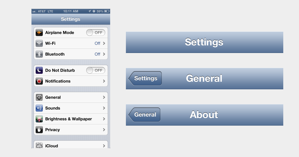
17 |
18 | - Users are likely familiar with this pattern, since it's widely used across iOS.
19 | - With table views, the user sees the top level, bird's-eye view of the hierarchy without requiring any interaction.
20 | - As the user drills farther down the hierarchy, the navigation bar continues to look and work the same way, creating continuity in the UI.
21 | - The navigation bar, along with [properly labeled back buttons](http://mrgan.tumblr.com/post/10492926111/labeling-the-back-button), works as a myopic breadcrumb, showing the user's current location and giving context to what the next level up in the hierarchy is. A hamburger button gives no context.
22 |
23 | 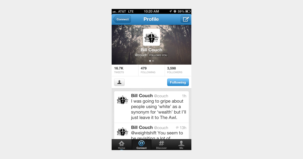
24 |
25 | - This pattern can work seamlessly with contextual navigation. Twitter's profile view is a perfect example of this.
26 | - Table views can be effectively combined with tab bars, bringing the advantages of persistent navigation to a complex IA.
27 | - The back button is in a hard-to-reach location, but when combined with a tab bar, the tab bar button can act as an easy-to-reach shortcut to the top-level.
28 |
29 | ## What can be learned from left nav flyouts
30 |
31 | One advantage that the left nav flyout pattern generally has over table views is the swipe-to-reveal gesture shortcut. For table views, this gesture could be used as a shortcut for the back button – much like Loren Brichter's original Twitter for iPad – and navigation is probably a more common action than deleting items with the swipe-to-delete gesture.
32 |
33 | 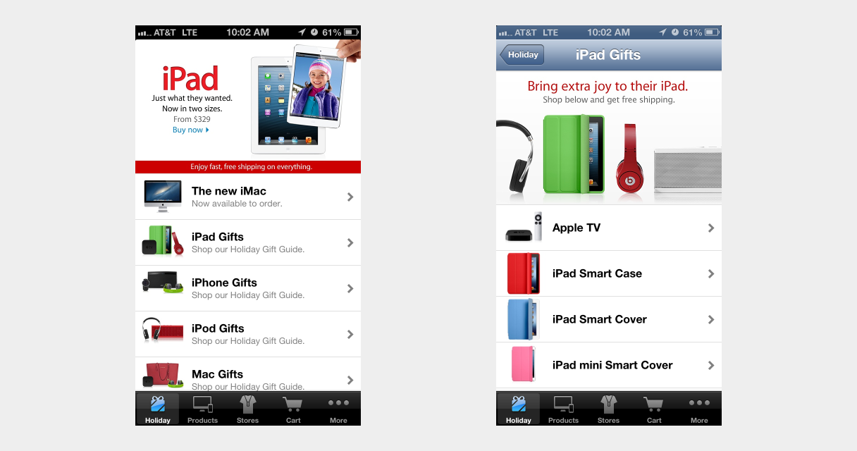
34 |
35 | Some may argue that the modal nature of left nav flyouts is well-suited for use as filtering controls for large collections. But, to use the Apple Store app as an example again, table views can be a very efficient way to filter through large collections of information.
36 |
37 | ## Forget the flyout – use table views
38 |
39 | If your product has a complex IA that can't neatly fit into a tab bar, consider the advantages that table views can provide before jumping on the left nav flyout bandwagon.
40 |
41 | _*Note: For lack of a better term, table views refers to the one-window drilldown pattern that combines lists and navigation bars and is widely used in iOS._
42 |
43 |
44 |
--------------------------------------------------------------------------------
/src/posts/the-cascade-is-not-inheritance.md:
--------------------------------------------------------------------------------
1 | ---
2 | title: The Cascade is Not Inheritance
3 | date: 2019-07-20
4 | excerpt: On more than one occasion, I've heard people conflate the cascade feature of CSS with inheritance.
5 | ---
6 |
7 | On more than one occasion, I've heard people conflate the *cascade* feature of CSS with *inheritance*.
8 | While it's an understandable thing to mix up because they are, in fact, related,
9 | I think it's important to use the correct terms when talking about technology like this.
10 |
11 | ## Inheritance
12 |
13 | *Inheritance* is when a child element inherits styles from one of its parent elements.
14 | Some (not all) CSS properties will automatically apply as a *default value* for child elements.
15 | This allows you to set a font family and color at the top level of a page
16 | and have all elements within that page use the same styles.
17 | Very cool.
18 |
19 | ## The Cascade
20 |
21 | The *Cascade* is the set of rules that a browser uses to determine which particular styles should apply to a given element,
22 | when there are conflicting rules.
23 | This is, in my mind, the trickiest part of the CSS language and it trips people up all the time.
24 |
25 | The algorithm specified in CSS takes the following into consideration when applying styles:
26 |
27 | - [Origin and Importance](https://www.w3.org/TR/css-cascade-3/#cascade-origin), which includes author, user agent, and user stylesheets
28 | 1. Transition declarations
29 | 2. Important user agent declarations
30 | 3. Important user declarations
31 | 4. Important author declarations
32 | 5. Animation declarations
33 | 6. Normal author declarations
34 | 7. Normal user declarations
35 | 8. Normal user agent declarations
36 | - [Specificity](https://www.w3.org/TR/css-cascade-3/#cascade-specificity), which is [calculated based on selectors](https://www.w3.org/TR/selectors/#specificity-rules)
37 | - [Order of Appearance](https://www.w3.org/TR/css-cascade-3/#cascade-order), which means the last declared rule wins
38 |
39 | This quote from [MDN's Introduction to CSS: Cascade and Inheritance][mdn] sums it up pretty well:
40 |
41 | > If you didn't fully understand the cascade, specificity, and inheritance, then don't worry! This is definitely the most complicated thing we've covered so far in the course, and is something that even professional web developers sometimes find tricky.
42 |
43 | [mdn]: https://developer.mozilla.org/en-US/docs/Learn/CSS/Introduction_to_CSS/Cascade_and_inheritance
44 | [specificity wars]: https://www.smashingmagazine.com/2007/07/css-specificity-things-you-should-know/
45 |
--------------------------------------------------------------------------------
/src/posts/the-good-the-bad-and-the-cascade.md:
--------------------------------------------------------------------------------
1 | ---
2 | title: The Good, The Bad, and The Cascade
3 | date: 2019-03-17
4 | draft: true
5 | ---
6 |
7 |
8 | - style properties
9 | - Inheritance (not the cascade)
10 | - User style sheets (the cascade)
11 | - In-line block
12 | - Flexbox
13 | - Grid
14 |
15 | ## Abstractions
16 | - Sass
17 | - Variables
18 | - Imports
19 | - Mixins (bad)
20 | - Functions (bad)
21 |
22 | ## Standards
23 | - Custom properties
24 |
25 |
26 | ## More bad stuff
27 | - Specificity
28 | - Selectors
29 |
30 | ## New Abstractions
31 |
32 | - Hashed className s
33 | - JS module scope
34 | - Single build tool
35 | - Portable code
36 | - Runtime evaluation?
37 |
38 |
39 | - CSS as assembly language
40 |
--------------------------------------------------------------------------------
/src/posts/unit-testing-ui.md:
--------------------------------------------------------------------------------
1 | ---
2 | title: 'Unit testing UI'
3 | date: 2016-06-20
4 | ---
5 |
6 | I recently read
7 | [this excellent article](http://product.voxmedia.com/2016/4/20/11458814/how-designers-can-use-unit-testing-to-build-resilient-and-happy-design-systems),
8 | where the design team at Vox has devised a testing framework for new UI [components](/blog/posts/components) introduced into their pattern library.
9 | While the methods they suggest are excellent, and what I’d consider something that should be industry-standard in our field,
10 | it got me thinking that this concept could be taken a step further.
11 | What if designers wrote actual unit tests for UI components?
12 | What if those tests were actually applied in user acceptance testing, A/B tests, and tested against performance metrics?
13 |
14 |
15 |
16 | ## What would a unit test look like?
17 |
18 | This is a really contrived example of what a UI unit test could look like:
19 |
20 | ```
21 | describe: CTA button
22 | context: when a user sees the button
23 | expect: Users should know that the button is clickable
24 | expect: User should be able to click the button
25 | expect: Conversions should be above 4%
26 | ```
27 |
28 | Taking a cue from test driven development, these tests should be written before any design work is started, and they should "fail" – because there’s no design yet.
29 |
30 | Any work that follows should be towards making those tests pass.
31 |
32 | You might notice that this looks suspiciously like a [user story](https://en.wikipedia.org/wiki/User_story),
33 | but I think this approach differs in a few ways.
34 | First, user stories attempt to capture the _how_ and _why_ in addition to the _what._
35 | These unit tests only concern themselves with _what_.
36 | Secondly, user stories are very much a part of Agile software development,
37 | whereas these are simply meant to measure the design of UI components.
38 |
39 | ## “Running” tests
40 |
41 | Once you have a potential component, or even better, several potential components,
42 | you’d be ready to start testing it against the unit tests previously written.
43 | These tests shouldn’t overshadow the typical formats and methodologies of user testing, A/B testing, etc.
44 | Instead, they should be used as an analytical tool to gauge the results.
45 |
46 | If, when user testing a feature, the user doesn’t notice the button, there’s still more design work to do.
47 |
48 | If, after ramping up a new button component, A/B testing shows that conversion is lower than expected, there’s still more work to do.
49 |
50 | If users are bouncing at higher-than-anticipated rates because of slow page load, there’s still more work to be done.
51 |
52 | Now, I will admit that design work is a lot less black and white than software development can be, and that it might be easy to shoot yourself in the foot with an approach like this. If, for example, conversion never gets above 3.9%, and you spend 2 weeks designing and redesigning a button, there are probably some other variables affecting things, and there are better ways to prioritize your time.
53 |
54 | But taking this idea as an approach to problem solving, gauging the efficacy of a design solution, and setting up goals for a product, I think it’s a concept worth exploring.
55 |
56 |
57 |
--------------------------------------------------------------------------------
/src/posts/unity-inputsystem-detector.md:
--------------------------------------------------------------------------------
1 | ---
2 | title: Unity InputSystem Touchscreen Detector
3 | date: 2023-10-05
4 | draft: true
5 | devlog: 3
6 | tags:
7 | - devlog
8 | - unity
9 | - input
10 | - controller
11 | - mobile
12 | - touchscreen
13 | - tutorial
14 | ---
15 |
16 | When I first started working on [Novantica][], I was considering releasing on iOS in addition to Steam and used TestFlight to manage development builds on my phone.
17 | I've always intended for the game to work well with gamepads/controllers, but I also wanted a way to play test the game using an on-screen virtual controller.
18 |
19 | I decided to use the [InputSystem][] package so that the game would support most gamepads and it includes a very easy way to build a custom on-screen controller with the [OnScreenControl][] component.
20 | For the iOS build of the game, a custom on-screen controller shows, and automatically hides when a controller is connected.
21 | It took a bit of fiddling with the InputSystem to get this to work, and I'd like to share how I set this up.
22 |
23 | First, make sure you have the InputSystem installed and enabled in your project.
24 | Find or create some images assets to use for any joysticks or buttons you want to use for the on-screen controller, then create a UI canvas for the controller, adding and positioning the joystick and buttons to suit your needs.
25 |
26 | The controller I had in the iOS builds looked like this:
27 |
28 | \[IMAGE\]
29 |
30 | Next, create a new script for hiding and showing the on-screen virtual controller.
31 |
32 | \[GIST\]
33 |
34 | Add this script to a parent component and hook up the UI canvas in the inspector.
35 | To test this out in the editor, enter play mode, and you should see the on-screen virtual controller.
36 | Now connect a gamepad to your computer; the virtual controller should disappear.
37 | Disconnecting the physical controller should make the on-screen virtual controller reappear.
38 |
39 | [novantica]: https://novanticagame.com
40 | [inputsystem]: https://docs.unity3d.com/Packages/com.unity.inputsystem@1.7/manual/index.html
41 | [onscreencontrol]: https://docs.unity3d.com/Packages/com.unity.inputsystem@1.7/manual/OnScreen.html
42 |
--------------------------------------------------------------------------------
/src/posts/zero-configuration-react-static-site-generator.md:
--------------------------------------------------------------------------------
1 | ---
2 | title: 'Zero-Configuration React Static Site Generator'
3 | date: 2016-02-15
4 | tags:
5 | - react
6 | - static-site-generator
7 | related:
8 | - name: Static Site Generation with React and Webpack
9 | href: http://jxnblk.com/blog/posts/static-site-generation-with-react-and-webpack/
10 | ---
11 |
12 | React is a great way to generate static HTML with a component-based UI.
13 | One of the biggest hurdles to working with React is the amount of boilerplate and build configuration it takes to get going.
14 | I wanted to make it dead-simple to start building static pages with React
15 | and without the need to install tons of npm modules and configure webpack.
16 |
17 |
18 |
19 | That’s where [static-react](https://github.com/jxnblk/static-react) comes in. Here’s out to get started.
20 |
21 | *Update: As of version 3.2.0, static-react includes Babel presets and they do not need to be installed separately. This post has been updated to reflect those changes.*
22 |
23 | ## 1. Install Dependencies
24 |
25 | ```sh
26 | npm i -D react static-react
27 | ```
28 |
29 | ~~The Babel presets are optional, but make working with React much nicer, in my opinion.~~
30 |
31 | ## 2. Add a Run Script
32 |
33 | Add the following run script to package.json.
34 |
35 | ```json
36 | "scripts": {
37 | "start": "static-react components/Root.js > index.html"
38 | }
39 | ```
40 |
41 | ## ~~3. Configure Babel (Optional) [\*](#1)~~
42 |
43 | ~~Add the following to package.json.~~
44 |
45 | ## 4. Add Components
46 |
47 | Create a `components` directory and a `Root.js` React component.
48 |
49 | ```js
50 | // Root.js
51 | import React from 'react'
52 |
53 | class Root extends React.Component {
54 | render () {
55 | return
Hello
56 | }
57 | }
58 |
59 | export default Root
60 | ```
61 |
62 | ## 5. Build
63 |
64 | ```sh
65 | npm start
66 | ```
67 |
68 | Open `index.html` and you should see the rendered Root component.
69 |
70 | ## Building Out a Page
71 |
72 | You'll certainly want more than just a heading in the final page.
73 | Build out some more components and run `npm start` to rebuild.
74 |
75 | Here is an example set of starter components:
76 |
77 | ```js
78 | // Root.js
79 | import React from 'react'
80 | import Head from './Head'
81 | import Header from './Header'
82 | import Main from './Main'
83 | import Footer from './Footer'
84 |
85 | class Root extends React.Component {
86 | render () {
87 | return (
88 |
89 |
91 |
92 |
93 |
94 |
95 |
96 | )
97 | }
98 | }
99 |
100 | export default Root
101 | ```
102 |
103 | ```js
104 | // Head.js
105 | import React from 'react'
106 |
107 | const Head = ({ title }) => (
108 |
109 |
110 | {title}
111 |
112 |
113 |
114 |
115 | )
116 |
117 | export default Head
118 | ```
119 |
120 | ```js
121 | // Header.js
122 | import React from 'react'
123 |
124 | const Header = ({ title }) => (
125 |
126 |
{title}
127 |
128 | )
129 |
130 | export default Header
131 | ```
132 |
133 | ```js
134 | // Main.js
135 | import React from 'react'
136 |
137 | const Main = () => (
138 |
139 |
141 |
142 | )
143 |
144 | export default Main
145 | ```
146 |
147 | ```js
148 | // Footer.js
149 | import React from 'react'
150 |
151 | const Footer = () => (
152 |
155 | )
156 |
157 | export default Footer
158 | ```
159 |
160 | If you have any thoughts on or issues with the static-react module, please check out the repo on [GitHub](https://github.com/jxnblk/static-react).
161 |
162 |
163 |
164 | * Technically, I guess this post should be titled Near-Zero-Configuration, but using Babel is completely optional.
165 |


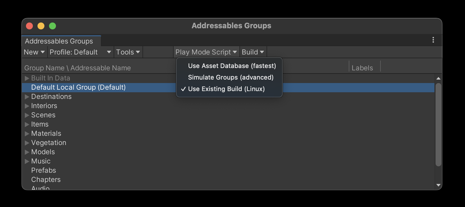 \n
\n 
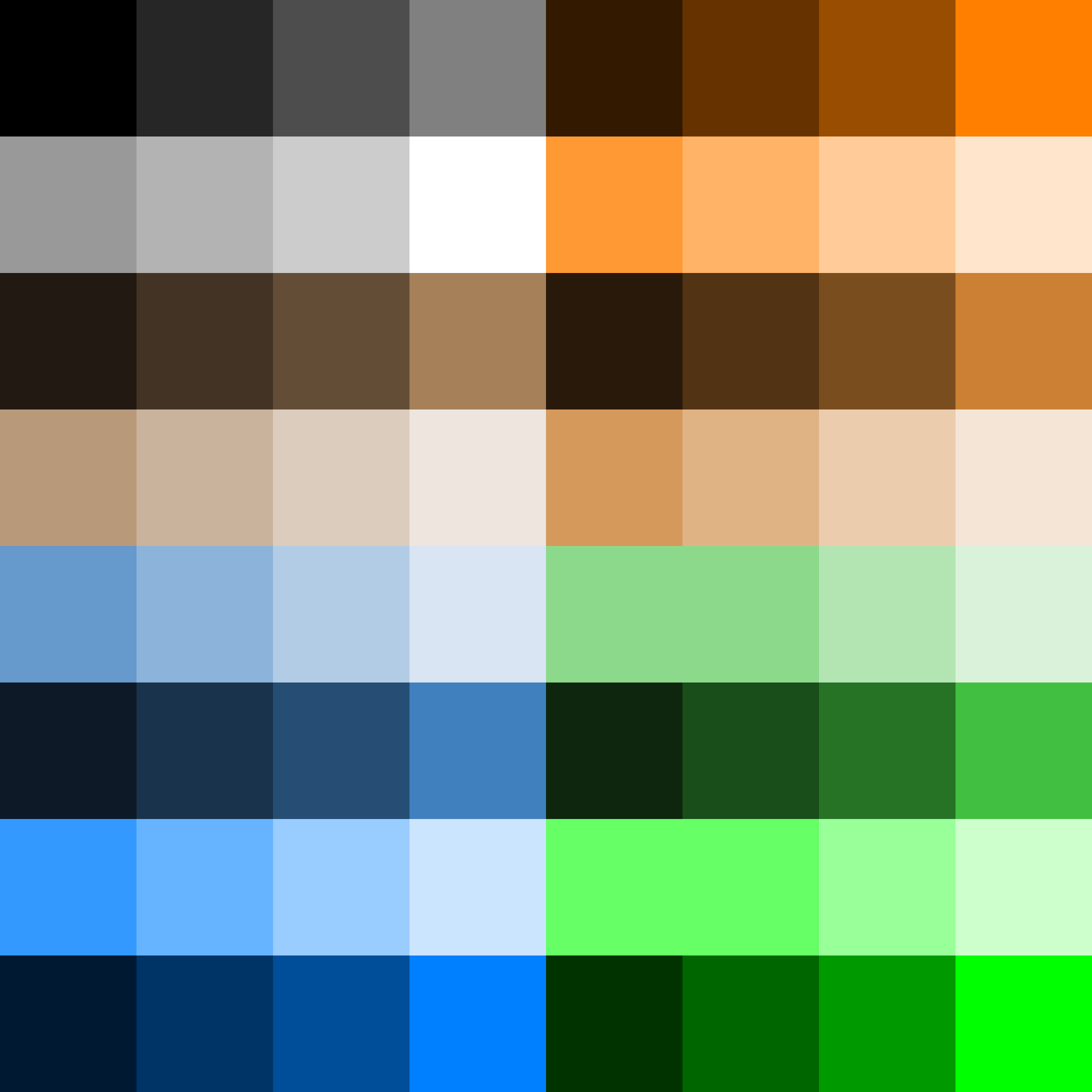 \n
\n  23 |
23 |  54 |
54 |  65 |
66 |
65 |
66 | 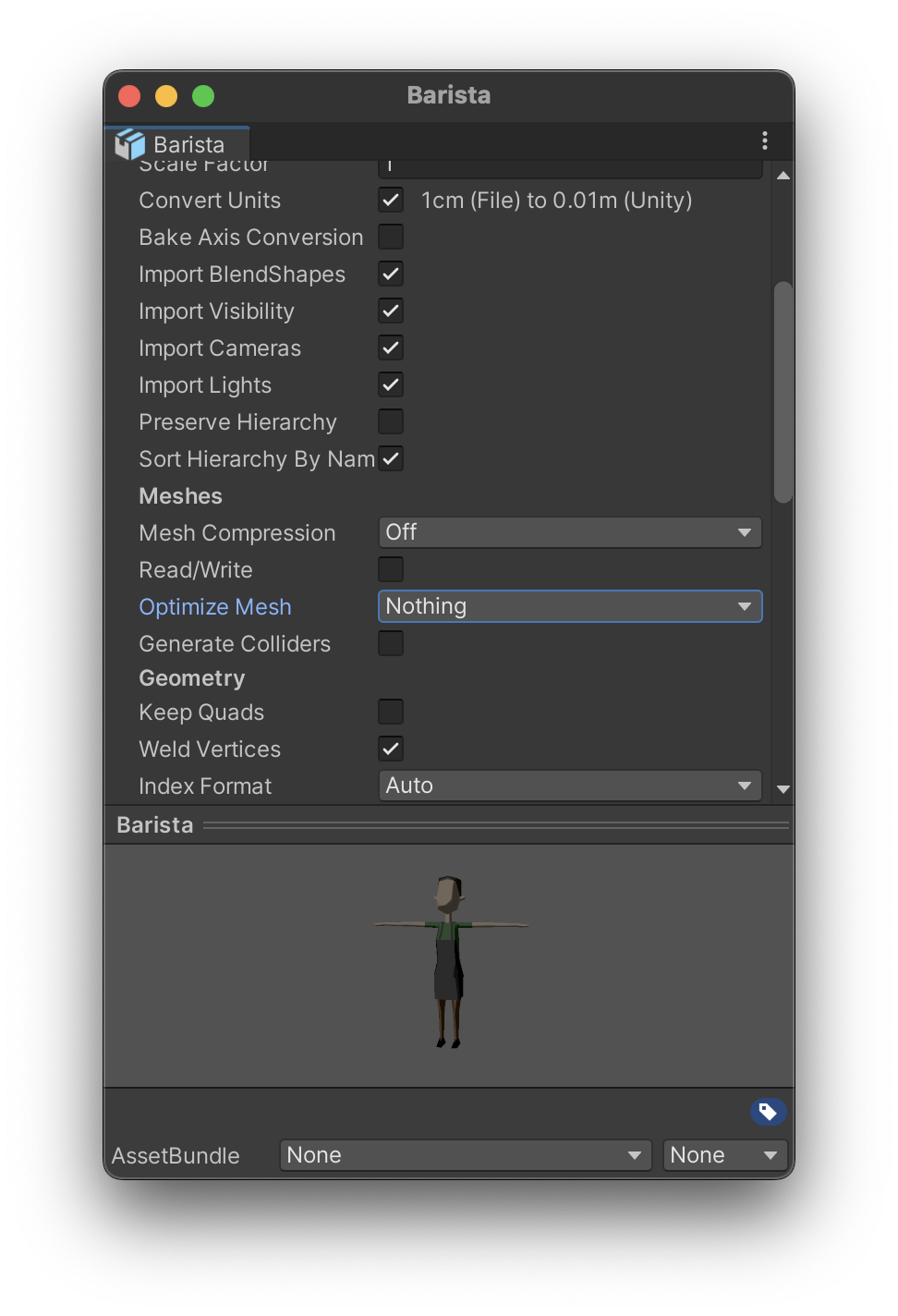 78 |
78 |