
 16 |
16 |  17 |
17 |  18 |
19 |
18 |
19 |  38 |
38 |
39 |
52 |
40 |
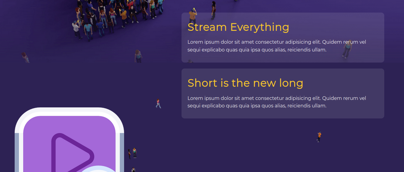
45 | Stream Everything
41 |42 | Lorem ipsum dolor sit amet consectetur adipisicing elit. Quidem rerum vel sequi explicabo quas quia ipsa quos alias, reiciendis ullam. 43 |
44 |
46 |
51 | Short is the new long
47 |48 | Lorem ipsum dolor sit amet consectetur adipisicing elit. Quidem rerum vel sequi explicabo quas quia ipsa quos alias, reiciendis ullam. 49 |
50 |