viup.image #
fn load_animation #
fn load_animation(path string) ?&viup.Controlfn new_grayscale #
fn new_grayscale(width int, height int, pixels []byte) &viup.Controlfn new_rgb #
fn new_rgb(width int, height int, pixels []byte) &viup.Controlfn new_rgba #
fn new_rgba(width int, height int, pixels []byte) &viup.Controlfn load #
fn load(path string, attrs ...string) ?&viup.Control- fn load_animation
-
88 |
90 | - fn new_grayscale
-
91 |
93 | - fn new_rgb
-
94 |
96 | - fn new_rgba
-
97 |
99 | - fn load
-
100 |
102 |
viup.gl #
fn is_current #
fn is_current(control &viup.Control) boolfn make_current #
fn make_current(control &viup.Control) &viup.Controlfn set_palette #
fn set_palette(control &viup.Control, index int, r f32, g f32, b f32) &viup.Controlfn swap #
fn swap(control &viup.Control) &viup.Controlfn wait #
fn wait(is_gl bool)fn create_context #
fn create_context(attrs ...string) &viup.Control- fn is_current
-
93 |
95 | - fn make_current
-
96 |
98 | - fn set_palette
-
99 |
101 | - fn swap
-
102 |
104 | - fn wait
-
105 |
107 | - fn create_context
-
108 |
110 |
VIUP
3 |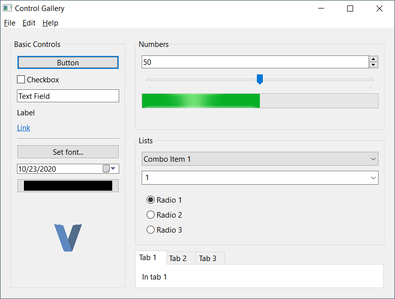 11 |
11 | 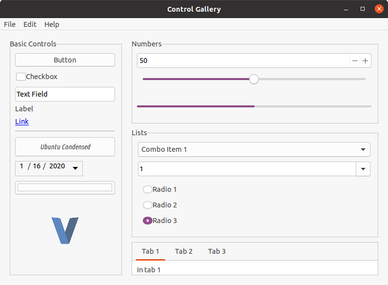 12 |
12 | README
<div align="center"> 54 | <h1>VIUP</h1> 55 | </div>
56 |VIUP is a work-in-progress V wrapper for the C-based cross-platform UI library, IUP. The aim of this 57 | library is to provide a thorough implementation of IUP in V. The implmentation is faithful to the original API but takes some liberties to provide 58 | a native "V" feel and modernizes some of the calls.
59 |<div align="center"> 60 | <img src="https://raw.githubusercontent.com/kjlaw89/viup/main/examples/gallery/gallery_windows.png" alt="Windows Gallery Example" style="width: 320px;" /> 61 | <img src="https://raw.githubusercontent.com/kjlaw89/viup/main/examples/gallery/gallery_linux.png" alt="Linux (Ubuntu) Gallery Example" style="width: 330px;" /> 62 | </div>
63 |Features
64 |-
65 |
- image
-
66 |
- load image 67 |
- convert image to native 68 |
- convert native to image 69 |
71 | - basic controls 72 |
- containers 73 |
- dialogs 74 |
- gl
-
75 |
- gl rendering 76 |
- gl controls 77 |
79 | - scintilla 80 |
- plot 81 |
- extra controls 82 |
- clipboard 83 |
- browser 84 |
Setup
86 |-
87 |
- Download the appropriate runtime libraries for your Operating system: https://sourceforge.net/projects/iup/files/3.30/ 88 |
- If using image functions, download
IMruntime libraries: http://webserver2.tecgraf.puc-rio.br/im/
89 |
Windows install
91 |Copy all applicable DLLs from Zip to binary directory. By default, only iup.dll is required. If using image functions, iup_im.dll is required as
92 | well as all of the DLLs frmo the IM library.
Windows App Manifest
94 |Windows UI apps need to be built with a Manifest. This manifest includes details about the app such as the name, version, and characteristics. VIUP
95 | includes a basic manifest with the gallery that can be easily modified. The generated manifest.syso needs to be in the directory during build but
96 | does not need to be distributed with your application.
To update the manifest:
98 |cd winmanifest
99 | windres -i resources.rc -o manifest.syso -O coff
Copy manifest.syso to application directory.
101 |Note: Currently running v . or v run . will not find the .syso file correctly. To include it in your project, add a #flag windows "path\\to\\file\\manifest.syso to the top of your application.
Linux install
103 |Extract runtime libraries to a folder and run sudo ./install to install libraries.
Libraries Path
105 |I've noticed in testing that the libraries are installed to /usr/lib64. It does not appear that they are picked up by the compiler there. Copying from
106 | that folder to /usr/lib resolves the problem. This may not be necessary in all cases.
Notes about dependencies
108 |This repo comes with a copy of the headers for the version of IUP that it was developed against (3.30), but does not ship with the runtime libraries. It is not necessary to get the IM library runtime if you do not plan to use it in your application.
109 |By default VIUP only initializes the subsystems that are imported. For example, importing just viup only initializes the standard dialogs, containers, and components.
If an extension library is loaded (viup.image), the required runtime binaries must be installed or provided along with the build.
Example
112 |This repo comes with a simple application that demos all of the available controls. This app is available in the "examples/gallery". It requires the IM libraries. Once all runtime libraries are in the folder, run the example with v run ..
Using VIUP
114 |One of the strengths of IUP is that is it a very simple library. All controls are instances of &Control and share the same methods, though not all methods are applicable to a Control. Adjusting settings for a control is as simple as calling set_attr or providing the attributes when initializing the Control.
Here's a basic example of initializing a simple window:
116 |viup.
117 | dialog(viup.scroll(hbox), "title=Control Gallery") // Create our dialog with "Control Gallery" as the title and a scrollable Control
118 | .set_handle("MainWindow") // Define a global ID for our Window
119 | .set_menu("app_menu", menu) // Set an app menu if applicable
120 | .show_xy(viup.Pos.center, viup.Pos.center) // Display dialog in center of screen
121 | Attributes
123 |All controls can be passed attributes as the last parameters when creating a Control. Any amount of attributes can provided. Attributes can adjust the various characteristics of a Control such as the title, value(s), background or foreground colors, control sub-type, sizing, etc.
124 |Not all available attributes apply to each control. If an invalid attribute is provided it is actually accessible via get_attr but will not affect the control itself. Read up more on attributes in the IUP Documentation.
Example:
126 |viup.list(
127 | "List", // control 'name'
128 | "1=Combo Item 1", // Attr 1: Slot 1 is 'Combo Item 1'
129 | "2=Combo Item 2", // Attr 2: Slot 2 is 'Combo Item 2'
130 | "3=Combo Item 3", // ....
131 | "4=Combo Item 4", // ....
132 | "dropdown=yes", // Attr 5: List is a dropdown
133 | "expand=horizontal", // Attr 6: Expand horizontally
134 | "value=1" // Attr 7: Set default value to Slot 1
135 | )
136 | Callbacks & Events
138 |All controls have callback methods available for various events. Each callback method starts with on_ and can be quickly chained to add multiple callbacks.
Example:
140 |viup.button("Button", "action").on_action(button_clicked)
141 |
142 | fn button_clicked(control &viup.Control) viup.FuncResult {
143 | viup.message("Button Click", "Button clicked!")
144 | return .cont
145 | }
146 | In the example above, a Button control is initialized with "Button" for the title. An action callback is added with on_action(button_clicked). button_clicked is an ActionFunc callback and is automatically called when the button is clicked. VIUP mirrors the callbacks that IUP provides pretty closely, typically adding Func on the end for consistency.
The majority of callback functions can return a viup.FuncResult. This result can be one of the following:
-
150 |
cont- continue action
151 | close- close the application
152 | default- perform default action (may be equivalent tocontin most cases)
153 | ignore- ignores event and may stop propagation
154 |
Chaining
156 |Most Control methods will return back the Control when finished. This makes it easy to chain several method calls together.
157 |Example:
158 |viup
159 | .message_dialog(
160 | "title=About",
161 | "value=$about",
162 | "dialogtype=information"
163 | ) // Create a message dialog with attributes "title", "value", and "dialogtype"
164 | .popup(viup.Pos.current, viup.Pos.current) // Popup dialog to user
165 | .destroy() // Destroy dialog when closed
166 | Example 2:
168 |viup
169 | .button("Set font...", "", "expand=horizontal") // Create button with "Set font..." as title
170 | .set_handle("font_btn") // Set a handle name
171 | .callback(viup.ActionFunc(font_button_clicked)) // Set a Action callback
172 | Note: Dialogs return back an struct of Dialog. This struct has a few unique functions associated with it (i.e. popup, show, show_xy). It's not
174 | to chain to these methods from regular Control methods.
Controls
176 |All dialog, layouts and elements are "Controls" in IUP. As such, they all share common methods that can be utilized by any Control.
177 |Most used component methods:
178 || Method | 182 |Description | 183 |
|---|---|
get_attr / set_attr |
188 | Get or set an attribute value on the control. | 189 |
set_attrs |
192 | Used to set multiple attributes in a single call | 193 |
set_handle |
196 | Assigns this control a name on the global level. This is typically used in combination with viup.get_handle to restore the control in callbacks or other functions |
197 |
get_font / set_font |
200 | Get or set a Font |
201 |
refresh / refresh_children |
204 | Trigger a redraw for this component and/or its children | 205 |
Dialog Controls
209 || Function | 213 |Description | 214 |
|---|---|
color_dialog(...attrs) |
219 | Opens a color picker with optional color palette | 220 |
dialog(child, attrs) |
223 | Creates a standard Window or modal dialog | 224 |
file_dialog(...attrs) |
227 | Open a file chooser. This can be used to open or save files | 228 |
font_dialog(...attrs) |
231 | Opens a font picker | 232 |
message_dialog(...attrs) |
235 | Opens a customizable message modal | 236 |
message(title, message) |
239 | Shows a generic message box with a standard "OK" button to close | 240 |
Container Controls
244 || Function | 248 |Description | 249 |
|---|---|
background(child, attrs) |
254 | A simple container element that is designed to have a background color or image | 255 |
detach_box(child, attrs) |
258 | Container that is designed to be detachable from the parent container when needed. Can also be reattached. | 259 |
fill(...attrs) |
262 | Fills the remaining space for the parent container | 263 |
flat_frame(child, attrs) |
266 | Standard frame that allows custom rendering | 267 |
flat_scroll(child, attrs) |
270 | Standard scroll that allows custom rendering | 271 |
frame(child, attrs) |
274 | Container that puts a border around its children with an optional title | 275 |
grid(children, attrs) |
278 | Multi-control container that lays out its children in a table-like design | 279 |
hbox(children, attrs) |
282 | Multi-control container that lays out its children in a row | 283 |
menu(children, attrs) |
286 | Multi-control container for a dialog's menu items | 287 |
radio_group(child, attrs) |
290 | Container is used to group toggles together into a radio button group |
291 |
tabs(children, attrs) |
294 | Multi-control container for tabbed content | 295 |
vbox(children, attrs) |
298 | Multi-control container that lays out its children in a column | 299 |
Standard Controls
303 || Function | 307 |Description | 308 |
|---|---|
animated_label(animation, attrs) |
313 | Creates a control that can display an animation | 314 |
button(title, action, attrs) |
317 | Creates a standard button with title for the text |
318 |
canvas(action, attrs) |
321 | A control that can be used to render custom content | 322 |
divider(...attrs) |
325 | Draws a horizontal or vertical line (horizontal by default) | 326 |
label(title, attrs) |
329 | A simple control to show text or images | 330 |
link(url, title, attrs) |
333 | Similar to a label, can be used to link to an external source | 334 |
list(action, attrs) |
337 | Creates a component that can be used to list multiple values | 338 |
menu_item(action, attrs) |
341 | Used in the menu component as a specific action (e.g. "Open File..." or "About") |
342 |
menu_sep(...attrs) |
345 | Create a simple horizontal line in a menu |
346 |
multiline(action, attrs) |
349 | Creates a multiline chooser component | 350 |
progress(...attrs) |
353 | Basic progressbar component | 354 |
slider(orientation, attrs) |
357 | Creates a number-line slider component | 358 |
sub_menu(title, child, attrs) |
361 | Creates a sub menu component. Sub-menues are children of menu components. Typically structured like: Menu -> Sub-menu -> Menu -> Menu Item. |
362 |
text(action, attrs) |
365 | Creates a standard text-input control. Can be set as multi-line, number input, etc. | 366 |
toggle(title, action, attrs) |
369 | A radio or checkbox component. Defaults to radio when in a radio_group. |
370 |
Contributing / Support
374 |This project was developed as a way of improving my understanding of V & C. I will not be providing active support for the project, but I'll happily accept any pull requests. Use at your own discretion!
375 | 376 |