for better rendering.
158 |
159 | ## [2.5.0] - 21/03/2024
160 |
161 | - **Enhancement:**
162 | - `popOnClose` added to indicate whether the bottom picker will pop when closing or not, useful when using the bottom picker as layout widget.
163 |
164 | ## [2.4.0] - 04/02/2024
165 |
166 | - **Layout enhancement:** Update confirmation button design and attributes.
167 | - `iconColor` , `buttonText` , `buttonTextStyle`, `displayButtonIcon`, `buttonTextAlignment` removed.
168 | - Added `buttonContent`, `buttonStyle` attributes.
169 | - Picker content padding updated.
170 |
171 | ## [2.3.3] - 10/12/2023
172 |
173 | - Fix `onSubmit` attribute callback code and selected value retrieval from date and time picker [issue link](https://github.com/koukibadr/Bottom-Picker/issues/80).
174 |
175 | ## [2.3.2] - 14/11/2023
176 |
177 | - Fix date picker date initlization (`initialDateTime`, `maxDateTime`, `minDateTime`) [issue-76](https://github.com/koukibadr/Bottom-Picker/issues/76).
178 |
179 | ## [2.3.1] - 12/11/2023
180 |
181 | - Fix minutes set value in the `time` constructor.
182 | - Update `time` constructor to use `Time` class to ease setting hours and minutes values [PR-75](https://github.com/koukibadr/Bottom-Picker/pull/75).
183 |
184 | ## [2.2.1] - 22/10/2023
185 |
186 | - Fix analysis issues.
187 |
188 | ## [2.2.0] - 2/10/2023
189 |
190 | - Add localization support and multiple language support.
191 |
192 | ## [2.1.1] - 27/09/2023
193 |
194 | - Update package license to MIT license.
195 |
196 | ## [2.1.0] - 12/09/2023
197 |
198 | - **Enhancements:**
199 | - Added title padding to title widget.
200 | - Added title alignement.
201 | - Button padding, button width, Button text alignement and Button alignement parameters.
202 | - Customizable close icon size.
203 | - Added `selectionOverlay` parameter.
204 | - Date range picker dates attributes assertion.
205 | - **Bug fixes**
206 | - Date range picker initial dates error.
207 | - Button padding issue.
208 |
209 | ## [2.0.4] - 30/05/2023
210 |
211 | - Fix minute interval issue for cupertino date picker [https://github.com/flutter/flutter/issues/60456](https://github.com/flutter/flutter/issues/60456).
212 |
213 | ## [2.0.3] - 27/05/2023
214 |
215 | - Fix automatic refresh issue when the second date was smaller than the first date.
216 | - Fix: Inability to decrease the second date even if the first date was smaller ([PR link](https://github.com/koukibadr/Bottom-Picker/pull/65)).
217 |
218 | ## [2.0.2] - 02/04/2023
219 |
220 | - Fix range picker initialization error (issue [#59](https://github.com/koukibadr/Bottom-Picker/issues/59)).
221 |
222 | ## [2.0.1] - 24/10/2022
223 |
224 | - Update displayCloseIcon usage in code.
225 |
226 | ## [2.0.0] - 01/10/2022
227 |
228 | - Add range date picker.
229 | - Add description attribute.
230 | - Add description text style attribute.
231 |
232 | ## [1.9.1] - 27/06/2022
233 |
234 | - Fix static analysis issues.
235 |
236 | ## [1.9.0] - 27/06/2022
237 |
238 | - add minuteInterval attibute.
239 | - Bug fixes.
240 |
241 | ## [1.8.0] - 19/03/2022
242 |
243 | - Add display submit button parameter.
244 | - bug fixes.
245 |
246 | ## [1.7.0] - 16/02/2022
247 |
248 | - Add height parameter to bottom picker widget.
249 | - bug fixes.
250 |
251 | ## [1.6.0] - 12/02/2022
252 |
253 | - Update padding rendering in bottom picker widget.
254 | - Add button alignement parameter.
255 | - enhanced coding style.
256 | - bug fixes.
257 |
258 | ## [1.5.0] - 01/19/2022
259 |
260 | - Add close icon color parameter.
261 | - Add close icon display parameter.
262 | - Add different layout orientation options (LTR, RTL).
263 |
264 | ## [1.4.0] - 23/12/2021
265 |
266 | - Add picker text style attribute.
267 | - Add date format order parameter.
268 | - Add item extent parameter.
269 |
270 | ## [1.1.0] - 20/11/2021
271 |
272 | - Add background color parameter.
273 | - Enhanced rendering performance.
274 | - Bug fixes.
275 |
276 | ## [1.0.6] - 20/11/2021
277 |
278 | - Bug fixes.
279 |
280 | ## [1.0.5] - 13/11/2021
281 |
282 | - Enhanced tablet view.
283 | - remove uneccessary parameters in datetime constructors.
284 |
285 | ## [1.0.4] - 06/11/2021
286 |
287 | - Add selected index parameter.
288 |
289 | ## [1.0.3] - 22/10/2021
290 |
291 | - Fix bugs.
292 | - Add customization support to confirm button.
293 |
294 | ## [1.0.2] - 27/08/2021
295 |
296 | - Fix bottom picker drag bug.
297 |
298 | ## [1.0.1] - 15/01/2021
299 |
300 | - Fix onSubmit return value bug.
301 |
302 | ## [1.0.0] - 08/01/2021
303 |
304 | - Simple list item picker.
305 | - Date picker with max and min dates configuration.
306 | - Time picker with 12h/24h time format.
307 | - Date and time picker.
308 | - Multiple built-in themes.
309 | - Customized button theme with custom colors.
310 | - On item change / On submit and On close callback handlers.
311 |
--------------------------------------------------------------------------------
/README.md:
--------------------------------------------------------------------------------
1 | # Bottom Picker
2 |
3 |
4 |  5 |
5 |
6 | Bring beautiful bottom pickers to all your Flutter apps! Version 4.0.0 offer full customization alongside more advanced features for cupertino picker.
7 |
8 |
9 | | 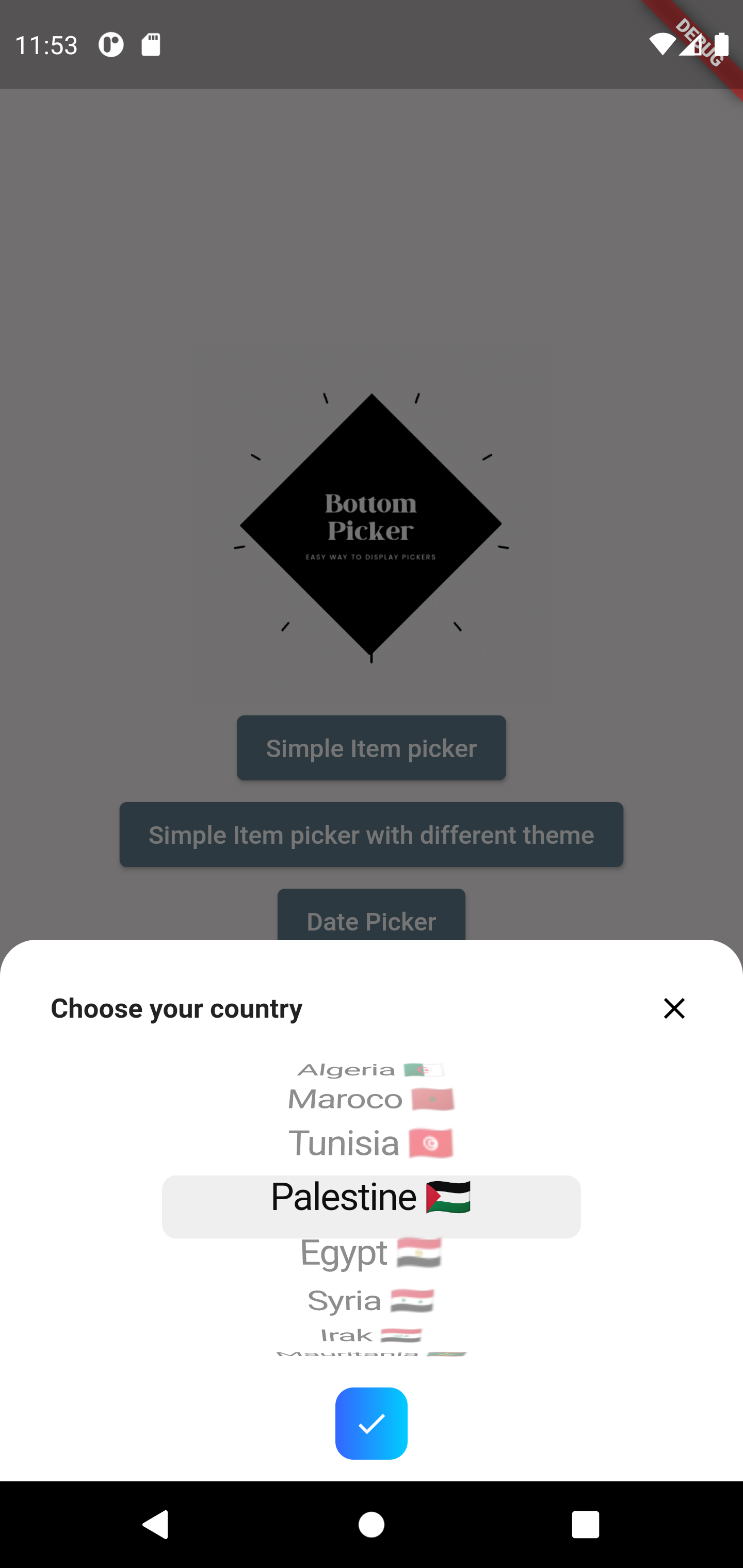 | 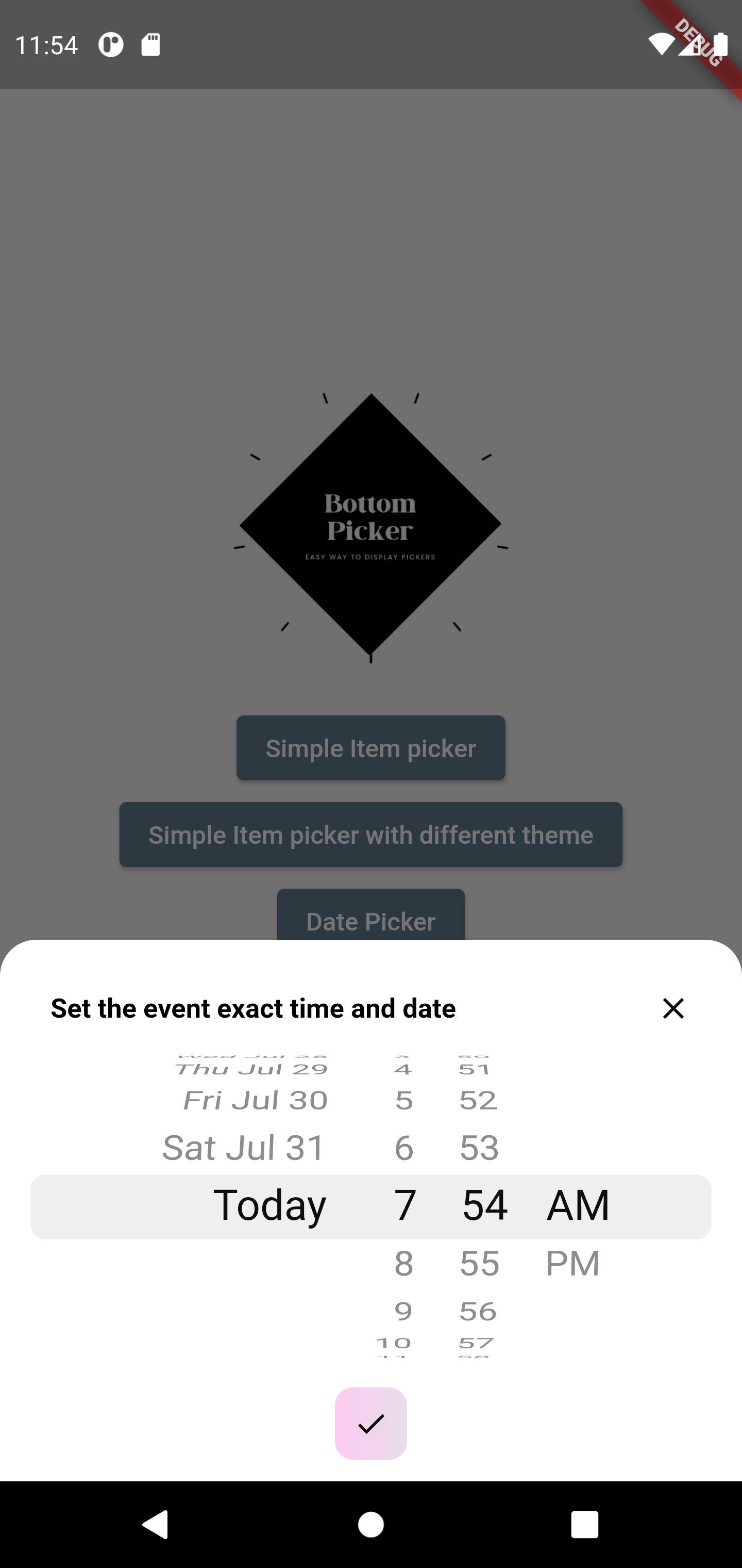 |
10 | | ------------------------------------------------------------------------------------------------------------------------------ | ----------------------------------------------------------------------------------------------------------------------- |
11 | |  | 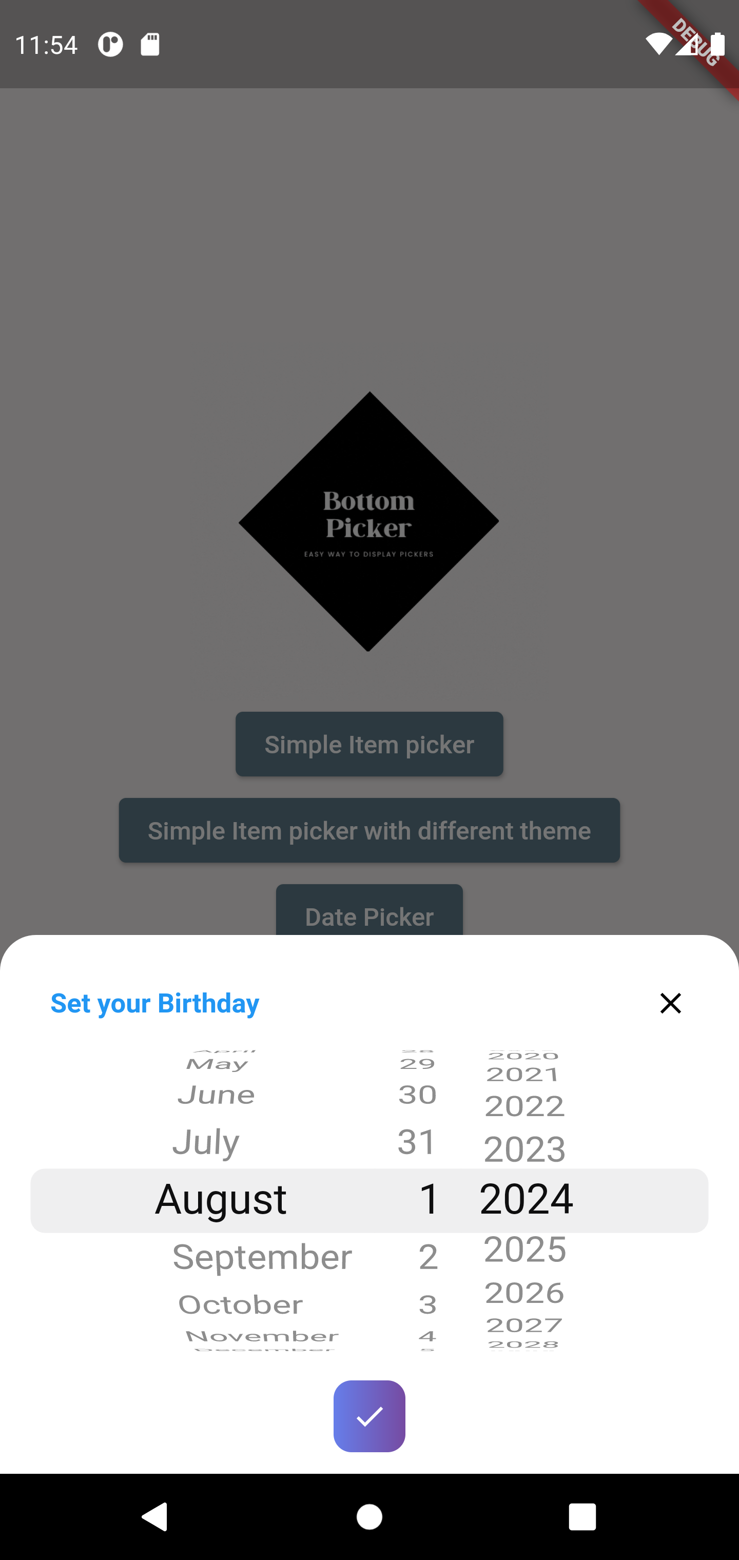 |
12 | | 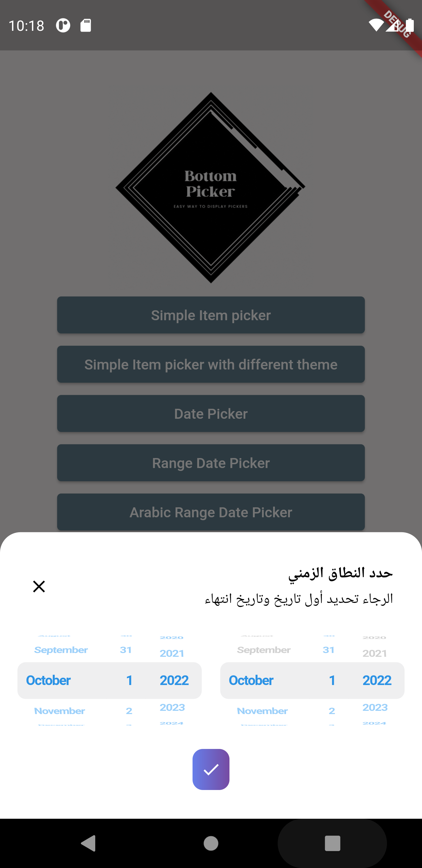 | 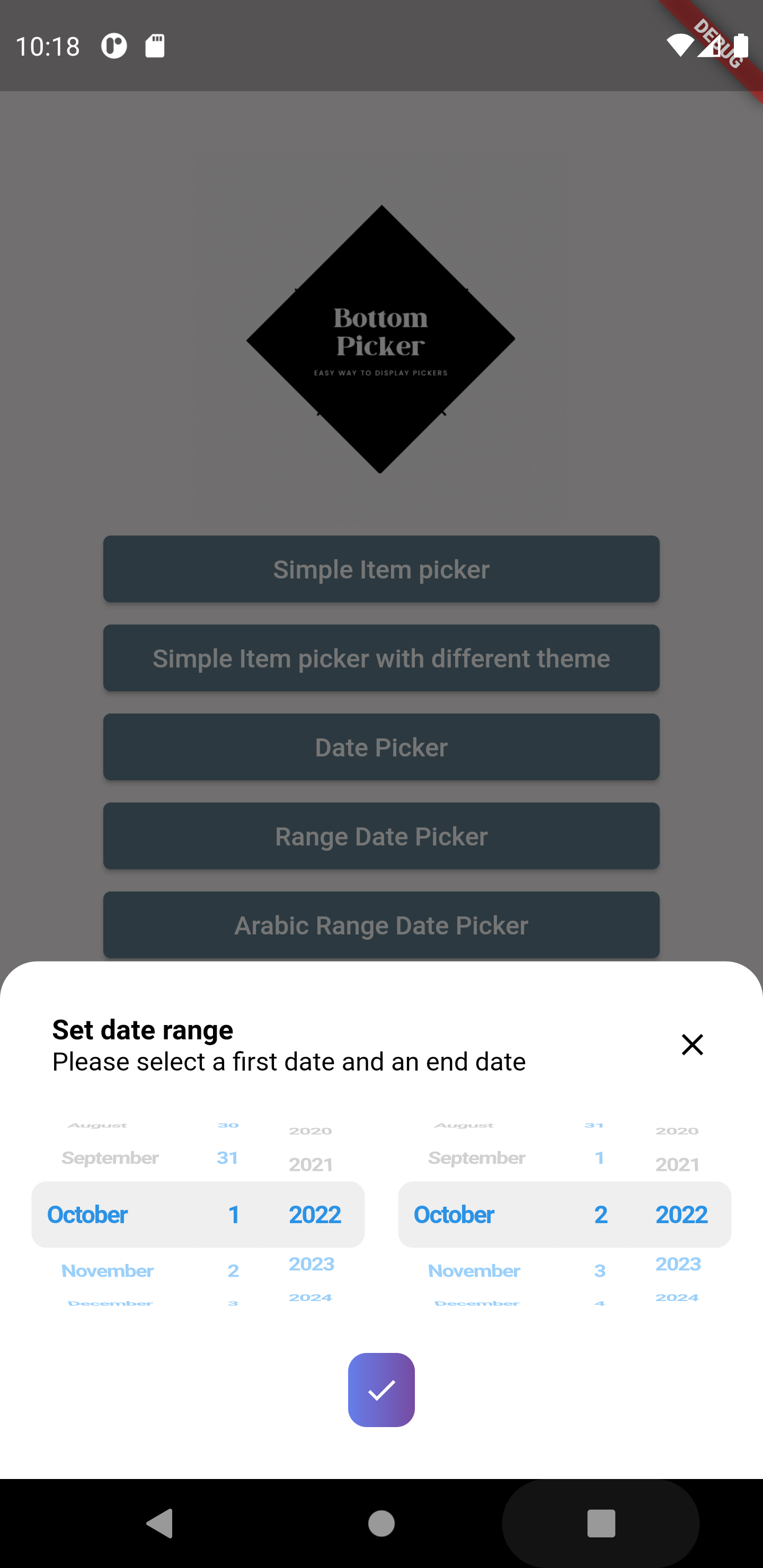 |
13 |
14 | ## Features
15 |
16 | ### Core Picker Types
17 |
18 | * Simple list picker wheel
19 | * Date picker
20 | * Dedicated Year picker
21 | * Month and year picker
22 | * Date range picker (RTL and LTR)
23 | * Time picker
24 | * Duration Timer picker
25 | * Date and Time picker
26 |
27 | ### Customization & Behavior
28 |
29 | * 24h / 12h time format support
30 | * Filter options for unpickable or blocked dates
31 | * Customizable header/title via an optional builder callback
32 | * Control auto-closing of the picker on submit
33 | * Customize confirm button
34 | * Customize first selected item
35 | * Customize background color
36 | * Customize date format order
37 | * Customize picker text style (color, font size, font weight, etc.)
38 | * Customize close button style and display
39 | * Customize layout orientation (LTR / RTL)
40 | * Customizable bottom picker height
41 | * Customizable `minuteInterval` attribute
42 |
43 | ### Platform Support & Theming
44 |
45 | * Fully support Web and Desktop platforms (using wheel views)
46 | * Built-in themes
47 | * Enhanced tablet view
48 |
49 | ## Getting Started
50 |
51 | To add bottom picker to your project add this line to your pubspec.yaml file
52 |
53 | ```yaml
54 | dependencies:
55 | bottom_picker: ^4.1.0
56 | ```
57 |
58 | ## Parameters
59 |
60 | ````dart
61 | /// Renders the header component of the bottom picker
62 | final Widget Function(BuildContext context)? headerBuilder;
63 |
64 | ///defines whether the bottom picker is dismissable or not
65 | ///by default it's set to false
66 | ///
67 | final bool dismissable;
68 |
69 | ///list of items (List of widgets) used to create simple item picker (required)
70 | ///and should not be empty or null
71 | ///
72 | ///for date/dateTime/time items parameter is not available
73 | ///
74 | late List? items;
75 |
76 | ///Nullable function, invoked when navigating between picker items
77 | ///whether it's date picker or simple item picker it will return a value DateTime or int(index)
78 | ///
79 | late Function(dynamic)? onChange;
80 |
81 | ///Nullable function invoked when clicking on submit button
82 | ///if the picker type is date/time/dateTime it will return DateTime value
83 | ///else it will return the index of the selected item
84 | ///
85 | late Function(dynamic)? onSubmit;
86 |
87 | /// Nullable function invoked when the picker get dismissed
88 | /// it will return the selected value
89 | late Function(dynamic)? onDismiss;
90 |
91 | ///set the theme of the bottom picker (the button theme)
92 | ///possible values
93 | ///```
94 | ///{
95 | ///blue,
96 | ///orange,
97 | ///temptingAzure,
98 | ///heavyRain,
99 | ///plumPlate,
100 | ///morningSalad
101 | ///}
102 | ///```
103 | final BottomPickerTheme bottomPickerTheme;
104 |
105 | ///used for simple bottom picker
106 | ///by default it's 0, needs to be in the range [0, this.items.length-1]
107 | ///otherwise an exception will be thrown
108 | ///for date and time picker type this parameter is not available
109 | ///
110 | late int selectedItemIndex;
111 |
112 | ///The initial date time applied on the date and time picker
113 | ///by default it's null
114 | ///
115 | DateTime? initialDateTime;
116 |
117 | ///The initial time set in the time picker widget
118 | ///required only when using the `time` constructor
119 | Time? initialTime;
120 |
121 | /// The initial duration set for the timer picker
122 | /// By default it's set to null so it's `Duration.zero`
123 | Duration? initialTimerDuration;
124 |
125 | /// The time picker mode "hm", "hms" or "ms"
126 | /// By default it's set to "hm"
127 | CupertinoTimerPickerMode? timerPickerMode;
128 |
129 | /// The timer seconds interval
130 | /// Cannot be less then 1
131 | ///
132 | /// Default value is 1.
133 | int timerSecondsInterval = 1;
134 |
135 | ///The max time can be set in the time picker widget
136 | Time? maxTime;
137 |
138 | ///The min time can be set in the time picker widget
139 | Time? minTime;
140 |
141 | ///The gap between two minutes
142 | ///by default it's 1 minute
143 | int minuteInterval = 1;
144 |
145 | ///the max date time on the date picker
146 | ///by default it's null
147 | DateTime? maxDateTime;
148 |
149 | ///the minimum date & time applied on the date picker
150 | ///by default it's null
151 | ///
152 | DateTime? minDateTime;
153 |
154 | ///define whether the time uses 24h or 12h format
155 | ///by default it's false (12h format)
156 | ///
157 | late bool use24hFormat;
158 |
159 | ///the padding that will be applied to the button
160 | ///if the padding is null the button will be rendered null
161 | final double? buttonPadding;
162 |
163 | ///the width that will be applied to the button
164 | ///if the buttonWidth is null the button will be rendered with null
165 | final double? buttonWidth;
166 |
167 | ///the bottom picker background color,
168 | ///by default it's white
169 | ///
170 | final Color backgroundColor;
171 |
172 | ///date order applied on date picker or date time picker
173 | ///by default it's YYYY/MM/DD
174 | DatePickerDateOrder? dateOrder;
175 |
176 | /// The picker theme data
177 | final CupertinoTextThemeData? pickerThemeData;
178 |
179 | ///define the picker item extent available only for list items picker
180 | ///by default it's 35
181 | late double itemExtent;
182 |
183 | ///the layout orientation of the bottom picker
184 | ///by default the orientation is set to LTR
185 | ///```
186 | ///LAYOUT_ORIENTATION.ltr,
187 | ///LAYOUT_ORIENTATION.rtl
188 | ///```
189 | TextDirection? layoutOrientation;
190 |
191 | ///THe alignment of the bottom picker button
192 | ///by default it's `MainAxisAlignment.center`
193 | final MainAxisAlignment buttonAlignment;
194 |
195 | ///bottom picker main widget height
196 | ///if it's null the bottom picker will get the height from
197 | ///[bottomPickerHeight] extension on context
198 | final double? height;
199 |
200 | ///invoked when pressing on the submit button when using range picker
201 | ///it return two dates (first date, end date)
202 | ///required when using [BottomPicker.range]
203 | late Function(DateTime, DateTime)? onRangeDateSubmitPressed;
204 |
205 | ///the minimum first date in the date range picker
206 | ///not required if null no minimum will be set in the date picker
207 | DateTime? minFirstDate;
208 |
209 | ///the minimum second date in the date range picker
210 | ///not required if null no minimum will be set in the date picker
211 | DateTime? minSecondDate;
212 |
213 | ///the maximum first date in the date range picker
214 | ///not required if null no minimum will be set in the date picker
215 | DateTime? maxFirstDate;
216 |
217 | ///the maximum second date in the date range picker
218 | ///not required if null no minimum will be set in the date picker
219 | DateTime? maxSecondDate;
220 |
221 | ///the initial first date in the date range picker
222 | ///not required if null no minimum will be set in the date picker
223 | DateTime? initialFirstDate;
224 |
225 | ///the initial last date in the date range picker
226 | ///not required if null no minimum will be set in the date picker
227 | DateTime? initialSecondDate;
228 |
229 | /// A widget overlaid on the picker to highlight the currently selected entry.
230 | /// The [selectionOverlay] widget drawn above the [CupertinoPicker]'s picker
231 | /// wheel.
232 | Widget? selectionOverlay;
233 |
234 | ///The button's widget that will be displayed
235 | ///if null the button will have a simple 'Select' text in the center
236 | final Widget? buttonContent;
237 |
238 | ///indicates if the submit button will be displayed or not
239 | ///by default the submit button is shown
240 | late bool displaySubmitButton;
241 |
242 | ///a single color will be applied to the button instead of the gradient
243 | ///themes
244 | ///
245 | final Color? buttonSingleColor;
246 |
247 | ///to set a custom button theme color use this list
248 | ///when it's not null it will be applied
249 | ///
250 | final List? gradientColors;
251 |
252 | /// The style that will be applied on the button's widget
253 | final BoxDecoration? buttonStyle;
254 |
255 | /// Invoked when pressing on the submit button when using range picker
256 | /// it return two dates (first time, end time)
257 | /// required when using [BottomPicker.rangeTime]
258 | late Function(DateTime, DateTime)? onRangeTimeSubmitPressed;
259 |
260 | /// Function invoked when the picker is dismissed used with range picker
261 | /// and time range picker.
262 | late Function(DateTime, DateTime)? onRangePickerDismissed;
263 |
264 | ///the minimum first time in the time range picker
265 | ///not required if null no minimum will be set in the time picker
266 | DateTime? minFirstTime;
267 |
268 | ///the minimum second time in the time range picker
269 | ///not required if null no minimum will be set in the time picker
270 | DateTime? minSecondTime;
271 |
272 | ///the maximum first time in the time range picker
273 | ///not required if null no minimum will be set in the time picker
274 | DateTime? maxFirstTime;
275 |
276 | ///the maximum second time in the time range picker
277 | ///not required if null no minimum will be set in the time picker
278 | DateTime? maxSecondTime;
279 |
280 | ///the initial first time in the time range picker
281 | ///not required if null no minimum will be set in the time picker
282 | DateTime? initialFirstTime;
283 |
284 | ///the initial last time in the time range picker
285 | ///not required if null no minimum will be set in the time picker
286 | DateTime? initialSecondTime;
287 |
288 | /// Indicates whether the time seperator (":") will be shown or not.
289 | bool showTimeSeparator = false;
290 |
291 | /// Indiacate whether the bottom picker will be closed (poped out of the Navigator)
292 | /// when the submit button is pressed.
293 | ///
294 | /// By default closeOnSubmit = true.
295 | bool? closeOnSubmit;
296 |
297 | /// The datepicker calendar type
298 | List calendarDays = CupertinoDatePickerWidget.fullWeek;
299 |
300 | /// The bottom picker selector diameter ratio.
301 | final double diameterRatio;
302 |
303 | /// A predicate that can be used to select which hours are selectable.
304 | SelectableHourPredicate? hourPredicate;
305 |
306 | /// Indicates whether to use SafeArea to avoid content overflow.
307 | final bool useSafeArea;
308 | ````
309 |
310 | ## Examples
311 |
312 | ### Simple item picker
313 |
314 | ```dart
315 | BottomPicker(
316 | items: items,
317 | headerBuilder: (context) {
318 | return Row(
319 | children: [
320 | Expanded(
321 | child: Text(
322 | 'Choose your country',
323 | style: TextStyle(
324 | fontWeight: FontWeight.bold,
325 | fontSize: 15,
326 | ),
327 | ),
328 | ),
329 | InkWell(
330 | onTap: () {
331 | Navigator.pop(context);
332 | },
333 | child: Icon(Icons.close),
334 | ),
335 | ],
336 | );
337 | },
338 | ).show(context);
339 | ```
340 |
341 | ### DateTime picker
342 |
343 | ```dart
344 | BottomPicker.date(
345 | headerBuilder: (context) {
346 | return Row(
347 | children: [
348 | Text(
349 | 'Set your Birthday',
350 | style: TextStyle(
351 | fontWeight: FontWeight.bold,
352 | fontSize: 15,
353 | color: Colors.blue,
354 | ),
355 | ),
356 | ],
357 | );
358 | },
359 | dateOrder: DatePickerDateOrder.dmy,
360 | initialDateTime: DateTime(1996, 10, 22),
361 | maxDateTime: DateTime(1998),
362 | minDateTime: DateTime(1980),
363 | onChange: (index) {
364 | print(index);
365 | },
366 | onSubmit: (index) {
367 | print(index);
368 | },
369 | onDismiss: (p0) {
370 | print(p0);
371 | },
372 | bottomPickerTheme: BottomPickerTheme.plumPlate,
373 | ).show(context);
374 | ```
375 |
376 | ### Year picker
377 |
378 | ```dart
379 | BottomPicker.year(
380 | headerBuilder: (context) {
381 | return Row(
382 | children: [
383 | Text(
384 | 'Set your Birthday Year',
385 | style: TextStyle(
386 | fontWeight: FontWeight.bold,
387 | fontSize: 15,
388 | color: Colors.blue,
389 | ),
390 | ),
391 | ],
392 | );
393 | },
394 | initialDateTime: DateTime(1996),
395 | maxDateTime: DateTime(1998),
396 | minDateTime: DateTime(1980),
397 | onChange: (index) {
398 | print(index);
399 | },
400 | onSubmit: (index) {
401 | print(index);
402 | Navigator.pop(context);
403 | },
404 | onDismiss: (p0) {
405 | print(p0);
406 | },
407 | bottomPickerTheme: BottomPickerTheme.plumPlate,
408 | ).show(context);
409 | ```
410 |
411 | ### Custom days picker
412 |
413 | ```dart
414 | BottomPicker.dateTime(
415 | headerBuilder: (context) {
416 | return Row(
417 | mainAxisAlignment: MainAxisAlignment.spaceBetween,
418 | children: [
419 | Text(
420 | 'Set the event exact time and date',
421 | style: TextStyle(
422 | fontWeight: FontWeight.bold,
423 | fontSize: 15,
424 | color: Colors.black,
425 | ),
426 | ),
427 | InkWell(
428 | onTap: () {
429 | print('Picker closed');
430 | Navigator.pop(context);
431 | },
432 | child: Text(
433 | 'close',
434 | style: TextStyle(
435 | decoration: TextDecoration.underline,
436 | ),
437 | ),
438 | ),
439 | ],
440 | );
441 | },
442 | onSubmit: (date) {
443 | print(date);
444 | },
445 | calendarDays: CupertinoDatePickerWidget.workDays,
446 | ).show(context);
447 | ```
448 |
449 | ## Contributing
450 |
451 | We warmly welcome contributions to the `bottom_picker` package! Your help in making it even better is highly appreciated.
452 |
453 | **How you can contribute:**
454 |
455 | * **Found a bug?** Please [open a new issue](https://github.com/koukibadr/Bottom-Picker/issues/new?assignees=&labels=bug&template=bug_report.md&title=) with clear steps to reproduce the problem. The more detail you provide, the easier it will be to fix.
456 | * **Have a great idea for a new feature?** We'd love to hear it! Please [open a new issue](https://github.com/koukibadr/Bottom-Picker/issues/new?assignees=&labels=enhancement&template=feature_request.md&title=) to discuss your suggestion. Explain the use case and how it would benefit users.
457 | * **Want to get your hands dirty and contribute code?** Fantastic! Here's how:
458 | 1. Fork the [repository](https://github.com/koukibadr/Bottom-Picker).
459 | 2. Create a new branch for your feature or bug fix.
460 | 3. Make your changes, ensuring you follow the project's coding style and conventions.
461 | 4. Write clear and concise commit messages.
462 | 5. Submit a [pull request](https://github.com/koukibadr/Bottom-Picker/pulls) with a detailed description of your changes and why they should be merged.
463 |
464 | We'll review your contributions and provide feedback as soon as possible. Thank you for your interest in improving `bottom_picker`!
465 |
466 | ## Bottom Picker Heros
467 |
468 |
469 |  470 |
471 |
--------------------------------------------------------------------------------
470 |
471 |
--------------------------------------------------------------------------------