├── .DS_Store
├── .github
└── workflows
│ ├── npm-publish-github-packages.yml
│ └── webpack.yml
├── .gitignore
├── .idea
├── .gitignore
├── misc.xml
├── modules.xml
├── react-native-accordion-list.iml
└── vcs.xml
├── .prettierrc
├── LICENSE
├── README.md
├── examples
├── android.gif
├── demo.gif
├── ios.gif
└── singleSelect.gif
├── lib
├── .DS_Store
├── animations
│ ├── toggleAnimation.d.ts
│ ├── toggleAnimation.js
│ └── toggleAnimation.js.map
├── components
│ ├── .DS_Store
│ ├── AccordionItem
│ │ ├── index.d.ts
│ │ ├── index.js
│ │ ├── index.js.map
│ │ ├── styles.d.ts
│ │ ├── styles.js
│ │ └── styles.js.map
│ └── AccordionList
│ │ ├── index.d.ts
│ │ ├── index.js
│ │ └── index.js.map
├── index.d.ts
├── index.js
├── index.js.map
└── models
│ ├── AccordionItem.d.ts
│ ├── AccordionItem.js
│ ├── AccordionItem.js.map
│ ├── AccordionList.d.ts
│ ├── AccordionList.js
│ ├── AccordionList.js.map
│ ├── AccordionPressable.d.ts
│ ├── AccordionPressable.js
│ └── AccordionPressable.js.map
├── package-lock.json
├── package.json
├── src
├── .DS_Store
├── README.md
├── animations
│ └── toggleAnimation.tsx
├── components
│ ├── .DS_Store
│ ├── AccordionItem
│ │ ├── index.tsx
│ │ └── styles.tsx
│ └── AccordionList
│ │ └── index.tsx
├── index.tsx
└── models
│ ├── AccordionItem.tsx
│ ├── AccordionList.tsx
│ └── AccordionPressable.tsx
├── tsconfig.json
└── tslint.json
/.DS_Store:
--------------------------------------------------------------------------------
https://raw.githubusercontent.com/louaySleman/react-native-accordion-list-view/a35573fc0beb36e31851c0513cbe0a05700df022/.DS_Store
--------------------------------------------------------------------------------
/.github/workflows/npm-publish-github-packages.yml:
--------------------------------------------------------------------------------
1 | # This workflow will run tests using node and then publish a package to GitHub Packages when a release is created
2 | # For more information see: https://help.github.com/actions/language-and-framework-guides/publishing-nodejs-packages
3 |
4 | name: Node.js Package
5 |
6 | on:
7 | release:
8 | types: [created]
9 |
10 | jobs:
11 | build:
12 | runs-on: ubuntu-latest
13 | steps:
14 | - uses: actions/checkout@v3
15 | - uses: actions/setup-node@v3
16 | with:
17 | node-version: 16
18 | - run: npm ci
19 | - run: npm test
20 |
21 | publish-gpr:
22 | needs: build
23 | runs-on: ubuntu-latest
24 | permissions:
25 | contents: read
26 | packages: write
27 | steps:
28 | - uses: actions/checkout@v3
29 | - uses: actions/setup-node@v3
30 | with:
31 | node-version: 16
32 | registry-url: https://npm.pkg.github.com/
33 | - run: npm ci
34 | - run: npm publish
35 | env:
36 | NODE_AUTH_TOKEN: ${{secrets.GITHUB_TOKEN}}
37 |
--------------------------------------------------------------------------------
/.github/workflows/webpack.yml:
--------------------------------------------------------------------------------
1 | name: NodeJS with Webpack
2 |
3 | on:
4 | push:
5 | branches: [ main ]
6 | pull_request:
7 | branches: [ main ]
8 |
9 | jobs:
10 | build:
11 | runs-on: ubuntu-latest
12 |
13 | strategy:
14 | matrix:
15 | node-version: [12.x, 14.x, 16.x]
16 |
17 | steps:
18 | - uses: actions/checkout@v3
19 |
20 | - name: Use Node.js ${{ matrix.node-version }}
21 | uses: actions/setup-node@v3
22 | with:
23 | node-version: ${{ matrix.node-version }}
24 |
25 | - name: Build
26 | run: |
27 | npm install
28 | npx webpack
29 |
--------------------------------------------------------------------------------
/.gitignore:
--------------------------------------------------------------------------------
1 | node_modules
2 |
--------------------------------------------------------------------------------
/.idea/.gitignore:
--------------------------------------------------------------------------------
1 | # Default ignored files
2 | /shelf/
3 | /workspace.xml
4 | # Editor-based HTTP Client requests
5 | /httpRequests/
6 | # Datasource local storage ignored files
7 | /dataSources/
8 | /dataSources.local.xml
9 |
--------------------------------------------------------------------------------
/.idea/misc.xml:
--------------------------------------------------------------------------------
1 |
2 |
3 |
4 |
5 |
--------------------------------------------------------------------------------
/.idea/modules.xml:
--------------------------------------------------------------------------------
1 |
2 |
3 |
4 |
5 |
6 |
7 |
8 |
--------------------------------------------------------------------------------
/.idea/react-native-accordion-list.iml:
--------------------------------------------------------------------------------
1 |
2 |
3 |
4 |
5 |
6 |
7 |
8 |
9 |
--------------------------------------------------------------------------------
/.idea/vcs.xml:
--------------------------------------------------------------------------------
1 |
2 |
3 |
4 |
5 |
6 |
--------------------------------------------------------------------------------
/.prettierrc:
--------------------------------------------------------------------------------
1 | {
2 | "printWidth": 120,
3 | "trailingComma": "all",
4 | "singleQuote": true
5 | }
6 |
--------------------------------------------------------------------------------
/LICENSE:
--------------------------------------------------------------------------------
1 | MIT License
2 |
3 | Copyright (c) 2022 louaySleman
4 |
5 | Permission is hereby granted, free of charge, to any person obtaining a copy
6 | of this software and associated documentation files (the "Software"), to deal
7 | in the Software without restriction, including without limitation the rights
8 | to use, copy, modify, merge, publish, distribute, sublicense, and/or sell
9 | copies of the Software, and to permit persons to whom the Software is
10 | furnished to do so, subject to the following conditions:
11 |
12 | The above copyright notice and this permission notice shall be included in all
13 | copies or substantial portions of the Software.
14 |
15 | THE SOFTWARE IS PROVIDED "AS IS", WITHOUT WARRANTY OF ANY KIND, EXPRESS OR
16 | IMPLIED, INCLUDING BUT NOT LIMITED TO THE WARRANTIES OF MERCHANTABILITY,
17 | FITNESS FOR A PARTICULAR PURPOSE AND NONINFRINGEMENT. IN NO EVENT SHALL THE
18 | AUTHORS OR COPYRIGHT HOLDERS BE LIABLE FOR ANY CLAIM, DAMAGES OR OTHER
19 | LIABILITY, WHETHER IN AN ACTION OF CONTRACT, TORT OR OTHERWISE, ARISING FROM,
20 | OUT OF OR IN CONNECTION WITH THE SOFTWARE OR THE USE OR OTHER DEALINGS IN THE
21 | SOFTWARE.
22 |
--------------------------------------------------------------------------------
/README.md:
--------------------------------------------------------------------------------
1 | ## react-native-accordion-list-view
2 | A high performance, beautiful and fully customizable Accordion list for React Native.
3 | Implemented using [react-native-vector-icons](https://github.com/oblador/react-native-vector-icons).
4 |
5 |
6 |
7 |  8 |
8 |  9 |
9 |
10 |
11 |
12 |  13 |
13 |  14 |
15 |
14 |
15 |
16 |
17 | ## Getting started
18 | ```js
19 | npm install react-native-accordion-list-view --save
20 | ```
21 | or
22 | ```js
23 | yarn add react-native-accordion-list-view
24 | ```
25 | Now we need to install [react-native-vector-icons](https://github.com/oblador/react-native-vector-icons).
26 |
27 | ```js
28 | npm install react-native-vector-icons --save
29 | ```
30 | or
31 | ```js
32 | yarn add react-native-vector-icons
33 | ```
34 |
35 | ## Platforms Supported
36 |
37 | - [x] iOS
38 | - [x] Android
39 |
40 | ## Important Note
41 | This plugin work with Layout Animation and In order to get this to work on Android you need to set the following flags via UIManager:
42 | ```javascript
43 | if (Platform.OS === 'android') {
44 | if (UIManager.setLayoutAnimationEnabledExperimental) {
45 | UIManager.setLayoutAnimationEnabledExperimental(true);
46 | }
47 | }
48 | ```
49 |
50 | ### Demo
51 |
52 |
53 | 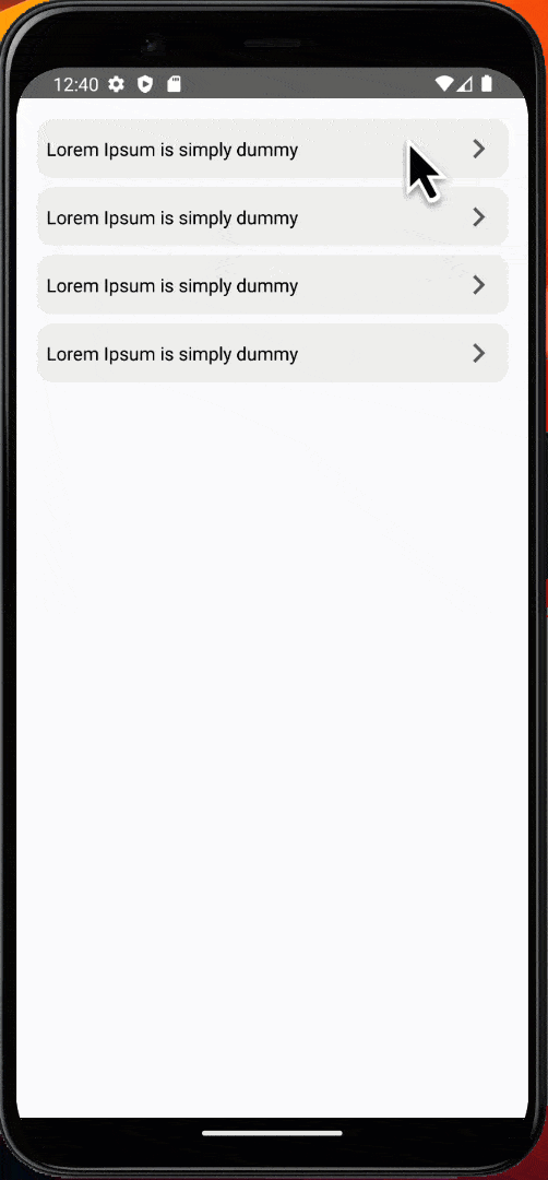 54 |
54 |
55 |
56 | 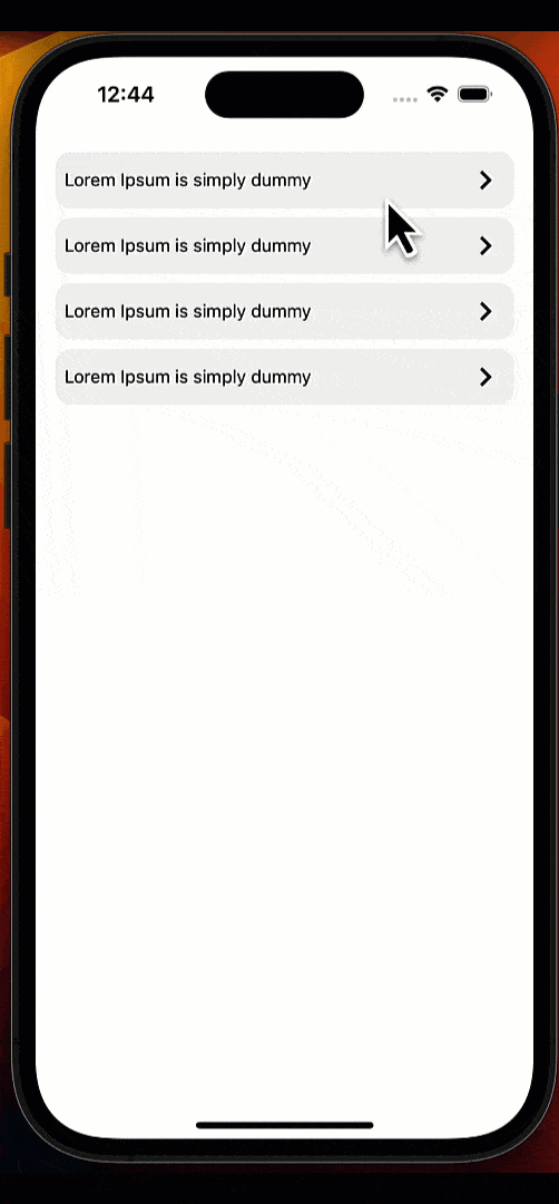 57 |
57 |
58 |
7 |
8 |
9 |
10 |
11 |
12 |
13 |
14 |
15 |
16 |
17 | ## Getting started
18 | ```js
19 | npm install react-native-accordion-list-view --save
20 | ```
21 | or
22 | ```js
23 | yarn add react-native-accordion-list-view
24 | ```
25 | Now we need to install [react-native-vector-icons](https://github.com/oblador/react-native-vector-icons).
26 |
27 | ```js
28 | npm install react-native-vector-icons --save
29 | ```
30 | or
31 | ```js
32 | yarn add react-native-vector-icons
33 | ```
34 |
35 | ## Platforms Supported
36 |
37 | - [x] iOS
38 | - [x] Android
39 |
40 | ## Important Note
41 | This plugin work with Layout Animation and In order to get this to work on Android you need to set the following flags via UIManager:
42 | ```javascript
43 | if (Platform.OS === 'android') {
44 | if (UIManager.setLayoutAnimationEnabledExperimental) {
45 | UIManager.setLayoutAnimationEnabledExperimental(true);
46 | }
47 | }
48 | ```
49 |
50 | ### Demo
51 |
52 |
53 |
54 |
55 |
56 |
57 |
58 |