20 |
41 | );
42 | };
43 |
44 | export default Examples;
45 |
--------------------------------------------------------------------------------
/examples/src/CustomIndicator.tsx:
--------------------------------------------------------------------------------
1 | import React from 'react';
2 | // eslint-disable-next-line @typescript-eslint/ban-ts-comment
3 | // @ts-expect-error
4 | import ProgressBar from 'react-customizable-progressbar';
5 | import { ExampleProps } from './Examples';
6 |
7 | const CustomIndicator = ({ progress }: ExampleProps) => (
8 |
21 |
30 |
31 | Progress
22 | setProgress(parseInt(e.target.value, 10))}
26 | min={0}
27 | max={100}
28 | />
29 |
32 |
40 |
9 |
35 |
44 |
45 | );
46 |
47 | export default CustomIndicator;
48 |
--------------------------------------------------------------------------------
/package.json:
--------------------------------------------------------------------------------
1 | {
2 | "name": "react-customizable-progressbar",
3 | "version": "2.1.1",
4 | "description": "Customizable circular SVG progress bar component for React",
5 | "main": "./dist/index.cjs.js",
6 | "module": "./dist/index.es.js",
7 | "types": "./dist/index.d.ts",
8 | "exports:": {
9 | "import": "./dist/index.es.js",
10 | "require": "./dist/index.cjs.js"
11 | },
12 | "files": [
13 | "dist"
14 | ],
15 | "scripts": {
16 | "lint": "eslint src --ext ts,tsx",
17 | "build:library": "vite build --config vite.config.library.ts",
18 | "dev:examples": "vite --config vite.config.examples.ts"
19 | },
20 | "repository": {
21 | "type": "git",
22 | "url": "git+https://github.com/martyan/react-customizable-progressbar.git"
23 | },
24 | "keywords": [
25 | "react",
26 | "circular",
27 | "progress",
28 | "bar",
29 | "component",
30 | "customizable",
31 | "svg",
32 | "animation"
33 | ],
34 | "homepage": "https://martinjuzl.com/react-customizable-progressbar",
35 | "author": "Martin Juzl",
36 | "license": "MIT",
37 | "devDependencies": {
38 | "@types/react": "^18.3.23",
39 | "@types/react-dom": "^18.3.7",
40 | "@typescript-eslint/eslint-plugin": "^8.0.0",
41 | "@typescript-eslint/parser": "^8.0.0",
42 | "@vitejs/plugin-react": "^3.1.0",
43 | "autoprefixer": "^10.4.12",
44 | "eslint": "^8.57.0",
45 | "eslint-config-prettier": "^9.1.0",
46 | "eslint-plugin-prettier": "^5.2.1",
47 | "eslint-plugin-react": "^7.32.1",
48 | "moment": "^2.30.1",
49 | "postcss": "^8.4.16",
50 | "postcss-loader": "^7.0.1",
51 | "prettier": "^3.3.3",
52 | "react": "^18.3.1",
53 | "react-dom": "^18.3.1",
54 | "sass": "^1.77.8",
55 | "typescript": "^5.2.2",
56 | "vite": "^4.5.0",
57 | "vite-plugin-dts": "^4.3.0",
58 | "vite-plugin-eslint": "^1.6.0"
59 | },
60 | "peerDependencies": {
61 | "react": "^16.14.0 || ^17.0.0 || ^18.0.0 || ^19.0.0",
62 | "react-dom": "^16.14.0 || ^17.0.0 || ^18.0.0 || ^19.0.0"
63 | }
64 | }
65 |
--------------------------------------------------------------------------------
/examples/src/Examples.scss:
--------------------------------------------------------------------------------
1 | @import url('https://fonts.googleapis.com/css?family=Roboto:300,400,500');
2 | @import url('https://maxcdn.bootstrapcdn.com/font-awesome/4.7.0/css/font-awesome.min.css');
3 |
4 | .examples {
5 | font-family: 'Roboto', sans-serif;
6 |
7 | .slider {
8 | max-width: 280px;
9 | display: none;
10 | margin: 30px auto;
11 | justify-content: space-between;
12 | align-items: center;
13 |
14 | .desc {
15 | display: inline-block;
16 | font-size: 1.05em;
17 | color: #777;
18 | font-weight: 300;
19 | }
20 |
21 | input {
22 | display: inline-block;
23 | }
24 |
25 | @media (min-width: 480px) {
26 | display: flex;
27 | }
28 | }
29 |
30 | .list {
31 | display: flex;
32 | flex-wrap: wrap;
33 | justify-content: center;
34 |
35 | .item {
36 | flex-basis: 236px;
37 | flex-shrink: 0;
38 | flex-grow: 0;
39 | padding: 5px 15px;
40 | background-color: white;
41 | border-radius: 5px;
42 | margin: 30px;
43 |
44 | .title {
45 | display: flex;
46 | justify-content: space-between;
47 | align-items: center;
48 | padding: 15px 5px;
49 | margin-bottom: 20px;
50 | font-weight: 400;
51 | text-transform: uppercase;
52 | color: #666;
53 | border-bottom: 1px solid #f5f5f5;
54 | font-size: 0.9em;
55 |
56 | span {
57 | flex: 1;
58 | margin-right: 10px;
59 | }
60 |
61 | a {
62 | text-decoration: none;
63 | color: #ccc;
64 | font-size: 0.9em;
65 | }
66 | }
67 |
68 | .indicator {
69 | display: flex;
70 | align-items: center;
71 | justify-content: center;
72 | text-align: center;
73 | position: absolute;
74 | top: 0;
75 | width: 100%;
76 | height: 100%;
77 | margin: 0 auto;
78 | font-size: 2.2em;
79 | font-weight: 100;
80 | color: #555;
81 | user-select: none;
82 | }
83 |
84 | .indicator-volume {
85 | display: flex;
86 | align-items: flex-end;
87 | justify-content: center;
88 | text-align: center;
89 | position: absolute;
90 | top: 0;
91 | width: 100%;
92 | height: 100%;
93 | margin: 0 auto;
94 | font-size: 1.3em;
95 |
96 | .inner {
97 | margin-bottom: 30px;
98 | }
99 |
100 | .percentage {
101 | font-size: 1.6em;
102 | color: #bbb;
103 | font-weight: 100;
104 | }
105 |
106 | .icon {
107 | font-size: 3em;
108 | color: #5d9cec;
109 | margin-bottom: 15px;
110 | }
111 | }
112 | }
113 | }
114 | }
115 |
--------------------------------------------------------------------------------
/examples/src/Countdown.tsx:
--------------------------------------------------------------------------------
1 | import React, { useState } from 'react';
2 | // eslint-disable-next-line @typescript-eslint/ban-ts-comment
3 | // @ts-expect-error
4 | import ProgressBar from 'react-customizable-progressbar';
5 | import moment, { Moment } from 'moment';
6 | import Timer from './Timer';
7 | import './Countdown.scss';
8 |
9 | const totalSeconds = 60;
10 | const initialSeconds = 15;
11 | const initialProgress = (initialSeconds / totalSeconds) * 100;
12 |
13 | const getText = (date: Moment) => {
14 | const h = date.hour();
15 | const m = date.minute();
16 |
17 | if (h) return date.format('h[h] m[m] s[s]');
18 | else if (m) return date.format('m[m] s[s]');
19 | else return date.format('s[s]');
20 | };
21 |
22 | interface IndicatorProps {
23 | elapsedSeconds: number;
24 | }
25 |
26 | const Indicator = ({ elapsedSeconds }: IndicatorProps) => {
27 | const seconds = totalSeconds - elapsedSeconds - initialSeconds;
28 | const date = moment().startOf('day').seconds(seconds);
29 |
30 | return (
31 |
10 | Custom indicator
11 |
15 | code
16 |
17 |
18 |
19 |
36 |
43 |
37 |
42 |
38 |
39 |
40 | {progress}%
41 |
32 |
41 | );
42 | };
43 |
44 | const Countdown = () => {
45 | const [elapsedSeconds, setElapsedSeconds] = useState(0);
46 | const [progress, setProgress] = useState(initialProgress);
47 |
48 | const roundProgress = (progress: number) => {
49 | const factor = Math.pow(10, 2);
50 | return Math.round(progress * factor) / factor;
51 | };
52 |
53 | const handleTimer = (elapsedSeconds: number) => {
54 | const progress = roundProgress(
55 | ((elapsedSeconds + initialSeconds) / totalSeconds) * 100
56 | );
57 |
58 | setProgress(progress);
59 | setElapsedSeconds(elapsedSeconds);
60 | };
61 |
62 | return (
63 |
33 |
40 | 0 ? 'caption' : 'caption big'}>
34 | Popcorn ready in
35 |
36 | 0 ? 'time' : 'time hidden'}>
37 | {getText(date)}
38 |
39 |
64 |
99 | );
100 | };
101 |
102 | export default Countdown;
103 |
--------------------------------------------------------------------------------
/README.md:
--------------------------------------------------------------------------------
1 | # react-customizable-progressbar
2 |
3 | Customizable circular SVG progress bar component for React
4 |
5 |
65 | Countdown
66 |
71 | code
72 |
73 |
74 |
75 |
76 |
88 |
90 |
91 |
98 | 6 |
7 | 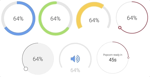 8 |
8 |
10 | 11 | Check examples or generator to play around with all props 12 | 13 | ### Installation 14 | 15 | ```bash 16 | npm install --save react-customizable-progressbar 17 | ``` 18 | 19 | or 20 | 21 | ```bash 22 | yarn add react-customizable-progressbar 23 | ``` 24 | 25 | ### Usage 26 | 27 | ```jsx 28 | import ProgressBar from 'react-customizable-progressbar'; 29 | 30 |
146 |
203 |
204 | {children || null}
205 |
206 | );
207 | };
208 |
209 | const defaultProps: ReactCustomizableProgressbarProps = {
210 | radius: 100,
211 | progress: 0,
212 | steps: 100,
213 | cut: 0,
214 | rotate: -90,
215 | strokeWidth: 20,
216 | strokeColor: 'indianred',
217 | fillColor: 'none',
218 | strokeLinecap: 'round',
219 | transition: '.3s ease',
220 | pointerRadius: 0,
221 | pointerStrokeWidth: 20,
222 | pointerStrokeColor: 'indianred',
223 | pointerFillColor: 'white',
224 | trackStrokeColor: '#e6e6e6',
225 | trackStrokeWidth: 20,
226 | trackStrokeLinecap: 'round',
227 | trackTransition: '.3s ease',
228 | counterClockwise: false,
229 | inverse: false,
230 | initialAnimation: false,
231 | initialAnimationDelay: 0,
232 | className: '',
233 | };
234 |
235 | export default Index;
236 |
--------------------------------------------------------------------------------