├── examples
├── responsive-screen
│ ├── .watchmanconfig
│ ├── app.json
│ ├── .babelrc
│ ├── App.test.js
│ ├── .gitignore
│ ├── package.json
│ ├── README.md
│ └── App.js
├── responsive-screen-orientation-change
│ ├── .watchmanconfig
│ ├── app.json
│ ├── .babelrc
│ ├── App.test.js
│ ├── .gitignore
│ ├── package.json
│ ├── README.md
│ └── App.js
└── responsive-screen-styled-components
│ ├── .watchmanconfig
│ ├── app.json
│ ├── .babelrc
│ ├── App.test.js
│ ├── .gitignore
│ ├── README.md
│ ├── package.json
│ └── App.js
├── .github
└── FUNDING.yml
├── index.d.ts
├── index.js.flow
├── LICENSE
├── package.json
├── index.js
├── README.ptbr.md
└── README.md
/examples/responsive-screen/.watchmanconfig:
--------------------------------------------------------------------------------
1 | {}
2 |
--------------------------------------------------------------------------------
/examples/responsive-screen-orientation-change/.watchmanconfig:
--------------------------------------------------------------------------------
1 | {}
2 |
--------------------------------------------------------------------------------
/examples/responsive-screen-styled-components/.watchmanconfig:
--------------------------------------------------------------------------------
1 | {}
2 |
--------------------------------------------------------------------------------
/examples/responsive-screen/app.json:
--------------------------------------------------------------------------------
1 | {
2 | "expo": {
3 | "sdkVersion": "27.0.0"
4 | }
5 | }
6 |
--------------------------------------------------------------------------------
/.github/FUNDING.yml:
--------------------------------------------------------------------------------
1 | # These are supported funding model platforms
2 |
3 | custom: ['https://www.paypal.me/jeevium']
4 |
--------------------------------------------------------------------------------
/examples/responsive-screen-orientation-change/app.json:
--------------------------------------------------------------------------------
1 | {
2 | "expo": {
3 | "sdkVersion": "27.0.0"
4 | }
5 | }
6 |
--------------------------------------------------------------------------------
/examples/responsive-screen-styled-components/app.json:
--------------------------------------------------------------------------------
1 | {
2 | "expo": {
3 | "sdkVersion": "27.0.0"
4 | }
5 | }
6 |
--------------------------------------------------------------------------------
/examples/responsive-screen/.babelrc:
--------------------------------------------------------------------------------
1 | {
2 | "presets": ["babel-preset-expo"],
3 | "env": {
4 | "development": {
5 | "plugins": ["transform-react-jsx-source"]
6 | }
7 | }
8 | }
9 |
--------------------------------------------------------------------------------
/examples/responsive-screen-orientation-change/.babelrc:
--------------------------------------------------------------------------------
1 | {
2 | "presets": ["babel-preset-expo"],
3 | "env": {
4 | "development": {
5 | "plugins": ["transform-react-jsx-source"]
6 | }
7 | }
8 | }
9 |
--------------------------------------------------------------------------------
/examples/responsive-screen-styled-components/.babelrc:
--------------------------------------------------------------------------------
1 | {
2 | "presets": ["babel-preset-expo"],
3 | "env": {
4 | "development": {
5 | "plugins": ["transform-react-jsx-source"]
6 | }
7 | }
8 | }
9 |
--------------------------------------------------------------------------------
/examples/responsive-screen/App.test.js:
--------------------------------------------------------------------------------
1 | import React from 'react';
2 | import App from './App';
3 |
4 | import renderer from 'react-test-renderer';
5 |
6 | it('renders without crashing', () => {
7 | const rendered = renderer.create().toJSON();
8 | expect(rendered).toBeTruthy();
9 | });
10 |
--------------------------------------------------------------------------------
/examples/responsive-screen-orientation-change/App.test.js:
--------------------------------------------------------------------------------
1 | import React from 'react';
2 | import App from './App';
3 |
4 | import renderer from 'react-test-renderer';
5 |
6 | it('renders without crashing', () => {
7 | const rendered = renderer.create().toJSON();
8 | expect(rendered).toBeTruthy();
9 | });
10 |
--------------------------------------------------------------------------------
/examples/responsive-screen-styled-components/App.test.js:
--------------------------------------------------------------------------------
1 | import React from 'react';
2 | import App from './App';
3 |
4 | import renderer from 'react-test-renderer';
5 |
6 | it('renders without crashing', () => {
7 | const rendered = renderer.create().toJSON();
8 | expect(rendered).toBeTruthy();
9 | });
10 |
--------------------------------------------------------------------------------
/examples/responsive-screen/.gitignore:
--------------------------------------------------------------------------------
1 | # See https://help.github.com/ignore-files/ for more about ignoring files.
2 |
3 | # expo
4 | .expo/
5 |
6 | # dependencies
7 | /node_modules
8 |
9 | # misc
10 | .env.local
11 | .env.development.local
12 | .env.test.local
13 | .env.production.local
14 |
15 | npm-debug.log*
16 | yarn-debug.log*
17 | yarn-error.log*
18 |
--------------------------------------------------------------------------------
/examples/responsive-screen-orientation-change/.gitignore:
--------------------------------------------------------------------------------
1 | # See https://help.github.com/ignore-files/ for more about ignoring files.
2 |
3 | # expo
4 | .expo/
5 |
6 | # dependencies
7 | /node_modules
8 |
9 | # misc
10 | .env.local
11 | .env.development.local
12 | .env.test.local
13 | .env.production.local
14 |
15 | npm-debug.log*
16 | yarn-debug.log*
17 | yarn-error.log*
18 |
--------------------------------------------------------------------------------
/examples/responsive-screen-styled-components/.gitignore:
--------------------------------------------------------------------------------
1 | # See https://help.github.com/ignore-files/ for more about ignoring files.
2 |
3 | # expo
4 | .expo/
5 |
6 | # dependencies
7 | /node_modules
8 |
9 | # misc
10 | .env.local
11 | .env.development.local
12 | .env.test.local
13 | .env.production.local
14 |
15 | npm-debug.log*
16 | yarn-debug.log*
17 | yarn-error.log*
18 |
--------------------------------------------------------------------------------
/index.d.ts:
--------------------------------------------------------------------------------
1 | declare module 'react-native-responsive-screen' {
2 | import { Component } from 'react';
3 |
4 | export function widthPercentageToDP(widthPercent: string | number): number;
5 | export function heightPercentageToDP(heightPercent: string | number): number;
6 | export function listenOrientationChange(screenClassComponent: Component): void;
7 | export function removeOrientationListener(): void;
8 | }
9 |
--------------------------------------------------------------------------------
/index.js.flow:
--------------------------------------------------------------------------------
1 | // @flow
2 |
3 | import type { Component } from "react";
4 |
5 | declare export function widthPercentageToDP(
6 | widthPercent: string | number
7 | ): number;
8 |
9 | declare export function heightPercentageToDP(
10 | heightPercent: string | number
11 | ): number;
12 |
13 | declare export function listenOrientationChange(
14 | screenClassComponent: Component
15 | ): void;
16 |
17 | declare export function removeOrientationListener(): void;
18 |
--------------------------------------------------------------------------------
/examples/responsive-screen/package.json:
--------------------------------------------------------------------------------
1 | {
2 | "name": "responsive-screen",
3 | "version": "0.1.0",
4 | "private": true,
5 | "devDependencies": {
6 | "react-native-scripts": "1.14.0",
7 | "jest-expo": "~27.0.0",
8 | "react-test-renderer": "16.3.1"
9 | },
10 | "main": "./node_modules/react-native-scripts/build/bin/crna-entry.js",
11 | "scripts": {
12 | "start": "react-native-scripts start",
13 | "eject": "react-native-scripts eject",
14 | "android": "react-native-scripts android",
15 | "ios": "react-native-scripts ios",
16 | "test": "jest"
17 | },
18 | "jest": {
19 | "preset": "jest-expo"
20 | },
21 | "dependencies": {
22 | "expo": "^27.0.1",
23 | "react": "16.3.1",
24 | "react-native": "~0.55.2",
25 | "react-native-responsive-screen": "^1.1.1"
26 | }
27 | }
28 |
--------------------------------------------------------------------------------
/examples/responsive-screen-orientation-change/package.json:
--------------------------------------------------------------------------------
1 | {
2 | "name": "responsive-screen-orientation-change",
3 | "version": "0.1.0",
4 | "private": true,
5 | "devDependencies": {
6 | "react-native-scripts": "1.14.0",
7 | "jest-expo": "~27.0.0",
8 | "react-test-renderer": "16.3.1"
9 | },
10 | "main": "./node_modules/react-native-scripts/build/bin/crna-entry.js",
11 | "scripts": {
12 | "start": "react-native-scripts start",
13 | "eject": "react-native-scripts eject",
14 | "android": "react-native-scripts android",
15 | "ios": "react-native-scripts ios",
16 | "test": "jest"
17 | },
18 | "jest": {
19 | "preset": "jest-expo"
20 | },
21 | "dependencies": {
22 | "expo": "^27.0.1",
23 | "react": "16.3.1",
24 | "react-native": "~0.55.2",
25 | "react-native-responsive-screen": "^1.1.2"
26 | }
27 | }
28 |
--------------------------------------------------------------------------------
/examples/responsive-screen-styled-components/README.md:
--------------------------------------------------------------------------------
1 | This is an example repository that contains a sample setup of react-native-responsive-screen package with use of styled components.
2 |
3 | # Usage
4 |
5 | ```javascript
6 | import {widthPercentageToDP as wp, heightPercentageToDP as hp} from 'react-native-responsive-screen';
7 | import styled from 'styled-components';
8 |
9 | class Login extends Component {
10 | render() {
11 | return (
12 |
13 |
14 | Login
15 |
16 |
17 | );
18 | }
19 | }
20 |
21 | const Container = styled.View`
22 | flex: 1;
23 | `;
24 |
25 | const TextWrapper = styled.View`
26 | height: ${hp('70%')};
27 | width: ${wp('80%')};
28 | `;
29 |
30 | const Login = styled.Text`
31 | font-size: ${hp('5%')};
32 | `;
33 |
34 | export default Login;
35 | ```
36 |
--------------------------------------------------------------------------------
/examples/responsive-screen-styled-components/package.json:
--------------------------------------------------------------------------------
1 | {
2 | "name": "responsive-screen-styled-components",
3 | "version": "0.1.0",
4 | "private": true,
5 | "devDependencies": {
6 | "react-native-scripts": "1.14.0",
7 | "jest-expo": "~27.0.0",
8 | "react-test-renderer": "16.3.1"
9 | },
10 | "main": "./node_modules/react-native-scripts/build/bin/crna-entry.js",
11 | "scripts": {
12 | "start": "react-native-scripts start",
13 | "eject": "react-native-scripts eject",
14 | "android": "react-native-scripts android",
15 | "ios": "react-native-scripts ios",
16 | "test": "jest"
17 | },
18 | "jest": {
19 | "preset": "jest-expo"
20 | },
21 | "dependencies": {
22 | "expo": "^27.0.1",
23 | "react": "16.3.1",
24 | "react-native": "~0.55.2",
25 | "react-native-responsive-screen": "^1.1.1",
26 | "styled-components": "^3.2.6"
27 | }
28 | }
29 |
--------------------------------------------------------------------------------
/examples/responsive-screen/README.md:
--------------------------------------------------------------------------------
1 | This is an example repository that contains a sample setup of `react-native-responsive-screen` package.
2 |
3 | # Usage
4 | ```javascript
5 | import {widthPercentageToDP as wp, heightPercentageToDP as hp} from 'react-native-responsive-screen';
6 |
7 | class Login extends Component {
8 | render() {
9 | return (
10 |
11 |
12 | Login
13 |
14 |
15 | );
16 | }
17 | }
18 |
19 | const styles = StyleSheet.create({
20 | container: { flex: 1 },
21 | textWrapper: {
22 | height: hp('70%'), // 70% of height device screen
23 | width: wp('80%') // 80% of width device screen
24 | },
25 | myText: {
26 | fontSize: hp('5%') // End result looks like the provided UI mockup
27 | }
28 | });
29 |
30 | export default Login;
31 | ```
32 |
--------------------------------------------------------------------------------
/LICENSE:
--------------------------------------------------------------------------------
1 | MIT License
2 |
3 | Copyright (c) 2018 Tasos Maroudas
4 |
5 | Permission is hereby granted, free of charge, to any person obtaining a copy
6 | of this software and associated documentation files (the "Software"), to deal
7 | in the Software without restriction, including without limitation the rights
8 | to use, copy, modify, merge, publish, distribute, sublicense, and/or sell
9 | copies of the Software, and to permit persons to whom the Software is
10 | furnished to do so, subject to the following conditions:
11 |
12 | The above copyright notice and this permission notice shall be included in all
13 | copies or substantial portions of the Software.
14 |
15 | THE SOFTWARE IS PROVIDED "AS IS", WITHOUT WARRANTY OF ANY KIND, EXPRESS OR
16 | IMPLIED, INCLUDING BUT NOT LIMITED TO THE WARRANTIES OF MERCHANTABILITY,
17 | FITNESS FOR A PARTICULAR PURPOSE AND NONINFRINGEMENT. IN NO EVENT SHALL THE
18 | AUTHORS OR COPYRIGHT HOLDERS BE LIABLE FOR ANY CLAIM, DAMAGES OR OTHER
19 | LIABILITY, WHETHER IN AN ACTION OF CONTRACT, TORT OR OTHERWISE, ARISING FROM,
20 | OUT OF OR IN CONNECTION WITH THE SOFTWARE OR THE USE OR OTHER DEALINGS IN THE
21 | SOFTWARE.
22 |
--------------------------------------------------------------------------------
/package.json:
--------------------------------------------------------------------------------
1 | {
2 | "name": "react-native-responsive-screen",
3 | "version": "1.4.2",
4 | "description": "Make React Native views responsive for all devices with the use of 2 simple methods.",
5 | "main": "index.js",
6 | "scripts": {
7 | "test": "echo \"Error: no test specified\" && exit 1"
8 | },
9 | "repository": {
10 | "type": "git",
11 | "url": "git+https://github.com/marudy/react-native-responsive-screen.git"
12 | },
13 | "keywords": [
14 | "react-native",
15 | "responsive-ui",
16 | "responsive-view",
17 | "responsive-screen",
18 | "responsive"
19 | ],
20 | "author": "Tasos Maroudas (https://github.com/marudy)",
21 | "contributors": [
22 | "Tasos Maroudas (https://github.com/marudy)",
23 | "Chrysa Kaia (https://github.com/ckaia)"
24 | ],
25 | "license": "MIT",
26 | "bugs": {
27 | "url": "https://github.com/marudy/react-native-responsive-screen/issues"
28 | },
29 | "homepage": "https://github.com/marudy/react-native-responsive-screen#readme",
30 | "peerDependencies": {
31 | "react-native": ">=0.35"
32 | }
33 | }
34 |
--------------------------------------------------------------------------------
/examples/responsive-screen-styled-components/App.js:
--------------------------------------------------------------------------------
1 | // packages
2 | import * as React from 'react';
3 | import { StyleSheet, Text, View, Dimensions } from 'react-native';
4 | import { widthPercentageToDP, heightPercentageToDP } from 'react-native-responsive-screen';
5 | import styled from 'styled-components';
6 |
7 | export default class App extends React.Component {
8 | render() {
9 | return (
10 |
11 |
12 | This box is always of 84.5% width and 17% height.
13 | Test it by running this example repo in phones/
14 | emulators with screens of various dimensions and pixel per inch (ppi).
15 |
16 |
17 | );
18 | }
19 | }
20 |
21 | const Container = styled.View`
22 | flex: 1;
23 | background-color: gray;
24 | align-items: center;
25 | justify-content: center;
26 | `;
27 |
28 | const ResponsiveBox = styled.View`
29 | width: ${widthPercentageToDP('84.5%')};
30 | height: ${heightPercentageToDP('17%')};
31 | border-width: 2;
32 | border-color: orange;
33 | flex-direction: column;
34 | justify-content: space-around;
35 | `;
36 |
37 | const DemoText = styled.Text`
38 | color: white;
39 | `;
--------------------------------------------------------------------------------
/examples/responsive-screen/App.js:
--------------------------------------------------------------------------------
1 | // packages
2 | import * as React from 'react';
3 | import { StyleSheet, Text, View, Dimensions } from 'react-native';
4 | import {widthPercentageToDP, heightPercentageToDP} from 'react-native-responsive-screen';
5 |
6 | export default class App extends React.Component {
7 | render() {
8 | return (
9 |
10 |
11 | This box is always of 84.5% width and 17% height.
12 | Test it by running this example repo in phones/
13 | emulators with screens of various dimensions and pixel per inch (ppi).
14 |
15 |
16 | );
17 | }
18 | }
19 |
20 | const styles = StyleSheet.create({
21 | container: {
22 | flex: 1,
23 | backgroundColor: 'gray',
24 | alignItems: 'center',
25 | justifyContent: 'center',
26 | },
27 | responsiveBox: {
28 | width: widthPercentageToDP('84.5%'),
29 | height: heightPercentageToDP('17%'),
30 | borderWidth: 2,
31 | borderColor: 'orange',
32 | flexDirection: 'column',
33 | justifyContent: 'space-around'
34 | },
35 | text: {
36 | color: 'white'
37 | }
38 | });
39 |
--------------------------------------------------------------------------------
/examples/responsive-screen-orientation-change/README.md:
--------------------------------------------------------------------------------
1 | This is an example repository that contains a sample setup of react-native-responsive-screen package with support of device orientation changes.
2 |
3 | # Usage
4 |
5 | In order to detect orientation change, there are 2 differences from the simple case:
6 | * we add a listener function in every screen that supports orientation change (and a remove listener function respectively)
7 | * we move the stylesheet creation inside the render function, so that the styles are recalculated whenever we detect an orientation change (and therefore trigger a rerender).
8 |
9 | ```javascript
10 | import {
11 | widthPercentageToDP as wp,
12 | heightPercentageToDP as hp,
13 | listenOrientationChange as lor,
14 | removeOrientationListener as rol
15 | } from 'react-native-responsive-screen';
16 |
17 | class Login extends Component {
18 | componentDidMount() {
19 | lor(this);
20 | }
21 |
22 | componentWillUnmount() {
23 | rol();
24 | }
25 |
26 | render() {
27 | const styles = StyleSheet.create({
28 | container: { flex: 1 },
29 | textWrapper: {
30 | height: hp('70%'),
31 | width: wp('80%')
32 | },
33 | myText: { fontSize: hp('5%') }
34 | });
35 |
36 | return (
37 |
38 |
39 | Login
40 |
41 |
42 | );
43 | }
44 | }
45 |
46 | export default Login;
47 | ```
48 |
--------------------------------------------------------------------------------
/examples/responsive-screen-orientation-change/App.js:
--------------------------------------------------------------------------------
1 | // packages
2 | import * as React from 'react';
3 | import { StyleSheet, Text, View, Dimensions } from 'react-native';
4 | import {
5 | widthPercentageToDP,
6 | heightPercentageToDP,
7 | listenOrientationChange,
8 | removeOrientationListener
9 | } from 'react-native-responsive-screen';
10 |
11 | export default class App extends React.Component {
12 | componentWillMount() {
13 | listenOrientationChange(this);
14 | }
15 |
16 | componentWillUnMount() {
17 | removeOrientationListener();
18 | }
19 |
20 | render() {
21 | const styles = StyleSheet.create({
22 | container: {
23 | flex: 1,
24 | backgroundColor: 'gray',
25 | alignItems: 'center',
26 | justifyContent: 'center',
27 | },
28 | responsiveBox: {
29 | width: widthPercentageToDP('84.5%'),
30 | height: heightPercentageToDP('17%'),
31 | borderWidth: 2,
32 | borderColor: 'orange',
33 | flexDirection: 'column',
34 | justifyContent: 'space-around'
35 | },
36 | text: {
37 | color: 'white'
38 | }
39 | });
40 |
41 | return (
42 |
43 |
44 | This box is always of 84.5% width and 17% height.
45 | Test it by running this example repo in phones/
46 | emulators with screens of various dimensions and pixel per inch (ppi).
47 |
48 |
49 | );
50 | }
51 | }
52 |
--------------------------------------------------------------------------------
/index.js:
--------------------------------------------------------------------------------
1 | // packages
2 | import { Dimensions, PixelRatio } from 'react-native';
3 |
4 | // Retrieve initial screen's width
5 | let screenWidth = Dimensions.get('window').width;
6 |
7 | // Retrieve initial screen's height
8 | let screenHeight = Dimensions.get('window').height;
9 |
10 | /**
11 | * Converts provided width percentage to independent pixel (dp).
12 | * @param {string} widthPercent The percentage of screen's width that UI element should cover
13 | * along with the percentage symbol (%).
14 | * @return {number} The calculated dp depending on current device's screen width.
15 | */
16 | const widthPercentageToDP = widthPercent => {
17 | // Parse string percentage input and convert it to number.
18 | const elemWidth = typeof widthPercent === "number" ? widthPercent : parseFloat(widthPercent);
19 |
20 | // Use PixelRatio.roundToNearestPixel method in order to round the layout
21 | // size (dp) to the nearest one that correspons to an integer number of pixels.
22 | return PixelRatio.roundToNearestPixel(screenWidth * elemWidth / 100);
23 | };
24 |
25 | /**
26 | * Converts provided height percentage to independent pixel (dp).
27 | * @param {string} heightPercent The percentage of screen's height that UI element should cover
28 | * along with the percentage symbol (%).
29 | * @return {number} The calculated dp depending on current device's screen height.
30 | */
31 | const heightPercentageToDP = heightPercent => {
32 | // Parse string percentage input and convert it to number.
33 | const elemHeight = typeof heightPercent === "number" ? heightPercent : parseFloat(heightPercent);
34 |
35 | // Use PixelRatio.roundToNearestPixel method in order to round the layout
36 | // size (dp) to the nearest one that correspons to an integer number of pixels.
37 | return PixelRatio.roundToNearestPixel(screenHeight * elemHeight / 100);
38 | };
39 |
40 | /**
41 | * Event listener function that detects orientation change (every time it occurs) and triggers
42 | * screen rerendering. It does that, by changing the state of the screen where the function is
43 | * called. State changing occurs for a new state variable with the name 'orientation' that will
44 | * always hold the current value of the orientation after the 1st orientation change.
45 | * Invoke it inside the screen's constructor or in componentDidMount lifecycle method.
46 | * @param {object} that Screen's class component this variable. The function needs it to
47 | * invoke setState method and trigger screen rerender (this.setState()).
48 | */
49 | const listenOrientationChange = that => {
50 | Dimensions.addEventListener('change', newDimensions => {
51 | // Retrieve and save new dimensions
52 | screenWidth = newDimensions.window.width;
53 | screenHeight = newDimensions.window.height;
54 |
55 | // Trigger screen's rerender with a state update of the orientation variable
56 | that.setState({
57 | orientation: screenWidth < screenHeight ? 'portrait' : 'landscape'
58 | });
59 | });
60 | };
61 |
62 | /**
63 | * Wrapper function that removes orientation change listener and should be invoked in
64 | * componentWillUnmount lifecycle method of every class component (UI screen) that
65 | * listenOrientationChange function has been invoked. This should be done in order to
66 | * avoid adding new listeners every time the same component is re-mounted.
67 | */
68 | const removeOrientationListener = () => {
69 | Dimensions.removeEventListener('change', () => {});
70 | };
71 |
72 | export {
73 | widthPercentageToDP,
74 | heightPercentageToDP,
75 | listenOrientationChange,
76 | removeOrientationListener
77 | };
78 |
--------------------------------------------------------------------------------
/README.ptbr.md:
--------------------------------------------------------------------------------
1 | # Conteúdo
2 | * [Sobre](#react-native-responsive-screen)
3 | * [Instalação](#instalação)
4 | * [Utilização](#utilização)
5 | * [Exemplos](#exemplos)
6 | * [Como eu sei que funciona em todos os dispositivos ?](#exemplos)
7 | * [Licença](#licença)
8 | * [Pull Requests](#pull)
9 |
10 | # react-native-responsive-screen
11 |
12 | [](https://www.npmjs.com/package/react-native-responsive-screen)
13 | []()
14 |
15 | react-native-responsive-screen é uma pequena biblioteca que provê 2 métodos simples para que desenvolvedores React Native possam criar componentes completamente responsivos. Nenhuma media query é necessária.
16 |
17 | A biblioteca entrega também um terceiro método opcional para detectar a orientação da tela e renderizar as novas dimensões automaticamente em caso de mudança.
18 |
19 | Faça um teste e deixe sua vida mais fácil!
20 |
21 | Veja [este artigo no medium (em inglês)](https://medium.com/react-native-training/build-responsive-react-native-views-for-any-device-and-support-orientation-change-1c8beba5bc23) para conhecer o poder da biblioteca! 🚀
22 |
23 |  24 |
25 | # Instalação
26 |
27 | `npm install react-native-responsive-screen --save`
28 |
29 | # Utilização
30 | * Depois da instalação da dependência, quando a aplicação é iniciada (em dispositivos reais e/ou emulador), largura e altura da tela são detectados. I.e. para o modelo Samsung A5 2017 é detectado `width: 360DP` e `height: 640DP` (estes valores não levam em consideração o fator de escala do dispositivo).
31 | * O pacote expõe 2 métodos básicos: `widthPercentageToDP` e `heightPercentageToDP`. Estes nomes significam que você pode prover uma string "como porcentagem" para cada método e será retornado o DP (pixel independente) que corresponde a porcentagem indicada, da altura e da largura da tela. I.e. para Samsung A5 2017, se for indicado CSS box: `width: widthPercentageToDP('53%')`, o estilo renderizado será `width: 190.8` DP. Veja o exemplo número 1 para saber como utilizar.
32 | * Os métodos `widthPercentageToDP` e `heightPercentageToDP` podem ser usados para qualquer propriedade de estilo (CSS) que aceita DP como valor. Valores DP são aqueles de tipo `number` mencionados na documentação do RN: [Veja propriedades de estilo](https://facebook.github.io/react-native/docs/view-style-props.html), [para Texto](https://facebook.github.io/react-native/docs/text-style-props.html), [para Imagem](https://facebook.github.io/react-native/docs/image-style-props.html), [para Layout](https://facebook.github.io/react-native/docs/layout-props.html) e [para Sombra](https://facebook.github.io/react-native/docs/shadow-props.html). Use os métodos expostos para todas as propriedades do tipo `number` em seu app para deixa-la totalmente responsiva em todos os tamanhos de tela.
33 | * Você também pode indicar números decimais para estes métodos, i.e. `font-size: widthPercentageToDP('3.75%')`.
34 | * Estes métodos podem ser utilizados com ou sem flex, dependendo do que você precisa fazer e como você opta por implementar.
35 | * A maneira sugerida é começar o desenvolvimento para telas maiores (i.e. tablets). Desta maneira você estará menos sujeito a esquecer de adicionar valores responsivos para todas as propriedades do tipo `number`. De qualquer maneira, quando você tiver terminado, você deve testar com uma grande gama de dispositivos com diferentes tamanhos de tela, como mostrado abaixo em [Como eu sei que funciona em todos os dispositivos ?](#exemplos).
36 | * Existem ainda dois métodos para serem utilizados se você deseja suportar responsividade na mudança de orientação de telas. Estes são `listenOrientationChange` e `removeOrientationListener`. Para saber como utiliza-los, veja o exemplo número 3.
37 | * Você pode usar este pacote conjuntamente com `styled-components`. Veja como fazer isso no exemplo número 2.
38 |
39 | # Updates 🚀
40 | * `widthPercentageToDP` e `heightPercentageToDP` aceitam valores numéricos a partir da versão 1.2.1. Isto significa que uma largura de 53% pode ser indicata tanto como `width: widthPercentageToDP('53%')` quanto `width: widthPercentageToDP(53)`.
41 |
42 | # Exemplos
43 |
44 | ## 1. Como usar com StyleSheet.create() sem suporte para mudança de orientação da tela
45 | ```javascript
46 | import {widthPercentageToDP as wp, heightPercentageToDP as hp} from 'react-native-responsive-screen';
47 |
48 | class Login extends Component {
49 | render() {
50 | return (
51 |
52 |
53 | Login
54 |
55 |
56 | );
57 | }
58 | }
59 |
60 | const styles = StyleSheet.create({
61 | container: { flex: 1 },
62 | textWrapper: {
63 | height: hp('70%'), // 70% da altura da tela
64 | width: wp('80%') // 80% da largura da tela
65 | },
66 | myText: {
67 | fontSize: hp('5%') // Resultado final indicado no mock-up disponível
68 | }
69 | });
70 |
71 | export default Login;
72 | ```
73 | Você encontra um exemplo funcional no [repositório de exemplos](https://github.com/marudy/react-native-responsive-screen/blob/master/examples/responsive-screen/README.md)
74 |
75 |
76 | ## 2. Como utilizar com StyleSheet.create() e suporte a mudança de orientação de tela
77 | Veja o README do [repositório de exemplos](https://github.com/marudy/react-native-responsive-screen/blob/master/examples/responsive-screen-orientation-change/README.md)
78 |
79 |
80 | ## 3. Como utiliar com componentes estilizados
81 | Veja o README do [repositório de exemplos](https://github.com/marudy/react-native-responsive-screen/blob/master/examples/responsive-screen-styled-components/README.md)
82 |
83 |
84 | # Como eu sei que funciona em todos os dispositivos ?
85 |
86 | Como indicado no artigo ["Como desenvolver UI responsiva com React Native (em inglês)"](https://medium.com/building-with-react-native/how-to-develop-responsive-uis-with-react-native-1x03-a448097c9503), esta solução já se encontra em aplicativos em produção e foi testada com uma gama de dispositivos Android e iOS com diferentes especificações de telas, para verificar que o mesmo resultado é sempre alcançado.
87 |
88 | ## Exemplo:
89 | Os quatro ladrilhos azuis na metade inferior da tela devem ocupar 98% da largura da tela em dp e 10% da altura da tela em dp:
90 |
91 | ### Smartphones
92 |
24 |
25 | # Instalação
26 |
27 | `npm install react-native-responsive-screen --save`
28 |
29 | # Utilização
30 | * Depois da instalação da dependência, quando a aplicação é iniciada (em dispositivos reais e/ou emulador), largura e altura da tela são detectados. I.e. para o modelo Samsung A5 2017 é detectado `width: 360DP` e `height: 640DP` (estes valores não levam em consideração o fator de escala do dispositivo).
31 | * O pacote expõe 2 métodos básicos: `widthPercentageToDP` e `heightPercentageToDP`. Estes nomes significam que você pode prover uma string "como porcentagem" para cada método e será retornado o DP (pixel independente) que corresponde a porcentagem indicada, da altura e da largura da tela. I.e. para Samsung A5 2017, se for indicado CSS box: `width: widthPercentageToDP('53%')`, o estilo renderizado será `width: 190.8` DP. Veja o exemplo número 1 para saber como utilizar.
32 | * Os métodos `widthPercentageToDP` e `heightPercentageToDP` podem ser usados para qualquer propriedade de estilo (CSS) que aceita DP como valor. Valores DP são aqueles de tipo `number` mencionados na documentação do RN: [Veja propriedades de estilo](https://facebook.github.io/react-native/docs/view-style-props.html), [para Texto](https://facebook.github.io/react-native/docs/text-style-props.html), [para Imagem](https://facebook.github.io/react-native/docs/image-style-props.html), [para Layout](https://facebook.github.io/react-native/docs/layout-props.html) e [para Sombra](https://facebook.github.io/react-native/docs/shadow-props.html). Use os métodos expostos para todas as propriedades do tipo `number` em seu app para deixa-la totalmente responsiva em todos os tamanhos de tela.
33 | * Você também pode indicar números decimais para estes métodos, i.e. `font-size: widthPercentageToDP('3.75%')`.
34 | * Estes métodos podem ser utilizados com ou sem flex, dependendo do que você precisa fazer e como você opta por implementar.
35 | * A maneira sugerida é começar o desenvolvimento para telas maiores (i.e. tablets). Desta maneira você estará menos sujeito a esquecer de adicionar valores responsivos para todas as propriedades do tipo `number`. De qualquer maneira, quando você tiver terminado, você deve testar com uma grande gama de dispositivos com diferentes tamanhos de tela, como mostrado abaixo em [Como eu sei que funciona em todos os dispositivos ?](#exemplos).
36 | * Existem ainda dois métodos para serem utilizados se você deseja suportar responsividade na mudança de orientação de telas. Estes são `listenOrientationChange` e `removeOrientationListener`. Para saber como utiliza-los, veja o exemplo número 3.
37 | * Você pode usar este pacote conjuntamente com `styled-components`. Veja como fazer isso no exemplo número 2.
38 |
39 | # Updates 🚀
40 | * `widthPercentageToDP` e `heightPercentageToDP` aceitam valores numéricos a partir da versão 1.2.1. Isto significa que uma largura de 53% pode ser indicata tanto como `width: widthPercentageToDP('53%')` quanto `width: widthPercentageToDP(53)`.
41 |
42 | # Exemplos
43 |
44 | ## 1. Como usar com StyleSheet.create() sem suporte para mudança de orientação da tela
45 | ```javascript
46 | import {widthPercentageToDP as wp, heightPercentageToDP as hp} from 'react-native-responsive-screen';
47 |
48 | class Login extends Component {
49 | render() {
50 | return (
51 |
52 |
53 | Login
54 |
55 |
56 | );
57 | }
58 | }
59 |
60 | const styles = StyleSheet.create({
61 | container: { flex: 1 },
62 | textWrapper: {
63 | height: hp('70%'), // 70% da altura da tela
64 | width: wp('80%') // 80% da largura da tela
65 | },
66 | myText: {
67 | fontSize: hp('5%') // Resultado final indicado no mock-up disponível
68 | }
69 | });
70 |
71 | export default Login;
72 | ```
73 | Você encontra um exemplo funcional no [repositório de exemplos](https://github.com/marudy/react-native-responsive-screen/blob/master/examples/responsive-screen/README.md)
74 |
75 |
76 | ## 2. Como utilizar com StyleSheet.create() e suporte a mudança de orientação de tela
77 | Veja o README do [repositório de exemplos](https://github.com/marudy/react-native-responsive-screen/blob/master/examples/responsive-screen-orientation-change/README.md)
78 |
79 |
80 | ## 3. Como utiliar com componentes estilizados
81 | Veja o README do [repositório de exemplos](https://github.com/marudy/react-native-responsive-screen/blob/master/examples/responsive-screen-styled-components/README.md)
82 |
83 |
84 | # Como eu sei que funciona em todos os dispositivos ?
85 |
86 | Como indicado no artigo ["Como desenvolver UI responsiva com React Native (em inglês)"](https://medium.com/building-with-react-native/how-to-develop-responsive-uis-with-react-native-1x03-a448097c9503), esta solução já se encontra em aplicativos em produção e foi testada com uma gama de dispositivos Android e iOS com diferentes especificações de telas, para verificar que o mesmo resultado é sempre alcançado.
87 |
88 | ## Exemplo:
89 | Os quatro ladrilhos azuis na metade inferior da tela devem ocupar 98% da largura da tela em dp e 10% da altura da tela em dp:
90 |
91 | ### Smartphones
92 | 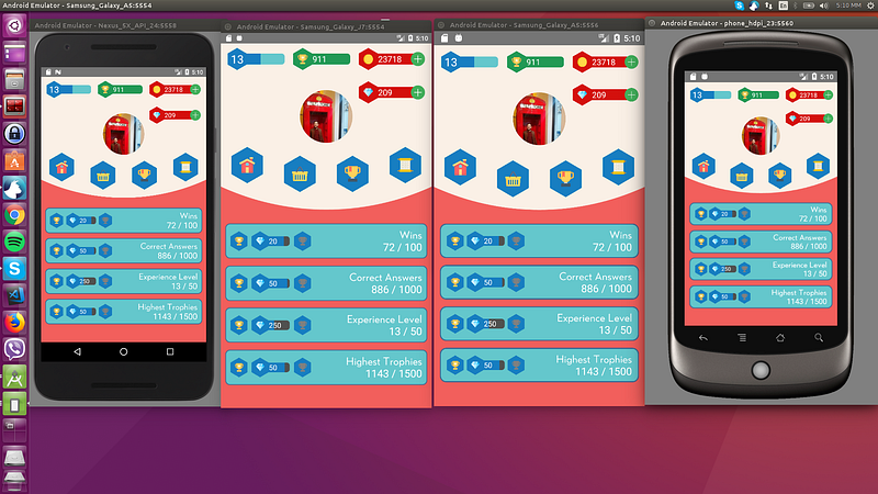 93 |
93 | 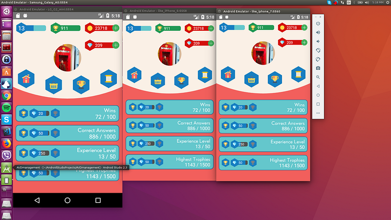 94 |
94 | 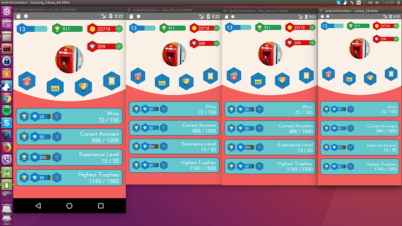 95 |
96 | ### Tablets
97 |
95 |
96 | ### Tablets
97 | 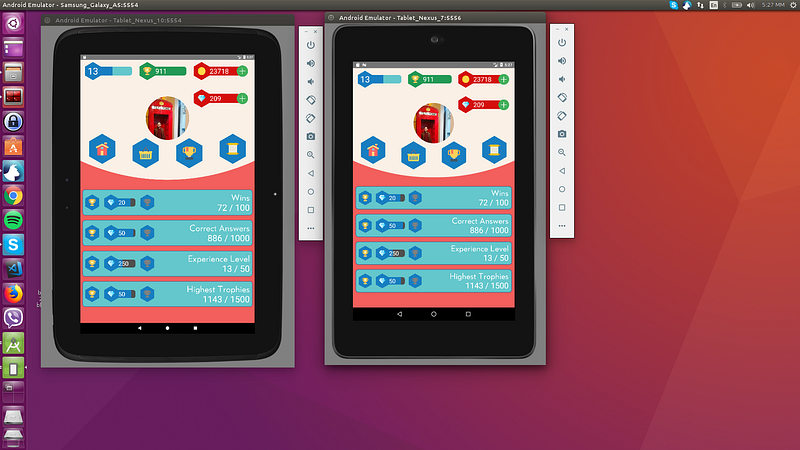 98 |
99 | # Licença
100 |
101 | MIT
102 |
103 | # Pull
104 |
105 | Pull requests são bem-vindos! Por favor, mande o PR para a branch `development`, e não para a `master`. Obrigado.
106 |
--------------------------------------------------------------------------------
/README.md:
--------------------------------------------------------------------------------
1 | # Help with maintenance would be appreciated!
2 | #### If interested please send me an email: tasos.maroudas@codedlines.com
3 |
4 | # Contents
5 | * [The package](#react-native-responsive-screen)
6 | * [Installation](#installation)
7 | * [Usage](#usage)
8 | * [Examples](#examples)
9 | * [How do I know it works for all devices ?](#example)
10 | * [License](#license)
11 | * [Pull Requests](#pull)
12 |
13 | # react-native-responsive-screen
14 |
15 | [](https://www.npmjs.com/package/react-native-responsive-screen)
16 | []()
17 |
18 | react-native-responsive-screen is a small library that provides 2 simple methods so that React Native developers can code their UI elements fully responsive. No media queries needed.
19 |
20 | It also provides an optional third method for screen orientation detection and automatic rerendering according to new dimensions.
21 |
22 | Give it a try and make your life simpler!
23 |
24 | Check out [this medium article](https://medium.com/react-native-training/build-responsive-react-native-views-for-any-device-and-support-orientation-change-1c8beba5bc23) to see the power of the library! 🚀
25 |
26 |
27 |
28 | # Installation
29 |
30 | `npm install react-native-responsive-screen --save`
31 |
32 | # Usage
33 | * After the package has installed, when application loads (in real device and/or emulator), it detects the screen's width and height. I.e. for Samsung A5 2017 model it detects `width: 360DP` and `height: 640DP` (these are the values without taking into account the device's scale factor).
34 | * The package exposes 2 basic methods: `widthPercentageToDP` and `heightPercentageToDP`. Their names essentially mean that you can supply a "percentage like" string value to each method and it will return the DP (indipendent pixel) that correspond to the supplied percentage of current screen's width/height respectivelly. I.e. for Samsung A5 2017, if we supply to a CSS box: `width: widthPercentageToDP('53%')`, the rendered style will be `width: 190.8` DP. Check example number 1 for how to use them.
35 | * Methods `widthPercentageToDP` and `heightPercentageToDP` can be used for any style (CSS) property that accepts DP as value. DP values are the ones of type `number` over the props mentioned in RN docs: [View style props](https://facebook.github.io/react-native/docs/view-style-props.html), [Text style props](https://facebook.github.io/react-native/docs/text-style-props.html), [Image style props](https://facebook.github.io/react-native/docs/image-style-props.html), [Layout props](https://facebook.github.io/react-native/docs/layout-props.html) and [Shadow props](https://facebook.github.io/react-native/docs/shadow-props.html). Use the exposed methods for all of the type `number` properties used in your app in order to make your app fully responsive for all screen sizes.
36 | * You can also provide decimal values to these 2 methods, i.e. `font-size: widthPercentageToDP('3.75%')`.
37 | * The package methods can be used with or without flex depending on what you want to do and how you choose to implement it.
38 | * The suggested approach is to start developing from larger screens (i.e. tablets). That way you are less prone to forget adding responsive values for all properties of type `number`. In any case, when your screen development is done, you should test it over a big range of different screens as shown below in the [How do I know it works for all devices ?](#example) section.
39 | * There are 2 more methods to use if you want to support responsiveness along with orientation change. These are `listenOrientationChange` and `removeOrientationListener`. To see how to use them, check example number 3.
40 | * You can use this package along with `styled-components`. To see how to do that, check example number 2.
41 |
42 | # Updates 🚀
43 | * `v1.4.0` onwards: The library now has flowtype support. Types should work out of the box, no additional setup needed.
44 | * `widthPercentageToDP` and `heightPercentageToDP` methods accept numeric values as well from version 1.2.1 onwards. That being said a width of 53% can now be written both `width: widthPercentageToDP('53%')` and `width: widthPercentageToDP(53)`.
45 |
46 | # Examples
47 |
48 | ## 1. How to use with StyleSheet.create() and without orientation change support
49 | ```javascript
50 | import {widthPercentageToDP as wp, heightPercentageToDP as hp} from 'react-native-responsive-screen';
51 |
52 | class Login extends Component {
53 | render() {
54 | return (
55 |
56 |
57 | Login
58 |
59 |
60 | );
61 | }
62 | }
63 |
64 | const styles = StyleSheet.create({
65 | container: { flex: 1 },
66 | textWrapper: {
67 | height: hp('70%'), // 70% of height device screen
68 | width: wp('80%') // 80% of width device screen
69 | },
70 | myText: {
71 | fontSize: hp('5%') // End result looks like the provided UI mockup
72 | }
73 | });
74 |
75 | export default Login;
76 | ```
77 | You can find a working example of this over the [related example repository](https://github.com/marudy/react-native-responsive-screen/blob/master/examples/responsive-screen/README.md)
78 |
79 |
80 | ## 2. How to use with StyleSheet.create() and with orientation change support
81 | Check the README of the [related example repository](https://github.com/marudy/react-native-responsive-screen/blob/master/examples/responsive-screen-orientation-change/README.md)
82 |
83 |
84 | ## 3. How to use with styled components
85 | Check the README of the [related example repository](https://github.com/marudy/react-native-responsive-screen/blob/master/examples/responsive-screen-styled-components/README.md)
86 |
87 |
88 | # How do I know it works for all devices ?
89 |
90 | As mentioned in ["How to Develop Responsive UIs with React Native"](https://medium.com/building-with-react-native/how-to-develop-responsive-uis-with-react-native-1x03-a448097c9503) article, this solution is already in production apps and is tested with a set of Android, iOS emulators of different screen specs, in order to verify that we always have the same end result.
91 |
92 | ## Example:
93 | The 4 blue tiles at the bottom half of the screen should take over 98% of the screen’s width in dp and 10% of the screen’s height in dp always:
94 |
95 | ### Smartphones
96 |
97 |
98 |
99 |
100 | ### Tablets
101 |
102 |
103 | # License
104 |
105 | MIT
106 |
107 | # Pull
108 |
109 | Pull requests are welcome! Please make the PR to `development` branch though and not `master`. Thanks.
110 |
--------------------------------------------------------------------------------
98 |
99 | # Licença
100 |
101 | MIT
102 |
103 | # Pull
104 |
105 | Pull requests são bem-vindos! Por favor, mande o PR para a branch `development`, e não para a `master`. Obrigado.
106 |
--------------------------------------------------------------------------------
/README.md:
--------------------------------------------------------------------------------
1 | # Help with maintenance would be appreciated!
2 | #### If interested please send me an email: tasos.maroudas@codedlines.com
3 |
4 | # Contents
5 | * [The package](#react-native-responsive-screen)
6 | * [Installation](#installation)
7 | * [Usage](#usage)
8 | * [Examples](#examples)
9 | * [How do I know it works for all devices ?](#example)
10 | * [License](#license)
11 | * [Pull Requests](#pull)
12 |
13 | # react-native-responsive-screen
14 |
15 | [](https://www.npmjs.com/package/react-native-responsive-screen)
16 | []()
17 |
18 | react-native-responsive-screen is a small library that provides 2 simple methods so that React Native developers can code their UI elements fully responsive. No media queries needed.
19 |
20 | It also provides an optional third method for screen orientation detection and automatic rerendering according to new dimensions.
21 |
22 | Give it a try and make your life simpler!
23 |
24 | Check out [this medium article](https://medium.com/react-native-training/build-responsive-react-native-views-for-any-device-and-support-orientation-change-1c8beba5bc23) to see the power of the library! 🚀
25 |
26 |
27 |
28 | # Installation
29 |
30 | `npm install react-native-responsive-screen --save`
31 |
32 | # Usage
33 | * After the package has installed, when application loads (in real device and/or emulator), it detects the screen's width and height. I.e. for Samsung A5 2017 model it detects `width: 360DP` and `height: 640DP` (these are the values without taking into account the device's scale factor).
34 | * The package exposes 2 basic methods: `widthPercentageToDP` and `heightPercentageToDP`. Their names essentially mean that you can supply a "percentage like" string value to each method and it will return the DP (indipendent pixel) that correspond to the supplied percentage of current screen's width/height respectivelly. I.e. for Samsung A5 2017, if we supply to a CSS box: `width: widthPercentageToDP('53%')`, the rendered style will be `width: 190.8` DP. Check example number 1 for how to use them.
35 | * Methods `widthPercentageToDP` and `heightPercentageToDP` can be used for any style (CSS) property that accepts DP as value. DP values are the ones of type `number` over the props mentioned in RN docs: [View style props](https://facebook.github.io/react-native/docs/view-style-props.html), [Text style props](https://facebook.github.io/react-native/docs/text-style-props.html), [Image style props](https://facebook.github.io/react-native/docs/image-style-props.html), [Layout props](https://facebook.github.io/react-native/docs/layout-props.html) and [Shadow props](https://facebook.github.io/react-native/docs/shadow-props.html). Use the exposed methods for all of the type `number` properties used in your app in order to make your app fully responsive for all screen sizes.
36 | * You can also provide decimal values to these 2 methods, i.e. `font-size: widthPercentageToDP('3.75%')`.
37 | * The package methods can be used with or without flex depending on what you want to do and how you choose to implement it.
38 | * The suggested approach is to start developing from larger screens (i.e. tablets). That way you are less prone to forget adding responsive values for all properties of type `number`. In any case, when your screen development is done, you should test it over a big range of different screens as shown below in the [How do I know it works for all devices ?](#example) section.
39 | * There are 2 more methods to use if you want to support responsiveness along with orientation change. These are `listenOrientationChange` and `removeOrientationListener`. To see how to use them, check example number 3.
40 | * You can use this package along with `styled-components`. To see how to do that, check example number 2.
41 |
42 | # Updates 🚀
43 | * `v1.4.0` onwards: The library now has flowtype support. Types should work out of the box, no additional setup needed.
44 | * `widthPercentageToDP` and `heightPercentageToDP` methods accept numeric values as well from version 1.2.1 onwards. That being said a width of 53% can now be written both `width: widthPercentageToDP('53%')` and `width: widthPercentageToDP(53)`.
45 |
46 | # Examples
47 |
48 | ## 1. How to use with StyleSheet.create() and without orientation change support
49 | ```javascript
50 | import {widthPercentageToDP as wp, heightPercentageToDP as hp} from 'react-native-responsive-screen';
51 |
52 | class Login extends Component {
53 | render() {
54 | return (
55 |
56 |
57 | Login
58 |
59 |
60 | );
61 | }
62 | }
63 |
64 | const styles = StyleSheet.create({
65 | container: { flex: 1 },
66 | textWrapper: {
67 | height: hp('70%'), // 70% of height device screen
68 | width: wp('80%') // 80% of width device screen
69 | },
70 | myText: {
71 | fontSize: hp('5%') // End result looks like the provided UI mockup
72 | }
73 | });
74 |
75 | export default Login;
76 | ```
77 | You can find a working example of this over the [related example repository](https://github.com/marudy/react-native-responsive-screen/blob/master/examples/responsive-screen/README.md)
78 |
79 |
80 | ## 2. How to use with StyleSheet.create() and with orientation change support
81 | Check the README of the [related example repository](https://github.com/marudy/react-native-responsive-screen/blob/master/examples/responsive-screen-orientation-change/README.md)
82 |
83 |
84 | ## 3. How to use with styled components
85 | Check the README of the [related example repository](https://github.com/marudy/react-native-responsive-screen/blob/master/examples/responsive-screen-styled-components/README.md)
86 |
87 |
88 | # How do I know it works for all devices ?
89 |
90 | As mentioned in ["How to Develop Responsive UIs with React Native"](https://medium.com/building-with-react-native/how-to-develop-responsive-uis-with-react-native-1x03-a448097c9503) article, this solution is already in production apps and is tested with a set of Android, iOS emulators of different screen specs, in order to verify that we always have the same end result.
91 |
92 | ## Example:
93 | The 4 blue tiles at the bottom half of the screen should take over 98% of the screen’s width in dp and 10% of the screen’s height in dp always:
94 |
95 | ### Smartphones
96 |
97 |
98 |
99 |
100 | ### Tablets
101 |
102 |
103 | # License
104 |
105 | MIT
106 |
107 | # Pull
108 |
109 | Pull requests are welcome! Please make the PR to `development` branch though and not `master`. Thanks.
110 |
--------------------------------------------------------------------------------