(
9 | key: string,
10 | initialValue?: t
11 | ) => [t, (value: t) => void];
12 |
13 | export interface PheliaMessageProps {
14 | /** The props for the component */
15 | props?: p;
16 | /** A hook to create some state for a component */
17 | useState: UseState;
18 | /** A hook to create a modal for a component */
19 | useModal: UseModal;
20 | }
21 |
22 | export interface PheliaHomeProps {
23 | /** A hook to create some state for a component */
24 | useState: UseState;
25 | /** A hook to create a modal for a component */
26 | useModal: UseModal;
27 | /** The user interacting with the home page */
28 | user: SlackUser;
29 | }
30 |
31 | export interface SlackUser {
32 | /** Unique identifier for the slack user */
33 | id: string;
34 | /** The user name of the slack user */
35 | username: string;
36 | /** The user name of the slack user */
37 | name: string;
38 | /** The team the user is associated with */
39 | team_id: string;
40 | }
41 |
42 | export type PheliaStorage = AsyncStorage | Storage;
43 | export type PheliaMessage
= (
44 | props: PheliaMessageProps
45 | ) => JSX.Element;
46 |
47 | export type PheliaModalProps
= Omit, "useModal">;
48 |
49 | export type PheliaModal = (props: PheliaModalProps
) => JSX.Element;
50 | export type PheliaHome = (props: PheliaHomeProps) => JSX.Element;
51 |
52 | export interface AsyncStorage {
53 | /** Set a value in storage */
54 | set: (key: string, value: string) => Promise;
55 | /** Get a value in storage */
56 | get: (key: string) => Promise;
57 | }
58 |
59 | export interface Storage {
60 | /** Set a value in storage */
61 | set: (key: string, value: string) => void;
62 | /** Get a value in storage */
63 | get: (key: string) => string;
64 | }
65 |
66 | export interface Action {
67 | /** The actions */
68 | value: string;
69 | /** The event for the action */
70 | event: InteractionEvent;
71 |
72 | /** The type of action */
73 | type?: "interaction" | "onload" | "onupdate" | "oncancel" | "onsubmit";
74 | }
75 |
76 | export interface PheliaMessageMetadata {
77 | /** A phelia message component */
78 | message: PheliaMessage;
79 | /** The name of the message */
80 | name: string;
81 | }
82 |
83 | export interface InteractionEvent {
84 | /** A user the event is associated with */
85 | user: SlackUser;
86 | }
87 |
88 | export interface SubmitEvent extends InteractionEvent {
89 | /** The object constructed by the form */
90 | form: { [key: string]: any };
91 | }
92 |
93 | export interface MultiSelectOptionEvent extends InteractionEvent {
94 | /** The selected Option values */
95 | selected: string[];
96 | }
97 |
98 | export interface SelectDateEvent extends InteractionEvent {
99 | /** The selected formatted date */
100 | date: string;
101 | }
102 |
103 | export interface SelectOptionEvent extends InteractionEvent {
104 | /** The selected Option value */
105 | selected: string;
106 | }
107 |
108 | export interface SearchOptionsEvent extends InteractionEvent {
109 | /** The query for the typeahead */
110 | query: string;
111 | }
112 |
113 | export interface PheliaMessageContainer {
114 | /** The channel the message is going to */
115 | channelID: string;
116 | /** The user that made the message */
117 | invokerKey: string;
118 | /** The text content of the message */
119 | message: string;
120 | /** An id for a modal */
121 | modalKey: string;
122 | /** The name of the phelia component */
123 | name: string;
124 | /** Props for a phelia component */
125 | props: { [key: string]: any };
126 | /** State for a phelia component */
127 | state: { [key: string]: any };
128 | /** */
129 | ts: string;
130 | /** The type of phelia component surface */
131 | type: "message" | "modal" | "home";
132 | /** When `type` === message: whether the message is ephemeral or not */
133 | isEphemeral?: true;
134 | /**
135 | * When `type` === modal, whether the modal was initiated inside another
136 | * component (by use of `useModal`) or by a command or shortcut.
137 | */
138 | modalType: "inline" | "root";
139 | /** An id for the surface */
140 | viewID: string;
141 | /** A user who interacts with the message */
142 | user: SlackUser;
143 | }
144 |
145 | export type MessageCallback = () => PheliaMessage[];
146 |
--------------------------------------------------------------------------------
/src/core/phelia.ts:
--------------------------------------------------------------------------------
1 | import { createMessageAdapter } from "@slack/interactive-messages";
2 | import { MessageAdapterOptions } from "@slack/interactive-messages/dist/adapter";
3 | import {
4 | WebClient,
5 | WebClientOptions,
6 | ChatPostMessageArguments,
7 | ChatPostEphemeralArguments,
8 | } from "@slack/web-api";
9 | import React, { useState as reactUseState } from "react";
10 |
11 | import { render, getOnSearchOptions } from "./reconciler";
12 | import {
13 | generateEvent,
14 | loadMessagesFromArray,
15 | loadMessagesFromDirectory,
16 | parseMessageKey,
17 | } from "./utils";
18 | import { SelectMenu } from "./components";
19 | import {
20 | InteractionEvent,
21 | MessageCallback,
22 | PheliaMessage,
23 | PheliaMessageContainer,
24 | PheliaModal,
25 | PheliaStorage,
26 | SubmitEvent,
27 | PheliaHome,
28 | SlackUser,
29 | } from "./interfaces";
30 |
31 | /** The main phelia client. Handles sending messages with phelia components */
32 | export class Phelia {
33 | private client: WebClient;
34 |
35 | private static Storage: PheliaStorage = new Map();
36 |
37 | private messageCache = new Map();
38 |
39 | private homeComponent: PheliaHome = undefined;
40 |
41 | setStorage(storage: PheliaStorage) {
42 | Phelia.Storage = storage;
43 | }
44 |
45 | constructor(token: string, slackOptions?: WebClientOptions) {
46 | this.client = new WebClient(token, slackOptions);
47 | }
48 |
49 | async openModal(
50 | modal: PheliaModal
,
51 | triggerID: string,
52 | props: p = null
53 | ): Promise {
54 | const initializedState: { [key: string]: any } = {};
55 |
56 | /** A hook to create some state for a component */
57 | function useState(
58 | key: string,
59 | initialValue?: t
60 | ): [t, (value: t) => void] {
61 | initializedState[key] = initialValue;
62 | return [initialValue, (_: t): void => null];
63 | }
64 |
65 | const message = await render(
66 | React.createElement(modal, { props, useState })
67 | );
68 |
69 | const response: any = await this.client.views.open({
70 | trigger_id: triggerID,
71 | view: {
72 | ...message,
73 | notify_on_close: true,
74 | },
75 | });
76 |
77 | const viewID = response.view.id;
78 | await Phelia.Storage.set(
79 | viewID,
80 | JSON.stringify({
81 | message: JSON.stringify(message),
82 | invokerKey: viewID,
83 | name: modal.name,
84 | props,
85 | state: initializedState,
86 | type: "modal",
87 | modalType: "root",
88 | viewID,
89 | })
90 | );
91 | }
92 |
93 | async postMessage(
94 | message: PheliaMessage
,
95 | channel: string,
96 | props: p = null,
97 | slackOptions?: ChatPostMessageArguments
98 | ): Promise {
99 | const initializedState: { [key: string]: any } = {};
100 |
101 | /** A hook to create some state for a component */
102 | function useState(
103 | key: string,
104 | initialValue?: t
105 | ): [t, (value: t) => void] {
106 | initializedState[key] = initialValue;
107 | return [initialValue, (_: t): void => null];
108 | }
109 |
110 | /** A hook to create a modal for a component */
111 | function useModal(): (title: string, props?: any) => Promise {
112 | return async () => null;
113 | }
114 |
115 | const messageData = await render(
116 | React.createElement(message, { useState, props, useModal })
117 | );
118 |
119 | const {
120 | channel: channelID,
121 | ts,
122 | message: sentMessageData,
123 | } = await this.client.chat.postMessage({
124 | ...messageData,
125 | ...slackOptions,
126 | channel,
127 | });
128 |
129 | const user = await this.enrichUser((sentMessageData as any).user);
130 |
131 | const messageKey = `${channelID}:${ts}`;
132 |
133 | await Phelia.Storage.set(
134 | messageKey,
135 | JSON.stringify({
136 | message: JSON.stringify(messageData),
137 | type: "message",
138 | name: message.name,
139 | state: initializedState,
140 | user,
141 | props,
142 | channelID,
143 | ts,
144 | })
145 | );
146 |
147 | return messageKey;
148 | }
149 |
150 | async postEphemeral(
151 | message: PheliaMessage
,
152 | channel: string,
153 | userId: string,
154 | props: p = null,
155 | slackOptions?: ChatPostEphemeralArguments
156 | ): Promise {
157 | const initializedState: { [key: string]: any } = {};
158 |
159 | /** A hook to create some state for a component */
160 | function useState(
161 | key: string,
162 | initialValue?: t
163 | ): [t, (value: t) => void] {
164 | initializedState[key] = initialValue;
165 | return [initialValue, (_: t): void => null];
166 | }
167 |
168 | /** A hook to create a modal for a component */
169 | function useModal(): (title: string, props?: any) => Promise {
170 | return async () => null;
171 | }
172 |
173 | const messageData = await render(
174 | React.createElement(message, { useState, props, useModal })
175 | );
176 |
177 | const { channel: channelID, ts } = await this.client.chat.postEphemeral({
178 | ...messageData,
179 | userId,
180 | channel,
181 | ...slackOptions,
182 | });
183 |
184 | const user = await this.enrichUser(userId);
185 |
186 | const messageKey = `${channelID}:${ts}`;
187 |
188 | await Phelia.Storage.set(
189 | messageKey,
190 | JSON.stringify({
191 | message: JSON.stringify(messageData),
192 | type: "message",
193 | isEphemeral: true,
194 | name: message.name,
195 | state: initializedState,
196 | user,
197 | props,
198 | channelID,
199 | ts,
200 | })
201 | );
202 |
203 | return messageKey;
204 | }
205 |
206 | async updateMessage(key: string, props: p) {
207 | const rawMessageContainer = await Phelia.Storage.get(key);
208 | if (!rawMessageContainer) {
209 | throw TypeError(`Could not find a message with key ${key}.`);
210 | }
211 |
212 | const container: PheliaMessageContainer = JSON.parse(rawMessageContainer);
213 |
214 | if (container.isEphemeral === true) {
215 | throw TypeError("Ephemeral messages cannot be updated.");
216 | }
217 |
218 | /** A hook to create some state for a component */
219 | function useState(key: string): [t, (value: t) => void] {
220 | return [
221 | container.state[key],
222 | (newState: t) => (container.state[key] = newState),
223 | ];
224 | }
225 |
226 | /** A hook to create a modal for a component */
227 | function useModal(): (title: string, props?: any) => Promise {
228 | return async () => null;
229 | }
230 |
231 | const message = await render(
232 | React.createElement(this.messageCache.get(container.name) as any, {
233 | useState,
234 | useModal,
235 | props,
236 | })
237 | );
238 |
239 | await this.client.chat.update({
240 | ...message,
241 | channel: container.channelID,
242 | ts: container.ts,
243 | });
244 |
245 | await Phelia.Storage.set(
246 | container.viewID,
247 | JSON.stringify({
248 | message: JSON.stringify(message),
249 | name: this.homeComponent.name,
250 | state: container.state,
251 | type: "home",
252 | viewID: container.viewID,
253 | user: container.user,
254 | })
255 | );
256 | }
257 |
258 | registerComponents(components: (PheliaMessage | PheliaModal)[]) {
259 | const pheliaComponents = loadMessagesFromArray(components);
260 |
261 | this.messageCache = pheliaComponents.reduce(
262 | (cache, { message, name }) => cache.set(name, message),
263 | this.messageCache
264 | );
265 | }
266 |
267 | registerHome(home: PheliaHome) {
268 | this.homeComponent = home;
269 | this.registerComponents([home]);
270 | }
271 |
272 | async updateHome(key: string) {
273 | const rawMessageContainer = await Phelia.Storage.get(key);
274 | if (!rawMessageContainer) {
275 | throw TypeError(`Could not find a home app with key ${key}.`);
276 | }
277 |
278 | const container: PheliaMessageContainer = JSON.parse(rawMessageContainer);
279 |
280 | /** A hook to create some state for a component */
281 | function useState(key: string): [t, (value: t) => void] {
282 | return [
283 | container.state[key],
284 | (newState: t) => (container.state[key] = newState),
285 | ];
286 | }
287 |
288 | /** A hook to create a modal for a component */
289 | function useModal(): (title: string, props?: any) => Promise {
290 | return async () => null;
291 | }
292 |
293 | /** Run the onload callback */
294 | await render(
295 | React.createElement(this.homeComponent, {
296 | useState,
297 | useModal,
298 | user: container.user,
299 | }),
300 | {
301 | value: undefined,
302 | event: { user: container.user },
303 | type: "onupdate",
304 | }
305 | );
306 |
307 | const home = await render(
308 | React.createElement(this.homeComponent, {
309 | useState,
310 | useModal,
311 | user: container.user,
312 | })
313 | );
314 |
315 | await this.client.views.publish({
316 | view: home,
317 | user_id: container.user.id,
318 | });
319 |
320 | await Phelia.Storage.set(
321 | container.viewID,
322 | JSON.stringify({
323 | message: JSON.stringify(home),
324 | name: this.homeComponent.name,
325 | state: container.state,
326 | type: "home",
327 | viewID: container.viewID,
328 | user: container.user,
329 | })
330 | );
331 | }
332 |
333 | async enrichUser(id: string): Promise {
334 | let user = { id } as SlackUser;
335 |
336 | try {
337 | const userResponse = (await this.client.users.info({
338 | user: id,
339 | })) as any;
340 |
341 | user.username = userResponse.user.profile.display_name;
342 | user.name = userResponse.user.name;
343 | user.team_id = userResponse.user.team_id;
344 | } catch (error) {
345 | console.warn(
346 | "Could not retrieve User's information, only 'user.id' is available for Home App. Oauth scope 'users:read' is required."
347 | );
348 | }
349 |
350 | return user;
351 | }
352 |
353 | appHomeHandler(
354 | home: PheliaHome,
355 | onHomeOpened?: (key: string, user?: SlackUser) => void | Promise
356 | ) {
357 | this.registerHome(home);
358 |
359 | return async (payload: any) => {
360 | if (payload.tab !== "home") {
361 | return;
362 | }
363 |
364 | let finalMessageKey: string;
365 |
366 | const messageKey = parseMessageKey(payload);
367 | const user = await this.enrichUser(payload.user);
368 |
369 | const rawMessageContainer = await Phelia.Storage.get(messageKey);
370 |
371 | if (!rawMessageContainer) {
372 | const initializedState: { [key: string]: any } = {};
373 |
374 | /** A hook to create some state for a component */
375 | function useState(
376 | key: string,
377 | initialValue?: t
378 | ): [t, (value: t) => void] {
379 | if (!initializedState[key]) {
380 | initializedState[key] = initialValue;
381 | }
382 | return [
383 | initializedState[key],
384 | (newValue: t) => (initializedState[key] = newValue),
385 | ];
386 | }
387 |
388 | /** A hook to create a modal for a component */
389 | function useModal(): (title: string, props?: any) => Promise {
390 | return async () => null;
391 | }
392 |
393 | /** Run the onload callback */
394 | await render(
395 | React.createElement(this.homeComponent, {
396 | useState,
397 | useModal,
398 | user,
399 | }),
400 | {
401 | value: undefined,
402 | event: { user },
403 | type: "onload",
404 | }
405 | );
406 |
407 | const home = await render(
408 | React.createElement(this.homeComponent, {
409 | useState,
410 | useModal,
411 | user,
412 | })
413 | );
414 |
415 | const response: any = await this.client.views.publish({
416 | view: home,
417 | user_id: payload.user,
418 | });
419 |
420 | const viewID = response.view.id;
421 |
422 | await Phelia.Storage.set(
423 | viewID,
424 | JSON.stringify({
425 | message: JSON.stringify(home),
426 | name: this.homeComponent.name,
427 | state: initializedState,
428 | type: "home",
429 | viewID,
430 | user,
431 | })
432 | );
433 |
434 | finalMessageKey = viewID;
435 | } else {
436 | const container: PheliaMessageContainer = JSON.parse(
437 | rawMessageContainer
438 | );
439 |
440 | /** A hook to create some state for a component */
441 | function useState(key: string): [t, (value: t) => void] {
442 | return [
443 | container.state[key],
444 | (newState: t) => (container.state[key] = newState),
445 | ];
446 | }
447 |
448 | /** A hook to create a modal for a component */
449 | function useModal(): (title: string, props?: any) => Promise {
450 | return async () => null;
451 | }
452 |
453 | /** Run the onload callback */
454 | await render(
455 | React.createElement(this.homeComponent, {
456 | useState,
457 | useModal,
458 | user,
459 | }),
460 | {
461 | value: undefined,
462 | event: { user },
463 | type: "onload",
464 | }
465 | );
466 |
467 | const home = await render(
468 | React.createElement(this.homeComponent, {
469 | useState,
470 | useModal,
471 | user,
472 | })
473 | );
474 |
475 | await this.client.views.publish({
476 | view: home,
477 | user_id: payload.user,
478 | });
479 |
480 | await Phelia.Storage.set(
481 | container.viewID,
482 | JSON.stringify({
483 | message: JSON.stringify(home),
484 | name: this.homeComponent.name,
485 | state: container.state,
486 | type: "home",
487 | viewID: container.viewID,
488 | user,
489 | })
490 | );
491 |
492 | finalMessageKey = container.viewID;
493 | }
494 |
495 | if (typeof onHomeOpened === "function") {
496 | await onHomeOpened(finalMessageKey, user);
497 | }
498 | };
499 | }
500 |
501 | async processAction(payload: any) {
502 | const messageKey = parseMessageKey(payload);
503 |
504 | const rawMessageContainer = await Phelia.Storage.get(messageKey);
505 |
506 | if (!rawMessageContainer) {
507 | throw new Error(
508 | `Could not find Message Container with key ${messageKey} in storage.`
509 | );
510 | }
511 |
512 | const container: PheliaMessageContainer = JSON.parse(rawMessageContainer);
513 | const user = payload.user;
514 |
515 | /** A hook to create some state for a component */
516 | function useState(
517 | key: string,
518 | initialValue?: t
519 | ): [t, (value: t) => void] {
520 | const [_, setState] = reactUseState(initialValue);
521 |
522 | return [
523 | container.state[key],
524 | (newValue: t): void => {
525 | container.state[key] = newValue;
526 | setState(newValue);
527 | },
528 | ];
529 | }
530 |
531 | /** A hook to create a modal for a component */
532 | const useModal = (key: string, modal: PheliaModal) => {
533 | return async (props?: any) => {
534 | const initializedState: { [key: string]: any } = {};
535 |
536 | /** A hook to create some state for the modal */
537 | function useState(
538 | key: string,
539 | initialValue?: t
540 | ): [t, (value: t) => void] {
541 | initializedState[key] = initialValue;
542 | return [initialValue, (_: t): void => null];
543 | }
544 |
545 | const message = await render(
546 | React.createElement(modal, { props, useState })
547 | );
548 |
549 | const response: any = await this.client.views.open({
550 | trigger_id: payload.trigger_id,
551 | view: {
552 | ...message,
553 | notify_on_close: true,
554 | },
555 | });
556 |
557 | const viewID = response.view.id;
558 |
559 | await Phelia.Storage.set(
560 | viewID,
561 | JSON.stringify({
562 | message: JSON.stringify(message),
563 | modalKey: key,
564 | invokerKey: messageKey,
565 | name: modal.name,
566 | props,
567 | state: initializedState,
568 | type: "modal",
569 | modalType: "inline",
570 | viewID,
571 | user,
572 | })
573 | );
574 | };
575 | };
576 |
577 | for (const action of payload.actions) {
578 | await render(
579 | React.createElement(this.messageCache.get(container.name) as any, {
580 | useState,
581 | props: container.props,
582 | useModal,
583 | user: container.type === "home" ? user : undefined,
584 | }),
585 | {
586 | value: action.action_id,
587 | event: generateEvent(action, user),
588 | type: "interaction",
589 | }
590 | );
591 | }
592 |
593 | const message = await render(
594 | React.createElement(this.messageCache.get(container.name) as any, {
595 | useState,
596 | props: container.props,
597 | useModal,
598 | user: container.type === "home" ? payload.user : undefined,
599 | })
600 | );
601 |
602 | if (JSON.stringify(message) !== container.message) {
603 | if (container.type === "message") {
604 | await this.client.chat.update({
605 | ...message,
606 | channel: container.channelID,
607 | ts: container.ts,
608 | });
609 | } else if (container.type === "modal") {
610 | await this.client.views.update({
611 | view_id: messageKey,
612 | view: {
613 | ...message,
614 | notify_on_close: true,
615 | },
616 | });
617 | } else {
618 | await this.client.views.update({
619 | view_id: messageKey,
620 | view: message,
621 | });
622 | }
623 | }
624 |
625 | await Phelia.Storage.set(
626 | messageKey,
627 | JSON.stringify({
628 | ...container,
629 | message: JSON.stringify(message),
630 | user,
631 | })
632 | );
633 | }
634 |
635 | async processSubmission(payload: any) {
636 | const messageKey = payload.view.id;
637 | const rawViewContainer = await Phelia.Storage.get(messageKey);
638 |
639 | if (!rawViewContainer) {
640 | throw new Error(
641 | `Could not find Message Container with key ${messageKey} in storage.`
642 | );
643 | }
644 |
645 | const viewContainer: PheliaMessageContainer = JSON.parse(rawViewContainer);
646 |
647 | const rawInvokerContainer = await Phelia.Storage.get(
648 | viewContainer.invokerKey
649 | );
650 |
651 | if (!rawInvokerContainer) {
652 | throw new Error(
653 | `Could not find Message Container with key ${viewContainer.invokerKey} in storage.`
654 | );
655 | }
656 |
657 | const invokerContainer: PheliaMessageContainer = JSON.parse(
658 | rawInvokerContainer
659 | );
660 |
661 | /** A hook to create some state for a component */
662 | function useState(
663 | key: string,
664 | initialValue?: t
665 | ): [t, (value: t) => void] {
666 | const [_, setState] = reactUseState(initialValue);
667 |
668 | return [
669 | invokerContainer.state[key],
670 | (newValue: t): void => {
671 | invokerContainer.state[key] = newValue;
672 | setState(newValue);
673 | },
674 | ];
675 | }
676 |
677 | const executedCallbacks = new Map();
678 | const executionPromises = new Array>();
679 |
680 | /** Extracts content from modal form submission */
681 | const formFromPayload = (payload: any) => {
682 | if (payload.type === "view_submission") {
683 | const form = Object.keys(payload.view.state.values)
684 | .map((key) => [key, Object.keys(payload.view.state.values[key])[0]])
685 | .map(([key, action]) => {
686 | const data = payload.view.state.values[key][action];
687 |
688 | if (data.type === "datepicker") {
689 | return [action, data.selected_date];
690 | }
691 |
692 | if (
693 | data.type === "checkboxes" ||
694 | data.type === "multi_static_select" ||
695 | data.type === "multi_external_select"
696 | ) {
697 | const selected = data.selected_options.map(
698 | (option: any) => option.value
699 | );
700 |
701 | return [action, selected];
702 | }
703 |
704 | if (data.type === "multi_users_select") {
705 | return [action, data.selected_users];
706 | }
707 |
708 | if (data.type === "multi_channels_select") {
709 | return [action, data.selected_channels];
710 | }
711 |
712 | if (data.type === "multi_conversations_select") {
713 | return [action, data.selected_conversations];
714 | }
715 |
716 | if (
717 | data.type === "radio_buttons" ||
718 | data.type === "static_select" ||
719 | data.type === "external_select"
720 | ) {
721 | return [action, data.selected_option.value];
722 | }
723 |
724 | if (data.type === "users_select") {
725 | return [action, data.selected_user];
726 | }
727 |
728 | if (data.type === "conversations_select") {
729 | return [action, data.selected_conversation];
730 | }
731 |
732 | if (data.type === "channels_select") {
733 | return [action, data.selected_channel];
734 | }
735 |
736 | return [action, data.value];
737 | })
738 | .reduce((form, [action, value]) => {
739 | form[action] = value;
740 | return form;
741 | }, {} as any);
742 | return form;
743 | }
744 |
745 | return undefined;
746 | };
747 |
748 | const form = formFromPayload(payload);
749 |
750 | /** A hook to create a modal for a component */
751 | function useModal(
752 | key: string,
753 | _modal: PheliaMessage,
754 | onSubmit?: (event: SubmitEvent) => Promise,
755 | onCancel?: (event: InteractionEvent) => Promise
756 | ): (title: string, props?: any) => Promise {
757 | if (key === viewContainer.modalKey && !executedCallbacks.get(key)) {
758 | executedCallbacks.set(key, true);
759 |
760 | if (form !== undefined) {
761 | onSubmit &&
762 | executionPromises.push(onSubmit({ form, user: payload.user }));
763 | } else {
764 | onCancel && executionPromises.push(onCancel({ user: payload.user }));
765 | }
766 | }
767 |
768 | return async () => null;
769 | }
770 |
771 | const isRootModal = invokerContainer.modalType === "root";
772 | await render(
773 | React.createElement(this.messageCache.get(invokerContainer.name) as any, {
774 | useState,
775 | props: invokerContainer.props,
776 | useModal,
777 | user: invokerContainer.type === "home" ? payload.user : undefined,
778 | }),
779 | !isRootModal
780 | ? undefined
781 | : {
782 | value: undefined,
783 | event: {
784 | form,
785 | user: payload.user,
786 | } as InteractionEvent,
787 | type: form === undefined ? "oncancel" : "onsubmit",
788 | }
789 | );
790 |
791 | await Promise.all(executionPromises);
792 |
793 | const message = await render(
794 | React.createElement(this.messageCache.get(invokerContainer.name) as any, {
795 | useState,
796 | props: invokerContainer.props,
797 | useModal,
798 | user: invokerContainer.type === "home" ? payload.user : undefined,
799 | })
800 | );
801 |
802 | if (JSON.stringify(message) !== invokerContainer.message) {
803 | if (invokerContainer.type === "message") {
804 | await this.client.chat.update({
805 | ...message,
806 | channel: invokerContainer.channelID,
807 | ts: invokerContainer.ts,
808 | });
809 | } else if (invokerContainer.type === "modal") {
810 | await this.client.views.update({
811 | view_id: messageKey,
812 | view: message,
813 | });
814 | } else {
815 | await this.client.views.publish({
816 | view_id: messageKey,
817 | view: message,
818 | user_id: payload.user.id,
819 | });
820 | }
821 | }
822 |
823 | await Phelia.Storage.set(
824 | viewContainer.invokerKey,
825 | JSON.stringify({
826 | ...invokerContainer,
827 | user: payload.user,
828 | message: JSON.stringify(message),
829 | })
830 | );
831 | }
832 |
833 | async processOption(payload: any) {
834 | const messageKey = parseMessageKey(payload);
835 |
836 | const rawMessageContainer = await Phelia.Storage.get(messageKey);
837 |
838 | if (!rawMessageContainer) {
839 | throw new Error(
840 | `Could not find Message Container with key ${messageKey} in storage.`
841 | );
842 | }
843 |
844 | const container: PheliaMessageContainer = JSON.parse(rawMessageContainer);
845 |
846 | /** A hook to create some state for a component */
847 | function useState(key: string): [t, (value: t) => void] {
848 | return [container.state[key], (_: t): void => null];
849 | }
850 |
851 | /** A hook to create a modal for a component */
852 | function useModal(): (title: string, props?: any) => Promise {
853 | return async () => null;
854 | }
855 |
856 | const onSearchOptions = await getOnSearchOptions(
857 | React.createElement(
858 | this.messageCache.get(container.name) as PheliaMessage,
859 | {
860 | useState,
861 | props: container.props,
862 | useModal,
863 | }
864 | ),
865 | {
866 | value: payload.action_id,
867 | event: { user: payload.user },
868 | type: "interaction",
869 | }
870 | );
871 |
872 | const optionsComponent = await onSearchOptions({
873 | user: payload.user,
874 | query: payload.value,
875 | });
876 |
877 | const { options, option_groups } = await render(
878 | React.createElement(SelectMenu, {
879 | placeholder: "",
880 | action: "",
881 | type: "static",
882 | children: optionsComponent,
883 | })
884 | );
885 |
886 | if (options) {
887 | return { options };
888 | }
889 |
890 | return { option_groups };
891 | }
892 |
893 | messageHandler(
894 | signingSecret: string,
895 | messages?: string | (PheliaModal | PheliaMessage)[] | MessageCallback,
896 | home?: PheliaMessage,
897 | slackOptions?: MessageAdapterOptions
898 | ) {
899 | if (messages) {
900 | const pheliaMessages =
901 | typeof messages === "string"
902 | ? loadMessagesFromDirectory(messages)
903 | : typeof messages === "function"
904 | ? loadMessagesFromArray(messages())
905 | : loadMessagesFromArray(messages);
906 |
907 | this.messageCache = pheliaMessages.reduce(
908 | (cache, { message, name }) => cache.set(name, message),
909 | this.messageCache
910 | );
911 | }
912 |
913 | if (home) {
914 | this.homeComponent = home;
915 | this.registerComponents([home]);
916 | }
917 |
918 | const adapter = createMessageAdapter(signingSecret, {
919 | ...slackOptions,
920 | syncResponseTimeout: 3000,
921 | });
922 |
923 | adapter.viewSubmission(new RegExp(/.*/), async (payload) => {
924 | this.processSubmission(payload);
925 | });
926 |
927 | adapter.viewClosed(new RegExp(/.*/), async (payload) => {
928 | this.processSubmission(payload);
929 | });
930 |
931 | adapter.action({ type: "block_suggestion" }, this.processOption.bind(this));
932 |
933 | adapter.action(new RegExp(/.*/), async (payload) => {
934 | this.processAction(payload);
935 | });
936 |
937 | adapter.options(new RegExp(/.*/), this.processOption.bind(this));
938 |
939 | return adapter.requestListener();
940 | }
941 | }
942 |
--------------------------------------------------------------------------------
/src/core/reconciler.ts:
--------------------------------------------------------------------------------
1 | import ReactReconciler from "react-reconciler";
2 | import Reconciler, { OpaqueHandle } from "react-reconciler";
3 |
4 | import { Action } from "./interfaces";
5 | import { SearchOptions } from "./components";
6 |
7 | type Type = any;
8 | type Props = JSX.ComponentProps & {
9 | [key: string]: any;
10 | };
11 | type Container = any;
12 | type Instance = any;
13 | type TextInstance = any;
14 | type HydratableInstance = any;
15 | type PublicInstance = any;
16 | type HostContext = any;
17 | type UpdatePayload = any;
18 | type ChildSet = any;
19 | type TimeoutHandle = any;
20 | type NoTimeout = any;
21 |
22 | /** A function to help debug errors */
23 | const debug = (...args: any[]) => {
24 | // console.log(args);
25 | };
26 |
27 | /** Reconciler config */
28 | class HostConfig
29 | implements
30 | ReactReconciler.HostConfig<
31 | Type,
32 | Props,
33 | Container,
34 | Instance,
35 | TextInstance,
36 | HydratableInstance,
37 | PublicInstance,
38 | HostContext,
39 | UpdatePayload,
40 | ChildSet,
41 | TimeoutHandle,
42 | NoTimeout
43 | > {
44 | getPublicInstance(_instance: Instance | TextInstance) {
45 | // throw new Error("Method not implemented.");
46 | }
47 | getRootHostContext(_rootContainerInstance: Container): HostContext {
48 | return { type: "root" };
49 | }
50 | getChildHostContext(
51 | _parentHostContext: HostContext,
52 | type: Type,
53 | _rootContainerInstance: Container
54 | ): HostContext {
55 | return { type };
56 | }
57 | prepareForCommit(_containerInfo: Container): void {
58 | return;
59 | }
60 | resetAfterCommit(_containerInfo: Container): void {
61 | return;
62 | }
63 | createInstance(
64 | type: Type,
65 | props: Props,
66 | rootContainerInstance: Container,
67 | _hostContext: HostContext,
68 | _internalInstanceHandle: OpaqueHandle
69 | ): Instance {
70 | if (props.toSlackElement) {
71 | return props.toSlackElement(
72 | props,
73 | (e) => {
74 | const [nodes, promises, onSearchOptions] = reconcile(
75 | e,
76 | rootContainerInstance.action,
77 | rootContainerInstance.getOnSearchOptions
78 | );
79 |
80 | if (
81 | nodes &&
82 | rootContainerInstance.action &&
83 | nodes.action_id === rootContainerInstance.action.value &&
84 | rootContainerInstance.getOnSearchOptions &&
85 | onSearchOptions
86 | ) {
87 | rootContainerInstance.onSearchOptions = onSearchOptions;
88 | }
89 |
90 | return [nodes, promises];
91 | },
92 | rootContainerInstance.promises
93 | );
94 | }
95 |
96 | throw Error("Unknown Component type " + JSON.stringify({ props, type }));
97 | }
98 | appendInitialChild(
99 | parentInstance: Instance,
100 | child: Instance | TextInstance
101 | ): void {
102 | debug("appendInitialChild");
103 |
104 | if (Array.isArray(parentInstance.blocks)) {
105 | parentInstance.blocks.push(child);
106 | return;
107 | }
108 |
109 | if (parentInstance.type === "overflow") {
110 | parentInstance.options.push(child);
111 | return;
112 | }
113 |
114 | if (
115 | parentInstance.type === "static_select" ||
116 | parentInstance.type === "multi_static_select"
117 | ) {
118 | if (child.isOptionGroup) {
119 | if (!Array.isArray(parentInstance.option_groups)) {
120 | parentInstance.option_groups = [];
121 | }
122 |
123 | parentInstance.option_groups.push(child);
124 | return;
125 | }
126 |
127 | if (!Array.isArray(parentInstance.options)) {
128 | parentInstance.options = [];
129 | }
130 |
131 | parentInstance.options.push({ ...child, url: undefined });
132 | return;
133 | }
134 |
135 | if (
136 | parentInstance.type === "checkboxes" ||
137 | parentInstance.type === "radio_buttons" ||
138 | parentInstance.isOptionGroup
139 | ) {
140 | parentInstance.options.push({ ...child, url: undefined });
141 | return;
142 | }
143 |
144 | if (parentInstance.type === "input") {
145 | parentInstance.element = child;
146 | return;
147 | }
148 |
149 | if (parentInstance.type === "actions") {
150 | parentInstance.elements.push(child);
151 | return;
152 | }
153 |
154 | if (parentInstance.type === "context") {
155 | parentInstance.elements.push(child);
156 | return;
157 | }
158 |
159 | if (parentInstance.isConfirm || parentInstance.isOption) {
160 | parentInstance.text = child;
161 |
162 | if (parentInstance.text.type === "text") {
163 | parentInstance.text.type = "plain_text";
164 | }
165 | return;
166 | }
167 |
168 | if (parentInstance.type === "button") {
169 | parentInstance.text.text += child.text;
170 | return;
171 | }
172 |
173 | if (parentInstance.type === "section") {
174 | if (!parentInstance.fields) {
175 | parentInstance.fields = [];
176 | }
177 |
178 | parentInstance.fields.push(child);
179 | return;
180 | }
181 |
182 | if (
183 | parentInstance.type === "mrkdwn" ||
184 | parentInstance.type === "plain_text"
185 | ) {
186 | parentInstance.text += child.text;
187 |
188 | return;
189 | }
190 |
191 | if (parentInstance.type === child.type) {
192 | parentInstance.text += child.text;
193 | return;
194 | }
195 |
196 | throw new Error(
197 | "appendInitialChild::" + JSON.stringify({ parentInstance, child })
198 | );
199 | }
200 |
201 | finalizeInitialChildren(
202 | _parentInstance: Instance,
203 | _type: Type,
204 | props: Props,
205 | rootContainerInstance: Container,
206 | _hostContext: HostContext
207 | ): boolean {
208 | if (rootContainerInstance.action?.type === "onload" && props.onLoad) {
209 | rootContainerInstance.promises.push(
210 | props.onLoad(rootContainerInstance.action.event)
211 | );
212 |
213 | return true;
214 | }
215 |
216 | if (rootContainerInstance.action?.type === "onupdate" && props.onUpdate) {
217 | rootContainerInstance.promises.push(
218 | props.onUpdate(rootContainerInstance.action.event)
219 | );
220 |
221 | return true;
222 | }
223 |
224 | if (rootContainerInstance.action?.type === "onsubmit" && props.onSubmit) {
225 | rootContainerInstance.promises.push(
226 | props.onSubmit(rootContainerInstance.action.event)
227 | );
228 |
229 | return true;
230 | }
231 |
232 | if (rootContainerInstance.action?.type === "oncancel" && props.onCancel) {
233 | rootContainerInstance.promises.push(
234 | props.onCancel(rootContainerInstance.action.event)
235 | );
236 |
237 | return true;
238 | }
239 |
240 | if (
241 | rootContainerInstance.action &&
242 | props.action === rootContainerInstance.action.value
243 | ) {
244 | if (rootContainerInstance.getOnSearchOptions && props.onSearchOptions) {
245 | rootContainerInstance.onSearchOptions = props.onSearchOptions;
246 | return true;
247 | }
248 |
249 | if (props.onClick) {
250 | rootContainerInstance.promises.push(
251 | props.onClick(rootContainerInstance.action.event)
252 | );
253 | }
254 |
255 | if (props.onSubmit) {
256 | rootContainerInstance.promises.push(
257 | props.onSubmit(rootContainerInstance.action.event)
258 | );
259 | }
260 |
261 | if (props.onSelect) {
262 | rootContainerInstance.promises.push(
263 | props.onSelect(rootContainerInstance.action.event)
264 | );
265 | }
266 |
267 | return true;
268 | }
269 |
270 | return false;
271 | }
272 | prepareUpdate(
273 | _instance: Instance,
274 | _type: Type,
275 | _oldProps: Props,
276 | _newProps: Props,
277 | _rootContainerInstance: Container,
278 | _hostContext: HostContext
279 | ) {
280 | debug("prepareUpdate");
281 | return true;
282 | }
283 | shouldSetTextContent(_type: Type, _props: Props): boolean {
284 | return false;
285 | }
286 | shouldDeprioritizeSubtree(_type: Type, _props: Props): boolean {
287 | return false;
288 | }
289 | createTextInstance(
290 | text: string,
291 | _rootContainerInstance: Container,
292 | _hostContext: HostContext,
293 | _internalInstanceHandle: OpaqueHandle
294 | ) {
295 | debug("createTextInstance");
296 | return {
297 | type: "text",
298 | text,
299 | };
300 | }
301 | scheduleDeferredCallback(
302 | _callback: () => any,
303 | _options?: {
304 | /** How long the timeout is */
305 | timeout: number;
306 | }
307 | ): any {}
308 | cancelDeferredCallback(callbackID: any): void {}
309 | setTimeout(
310 | _handler: (...args: any[]) => void,
311 | _timeout: number
312 | ): TimeoutHandle | NoTimeout {}
313 | clearTimeout(handle: TimeoutHandle | NoTimeout): void {}
314 | noTimeout: NoTimeout;
315 |
316 | now(): number {
317 | return Date.now();
318 | }
319 | isPrimaryRenderer: boolean;
320 | supportsMutation: boolean = true;
321 | supportsPersistence: boolean = false;
322 | supportsHydration: boolean = true;
323 |
324 | appendChildToContainer(
325 | container: Container,
326 | child: Instance | TextInstance
327 | ): void {
328 | if (container.isRoot) {
329 | container.node = child;
330 | return;
331 | }
332 |
333 | debug("appendChildToContainer");
334 |
335 | throw new Error("container is not an array");
336 | }
337 |
338 | appendChild(
339 | _parentInstance: Instance,
340 | _child: Instance | TextInstance
341 | ): void {
342 | debug("appendChild");
343 | }
344 |
345 | commitTextUpdate(
346 | textInstance: TextInstance,
347 | _oldText: string,
348 | newText: string
349 | ): void {
350 | debug("commitTextUpdate");
351 | textInstance.text = newText;
352 | }
353 | commitMount?(
354 | _instance: Instance,
355 | _type: Type,
356 | _newProps: Props,
357 | _internalInstanceHandle: Reconciler.Fiber
358 | ): void {
359 | debug("commitMount");
360 | }
361 |
362 | replaceContainerChildren?(container: Container, newChildren: ChildSet): void {
363 | debug("replaceContainerChildren", { container, newChildren });
364 | }
365 | resetTextContent(_instance: Instance) {
366 | debug("resetTextContent");
367 | }
368 | commitUpdate?(
369 | _instance: Instance,
370 | _updatePayload: UpdatePayload,
371 | _type: Type,
372 | _oldProps: Props,
373 | _newProps: Props,
374 | _internalInstanceHandle: OpaqueHandle
375 | ): void {}
376 |
377 | insertBefore?(
378 | parentInstance: Instance,
379 | child: Instance | TextInstance,
380 | beforeChild: Instance | TextInstance
381 | ): void {
382 | debug("insertBefore", { parentInstance, child, beforeChild });
383 | }
384 |
385 | insertInContainerBefore?(
386 | container: Container,
387 | child: Instance | TextInstance,
388 | beforeChild: Instance | TextInstance
389 | ): void {
390 | debug("insertInContainerBefore", { container, child, beforeChild });
391 | }
392 | removeChild?(parentInstance: Instance, child: Instance | TextInstance): void {
393 | debug("removeChild", parentInstance, child);
394 | }
395 | removeChildFromContainer?(
396 | container: Container,
397 | child: Instance | TextInstance
398 | ): void {
399 | debug("removeChildFromContainer", {
400 | container,
401 | child,
402 | });
403 | }
404 | }
405 |
406 | /** Reconcile the reaction components */
407 | function reconcile(
408 | element:
409 | | React.FunctionComponentElement
410 | | React.ComponentElement,
411 | action?: Action,
412 | getOnSearchOptions?: boolean
413 | ): [any, Promise[], SearchOptions] {
414 | const reconcilerInstance = Reconciler(new HostConfig());
415 | const root: any = {
416 | isRoot: true,
417 | action,
418 | promises: new Array>(),
419 | getOnSearchOptions,
420 | };
421 | const container = reconcilerInstance.createContainer(root, false, false);
422 |
423 | reconcilerInstance.updateContainer(element, container, null, null);
424 |
425 | return [root.node, root.promises, root.onSearchOptions];
426 | }
427 |
428 | /** Render the reaction components */
429 | export async function render(
430 | element:
431 | | React.FunctionComponentElement
432 | | React.ComponentElement,
433 | action?: Action
434 | ) {
435 | const [blocks, promises] = reconcile(element, action);
436 |
437 | await Promise.all(promises);
438 |
439 | return blocks;
440 | }
441 |
442 | /** Search filter options */
443 | export async function getOnSearchOptions(
444 | element:
445 | | React.FunctionComponentElement
446 | | React.ComponentElement,
447 | action: Action
448 | ) {
449 | const [_, promises, onSearchOptions] = reconcile(element, action, true);
450 |
451 | await Promise.all(promises);
452 |
453 | return onSearchOptions;
454 | }
455 |
--------------------------------------------------------------------------------
/src/core/utils.ts:
--------------------------------------------------------------------------------
1 | import fs from "fs";
2 | import path from "path";
3 |
4 | import {
5 | InteractionEvent,
6 | MultiSelectOptionEvent,
7 | PheliaMessage,
8 | PheliaMessageMetadata,
9 | SelectDateEvent,
10 | SelectOptionEvent,
11 | SlackUser
12 | } from "./interfaces";
13 |
14 | /** Convert an action to an event. */
15 | export function generateEvent(
16 | action: any,
17 | user: SlackUser
18 | ):
19 | | SelectDateEvent
20 | | InteractionEvent
21 | | MultiSelectOptionEvent
22 | | SelectOptionEvent {
23 | if (action.type === "datepicker") {
24 | return { date: action.selected_date, user };
25 | }
26 |
27 | if (
28 | action.type === "checkboxes" ||
29 | action.type === "multi_static_select" ||
30 | action.type === "multi_external_select"
31 | ) {
32 | return {
33 | selected: action.selected_options.map((option: any) => option.value),
34 | user
35 | };
36 | }
37 |
38 | if (action.type === "multi_users_select") {
39 | return { user, selected: action.selected_users };
40 | }
41 |
42 | if (action.type === "multi_channels_select") {
43 | return { user, selected: action.selected_channels };
44 | }
45 |
46 | if (action.type === "multi_conversations_select") {
47 | return { user, selected: action.selected_conversations };
48 | }
49 |
50 | if (action.type === "users_select") {
51 | return { user, selected: action.selected_user };
52 | }
53 |
54 | if (action.type === "conversations_select") {
55 | return { user, selected: action.selected_conversation };
56 | }
57 |
58 | if (action.type === "channels_select") {
59 | return { user, selected: action.selected_channel };
60 | }
61 |
62 | if (
63 | action.type === "overflow" ||
64 | action.type === "radio_buttons" ||
65 | action.type === "static_select" ||
66 | action.type === "external_select"
67 | ) {
68 | return { user, selected: action.selected_option.value };
69 | }
70 |
71 | return { user };
72 | }
73 |
74 | /** Get a unique key from a message payload */
75 | export function parseMessageKey(payload: any) {
76 | if (payload?.view?.id) {
77 | return payload.view.id;
78 | }
79 |
80 | if (payload.container) {
81 | const { channel_id, message_ts, view_id, type } = payload.container;
82 | return type === "view" ? view_id : `${channel_id}:${message_ts}`;
83 | }
84 | }
85 |
86 | /** Transform a message into message metadata */
87 | export function loadMessagesFromArray(
88 | messages: PheliaMessage[]
89 | ): PheliaMessageMetadata[] {
90 | return messages.map(message => ({ message, name: message.name }));
91 | }
92 |
93 | /** Read messages from a directory */
94 | export function loadMessagesFromDirectory(
95 | dir: string
96 | ): PheliaMessageMetadata[] {
97 | const modules = new Array();
98 |
99 | fs.readdirSync(dir).forEach(file => {
100 | try {
101 | const module = require(path.join(dir, file));
102 | modules.push(module);
103 | } catch (error) {}
104 | });
105 |
106 | return modules.map(m => ({
107 | message: m.default,
108 | name: m.default.name
109 | }));
110 | }
111 |
--------------------------------------------------------------------------------
/src/example/example-messages/birthday-picker.tsx:
--------------------------------------------------------------------------------
1 | import React from "react";
2 |
3 | import { Section, DatePicker, Message, PheliaMessageProps } from "../../core";
4 |
5 | const delay = (ms: number) => new Promise(res => setTimeout(res, ms));
6 |
7 | export function BirthdayPicker({ useState }: PheliaMessageProps) {
8 | const [birth, setBirth] = useState("birth");
9 | const [user, setUser] = useState("user");
10 |
11 | const today = new Date().toISOString().split("T")[0];
12 | const birthdayIsToday = birth === today;
13 |
14 | return (
15 |
16 | {
28 | await delay(2000);
29 | setBirth(date);
30 | setUser(user.username);
31 | }}
32 | action="date"
33 | />
34 | }
35 | />
36 |
37 | );
38 | }
39 |
--------------------------------------------------------------------------------
/src/example/example-messages/channels-select-menu.tsx:
--------------------------------------------------------------------------------
1 | import React from "react";
2 |
3 | import {
4 | Button,
5 | Text,
6 | Input,
7 | Message,
8 | Modal,
9 | PheliaMessageProps,
10 | Section,
11 | Divider,
12 | Actions,
13 | SelectMenu
14 | } from "../../core";
15 |
16 | export function ChannelsSelectMenuModal() {
17 | return (
18 |
19 |
20 |
25 |
26 |
27 | );
28 | }
29 |
30 | export function ChannelsSelectMenuExample({
31 | useModal,
32 | useState
33 | }: PheliaMessageProps) {
34 | const [form, setForm] = useState("form");
35 | const [selected, setSelected] = useState("selected");
36 |
37 | const openModal = useModal("modal", ChannelsSelectMenuModal, form => {
38 | setForm(JSON.stringify(form, null, 2));
39 | });
40 |
41 | return (
42 |
43 | {selected && (
44 |
45 | *Selected:* {selected}
46 |
47 | )}
48 |
49 | {!selected && (
50 | <>
51 |
52 | setSelected(event.selected)}
57 | />
58 |
59 |
60 | )}
61 |
62 |
63 |
64 | openModal()}>
68 | Open modal
69 |
70 | }
71 | />
72 |
73 | {form && (
74 |
75 | {"```\n" + form + "\n```"}
76 |
77 | )}
78 |
79 | );
80 | }
81 |
--------------------------------------------------------------------------------
/src/example/example-messages/conversations-select-menu.tsx:
--------------------------------------------------------------------------------
1 | import React from "react";
2 |
3 | import {
4 | Button,
5 | Text,
6 | Input,
7 | Message,
8 | Modal,
9 | PheliaMessageProps,
10 | Section,
11 | Divider,
12 | Actions,
13 | SelectMenu
14 | } from "../../core";
15 |
16 | export function ConversationsSelectMenuModal() {
17 | return (
18 |
19 |
20 |
26 |
27 |
28 | );
29 | }
30 |
31 | export function ConversationsSelectMenuExample({
32 | useModal,
33 | useState
34 | }: PheliaMessageProps) {
35 | const [form, setForm] = useState("form");
36 | const [selected, setSelected] = useState("selected");
37 |
38 | const openModal = useModal("modal", ConversationsSelectMenuModal, form => {
39 | setForm(JSON.stringify(form, null, 2));
40 | });
41 |
42 | return (
43 |
44 | {selected && (
45 |
46 | *Selected:* {selected}
47 |
48 | )}
49 |
50 | {!selected && (
51 | <>
52 |
53 | setSelected(event.selected)}
58 | />
59 |
60 |
61 | )}
62 |
63 |
64 |
65 | openModal()}>
69 | Open modal
70 |
71 | }
72 | />
73 |
74 | {form && (
75 |
76 | {"```\n" + form + "\n```"}
77 |
78 | )}
79 |
80 | );
81 | }
82 |
--------------------------------------------------------------------------------
/src/example/example-messages/counter.tsx:
--------------------------------------------------------------------------------
1 | import React from "react";
2 |
3 | import {
4 | Actions,
5 | Button,
6 | Message,
7 | PheliaMessageProps,
8 | Section,
9 | Text
10 | } from "../../core";
11 |
12 | export function Counter({
13 | useState,
14 | props
15 | }: PheliaMessageProps<{ name: string }>) {
16 | const [counter, setCounter] = useState("counter", 0);
17 |
18 | return (
19 |
20 |
21 |
22 | Hello {props.name}, here is your counter {counter}
23 |
24 |
25 |
26 |
29 |
32 |
33 |
34 | );
35 | }
36 |
--------------------------------------------------------------------------------
/src/example/example-messages/external-select-menu.tsx:
--------------------------------------------------------------------------------
1 | import React from "react";
2 |
3 | import {
4 | Button,
5 | Text,
6 | Input,
7 | Message,
8 | Modal,
9 | PheliaMessageProps,
10 | Section,
11 | Divider,
12 | Actions,
13 | SelectMenu,
14 | Option,
15 | OptionGroup
16 | } from "../../core";
17 |
18 | export function ExternalSelectMenuModal() {
19 | return (
20 |
21 |
22 | [
25 |
26 |
27 |
28 | ]}
29 | type="external"
30 | action="select-menu"
31 | placeholder="A placeholder"
32 | />
33 |
34 |
35 | );
36 | }
37 |
38 | export function ExternalSelectMenuExample({
39 | useModal,
40 | useState
41 | }: PheliaMessageProps) {
42 | const [form, setForm] = useState("form");
43 | const [selected, setSelected] = useState("selected");
44 |
45 | const openModal = useModal("modal", ExternalSelectMenuModal, form => {
46 | setForm(JSON.stringify(form, null, 2));
47 | });
48 |
49 | return (
50 |
51 | {selected && (
52 |
53 | *Selected:* {selected}
54 |
55 | )}
56 |
57 | {!selected && (
58 | <>
59 |
60 |
63 | This was loaded asynchronously
64 |
65 | }
66 | onSearchOptions={() => [
67 |
70 | ]}
71 | type="external"
72 | action="external"
73 | placeholder="A placeholder"
74 | onSelect={event => setSelected(event.selected)}
75 | />
76 |
77 |
78 | )}
79 |
80 |
81 |
82 | openModal()}>
86 | Open modal
87 |
88 | }
89 | />
90 |
91 | {form && (
92 |
93 | {"```\n" + form + "\n```"}
94 |
95 | )}
96 |
97 | );
98 | }
99 |
--------------------------------------------------------------------------------
/src/example/example-messages/greeter.tsx:
--------------------------------------------------------------------------------
1 | import React from "react";
2 |
3 | import {
4 | Actions,
5 | Button,
6 | Message,
7 | PheliaMessageProps,
8 | Section,
9 | Text
10 | } from "../../core";
11 |
12 | export function Greeter({ useState }: PheliaMessageProps) {
13 | const [name, setName] = useState("name");
14 |
15 | return (
16 |
17 | setName(user.username)}
22 | >
23 | Click me
24 |
25 | }
26 | text={Click the button}
27 | >
28 | *Name:*
29 | {name || ""}
30 |
31 |
32 |
39 |
40 |
41 | );
42 | }
43 |
--------------------------------------------------------------------------------
/src/example/example-messages/home-app.tsx:
--------------------------------------------------------------------------------
1 | import {
2 | Actions,
3 | Button,
4 | Home,
5 | PheliaHomeProps,
6 | Section,
7 | Text,
8 | } from "../../core";
9 | import React from "react";
10 | import { MyModal } from "./modal-example";
11 |
12 | export function HomeApp({ useState, useModal, user }: PheliaHomeProps) {
13 | const [counter, setCounter] = useState("counter", 0);
14 | const [loaded, setLoaded] = useState("loaded", 0);
15 | const [form, setForm] = useState("form");
16 | const [updated, setUpdated] = useState("updated", false);
17 |
18 | const openModal = useModal("modal", MyModal, (event) =>
19 | setForm(JSON.stringify(event.form, null, 2))
20 | );
21 |
22 | return (
23 | setLoaded(loaded + 1)}
25 | onUpdate={() => setUpdated(true)}
26 | >
27 |
28 | Hey there {user.username} :wave:
29 | *Updated:* {String(updated)}
30 | *Counter:* {counter}
31 | *Loaded:* {loaded}
32 |
33 |
34 |
35 |
38 |
39 |
42 |
43 |
44 | {form && (
45 |
46 | {"```\n" + form + "\n```"}
47 |
48 | )}
49 |
50 | );
51 | }
52 |
--------------------------------------------------------------------------------
/src/example/example-messages/index.ts:
--------------------------------------------------------------------------------
1 | export { ModalExample, MyModal } from "./modal-example";
2 | export { RadioButtonModal, RadioButtonExample } from "./radio-buttons";
3 | export { BirthdayPicker } from "./birthday-picker";
4 | export { Counter } from "./counter";
5 | export { Greeter } from "./greeter";
6 | export { OverflowMenuExample } from "./overflow-menu";
7 | export { RandomImage } from "./random-image";
8 | export {
9 | StaticSelectMenuExample,
10 | StaticSelectMenuModal
11 | } from "./static-select-menu";
12 | export {
13 | UsersSelectMenuExample,
14 | UsersSelectMenuModal
15 | } from "./users-select-menu";
16 | export {
17 | ConversationsSelectMenuExample,
18 | ConversationsSelectMenuModal
19 | } from "./conversations-select-menu";
20 | export {
21 | ChannelsSelectMenuExample,
22 | ChannelsSelectMenuModal
23 | } from "./channels-select-menu";
24 | export {
25 | ExternalSelectMenuExample,
26 | ExternalSelectMenuModal
27 | } from "./external-select-menu";
28 | export {
29 | MultiStaticSelectMenuExample,
30 | MultiStaticSelectMenuModal
31 | } from "./multi-static-select-menu";
32 | export {
33 | MultiExternalSelectMenuExample,
34 | MultiExternalSelectMenuModal
35 | } from "./multi-external-select-menu";
36 | export {
37 | MultiUsersSelectMenuExample,
38 | MultiUsersSelectMenuModal
39 | } from "./multi-users-select-menu";
40 | export {
41 | MultiChannelsSelectMenuModal,
42 | MultiChannelsSelectMenuExample
43 | } from "./multi-channels-select-menu";
44 | export {
45 | MultiConversationsSelectMenuExample,
46 | MultiConversationsSelectMenuModal
47 | } from "./multi-conversations-select-menu";
48 | export { HomeApp } from "./home-app";
49 |
--------------------------------------------------------------------------------
/src/example/example-messages/modal-example.tsx:
--------------------------------------------------------------------------------
1 | import React from "react";
2 |
3 | import {
4 | Actions,
5 | Button,
6 | Checkboxes,
7 | DatePicker,
8 | Input,
9 | Message,
10 | Modal,
11 | Option,
12 | PheliaMessageProps,
13 | Section,
14 | Text,
15 | TextField,
16 | PheliaModalProps,
17 | } from "../../core";
18 |
19 | export function MyModal({ useState }: PheliaModalProps) {
20 | const [showForm, setShowForm] = useState("showForm", false);
21 |
22 | return (
23 |
24 | {!showForm && (
25 |
26 |
29 |
30 | )}
31 |
32 | {showForm && (
33 | <>
34 |
35 |
36 |
37 |
38 |
39 |
40 |
41 |
42 |
43 |
44 |
47 |
48 |
49 |
50 |
51 |
52 |
57 |
58 |
59 | )}
60 |
61 | );
62 | }
63 |
64 | type State = "submitted" | "canceled" | "init";
65 |
66 | type Props = {
67 | name: string;
68 | };
69 |
70 | export function ModalExample({
71 | useModal,
72 | useState,
73 | props,
74 | }: PheliaMessageProps) {
75 | const [state, setState] = useState("state", "init");
76 | const [form, setForm] = useState("form", "");
77 |
78 | const openModal = useModal(
79 | "modal",
80 | MyModal,
81 | (form) => {
82 | setState("submitted");
83 | setForm(JSON.stringify(form, null, 2));
84 | },
85 | () => setState("canceled")
86 | );
87 |
88 | return (
89 |
90 |
91 | hey {props.name}!
92 |
93 |
94 | {state === "canceled" && (
95 |
96 | :no_good: why'd you have to do that
97 |
98 | )}
99 |
100 | {state === "submitted" && (
101 |
102 | {"```\n" + form + "\n```"}
103 |
104 | )}
105 |
106 | {state !== "init" && (
107 |
108 |
115 |
116 | )}
117 |
118 | {state === "init" && (
119 |
120 |
127 |
128 | )}
129 |
130 | );
131 | }
132 |
--------------------------------------------------------------------------------
/src/example/example-messages/multi-channels-select-menu.tsx:
--------------------------------------------------------------------------------
1 | import React from "react";
2 |
3 | import {
4 | Button,
5 | Divider,
6 | Input,
7 | Message,
8 | Modal,
9 | MultiSelectMenu,
10 | PheliaMessageProps,
11 | Section,
12 | Text
13 | } from "../../core";
14 |
15 | export function MultiChannelsSelectMenuModal() {
16 | return (
17 |
18 |
19 |
24 |
25 |
26 | );
27 | }
28 |
29 | export function MultiChannelsSelectMenuExample({
30 | useModal,
31 | useState
32 | }: PheliaMessageProps) {
33 | const [form, setForm] = useState("form");
34 | const [selected, setSelected] = useState("selected");
35 |
36 | const openModal = useModal("modal", MultiChannelsSelectMenuModal, form => {
37 | setForm(JSON.stringify(form, null, 2));
38 | });
39 |
40 | return (
41 |
42 | {selected && (
43 |
44 | *Selected:* {selected}
45 |
46 | )}
47 |
48 | {!selected && (
49 | setSelected(event.selected.join(", "))}
57 | />
58 | }
59 | />
60 | )}
61 |
62 |
63 |
64 | openModal()}>
68 | Open modal
69 |
70 | }
71 | />
72 |
73 | {form && (
74 |
75 | {"```\n" + form + "\n```"}
76 |
77 | )}
78 |
79 | );
80 | }
81 |
--------------------------------------------------------------------------------
/src/example/example-messages/multi-conversations-select-menu.tsx:
--------------------------------------------------------------------------------
1 | import React from "react";
2 |
3 | import {
4 | Button,
5 | Divider,
6 | Input,
7 | Message,
8 | Modal,
9 | MultiSelectMenu,
10 | PheliaMessageProps,
11 | Section,
12 | Text
13 | } from "../../core";
14 |
15 | export function MultiConversationsSelectMenuModal() {
16 | return (
17 |
18 |
19 |
24 |
25 |
26 | );
27 | }
28 |
29 | export function MultiConversationsSelectMenuExample({
30 | useModal,
31 | useState
32 | }: PheliaMessageProps) {
33 | const [form, setForm] = useState("form");
34 | const [selected, setSelected] = useState("selected");
35 |
36 | const openModal = useModal(
37 | "modal",
38 | MultiConversationsSelectMenuModal,
39 | form => {
40 | setForm(JSON.stringify(form, null, 2));
41 | }
42 | );
43 |
44 | return (
45 |
46 | {selected && (
47 |
48 | *Selected:* {selected}
49 |
50 | )}
51 |
52 | {!selected && (
53 | setSelected(event.selected.join(", "))}
61 | />
62 | }
63 | />
64 | )}
65 |
66 |
67 |
68 | openModal()}>
72 | Open modal
73 |
74 | }
75 | />
76 |
77 | {form && (
78 |
79 | {"```\n" + form + "\n```"}
80 |
81 | )}
82 |
83 | );
84 | }
85 |
--------------------------------------------------------------------------------
/src/example/example-messages/multi-external-select-menu.tsx:
--------------------------------------------------------------------------------
1 | import React from "react";
2 |
3 | import {
4 | Button,
5 | Text,
6 | Input,
7 | Message,
8 | Modal,
9 | PheliaMessageProps,
10 | Section,
11 | Divider,
12 | Option,
13 | OptionGroup,
14 | MultiSelectMenu
15 | } from "../../core";
16 |
17 | export function MultiExternalSelectMenuModal() {
18 | return (
19 |
20 |
21 | [
24 |
25 |
26 |
27 | ]}
28 | type="external"
29 | action="select-menu"
30 | placeholder="A placeholder"
31 | />
32 |
33 |
34 | );
35 | }
36 |
37 | export function MultiExternalSelectMenuExample({
38 | useModal,
39 | useState
40 | }: PheliaMessageProps) {
41 | const [form, setForm] = useState("form");
42 | const [selected, setSelected] = useState("selected");
43 |
44 | const openModal = useModal("modal", MultiExternalSelectMenuModal, form => {
45 | setForm(JSON.stringify(form, null, 2));
46 | });
47 |
48 | return (
49 |
50 | {selected && (
51 |
52 | *Selected:* {selected}
53 |
54 | )}
55 |
56 | {!selected && (
57 |
63 | This was loaded asynchronously
64 |
65 | ]}
66 | onSearchOptions={() => [
67 |
70 | ]}
71 | type="external"
72 | action="external"
73 | placeholder="A placeholder"
74 | onSelect={event => setSelected(event.selected.join(", "))}
75 | />
76 | }
77 | />
78 | )}
79 |
80 |
81 |
82 | openModal()}>
86 | Open modal
87 |
88 | }
89 | />
90 |
91 | {form && (
92 |
93 | {"```\n" + form + "\n```"}
94 |
95 | )}
96 |
97 | );
98 | }
99 |
--------------------------------------------------------------------------------
/src/example/example-messages/multi-static-select-menu.tsx:
--------------------------------------------------------------------------------
1 | import React from "react";
2 |
3 | import {
4 | Actions,
5 | Button,
6 | Divider,
7 | Input,
8 | Message,
9 | Modal,
10 | Option,
11 | OptionGroup,
12 | PheliaMessageProps,
13 | Section,
14 | Text,
15 | MultiSelectMenu
16 | } from "../../core";
17 |
18 | export function MultiStaticSelectMenuModal() {
19 | return (
20 |
21 |
22 |
23 |
24 |
25 |
26 |
27 |
28 |
29 |
30 |
31 |
34 |
35 |
36 |
37 |
38 |
39 | );
40 | }
41 |
42 | export function MultiStaticSelectMenuExample({
43 | useModal,
44 | useState
45 | }: PheliaMessageProps) {
46 | const [form, setForm] = useState("form");
47 | const [selected, setSelected] = useState("selected");
48 |
49 | const openModal = useModal("modal", MultiStaticSelectMenuModal, form => {
50 | setForm(JSON.stringify(form, null, 2));
51 | });
52 |
53 | return (
54 |
55 | {selected && (
56 |
57 | *Selected:* {selected}
58 |
59 | )}
60 |
61 | {!selected && (
62 | setSelected(event.selected.join(", "))}
69 | >
70 |
71 |
72 |
75 |
76 |
79 |
 3 |
3 |  60 |
60 |  11 |
11 |  86 |
86 | 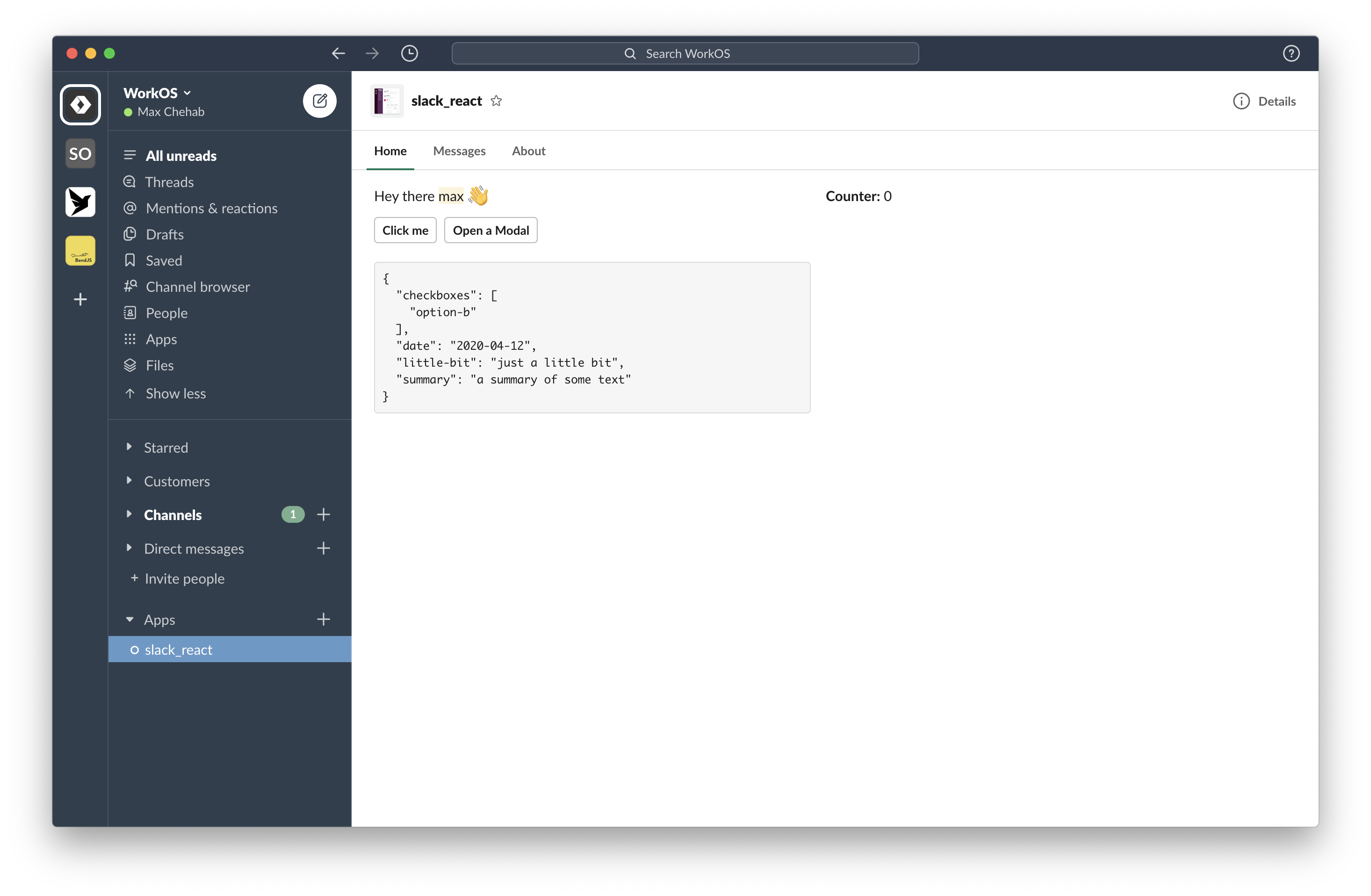 162 |
162 | 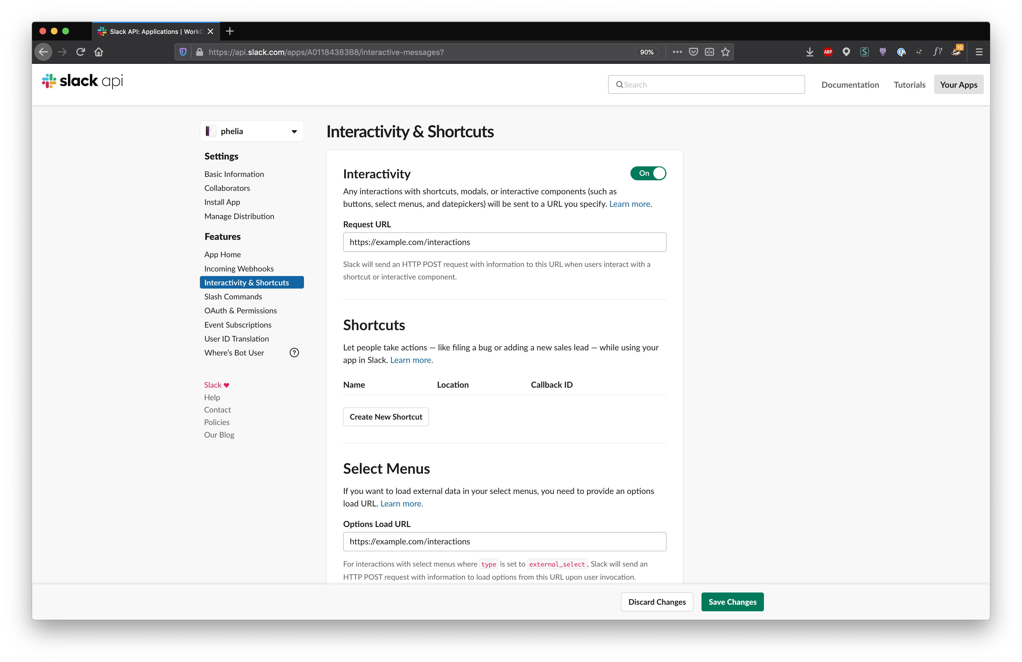 294 |
295 | Then use `client.messageHandler()` to intercept these webhook payloads.
296 |
297 | ```ts
298 | const client = new Phelia(process.env.SLACK_TOKEN);
299 |
300 | app.post(
301 | "/interactions",
302 | client.messageHandler(process.env.SLACK_SIGNING_SECRET)
303 | );
304 | ```
305 |
306 | ## Registering a Home Tab component
307 |
308 | To use a Home Tab component, register a webhook for **Slacks Events API** and register your Home Tab component with Phelia.
309 |
310 | Make sure that you have selected the `app_home_opened` **bot event** in the **Event Subscriptions** of your Slack application.
311 |
312 |
294 |
295 | Then use `client.messageHandler()` to intercept these webhook payloads.
296 |
297 | ```ts
298 | const client = new Phelia(process.env.SLACK_TOKEN);
299 |
300 | app.post(
301 | "/interactions",
302 | client.messageHandler(process.env.SLACK_SIGNING_SECRET)
303 | );
304 | ```
305 |
306 | ## Registering a Home Tab component
307 |
308 | To use a Home Tab component, register a webhook for **Slacks Events API** and register your Home Tab component with Phelia.
309 |
310 | Make sure that you have selected the `app_home_opened` **bot event** in the **Event Subscriptions** of your Slack application.
311 |
312 | 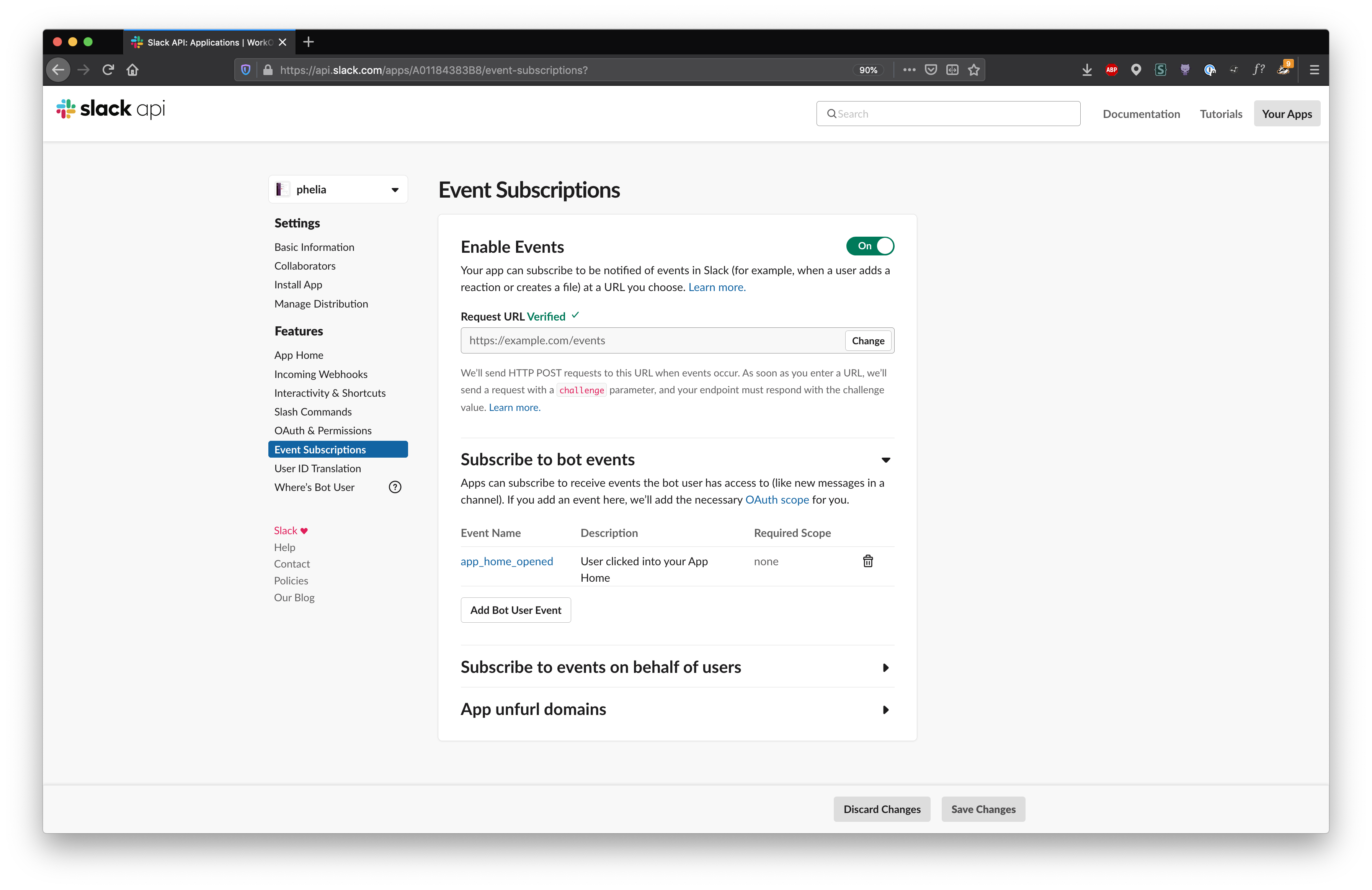 313 |
314 | Then use `client.appHomeHandler()` to intercept this webhook payload.
315 |
316 | ```ts
317 | import { createEventAdapter } from "@slack/events-api";
318 |
319 | const slackEvents = createEventAdapter(process.env.SLACK_SIGNING_SECRET);
320 | const client = new Phelia(process.env.SLACK_TOKEN);
321 |
322 | slackEvents.on("app_home_opened", client.appHomeHandler(HomeApp));
323 |
324 | app.use("/events", slackEvents.requestListener());
325 | ```
326 |
327 | _This requires use of Slack's SDK `@slack/events-api`_
328 |
329 | With this setup, whenever a user opens the Home tab it will display your Home App accordingly.
330 |
331 | ## Opening Modals
332 |
333 | Modals can be opened in two ways:
334 |
335 | 1. By use of the `useModal` hook in a component.
336 | 2. In response to a user command or action within Slack.
337 |
338 | When responding to user action outside a phelia component, one can record the `trigger_id` sent by slack in response to a command and use it to open a modal:
339 |
340 | ```ts
341 |
342 | // In response to some slash command from the user.
343 | const triggerID = slackCommandPayload.trigger_id;
344 | const client = new Phelia(process.env.SLACK_TOKEN);
345 |
346 | await client.openModal(
347 | MyModal,
348 | triggerID,
349 | { // props },
350 | );
351 | ```
352 |
353 | ## Injected Properties
354 |
355 | Depending on which type of component you are building, Phelia will inject a collection of functions and properties into your components function.
356 |
357 | ### `useState` Function
358 |
359 | The `useState` function is very similar to it's React predecessor. Given a unique key, `useState` will return a pair of values; the current state and a function to modify the state. The `useState` function also takes an optional second parameter to specify an initial value.
360 |
361 | **Example:**
362 |
363 | ```tsx
364 | function Counter({ useState }) {
365 | const [counter, setCounter] = useState("unique-key", 0);
366 |
367 | return (
368 |
313 |
314 | Then use `client.appHomeHandler()` to intercept this webhook payload.
315 |
316 | ```ts
317 | import { createEventAdapter } from "@slack/events-api";
318 |
319 | const slackEvents = createEventAdapter(process.env.SLACK_SIGNING_SECRET);
320 | const client = new Phelia(process.env.SLACK_TOKEN);
321 |
322 | slackEvents.on("app_home_opened", client.appHomeHandler(HomeApp));
323 |
324 | app.use("/events", slackEvents.requestListener());
325 | ```
326 |
327 | _This requires use of Slack's SDK `@slack/events-api`_
328 |
329 | With this setup, whenever a user opens the Home tab it will display your Home App accordingly.
330 |
331 | ## Opening Modals
332 |
333 | Modals can be opened in two ways:
334 |
335 | 1. By use of the `useModal` hook in a component.
336 | 2. In response to a user command or action within Slack.
337 |
338 | When responding to user action outside a phelia component, one can record the `trigger_id` sent by slack in response to a command and use it to open a modal:
339 |
340 | ```ts
341 |
342 | // In response to some slash command from the user.
343 | const triggerID = slackCommandPayload.trigger_id;
344 | const client = new Phelia(process.env.SLACK_TOKEN);
345 |
346 | await client.openModal(
347 | MyModal,
348 | triggerID,
349 | { // props },
350 | );
351 | ```
352 |
353 | ## Injected Properties
354 |
355 | Depending on which type of component you are building, Phelia will inject a collection of functions and properties into your components function.
356 |
357 | ### `useState` Function
358 |
359 | The `useState` function is very similar to it's React predecessor. Given a unique key, `useState` will return a pair of values; the current state and a function to modify the state. The `useState` function also takes an optional second parameter to specify an initial value.
360 |
361 | **Example:**
362 |
363 | ```tsx
364 | function Counter({ useState }) {
365 | const [counter, setCounter] = useState("unique-key", 0);
366 |
367 | return (
368 |