├── .gitignore ├── README.md ├── eslint.config.js ├── index.html ├── package-lock.json ├── package.json ├── postcss.config.js ├── src ├── App.jsx ├── Components │ ├── Contact │ │ ├── Contact.css │ │ └── Contact.jsx │ ├── Features │ │ ├── Features.css │ │ └── Features.jsx │ ├── HeroSection │ │ ├── HeroSection.css │ │ └── HeroSection.jsx │ ├── Join us │ │ ├── Joinus.jsx │ │ └── join.css │ ├── Pricing │ │ ├── Pricing.css │ │ └── Pricing.jsx │ ├── textsec │ │ ├── Textsec.jsx │ │ └── textsection.css │ ├── textsection │ │ ├── Textsection.jsx │ │ └── textsection.css │ └── titlesection │ │ ├── Titlesection.jsx │ │ └── titlesection.css ├── Navbar + Footer │ ├── Navbar │ │ ├── Navbar.css │ │ └── Navbar.jsx │ └── footer │ │ ├── Footer.css │ │ └── Footer.jsx ├── Signuppage │ ├── Login.css │ └── Login.jsx ├── assets │ ├── bg-image-block.svg │ ├── bg-tilt.png │ ├── bg-tilt.svg │ ├── favcon.png │ ├── favicon.svg │ ├── gif.gif │ ├── graph.svg │ ├── logo.svg │ ├── react.svg │ └── tracking.svg ├── index.css └── main.jsx ├── tailwind.config.js └── vite.config.js /.gitignore: -------------------------------------------------------------------------------- 1 | # Logs 2 | logs 3 | *.log 4 | npm-debug.log* 5 | yarn-debug.log* 6 | yarn-error.log* 7 | pnpm-debug.log* 8 | lerna-debug.log* 9 | 10 | node_modules 11 | dist 12 | dist-ssr 13 | *.local 14 | 15 | # Editor directories and files 16 | .vscode/* 17 | !.vscode/extensions.json 18 | .idea 19 | .DS_Store 20 | *.suo 21 | *.ntvs* 22 | *.njsproj 23 | *.sln 24 | *.sw? 25 | -------------------------------------------------------------------------------- /README.md: -------------------------------------------------------------------------------- 1 | 2 | # Collabsy 3 | 4 | Collabsy is a comprehensive project management and team collaboration tool designed to streamline team tasks, enhance communication, and simplify progress tracking—all in one intuitive platform. With a user-friendly admin dashboard, Collabsy empowers teams to achieve more with less effort. Transform your team collaboration experience and elevate productivity today 5 | 6 | -Check out the live site here: https://colllabsy.netlify.app/ 7 | 8 | 9 | 10 | ## Screenshots 11 | 12 | [![Capture.png](https://i.postimg.cc/3rS7fmQg/Capture.png)
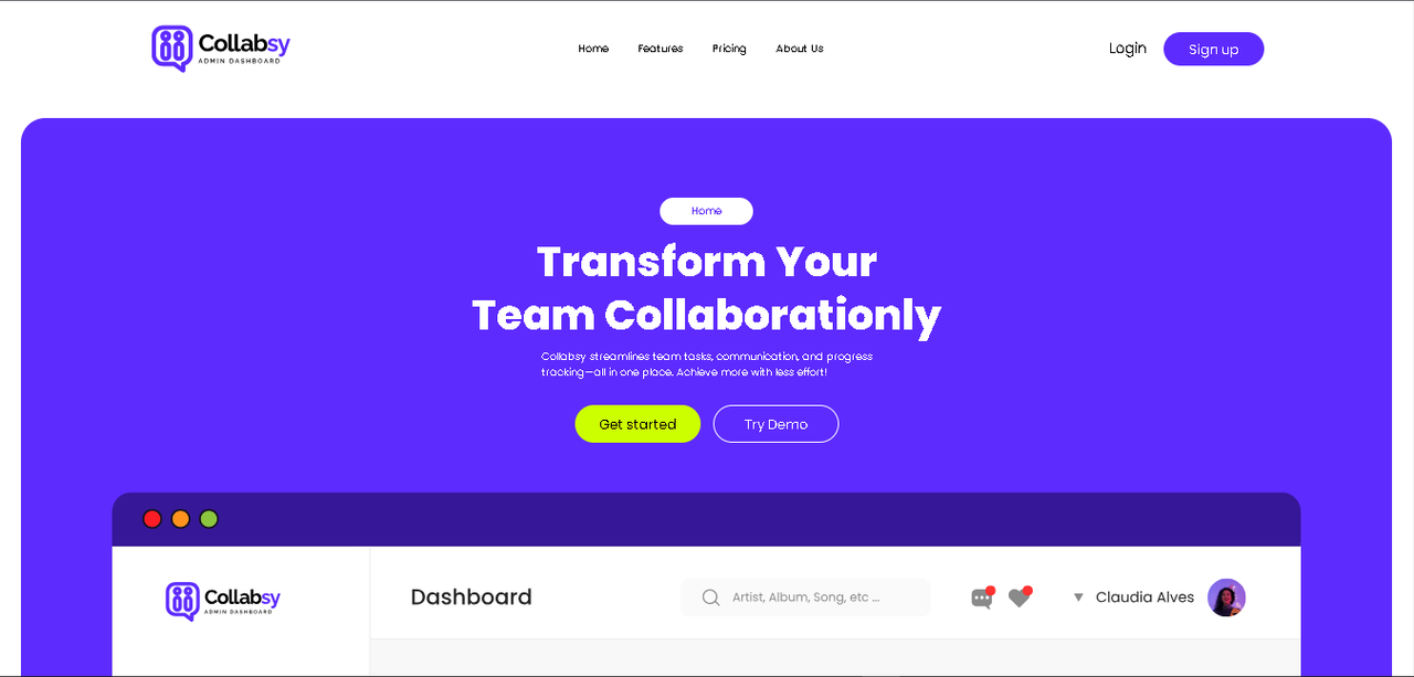
](https://postimg.cc/3WvPdyRR) 13 | 14 | 15 | ## Features 16 | 17 | - **Intuitive Admin Dashboard**: A user-friendly interface that allows you to manage projects and team activities efficiently. 18 | - **Task Management**: Easily create, assign, and track tasks to ensure deadlines are met and projects stay on schedule. 19 | - **Team Collaboration**: Enhance communication among team members with integrated chat and file-sharing capabilities. 20 | - **Progress Tracking**: Monitor project status in real-time to keep everyone aligned and informed. 21 | - **Customizable Workflows**: Tailor workflows to fit your team's needs, making project management more effective. 22 | - **Responsive Design**: Access Collabsy from any device, ensuring you can manage your projects on the go. 23 | - **Demo Mode**: Try out the platform before committing, with a fully functional demo showcasing key features. 24 | ## Tech Stack 25 | 26 | - **React**: A powerful JavaScript library for building user interfaces, enabling a dynamic and responsive experience. 27 | - **Tailwind CSS**: A utility-first CSS framework that allows for rapid design and development of custom user interfaces. 28 | - **Pure CSS**: For additional styling and customization, ensuring a polished and visually appealing layout. 29 | ## How It Works 30 | 31 | 1. **User Registration and Login**: New users can easily sign up and create an account. Existing users can log in to access their personalized dashboard. 32 | 33 | 2. **Dashboard Overview**: Upon logging in, users are greeted with an intuitive dashboard that provides a snapshot of ongoing projects, tasks, and team activity. 34 | 35 | 3. **Create and Manage Projects**: Users can create new projects, set deadlines, and assign tasks to team members directly from the dashboard. 36 | 37 | 4. **Collaborate with Team Members**: Team members can communicate through integrated chat features and share files, ensuring seamless collaboration. 38 | 39 | 5. **Track Progress**: Users can monitor project progress with visual indicators, making it easy to see which tasks are completed and which are still in progress. 40 | 41 | 6. **Adjust Workflows**: Teams can customize workflows and processes to better fit their unique needs, enhancing overall productivity. 42 | 43 | 7. **Demo Mode**: Users can explore a demo version of Collabsy to familiarize themselves with its features before committing to a full account 44 | 45 | ## Getting Started 46 | 47 | 1. Clone the repository. 48 | 49 | 2. Install dependencies: 50 | 51 | ```bash 52 | npm install 53 | ``` 54 | 55 | 3. Run the development server: 56 | 57 | ```bash 58 | npm start 59 | ``` 60 | ## Contributing 61 | 62 | Feel free to submit issues or pull requests to contribute to the development of Admin Dashboard. Let's make it even better! 63 | 64 | -------------------------------------------------------------------------------- /eslint.config.js: -------------------------------------------------------------------------------- 1 | import js from '@eslint/js' 2 | import globals from 'globals' 3 | import react from 'eslint-plugin-react' 4 | import reactHooks from 'eslint-plugin-react-hooks' 5 | import reactRefresh from 'eslint-plugin-react-refresh' 6 | 7 | export default [ 8 | { ignores: ['dist'] }, 9 | { 10 | files: ['**/*.{js,jsx}'], 11 | languageOptions: { 12 | ecmaVersion: 2020, 13 | globals: globals.browser, 14 | parserOptions: { 15 | ecmaVersion: 'latest', 16 | ecmaFeatures: { jsx: true }, 17 | sourceType: 'module', 18 | }, 19 | }, 20 | settings: { react: { version: '18.3' } }, 21 | plugins: { 22 | react, 23 | 'react-hooks': reactHooks, 24 | 'react-refresh': reactRefresh, 25 | }, 26 | rules: { 27 | ...js.configs.recommended.rules, 28 | ...react.configs.recommended.rules, 29 | ...react.configs['jsx-runtime'].rules, 30 | ...reactHooks.configs.recommended.rules, 31 | 'react/jsx-no-target-blank': 'off', 32 | 'react-refresh/only-export-components': [ 33 | 'warn', 34 | { allowConstantExport: true }, 35 | ], 36 | }, 37 | }, 38 | ] 39 | -------------------------------------------------------------------------------- /index.html: -------------------------------------------------------------------------------- 1 | 2 | 3 | 4 | 5 | 6 | 7 | Collabsy 8 | 9 | 10 |
11 | 12 | 13 | 14 | -------------------------------------------------------------------------------- /package.json: -------------------------------------------------------------------------------- 1 | { 2 | "name": "collabsy", 3 | "private": true, 4 | "version": "0.0.0", 5 | "type": "module", 6 | "scripts": { 7 | "dev": "vite", 8 | "build": "vite build", 9 | "lint": "eslint .", 10 | "preview": "vite preview" 11 | }, 12 | "dependencies": { 13 | "collabsy": "file:", 14 | "react": "^18.3.1", 15 | "react-dom": "^18.3.1", 16 | "react-router-dom": "^6.27.0" 17 | }, 18 | "devDependencies": { 19 | "@eslint/js": "^9.11.1", 20 | "@types/react": "^18.3.10", 21 | "@types/react-dom": "^18.3.0", 22 | "@vitejs/plugin-react": "^4.3.2", 23 | "autoprefixer": "^10.4.20", 24 | "eslint": "^9.11.1", 25 | "eslint-plugin-react": "^7.37.0", 26 | "eslint-plugin-react-hooks": "^5.1.0-rc.0", 27 | "eslint-plugin-react-refresh": "^0.4.12", 28 | "globals": "^15.9.0", 29 | "postcss": "^8.4.47", 30 | "tailwindcss": "^3.4.14", 31 | "vite": "^5.4.8" 32 | } 33 | } 34 | -------------------------------------------------------------------------------- /postcss.config.js: -------------------------------------------------------------------------------- 1 | export default { 2 | plugins: { 3 | tailwindcss: {}, 4 | autoprefixer: {}, 5 | }, 6 | } 7 | -------------------------------------------------------------------------------- /src/App.jsx: -------------------------------------------------------------------------------- 1 | import React from "react"; 2 | import Navbar from "./Navbar + Footer/Navbar/Navbar"; 3 | import HeroSection from "./Components/HeroSection/HeroSection"; 4 | import Titlesection from "./Components/titlesection/titlesection"; 5 | import Features from "./Components/Features/Features"; 6 | import Pricing from "./Components/Pricing/Pricing"; 7 | import Contact from "./Components/Contact/Contact"; 8 | import Joinus from "./Components/Join us/Joinus"; 9 | import Footer from "./Navbar + Footer/footer/Footer"; 10 | import { BrowserRouter as Router, Routes, Route } from "react-router-dom"; // Correct this line 11 | import Login from "./Signuppage/Login"; 12 | 13 | const App = () => { 14 | return ( 15 | {/* This is the correct usage */} 16 |
17 | 18 | 19 | 20 | 21 | 22 | 23 | 24 | 25 | 26 | } /> 27 | 28 |
30 |
31 | ); 32 | }; 33 | 34 | export default App; 35 | -------------------------------------------------------------------------------- /src/Components/Contact/Contact.css: -------------------------------------------------------------------------------- 1 | .contact { 2 | align-items: center; 3 | flex-direction: column; 4 | border-radius: 20px; 5 | background-color: #5e2bff; 6 | height: auto; 7 | margin-top: 150px; 8 | padding: 50px 40px; 9 | justify-content: space-between; 10 | position: relative; 11 | padding-top: 70px; 12 | 13 | } 14 | 15 | /* New CSS for column layout of Titlesection and Textsec */ 16 | .title-text-container { 17 | display: flex; 18 | flex-direction: column; 19 | align-items: center; 20 | margin-bottom: 8px; 21 | } 22 | 23 | .content-sections { 24 | display: flex; 25 | justify-content: space-between; 26 | width: 100%; 27 | } 28 | 29 | /* Left and right sections remain unaffected */ 30 | .left-sectionn { 31 | flex: 1; 32 | display: flex; 33 | justify-content: center; 34 | position: relative; 35 | } 36 | 37 | .right-sectionn { 38 | flex: 1; 39 | display: flex; 40 | justify-content: center; 41 | position: relative; 42 | } 43 | 44 | /* Rectangle Backgrounds */ 45 | .left-sectionn::before, 46 | .right-sectionn::before { 47 | content: ''; 48 | position: absolute; 49 | top: 0; 50 | bottom: 0; 51 | left: 0; 52 | right: 0; 53 | border-radius: 20px; 54 | z-index: -1; 55 | } 56 | 57 | /* Contact Form */ 58 | .contact-form-container { 59 | max-width: 500px; 60 | padding: 20px; 61 | 62 | border-radius: 10px; 63 | width: 100%; 64 | 65 | } 66 | 67 | .contact-title { 68 | font-size: 24px; 69 | font-weight: bold; 70 | margin-bottom: 20px; 71 | color: #ffffff; 72 | } 73 | 74 | .form-group { 75 | margin-bottom: 16px; 76 | } 77 | 78 | .form-group label { 79 | display: block; 80 | font-size: 15px; 81 | color: #fff; 82 | margin-bottom: 8px; 83 | } 84 | 85 | .input-field { 86 | font-size: 13px; 87 | width: 100%; 88 | padding: 10px; 89 | border-radius: 5px; 90 | border: 1px solid #ddd; 91 | background-color: #f1f1f1; 92 | transition: all 0.3s ease; 93 | } 94 | 95 | .input-field:focus { 96 | outline: none; 97 | border-color: #5e2bff; 98 | box-shadow: 0 0 8px rgba(94, 43, 255, 0.3); 99 | } 100 | 101 | .submit-button { 102 | width: 100%; 103 | padding: 12px; 104 | background-color: #CCFF00; 105 | color: #000000; 106 | font-size: 16px; 107 | border: none; 108 | border-radius: 50px; 109 | cursor: pointer; 110 | transition: background-color 0.3s ease; 111 | } 112 | 113 | .submit-button:hover { 114 | background-color: rgb(255, 255, 255); 115 | 116 | } 117 | 118 | 119 | 120 | 121 | @media (max-width: 500px){ 122 | .submit-button{ 123 | font-size: 10px; 124 | } 125 | .form-group label{ 126 | font-size: 12px; 127 | } 128 | 129 | .input-field{ 130 | font-size: 10px; 131 | } 132 | .contact{ 133 | padding: 10px; 134 | padding-top: 30px; 135 | margin-top: 70px; 136 | 137 | } 138 | .contact-form-container{ 139 | padding-top: 10px; 140 | } 141 | } -------------------------------------------------------------------------------- /src/Components/Contact/Contact.jsx: -------------------------------------------------------------------------------- 1 | import React from 'react'; 2 | import './Contact.css'; 3 | import Titlesection from '../titlesection/titlesection'; 4 | import Textsec from '../textsec/Textsec'; 5 | import gif from '../../assets/gif.gif'; 6 | 7 | const Contact = () => { 8 | return ( 9 |
10 | {/* New wrapper for Titlesection and Textsec */} 11 |
12 | 13 | 14 |
15 | 16 |
17 |
18 |
19 |
20 |
21 | 22 | 28 |
29 |
30 | 31 | 38 |
39 |
40 | 41 | 48 |
49 | 52 |
53 |
54 |
55 | 56 | {/* Uncomment if needed */} 57 | 58 |
59 |
60 | ); 61 | }; 62 | 63 | export default Contact; 64 | -------------------------------------------------------------------------------- /src/Components/Features/Features.css: -------------------------------------------------------------------------------- 1 | .Features { 2 | padding: 50px 30px; 3 | align-items: center; 4 | display: flex; 5 | flex-direction: column; 6 | padding-top: 120px; 7 | } 8 | 9 | .twosection { 10 | align-items: center; 11 | display: flex; 12 | width: 100%; 13 | justify-content: space-between; 14 | padding: 50px 52px; 15 | 16 | /* Ensure both sections have the same width */ 17 | gap: 20px; /* Adds space between the sections */ 18 | } 19 | 20 | .left-section, 21 | .right-section { 22 | background-color: #f1f1f1; 23 | border-radius: 10px; 24 | padding: 20px 30px; 25 | 26 | /* Ensure both sections have the same width and height */ 27 | flex: 1; /* Makes both sections take equal space */ 28 | height: 100%; /* Ensures both sections stretch equally in height */ 29 | display: flex; 30 | flex-direction: column; 31 | justify-content: center; /* Centers the content vertically */ 32 | padding-bottom: 60px; 33 | } 34 | 35 | .left-section img, 36 | .right-section img { 37 | width: 100%; 38 | height: auto; /* Maintain aspect ratio */ 39 | display: flex; 40 | align-items: center; 41 | } 42 | 43 | .twosection h1 { 44 | line-height: 128.29%; 45 | font-weight: 700; 46 | font-family: var(--font-poppins); 47 | color: #000; 48 | text-align: left; 49 | display: inline-block; 50 | margin-top: 15px; 51 | } 52 | 53 | .twosection p { 54 | line-height: 128.29%; 55 | font-weight: 300; 56 | font-family: var(--paragraph-heading); 57 | color: #000; 58 | text-align: left; 59 | margin-top: 10px; 60 | } 61 | 62 | /* Responsive styles */ 63 | @media (max-width: 700px) { 64 | .Features { 65 | padding-top: 50px; 66 | } 67 | 68 | .twosection { 69 | flex-direction: column; /* Stack sections vertically on smaller screens */ 70 | } 71 | 72 | .left-section, 73 | .right-section { 74 | width: 100%; /* Each section takes full width on smaller screens */ 75 | } 76 | } 77 | 78 | @media (max-width: 500px) { 79 | .Features { 80 | padding-top: 30px; 81 | } 82 | 83 | .twosection{ 84 | padding: 25px 0px; 85 | } 86 | .twosection h1{ 87 | font-size: 15px; 88 | } 89 | .twosection p{ 90 | font-size: 10px; 91 | } 92 | .left-section, 93 | .right-section { 94 | padding-bottom: 20px; 95 | 96 | } 97 | } 98 | 99 | @media (max-width: 300px) { 100 | .Features { 101 | padding-top: 20px; 102 | } 103 | } 104 | -------------------------------------------------------------------------------- /src/Components/Features/Features.jsx: -------------------------------------------------------------------------------- 1 | import React from 'react' 2 | import Titlesection from '../titlesection/titlesection' 3 | import "./Features.css" 4 | import Textsection from '../textsection/textsection' 5 | import graph from '../../assets/graph.svg'; 6 | import tracking from '../../assets/tracking.svg'; 7 | 8 | 9 | const Features = () => { 10 | return ( 11 |
12 | 13 | 14 | 15 | 19 |
20 |
21 | 22 |

Real-Time Data Charts

23 |

Visualize project metrics at a glance and make informed decisions quickly.

24 |
25 |
26 | 27 |

Project Tracking

28 |

Monitor progress and deadlines to keep your team on track.

29 |
30 |
31 |
32 | ) 33 | } 34 | 35 | export default Features 36 | -------------------------------------------------------------------------------- /src/Components/HeroSection/HeroSection.css: -------------------------------------------------------------------------------- 1 | .Hero { 2 | padding: 0px 30px; 3 | background-color: var(--primary-color); 4 | margin: 25px; 5 | border-radius: 29px; 6 | height: 900px; 7 | align-items: center; 8 | display: flex; 9 | flex-direction: column; 10 | padding-top: 95px; 11 | overflow: hidden; 12 | } 13 | 14 | .text h1 { 15 | font-size: 50px; 16 | line-height: 128.29%; 17 | display: inline-block; 18 | font-weight: 800; 19 | text-align: center; 20 | color: white; 21 | } 22 | 23 | .text { 24 | padding-top: 13px; 25 | align-items: center; 26 | display: flex; 27 | flex-direction: column; 28 | gap: 9px; 29 | } 30 | 31 | .paragra { 32 | color: rgb(206, 206, 206); 33 | line-height: 128.29%; 34 | text-align: center; 35 | display: inline-block; 36 | font-family: var(--paragraph-heading); 37 | font-weight: 300; 38 | } 39 | 40 | .buttons { 41 | display: flex; 42 | padding-top: 30px; 43 | gap: 15px; 44 | text-align: center; 45 | } 46 | 47 | .buttons a{ 48 | text-decoration: none; 49 | } 50 | 51 | .buttons .first-button { 52 | background-color: #ccff00; 53 | border: none; 54 | border-radius: 54px; 55 | width: 150px; 56 | height: 45px; 57 | font-size: 16px; 58 | cursor: pointer; 59 | transition: all ease-in-out 0.2s; 60 | align-items: center; 61 | display: flex; 62 | justify-content: center; 63 | } 64 | 65 | .buttons .second-button { 66 | width: 150px; 67 | height: 45px; 68 | border: 1px solid #fff; 69 | border-radius: 54px; 70 | font-size: 16px; 71 | cursor: pointer; /* Keep this to show pointer on hover */ 72 | background-color: rgba(174, 134, 255, 0); 73 | color: white; 74 | transition: all ease-in-out 0.2s; 75 | align-items: center; 76 | display: flex; 77 | justify-content: center; 78 | } 79 | 80 | .Hero img { 81 | position: relative; /* Allows for positioning adjustments */ 82 | padding-top: 50px; 83 | width: 90%; /* Increase the width beyond 100% to hide part of the image */ 84 | height: auto; /* Maintain the aspect ratio */ 85 | object-fit: cover; /* Ensures the image fills the container without distortion */ 86 | } 87 | 88 | .buttons .first-button:hover { 89 | background-color: #ffffff; 90 | } 91 | 92 | .buttons .second-button:hover { 93 | background-color: #ffffff; 94 | color: black; 95 | } 96 | 97 | @media (max-width: 963px) { 98 | .Hero { 99 | height: 700px; 100 | } 101 | } 102 | 103 | @media (max-width: 728px) { 104 | .Hero { 105 | height: 550px; 106 | } 107 | 108 | .text h1 { 109 | font-size: 30px; 110 | padding-top: -5px; 111 | } 112 | .text p { 113 | font-size: 10px; 114 | } 115 | .buttons .first-button { 116 | width: 130px; 117 | height: 40px; 118 | font-size: 13px; 119 | } 120 | .buttons .second-button { 121 | width: 130px; 122 | height: 40px; 123 | font-size: 13px; 124 | } 125 | } 126 | 127 | @media (max-width: 500px) { 128 | .text h1 { 129 | font-size: 23px; 130 | padding-top: -5px; 131 | } 132 | .text p { 133 | font-size: 8px; 134 | } 135 | .buttons .first-button { 136 | width: 110px; 137 | height: 37px; 138 | font-size: 11px; 139 | } 140 | .buttons .second-button { 141 | width: 110px; 142 | height: 37px; 143 | font-size: 11px; 144 | } 145 | } 146 | 147 | @media (max-width: 496px) { 148 | .buttons .first-button { 149 | width: 90px; 150 | height: 37px; 151 | font-size: 10px; 152 | } 153 | .buttons .second-button { 154 | width: 90px; 155 | height: 37px; 156 | font-size: 10px; 157 | } 158 | .text p { 159 | font-size: 5px; 160 | } 161 | 162 | .Hero { 163 | height: 380px; 164 | padding: 60px 10px; 165 | margin: 15px; 166 | } 167 | .Hero img { 168 | margin-top: -20px; 169 | } 170 | .text h1 { 171 | font-size: 18px; 172 | padding-top: -5px; 173 | } 174 | .buttons { 175 | gap: 10px; 176 | padding-top: 20px; 177 | } 178 | } 179 | -------------------------------------------------------------------------------- /src/Components/HeroSection/HeroSection.jsx: -------------------------------------------------------------------------------- 1 | 2 | import "./HeroSection.css"; 3 | import Titlesection from "../titlesection/titlesection"; 4 | import background from "../../assets/bg-image-block.svg"; 5 | 6 | const HeroSection = () => { 7 | return ( 8 |
9 | 10 |
11 |

12 | Transform Your
13 | Team Collaborationly 14 |

15 |

16 | Collabsy streamlines team tasks, communication, and progress
17 | tracking—all in one place. Achieve more with less effort! 18 |

19 |
20 |
21 | 25 | Get started 26 | 27 | 31 | Try Demo 32 | 33 |
34 | 35 |
36 | ); 37 | }; 38 | 39 | export default HeroSection; 40 | -------------------------------------------------------------------------------- /src/Components/Join us/Joinus.jsx: -------------------------------------------------------------------------------- 1 | import React from "react"; 2 | import bg from "../../assets/bg-tilt.svg"; 3 | import './join.css' 4 | 5 | const Joinus = () => { 6 | return ( 7 |
8 |
9 |
10 | Let’s Join With Us 11 |
12 |

13 | By Joining and enjoying our panel, you can make the
job you do 14 | as a recruiter easier 15 |

16 | 19 |
20 | {/* This div will be hidden on sm and md, shown on lg and larger */} 21 |
22 | background 23 |
24 |
25 | ); 26 | }; 27 | 28 | export default Joinus; 29 | -------------------------------------------------------------------------------- /src/Components/Join us/join.css: -------------------------------------------------------------------------------- 1 | 2 | 3 | .right img { 4 | width: 110%; /* Adjust the width to your desired value */ 5 | 6 | margin-top: 100px; 7 | } 8 | 9 | @media (max-width: 800px){ 10 | .right img{ 11 | display: none; 12 | } 13 | } 14 | 15 | @media (max-width: 460px){ 16 | .joinus{ 17 | align-items: center; 18 | padding-left: 40px; 19 | padding-right: 40px; 20 | } 21 | .texthead{ 22 | font-size: 18px; 23 | } 24 | .paragra{ 25 | font-size: 9px; 26 | } 27 | } 28 | 29 | @media (max-width: 460px){ 30 | .paragra{ 31 | font-size: 7px; 32 | } 33 | .joinus{ 34 | align-items: center; 35 | padding-left: 40px; 36 | padding-right: 40px; 37 | } 38 | .text-h{ 39 | font-size: 8px; 40 | } 41 | } -------------------------------------------------------------------------------- /src/Components/Pricing/Pricing.css: -------------------------------------------------------------------------------- 1 | /* General Pricing Container */ 2 | .pricing { 3 | padding: 20px; 4 | align-items: center; 5 | display: flex; 6 | flex-direction: column; 7 | padding-top: 60px; 8 | } 9 | 10 | @media (max-width: 500px) { 11 | .pricing { 12 | padding-top: 20px; 13 | } 14 | } 15 | 16 | .pricing-container { 17 | padding: 0px 35px; 18 | } 19 | 20 | /* Pricing Toggle */ 21 | .pricing-toggle { 22 | display: flex; 23 | justify-content: center; 24 | margin: 20px 0; 25 | } 26 | 27 | .toggle-wrapper { 28 | display: flex; 29 | align-items: center; 30 | position: relative; 31 | border-radius: 9999px; 32 | /* This is the background behind the slider */ 33 | width: 217px; 34 | padding: 4px; 35 | justify-content: space-between; 36 | gap: 20px; 37 | transition: transform 0.3s ease 38 | } 39 | 40 | .toggle-bg { 41 | position: absolute; 42 | top: 0; 43 | left: 0; 44 | width: 100%; 45 | height: 100%; 46 | border-radius: 9999px; 47 | transition: transform 0.3s ease 48 | /* Background color behind the toggle */ 49 | } 50 | 51 | .toggle-slider { 52 | position: absolute; 53 | top: 0; 54 | left: 0; 55 | width: 50%; 56 | height: 100%; 57 | background-color: #5e2bff; /* Color of the toggle slider */ 58 | border-radius: 9999px; 59 | transition: transform 0.3s ease; 60 | } 61 | 62 | .toggle-button { 63 | z-index: 1; 64 | flex: 1; 65 | text-align: center; 66 | font-weight: 500; 67 | padding: 5px 0; 68 | cursor: pointer; 69 | transition: color 0.3s ease; 70 | background-color: #5e2bff; 71 | border: none; 72 | border-radius: 50px; 73 | transition: transform 0.3s ease 74 | } 75 | 76 | .toggle-button.text-white { 77 | color: #ffff; 78 | font-size: 12px; 79 | transition: transform 0.3s ease 80 | 81 | } 82 | 83 | .toggle-button.text-slate-500 { 84 | color: #5e2bff; 85 | font-size: 12px; 86 | background-color: #fff; 87 | border: 1px solid; 88 | transition: transform 0.3s ease 89 | } 90 | 91 | 92 | .toggle-button .text-slate-400 { 93 | color: #9ca3af; 94 | } 95 | 96 | .toggle-button .text-indigo-200 { 97 | color: #c7d2fe; 98 | } 99 | 100 | /* Pricing Grid */ 101 | .pricing-grid { 102 | display: grid; 103 | grid-template-columns: repeat(3, 1fr); 104 | gap: 20px; 105 | margin-top: 40px; 106 | } 107 | 108 | @media (max-width: 768px) { 109 | .pricing-grid { 110 | grid-template-columns: 1fr; 111 | gap: 20px; 112 | } 113 | } 114 | 115 | /* Pricing Card */ 116 | .pricing-card { 117 | background-color: white; 118 | border-radius: 12px; 119 | box-shadow: 0 10px 15px rgba(0, 0, 0, 0.1); 120 | padding: 30px; 121 | text-align: center; 122 | transition: transform 0.3s ease, box-shadow 0.3s ease; 123 | } 124 | 125 | .pricing-card:hover { 126 | transform: translateY(-10px); 127 | box-shadow: 0 15px 25px rgba(0, 0, 0, 0.15); 128 | } 129 | 130 | .most-popular { 131 | border: 2px solid #5e2bff; 132 | } 133 | 134 | .popular-badge { 135 | background-color: #5e2bff; 136 | color: white; 137 | padding: 5px 10px; 138 | border-radius: 9999px; 139 | font-size: 14px; 140 | position: absolute; 141 | 142 | left: 50%; 143 | transform: translateX(-50%); 144 | } 145 | 146 | /* Pricing Header */ 147 | .pricing-header { 148 | margin-bottom: 20px; 149 | } 150 | 151 | .plan-name { 152 | font-size: 24px; 153 | font-weight: 600; 154 | margin-bottom: 10px; 155 | } 156 | 157 | .price { 158 | display: flex; 159 | justify-content: center; 160 | align-items: baseline; 161 | font-size: 32px; 162 | font-weight: 700; 163 | margin-bottom: 10px; 164 | } 165 | 166 | .currency { 167 | font-size: 18px; 168 | margin-right: 5px; 169 | } 170 | 171 | .duration { 172 | font-size: 18px; 173 | color: #6b7280; 174 | margin-left: 5px; 175 | } 176 | 177 | .description { 178 | font-size: 14px; 179 | color: #6b7280; 180 | margin-bottom: 20px; 181 | } 182 | 183 | .purchase-btn { 184 | display: inline-block; 185 | background-color: #5e2bff; 186 | color: white; 187 | padding: 10px 20px; 188 | border-radius: 9999px; 189 | font-weight: 500; 190 | text-decoration: none; 191 | transition: background-color 0.3s ease; 192 | } 193 | 194 | .purchase-btn:hover { 195 | background-color: #4c23cc; 196 | } 197 | 198 | /* Plan Includes */ 199 | .plan-includes { 200 | font-weight: 600; 201 | margin-bottom: 15px; 202 | } 203 | 204 | /* Features List */ 205 | .features-list { 206 | list-style: none; 207 | padding: 0; 208 | margin: 0; 209 | } 210 | 211 | .feature-item { 212 | font-size: 14px; 213 | color: #4b5563; 214 | margin-bottom: 10px; 215 | display: flex; 216 | align-items: center; 217 | } 218 | 219 | /* Media Queries for Smaller Screens */ 220 | @media (max-width: 768px) { 221 | .pricing-grid { 222 | grid-template-columns: 1fr; 223 | } 224 | } 225 | 226 | @media (max-width: 500px) { 227 | .pricing-card { 228 | padding: 20px; 229 | } 230 | } 231 | 232 | 233 | @media (max-width: 500px){ 234 | .plan-name{ 235 | font-size: 20px; 236 | } 237 | .description{ 238 | font-size: 13px; 239 | } 240 | 241 | .purchase-btn{ 242 | font-size: 9px; 243 | } 244 | .feature-item{ 245 | font-size: 10px; 246 | } 247 | } -------------------------------------------------------------------------------- /src/Components/Pricing/Pricing.jsx: -------------------------------------------------------------------------------- 1 | import React, { useState } from 'react'; 2 | import './Pricing.css'; 3 | import Titlesection from '../titlesection/titlesection'; 4 | import Textsection from '../textsection/textsection'; 5 | 6 | const Pricing = () => { 7 | const [isAnnual, setIsAnnual] = useState(true); 8 | 9 | return ( 10 |
11 |
12 | 13 | 17 |
18 | 19 |
20 | {/* Pricing toggle */} 21 |
22 |
23 | {/* The background needs to be placed outside of the slider */} 24 | 25 | 28 | 29 | 36 | 43 |
44 |
45 | 46 |
47 | {/* Pricing Tab 1 */} 48 |
49 |
50 |
51 |
Essential
52 |
53 | $ 54 | {isAnnual ? '29' : '35'} 55 | /mo 56 |
57 |
58 | There are many variations available, but the majority have suffered. 59 |
60 | 61 | Purchase Plan 62 | 63 |
64 |
Includes:
65 |
    66 |
  • Unlimited placeholder texts
  • 67 |
  • Consectetur adipiscing elit
  • 68 |
  • Excepteur sint occaecat cupidatat
  • 69 |
  • Officia deserunt mollit anim
  • 70 |
71 |
72 |
73 | 74 | {/* Pricing Tab 2 */} 75 |
76 |
77 |
Most Popular
78 |
79 |
Perform
80 |
81 | $ 82 | {isAnnual ? '49' : '55'} 83 | /mo 84 |
85 |
86 | There are many variations available, but the majority have suffered. 87 |
88 | 89 | Purchase Plan 90 | 91 |
92 |
Includes:
93 |
    94 |
  • Unlimited placeholder texts
  • 95 |
  • Consectetur adipiscing elit
  • 96 |
  • Excepteur sint occaecat cupidatat
  • 97 |
  • Predefined chunks as necessary
  • 98 |
99 |
100 |
101 | 102 | {/* Pricing Tab 3 */} 103 |
104 |
105 |
106 |
Enterprise
107 |
108 | $ 109 | {isAnnual ? '79' : '85'} 110 | /mo 111 |
112 |
113 | There are many variations available, but the majority have suffered. 114 |
115 | 116 | Purchase Plan 117 | 118 |
119 |
Includes:
120 |
    121 |
  • Unlimited placeholder texts
  • 122 |
  • Consectetur adipiscing elit
  • 123 |
  • Excepteur sint occaecat cupidatat
  • 124 |
  • Free from repetition
  • 125 |
126 |
127 |
128 |
129 |
130 |
131 | ); 132 | }; 133 | 134 | export default Pricing; 135 | -------------------------------------------------------------------------------- /src/Components/textsec/Textsec.jsx: -------------------------------------------------------------------------------- 1 | import React from 'react'; 2 | import "./textsection.css"; 3 | 4 | const Textsec = ({subtitle }) => { 5 | return ( 6 |
7 |

8 |

{subtitle}

9 |

10 |
11 | ); 12 | }; 13 | 14 | export default Textsec; -------------------------------------------------------------------------------- /src/Components/textsec/textsection.css: -------------------------------------------------------------------------------- 1 | .text-1 { 2 | font-size: 19px; 3 | margin: 0; 4 | margin-top: 10px; 5 | font-weight: 700; 6 | text-align: center; 7 | } 8 | .h11 { 9 | color: #ffffff; 10 | 11 | 12 | } 13 | 14 | .span1 { 15 | margin: 0; 16 | color: #fff; 17 | font-size: 32px; 18 | font-weight: 700; 19 | 20 | } 21 | 22 | 23 | 24 | 25 | 26 | @media (max-width: 600px) { 27 | .text-1{ 28 | font-size: 14px; 29 | } 30 | } 31 | 32 | @media (max-width: 515px) { 33 | .text-1{ 34 | font-size: 11px; 35 | } 36 | } 37 | 38 | @media (max-width: 421px) { 39 | .text-1{ 40 | font-size: 7px; 41 | } 42 | } -------------------------------------------------------------------------------- /src/Components/textsection/Textsection.jsx: -------------------------------------------------------------------------------- 1 | import React from 'react'; 2 | import "./textsection.css"; 3 | 4 | const Textsection = ({ title, subtitle }) => { 5 | return ( 6 |
7 |

8 | {title}
9 | {subtitle} 10 |

11 |
12 | ); 13 | }; 14 | 15 | export default Textsection; -------------------------------------------------------------------------------- /src/Components/textsection/textsection.css: -------------------------------------------------------------------------------- 1 | .text-1 { 2 | font-size: 35px; 3 | margin: 0; 4 | margin-top: 20px; 5 | font-weight: 700; 6 | text-align: center; 7 | } 8 | h1 { 9 | color: #000; 10 | 11 | } 12 | .new-text{ 13 | font-size: 23px; 14 | } 15 | 16 | span { 17 | margin: 0; 18 | background: linear-gradient(180deg, #cab4ff 20%, #4d16ff 80%, #fff); 19 | -webkit-background-clip: text; 20 | -webkit-text-fill-color: transparent; 21 | } 22 | 23 | 24 | 25 | 26 | 27 | @media (max-width: 600px) { 28 | .text-1{ 29 | font-size: 20px; 30 | } 31 | } 32 | 33 | @media (max-width: 515px) { 34 | .new-text{ 35 | font-size: 20px; 36 | } 37 | 38 | } 39 | 40 | 41 | 42 | @media (max-width: 421px) { 43 | .new-text{ 44 | font-size: 11px; 45 | } 46 | } -------------------------------------------------------------------------------- /src/Components/titlesection/Titlesection.jsx: -------------------------------------------------------------------------------- 1 | import React from 'react'; 2 | import "./titlesection.css"; 3 | 4 | const Titlesection = ({ text, backgroundColor = "#5e2bff", textColor = "#fff" }) => { 5 | return ( 6 |
10 | {text} 11 |
12 | ); 13 | }; 14 | 15 | export default Titlesection; 16 | -------------------------------------------------------------------------------- /src/Components/titlesection/titlesection.css: -------------------------------------------------------------------------------- 1 | .button { 2 | display: inline-block; 3 | padding: 6px 37px; 4 | background-color: #5e2bff; /* Default color, overridden by inline styles */ 5 | color: #fff; /* Default text color, overridden by inline styles */ 6 | border-radius: 74px; 7 | text-align: center; 8 | font-size: 13px; 9 | } 10 | 11 | /* Media queries for responsive design */ 12 | @media (max-width: 768px) { 13 | .button { 14 | padding: 4px 20px; /* Reduce padding on smaller screens */ 15 | font-size: 11px; /* Adjust font size */ 16 | } 17 | } 18 | 19 | @media (max-width: 480px) { 20 | .button { 21 | padding: 2px 20px; /* Further reduce padding */ 22 | font-size: 10px; /* Adjust font size */ 23 | } 24 | } 25 | -------------------------------------------------------------------------------- /src/Navbar + Footer/Navbar/Navbar.css: -------------------------------------------------------------------------------- 1 | .Navbar { 2 | display: flex; 3 | align-items: center; 4 | justify-content: space-between; 5 | z-index: 1000; 6 | margin-right: 110px; 7 | margin-left: 110px; 8 | background-color: rgb(255, 255, 255); 9 | padding: 0.5px 4%; 10 | padding-top: 15px; 11 | padding-bottom: 15px; 12 | position: sticky; 13 | top: 0; /* Ensures it sticks to the top */ 14 | transition: background-color 0.3s ease, box-shadow 0.3s ease; 15 | } 16 | 17 | .logo { 18 | width: max(10vw, 130px); 19 | align-items: center; 20 | cursor: pointer; 21 | } 22 | 23 | .nav-list { 24 | display: flex; 25 | align-items: center; 26 | gap: 35px; 27 | flex: 1; 28 | justify-content: center; /* This centers the navigation list */ 29 | text-decoration: none; 30 | } 31 | 32 | .nav-list li { 33 | list-style: none; 34 | cursor: pointer; 35 | font-family: var(--font-poppins); 36 | transition: all ease-in-out 0.2s; 37 | text-decoration: none; 38 | } 39 | .nav-list li a{ 40 | text-decoration: none; 41 | } 42 | 43 | .nav-right { 44 | display: flex; 45 | align-items: center; 46 | gap: 20px; 47 | } 48 | 49 | .nav-right li { 50 | list-style: none; 51 | font-family: var(--font-poppins); 52 | color: #000; 53 | font-size: 17px; 54 | cursor: pointer; 55 | transition: all ease-in-out 0.2s; 56 | 57 | } 58 | .nav-right a{ 59 | text-decoration: none; 60 | } 61 | .nav-right button { 62 | background-color: var(--button-background); 63 | width: 120px; 64 | height: 40px; 65 | color: white; 66 | border-radius: 54px; 67 | font-size: 16px; 68 | display: inline-block; 69 | border: none; 70 | cursor: pointer; 71 | transition: all ease-in-out 0.2s; 72 | } 73 | 74 | /* Hover Effects */ 75 | .nav-right button:hover { 76 | background-color: #4c22ac; 77 | } 78 | 79 | .nav-list li:hover { 80 | color: var(--button-background); 81 | } 82 | 83 | .nav-right li:hover { 84 | color: rgb(121, 121, 121); 85 | } 86 | 87 | /* For tablets and smaller devices */ 88 | @media (max-width: 938px) { 89 | .Navbar { 90 | margin-right: 50px; 91 | margin-left: 50px; 92 | padding: 0.5px 2%; 93 | padding-top: 10px; 94 | } 95 | .nav-list { 96 | display: none; 97 | } 98 | } 99 | 100 | /* For mobile devices */ 101 | @media (max-width: 480px) { 102 | .Navbar { 103 | margin-right: 10px; 104 | margin-left: 10px; 105 | padding: 10px 20px; 106 | } 107 | .logo { 108 | width: max(8vw, 100px); 109 | align-self: center; 110 | } 111 | .nav-right button { 112 | font-size: 11px; 113 | width: 100px; 114 | height: 35px; 115 | } 116 | .nav-right li { 117 | font-size: 14px; 118 | } 119 | .nav-right { 120 | gap: 15px; 121 | } 122 | } 123 | 124 | /* Add styles for the scrolled state */ 125 | .Navbar.scrolled { 126 | box-shadow: 0 17px 50px rgba(0, 0, 0, 0.2); /* Optional shadow effect when scrolled */ 127 | background-color: rgba(255, 255, 255, 0.9); /* Slightly transparent background when scrolled */ 128 | animation: fadeIn 0.5s ease forwards; /* Apply the fade-in animation */ 129 | border-radius: 50px; 130 | top: 22px; 131 | 132 | } 133 | 134 | @keyframes fadeIn { 135 | 0% { 136 | opacity: 30s; 137 | transform: translateY(-10px); /* Slide from above */ 138 | } 139 | 100% { 140 | opacity: 1; 141 | transform: translateY(0); /* Original position */ 142 | } 143 | } -------------------------------------------------------------------------------- /src/Navbar + Footer/Navbar/Navbar.jsx: -------------------------------------------------------------------------------- 1 | import React, { useEffect } from 'react'; 2 | import './Navbar.css'; 3 | import logo from '../../assets/logo.svg'; 4 | import { Link } from 'react-router-dom'; 5 | 6 | const Navbar = () => { 7 | useEffect(() => { 8 | const handleScroll = () => { 9 | const navbar = document.getElementsByClassName('Navbar')[0]; 10 | if (window.scrollY > 50) { 11 | navbar.classList.add('scrolled'); 12 | } else { 13 | navbar.classList.remove('scrolled'); 14 | } 15 | }; 16 | 17 | window.addEventListener('scroll', handleScroll); 18 | 19 | return () => { 20 | window.removeEventListener('scroll', handleScroll); 21 | }; 22 | }, []); 23 | 24 | return ( 25 |
26 | Logo 27 | 33 |
34 |
  • Login
  • 35 | 36 |
    37 |
    38 | ); 39 | }; 40 | 41 | export default Navbar; 42 | -------------------------------------------------------------------------------- /src/Navbar + Footer/footer/Footer.css: -------------------------------------------------------------------------------- https://raw.githubusercontent.com/mzherx/Collabsy/e8fa84175ba0767b299b934d9de365da4f8ea6cd/src/Navbar + Footer/footer/Footer.css -------------------------------------------------------------------------------- /src/Navbar + Footer/footer/Footer.jsx: -------------------------------------------------------------------------------- 1 | import React from "react"; 2 | import "./Footer.css"; 3 | import logoo from '../../assets/logo.svg'; 4 | const Footer = () => { 5 | return ( 6 |
    7 |
    8 |
    9 |
    10 | Your Local SVG 16 |
    17 |

    18 | Copyright © 2024 Collabsy 19 |

    20 |

    21 | All rights reserved 22 |

    23 |
    24 | 43 | 62 | 81 | 100 |
    101 |
    102 |
    103 |

    104 | Company 105 |

    106 | 110 | Blog 111 | 112 | 116 | Pricing 117 | 118 | 122 | About Us 123 | 124 | 128 | Contact us 129 | 130 | 134 | Testimonials 135 | 136 |
    137 |
    138 |

    139 | Support 140 |

    141 | 145 | Legal policy 146 | 147 | 151 | Status policy 152 | 153 | 157 | Privacy policy 158 | 159 | 163 | Terms of service 164 | 165 |
    166 |
    167 | 170 |
    171 | 176 | 194 |
    195 |
    196 |
    197 | 198 |
    199 | 202 |
    203 | 208 | 226 |
    227 |
    228 |
    229 | ); 230 | }; 231 | 232 | export default Footer; 233 | -------------------------------------------------------------------------------- /src/Signuppage/Login.css: -------------------------------------------------------------------------------- 1 | @import url('https://fonts.googleapis.com/css2?family=Montserrat:ital,wght@0,100..900;1,100..900&display=swap'); 2 | 3 | *{ 4 | margin: 0; 5 | padding: 0; 6 | box-sizing: border-box; 7 | font-family: "Montserrat", sans-serif; 8 | } 9 | 10 | body{ 11 | background-color: #c9d6ff; 12 | background: linear-gradient(to right, #e2e2e2, #c9d6ff); 13 | display: flex; 14 | align-items: center; 15 | justify-content: center; 16 | flex-direction: column; 17 | height: 100vh; 18 | } 19 | 20 | .container{ 21 | background-color: white; 22 | border-radius: 30px; 23 | box-shadow: 0 5px 15px rgba(0, 0, 0, .35); 24 | position: relative; 25 | overflow: hidden; 26 | width: 768px; 27 | max-width: 100%; 28 | min-height: 480px; 29 | } 30 | 31 | .container p{ 32 | font-size: 14px; 33 | line-height: 20px; 34 | letter-spacing: .3px; 35 | margin: 20px 0; 36 | } 37 | 38 | .container span{ 39 | font-size: 12px; 40 | } 41 | 42 | .container a{ 43 | color: #333; 44 | font-size: 13px; 45 | text-decoration: none; 46 | margin: 15px 0 10px; 47 | } 48 | 49 | .container button{ 50 | background-color: #512da8; 51 | color: #fff; 52 | font-size: 12px; 53 | padding: 10px 45px; 54 | border: 1px solid transparent; 55 | border-radius: 8px; 56 | font-weight: 600; 57 | letter-spacing: 0.5px; 58 | cursor: pointer; 59 | text-transform: uppercase; 60 | margin-top: 10px; 61 | } 62 | 63 | .container button.hidden{ 64 | background-color: transparent; 65 | border-color: #fff; 66 | } 67 | 68 | .container form{ 69 | background-color: #fff; 70 | display: flex; 71 | align-items: center; 72 | justify-content: center; 73 | flex-direction: column; 74 | padding: 40px 0; 75 | height: 100%; 76 | } 77 | 78 | .container input{ 79 | background-color: #eee; 80 | border: none; 81 | margin: 8px 0; 82 | padding: 10px 15px; 83 | font-size: 13px; 84 | border-radius: 8px; 85 | width: 100%; 86 | outline: none; 87 | } 88 | 89 | .form-container{ 90 | position: absolute; 91 | top: 0; 92 | height: 100%; 93 | transition: all .6s ease-in-out; 94 | } 95 | 96 | .sign-in{ 97 | left: 0; 98 | width: 50%; 99 | z-index: 2; 100 | } 101 | 102 | .container.active .sign-in{ 103 | transform: translateX(100%); 104 | } 105 | 106 | .sign-up{ 107 | left: 0; 108 | width: 50%; 109 | opacity: 0; 110 | z-index: 1; 111 | } 112 | 113 | .container.active .sign-up{ 114 | transform: translateX(100%); 115 | opacity: 1; 116 | z-index: 5; 117 | animation: move .6s; 118 | } 119 | 120 | @keyframes move{ 121 | 0%, 49.99%{ 122 | opacity: 0; 123 | z-index: 1; 124 | } 125 | 50%, 100%{ 126 | opacity: 1; 127 | z-index: 5; 128 | } 129 | } 130 | 131 | .social-icons{ 132 | margin: 20px 0; 133 | } 134 | 135 | .social-icons a{ 136 | border: 1px solid #ccc; 137 | border-radius: 20%; 138 | display: inline-flex; 139 | justify-content: center; 140 | align-items: center; 141 | margin: 0 3px; 142 | width: 40px; 143 | height: 40px; 144 | } 145 | 146 | .toggle-container{ 147 | position: absolute; 148 | top: 0; 149 | left: 50%; 150 | width: 50%; 151 | height: 100%; 152 | overflow: hidden; 153 | transition: all .6s ease-in-out; 154 | border-radius: 150px 0 0 100px; 155 | z-index: 1000; 156 | } 157 | 158 | .container.active .toggle-container{ 159 | transform: translateX(-100%); 160 | border-radius: 0 150px 100px 0; 161 | } 162 | 163 | .toggle{ 164 | background-color: #512da8; 165 | height: 100%; 166 | background: linear-gradient(to right, #5c6bc0, #512da8); 167 | color: #fff; 168 | position: relative; 169 | left: -100%; 170 | height: 100%; 171 | width: 200%; 172 | transform: translate(0); 173 | transition: all .6s ease-in-out; 174 | } 175 | 176 | .container.container.active .toggle{ 177 | transform: translateX(50%); 178 | } 179 | 180 | .toggle-panel{ 181 | position: absolute; 182 | width: 50%; 183 | height: 100%; 184 | display: flex; 185 | align-items: center; 186 | justify-content: center; 187 | flex-direction: column; 188 | padding: 0 30px; 189 | text-align: center; 190 | top: 0; 191 | transform: translateX(0); 192 | transition: all .6s ease-in-out; 193 | } 194 | 195 | .toggle-left{ 196 | transform: translateX(-200%); 197 | } 198 | 199 | .container.active .toggle-left{ 200 | transform: translateX(0); 201 | } 202 | 203 | .toggle-right{ 204 | right: 0; 205 | transform: translateX(0); 206 | } 207 | 208 | .container.active .toggle-right{ 209 | transform: translateX(200%); 210 | } 211 | -------------------------------------------------------------------------------- /src/Signuppage/Login.jsx: -------------------------------------------------------------------------------- 1 | import React from 'react' 2 | 3 | const Login = () => { 4 | return ( 5 |
    6 | 7 |
    8 | ) 9 | } 10 | 11 | export default Login 12 | -------------------------------------------------------------------------------- /src/assets/bg-tilt.png: -------------------------------------------------------------------------------- https://raw.githubusercontent.com/mzherx/Collabsy/e8fa84175ba0767b299b934d9de365da4f8ea6cd/src/assets/bg-tilt.png -------------------------------------------------------------------------------- /src/assets/favcon.png: -------------------------------------------------------------------------------- https://raw.githubusercontent.com/mzherx/Collabsy/e8fa84175ba0767b299b934d9de365da4f8ea6cd/src/assets/favcon.png -------------------------------------------------------------------------------- /src/assets/favicon.svg: -------------------------------------------------------------------------------- 1 | -------------------------------------------------------------------------------- /src/assets/gif.gif: -------------------------------------------------------------------------------- https://raw.githubusercontent.com/mzherx/Collabsy/e8fa84175ba0767b299b934d9de365da4f8ea6cd/src/assets/gif.gif -------------------------------------------------------------------------------- /src/assets/graph.svg: -------------------------------------------------------------------------------- 1 | -------------------------------------------------------------------------------- /src/assets/logo.svg: -------------------------------------------------------------------------------- 1 | -------------------------------------------------------------------------------- /src/assets/react.svg: -------------------------------------------------------------------------------- 1 | -------------------------------------------------------------------------------- /src/index.css: -------------------------------------------------------------------------------- 1 | @import url('https://fonts.googleapis.com/css2?family=Poppins:ital,wght@0,100;0,200;0,300;0,400;0,500;0,600;0,700;0,800;0,900&display=swap'); 2 | 3 | @tailwind components; 4 | @tailwind utilities; 5 | @import url('https://fonts.googleapis.com/css2?family=Montserrat:ital,wght@0,100..900;1,100..900&family=Poppins:ital,wght@0,100;0,200;0,300;0,400;0,500;0,600;0,700;0,800;0,900;1,100;1,200;1,300;1,400;1,500;1,600;1,700;1,800;1,900&display=swap'); 6 | *{ 7 | padding: 0; 8 | margin: 0; 9 | box-sizing: border-box; 10 | /* Primary Font: */ font-family: "Poppins", sans-serif; 11 | /* Secondary Font: font-family: "Montserrat", sans-serif;*/ 12 | } 13 | 14 | body{ 15 | background: white; 16 | } 17 | 18 | :root { 19 | /* fonts */ 20 | --font-poppins: Poppins; 21 | /* Colors */ 22 | --button-background: #5e2bff; 23 | --primary-color: #5e2bff; 24 | --paragraph-heading : "Montserrat", sans-serif; 25 | } -------------------------------------------------------------------------------- /src/main.jsx: -------------------------------------------------------------------------------- 1 | import { StrictMode } from 'react' 2 | import { createRoot } from 'react-dom/client' 3 | import App from './App.jsx' 4 | import './index.css' 5 | 6 | createRoot(document.getElementById('root')).render( 7 | 8 | 9 | , 10 | ) 11 | -------------------------------------------------------------------------------- /tailwind.config.js: -------------------------------------------------------------------------------- 1 | export default { 2 | content: [ 3 | "./index.html", 4 | "./src/**/*.{js,ts,jsx,tsx}", 5 | ], 6 | theme: { 7 | extend: { 8 | colors: { 9 | purple: { 10 | 600: '#5e2bff', // Custom purple color 11 | 700: "#ffffff" 12 | }, 13 | }, 14 | }, 15 | }, 16 | corePlugins: { 17 | preflight: false, // Disable Tailwind's base reset 18 | }, 19 | plugins: [], 20 | }; 21 | -------------------------------------------------------------------------------- /vite.config.js: -------------------------------------------------------------------------------- 1 | import { defineConfig } from 'vite' 2 | import react from '@vitejs/plugin-react' 3 | 4 | // https://vitejs.dev/config/ 5 | export default defineConfig({ 6 | plugins: [react()], 7 | server:{ 8 | host:true, 9 | } 10 | }) 11 | --------------------------------------------------------------------------------