├── .github
└── workflows
│ └── npmpublish.yml
├── .gitignore
├── .prettierrc
├── FloatingButton
├── hamburger.js
├── index.js
└── styles.js
├── README.md
├── dist
├── hamburger.js
├── index.js
└── styles.js
├── package-lock.json
├── package.json
└── screenshots
├── Floating Button 1.gif
├── Floating Button 2.gif
├── Floating Button 3.gif
└── Floating Button 4.gif
/.github/workflows/npmpublish.yml:
--------------------------------------------------------------------------------
1 | # This workflow will run tests using node and then publish a package to GitHub Packages when a release is created
2 | # For more information see: https://help.github.com/actions/language-and-framework-guides/publishing-nodejs-packages
3 |
4 | name: Node.js Package
5 |
6 | on:
7 | release:
8 | types: [created]
9 |
10 | jobs:
11 | build:
12 | runs-on: ubuntu-latest
13 | steps:
14 | - uses: actions/checkout@v2
15 | - uses: actions/setup-node@v1
16 | with:
17 | node-version: 12
18 | - run: npm ci
19 |
20 | publish-npm:
21 | needs: build
22 | runs-on: ubuntu-latest
23 | steps:
24 | - uses: actions/checkout@v2
25 | - uses: actions/setup-node@v1
26 | with:
27 | node-version: 12
28 | registry-url: https://registry.npmjs.org/
29 | - run: npm ci
30 | - run: npm run publish:npm
31 | - run: npm publish
32 | env:
33 | NODE_AUTH_TOKEN: ${{secrets.npmToken}}
34 |
--------------------------------------------------------------------------------
/.gitignore:
--------------------------------------------------------------------------------
1 | # See https://help.github.com/articles/ignoring-files/ for more about ignoring files.
2 |
3 | # dependencies
4 | /node_modules
5 | /.pnp
6 | .pnp.js
7 |
8 | # testing
9 | /coverage
10 |
11 | # production
12 | /build
13 |
14 | # misc
15 | .DS_Store
16 | .env.local
17 | .env.development.local
18 | .env.test.local
19 | .env.production.local
20 |
21 | npm-debug.log*
22 | yarn-debug.log*
23 | yarn-error.log*
24 |
--------------------------------------------------------------------------------
/.prettierrc:
--------------------------------------------------------------------------------
1 | {
2 | "printWidth": 80,
3 | "tabWidth": 2,
4 | "useTabs": false,
5 | "semi": true,
6 | "singleQuote": false,
7 | "trailingComma": "all"
8 | }
9 |
--------------------------------------------------------------------------------
/FloatingButton/hamburger.js:
--------------------------------------------------------------------------------
1 | import React, { useState } from "react";
2 | import styled from "styled-components";
3 | import posed from "react-pose";
4 | import PropTypes from "prop-types";
5 |
6 | const ToggleWrapper = styled.span`
7 | cursor: pointer;
8 | display: flex;
9 | height: ${(props) => props.size / 2}px;
10 | position: relative;
11 | width: ${(props) => props.size / 2}px;
12 | flex-direction: column;
13 | align-items: center;
14 | justify-content: space-around;
15 | `;
16 |
17 | const Line = styled.div`
18 | height: ${(props) => props.size * 0.05}px;
19 | width: ${(props) => props.size * 0.5}px;
20 | border: white;
21 | border-radius: ${(props) => props.size * 0.05}px;
22 | background-color: ${(props) => props.color};
23 | `;
24 |
25 | const Line1 = posed(Line)({
26 | open: {
27 | y: (props) => props.size / 6,
28 | rotate: 45,
29 | },
30 | closed: { y: 0, rotate: 0 },
31 | });
32 |
33 | const Line2 = posed(Line)({
34 | open: {
35 | rotate: 0,
36 | width: 0,
37 | },
38 | closed: { width: (props) => props.size * 0.5, rotate: 0 },
39 | });
40 |
41 | const Line3 = posed(Line)({
42 | open: {
43 | y: (props) => -props.size / 6,
44 | rotate: -45,
45 | },
46 | closed: { y: 0, rotate: 0 },
47 | });
48 |
49 | const MenuToggle = ({ size, color }) => {
50 | const [open, setOpen] = useState(false);
51 | return (
52 | setOpen(true)} size={size}>
53 |
54 |
55 |
56 |
57 | );
58 | };
59 |
60 | MenuToggle.defaultProps = {
61 | size: 60,
62 | color: "white",
63 | };
64 |
65 | MenuToggle.propTypes = {
66 | size: PropTypes.number,
67 | color: PropTypes.string,
68 | };
69 |
70 | export default MenuToggle;
71 |
--------------------------------------------------------------------------------
/FloatingButton/index.js:
--------------------------------------------------------------------------------
1 | /**
2 | * @param {number} size the size of the buttons.
3 | * @param {boolean} top specify if the button should be on the top if false the
4 | * button will be at the bottom.
5 | * @param {boolean} right specify if the button should be on the right if false the
6 | * button will be at the left.
7 | * @param {string} color the backgroundColor for the main button
8 | * @children should be an Item component with params :
9 | * @param {string} imgSrc the icon to use on given button
10 | * @param {function} onClick the callback function call onClick
11 | * @param {string} backgroundColor the backgroundColor for the Item
12 | */
13 |
14 | import React, { useState, useEffect, useRef } from "react";
15 | import { Container, Floating, Item } from "./styles";
16 | import { PoseGroup } from "react-pose";
17 | import PropTypes from "prop-types";
18 | import MenuToggle from "./hamburger";
19 |
20 | const rotations = {
21 | "3": [
22 | [(3 * Math.PI) / 2, Math.PI],
23 | [0, Math.PI / 2],
24 | ],
25 | "6": [
26 | [Math.PI, Math.PI],
27 | [0, 0],
28 | ],
29 | };
30 |
31 | function FloatingButton({
32 | backgroundColor,
33 | color,
34 | size,
35 | top,
36 | right,
37 | icon,
38 | children,
39 | }) {
40 | const [expanded, setExpanded] = useState(false);
41 | const ref = useRef(null);
42 |
43 | let number = React.Children.count(children);
44 |
45 | useEffect(() => {
46 | document.addEventListener("click", handleClickOutside, true);
47 | return () => {
48 | document.removeEventListener("click", handleClickOutside, true);
49 | };
50 | });
51 |
52 | const handleClickOutside = (event) => {
53 | if (ref.current && !ref.current.contains(event.target)) {
54 | setExpanded(false);
55 | }
56 | };
57 |
58 | function getAngle(i) {
59 | const angle =
60 | number <= 3 ? Math.PI / 2 : number <= 6 ? Math.PI : 2 * Math.PI;
61 | const rotate =
62 | rotations[number <= 3 ? "3" : "6"][Number(top)][Number(right)];
63 | return {
64 | angle:
65 | rotate +
66 | (number <= 6 ? (i * angle) / (number - 1) : (i * angle) / number),
67 | distance:
68 | number <= 6
69 | ? size / Math.sin(angle / (number - 1)) + size / 2
70 | : size / Math.sin(angle / number) + size / 2,
71 | };
72 | }
73 |
74 | return (
75 | {
77 | setExpanded(!expanded);
78 | }}
79 | top={top}
80 | right={right}
81 | pose={expanded ? "open" : "closed"}
82 | number={number}
83 | distance={getAngle(0).distance}
84 | ref={ref}
85 | >
86 |
90 | {icon ? (
91 |  99 | ) : (
100 |
101 | )}
102 |
103 | {number === 1 ? (
104 |
99 | ) : (
100 |
101 | )}
102 |
103 | {number === 1 ? (
104 | - children.props.onClick()}
113 | >
114 |
 123 |
123 |
124 | ) : (
125 |
126 | {expanded &&
127 | [...Array(number)].map((x, i) => (
128 | - children[i].props.onClick()}
137 | >
138 |
 143 |
143 |
144 | ))}
145 |
146 | )}
147 |
148 | );
149 | }
150 |
151 | FloatingButton.defaultProps = {
152 | color: "#dbdbdb",
153 | backgroundColor: "#8f1d30",
154 | size: 60,
155 | top: false,
156 | right: true,
157 | children: {},
158 | };
159 |
160 | FloatingButton.propTypes = {
161 | color: PropTypes.string,
162 | backgroundColor: PropTypes.string,
163 | size: PropTypes.number,
164 | top: PropTypes.bool,
165 | right: PropTypes.bool,
166 | children: PropTypes.oneOfType([PropTypes.array, PropTypes.object]),
167 | };
168 |
169 | export default FloatingButton;
170 | export { FloatingButton };
171 | export { Item };
172 |
--------------------------------------------------------------------------------
/FloatingButton/styles.js:
--------------------------------------------------------------------------------
1 | import styled from "styled-components";
2 | import posed from "react-pose";
3 |
4 | export const Floating = styled(
5 | posed.div({
6 | pressable: true,
7 | hover: { scale: 1.1 },
8 | press: { x: 0, delay: 100 },
9 | open: {
10 | x: (props) =>
11 | props.number > 3 && (props.right ? -props.distance : props.distance),
12 | y: (props) =>
13 | props.number > 6 && (props.top ? props.distance : -props.distance),
14 | },
15 | closed: { x: 0, y: 0, rotate: 0 },
16 | })
17 | )`
18 | position: absolute;
19 | display: flex;
20 | align-items: center;
21 | justify-content: center;
22 | top: ${(props) => (props.top ? "50px" : "none")};
23 | bottom: ${(props) => (!props.top ? "50px" : "none")};
24 | right: ${(props) => (props.right ? "50px" : "none")};
25 | left: ${(props) => (!props.right ? "50px" : "none")};
26 | z-index: 9999;
27 | `;
28 |
29 | export const Container = styled(
30 | posed.div({
31 | hoverable: true,
32 | pressable: true,
33 | init: { scale: 1 },
34 | hover: { scale: 1.2 },
35 | press: { scale: 0.8 },
36 | })
37 | )`
38 | height: ${(props) => props.size}px;
39 | width: ${(props) => props.size}px;
40 | border-radius: ${(props) => props.size}px;
41 | background-color: #8f1d30;
42 | cursor: pointer;
43 | display: flex;
44 | justify-content: center;
45 | align-items: center;
46 | `;
47 |
48 | export const Item = styled(
49 | posed.div({
50 | hoverable: true,
51 | pressable: true,
52 | init: { scale: 1 },
53 | hover: { scale: 1.2 },
54 | press: { scale: 0.8 },
55 | enter: {
56 | y: (props) => Math.sin(props.i) * props.distance,
57 | x: (props) => Math.cos(props.i) * props.distance,
58 | opacity: 1,
59 | delay: 150,
60 | transition: {
61 | y: { type: "spring", stiffness: 500, damping: 10 },
62 | x: { type: "spring", stiffness: 500, damping: 10 },
63 | boxShadow: { delay: 300, type: "spring", stiffness: 500, damping: 10 },
64 | default: { duration: 150 },
65 | },
66 | },
67 | exit: {
68 | y: 0,
69 | x: 0,
70 | opacity: 0,
71 | transition: {
72 | duration: 150,
73 | },
74 | },
75 | })
76 | )`
77 | white-space: nowrap;
78 | position: absolute;
79 | height: ${(props) => props.size}px;
80 | width: ${(props) => props.size}px;
81 | border-radius: ${(props) => props.size}px;
82 | background-color: #dbdbdb;
83 | cursor: pointer;
84 | display: flex;
85 | justify-content: center;
86 | align-items: center;
87 | `;
88 |
--------------------------------------------------------------------------------
/README.md:
--------------------------------------------------------------------------------
1 | React Awesome Floating Button
2 |
3 |
4 |
5 |  6 |
6 |  7 |
8 |
7 |
8 |
9 |
10 |
11 |
12 | ### An Awesome & Unique Customizable Floating Button
13 |
14 |
15 | Powered by The WuuD Team
16 |
17 |
18 | ## Build & Run
19 |
20 | #### Demo
21 |
22 | Live demo: https://react-floating-button.netlify.app/
23 |
24 | #### Screenshots
25 |
26 |
27 | 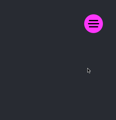 28 |
28 | 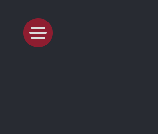 29 |
29 | 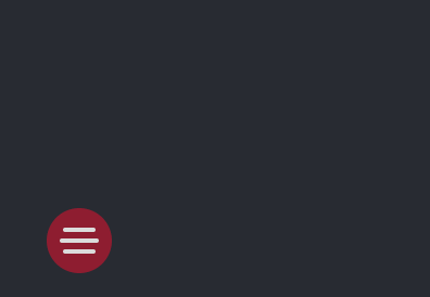 30 |
30 |  31 |
31 |
32 |
33 | #### Install
34 |
35 | With npm
36 |
37 | ```bsh
38 | npm install react-floating-button
39 | ```
40 |
41 | With yarn
42 |
43 | ```bsh
44 | yarn add react-floating-button
45 | ```
46 |
47 | #### Usage
48 |
49 | ```javascript
50 | import { FloatingButton, Item } from "react-floating-button";
51 | import downloadIcon from "./assets/DOWNLOAD.svg";
52 | import forwardIcon from "./assets/FORWARD.svg";
53 |
54 |
55 | - {
58 | console.log("callback function here");
59 | }}
60 | />
61 |
- {
64 | console.log("callback function here");
65 | }}
66 | />
67 |
;
68 | ```
69 |
70 | ## Options
71 |
72 | ### FloatingButton
73 |
74 | | Property | Description | Type | Default |
75 | | --------------- | ------------------------------------------------------------------------------------ | ------- | --------- |
76 | | right | Specify if the button should be on the right if false the button will be at the left | boolean | `true` |
77 | | top | Specify if the button should be on the right if false the button will be at the left | boolean | `false` |
78 | | size | The size used for the buttons | number | `60` |
79 | | backgroundColor | The backgroundColor for the main button | string | `#8f1d30` |
80 | | color | The color for the burger icon | string | `#dbdbdb` |
81 |
82 | ### Item
83 |
84 | | Property | Description | Type | Default |
85 | | --------------- | -------------------------------- | ------ | --------- |
86 | | imgSrc | The icon to use on given button | string | - |
87 | | backgroundColor | The backgroundColor for the Item | string | `#dbdbdb` |
88 | | onClick | Called when an item is clicked | func | - |
89 |
90 | ## Attribution
91 |
92 | - React Pose powered by [Popmotion](https://popmotion.io/pose/)
93 | - Built & Developed from [React JS](https://reactjs.org/)
94 |
95 | ## Contributing to The Project
96 |
97 | Contributing to the project is a piece of :cake:, read the [contributing guidelines](https://github.com/na6im/awsome-floating-button/blob/master/.github/CONTRIBUTING.md). You can discuss the project using the [issues section](https://github.com/na6im/awsome-floating-button/issues/new). To add a line create an issue and send a pull request, see [how to send a pull request](https://github.com/na6im/awsome-floating-button/blob/master/.github/CONTRIBUTING.md).
98 |
99 | ## License
100 |
101 | The code is available under the [MIT](https://github.com/na6im/awsome-floating-button/blob/master/LICENSE) license.
102 |
103 |
104 | WuuD® - in code we trust -
105 |
106 |
--------------------------------------------------------------------------------
/dist/hamburger.js:
--------------------------------------------------------------------------------
1 | import React, { useState } from "react";
2 | import styled from "styled-components";
3 | import posed from "react-pose";
4 | import PropTypes from "prop-types";
5 | const ToggleWrapper = styled.span`
6 | cursor: pointer;
7 | display: flex;
8 | size: ${props => props.size / 2}px;
9 | position: relative;
10 | width: ${props => props.size / 2}px;
11 | flex-direction: column;
12 | align-items: center;
13 | justify-content: space-around;
14 | `;
15 | const Line = styled.div`
16 | size: ${props => props.size * 0.05}px;
17 | width: ${props => props.size * 0.5}px;
18 | border: white;
19 | border-radius: ${props => props.size * 0.05}px;
20 | background-color: ${props => props.color};
21 | `;
22 | const Line1 = posed(Line)({
23 | open: {
24 | y: props => props.size / 6,
25 | rotate: 45
26 | },
27 | closed: {
28 | y: 0,
29 | rotate: 0
30 | }
31 | });
32 | const Line2 = posed(Line)({
33 | open: {
34 | rotate: 0,
35 | width: 0
36 | },
37 | closed: {
38 | width: props => props.size * 0.5,
39 | rotate: 0
40 | }
41 | });
42 | const Line3 = posed(Line)({
43 | open: {
44 | y: props => -props.size / 6,
45 | rotate: -45
46 | },
47 | closed: {
48 | y: 0,
49 | rotate: 0
50 | }
51 | });
52 |
53 | const MenuToggle = ({
54 | size,
55 | color
56 | }) => {
57 | const [open, setOpen] = useState(false);
58 | return /*#__PURE__*/React.createElement(ToggleWrapper, {
59 | onClick: () => setOpen(true),
60 | size: size
61 | }, /*#__PURE__*/React.createElement(Line1, {
62 | pose: open ? "open" : "closed",
63 | size: size,
64 | color: color
65 | }), /*#__PURE__*/React.createElement(Line2, {
66 | pose: open ? "open" : "closed",
67 | size: size,
68 | color: color
69 | }), /*#__PURE__*/React.createElement(Line3, {
70 | pose: open ? "open" : "closed",
71 | size: size,
72 | color: color
73 | }));
74 | };
75 |
76 | MenuToggle.defaultProps = {
77 | size: 60,
78 | color: "white"
79 | };
80 | MenuToggle.propTypes = {
81 | size: PropTypes.number,
82 | color: PropTypes.string
83 | };
84 | export default MenuToggle;
--------------------------------------------------------------------------------
/dist/index.js:
--------------------------------------------------------------------------------
1 | /**
2 | * @param {number} size the size of the buttons.
3 | * @param {boolean} top specify if the button should be on the top if false the
4 | * button will be at the bottom.
5 | * @param {boolean} right specify if the button should be on the right if false the
6 | * button will be at the left.
7 | * @param {string} color the backgroundColor for the main button
8 | * @children should be an Item component with params :
9 | * @param {string} imgSrc the icon to use on given button
10 | * @param {function} onClick the callback function call onClick
11 | * @param {string} backgroundColor the backgroundColor for the Item
12 | */
13 | import React, { useState, useEffect, useRef } from "react";
14 | import { Container, Floating, Item } from "./styles";
15 | import { PoseGroup } from "react-pose";
16 | import PropTypes from "prop-types";
17 | import MenuToggle from "./hamburger";
18 | const rotations = {
19 | "3": [[3 * Math.PI / 2, Math.PI], [0, Math.PI / 2]],
20 | "6": [[Math.PI, Math.PI], [0, 0]]
21 | };
22 |
23 | function FloatingButton({
24 | backgroundColor,
25 | color,
26 | size,
27 | top,
28 | right,
29 | children
30 | }) {
31 | const [expanded, setExpanded] = useState(false);
32 | const ref = useRef(null);
33 | let number = React.Children.count(children);
34 | useEffect(() => {
35 | document.addEventListener("click", handleClickOutside, true);
36 | return () => {
37 | document.removeEventListener("click", handleClickOutside, true);
38 | };
39 | });
40 |
41 | const handleClickOutside = event => {
42 | if (ref.current && !ref.current.contains(event.target)) {
43 | setExpanded(false);
44 | }
45 | };
46 |
47 | function getAngle(i) {
48 | const angle = number <= 3 ? Math.PI / 2 : number <= 6 ? Math.PI : 2 * Math.PI;
49 | const rotate = rotations[number <= 3 ? "3" : "6"][Number(top)][Number(right)];
50 | return {
51 | angle: rotate + (number <= 6 ? i * angle / (number - 1) : i * angle / number),
52 | distance: number <= 6 ? size / Math.sin(angle / (number - 1)) + size / 2 : size / Math.sin(angle / number) + size / 2
53 | };
54 | }
55 |
56 | return /*#__PURE__*/React.createElement(Floating, {
57 | onClick: () => {
58 | setExpanded(!expanded);
59 | },
60 | top: top,
61 | right: right,
62 | pose: expanded ? "open" : "closed",
63 | number: number,
64 | distance: getAngle(0).distance,
65 | ref: ref
66 | }, /*#__PURE__*/React.createElement(Container, {
67 | size: size,
68 | style: {
69 | backgroundColor: `${backgroundColor || "none"}`
70 | }
71 | }, /*#__PURE__*/React.createElement(MenuToggle, {
72 | expanded: expanded,
73 | color: color,
74 | size: size
75 | })), /*#__PURE__*/React.createElement(PoseGroup, null, number === 1 ? /*#__PURE__*/React.createElement(Item, {
76 | key: 0,
77 | i: getAngle(0).angle,
78 | size: size,
79 | distance: getAngle(0).distance,
80 | style: {
81 | backgroundColor: children.props.backgroundColor
82 | },
83 | onClick: () => children.props.onClick()
84 | }, /*#__PURE__*/React.createElement("img", {
85 | src: children.props.imgSrc,
86 | style: {
87 | height: size / 2,
88 | width: size / 2,
89 | fill: "white"
90 | },
91 | alt: "icon"
92 | })) : expanded && [...Array(number)].map((x, i) => /*#__PURE__*/React.createElement(Item, {
93 | key: i,
94 | i: getAngle(i).angle,
95 | size: size,
96 | distance: getAngle(i).distance,
97 | style: {
98 | backgroundColor: children[i].props.backgroundColor
99 | },
100 | onClick: () => children[i].props.onClick()
101 | }, /*#__PURE__*/React.createElement("img", {
102 | src: children[i].props.imgSrc,
103 | style: {
104 | height: size / 2,
105 | width: size / 2
106 | },
107 | alt: `icon-${i}`
108 | })))));
109 | }
110 |
111 | FloatingButton.defaultProps = {
112 | color: "#dbdbdb",
113 | backgroundColor: "#8f1d30",
114 | size: 60,
115 | top: false,
116 | right: true,
117 | children: {}
118 | };
119 | FloatingButton.propTypes = {
120 | color: PropTypes.string,
121 | backgroundColor: PropTypes.string,
122 | size: PropTypes.number,
123 | top: PropTypes.bool,
124 | right: PropTypes.bool,
125 | children: PropTypes.oneOfType([PropTypes.array, PropTypes.object])
126 | };
127 | export default FloatingButton;
128 | export { FloatingButton };
129 | export { Item };
--------------------------------------------------------------------------------
/dist/styles.js:
--------------------------------------------------------------------------------
1 | import styled from "styled-components";
2 | import posed from "react-pose";
3 | export const Floating = styled(posed.div({
4 | pressable: true,
5 | hover: {
6 | scale: 1.1
7 | },
8 | press: {
9 | x: 0,
10 | delay: 100
11 | },
12 | open: {
13 | x: props => props.number > 3 && (props.right ? -props.distance : props.distance),
14 | y: props => props.number > 6 && (props.top ? props.distance : -props.distance)
15 | },
16 | closed: {
17 | x: 0,
18 | y: 0,
19 | rotate: 0
20 | }
21 | }))`
22 | position: absolute;
23 | top: ${props => props.top ? "50" : "null"};
24 | display: flex;
25 | align-items: center;
26 | justify-content: center;
27 | top: ${props => props.top ? "50px" : "none"};
28 | bottom: ${props => !props.top ? "50px" : "none"};
29 | right: ${props => props.right ? "50px" : "none"};
30 | left: ${props => !props.right ? "50px" : "none"};
31 | z-index: 9999;
32 | `;
33 | export const Container = styled(posed.div({
34 | hoverable: true,
35 | pressable: true,
36 | init: {
37 | scale: 1
38 | },
39 | hover: {
40 | scale: 1.2
41 | },
42 | press: {
43 | scale: 0.8
44 | }
45 | }))`
46 | height: ${props => props.size}px;
47 | width: ${props => props.size}px;
48 | border-radius: ${props => props.size}px;
49 | background-color: #8f1d30;
50 | cursor: pointer;
51 | display: flex;
52 | justify-content: center;
53 | align-items: center;
54 | `;
55 | export const Item = styled(posed.div({
56 | hoverable: true,
57 | pressable: true,
58 | init: {
59 | scale: 1
60 | },
61 | hover: {
62 | scale: 1.2
63 | },
64 | press: {
65 | scale: 0.8
66 | },
67 | enter: {
68 | y: props => Math.sin(props.i) * props.distance,
69 | x: props => Math.cos(props.i) * props.distance,
70 | opacity: 1,
71 | delay: 150,
72 | transition: {
73 | y: {
74 | type: "spring",
75 | stiffness: 500,
76 | damping: 10
77 | },
78 | x: {
79 | type: "spring",
80 | stiffness: 500,
81 | damping: 10
82 | },
83 | boxShadow: {
84 | delay: 300,
85 | type: "spring",
86 | stiffness: 500,
87 | damping: 10
88 | },
89 | default: {
90 | duration: 150
91 | }
92 | }
93 | },
94 | exit: {
95 | y: 0,
96 | x: 0,
97 | opacity: 0,
98 | transition: {
99 | duration: 150
100 | }
101 | }
102 | }))`
103 | position: absolute;
104 | height: ${props => props.size}px;
105 | width: ${props => props.size}px;
106 | border-radius: ${props => props.size}px;
107 | background-color: #dbdbdb;
108 | cursor: pointer;
109 | display: flex;
110 | justify-content: center;
111 | align-items: center;
112 | `;
--------------------------------------------------------------------------------
/package.json:
--------------------------------------------------------------------------------
1 | {
2 | "name": "react-floating-button",
3 | "version": "1.1.1",
4 | "description": "An Awesome floating button",
5 | "main": "dist/index.js",
6 | "scripts": {
7 | "test": "echo \"Error: no test specified\" && exit 1",
8 | "publish:npm": "set NODE_ENV=production && rm -rf dist && mkdir dist && npx babel FloatingButton --out-dir dist --copy-files"
9 | },
10 | "files": [
11 | "dist"
12 | ],
13 | "dependencies": {
14 | "react": "^16.13.1",
15 | "react-dom": "^16.13.1",
16 | "react-pose": "^4.0.10",
17 | "react-scripts": "3.4.1",
18 | "styled-components": "^5.1.0"
19 | },
20 | "babel": {
21 | "presets": [
22 | "@babel/react"
23 | ]
24 | },
25 | "devDependencies": {
26 | "@babel/cli": "^7.8.4"
27 | },
28 | "repository": {
29 | "type": "git",
30 | "url": "https://github.com/na6im/react-floating-button"
31 | },
32 | "author": "Nassim AMOKRANE",
33 | "keywords": [
34 | "react",
35 | "button",
36 | "floating",
37 | "float",
38 | "Customizable",
39 | "awesome",
40 | "floating-button",
41 | "material",
42 | "animation",
43 | "animaited",
44 | "responsive"
45 | ],
46 | "license": "MIT"
47 | }
48 |
--------------------------------------------------------------------------------
/screenshots/Floating Button 1.gif:
--------------------------------------------------------------------------------
https://raw.githubusercontent.com/na6im/react-floating-button/6be9d3c4a752a9da3046f40825601f1eb0d18c0c/screenshots/Floating Button 1.gif
--------------------------------------------------------------------------------
/screenshots/Floating Button 2.gif:
--------------------------------------------------------------------------------
https://raw.githubusercontent.com/na6im/react-floating-button/6be9d3c4a752a9da3046f40825601f1eb0d18c0c/screenshots/Floating Button 2.gif
--------------------------------------------------------------------------------
/screenshots/Floating Button 3.gif:
--------------------------------------------------------------------------------
https://raw.githubusercontent.com/na6im/react-floating-button/6be9d3c4a752a9da3046f40825601f1eb0d18c0c/screenshots/Floating Button 3.gif
--------------------------------------------------------------------------------
/screenshots/Floating Button 4.gif:
--------------------------------------------------------------------------------
https://raw.githubusercontent.com/na6im/react-floating-button/6be9d3c4a752a9da3046f40825601f1eb0d18c0c/screenshots/Floating Button 4.gif
--------------------------------------------------------------------------------