├── .eslintrc.json
├── .gitignore
├── .nvmrc
├── .prettierrc
├── .stackbit
├── models
│ ├── Button.ts
│ ├── Card.ts
│ ├── CardsSection.ts
│ ├── Config.ts
│ ├── Footer.ts
│ ├── Header.ts
│ ├── HeroSection.ts
│ ├── Image.ts
│ ├── Link.ts
│ ├── Page.ts
│ ├── ThemeStyle.ts
│ └── index.ts
└── presets
│ ├── card-section.json
│ ├── hero-section.json
│ ├── images
│ ├── cards-section.png
│ ├── hero-section.png
│ ├── page-empty.png
│ └── page-landing.png
│ └── page.json
├── README.md
├── content
├── data
│ ├── config.json
│ └── style.json
└── pages
│ ├── about.md
│ └── index.md
├── netlify.toml
├── next-env.d.ts
├── next.config.js
├── package-lock.json
├── package.json
├── public
└── images
│ ├── favicon.svg
│ ├── hero.svg
│ ├── mui-5.svg
│ ├── nextjs.svg
│ └── ts.svg
├── renovate.json
├── src
├── components
│ ├── DynamicComponent.tsx
│ ├── atoms
│ │ ├── Button.tsx
│ │ ├── Link.tsx
│ │ └── Markdown.tsx
│ └── sections
│ │ ├── CardsSection
│ │ └── index.tsx
│ │ ├── Footer
│ │ └── index.tsx
│ │ ├── Header
│ │ └── index.tsx
│ │ └── HeroSection
│ │ └── index.tsx
├── pages
│ ├── [[...slug]].tsx
│ └── _app.tsx
├── types
│ ├── annotations.ts
│ ├── content.ts
│ └── index.ts
└── utils
│ ├── content.ts
│ ├── createEmotionCache.ts
│ └── theme.ts
├── stackbit.config.ts
└── tsconfig.json
/.eslintrc.json:
--------------------------------------------------------------------------------
1 | {
2 | "extends": "next/core-web-vitals"
3 | }
4 |
--------------------------------------------------------------------------------
/.gitignore:
--------------------------------------------------------------------------------
1 | # See https://help.github.com/articles/ignoring-files/ for more about ignoring files.
2 |
3 | # dependencies
4 | /node_modules
5 | /.pnp
6 | .pnp.js
7 | pnpm-lock.yaml
8 |
9 | # stackbit
10 | .cache
11 | .stackbit/cache
12 |
13 | # testing
14 | /coverage
15 |
16 | # next.js
17 | /.next/
18 | /out/
19 |
20 | # production
21 | /build
22 |
23 | # misc
24 | .DS_Store
25 | *.pem
26 | Thumbs.db
27 |
28 | # debug
29 | npm-debug.log*
30 | .pnpm-debug.log*
31 | yarn-debug.log*
32 | yarn-error.log*
33 |
34 | # local env files
35 | .env
36 | .env.local
37 | .env.development.local
38 | .env.test.local
39 | .env.production.local
40 |
41 | # IDE
42 | *.code-workspace
43 | .idea
44 |
--------------------------------------------------------------------------------
/.nvmrc:
--------------------------------------------------------------------------------
1 | v18
2 |
--------------------------------------------------------------------------------
/.prettierrc:
--------------------------------------------------------------------------------
1 | {
2 | "printWidth": 160,
3 | "singleQuote": true,
4 | "trailingComma": "none",
5 | "tabWidth": 4,
6 | "overrides": [
7 | {
8 | "files": ["*.md", "*.yaml"],
9 | "options": {
10 | "tabWidth": 2
11 | }
12 | }
13 | ]
14 | }
15 |
--------------------------------------------------------------------------------
/.stackbit/models/Button.ts:
--------------------------------------------------------------------------------
1 | import { Model } from '@stackbit/types';
2 |
3 | export const Button: Model = {
4 | type: 'object',
5 | name: 'Button',
6 | label: 'Button',
7 | labelField: 'label',
8 | fieldGroups: [{ name: 'styles', label: 'Styles' }],
9 | fields: [
10 | { type: 'string', name: 'label', label: 'Label', default: 'Learn more', required: true },
11 | { type: 'string', name: 'url', label: 'URL', default: '/', required: true },
12 | {
13 | type: 'enum',
14 | name: 'size',
15 | group: 'styles',
16 | controlType: 'button-group',
17 | label: 'Size',
18 | options: [
19 | { label: 'Small', value: 'small' },
20 | { label: 'Medium', value: 'medium' },
21 | { label: 'Large', value: 'large' }
22 | ],
23 | default: 'medium'
24 | },
25 | {
26 | type: 'enum',
27 | name: 'variant',
28 | group: 'styles',
29 | controlType: 'button-group',
30 | label: 'Variant',
31 | options: [
32 | { label: 'Contained', value: 'contained' },
33 | { label: 'Outlined', value: 'outlined' },
34 | { label: 'Text', value: 'text' }
35 | ],
36 | default: 'text'
37 | },
38 | {
39 | type: 'enum',
40 | name: 'color',
41 | group: 'styles',
42 | controlType: 'button-group',
43 | label: 'Color',
44 | options: [
45 | { label: 'Inherit', value: 'inherit' },
46 | { label: 'Primary', value: 'primary' },
47 | { label: 'Secondary', value: 'secondary' }
48 | ],
49 | default: 'primary'
50 | }
51 | ]
52 | };
53 |
--------------------------------------------------------------------------------
/.stackbit/models/Card.ts:
--------------------------------------------------------------------------------
1 | import { Model } from '@stackbit/types';
2 |
3 | export const Card: Model = {
4 | type: 'object',
5 | name: 'Card',
6 | label: 'Card',
7 | labelField: 'title',
8 | fields: [
9 | { type: 'string', name: 'title', label: 'Title', default: 'Item Title' },
10 | {
11 | type: 'markdown',
12 | name: 'text',
13 | label: 'Text',
14 | default:
15 | 'Sed ut perspiciatis unde omnis iste natus error sit voluptatem accusantium doloremque laudantium, totam rem aperiam, eaque ipsa quae. explicabo.'
16 | },
17 | {
18 | type: 'model',
19 | name: 'image',
20 | label: 'Image',
21 | models: ['Image'],
22 | default: { type: 'Image', url: 'https://assets.stackbit.com/components/images/default/default-image.png', altText: 'Item image' }
23 | },
24 | {
25 | type: 'list',
26 | name: 'actions',
27 | label: 'Actions',
28 | items: { type: 'model', models: ['Button'] },
29 | default: [{ type: 'Button', label: 'Learn More', url: '/' }]
30 | }
31 | ]
32 | };
33 |
--------------------------------------------------------------------------------
/.stackbit/models/CardsSection.ts:
--------------------------------------------------------------------------------
1 | import { Model } from '@stackbit/types';
2 |
3 | export const CardsSection: Model = {
4 | type: 'object',
5 | name: 'CardsSection',
6 | label: 'Cards',
7 | labelField: 'title',
8 | thumbnail: 'https://assets.stackbit.com/components/models/thumbnails/default.png',
9 | groups: ['sectionComponent'],
10 | fields: [
11 | { type: 'string', name: 'title', label: 'Title', default: 'Featured Items' },
12 | { type: 'string', name: 'subtitle', label: 'Subtitle', default: 'The section subtitle' },
13 | {
14 | type: 'list',
15 | name: 'items',
16 | label: 'Items',
17 | items: { type: 'model', models: ['Card'] },
18 | default: [
19 | {
20 | type: 'Card',
21 | title: 'Item Title',
22 | text: 'Sed ut perspiciatis unde omnis iste natus error sit voluptatem accusantium doloremque laudantium, totam rem aperiam, eaque ipsa quae. explicabo.\n',
23 | image: { type: 'Image', url: 'https://assets.stackbit.com/components/images/default/default-image.png', altText: 'Item image' },
24 | actions: [{ type: 'Link', label: 'Learn More', url: '/' }]
25 | }
26 | ]
27 | }
28 | ]
29 | };
30 |
31 |
--------------------------------------------------------------------------------
/.stackbit/models/Config.ts:
--------------------------------------------------------------------------------
1 | import { Model } from '@stackbit/types';
2 |
3 | export const Config: Model = {
4 | type: 'data',
5 | name: 'Config',
6 | label: 'Site configuration',
7 | singleInstance: true,
8 | filePath: 'content/data/config.json',
9 | canDelete: false,
10 | fields: [
11 | { type: 'image', name: 'favicon', label: 'Favicon', default: 'https://assets.stackbit.com/components/images/default/favicon.svg' },
12 | { type: 'model', name: 'header', label: 'Header configuration', models: ['Header'] },
13 | { type: 'model', name: 'footer', label: 'Footer configuration', models: ['Footer'] }
14 | ]
15 | };
16 |
--------------------------------------------------------------------------------
/.stackbit/models/Footer.ts:
--------------------------------------------------------------------------------
1 | import { Model } from '@stackbit/types';
2 |
3 | export const Footer: Model = {
4 | type: 'object',
5 | name: 'Footer',
6 | label: 'Footer',
7 | labelField: 'copyrightText',
8 | fields: [
9 | {
10 | type: 'list',
11 | name: 'navLinks',
12 | label: 'Navigation links',
13 | items: { type: 'model', models: ['Link'] },
14 | default: [
15 | { type: 'Link', label: 'Home', url: '/' },
16 | { type: 'Link', label: 'About', url: '/' }
17 | ]
18 | },
19 | { type: 'markdown', name: 'copyrightText', label: 'Copyright text', default: 'Copyright text' }
20 | ]
21 | };
22 |
--------------------------------------------------------------------------------
/.stackbit/models/Header.ts:
--------------------------------------------------------------------------------
1 | import { Model } from '@stackbit/types';
2 |
3 | export const Header: Model = {
4 | type: 'object',
5 | name: 'Header',
6 | label: 'Header',
7 | labelField: 'title',
8 | fields: [
9 | { type: 'string', name: 'title', label: 'Title', default: 'Your Brand' },
10 | {
11 | type: 'list',
12 | name: 'navLinks',
13 | label: 'Navigation links',
14 | items: { type: 'model', models: ['Link'] },
15 | default: [
16 | { type: 'Link', label: 'Home', url: '/' },
17 | { type: 'Link', label: 'About', url: '/' }
18 | ]
19 | }
20 | ]
21 | };
22 |
--------------------------------------------------------------------------------
/.stackbit/models/HeroSection.ts:
--------------------------------------------------------------------------------
1 | import { Model } from '@stackbit/types';
2 |
3 | export const HeroSection: Model = {
4 | type: 'object',
5 | name: 'HeroSection',
6 | label: 'Hero',
7 | labelField: 'title',
8 | thumbnail: 'https://assets.stackbit.com/components/models/thumbnails/default.png',
9 | groups: ['sectionComponent'],
10 | fields: [
11 | { type: 'string', name: 'title', label: 'Title', default: 'This Is A Big Hero Headline' },
12 | { type: 'string', name: 'subtitle', label: 'Subtitle', default: 'The section subtitle' },
13 | {
14 | type: 'markdown',
15 | name: 'text',
16 | label: 'Text',
17 | default:
18 | 'Aenean eros ipsum, interdum quis dignissim non, sollicitudin vitae nisl. Aenean vel aliquet elit, at blandit ipsum. Sed eleifend felis sit amet erat molestie, hendrerit malesuada justo ultrices. Nunc volutpat at erat vitae interdum. Ut nec massa eget lorem blandit condimentum et at risus.\n'
19 | },
20 | {
21 | type: 'list',
22 | name: 'actions',
23 | label: 'Actions',
24 | items: { type: 'model', models: ['Button'] },
25 | default: [
26 | { type: 'Button', label: 'Get Started', url: '/', size: 'large', variant: 'contained' },
27 | { type: 'Button', label: 'Learn more', url: '/', size: 'large', variant: 'outlined' }
28 | ]
29 | },
30 | {
31 | type: 'model',
32 | name: 'image',
33 | label: 'Image',
34 | models: ['Image'],
35 | default: { type: 'Image', url: 'https://assets.stackbit.com/components/images/default/hero.png', altText: 'Hero section image' }
36 | }
37 | ]
38 | };
39 |
40 |
--------------------------------------------------------------------------------
/.stackbit/models/Image.ts:
--------------------------------------------------------------------------------
1 | import { Model } from '@stackbit/types';
2 |
3 | export const Image: Model = {
4 | type: 'object',
5 | name: 'Image',
6 | label: 'Image',
7 | labelField: 'altText',
8 | fields:
9 | [{
10 | type: 'image',
11 | name: 'url',
12 | label: 'Image',
13 | description: 'The URL of the image',
14 | default: 'https://assets.stackbit.com/components/images/default/default-image.png'
15 | },
16 | {
17 | type: 'string',
18 | name: 'altText',
19 | label: 'Alt text',
20 | description: 'The alt text of the image',
21 | default: 'Image alt text'
22 | }]
23 | };
24 |
--------------------------------------------------------------------------------
/.stackbit/models/Link.ts:
--------------------------------------------------------------------------------
1 | import { Model } from '@stackbit/types';
2 |
3 | export const Link: Model = {
4 | type: 'object',
5 | name: 'Link',
6 | label: 'Link',
7 | labelField: 'label',
8 | fieldGroups: [{ name: 'styles', label: 'Styles' }],
9 | fields: [
10 | { type: 'string', name: 'label', label: 'Label', default: 'Learn more', required: true },
11 | { type: 'string', name: 'url', label: 'URL', default: '/', required: true },
12 | {
13 | type: 'enum',
14 | name: 'underline',
15 | group: 'styles',
16 | controlType: 'button-group',
17 | label: 'Underline',
18 | options: [
19 | { label: 'Always', value: 'always' },
20 | { label: 'Hover', value: 'hover' },
21 | { label: 'None', value: 'none' }
22 | ],
23 | default: 'always'
24 | },
25 | {
26 | type: 'enum',
27 | name: 'color',
28 | group: 'styles',
29 | controlType: 'button-group',
30 | label: 'Color',
31 | options: [
32 | { label: 'Inherit', value: 'inherit' },
33 | { label: 'Primary', value: 'primary' },
34 | { label: 'Secondary', value: 'secondary' }
35 | ],
36 | default: 'primary'
37 | }
38 | ]
39 | };
40 |
--------------------------------------------------------------------------------
/.stackbit/models/Page.ts:
--------------------------------------------------------------------------------
1 | import { Model } from '@stackbit/types';
2 |
3 | export const Page: Model = {
4 | type: 'page',
5 | name: 'Page',
6 | label: 'Page',
7 | urlPath: '/{slug}',
8 | filePath: 'content/pages/{slug}.md',
9 | hideContent: true,
10 | thumbnail: 'https://assets.stackbit.com/components/models/thumbnails/default.png',
11 | fields: [
12 | { type: 'string', name: 'title', label: 'Title', default: 'This Is a New Page', required: true },
13 | {
14 | type: 'list',
15 | name: 'sections',
16 | label: 'Sections',
17 | items: { type: 'model', models: [], groups: ['sectionComponent'] },
18 | default: [
19 | {
20 | type: 'HeroSection',
21 | title: 'This Is A Big Hero Headline',
22 | text: 'Aenean eros ipsum, interdum quis dignissim non, sollicitudin vitae nisl. Aenean vel aliquet elit, at blandit ipsum. Sed eleifend felis sit amet erat molestie, hendrerit malesuada justo ultrices. Nunc volutpat at erat itae interdum. Ut nec massa eget lorem blandit condimentum et at risus.\n',
23 | actions: [
24 | { type: 'Button', label: 'Get Started', url: '/', size: 'large', variant: 'contained' },
25 | { type: 'Button', label: 'Learn more', url: '/', size: 'large', variant: 'outlined' }
26 | ],
27 | image: { type: 'Image', url: 'https://assets.stackbit.com/components/images/default/hero.png', altText: 'Hero section image' }
28 | }
29 | ]
30 | }
31 | ]
32 | };
33 |
--------------------------------------------------------------------------------
/.stackbit/models/ThemeStyle.ts:
--------------------------------------------------------------------------------
1 | import { Model } from '@stackbit/types';
2 |
3 | export const ThemeStyle: Model = {
4 | type: 'data',
5 | name: 'ThemeStyle',
6 | label: 'Theme Style',
7 | singleInstance: true,
8 | filePath: 'content/data/style.json',
9 | canDelete: false,
10 | fields: [
11 | {
12 | type: 'enum',
13 | name: 'mode',
14 | label: 'Mode',
15 | controlType: 'button-group',
16 | options: [
17 | { label: 'Light', value: 'light' },
18 | { label: 'Dark', value: 'dark' }
19 | ],
20 | default: 'light'
21 | },
22 | { type: 'color', name: 'primaryColor', label: 'Primary color' },
23 | {
24 | type: 'color',
25 | name: 'secondaryColor',
26 | label: 'Secondary color'
27 | }
28 | ]
29 | };
30 |
31 |
--------------------------------------------------------------------------------
/.stackbit/models/index.ts:
--------------------------------------------------------------------------------
1 | import { Button} from './Button';
2 | import { Card } from './Card';
3 | import { CardsSection } from './CardsSection';
4 | import { Config } from './Config';
5 | import { Footer } from './Footer';
6 | import { Header } from './Header';
7 | import { HeroSection } from './HeroSection';
8 | import { Image } from './Image';
9 | import { Link } from './Link';
10 | import { Page } from './Page';
11 | import { ThemeStyle } from './ThemeStyle';
12 |
13 | export const allModels = {
14 | Button,
15 | Card,
16 | CardsSection,
17 | Config,
18 | Footer,
19 | Header,
20 | HeroSection,
21 | Image,
22 | Link,
23 | Page,
24 | ThemeStyle,
25 | };
--------------------------------------------------------------------------------
/.stackbit/presets/card-section.json:
--------------------------------------------------------------------------------
1 | {
2 | "model": "CardsSection",
3 | "presets": [
4 | {
5 | "label": "Cards Section",
6 | "thumbnail": "images/cards-section.png",
7 | "data": {
8 | "title": "Cards Section Title",
9 | "subtitle": "The section subtitle",
10 | "items": [
11 | {
12 | "type": "Card",
13 | "title": "First Item Title",
14 | "text": "Lorem ipsum dolor sit amet, consectetur adipiscing elit. Sed ante lorem, tincidunt ac leo efficitur, feugiat tempor odio. Maecenas pharetra ipsum dolor, et iaculis elit ornare ac.",
15 | "image": {
16 | "type": "Image",
17 | "url": "/images/nextjs.svg",
18 | "altText": "First item image"
19 | },
20 | "actions": [
21 | {
22 | "type": "Button",
23 | "label": "Learn more",
24 | "url": "/"
25 | }
26 | ]
27 | },
28 | {
29 | "type": "Card",
30 | "title": "Second Item Title",
31 | "text": "Lorem ipsum dolor sit amet, consectetur adipiscing elit. Sed ante lorem, tincidunt ac leo efficitur, feugiat tempor odio. Maecenas pharetra ipsum dolor, et iaculis elit ornare ac.",
32 | "image": {
33 | "type": "Image",
34 | "url": "/images/mui-5.svg",
35 | "altText": "Second item image"
36 | },
37 | "actions": [
38 | {
39 | "type": "Button",
40 | "label": "Learn more",
41 | "url": "/"
42 | }
43 | ]
44 | },
45 | {
46 | "type": "Card",
47 | "title": "Third Item Title",
48 | "text": "Lorem ipsum dolor sit amet, consectetur adipiscing elit. Sed ante lorem, tincidunt ac leo efficitur, feugiat tempor odio. Maecenas pharetra ipsum dolor, et iaculis elit ornare ac.",
49 | "image": {
50 | "type": "Image",
51 | "url": "/images/ts.svg",
52 | "altText": "Third item image"
53 | },
54 | "actions": [
55 | {
56 | "type": "Button",
57 | "label": "Learn more",
58 | "url": "/"
59 | }
60 | ]
61 | }
62 | ]
63 | }
64 | }
65 | ]
66 | }
--------------------------------------------------------------------------------
/.stackbit/presets/hero-section.json:
--------------------------------------------------------------------------------
1 | {
2 | "model": "HeroSection",
3 | "presets": [
4 | {
5 | "label": "Hero Section",
6 | "thumbnail": "images/hero-section.png",
7 | "data": {
8 | "title": "This Is A Big Hero Headline",
9 | "text": "Aenean eros ipsum, interdum quis dignissim non, sollicitudin vitae nisl. Aenean vel aliquet elit, at blandit ipsum. Sed eleifend felis sit amet erat molestie, hendrerit malesuada justo ultrices. Nunc volutpat at erat itae interdum. Ut nec massa eget lorem blandit condimentum et at risus.",
10 | "image": {
11 | "type": "Image",
12 | "url": "/images/hero.svg",
13 | "altText": "Hero section image"
14 | },
15 | "actions": [
16 | {
17 | "type": "Button",
18 | "label": "Start Building",
19 | "url": "https://docs.netlify.com/visual-editor/get-started/",
20 | "size": "large",
21 | "variant": "contained",
22 | "color": "primary"
23 | },
24 | {
25 | "type": "Button",
26 | "label": "Read the Docs",
27 | "url": "https://docs.netlify.com/visual-editor/overview/",
28 | "size": "large",
29 | "variant": "outlined",
30 | "color": "primary"
31 | }
32 | ]
33 | }
34 | }
35 | ]
36 | }
--------------------------------------------------------------------------------
/.stackbit/presets/images/cards-section.png:
--------------------------------------------------------------------------------
https://raw.githubusercontent.com/netlify-templates/ts-mui-nextjs-starter/c3ee27aa6bb25270d9cbe79567064f3df376a1c4/.stackbit/presets/images/cards-section.png
--------------------------------------------------------------------------------
/.stackbit/presets/images/hero-section.png:
--------------------------------------------------------------------------------
https://raw.githubusercontent.com/netlify-templates/ts-mui-nextjs-starter/c3ee27aa6bb25270d9cbe79567064f3df376a1c4/.stackbit/presets/images/hero-section.png
--------------------------------------------------------------------------------
/.stackbit/presets/images/page-empty.png:
--------------------------------------------------------------------------------
https://raw.githubusercontent.com/netlify-templates/ts-mui-nextjs-starter/c3ee27aa6bb25270d9cbe79567064f3df376a1c4/.stackbit/presets/images/page-empty.png
--------------------------------------------------------------------------------
/.stackbit/presets/images/page-landing.png:
--------------------------------------------------------------------------------
https://raw.githubusercontent.com/netlify-templates/ts-mui-nextjs-starter/c3ee27aa6bb25270d9cbe79567064f3df376a1c4/.stackbit/presets/images/page-landing.png
--------------------------------------------------------------------------------
/.stackbit/presets/page.json:
--------------------------------------------------------------------------------
1 | {
2 | "model": "Page",
3 | "presets": [
4 | {
5 | "label": "Empty page",
6 | "thumbnail": "images/page-empty.png",
7 | "data": {
8 | "title": "Empty page",
9 | "sections": [
10 | {
11 | "type": "HeroSection",
12 | "title": "An Empty Page",
13 | "text": "Add more sections by hovering above or below this one and clicking '+ Add Section', or using the sidebar.",
14 | "image": null
15 | }
16 | ]
17 | }
18 | },
19 | {
20 | "label": "Landing",
21 | "thumbnail": "images/page-landing.png",
22 | "data": {
23 | "title": "Example landing page",
24 | "sections": [
25 | {
26 | "type": "HeroSection",
27 | "title": "This is a Big Hero Headline",
28 | "text": "Aenean eros ipsum, interdum quis dignissim non, sollicitudin vitae nisl. Aenean vel aliquet elit, at blandit ipsum. Sed eleifend felis sit amet erat molestie, hendrerit malesuada justo ultrices. Nunc volutpat at erat itae interdum. Ut nec massa eget lorem blandit condimentum et at risus.",
29 | "image": {
30 | "type": "Image",
31 | "url": "/images/hero.svg",
32 | "altText": "Hero section image"
33 | },
34 | "actions": [
35 | {
36 | "type": "Button",
37 | "label": "Start Building",
38 | "url": "https://docs.netlify.com/create/getting-started/",
39 | "size": "large",
40 | "variant": "contained",
41 | "color": "primary"
42 | },
43 | {
44 | "type": "Button",
45 | "label": "Read the Docs",
46 | "url": "https://docs.netlify.com/visual-editor/overview/",
47 | "size": "large",
48 | "variant": "outlined",
49 | "color": "primary"
50 | }
51 | ]
52 | },
53 | {
54 | "type": "CardsSection",
55 | "title": "Cards Section Title",
56 | "subtitle": "The section subtitle",
57 | "items": [
58 | {
59 | "type": "Card",
60 | "title": "First Item Title",
61 | "text": "Lorem ipsum dolor sit amet, consectetur adipiscing elit. Sed ante lorem, tincidunt ac leo efficitur, feugiat tempor odio. Maecenas pharetra ipsum dolor, et iaculis elit ornare ac.",
62 | "image": {
63 | "type": "Image",
64 | "url": "/images/nextjs.svg",
65 | "altText": "First item image"
66 | },
67 | "actions": [
68 | {
69 | "type": "Button",
70 | "label": "Learn more",
71 | "url": "/"
72 | }
73 | ]
74 | },
75 | {
76 | "type": "Card",
77 | "title": "Second Item Title",
78 | "text": "Lorem ipsum dolor sit amet, consectetur adipiscing elit. Sed ante lorem, tincidunt ac leo efficitur, feugiat tempor odio. Maecenas pharetra ipsum dolor, et iaculis elit ornare ac.",
79 | "image": {
80 | "type": "Image",
81 | "url": "/images/mui-5.svg",
82 | "altText": "Second item image"
83 | },
84 | "actions": [
85 | {
86 | "type": "Button",
87 | "label": "Learn more",
88 | "url": "/"
89 | }
90 | ]
91 | },
92 | {
93 | "type": "Card",
94 | "title": "Third Item Title",
95 | "text": "Lorem ipsum dolor sit amet, consectetur adipiscing elit. Sed ante lorem, tincidunt ac leo efficitur, feugiat tempor odio. Maecenas pharetra ipsum dolor, et iaculis elit ornare ac.",
96 | "image": {
97 | "type": "Image",
98 | "url": "/images/ts.svg",
99 | "altText": "Third item image"
100 | },
101 | "actions": [
102 | {
103 | "type": "Button",
104 | "label": "Learn more",
105 | "url": "/"
106 | }
107 | ]
108 | }
109 | ]
110 | }
111 | ]
112 | }
113 | }
114 | ]
115 | }
116 |
--------------------------------------------------------------------------------
/README.md:
--------------------------------------------------------------------------------
1 | # Netlify Next.js + TypeScript + MUI Starter
2 |
3 | 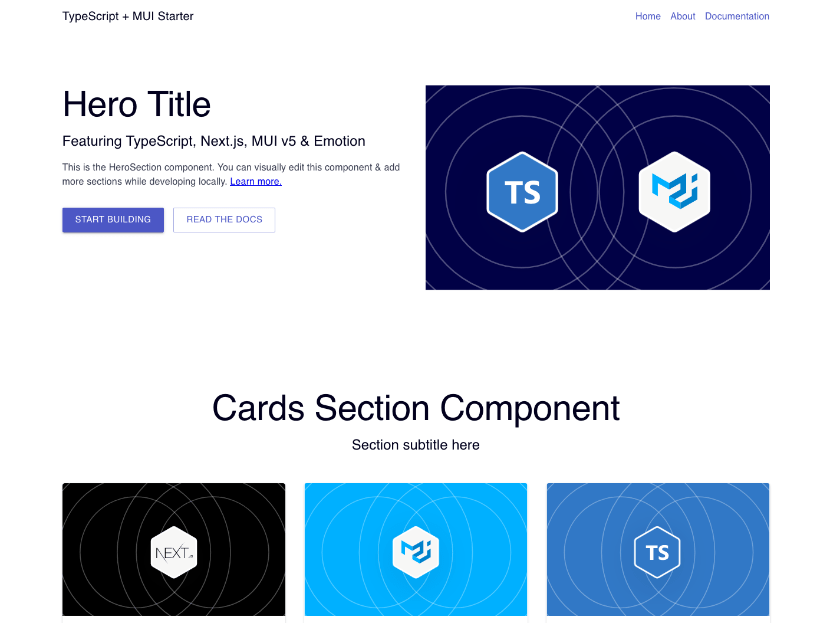
4 |
5 | This is a minimal starting point for new Netlify projects with visual editing. It is built with Next.js, TypeScript, and [MUI](https://mui.com/), and is equipped with [visual editing capabilities](https://docs.netlify.com/visual-editor/visual-editing/). It uses markdown files as the the [Git Content Source](https://docs.netlify.com/create/content-sources/git/).
6 |
7 | **⚡ View demo:** [ts-mui-starter.netlify.app](https://ts-mui-starter.netlify.app/)
8 |
9 | ## Deploying to Netlify
10 |
11 | If you click "Deploy to Netlify" button, it will create a new repo for you that looks exactly like this one, and sets that repo up immediately for deployment on Netlify.
12 |
13 | [](https://app.netlify.com/start/deploy?repository=https://github.com/netlify-templates/ts-mui-nextjs-starter)
14 |
15 | ## Features
16 |
17 | This is meant to be a simple starting point that demonstrates the use of bringing your own component library, such as MUI.
18 |
19 | In addition to MUI support, this project contains the following:
20 |
21 | - **Flexible Pages:** Simple and flexible page model that lets editors add new pages.
22 | - **Basic Components:** A few basic components to add to new pages.
23 | - **Layout Elements:** Header and footer elements automatically added to pages.
24 | - **Component & Template Presets:** Predefined arrangements of content and components for faster editing. [Learn more](https://docs.netlify.com/create/content-presets/).
25 | - **TypeScript Support:** Components and content are type-safe. (See `types` directory for definitions.)
26 |
27 | ## Getting Started
28 |
29 | The typical development process is to begin by working locally. Clone this repository, then run `npm install` in its root directory.
30 |
31 | Run the Next.js development server:
32 |
33 | ```txt
34 | cd ts-mui-nextjs-starter
35 | npm run dev
36 | ```
37 |
38 | Install the [Netlify Create CLI](https://www.npmjs.com/package/@stackbit/cli). Then open a new terminal window in the same project directory and run the Netlify Create Dev server:
39 |
40 | ```txt
41 | npm install -g @stackbit/cli
42 | stackbit dev
43 | ```
44 |
45 | This outputs your own Netlify visual editor URL. Open this, register, or sign in, and you will be directed to the Netlify visual editor for your new project.
46 |
47 | 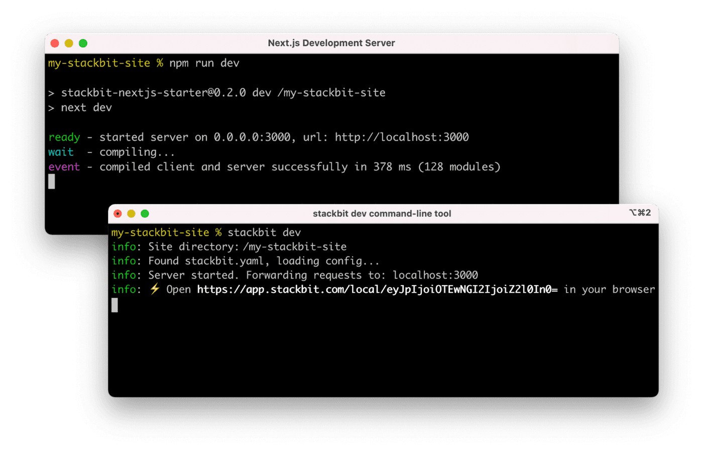
48 |
49 | ## Next Steps
50 |
51 | Here are a few suggestions on what to do next if you're new to Netlify visual editor:
52 |
53 | - Learn [how Netlify visual editor works](https://docs.netlify.com/visual-editor/overview/)
54 | - Check [Netlify visual editor reference documentation](https://visual-editor-reference.netlify.com/)
55 |
56 | ## Support
57 |
58 | If you get stuck along the way, get help in our [support forums](https://answers.netlify.com/).
59 |
--------------------------------------------------------------------------------
/content/data/config.json:
--------------------------------------------------------------------------------
1 | {
2 | "type": "Config",
3 | "favicon": "/images/favicon.svg",
4 | "header": {
5 | "title": "TypeScript + MUI Starter",
6 | "navLinks": [
7 | {
8 | "type": "Link",
9 | "label": "Home",
10 | "url": "/",
11 | "underline": "hover"
12 | },
13 | {
14 | "type": "Link",
15 | "label": "About",
16 | "url": "/about",
17 | "underline": "hover"
18 | },
19 | {
20 | "type": "Link",
21 | "label": "Documentation",
22 | "url": "https://docs.netlify.com/visual-editor/overview/",
23 | "underline": "hover"
24 | }
25 | ]
26 | },
27 | "footer": {
28 | "copyrightText": "Powered by [Netlify](https://www.netlify.com/).",
29 | "navLinks": [
30 | {
31 | "type": "Link",
32 | "label": "Home",
33 | "underline": "hover",
34 | "url": "/"
35 | },
36 | {
37 | "type": "Link",
38 | "label": "About",
39 | "underline": "hover",
40 | "url": "/about"
41 | },
42 | {
43 | "type": "Link",
44 | "label": "Documentation",
45 | "underline": "hover",
46 | "url": "https://docs.netlify.com/visual-editor/overview/"
47 | }
48 | ]
49 | }
50 | }
--------------------------------------------------------------------------------
/content/data/style.json:
--------------------------------------------------------------------------------
1 | {
2 | "type": "ThemeStyle",
3 | "mode": "light",
4 | "primaryColor": "#4C57C5",
5 | "secondaryColor": "#F65458"
6 | }
7 |
--------------------------------------------------------------------------------
/content/pages/about.md:
--------------------------------------------------------------------------------
1 | ---
2 | title: About
3 | type: Page
4 | sections:
5 | - type: HeroSection
6 | title: Example for H2 headline
7 | subtitle: This is the subtitle
8 | text: >
9 | This is **Markdown** *text*.
10 |
11 |
12 |
13 | Lorem ipsum dolor sit amet, consectetur adipiscing elit, sed do eiusmod
14 | tempor incididunt ut labore et dolore magna aliqua. Ut enim ad minim
15 | veniam, quis nostrud exercitation ullamco laboris nisi ut aliquip ex ea
16 | commodo consequat.
17 | ---
18 |
--------------------------------------------------------------------------------
/content/pages/index.md:
--------------------------------------------------------------------------------
1 | ---
2 | title: Home
3 | type: Page
4 | sections:
5 | - type: HeroSection
6 | title: Hero Title
7 | subtitle: 'Featuring TypeScript, Next.js, MUI v5 & Emotion'
8 | text: >
9 | This is the HeroSection component. You can visually edit this component &
10 | add more sections while developing locally. [Learn
11 | more.](https://docs.netlify.com/visual-editor/local-development/)
12 | actions:
13 | - type: Button
14 | label: Start Building
15 | url: 'https://docs.netlify.com/visual-editor/get-started/'
16 | size: large
17 | variant: contained
18 | color: primary
19 | - type: Button
20 | label: Read the Docs
21 | url: 'https://docs.netlify.com/visual-editor/overview/'
22 | size: large
23 | variant: outlined
24 | color: primary
25 | image:
26 | type: Image
27 | url: /images/hero.svg
28 | altText: Hero section image
29 | - type: CardsSection
30 | title: Cards Section Component
31 | subtitle: Section subtitle here
32 | items:
33 | - type: Card
34 | title: First Card Title
35 | image:
36 | type: Image
37 | url: /images/nextjs.svg
38 | altText: First item image
39 | text: >
40 | Lorem ipsum dolor sit amet, consectetur adipiscing elit, sed do
41 | eiusmod tempor incididunt ut labore et dolore magna aliqua. Ut enim ad
42 | minim veniam, quis nostrud exercitation ullamco laboris nisi ut
43 | aliquip ex ea commodo consequat.
44 | actions:
45 | - type: Button
46 | label: Read the Docs
47 | url: 'https://docs.netlify.com/visual-editor/overview/'
48 | - type: Card
49 | title: Second Card Title
50 | image:
51 | type: Image
52 | url: /images/mui-5.svg
53 | altText: Second item image
54 | text: >
55 | Lorem ipsum dolor sit amet, consectetur adipiscing elit, sed do
56 | eiusmod tempor incididunt ut labore et dolore magna aliqua. Ut enim ad
57 | minim veniam, quis nostrud exercitation ullamco laboris nisi ut
58 | aliquip ex ea commodo consequat.
59 | actions:
60 | - type: Button
61 | label: Read the Docs
62 | url: 'https://docs.netlify.com/visual-editor/overview/'
63 | - type: Card
64 | title: Third Card Title
65 | image:
66 | type: Image
67 | url: /images/ts.svg
68 | altText: Third item image
69 | text: >
70 | Lorem ipsum dolor sit amet, consectetur adipiscing elit, sed do
71 | eiusmod tempor incididunt ut labore et dolore magna aliqua. Ut enim ad
72 | minim veniam, quis nostrud exercitation ullamco laboris nisi ut
73 | aliquip ex ea commodo consequat.
74 | actions:
75 | - type: Button
76 | label: Read the Docs
77 | url: 'https://docs.netlify.com/visual-editor/overview/'
78 | ---
79 |
--------------------------------------------------------------------------------
/netlify.toml:
--------------------------------------------------------------------------------
1 | [[plugins]]
2 | package = "@netlify/plugin-nextjs"
3 |
4 | [build]
5 | publish = ".next"
6 | command = "npm run build"
--------------------------------------------------------------------------------
/next-env.d.ts:
--------------------------------------------------------------------------------
1 | ///
2 | ///
3 |
4 | // NOTE: This file should not be edited
5 | // see https://nextjs.org/docs/pages/api-reference/config/typescript for more information.
6 |
--------------------------------------------------------------------------------
/next.config.js:
--------------------------------------------------------------------------------
1 | /** @type {import('next').NextConfig} */
2 | const nextConfig = {
3 | reactStrictMode: true
4 | };
5 |
6 | module.exports = nextConfig;
--------------------------------------------------------------------------------
/package.json:
--------------------------------------------------------------------------------
1 | {
2 | "name": "mui-nextjs-starter",
3 | "version": "0.1.1",
4 | "sideEffects": false,
5 | "scripts": {
6 | "dev": "next dev",
7 | "build": "next build",
8 | "start": "next start",
9 | "export": "next export",
10 | "prettier": "prettier --write src"
11 | },
12 | "dependencies": {
13 | "@emotion/cache": "^11.14.0",
14 | "@emotion/react": "^11.14.0",
15 | "@emotion/server": "^11.11.0",
16 | "@emotion/styled": "^11.14.0",
17 | "@mui/icons-material": "^6.2.0",
18 | "@mui/material": "^6.2.0",
19 | "front-matter": "^4.0.2",
20 | "glob": "^10.4.2",
21 | "js-yaml": "^4.1.0",
22 | "markdown-to-jsx": "^7.7.1",
23 | "next": "^15.1.0",
24 | "react": "^19.0.0",
25 | "react-dom": "^19.0.0"
26 | },
27 | "devDependencies": {
28 | "@stackbit/cms-git": "^1.0.2",
29 | "@stackbit/types": "^2.0.2",
30 | "@types/glob": "^8.1.0",
31 | "@types/js-yaml": "^4.0.9",
32 | "@types/node": "^22.13.14",
33 | "@types/react": "^19.0.1",
34 | "autoprefixer": "^10.4.19",
35 | "eslint": "^8.57.0",
36 | "eslint-config-next": "^15.1.0",
37 | "eslint-config-prettier": "^9.1.0",
38 | "prettier": "^3.3.2",
39 | "typescript": "^5.4.5"
40 | },
41 | "description": "A Nextjs page builder, component library and data source mapper all in one.",
42 | "main": "next.config.js",
43 | "license": "MIT"
44 | }
45 |
--------------------------------------------------------------------------------
/public/images/favicon.svg:
--------------------------------------------------------------------------------
1 |
--------------------------------------------------------------------------------
/public/images/hero.svg:
--------------------------------------------------------------------------------
1 |
--------------------------------------------------------------------------------
/public/images/mui-5.svg:
--------------------------------------------------------------------------------
1 |
--------------------------------------------------------------------------------
/public/images/nextjs.svg:
--------------------------------------------------------------------------------
1 |
--------------------------------------------------------------------------------
/public/images/ts.svg:
--------------------------------------------------------------------------------
1 |
--------------------------------------------------------------------------------
/renovate.json:
--------------------------------------------------------------------------------
1 | {
2 | "$schema": "https://docs.renovatebot.com/renovate-schema.json",
3 | "extends": [
4 | "local>netlify-templates/renovate-config"
5 | ]
6 | }
7 |
--------------------------------------------------------------------------------
/src/components/DynamicComponent.tsx:
--------------------------------------------------------------------------------
1 | import dynamic from 'next/dynamic';
2 | import type { ComponentType, FC } from 'react';
3 | import type { Props as CardsSectionProps } from './sections/CardsSection';
4 | import type { Props as HeroSectionProps } from './sections/HeroSection';
5 |
6 | export type Props = CardsSectionProps | HeroSectionProps;
7 |
8 | type ComponentsMap = {
9 | [P in Props as P['type']]: ComponentType;
10 | };
11 |
12 | const componentsMap: ComponentsMap = {
13 | // sections
14 | CardsSection: dynamic(() => namedComponent(import('./sections/CardsSection'), 'CardsSection')),
15 | HeroSection: dynamic(() => namedComponent(import('./sections/HeroSection'), 'HeroSection'))
16 | };
17 |
18 | export const DynamicComponent: FC = (props) => {
19 | if (!props.type) {
20 | throw new Error(`Object does not have the 'type' property required to select a component: ${JSON.stringify(props, null, 2)}`);
21 | }
22 | const Component = componentsMap[props.type] as ComponentType;
23 | if (!Component) {
24 | throw new Error(
25 | `No component match object with type: '${props.type}'\nMake sure DynamicComponent.tsx file has an entry for '${props.type}' in 'componentsMap'`
26 | );
27 | }
28 | return ;
29 | };
30 |
31 | const namedComponent = async (modPromise: Promise, exportName: N) => {
32 | const mod = await modPromise;
33 | return mod[exportName];
34 | };
35 |
--------------------------------------------------------------------------------
/src/components/atoms/Button.tsx:
--------------------------------------------------------------------------------
1 | import * as React from 'react';
2 | import NextLink from 'next/link';
3 | import type * as types from 'types';
4 |
5 | import MuiButton from '@mui/material/Button';
6 |
7 | export type Props = types.Button & types.StackbitFieldPath & { className?: string; sx?: { [key: string]: any } };
8 |
9 | export const Button: React.FC = (props) => {
10 | const { className, label, url, size = 'medium', variant = 'text', color = 'primary', sx, 'data-sb-field-path': fieldPath } = props;
11 | const annotations = fieldPath ? [fieldPath, `${fieldPath}.url#@href`].join(' ').trim() : null;
12 |
13 | return (
14 |
15 | {label}
16 |
17 | );
18 | };
19 |
--------------------------------------------------------------------------------
/src/components/atoms/Link.tsx:
--------------------------------------------------------------------------------
1 | import * as React from 'react';
2 | import NextLink from 'next/link';
3 | import type * as types from 'types';
4 |
5 | import MuiLink from '@mui/material/Link';
6 |
7 | export type Props = types.Link & types.StackbitFieldPath & { className?: string; sx?: { [key: string]: any } };
8 |
9 | export const Link: React.FC = (props) => {
10 | const { className, label, url, underline = 'always', color = 'primary', sx, 'data-sb-field-path': fieldPath } = props;
11 | const annotations = fieldPath ? [fieldPath, `${fieldPath}.url#@href`].join(' ').trim() : null;
12 |
13 | return (
14 |
15 | {label}
16 |
17 | );
18 | };
19 |
--------------------------------------------------------------------------------
/src/components/atoms/Markdown.tsx:
--------------------------------------------------------------------------------
1 | import { FC } from 'react';
2 | import MarkdownToJsx from 'markdown-to-jsx';
3 | import type * as types from 'types';
4 |
5 | export type Props = { text: string; className?: string } & types.StackbitFieldPath;
6 |
7 | export const Markdown: FC = (props) => {
8 | const { text, className, 'data-sb-field-path': fieldPath } = props;
9 |
10 | return (
11 |
12 | {text}
13 |
14 | );
15 | };
16 |
--------------------------------------------------------------------------------
/src/components/sections/CardsSection/index.tsx:
--------------------------------------------------------------------------------
1 | import * as React from 'react';
2 | import type * as types from 'types';
3 | import { Button } from '../../atoms/Button';
4 | import { Markdown } from '../../atoms/Markdown';
5 |
6 | import MuiBox from '@mui/material/Box';
7 | import MuiCard from '@mui/material/Card';
8 | import MuiCardActions from '@mui/material/CardActions';
9 | import MuiCardContent from '@mui/material/CardContent';
10 | import MuiCardMedia from '@mui/material/CardMedia';
11 | import MuiGrid from '@mui/material/Grid';
12 | import MuiTypography from '@mui/material/Typography';
13 |
14 | export type Props = types.CardsSection & types.StackbitFieldPath;
15 |
16 | export const CardsSection: React.FC = (props) => {
17 | const { title, subtitle, items = [], 'data-sb-field-path': fieldPath } = props;
18 | return (
19 |
20 | {title && (
21 |
22 | {title}
23 |
24 | )}
25 | {subtitle && (
26 |
27 | {subtitle}
28 |
29 | )}
30 | {items.length > 0 && (
31 |
32 | {items.map((item, index) => (
33 |
34 | ))}
35 |
36 | )}
37 |
38 | );
39 | };
40 |
41 | const CardsSectionItem: React.FC = (props) => {
42 | const { title, text, image, actions = [], titleTag = 'h3', 'data-sb-field-path': fieldPath } = props;
43 | return (
44 |
45 |
46 | {image?.url && (
47 |
48 | )}
49 | {(title || text) && (
50 |
51 | {title && (
52 |
53 | {title}
54 |
55 | )}
56 | {text && (
57 |
58 |
59 |
60 | )}
61 |
62 | )}
63 | {actions.length > 0 && (
64 |
65 | {actions.map((action, index) => (
66 |
67 | ))}
68 |
69 | )}
70 |
71 |
72 | );
73 | };
74 |
--------------------------------------------------------------------------------
/src/components/sections/Footer/index.tsx:
--------------------------------------------------------------------------------
1 | import * as React from 'react';
2 | import type * as types from 'types';
3 | import { Link } from '../../atoms/Link';
4 | import { Markdown } from '../../atoms/Markdown';
5 |
6 | import MuiBox from '@mui/material/Box';
7 | import MuiTypography from '@mui/material/Typography';
8 |
9 | type Props = types.Footer & types.StackbitObjectId;
10 |
11 | export const Footer: React.FC = (props) => {
12 | const { navLinks = [], copyrightText, 'data-sb-object-id': objectId } = props;
13 | const fieldPath = objectId ? `${objectId}:footer` : null;
14 | return (
15 |
16 | {navLinks.length > 0 && (
17 |
18 | {navLinks.map((link, index) => (
19 |
20 | ))}
21 |
22 | )}
23 | {copyrightText && (
24 |
25 |
26 |
27 | )}
28 |
29 | );
30 | };
31 |
--------------------------------------------------------------------------------
/src/components/sections/Header/index.tsx:
--------------------------------------------------------------------------------
1 | import * as React from 'react';
2 | import type * as types from 'types';
3 | import { Link } from '../../atoms/Link';
4 |
5 | import MuiAppBar from '@mui/material/AppBar';
6 | import MuiBox from '@mui/material/Box';
7 | import MuiToolbar from '@mui/material/Toolbar';
8 | import MuiTypography from '@mui/material/Typography';
9 |
10 | export type Props = types.Header & types.StackbitObjectId;
11 |
12 | export const Header: React.FC = (props) => {
13 | const { title, navLinks = [], 'data-sb-object-id': objectId } = props;
14 | const fieldPath = objectId ? `${objectId}:header` : null;
15 | return (
16 |
17 |
18 | {title && (
19 |
20 |
21 | {title}
22 |
23 |
24 | )}
25 | {navLinks.length > 0 && (
26 |
27 | {navLinks.map((link, index) => (
28 |
37 | ))}
38 |
39 | )}
40 |
41 |
42 | );
43 | };
44 |
--------------------------------------------------------------------------------
/src/components/sections/HeroSection/index.tsx:
--------------------------------------------------------------------------------
1 | import * as React from 'react';
2 | import type * as types from 'types';
3 | import { Button } from '../../atoms/Button';
4 | import { Markdown } from '../../atoms/Markdown';
5 |
6 | import MuiBox from '@mui/material/Box';
7 | import MuiGrid from '@mui/material/Grid';
8 | import MuiStack from '@mui/material/Stack';
9 | import MuiTypography from '@mui/material/Typography';
10 |
11 | export type Props = types.HeroSection & types.StackbitFieldPath;
12 |
13 | export const HeroSection: React.FC = (props) => {
14 | const { title, subtitle, text, image, actions = [], 'data-sb-field-path': fieldPath } = props;
15 | const hasTextContent = !!title || !!subtitle || !!text || actions.length > 0;
16 |
17 | return (
18 |
19 |
20 | {hasTextContent && (
21 |
22 | {title && (
23 |
24 | {title}
25 |
26 | )}
27 | {subtitle && (
28 |
29 | {subtitle}
30 |
31 | )}
32 | {text && (
33 |
34 |
35 |
36 | )}
37 | {actions.length > 0 && (
38 |
46 | {actions.map((action, index) => (
47 |
56 | ))}
57 |
58 | )}
59 |
60 | )}
61 | {image?.url && (
62 |
63 |
74 |
75 | )}
76 |
77 |
78 | );
79 | };
80 |
--------------------------------------------------------------------------------
/src/pages/[[...slug]].tsx:
--------------------------------------------------------------------------------
1 | import * as React from 'react';
2 | import Head from 'next/head';
3 | import { GetStaticPaths, GetStaticProps } from 'next';
4 | import type * as types from 'types';
5 | import { DynamicComponent } from '../components/DynamicComponent';
6 | import { Header } from '../components/sections/Header';
7 | import { Footer } from '../components/sections/Footer';
8 | import { pagesByType, siteConfig, urlToContent } from '../utils/content';
9 |
10 | import MuiBox from '@mui/material/Box';
11 | import MuiContainer from '@mui/material/Container';
12 |
13 | export type Props = { page: types.Page; siteConfig: types.Config };
14 |
15 | const Page: React.FC = ({ page, siteConfig }) => {
16 | return (
17 |
18 |
19 |
20 | {page.title}
21 |
22 | {siteConfig.favicon && }
23 |
24 | {siteConfig.header && }
25 | {(page.sections ?? []).length > 0 && (
26 |
27 | {(page.sections ?? []).map((section, index) => (
28 |
29 | ))}
30 |
31 | )}
32 | {siteConfig.footer && }
33 |
34 |
35 | );
36 | };
37 |
38 | export default Page;
39 |
40 | export const getStaticPaths: GetStaticPaths = () => {
41 | const pages = pagesByType('Page');
42 | return {
43 | paths: Object.keys(pages),
44 | fallback: false
45 | };
46 | };
47 |
48 | export const getStaticProps: GetStaticProps = ({ params }) => {
49 | const url = '/' + (params?.slug || []).join('/');
50 | const page = urlToContent(url) as types.Page;
51 | return { props: { page, siteConfig: siteConfig() } };
52 | };
53 |
--------------------------------------------------------------------------------
/src/pages/_app.tsx:
--------------------------------------------------------------------------------
1 | import { ThemeProvider } from '@mui/material/styles';
2 | import CssBaseline from '@mui/material/CssBaseline';
3 | import { CacheProvider } from '@emotion/react';
4 | import theme from '../utils/theme';
5 | import createEmotionCache from '../utils/createEmotionCache';
6 |
7 | // Client-side cache, shared for the whole session of the user in the browser.
8 | const clientSideEmotionCache = createEmotionCache();
9 |
10 | export default function App({ Component, pageProps, emotionCache = clientSideEmotionCache }: any) {
11 | return (
12 |
13 |
14 | {/* CssBaseline kickstart an elegant, consistent, and simple baseline to build upon. */}
15 |
16 |
17 |
18 |
19 | );
20 | }
21 |
--------------------------------------------------------------------------------
/src/types/annotations.ts:
--------------------------------------------------------------------------------
1 | export type StackbitObjectId = {
2 | 'data-sb-object-id'?: string;
3 | };
4 |
5 | export type StackbitFieldPath = {
6 | 'data-sb-field-path'?: string;
7 | };
8 |
--------------------------------------------------------------------------------
/src/types/content.ts:
--------------------------------------------------------------------------------
1 | export type Document = Config | Page;
2 | export type DocumentTypeNames = 'Config' | 'Page';
3 |
4 | export type Section = CardsSection | HeroSection;
5 |
6 | /** Document types */
7 | export type Config = {
8 | __id: string;
9 | __url: null;
10 | type: 'Config';
11 | favicon?: string;
12 | header?: Header;
13 | footer?: Footer;
14 | };
15 |
16 | export type Page = {
17 | __id: string;
18 | __url: string;
19 | type: 'Page';
20 | title: string;
21 | sections?: Section[];
22 | body?: string;
23 | };
24 |
25 | /** Nested types */
26 | export type Button = {
27 | type: 'Button';
28 | label: string;
29 | url: string;
30 | size?: 'small' | 'medium' | 'large';
31 | variant?: 'contained' | 'outlined' | 'text';
32 | color?: 'inherit' | 'primary' | 'secondary';
33 | };
34 |
35 | export type Card = {
36 | type: 'Card';
37 | title?: string;
38 | text?: string;
39 | image?: Image;
40 | actions?: Button[];
41 | };
42 |
43 | export type CardsSection = {
44 | type: 'CardsSection';
45 | title?: string;
46 | subtitle?: string;
47 | items?: Card[];
48 | };
49 |
50 | export type Footer = {
51 | type: 'Footer';
52 | copyrightText?: string;
53 | navLinks?: Link[];
54 | };
55 |
56 | export type Header = {
57 | type: 'Header';
58 | title?: string;
59 | navLinks?: Link[];
60 | };
61 |
62 | export type HeroSection = {
63 | type: 'HeroSection';
64 | title?: string;
65 | subtitle?: string;
66 | text?: string;
67 | actions?: Button[];
68 | image?: Image;
69 | };
70 |
71 | export type Image = {
72 | type: 'Image';
73 | url?: string;
74 | altText?: string;
75 | };
76 |
77 | export type Link = {
78 | type: 'Link';
79 | label: string;
80 | url: string;
81 | underline?: 'always' | 'hover' | 'none';
82 | color?: 'inherit' | 'primary' | 'secondary';
83 | };
84 |
--------------------------------------------------------------------------------
/src/types/index.ts:
--------------------------------------------------------------------------------
1 | export * from './content';
2 | export * from './annotations';
3 |
--------------------------------------------------------------------------------
/src/utils/content.ts:
--------------------------------------------------------------------------------
1 | import * as fs from 'fs';
2 | import path from 'path';
3 | import { globSync } from "glob";
4 | import frontmatter from 'front-matter';
5 | import * as types from 'types';
6 |
7 | export const dataDir = 'content/data';
8 | export const pagesDir = 'content/pages';
9 | export const siteConfigFile = dataDir + '/config.json';
10 |
11 | const supportedFileTypes = ['md', 'json'];
12 |
13 | function contentFilesInPath(dir: string) {
14 | const globPattern = `${dir}/**/*.{${supportedFileTypes.join(',')}}`;
15 | return globSync(globPattern);
16 | }
17 |
18 | function readContent(file: string): types.Document {
19 | const rawContent = fs.readFileSync(file, 'utf8');
20 | let content = null;
21 | switch (path.extname(file).substring(1)) {
22 | case 'md':
23 | const parsedMd = frontmatter>(rawContent);
24 | content = {
25 | ...parsedMd.attributes,
26 | body: parsedMd.body
27 | };
28 | break;
29 | case 'json':
30 | content = JSON.parse(rawContent);
31 | break;
32 | default:
33 | throw Error(`Unhandled file type: ${file}`);
34 | }
35 |
36 | content.__id = file;
37 | content.__url = fileToUrl(file);
38 | return content;
39 | }
40 |
41 | function fileToUrl(file: string) {
42 | if (!file.startsWith(pagesDir)) return null;
43 |
44 | let url = file.slice(pagesDir.length);
45 | url = url.split('.')[0];
46 | if (url.endsWith('/index')) {
47 | url = url.slice(0, -6) || '/';
48 | }
49 | return url;
50 | }
51 |
52 | function urlToFilePairs() {
53 | const pageFiles = contentFilesInPath(pagesDir);
54 | return pageFiles.map((file) => [fileToUrl(file), file]);
55 | }
56 |
57 | export function urlToContent(url: string) {
58 | const urlToFile = Object.fromEntries(urlToFilePairs());
59 | const file = urlToFile[url];
60 | return readContent(file);
61 | }
62 |
63 | export function pagesByType(contentType: types.DocumentTypeNames) {
64 | let result: Record = {};
65 | for (const [url, file] of urlToFilePairs()) {
66 | if (file) {
67 | const content = readContent(file);
68 | if (url && content.type === contentType) result[url] = content;
69 | }
70 | }
71 | return result;
72 | }
73 |
74 | export function siteConfig() {
75 | return readContent(siteConfigFile) as types.Config;
76 | }
77 |
--------------------------------------------------------------------------------
/src/utils/createEmotionCache.ts:
--------------------------------------------------------------------------------
1 | import createCache from '@emotion/cache';
2 |
3 | // prepend: true moves MUI styles to the top of the so they're loaded first.
4 | // It allows developers to easily override MUI styles with other styling solutions, like CSS modules.
5 | export default function createEmotionCache() {
6 | return createCache({ key: 'css', prepend: true });
7 | }
8 |
--------------------------------------------------------------------------------
/src/utils/theme.ts:
--------------------------------------------------------------------------------
1 | const themeStyle = require('../../content/data/style.json');
2 | import { createTheme, responsiveFontSizes } from '@mui/material/styles';
3 |
4 | let theme = createTheme({
5 | palette: {
6 | mode: themeStyle.mode ?? 'light',
7 | primary: {
8 | main: themeStyle.primaryColor ?? '#1F2B9D'
9 | },
10 | secondary: {
11 | main: themeStyle.secondaryColor ?? '#F65458'
12 | },
13 | text: {
14 | primary: themeStyle.mode === 'dark' ? '#fff' : '#02001d',
15 | secondary: themeStyle.mode === 'dark' ? '#979797' : '#374151'
16 | }
17 | },
18 | typography: {
19 | h1: {
20 | fontWeight: 500
21 | },
22 | h2: {
23 | fontWeight: 500
24 | },
25 | h3: {
26 | fontWeight: 500
27 | }
28 | }
29 | });
30 |
31 | theme = responsiveFontSizes(theme);
32 |
33 | export default theme;
34 |
--------------------------------------------------------------------------------
/stackbit.config.ts:
--------------------------------------------------------------------------------
1 | import { GitContentSource } from '@stackbit/cms-git';
2 | import { defineStackbitConfig } from '@stackbit/types';
3 | import { allModels } from './.stackbit/models';
4 |
5 | const gitContentSource = new GitContentSource({
6 | rootPath: __dirname,
7 | contentDirs: ['content'],
8 | models: Object.values(allModels),
9 | assetsConfig: {
10 | referenceType: 'static',
11 | staticDir: 'public',
12 | uploadDir: 'images',
13 | publicPath: '/'
14 | }
15 | });
16 |
17 | export const sbConfig = defineStackbitConfig({
18 | stackbitVersion: '~0.7.0',
19 | ssgName: 'nextjs',
20 | nodeVersion: '18',
21 | contentSources: [gitContentSource],
22 | presetSource: {
23 | type: 'files',
24 | presetDirs: ['.stackbit/presets']
25 | },
26 | styleObjectModelName: 'ThemeStyle'
27 | });
28 |
29 | export default sbConfig;
30 |
31 |
--------------------------------------------------------------------------------
/tsconfig.json:
--------------------------------------------------------------------------------
1 | {
2 | "compilerOptions": {
3 | "target": "es5",
4 | "lib": ["dom", "dom.iterable", "esnext"],
5 | "allowJs": true,
6 | "skipLibCheck": true,
7 | "strict": true,
8 | "forceConsistentCasingInFileNames": true,
9 | "noErrorTruncation": true,
10 | "noEmit": true,
11 | "esModuleInterop": true,
12 | "module": "esnext",
13 | "moduleResolution": "node",
14 | "resolveJsonModule": true,
15 | "isolatedModules": true,
16 | "jsx": "preserve",
17 | "incremental": true,
18 | "baseUrl": ".",
19 | "paths": {
20 | "types": ["./src/types/index.ts"]
21 | }
22 | },
23 | "include": ["next-env.d.ts", "**/*.ts", "**/*.tsx", "stackbit.config.ts"],
24 | "exclude": ["node_modules"]
25 | }
26 |
--------------------------------------------------------------------------------