 ](http://nikgraf.github.io/belle/)
8 |
9 | [](https://travis-ci.org/nikgraf/belle)
10 | [](https://david-dm.org/nikgraf/belle)
11 | [](https://david-dm.org/nikgraf/belle#info=peerDependencies)
12 |
13 | ## Getting Started
14 |
15 | Belle is available as [npm](http://npmjs.org) package. Once you have npm you can install Belle in your project folder with:
16 |
17 | ```
18 | npm install belle
19 | ```
20 |
21 | ### Import & use Belle Components
22 |
23 | We recommend you to get started with [React](https://facebook.github.io/react/) first. Once you have a simple application setup you can import any Belle component and use it right away. No stylesheets, font or any other prerequisite needed.
24 |
25 | ```html
26 |
27 |
28 |
29 |
30 |
31 |
32 |
33 |
37 |
38 |
39 |
40 | ```
41 |
42 | ```javascript
43 | var React = require('react');
44 | var belle = require('belle');
45 | var TextInput = belle.TextInput;
46 |
47 | var App = React.createClass({
48 |
49 | render: function() {
50 | return (
51 |
](http://nikgraf.github.io/belle/)
8 |
9 | [](https://travis-ci.org/nikgraf/belle)
10 | [](https://david-dm.org/nikgraf/belle)
11 | [](https://david-dm.org/nikgraf/belle#info=peerDependencies)
12 |
13 | ## Getting Started
14 |
15 | Belle is available as [npm](http://npmjs.org) package. Once you have npm you can install Belle in your project folder with:
16 |
17 | ```
18 | npm install belle
19 | ```
20 |
21 | ### Import & use Belle Components
22 |
23 | We recommend you to get started with [React](https://facebook.github.io/react/) first. Once you have a simple application setup you can import any Belle component and use it right away. No stylesheets, font or any other prerequisite needed.
24 |
25 | ```html
26 |
27 |
28 |
29 |
30 |
31 |
32 |
33 |
37 |
38 |
39 |
40 | ```
41 |
42 | ```javascript
43 | var React = require('react');
44 | var belle = require('belle');
45 | var TextInput = belle.TextInput;
46 |
47 | var App = React.createClass({
48 |
49 | render: function() {
50 | return (
51 | 12 | Belle provides you with a set of React components like Toggle, ComboBox, Rating, TextInput, Button, Card, Select and soon many more. 13 |
14 | 15 |16 | All of the components are optimized to work both on mobile & desktop devices. The styles are highly customizable on two levels. You can configure the base styles of all the components as well as modify each one of them individually. 17 |
18 | 19 |Overview
20 | 21 | 26 |
26 |
29 |
59 |
60 | 33 | “ 34 | This is so good. I like the effort you put into tweaking the UX. 35 | ” 42 |
43 |
44 |  50 |
50 |
57 |
58 |
50 | Christopher Chedeau (Vjeux)
53 | React Core Team
56 | Browser Support
61 |-
62 |
- Chrome (mobile and desktop) 63 |
- Safari (mobile and desktop) 64 |
- Firefox 65 |
- Internet Explorer 9, 10, 11 66 |
Theme Support
69 | 70 | As mentioned above the styles are highly configurable and for demonstration purposes you can view this website with the Boostrap3 theme. 71 | 72 |75 | 76 |
 16 |
16 | 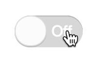 113 |
113 |  117 |
118 |
117 |
118 |  137 |
138 |
137 |
138 |