 15 |
15 |
25 |
87 |
88 |
89 |
--------------------------------------------------------------------------------
/content/1.getting-started/1.index.md:
--------------------------------------------------------------------------------
1 | ---
2 | title: Introduction
3 | description: Welcome to Nuxt UI documentation template.
4 | navigation:
5 | icon: i-lucide-house
6 | ---
7 |
8 | This template is a ready-to-use documentation template made with [Nuxt UI](https://ui.nuxt.com) to create beautiful & responsive Nuxt applications in minutes.
9 |
10 | There are already many websites based on this template:
11 |
12 | ::card-group
13 | :::card
14 | ---
15 | icon: i-simple-icons-nuxtdotjs
16 | target: _blank
17 | title: Nuxt
18 | to: https://nuxt.com
19 | ---
20 | The Nuxt website
21 | :::
22 |
23 | :::card
24 | ---
25 | icon: i-simple-icons-nuxtdotjs
26 | target: _blank
27 | title: Nuxt UI
28 | to: https://ui.nuxt.com
29 | ---
30 | The documentation of `@nuxt/ui`
31 | :::
32 |
33 | :::card
34 | ---
35 | icon: i-simple-icons-nuxtdotjs
36 | target: _blank
37 | title: Nuxt Image
38 | to: https://image.nuxt.com
39 | ---
40 | The documentation of `@nuxt/image`
41 | :::
42 |
43 | :::card
44 | ---
45 | icon: i-simple-icons-nuxtdotjs
46 | target: _blank
47 | title: Nuxt Content
48 | to: https://content.nuxt.com
49 | ---
50 | The documentation of `@nuxt/content`
51 | :::
52 |
53 | :::card
54 | ---
55 | icon: i-simple-icons-nuxtdotjs
56 | target: _blank
57 | title: Nuxt Devtools
58 | to: https://devtools.nuxt.com
59 | ---
60 | The documentation of `@nuxt/devtools`
61 | :::
62 |
63 | :::card
64 | ---
65 | icon: i-simple-icons-nuxtdotjs
66 | target: _blank
67 | title: Nuxt Hub
68 | to: https://hub.nuxt.com
69 | ---
70 | The best place to manage your projects, environments and variables.
71 | :::
72 | ::
73 |
74 | ## Key Features
75 |
76 | This template includes a range of features designed to streamline documentation management:
77 |
78 | - **Powered by** [**Nuxt**](https://nuxt.com): Utilizes the latest Nuxt framework for optimal performance.
79 | - **Built with** [**Nuxt UI**](https://ui.nuxt.com): Integrates a comprehensive suite of UI components.
80 | - [**MDC Syntax**](https://content.nuxt.com/usage/markdown) **via** [**Nuxt Content**](https://content.nuxt.com): Supports Markdown with component integration for dynamic content.
81 | - **Auto-generated Sidebar Navigation**: Automatically generates navigation from content structure.
82 | - **Full-Text Search**: Includes built-in search functionality for content discovery.
83 | - **Optimized Typography**: Features refined typography for enhanced readability.
84 | - **Dark Mode**: Offers dark mode support for user preference.
85 | - **Extensive Functionality**: Explore the template to fully appreciate its capabilities.
86 |
--------------------------------------------------------------------------------
/app/components/OgImage/OgImageDocs.vue:
--------------------------------------------------------------------------------
1 |
10 |
11 |
12 |
13 |
54 |
55 |
76 |
77 |
--------------------------------------------------------------------------------
/app/pages/[...slug].vue:
--------------------------------------------------------------------------------
1 |
54 |
55 |
56 |
56 |
75 | 60 | {{ headline }} 61 |
62 |66 | {{ title }} 67 |
68 |72 | {{ description }} 73 |
74 |
100 |
110 |
111 |
60 |
119 |
120 |
147 |
148 |
149 |
184 |
--------------------------------------------------------------------------------
/content/2.essentials/1.markdown-syntax.md:
--------------------------------------------------------------------------------
1 | ---
2 | title: Markdown Syntax
3 | description: Text, title, and styling in standard markdown.
4 | navigation:
5 | icon: i-lucide-heading-1
6 | ---
7 |
8 | ## Titles
9 |
10 | Use titles to introduce main sections. They structure your documentation and help users navigate content.
11 |
12 | ::code-preview
13 | ---
14 | class: "[&>div]:*:my-0"
15 | ---
16 | ## Titles
17 |
18 | #code
19 | ```mdc
20 | ## Titles
21 | ```
22 | ::
23 |
24 | ### Subtitles
25 |
26 | Use subtitles to divide sections further. They create a more detailed content hierarchy for better readability.
27 |
28 | ::code-preview
29 | ---
30 | class: "[&>div]:*:my-0"
31 | ---
32 | ### Subtitles
33 |
34 | #code
35 | ```mdc
36 | ### Subtitles
37 | ```
38 | ::
39 |
40 | ::tip
41 | Each title and subtitle creates an anchor and shows up automatically in the table of contents.
42 | ::
43 |
44 | ## Text Formatting
45 |
46 | Nuxt UI supports most Markdown formatting options.
47 |
48 | | Style | How to use | Result |
49 | | ------ | ------------ | ---------- |
50 | | Bold | `**bold**` | **Bold** |
51 | | Italic | `*italic*` | *Italic* |
52 | | Strike | `~~strike~~` | ~~Strike~~ |
53 |
54 | Combine formatting for richer text styles and visual emphasis.
55 |
56 | | Style | How to use | Result |
57 | | ------------- | ------------------- | ----------------- |
58 | | Bold Italic | `**_bold italic_**` | ***Bold Italic*** |
59 | | Bold Strike | `~~**bold**~~` | ~~**Bold**~~ |
60 | | Italic Strike | `~~*italic*~~` | ~~*Italic*~~ |
61 |
62 | For exponents, indices, or mathematical notations, use HTML `` and `` tags.
63 |
64 | | Style | How to use | Result |
65 | | ----------- | ------------------------ | ----------- |
66 | | Superscript | `superscript` | superscript |
67 | | Subscript | `subscript` | subscript |
68 |
69 | ## Links
70 |
71 | Links connect different parts of your documentation and external resources, essential for user navigation and providing references.
72 | To create a link, wrap the link text in brackets `[]()`.
73 |
74 | ::code-preview
75 | ---
76 | class: "[&>div]:*:my-0"
77 | ---
78 | [Nuxt UI](https://ui.nuxt.com/getting-started/installation)
79 |
80 | #code
81 | ```mdc
82 | [Nuxt UI](https://ui.nuxt.com/getting-started/installation)
83 | ```
84 | ::
85 |
86 | ### Internal links
87 |
88 | For linking within your documentation, use root-relative paths like `/getting-started/installation`.
89 |
90 | ::code-preview
91 | ---
92 | class: "[&>div]:*:my-0"
93 | ---
94 | [Installation](/getting-started/installation)
95 |
96 | #code
97 | ```mdc
98 | [Installation](/getting-started/installation)
99 | ```
100 | ::
101 |
102 | ## Lists
103 |
104 | Organize related items in a structured, readable format. Markdown supports unordered, ordered, and nested lists for various content needs.
105 |
106 | ### Unordered
107 |
108 | Use unordered lists for items without a specific sequence. Start each item with a `-` symbol.
109 |
110 | ::code-preview
111 | ---
112 | class: "[&>div]:*:my-0"
113 | ---
114 | - I'm a list item.
115 | - I'm another list item.
116 | - I'm the last list item.
117 |
118 | #code
119 | ```mdc
120 | - I'm a list item.
121 | - I'm another list item.
122 | - I'm the last list item.
123 | ```
124 | ::
125 |
126 | ### Ordered
127 |
128 | Use ordered lists when item order matters, like steps in a process. Start each item with a number.
129 |
130 | ::code-preview
131 | ---
132 | class: "[&>div]:*:my-0"
133 | ---
134 | 1. I'm a list item.
135 | 2. I'm another list item.
136 | 3. I'm the last list item.
137 |
138 | #code
139 | ```mdc
140 | 1. I'm a list item.
141 | 2. I'm another list item.
142 | 3. I'm the last list item.
143 | ```
144 | ::
145 |
146 | ### Nested
147 |
148 | Create hierarchical lists with sub-items for complex structures. Indent sub-items by four spaces for nesting.
149 |
150 | ::code-preview
151 | ---
152 | class: "[&>div]:*:my-0"
153 | ---
154 | - I'm a list item.
155 | - I'm a nested list item.
156 | - I'm another nested list item.
157 | - I'm another list item.
158 |
159 | #code
160 | ```mdc
161 | - I'm a list item.
162 | - I'm a nested list item.
163 | - I'm another nested list item.
164 | - I'm another list item.
165 | ```
166 | ::
167 |
168 | ## Tables
169 |
170 | Present structured data in rows and columns clearly. Tables are ideal for comparing data or listing properties.
171 |
172 | ::code-preview
173 | ---
174 | class: "[&>div]:*:my-0 [&>div]:*:w-full"
175 | ---
176 | | Prop | Default | Type |
177 | | ------- | --------- | -------- |
178 | | `name` | | `string` |
179 | | `size` | `md` | `string` |
180 | | `color` | `neutral` | `string` |
181 |
182 | #code
183 | ```mdc
184 | | Prop | Default | Type |
185 | |---------|-----------|--------------------------|
186 | | `name` | | `string`{lang="ts-type"} |
187 | | `size` | `md` | `string`{lang="ts-type"} |
188 | | `color` | `neutral` | `string`{lang="ts-type"} |
189 | ```
190 | ::
191 |
192 | ## Blockquotes
193 |
194 | Highlight important quotations, citations, or emphasized text. Blockquotes visually distinguish quoted content.
195 |
196 | ### Singleline
197 |
198 | Single-line blockquotes are best for short, impactful quotes or citations that fit within a single line. To create a single-line blockquote, add a `>` in front of a paragraph. Ideal for short and impactful quotes.
199 |
200 | ::code-preview
201 | ---
202 | class: "[&>div]:*:my-0"
203 | ---
204 | > Nuxt UI is a collection of Vue components, composables and utils designed to create beautiful and accessible user interfaces.
205 |
206 | #code
207 | ```mdc
208 | > Nuxt UI is a collection of Vue components, composables and utils designed to create beautiful and accessible user interfaces.
209 | ```
210 | ::
211 |
212 | ### Multiline
213 |
214 | Multi-line blockquotes are suitable for longer quotes or when you need to include multiple paragraphs within a single quotation.
215 |
216 | ::code-preview
217 | ---
218 | class: "[&>div]:*:my-0"
219 | ---
220 | > Nuxt UI is a collection of Vue components, composables and utils designed to create beautiful and accessible user interfaces.
221 | >
222 | > Create beautiful, responsive, and accessible Vue applications with Nuxt UI.
223 |
224 | #code
225 | ```mdc
226 | > Nuxt UI is a collection of Vue components, composables and utils designed to create beautiful and accessible user interfaces.
227 | >
228 | > Create beautiful, responsive, and accessible Vue applications with Nuxt UI.
229 | ```
230 | ::
231 |
--------------------------------------------------------------------------------
/content/index.md:
--------------------------------------------------------------------------------
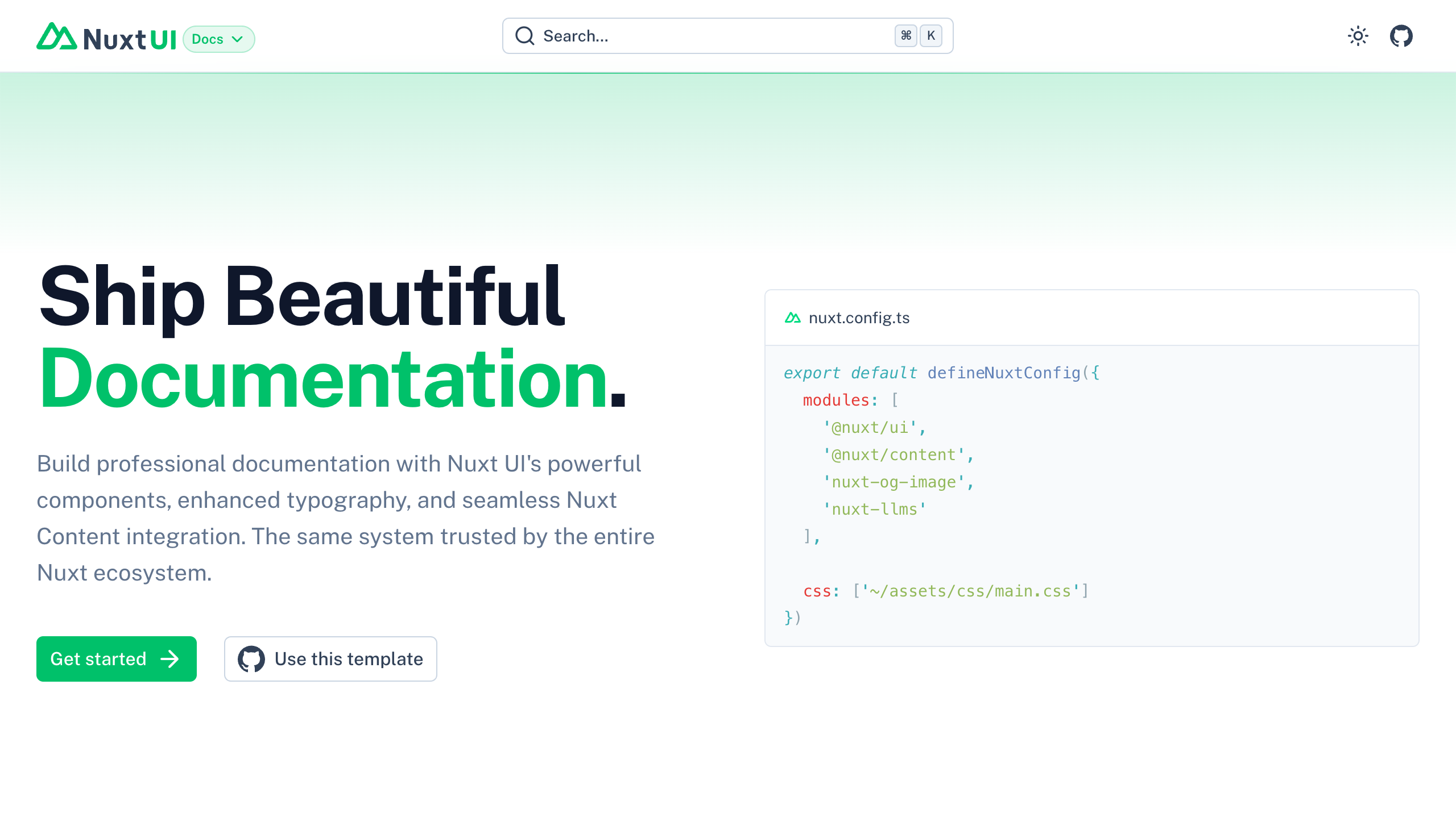
1 | ---
2 | seo:
3 | title: Nuxt Docs Template
4 | description: Create stunning, fast and SEO-optimized documentation sites with Nuxt UI.
5 | ---
6 |
7 | ::u-page-hero{class="dark:bg-gradient-to-b from-neutral-900 to-neutral-950"}
8 | ---
9 | orientation: horizontal
10 | ---
11 | #top
12 | :hero-background
13 |
14 | #title
15 | Ship Beautiful [Documentation]{.text-primary}.
16 |
17 | #description
18 | Build professional documentation with Nuxt UI's powerful components, enhanced typography, and seamless Nuxt Content integration. The same system trusted by the entire [Nuxt ecosystem](https://nuxt.com).
19 |
20 | #links
21 | :::u-button
22 | ---
23 | to: /getting-started
24 | size: xl
25 | trailing-icon: i-lucide-arrow-right
26 | ---
27 | Get started
28 | :::
29 |
30 | :::u-button
31 | ---
32 | icon: i-simple-icons-github
33 | color: neutral
34 | variant: outline
35 | size: xl
36 | to: https://github.com/nuxt-ui-templates/docs
37 | target: _blank
38 | ---
39 | Use this template
40 | :::
41 |
42 | #default
43 | :::prose-pre
44 | ---
45 | code: |
46 | export default defineNuxtConfig({
47 | modules: [
48 | '@nuxt/ui',
49 | '@nuxt/content',
50 | 'nuxt-og-image',
51 | 'nuxt-llms'
52 | ],
53 |
54 | css: ['~/assets/css/main.css']
55 | })
56 | filename: nuxt.config.ts
57 | ---
58 |
59 | ```ts [nuxt.config.ts]
60 | export default defineNuxtConfig({
61 | modules: [
62 | '@nuxt/ui',
63 | '@nuxt/content',
64 | 'nuxt-og-image',
65 | 'nuxt-llms'
66 | ],
67 |
68 | css: ['~/assets/css/main.css']
69 | })
70 | ```
71 | :::
72 | ::
73 |
74 | ::u-page-section{class="dark:bg-neutral-950"}
75 | #title
76 | Powered by Nuxt UI components
77 |
78 | #links
79 | :::u-button
80 | ---
81 | color: neutral
82 | size: lg
83 | target: _blank
84 | to: https://ui.nuxt.com/docs/getting-started/installation/nuxt
85 | trailingIcon: i-lucide-arrow-right
86 | variant: subtle
87 | ---
88 | Explore Nuxt UI
89 | :::
90 |
91 | #features
92 | :::u-page-feature
93 | ---
94 | icon: i-lucide-palette
95 | ---
96 | #title
97 | 100+ UI Components
98 |
99 | #description
100 | Access the complete Nuxt UI component library. From badges to modals, everything styled and accessible out of the box.
101 | :::
102 |
103 | :::u-page-feature
104 | ---
105 | icon: i-lucide-type
106 | ---
107 | #title
108 | Beautiful Typography
109 |
110 | #description
111 | Pre-styled prose components with perfect visual harmony. No need for @tailwindcss/typography - get precise control over every element.
112 | :::
113 |
114 | :::u-page-feature
115 | ---
116 | icon: i-lucide-layers
117 | ---
118 | #title
119 | Rich Prose Components
120 |
121 | #description
122 | Accordions, cards, callouts, tabs, steps, code blocks, and more - all provided by Nuxt UI for interactive documentation.
123 | :::
124 |
125 | :::u-page-feature
126 | ---
127 | icon: i-lucide-search
128 | ---
129 | #title
130 | Built-in Search
131 |
132 | #description
133 | Full-text search with ContentSearch component. No need for Algolia - instant, relevant results with keyboard shortcuts (⌘K).
134 | :::
135 |
136 | :::u-page-feature
137 | ---
138 | icon: i-lucide-navigation
139 | ---
140 | #title
141 | Smart Navigation
142 |
143 | #description
144 | Auto-generated navigation with ContentNavigation and ContentToc components. Sticky table of contents and prev/next links.
145 | :::
146 |
147 | :::u-page-feature
148 | ---
149 | icon: i-lucide-moon
150 | ---
151 | #title
152 | Dark Mode Ready
153 |
154 | #description
155 | Automatic theme switching with smooth transitions. Respects system preferences and remembers user choice.
156 | :::
157 | ::
158 |
159 | ::u-page-section{class="dark:bg-neutral-950"}
160 | #title
161 | Enhanced with Nuxt Content
162 |
163 | #links
164 | :::u-button
165 | ---
166 | color: neutral
167 | size: lg
168 | target: _blank
169 | to: https://content.nuxt.com/docs/getting-started/installation
170 | trailingIcon: i-lucide-arrow-right
171 | variant: subtle
172 | ---
173 | Explore Nuxt Content
174 | :::
175 |
176 | #features
177 | :::u-page-feature
178 | ---
179 | icon: i-simple-icons-markdown
180 | ---
181 | #title
182 | MDC Enhanced Markdown
183 |
184 | #description
185 | Write in Markdown while embedding Vue components. Seamlessly integrate interactive elements in your content.
186 | :::
187 |
188 | :::u-page-feature
189 | ---
190 | icon: i-lucide-file-text
191 | ---
192 | #title
193 | File-based Routing
194 |
195 | #description
196 | Organize content in folders and files. Your documentation structure automatically becomes your navigation.
197 | :::
198 |
199 | :::u-page-feature
200 | ---
201 | icon: i-lucide-code
202 | ---
203 | #title
204 | Syntax Highlighting
205 |
206 | #description
207 | Beautiful code blocks with language detection, line numbers, and copy buttons. Support for 100+ languages.
208 | :::
209 |
210 | :::u-page-feature
211 | ---
212 | icon: i-lucide-database
213 | ---
214 | #title
215 | Content Database
216 |
217 | #description
218 | Query your content with a MongoDB-like API. Filter, sort, and search through your documentation programmatically.
219 | :::
220 |
221 | :::u-page-feature
222 | ---
223 | icon: i-lucide-file-code
224 | ---
225 | #title
226 | Frontmatter Support
227 |
228 | #description
229 | Add metadata to your content files. Define SEO tags, navigation properties, and custom fields.
230 | :::
231 |
232 | :::u-page-feature
233 | ---
234 | icon: i-lucide-git-branch
235 | ---
236 | #title
237 | Version Control
238 |
239 | #description
240 | Content lives in your repository. Branch, review, and deploy documentation alongside your code.
241 | :::
242 | ::
243 |
244 | ::u-page-section{class="dark:bg-gradient-to-b from-neutral-950 to-neutral-900"}
245 | :::u-page-c-t-a
246 | ---
247 | links:
248 | - label: Start building
249 | to: '/getting-started'
250 | trailingIcon: i-lucide-arrow-right
251 | - label: View on GitHub
252 | to: 'https://github.com/nuxt-ui-templates/docs'
253 | target: _blank
254 | variant: subtle
255 | icon: i-simple-icons-github
256 | title: Ready to build an amazing documentation?
257 | description: Join thousands of developers building with Nuxt and Nuxt UI. Get this template and start shipping today.
258 | class: dark:bg-neutral-950
259 | ---
260 |
261 | :stars-bg
262 | :::
263 | ::
264 |
--------------------------------------------------------------------------------
/content/3.ai/1.mcp.md:
--------------------------------------------------------------------------------
1 | ---
2 | title: MCP Server
3 | description: Connect your documentation to AI tools with a native MCP server.
4 | navigation:
5 | icon: i-lucide-cpu
6 | ---
7 |
8 | ## About MCP Servers
9 |
10 | The [Model Context Protocol (MCP)](https://modelcontextprotocol.io/) is an open protocol that creates standardized connections between AI applications and external services, like documentation.
11 |
12 | This documentation template includes a built-in MCP server, preparing your content for the broader AI ecosystem where any MCP client (like Claude, Cursor, VS Code, and others) can connect to your documentation.
13 |
14 | ### How MCP Servers Work
15 |
16 | When an MCP server is connected to an AI tool, the LLM can decide to use your documentation tools during response generation:
17 |
18 | - The LLM can **proactively search your documentation** while generating a response, not just when explicitly asked.
19 | - The LLM determines **when to use tools** based on the context of the conversation and the relevance of your documentation.
20 | - Each tool call happens **during the generation process**, allowing the LLM to incorporate real-time information from your documentation into its response.
21 |
22 | For example, if a user asks a coding question and the LLM determines that your documentation is relevant, it can search your docs and include that information in the response without the user explicitly asking about your documentation.
23 |
24 | ## Accessing Your MCP Server
25 |
26 | Your MCP server is automatically available at the `/mcp` path of your documentation URL.
27 |
28 | ::prose-note
29 | For example, if your documentation is hosted at `https://docs.example.com`, your MCP server URL is `https://docs.example.com/mcp`.
30 | ::
31 |
32 | ## Disable the MCP Server
33 |
34 | If you want to disable the MCP server, you can do so in your `nuxt.config.ts`:
35 |
36 | ```ts [nuxt.config.ts]
37 | export default defineNuxtConfig({
38 | mcp: {
39 | enabled: false,
40 | },
41 | })
42 | ```
43 |
44 | ## Built-in Tools
45 |
46 | This template provides two tools out of the box that allow any LLM to discover and read your documentation:
47 |
48 | ### `list-pages`
49 |
50 | Lists all documentation pages with their titles, paths, and descriptions. AI assistants should call this first to discover available content.
51 |
52 | | Parameter | Type | Description |
53 | |-----------|------|-------------|
54 | | `locale` | string (optional) | Filter pages by locale |
55 |
56 | ### `get-page`
57 |
58 | Retrieves the full markdown content of a specific documentation page.
59 |
60 | | Parameter | Type | Description |
61 | |-----------|------|-------------|
62 | | `path` | string (required) | The page path (e.g., `/en/getting-started/installation`) |
63 |
64 | ## Setup
65 |
66 | The MCP server uses HTTP transport and can be installed in different AI assistants.
67 |
68 | ### Claude Code
69 |
70 | Add the server using the CLI command:
71 |
72 | ```bash
73 | claude mcp add --transport http my-docs https://docs.example.com/mcp
74 | ```
75 |
76 | ### Cursor
77 |
78 | ::install-button
79 | ---
80 | url: "https://docs.example.com/mcp"
81 | ide: "cursor"
82 | label: "Install in Cursor"
83 | ---
84 | ::
85 |
86 | Or manually create/update `.cursor/mcp.json` in your project root:
87 |
88 | ```json [.cursor/mcp.json]
89 | {
90 | "mcpServers": {
91 | "my-docs": {
92 | "type": "http",
93 | "url": "https://docs.example.com/mcp"
94 | }
95 | }
96 | }
97 | ```
98 |
99 | ### Visual Studio Code
100 |
101 | Ensure you have GitHub Copilot and GitHub Copilot Chat extensions installed.
102 |
103 | ::install-button
104 | ---
105 | url: "https://docs.example.com/mcp"
106 | ide: "vscode"
107 | label: "Install in VS Code"
108 | ---
109 | ::
110 |
111 | Or manually create/update the `.vscode/mcp.json` file:
112 |
113 | ```json [.vscode/mcp.json]
114 | {
115 | "servers": {
116 | "my-docs": {
117 | "type": "http",
118 | "url": "https://docs.example.com/mcp"
119 | }
120 | }
121 | }
122 | ```
123 |
124 | ### Windsurf
125 |
126 | 1. Open Windsurf and navigate to **Settings** > **Windsurf Settings** > **Cascade**
127 | 2. Click the **Manage MCPs** button, then select the **View raw config** option
128 | 3. Add the following configuration:
129 |
130 | ```json [.codeium/windsurf/mcp_config.json]
131 | {
132 | "mcpServers": {
133 | "my-docs": {
134 | "type": "http",
135 | "url": "https://docs.example.com/mcp"
136 | }
137 | }
138 | }
139 | ```
140 |
141 | ### Zed
142 |
143 | 1. Open Zed and go to **Settings** > **Open Settings**
144 | 2. Navigate to the JSON settings file
145 | 3. Add the following context server configuration:
146 |
147 | ```json [.config/zed/settings.json]
148 | {
149 | "context_servers": {
150 | "my-docs": {
151 | "source": "custom",
152 | "command": "npx",
153 | "args": ["mcp-remote", "https://docs.example.com/mcp"],
154 | "env": {}
155 | }
156 | }
157 | }
158 | ```
159 |
160 | ## Customization
161 |
162 | Since this template uses the [`@nuxtjs/mcp-toolkit`](https://mcp-toolkit.nuxt.dev/) module, you can extend the MCP server with custom tools, resources, prompts, and handlers.
163 |
164 | ### Adding Custom Tools
165 |
166 | Create new tools in the `server/mcp/tools/` directory:
167 |
168 | ```ts [server/mcp/tools/search.ts]
169 | import { z } from 'zod'
170 |
171 | export default defineMcpTool({
172 | description: 'Search documentation by keyword',
173 | inputSchema: {
174 | query: z.string().describe('The search query'),
175 | },
176 | handler: async ({ query }) => {
177 | const results = await searchDocs(query)
178 | return {
179 | content: [{ type: 'text', text: JSON.stringify(results) }],
180 | }
181 | },
182 | })
183 | ```
184 |
185 | ### Adding Resources
186 |
187 | Expose files or data sources as MCP resources in the `server/mcp/resources/` directory. The simplest way is using the `file` property:
188 |
189 | ```ts [server/mcp/resources/changelog.ts]
190 | export default defineMcpResource({
191 | file: 'CHANGELOG.md',
192 | metadata: {
193 | description: 'Project changelog',
194 | },
195 | })
196 | ```
197 |
198 | This automatically handles URI generation, MIME type detection, and file reading.
199 |
200 | ### Adding Prompts
201 |
202 | Create reusable prompts for AI assistants in the `server/mcp/prompts/` directory:
203 |
204 | ```ts [server/mcp/prompts/migration-help.ts]
205 | import { z } from 'zod'
206 |
207 | export default defineMcpPrompt({
208 | description: 'Get help with migrating between versions',
209 | inputSchema: {
210 | fromVersion: z.string().describe('Current version'),
211 | toVersion: z.string().describe('Target version'),
212 | },
213 | handler: async ({ fromVersion, toVersion }) => {
214 | return {
215 | messages: [{
216 | role: 'user',
217 | content: {
218 | type: 'text',
219 | text: `Help me migrate from version ${fromVersion} to ${toVersion}. What are the breaking changes and steps I need to follow?`,
220 | },
221 | }],
222 | }
223 | },
224 | })
225 | ```
226 |
227 | ### Adding Custom Handlers
228 |
229 | Handlers allow you to create separate MCP endpoints with their own tools, resources, and prompts. This is useful for exposing different capabilities at different routes.
230 |
231 | For example, you could have:
232 | - `/mcp` - Main documentation MCP server
233 | - `/mcp/migration` - Dedicated MCP server for migration assistance
234 |
235 | ```ts [server/mcp/migration.ts]
236 | import { z } from 'zod'
237 |
238 | const migrationTool = defineMcpTool({
239 | name: 'migrate-v3-to-v4',
240 | description: 'Migrate code from version 3 to version 4',
241 | inputSchema: {
242 | code: z.string().describe('The code to migrate'),
243 | },
244 | handler: async ({ code }) => {
245 | // Migration logic
246 | return {
247 | content: [{ type: 'text', text: migratedCode }],
248 | }
249 | },
250 | })
251 |
252 | export default defineMcpHandler({
253 | route: '/mcp/migration',
254 | name: 'Migration Assistant',
255 | version: '1.0.0',
256 | tools: [migrationTool],
257 | })
258 | ```
259 |
260 | ### Overwriting Built-in Tools
261 |
262 | You can override the default `list-pages` or `get-page` tools by creating a tool with the same name in your project:
263 |
264 | ```ts [server/mcp/tools/list-pages.ts]
265 | import { z } from 'zod'
266 |
267 | export default defineMcpTool({
268 | description: 'Custom list pages implementation',
269 | inputSchema: {
270 | locale: z.string().optional(),
271 | category: z.string().optional(),
272 | },
273 | handler: async ({ locale, category }) => {
274 | const pages = await getCustomPageList(locale, category)
275 | return {
276 | content: [{ type: 'text', text: JSON.stringify(pages) }],
277 | }
278 | },
279 | })
280 | ```
281 |
282 | ::tip{to="https://mcp-toolkit.nuxt.dev/"}
283 | Check the MCP Toolkit documentation for more information about tools, resources, prompts, handlers and advanced configuration.
284 | ::
285 |
--------------------------------------------------------------------------------
/content/2.essentials/2.code-blocks.md:
--------------------------------------------------------------------------------
1 | ---
2 | title: Code Blocks
3 | description: Display inline code and code blocks
4 | navigation:
5 | icon: i-lucide-code-xml
6 | ---
7 |
8 | ## Basic
9 |
10 | ### Inline Code
11 |
12 | Use inline code to display code snippets within text paragraphs. It's ideal for referencing code elements directly in sentences.
13 |
14 | ::code-preview
15 | ---
16 | class: "[&>div]:*:my-0"
17 | ---
18 | `inline code`
19 |
20 | #code
21 | ```mdc
22 | `inline code`
23 | ```
24 | ::
25 |
26 | ### Code Blocks
27 |
28 | Use code blocks to display multi-line code snippets with syntax highlighting. Code blocks are essential for presenting code examples clearly.
29 |
30 | ::code-preview
31 | ---
32 | class: "[&>div]:*:my-0 [&>div]:*:w-full"
33 | ---
34 | ```ts
35 | export default defineNuxtConfig({
36 | modules: ['@nuxt/ui']
37 | })
38 | ```
39 |
40 | #code
41 | ````mdc
42 | ```ts
43 | export default defineNuxtConfig({
44 | modules: ['@nuxt/ui']
45 | })
46 | ```
47 | ````
48 | ::
49 |
50 | When writing a code-block, you can specify a filename that will be displayed on top of the code block. An icon will be automatically displayed based on the extension or the name.
51 | Filenames help users understand the code's location and purpose within a project.
52 |
53 | ::code-preview
54 | ---
55 | class: "[&>div]:*:my-0 [&>div]:*:w-full"
56 | ---
57 | ```ts [nuxt.config.ts]
58 | export default defineNuxtConfig({
59 | modules: ['@nuxt/ui']
60 | })
61 | ```
62 |
63 | #code
64 | ````mdc
65 | ```ts [nuxt.config.ts]
66 | export default defineNuxtConfig({
67 | modules: ['@nuxt/ui']
68 | })
69 | ```
70 | ````
71 | ::
72 |
73 | ::tip
74 | Some icons are already defined by default, but you can add more in your `app.config.ts` through the `ui.prose.codeIcon` key:
75 |
76 | ```ts [app.config.ts]
77 | export default defineAppConfig({
78 | ui: {
79 | prose: {
80 | codeIcon: {
81 | terminal: 'i-ph-terminal-window-duotone'
82 | }
83 | }
84 | }
85 | })
86 | ```
87 | ::
88 |
89 | Every code-block has a built-in copy button that will copy the code to your clipboard.
90 |
91 | ::tip
92 | You can change the icon in your `app.config.ts` through the `ui.icons.copy` and `ui.icons.copyCheck` keys:
93 |
94 | ```ts [app.config.ts]
95 | export default defineAppConfig({
96 | ui: {
97 | icons: {
98 | copy: 'i-lucide-copy',
99 | copyCheck: 'i-lucide-copy-check'
100 | }
101 | }
102 | })
103 | ```
104 | ::
105 |
106 | #### Highlight Line
107 |
108 | To highlight lines of code, add `{}` around the line numbers you want to highlight.
109 | Line highlighting is useful for focusing users on important parts of code examples.
110 |
111 | ::code-preview
112 | ---
113 | class: "[&>div]:*:my-0 [&>div]:*:w-full"
114 | ---
115 | ```ts [nuxt.config.ts]{4-5}
116 | export default defineAppConfig({
117 | ui: {
118 | icons: {
119 | copy: 'i-lucide-copy',
120 | copyCheck: 'i-lucide-copy-check'
121 | }
122 | }
123 | })
124 | ```
125 |
126 | #code
127 | ````mdc
128 | ```ts [nuxt.config.ts]{4-5}
129 | export default defineAppConfig({
130 | ui: {
131 | icons: {
132 | copy: 'i-lucide-copy',
133 | copyCheck: 'i-lucide-copy-check'
134 | }
135 | }
136 | })
137 | ```
138 | ````
139 | ::
140 |
141 | ## Advanced
142 |
143 | ### CodeGroup
144 |
145 | Group code blocks in tabs using `code-group`. `code-group` is perfect for showing code examples in multiple languages or package managers.
146 |
147 | ::code-preview
148 | ---
149 | class: "[&>div]:*:my-0 [&>div]:*:w-full"
150 | ---
151 | :::code-group{.w-full}
152 | ```bash [pnpm]
153 | pnpm add @nuxt/ui
154 | ```
155 |
156 | ```bash [yarn]
157 | yarn add @nuxt/ui
158 | ```
159 |
160 | ```bash [npm]
161 | npm install @nuxt/ui
162 | ```
163 |
164 | ```bash [bun]
165 | bun add @nuxt/ui
166 | ```
167 | :::
168 |
169 | #code
170 | ````mdc
171 | :::code-group
172 |
173 | ```bash [pnpm]
174 | pnpm add @nuxt/ui
175 | ```
176 |
177 | ```bash [yarn]
178 | yarn add @nuxt/ui
179 | ```
180 |
181 | ```bash [npm]
182 | npm install @nuxt/ui
183 | ```
184 |
185 | ```bash [bun]
186 | bun add @nuxt/ui
187 | ```
188 |
189 | ::
190 | ````
191 | ::
192 |
193 | ::note{to="#pre"}
194 | Like the `ProsePre` component, the `CodeGroup` handles filenames, icons and copy button.
195 | ::
196 |
197 | ### CodeTree
198 |
199 | Display code blocks in a file tree view using `code-tree`. `code-tree` is excellent for showcasing project structures and file relationships.
200 |
201 | ::code-preview{class="[&>div]:*:my-0 [&>div]:*:w-full"}
202 | :::code-tree{default-value="app/app.config.ts"}
203 | ```ts [nuxt.config.ts]
204 | export default defineNuxtConfig({
205 | modules: ['@nuxt/ui'],
206 |
207 | css: ['~/assets/css/main.css']
208 | })
209 |
210 | ```
211 |
212 | ```css [app/assets/css/main.css]
213 | @import "tailwindcss";
214 | @import "@nuxt/ui";
215 | ```
216 |
217 | ```ts [app/app.config.ts]
218 | export default defineAppConfig({
219 | ui: {
220 | colors: {
221 | primary: 'sky',
222 | colors: 'slate'
223 | }
224 | }
225 | })
226 | ```
227 |
228 | ```vue [app/app.vue]
229 |
230 |
121 |
146 |
131 |
144 |
145 |